#build a header navigation in html
Explore tagged Tumblr posts
Visit Tumblr Blog
Explore Tumblr blogs with no restrictions, modern design and the best experience.
Last Seen Tumblr Blogs


Fun Fact
Hackers stole 65M passwords from Tumblr in 2013.
Text
Mini React.js Tips #3 | Resources ✨

Continuing the #mini react tips series, its components making time~!
In React, a component is like a Lego brick for building websites or apps. It's a small, independent part of the user interface (UI) that you can reuse whenever you need it. These components can be combined to create bigger and more complex applications. Examples are the header, footer, cards, asides, etc!
What you'll need:
know how to create a React project >> click
know the default React project's file structure >> click
know basic HTML
know basic JavaScript
basic knowledge of using the Terminal

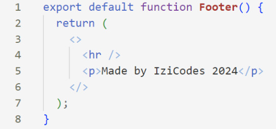
What We Are Creating:
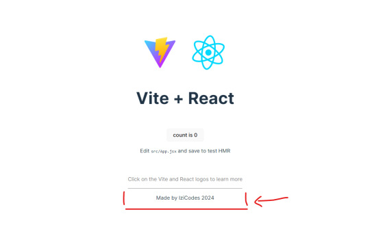
The footer at the bottom!
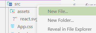
[ 1 ] Navigate to the 'src' Folder: Open your project in Visual Studio Code, locate the 'src' folder, and right-click on it.
[ 2 ] Create a New File: Click 'New File' to create the file within the 'src' folder. This file will house the code for your React component.
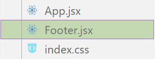
[ 3 ] Naming Conventions: Give your component a name, according to the convention of starting with a capital letter. This naming convention is essential for React to recognize your component~!!
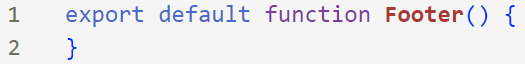
[ 4 ] Create The Initial Function: Open the file and type:
export default function [name of component]() {}
[ 5 ] Insert The return() Statement: The statement is used within a component to specify what content should be rendered when the component is invoked or used. Type:
return()
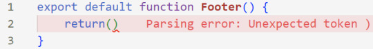
*the error is there because we haven't added anything inside yet, don't worry!
[ 6 ] Insert The Empty Tags: Inside of the return(), add empty tags (tags that don't have a specified element inside of them).
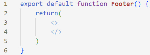
[ 7 ] Time For Some HTML: Inside the empty tags, enter the normal HTML elements that you want~!
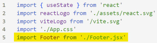
[ 8 ] Integration with App.jsx: Navigate to the 'App.jsx' file in the project, which is typically the entry point of your React application. At the top, import your newly created component. Type:
import [name of component] from './[location of the component]'
[ 9 ] Use Your Component: Inside the return() statement of the 'App()' function, include your component using the following syntax:
<[name of your component] />
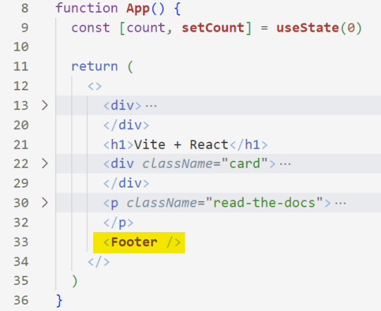
[ 10 ] Run the Development Server: Start your development server with the command (the 'Local' link):
npm run dev
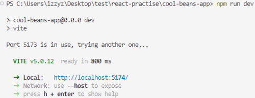
[ 11 ] Preview Your Project: Open the link provided in your terminal in your web browser. Witness your component in action!
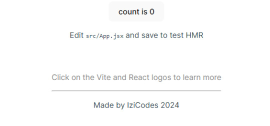
Congratulations! You made your first component! Try and create some new ones and place them around in the App()~!
BroCode’s 'React Full Course for Free’ 2024 >> click
React Official Website >> click
W3School's React Components >> click
Importing and Exporting Components >> click
🐬Previous Tip: Tip #2 The anatomy of the default React project >> click
Stay tuned for the other posts I will make on this series #mini react tips~!
#mini react tips#my resources#resources#codeblr#coding#progblr#programming#studyblr#studying#javascript#react.js#reactjs#coding tips#coding resources
33 notes
·
View notes
Text
How to Optimize Your Website for Search Engines
In today's digital era, having an online presence is crucial for businesses and individuals alike. However, merely having a website is not enough; you need to ensure that your website ranks well on search engines to attract organic traffic. This comprehensive guide will run you through the important steps to optimize your website for search engines, ensuring that your content reaches the right audience. Let's dive in and uncover the secrets to improving your website's search engine visibility.
Introduction
In the vast digital landscape, search engines act as the gateway to information. When users search for a query, search engines like Google, Bing, and Yahoo crawl through countless web pages to deliver the most relevant results. In simple terms optimizing your website for search engines is about making it easy for these search engines to understand and index your content for better SERPs. This guide will help you navigate the nuances of SEO and provide actionable steps to enhance your website's visibility.
Search Engine Optimization (SEO)
Search Engine Optimization (SEO) is the practice of optimizing your website to improve its visibility on search engine result pages (SERPs). By implementing various techniques, you can enhance your website's chances of ranking higher, thereby increasing the likelihood of organic traffic. SEO encompasses both on-page and off-page strategies, all target at making your website more attractive to search engines.
Keyword Research and Analysis
Keyword research is the foundation of any successful SEO strategy. It involves identifying the keywords and phrases that your target audience is likely to use when searching for content related to your website. Effective keyword research provides insights into user intent, allowing you to create content that aligns with what users are looking for.
On-Page Optimization
On-page optimization focuses on improving individual web pages to rank higher and earn more relevant traffic. It involves various elements, including:
Title Tags and Meta Descriptions
Title tags and meta descriptions are HTML elements that provide concise descriptions of a web page's content. They play a crucial role in attracting clicks from search engine users. Crafting compelling, keyword-rich titles and descriptions can significantly impact your click-through rates.
Header Tags (H1, H2, H3, H4)
Header tags structure your content and provide hierarchy. The H1 tag represents the main heading of the page, while H2, H3, and H4 tags are used for subheadings. Using these tags appropriately makes your content more readable and scannable.
High-Quality Content Creation
Content is king in the world of SEO. High-quality, relevant, and informative content not only engages users but also signals to search engines that your website provides value. Incorporate relevant keywords naturally within your content, avoiding keyword stuffing.
URL Structure
A clean and descriptive URL structure improves user experience and search engine crawlability. Use concise, meaningful URLs that reflect the content of the page.
Internal Linking
Internal linking connects different pages within your website, improving navigation and distributing link equity. It helps search engines discover and index more of your content.
Image Optimization
Images are an integral part of web content. Properly optimized images improve page load times and enhance user experience. Use descriptive file names and add alt text to images for accessibility and SEO benefits.
Off-Page Optimization
Off-page optimization involves activities outside your website that influence its search engine rankings. The primary focus is on building high-quality backlinks and increasing brand awareness through social media engagement.
Backlink Building
Backlinks are links from other websites to yours. They act as endorsements, signaling to search engines that your content is valuable. Focus on acquiring authoritative and relevant backlinks through outreach, guest posting, and content partnerships.
Social Media Engagement
Engaging with your audience on social media platforms not only increases brand visibility but also encourages sharing and interaction. Social signals, such as likes, shares, and comments, indirectly impact SEO by driving traffic and indicating content relevance.
Mobile-Friendly Design
With mobile devices driving a significant portion of web traffic, having a mobile-friendly website is essential. Responsive design ensures that your website adapts to different screen sizes, providing a seamless experience for users across devices.
Website Speed and Performance
Page speed is a critical factor in both user experience and SEO. Slow-loading pages can lead to higher bounce rates and lower search engine rankings. Optimize images, minimize code, and leverage caching to improve website speed.
Technical SEO
Technical SEO focuses on the backend elements that impact search engine crawlability and indexing.
XML Sitemaps
XML sitemaps provide search engines with a roadmap of your website's structure, helping them discover and index content more efficiently.
Robots.txt
The robots.txt file instructs search engine bots on which pages to crawl and which to exclude. Proper configuration prevents search engines from indexing duplicate, irrelevant, or sensitive content.
Canonicalization
Canonical tags indicate the preferred version of a web page when multiple versions with similar content exist. This prevents duplicate content issues and consolidates ranking authority.
SSL Certificate
An SSL certificate encrypts data transmitted between a user's browser and your website, enhancing security and boosting search engine rankings.
User Experience and Engagement
A positive user experience is a key factor in SEO. A well-designed, easy-to-navigate website with relevant content keeps users engaged and encourages them to explore further.
Monitoring and Analytics
Regularly monitor your website's performance using tools like Google Analytics and Google Search Console. Analyzing data helps you identify what's working and where improvements are needed.
Keeping Up with Algorithm Changes
Search engine algorithms are constantly evolving. Staying informed about updates ensures that your SEO strategies remain effective and aligned with search engine guidelines.
Local SEO Strategies
For businesses targeting a local audience, local SEO strategies are crucial. Claim your Google My Business listing, encourage customer reviews, and optimize for location-specific keywords.
Voice Search Optimization
With the rise of voice-activated devices, optimizing for voice search is becoming more important. Focus on conversational, long-tail keywords and provide concise answers to common questions.
E-A-T and YMYL Guidelines
Expertise, Authoritativeness, and Trustworthiness (E-A-T) are essential for websites offering Your Money or Your Life (YMYL) content. Establish credibility by showcasing expertise and authoritative sources.
Conclusion
Optimizing your website for search engines is an ongoing process that requires dedication and a holistic approach. By implementing the strategies outlined in this comprehensive guide, you'll be better equipped to improve your website's search engine visibility, attract organic traffic, and provide value to your audience.
Source
4 notes
·
View notes
Text
What is SEO in Digital Marketing? Benefits & Types Of SEO
SEO
What is SEO in Digital Marketing?
SEO stands for Search Engine Optimization. It is an organic process used to enhance the visibility and ranking of a website or webpage on the search engine results pages (SERPs). SEO aims to drive organic (unpaid) traffic for a particular’s web page/website.
SEO depends on various important factors like as keyword research, high-quality & relevant content, meta description, title tag, heading tag, URL structure, mobile friendliness etc.
Benefits Of SEO?
Increased Organic Traffic: SEO is an organic process. So, you can get more organic traffic from search engine result pages.
Better User Experience: SEO involves optimizing various aspects of a website, such as its structure, content, and navigation. This often leads to an improved user experience, making it easier for visitors to find what they're looking for.
Long-Term Results: SEO is a time taking organic process. If you follow the best SEO path and implement it on your website, that time you can get long-term benefits.
Cost-Effectiveness: Organic traffic generated through SEO is essentially free, making it a cost-effective way to attract visitors compared to paid advertising methods.
Targeted Traffic: SEO allows you to target specific keywords and phrases that are relevant to your business, ensuring that the traffic you receive is more likely to convert into customers.
Types Of SEO
On-Page SEO: This involves optimizing the content and HTML source code of individual web pages. It includes elements like keyword optimization, high-quality content creation, proper use of header tags, meta descriptions, and optimizing images.
Off-Page SEO: Off-Page SEO means whatever you can do outside of your website. Off-Page SEO is known as Off Side SEO or Link building. After completing your on-page SEO activities, you will start to create Link building to other high-quality websites for your websites. Like as Infographic submission, social bookmarking, classified submission, PPT/PDF submission etc.
Technical SEO: Technical SEO is a part of On-Page SEO. Because you are optimizing your website to ensure that search engines can crawl, index, and understand your content effectively. It includes tasks like improving site speed, optimizing for mobile devices, fixing broken links, and creating XML sitemaps.
Local SEO: For businesses with a physical presence, local SEO is crucial. It involves optimizing your online presence to appear in local search results, often including tasks like creating and optimizing Google My Business profiles, managing online reviews, and ensuring consistent NAP (Name, Address, Phone Number) information across platforms.

If you want to promote your business online, contact Digital Arijit, the best SEO expert in Kolkata. Get excellent SEO services at an affordable price. Visit Our Site: - https://digitalarijit.in/seo-expert-in-kolkata/
Content Strategy: Creating valuable, relevant, and high-quality content is a cornerstone of effective SEO. This includes blog posts, articles, videos, infographics, and other content that caters to your target audience's interests and needs.
Keyword Research: Keyword research is an important part of SEO. Keywords are search terms or words that users search in the search bar. Without the right keyword, you never get better visibility on the SERP. Your selected keyword must be according to your business niche and targeted audience.
Analytics and Monitoring: Regularly analysing your website's performance using tools like Google Analytics helps you track the effectiveness of your SEO efforts. Monitoring your rankings, traffic, and user behaviour can guide your ongoing optimization strategies.
Conclusion
In summary, SEO is a multifaceted approach that combines various techniques to improve a website's visibility, credibility, and organic traffic from search engines. It involves on-page and off-page optimization, technical improvements, content creation, keyword research, and continuous monitoring to achieve its benefits.
2 notes
·
View notes
Text
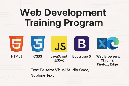
Web Development Training Program

Master the Core Front-End Technologies: HTML, CSS, JavaScript, and BootstrapThis course provides a complete introduction to front-end web development, enabling you to build responsive, interactive, and professional websites from scratch. By mastering these technologies, you'll be equipped with the foundational skills needed for a career in web development.Tools & Technologies Covered:HTML5 CSS3 JavaScript (ES6+) Bootstrap 5 Text Editors: Visual Studio Code, Sublime Text Web Browsers: Chrome, Firefox, Edge Understand how websites are structured and styled using HTML and CSS. Create interactive, dynamic web pages using JavaScript. Build responsive, mobile-first web designs using Bootstrap. Overview of the Web Development Process Understanding Client-Side and Server-Side Development Setting Up the Development Environment (Text Editors, Browsers) Structure of an HTML Document Basic HTML ElementsHeadings, Paragraphs, Lists, Links Images and Media ElementsAdding Images, Audio, and Video Forms and Input ElementsText Fields, Buttons, Dropdowns, and Checkboxes Semantic HTML5 Tags (header, nav, section, article, footer) CSS Syntax: Selectors, Properties, and Values Styling Text and ElementsFonts, Colors, Backgrounds, Borders The Box Model (Margins, Padding, Borders, Content) Layout and PositioningStatic, Relative, Absolute, Fixed, and Sticky Responsive Design with Media Queries Advanced Features: Animations, Transitions, Gradients Introduction to JavaScript Variables and Data Types (var, let, const) Operators and Control Flow (if-else, loops) Functions and EventsWriting and Calling Functions Handling Click, Mouse, and Keyboard Events Arrays and Objects Manipulating the DOMSelecting and Updating HTML Elements Adding Dynamic Behavior to Web Pages Setting Up Bootstrap (CDN or Local) Understanding the Grid SystemRows, Columns, Breakpoints for Responsive Layouts Using Bootstrap ComponentsNavigation Bars, Modals, Buttons, Cards, Forms Styling with UtilitiesColors, Spacing, Typography Advanced FeaturesCreating Hero Sections and Interactive Forms Customizing Bootstrap with Custom CSS and Sass Combining All Technologies to Create Web Pages Styling and Adding Interactivity to Content Building Responsive and Dynamic Multi-Page Websites Developing a Full-Stack Web ApplicationResponsive Landing Page with Navigation Interactive Elements (Forms, Buttons, Modals) Using JavaScript for Dynamic Content and Validations Styling the Project with Bootstrap Components Hands-On Practice: Build multiple projects throughout the course. Real-World Application: Work on a capstone project to create a complete website. Certification: Earn a Web Development certificate upon successful completion. Aspiring web developers and designers. Students looking to start a career in front-end development. Professionals seeking to build personal or business websites. Read the full article
0 notes
Text
Website Designing Excellence in Abu Dhabi: Why Golden Mood UAE Stands Out
In today’s digital-driven marketplace, a strong online presence isn’t optional—it’s essential. Whether you’re a startup trying to establish credibility or a well-established company aiming to expand your digital reach, your website plays a critical role. A professionally designed website is no longer a luxury—it's a fundamental asset. This is why website designing has become a key growth factor for businesses in Abu Dhabi and beyond.
Among the many players in the digital space, Golden Mood Computer Consultancy has carved out a leading reputation for offering high-quality, user-focused, and SEO-optimized website designing services in Abu Dhabi.
Why Website Designing Matters for Every Business
A website is often the first interaction customers have with your brand. A dated, unresponsive, or confusing site can drive away potential clients within seconds. On the other hand, a well-designed, intuitive, and responsive website builds credibility and trust—two elements crucial to winning and retaining business.
Professional website designing ensures:
✅ A great first impression
✅ Seamless user experience
✅ Optimized performance across devices
✅ Better rankings on search engines
✅ Higher conversion rates
Whether you run a corporate firm, a boutique, a medical clinic, or a real estate agency in Abu Dhabi, your website must be visually appealing, easy to navigate, and conversion-optimized.
About Golden Mood UAE
Golden Mood Computer Consultancy is a leading IT and digital services provider in the UAE. With years of experience and an in-house team of developers, designers, and strategists, the company is known for delivering end-to-end solutions in website designing, IT consultancy, server setup, and more.
What sets Golden Mood apart is its focus on customized design strategies, ensuring every client gets a website that aligns with their brand, business goals, and audience needs.
Website Designing Services Offered
Golden Mood UAE offers a full suite of web design and development services, including:
1. Custom Website Designing
Each business has unique goals. Golden Mood creates websites tailored to your brand’s identity, voice, and mission. Whether minimal, corporate, or creative, the design suits your market.
2. Responsive Design
Web traffic today comes from a wide range of devices. All websites are fully optimized for mobile, tablet, and desktop, ensuring a consistent user experience.
3. E-commerce Web Design
Need to sell online? Golden Mood develops secure and scalable online stores, complete with inventory systems, product filters, payment gateways, and customer dashboards.
4. WordPress & CMS Solutions
Want to manage your content without technical know-how? Golden Mood builds WordPress and CMS-driven sites that are intuitive and easy to update.
5. Landing Page & Microsite Design
For marketing campaigns and product launches, high-converting landing pages are developed with clear CTAs, fast load times, and analytics tracking.
6. Website Redesign & Upgrades
Already have a website but it’s outdated? Golden Mood redesigns sites to meet modern design and performance standards.
7. Website Maintenance & Support
Keep your website running smoothly with ongoing updates, security patches, content edits, and performance monitoring.
SEO-Ready Website Designing
Golden Mood doesn’t just design pretty websites—they ensure they perform. That’s why every website is built with SEO best practices in mind. These include:
Proper HTML structure with header tags (H1, H2, H3)
Optimized images and fast load times
Meta titles and descriptions
Sitemap and robots.txt setup
Secure HTTPS encryption
Mobile-first design principles
Google Analytics and Search Console integration
This SEO-focused foundation helps your website rank higher on Google and attract more organic traffic.
Benefits of Choosing Golden Mood UAE
Here’s why clients across Abu Dhabi trust Golden Mood:
Customized Solutions – No templates. Only tailor-made websites.
Business-Oriented Approach – Designed to help you grow.
Full Technical Support – Hosting, domain setup, email configuration, and more.
Creative Team – Designers and developers who understand global trends and local market needs.
On-Time Delivery – Projects are delivered quickly without sacrificing quality.
Clear Communication – Regular updates and collaborative design process.
Whether you're creating a brand-new site or improving an existing one, Golden Mood is equipped to help you succeed.
What Industries Do They Serve?
Golden Mood works with a wide array of industries, including:
Real estate
Healthcare and medical
E-commerce and retail
Education and training
Legal and finance
Travel and tourism
Personal blogs and portfolios
Their diverse experience allows them to understand the specific functionality and design needs of each sector.
Contact Golden Mood UAE
Ready to elevate your business with professional website designing in Abu Dhabi? Golden Mood UAE is here to turn your ideas into a powerful online platform.
Website: https://mooduae.com Email: [email protected] Phone: +971 56 414 1059
Your website is not just a digital accessory—it’s your online headquarters. With expert design, intuitive functionality, and SEO integration, Golden Mood UAE ensures your website becomes a valuable business asset.
For businesses serious about growing online, investing in professional website designing isn’t optional—it’s essential. And with Golden Mood, you get a team that understands not just how to design—but how to make websites that deliver results.
0 notes
Text
CSS Tutorial for Beginners: Build Stylish Web Pages

In the digital world, design is everything. A clean, stylish website can make a powerful first impression, keeping users engaged and encouraging them to return. While HTML is responsible for the structure of a web page, it is CSS (Cascading Style Sheets) that gives it life, color, and personality. If you're looking to create beautiful, modern websites, this CSS tutorial for beginners is the perfect place to start.
Whether you're new to web development or just want to improve your front-end skills, this tutorial will help you build stylish web pages using CSS. We'll walk through the fundamentals of CSS, explore how it works with HTML, and give you real examples to apply immediately.
What Is CSS?
CSS (Cascading Style Sheets) is the language used to describe the presentation of a document written in HTML. It defines how elements like text, images, and layouts should appear on a webpage—everything from font sizes and colors to spacing and positioning.
Without CSS, all websites would look plain and unstyled. CSS separates content (HTML) from design, making web pages easier to manage and more visually appealing.
Why Learn CSS?
Learning CSS offers several benefits, especially for beginners:
Design freedom: Customize any website with colors, fonts, layouts, and animations.
Responsive design: Make your web pages look great on all screen sizes and devices.
Better user experience: Improve readability, navigation, and visual appeal.
Easy maintenance: Update styles quickly without altering the content.
Career advantage: Front-end developers, designers, and content creators all use CSS.
How CSS Works with HTML
CSS works hand-in-hand with HTML by selecting specific HTML elements and applying styles to them. There are three main ways to use CSS in an HTML document:
Inline CSS – inside HTML elements
Internal CSS – inside a <style> tag in the head section
External CSS – in a separate .css file linked to your HTML
Here’s a simple example of internal CSS:<!DOCTYPE html> <html> <head> <style> h1 { color: blue; text-align: center; } p { font-size: 16px; color: gray; } </style> </head> <body> <h1>Welcome to My Website</h1> <p>This is a styled paragraph using CSS.</p> </body> </html>
CSS Syntax Explained
CSS consists of selectors and declarations. Here's the basic structure:selector { property: value; }
Example:p { color: green; font-size: 18px; }
p is the selector (targets <p> tags)
color and font-size are properties
green and 18px are values
You can apply multiple styles to one element by including multiple property-value pairs inside the braces.
Key CSS Concepts Every Beginner Should Know
1. Selectors
Selectors define which HTML elements you want to style. Common types include:
* – universal selector
p, h1, div – element selectors
.className – class selector
#idName – ID selector
Example:#main { background-color: #f0f0f0; }
2. Colors and Fonts
CSS allows full control over colors and typography.body { background-color: white; color: #333; font-family: Arial, sans-serif; }
3. Box Model
Every HTML element is a rectangular box, made up of:
Content
Padding
Border
Margin
Understanding the box model is key to layout and spacing.div { padding: 10px; border: 1px solid #ccc; margin: 20px; }
4. Positioning and Layout
Use CSS properties like position, display, flex, and grid to control layout..container { display: flex; justify-content: space-between; }
5. Responsive Design
Make your site mobile-friendly using media queries.@media (max-width: 600px) { body { font-size: 14px; } }
Build a Simple Styled Web Page
Let’s build a simple web page using HTML and CSS:
HTML (index.html)<!DOCTYPE html> <html> <head> <link rel="stylesheet" href="style.css"> <title>My Stylish Page</title> </head> <body> <header> <h1>My Stylish Web Page</h1> </header> <main> <p>This is a simple paragraph styled with CSS.</p> </main> </body> </html>
CSS (style.css)body { background-color: #f9f9f9; color: #333; font-family: 'Segoe UI', sans-serif; } header { background-color: #007BFF; color: white; padding: 20px; text-align: center; } main { padding: 20px; }
Save both files in the same folder, open index.html in a browser, and admire your styled page!
Tools to Help You Learn CSS
CodePen – Try CSS code snippets online.
MDN Web Docs – Comprehensive documentation for CSS.
Visual Studio Code – A great editor with live preview extensions.
CSS Zen Garden – Explore examples of what’s possible with CSS.
Final Thoughts
This CSS Tutorial for Beginners is your gateway to designing elegant, responsive, and professional-looking web pages. By learning CSS, you gain control over how content appears and interacts with users. Start small, practice consistently, and experiment with real-world projects.
Once you master the basics, explore advanced topics like animations, transitions, flexbox, grid, and preprocessors like SASS.
0 notes
Text
Technical Writing Services for API Documentation: What We Offer
In today’s developer-driven world, your API isn’t just a backend tool—it’s a product. Whether it's powering integrations, enabling partner platforms, or supporting mobile apps, your API’s usability directly affects adoption, retention, and support costs. But even the most powerful API can fall flat if developers can’t figure out how to use it.
That’s where our technical writing services come in. At TransCurators, we specialise in creating clear, structured, and developer-friendly API documentation that improves time-to-value, reduces support requests, and enhances the overall developer experience.
If your product includes APIs—REST, GraphQL, Webhooks, or SDKs—our expert Technical Writing Services can help you deliver documentation that developers actually enjoy using.
Why API Documentation Matters
APIs are only as useful as the instructions that accompany them. Great documentation:
Onboards developers faster
Minimises trial-and-error debugging
Promotes correct implementation
Builds trust in your platform
Poorly written docs lead to frustration, support tickets, and low adoption rates. Great docs can become a competitive advantage—especially in SaaS, fintech, healthtech, and enterprise software.
What We Offer in API Documentation Services
At TransCurators, we don’t just write about endpoints—we design developer journeys. Our API documentation services include the following:
1. Comprehensive Endpoint References
We write complete, accurate, and standardised endpoint references including:
HTTP methods (GET, POST, PUT, DELETE)
Parameters (path, query, header, body)
Sample requests and responses
Error codes and messages
Authentication and rate-limiting details
We ensure each endpoint is well-documented and easy to consume—so your devs don’t need to read your source code just to build an integration.
2. Getting Started Guides and Quickstarts
The first impression counts. Our writers create engaging, no-fluff guides that:
Help new users authenticate and make their first API call
Walk developers through common use cases
Provide real-world code examples in multiple languages
Reduce onboarding time and drop-off rates
These are written for clarity and tested for usability—so even junior developers can hit the ground running.
3. SDK and Client Library Documentation
If your API includes SDKs or client libraries (JavaScript, Python, Java, etc.), we document:
Installation and setup instructions
Authentication and token handling
Function/class-level explanations
Sample implementation flows
This ensures developers know what to call, how to call it, and what to expect back—in any supported language.
4. Tutorials and Use-Case-Based Walkthroughs
Beyond reference material, we create:
End-to-end tutorials
Integration scenarios
Domain-specific examples (e.g., payments, analytics, workflows)
This helps developers connect the dots between raw endpoints and their actual implementation goals.
5. OpenAPI/Swagger Integration and Structuring
Already using OpenAPI or Swagger? We can:
Review and polish autogenerated docs
Add missing descriptions and examples
Convert OpenAPI specs into fully written HTML, Markdown, or Confluence docs
Organise your documentation portal for better discoverability
We bridge the gap between machine-generated specs and human-friendly documentation.
6. Developer Portal Content and UX Consultation
We also help with:
Content strategy for developer portals
Hierarchical structuring (Overview → Getting Started → Endpoints → FAQs)
Search, navigation, and link optimization
Portal audits for clarity and coverage gaps
This results in a seamless, branded, and usable experience across your developer-facing assets.
7. Continuous Maintenance and Versioning
APIs evolve. So should your docs. We offer:
Ongoing maintenance and update plans
Version control (v1, v2, beta)
Deprecation notices and changelogs
Coordination with release cycles or sprint updates
With TransCurators, you don’t just get documentation—you get a system that grows with your API.
Conclusion
API documentation isn’t a secondary task—it’s a core part of your developer experience. Whether you’re building a public API ecosystem or internal developer tools, high-quality, user-centric documentation makes all the difference in adoption and success.
Our expert technical writing services are built to support API-first companies and developer-facing teams who value clarity, speed, and scalability. If you want your documentation to feel as good as your code performs, explore our full suite of Technical Writing Services and take your developer experience to the next level.
0 notes
Text
Custom Shopify Theme Development: Building E-Commerce That Matches Your Brand
In today's fast-paced online world, getting out isn't an option; it's essential. It's important to consider that your Shopify store's design isn't only about aesthetics, but also about attracting the attention of customers, building trust, and generating conversions. This is where custom Shopify theme development can be a significant game changer.

Instead of using generic templates that are pre-made, custom theme development provides your store a design that is a reflection of your brand. Pixel by pixel after click.
What is Custom Shopify Theme Development?
The customization process for Shopify theme development is the process of creating and programming a custom-made design for the Shopify store. Instead of using pre-designed themes that are available from Shopify's Theme Store Shopify Theme Store, a custom theme is created from scratch or extensively customized to meet your company's particular needs. Control as well as creativity and conversion.
Control creative thinking, control, and conversion.
Why Go Custom? (Top Benefits)
1. Total Branding Control
With a custom theme, every part of your store—colors, layout, buttons, typography—is designed to reflect your brand identity, not someone else’s.
2. Optimized for Conversions
Standard themes are built for everyone. Custom themes are built for your customers, optimized to guide them smoothly from product discovery to checkout.
3. Blazing Fast Performance
A custom-built theme contains only the code you need, which speeds up loading times, enhances user experience, and boosts SEO rankings.
4. Mobile-First and UX-Centered
Modern custom themes are crafted with a mobile-first approach, ensuring seamless navigation, fast interaction, and high conversions on smartphones and tablets.
5. Flexibility for Scaling
Need to integrate advanced features, unique product pages, or third-party APIs? A custom theme makes that possible without performance bottlenecks.
Key Components of a Custom Shopify Theme
1. Homepage Layout
A fully customized homepage designed to hook visitors, introduce your brand, highlight bestsellers, and drive them deeper into the store.
2. Custom Product Pages
Built with tailored layouts to emphasize features, benefits, social proof (like reviews), and dynamic upselling sections.
3. Collection Filters & Sorting
Smart, user-friendly filtering systems that help customers find what they need in seconds.
4. Optimized Cart & Checkout Flow
A streamlined path from browsing to purchase, minimizing abandoned carts.
5. Advanced Navigation Menus
Mega menus, sticky headers, or mobile accordion menus—built your way to ensure ease of use.
The Custom Theme Development Process (Step-by-Step)
Step 1: Discovery & Strategy
Understand your brand, target audience, and store goals. This phase includes competitor analysis and planning site architecture.
Step 2: Wireframes & Design Mockups
UX/UI designers create mockups of key pages using tools like Figma or Adobe XD.
Step 3: Theme Coding & Development
Developers write clean, responsive Liquid code (Shopify’s templating language), combined with HTML, CSS, JavaScript, and JSON.
Step 4: App & Feature Integration
Add custom functionalities such as wishlists, subscription options, multilingual support, or personalized recommendations.
Step 5: Testing & QA
Extensive testing across devices and browsers for bugs, loading speed, and user experience.
Step 6: Launch & Optimization
Once approved, the theme is published. Post-launch optimization includes SEO tuning, analytics setup, and A/B testing.
Tools & Technologies Used
Shopify Liquid—Shopify’s templating language
HTML5/CSS3—for structure and styling
JavaScript/jQuery—for dynamic elements
JSON—for theme settings
Git—for version control
Figma/Sketch/Adobe—For UI/UX design
Shopify CLI—For local theme development and deployment
Custom vs. Pre-Built Theme: What's Better?
Feature Pre-Built Theme Custom Theme: Low upfront cost Higher, one-time investment Branding Limited customization 100% brand-aligned Performance May include excess code Clean, lightweight code Scalability Less flexible Easily scalable and extendable Support & Maintenance Generic support Tailored to your setup
If your business is growing and you want to leave a lasting impression, custom is the way to go.
Who Should Invest in Custom Shopify Theme Development?
Established brands needing a strong digital presence.
Niche businesses with complex product requirements.
Startups aiming to disrupt with a bold brand identity.
Agencies and designers building Shopify solutions for clients.
SEO & Performance Optimization in Custom Themes
A professionally developed custom theme isn’t just beautiful—it’s also built to rank high and convert visitors.
Fast load speeds
Structured schema markup
Custom meta tags & SEO-friendly URLs
Optimized image formats
Mobile-first responsive layouts
Lightweight code for better Core Web Vitals
Final Thoughts: Is Custom Shopify Theme Development Worth It?
If you're committed to your e-commerce, buying the custom Shopify theme is among the best decisions you could make. It provides you with a distinct advantage in a competitive marketplace, builds brand equity over time, and gives users an experience that converts.
Rather than trying to fit into a cookie-cutter template, custom theme development lets your brand shine in its own unique light exactly the way it should.
0 notes
Text
Web Designing 101: Everything You Need to Know as a Beginner
Introduction
In case you've ever wondered how web sites go from clean pages to sleek, interactive stories, you have stepped into the world of web designing. From the format and shades to the fonts and navigation, net layout shapes how customers sense and engage online. In today’s digital-first international, know-how the fundamentals of net layout is essential—now not only for designers however for all and sundry who wants to launch a website with cause and varnish.
Whether or not you are an entrepreneur, innovative, or someone seeking to pick up a valuable skill, this guide will walk you via the crucial factors of net layout, display you the equipment you want, and assist you begin constructing web sites which might be each lovely and useful.
1. What exactly Is net design?
Internet design is greater than simply making things look pretty—it’s bridging aesthetics with usability:
Visual layout (UI): choosing colorings, typography, and layouts that engage customers and bring brand identity.
User revel in (UX): Crafting intuitive and exciting navigation paths thru the web site.
Responsive layout: making sure the web page works properly on laptop, pill, and cell gadgets.
Interaction layout: Incorporating animations, buttons, and comments to make the site sense alive.
🧩 Why internet design matters
First Impressions matter: A smooth, professional site builds agree with right away.
Better Engagement: nicely-designed websites encourage customers to stay longer, discover greater—because of this higher conversions.
Seo pleasant: clean code and mobile responsiveness assist your site get located via engines like google.
Stick out from the gang: precise, well-designed sites assist you stand aside in a crowded online space.
2. The net Designing technique: A Step-through-Step manual
Right here’s a newbie-pleasant roadmap to approach your net design adventure:
A. Research & planning
Define Your goals: Do you want to showcase a portfolio, promote products, or proportion content?
Recognise Your audience: who're they, what troubles do they've, and how do they seek on line?
Competitor analysis: discover strengths and weaknesses in competitors' web sites to set your USP!
B. Wireframing & layout
Caricature the structure: Use tools like Figma, comic strip, or Adobe XD—or maybe pen and paper—to map out pages.
Focus on Hierarchy: arrange content material to manual attention, placing CTAs where they naturally belong.
Make sure White space: deliver your layout room to respire—litter overwhelms.
C. Visible layout (UI design)
Pick a shade Scheme: A number one palette of two–three colorings maintains the layout unified. Use gear like Coolors or Adobe color for notion.
Pick web-secure Fonts: Pair a serif header with a sans-serif frame; Google Fonts is a first-rate free supply.
Include Imagery: Use satisfactory pictures or icons (Unsplash, Pexels, Flaticon) to make your format pop.
D. Responsive layout
Mobile-First technique: layout for the smallest display screen first, then scale up.
Trying out across devices: Use browser tools or preview in actual devices to ensure your web site works anywhere.
Bendy factors: keep away from fixed width—use percent-based totally sizing and bendy grids.
E. Development basics
HTML for structure
html
CopyEdit
<header><h1>web site title</h1></header>
<nav>…</nav>
<main>…</main>
<footer>…</footer>
CSS for style
css
CopyEdit
Body font-own family: Arial, sans-serif; history: #f8f8f8;
Header heritage: #003366; color: white; padding: 20px;
Optional: JavaScript for Interactivity
Show/cover content, animate buttons, reply to person actions
F. Checking out & Refinement
Pass-Browser exams: make sure it looks correct on Chrome, Firefox, Safari, and side.
Usability assessments: Ask actual people to test it—look ahead to confusion, damaged hyperlinks, or gradual pages.
Performance checks: Use Google PageSpeed Insights and GTMetrix to optimize load time.
G. Launch & preservation
Use a reliable Host: alternatives variety from Bluehost and SiteGround to cloud solutions like AWS.
Select a CMS: WordPress, Webflow, or maybe headless CMS depending in your desires.
Monitor & enhance: Use analytics equipment to track overall performance and refine primarily based on real facts.
Three. Critical tools each newbie need to recognize
Layout & Prototyping
Figma: loose collaboration with effective UI equipment.
Adobe XD: tremendous for prototyping and interaction-heavy designs.
Cartoon: A macOS favourite—easy however effective.
Improvement
VS Code: A free, extensible code editor with heaps of beneficial plugins.
Browser DevTools: best for actual-time edits and debugging.
Git + GitHub: version manage way to song adjustments and collaborate.
Portraits & images
Canva: smooth tool for simple banners or social photos.
Unsplash/Pexels: terrific unfastened pictures.
TinyPNG: Compress pictures with out dropping first-rate.
Fonts & Icons
Google Fonts
Font terrific or Flaticon
Overall performance & checking out
Google PageSpeed Insights
GTMetrix
Google Analytics
Four. Middle layout standards every clothier ought to comply with
Visual Hierarchy
Highlight crucial factors (headlines, CTAs) the use of length, colour, and site.
Alignment & clarity
Steady spacing across elements maintains your layout balanced.
Consistency
Repeating design patterns builds familiarity and accept as true with.
Accessibility
Alt text for pix
Keyboard navigation
Colour contrast ratios (use equipment like WebAIM contrast checker)
Comments
Make certain buttons and inputs respond (hover styles, click animations) so customers understand what’s happening.
Five. Not unusual errors novices ought to keep away from
Litter Overload: Too many fonts, snap shots, and buttons confuse customers.
Ignoring cellular: laptop-most effective web sites frustrate most people of cellular visitors.
Slow Load times: massive pics or heavy scripts force users away.
Terrible clarity: Tiny fonts, low assessment, and lengthy paragraphs harm consumer experience.
Broken hyperlinks & Typos: Small errors break credibility.
6. Studying & developing: What’s subsequent After the fundamentals?
Be part of on-line publications: Coursera, Udemy, or freeCodeCamp have notable tutorials.
Construct a Portfolio: Create small initiatives like a non-public web page, landing pages, or event microsites.
Observe other web sites: analyze top manufacturers and nearby competition—what works and why?
Study a CSS Framework: discover Bootstrap or Tailwind for faster, cleanser code.
Iterate & update: Your first website isn’t your ultimate—hold refining as you learn.
Conclusion
Net design is a blend of art and technology—stability visuals with usability to create stories human beings enjoy. With this manual, you have got the fundamentals covered: making plans your site, learning the equipment, know-how format and visuals, building and trying out your design, and launching it live.
The nice component? Web layout is a adventure of continual boom. Practice regularly, collaborate with others, and keep refining your capabilities. Destiny you'll thanks for starting now.
FAQs
1. Do I need to learn coding to be a web clothier?
Not continually—tools like Webflow or Wix permit you to layout visually. However knowing HTML/CSS allows you customise and stand out.
2. Am i able to layout on cell devices?
It is better to use computing device for layout work. Mobile tools exist, however actual layout paintings desires display screen area and precision.
3. How long does it take to build a basic web site?
Easy portfolio or brochure web sites can take some days. More complicated designs and CMS integration might also take some weeks.
4. Ought to I begin with a non-public assignment or purchaser paintings?
Start with personal or pattern tasks—no deadline stress—then show off them on your portfolio to attract actual customers.
Five. Where can i get feedback on my design paintings?
Join communities like Dribbble, Behance, Reddit’s r/web_design, or facebook/Webflow corporations to acquire critique and enhance quicker.
0 notes
Text
How Can the Restinn WordPress Theme Help You Attract More Hotel Guests Online?
In today’s fast-paced digital world, a potential guest’s decision to book a stay often begins—and ends—online. Travelers are no longer calling for information or flipping through brochures. Instead, they are judging your property by how your website looks, feels, and functions. If your hotel’s site doesn’t make a great first impression or lacks smooth booking functionality, you’re losing business.
Fortunately, the Restinn WordPress Theme is specifically designed to help hotels, inns, and bed-and-breakfast businesses create a stunning online experience that turns casual browsers into confirmed guests. Whether you’re running a luxury retreat or a cozy countryside inn, this theme provides the tools to showcase your space beautifully and boost your bottom line.
Here’s how Restinn can give your hospitality brand a competitive edge.
First Impressions Matter: Design That Reflects Your Brand
Before a guest ever steps foot in your lobby, they experience your hotel through its website. A clunky, outdated design can lead visitors to think your service will be the same. With Restinn, you get a sleek, modern design optimized for hospitality businesses.
Key design features include:
A full-screen homepage slider to showcase scenic views, rooms, or amenities.
Clean, readable fonts and well-organized layouts that reflect professionalism.
Multiple homepage sections for highlighting services, features, and promotions.
This allows you to create a website that speaks directly to your ideal guests—whether they’re honeymooners, solo travelers, or families.
Simplified Booking for Guests and Staff
At the heart of any successful hotel website is a seamless booking system. The Restinn theme supports integration with leading hotel booking plugins, making it easy for users to check availability and reserve rooms.
Benefits include:
Instant room reservations 24/7.
Streamlined payment options via WooCommerce or PayPal.
Reduced reliance on OTA platforms and third-party fees.
By giving guests a friction-free way to book directly from your site, you take back control over your sales and customer relationships.
Mobile-Ready for Travelers on the Go
Modern travelers rely on their smartphones to research, compare, and book accommodations. If your website isn’t mobile-optimized, you could be missing out on a large segment of potential bookings.
Restinn is 100% responsive, meaning your site looks and works great on all devices. It:
Adjusts layouts automatically for phones, tablets, and desktops.
Maintains fast loading times even on mobile networks.
Offers easy navigation for smaller screens.
This ensures you’re prepared to meet travelers wherever they are, with a website that’s always accessible and easy to use.
Designed for Higher Google Rankings
Search visibility is key to getting more guests through your digital doors. Restinn is built with clean, lightweight code that helps improve your search engine performance. Combined with proper content structure and plugin support, your hotel can appear higher in local and travel-related searches.
SEO-ready features include:
Optimized header tags and HTML structure.
Fast-loading design for better Core Web Vitals.
Plugin compatibility with Yoast SEO and Rank Math.
This makes it easier to target keywords like “boutique hotel in [City]” or “romantic getaway near [Landmark]” and attract the right visitors organically.
Drag-and-Drop Customization Without Coding
Don’t want to touch a single line of code? No problem. The Restinn WordPress Theme works perfectly with drag-and-drop builders like Elementor and Gutenberg, so you can build or edit pages visually.
Customize:
Your homepage layout to highlight top services or offers.
Room pages with unique galleries and descriptions.
Headers, footers, and color schemes to match your hotel’s brand identity.
This user-friendly customization allows you to evolve your website over time—promoting seasonal packages, new rooms, or limited-time offers with ease.
Multilingual and International-Friendly
Hotels often cater to guests from around the globe. To improve communication and customer experience, it’s essential to offer a multilingual website.
Restinn is translation-ready and supports popular plugins like WPML and Polylang. It also offers RTL (right-to-left) language support, enabling you to provide content in languages such as Arabic, Urdu, or Hebrew.
This inclusivity builds trust and opens your business to a broader global audience.
Testimonials and Social Proof to Build Trust
Guests want to know that others have had a great experience at your property. With built-in sections for testimonials and reviews, you can feature glowing feedback from past visitors.
You can also:
Showcase TripAdvisor or Google Reviews.
Embed star ratings or review carousels.
Display guest photos or video testimonials.
Social proof is a powerful conversion tool. It shows that others have trusted you with their vacation or event—and that they were thrilled with the results.
Speed, Security, and Performance
Booking a hotel room involves entering personal and financial data. Your site must feel safe and function smoothly. The Restinn WordPress Theme has been optimized to deliver both speed and security.
Performance perks include:
Support for SSL certificates.
Fast page loading for better user experience and SEO.
Compatibility with top security plugins like Wordfence.
Together, these features reduce bounce rates and increase user confidence—two essential factors in driving conversions.
A Perfect Fit for Diverse Accommodation Types
While Restinn is designed with hotels in mind, it’s flexible enough to support:
Guesthouses and vacation homes
B&Bs and hostels
Luxury resorts and spas
Eco-lodges and boutique retreats
Its multipurpose nature makes it easy to tailor the theme to your specific type of lodging by simply adjusting content, colors, and imagery.
Final Words:
If you’re running a hotel or lodging business and need a professional online presence that actually drives bookings, the Restinn WordPress Theme is an ideal solution. With a stunning layout, easy booking integrations, mobile-friendly design, and SEO-ready features, it helps you compete in the online travel space without hiring a full-time web team.
Your website is more than just a digital brochure—it’s your best sales tool. Invest in a theme that reflects your brand’s values and hospitality. Make the booking process as easy and enjoyable as the stay itself, and you’ll see more guests checking in—both online and off.
#restinn WordPress theme#rest inn hotel template#inn website WordPress theme#bed and breakfast WordPress site#peaceful inn WordPress theme#relaxation stay WordPress template#quiet inn WordPress theme#resting place WordPress theme#vacation inn WordPress site#cozy inn WordPress theme#sleep inn WordPress template#weekend inn WordPress site#motel and inn WordPress theme#budget inn WordPress template#room booking inn theme#serene lodge WordPress template#classic inn WordPress site#small stay WordPress theme#travel lodge WordPress theme#guest inn website template
0 notes
Text
Web Development Training Program
Master the Core Front-End Technologies: HTML, CSS, JavaScript, and BootstrapThis course provides a complete introduction to front-end web development, enabling you to build responsive, interactive, and professional websites from scratch. By mastering these technologies, you'll be equipped with the foundational skills needed for a career in web development.Tools & Technologies Covered:HTML5 CSS3 JavaScript (ES6+) Bootstrap 5 Text Editors: Visual Studio Code, Sublime Text Web Browsers: Chrome, Firefox, Edge Understand how websites are structured and styled using HTML and CSS. Create interactive, dynamic web pages using JavaScript. Build responsive, mobile-first web designs using Bootstrap. Overview of the Web Development Process Understanding Client-Side and Server-Side Development Setting Up the Development Environment (Text Editors, Browsers) Structure of an HTML Document Basic HTML ElementsHeadings, Paragraphs, Lists, Links Images and Media ElementsAdding Images, Audio, and Video Forms and Input ElementsText Fields, Buttons, Dropdowns, and Checkboxes Semantic HTML5 Tags (header, nav, section, article, footer) CSS Syntax: Selectors, Properties, and Values Styling Text and ElementsFonts, Colors, Backgrounds, Borders The Box Model (Margins, Padding, Borders, Content) Layout and PositioningStatic, Relative, Absolute, Fixed, and Sticky Responsive Design with Media Queries Advanced Features: Animations, Transitions, Gradients Introduction to JavaScript Variables and Data Types (var, let, const) Operators and Control Flow (if-else, loops) Functions and EventsWriting and Calling Functions Handling Click, Mouse, and Keyboard Events Arrays and Objects Manipulating the DOMSelecting and Updating HTML Elements Adding Dynamic Behavior to Web Pages Setting Up Bootstrap (CDN or Local) Understanding the Grid SystemRows, Columns, Breakpoints for Responsive Layouts Using Bootstrap ComponentsNavigation Bars, Modals, Buttons, Cards, Forms Styling with UtilitiesColors, Spacing, Typography Advanced FeaturesCreating Hero Sections and Interactive Forms Customizing Bootstrap with Custom CSS and Sass Combining All Technologies to Create Web Pages Styling and Adding Interactivity to Content Building Responsive and Dynamic Multi-Page Websites Developing a Full-Stack Web ApplicationResponsive Landing Page with Navigation Interactive Elements (Forms, Buttons, Modals) Using JavaScript for Dynamic Content and Validations Styling the Project with Bootstrap Components Hands-On Practice: Build multiple projects throughout the course. Real-World Application: Work on a capstone project to create a complete website. Certification: Earn a Web Development certificate upon successful completion. Aspiring web developers and designers. Students looking to start a career in front-end development. Professionals seeking to build personal or business websites. Read the full article
0 notes
Text
8 CSS & JavaScript Snippets for Creating Sticky Elements — Speckyboy
New Post has been published on https://thedigitalinsider.com/8-css-javascript-snippets-for-creating-sticky-elements-speckyboy/
8 CSS & JavaScript Snippets for Creating Sticky Elements — Speckyboy
Modern websites often feature extensive scrolling. Long pages are common on desktop devices, but are even more frequent on mobile screens. The practice creates usability challenges for tasks like navigation and referencing important information.
That’s where “sticky” design elements come in handy. They allow users to scroll without losing access to your site’s menu. You can also use them to keep ads in view, attach social media sharing buttons to the viewport, or create fun special effects.
Implementing a sticky element can be simple, as CSS has a dedicated position property for this function. JavaScript can be used for building more robust features. As usual, there are several methods to achieve your goals.
We searched the CodePen archives to find interesting examples of sticky elements in use. Below, you’ll find various options that enhance the user experience. So, get stuck in your easy chair and be inspired by these code snippets!
Pure CSS Header Animation to Sticky Navigation
Created by Amit
Sticky headers are among the most popular use cases. On Chromium browsers, this snippet uses CSS to transform a tall and narrow header into a full-screen bar upon scrolling. Unsupported browsers receive a narrower, taller, sticky header. Keyframe animation is used to create smooth transitions. The feature is useful, lightweight, and attractive.
See the Pen Pure CSS header animation to sticky nav by Amit
Sticky Responsive Sidebar Navigation
Created by Areal Alien
Sidebar navigation can also take advantage of staying put during scrolling. Hovering over the sidebar expands the navigation to include text labels – it works on mobile too. However, you might also reserve this concept for large screens and use the traditional “hamburger” menu for mobile.
See the Pen Sticky responsive sidenav by Areal Alien
CSS Sticky Table Header & Column
Created by Mike Golus
Long HTML tables can be a pain to read. You have to memorize the column headers to understand the context. Sticky headers make even the busiest tables easier to read. Using position:sticky (and a few other tricks) on the first row and column enables scrolling without losing sight of key information. The examples in this Pen demonstrate how it’s done.
See the Pen CSS Sticky Table Header and Column by Mike Golus
Long Scroll Sticky Sections
Created by Burmese Potato
Here’s a unique way to denote the various sections of a long page. Scroll down the page, and the episode number (displayed in the left column) sticks until you reach the end of the section. The snippet combines sticky positioning with the calc() property on the container’s height to keep the number in view. This little bit of CSS adds a nice touch to the user experience.
See the Pen Pretty Sticky by Burmese Potato
Just Another Sticky Section Layout
Created by Misala
Sticky design elements can also be used to show off product features. Scroll down this page and watch as featured text and videos change. The layout occupies the entire screen viewport and is responsive for mobile devices. It’s a high-end feature sure to capture a user’s attention.
See the Pen just another sticky section layout by misala
Multi-Navigation Sticky Bars & Layout
Created by Den
This snippet asks the question: What if you have more than one navigation bar? The first bar is sticky by default. Scroll past a few sections, and a second sub-navigation bar lines up underneath. That second bar also features a neat frosted glass look as content scrolls underneath.
See the Pen Sticky layout + filters #2024 by Den
Sticky Video with CSS @container scroll-state()
Created by Jhey
We’re seeing more websites implement sticky videos, where the presentation sticks to the bottom corner upon scrolling. It allows users to view the rest of your content without losing sight of the video. Here, CSS container queries are used to reposition the video player. Use the included config panel to see how different settings impact the animation effects.
See the Pen CSS @container scroll-state() faux PiP video by Jhey
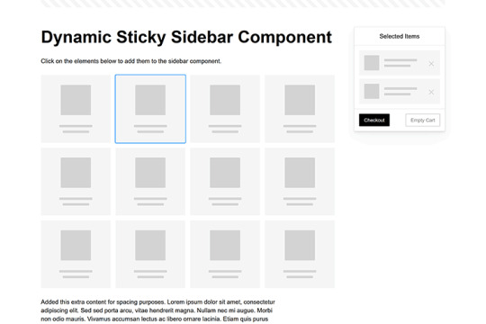
Dynamic Sticky Sidebar Component
Created by Ryan Mulligan
Features like shopping carts are a perfect fit for sticky sidebars. The UI makes it easier for shoppers to keep track of their cart and, most importantly, finish their purchase. This sidebar widget keeps track of cart contents and sticks to the screen while you scroll in the page content area.
See the Pen Dynamic Sticky Sidebar Component by Ryan Mulligan
Stick With What Works in Your Designs
We may think of sticky elements as being used for site headers and navigation. However, the examples above show that they can do much more. There are so many creative possibilities for informing and entertaining users.
What’s more, CSS can do a lot of the heavy lifting for you. Several snippets in this collection don’t require a single line of JavaScript. Still, it’s nice to know you can add some DOM manipulation when needed.
We hope this collection sparked your imagination! Check out our CodePen collection for even more sticky snippets.
Related Topics
Written by Eric Karkovack
Eric Karkovack is a web designer and WordPress expert with over two decades of experience. You can visit his business site here. He recently started a writing service for WordPress products: WP Product Writeup. He also has an opinion on just about every subject. You can follow his rants on Bluesky @karks.com.
Read more articles by Eric Karkovack
#2024#ADD#alien#amp#animation#Articles#attention#Building#Business#buttons#Capture#change#chromium#code#container#content#CSS#CSS Layout Snippets#CSS Snippets#Design#desktop#devices#easy#effects#Featured#Features#Filters#Full#glass#hamburger
0 notes
Text
Mastering On-Page SEO: How to Build a Search-Optimized Website from the Ground Up
Whether you're launching a new website or trying to improve your existing SEO strategy, one thing remains clear: On-Page SEO is your foundation.
Without it, your content won’t reach the right audience—no matter how great it is. In this detailed guide, we’ll walk you through how to structure your content and website architecture so that both users and search engines love it.
🧱 What Is On-Page SEO?
On-Page SEO is the process of optimizing your website’s pages to improve their visibility in search engine results. It covers everything you control on your own website—unlike Off-Page SEO, which focuses on backlinks and external signals.
On-Page SEO includes:
Keyword placement
Page structure
Content quality
Internal linking
UX and mobile performance
Site speed
Accessibility
🧭 The SEO Framework: Three Dimensions of On-Page SEO
To understand On-Page SEO fully, think of it in three dimensions:
1. Content Optimization
Creating valuable content that addresses user intent.
2. HTML Optimization
Using meta tags, header tags, and schema markup to help search engines understand your content.
3. Site Architecture
Designing a structure that enhances crawling, indexing, and user navigation.
Let’s dive into each.
📚 Part 1: Content Optimization
🎯 Targeting the Right Keywords
Start with search intent. Before you write, ask:
What is the user trying to accomplish?
Are they looking for information, a product, a tutorial?
Tips:
Use long-tail keywords to reduce competition.
Use tools like Ubersuggest, SEMrush, or Google Keyword Planner.
✍️ Writing SEO-Friendly Content
Great content does three things:
Informs or solves a problem
Keeps readers engaged
Encourages action or next steps
Best practices:
Use your main keyword within the first 100 words.
Use subheadings (H2/H3) to break content into sections.
Answer related questions users may have (good for featured snippets).
🧠 Semantic SEO: Go Beyond Keywords
Google is smart. It now ranks pages that cover a topic comprehensively, not just those stuffed with exact-match keywords.
Use tools like:
LSIGraph: To find semantically related keywords.
Surfer SEO: To see what top-ranking pages include.
🛠️ Part 2: HTML Optimization
📌 Meta Tags
Title Tag
Include the primary keyword close to the beginning.
Keep it under 60 characters.
Meta Description
Summarize the page with a compelling CTA.
Keep it under 155–160 characters.
🧩 Header Tags (H1 to H6)
Use headers to create a clear hierarchy:
H1: Page title (only once).
H2/H3: Subsections and supporting content.
Pro tip: Include keywords naturally in headers.
🧼 Clean, SEO-Friendly URLs
URLs should be:
Short and descriptive
Include your keyword
Use hyphens for spacing
Bad: yourwebsite.com/page?id=4589§ion=abc
Good: yourwebsite.com/seo/on-page-optimization
📷 Alt Tags for Images
Describe each image using keywords appropriately. This helps:
Search engines understand images.
Improve accessibility for screen readers.
Boost traffic through Google Image Search.
📚 Structured Data / Schema Markup
Add schema to support:
FAQs
Reviews
Products
Recipes
Events
Use Google’s Structured Data Markup Helper to implement it.
🏗️ Part 3: Site Architecture & UX
🗺️ Internal Linking
Link to other relevant pages on your site:
Boosts page authority
Improves crawlability
Encourages longer sessions
Use descriptive anchor text (not “click here”).
📱 Mobile Optimization
Google uses mobile-first indexing.
Ensure:
Responsive design
Touch-friendly navigation
Readable font sizes
Use Google’s Mobile-Friendly Test to evaluate your site.
⚡ Page Speed
A slow site hurts both UX and rankings.
Boost speed by:
Compressing images
Using a CDN
Minifying CSS/JavaScript
Enabling lazy loading
Test your speed with:
Google PageSpeed Insights
GTmetrix
WebPageTest
🔐 HTTPS and Secure Site Structure
Google considers HTTPS a ranking factor. Ensure your site has an SSL certificate.
Also, structure your site logically:
Homepage → Categories → Subcategories → Content
Use breadcrumbs and clear menus
📊 Tools to Supercharge Your On-Page SEO
ToolFunctionYoast SEO / Rank MathSEO analysis, meta tags (WordPress)Ahrefs / SEMrushKeyword and competitor researchSurfer SEOContent editor based on SERP dataScreaming FrogOn-page auditsGoogle Search ConsolePerformance, indexing, crawl errorsHotjarAnalyze user behavior and heatmaps
🚫 Common On-Page SEO Pitfalls
🟥 Duplicate meta tags and content
🟥 Broken internal links
🟥 Ignoring mobile UX
🟥 Not optimizing for featured snippets
🟥 Poor page layout (walls of text, no images)
🟥 Outdated or thin content
📌 On-Page SEO Checklist (Quick Reference)
✅ Keyword in title ✅ Keyword in meta description ✅ One H1 per page ✅ Use H2/H3 for subheadings ✅ Short, readable URL ✅ Internal links to related pages ✅ External links to credible sources ✅ Image alt tags with keywords ✅ Schema markup added ✅ Fast loading time ✅ Mobile-friendly layout ✅ No duplicate content
🧠 Frequently Asked Questions
Q: Does Google still use meta keywords? A: No. They’ve been deprecated for years.
Q: How often should I update on-page content? A: Aim to refresh every 6–12 months for important pages.
Q: Can I rank without backlinks if my On-Page SEO is strong? A: You can rank for low-competition keywords, but backlinks help in competitive spaces.
🚀 Conclusion
On-Page SEO is the heart of your website’s visibility. It’s where your SEO journey begins—and without a strong foundation, no amount of link building or social shares will help you rank long term.
By mastering content optimization, HTML improvements, and site architecture, you position your site to climb the search engine ladder—organically, sustainably, and strategically.
1 note
·
View note
Text
Understanding On-Page SEO for Beginners: What You Need to Know
On-Page SEO is the practice of optimizing your website’s content and structure to improve its visibility in search engine results. For beginners, it’s the most direct and controllable way to help your site rank higher on Google. By focusing on key elements like keywords, titles, headers, page speed, and mobile-friendliness, you make it easier for both users and search engines to understand and value your content. This guide breaks down the essential on-page SEO techniques you need to know — no technical background required — so you can start improving your website’s performance right away.
What is On-Page SEO?
On-Page SEO refers to the practice of optimizing individual web pages to help them rank higher in search engine results and earn more relevant traffic. Unlike off-page SEO, which involves external signals like backlinks, on-page SEO is everything you can control directly on your website. It includes both the content users see and the HTML source code that search engines crawl. Think of it as building a strong foundation — without proper on-page SEO, even the best marketing efforts may fall short.

This process involves aligning your website’s content and structure with the best practices that Google and other search engines look for. These practices ensure that search engines understand what your page is about and why it should rank for specific keywords. By doing so, your site becomes more relevant and user-friendly, increasing the chances that visitors will stay longer, engage with your content, and eventually convert. For beginners, it’s the most accessible and cost-effective way to start improving search visibility.
Why On-Page SEO Matters
On-page SEO is essential because it directly affects how search engines evaluate your content. Even if you have great information, your page might not rank well if it isn’t optimized correctly. Search engines like Google use complex algorithms to match user queries with the most relevant results. If your page doesn’t clearly communicate what it’s about — using the right keywords, titles, and tags — it may get overlooked, even if it offers value.
Moreover, strong on-page SEO also improves the user experience (UX). A well-structured page that loads quickly, reads clearly, and works on mobile devices helps retain visitors. Google pays close attention to these behavior signals — like bounce rate and time spent on a page — and uses them to determine how valuable your content is. So, by improving on-page SEO, you’re not just making your site better for search engines — you’re making it better for real people too.
Keywords and Content Optimization
One of the core elements of on-page SEO is effective keyword usage. Keywords are the phrases that people type into search engines. When creating content, you should identify relevant keywords for your topic and naturally incorporate them into your title, headings, paragraphs, and even image descriptions. But it’s important to avoid keyword stuffing — the outdated practice of overusing keywords unnaturally. Instead, focus on creating useful, engaging content that answers the user’s question while using keywords in a meaningful way.
In addition to keywords, the quality of your content matters greatly. Your content should be original, well-researched, and provide genuine value. Google rewards content that is informative, readable, and focused on helping users. Long-form content tends to rank better, especially when it’s broken into sections using subheadings. Adding bullet points, images, and internal links helps both readers and search engines navigate your content more easily, making your pages more attractive and accessible.
Title Tags, Meta Descriptions, and Headings
Title tags and meta descriptions are among the first things people see in search engine results, so optimizing them is crucial. A title tag should include your main keyword and give a clear idea of what the page is about — ideally under 60 characters. Meta descriptions, though not a direct ranking factor, help improve click-through rates. A well-written description can entice users to visit your site, giving you an edge over competitors even if you rank slightly lower.
Headings (H1, H2, H3, etc.) also play a key role in on-page SEO. Your H1 tag should include the primary keyword and clearly state the topic of the page. Subheadings (H2 and below) should organize content logically and make it easier to read. Not only do headers help readers skim your content, but they also help search engines understand the structure and key points. This organization improves both SEO performance and user experience.
URL Structure, Internal Links, and Navigation
Your website’s URL structure contributes to how search engines and users understand your content. Clean, descriptive URLs that include keywords tend to perform better than long, confusing strings of numbers or symbols. For example, yourwebsite.com/seo-tips is much clearer than yourwebsite.com/page?id=12345. A logical URL structure also helps Google crawl and index your pages more efficiently, leading to improved visibility over time.
Internal linking is another crucial element of on-page SEO. Linking to other relevant pages within your own website helps distribute link authority and keeps users engaged longer. It also assists search engines in discovering new pages and understanding how different parts of your site relate to one another. Combined with easy-to-use menus and mobile-friendly navigation, these factors create a more intuitive experience for your visitors, improving usability and boosting your overall SEO strategy.
Mobile Optimization and Page Speed
Mobile optimization has become a non-negotiable part of on-page SEO. With the majority of web traffic now coming from mobile devices, Google uses mobile-first indexing — meaning it primarily uses the mobile version of your content to determine rankings. Your site must be responsive, meaning it adjusts to different screen sizes without losing functionality. Text should be easy to read, buttons should be accessible, and layout elements should load correctly on all devices.
Page speed is also a confirmed ranking factor. Slow-loading pages frustrate users and increase bounce rates, which negatively impact your rankings. You can improve load times by compressing images, reducing unnecessary scripts, and using reliable hosting. Tools like Google PageSpeed Insights can help diagnose issues and provide suggestions. In short, a fast, mobile-friendly website improves both user satisfaction and search engine performance, making it a critical component of on-page SEO.
Image Optimization and Multimedia Elements
Images and multimedia elements make content more engaging, but they also play a role in SEO. Every image should include alt text that describes its content — this not only improves accessibility for screen readers but also helps search engines understand what the image represents. Optimizing image file sizes is essential too; large images can slow down your site, negatively affecting page speed and user experience.
Beyond images, adding videos, charts, and interactive elements can increase engagement and time-on-page — both of which are positive signals to Google. When using multimedia, always ensure that it complements your content and doesn't distract from your message. Use captions, titles, and structured layouts to integrate these elements smoothly. Done right, multimedia enriches your content, making it more informative and visually appealing while also enhancing your SEO effectiveness.
Conclusion: Mastering On-Page SEO for Long-Term Growth
On-page SEO may seem complex at first, but it becomes manageable once you understand the key components. From optimizing content and titles to improving load speed and mobile usability, every change you make has the potential to improve how your site performs in search engines. More importantly, these improvements make your website better for users — which is exactly what Google aims to reward.
youtube
By focusing on relevance, clarity, and user experience, you set your site up for sustained visibility and growth. On-page SEO is not a one-time task but an ongoing process. As algorithms change and your content grows, continuous optimization ensures you stay competitive in your niche. Whether you're a blogger, a business owner, or a beginner in digital marketing, mastering these basics is the first step toward building a strong and successful online presence.
0 notes
Text
Accessible Website Design: Best Practices for Reaching All Audiences

In the digital age, your website is often the first point of contact between your brand and potential customers. But if your site isn't accessible, you're leaving out millions of users who navigate the web with disabilities. Accessible website design ensures that all users—regardless of physical or cognitive ability—can engage with your content and services. It’s not only a legal requirement in many jurisdictions but also a smart and ethical business strategy.
What Is Accessible Website Design?
Accessible website design refers to creating websites that are usable by people of all abilities and disabilities. This includes individuals who use screen readers, navigate by keyboard, have color blindness, or face cognitive challenges. The goal is to eliminate digital barriers and create an inclusive experience that welcomes everyone.
Why Accessibility Matters
1 in 5 people in Canada has a disability.
Inaccessible websites can lead to legal action and fines under laws like the AODA in Ontario and the Americans with Disabilities Act (ADA) in the U.S.
Accessibility improves SEO, usability, and user retention.
In short, accessibility isn't just about compliance—it's about making the web better for everyone.
Best Practices for Accessible Website Design
1. Use Semantic HTML
Semantic HTML (like <header>, <nav>, <main>, <footer>, and <section>) helps screen readers interpret and navigate your content more easily.
2. Ensure Keyboard Navigation
Some users rely solely on a keyboard to browse the web. Make sure all interactive elements—buttons, links, menus, and forms—are fully operable via keyboard.
3. Provide Text Alternatives for Non-Text Content
Use alt text for images, transcripts for audio, and captions for videos. This enables users with visual or auditory impairments to access your content.
4. Maintain Sufficient Color Contrast
Text should stand out clearly against background colors. Use tools like the WCAG contrast checker to ensure your design meets the recommended 4.5:1 ratio for normal text.
5. Use Descriptive Link Text
Instead of writing “click here,” use descriptive phrases like “Download the annual report” so users know exactly what to expect.
6. Avoid Relying Solely on Color to Convey Information
Color-coded charts or form fields should also include labels, patterns, or icons to ensure the information is accessible to color-blind users.
7. Make Forms Accessible
Label every input field clearly, use fieldsets and legends for grouped options, and include helpful error messages and instructions.
8. Create a Logical Content Structure
Use headings (<h1> to <h6>) in a hierarchical order to organize content. This makes it easier for users—especially those using screen readers—to scan and understand your page.
9. Responsive Design for All Devices
Accessible website design must be mobile-friendly. Ensure that text resizes, navigation adjusts, and content stacks appropriately on all screen sizes.
10. Test with Real Users and Tools
Use tools like WAVE, axe, or Lighthouse to scan for accessibility issues, and consider user testing with individuals who have disabilities to uncover real-world usability problems.
The Benefits of Accessible Website Design
Broader Audience Reach: Inclusive websites welcome all users, expanding your potential customer base.
Improved SEO: Many accessibility practices align with SEO best practices, enhancing search visibility.
Positive Brand Reputation: Accessibility signals social responsibility and builds trust.
Legal Protection: Compliance with AODA, ADA, and WCAG 2.0/2.1 guidelines reduces legal risk.
Final Thoughts
AODA website design is no longer optional—it’s essential. As digital spaces become more central to how we live, work, and connect, designing for accessibility ensures your message reaches everyone. By following best practices and using the right tools, businesses can create more equitable, usable, and effective digital experiences.
0 notes
Text
Running React Code in Visual Studio Code and Online

React continues to dominate the front-end development landscape, offering a powerful and flexible library for building modern user interfaces. Whether you're just getting started or looking to optimize your workflow, this guide will walk you through everything you need to know about running React in Visual Studio Code and online platforms.
For Detailed Guide:- how to run tests in vs code .
Create Your First React Application using Visual Studio Code
Visual Studio Code (VS Code) provides an excellent environment for React development thanks to its robust extension ecosystem and integrated terminal.
Step 1: Install the prerequisites
Before creating a React application, you need to have the following installed:
Node.js and npm - React depends on these to run and manage packages.Verify your installation by running these commands in a terminal: powershell node -v npm -v
Visual Studio Code - Download and install from the official website.
Step 2: Set up VS Code for React development
After installing VS Code, enhance your development experience with these essential extensions:
ES7+ React/Redux/React-Native snippets - For quick React code templates
JavaScript (ES6) code snippets - Speeds up JS coding
Prettier - Code formatter - For consistent code formatting
Step 3: Create a new React application
Now you're ready to create your first React application:
Open VS Code
Open the integrated terminal (View > Terminal or Ctrl+` )
Navigate to the directory where you want to create your project
Run the Create React App command:
powershell npx create-react-app my-first-react-app
The tool will create a new directory with all the necessary files and dependencies for a React project. This might take a few minutes.
Step 4: Explore the project structure
Once the installation completes, you'll have a new folder with this structure:
powershell my-first-react-app/ ├── node_modules/ ├── public/ ├── src/ │ ├── App.css │ ├── App.js │ ├── App.test.js │ ├── index.css │ ├── index.js │ ├── logo.svg │ ├── reportWebVitals.js │ └── setupTests.js ├── .gitignore ├── package.json ├── package-lock.json └── README.md
Let's look at the core files:
public/index.html: The HTML template for your app
src/index.js: The JavaScript entry point
src/App.js: The main React component
package.json: Lists dependencies and scripts
How do I start running a React app?
Starting your React app is straightforward once you've set up the project.
Step 1: Navigate to your project directory
If you're not already in your project directory, navigate to it:
powershell cd my-first-react-app
Step 2: Start the development server
Run the following command to start the development server:
powershell npm start
This command starts the development server and automatically opens your default browser to http://localhost:3000 where your app is running.
Step 3: Make changes and see live updates
The development server includes hot reloading, which means your app will automatically update when you make changes to the code.
Open src/App.js in VS Code and make a simple change:
javascript jsxfunction App() { return ( <div className="App"> <header className="App-header"> <img src={logo} className="App-logo" alt="logo" /> <p> Hello, React World! </p> </header> </div> ); }
Save the file and watch your browser update automatically.
How do I run a command React app?
"Running a command React app" typically refers to using the Create React App CLI commands to perform various operations on your project.
Common Create React App Commands
Create a new app powershell npx create-react-app my-app
Start the development server powershell npm start
Run tests powershell npm test
Build for production powershell npm run build This creates an optimized production build in the build folder.
Eject from Create React Apppowershell npm run eject
Using npx for one-off commands
You can also use npx to run packages without installing them globally:
powershell npx eslint src/ --fix
How do I run the React app in the VS Code terminal?
VS Code's integrated terminal makes it easy to run your React app without leaving the editor.
Step 1: Open the integrated terminal
There are several ways to open the terminal in VS Code:
Press Ctrl+ ` (backtick)
Select View > Terminal from the menu
Use the keyboard shortcut Ctrl+Shift+` to create a new terminal
Step 2: Navigate to your project directory
If you need to change directories:
` powershell cd path/to/my-react-app `
Step 3: Start the development server
Run the start script from your package.json:
` powershell npm start `
Step 4: Stop the development server
When you're done working, you can stop the server by pressing Ctrl+C in the terminal.
Running other scripts
Your package.json file contains various scripts that you can run from the terminal:
` powershell npm test # Run tests npm run build # Create production build npm run eject # Eject from Create React App `
React Developer Tools Extension
The React Developer Tools browser extension is essential for debugging and inspecting your React applications.
Installing React Developer Tools
For Chrome: Visit the Chrome Web Store and search for "React Developer Tools"
For Firefox: Visit Firefox Add-ons and search for "React Developer Tools"
For Edge: Visit the Edge Add-ons store and search for "React Developer Tools"
Using React Developer Tools
After installation, you'll see new tabs in your browser's developer tools:
Components: Inspect the React component tree
Profiler: Measure rendering performance
Key features to explore:
Component inspection: Click on any component to view its props and state
Filtering: Filter components by name
Props/State editing: Change values on the fly to test different states
Highlighting: Select a component to highlight it in the browser
ESLint and Prettier for Code Quality
Maintaining code quality is crucial for React projects. ESLint helps catch errors and enforce style, while Prettier ensures consistent formatting.
Setting up ESLint in VS Code
Install the ESLint extension
Install ESLint in your project`powershell npm install eslint --save-dev `
Initialize ESLint configuration` powershell npx eslint --init `
Configure for React Choose options for:
* JavaScript modules React Browser environment JavaScript config file format
Setting up Prettier in VS Code
Install the Prettier extension
Install Prettier in your project`powershell npm install prettier eslint-config-prettier eslint-plugin-prettier --save-dev `
Create a Prettier configuration file Create .prettierrc in your project root:` javascript json{ "semi": true, "tabWidth": 2, "printWidth": 100, "singleQuote": true, "trailingComma": "all", "jsxBracketSameLine": true } `
Update your ESLint config Add Prettier to your .eslintrc.js:` powershell jsmodule.exports = { // Other ESLint config... extends: [ 'eslint:recommended', 'plugin:react/recommended', 'plugin:prettier/recommended' ], // Other config... } `
Setting up Format on Save
Open VS Code settings (File > Preferences > Settings)
Search for "format on save"
Check the box to enable it
Now your code will be automatically formatted when you save it.
How to run React code online?
Running React code online is perfect for quick experiments, learning, or sharing code with others without setting up a local environment.
Replit
Replit offers a full development environment in the browser.
Getting Started with Replit:
Visit Replit
Sign up or log in
Click "Create" and select "React.js" template
Features:
Full Terminal Access: Run any command in the integrated terminal
Hosting: Deploy your app directly from Replit
Multiplayer Editing: Collaborate with team members in real-time
Versioning: Track changes with built-in version control
CodeSandbox
CodeSandbox is one of the most popular online IDEs for React development.
Getting Started with CodeSandbox:
Visit CodeSandbox
Click "Create Sandbox"
Select "React" from the template options
Features:
Live Preview: See your changes instantly
NPM Support: Add packages as needed
GitHub Integration: Import and export projects to GitHub
Collaboration: Share your sandbox with others for real-time collaboration
StackBlitz
StackBlitz is a fast, browser-based IDE built for modern web development, including React.
🔹 Getting Started:
Visit stackblitz
Click "Create Project" → Choose React
Or use https://stackblitz.com/fork/react to start quickly
🔹 Features:
Instant dev server start-up
Real-time preview beside code
NPM dependency management
Offline support (runs in-browser using WebContainers)
GitHub integration
JSFiddle
JSFiddle isn’t React-specific but supports it well with proper setup.
🔹 Getting Started:
Visit jsfiddle
In the "JavaScript" panel, set the framework to React (Settings → Frameworks)
Add React and ReactDOM via CDN
🔹 Features:
Easy prototyping
Quick sharing via link
Basic collaboration
Embed anywhere
PlayCode
PlayCode is a fast playground for JavaScript and React code.
🔹 Getting Started:
Visit playcode
Select “React” playground from templates
🔹 Features:
Super fast updates
Simple interface
Supports NPM packages
Great for beginners
CodePen
Popular among designers and developers for quick demos.
🔹 Getting Started:
Visit codepen
Create a new Pen → Settings → Add React and ReactDOM in JS settings
🔹 Features:
Ideal for UI component testing
Shareable demos
Embed-friendly
Huge community showcase
Summary Comparison
PlatformReact TemplateCollaborationGitHub IntegrationNPM SupportLive PreviewReplit✅✅✅✅✅CodeSandbox✅✅✅✅✅StackBlitz✅✅✅✅✅JSFiddle⚠️ (manual)⚠️ basic❌❌✅PlayCode✅❌❌✅✅CodePen⚠️ (manual)✅❌❌✅
New AI Agent in the Town
Unit testing agent
Keploy has recently released a Unit Testing Agent that generates stable, useful unit tests directly in your GitHub PRs, covering exactly what matters. How cool is this? Testing directly in PRs – so developers won’t need to write test cases for their new features. Keploy writes them for you! No noisy stuff – just clean, focused tests targeting the code changes. You can also try this Unit Testing Agent in your VSCode.
2. API testing agent Instead of writing test cases to test your APIs, what if you provide your schema, API endpoints, and curl commands to an agent, and it generates the test suite and gives you the test reports? Sounds interesting or confusing? Yes, it is possible! Keploy API Testing Agent will do all this without you touching any code. Not convinced? Just give it a try, and you will really enjoy it.
Conclusion
Visual Studio Code provides a powerful, customizable environment for React development that can significantly boost your productivity. With its integrated terminal, extensions ecosystem, and debugging capabilities, it's the IDE of choice for many React developers.
For those times when setting up a local environment isn't practical, online React development platforms offer convenient alternatives. Whether you're prototyping an idea, collaborating with team members, or simply learning React, these platforms provide the tools you need to code effectively from any device with a browser.
By combining the power of VS Code for serious development work with the convenience of online platforms for quick experiments and sharing, you can create a flexible React development workflow that adapts to your needs.
Remember that the key to becoming proficient with React is practice and experimentation. Don't be afraid to try different tools and approaches to find what works best for your workflow.
FAQs
1. Do I need to install Node.js to use React?
Yes, Node.js is required for local React development. It provides the npm package manager which is used to install React and its dependencies. However, if you're using online platforms like CodeSandbox or StackBlitz, you don't need to install Node.js locally as these platforms provide the necessary environment in the browser.
2. How do I deploy my React application to production?
There are several ways to deploy a React application:
Build and host on static hosting services: Run npm run build to create a production build, then upload the files from the build folder to services like Netlify, Vercel, or GitHub Pages.
Continuous deployment: Connect your Git repository to services like Netlify or Vercel for automatic deployments when you push changes.
Container-based deployment: Package your app in a Docker container and deploy to services like AWS, Google Cloud, or Azure.
3. Do I still need to write test cases manually if I use Keploy's Unit and API Testing Agents?
Not at all! Keploy's Unit Testing Agent automatically generates unit tests directly in your GitHub PRs, targeting exactly the code you've changed - so you no longer have to write them manually. Similarly, the API Testing Agent creates test suites and reports just from your API schema, endpoints, and curl commands. You save time, avoid noisy or irrelevant tests, and get clean, actionable test coverage without writing a single line of test code.
4. Can I use TypeScript with React?
Yes, TypeScript works very well with React. To create a new React project with TypeScript:
` powershell bashnpx create-react-app my-app --template typescript `
For existing projects, you can add TypeScript by installing:
` powershell bashnpm install --save typescript @types/node @types/react @types/react-dom @types/jest `
Then rename your .js files to .tsx (for components) or .ts (for non-component files).
5. Does Keploy help with testing my JavaScript application?
Yes, Keploy can help you test JavaScript applications, especially when it comes to API and integration testing. Keploy captures real API calls during runtime and automatically generates test cases and mocks. This makes it ideal for Node.js/JavaScript backends or services interacting with external APIs and databases. You can also integrate Keploy into your CI pipeline to ensure consistent and reliable test coverage.
🔗 Recommended Blogs on Software Development Tool
1. Best Practices and Tools for Software Unit Testing
This guide explores essential unit testing tools such as Keploy, Jest, and JUnit, highlighting their features and benefits. It also covers proven best practices to improve test reliability, streamline collaboration among developers, and enhance software quality throughout the development lifecycle.
2. Top 7 Test Automation Tools in 2025: Boost Your Software Testing Efficiency
This article provides an overview of each tool’s capabilities and explains how they can help teams accelerate testing cycles, improve accuracy, and deliver high-quality software faster.
3. A Guide To Test Cases In Software Testing
Learn what test cases are, why they matter, and how to create effective ones to ensure your software works flawlessly. This guide covers key components, best practices, and tips for writing clear, comprehensive test cases.
4. Functional Testing: An In-Depth Overview
Explore the fundamentals of functional testing, its importance in verifying software behavior, different types of functional tests, and best practices to ensure your application meets all specified requirements.
0 notes