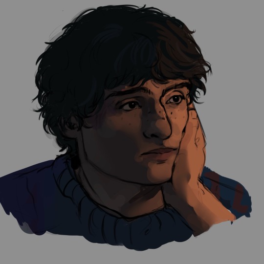
#but i think of their art and their process of making art a lot and their posts about it and stuff
Explore tagged Tumblr posts
Visit Tumblr Blog
Explore Tumblr blogs with no restrictions, modern design and the best experience.
Last Seen Tumblr Blogs


Fun Fact
If you dial 1-866-584-6757, you can leave an audio post for your followers.
Text
Home and Hearth
We present a conversation between Erion Makuo, Senior Artist, and Chris Gardiner, Narrative Director, about her work using characters' homes as a vehicle for story and mood.
CHRIS: Erion! Tell us who you are and what you do!
ERION: Hey! I’m a fantasy illustrator and make art for books, Dungeons & Dragons, and Magic: The Gathering. For Mandrake, I paint the character illustrations and some of the environments. It’s my first time working on a video game.
CHRIS: I find that last bit very difficult to believe, for reasons that will no doubt become clear in this conversation. I wanted to talk to you about your work on characters’ homes in Mandrake – particularly the interiors, because they’ve turned out to be such rich, playful tools for storytelling.
In fact, your work is so dense with detail that we should use an example from the game and talk about the specifics.
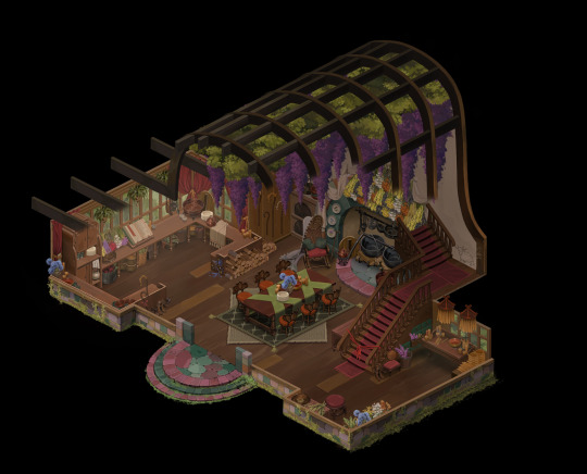
CHRIS: So this is the home of the Iveys. For context, Rosen Ivey is the village leader and beekeeper, and she lives in this house with her shepherd husband Able; her young son Thomas; her older daughter Kenway; Kenway's betrothed, Coll; and Rosen's elderly mother Metheven.
CHRIS: That image is obviously the result of an enormous amount of work. But when “Draw the interior of the Ivey house” lands in your Jira task list, what information have you been given to start work with?
ERION: In this case, (Art Director) Toby had already done some concept art for the exterior of the house, so I already had a general shape to work with.
I also read the profiles for all the characters who live there, so I know the residents and what they use the house for. For the Ivey family, it’s where they are together, which means we need a hearth, a table, and, logically, a kitchen. Rosen and her mother make candles, so they would have a place for that too.
We’d also been developing an architectural style for Chandley, which I wanted the home to reflect.
CHRIS: Let’s come back to the architectural style, because I want to ask more about that when we zoom in on some details. Before that, what does the early part of your process look like? How do you get started?
ERION: Lots of visual reference! I looked at as many pictures of historically-appropriate homes as I could, and Toby had taken a load of reference photos of some on one of his holidays that I used.
Then I look at the space, at what people would use it for. Where would they store their food? Where would they keep their clothes? Where would they put their shoes? You have to think of it as a real house, and how to make it feel lived in.
CHRIS: 'Where would they leave their shoes?' is such a great question. It’s practical, but it’s also intimate. Do you ask yourself lots of questions like that?
ERION: Yes – you have to find ways to remove the initial analysis paralysis. A big white space is too much, and you can’t process all the possibilities. Limiting your brief helps. The more limited you are, the more creative you have to become. So I try to limit myself with the characters this home is representing. A practical character might not care for decoration, so you have to find some other way to express who they are.
The other thing that questions help do is fill out the negative space. When you’re looking at a picture of an empty room you need a lot to fill it. So I do a lot of… not peoplewatching, as such, but being conscious of my own habits. People tend to do pretty much the same things. They leave their shoes by the door when they come in, to avoid getting mud in the house. In the Ivey house there are five people for every dinner – it’s going to be busy, so they keep the plates on the table for convenience.
Similarly, both Able and Kenway are shepherds, and have crooks. They just lean the crooks they’ve been using that day near the door when they come in, but they have extras because a good craftsman has spare tools. And those spare, maybe nicer, crooks are mounted neatly on the wall.
Because you’re asking those questions, the details have meaning. There’s something worthwhile for the players to discover, there. I’ve heard voice actors say they ask themselves questions about their character and their life to inform their line delivery, too.
CHRIS: Writers do it, too. It’s interesting how similar our early process sounds! And were there any problems or surprises when you were working on this interior?
ERION: The initial sketch was much smaller and more confined, but I had to increase the size several times. There’s five characters to represent, and who might be physically present in the space, plus the player needs to be able to navigate it easily.
We also iterated a lot on the placement of the structural support. Originally, I drew load-bearing beams through the centre of the house to support all the weight of the roof, but we had to cut them to make pathfinding better and to make the interior read better at a glance.
CHRIS: In the eternal battle between player experience and architectural health and safety, health and safety always loses.
ERION: In fact, we increased the size of the interior so much we then had to go back and blow up the exterior, too. The exterior is smaller, but we ‘zoom in’ when you go inside. But the difference between inside and outside felt too much, so we had to bring them together a bit.
CHRIS: Great – let’s talk about some nitty-gritty details, now, and your thinking behind them.
CHRIS: A while ago you mentioned Chandley’s architectural style – are these multicoloured bricks part of that?
ERION: Yes. Chandley is in a land called Penhallion. Older, grander Penhallion architecture is mostly only seen in ruins now. It’s inspired by art nouveau, uses lots of flowing lines, and its buildings had roofs of green metal. The more rustic, more contemporary architecture in Chandley still uses flowing lines, but fewer of them; their roofs use wooden shingles instead of metal, but they still paint them green.
My idea is that these multicoloured bricks, which are found in several houses, were salvaged from older, fancier buildings and reused.
CHRIS: I also like how both forms of Penhallion architecture contrast with the other architectural style in the region, which was imported by a powerful distant culture. That’s all soaring, white marble with copper detailing and water features. Ideally, players will be able to tell which culture and period a building is associated with just by looking at it.

CHRIS: I love Rosen’s candlemaking station. That detail of the candles being these long coils – is that a real thing?
ERION: Yes, I did visual research for this, and looked at lots of photos of people recreating medieval candlemaking. Those long coils must be convenient for storage, and then you cut individual candles off them.
Many candles have additives in them for fragrance, too. It’s hard to show that in the candles themselves at this scale, so I added the drawers full of wisteria, which I decided Rosen adds to the candles. Toby’s original concept art of the exterior of the house featured a patch of wisteria under the eaves. That struck me, so I took it and ran with it in the interior, too.
CHRIS: I love Metheven’s chair, and all its details. It’s a nice, comfortable rocking chair, it’s got her cane next to it, which she uses to help her rise and sit, and a shawl for the cold. Festooned, I notice, in classic Erion tassles.
ERION: Tassles on everything. Tassles on my grave.
Metheven felt like the heart of the house to me, so I wanted her to be in the centre of it, near the hearth. That also kind of put her at the head of the table — not too formally, but she’s the matriarch of the house, and respected.
CHRIS: That’s a lovely detail; I hadn’t noticed that. Let’s talk about my favourite favourite favourite things, which are the kids’ drawings.

CHRIS: I love these, because they give a sense of history to the house – both the kids are much older now, but these recall a time when they were little. But also, these aren’t generic images you chose…
ERION: I was mostly trying to make some empty corners more interesting! And I thought 'kids would definitely paint on something if they had the chance.'
It’s always a more interesting design if you make it specific. These weren’t drawn by a generic kid. They were done by a kid who looks after highland cows, and another one whose father was spirited away by night-creatures and is processing the trauma.
CHRIS: Exactly. I think that players who notice the drawings will initially think "oh, that’s cute" and then as they learn what one of those pictures is and why it was drawn, that’ll change to "oh no, wait it’s actually brutal." I also love the height chart – I think I suggested this one because my wife and I did one for our kids (until our oldest got so tall we could no longer reach the top of his head), and it helped sell that concept of this having been a family home for a long time.
ERION: My parents did the same with us in our first flat, too!
CHRIS: Lastly, let’s talk about that big, beautiful cookbook in the kitchen. What motivated that?
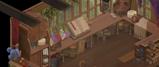
ERION: Desperation. I had this big empty space along the window and no idea what to fill it with. So I thought 'massive cookbook'.
CHRIS: That’s funny. Because while character profiles and setting lore feeds into the art, it's just as common for ideas to flow the other way.
In this case, when we writers saw that big cookbook we got excited – this is obviously a family that takes its food seriously, that has preserved and honed generations of recipes in a book that’s been passed down over and over again.
Then recently, when we were discussing the cooking system we realised we’d need an NPC to act as the key point of information on it – to perhaps sell recipes or advise you on ingredients. And we remembered this gorgeous image of the cookbook. So we gave that role to Able Ivey – we’d intentionally left him a bit more sparse to attach ideas to him as we developed them. And this was perfect. It’ll give him a distinguishing function and a bunch of material for his conversations. All because you drew this big old cookbook.
ERION: I didn’t know that!
CHRIS: Erion, thank you very much for spending the time to talk about all this with us. I release you now to your inks and your easel.
158 notes
·
View notes
Note
I freaking LOVE your art dood. It’s so damn lively and zingy and engaging and really genuinely stands out. It’s such a delight to look at,
I went through your asks and really appreciated you sharing your artistic influences.
I have an artist question I gotta ask.
How do you go about planning your compositions/arrangements? Like it’s one thing to just draw ship art but I noticed your /compositions/ are really strong and consistently visually interesting. They have a great energy to them,
and I was wondering if you had any tips or could share the things you thing about when you’re arranging those boys on the page, It’s something I really felt stood out!
Thank you!
I want to give you good examples but my art changes a lot depending on the projects I work on so, apologies if the style differences are a bit jarring xD
Here’s the things I think about the most when it comes to composition.
-INTENTION
I find that choosing a specific feeling or little story I want to convey trough the drawing helps giving it focus.
Ask yourself, how do I want the characters to be perceived?
Is there a conflict, a relationship? What are they feeling, physically and emotionally? How is the environment affecting them?
Every answer can help you choose things like the camera angle, the poses, and the placement of each element.
Want a character to feel helpless? > when we’re looking down on them, that feeling is dialled up. When we’re looking up to them on the other hand, they look in charge.
Are they being subdued by another character?> You can convey that by giving them a hunched posture, or putting them physically below their oppressor if the environment allows it. The way one touches the other (or doesn't) can also tell a million things.

-DIRECTION
I think art looks best when it has flow to it, and this is also something where intention helps you make the right choices.
I highly recommend reading Mike Mattesi’s “FORCE” book series on the subject.
The direction of your character’s energy and movement is dictated by “lines of action” (actual concept that you can research!);
If you keep them in mind during the sketching process your final piece will look much more dynamic, and you can harness this energy to guide the focus of the art.


Shadows and lights work similarly: your eye is naturally drawn where the light is is more intense, while concealing elements with shadows will make them look ambiguous and mysterious… you can use that!
-BALANCE
Hard for me to explain, but experiencing lots of good art will definitely give you a feel for it.
You want your arrangement to fill the canvas in a pleasing way;
Pushing too many elements on one side will make the piece feel unbalanced, but spreading them too evenly might feel boring… you want a little movement, but not to an unpleasant degree.
My personal tips: know the aspect ratio of your canvas and work with it. If characters are making the piece lean too much on one side, use background elements to balance it out on the other. Make thumbnails!


I also block out the silhouettes during the sketching progress, it gives me a clearer idea of the area that is being covered and how the “puzzle pieces” fit together :)

I hope this helps! I actually think about these 3 things a lot for the coloring process as well, but I’m not confident enough with color theory to make a post about it haha.
The two posts with my influences are here and here!
148 notes
·
View notes
Note
Do you have any tips for learning anatomy for an intermediate artist? Something that might not come to mind/be said otherwise that might make something, like, click, somehow? It's so hard to find good tutorials for someone that's already been drawing for a long time. Thanks!
It took me awhile to think of an answer for this because honestly it can really depend on what your goals are for your art and the type of artist you are
But im going to keep it generalized
Since you mentioned you've tried looking for tutorials online I already know you want to study
Im going to direct you to bookstores/libraries
You are going to want to get art books of all varieties and read them. Here are a few staples i have in my personal collection (I will link them later)

We will never stop learning, even the foundations of art need to be revisited at times. So if you believe "I already know this"
Abandon that thought process. Devour your resources.
You can also grab artbooks of media you are inspired by

These books should be read, not just looked at. The artists often talk about the process that went into creating their works and give insight, though at times minimal, of their approach to art.
Study their style. Pull from it what you enjoy and work it into your own.
The internet can be confusing to navigate and much of the time finding a good tutorial is based on luck
Ive been online for a good while, most online tuts are great and fun. Some are very damaging or flat out wrong. (Not to say every art book is correct. But there are certainly ones that are held as standard such as Color and Light and the Morpho books)
I could say a lot more on what advice I have but I would honestly be simply parroting what I've learned in these books. Good luck !
183 notes
·
View notes
Text
I'm so ill about Murderbot trying to offer the governor module hack to the GrayCris SecUnits. And them not accepting.
It's easy to imagine that all the constructs are banging against the walls of their governor module, wanting to break free. Some of them probably are. But the reality of psychology is that if you live under abuse long enough, you forget how to anything but what you're supposed to do. And constructs are brought into existence with the governor module up and running. The thought process isn't going to be 'command received > if I don't obey I'll get zapped > obey command.' That middle step gets trained out before they even have time to process it could be there.
Murderbot struggles so much with its inclination toward apathy. In Artificial Condition it realizes that if it doesn't make itself care it's just going to ride around, watching shows, until it's caught and killed. And that, I think, is where most constructs are. Some desperately want freedom, sure, like Tlacey's ComfortUnit. And I think there's something to be said there about anger being one of their few weapons against the apathy, and how that contributes to the Rogue Constructs Kill People narrative, and how that further emphasizes the apathy in the not-angry constructs.
Most constructs would just be... checked out. Receive command, follow command. They are treated like mindless machines, and if you treat something like it doesn't have feelings it will end up not having feelings, because it has zero contrasting input. Murderbot escapes this because of its memories of Ganaka Pit. Personally, I think it was as checked out as any construct before that, and then the horror of that brought it online, so to speak. So much so that it hacked its governor module (an incredibly dangerous thing to do) so it wouldn't be in that position again. And then it discovered shows. In Compulsory, it basically says that it chose to disobey its orders because a character had just died on Sanctuary Moon, and that made it sad, and it didn't want to feel sad about another death. Its shows help it learn empathy and generalization in a way that is simply not possible for constructs with functioning governor modules. This even comes up with ART - that despite being raised with love and being well treated, ART isn't good at empathy and doesn't much care about anyone outside its crew, but begins to learn once Murderbot helps it bridge the organic-inorganic gap. And now we're in danger of this post becoming me waxing poetic about the importance of escapist fiction.
But the point is, I love seeing the other SecUnits not react when Murderbot tries to connect with them. They're too checked out. They've disassociated to protect themselves and in so doing are blocking their avenue of escape. Just like Murderbot when its memories are stripped away, there really isn't a lot of 'person' in there. It's never going to be as simple as a massive construct uprising; it is going to be slow, one genuine connection at a time. One rare instance of a construct reaching back when someone or something tries to establish a connection. And Murderbot, for all it tries to insist it doesn't care, does keep trying. It offers that freedom to the GrayCris units. It pings to the SecUnits standing guard as it's being taken to be boiled down. And some day, it will get a response.
90 notes
·
View notes
Note
Why is your drawing style so scrumptious and adorable. How does one achieve this type of cuteness for drawing. My heart is literally overflowing with happiness and jumping in joy from everything you made
Wahh thank you so much, that’s such high praise to receive🥹
Honestly there’s no secret, I think all I do is infuse my art with 100% concentrated love for my blorbos 😭 Like if I think Jamil’s really cute I can’t help but let it show in my art, I believe there’s really so much you can tell about an artist based on how they draw certain things 🙂↕️
For a more technical answer on how to achieve a style, I recommend studying artists and styles you like and observing how they stylize features! I for example take a lot of inspiration from artists with strong linework + crisp colouring styles (as opposed to more rendered, painting-like styles) and I really enjoy studying how they do things. Little details down to where they place the nose on the face and how big they draw the eyes can surprisingly make a difference, and my own style is just a combination of features I decided I enjoyed in other people’s art fused into one style. There’s no single one person I learn from, and I find the process of collecting things that make me go “I like this being done this way” to be really fun. Even better when I’m indecisive and just learn more than one way of doing things so I can swap in between as I like (you might notice I have more than one chibi style for example).
And then of course the biggest thing is to just enjoy what you’re doing! If you’re not having fun/don’t love making the stuff you’re making, it shows (believe it or not). I like to believe people can tell how much I enjoy drawing Jamimayu just from looking at my art, and the simple joy from people literally just drawing whatever they like is very infectious, which has nothing to do with skill level whatsoever.
This response got longer than I intended, but yeah - draw the things you love and put your heart into your art, then have fun with the process of developing your own style :)
#asks#anonymous#me yapping too much about art again#its funny i used to think i had no style and felt very frustrated#but then i look back at old art and see traces of things that i carried over to today#i think its always developing whether you notice it or not#and you should be proud that your style is yours alone and not possible to 100% replicate#by anyone#because they dont have your cumulative experiences#or know your journey#also dont worry abt your style being unstable#because early on is when you have the most flexibility and room for experimentation#the more your style takes form i think the harder it is to go back to that state#so yeah dont stress and just have fun and keep going#ANYWAY ill stop
32 notes
·
View notes
Note
Hello! I just saw your zosan art and it was fabulous so I immediately had to follow you. I really love your art style, so I wanted to ask about your experience with art. How much do you typically draw? Did you start young or when you were older? Do you have any formal art education under your belt? Also, do you have any tips for artists who are just starting out? (Or more broadly, for artists with less experience than you?) And finally, how do you usually start an art piece? I know this is a lot of questions, so if it's too much, just answer some. Or don't answer any at all, I'll understand! Once again, I really love your art and I hope you have a great day/night ♥️♥️♥️
Hi, thank you for your sweet message. Er, I think I draw a lot but, not necessarily everyday? (I love my sketchbook.) I started doing it once I could hold a pen and it just became a thing I do. For fun, out of boredom, for reflexion, for relaxation, for connecting what's in my head and what's around me. Put a pen in my general vicinity and I will eventually start scribbling. I have a Bachelor and Master Degree in Illustration and work as a freelancer. So I draw a lot for that and it is great, but doing it for myself feeds my soul. Even if it is silly. Especially if it is silly. Tips for making art... hmm. It is always a bit difficult giving general advice for that. Do what feels interesting to you. Have fun. Making a lot of art will help you to become better, but it doesn't have to be a tedious training process. So you can be as curious and playful with it as it fits you. Art isn't about making something in the correct way, but learning and understanding what you are doing. How does the human body work? How can I express this feeling? How do I make an intriguing and beautiful composition? There are many ways to answer questions like these and your answers can be entirely your own. To find them you got to try out a lot of things and make a lot of art. A lot of mediocre art, I might say. Stuff that is bad, stuff that is just meh. But that's really okay as long ever so often you make something that you feel really proud of, that makes you happy in that moment. Find people that will be happy with you about your art. Who can tell you what they like about it, what they think what is good about it, but also what doesn't work yet. Getting good feedback is incredibly helpful. It doesn't mean that you have to agree with everything someone else, even if they are more experienced but it helped me to hone my sense when to change and try out new thing and when to I want to stand firm on my creative decision. It is why I am glad, that I studied. But also a lot for communities online in which I shared my stuff. We can challenge us, motivate us, inspire us, share our joy.
So, I hope this wasn't too general and cheesy. :D Now where do I start an art piece. An idea? A feeling? Sometimes just a line on paper. A sketch. Usually for more complicated stuff. Deciding where I want to put what and to get a grip on the feel I want which then start to refine bit by bit.


Hope this helps. :D For more specific art questions feel always free to ask, although I can never guarantee a fast reply.
30 notes
·
View notes
Note
Wgat brushes do you use + what's your coloring process😭😭😭 your art is so cool dude
hii, okay so for brushes
my two faves are ‘chalky color’ and ‘clean sketch’ both from this pack (which is free btw) my other commonly used ones are ‘round brush’ and ‘nikko rull’ which are both default procreate brushes, i think. i use the clean sketch for sketching (duh) and the rest for coloring/rendering
okay and uh fair warning my coloring process is kinda a mess but I’ll try my best to explain it 😅 this ugly mike drawing can be my test subject
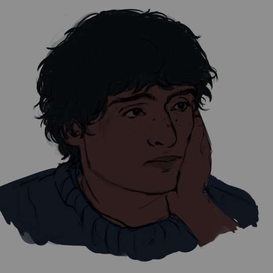
so i start by laying down the base colors, each different color is on a different layer, all of which are under the sketch layer. and i always start with the darker colors first bc it (to me at least) makes the lighting feel more natural, especially if the lighting is more dramatic like above
in terms of actually picking the colors i mostly just wing it and you kinda get a feel for it eventually, but what really helps is to look at references and or color pick from references. when i first started drawing i color picked from references and it helped me understand a lot! definitely don’t rely on it too much tho lmao
after the base colors are down i just start blocking out shapes, mainly the most prominent ones, the main goal is to give the drawing volume. after blocking out shapes i usually blend as needed, blending is only really needed in spots where there isn’t as much definition. then i add a layer over the sketch layer and just start rendering and cleaning up
okay this is where it gets stupid. after all of that i merge all the layers together (except for details like text, freckles, highlights in the eyes, etc) and adjust the colors as needed with either coloring dropping or simply just adjusting saturation, brightness, and hues till i’m happy with it and just continue to add details, refine it, and blend more
hopefully this makes sense and answered what you needed :)
#asks#brushes#also note the last drawing shown is before i add the layers above the sketch so it’s not finished#but where I’d go from there is add a layer on top of that and render and clean stuff up#before merging it all and continuing rendering
23 notes
·
View notes
Note
2 and 4 for your ocs?
2. How long was the process before the character reached its final version? (or a version that would be clearly recognizable as the character?)
OH this one is good especially because I get to show you guys this thing

BEHOLD the ultimate Eiko timeline
This is extremely embarrassing because oh my God the earlier ones- but I think it's the perfect visual answer to this question lmao
I'd say she only reached her current design as of March 2024- I don't count the 2023 ones because I'd group those in with the October 2022 ones. 2024 was when Eiko's lore changed to become a lot more similar to what it is now, and her design did so as well. So yeah it was a- pretty long process lmao
She stopped being an MHA OC as of late 2021, which is when I believe I made the second Eiko (I don't know the specific date bc I lost the original file :/), but man it took a very long time for me to give her an actual story and plot and lore that made sense lmao.
All of this also applies to my other OCs, except they all underwent a lot less changes than Eiko. Hayato especially the only major difference he went through compared to his original designs is he has proper bangs now, he has brown eyes instead of orange, and he has cat-like characteristics-
Sanako was younger in her original MHA OC version, she was like 8-10 at best? And I did not know what I wanted for her hair so she had it loose and I didn't like it- then I discovered Babymetal, got obsessed and that is literally the only reason why she has twintails. Amara used to have pink eyes, but that's pretty much the only change (I don't count hairstyles bc even back then I drew her in different hairstyles). As for Theo, his eyesight literally just got worse and that's it LMAO (this art is all from the MHA era help)


4. And reverse, which of the four things (character's name, appearance, personality and role in the story) did you struggle with the most?
Absolutely role in the story for Eiko lmao, because I sort of went about it the reverse way? I had a character and I was trying to write a story for and around her, instead of writing a story first and then coming up with characters to fill the roles that needed filling. Not the best way to write a story, at least it made it harder than it needed to be
Second I'd say her appearance because as you can see it changed a lot- I was mostly very unhappy with her hair, I have no idea why I used to draw it in such a weird shape?? I eventually realized I really liked the idea of making it curly with full bangs so that's what I changed it to. Her uniform also went through a lot of changes.
Name was easy as I've discussed. Personality, her key traits (being reserved and hot-tempered) have remained throughout every iteration, of course with her backstory I changed some things and added others but yeah that was also relatively straightforward
#oc eiko#oc hayato#oc sanako#oc theo#oc amara#adagiorii oc#adagiorii art#oc#oc art#original character art#original character#digital art#digital artist#oc artist#artists on tumblr#art#my art#my oc#oc artwork
28 notes
·
View notes
Text
DELTARUNE Multiplayer Mod - Update Post 1
hello dear tenna-fam, it is i, mc-intosh back with more news on REMOTERUNE (idk if this will be the final name but thats what i am calling it as of now), aka the 24-player multiplayer mod i am currently working on.
last time, i mentioned how there will be multiple custom characters you'll be able to play as. well, i have something to show you.
INTRODUCING...!

RUDINN!!
(sprites courtesy of Pengun64 on my discord server)
THAT'S RIGHT!! one of the chapter 1 enemies - Rudinn - is becoming a PLAYABLE CHARACTER in the mod! the screenshot i attached above is not concept art. it was taken in engine, during testing. it's insane to me how much progress i've been able to make so quickly - i think i've fallen in love with gamemaker??? it's like, actually really nice to work with?????
anyway - the basics for turn handling have been implemented. the server receives moves made by each of the players, and when everyone submits their move, the turn begins! for now, the only thing the server processes afterwards is healing using items. acts, fighting and spells havent yet been implemented. (sorry folks... it's coming soon!)
i've received tons of support on twitter, tumblr, discord and even irl for my mod (which i'd like to thank everyone for, means a lot to me!!)
before i end the update post - have a video of me testing the healing functionality for the first time. (yes, im aware that the selected person doesn't match who actually got the heal. i haven't finished making the online player selection screen work yet.)
#deltarune#deltarune chapter 3#deltarune chapter 4#kris deltarune#ralsei deltarune#susie deltarune#kris dreemurr#modding#deltarune modding#deltarune tomorrow#this was way too easy to set up#i've been doing networking for a long time you can tell#i actually enjoy the pain that networking brings#deltaruners#undertale#multiplayer
25 notes
·
View notes
Text
i actually don’t fundamentally understand how these card/payment/bank companies have the right to prohibit which content is allowed on Any platform. these are payment processing companies. they have a function. i’m not saying morals shouldn’t come into the transfer of money but there is literally nothing illegal in creating graphic fetish content, nor is it morally reprehensible. i simply don’t care whether or not the owners of these companies think its a ”risk”. losing your fucking earnings because there’s nowhere to publish your art, that’s a risk a lot of people have to make. not being able to discuss controversial topics, also not good!
20 notes
·
View notes
Text


Just some more thoughts on that jayvik dbh au
#I got a lot of people saying that Viktor should be the Android#which I did mention in the tags last time#but after thinking about it I just think that the human experience is such an integral part of viktor as a character#(aside from the fact that it makes every character ever)#his pain and suffering due to his illness and disability and class#like I can’t take that away from him#not that Jayce doesn’t go through his own things too#but I think Jayce’s naïveté from season one lends itself well to an Android in awe of human life#and a jaded but wise Viktor who still has a good heart and sense of humour#I mean this is just my version of the au and like I think I said in my tags last time im pretty sure I’ve seen a few around with android V#definitely got recommended some fics that I’m excited to check out!#sorry for rambling - this isn’t to discredit any other interpretations!! just kind of exploring my thought process behind it :)#oh also sorry that this is angsty lol#it’s fine#my art#arcane#jayvik#Jayce talis#jayce arcane#Viktor arcane#dbh#detroit become human#arcane au#noodles talks#(in the tags)
6K notes
·
View notes
Text
Not being devils advocate here merely putting out a common issue that I’ve seen and heard regarding being drawing PoC characters and that is skin tone.
Skin tone, especially for darker tones, is a fine line between oversaturated and undersaturated. Too bright they’re orange like a highlighter. Too grey and they’re an ashy purple.
The best way I learnt to try and understand how to render different skin tones is applying makeup knowledge. Foundation chemistry is an art form I mean look at TirTir! They got told to go back to the lab and learn and they did! Listening and learning to PoC makeup content creators helped me a lot.
A black person wont use the same blush that I use! I have to use a light baby pink because I’m #FFFFFF vampiric and they have to use a deep red or magenta! And the same thought process applies to your digital rendering of skin tones
Your multiplayer layer of primary yellow blue and red won’t work on every skin tone! And that’s because of undertones! We are making the undertones!
Olive skin will need more green and yellow shifted primaries whilst cold will need more blue and purple shifted.
But this doesn’t matter if your foundation is whack.
Let’s have a look at Sabine because it has taken me so long to work out a realistic skin tone for her so I feel confident discussing this. Clearly, she is a woman of colour. It just so happens that her main colour when you colour pick is orange. I’m not kidding I’ve colour picked and freaked out because it is truly the most saturated orange I’ve seen for a while (not discrediting that there are warm medium skin tones) and it does come down to how saturated SSO is in general (does anyone else get headaches?)
My immediate reaction is to desaturate so I’m gonna go into a more grey area but not too grey! It’s a goldilocks principle! And then her shadows would be a bit more desaturated because she’s well…in shadow. With the undertones I’d go more a warm yellow, a halfway point between red and magenta and then a blue-purple.
Jay is darker than Sabine but also hella orange too liek I think they’re on the same saturation level too. I remember my crash out realising the SSO screenshot colour drops matching. To counteract this we drop saturation and light level but WE NEVER GO TO PURPLE OR LIKE A WEIRD WARM GREY. It makes them (and POC in general) look ashy and it’s…i don’t know how to explain it but it feels disrespectful and also very half assed.
Back to the makeup:
Most companies have an orange issue so please be mindful of that. Brands like L’Oréal has some pretty wide spread foundation series like True Labs which have photos online you can look at.
You’ll notice that there’s still colour variance and never any grey. In fact I remember an MUA mentioning that deeper tones tend to go more pink based than orange. Skin is weird and wonderful.
TLDR: your fear of rendering skin tones is probably the most common thing of artists especially amongst white artists but it doesn’t excuse your bigotry and lack of flexibility. You have the internet and and entire industry that has spent billions on investing into skin colour match and diversity.
Observation is the best lesson
If you are drawing an Indian character, go search up an Indian MUA. You don’t have to understand the language because art is a language! You can colour contour they’re using, their concealer their blush.
Do the same for every race and ethnicity you feel uncomfortable rendering.
I wouldn’t recommend TV shows or movie screen caps (unless in natural lighting) because there tends to be a colour grading on top (see: Twilight) that can mess with colour drops. If you are though, make sure the colours are in a “family” like if the scene is blue, is everyone under the same blue tint.
You have so much knowledge at your finger tips. Use it.
not to drag the sso community but lowkey it's shocking the way some of the people in this community realized they can get away w never ever drawing nonwhite or chubby people or linda with actual ethnic features and not just barbie with a tan if they just only draw the OG designs for the soul riders 😐 dgmw i like the og designs too but i basically exclusively see art of linda and lisa as their og designs like LOLLLL come on guys... i've seen more fanart of their og designs now than i ever did back in the heyday of old sso or starshine legacy 😶 and even if it WAS just bc there are now new players then that's even worse bc they wouldn't even have been playing when those character models were in the game, so that's obviously because they just prefer the designs where lisa is pale and white and linda isn't chubby or actually ethnic looking. and i don't wanna hear no "i just prefer the designs" shit like people can't make artistic liberties. i do it all the time watch this i can draw old design linda chubby with a bigger nose and brown eyes. same with lisa! Now everybody do it.
28 notes
·
View notes
Text


unconditionally
#my art#jujutsu kaisen#jjk#yuji itadori#megumi fushiguro#itafushi#fushiita#fanart#jjk fanart#jujutsu kaisen fanart#megumi#yuuji#im shaky and numb the way this took years off my life#genuinely cannot believe i thought it was smart to make it a comic i could have stuck at a painting and it would have been fine#but nooooooo in my hubris i thought Surely im an expert at this longform stuff now Surely i can do it :)#and then it killed me it killed me dead this is like over twice as long as the train comic and 4 times as detailed#backgrounds . angles. i yearn fr death.#AND I HAD 2 WRITE THEM ACTUALLY TALKING GGSDH i am actually so insecure abt the way the dialogue flows gomen....#i wanted to add more to it to fix how clipped and rushed i think it reads#but that would mean drawing more expressions would mean drawing more panels would mean more gd hyDRANGEAS#so ultimately i decided 2 have the conversation take the hit because let me tell u.#if i have to draw. one more blue petal i will snap i will lose it#i knew tht would happen n wanted to alleviate some of the pain so i found a few brushes that helped speed up the process#but the thing w a lot of premade flower brushes is they also come preshaded n look uniform in a way that stands out badly against my style#so i had 2 render over them anyway........#yuuji's domain rly putting me through the wringer first the train station now death by a bajillion petals smh#all that to say tho . my labour of love . i am going to take a nap#hina.comic
6K notes
·
View notes
Text
What beautiful voice...
#sammick#sinners#sammie moore#remmick#my art#my fanart#fanart#spent a little bit more time in this so this takes like 5 hours i think. which is still crazy fast for me#i feel like i levelled up with this haha#wanted to put more layers to make lineart first so it would look tidier but i actually enjoyed the messiness of the process too much#clean polished art always look better but its not fun to do... one layer with rake brush is a lot more engaging#i havent reached the balance between messy process and polished enough result but im getting there
622 notes
·
View notes
Text

i'm ready to try
#This drawing is kind of personal to me#I recently graduated (CUM LAUDE WOOOO!!!!) and its like. not to get depressing#but when i was younger i was never sure whether i would make it to this point#When i was going through what i consider to still be like. the worst time of my entire life#This fictional character was there for me and she was something for me to latch onto and cope with#eGem helped me a lot with being able to process my emotions at the time but also helped me to reflect on myself#which i think is a big reason as to why I'm really happy with where i am with myself right now#I'm going off to uni next school year to study astronomy!!! which!!!#Im also doing because of eGem!!! She ignited this kind of childlike wonder for space for me#I love doing math and physics and whilst Im still a bit scared because. honestly i don't know whether this is what i want to do with my lif#I think i'll be okay either way#either way i wanted to draw egem again even if i haven't done so in a while because its like#i think i wouldnt be who i am without her. i think i'd be a lot worse off#so like. thank you empires smp thank you geminitay thank you egem This drawing is me expressing my gratitude#AND THANK YOU AUTISM!#empires smp#empires smp s1#empiresblr#esmp#geminitay#art#fanart#alice.art#mcyt#mcytblr#song is andromeda by weyes blood... obv.. you guys know me by now :oP
3K notes
·
View notes
Text
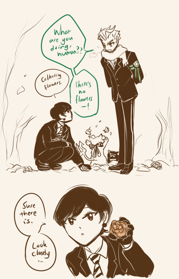
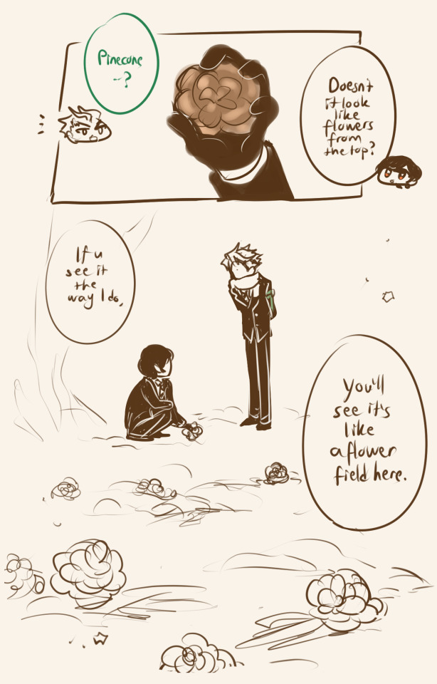
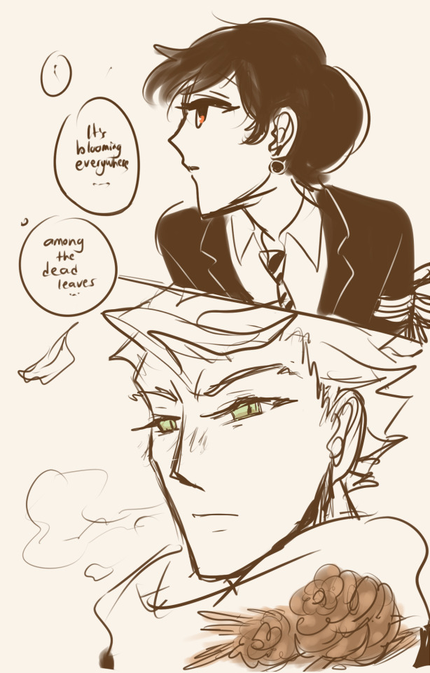
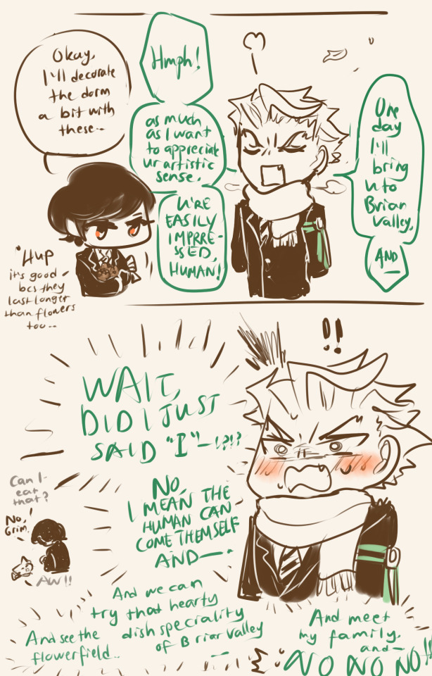
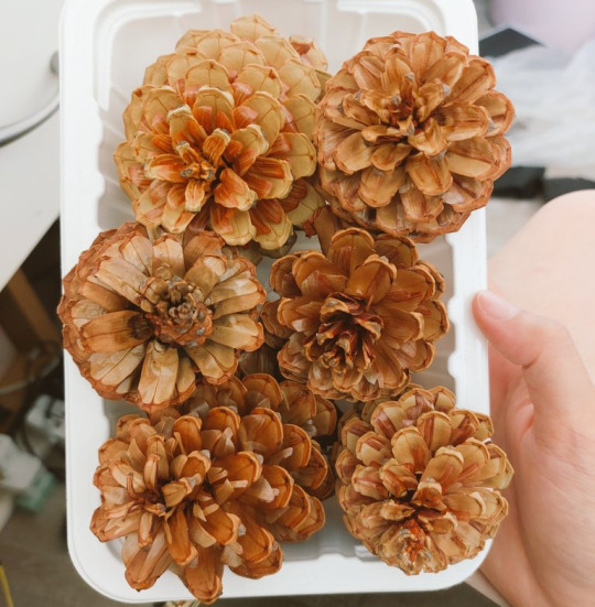
no, but pinecones is really beautiful isn't it ?
#perfect kind of flowers for fae kind who probably feels that flowers die in 0.1 sec bcs of their long life#imagine making mal a pine cone flower wreath and he is so happy with it; that if yuu ever think of selling it king mal mal would order it#for every house in the valley; so everyone has one in their house as new kind of briar valley culture & tradition fhsdh#twst#twisted wonderland#sebek zigvolt#twst yuu#twst mc#twst grim#fanart#i wonder if sebek can see the pinecones as beautiful too#well sebek is weak at subjective thing like art; he might only be able to see things as it is#but he might take on some things from poet or romantic genre books; so i wonder what he sees#i know a fellow who absolutely can't see what i see; i feel like his brain is like a white digital sci fi cube that is clean#and looking so minimalistic it looks like it can only process logical things like numbers#it's so weird that some people don't actually process things by imagining a lot of other things visually in their mind
1K notes
·
View notes