#cleverbird
Explore tagged Tumblr posts
Visit Tumblr Blog
Explore Tumblr blogs with no restrictions, modern design and the best experience.
Last Seen Tumblr Blogs


Fun Fact
In 2020, Tumblr had 29.4 million users in the US.
Text
Cuckoo miracle.
Field and shore were getting dark. I saw a cuckoo flew towards lake and hided in trees, I followed this area.
I stopped and tried to imitate cuckoo's sound by whistle with pausing.
Then changed my attention to nightingale, took out my binoculars and all of a sudden that cuckoo flew near me, about meter away! Round over my head and vanished in the direction it came.
June 2020,
Chelyabinskaya oblast', Russia.
2 notes
·
View notes
Photo
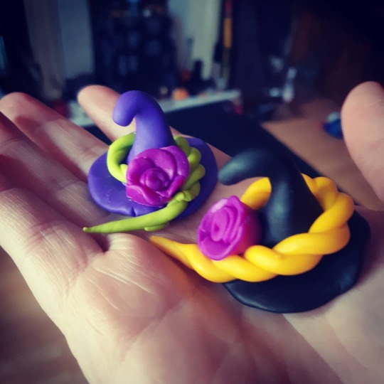
Skye being clever and making little witch hats 😍 #WitchesOfInstagram #Witch #WitchHat #Rose #FimoClay #CleverBird @douglassskye https://www.instagram.com/p/B6x1P9Sn5TI/?igshid=hkp1ouopv5xx
2 notes
·
View notes
Photo

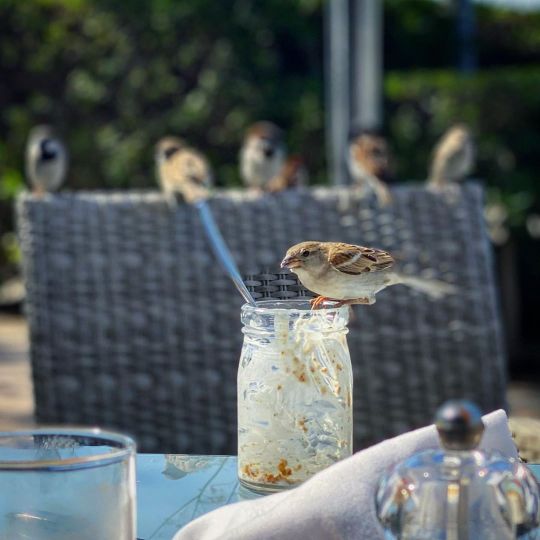
Happy Valentine's day 💕🐥 ~ A. #cleverbird #funnybird #goodbird #sparrow #bird #valentines #valentines_day #valentinesday2020 #valentinesday https://www.instagram.com/p/B8jPN1Bn5xI/?igshid=1wak2kxp3retr
#cleverbird#funnybird#goodbird#sparrow#bird#valentines#valentines_day#valentinesday2020#valentinesday
0 notes
Text


Magpie mare | soulsteed | reverse brindle?
the soulsteed reminds me of a magpie a lot anyway, she's baby and i love her :D did i really buy a new hairstyle ( and also another one) just to match with the bday stuff? i wish i didn't
#star stable online#sso#her name is cleverbird in sso because there's no magpie as name option#which reminds me this morning i saw someone who named their own bday horse cleverpie and i kNEW that their horse was nicknamed magpie too#we were both big brained#my horses
5 notes
·
View notes
Photo
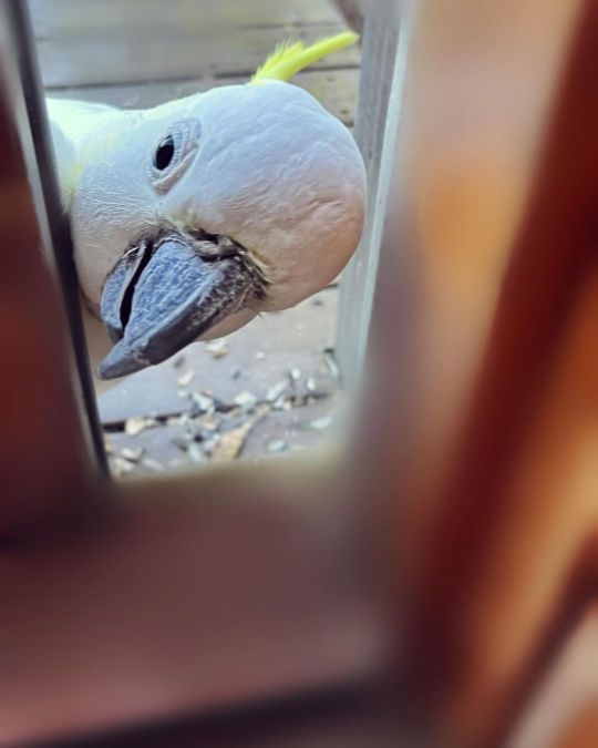
Beware of cockatoo intruders. I left the sliding door open (just a little) and next thing I know there’s a large bird head sticking through the opening. The sulphur-crested white cockatoo is a medium to large-sized parrot roughly 12-28 in (30-70 cm) in length. They live anywhere from 40 to 60 years. (I think that’s why they’re so clever.. experience) * * * * * * * #sulphurcrestedcockatoo #cleverbirds #intruder #supergorgeousness #artnerd #Instagay #instagrammers #learningtosee #inspirationiseverywhere #instagramphotos #appropriation #artfag #arthag #Helleaux #StayAtHomeModel (at Chez What?) https://www.instagram.com/p/ChWMwATrTRP/?igshid=NGJjMDIxMWI=
#sulphurcrestedcockatoo#cleverbirds#intruder#supergorgeousness#artnerd#instagay#instagrammers#learningtosee#inspirationiseverywhere#instagramphotos#appropriation#artfag#arthag#helleaux#stayathomemodel
1 note
·
View note
Photo
Breakfast gatecrashers amass! #breakfast #hitchcock #cleverbirds #lost #notlost (at Fairmont Bab Al Bahr) https://www.instagram.com/p/B9WrOj7lULU/?igshid=w2g3zyk24nvj
0 notes
Photo

Look how the birds pooped on this sign - in an attempt to obscure the “DON’T”!! #thebirds #birdsaresmart #cleverbirds #nicetry https://www.instagram.com/p/B1HgJUdnKeI/?igshid=1ep0ep4aml92l
0 notes
Video
When I saw the original movie I laughed so the whole place asked me to shut up. I think about that every time I hear it.... MUSICAL GENIUS! 😍🎶🎶 #cleverbird #maestro @dp4k.m this is great
0 notes
Text
Portfolio Inspiration
Cleverbird Creative

I absolutely love the animated bird gif that appears on the loading page for this website. I want to incorporate this into my own portfolio site if possible as I think that my visual mark would work well for this and really give my brand a professional look.

The layout at the bottom of this site is a similar idea to how I envisioned mine to look. I think that my logo works well as a centre point to the navigation. The different projects automatically slide across the main page ensuring that the viewer is introduced to the types and style of design that this company can produce. The images are very high quality giving a very professional feel and therefore gaining trust from the potential client.

I love how welcoming the use of ‘Let’s Chat’ is. I think that this shows that the brand is friendly and professional yet casual, the client should be more than trusting to contact them and discuss potential design projects. This page gives a clear display of information giving a phone number, address and email. The option to fill out a form at the bottom also would entice someone to get in touch as it is such an easy process. A website must be very easy for a user to interact with, if it is complicated this would put a client off.
0 notes
Photo
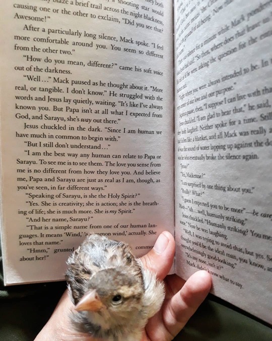
📖 💞🐥 #theshack #theshackbook #sarayu #papa #elousia #yeshua #jesus #jesuschrist #yahweh #holyspirit #holyghost #god #cleverbird #funnybird #goodbird #sparrow #bird https://www.instagram.com/p/B8GwfJKnlnj/?igshid=vhrf7mztl990
#theshack#theshackbook#sarayu#papa#elousia#yeshua#jesus#jesuschrist#yahweh#holyspirit#holyghost#god#cleverbird#funnybird#goodbird#sparrow#bird
0 notes
Text
20 Best New Portfolios, January 2019
Welcome back, WDD Readers. It’s January 2019, and we’re all coming back to work bleary-eyed and bushy-tailed. Why don’t you take a moment to put off wor… I mean get inspired by these new portfolios? We’ve got a fair bit of variety in aesthetics and strategies this month. Enjoy.
Note: I’m judging these sites by how good they look to me. If they’re creative and original, or classic but really well-done, it’s all good to me. Sometimes, UX and accessibility suffer. For example, many of these sites depend on JavaScript to display their content at all; this is a Bad Idea, kids. If you find an idea you like and want to adapt to your own site, remember to implement it responsibly.
Robbygraphics
Robbygraphics starts us off with some modernist minimalism and a touch of illustration. It’s a part of that business-friendly wave of design that I mentioned recently, and it’s a fine example of the trend.
My only critique is that the hero image on the home page could really be SVG. PNG is great and all, but large vector illustrations are better served in a vector format, these days.
Platform: WordPress
O
Yup, this designer is named “O”. The one-page portfolio is a bare-bones as the name, with simple typography, screenshots, and red blobs that change shape as you scroll.
I’m not a huge fan of animations that absolutely depend on having smooth scrolling turned on (I keep it turned off), but overall, it’s a good-looking site.
Platform: Custom CMS built on Ruby (I think)
Florent Biffi
Florent Biffi stands out in the crowd with bold text on a sort of… wrinkled cloth texture? Look, the effect, while simple, is fairly striking. I haven’t seen it a lot. The rest of the site is fairly standard sans-serif fare with thick headings and occasionally-overlapping elements. That first striking visual is enough to keep a user scrolling all on its own, and that’s the point, isn’t it?
Platform: Static Site
Timo Kuilder
Timo Kuilder makes new-age-ish cip-art-ish illustrations that look… way better than that sounds. So of course the whole site leans into the aesthetic, using a light masonry collage of the work to sell their services.
Platform: Cargo Combined with Backdrop, apparently.
D7 Creative
D7 Creative takes an interesting and highly interactive approach by making every section of their one-pager look almost completely different. I mean, that’s one way to showcase your range, right? Plus, they have a fully functioning game of Snake that you can play.
It’s not the most visually consistent approach, but rules are made to be broken eventually.
Platform: WordPress
Playground
Playground is a fusion of the corporate-friendly aesthetic (including lots of solid blue and red) with the constantly-overlapping elements of more post-modernist web design. There’s also plenty of animation, but it’s understated enough that it’s not too distracting. I like this style a lot, but don’t make me come up with a name for it, please.
Platform: Static Site
Camilo Alvarez
Camilo Alvarez hit me right in the nostalgia. I had a phase where I used a sort of “film grain” effect for almost everything. Well the film grain is back with an animated vengeance, overlaid on a sort of post-minimalist design. As with most of these sites, it’s a bit JS-heavy for me, but it’s pretty and it’s making me feel young again, so it’s here on the list.
Platform: WordPress
Fly Digital
Fly Digital is going very minimalist, and reminds me of the ’90s in a good way. I normally wouldn’t recommend a handwriting typeface for body text, but when there’s this little text, you can get away with it. Though the text could be bigger. And I wouldn’t blur out those client logos on the home page, even if you are going to unblur them on hover.
Otherwise, the site feels handmade and old-fashioned without feeling amateurish. It’s a fine line to walk, but they’re doing it.
Platform: WordPress
epo
Where other sites merely feel modern, epo feels super modern. It’s like flat design had a baby with a corporate color palette. It’s like easy listening music in web design form. None of that is criticism, mind you. If it gets them the clients they want, then it’s doing the job right.
Platform: WordPress
Breadhead
Breadhead brings us some of that classic elegant dark-layout minimalism that we don’t see nearly often enough these days. Thin type, illustrations, and an all around classy feel are what will make this design stick in your brain for a while.
Platform: Static Site
Marijn Bankers
Marijn Bankers’ portfolio reminds me, at first, of an animated spa brochure. You know, the whites and pastels, then thin type, the thinly-lined UI elements, everything. As you dive into the site, it feels more like an architecture firm.
And then it all makes sense when you look through the portfolio. His clients are exactly those who would appreciate the aesthetic. I keep highlighting websites with this approach for the simple reason that it works. Portfolios tailored to the clients just work.
Platform: Static Site
Anvar Shoe
Anvar Shoe’s portfolio eschews the aesthetic fusion we’ve been seeing lately for a site that looks positively post-minimalist. It’s artsy all the way with a mostly-one-column layout and effects that, once again, kind of depend on smooth scrolling to look good.
Platform: Static Site
YRS Truly
YRS Truly is an interesting case. I’ve previously featured portfolio sites that mimic an operating system, but this one fuses the “windows” gimmick with the general structure and layout of a normal two-column website. It’s odd, but it works, and it uses UI conventions that most of us are used to.
Platform: WordPress
Cleverbirds
Cleverbirds’ art portfolio is highly presentational and animated. No points for accessibility here, but if you want some creative and pretty ideas for monochromatic web graphics, look no further. It’s on the list because it’s pretty, and that’s that.
Platform: Static Site
João Pereira
João Pereira’s portfolio is just plain pretty; I love the use of color. While the text could use a little more contrast in places, it’s just generally gorgeous. Plus you can click the triangles in the background to see a list of his skills.
Sure, that’s not intuitive, but it’s better than any “skill progress bars” I’ve ever seen.
Platform: Static Site
Kristopher Bolleter
Kristopher Bolleter’s portfolio leads with text that says, “No cliché slogans, just work that speaks for itself.” Well, he might not know how often I use the phrase “speaks for itself”, right?
All kidding aside, he lives by that motto, presenting all his featured work on one page in old-fashioned iMac illustrations. Man it’s been a while since I’ve seen that instead of the mockup mobile devices. The whole thing isn’t very flashy, but it’s effective and serviceable.
Platform: Hugo
Adrien Laurent
Adrien Laurent brings us back to the flashy stuff with their portfolio. It’s post-modernist, presentational, pastel, and loaded with animation (I couldn’t think of an animation-related word that started with “p”).
Platform: Static Site
Translation
Translation takes a generally bold approach, starting with their overall aesthetic, and on to their assertion that “The world doesn’t need another ad agency.” With a monochromatic palette and really big headings, the whole idea seems to be to blast your brain and hope it sticks. Well it’s working for me.
Platform: Static Site
Anthony Florio
Anthony Florio’s portfolio is fairly standard modernist, with light artsy touches in the form of randomly placed illustration. And it wouldn’t be a photographer’s portfolio without some sort of collage.
Do you ever miss the classic grid full of thumbnails? Nah. Me neither.
Platform: Static Site
Corn Studio
No portfolio list of mine is truly complete without someone using yellow right. In this case, it’s the ever-so-appropriately named Corn Studio gracing us with the classic yellow and black, combined with some highly animated minimalism. It’s flat, it’s pretty, and it’s pretty good.
Platform: WordPress
Add Realistic Chalk and Sketch Lettering Effects with Sketch’it – only $5!
Source from Webdesigner Depot http://bit.ly/2M8ixb4 from Blogger http://bit.ly/2FrtMuL
0 notes
Text
20 Finest New Portfolios, January 2019
Welcome again, WDD Readers. It’s January 2019, and we’re all coming again to work bleary-eyed and bushy-tailed. Why don’t you’re taking a second to place off wor… I imply get impressed by these new portfolios? We’ve bought a good bit of selection in aesthetics and techniques this month. Get pleasure from.
Be aware: I’m judging these websites by how good they give the impression of being to me. In the event that they’re inventive and authentic, or traditional however actually well-done, it’s all good to me. Generally, UX and accessibility undergo. For instance, many of those websites rely on JavaScript to show their content material in any respect; it is a Unhealthy Thought, youngsters. Should you discover an thought you want and need to adapt to your personal website, bear in mind to implement it responsibly.
Robbygraphics
Robbygraphics begins us off with some modernist minimalism and a contact of illustration. It’s part of that business-friendly wave of design that I discussed lately, and it’s a nice instance of the development.
My solely critique is that the hero picture on the house web page might actually be SVG. PNG is nice and all, however massive vector illustrations are higher served in a vector format, as of late.
Platform: WordPress
O
Yup, this designer is called “O”. The one-page portfolio is a bare-bones because the title, with easy typography, screenshots, and crimson blobs that change form as you scroll.
I’m not an enormous fan of animations that completely rely on having easy scrolling turned on (I maintain it turned off), however general, it’s a handsome website.
Platform: Customized CMS constructed on Ruby (I believe)
Florent Biffi
Florent Biffi stands out within the crowd with daring textual content on a kind of… wrinkled fabric texture? Look, the impact, whereas easy, is pretty placing. I haven’t seen it lots. The remainder of the location is pretty commonplace sans-serif fare with thick headings and occasionally-overlapping parts. That first placing visible is sufficient to maintain a person scrolling all by itself, and that’s the purpose, isn’t it?
Platform: Static Website
Timo Kuilder
Timo Kuilder makes new-age-ish cip-art-ish illustrations that look… method higher than that sounds. So in fact the entire website leans into the aesthetic, utilizing a lightweight masonry collage of the work to promote their providers.
Platform: Cargo Mixed with Backdrop, apparently.
D7 Inventive
D7 Inventive takes an attention-grabbing and extremely interactive strategy by making each part of their one-pager look virtually fully completely different. I imply, that’s one method to showcase your vary, proper? Plus, they’ve a completely functioning recreation of Snake which you can play.
It’s not essentially the most visually constant strategy, however guidelines are made to be damaged ultimately.
Platform: WordPress
Playground
Playground is a fusion of the corporate-friendly aesthetic (together with numerous stable blue and crimson) with the constantly-overlapping parts of extra post-modernist internet design. There’s additionally loads of animation, however it’s understated sufficient that it’s not too distracting. I like this type lots, however don’t make me give you a reputation for it, please.
Platform: Static Website
Camilo Alvarez
Camilo Alvarez hit me proper within the nostalgia. I had a part the place I used a kind of “movie grain” impact for virtually all the things. Nicely the movie grain is again with an animated vengeance, overlaid on a kind of post-minimalist design. As with most of those websites, it’s a bit JS-heavy for me, however it’s fairly and it’s making me really feel younger once more, so it’s right here on the record.
Platform: WordPress
Fly Digital
Fly Digital goes very minimalist, and jogs my memory of the ’90s in a great way. I usually wouldn’t suggest a handwriting typeface for physique textual content, however when there’s this little textual content, you will get away with it. Although the textual content might be larger. And I wouldn’t blur out these consumer logos on the house web page, even when you’ll unblur them on hover.
In any other case, the location feels handmade and old school with out feeling amateurish. It’s a nice line to stroll, however they’re doing it.
Platform: WordPress
epo
The place different websites merely really feel fashionable, epo feels tremendous fashionable. It’s like flat design had a child with a company coloration palette. It’s like straightforward listening music in internet design kind. None of that’s criticism, thoughts you. If it will get them the shoppers they need, then it’s doing the job proper.
Platform: WordPress
Breadhead
Breadhead brings us a few of that traditional elegant dark-layout minimalism that we don’t see almost usually sufficient as of late. Skinny sort, illustrations, and an throughout stylish really feel are what is going to make this design stick in your mind for some time.
Platform: Static Website
Marijn Bankers
Marijn Bankers’ portfolio jogs my memory, at first, of an animated spa brochure. You realize, the whites and pastels, then skinny sort, the thinly-lined UI parts, all the things. As you dive into the location, it feels extra like an structure agency.
After which all of it is smart if you look via the portfolio. His shoppers are precisely those that would recognize the aesthetic. I maintain highlighting web sites with this strategy for the straightforward purpose that it really works. Portfolios tailor-made to the shoppers simply work.
Platform: Static Website
Anvar Shoe
Anvar Shoe’s portfolio eschews the aesthetic fusion we’ve been seeing these days for a website that appears positively post-minimalist. It’s artsy all the way in which with a mostly-one-column structure and results that, as soon as once more, type of rely on easy scrolling to look good.
Platform: Static Website
YRS Really
YRS Really is an attention-grabbing case. I’ve beforehand featured portfolio websites that mimic an working system, however this one fuses the “home windows” gimmick with the overall construction and structure of a standard two-column web site. It’s odd, however it works, and it makes use of UI conventions that the majority of us are used to.
Platform: WordPress
Cleverbirds
Cleverbirds’ artwork portfolio is very presentational and animated. No factors for accessibility right here, however if you would like some inventive and fairly concepts for monochromatic internet graphics, look no additional. It’s on the record as a result of it’s fairly, and that’s that.
Platform: Static Website
João Pereira
João Pereira’s portfolio is simply plain fairly; I really like using coloration. Whereas the textual content might use slightly extra distinction in locations, it’s simply usually attractive. Plus you possibly can click on the triangles within the background to see an inventory of his expertise.
Positive, that’s not intuitive, however it’s higher than any “talent progress bars” I’ve ever seen.
Platform: Static Website
Kristopher Bolleter
Kristopher Bolleter’s portfolio leads with textual content that claims, “No cliché slogans, simply work that speaks for itself.” Nicely, he may not know the way usually I exploit the phrase “speaks for itself”, proper?
All kidding apart, he lives by that motto, presenting all his featured work on one web page in old school iMac illustrations. Man it’s been some time since I’ve seen that as a substitute of the mockup cellular units. The entire thing isn’t very flashy, however it’s efficient and serviceable.
Platform: Hugo
Adrien Laurent
Adrien Laurent brings us again to the flashy stuff with their portfolio. It’s post-modernist, presentational, pastel, and loaded with animation (I couldn’t consider an animation-related phrase that began with “p”).
Platform: Static Website
Translation
Translation takes a usually daring strategy, beginning with their general aesthetic, and on to their assertion that “The world doesn’t want one other advert company.” With a monochromatic palette and actually large headings, the entire thought appears to be to blast your mind and hope it sticks. Nicely it’s working for me.
Platform: Static Website
Anthony Florio
Anthony Florio’s portfolio is pretty commonplace modernist, with gentle artsy touches within the type of randomly positioned illustration. And it wouldn’t be a photographer’s portfolio with out some kind of collage.
Do you ever miss the traditional grid stuffed with thumbnails? Nah. Me neither.
Platform: Static Website
Corn Studio
No portfolio record of mine is really full with out somebody utilizing yellow proper. On this case, it’s the ever-so-appropriately named Corn Studio gracing us with the traditional yellow and black, mixed with some extremely animated minimalism. It’s flat, it’s fairly, and it’s fairly good.
Platform: WordPress
Supply hyperlink
source https://webart-studio.com/20-finest-new-portfolios-january-2019/
0 notes
Photo

We saw a #woodpecker , he was up and down the tree for quite some time. Then he spotted an #eagle nearby and he hid around the back of the tree and froze. #cleverbird #woodpeckersofinstagram #michiganadventures https://ift.tt/2MppzGU
0 notes
Photo

Cleverbird Creative
Cleverbird Creative is an award-winning boutique web design and development firm based in Chicago since 2008.
by csreladm via CSSREEL | CSS Website Awards | World best websites | website design awards | CSS Gallery https://ift.tt/2rzgRgL
0 notes
Photo

New #WebDesign Inspiration Cleverbirds (https://cssnectar.com/css-gallery-inspiration/cleverbirds/) on CSS Nectar #webgallery
0 notes
Video
Hello Chicago from @dp4k.m HITCHING A RIDE IN CHICAGO! #cleverbird #rainyday #chicago #freeride #toocuteforwords
0 notes