#compsitions to be made.......
Explore tagged Tumblr posts
Visit Tumblr Blog
Explore Tumblr blogs with no restrictions, modern design and the best experience.
Last Seen Tumblr Blogs


Fun Fact
If you dial 1-866-584-6757, you can leave an audio post for your followers.
Text
Might be insane and bit of a pedant but I think the eye highlighted on Marckus was the opposite of what it is on Magnus's sprite and that is giving me ideas
#compsitions to be made.......#anyways I go beddy bye bye now I hope please dear god let me sleep#bigeloo.txt
1 note
·
View note
Text

High-Quality Durostone Material Supplier China
Jiujiang Jiatai Material Co., Ltd. is a leading supplier of high-quality Durostone materials in China. Our premium supplier offers high-quality solutions for industrial applications, ensuring durability and efficiency. Contact us at +86-18970240085.
0 notes
Text
Is Sinnoh confirmed?
Day 535-no
#pokemon#diamond#platinum#pearl#dpp#nintendo#sinnoh#so i was in my 3 hour chem lab today but it was actually really fun!!#we used this chemical that smelt like gralic for some sciency reason#so i was talking ti my roommate and she was like ‘do you think vampires could ingest that chemical?’#since it smelt like garlic we determiend that whatever chemical composition made up a clove of garlic was the same chemical composition#of the chemical i used in my lab#overall we determined that there are no vampires in my lab#this is what happens when you put 2 scince majors together#and now im curious if you need me ill be looking up tbe chemical compsition of garlic#have a goodnight !!!
9 notes
·
View notes
Text
Investigating the Torah’s Composition: Stages of Development
Up until the second millennium, the mainstream opinion concerning the authorship of the Torah was that it was written by Moses. By the eleventh century, however, enough observations had been made that seemed to be evidence against this idea that the mainstream conception began to shift. Between 1200 and 1688, three distinct stages in the development of scholarly opinion concerning the authorship of the Torah can be discerned. A sketch of this development is given below.
Stage One: An Appended Mosaic Composition
Whereas earlier commentators from Origen (3rd century) to the Rashi (11th century) came up with elaborate explanations for apparent contradictions and impossibilities in the Biblical text, things began to change in the generation immediately after the Rashi. Starting in the Islamic world, Jewish and Christian scholars began to make observations about the chronology and language of the Torah. Isaac ibn Yashush, writing from 11th century Spain, claimed that the kings of Edom written in Genesis 36 lived long after Moses, and so that section was written by someone after Moses. This observation resulted in him being scorned by his contemporaries. Yet the man who called him ���Isaac the Blunderer,” Abraham ibn Ezra, also noted the oddity of Moses’s use of third person narrative and language that reflected the monarchical period of Israel’s history. Whereas ibn Ezra was cryptic in the implications of his observations, the Spanish-Jewish scholar Bonfils brought these conclusions to light in 14th century Damascus. Using ibn Ezra’s comments as evidence, Bonfils claimed that these verses were written by “one of the later prophets,” denying full Mosaic authorship while still asserting the inspiration of the Scriptures. Tostatus, a fifteenth century Bishop of Avila, popularized an older tradition which stated that Moses’s death and the final verses of Deuteronomy were written by Joshua (as opposed to one in which Moses cries as he obediently writes about his own death). This in itself opened up more issues, though, as Protestant scholar Andreas Carlstadt noted that the style of these final verses matched the style of the passages that preceded it.
Stage Two: A Heavily Edited Mosaic Composition
By the sixteenth century, a trio of Catholic scholars posited a different stance. Fr. Andreas van Maes, a humanist and scholar of Syriac, alongside Jesuit scholars Benedict Pereira and Jacques Bonfrere, suggested that the Torah was based on a Mosaic composition. Later inspired authors would elaborate upon the more simplistic Mosaic narrative. Such elaborations would have included adding details to a more simplistic narrative, adjusting phrasing to make it less awkward to contemporary readers, and changing the names of the locales in order to make them more readily recognizable. Their work was condemned by the Church. Despite this early condemnation, by the seventeenth century, French Protestant-turned-Catholic priest Fr. Ricard Simon actually took this position when criticizing Spinoza (see next stage, below). He argued in 1685 that the modern Torah was a heavily edited Mosaic work, and that the arrangements and elaborations of the text were themselves made by inspired scribes and prophets, making the edited work itself a product of Divine Inspiration. Though it was meant to protect the tradition of Mosaic authorship against the new position that rejected any input from Moses, more conservative elements in the Church condemned Fr. Simon and expelled him from the Oratorian order.
Stage Three: Not A Mosaic Compsition at All
In 1651, English philosopher Thomas Hobbes declared that Moses could not possibly have written the Torah based on linguistic evidence. Especially striking to Hobbes was the use of “to this day” to describe the after effects of Biblical events; to say that something is still the case “to this day” implies a long period of time between the narrated event and the narration itself. Four years later, French Calvinist Isaac de Peyrère provided more textual evidence, including the fact that Moses spoke to the people “across the Jordan” (meaning that whoever was writing was doing so in Israel, a land Moses never entered). De Peyrère’s books were burned, and he recanted his views and converted to Catholicism in order to avoid life imprisonment. Spinoza was probably the most rabid critic of the Torah, denying its Divine inspiration completely and synthesizing much of the evidence given above in order to say that it was “clearer than the sun at noon that the Pentateuch was not written by Moses.” Already excommunicated from his Jewish community, he now came under attack by Catholics and Protestants alike. An attempt was made on his life, and numerous writers (like Fr. Richard Simon, above) wrote refutations of Spinoza’s works. It was this final stage that ultimately proved to be vindicated; by the eighteenth century, a series of authors and amateur historical-critical text analysts had determined that the Torah had at least two primary sources; some believed that the Torah, which seemed to have doublets of stories, contained sources older than Moses, followed by a story Moses rewrote in his own words. This theory fell apart as it became increasingly obvious both sources were written centuries after Moses. This Two-Source hypothesis, even in its later form, was discarded after the discovery of not only doublets, but triplets of similar stories in the Torah. When German scholar W.M.L. de Wette noticed that Deuteronomy was stylistically very different from the other books of the Torah in 1804, these three sources now increased to at least four. To this day, the Four Document Hypothesis remains the strongest theory for the composition of the Torah, though the hypothesis has continually been tweaked in the past 200 years, and much remains unknown about who exactly these authors and the mysterious redactor of the text are. Source: Richard Elliott Friedman (Who Wrote the Bible?, pages 4-9)
24 notes
·
View notes
Text
Thank you for tagging, dear @sims-and-pixels!
Five songs you’ve been listening to on repeat?
Korpiklaani - Under the Sun
Obtest - Burtai
Talco - Bella, ciao
Rammstein - Deutschland
Koral - Ne allj meg soha
Last movie you watched?
Soviet Dead Mountaineer's Hotel. I watched it with my boyfriend and we really enjoyed the atmosphere of 1970′s, great visual compsition and interesting plot.
Currently watching?
I’m not a big fan of movies and TV shows, mostly I watch videos on Youtube about animals.
Currently reading?
Thanks for remembering! I was reading some memoirs about WWII but made a pause to read a research about Russian Civil war.
I tag @alainas-sims, @sims4italianfan, @aniraklova, @cherryfizz-sims and everyone who wants to join! Feel free to ignore if tou don’t want to do that.
6 notes
·
View notes
Text
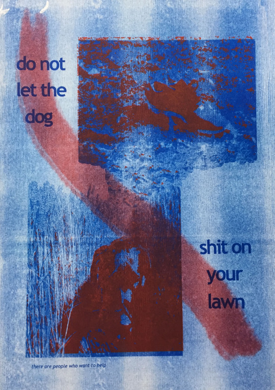
risograph printing
after the session in our last project, i have fallen in love with the process of risograph printing. for this project, i felt the coloured inks available would resonate highly to ones i love in the older ww2 posters i looked into and recreate that nostalgic feel within my own designs.
the first design i printed was one i actually developed from my collage leftovers.

i had only just layed the remnants of the black paper after cutting out the dog on some yellow paper and really liked how the two colours looked together, so i took it into photoshops and played around with it a little bit.

each colour has to be printed individually, with other colours being printed on top, as the two images above show. i actually like both versions a lot, as i love the how dense and bright the yellow ink brights on full. while yellow slightly contradicts my idea of the black dog theme, as it is typically associated with being a happier colour, i think the two colours work well together because they contrast so well. it also shows a happier side to my project, that there is hope for people experiencing depressive thoughts.
the second design i created was a digital collage piece i worked up on photoshop, which on first printing went a bit wrong.
i had wanted the two inks to make up different parts of an image, but when i ran the black and white compsite iamges through, they just didn’t line up properly, and the compsite images were so dark and dense that the inks became muddy and patchy, and became too much when layered together. i think there may have been a problem with the printing of the blue ink, as the background especially came out very splotchyeven though i had made the composite image completely smooth. so to overcome this, i decided to take out the dense blue layer altogther to try and create somewhat of a clearer image.
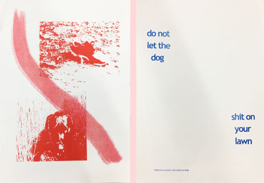
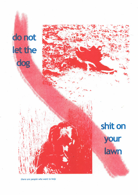
i’m much happier with how this composition works. while the images still aren’t quite readable, they’re a lot bolder because they’re not so messy without the blue layer, and contrast nicely with the white background. i kept the writing blue as i like the two colours together still, just when they are not so conflicting and dense.
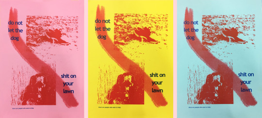
i also printed the two layers on different coloured cardstocks to create different tones within the ink, and to see the original plan i had in mind with the solid colour background. i particularly like the pink one, as it really works well with the riso inks, and i think makes them pop off the page.
the one thing i would change about this design, and perhaps the yellow and black one too, is the incorporation of more text. while both deisgns relate to my theme of the black dog, there is no information for the audience about my topic, leaving them quite open for interpretation, and not fitting the form of awareness i would like to raise in this campaign. to fix this, i could include a helpline number somewhere on the poster for those struggling with depression to reach out to, or more information about the illness. i really need to put some more research into how to address this and then perhaprs create mockups of these designs with that included.
1 note
·
View note
Text

Ah, May 17th. The Chivas Regal of days.
You know, when I was a kid, I thought adults were very smart (I know), because they could write wonderful stories and novels, and I was stuck writing "and then" at the beginning of every sentence.
And then, when I was in fifth grade, I learned about essay composition, and how important it is to set up a compsition with introduction, primary statement, secondary statement, and conclusion.
And then, a few years ago, I started re-reading some of the books I liked when I was a kid. And then I realized all that clever writing was not really that great - which is understandable, since those were hastily-written kids' books - but made use of a lot of those techniques I learned in fifth grade.
And then I kind of stopped reading stuff for its nostalgia value. It made me kind of sad finding a book I spent weeks reading when I was a kid and finish it in a few hours, finding the story to be so hollow and bland. I think sometimes it's better to leave those memories in the past, back when the books meant so much to me, and I'd imagine the characters and the worlds so vividly, get so into the plot.
There are some artists who work pretty hard on drawing realistic figures, and I have nothing but respect for them. But I also know I'll never make something that good. When I was a kid, I'd see detailed pencil sketches made with short strokes and a lot of correcting, to add depth and realism. So I'd try to imitate them by doing the same old crappy drawings, only with short strokes added in random directions.
Today's Buddy is an example of how it usually turns out. Just like with writing essays, it didn't change much - only instead of writing "and then", I add some fluff on the edges.
1 note
·
View note
Photo

I didn't have a chance to see the blood moon last night but here's a composite I did for one I was able to catch back in April 2014. From 10:30pm to 3am I stepped outside every 10 minutes to document the lunar eclipse cycle. I chose select photos to put into this lunar eclipse cycle compsite. I also made a time lapse video that can be found on my YouTube page: youtu.be/iV_rk9fIT3E #somaticstudios #photographer #photography #adventure #explore #wanderlust #photosafari https://www.instagram.com/p/Bs6eaYsAjHN/?utm_source=ig_tumblr_share&igshid=18uif566j8byz
2 notes
·
View notes
Photo

this is made with acrylics around half and hour and I’m glad wirh the compsition that I,ve got. the two red points at both sides of the model work really well and the contrast of the clear colors on the black catridge crates nice effect aswell.
2 notes
·
View notes
Text
Evaluation
What went well:
The team worked very well together and all of us took part and gave a large amount of effort in order to complete the project. The overall compsition of the advertisement was very good because we used the grid on the viewfinder and used the rule of thirds, such as in the opening shot we framed the shot so that the bench was in the centre and so that a lot of sky would be shown aswell. The lighting of the advertisement was all natural and worked very well considering we did not use a single studio light. The sound of birds tweeting and trees saying was added in in the latter staged of editing. This worked well due to it immersing the viewer that the scene they are viewing is peaceful and calm, so when the Sprite jumps off the bench the music of the ‘Magnificent Seven’ theme kicks in, which heavily increases the pacing as the Sprite rolls around and comes to life.
Even better if:
Some of the shots at the beginning were very shaky due to us not using a tripod for the first part of the advertisment. One of the shots after the bench scene were overexposed because when using the camera the cameraman forgot to select a correct ND filter, which would have made the image darker and lowered the overall aperture.
0 notes