#cover tutorial
Explore tagged Tumblr posts
Visit Tumblr Blog
Explore Tumblr blogs with no restrictions, modern design and the best experience.
Last Seen Tumblr Blogs


Fun Fact
US Tumblr user growth rate is estimated to slow down to 4.1%.
Text
Four hairstyle tutorial for long hair at summer (cr 白菲菲)
#china#fashion#chinese fashion#video#tutorial#the point is nothing covers the neck#so it won't be hot
1K notes
·
View notes
Note
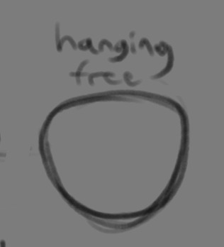
If you don't mind my asking, how do you go about drawing fat? :3
JUST THE EXCUSE I WAS LOOKING FOR
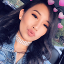
So, for me personally, a lot of the time when I draw fat characters, I'm not looking to specifically capture the specifics of fat as much as the feel of fat. Bulkier, rounder shapes in the right places that has a feeling of weight to em! A lot of that is intuition and simplification at this point, but it all works on the same frame as just any ol' person. Like take this-

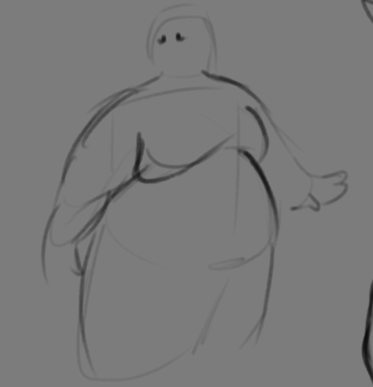
For example. This is the basis for any body shape, not just the more average one that it may imply. Sure- it can be that average body shape:
But also a fat one too!

And a big part of that is knowing where fat usually tends to bunch up on the body, so lets take a look piece by piece! (Please keep in mind this is very simplified, and not completely precise in some parts)

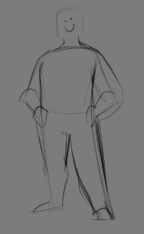
THE FACE: Cheeks (in purple) and especially the chin (in light blue) are the places where a lot of the fat is gonna wanna gather and round out on your face! Additionally, theres a small pocket of fat beneath the cranium on the backside of your head. It's small, but it is there. I believe fat can build up elsewhere like the bridge of your nose and forehead, but generally speaking, you're gonna have a whole lot more buildup in other places first.
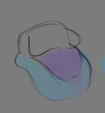
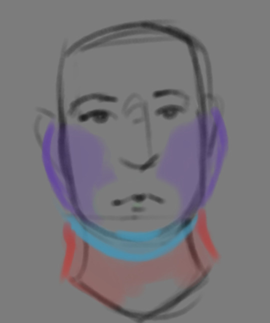
THE TORSO: A lot of the fat built up on the torso is gonna be sent to your tummy. More cushioning for vital organs, mostly out of the way, it just makes sense. Additionally, the lower backs fat builds up and joins with a patch of fat on your sides that forms what is typically referred to as the love handles to make that double belly look. Along with this, the immediate next target for the torso is the breasts, followed by the upper back!
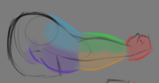
THE ARMS: For this limb, a VERY notable amount of the fat present builds up on the tricep and bicep areas, lessening once you get towards the flexor and extensor areas. You can almost think of the arm as a sort of triangular shape, wide side starting from the shoulder and tapering towards the hand, which itself mostly builds up fat around the back of the hand and the fingers. The shoulders themselves don't build up too much fat unless you got a lot
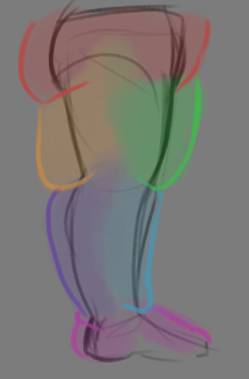
THE LEGS: And finally, you can think of the legs having pretty similar curves to what you're probably already used to thinking. The front of the thighs getting a big buildup, along with the back of the calves, the other parts being flatter in turn. As far as the feet go- similarly to the hands, the top of the feet, along with the heels get most of the buildup, as fat on your soles would impede mobility. The glute, hip and crotch area will also especially build up fat, lending to the same triangular shape that you can see in the arm!
A big thing to note with fat is that it tends to taper off towards joints. Your knees, elbows, shoulders, hips, and all the other places are gonna have significantly less fat so that you remain mobile and flexible, as that's important!
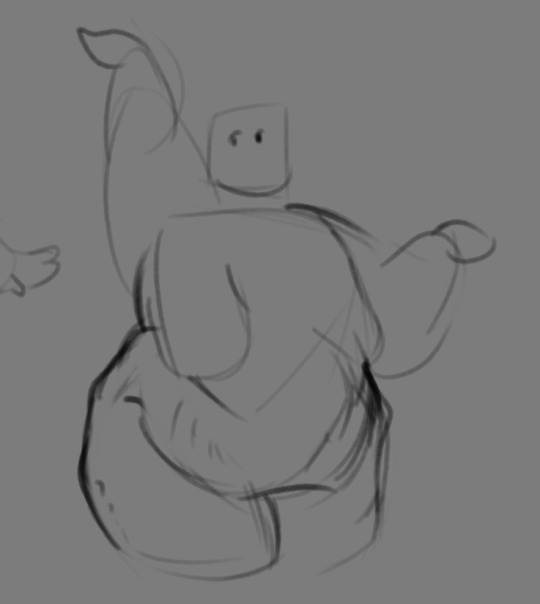
Now that we have an idea of where fat builds up on the body, you might have something that looks kinda like this
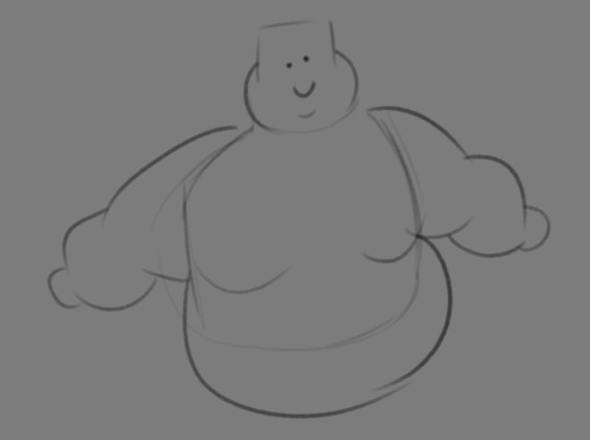
Which yes, does demonstrate a solid understanding of the places fat builds up, lacks the weight you're probably trying to convey, which brings us to out next point! Fat is well... heavy! Gravity is what gives fat much of it's shape, especially as you tread towards larger and larger bodies.
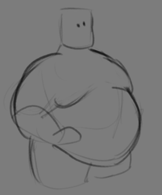
This is demonstrated really well on the arms especially-


Those big ol' bits of fat'll really start to sag when left hanging, and they will squish like hell if they run into something. I like to think of these bits of fat as big ol' ovals that squash and stretch depending on if there's an obstacle in their way or not


These are the important shapes to remember when it comes to the weightiness of fat! If you take all of this into mind, you should be getting something a lot closer to that shape you've been after!

Oh, and always remember that fat bodies come in all variety of shapes and sizes! Play around with a whole lot, and seek out all the resources you can! it'll really lend to your knowledge when it comes to this kinda stuff!
And as I always recommend when it comes to learning art- look at what your favorite artists do with fat bodies. See what you really like about the fat bodies they draw and try to replicate it in your own work, I promise you it's one of the most helpful things ever.
This is like the most basic of basics when it comes to drawing fat bodies though. If there's any additional thing about fat bodies, or maybe you want clarification on something, don't be afraid to ask! If there's enough to cover, I'll make an addition to this post!
#hat answers#my art#design talk#tutorials#yeah im unfortunately pretty tired so this gets a liiiitle rambly at the end but i think this covers like the basic basics#i hope this was helpful at all#and again dont be afraid to ask questions and stuff#if theres enough traction/questions on this i will most definitely try to clear up as much as i can in an addition to the post#whoops this took a bit!
3K notes
·
View notes
Text
O_O...HI
sooo i'm officially making another little art tips and tricks pdf - this time focusing on approaching character and shape design !!
is there anything you guys are curious about regarding those topics that i might be able to explain in a tutorial? ie: drawing character interactions, contrast in shapes/lines, color palettes for a chara, expressions, how do you draw ___, etc ?
feel free to reply here or send an ask :-D
#myart#character design#shape design#art tips#art tutorial#i wanna cover as many topics as possible!
1K notes
·
View notes
Note
How do you draw the bodies? I know you made a tutorial on how to draw the helms, but I’ve just gotten into transformers and I’m struggling with the mechs😭
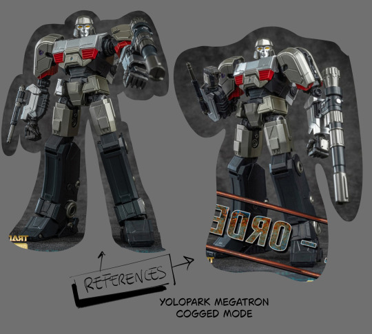
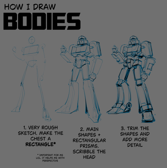
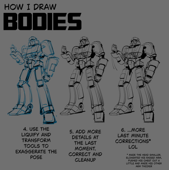
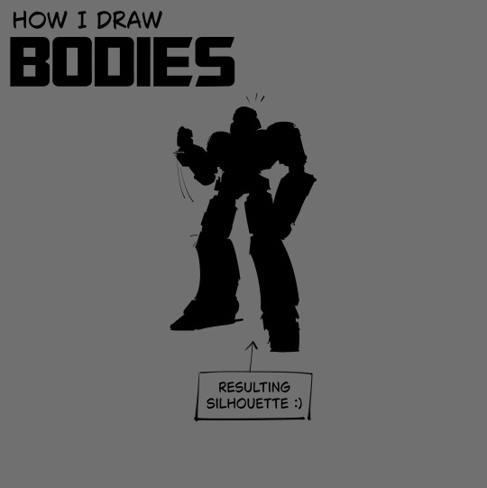
i made this in advance LOL hope it helps
#.txt#tutorial#note that i doodle the pose first and scavenge for references later. in case it matters#also sometimes i don't even get to step 6 LOL i stop at 3 and get right into coloring and rendering#i figure out the details and do corrections as i go. but that's for the stuff that doesn't require lineart#for the lined stuff i have to be more intricate. mistakes are more obvious then. at least imo#but i can cover them up in black fill most of the time mwahahahahhah
553 notes
·
View notes
Text
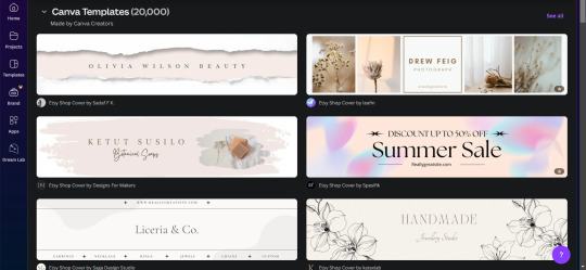
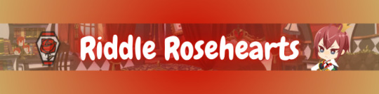
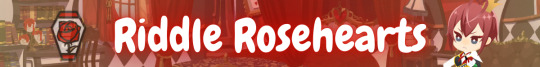
How I make my Covers and Dividers

Hi.👋 So, the idea to make these posts came about because @cat1705 asked me in private how I made my dividers and that made me wonder if other people would be interested in knowing how I made my covers and dividers. I made a poll and a lot of people were interested in knowing how I made them.
I make them in Canva, so anyone can make them, but I would like this to be more of a help for you to create your own and not for you to do exactly like me. Even though I'm always playing around with the font and the way I place the images, I have a guiding line, so to speak, and that's what I'm going to try to show you.

👉COVERS
Well, first things first, apparently I use the dimensions of an Etsy cover photo template. I just chose it because the dimensions looked good. Choose any one and delete all the elements in it until you have only the white background.
To make covers with several characters I use these frames that serve to drag the image inside and adjust it within the defined limits.
I always use only official images from the game so as not to steal anyone's fanart. I usually get the images from the wikis.
You can also upload the image by just dragging it.


To make sure the title won't cover the characters' faces, I put some temporary text on top to adjust the images.
After uploading the image, drag it to the correct frame and drop it.
To adjust the image, double-click, enlarge, rotate, reduce and move it as you wish. When you think it is ready, click outside the image or press the enter key.
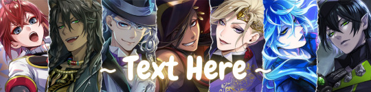
When the image is ready, I remove the text and download the image with the characters.
To download, click the button in the top right corner that says "Share". Then click on "Download", the first button on the last line. It should already be in PNG format, so you won't need to change it.
Attention: If you have more than one page: in "Select pages" choose the option "Current page", click “Done” and only then click on "Download". Otherwise, you will download ALL the pages you have and not the specific one you want.
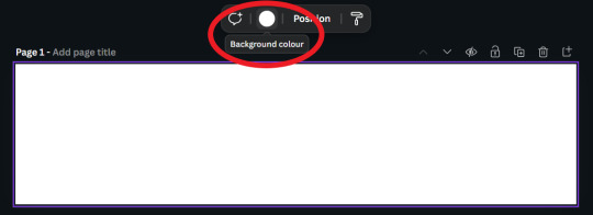
On another page I usually have a gradient background and a little frame. I make the gradient by clicking on "Background color" and in "add a new color" there is the option "Gradient". I don't remember where I got the frame I use, but you can look for some free ones in "Elements".
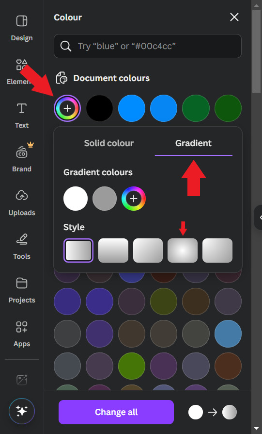
Use the colors that you think look best, I usually put the light color in the center and the dark color at the ends. For this example I will use white and a golden yellow.

Then, I upload the previous character image and make it 50% transparent. On top of the white frame too (It's just my thing, I don't have a reason to do it, I just think it looks good)
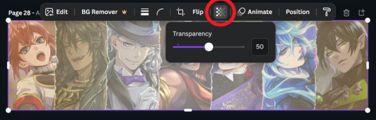
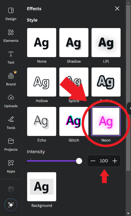
Then I'll put the title. I usually use the "Chewy" font. The font size depends on the size of the title I decided to give it, but it's usually around 80/90. And I add the Effect: "Neon"

To finish, I look for some images in "Elements" to decorate a little more. Searching for "line art" is usually a good tip.
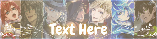
When you're ready, download the image and you're done.
.
👉CHARACTER DIVIDERS
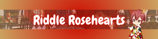
The dividers follow a similar pattern to the covers to match. Create a new page with the same background color gradient.
For the background, I use game backgrounds that match the theme of the fic. For this example, I'm going to make a generic Riddle divider with an image of his room with transparency at 50%.

Then I reduce the height of the image until it is half the height of the canva and place it in the center. Remembering that you can adjust the image by double clicking.

I keep the color of the ends the same, but I adjust the color of the center to the color of the dorm to which the character belongs. In this case, red from Heartslabyul. But I will leave an image with the colors I use for each room, taken from the colors of their personal icons.

For the character name, copy and paste the title, as the font and effect is the same, and adjust to the size of the divider.
And also change the color of the letters to the dorm color.

Then I upload the png image of the character's chibi that can be found on the wikis. In this case I'll use the chibi with Riddle's dorm uniform.
I crop the image to help me orient myself better, but you don't need to do that.
Then I upload the character's personal icon, also found on wikis, adjust the size and set the transparency to 60%.
To finish, I download the image and crop the top and bottom in Paint.
Yes... in Paint... it works ok, shut up!
.
👉LINE DIVIDERS
Finally, for the line dividers, you can copy the Cover because the background colors are the same and erase everything except the image with 50% transparency.

Then I cut it in half, like in the character divider, and again in half to make it thinner, and I place it in the middle of the canvas. (These measures may not be exactly the same as the ones I use today, but the logic in the beginning was this.)

I replace the image with one that seems to fit the theme of the fic. You can do this by dragging it. I usually use game backgrounds, but when none of them seem to look good I look for images from Canva, in "Elements"
That's what I'm going to do to show you. In Elements, write what you want to search for, I'll simply write "background" and choose one of the images without the crown icon (this icon means it's a paid image).
I'll choose any one.


Then I upload the personal icons of the characters that are the focus of the fic. For this example it's the overblot students (because they're my favorite)
Drag them in, place them in a line and adjust the size to that of the line. You can do this one at a time or all at once by selecting them all.
When it's just one character I put one icon upright and the one on the side upside down.

To repeat the pattern, select all of them, copy, paste, and drag until the new set is next to the first. Repeat until the entire line is filled.

Then select all the icons again and set their transparency to 50%.

And finally, download the image and crop the top and bottom parts in Paint. Or wherever you want.
Aaand... I think that's it.
If there's anything you'd like me to explain better, you can ask in the comments. I hope you enjoyed it and that it can help you if you create your own covers and dividers.😘
84 notes
·
View notes
Text

If you've been wondering why certain TS2 makeup items change the color of your Sim's eyelashes or the inside of the mouth - that's why↑ Which brings me to my question:
TS2 players, have you introduced tongues to your game?
#ts2 poll#sims 2#the sims 2#-- this is totally not a#ts2 tutorial#I've played for a long time without tongue masks but once I added it there was no going back#now seeing black cavity when sim opens their mouth makes me anxious - I've just edited ~30 bits of makeup covering tongue masks
93 notes
·
View notes
Text
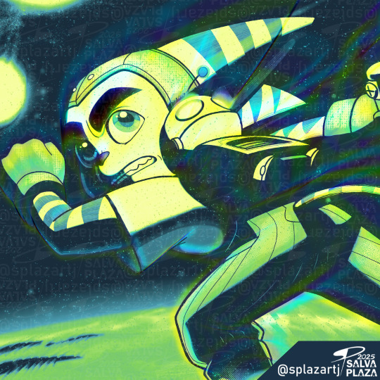
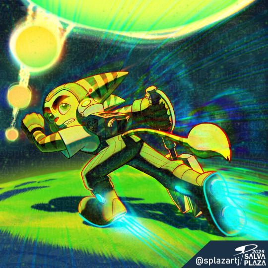
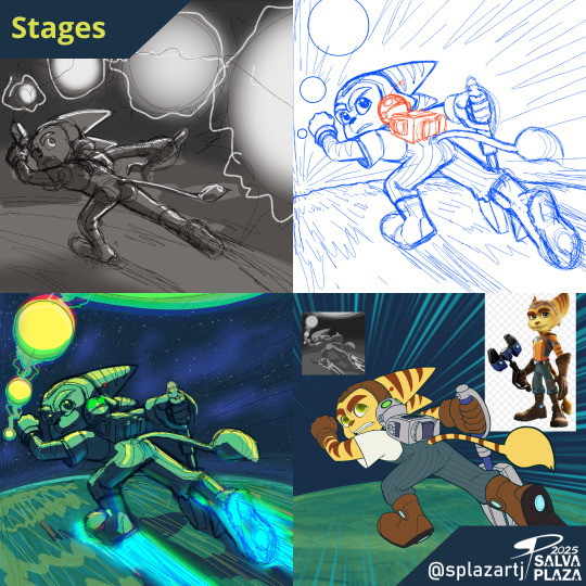
🔧"You can't run away."✨ Here's the second cover art for Luca Salis and the comic from @innawhiledubs
Luca Salis Spotify: t.ly/IC_tL
Youtube: t.ly/AE1_A
Comic Dub: t.ly/nR59t
Here is the Process Video:
#ratchet#clank#illustration#cover#music#digitalart#commission#playstation#art#captain qwark#insomniac games#ratchet and clank#lombax#comic dub#art commission#process#garage#space#space ships#robot#wrench#splazartj#timelapse#tutorial#video
69 notes
·
View notes
Text
EVER WANTED TO PLAY THERMODYNAMIC LAWYER GFD, ESQUIRE ON UKULELE?
It's your lucky day--get ready to hold yourself in contempt EVEN MORE
(Yes, this is inspired by that one user who explained their love for playing not-meant-for-uke WWATTW songs on the uke specifically)
#music#ukulele#guitar tutorial#thermodynamic lawyer#everything is a lot#Will wood#will wood and the tapeworms#wee woo#William woodiam#will wood covers#wwattw
25 notes
·
View notes
Text


Stupid doodles from yesterday
#in order of appearance:#cj cid#cj covered in discontent#cj the before#cj ttdl#to toe dead lines#cj thdph#cj tfftt#cj ysllb#cj the scrapyard tutorial level#cj gw#cj gwotnlh#cj wwph#end of the list#chonny jash#art#fanart#chonnys charming chaos compendium#cj soul#cj heart#cj mind#cj whole#glowing puddle’s jashverse
36 notes
·
View notes
Text
twisting ft. @miodiodavinci's SALVADOR Auto Recovery

credits under the cut
original, instrumental by They Might Be Giants
UST, tuning, mix, art by @epicdogymoment
#leologisms#leography#utau#ijo Lijo#salvador auto recovery#tmbg#they might be giants#haaaaaahhh. yet another one that had to go through numerous rounds of mixing and re-mixing#so hard to get a sense for keeping vocals and bg vocals and instrumental balanced.....#the audio cover image is a quick redraw/study (?) of a very very cropped version of the flood album cover#what else is there to say. aaahhh right THIS is the thing i was doing the salvador english test (chug jug) for#ill say im definitely happy with how well i got him to articulate. but i also know all of the words to this song by heart so#im definitely biased. i like this song toooo much and doing this cover reminded me how much i like it#this is also my first time getting an utau to scream!! its very difficult to pull off. especially because the vast majority of tutorials ar#specifically for like screamo-style screams? not what im going for#anyway. thank you tmbg for the flood (1990) album and all the short songs and the official (official!!!) instrumental versions#and thank you mio for making this lovely lad. so i could force him to sing in english.#also i figured i should credit myself for ? things ? feels weird because its on my blog#but yeah i make my own usts. just think its easier to build em from scratch so theyre tailored to the vb im using and how i want to tune it#............bows really deeply.
42 notes
·
View notes
Text
Ngl monster hunter wilds is one of the most frustrating UIs and command entry systems I've used. I mean, I GET that it's a long established series so people are familiar with the setup, but it is genuinely a mark of shit setup if there is no real tutorial on how to use the system if you have no prev mh experience :/
Radial menu heal commands are just gaslighting at this point. 3 - 5 attempts to get the input to actually register mid-battle.....caca ass layout 🙃
#Creepy chatter#I KNOW there are setting toggles#Ive spent hours in there already. It just does not register 'release' inputs#And kinda doodoo as well to need hours of tweaking settings#And you can't even map your controller 💀#Brother in christ I have never had a more frustrating $70 game#Would you believe even the high tutorial setting doesn't even cover how to use the item belt or crafting#Unless you stumble into the menu eventually 🤦#My partner is a long time mh player and it is kinda stupid the amount of core functions he has to explain to me#Bc the game just. Never addresses them.#Such as: how to load/use/change ammo on your sling 💀#Im going to keep playing I just hate how mh feels to learn. Pop ups mid battle no pause crazy ass outta their mind UI....
24 notes
·
View notes
Text
(10 min into the game) MY FAMILY, MY BOIS, MY LOVES!!! 🥹🥹
(3 hours later) I'm gonna punch you in your f*cking face, you lovely idiot. I will heal your wounds immediatelly, but I will punch you nonetheless....
OH YES, ALSO LOVE IS THERE TOO, LOOKING VERY RESPECTFULLY, BUT SORRY I LOVE YOU. ❤️❤️❤️❤️
#fuck I'm so happy#Y'ALL I'M GOING FOR IT#FINALLY GAME 2 WHOOOO#I LOVED EVERYTHING SO FAR#ABOVE ALL HENRY'S SASSY WIFE HERE#LIKE LITERALLY THEIR DIALOGUE. HIS REACTIONS. HONESTLY ONE OF THEM JUST NEEDS TO POPP THE QUESTION “so what are we?” ALREADY#HANS' LITTLE SIGH AT THE LAKE#YOU KNOW EXACTLY WHICH ONE - Y'ALL I SCREAMED#MY LITTLE WHINEY BITCH IS HERE AND I LOVE HIM#ALRIGHTY CAPON LET'S START YOUR CHARACTER DEVELOPMENT ARC RIGHT HERE RIGHT NOW BABY#ALSO HENRY OMG YOU FINE MAN.#YOU GREW UP SO FAST#HONESTLY I CAN'T LOOK AWAY SIR#I LOVE THEM BOTH SO MUCH - THERE CHARACTER ARE ON PEAK.#ALSO COVER THEM IN SHIT I DON'T CARE I LOVE THEM#I AM STILL SCREAMING SORRY Y'ALL#kcd2#kingdom come deliverance 2#hansry#even tho I know a lot of the game by now that's an amazing feeling there playing it#the intro - the tutorial - the proper introduction - all was fire and I had goosebumbs.#spoiler? cause screenshots?#icy play kcd2#also not me taking hundreds of reference shots from naked hans while sneaking away from bandits lol
34 notes
·
View notes
Text
ok yall I’m tempted to make like a comprehensive How To drawing tutorial sometime, but I gotta know which part y’all want some info on the most. Just so I can know which aspects to go into more detail on.
Also this is gonna be focused on a stylized art style so if you want to know how to uh realistically draw any of these you’re out of luck lmao.
#polls but not#art tutorial#I’ve gotten a lot of people asking for advice and I’m like !!! I gotta make one big post to really cover all my bases
118 notes
·
View notes
Note
I really like your art style but had a question that might sound strange.
How do you get everything to look consistent?
thank you !! 🥺 this could mean a few things so I'm gonna try to answer all of them just in case! if you need me to explain anything in more depth just let me know (the art professor brain kicks in)
1. Style consistency across my work:
I personally don't feel like I'm very consistent. I know I have an overall 'style' that's mine and bleeds through even when attempting to draw in a different style, but I use such varied techniques and change up my process so much that I can't say the secret is in any of those things. It's more of the manifestation of the specific way I observe, translated to a visual work. Art to me is a lot of observation, then choices taken to arrange the observed using techniques, materials, and skills that are built over time and serve the purpose of achieving a goal.
I have a 'way' of drawing faces that people have pointed out is distinct. Same with hands, and clothing folds. It comes from muscle memory, and memes (not the funny type, the type that's a repetition of a pattern) or clichés that become the easiest way to do a specific part of a piece.
2. Consistency within a specific piece:
This one is a bit less tricky to explain. You're going to want to use the same tools throughout the piece for it to look consistent.
Example: If you use line weight somewhere, and completely uniform lines elsewhere, it's going to look out of place. This is a valid resource to produce a sense of estrangement in the viewer, but not something you want to happen unknowingly!
Practice writing down your choices for a piece and sticking to them, whether it's traditional or digital. Make a list of the tools (brushes, colors, method, materials) you will use. For mixed media art, there's a way to make even the most wild-looking, varied art, appear consistent! It's all in the treatment of the parts that CAN coincide. If you use the method of collage, maybe what matches is your palette? The composition rules? Proportions? go wild ^^
I hope that helps!!
18 notes
·
View notes
Text

We close our eyes so tightly
Just hoping we can meet again
Strobe - KAF
#just a doodle ajddiidjd#having a bad week 😞#thinking about how trigger has that eye cover and how she holds on to those cracked pieces#sorta embedding the vision her squadmates being alive and blindly believing it#idk something something deep 😂😭🙈#I WAS JUST EXPERIMENTING AND FOUND OUT ABOUT UNSHARP MASK?#i love fungzau and hanacue tutorials waaaa#my art#animedrawing#fanart#doodles#my doods#fanart of a game#zenless zone zero#zenless fanart#zzz#zzzero#zzz trigger
14 notes
·
View notes
Text
W101's Advanced Combat 103: Clears, Gambits, and School Synergy
Over the past few years, Wizard101 has been trying to add more variety to gameplay by introducing Advanced Combat, which focuses less on raw damage and more on hanging effects, the additional ‘things’ that can be present in battle.
In my last post on this series I introduced the theory of School Identity and the Roshambo wheel, using metaphor and the conceptual identities and themes of the schools to explain the relationships between them. This post will demonstrate how the Roshambo is used in combat, using many spell examples.
Clears
Clears allow you to remove hanging effects that benefit your opponent to get something that benefits yourself. Let's look at two examples of Ice school Clears.
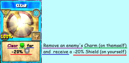
This example Clear is from the Arc 2 prequest's tutorial. It can clear a Charm because Charms are representative of Storm, and Ice freezes Storm.

And this B Path Evil Snowman is able to clear Curses because Curses are representative of Death, and Ice survives Death.
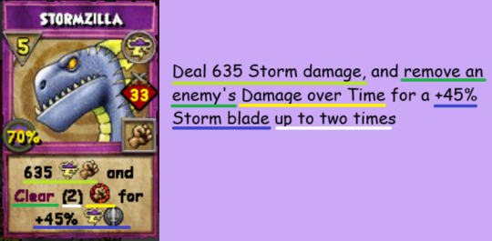
Sometimes, you'll have spells that have their Clear condition after doing their damage, rather than before, such as in this example below. As a reminder, Storm can clear DoTs because DoTs are representative of Fire, and Storm douses Fire.
Gambits
Gambits are the opposite of Clears. They let you sacrifice something that benefits yourself for another thing that benefits yourself. This can be a stronger hanging effect, higher damage, or pips.
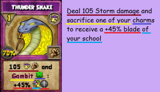
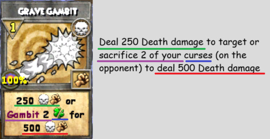


Wait, that last example seems odd. It's a Death spell, but instead of gambiting or casting a Curse (which is its representative hanging effect), it's gambiting Charms (which represents Storm) and recieving Wards (which represents Ice). What's going on here?
School Synergy
Schools are not only able to counter one another, but synergize with one another, using the hanging effects of other schools in their own spells. Specifically, schools can synergize with the other schools adjacent to them.
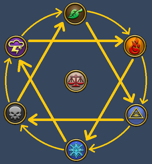
Death is in between Ice and Storm, and so it can synergize with those two schools. Death spells can gambit or produce curses, wards, or charms. Weaknesses, Shields, or Blades.
While the official concept of School Synergy and using it with the roshambo system is relatively new, there are some examples of older spells that display Synergy as well.
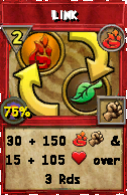
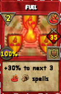
These are a pair of old Fire school spells, and they fully display all the synergies Fire has within Advanced Combat. Damage over Times (Fire itself) and Heal over Times (Life) in Link, and Jinxes (Myth) in Fuel.
In my eyes, Synergy isn't just a brand new system meant to make the schools more interconnected and able to interact with each other, but expanding upon older mechanics and lore to make it more thorough.
What About Balance?
As mentioned near the end of the last post, Balance sits within the School wheel, not countering and not countered by anything. Additionally, because Balance is in the center, it's adjacent to all the schools, and able to synergize with everything.
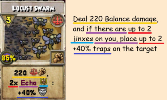
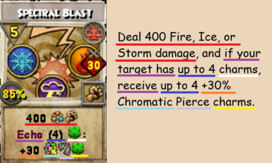
Thus, instead of Clearing or Gambiting anything, some B-Path Balance spells have a unique mechanic called Echo. If your opponent has a certain hanging effect active, your spell will give you the same kind of hanging effect without removing theirs.
Other Key Terms
There are some spells that don't include Gambits, Clears, or Echoes, but still lean into the roshambo and the concepts of Synergy, or just provide additional utility. As an example, often times DoTs HoTs and Bombs won't be officially gambited, but some spells will trigger a secondary effect of some kind if a DoT or Bomb is on your target, or if an HoT is on you. Most can be understood just by reading the symbols, but some use additional terms that I haven't yet covered and so I'll cover them here.
Detonate: Deal all of the damage in a single DoT or bomb
Activate: Deal all of the healing in a single HoT. A HoT detonate, essentially.
Swap: Trade one of your hanging effects with one of your opponent's hanging effects of the same time. (E.G., swap 1 of your charms with your target's charms) (Exercise for the reader: find the spell that has this effect.)
Push: Put one of your hanging effects onto your target.
#leah speaks :3#wizard101#w101#wizblr#advice corner#and that about wraps up everything I wanted to cover in this tutorial series#if anyone has any questions or if there's another aspect of advanced combat youd like me to write about feel free to ask me
30 notes
·
View notes