#process
Explore tagged Tumblr posts
Visit Tumblr Blog
Explore Tumblr blogs with no restrictions, modern design and the best experience.
Last Seen Tumblr Blogs


Fun Fact
Tumblr Inc. is using 66 technologies for its website.
Note
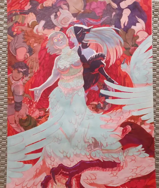
Do you post more speedpaints? Just love watching them.
sure
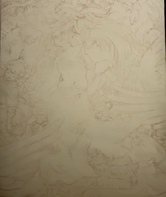
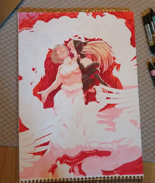
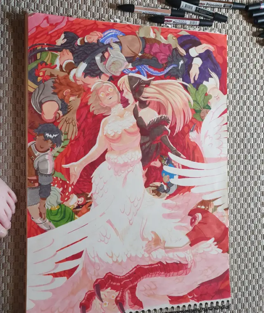
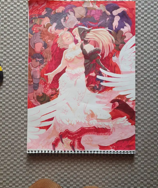
~6.5 hours. at least an hour of me trying to draw hands, gave up, join discord vc with an irl so they can screenshot me making multiple hands poses and consult them on their anatomical knowledge. didnt feel like drawing accurate wings but somehow make it works
423 notes
·
View notes
Text
keep running into a lot of advice that’s like “if you’re researching too much it’s bc you’re avoiding doing it” which I’m sure is true but also I was unable to get started until I found that writing nugget about the “end being in the beginning” and how to make conflict to get anywhere?
so it’s not always true but yes I would say I AM avoiding the work a bit bc now I know I am going to have to sink a lot of time into something that will in fact be bad on purpose and it feels weirddddd
33 notes
·
View notes
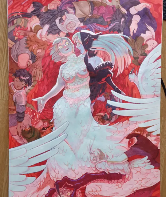
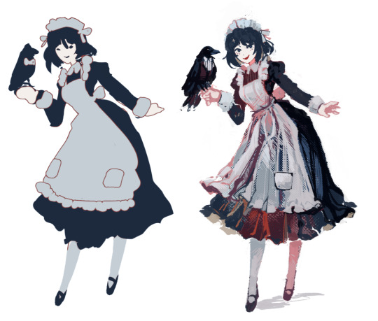
Text

Breakdown of the drawing
29 notes
·
View notes
Text


Scratch Approved!
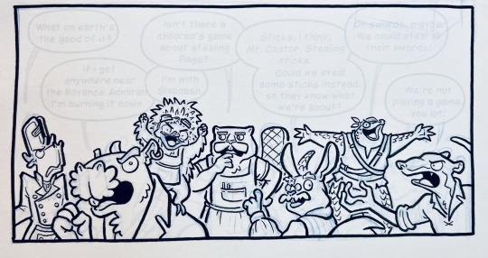
revenge on MissingSkeleton's sona, Scratch!! 🐐 🤍
this guy... THIS GUY???? not sure if it deleted attacks or something… but 9 [NINE] YEARS BETWEEN THE ATTACK IT DID ON ME AND ITS LAST ONE is absolutely BONKERS?? 💥💥 he DEFINITELY deserves something in return for that!!!! like...i am HONOURED beyond AWE dude fdhgkjnsdfhfg
bro lucked out that his one and only character is a goat, as i LOVE GOATERS HEHE and what a joy it was to draw it :D ✨✨
#goat#bovine#furry#furry art#iDoodle2Draw#iD2D#art#artwork#drawing#digital drawing#Art Fight#ArtFight#Art Fight 2025#ArtFight 2025#ArtFight2025#AF2025#art trade#process
36 notes
·
View notes
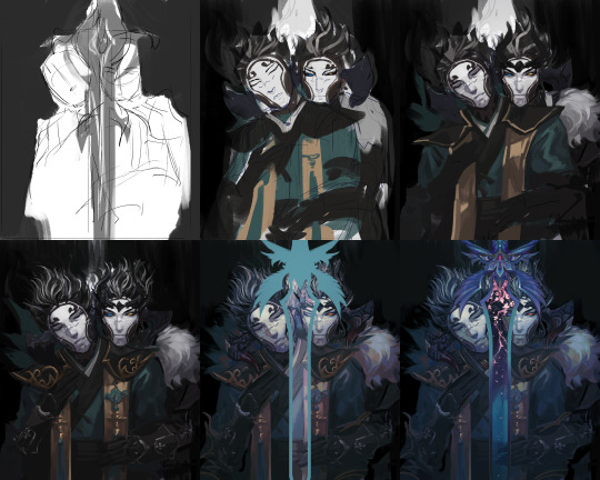
Text

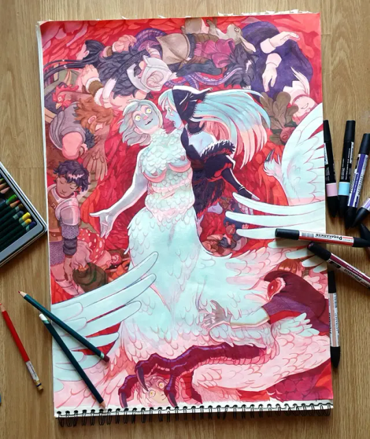
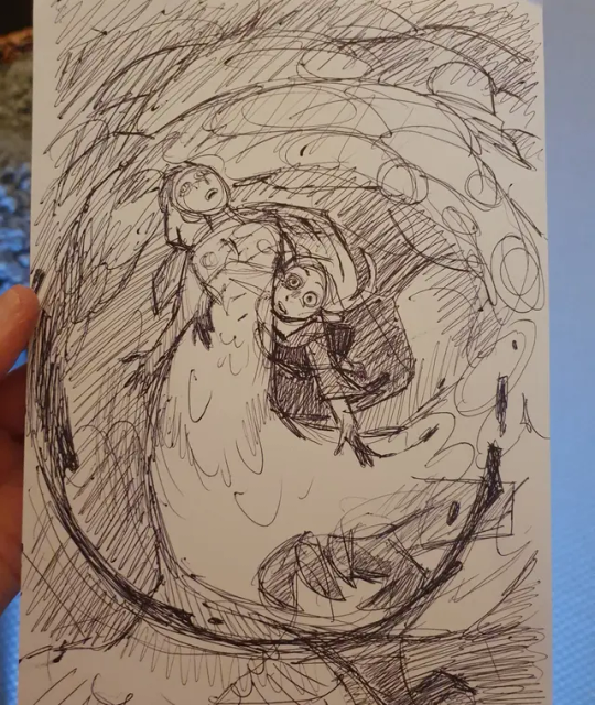
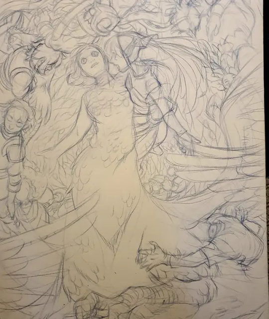
found the color thumbnails for this piece and i thought it was interesting to look back on how i clearly had An Idea but was still struggling to get it down on paper anyway
#i don't think painting/rendering will ever stop feeling like being beaten by one billion demons for me but i still love to do it lol#guy who was just fighting for their life on the canvas: wow that was so fun i should do it again :-)#process#<- i guess?
36 notes
·
View notes
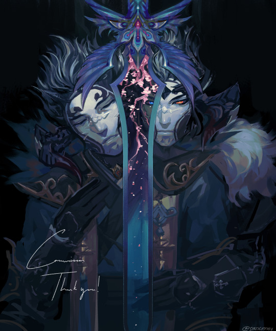
Text

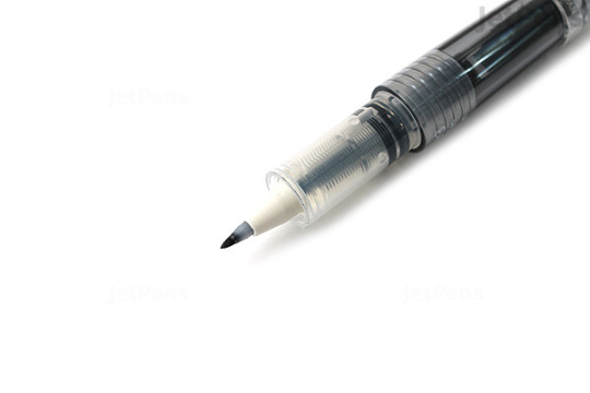
a) Thank you!
b) The figures are inked with a (sadly discontinued) Pilot Petit 3 Mini Fude Brush Pen, while the backgrounds are a blend of various Kuretake, Zebra, and Faber-Castell PITT pens. The Petit 3, pictured below, gives a juicier line than a lot of the other fude felt tips, which I like for giving characters a bit more bounce.
Happy Seacritters Saturday here are a bunch of panels I’ve been happy with from this week’s inking sprint!
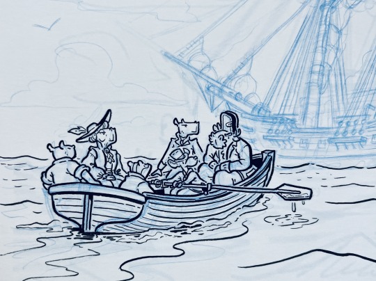
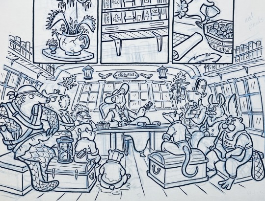
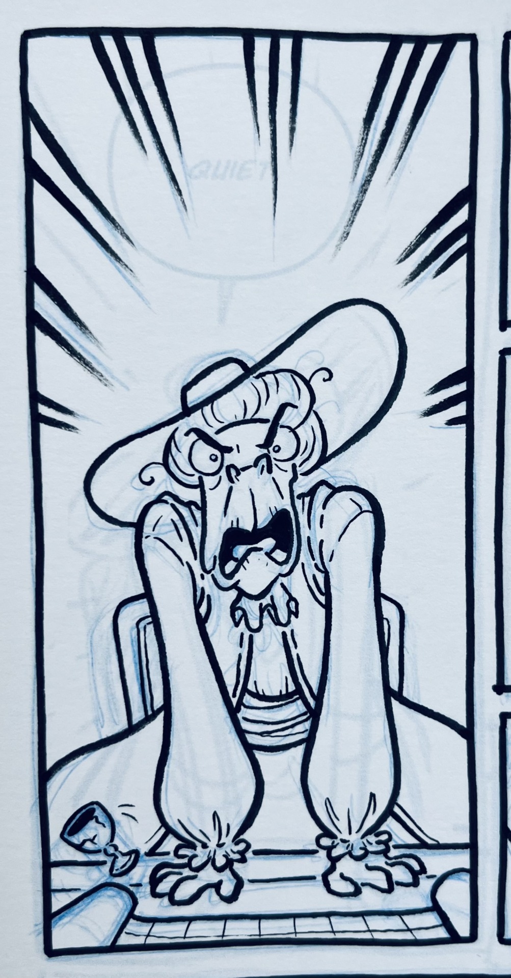
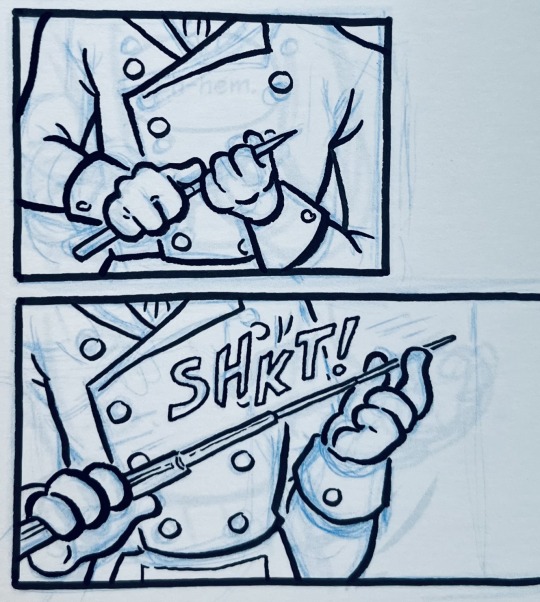
#seacritters#inking#making comics#process#personal work#pens#pilot petit 3#fude pen#brush pen#felt tip#traditional media#Boat stuff#age of sail#capybara
90 notes
·
View notes
Text
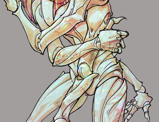
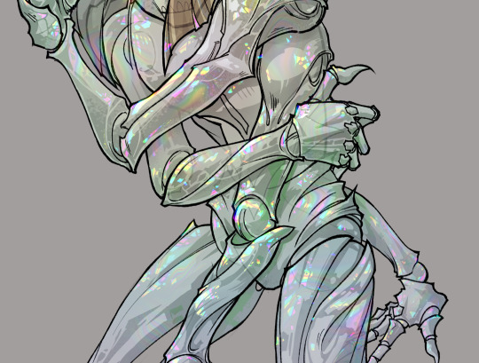
gonna show u guys a little opalescent highlight hack i threw together today
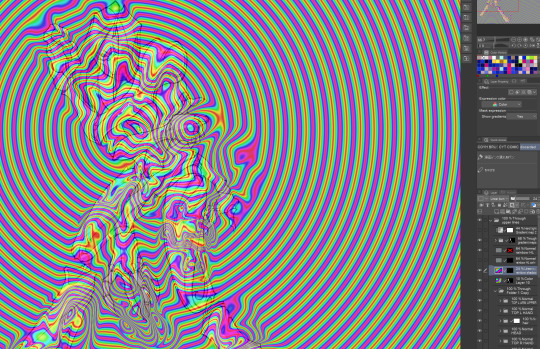
rainbow gradient above your main figure (i usually have all my main figure folders/layers in one big folder, so i can clip gradient maps + adjustments to it!). liquify tool to push the colors around a bit. STAY WITH ME I KNOW IT LOOKS STUPID RN I'M GOING SOMEWHERE WITH THIS
THEN: set it to add/glow (or the equivalent in ur drawing program), lower the opacity a bit, and apply a layer mask. then u can edit the mask with whatever tools you like to create rainbow highlights!!
in this case i'm mostly using the lasso fill tool to chip out little facets, but i've also done some soft airbrushing to bring in larger rainbow swirls in some areas. it's pretty subtle here, but you can see it better when i remove the gradient map that's above everything, since below i'm working in greyscale:
more granular rambling beneath the cut!
u could also just do this with a brush that has color jitter, but what i like about using layer masks for highlight/shading layers is how simple and reversible it makes everything. i can use whatever brushes i want, and erasing/redoing things is super low stakes, which is great when i often approach this stuff with a super trial-and-error approach.
example: have u ever thrown a gradient w multiple colors over an entire piece, set it to multiply etc, and then tried to erase it away to carve out shadows/highlights? it's super frustrating, bc it looks really good, but if u erase something and then change ur mind later, u basically would have to like. recreate the gradient in the area u want to cover up again. that's how i used to do things before figuring out layer masks!! but masking basically creates a version of this with INFINITE undo bc u can erase/re-place the base layer whenever u want.
anyway, back to rambling about this specific method:
i actually have TWO of these layers on this piece (one with the liquified swirls shown above, and another that's just a normal concentric circle gradient with much broader stripes) so i can vary the highlights easily as needed.
since i've basically hidden the rainbow pattern from myself, the colors in each brushstroke i make will kind of be a surprise, which isn't always great -- but easily fixable! for example, if i carve out a highlight and it turns out the rainbow pattern in that area is way too stripey, i can just switch from editing the mask to editing the main layer and blur that spot a bit.
also, this isn't a full explanation of the overall transparency effect in these screencaps! there's other layer stuff happening below the rainbow highlights, but the short version is i have all this character's body parts in different folders, each with their own lineart and background fill, and then the fill opacity is lowered and there's multiply layers clipped to that -- blah blah it's a whole thing. maybe i'll have a whole rundown on this on patreon later. uhhh i think that's it tho! i hope u get something useful out of this extremely specific thing i did lmao
12K notes
·
View notes
Text
forever repeating 'trust the process' in my head while making these marker portrait studies 😅 #brbchasingdreams
🎵 Blue Wednesday - Things In Between
#brbchasingdreams#art#art process#mixed media#alcohol marker#marker#marker art#portrait#study#art style#skin#skin tones#sketch#female#portraiture#process#drawing#artist#artists on tumblr#illustration
10K notes
·
View notes
Text
I actually took photos of my process this time! I always look for these when i try to learn the medium, so here you go! Details on the process is in the alt text!
6K notes
·
View notes
Note
I’m obsessed with the Lackadaisy comics way of shading/colouring! Could you please give a tutorial of how you do that and what brushes you use?
Here's a sample I used for the Lackadaisy Essentials art book. About 98% of the time, I'm not using specialized brushes - just basic soft and hard-round brushes, with various opacities.


Digital scan of the establishing shot pencil drawing - I added some some grid lines on top to double check the 1-point perspective. I didn’t include the characters here because I knew I’d be using the art as a background for more than one panel in the comic.
Initial lighting pass - This was done almost entirely by burning shadow directly into the pencil art scan. This way, I preserve a lot of my pencil lines (rather than painting over them) and the grain of the paper remains in play. This helps retain a sort of aged, natural media look despite the largely digital nature of it.
Contrast and brightness adjustments - Here I hand-painted more minute details into the rug, decor and fixtures with small diameter round brushes. I drew a wallpaper pattern on a separate canvas, then applied it as an overlay layer here too. And, of course, the characters arrived as raw pencils on new layers.
Character compositing and color wash - I didn't want to go fully monochrome with the colors, but I also didn't want to treat this like a full color digital painting. Instead, I opted for something resembling a warm-to- cool wash, achieved with a color layer on top of the grayscale base. Young Mordecai and Rose were toned to match the scene with a combination of burning, dodging and painting.
Lighting effects and atmosphere - Overlay layers can be used to push warm values into a much more saturated, vibrant place than a color layer alone can manage, and that's what I did here to create the streaming sunlight. I used a screen layer to include overexposure on bright colored elements as well. Floating dust motes in the light were added for atmosphere, and I polished the characters up with their own color and overlay layers to match the scene.
There's another, older process breakdown here on the Lackadaisy web site too, if you want more information.
1K notes
·
View notes
Text
德化白瓷 Déhuà báicí/dehua white porcelain
Dehua County, located in Quanzhou, Fujian, China, is renowned for its white porcelain.
Its kilns flourished during the Tang (618-907 CE) and Song dynasties(960–1279 CE), peaked in the Yuan and Ming periods, and remain famous today, particularly for their white porcelain. Fired at high temperatures, the unglazed porcelain exhibits a smooth, jade-like texture, appearing crystal-clear and pure white.
Dehua white porcelain is renowned for its "high-toughness thin-bodied高韧薄胎瓷衣" technique, a breakthrough in ceramic craftsmanship that achieves exceptional strength in ultra-thin structures. This technology enables the creation of porcelain pieces with egg-shell thinness (0.2–0.5 mm) while maintaining remarkable durability, making it a hallmark of Dehua's artistry. However, not every piece of Dehua white porcelain employs this technique, as it involves significantly higher production costs.
#china#fashion#chinese fashion#video#crafts#art#dehua baici#dehua white porcelain#porcelain#clay#music#process
707 notes
·
View notes
Note
I really like your art! And wanted to ask, what brush do you use? Thank you for blessing us with your drawings!
ive been abusing this singular brush (soft falcon pen(bleed)) for months
99 notes
·
View notes
Text
Commission o7 Process below the cut
5K notes
·
View notes
Text
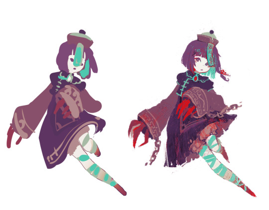
wip vs finals; paint-blob edition
#process#been having a field day experimenting with the layer outline setting#these ones too i was trying out layer screentones as texture
1K notes
·
View notes
Text


a collection of my favorite clip studio brushes that i shared on bsky a while back - i figured i'd share it here too! they are all FREE!! (or were last time i checked like 6 months ago)
#process#clip studio paint#csp#sowry for not posting much recently. i have life.#been doing a lot of fiber arts that are just 4 me ^__~
865 notes
·
View notes