#create logotype
Explore tagged Tumblr posts
Visit Tumblr Blog
Explore Tumblr blogs with no restrictions, modern design and the best experience.
Last Seen Tumblr Blogs


Fun Fact
Mobile US users spent an average of 115.8 minutes on Tumblr app monthly.
Text
The process of creating a logo "Mercheater" in a deathcore style.
#deathcore#deathcore logo#death metal logo#logotype#logo#metal logo#create process#logo process#create logotype#digital art
0 notes
Text
From Logotypes to Taglines: The Essential Elements of Your Small Business Brand
Introduction Creating a strong brand is crucial for small businesses aiming to stand out in a crowded marketplace. From logotypes to taglines, understanding the essential elements of your small business brand can set the foundation for lasting customer relationships and business growth. This comprehensive guide explores how to effectively harness these elements, ensuring your brand resonates…
#best practices for brand management#Brand#Branding strategies for small businesses#building brand loyalty#Business#business growth strategies#corporate social responsibility#creating a strong brand identity#customer relationship management#digital marketing for startups#e-commerce tips for businesses#Elements#Essential#how to scale your business.#how to start a successful business#importance of social media for businesses#influencer marketing for brands#Logotypes#Small#small business funding options#Taglines#top business trends 2024
0 notes
Text
Here's an internet first to celebrate my forty-first birthday: I submit to you the complete illustrations SCEJ used as cover art for the Japanese editions of Siren and Siren 2, created by Shinsaku Fujita. Uncropped. No logotypes. No text.
#siren#forbidden siren#shinsaku fujita#artwork#cover art#illustration#scej#playstation 2#survival horror#j horror#japan studio
1K notes
·
View notes
Text

❥ K I N K T O B E R 2 0 2 3
Masterlist
➽──────────❥
❥ DAY 3. Camgirl! with Eren Jaeger
Summary. Eren got you a tulip necklace on your birthday, one that you never take off, not even during your livestreams on a secret site at night. And Eren could recognize that necklace anywhere.
Content Warning. Fem! reader, no use of y/n, all characters are adults, smut, use of a toy, overstimulation, maturbation (both receiving).
Word count. 3,056.
MINORS OR AGELESS BLOGS DO NOT INTERACT !!

Seeing how you get so excited by receiving something so small and simple as a necklace with the shape of a tulip makes Eren's heart throb uncontrollably from excitement.
He created all the design from zero, keeping in mind one time where you told him that your favorite flower was the tulips. Every minute of designing it and working long shifts to pay it totally worth it when you jumped on his arms giggling about how grateful you were to have a bestfriend like him.
Even though he had some girlfriends in the past, his big crush on you never disappeared completely.
Small touches and risky jokes about how it would be if you both would start dating were the farthest that he achieved to make you blush and think a little of the idea of dating him.
This was making him go crazy, but he enjoyed those moments when you kept hugging him longer and tighter than usually.
Some weeks later after giving you that gift —and loving the fact that you never take it off— he came home early from Uni tired from his assignments. All that he wanted was just to find something to distract himself a little and forget about all his final projects piling up on his desk.
Looking at the clock it was still too soon before Armin came home from work, and the games on his console were updating.
Since he was alone, stressed and single, he opened a tab with a particular logotype that he usually only opens late at night. He reminds himself that it will be quick and just to relax a little before starting working on his lab reports.
Anyways— the neckline that you chose to wear today combined with the necklace were calling for his eyes all day, almost feeling like you noticed the way his eyes darted down in the middle of your conversations.
While fighting with his inner thoughts, he starts to scroll down with a blush on his face.
There were the usual miniatures of the typical plots, maybe it was on his saturated brain but any of those titles or previews were particularly calling for his attention.
When he clicked back to the top of the page, the option of "Livestream" awakened an interest in him.
He didn't usually watch those thanks to being used to watching this kind of stuff at night since his schedule and Armin's were almost the same, which led to not having too much time alone at home.
But today things were a little bit in his favor, so he clicked on it.
There was a top ones where you could only access if you paid a fortune for it, so he scrolled more to find the ones of the "Rising stars", one of them was called "TulipGarden" which made him smile at the sudden thought of you coming to his mind.
When he checked the profile, there was only a cutted photo of a girl in a red bra. The photo only showed her smile and her breasts, which gave him a small hint that the girl was cute, so he clicked it and paid a considerably smaller amount to enter.
Eren throws his head back sighing while the charging screen loads the stream, it's the first time he does this and it feels a little weird. Connie once confessed that he spent like 200 dollars on a cam girl he used to follow. He's not the kind of guy who crushes instantly on a hot girl like his friend, so this might be a one time thing.
"Oh! Welcome to the stream, KrugerSoldier!"
The sound of that familiar soft voice drives a cold shiver through his spine, causing him to straighten on his seat and look immediately at the screen in a way that makes his head go dizzy for some seconds.
There you are. Well, a part of you, since half of your face is covered with a white burlesque mask. But he could recognize that voice anywhere, just like that hair, those lips, that skin, and specially: that necklace.
Eren has to bite his lower lip when his eyes can't get off from how that necklace swings between the curve of your clothed breasts with a white lingerie while you lean over to the screen to read the comments. Letting all the viewers see how good your tits hang almost exposed.
Thankfully, he chose as nickname the last name of a friend of the family who used to take care of him when he was a child, so you don't know yet that it's your best friend.
Sorry, Sir Kruger, hope anyone who knows you finds about this username.
"Okay, since there are some new guests on my stream I'll repeat the donation goals!" Since you were seated again on the chair, Eren's attention got back again to your masked face. "Listen carefully! I won't repeat it, okay?"
Eren nods completely stunned even if you can’t see him. At this point he doesn't even care if Armin comes and opens the door to find him in such a compromising situation.
“Well, as you know, through the donations you can control my… toy” Your face gets blushed, even if your cheeks are half covered, the viewers can notice the cute blush growing on them. They love to see your shy reactions previous to the show of how the lust gets all over you, causing the notifications to start blowing a little and make you bite your lip as you close your eyes, throwing your head back. “Yeah… Just like that”
The donations are just like one or five dollars, so the vibrations aren’t intense, but enough to have you already squirming on your seat struggling to keep talking, you can only whine and thank them for the donations with a broken voice.
Oh.
So she's into that.
Eren’s reaction is not far from yours with his head thrown back like yours, his hand is already squeezing softly his hard cock above his gray sweatpants and the soaked spot on his boxers might betray him soon.
Your voice is coming out stained, trying to keep talking through the stimulation of the small pink toy vibrating inside your core as the notifications keep coming.
“G-God! Fuck…” The notifications stopped a little, but the insane wave of them interrupted your words by leaving you breathing hard as you try to recompose and hols the border of your desk to look again at the screen. “Y-You missed me a lot, as I see. Well, as I was saying–”
Kruger Soldier has donated 30 dollars!
A louder “Ding!” resonates on the stream along with the high pitched moan coming out from your mouth as the strong vibrations invade you for some seconds.
You squirm on the gaming chair like you’re trying to escape from the small toy buzzing inside you, covering your mouth and trembling as the site blows a banner saying “Congratulations! Second goal achieved: Getting off from the underwear!”
Even if Eren’s aching cock is already being tortured by his hand stroking it harshly up and down, he’s surprised about how hard the vibrations were sent due to his high donation.
Truth has to be said, he planned to just donate 20 but his finger slipped while he was freeing his erection from his pants.
But he’s not complaining when he sees you sliding down the braces of your bra with a lustful smile, biting your lip while your body is still trembling.
“I see that the new one is a little eager, huh? If you keep that peace I might think of giving you a reward…” His eyes widen, not only by knowing that you’ll reward him if he spends his entire wallet on making you squirm in front of hundreds of strangers, but also by the sight of your bare tits on display for him.
He has fantasized a lot about seeing you naked when he’s touching himself like now. Imagining how they would bounce after taking off your bra while you ride him, and that thought can finally be checked on his list of fantasies— at half, at least.
He lets out a stained moan coming from his mouth squeezing himself a little harder seeing how you shake them in front of the camera. His mind is going more dizzy right now, he could die right now and he’d be totally happy that his last view is how good that necklace looks between your breasts.
And when you shake them on camera? God— He might fucking cum already.
Best fucking present in the world.
The notifications start to blow again, getting a little higher numbers just to get you on the sweet edge of pleasure just like always.
An idea comes to your mind since there's such a good welcome this time, and you take a quick glance to the bed behind you.
Your desk is just in front of your bed, just for ease when the streams get a little more heaty, this kinda looks like an occasion for it. But you need a little reassurance from your viewers, just to be sure.
“Y-You guys are being so good to me today… Should I– Fuck!” Eren has sent another multiple small donations that make you break the character for a little, making you tremble and see again how good those tits look when you start to shake.
The moans can't be held when the vibrations are being sent without a break for you. Your cunt is dripping on the small toy and you have to tangle your fingers on your hair while the other squeezes your breast to not, finally, rub your clit to reach the orgasm.
“You really like to tease me a lot this time…" You see the comments praising you for such a good show and you take a breath before continuing, trying to keep the character. "D-Do you want me to get on the bed for a better show? One for no, two for yes. But I'll leave the decision on our new good visitor, Kruger Soldier. Just for being so good to me, y'know."
The small body on his screen is trembling, already feeling close and you have just reached the second donation goal to get naked, but the way you still manage to keep the act makes Eren snort with a big smile.
You're so cute.
But for you he's the devil.
That damn viewer is sending you so many constant donations that at this point you could cum just by seeing his name on the screen, predicting that this might be the donation that might be getting you screaming his username.
Kruger Soldier has donated 10 dollars!
Even though the vibrations make you moan sharply on your hand, it disappoints you a little that he chose to keep it on the chair.
“O–On the chair, will be then.” You huff, still squirming but a little sad, until another wave of vibrations startles you on your seat in a cry.
The notification sound comes again, from the same user, but this time it comes with a message: “Srry. You said two for yes, right? My bad:)”
You bite your lip at the message after you recover from the intense stimulation, holding your laugh.
This person is clearly teasing you, but you’re starting to enjoy this little game. Anyways, you’re always grateful for a good tip during your streams.
Eren is already close to the orgasm when you get on the bed, letting the camera catch how good your naked boy looks. But he won’t cum now, even if his balls are begging for the release he won’t. He wants to cum with you.
No, he needs it.
When you get on the bed facing the camera, he gets a little sad of not being able to get the view of your ass in delight for him just like your tits before, but he won’t start complaining right now that his red tip is almost exploding with an orgasm.
With small donations of 5 dollars, Eren doesn’t even gives you time to get comfortable on the bed, already having you bending on the bed, with your chest pressing on the mattress as you hold the sheets on your fists, trying to hold something to repress the hard waves of pleasure covering you while your knees try to keep your ass up to give the viewers a good view of the curve of your back.
There's still a part of you that chose this position to let you enjoy the pleasure, wrinkling your eyebrows through the torture of the pleasure and being free to scream on the sheets.
Your moans are harder than ever in a stream before, due to being a “rising star”, your donations are usually small and not that constant, so you aren't used to being this stimulated.
But this new viewer is so stubborn with the notifications that you’re almost forgetting that you’re on live when your hand stops grabbing the sheet to rub almost violently on your clit to reach the sweet orgasm.
On the other side, Eren is already sweating hard, wanting to take off his hoodie to stop dropping on his clothes like he just finished working out, but that would mean stopping giving him pleasure just at the same time as you as he keeps donating.
“Fuck— Please cum, dear…” His voice is already so needy, a small tear coming out from his left eye as his hand gets a rougher and messier peace.
You both already forgot what you are doing, what page you are on or even the fact there are a lot of other people watching you.
The screams of your pleasure are being sinked on the matress but the camera still gets your legs shaking and your cunt tightening around the —fucking still vibrating— toy. You cry hard against the sheets as you ride the orgasm when the viewers start to enjoy your high.
It’s then, when you scream hard against the mattress and your body shakes and rolls on the bed, compulsing and arching of the pleasure that the vibrator is giving you. You grab your tits, thighs, hair and the sheets trying to control the intense shaking of your body as the juices of your cunt blow, soaking on the mattress and making a wet lustful mess of a squirt.
Meanwhile, Eren is cumming harder than ever in his life in a loud moan that chants your name and covering his hoodie and sweatpants with white strings and stains of cum.
He knows that this is going to be a headache to clean, mostly because it is his favorite hoodie because you gifted it to him on christmas but it’s okay.
You won't get mad if you're the reason why it's dirty, isn't it?
Seeing how you’re still laying on the bed, with spreaded shaky legs and still compulsing a little because of the hard orgasm is —even if the context is not the best— the cutest thing.
How you try to get up, holding the bed with weak arms and trying to catch your breath when you walk, trembling to the chair and sitting, fixing your hair a little and smiling shyly.
Eren is not sure if the blush on his face is because of his previous orgasm or because he's madly in love with you.
“Hey… I–I’m sorry, I think that I should…” Your voice is husky and shaky, it even gives the hint that you’ve never came like this on live since your embarrassed reaction. “I should end the stream right now, I… I’m too weak to keep going. I love you guys!”
You wave at the camera shyly and send some kisses before the screen goes black. Eren closes his eyes, still struggling to calm after what he saw and did. He didn’t expect to find you on a page like this but he also can’t complain after almost spending all his money on making you cum.
⋆·˚ ༘ *
“You should fight with your boss for a raise on your pay. Seriously.” You rest your elbows on the bar of the cafeteria, waiting for your coffee as Eren is preparing it.
“I know that you just want me to take you to watch that movie that you like.” Eren grabs your nose between his knuckles, making you whine and blush at his action.
Since he saw you on that page, he has never entered that section again. But he’s gotten more flirty with you, he wants to own you, to see that cute fucked out face again.
But only for him.
You pout at him and caress his hand when he lends you the cup, causing him to tense when your nails caress softly his veins.
“That's true but only a part of it. Come on, I miss you!” Your words make his chest throb and breathe heavy, almost making him grab your face and kiss you. “And, why do you suddenly need money? What did you spend your money on?”
Eren’s eyes glance down to your neckline, where the tulip necklace rests and slowly starts darting to your glossy lips and finally your eyes. He know that you noticed how his eyes almost ate you out but, since you didn’t leaned back from the touch, he brings his other hand up to your face and put a string of hair behind your ear, making you shiver at the contact.
"And what about you? Don't you have a job or something?" He ignores your question, looking deeply in your eyes.
You laugh softly, shaking your head, still caressing his hand with your thumb.
"No, I don't. I had one but it got boring and I dropped it." Eren chuckles at the answer, leaning a little closer to you and making your breath knot on your throat as you glup.
"That 's better. I want to be the only one who spends his entire wallet on you. No one else, okay?"
Eren has to hold himself from kissing you when you nod, biting your lip, giving you your coffee and asking you to wait for him while he changes into his normal clothes.
Maybe clicking on that stream was the best decision he could ever made.
@softlilpeachxx
#aot smut#eren jeager smut#eren smut#eren x reader#eren yaeger smut#snk smut#eren jeager x reader#eren x y/n#eren x you#eren yaeger x reader#aot x reader#attack on titan x reader#attack on titan smut#snk x reader#kinktober 2023#kinktober#brilium
737 notes
·
View notes
Text
youtube
Bloody Painter Dating Sim Game Official Trailer ● itch io➔ https://delucat.itch.io/bloody-painter-dating-sim ● Steam➔ https://store.steampowered.com/app/3214880/ ● 10th Anniversary Merchandise➔ https://delucat.com/en/collections/bloodypainter Merchandise Pre-orders open on October 14th, close on November 30, 2024. Shipping in February 2025.
This is an official romantic horror visual novel game created to celebrate the 10th anniversary of the character from 'Bloody Painter' and to give back to the fans for their support. It is a spin-off based on the 2017 version of the story.
🩸STORY🩸 You have unfortunately been captured by a serial killer, and you must increase your chances of survival within seven days. Your choices will determine how he treats you and the outcome of your relationship. What will your final relationship with him be...? Will there be a change in the relationship between the killer and his prey?
🩸CREDITS🩸 Development. Story. Programming by 迪鹿DeluCat @DeluCatOfficial Graphics by 牛奶 @milk890522 Background by kurumi2179、迪鹿DeluCat @DeluCatOfficial Logotype by サヤカ @laipeng16 oice Acting by Easton Trailer by ZAO @ZAO_Studio_
#visualnovel#indiegame#BloodyPainter#Bloody_Painter#BP#Creepypasta#血腥畫家#Bloody_painter_10th_anniversary#Bloodypainter10thanniversary#Bloody_Painter_Dating_Sim_Game#BloodyPainterDatingSimGame
99 notes
·
View notes
Text
I created logo for my au Rayman: Neverlasting Nightmare cuz I was bored

the logotype was inspired by Rayman Legends' logotype

second version (my favorite)
#rayman#rayman au#rayman neverlasting nightmare au#logo#alternative universe#boredom#tw: a lot of eyes
14 notes
·
View notes
Text
Uncovered: The Ninja Tales
3. Machinedrum - 3FOR82 (2024)
To complete our trilogy of ‘The Ninja Tales’, Part III takes a look at the hidden spot gloss ASCII artwork for Travis Steward's aka Machinedrum’s 11th studio album, 3FOR82 out on Ninja Tune on 24th May 2024. It is reported that Stewart crafted the album during a pilgrimage to Joshua Tree National Park, California, to seek clarity and inspiration, saying, “..I knew that I should, at some point in my life, go out there to work on something creatively.”

Fascinated by the outwardly simple artwork that, in reality has many hidden depths, we caught up with graphic designer and Machinedrum's Creative Director, Joseph Durnan and Ninja Tune’s Head of Production, Sean Preston to understand more about the process for creating the album’s hidden code artwork using The Demoscene. For us mere mortals unfamiliar with The Demoscene, it is an international computer art subculture made up of a worldwide network of creative minds, focused on producing demos: self-contained, sometimes extremely small, computer programs that produce audiovisual presentations.
Joseph told us, “One component we latched onto early was the Demoscene's challenge of keeping file sizes as low as possible while maximising the complexity of the demos. ASCII art, halftoning, and duotone degrading helped express that idea, with legendary demoscener TPOLM's art and Travis' (Machinedrum) personal artefacts from his teenage years acting as source material. The words flooding the sleeve and hidden code are nods to personal messages within Demoscene culture—references to in-jokes, cryptic sayings and messages to other demo makers. I liked how this type of content could either seem conceptual and esoteric to an outsider, or something between total gibberish and a confusing nerdy joke. Blending this with the 3FOR82 process involved using personal numbers related to birth dates, in-studio references among the album collaborators, and redundant information about the WAV files for the album tracks.”


Accompanying the record is a 16-page boutique zine. Joseph explains, “The accompanying zine goes deeper into the archival aspect, including rules from a quest-style video game imagined by Machinedrum as a child and a transcript from his first-ever interview. It also features nostalgic cyber-culture-style artwork contributions from Sensory Works and bitmapped photos from studio shoots with Tinashe and AK the Saviour.”
The limited edition translucent yellow glow vinyl edition, includes an alternative Dinked album art oversleeve and Joseph told us more about this, “For the limited edition Dinked art, TDR's Ian Anderson "3FOR82" font was degraded via an online ASCII art converter, overlaid with the T-26 font "Bias” for the MACHINEDRUM type. The font non-coincidentally looks good with Ian's logotype because a lot of the T26 foundry's typefaces made their way into his designs in the 90s and early 00s - which is widely held up as an era defining body of work within that world. Something definitive of the visual language of electronic music was how much of the artwork developed with technology, mirroring the way the Demoscene visuals have mutated over the past 30 years.”


Ninja Tune’s Head of Production, Sean Preston worked alongside Durnan on the album artwork and gave us his insight into the creative process.
He told us, “I think if anyone else other than Joe had come to me with the premise for the latest Machinedrum album I would’ve done all I could to put them off, but having suffered under the designer’s collaboration for several years, I was all too aware of his penchant for ASCII art, glitchy graphics, and secret gifts/traps buried deep within pixel data for me to find. Sometimes, where you land with the final packaging on a record, is more pleasing or rewarding because of the pitfalls laid before it, most of which in this instance we couldn’t have known ahead of the course.”
Sean explains, "Initially pencilled for manufacture in Ireland, we had to pivot to printing some of the sleeves there, stickers, zine booklet and o-card (for the Dinked edition) in three separate locations in the UK, and pressing the vinyl in France. The danger in working that way is that most printers have their own calibration settings for sleeves and o-card sizes. It also presents a risk to hitting colour consistency across the print parts. Getting printers to talk about these things with each other isn’t always a harmonious of fruitful pursuit, but with a good amount of physical proofing, some nervy stress tests, the record comes together really well.”


We asked more about the 16 page zine insert and Sean explained, “The zine booklet, complete with French folds, feels like a real artefact, centring the artwork’s ambition on an uncoated offset paper and card. The outer sleeve is 6-colour, utilising a bright Pantone Green and Pantone Orange against a CMYK composite, overlaid with a blind spot varnish. A blind varnish is a varnish that doesn’t necessarily correspond to the colour artwork it is printed on. Often when you see this, the blind varnish is vibrant, blind only in name, and usually employed as large block text, which requires a certain level of legibility. I visited the printer near Dublin specifically to get the right amount of subtlety to the overlaid varnish. Because of the miniscule, dotted areas occupied by the varnish, the traditional method of varnishing wasn’t going to give us the fine detail desired. The beauty of working with the sort of printer we did (AngloPrinters in Drogheda, around 45 mins north of Dublin) is that they are experienced and agile enough to recognise intention and move to solutions that benefit the artistic purpose. The finished sleeve now holds a finely detailed varnish that is present in light, but subtle enough to maintain the overall clandestine aesthetic that pervades the album’s artwork and music.”

youtube

3FOR82 by Machinedrum is released on Ninja Tune on 24th May 2024. Artwork by Joseph Durnan [124 World]. Typography by Ian Anderson (The Designers Republic). Record FlipFrames by Art Vinyl.
#art vinyl#album cover art#digital art#record cover#machinedrum#ninja tune#graphic design#ascii art#demoscene#artanddesign#uncovered
9 notes
·
View notes
Text
7 Types of Logos: How to Use Them for Your Custom Ecommerce Website
A logo is an image that symbolizes your business. But did you know there are 7 different types of logos?
Though they’re all a combination of typography and images, each type of logo gives your brand a different feel. And since your logo is the first thing new customers will see, especially on a custom ecommerce website, you want to make sure you get it right.
Here are the 7 types of logos you need to know about:
1. Monogram (or lettermark) logos 2. Wordmark logos 3. Pictorial mark logos 4. Abstract logo marks 5. Mascot logos 6. The combination mark 7. The emblem
Want to know how to choose the best logo type for your business? Read on!
1. Monogram logos (or lettermarks)
Monogram logos or lettermarks are logos that consist of letters, usually brand initials. IBM, CNN, HP, HBO… Noticing a pattern, yes? They’re the initialisms of a few famous businesses with rather lengthy names. With 2 or 3 words to remember, they’ve each turned to using their initials for brand-identification purposes. So it makes perfect sense for them to use monograms — sometimes called lettermark logos — to represent their organizations.
A lettermark is a typography-based logo that’s comprised of a few letters, usually a company’s initials. The lettermark is all about simplicity. By utilizing just a few letters lettermark logos are effective at streamlining any company brand if they have a long name. For example, how much easier is it to say — and remember — NASA versus the National Aeronautics and Space Administration?
Because the focus is on initials, the font you choose (or create) is very important to make sure your logo is not only on-theme with what your company does, but also legible when you print on business cards. Also, if you’re not an established business already you may want to add your full business name below the logo so people can begin to learn who you are right away.
2. Wordmarks (or logotypes)
Similar to a lettermark, a wordmark or logotype is a font-based logo that focuses on a business’ name alone. Think Visa and Coca-Cola. Wordmark logos work really well when a company has a succinct and distinct name. Google’s logo is a great example of this. The name itself is catchy and memorable so, when combined with strong typography, the logo helps create strong brand recognition.
Also, like with a lettermark logo, typography will be an important decision. Since the focus will be on your name, you’ll want to pick a font — or create a font — that captures the essence of what your business does. For example, fashion labels tend to use clean, elegant fonts that feel high-end, while legal or government agencies almost always stick to traditional, “heavier” text that feels secure.
When to use lettermark and wordmark logos:
Consider a lettermark logo if your business happens to have a long name. Condensing the business name into initials will help simplify your design and likewise, customers will have an easier time recalling your business and your logo.
A wordmark is a good decision if you’re a new business and need to get your name out there, just make sure that name is short enough to take advantage of the design. Anything too long can look too cluttered.
A wordmark logo is a good idea if you have a distinct business name that will stick in customers’ minds. Having your name in a great, designed font will make your brand all the stickier.
Both lettermark and wordmark logos are easy to replicate across marketing material and branding thus making them highly adaptable options for a new, and developing, business.
Remember that you’ll want to be scrupulous when creating a lettermark or a wordmark. Your business name in a font alone likely won’t be distinct enough to capture the nuance of your brand. So make sure you hire a professional who’ll have an eye for detail.
3. Pictorial marks (or logo symbols)
A pictorial mark (sometimes called brand mark or logo symbol) is an icon — or graphic-based logo. It’s probably the image that comes to mind when you think “logo”: the iconic Apple logo, the Twitter bird, the Target bullseye. Each of these companies’ logos is so emblematic, and each brand so established, that the mark alone is instantly recognizable. A true brand mark is only an image. Because of this, it can be a tricky logo type for new companies, or those without strong brand recognition, to use.
mark is what image to choose. This is something that will stick with your company its entire existence. You need to think about the broader implications of the image you choose: do you want to play on your name (like John Deere does with their deer logo)? Or are you looking to create deeper meaning (think how the Snapchat ghost tells us what the product does)? Or do you want to evoke an emotion (as the World Wildlife foundation does with their stylized image of a panda — an adorable and endangered species)?
4. Abstract logo marks
An abstract mark is a specific type of pictorial logo. Instead of being a recognizable image — like an apple or a bird — it’s an abstract geometric form that represents your business. A few famous examples include the BP starburst-y logo, the Pepsi divided circle and the strip-y Adidas flower. Like all logo symbols, abstract marks work really well because they condense your brand into a single image. However, instead of being restricted to a picture of something recognizable, abstract logos allow you to create something truly unique to represent your brand.
The benefit of an abstract mark is that you’re able to convey what your company does symbolically, without relying on the cultural implications of a specific image. Through color and form, you can attribute meaning and cultivate emotion around your brand. (As an example, think about how the Nike swoosh implies movement and freedom).
5. Mascots
Mascot logos are logos that involve an illustrated character. Often colorful, sometimes cartoonish, and most always fun, the mascot logo is a great way to create your very own brand spokesperson — er, spokes-character(?).
A mascot is simply an illustrated character that represents your company. Think of them as the ambassador for your business. Famous mascots include the Kool-Aid Man, KFC’s Colonel and Planter’s Mr. Peanut.
Mascots are great for companies that want to create a wholesome atmosphere by appealing to families and children. Think of all those mascots at sporting events and the great dynamic they create by getting involved with the audience!
When to use picture and symbol logos:
A pictorial mark alone can be tricky. It’s effective if you already have an established brand but that’s not a hard and strict rule. You can use brandmarks to your advantage to convey what your business does graphically if your name is too long, and they can also be used effectively to convey a desired idea or emotion.
Pictorial and abstract marks also work quite well for global commerce if, for example, a business name doesn’t lend itself well to translation.
A pictorial mark however may not be the best idea if you anticipate changes to your business model in the future. You may start off selling pizzas and use a pizza in your logo but what happens when you start to selling sandwiches or burgers, or even produce?
Abstract marks allow you to create a completely unique image for your business, but are best left to design professionals who understand how color, shape and structure combine to create meaning.
Think about creating a mascot if you are trying to appeal to young children or families. One big benefit of a mascot is it can encourage customer interaction so it’s a great tool for social media marketing as well as real-world marketing events. I mean, who doesn’t want to take a selfie with the Pillsbury Doughboy?
Remember that a mascot is only one part of a successful logo and brand, and you may not be able to use it across all your marketing material. For example, a highly detailed illustration may not print well on a business card. So put some consideration in the next type of logo design below, the combination mark.
6. The combination mark
A combination mark is a logo comprised of a combined wordmark or lettermark and a pictorial mark, abstract mark, or mascot. The picture and text can be laid out side-by-side, stacked on top of each other, or integrated together to create an image. Some well-known combination mark logos include Doritos, Burger King and Lacoste.
Because a name is associated with the image, a combination mark is a versatile choice, with both the text and icon or mascot working together to reinforce your brand. With a combination mark, people will also begin to associate your name with your pictorial mark or mascot right away! In the future, you may be able to rely exclusively on a logo symbol, and not have to always include your name. Also, because the combination of a symbol and text creates a distinct image together, this type of logo is usually easier to trademark than a pictorial mark alone.
7. The emblem
An emblem logo consists of font inside a symbol or an icon; think badges, seals and crests. These logos tend to have a traditional appearance about them that can make a striking impact, thus they are often the go-to choice for many schools, organizations or government agencies. The auto industry is also very fond of emblem logos. While they have a classic style, some companies have effectively modernized the traditional emblem look with logo designs fit for the 21st century (think of Starbucks’ iconic mermaid emblem, or Harley-Davidson’s famous crest).
But because of their lean towards higher detail, and the fact that the name and symbol are rigidly entwined, they can be less versatile than the aforementioned types of logos. An intricate emblem design won’t be easy to replicate across all branding. For business cards, a busy emblem may shrink so small before it becomes too difficult to read. Also, if you plan on embroidering this type of logo on hats or shirts, then you’ll really have to create a design that is on the simple side or it just won’t be possible. So as a rule keep your design uncomplicated and you’ll walk away with a strong, bold look that’ll make you look like the consummate professional.
When to use a combination mark or emblem logos:
A combination mark is a great choice for pretty much any business out there. It’s versatile, usually highly unique, and the most popular choice of logo among prominent companies. (We also see A LOT of combination mark logos get created on 99designs.)
An emblem’s traditional look might be favored by lots of public agencies and schools but it can also serve any up-and-coming private business quite well, especially those in the food and beverage industry: think beer labels and coffee cups (Starbucks!). But remember to play it safe when it comes to detail. You still want a design you’ll be able to print neatly across all of your marketing material.
There you have it. A breakdown of all the types of logos out there.
Want more logo design tips? Learn how to design a logo here.
#app development services#custom erp#web and mobile app development company#ecommerce development services#flutter mobile development#digital consulting#custom ecommerce website#erp development
3 notes
·
View notes
Text
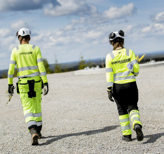


Logotype rework and graphic profile created. The reworked logo is here used in signage, on work machines & vehicles, and on workwear among other things.
3 notes
·
View notes
Text
Luci logotype logomark design process Created by @anhdodes - Anh Do - logo designer
Need a professional logo design? Want to get this logo design? CONTACT US! Check out our logo collection: Logoadoni © 2024 Anh Do - Logo Designer
#logo design#monogram logo#logo designer#artists on tumblr#branding#design#animal logo design#digital art#digital illustration#graphic design
9 notes
·
View notes
Note
tell me your favorite legible font that isnt comic sans i want to know for promo graphic reasons
Handwritten eg for comic letteringO Lexia Readable
Script, eg for signatures: Learning Curve
Serif eg for print: Crimson
Sans serif, eg for websites: Coolvetica
I waffled on monospace recs because "my" favourite is Open Dyslexic Mono, but let me be clear: it is HIDEOUS it is the fucking butt ugliest goddamn font.
But it reads so easy on my notepad...
14 notes
·
View notes
Text
I will create an vintage automotive and car logo
"Design retro, vintage, automotive and auto detailing car logo"
Show off your car by turning it into logo creation! This is unique and really good for your business logo and t-shirt design.
#GoodFriday #ALNST
#automotivelogo #carlogo #logo #logodesigner #graphicdesign #logotype #brandingdesign #logodesign #branding #automotive #logodesigns #digitalmarketingagency #graphicdesigner #socialmediamarketing #logoconcept #logoinspiration #frrdesign #marketingdigital #promovareonline #logos #afacerionline #detailinglogo #marketingonline #serviciidigitale #racing #offroad #designgrafic #businesscard #afacerelocala #socialmediapost
#GoodFriday#ALNST#automotivelogo#carlogo#logo#logodesigner#graphicdesign#logotype#brandingdesign#logodesign#branding#automotive#logodesigns#digitalmarketingagency#graphicdesigner#socialmediamarketing#logoconcept#logoinspiration#frrdesign#marketingdigital#promovareonline#logos#afacerionline#detailinglogo#marketingonline#serviciidigitale#racing#offroad#designgrafic#businesscard
2 notes
·
View notes
Text
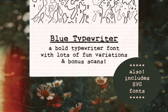
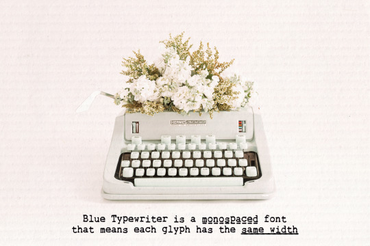
Blue Typewriter is a bold typewriter font and scans pack (with graphics, text, paper) sampled from old documents, for an authentic vintage look. Use this set in any designs that needs a vintage touch: in long or short texts, in digital collages, branding and packaging, social media posts, logotypes, etc.
Included in this product:
Blue Typewriter font with variations: underlined, dashed, crossed-out and dashed underline, in SVG and vector versions (with the vector versions created separately, so that the two versions include subtle differences)
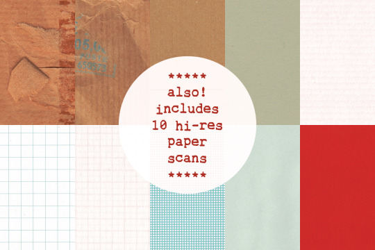
10 high resolution paper textures in PNG and JPEG (minimum width around 2500 px)
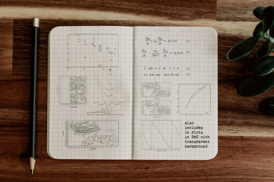
16 plots and equations with transparent background sourced from vintage scientific material
Get it at my website, Creative Market or The Hungry JPEG
8 notes
·
View notes
Text

Different versions of the Gen Design logotype/logomark. I find myself gravitating toward the design at the center, although I understand the need to create a certain distance from the past. In the end, they chose wisely.
Source: The World of Fumito Ueda, Kodansha 2023
27 notes
·
View notes
Text


Introducing new logo design concept for EnviroSpin.
----------------
Client: EnviroSpin
Logotype: Abstract Logo
Industry: Eco Products
-----------------
-----------------
Instagram: @gavi_digital
WhatsApp: +94 71 897 5976
E-mail: [email protected]
-----------------
#logo design#creative logo#graphic design#gavi#gavi digital#gavi ads#logo design sri lanka#logo#abstract logo
2 notes
·
View notes
Text
Future Fonts Feature Friday 1dec2023


Ampersandist by Space Type (version 0.2 ATTOW)
I feel like everyone who writes an ampersand with a broad edge nib will look at it and go, "Wow, this fucks", and they'd be absolutely right.
This work-in-progress typeface started as a logotype for a project called Ampersandist. In addition to the logotype, I created various ampersands to be incorporated into the visual branding. - Lynne Yun

Inspired by the work of the fantastic Villu Toots and Oldřich Menhart, Yun transforms their intimate relationship with calligraphy into a font that truly captures the feeling of expressing boldy with a broad edge.

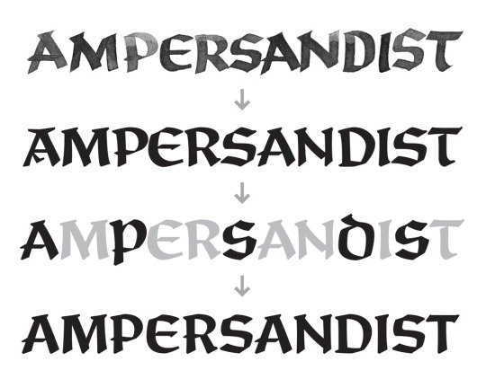
It's genuinely great work; I highly recommend checking it out and considering using it for your fantasy or pre-industrial age-themed work. It's nicely legible from afar, and the three weights really make for a great pairing. I can totally see this on a playing card for a fantasy card game.
Sexy type. Would intimately sit together in a castle room with only a lit candle/10
You can support it here on FutureFonts.xyz
5 notes
·
View notes