#css course
Explore tagged Tumblr posts
Visit Tumblr Blog
Explore Tumblr blogs with no restrictions, modern design and the best experience.
Last Seen Tumblr Blogs


Fun Fact
Tumblr was the first site to host the blog for President Barack Obama in 2011.
Text
A lot of people call making (mostly static) websites "coding" and fair enough honestly. But it always seems kind of weird to me. When I think of programming I think of the beauty in structure and natural abstractions that you design to communicate ideas, often based on mathematical truths. Meanwhile web development is pure hell, nothing works ever. If it's working then you forgot to test on some browser version that every one of your friends is using for some unknown cosmic reason. It's all opaque and nothing makes sense, there's no beauty, only ire. It only gets worse the deeper into "real" programming you go (Javascript etc.).
#programming#coding#of course it's more nuanced than this#you can make beautiful HTML/CSS/JS#you can make horrendous nonweb code#but deep down this is how I feel#intuitively
11 notes
·
View notes
Note
Idk if anyone's ever asked you this but how do you go about animating? i.e. what program do you use and what's your process?
I really wanna start animating but it seems like such a daunting task lol
okay lots of words so. under the read more lmao
toon boom harmony is industry standard 2d animation software so thats what i use for freelance work and more finished things like that antibodies animation (though i did the bg painting in procreate) – but totally not the ideal software for just starting out with animation lmao not to mention the fact that its a subscription :/// small sketches like that gif of bones i posted i'll sometimes tackle in procreate or procreate dreams, which are wayy more affordable and user friendly, even if theye a bit less robust.
if youre looking for a combination of robust software with the best price, blender is free and has 2d capabilities that ive messed around with a few times – its super cool, but the interface can be confusing if you've never worked in blender before and it has a bit of a steep learning curve BUT theres also always always always good ol paper and pencil, and nowadays most people own a camera and can access video editing software to stitch things together the best things to start out with are the basics, like a ball bounce animation, different weight objects falling, walk cycles – once you get an understanding of how timing works with animation, then tackling how characters move is the next step. just going into complex characters right off the bat is an easy way to get frustrated FAST lmao starting simple is always the way to go also a lot of cartoons and stuff move A Lot Less than you would think, a 10 second animation at 12 frames per second is almost never going to be 120 different individual drawings – sometimes you can just get away with a few blinks and a bit of lip sync to really sell an animation, so while animation does take a lot of time and effort try not to be too intimidated!!
#also there are a lot of youtube tutorials out there if that helps#im not too experienced with rigging and im hoping to give myself a crash course in harmony rigging sometime soon#maybe after i finish learning html+css lmao i gotta finish that video first#ask#ghostfrog81
52 notes
·
View notes
Text
The Importance of Investing in Soft Skills in the Age of AI
New Post has been published on https://thedigitalinsider.com/the-importance-of-investing-in-soft-skills-in-the-age-of-ai/
The Importance of Investing in Soft Skills in the Age of AI
I’ll set out my stall and let you know I am still an AI skeptic. Heck, I still wrap “AI” in quotes a lot of the time I talk about it. I am, however, skeptical of the present, rather than the future. I wouldn’t say I’m positive or even excited about where AI is going, but there’s an inevitability that in development circles, it will be further engrained in our work.
We joke in the industry that the suggestions that AI gives us are more often than not, terrible, but that will only improve in time. A good basis for that theory is how fast generative AI has improved with image and video generation. Sure, generated images still have that “shrink-wrapped” look about them, and generated images of people have extra… um… limbs, but consider how much generated AI images have improved, even in the last 12 months.
There’s also the case that VC money is seemingly exclusively being invested in AI, industry-wide. Pair that with a continuously turbulent tech recruitment situation, with endless major layoffs and even a skeptic like myself can see the writing on the wall with how our jobs as developers are going to be affected.
The biggest risk factor I can foresee is that if your sole responsibility is to write code, your job is almost certainly at risk. I don’t think this is an imminent risk in a lot of cases, but as generative AI improves its code output — just like it has for images and video — it’s only a matter of time before it becomes a redundancy risk for actual human developers.
Do I think this is right? Absolutely not. Do I think it’s time to panic? Not yet, but I do see a lot of value in evolving your skillset beyond writing code. I especially see the value in improving your soft skills.
What are soft skills?
A good way to think of soft skills is that they are life skills. Soft skills include:
communicating with others,
organizing yourself and others,
making decisions, and
adapting to difficult situations.
I believe so much in soft skills that I call them core skills and for the rest of this article, I’ll refer to them as core skills, to underline their importance.
The path to becoming a truly great developer is down to more than just coding. It comes down to how you approach everything else, like communication, giving and receiving feedback, finding a pragmatic solution, planning — and even thinking like a web developer.
I’ve been working with CSS for over 15 years at this point and a lot has changed in its capabilities. What hasn’t changed though, is the core skills — often called “soft skills” — that are required to push you to the next level. I’ve spent a large chunk of those 15 years as a consultant, helping organizations — both global corporations and small startups — write better CSS. In almost every single case, an improvement of the organization’s core skills was the overarching difference.
The main reason for this is a lot of the time, the organizations I worked with coded themselves into a corner. They’d done that because they just plowed through — Jira ticket after Jira ticket — rather than step back and question, “is our approach actually working?” By focusing on their team’s core skills, we were often — and very quickly — able to identify problem areas and come up with pragmatic solutions that were almost never development solutions. These solutions were instead:
Improving communication and collaboration between design and development teams
Reducing design “hand-off” and instead, making the web-based output the source of truth
Moving slowly and methodically to move fast
Putting a sharp focus on planning and collaboration between developers and designers, way in advance of production work being started
Changing the mindset of “plow on” to taking a step back, thoroughly evaluating the problem, and then developing a collaborative and by proxy, much simpler solution
Will improving my core skills actually help?
One thing AI cannot do — and (hopefully) never will be able to do — is be human. Core skills — especially communication skills — are very difficult for AI to recreate well because the way we communicate is uniquely human.
I’ve been doing this job a long time and something that’s certainly propelled my career is the fact I’ve always been versatile. Having a multifaceted skillset — like in my case, learning CSS and HTML to improve my design work — will only benefit you. It opens up other opportunities for you too, which is especially important with the way the tech industry currently is.
If you’re wondering how to get started on improving your core skills, I’ve got you. I produced a course called Complete CSS this year but it’s a slight rug-pull because it’s actually a core skills course that uses CSS as a context. You get to learn some iron-clad CSS skills alongside those core skills too, as a bonus. It’s definitely worth checking out if you are interested in developing your core skills, especially so if you receive a training budget from your employer.
Wrapping up
The main message I want to get across is developing your core skills is as important — if not more important — than keeping up to date with the latest CSS or JavaScript thing. It might be uncomfortable for you to do that, but trust me, being able to stand yourself out over AI is only going to be a good thing, and improving your core skills is a sure-fire way to do exactly that.
#ai#approach#Article#Articles#Artificial Intelligence#career#circles#code#coding#Collaboration#collaborative#communication#course#CSS#Design#designers#Developer#developers#development#factor#focus#Future#generative#generative ai#Giving#Global#hand#how#how to#HTML
4 notes
·
View notes
Text
Lime - wallpost/class overview
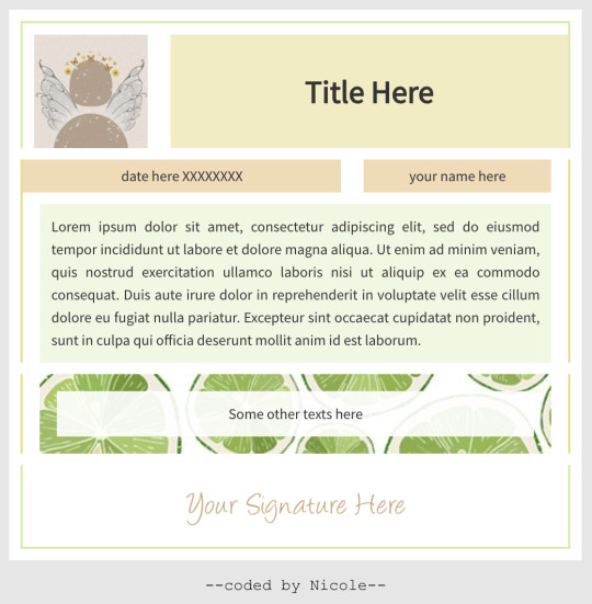
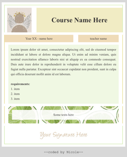
I finally finished my first ever class overview code that did not break right in front of my eyes HAHAHA
It took ridiculously long to get it right, so I hope it'll work for you too
Matching Article & Lesson code: here
Please read the TERMS OF USE before using my code <3
Link: v.1 (wallpost) || v.2 (class overview)
#wox#css#code#html#woxcode#free#wox wallpost#wallpost#course#class overview#nickycodes#coder's choice#overview
27 notes
·
View notes
Text

𝐘𝐨𝐮𝐫 𝐓𝐞𝐜𝐡 𝐂𝐚𝐫𝐞𝐞𝐫 𝐒𝐭𝐚𝐫𝐭𝐬 𝐇𝐞𝐫𝐞!
𝗪𝗮𝗻𝘁 𝘁𝗼 𝗯𝗲𝗰𝗼𝗺𝗲 𝗮 𝗙𝘂𝗹𝗹 𝗦𝘁𝗮𝗰𝗸 𝗗𝗲𝘃𝗲𝗹𝗼𝗽𝗲𝗿?
The tech world is booming, and skilled developers are in high demand! Learn both frontend & backend development and step into a high-paying career.
𝐖𝐡𝐚𝐭 𝐲𝐨𝐮’𝐥𝐥 𝐥𝐞𝐚𝐫𝐧: ✅ Frontend: HTML, CSS, JavaScript, React ✅ Backend: Node.js, Express, MongoDB ✅ Real-world projects & hands-on training
Don’t just dream about coding—make it your profession!
Transforming Passion into Profession!
✆ 𝗖𝗮𝗹𝗹/𝗪𝗵𝗮𝘁𝘀𝗔𝗽𝗽 on +𝟵𝟭-𝟴𝟰𝟱𝟱𝟬 𝟮𝟭𝟬𝟵𝟬 🌐 𝗪𝗲𝗯: www.giniskills.com
#giniskills#TechCareers#webdesign#webdevelopment#training#websitedesign#Courses#skills#webdesigner#careers#html#css#javascripttutorial#fullstackdevelopercourse#frontend#backend#LiveProjectTraining#HighPayingCareers#MongoDB#coding#skilleddevelopers#DreamCareer#bhubaneswarbuzz#Odisha#Bhubaneswar
4 notes
·
View notes
Text
When I figure out how to use css and html, so I can do useless customizations on random apps, it’s over for everybody. 👤
#html css#my blogs#my websites#my anki cards#everything is gonna be decked out for no reason#it was so easy and fun when I was taking courses on it but I just stopped out of nowhere 💀
2 notes
·
View notes
Text
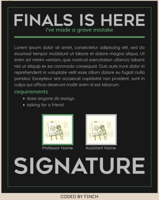
finals is here | course overview a friend of mine requested a silly little course overview with my previous article code, but this can also function as a wallpost too once again only inline css so you'll have to find the colors manually to switch out (5ea26f, rgba(94, 162, 111, 0.5), bbbbbb, good luck) title is font meme there is no god pastebin
#coding#world of olympians#world of potter#html#html template#css#wox site#wox#course overview#wallpost
12 notes
·
View notes
Text

hi everyone, long time no see! but don't you dare think i just layed in bed and let my worthy time waste away (i did that the week before) !!! i actually had my first official (paid:o) internship week and slowly but surely i will guide your through my time there and show u all of the exercises i did!
i hope it might help a few of u and if u want to, feel free to try some of those exercises yourself!!
!!!! I just really have to add: i'm not the best at explaining and generally, when explain my code on this blog, i actually try to explain it to myself! if you don't understand what i'm talking about or if you think something is wrong, pls feel free to hmu and tell me about it:)
#codeblr#programming#coding#htmlcoding#studyblr#100 days of code#codecademy#skull internship#java#javaprogramming#java course#java developers#webdesign#webdevelopment#codergirl#htmllearn#code#code job#css#internship#learn to code#php#php training#phpmyadmin
33 notes
·
View notes
Text
all these coding classes lately remind me that i gotta work on my website sooner or later...
#now that im actually taking school courses for html/css im realizing its notttt that bad#like its Frustrating as hell but im better than i thought i was. thats for sure#I WOULDVE worked on my site earlier this year i just got hit by irl shit. yknow how it is#anyway i want to talk here more. i have so many thoughts and i have so little time to dump them.......aaaaaaaa#guess i had to take a step away from using the internet too much. and that break lasted for. What. A few years now LOL#i need to post more of my art here.. havent posted my art to tumblr since 2022 i dont think.."???? Mental illness sorry#ANYWAY ig going out of my way to talk to ppl outside my friendgroup more has done me wonders mentally. bc now im not feeling shy/Scared#like. at all anymore#also im moving next year so hopefully thatll give me the energy to work on stuff again!#chat.txt#ohyeah i need to like. redo my blog theme + work on toyhouse page a bit more#ok gn
2 notes
·
View notes
Text
oh my fucking god i understand the hexadecimal system
#LEARNING IS SO FREAKING COOL DUDE !!!!!!!!!!!!!!! ITS NOT JUST THROWING RANDOM LETTERS IN THERE FOR NO REASON IT TURNS OUT#im doing a web development course and for a while it was all review bc i just picked up a lot of html and css in middle school#by reverse engineering tumblr theme codes lol. but now its getting into a lot of reasons *why* some code stuff works the way it does#and its blowing my mind#emily.docx
7 notes
·
View notes
Text
Learn HTML and CSS: A Comprehensive Guide for Beginners
Introduction to HTML and CSS
HTML (HyperText Markup Language) and CSS (Cascading Style Sheets) are the core technologies for creating web pages. HTML provides the structure of the page, while CSS defines its style and layout. This guide aims to equip beginners with the essential knowledge to start building and designing web pages.
Why Learn HTML and CSS?
HTML and CSS are fundamental skills for web development. Whether you're looking to create personal websites, start a career in web development, or enhance your current skill set, understanding these technologies is crucial. They form the basis for more advanced languages and frameworks like JavaScript, React, and Angular.
Getting Started with HTML and CSS
To get started, you need a text editor and a web browser. Popular text editors include Visual Studio Code, Sublime Text, and Atom. Browsers like Google Chrome, Firefox, and Safari are excellent for viewing and testing your web pages.
Basic HTML Structure
HTML documents have a basic structure composed of various elements and tags. Here’s a simple example:
html
Copy code
<!DOCTYPE html>
<html>
<head>
<title>My First Web Page</title>
<link rel="stylesheet" type="text/css" href="styles.css">
</head>
<body>
<h1>Welcome to My Web Page</h1>
<p>This is a paragraph of text on my web page.</p>
</body>
</html>
: Declares the document type and HTML version.
: The root element of an HTML page.
: Contains meta-information about the document.
: Connects the HTML to an external CSS file.
: Contains the content of the web page.
Essential HTML Tags
HTML uses various tags to define different parts of a web page:
to : Headings of different levels.
: Paragraph of text.
: Anchor tag for hyperlinks.
: Embeds images.
: Defines divisions or sections.
: Inline container for text.
Creating Your First HTML Page
Follow these steps to create a simple HTML page:
Open your text editor.
Write the basic HTML structure as shown above.
Add a heading with the tag.
Add a paragraph with the tag.
Save the file with a .html extension (e.g., index.html).
Open the file in your web browser to view your web page.
Introduction to CSS
CSS is used to style and layout HTML elements. It can be included within the HTML file using the <style> tag or in a separate .css file linked with the <link> tag.
Basic CSS Syntax
CSS consists of selectors and declarations. Here’s an example:
css
Copy code
h1 {
color: blue;
font-size: 24px;
}
Selector (h1): Specifies the HTML element to be styled.
Declaration Block: Contains one or more declarations, each consisting of a property and a value.
Styling HTML with CSS
To style your HTML elements, you can use different selectors:
Element Selector: Styles all instances of an element.
Class Selector: Styles elements with a specific class.
ID Selector: Styles a single element with a specific ID.
Example:
html
Copy code
<!DOCTYPE html>
<html>
<head>
<title>Styled Page</title>
<link rel="stylesheet" type="text/css" href="styles.css">
</head>
<body>
<h1 class="main-heading">Hello, World!</h1>
<p id="intro">This is an introduction paragraph.</p>
</body>
</html>
In the styles.css file:
css
Copy code
.main-heading {
color: green;
text-align: center;
}
#intro {
font-size: 18px;
color: grey;
}
CSS Layout Techniques
CSS provides several layout techniques to design complex web pages:
Box Model: Defines the structure of an element’s content, padding, border, and margin.
Flexbox: A layout model for arranging items within a container, making it easier to design flexible responsive layouts.
Grid Layout: A two-dimensional layout system for more complex layouts.
Example of Flexbox:
css
Copy code
.container {
display: flex;
justify-content: space-around;
}
.item {
width: 100px;
height: 100px;
background-color: lightblue;
}
Best Practices for Writing HTML and CSS
Semantic HTML: Use HTML tags that describe their meaning clearly (e.g., , , ).
Clean Code: Indent nested elements and use comments for better readability.
Validation: Use tools like the W3C Markup Validation Service to ensure your HTML and CSS are error-free and standards-compliant.
Accessibility: Make sure your website is accessible to all users, including those with disabilities, by using proper HTML tags and attributes.
Free Resources to Learn HTML and CSS
W3Schools: Comprehensive tutorials and references.
MDN Web Docs: Detailed documentation and guides for HTML, CSS, and JavaScript.
Codecademy: Interactive courses on web development.
FreeCodeCamp: Extensive curriculum covering HTML, CSS, and more.
Khan Academy: Lessons on computer programming and web development.
FAQs about Learning HTML and CSS
Q: What is HTML and CSS? A: HTML (HyperText Markup Language) structures web pages, while CSS (Cascading Style Sheets) styles and layouts the web pages.
Q: Why should I learn HTML and CSS? A: Learning HTML and CSS is essential for creating websites, understanding web development frameworks, and progressing to more advanced programming languages.
Q: Do I need prior experience to learn HTML and CSS? A: No prior experience is required. HTML and CSS are beginner-friendly and easy to learn.
Q: How long does it take to learn HTML and CSS? A: The time varies depending on your learning pace. With consistent practice, you can grasp the basics in a few weeks.
Q: Can I create a website using only HTML and CSS? A: Yes, you can create a basic website. For more complex functionality, you'll need to learn JavaScript.
Q: What tools do I need to start learning HTML and CSS? A: You need a text editor (e.g., Visual Studio Code, Sublime Text) and a web browser (e.g., Google Chrome, Firefox).
Q: Are there free resources available to learn HTML and CSS? A: Yes, there are many free resources available online, including W3Schools, MDN Web Docs, Codecademy, FreeCodeCamp, and Khan Academy.
#how to learn html and css#html & css course#html & css tutorial#html and css#html course#html css tutorial#html learn#html learn website#learn html#learn html and css#html and css course#html and css full course#html and css online course#how to learn html and css for beginners
4 notes
·
View notes
Text
Revisiting CSS Multi-Column Layout
New Post has been published on https://thedigitalinsider.com/revisiting-css-multi-column-layout/
Revisiting CSS Multi-Column Layout
Honestly, it’s difficult for me to come to terms with, but almost 20 years have passed since I wrote my first book, Transcending CSS. In it, I explained how and why to use what was the then-emerging Multi-Column Layout module.
Hint: I published an updated version, Transcending CSS Revisited, which is free to read online.
Perhaps because, before the web, I’d worked in print, I was over-excited at the prospect of dividing content into columns without needing extra markup purely there for presentation. I’ve used Multi-Column Layout regularly ever since. Yet, CSS Columns remains one of the most underused CSS layout tools. I wonder why that is?
Holes in the specification
For a long time, there were, and still are, plenty of holes in Multi-Column Layout. As Rachel Andrew — now a specification editor — noted in her article five years ago:
“The column boxes created when you use one of the column properties can’t be targeted. You can’t address them with JavaScript, nor can you style an individual box to give it a background colour or adjust the padding and margins. All of the column boxes will be the same size. The only thing you can do is add a rule between columns.”
She’s right. And that’s still true. You can’t style columns, for example, by alternating background colours using some sort of :nth-column() pseudo-class selector. You can add a column-rule between columns using border-style values like dashed, dotted, and solid, and who can forget those evergreen groove and ridge styles? But you can’t apply border-image values to a column-rule, which seems odd as they were introduced at roughly the same time. The Multi-Column Layout is imperfect, and there’s plenty I wish it could do in the future, but that doesn’t explain why most people ignore what it can do today.
Patchy browser implementation for a long time
Legacy browsers simply ignored the column properties they couldn’t process. But, when Multi-Column Layout was first launched, most designers and developers had yet to accept that websites needn’t look the same in every browser.
Early on, support for Multi-Column Layout was patchy. However, browsers caught up over time, and although there are still discrepancies — especially in controlling content breaks — Multi-Column Layout has now been implemented widely. Yet, for some reason, many designers and developers I speak to feel that CSS Columns remain broken. Yes, there’s plenty that browser makers should do to improve their implementations, but that shouldn’t prevent people from using the solid parts today.
Readability and usability with scrolling
Maybe the main reason designers and developers haven’t embraced Multi-Column Layout as they have CSS Grid and Flexbox isn’t in the specification or its implementation but in its usability. Rachel pointed this out in her article:
“One reason we don’t see multicol used much on the web is that it would be very easy to end up with a reading experience which made the reader scroll in the block dimension. That would mean scrolling up and down vertically for those of us using English or another vertical writing mode. This is not a good reading experience!”
That’s true. No one would enjoy repeatedly scrolling up and down to read a long passage of content set in columns. She went on:
“Neither of these things is ideal, and using multicol on the web is something we need to think about very carefully in terms of the amount of content we might be aiming to flow into our columns.”
But, let’s face it, thinking very carefully is what designers and developers should always be doing.
Sure, if you’re dumb enough to dump a large amount of content into columns without thinking about its design, you’ll end up serving readers a poor experience. But why would you do that when headlines, images, and quotes can span columns and reset the column flow, instantly improving readability? Add to that container queries and newer unit values for text sizing, and there really isn’t a reason to avoid using Multi-Column Layout any longer.
A brief refresher on properties and values
Let’s run through a refresher. There are two ways to flow content into multiple columns; first, by defining the number of columns you need using the column-count property:
Second, and often best, is specifying the column width, leaving a browser to decide how many columns will fit along the inline axis. For example, I’m using column-width to specify that my columns are over 18rem. A browser creates as many 18rem columns as possible to fit and then shares any remaining space between them.
Then, there is the gutter (or column-gap) between columns, which you can specify using any length unit. I prefer using rem units to maintain the gutters’ relationship to the text size, but if your gutters need to be 1em, you can leave this out, as that’s a browser’s default gap.
The final column property is that divider (or column-rule) to the gutters, which adds visual separation between columns. Again, you can set a thickness and use border-style values like dashed, dotted, and solid.
These examples will be seen whenever you encounter a Multi-Column Layout tutorial, including CSS-Tricks’ own Almanac. The Multi-Column Layout syntax is one of the simplest in the suite of CSS layout tools, which is another reason why there are few reasons not to use it.
Multi-Column Layout is even more relevant today
When I wrote Transcending CSS and first explained the emerging Multi-Column Layout, there were no rem or viewport units, no :has() or other advanced selectors, no container queries, and no routine use of media queries because responsive design hadn’t been invented.
We didn’t have calc() or clamp() for adjusting text sizes, and there was no CSS Grid or Flexible Box Layout for precise control over a layout. Now we do, and all these properties help to make Multi-Column Layout even more relevant today.
Now, you can use rem or viewport units combined with calc() and clamp() to adapt the text size inside CSS Columns. You can use :has() to specify when columns are created, depending on the type of content they contain. Or you might use container queries to implement several columns only when a container is large enough to display them. Of course, you can also combine a Multi-Column Layout with CSS Grid or Flexible Box Layout for even more imaginative layout designs.
Using Multi-Column Layout today
Patty Meltt is an up-and-coming country music sensation. She’s not real, but the challenges of designing and developing websites like hers are.
My challenge was to implement a flexible article layout without media queries which adapts not only to screen size but also whether or not a <figure> is present. To improve the readability of running text in what would potentially be too-long lines, it should be set in columns to narrow the measure. And, as a final touch, the text size should adapt to the width of the container, not the viewport.
Article with no <figure> element. What would potentially be too-long lines of text are set in columns to improve readability by narrowing the measure.
Article containing a <figure> element. No column text is needed for this narrower measure.
The HTML for this layout is rudimentary. One <section>, one <main>, and one <figure> (or not:)
<section> <main> <h1>About Patty</h1> <p>…</p> </main> <figure> <img> </figure> </section>
I started by adding Multi-Column Layout styles to the <main> element using the column-width property to set the width of each column to 40ch (characters). The max-width and automatic inline margins reduce the content width and center it in the viewport:
main margin-inline: auto; max-width: 100ch; column-width: 40ch; column-gap: 3rem; column-rule: .5px solid #98838F;
Next, I applied a flexible box layout to the <section> only if it :has() a direct descendant which is a <figure>:
section:has(> figure) display: flex; flex-wrap: wrap; gap: 0 3rem;
This next min-width: min(100%, 30rem) — applied to both the <main> and <figure> — is a combination of the min-width property and the min() CSS function. The min() function allows you to specify two or more values, and a browser will choose the smallest value from them. This is incredibly useful for responsive layouts where you want to control the size of an element based on different conditions:
section:has(> figure) main flex: 1; margin-inline: 0; min-width: min(100%, 30rem); section:has(> figure) figure flex: 4; min-width: min(100%, 30rem);
What’s efficient about this implementation is that Multi-Column Layout styles are applied throughout, with no need for media queries to switch them on or off.
Adjusting text size in relation to column width helps improve readability. This has only recently become easy to implement with the introduction of container queries, their associated values including cqi, cqw, cqmin, and cqmax. And the clamp() function. Fortunately, you don’t have to work out these text sizes manually as ClearLeft’s Utopia will do the job for you.
My headlines and paragraph sizes are clamped to their minimum and maximum rem sizes and between them text is fluid depending on their container’s inline size:
h1 font-size: clamp(5.6526rem, 5.4068rem + 1.2288cqi, 6.3592rem); h2 font-size: clamp(1.9994rem, 1.9125rem + 0.4347cqi, 2.2493rem); p font-size: clamp(1rem, 0.9565rem + 0.2174cqi, 1.125rem);
So, to specify the <main> as the container on which those text sizes are based, I applied a container query for its inline size:
main container-type: inline-size;
Open the final result in a desktop browser, when you’re in front of one. It’s a flexible article layout without media queries which adapts to screen size and the presence of a <figure>. Multi-Column Layout sets text in columns to narrow the measure and the text size adapts to the width of its container, not the viewport.
Modern CSS is solving many prior problems
Structure content with spanning elements which will restart the flow of columns and prevent people from scrolling long distances.
Prevent figures from dividing their images and captions between columns.
Almost every article I’ve ever read about Multi-Column Layout focuses on its flaws, especially usability. CSS-Tricks’ own Geoff Graham even mentioned the scrolling up and down issue when he asked, “When Do You Use CSS Columns?”
“But an entire long-form article split into columns? I love it in newspapers but am hesitant to scroll down a webpage to read one column, only to scroll back up to do it again.”
Fortunately, the column-span property — which enables headlines, images, and quotes to span columns, resets the column flow, and instantly improves readability — now has solid support in browsers:
h1, h2, blockquote column-span: all;
But the solution to the scrolling up and down issue isn’t purely technical. It also requires content design. This means that content creators and designers must think carefully about the frequency and type of spanning elements, dividing a Multi-Column Layout into shallower sections, reducing the need to scroll and improving someone’s reading experience.
Another prior problem was preventing headlines from becoming detached from their content and figures, dividing their images and captions between columns. Thankfully, the break-after property now also has widespread support, so orphaned images and captions are now a thing of the past:
figure break-after: column;
Open this final example in a desktop browser:
You should take a fresh look at Multi-Column Layout
Multi-Column Layout isn’t a shiny new tool. In fact, it remains one of the most underused layout tools in CSS. It’s had, and still has, plenty of problems, but they haven’t reduced its usefulness or its ability to add an extra level of refinement to a product or website’s design. Whether you haven’t used Multi-Column Layout in a while or maybe have never tried it, now’s the time to take a fresh look at Multi-Column Layout.
#:has#ADD#almanac#Article#Articles#back up#background#book#box#browser#challenge#clamp#colours#columns#container#content#course#creators#CSS#CSS Grid#css-tricks#Design#designers#desktop#developers#digitalocean#display#easy#English#Explained
2 notes
·
View notes
Text
Responsive Animated Website With HTML & CSS
youtube
#html#tamilitmemes#css3#tamilwebdesign#css animation#web development#web design#website#webdesign#youtube#responsivewebdesign#responsive design#responsive webdesign#responsive web design#webdev#htmlcodes#htmlcss#learn html#html5#html course#css tutorial#html css#html5 css3#css#htmlcoding#frontenddevelopment#javascript#csstricks#websitedesign#website development
5 notes
·
View notes
Text

Discover how to use Python for web scraping, a potent method of obtaining data from websites. BeautifulSoup and Requests are two Python packages that make this process easier and allow for the smooth parsing of HTML structures.
#Best python course in kanpur#python#programming#coding#java#javascript#programmer#developer#html#snake#coder#code#computerscience#technology#css#machinelearning#pythonprogramming#linux#ballpython#php#datascience#reptile#snakes#reptiles#snakesofinstagram#software#reptilesofinstagram#webdevelopment#webdeveloper#tech
8 notes
·
View notes
Text
you'd think that taking a container box and copying it to the other side of your neocities would be easy
it
no
#ashton is talking#neocities#y'know maybe taking a crash course on html/css would be helpful even if i'm just using a template#apparently it's more complex than “copy - paste - rename box so it's a separate thing - tweak some things”#i will persevere though#i'll figure it out eventually#(of course i'd accept help-)
4 notes
·
View notes
Text

WEB DESIGN COURSES
2 notes
·
View notes