#did find out that in the book tarzan was based on and a small line hint from the movie
Explore tagged Tumblr posts
Visit Tumblr Blog
Explore Tumblr blogs with no restrictions, modern design and the best experience.
Last Seen Tumblr Blogs


Fun Fact
1,644 Tumblr posts in 1 second.
Text
I finally finsh3d compiling a list of all the Disney heroes and villans from animated movies and deciding who I want to be my canon
Now I have to comb through some ext3nded media to cherry pick who I want from there
#its probly gonna be like some aladdin villians#and the tamglerd series crew#with features from the baker and other little highlight moments#did find out that in the book tarzan was based on and a small line hint from the movie#him and clayton are cousins#hmmm#i do need to make the cornera (i do not care about any speelint mistakes in this moments) and arendelle family tree#also basically everyone feom nightmare before Christmas excluding sally is one the isle#cause i said so#i also havent done anything on pixie hollow or any neverland media other than the og peter pan#und3cided if i want pirates of the carriban
4 notes
·
View notes
Photo
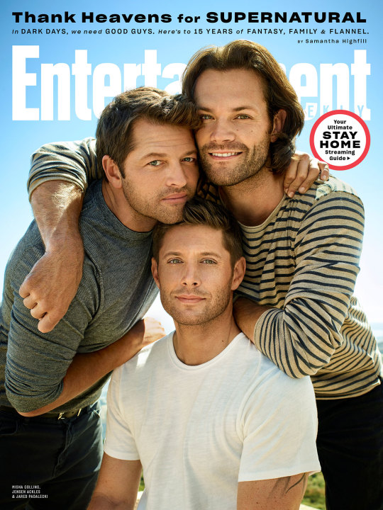
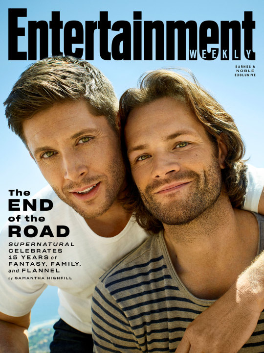
Supernatural stars reflect on the show's undying legacy
Jared Padalecki, Jensen Ackles, and Misha Collins discuss 15 years of fantasy, family, and flannel.
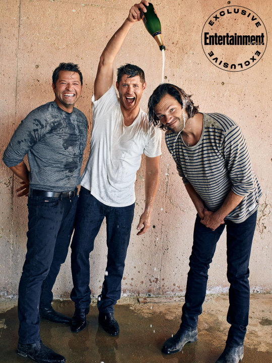
"We only get one shot at this." Sam and Dean Winchester are surrounded. The monster-hunting brothers are standing on the edge of a cliff. They look to Castiel, their brother in arms — or is it wings? — but even he can’t help. One move in the wrong direction could ruin everything. After years of fighting demons, going toe-to- toe with Satan himself, and saving the world multiple times, they once again find themselves in a position of having to perform under pressure. But this situation is unlike anything they’ve ever dealt with before. All eyes are on them as they have one shot…at getting the perfect picture.
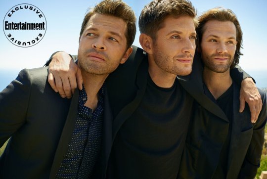
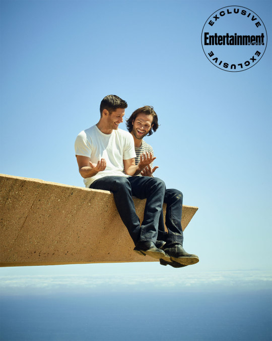
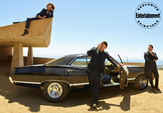
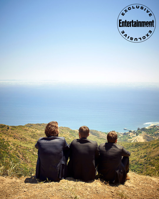
It’s a dry, hot August day in Malibu — when people were still allowed to gather outside — as Supernatural stars Jensen Ackles, Jared Padalecki, and Misha Collins prepare for the last setup of their final Entertainment Weekly cover shoot. With a bottle of champagne in each of their hands, Ackles once again reminds them they get “one shot” to do this right. But if their characters can shoulder the weight of the world, surely these three can handle a photo. Read the whole story below
The champagne soaking is meant to be a celebration of 15 years, of making television history. Supernatural, the story of two brothers destined to save the world, is the longest-running genre show in the history of American broadcast television. (So old, the first three seasons shot on this thing called film.) What started as an underdog story, living its first few years on the verge of cancellation, has become an institution, a milestone to which other shows aspire. Supernatural not only survived the move from The WB to The CW after its first season — it’s now the final WB show left standing — but became the backbone of the now highly successful CW network. Over the years, the sci-fi series has aired on every weeknight, helping to launch shows including Arrow and The Vampire Diaries. The network moved it one final time, most recently, to Mondays, to help Roswell, New Mexico expand its audience. “Supernatural is a major link to many of the shows that we have successfully built to market,” The CW’s chairman and CEO Mark Pedowitz says. “Almost every one of our shows has had it as a lead-out or a lead-in.”
And to think, it all started as a promise to bring horror to television. After Supernatural creator Eric Kripke had finished working with Warner Bros. on 2003’s Tarzan series, he pitched the idea of a reporter who travels around hunting urban legends. As he puts it, it was a Kolchak: The Night Stalker rip-off. But when he realized the story would benefit from having brothers at its core, he started writing. “At the time, The Ring and The Grudge were huge hits in theaters,” Kripke remembers. “We said, ‘We’re going to take that experience and we’re going to put it on TV,’ and the initial goal was to be scary.” After Warner Bros. passed on his first, what he calls “uptight,” draft, Kripke had to reassess the kind of show he was creating. “I canceled all my Christmas plans and wrote that second draft in three weeks,” he says. “That was when the show got its sense of humor, because I was locked alone, over winter break, in my office. I couldn’t do anything fun, so I started entertaining myself.”
The show was still scary, but it was also funny and, over the years, would continue to evolve. Sure, you could say it’s a little bit X-Files — in its early days, the show often used the line “The X-Files meets Route 66” — and there were definite Star Wars influences (Sam and Dean were originally based on Luke Skywalker and Han Solo). But no combination of pop culture is going to perfectly describe Supernatural because the show has managed to do something remarkably rare in the age of peak TV, where audiences are so overwhelmed with content that an original idea seems foreign: It’s created a truly one-of- a-kind experience.
For starters, it’s a show about two flannel-wearing, beer-loving, blue-collar dudes from Kansas who for a good chunk of their lives traveled from cheap motel to cheap motel, paying for gas and greasy diner food with a mix of fake credit cards and money they earned scamming people at the pool table. “Almost all television is about rich people or, at the very least, middle-class people,” co-showrunner Andrew Dabb says. “The fact that we’ve been able to take this Midwestern blue-collar approach to this genre feels like we’re breaking the mold.”
But the mold-breaking didn’t stop there. Supernatural might’ve started out as a horror show with some snarky one-liners, but it evolved into some of the boldest, most experimental (and certainly strangest) stories on the small screen. “We’re a show of big swings,” co-showrunner Robert Singer says. “I used to say, with every idea, ‘This will be a home run or they’ll cancel us,’ but every year we wanted to do something really nuts." And when he says nuts, we’re not just talking about the episode with the talking teddy bear or the murderer targeting imaginary friends. Those are just some standard monsters of the week. We’re talking about the black-and-white episode shot like a classic Hollywood monster movie, or the episode that introduced Chuck (Rob Benedict), a prophet — who’d later reveal himself to be God — who was famous for writing a book series called Supernatural. That, of course, led to Sam and Dean attending a Supernatural fan convention as the show continued to redefine what it meant to inject a series with meta humor. And the swings never stopped. Season 13 featured a Scooby-Doo crossover as an animated Sam, Dean, and Castiel solved a case alongside the Mystery Inc. gang. And in season 14, after giving God a sister a few years prior, the show made the Big Man Himself its final villain. “I don’t think any idea, barring some production concerns, has been viewed as too crazy,” Dabb says. “Because we know that our fans are smart and that they’ll follow these guys anywhere.”
So long as each episode features Sam and Dean — and the occasional heartfelt talk on the hood of the Impala — the show can do just about anything, which is another reason Kripke had to rewrite his first draft of the pilot. Originally, Dean was the only brother who knew about monsters growing up, bringing Sam up to speed later in life. It wasn’t until Kripke figured out that they needed to be in this together that the series snapped into place. Because at the end of it all, they’re two brothers bonded by the loss of their mother and a life spent on the road with an absentee father. (It just so happens that their mother was killed by a demon and their father hunted them.) The familial dynamic — the irrational codependency, as the angel Zachariah (Kurt Fuller) once called it — is the most important part of the show. “The first inkling I had that we had something special was shooting the pilot,” Kripke says. “It was the scene on the bridge when Sam and Dean talk about their mother. It was the first time that you really saw their chemistry and their connection as brothers on full display. Because I’ve always said this show begins and ends with whether you believe that sibling relationship.” But Sam and Dean weren’t just the center of the show. For many years, they were the show.
Supernatural has never been an ensemble drama. For the first 82 hours of the series, Ackles and Padalecki were the only long-running series regulars — Katie Cassidy and Lauren Cohan briefly joined for season 3, appearing in 12 episodes combined. But Sam and Dean weren’t just in every episode; they anchored every episode. (They skipped table reads because there would’ve been only two actors there.) “I had many moments of not only questioning, ‘Can I keep this up?’ but an answer of ‘I cannot keep this up,’ ” Padalecki, 37, who’s been vocal about his struggle in the early seasons, says. “I borrowed strength from Jensen.” But even Ackles, 42, admits it was a tough job. “The 23-episode seasons were nine and a half months of filming,” he adds. “It was a lot of work, but I always came back to: I still enjoy it, I still like telling the story, I still like these characters and the people I work with.”
Not only did the guys stick around, they built a reputation of having created one of the warmest sets in the business, with a number of crew members staying with the production all 15 seasons. It all dates back to a talk Kripke had with his stars during the filming of the series’ second episode. “I said, ‘The show is about your two characters, and with that comes this responsibility,’ ” Kripke says. Padalecki remembers the exact setting of what he calls their “Good Will Hunting moment,” a bench in Stanley Park in Vancouver, where they film. It was a chat both actors took to heart. “We’d both been on other sets,” Ackles says. “We knew we wanted to enjoy it, to have fun with our crew; we wanted them to like us and us to like them and to have fun doing what we do.” It’s an attitude Pedowitz hopes bleeds into other CW shows, an attitude that launched an annual tradition where the CW chairman/CEO takes his new casts out to dinner with the Supernatural guys, a chance for the vets to share advice. “It’s always the most flattering situation,” Padalecki says, recalling a moment he had a few years back with the late Luke Perry, who was a part of the Riverdale cast. “Luke was sitting next to me and he was like, ‘What y’all have done and what we hear about you guys, it’s really cool to be associated with y’all in some way, shape, or form,’” he recalls. “And I’m sitting there pinching myself.”
It’s a behind-the-scenes legacy that’s perhaps just as impressive, if not more so, than the onscreen legacy. Collins, 45, who started as a guest star and the show’s first angel in season 4, has become the show’s third-longest-running series regular, and he still remembers walking onto set his first day. “When you’re coming onto a show as a guest star, it can be a little bit nerve-racking,” Collins says. “Coming to this set, it was an immediately different vibe. Think- ing about working on other shows in the future, that’s something that I aspire to bring with me.”
A similar reputation extends to the fans as well. Not only is the #SPNFamily one of the most dedicated fandoms out there, it’s also known to be a pretty nice one. (Not many fandoms can say they’ve helped launch a crisis support network for their fellow fans.) But their dedication isn’t just about seeing what crazy twist God throws at Team Free Will next. Thanks to fan conventions and social media, the viewers are just as invested in the lives of the actors. Supernatural’s not just about the words on the page, it’s about the actors saying them. “When you’re dealing with the public taste, there’s an alchemy of great writing, a great idea, and the close-up that’s required,” Peter Roth, chairman of Warner Bros. Television Group, says. “You need stars who you want in your living room.” And you need stars who want to be in your living room, and who, even after 15 years, care so deeply that they get emotional while taking photos in Malibu.
"It's going to be a long eight months," Ackles declares. Standing on that same ledge, an hour before the champagne shot, Ackles, Padalecki, and Collins walk away from a group hug after unexpectedly starting to tear up. It might be the setting — looking out over the ocean — or the occasion: their last-ever photo shoot. Or maybe it’s the fact that they’re almost a month into filming their final season.
It had been a question posed to the stars for years: How long will this show continue? How long can it continue? “Even my mom and dad were like, ‘When are you going to be done with this?’” Ackles says with a laugh. It was a decision the network and studio had ultimately put into the actors’ hands, and it was a conversation they’d been having for a while. Back in 2016, Padalecki told EW, “If we don’t make it to [episode] 300, I think Ackles and I will both be truly bummed.” But in season 14, they hit 300…and then kept going. While filming episode 307, they announced the upcoming 15th season would be the end, which will bring them to a total of 327 episodes when all is said and done. “[Jared] and I were always married to the fact that we never wanted to go out with a diet version of what we had,” Ackles says. “We wanted to have enough gas left in the tank to get us racing across the finish line. We didn’t want to limp across.” Padalecki remembers the moment it hit him — not the decision to end it, but rather the opposite. “We had that moment where he and I both realized that we didn’t want it to end,” he says. “It finally got to a point, ironically, where it was like, ‘I never want to leave this. I could do this until the day I die, and then if I get the choice when I’m dead, I’ll re-up!’ But you never want to be the last person at a party. We just knew. That’s not to say there haven’t been vacillations, but we all trust the decision that was made.”
Starting in July 2019, the cast and crew returned to Vancouver to begin filming the final season, but in March 2020, with two episodes left to go, they were sent home. For years, fans had wondered what, if anything, could stop the Winchesters, and now it seems we have the answer: a global pandemic. As sets closed amid social-distancing measures due to the spread of COVID-19, it didn’t take long for fans to start connecting the dots, sharing relevant GIFs from episodes that featured viruses, most notably Chuck telling Dean to hoard toilet paper “like it’s made of gold” before the end of the world in season 5’s “The End.” (Did we mention that Supernatural is also kind of psychic? In a season 6 episode, Dean calls Sam “Walker, Texas Ranger,” which just so happens to be the role Padalecki has lined up after this ends.)
When production paused, it all felt a little like we were living in an episode of the show, just waiting for Sam and Dean to drive up in Baby, open those creaky doors, and save us. They might not be able to do quite that, but the thing with the Winchesters is that they never stay down for long. When Supernatural is able to safely resume production, it will. And though there are only two episodes left to film, fans will enjoy a total of seven unseen hours, including the return of Charlie (Felicia Day) and a mystery woman who visits the bunker and, for some reason, gives Sam and Dean all the holidays they never got to celebrate. “She makes Christmas for them and Thanksgiving, birthday parties, and all that. It’s a very good episode,” Singer says, adding, “I don’t know when it’s going to air.”
That’s the thing—no one knows, not even the guys who took out Yellow Eyes, stopped Leviathans, defeated Death himself, and are supposedly destined to be the messengers of God’s destruction. But Sam and Dean do know the value of a good plan B. “Obviously it’s a horribly unfortunate situation we’re in, but the silver lining is that it gives us an opportunity to recharge,” Ackles says. “We had just finished episode 18, we shot one day of episode 19, and I was reading these two monster scripts thinking, ‘It’s like we’re at the end of a marathon and they want us to sprint for the last two miles.’ I feel like this almost gives us an opportunity to refocus and go into the last two episodes and hit them with everything we got.” Because when they do return to set, shave their quarantine beards, and step back into Sam and Dean’s shoes for the last time, they’ll have one shot at ending this thing…and they’re determined not to miss.
Photos: Peggy Sirota for EW
https://ew.com/tv/supernatural-stars-cover-ew-to-reflect-on-the-shows-undying-legacy/
#supernatural#jensen ackles#jared padalecki#misha collins#last season#season 15#entertainment weekly#cover story#dean winchester#sam winchester#castiel#full post#SPN#spn family#new photo#new photos
788 notes
·
View notes
Text
Best Coast: Adventureland
I recently became a fan of the Lost Bros Co’s Oh Boy! The Podcast. I’ve been learning a lot of great things about Walt Disney World (WDW) that I have never heard before, and I am loving the recommendations, tips, and bits of knowledge and nostalgia that they share. Since Disneyland (DL) is my “home park,” it’s always fascinating to learn more about how the other park lives. The Lost Bros also play some pretty entertaining “games” on their show that incorporate their opinions and creative ideas. In one of their first episodes, they play something like West Coast vs. East Coast, aka DL vs. WDW, where they compared the same attractions and rides from each park. To them, DL took the cake on the majority of rides, even though the Lost Bros themselves are WDW locals. After my 2 trips to WDW in 2018, I’ve been comparing the parks myself as well. So as a DL native, “let’s get down to business” and find out what the West Coast thinks as well.
I’m going to go land by land and space each post out, because if this were just one whole post, you’d be reading a full book at that point.
Adventureland (TL;DR Disneyland wins!)
Adventureland is my favorite (follow up post on “Lands That I Love” to follow). When you first walk into the park and go up Main Street USA, you first hit “the Hub” (with or without grass to sit on, depending on your park) where the road spikes off into different directions and your journey begins depending on which land you run to first. Well, I always veer to the left and begin my day at Adventureland, so I’m going to start here first.
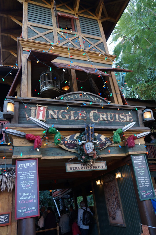
WDW: The biggest advantage WDW has is space. There’s TONS of it in Florida, unlike in tiny Anaheim, CA. So it’s great that they have more to work with over there. One of the things I do love about WDW’s version is that they have a whole Pirates of the Caribbean dedicated section (Caribbean Plaza) with this AMAZING scavenger hunt quest game that I will cover in a later post. And they have a whole restaurant devoted to the Jungle Cruise and its dad joke puns, which is one of my favorite things ever. That being said, I still think DL is the winner here.
DL: While smaller, it has much more of a jungle adventure vibe with towering, lush tropical plants and trees than WDW, which is much more open and goes with the desert Bazaar feeling instead. I definitely get the feeling that I’m isolated in a mysterious jungle somewhere, and I’m just a sucker for that old-timey, vintage adventurer and tiki aesthetic. That feeling is just missing for me somehow at WDW. Plus we now have one of the best snack spots ever, The Tropical Hideaway! It’s no Jungle Navigation Co. Skipper Canteen, but I can’t complain. Dole Whip is my favorite Disney snack and I’ll admit that I stan that exclusive chile-mango whip real hard. We also have the major advantage of being home to The Indiana Jones Adventure, which I won’t compare with WDW since it doesn’t really have an equivalent ride. But in my opinion, just having Indy alone puts the DL Adventureland wayyyyy in the lead. Now in terms of comparing similar rides and attractions...
The Enchanted Tiki Room: While I have to agree with the Lost Bros Co and say that the inside show is pretty much the same, I have to say that the DL version still surpasses the WDW version because of its pre-show and its new Dole Whip snack service at Tropical Hideaway. At DL the preshow allows you to eat a Dole Whip and sit down while you watch each of the enchanted Polynesian god totems come to life. The totems each share their name and a little backstory about their part in the Polynesian mythology while giving a specific animatronic performance. The fun part, especially for kids, is the scavenger hunt feeling you get when you follow the totems around the preshow area and try to find out which totem is speaking and from where. Plus the detail inside Tropical Hideaway, from magic lamps and carpets to the infamous missing Rosita telling corny Jungle Cruise-worthy jokes, is top notch. In contrast, the WDW world version has you standing in a little amphitheater setting to watch two animatronic birds share their personal story of the Jungle Cruise with you, which is a little more meh for me. And there’s hardly any space for you to sit and enjoy your Dole Whip.
The Jungle Cruise: This one is a little tough. This is one of my favorite rides ever, not only because it serves me tons of that vintage exploration aesthetic vibe I love, but also because I an unashamedly obsessed with the dad joke script. I’ve ridden this thing so many times, I can recite any version of the script and be your Skipper myself. In fact, if I worked at Disney, one of my dream roles is to be a Jungle Cruise Skipper. I love love love the DL version and its classic scenes, like the ambush from the natives and the piranhas. Plus I’m used to seeing our version of Trader Sam and was shocked to see a completely different guy at the WDW one. According to the Imagineering backstory, they actually ARE 2 different Sam’s! They happen to be cousins who each opened up their own trading business on opposite coasts. There’s also almost never a wait at the DL one, averaging at about 10-15 min whenever I walk by (30-40 min is maybe the most I’ve ever seen). The queue is a little cramped and small, but I love waiting in the 2-story building and looking at all the Jungle Cruise memorabilia on the walls and the cute rooms/scenes set up inside it (reminiscent of Swiss Family Robinson Tree House back when it used to be at DL). It also has a bomb Jungle Cruise logo sign on the front. In contrast, the WDW queue is a more open and airy, allowing those huge, life-saving fans on the ceiling to do their work. There is some interactive element in the line, but less so than many of the other, more entertaining queues at Magic Kingdom (MK). I remember something about a hissing tarantula in a cage near the end of the line, but it was broken when I visited. I also loved the witty menu and accident signs on the dock right before you board your boat. But the wait time always seems outrageously longer than it should be for this ride, and somehow FastPasses distribute quicker than I would have expected. On the ride, I also really liked the temple tunnel at WDW that we don’t have at DL. For those who have never been on it, there’s a decent stretch of river that goes inside the ruins of a temple through an enclosed tunnel. It allowed for some cool effects and scenes in the dark, but cuts off the flow of the Skipper’s script. The Skipper literally has to stop talking because the microphone would echo too much. In addition to the ride, they have claim to a very fun and punny restaurant overflowing with Imagineering secrets and Jungle Cruise memorabilia. Not only is the atmosphere and theming on point, but the menu is DELICIOUS at the Skipper Canteen. Finally, they regularly get a Christmas overhaul for the Jingle Cruise, which is fantastic. I’ve never been to the WDW Jingle Cruise, but they did it only once (maybe twice) at DL that I can remember, and I loved the Christmas decorations both inside and outside the ride. The Christmas puns were also a nice change. But overall, in terms of the ride, I have to give it to DL’s Jungle Cruise for the overall immersive experience and aesthetic, but I might just be biased because that’s the one I grew up with. I also think there’s a richer opportunity for jokes at the DL one.
Treehouse: Ok, when I was a kid, DL is the one who used to have the Swiss Family Robinson Treehouse and it was one of my favorite things to explore. I was obsessed with playing house and going adventures as a kid, so I loved seeing how someone could build a home in a tropical tree. Then it became the Tarzan treehouse walkthrough. The theming is very cool and the storytelling is great, but as a child afraid of loud noises and jump scares, that stupid jaguar, Sabor, and his snarl scared the shit out of me and has traumatized me good. I still don’t like him and have to scoot quickly around him with my fingers stuffed in my ears. But otherwise, the treehouse is a good little cardio climb. So, again, I am a little biased because of a nostalgia factor, and WDW wins since they now have the Swiss Family Robinson Treehouse. But objectively, I can see how that’s really boring to many people without a history like mine, so I will give DL the point for taking advantage of the already existing treehouse structure and turning it into a self-paced story walkthrough based on one of their popular films (kind of like Sleeping Beauty’s Castle).
While Pirates of the Caribbean lives at Adventureland in WDW, I’m going to leave off comparing that one for when I discuss “America Lands” next time.
So that’s part 1 of many many comparisons to come. Again, take my opinions with a grain of salt since I grew up at DL, but you’ll see that there’s a lot at WDW that I love more than DL too. See ya, pal!
PC: the.disney.doc
#adventureland#disneyland#walt disney world#waltdisneyworld#disney parks#disney resort#disney california adventure#disneycaliforniaadventure#magic kingdom#disney life#disney blog#the lost bros#the lost bros co#oh boy the podcast
5 notes
·
View notes
Text
Cross-Cultural Design
When I first traveledto Japan as an exchange student in 2001, I lived in northern Kyoto, a blockfrom the Kitayama subway station.
My first time using the train to get to my university was almost a disaster, even though it was only two subway stops away. I thought I had everything I needed to successfully make the trip. I double- and triple-checked that I had the correct change in one pocket and a computer printout of where I was supposed to go in the other. I was able to make it down into the station, but then I just stood at a ticket machine, dumbfounded, looking at all the flashing lights, buttons, and maps above my head (Fig 5.1). Everything was so impenetrable. I was overwhelmed by the architecture, the sounds, the signs, and the language.
Fig 5.1: Kyoto subway ticket machines—with many line maps and bilingual station names—can seem complicated, especially to newcomers.
My eyes cravedsomething familiar—and there it was. The ticket machine had a small button thatsaid English! Ipushed it but became even more lost: the instructions were poorly translated,and anyway, they explained a system that I couldn’t use in the first place.
Guess what saved me?Two little old Japanese ladies. As they bought tickets, I casually looked overtheir shoulders to see how they were using the machines. First, they looked up atthe map to find their desired destination. Then, they noted the fare written nextto the station. Finally, they put some money into the machine, pushed thebutton that lit up with their correct fare, and out popped the tickets! Wow! Itried it myself after they left. And after a few tense moments, I got my ticketand headed through the gates to the train platform.
I pride myself onbeing a third-culture kid, meaning I was raised in a cultureother than the country named on my passport. But even with a cultural upbringing in both Nigeriaand the US, it was one of the first times I ever had to guess my way through atask with no previous reference points. And I did it!
Unfortunately, the same guesswork happens online a million times a day. People visit sites that offer them no cultural mental models or visual framework to fall back on, and they end up stumbling through links and pages. Effective visual systems can help eliminate that guesswork and uncertainty by creating layered sets of cues in the design and interface. Let’s look at a few core parts of these design systems and tease out how we can make them more culturally responsive and multifaceted.
Typography
If you work on theweb, you deal with typography all the time. This isn’t a book about typography—othershave written far more eloquently and technically on the subject. What I wouldlike to do, however, is examine some of the ways culture and identityinfluence our perception of type and what typographic choices designers canmake to help create rich cross-cultural experiences.
Stereotypography
I came across the wordstereotypography a few years ago. Being African, I’m well aware of the way my continent isportrayed in Western media—a dirt-poor, rural monoculture with little in theway of technology, education, or urbanization. In the West, one of the most recognizablegraphic markers for things African, tribal, or uncivilized (and no, they arenot the same thing) is the typeface Neuland. Rob Giampietro calls it “the NewBlack Face,” a clever play on words. In an essay, he asks an importantquestion:
How did [Neuland and Lithos] come to signify Africans and African-Americans, regardless of how a designer uses them, and regardless of the purpose for which their creators originally intended them? (http://bkaprt.com/ccd/05-01/)
From its release in 1923 and continued use through the 1940s in African-American-focused advertising, Neuland has carried heavy connotations and stereotypes of cheapness, ugliness, tribalism, and roughness. You see this even today. Neuland is used in posters for movies like Tarzan, Jurassic Park, and Jumanji—movies that are about jungles, wildness, and scary beasts lurking in the bush, all Western symbolism for the continent of Africa. Even MyFonts’ download page for Neuland (Fig 5.2) includes tags for “Africa,” “jungle fever,” and “primitive”—tags unconnected to anything else in the product besides that racist history.

Fig 5.2: On MyFonts, the Neuland typeface is tagged with “Africa”, “jungle fever”, and “primitive”, perpetuating an old and irrelevant typographic stereotype (http://bkaprt.com/ccd/05-02/).
Don’t make, use, orsell fonts this way. Here are some tips on how to avoid stereotypography whendefining your digital experiences:
Be immediately suspicious of any typeface that “looks like” a culture or country. For example, so-called “wonton” or “chop-suey” fonts, whose visual style is thought to express “Asianness” or to suggest Chinese calligraphy, have long appeared on food cartons, signs, campaign websites, and even Abercrombie & Fitch T-shirts with racist caricatures of Asians (http://bkaprt.com/ccd/05-03/). Monotype’s website, where you can buy a version called Mandarin Regular (US$35), cringingly describes the typeface’s story as “an interpretation of artistically drawn Asian brush calligraphy” (Fig 5.3). Whether or not you immediately know its history, run away from any typeface that purports to represent an entire culture.

Fig 5.3: Fonts.com sells a typeface called Mandarin Regular with the following description: “The stylized Asian atmosphere is not created only by the forms of the figures but also by the very name of the typeface. A mandarin was a high official of the ancient Chinese empire” (http://bkaprt.com/ccd/05-04/).
Support type designers who are from the culture you are designing for. This might seem like it’s a difficult task, but the internet is a big place. I have found that, for clients who are sensitive to cultural issues, the inclusion of type designers’ names and backgrounds can be a powerful differentiator, even making its way into their branding packages as a point of pride.
The world wide webfont
Another common design toolyou should consider is webfonts—fonts specifically designed for use on websitesand apps. One of the main selling points of webfonts is that instead ofputting text in images, clients can use live text on their sites, which isbetter for SEO and accessibility. Theyare simple to implement these days, a matter of adding a line of code orchecking a box on a templating engine. The easiest way to get them on your siteis by using a service like Google Fonts, Fontstand, or Adobe Fonts.
Or is it? That assumesthose services are actually available to your users.
Google Fonts (and every other service using Google’s Developer API) is blocked in mainland China, which means that any of those nice free fonts you chose would simply not load (http://bkaprt.com/ccd/05-05/). You can work around this, but it also helps to have a fallback font—that’s what they’re for.
When you’re building your design system, why not take a few extra steps to define some webfonts that are visible in places with content blocks? Justfont is one of the first services focused on offering a wide range of Chinese webfonts (http://bkaprt.com/ccd/05-06/). They have both free and paid tiers of service, similar to Western font services. After setting up an account, you can grab whatever CSS and font-family information you need.
Multiple scriptsystems
When your design workrequires more than one script—for instance, a Korean typeface and a Latintypeface—your choices get much more difficult. Designs that incorporate morethan one are called multiple script systems (multiscript systems for short). Combining them is aninteresting design challenge, one that requires extra typographic sensitivity. Luckily,your multiscript choices will rarely appear on the same page together; you willusually be choosing fonts that work across the brand, not that work well nextto one another visually.
Let’s take a look at an example of effective multiscript use. SurveyMonkey, an online survey and questionnaire tool, has their site localized into a variety of different languages (Fig 5.4). Take note of the headers, the structure of the text in the menu and buttons, and how both fonts feel like part of the same brand.
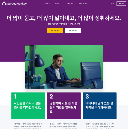

Fig 5.4: Compare the typographic choices in the Korean (http://bkaprt.com/ccd/05-07/) and US English (http://bkaprt.com/ccd/05-08/) versions of SurveyMonkey’s Take a Tour page. Do the header type and spacing retain the spirit of the brand while still accounting for typographic needs?
Some tips as you attempt to choose multiscript fonts for yourproject:
Inspect the overall weight and contrast level of the scripts. Take the time to examine how weight and contrast are used in the scripts you’re using. Find weights and sizes that give you a similar feel and give the page the right balance, regardless of the script.
Keep an eye on awkward script features. Character x-heights, descenders, ascenders, and spacing can throw off the overall brand effect. For instance, Japanese characters are always positioned within a grid with all characters designed to fit in squares of equal height and width. Standard Japanese typefaces also contain Latin characters, called romaji. Those Latin characters will, by default, be kerned according to that same grid pattern, often leaving their spacing awkward and ill-formed. Take the extra time to find a typeface that doesn’t have features that are awkward to work with.
Don’t automatically choose scripts based on superficial similarity. Initial impressions don’t always mean a typeface is the right one for your project. In an interview in the book Bi-Scriptual, Jeongmin Kwon, a typeface designer based in France, offers an example (http://bkaprt.com/ccd/05-09/). Nanum Myeongjo, a contemporary Hangul typeface, might at first glance look really similar to a seventeenth-century Latin old-style typeface—for instance, they both have angled serifs. However, Nanum Myeongjo was designed in 2008 with refined, modern strokes, whereas old-style typefaces were originally created centuries ago and echo handwritten letterforms (http://bkaprt.com/ccd/05-10/). Looking at the Google Fonts page for Nanum Myeongjo, though, none of that is clear (Fig 5.5). The page automatically generates a Latin Nn glyph in the top left of the page, instead of a more representative Hangul character sample. If I based my multiscript font choices on my initial reactions to that page, my pairings wouldn’t accurately capture the history and design of each typeface.

Fig 5.5: The Google Fonts page for Nanum Myeongjo shows a Latin character sample in the top left, rather than a more representative character sample.
Visual density
CSS can help you controlvisual density—how much text, image, and other content there is relative to thenegative space on your page. As you read on, keep cultural variables in mind: differentcultures value different levels of visual density.
Let’s compare what arecommonly called CJK(Chinese, Japanese, Korean) alphabets and Latin (English, French, Italian, etc.) alphabets. CJK alphabetshave more complex characters, with shapes that are generally squarer than Latinletterforms. The glyphs also tend to be more detailed than Latin ones, resultingin a higher visual density.
Your instinct might beto create custom type sizes and line heights for each of your localized pages.That is a perfectly acceptable option, and if you are a typophile, it may driveyou crazy not todo it. But I’m here to tell you that when adding CJK languages to a designsystem, you can update it to account for their visual density without rippingout a lot of your original CSS:
Choose a font size that is slightly larger for CJK characters, because of their density.
Choose a line height that gives you ample vertical space between each line of text (referred to as line-height in CSS).
Look at your Latin text in the same sizes and see if it still works.
Tweak them together to find a size that works well with both scripts.
The 2017 site for Typojanchi, the Korean Typography Biennale, follows this methodology (Fig 5.6). Both the English and Korean texts have a font-size of 1.25em, and a line-height of 1.5. The result? The English text takes up more space vertically, and the block of Korean text is visually denser, but both are readable and sit comfortably within the overall page design. It is useful to compare translated websites like this to see how CSS styling can be standardized across Latin and CJK pages.
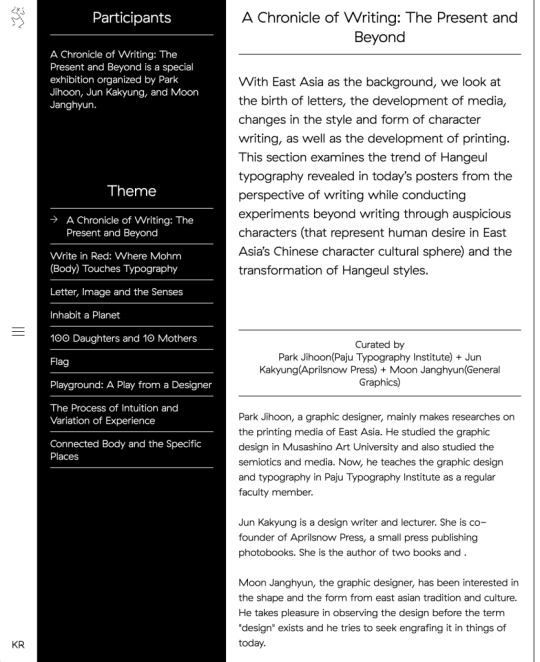
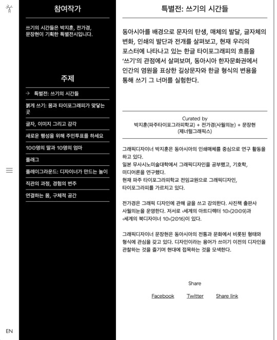
Fig 5.6: The 2017 site for Typojanchi, the Korean Typography Biennale, shows differing visual density in action. It is useful to compare translated websites like this to see how CSS styling can be standardized across Latin and CJK pages (http://bkaprt.com/ccd/05-11/).
Text expansion factors
Expansion factors calculatehow long strings of text will be in different languages. They use either adecimal (1.8) or a percentage (180%) to calculate the length of a text stringin English versus a different language. Of course, letter-spacing depends onthe actual word or phrase, but think of them as a very rough way to anticipate spacefor text when it gets translated.
Using expansion factors is best when planning for microcopy, calls to action, and menus, rather than long-form content like articles or blog posts that can freely expand down the page. The Salesforce Lightning Design System offers a detailed expansion-factor table to help designers roughly calculate space requirements for other languages in a UI (Fig 5.7).
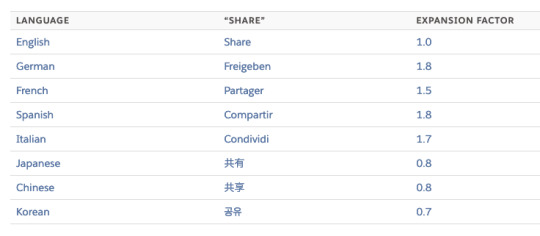
Fig 5.7: This expansion-factor table from Salesforce lets designers and developers estimate the amount of text that will exist in different languages. Though dependent on the actual words, such calculations can give you a benchmark to design with content in mind (http://bkaprt.com/ccd/05-12/).
But wait! Likeeverything in cross-cultural design, nothing is ever that simple. Japanese, forexample, has three scripts: Kanji, for characters of Chinese origin,hiragana, for words and sounds that are not represented in kanji, and katakana,for words borrowed from otherlanguages.
The follow button is a core part of the Twitter experience. It has six characters in English (“Follow”) and four in Japanese (フォロー), but the Japanese version is twenty percent longer because it is in katakana, and those characters take up more space than kanji (Fig 5.8). Expansion tables can struggle to accommodate the complex diversity of human scripts and languages, so don’t look to them as a one-stop or infallible solution.
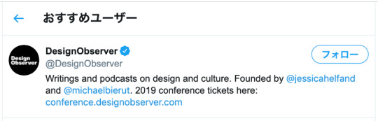
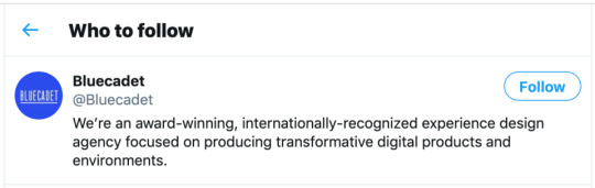
Fig 5.8: On Twitter, expansion is clearly visible: the English “Follow” button text comes in at about 47 pixels wide, while the Japanese text comes in at 60 pixels wide.
Here are a few thingsyou can do keep expansion factors in mind as you design:
Generate dummy text in different languages for your design comps. Of course, you should make sure your text doesn’t contain any unintentional swearwords or improper language, but tools like Foreign Ipsum are a good place to start getting your head around expansion factors (http://bkaprt.com/ccd/05-13/).
Leave extra space around buttons, menu items, and other microcopy. As well as being general good practice in responsive design, this allows you to account for how text in your target languages expands.
Make sure your components are expandable. Stay away from assigning a fixed width to your UI elements unless it’s unavoidable.
Let longer text strings wrap to a second line. Just ensure that text is aligned correctly and is easy to scan.
0 notes
Text
Cross-Cultural Design
When I first traveled to Japan as an exchange student in 2001, I lived in northern Kyoto, a block from the Kitayama subway station.
My first time using the train to get to my university was almost a disaster, even though it was only two subway stops away. I thought I had everything I needed to successfully make the trip. I double- and triple-checked that I had the correct change in one pocket and a computer printout of where I was supposed to go in the other. I was able to make it down into the station, but then I just stood at a ticket machine, dumbfounded, looking at all the flashing lights, buttons, and maps above my head (Fig 5.1). Everything was so impenetrable. I was overwhelmed by the architecture, the sounds, the signs, and the language.

Fig 5.1: Kyoto subway ticket machines—with many line maps and bilingual station names—can seem complicated, especially to newcomers.
My eyes craved something familiar—and there it was. The ticket machine had a small button that said English! I pushed it but became even more lost: the instructions were poorly translated, and anyway, they explained a system that I couldn’t use in the first place.
Guess what saved me? Two little old Japanese ladies. As they bought tickets, I casually looked over their shoulders to see how they were using the machines. First, they looked up at the map to find their desired destination. Then, they noted the fare written next to the station. Finally, they put some money into the machine, pushed the button that lit up with their correct fare, and out popped the tickets! Wow! I tried it myself after they left. And after a few tense moments, I got my ticket and headed through the gates to the train platform.
I pride myself on being a third-culture kid, meaning I was raised in a culture other than the country named on my passport. But even with a cultural upbringing in both Nigeria and the US, it was one of the first times I ever had to guess my way through a task with no previous reference points. And I did it!
Unfortunately, the same guesswork happens online a million times a day. People visit sites that offer them no cultural mental models or visual framework to fall back on, and they end up stumbling through links and pages. Effective visual systems can help eliminate that guesswork and uncertainty by creating layered sets of cues in the design and interface. Let’s look at a few core parts of these design systems and tease out how we can make them more culturally responsive and multifaceted.
Typography
If you work on the web, you deal with typography all the time. This isn’t a book about typography—others have written far more eloquently and technically on the subject. What I would like to do, however, is examine some of the ways culture and identity influence our perception of type and what typographic choices designers can make to help create rich cross-cultural experiences.
Stereotypography
I came across the word stereotypography a few years ago. Being African, I’m well aware of the way my continent is portrayed in Western media—a dirt-poor, rural monoculture with little in the way of technology, education, or urbanization. In the West, one of the most recognizable graphic markers for things African, tribal, or uncivilized (and no, they are not the same thing) is the typeface Neuland. Rob Giampietro calls it “the New Black Face,” a clever play on words. In an essay, he asks an important question:
How did [Neuland and Lithos] come to signify Africans and African-Americans, regardless of how a designer uses them, and regardless of the purpose for which their creators originally intended them? (http://bkaprt.com/ccd/05-01/)
From its release in 1923 and continued use through the 1940s in African-American-focused advertising, Neuland has carried heavy connotations and stereotypes of cheapness, ugliness, tribalism, and roughness. You see this even today. Neuland is used in posters for movies like Tarzan, Jurassic Park, and Jumanji—movies that are about jungles, wildness, and scary beasts lurking in the bush, all Western symbolism for the continent of Africa. Even MyFonts’ download page for Neuland (Fig 5.2) includes tags for “Africa,” “jungle fever,” and “primitive”—tags unconnected to anything else in the product besides that racist history.
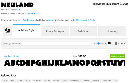
Fig 5.2: On MyFonts, the Neuland typeface is tagged with “Africa”, “jungle fever”, and “primitive”, perpetuating an old and irrelevant typographic stereotype (http://bkaprt.com/ccd/05-02/).
Don’t make, use, or sell fonts this way. Here are some tips on how to avoid stereotypography when defining your digital experiences:
Be immediately suspicious of any typeface that “looks like” a culture or country. For example, so-called “wonton” or “chop-suey” fonts, whose visual style is thought to express “Asianness” or to suggest Chinese calligraphy, have long appeared on food cartons, signs, campaign websites, and even Abercrombie & Fitch T-shirts with racist caricatures of Asians (http://bkaprt.com/ccd/05-03/). Monotype’s website, where you can buy a version called Mandarin Regular (US$35), cringingly describes the typeface’s story as “an interpretation of artistically drawn Asian brush calligraphy” (Fig 5.3). Whether or not you immediately know its history, run away from any typeface that purports to represent an entire culture.
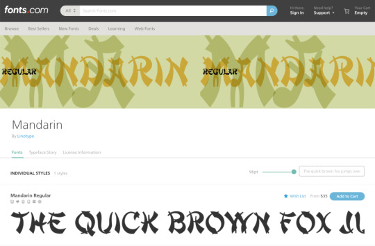
Fig 5.3: Fonts.com sells a typeface called Mandarin Regular with the following description: “The stylized Asian atmosphere is not created only by the forms of the figures but also by the very name of the typeface. A mandarin was a high official of the ancient Chinese empire” (https://ift.tt/2T4LppO).
Support type designers who are from the culture you are designing for. This might seem like it’s a difficult task, but the internet is a big place. I have found that, for clients who are sensitive to cultural issues, the inclusion of type designers’ names and backgrounds can be a powerful differentiator, even making its way into their branding packages as a point of pride.
The world wide webfont
Another common design tool you should consider is webfonts—fonts specifically designed for use on websites and apps. One of the main selling points of webfonts is that instead of putting text in images, clients can use live text on their sites, which is better for SEO and accessibility. They are simple to implement these days, a matter of adding a line of code or checking a box on a templating engine. The easiest way to get them on your site is by using a service like Google Fonts, Fontstand, or Adobe Fonts.
Or is it? That assumes those services are actually available to your users.
Google Fonts (and every other service using Google’s Developer API) is blocked in mainland China, which means that any of those nice free fonts you chose would simply not load (http://bkaprt.com/ccd/05-05/). You can work around this, but it also helps to have a fallback font—that’s what they’re for.
When you’re building your design system, why not take a few extra steps to define some webfonts that are visible in places with content blocks? Justfont is one of the first services focused on offering a wide range of Chinese webfonts (http://bkaprt.com/ccd/05-06/). They have both free and paid tiers of service, similar to Western font services. After setting up an account, you can grab whatever CSS and font-family information you need.
Multiple script systems
When your design work requires more than one script—for instance, a Korean typeface and a Latin typeface—your choices get much more difficult. Designs that incorporate more than one are called multiple script systems (multiscript systems for short). Combining them is an interesting design challenge, one that requires extra typographic sensitivity. Luckily, your multiscript choices will rarely appear on the same page together; you will usually be choosing fonts that work across the brand, not that work well next to one another visually.
Let’s take a look at an example of effective multiscript use. SurveyMonkey, an online survey and questionnaire tool, has their site localized into a variety of different languages (Fig 5.4). Take note of the headers, the structure of the text in the menu and buttons, and how both fonts feel like part of the same brand.

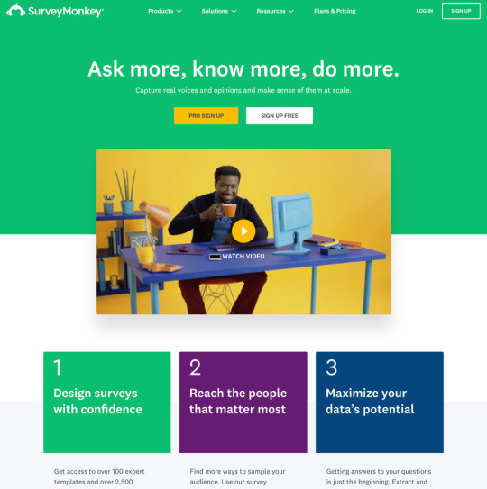
Fig 5.4: Compare the typographic choices in the Korean (http://bkaprt.com/ccd/05-07/) and US English (http://bkaprt.com/ccd/05-08/) versions of SurveyMonkey’s Take a Tour page. Do the header type and spacing retain the spirit of the brand while still accounting for typographic needs?
Some tips as you attempt to choose multiscript fonts for your project:
Inspect the overall weight and contrast level of the scripts. Take the time to examine how weight and contrast are used in the scripts you’re using. Find weights and sizes that give you a similar feel and give the page the right balance, regardless of the script.
Keep an eye on awkward script features. Character x-heights, descenders, ascenders, and spacing can throw off the overall brand effect. For instance, Japanese characters are always positioned within a grid with all characters designed to fit in squares of equal height and width. Standard Japanese typefaces also contain Latin characters, called romaji. Those Latin characters will, by default, be kerned according to that same grid pattern, often leaving their spacing awkward and ill-formed. Take the extra time to find a typeface that doesn’t have features that are awkward to work with.
Don’t automatically choose scripts based on superficial similarity. Initial impressions don’t always mean a typeface is the right one for your project. In an interview in the book Bi-Scriptual, Jeongmin Kwon, a typeface designer based in France, offers an example (http://bkaprt.com/ccd/05-09/). Nanum Myeongjo, a contemporary Hangul typeface, might at first glance look really similar to a seventeenth-century Latin old-style typeface—for instance, they both have angled serifs. However, Nanum Myeongjo was designed in 2008 with refined, modern strokes, whereas old-style typefaces were originally created centuries ago and echo handwritten letterforms (http://bkaprt.com/ccd/05-10/). Looking at the Google Fonts page for Nanum Myeongjo, though, none of that is clear (Fig 5.5). The page automatically generates a Latin Nn glyph in the top left of the page, instead of a more representative Hangul character sample. If I based my multiscript font choices on my initial reactions to that page, my pairings wouldn’t accurately capture the history and design of each typeface.
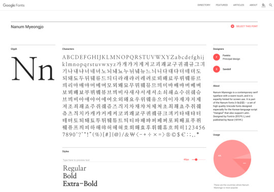
Fig 5.5: The Google Fonts page for Nanum Myeongjo shows a Latin character sample in the top left, rather than a more representative character sample.
Visual density
CSS can help you control visual density—how much text, image, and other content there is relative to the negative space on your page. As you read on, keep cultural variables in mind: different cultures value different levels of visual density.
Let’s compare what are commonly called CJK (Chinese, Japanese, Korean) alphabets and Latin (English, French, Italian, etc.) alphabets. CJK alphabets have more complex characters, with shapes that are generally squarer than Latin letterforms. The glyphs also tend to be more detailed than Latin ones, resulting in a higher visual density.
Your instinct might be to create custom type sizes and line heights for each of your localized pages. That is a perfectly acceptable option, and if you are a typophile, it may drive you crazy not to do it. But I’m here to tell you that when adding CJK languages to a design system, you can update it to account for their visual density without ripping out a lot of your original CSS:
Choose a font size that is slightly larger for CJK characters, because of their density.
Choose a line height that gives you ample vertical space between each line of text (referred to as line-height in CSS).
Look at your Latin text in the same sizes and see if it still works.
Tweak them together to find a size that works well with both scripts.
The 2017 site for Typojanchi, the Korean Typography Biennale, follows this methodology (Fig 5.6). Both the English and Korean texts have a font-size of 1.25em, and a line-height of 1.5. The result? The English text takes up more space vertically, and the block of Korean text is visually denser, but both are readable and sit comfortably within the overall page design. It is useful to compare translated websites like this to see how CSS styling can be standardized across Latin and CJK pages.


Fig 5.6: The 2017 site for Typojanchi, the Korean Typography Biennale, shows differing visual density in action. It is useful to compare translated websites like this to see how CSS styling can be standardized across Latin and CJK pages (https://ift.tt/2T2Emhi).
Text expansion factors
Expansion factors calculate how long strings of text will be in different languages. They use either a decimal (1.8) or a percentage (180%) to calculate the length of a text string in English versus a different language. Of course, letter-spacing depends on the actual word or phrase, but think of them as a very rough way to anticipate space for text when it gets translated.
Using expansion factors is best when planning for microcopy, calls to action, and menus, rather than long-form content like articles or blog posts that can freely expand down the page. The Salesforce Lightning Design System offers a detailed expansion-factor table to help designers roughly calculate space requirements for other languages in a UI (Fig 5.7).

Fig 5.7: This expansion-factor table from Salesforce lets designers and developers estimate the amount of text that will exist in different languages. Though dependent on the actual words, such calculations can give you a benchmark to design with content in mind (http://bkaprt.com/ccd/05-12/).
But wait! Like everything in cross-cultural design, nothing is ever that simple. Japanese, for example, has three scripts: Kanji, for characters of Chinese origin, hiragana, for words and sounds that are not represented in kanji, and katakana, for words borrowed from other languages.
The follow button is a core part of the Twitter experience. It has six characters in English (“Follow”) and four in Japanese (フォロー), but the Japanese version is twenty percent longer because it is in katakana, and those characters take up more space than kanji (Fig 5.8). Expansion tables can struggle to accommodate the complex diversity of human scripts and languages, so don’t look to them as a one-stop or infallible solution.

Fig 5.8: On Twitter, expansion is clearly visible: the English “Follow” button text comes in at about 47 pixels wide, while the Japanese text comes in at 60 pixels wide.
Here are a few things you can do keep expansion factors in mind as you design:
Generate dummy text in different languages for your design comps. Of course, you should make sure your text doesn’t contain any unintentional swearwords or improper language, but tools like Foreign Ipsum are a good place to start getting your head around expansion factors (http://bkaprt.com/ccd/05-13/).
Leave extra space around buttons, menu items, and other microcopy. As well as being general good practice in responsive design, this allows you to account for how text in your target languages expands.
Make sure your components are expandable. Stay away from assigning a fixed width to your UI elements unless it’s unavoidable.
Let longer text strings wrap to a second line. Just ensure that text is aligned correctly and is easy to scan.
Cross-Cultural Design published first on https://deskbysnafu.tumblr.com/
0 notes
Text
Some thoughts on every single disney animated feature film I've currently seen
-Snow White: This movie is nowhere near as boring as I expected it to be, but still pretty boring. Its technical innovations are incredible within context but it truly couldn't capture my attention whatsoever. The only reason I watched it is because I had to write a paper about it.
-Pinocchio: Clunky. There was a logic at the time at disney that the movies would more or less be a series of related cartoons tied together with a through-line and this is very much that. While it is still a cohesive narrative, it's very much a series of events rather than a story.
-Dumbo: More of a narrative here, but still very disjointed. The animation is good and it has much more personality since it's more or less a contemporary setting, but outside of the famous pink elephants sequence, it's not much.
-Bambi: This is what I'd consider to be the first truly cohesive story from disney's feature. This movie is truly phenomenal and well earned its way into the canon of epics. Bambi's journey from young fawn to prince of the forest is beautiful and moving. The jokes about dead moms only stick because this movie is just that good.
-Saludos Amigos: The first of the package films. Doesn't hold a candle to the superior Three Caballeros but still incredible in its own right. It's short enough to do a double feature with Three Caballeros so that's how I recommend viewing it.
-The Three Caballeros: Now THIS is what I'm talking about! The finale gets due recognition for being truly one of the best pieces of animation to come out of disney, but everything up to it is still pretty incredible. Horny donald is the best donald and I love the flying serape sequence.
-Melody Time: This one's very disjointed but Pecos Bill is one of the best and funniest shorts disney's ever made. I highly recommend at least watching just that segment.
-The Adventure of Ichabod and Mr. Toad: Sleepy Hollow's disney adaptation is the much more famous half of this feature but in reality, it's got practically nothing to do with the headless horseman. Mr Toad however, is truly phenomenal as an epic crime thriller that will keep you in suspense. I know that sounds like a joke but truly it's not. Go watch it.
-Cinderella: Boring
-Alice in Wonderland: Also boring
-Lady and the Tramp: I was shocked at how much I enjoyed this one. It's fun, cute, and even funny at times. It really drops the ball in the finale, but for the most part, this romantic comedy is a real gem and definitely holds up. I recommend to kids and adults alike.
-Sleeping Beauty: It's wild how contemporary this one feels. The first half is a teen romantic comedy about mistaken identity and sneaking away from strict parents to get some time with your secret crush, but the second half falls apart with its focus on action instead of the characters. Special shout out to the incredible colors and moving tapestry art style which is great throughout.
-One Hundred and One Dalmatians: Again, surprisingly contemporary. Disney's first foray into the 1960s gives us a fun romp with memorable characters and gorgeous animation that feels down to earth compared to the more fantasy driven works of before.
-The Many Adventures of Winnie the Pooh: Is Pooh disney's greatest character? That's hard to say but I wouldn't disagree with someone that thinks so. Cute, fun, and funny, this movie is truly a warm blanket. For as much as we give shit to sickly sweet disney, this movie doesn't pretend to be anything but a small little story of cute characters. The surprisingly somber ending will leave you more contemplative than you expected, but still content to have spent time in the hundred acre wood.
-The Little Mermaid: I am always saddened to remember that this movie doesn't hold up as much as I wish it did. For every memorable song or character moment, there's a piece of clunky animation or just plain weird dialogue. It's so clear the studio was trying to get back on its feet. This first step pushes forward, but not where it needs to be.
-Beauty and the Beast: A slow first act leads to a truly phenomenal second and third. A triumph in animation, songwriting, and the studio itself. Far more nuance and beauty in this story than detractors like to claim. Well deserving of its nomination.
-Aladdin: It's not a heartfelt movie with some laughs, it's a comedy with some heart. Great action sequences, stellar animation, and just plain fun. After the regal romance of beast a year earlier, Aladdin's vegas style romp is a welcome addition to a studio that often takes itself way too seriously
-The Lion King: Like with bambi, this coming of age story deserves all the praise it gets. Incredible music, awe inspiring animation, and a tight storyline with memorable characters make this movie worth watching over and over again.
-Pocahontas: Maybe the most contrived, try hard, fucking boring movie the studio has ever made. Almost unwatchable.
-The Hunchback of Notre Dame: I am always shocked to find out this movie isn't a beloved classic. Truly incredible art and an amazing score/soundtrack make this one an instant classic to me. If you haven't watched it since childhood, give it another shot.
-Hercules: If it was just funny and had good music this one would be good, but it also has some of disney's best characters and a beautiful story of dueling world views.
-Mulan: Would've been a 10/10 if it weren't for fucking Mushu which makes it a seven to me. Otherwise, a fun, story with great music and truly epic action scenes.
-Tarzan: Often considered the weakest of the renaissance, this adventure about identity and family features a great (if too in your face) phil collins soundtrack with truly amazing animation innovation being displayed.
-The Emperor's New Groove: It's not funny.
-Atlantis: The Lost Empire: I truly can't think of a single bad thing about this movie. Incredible art, one of disney's best scores, and a story that will keep you captivated on its adventure. This movie is near perfect.
-Lilo & Stich: I once heard someone say this is disney's best film and I'm inclined to agree. The gorgeous water color backgrounds and Chris Sanders' beautiful character design play out a beautiful story that reflects a story of two abandoned children, with nuance about colonization to boot. Hawaiian Rollercoaster Ride might be the best original disney song too.
-Treasure Planet: Such a hit or miss movie. Amazing action set pieces, but contrived characters. A phenomenal score, but a terrible soundtrack. This might be the most studio noted film disney's done and it's all the worse for it.
-Brother Bear: Not perfect by any means, but the beautiful animation and even more beautiful backgrounds are worth a look. The story is a little too basic and a little too predictable, reeking of white writers.
-Chicken Little: This is the first time I realized movies could be bad.
-Meet the Robinsons: Your nostalgia lied to you.
-The Princess and the Frog: Way too many cooks in the kitchen. Everything is good, but it's all a little muddled. It's a shame to because Tiana deserves better.
-Tangled: Like with mermaid, this return to form isn't perfect but it moves the studio forward. Rapunzel and Flynn are great characters and the subtle tweaking of the "formula" show the studio's willingness to innovate.
-Winnie the Pooh: Cute, but a very pleasant, fine movie. Worth watching.
-Wreck-It Ralph: I applaud this one for being so different. Lots of comedy here and a far better response to dreamworks than chicken little ever was.
-Frozen: Unfortunately, this movie is worth the hype. Is it amazing? No, but it's certainly very good. It's easy to see why this was the phenomenon it became.
-Big Hero 6: One of many in the series of attempt for disney to do an action movie. This superhero coming of age is definitely one of the better superhero stories not explicitly based on a comic, but it still feels like a comic book themed movie rather than a story that truly connects to the media that inspires it.
-Zootopia: Nowhere near as poignant as it wants to be, but plenty of fun with a great score by Michael Giacchino.
-Moana: Easily the best of the new princesses and a damn shame that it hasn't gotten the recognition it deserves. Moana's stellar animation and blast of a soundtrack create a beautiful film that's perfect for young girls. Seemingly a stealth remake of mermaid by the original directors, this one deserves to be a classic.
-Ralph Breaks the Internet: A surreal comedy from disney with a weak story but certainly some story innovations you wouldn't expect from the company. Watch it if only to see something you'd never expect the studio to do.
-Frozen 2: A surprisingly lore driven film that I really didn't expect. Probably the closest thing the company has done to a lord of the rings style story in recent years and I'm excited to see what this potential leads to next.
-Raya and the Last Dragon: Rips off way too much from Last Airbender in a way that is never bad, but man it gets kinda borings. Can't focus on any one thing unfortunately.
0 notes
Text
Tips for making gender-responsive budgets a reality
New Post has been published on https://universeinform.com/2017/03/15/tips-for-making-gender-responsive-budgets-a-reality/
Tips for making gender-responsive budgets a reality
The 2-week long Commission on the Popularity of Women, the biggest annual intergovernmental discussion board on Ladies’s rights, kicked off on the U.N. Headquarters this week, drawing thousands of nongovernmental companies and civil society activists to The big apple, notwithstanding a few subject over the effect of President Donald Trump’s journey ban on participation.
In a side event on Monday — one of the few earlier than a blizzard briefly added events to a halt — this yr’s subject of Women’s economic empowerment changed into introduced into awareness with a discussion on gender-responsive budgeting.
This device, which addresses gender bias in government making plans, guidelines and spending, has grown to be increasingly famous in latest years. The previous day, specialists had been handy from Kenya, Tunisia, Morocco, Austria and Mexico to percentage their stories in introducing and strengthening budgets to help make sure Women have same possibilities, as
Well as youngsters, human beings dwelling with disabilities, and others.
Guidelines and spending have grown to be increasingly famous in latest years. The previous day, specialists had been handy from Kenya, Tunisia, Morocco, Austria and Mexico to percentage their stories in introducing and strengthening budgets to help make sure Women have same possibilities, as well as youngsters, human beings dwelling with disabilities, and others.
Devex spoke with one featured speaker, Emilia Reyes, the director of regulations and public budgets for the Mexico City-based NGO Equidad de Género (or Gender Equity), which consults with governments in and outside of Latin The united states on creating gender-responsive governments. Right here, she gives her pinnacle recommendations on what it takes to create budgets that bear in mind gender, and what civil society can do to assist make this happen.
Drawing close gender-responsive budgets with new governments or partners
It comes right down to spotting that “we are only the facilitators of this, however [the partners] are the experts,” said Reyes, who worked with Latin American governments main as much as the Lima weather change convention in 2014 on gender-responsive version and mitigation proposals.
“Whilst you are from the outdoor, you can’t say I have got a superb application, and also you provide them this. You need to work with what’s there, so they bring this and begin reviewing diagnostics with a gender angle.”
Inquiries to do not forget to encompass: What are the wishes of the populations and groups in order to be blanketed by the program? What inequalities persist, and how are gender roles related to the configuration of those inequalities
Verified And Profitable Cash Making Thoughts
With an entrepreneurial spirit, perhaps you might be thinking about Money making Thoughts that have been Demonstrated and are Profitable on the net that you could use to make a living with. On-line commercial enterprise is still an evolving device to earn Money. Everyone has anticipated a prime tech crash as a depend on reality it is already going on.
Consistent with Hostingfacts.Com in 2017, “there will be greater internet site visitors than all previous net years combined.
.And mobile-linked gadgets will generate sixty-eight% of all internet site visitors in 2017.”
And mobile-linked gadgets will generate sixty-eight% of all internet site visitors in 2017.”
extra facts display that “global retail e-trade income will attain $1.915 Trillion on this by myself In step with Emarketer.Com. There are a number of methods via which humans could make Cash Online.
net businesses afford relaxation and comfortability to folks who run their own business while sitting in their homes or traveling the world. E- commerce refers to the online functioning of groups in which all of the transactions are widespread with the aid of the world Wide Net.
Online sales in the U.S.A. are predicted to attain $523 billion inside the subsequent five years. This is up fifty-six% from $335 billion in 2015, and cellular gadgets are expected to be a key leader in that growth, Forrester Studies Inc. Says.
The Census Bureau of the Branch of commerce introduced “that the estimate of U.S. Retail e-commerce sales for the third region of 2016, became $one zero one.three billion, an increase of four.0 percentage from the second one area of 2016. General retail sales globally for the 1/3 area, was expected at $1,212.5 billion, an increase of zero.nine percentage from the second one region of 2016.”
With the collapse of the tech bust in complete swing, must you even strive entrepreneurship Online, let alone a new enterprise release in 2017? My answer? Definitely yes.
on the internet, there are limitless matters that may be achieved to earn Money. It is all as much as the character how a good deal they can benefit from these On-line possibilities. The fashion is continuously evolving with progressive business Ideas.
The start of a new yr method great interest in new and interesting matters, as we stay up for the yr within the making. The 12 months 2017 is also likely to see a few adjustments with a few Money making Thoughts now not being in the call for and new ones harvesting up.
Studying a way to make Money on the net with an e-enterprise is one of the most Verified and Profitable Money making Ideas dominating the economy. Facebook now has 1.55 billion energetic customers and 2.nine billion Google searches are made every day. With this statistics, there’s the limitless opportunity for the regular character looking to create Cash Online.
In this article, I’ve researched a number of the organizations which might be going to be Profitable for the subsequent five years. whilst tech can be on the decline, the world constantly has room for Demonstrated, Profitable and modern products as well as services.
Gender Dysphoria – Permit the Youngsters Play
When I used to be ten I started to read broadly. I wolfed books that supplied a truth in contrast to my personal. The Tarzan series through Edgar Rice Burroughs became a favorite. I was fascinated with the backdrop and the characters. I fell in love with the books but I did no longer fall in love with Tarzan – I wanted to be Tarzan. I liked Jane however that sissy lifestyles were now not for me! I had a ripe creativeness and started out to play-act being much like him inside the woods with whatever pals I may want to persuade to enroll in me. At domestic I immersed into a global inner my head and have become him. I advised mom approximately the new development and researched all I should approximately Tarzan and the lifestyles he might have led if he changed into real. Thankfully my mom turned into a slightly absent-minded kind and would have responded with something like:
“That is first-rate pricey”, smiling down at me.
My brother was known as me a freakbeat me up and said,
“see, you’re just a stupid woman.”
Nowhere throughout this pretty lengthy and worried phase in my youth did everybody endorse I had one of this element asgender dysphoria. No person at home or college counseled I had to see a physician or counselor. The ones had been the days When we had been encouraged to have imaginations, wondering talents and left alone to certainly be a toddler. Which became Just as well as inside two years I had developed a large overwhelm on my brother’s pal and spent a great deal time wiggling my newly growing discern to try to attract his interest.
Whilst boys insist they may be truly women and women insist they’re certainly boys – determining that an infant “sincerely is” the other sex should not also be on the list of options, let alone condemning him/her to a complex, difficult lifestyles underneath permanent medical scrutiny. In my view that is corresponding to toddler abuse.
How Responsive Website design Can Growth Income
Responsive Website design Can Increase Sales
In the cutting-edge competitive market, a vital element of success is the usage of leading-aspect internet site era and layout. One of the key tendencies in web sites proper now is responsive Website design (RWD.) Stated virtually, if your internet site doesn’t have a responsive net layout, your enterprise is possibly underperforming.
What’s a Responsive Website design?
You’ve probably already encountered responsive websites even as browsing on-line. These are the websites that fast and mechanically adapt to the display size of your device. Responsive net layout ensures that your website content displays efficiently and uniformly on a selection of devices, structures, and display sizes, without the want to create more than one websites. Special coding techniques are utilized that make a web page automatically alter to the device or display size for the quality consumer experience viable.
The capacity of your website to look attractive and continue to be consumer-pleasant on any size display is important, considering that so many customers are actually the use of mobile gadgets. websites with responsive Web site design appearance first-rate on laptops and computers, however additionally they adapt seamlessly to the small screens of cellular devices, with no extra frustrating zooming and scrolling wished.
The Fashion Closer to cellular
Your website is a device for both branding and generating Income. in case your website doesn’t look excellent on a user’s device, their opinion of your brand can suffer. If browsing your web page on a cell phone or tablet consequences in an irritating enjoy, customers are likely to click on away altogether and find one in every of your competition’ responsively-designed websites instead.
Consistent with the Pew Studies Center, 56% of Yankee adults now personal a phone, and 34% of them very own a tablet device. A complete 34% of cellphone internet customers say their primary technique of going on-line is the usage of their cellular cellphone (as opposed to a computer or laptop computer.) Cisco systems reviews that cellphone utilization grew a surprising 81% in 2012, and IDC reviews that tablet shipments handed Laptop shipments within the 4th quarter of 2013
0 notes
Text
Sensor Sweep: Derleth, Elemental Evil, Tarzan, Weird Tales
Cthulhu Mythos (Innsmouth Free Press): August Derleth has been the whipping boy for HPL fans since 1939, when he created Arkham House with Donald Wandrei, a publishing concern specifically created to get the works of H.P. Lovecraft into hardcovers. Like many Mythos fans, I have read the “posthumous collaborations” and find them middling-to-dull. What I had not known at the time I read them was that August Derleth had written them largely as promotional devices for the Arkham House books, appearing in Weird Tales and other publications where HPL fans would be.
Gaming (Kairos): The gamer scene has been in an uproar over a story that broke over the weekend concerning The Last of Us II. For those who aren’t familiar, it’s the sequel to a game that gained some popularity during last decade’s zombie fad. Rumors had been swirling for years on 4chan that the Death Cultists in charge of the game studio would poz up the sequel. Newly substantiated leaks suggest that the Cultists have outdone themselves.
D&D (Goodman Games): Announcing Original Adventures Reincarnated #6: The Temple of Elemental Evil! This exciting release reprints the original material from the published module T1-4: The Temple of Elemental Evil, as well as the original version of T1: The Village of Hommlet. Created by Gary Gygax and Frank Mentzer, The Temple of Elemental Evil has long been regarded as one of the greatest adventures in TSR’s publishing history. And we are proud to bring this module to a new audience.
Tolkien (Notion Club Papers): In Paul Kocher’s Master of Middle Earth (the first first-rate work of literary criticism that Tolkien attracted) there is a superb chapter that discusses the inter-relationship between individual choices and the working of divine providence. It is indeed a recurrent theme throughout the story. It is clear that the individual protagonists have real decisions to make, and that these decisions are genuinely free and not pre-determined; equally it is clear that there is a divine will at work shaping events in the direction of Good.
Lovecraft and Tolkien (Tentaculii): At the end of the The Lovecraft Geek podcast Price reveals he has a new book of short stories available, Horrors and Heresies, in which horror meets various aspects of religion. Price is, of course, an expert on the Bible as well as on Lovecraft and sword-and-sorcery, so a joining of the three should be especially succulent. If you want to know more of the anthology, the podcast The Free Thought Prophet #195 recently brought him onto the show to discuss the new collection.
Fiction (Telegraph India): One can rule out the possibility of the descendants of Rudyard Kipling, Arthur Conan Doyle and Mary Kingsley — the three subjects of Sarah LeFanu’s book — of being slighted by what the author digs up about their illustrious ancestors in this ambitious but compelling biographical work. There is as much joy in it for readers as there are lessons for writers. One of the striking attributes of this work, as it traces the long and, in Kingsley’s case in particular, arduous journeys undertaken by the two men and one woman to fame and, eventually, to South Africa, is the intelligent building of the narrative’s edifice.
Weird Tales (DMR Books): A Million Years in the Future by Thomas P. Kelley, which was serialized in Weird Tales in 1940, falls in this category. The title is extraordinarily precise: the novel takes place in the year 1,001,940. Over the past five hundred millennia Earth has been repeatedly ravaged by invaders from other galaxies, the most vicious of which are the Black Raiders from the distant planet Capara. As a result of these assaults, Earth has descended into a state of savagery.
Fiction (David J. West): Between March 29th and April 22nd, I released 4 books – count them 4 books. In my #SAVANT series of weird western/gaslamp fantasy Memento Mori, with Porter Rockwell and Elizabeth Dee (John Dee’s descendant and heir to his magical legacy). I got the rights back to my first novel Heroes of the Fallen so I have rereleased it with a new cover, slight edits and a big old glossary in the back that I always wanted included.
Weird Tales (Black Gate): I’ve wanted to do for awhile now, a detailed look at a single issue of Weird Tales magazine where I do a short analysis of each story, the famous, the infamous, and the forgotten. Just to make things a little confusing, I rate these stories, unlike movies, on a 1-5 scale, with the lower the number, the better the story. You can look at these ratings as A-B-C-D-F, or Excellent – Good – Mediocre – Below Average – Poor.
Edgar Rice Burroughs (DMR Books): One hundred years ago today, Tarzan the Untamed was published in hardcovers for the first time. This was a very important book in the evolution of the Tarzan series and an exciting, classic novel in its own right. I’ll let the ERB fans at The Oparian Vault give you the gory details of the publishing history: “Tarzan the Untamed is the seventh book in the Tarzan series written by Edgar Rice Burroughs. It was originally published as two separate stories serialized in different pulp magazines.
Fiction (Broadswords & Blasters): et’s get something out of the way, The Chronicles of Amber by Roger Zelazy isn’t pulp per se. For starters, the first novel in the series, “NINE PRINCES IN AMBER” wasn’t published until 1970, putting it more in line with the New Wave movement coming out of the sixties. That said, critics have drawn comparisons to the 1946 novella written by Henry Kutter (with perhaps some help from his wife, C.L. Moore) called the THE DARK WORLD, giving it at the very least a line back to the pulps.
Comic Books (CBR): A meta-message is where a comic book creator comments on/references the work of another comic book/comic book creator (or sometimes even themselves) in their comic. Each time around, I’ll give you the context behind one such “meta-message.” Today, based on a suggestion from reader Rob H., we look at the OTHER Colonel Future tribute to Edmond Hamilton!
Fiction (Paperback Warrior): Hardboiled crime novels reached a new height of popularity in the late 1940s. Many scholars and fans point to Mickey Spillane as a catalyst for this pop-culture phenomenon. His debut novel, I, the Jury, was published in 1947 and became an instant runaway bestseller. The book introduced the world to the iconic Mike Hammer, a fictional private-investigator who pursues bad guys mostly in New York City. Hammer is known for his physical rough ‘n tumble, unorthodox style gained from his U.S. Army experience in WWII.
Fiction (Real Book Spy): The Top 10 Most Lethal Characters in the Thriller Genre Right Now. Who is the most lethal character in the thriller genre right now? Each year, we set out to answer that question, creating a new list based only on the books from that year. So, no playing favorites or taking into account past action from previous books. If a character stopped a nuclear attack and smoked fifty bad guys in the process last year, but turned in a less impressive performance this time around, none of what happened before 2019 matters.
Fiction (Dark Worlds Quarterly): Bram Stoker (1847-1912) won a place in literary history with one book, Dracula (1897). It was not his only novel, but it is his only masterpiece in the long form. The novels that followed range from passable (The Jewel of The Seven Stars, 1903) to down-right bizarre (The Lair of the White Worm, 1911). Stoker’s earlier works are best not discussed. Stoker may have had only one great novel in him, but he did produce a small number of short stories that might have won him a reputation without Dracula. Most of these stories were collected in his posthumous collection Dracula’s Guest And Other Weird Stories (1914).
D&D (Trollsmyth): Yesterday, my wife and I were talking about choice in D&D, and that lead to a chat about dungeons. Apparently, she’d never experienced the classic dungeons. Her experiences with early D&D were largely of the cloaked-guy-in-the-tavern-sends-you-into-the-dungeon-to-retrieve-a-Maguffin-and-you-get-to-keep-everything-else-you-find sort. And where the monsters just waited patiently in their rooms for the PCs to kick in the door. That sort of thing.
Sensor Sweep: Derleth, Elemental Evil, Tarzan, Weird Tales published first on https://sixchexus.weebly.com/
0 notes