#did them in order to avoid following a portrait tutorial
Explore tagged Tumblr posts
Visit Tumblr Blog
Explore Tumblr blogs with no restrictions, modern design and the best experience.
Last Seen Tumblr Blogs


Fun Fact
Tumblr has been banned in Indonesia for providing people with access to pornographic content.
Text
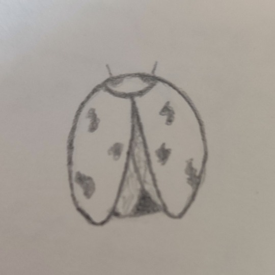
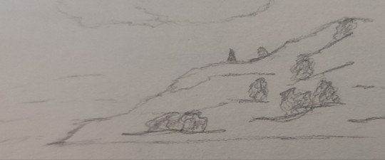
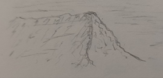
doodles of the day, i guess
#mara doodles#did them in order to avoid following a portrait tutorial#as you do#the bug is a chonker chongus (very real scientific name)#the landscapes are just random vibes i got from watching a bikepacking trip on yt (while the tutorial tab was eyeing me with disdain)
7 notes
·
View notes
Text
Portfolio Development - Extended project of Assignment 1

This is the extended project of assignment 1 and this is the final result. I am quite satisfied with the result as the metallic armors and weapons work surprisingly well, which are the key elements of the design.
In this final project, I decided to use the same approach in assignment 1, using 3 words, fantasy, elegant and integrity to create a character design. I decided to polish the 3rd silhouette mannequin I had done in assignment 1 since it was the only unfinished one. I wanted to explore more of its potential in this project. I also found the 2nd silhouette was very elegant and interesting, so I extracted the feathers and wings elements, combining them into this project.
To achieve the 'elegance' requirement in this project, instead of adding intricate ornaments or accessories that I had done in assignment 1, I challenged myself to create a character design based on minimalist aesthetics. I tried to keep everything clean and refined, avoiding excessive elements that could cause distractions. I designed a white tight outfit with a certain curvature cutline on the waist for the character to highlight the ‘elegance’ element. I then added metallic armors to her limbs and a knight helm. I paid extra attention to her helm as the character's head always catches the audience's attention in the first place. The shape of the metallic helm is the key element to satisfy the ‘fantasy’ requirement. It resembles angel wings folding up on top of each other, which signifies her deity as an angelic knight. Her helm also covers her eyes, indicating the symbol of impartiality and fairness. It signifies that her justice is executed without bias or prejudice, which satisfies the ‘integrity’ element in this project. Besides, I also focused on her face design and facial expression. I can say it was pretty challenging to draw a realistic human face.

Fig.1 Lighting set-up
In order to deliver her face design, I first thought about the realistic light setting. Butterfly lighting techniques first came to my mind. Although this set-up can emphasise the realism of the image, facial details and texture are hidden because of high contrast, over-exposed lighting area and heavy shadow. This method could be great for illustrations but not for concept art design, since it is crucial to demonstrate every single detail. Therefore, I decided to use the clamshell set-up for the portrait of my character. Although clamshell lighting could flatten the face, it retains the facial details and features while maintaining a certain extent of depth under the cheekbone area. After I decided the lighting configuration, I researched human facial muscles and followed the muscle anatomy to fill in the shadow and crafted out the facial features. Again, like I did in assignment 1, I made her facial expression emotionless and rigid to emphasise the ‘integrity’ element, as she is constantly suppressing her emotions. I didn’t add overly complicated decorations on her armors and weapon because I wanted to use the form-follow function approach and keep the simplicity as an elegant aesthetic. The armors and weapon have clean lines and their structure was designed solely for protection and battle purposes. Aforementioned, I tried to use the wings elements of the 2nd silhouette design in this project. I tried to add 3 pairs of angelic wings for her, and I was overwhelmed by their complicated structure. I first used colour blocks to define the basic shape and layer of each pair of wings, and then, adding the details on top of the colour blocks. Her angelic wings serve as an element of fantasy, they are also the symbol of her deity and nature of integrity.
References:
Fig 1: digitalcameraworld.com. Available at:
https://www.digitalcameraworld.com/tutorials/photography-cheat-sheet-lighting-setups-for-for-professional-portraits
(Accessed: January 13, 2025)
Brandon Jackson (2023) What is Clamshell Lighting and How to Use It for Portrait Photos, petapixel.com. Available at:
https://petapixel.com/clamshell-lighting/
(Accessed: January 13, 2025)
0 notes
Text
How to draw face? A step by step guide...

Does Portrait Drawing interest you, yet you find it hard to get indulged in it? Are you wanting to know the HOWS about the skill? Just read on, this might HELP!!! Portrait Drawing has several aspects which are to be considered minutely in order achieve perfection; features, their lengths and placements along with the right angles are some of them. One is ought to face a tough time learning these in the early days. But remember, they are just a bit difficult; not impossible.
| Follow the link of the portrait painting video tutorial you may be interested in |
Few things to start with; one is right methods of measuring that can make the experience simpler. Proper measuring techniques help in learning the task right and also to keep the basic mistakes at bay. Avoiding fundamental errors is of utmost importance; greater than matching the reference subject i.e. the character. As an artist, one needs to know that matching the art with the reference subject isn’t the only intention. People are going to question your portrait when they note and pin point the basic faults (if any).
5 Primary Steps to create an Error free Portrait (that will be a success)
How to draw face step 1: FACE AND ITS SHAPE

Shape is the beginning and almost everything for any face; this is true at least for portrait drawing. One may have noted different shapes like a round shaped face, oval or even a lengthy kind. Such an input of shape might sound very basic but for a portrait artist it is the most essential detail. One needs to go by his or her instincts and believe what he or she sees regarding the shape. Going forward with conviction would do a lot of good for the portrait.
How to draw face step 2 : Features AND THEIR POSITIONING

Features on a face are just as important as the shape. Leaning to imbibe them and measure them without getting in contact with the person (model) is only possible through practice. Features like blunt nose, big lips, small eyes etc are very important; even a negative features works well in depiction in a portrait. A big (enlarged) forehead being the highlight of all the features (works beautifully to complete a face structure, according to me).
How to draw face step 3 : SHADING…HOW TO BEGIN AND GO ABOUT ?

Skin and its texture is the most special part of a human body as it enables identification. It has so much beneath-flesh, blood and the veins. On an artistic front; a mid tone shade for the first layer is considered to be the best. However, the following layers can go to the darker shades. The mid tone shade helps in providing a layer of reference with which the rest of the layers can be build. A portrait to be perfect must have both the gloom and the shine. Shading to be precise needs a lot of patience and is a step by step process.
How to draw face step 4: HAIR DO AND PROVIDING VALUES TO THE PORTRAIT

Value adding again is a slow process and it places in developing the portrait as the artist would like. This is where the portrait starts matching the original character. There might be a requirement of repeating the previous acts until the art reaches a similarity. Hair similarly; is a big part of the entire art, this because it assists the portrait in resembling the reference almost by 50%. Again for the hair, one needs to choose the mid tone and keep adding values as and when required. A personal suggestion: try understanding the pattern that the hair or the hairstyle shows. Observe it and try to recreate the pattern and do not follow the style of the hair strand by strand.
How to draw face step 5: HIGHLIGHTING AND HOW ITS WORKS?

Portrait comes to life after the highlights are done. There are 2 kinds of highlighting; one that requires mixing with the skin tone and the other type that stands unlike the skin color (which stands out/projects out and for a beginner, it may make you completely doubtful about such projected highlights). The skin tone is the best medium to have a full range reflection and as well the dark most value on it.
This article is written with a core intention to encourage and push interest in artists who were once in good practice but lost touch due to various reasons. I have done oil painting of about 50 characters of Game of Thrones which gave me the strength, confidence and the capacity to come up with a portrait painting video tutorial which may be of help to you. Do follow this link portrait painting tutorial to check the topics I have covered.
Thanks for reading, hope you enjoyed it as much as I did writing it.
Painting demo of Hodor
youtube
#portrait#face drawing#portrait painting#oil painting#how to draw face#portrait drawing#oil portrait painting
1 note
·
View note
Text
Forgotten Vows Friday: Forgetting You Chapter 5 -- Director’s Cut Edition
NOBODY PANIC I’M NOT ABANDONING EVERYTHING TO GO ON A WILD EDITING SPREE AGAIN. This is simply the addition of a single scene to Chapter 5 of “Forgetting You.” So why am I going back and sticking new scenes into an old story again?
Well, you can blame my new fan/buddy MartyrFan, an Iced Tea (Alice/Jack Frost from Rise of the Guardians) fan who recently got into my Valice stuff and started binge-reading a lot of the Forgotten Vows Verse. He recently wrote a slew of reviews for “Forgetting You,” and one of them contained this quote:
It's a little late for me to be asking about this, but what about Hysteria? Alice uses it for the first time after the first memory of the fire. I think that being to do THAT was definitely worth writing about, no offense.
Seeing that made me remember something -- I actually HAD written a scene showing off Alice’s first use of Hysteria, which also introduced the “burning Liddell doors” memories (aka the plot-important memories you have to see to progress). For some reason I don’t remember, though, I never put it in the finished product. With MartyrFan asking about, and me knowing that it was probably WAS a little weird that Hysteria and mentions of it appeared later in the fic as normal, I figured it was worth going back, rewriting the scene up to my current standards, and slapping it in Chapter 5. It comes between Alice collecting the Victor memory and Alice finding the Hatter (as Alice gets the tutorial on Hysteria right before she meets up with him again). I’ve touched nothing else save the first couple of lines of the “meeting the Hatter” scene to help it merge in a little better.
Chapter 5 on FF.net
Chapter 5 on AO3
Chapter 5 on my website (formatting went funny there though, and I still haven’t managed to change my theme)
One of the things Alice hated about the human brain, and her brain in particular, was its tendency to associate certain innocent objects and events with rather less-pleasant ones. White sheets with her bed in Rutledge, for example. Old keys with Bumby's hypnosis sessions. Red-and-white stripes with Tweedle-Dee and Tweedle-Dum.
Or, like at the current moment, the front door of her house with her first fight with the Jabberwock. She glared at the portal before her – familiar white wood tarnished with gray ash, flames leaping behind the decorative iron flowers in the window, LIDDELL written in charred letters across the top. What it was doing here, set into a pile of old junk cogs and springs in the depths of the Lost and Found, she couldn't say. But it was there nonetheless – and, annoyingly, appeared to be the only way forward in this maze of clockwork and steam. "Come on, Alice," she scolded herself. "You mustn't dillydally. You saw the Jabberwock's skeleton blow away on the breeze. He's not a threat anymore. And this – it's just a door. It can't hurt you."
Her right hand ached from a long-healed wound, reminding her that yes, when the door was on fire and the knob blazing hot, it could hurt you, and very well. She sighed. "I'm wearing gloves this time – well, most of a glove," she corrected herself, wiggling her bare fingers. "And there's metaessence galore in all those boxes and barrels scattered about. I can heal myself in moments. We've barely started our journey – there's no point in stopping now."
Evil yellow eyes, thick sharp claws, a boiling furnace that poured out streams of flaming death – Alice shook the image away. "He's gone. I can't spend my life afraid of something I've already defeated." She squared her shoulders. "And if anything like him lurks behind that door, it'll have to face my Blade and my Grinder, and fall like all the rest." As encouraged as she could possibly get under the circumstances, she stepped forward and grabbed the knob, twisting it quickly and wrenching it open to reveal –
The library.
Alice stared as she stepped inside. The room was just as she remembered it, back in happier times. Shelves on almost every wall, filled practically to bursting with books old and new. Papa's photography equipment, lovingly spread out over a nearby table, filling the air with a chemical stench. Toys scattered across floor and chairs (including a jack-in-the-box – that explained a lot about where the Jackbomb had come from). The family portrait at the head of the room, showing all four Liddells in their Sunday best. And beneath that – the fireplace, blazing away to chase off the early November chill. Alice swallowed as she took it all in, only too aware of how little effort it would take to turn pleasing heat into a raging inferno. A single malignant spark, as her mother had said. . . . "Our lovely library was a fire trap. A conflagration waiting to happen!"
. . .Which I already knew, so why on earth are we belaboring the point?
Alice put her hands on her hips, letting out a frustrated growl as the memory faded back into darkness, leaving only the flame-licked door behind her. Wonderland was playing games, and she didn’t like it. Why dress up such a simple reminder so? She'd just had a memory from Mama about how dangerous her father's "unnatural devotion to printed paper" was to them. Granted, Lorina's tone had been more jocular, equally a playful complaint about her husband's hoarding habits and a hidden warning to be careful when in the room, but still. It had delivered the same message. What had been so special about this brief image that it warranted further dressing up from the little crystal house? Was there a clue she was supposed to have seen – a little thing out of place that hinted at the true cause of the fire? But everything had seemed in order. . . . If you want me to get to the bottom of things, Wonderland, you have to give me more than that!
Well, at least she hadn't had to shed any blood in her family home this time around. She turned and opened the door again. More heaps of rusty junk greeted her eyes – but they were different heaps this time, at least. Apparently she'd been taken just that bit closer to the Hatter. Which is the absolute least Wonderland can do to help – oh damn!
She burst into butterflies, just barely avoiding the steaming, oozing hand. The Insidious Ruin flapped its china jaw and waddled after her. Alice turned and sliced it to ribbons with the Blade, but more were already forming, thick black puddles rising up through the junk. . .she darted around the trash piles, trying to keep track of them all without taking a hit. Two – three – four – five – “Ah!”
She stumbled, pinwheeling her arms wildly as she teetered at the edge of a sudden drop. The Ruins (two more, seven now, she'd never faced so many at once) took advantage of her distress and charged. Alice butterflied out of the way again, but a straggler managed to sear her side as she reformed. She went to slash its hand off, only to be knocked off-balance by one of its friends scorching her back. And then another rammed into her, sending her to hands and knees. . .she butterflied once more, looking for free space, but they just followed, an inescapable black wall of pain. . .she got her feet, but another hand came out and she was stumbling backward again, terrifyingly close to the edge. . .a leap took her over them, but they turned with distressing speed. . .one tore at her hair, another grabbed her arm, and she couldn't get to one without opening herself up to another. . .it hurt, it hurt, it all hurt so much. . .so much pain, so much fear, so much – so much –
So much anger. Her jaw clenched as the Ruins kept up their attack, chipping away at her life bit by bit. She could have returned to the Home by now. She could have just gotten the stupid pills and been back in time for lunch. She could have found a book to read, or told another story to the children, or gone for a walk with Victor. She could have even been doing more chores like a normal person. But no, Wonderland couldn't let her have that, could it? It had to drag her away from reality and torture her with happy memories gone sour and never give her a straight answer to any of her questions and try to bloody goddamn KILL HER EVERY TIME SHE TRIED TO PROGRESS – Her entire body throbbed with pain, and it was too much, too much, too MUCH –
The scream exploded out of her throat, a shockwave of sound that sent the Ruins flying back. Moments later, her Blade was in her hand, and she was slicing and dicing with a fervor she hadn't felt since the last time she'd been hit with a Ragebox. "How fine you look when dressed in rage," Cheshire purred across her memory, and she did, she was a goddess of destruction in black and white and red and the Ruins were screaming, doll heads tumbling into the abyss, pipes and pulleys crashing to the ground, and it was all glorious she could do this forever kill and kill and KILL –
And then, suddenly, brown and gray and brass were back in her vision, and she had no idea how she was even staying upright.
She braced herself against a junk heap, looking around. Not a Ruin to be seen, but a whole field of metaessence roses, glittering in the dim light leaking through the ceiling. Alice collected the nearest, shaking as it broke apart into red mist and soothed her pain. She was glad that the threat was gone, but – how was she capable of such intense fury? Had some somehow managed to internalize that horrible sprayed poison from the boxes? Or was that rage just an essential part of her being? I know I can be moody, and snappish, and just plain mean, but. . .oh God, I hope I haven't hurt anyone in reality. She wiped the sweat from her forehead. Probably just proved all those doctors who liked to call me "hysterical" right. . .actually, thinking about it, "Hysteria" wouldn't be a bad name for that. . . .
She took a deep breath and steadied herself. It's over with now, she thought as she circled around the battlefield, touching each rose in turn to regain her strength. And to be fair, it got me out of a very bad situation just now. Hopefully it only triggers when I'm that near death. And, doubly hopefully, only here in Wonderland. Otherwise. . . .
She didn't want to finish that thought. She picked up the last rose and brushed off her skirts. "Over and done with," she repeated. "And I don't think Wonderland would keep me if I'd actually killed someone. Just have to keep a close leash on it." She ran her fingers through her hair. "Come on. You'll feel better when you find Hatter." I hope.
#forgotten vows friday#forgotten vows verse#forgetting you#fanfic#hysteria mode#seriously this is a worthwhile fix#Hysteria SHOULD have a proper introduction#and so should those doors#in fact the Deluded Depths chapter will be getting an addition next week to show off that one#that's the last of the edits though I promise#. . .okay one more this week but it's tiny#I simply had to correct what age Lizzie said she inconveniently was in Chapter 11 of In The Land Of The Dead#if BJ died three years before Alice was born then Lizzie was five not eight#it bugged me#anyway I hope you all like how I handled the memory and Hysteria#tough writing for a tutorial but I think it worked out well#queued
5 notes
·
View notes
Text
Canvas Painting 101: Everything You Need to Know to Ensure Success
Canvas Painting for Beginners
Sample painting by Johannes Vloothuis
In a previous blog I discussed the different grades of watercolor paper so, in all fairness to the other mediums, this art supplies tutorial will give insight on how to prepare your canvas for the opaque mediums: oil, acrylic and pastel.
In leading art stores you will find already manufactured canvases and canvas boards. Some are very costly, such as linen ($20 for a 12- x 16-inch canvas), and you can even find the same size in a dollar store ($2.00 for a 12 x 16) cotton fabric. Is the cost worth it? Are the cheap canvases worth the savings?
I have tried the dollar store ones and discovered some of them are under-gessoed, so I add another layer of gesso. Shall I opt for the middle range? Artists are faced with this dilemma all the time, and I believe my professional insight will help you make the right decision.
Linen vs. Cotton Canvas
Linen is the most costly surface of them all. Many professionals note their plein air paintings are done on this surface. This gives the impression they can afford it and are successful. In fact, you will often see the title of the painting plus “on linen” specified under their paintings.
I admit linen is more cooperative than cotton as a painting surface. But I don’t feel it’s worth the additional cost unless you are being paid for that painting or know you will sell it. The collector will feel prouder of the acquisition knowing you used the top materials.
Additionally, duration isn’t a reason to justify favoring either cotton or linen because both use the same primers. Some artists complain the weave of a cotton canvas is too mechanical, whereas with linen it is more random. Also worth noting, many top landscape artists resort to dry brushing; linen lends itself nicely to these effects because some areas of the weave bulge more.
Close up of linen canvas for artists. Note the irregular pattern.
Unless you have money to spare I don’t think the expense merits working on a linen canvas for painting. Both cotton and linen canvases are either primed with acrylics or oil. Acrylic gesso-primed surfaces have a bit more friction, giving you more brush control for detail, whereas oil-primed surfaces are more slippery (Note: Do not use oil-primed canvas for acrylics.)
Neither one is better than the other. It’s a personal preference. Both of these fabrics are either stretched and mounted on wooden bars or glued on cardboard boards and commercially sold. In my opinion, presenting a painting on a cardboard board looks cheap to a collector even if linen is mounted on it. It also will not offer enough protection against humidity or insects.
Stretched canvases will increase the price. Some artists like the spring or feeling of a tight drum of the stretched canvas. To me, it makes no difference. As a side note, I feel too much instructional attention goes to art supplies rather than to the building blocks of good painting design. If you are competent in techniques, the surface is not much of an issue.
Close up of cotton canvas for painters. The tooth is quite fine.
Preparing Your Painting Surfaces
If you have the time to prepare your own painting surfaces and want to save a bundle, especially if you paint a lot, read on for some options you can experiment with. If you still want to use linen or cotton you can buy it by the roll, cut out your own sizes and then glue them to wooden panels.
You can use acrylic gel medium as glue for a few units or buy a gallon of Miracle Muck glue if you intend to make them in series. The cost per unit will considerably drop since the labor is no longer factored in.
Mounting these on stretcher boards is not worth the work, so forget that. The best option is to order an 8- x 4-foot birch wood panel at a lumber store and have them cut this panel into smaller units. I mostly work on 9 x 12, 11 x 14 or 12 x 16 canvases for outdoor painting and my online art demos.
Because lumber stores do not usually charge for cutting, the savings are substantial.These raw boards are good for absorbing the glue as well. You’ll end up with quite a few individual boards.
Once you have these units, you have the following two options:
Paste sections cut out from a roll. In case you decide to paste from a roll, make sure the size is a 1/4 inch larger on each side to compensate when the fabric shrinks when it gets wetted by the glue. Then, cut off the residue. This still takes some work.
Gesso your own surface. Take into account thin boards will warp when they become damp. Wet both sides when adding the glue or gesso. You can use 1/8 inch boards for small panels; 1/4 inch will be necessary for larger sizes; 1/2 inch for 24×30 inches or larger. Birch wood is light weight, so these canvases are handy for transporting on a plein air painting trip.
Applying Gesso
The most viable option, in my opinion, is to gesso your own painting surface. Again, the success of a painting is in your decision making (that’s where my online classes will benefit you), not the surfaces. I am a lazy artist and want to do the least work possible. I prefer to gesso panels instead of pasting canvas. There are three options when it comes to gessoing your surface:
A flat, smooth non-textured gesso. This is suitable for fine detail such as wild life and portraits. Apply three coats and do not water down.
A mildly textured surface. Gesso with Liquitex Super Heavy Gesso using a fine fabric roller. Do not water down. This will leave some pointed protrusions and will work well for dry brushing, which is a technique I often use to indicate foliage and grass in landscape paintings. Give a sanding after each coat so the protrusions aren’t too predominant. Apply only two coats. I find these prepared panels to work the best for small sizes.
Heavy textured surface. This is an excellent option to show convincing landscape texture. You can save a lot of money on paint as well. I would use this for painting larger than 16 x 20 inches. The rule of thumb is small panels should not take on heavy texture for simplicity; increase the texture as the size get larger. Do your general landscape drawing on the first layer of Liquitex Super Heavy gesso done in a smooth application. Apply a second coat straight out of the container in the same manner and paint your shapes by applying heavy loads on your brush.
For example, a waterfall will have downward strokes following the water movement. Trees would take on broken, choppy strokes. Paint rocks with “band aid strokes” or even a palette knife with white heavy gesso.
Remember, you’re emulating the actual colored pigment application. Pretend you are actually painting. Leave the smooth areas that will not have texture for contrast such as lakes, rivers and skies. It is important to have the smooth vs. textured areas so the texture stands out when contrasted with the smooth areas.
Sample of textured canvas with Liquitex Super Heavy Gesso
Allow the now gessoed surface to dry a couple of days, then apply the paint. But in this case, you do not need to apply heavy paint because you did that already with the gesso — a great savings technique!
Remember a 12 xb16 panel may warp, so wet the opposite side as you apply the first layer of gesso. This whole procedure will enhance the painting and help convey a three-dimensional aspect.
Toned canvas
Toning a Canvas
At this point, you might be thinking: This is great, but what do you do when working with pastel? Pastel paper is known to come in different colors. You can also tone your canvas before you paint. I use burnt sienna acrylics with very little water and apply a thin transparent wash over the white canvas. You can do this on any gessoed surface.
The advantage of toning is when you apply thin paint in the dark areas, such as in summer trees, some of that orange will glow through. I do this for green trees. You can also tone your canvas to a blue-gray in case you do a nocturne or foggy day. That cool background will influence the colors. This also helps avoid having little white dots where paint didn’t completely cover the canvas.
Preparing Painting Surfaces for Pastels
Most of the time pastel artists paint on sanded paper. Some may not find this very presentable to collectors because the painting is done on “paper,” and the artist may want to give them a more handsome, sturdy presentation.
You can prepare your own pastel boards with a pastel ground sold in major art stores, then simply follow the instructions on the container. Good luck and happy art-making, artists!
Want more from Johannes?
Johannes Vloothuis‘ Landscape Painting Essentials and other video courses are available at NorthLightShop.com. North Light has also released a book written by Vloothuis, titled Landscape Painting Essentials. Additionally, learn more about Vloothuis and register for his online art classes by visiting his website, ImproveMyPaintings.net.
And, because we also can’t get enough of Vloothuis, here is a short video demonstration from the artist on an easy technique for painting bundles of foliage in acrylic. Enjoy!
youtube
The post Canvas Painting 101: Everything You Need to Know to Ensure Success appeared first on Artist's Network.
from Artist's Network http://ift.tt/28TQ7lY
0 notes
Text
How to Craft the Perfect Post on Facebook, Twitter and Instagram
Managing a social media strategy is consistently challenging for individuals and businesses of all sizes.
There’s the art of uncovering when to post your content. Continually measuring your ROI and social analytics. And, of course, the constant demand for fresh, engaging content to be shared.
Added to that, each major social network has continued to diverge both in how they are set up and what your audiences expect on each one. Each different platform also has its own set of character limits, best times to post, ideal image sizes and more. The way to get the most engagement on Instagram is very different than Twitter for example, – even for the same exact article or topic!
With limited time and resources, creating a unique post for each social media channel can be a challenge, but it’s well-worth the effort.
So what does the perfect post for each social network look like?
In this article, we’ll guide you through the process of creating epic, engaging and beautifully crafted messages for Facebook, Twitter and Instagram. We’d also love to share a very special new Buffer feature with you to help you craft the perfect update for every social platform in one seamless experience.
Apply best social media marketing practices and enjoy greater customization of posts with Tailored Posts in the Buffer browser extension.
Learn more about Tailored Posts
Why you should tailor your content to each social channel
From our own research and in seeing the best practices of brands like Nike, NASA and leading agencies like VaynerMedia, we’ve noticed an increasingly common trend – prominent brands and those successful on social media are changing their message between networks for any given post.
Some examples of this include:
Adding hashtags to posts on Twitter and Instagram
Having a longer description on Linkedin and Google+
Tell stories and use more shareable copy on Facebook
Having a unique voice and sharing content with a message targeted to the right audience on the right network, can make a huge difference in the amount of engagement your posts get and how far your message reaches.
Tailored content in action
Here’s a look at how Nike share the same content and message across different platforms:
Facebook
On Facebook, Nike has made great use of the large Facebook character limit:
Twitter
On Twitter, Nike has reduced the message to fit within Twitter’s 140 character limit and kept things simple by using the last line of the verse and embedding the accompanying video natively:
This theory was the driving force behind developing the new Tailored Posts in the Buffer browser extension. We wanted customers to be able to optimize their messages for each social network, in one go
How to craft the perfect post on each social network
A handy guide to create the perfect social media posts.
Platforms:
– Facebook
– Instagram
– Twitter
How to create the perfect Facebook post
5 tips for crafting engaging copy for Facebook
No matter what type of post you’re sharing on Facebook, the copy you add alongside your content can be key in how it performs. Here’re a few tips to creating some awesome copy to boost your reach and engagement:
1. Experiment with post length
Facebook’s character limit on status updates is a whopping 63,206. However, when we studied Facebook post engagement a few years back we discovered that posts with 80 characters or less receive 66 percent higher engagement.
National Public Radio (NPR) also studied over 3,000 of their Facebook link posts and found that shorter posts (those under 120 characters) had higher click-through rates than longer posts (those above 280 characters). What’s also interesting is that NPR found longer posts received more “Other Clicks” such as clicks to “See More”.
It’s worth experimenting with both short and long posts to see what works best for your social media goals. It appears that short copy could work well for clicks, whereas longer copy could work better for engagement.
2. Ask a question
Questions are a great way to pique interest as someone scrolls through their Facebook feed. Questions can often turn an average status into a great one.
For example, instead of:
Here’s our complete guide to Facebook Ads ❌
You could include a question to make the copy more interesting:
Stuck on Facebook Advertising? We were, too! Here’s our complete guide ✅
3. Use a list
Lists usually work well too for giving context and invoking intrigue. Try breaking out some of the key points from your Facebook post into a few quick bullet points to include within your status.
4. Add a quote from your content
Is there a cool stat or quote from the article? If so, you could use that and then give context to your post.
Whether you’re linking to a blog post, sharing a video or any kind of Facebook post, there might be some great quotes within the content you could pull out and add to your post.
For example: Rather than “83% of marketers plan on Instagram Ads” you could write “Did you know that 83% of marketers plan on Instagram Ads? Here’s how you can get ahead of the curve!”
5. Include an emoji or two
Hubspot discovered that emojis in your post can increase likes by 57 percent, comments by 33 percent and shares by 33 percent over posts without them. Experiment with adding emojis to your copy to see how it affects enagement.
Ideal image sizes for Facebook
An incredible 300 million photos are uploaded to Facebook every day. For the best chance of standing out from the crowd and grabbing your audience’s attention as they scroll through their News Feed, the first thing to do is ensure your image sizes are spot on.
Here’s a quick overview of ideal images sizes for both shared images and link images on Facebook.
Shared image
An image is one of the most popular types of content to share on Facebook. When you share an image it’ll appear on your Page’s timeline and also in your followers’ News Feeds.
The recommended upload size for images on Facebook 1,200 x 630 pixels.
Shared link
Links are another popular way to share to Facebook. When you share a link to Facebook, the image specified within the webpage’s metadata will be pulled into your post automatically. The optimum size for a shared link image on Facebook is 1,200 x 627 pixels.
How to create the perfect Instagram post
cters, and after three lines of text, they become truncated with an ellipsis.
Ideally, you want to grab the readers attention with your opening line or two in order to provide context to your post or encourage them to keep reading further through your caption.
2. Experiment with micro-blogging
A new trend that’s growing on Instagram is to use the caption much like a short-form blog post to share valuable content with your audience.
Microblogging on Instagram allows you to elaborate a subject in more depth than a quick one or two line caption. For example, you could use Instagram captions to share:
Tutorials: You could use the Instagram caption to share a tutorial or how to with your audience. For example, if you’re sharing an image some food, you could share the recipe in the caption.
Tips and tricks: Bite-sized snippets related to the theme of your Instagram post. For example, accompanying an image of a beautiful workspace you could write about tips to create a productive work environment.
Behind-the-scenes: Take your audience behind the scenes by using the caption to tell the story behind the image. For example, if you’re sharing an image of a team member, you could expand on their story of their role at the company.
A couple of examples of micro-blogging on Instagram include: Jordan Syatt (@SyattFitness) and Steve Babcock (@stevehappens).
3. Add hashtags
Hashtags allow Instagrammers to discover content and accounts to follow. Research from Track Maven found that posts with over 11 hashtags tend to get more engagement.
Experiment with adding various hashtags to your posts and see how they affect your reach and engagement.
Top tip: If you would like to avoid adding too many hashtags to your caption, you can also add hashtags as comments.
4. Encourage replies
Asking your followers to respond directly to your post is one of the best ways to increase engagement on your Instagram posts. For example, DRock captioned a recent Instagram post about sneakers: “I love sneakers. What’s your favorite sneaker? ❤️”
Think about questions you can ask and ways you can encourage your audience to comment on your Instagram posts. Often, all it takes is a little nudge to get the conversation flowing.
Ideal image sizes for Instagram
You can now upload landscape (horizontal) or portrait (vertical) photos to Instagram as well as traditional square images. Here are the best sizes for Instagram’s three image types:
Square Instagram image
The ideal size for a square Instagram image is 1080px in width by 1080px in height.
Vertical Instagram image
The ideal size for a vertical Instagram image is 1080px in width by 1350px in height.
Horizontal Instagram image
The ideal size for a horizontal Instagram image is 1080px in width by 566px in height.
How to create the perfect Twitter post
4 tips for crafting engaging copy for Twitter
Minor tweaks to the copy in your tweets can drive huge improvements in your results. Here are 4 tips for creating awesome tweets:
1. Try to avoid using all 140 characters
Through rumors are always circling about Twitter’s character limit, tweets still come with a maximum of 140 characters. However, any images, videos, polls, or tweets that you quote don’t count against your 140 characters.
Buddy Media found that Tweets shorter than 100 characters get a 17 percent higher engagement rate. And more recently, Twitter shared that Promoted Tweets with 40-60 characters of copy result in a much lower CPA than longer Tweets.
If you want to make an impact with your copy, try to keep it as short as possible.
2. Avoid too many distracting hashtags
Twitter is where hashtags exploded into mainstream internet culture, but interestingly, jamming a number of hashtags into your tweets probably won’t drive too many clicks.
Joe Wadlington explains more on Twitter’s Business blog:
Hashtags link to all the other mentions of that phrase, and are useful if you’re focused on engagement. But, if your goal is have people go to your website or follow your account, you don’t want to risk someone clicking on a hashtag instead of your call-to-action.
Think about the purpose of your post before you add any hashtags. If you’re looking for this post to reach new audiences or trying to boost engagement, a hashtag or two can make sense. But if you’re looking for clicks from your existing audience, it could be best to not use hashtags at all.
3. Rewrite headlines when sharing links
When sharing a link to Twitter, think about alternate headlines you could share or ways you could use some key quotes or stats from the post within your 140 characters.
When links are shared to Twitter, the headline is displayed within the Twitter card and it can be good to avoid repeating it in your tweet, too.
4. Tell the reader if your content is “new”
Twitter is all about real-time and in-the-moment content. When people open up their timelines they’re often looking to discover what’s going on in the world that they care about.
With Twitter Ads, tweets that mention “new” products or services achieve a 10 percent lower CPA and a 26 percent lower cost-per-link-click (CPLC) and we believe the same to be true for oragnic, non-promoted tweets.
If you want to boost your clicks and engagement, tell your audience when something is “new”.
Ideal image sizes for Twitter
Images now appear uncropped on Twitter, so you can experience and present them as they were meant to be viewed. The minimum display size for an image on Twitter is 440 x 220.
Here are some recommended guidelines for Twitter images:
Minimum image size 440 x 220 pixels (a 2:1 ratio)
You can tweet up to 4 images within one tweet
Maximum display size 1024 x 512 pixels
Photos can be up to 5MB; animated GIFs can be up to 5MB on mobile, and up to 15MB on web
You can upload GIF, JPEG, and PNG files
Your photo will be automatically scaled for display in your expanded Tweet and in your user gallery
At Buffer, we tend to make our images 1024 x 512 pixels for Twitter.
Crafting the perfect message with Tailored Posts in the Buffer browser extension
We now know the importance of tailoring your message to each social platform you’re sharing on, but there hasn’t always been a great way to do it.
Traditionally, the two options for doing this are either to go to each network individually for each piece of content or repeatedly open the Buffer composer (or any other tool you may use) and share to one network at a time. We wanted to improve that.
With Tailored Posts, you can open it on any web page and instantly have a starting point ready for you to customize your post for each network.
We hope the new update makes it simpler for you to handle varying character limits, media attachments, tagging others across networks, and more. Tailored Posts also has a bunch of useful features, including:
Customize your posts for each social network
Create unique and authentic messages for each social network. With Tailored Posts, it’s easy to change your message between profiles for any given post.
Share unique images & video
Use unique images and videos with appropriate sizes on each social platform.
Learn more about Tailored Posts
Over to you
It’s amazing to think about all the possibilities and various ways you can share your content across social media platforms.
How do you share your tailor your content to each social network?
I’d love to hear any tips and ideas you’ve used that I might not have mentioned here in this post. Feel free to share your future ideas as well! Looking forward to hearing from you.
Thank How to Craft the Perfect Post on Facebook, Twitter and Instagram for first publishing this post.
0 notes