#even the most flexible and fine pointed nibs
Explore tagged Tumblr posts


Text
I finally took the time to photograph my vintage dip pen nib collection, and I need to share with you all how wonderful and diverse their designs are.
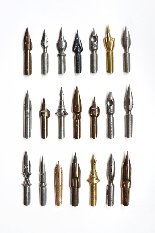
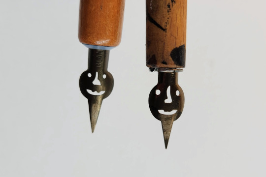
These two are my favorite. Just look at them! One of them is named Gorille and the other Mephisto, but to me they're little pumpkins.
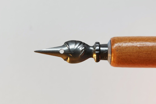
And of course you gotta love the Pinocchio nib. You get to write with the nose of a tiny guy! Just not something you get to do anymore.
#I collect them because they come in fun shapes but they're also incredibly nice to use#all the ones I own write impressively smoothly#even the most flexible and fine pointed nibs#I have a ton of modern nibs as well (like a lot) and smoothness plus flexibility is not a common trait combo#good object#dip pens
32K notes
·
View notes
Text
Mentioned a little while back that I got some more vintage fountain pens so here's one of them courtesy of my mid-at-best photography skills:


It's a Waterman no. 12 eyedropper. No clip but for some reason both Watermans and BCHR pens with clips hate me so this is the norm for me lol. Cap's patent date reads "MAY 24. 1898" so it's very likely it's from right about the turn of the 19th century. Barrel's patent date reads "FEB. 12. & NOV. 4. 1884" so I believe the later date on the cap is probably closer to when it actually left the factory.


Both patent dates are very clear despite visible aging throughout the pen. Barrel imprint "WATERMAN'S IDEAL FOUNTAIN PEN N.Y." is also very legible. The "12" stamped on the end barrel is much more faded and difficult to make out in poor lighting.

The pen's barrel, section, and cap are all made from ebonite/hardened black rubber. I don't see any markings that would lead me to believe this was ever chased/patterned. However, the pen has clearly been exposed to water throughout its life as it's a very uneven brown, with the section and parts of the barrel having turned black.


The no. 2 nib and its ebonite feed are completely intact thank fuck. The section was very stubborn and did NOT want to unscrew thanks to decades' old dried ink. I went ahead with the decision to partially soak the section to where it meets the barrel as it was already very discolored and seemed unlikely to be further damaged by this.
(Side note: it is not recommended to soak rubber pens or expose them to water unnecessarily, especially if the rubber still retains its original factory look. Even in this situation I took care to not soak the barrel.)
After some careful soaking and a little bit of heat (just low controlled heat!! NOT heated water!!!), the section unscrewed in my hand, so I didn't even need my section pliers, which was nice lol. Flushing the inside of the barrel with a syringe made cleaning go pretty fast, so I was able to fill it with ink in no time.


She's a flexy lol
The tines split very easily with hardly any pressure to the point I think I can safely classify it as a true flexible nib, albeit not a wet noodle. Without any flex, it leaves an almost stubbish EF or even EEF line—however, it lays down ink so wetly that unless you're writing VERY slowly, it doesn't look quite so fine lol. And with just barely any pressure, it easily puts down BBB lines, though (as evidenced by the slight railroading pictures) sometimes the feed struggles to keep up.
This is one of the most user-friendly vintage flex pens I've owned. It makes me wish my handwriting wasn't dogshit so I could do it justice :(
Biggest issue is a moderate crack on the cap. It isn't so severe to the point of drying out the pen, but I have to be careful when capping, and just to be safe posting is a no-go. It's functional but I wouldn't mind replacing it.

Overall, this a pretty good example of a user-grade vintage flex. Since there's no mechanism, it doesn't need to be restored, and it holds plenty of ink for writing/calligraphy purposes. I've enjoyed writing with it more than my other vintage flexies and semi-flexies for the past few weeks, and the inky fingertips are so worth it lol
#long post#personal#pens#fountain pen#vintage pen#vintage pens#stationery#fr the upstroke is usually much finer but it's just so wet and also i write too quickly to do it justice#i got a few other pens i want to post about (a waterman 13 and a moore's safety) but this is the one i've been using the most#well the most besides my vacumatic os and my dialog 3 but neither are flexy and both are very fucking different from this and each other lo#fr wish my penmanship was nicer especially with flexies#also did not realize how hard it is to record myself writing by holding my phone in my left hand smh
9 notes
·
View notes
Text
I do have a general preference for Japanese and Chinese brands for fountain pens because I like fine tips and also there's a number of fancy western pens that you can get a Chinese clone of at a better price point and honestly better quality control... dip pens don't really come with the same concerns, there's no feed and most nibs are pretty cheap (even fairly high quality nibs) and to elaborate like
the feed limits how thin you can make the tip of a fountain pen to a degree, the finest fountain pen nibs are not going to make something as thin as the thinnest dip pen nibs. and they add some complexity to the whole pen so everything needs to come together smoothly while a dip pen is like "Here is nib. Shove into holder. Done." so everything can just focus on the one part.
But if I'm going to bother writing with a dip pen it's going to be a flexible nib like a g pen or a blue pumpkin. which conveniently, more or less will all fit into the same holders.
3 notes
·
View notes
Text
Best Fountain Pens
Best Fountain Pens https://www.billsfinepens.com/best-fountain-pens United States
Best Fountain Pens: A Guide to Finding the Perfect Writing Instrument Fountain pens have long been revered for their craftsmanship, elegance, and the smooth, fluid writing experience they offer. Whether you're a seasoned collector, an occasional user, or someone looking to make a more sophisticated writing choice, understanding what makes a fountain pen the "best" for you is essential. In this guide, we'll explore what defines the best fountain pens, the factors that contribute to their quality, and some of the top contenders in the world of fine writing instruments. What Makes a Fountain Pen the Best? When searching for the best fountain pens, there are several key characteristics to keep in mind. While personal preference plays a significant role, a few universal qualities define the highest-quality pens. These include:
Smooth Writing Experience One of the most desirable features of a fountain pen is its smooth writing flow. The nib, ink, and overall design work together to create a writing experience that is free of skips and scratches. A high-quality fountain pen should provide a consistent and effortless writing experience, with no need for excessive pressure to achieve clean lines.
Craftsmanship and Material Quality The best fountain pens are crafted with precision and attention to detail. The materials used for the nib, barrel, cap, and other components can significantly impact both the pen's performance and aesthetic appeal. Premium materials like gold, platinum, and precious resin not only contribute to the pen’s durability but also enhance its visual appeal.
Comfort and Ergonomics A fountain pen should feel comfortable in your hand, especially if you plan to write for extended periods. The best pens are ergonomically designed, with well-balanced weight and grip that allows for a natural, relaxed writing posture. The shape and texture of the pen should fit well in the hand, preventing strain.
Ink System The ink delivery system is another important factor when evaluating the best fountain pens. Some pens use cartridges, while others rely on converter systems that allow you to fill the pen with ink directly from a bottle. A good ink system should be easy to use and should ensure a steady flow of ink without leaking or clogging.
Nib Quality and Flexibility The nib is the heart of the fountain pen. It comes in a range of materials and designs, with gold, steel, and titanium being the most common. Some nibs are more flexible, allowing for variations in line width, while others offer a more consistent writing line. The nib should also match your writing style—fine, medium, broad, or stub—so that your pen suits your handwriting needs.
Durability and Longevity A great fountain pen is built to last. Quality construction, attention to detail, and the use of high-end materials all contribute to a pen's longevity. Many of the best fountain pens are designed to be used for years, and some even become more personalized with time as the nib and ink system adapt to the user’s writing style. Factors to Consider When Choosing the Best Fountain Pen Before choosing the best fountain pen for your needs, it’s important to consider your preferences and intended use. Here are a few factors to think about:
Budget Fountain pens come in a wide range of price points. While high-end models from well-known brands can cost hundreds or even thousands of dollars, there are many excellent options at more affordable prices. It's important to consider your budget and choose a pen that fits within your price range while still offering good quality and performance.
Writing Purpose Are you using the fountain pen for everyday writing, for calligraphy, or as part of a professional collection? The purpose of your pen can help determine which style or brand would be best for you. For example, calligraphy pens often have broader nibs for creating decorative writing, while everyday writing pens may require a finer nib for clarity and precision.
Design and Aesthetics Fountain pens come in a variety of designs, ranging from sleek, minimalist styles to more ornate, detailed models. Consider whether you prefer a pen that makes a statement or one that is understated. The design and aesthetics of the pen should also match your personal style, as it’s a tool you’ll likely use and handle regularly.
Nib Type Fountain pen nibs come in various types, including fine, medium, broad, and stub. Each offers a different writing experience, with finer nibs providing more precise, delicate lines, and broader nibs giving a thicker, bolder stroke. Nib flexibility is also an important consideration—if you're a fan of expressive writing, a flexible nib might be ideal for you. Top Brands and Models of the Best Fountain Pens There are numerous high-quality fountain pen brands, each offering unique features and benefits. Here’s a look at some of the most renowned brands and their standout models:
Montblanc Meisterstück 146 Considered one of the best fountain pens in the world, the Montblanc Meisterstück 146 offers impeccable craftsmanship, superior writing performance, and classic design. Known for its smooth writing experience, the 146 features a 14k gold nib and a piston filling system for easy ink use. This pen is perfect for both professional and personal use, and its timeless style makes it a favorite among collectors. Key Features: • 14k gold nib • Resin body with platinum or gold-plated accents • Piston ink filling system • Iconic and elegant design
Parker Duofold The Parker Duofold is a legendary fountain pen known for its large size, smooth writing, and rich history. First introduced in the 1920s, this pen is synonymous with quality and prestige. The Duofold features a solid construction, with a gold or platinum nib, and is ideal for those who want a luxurious writing experience. Key Features: • 18k gold or stainless steel nib • Iconic oversized design • Range of colors and finishes • Classic design with a rich history
Pelikan Souverän M800 Pelikan is a German brand known for producing some of the finest fountain pens, and the Souverän M800 is a standout model. With its piston filling system and luxurious resin body, this pen delivers exceptional performance. The 18k gold nib offers a smooth and responsive writing experience, making it a favorite among fountain pen enthusiasts. Key Features: • 18k gold nib • Piston filling mechanism • Sleek, elegant design • Reliable and durable performance
Lamy Safari For those who prefer an affordable, reliable fountain pen with a modern design, the Lamy Safari is an excellent choice. Known for its comfortable grip and durable construction, the Lamy Safari is perfect for both beginners and seasoned fountain pen users. The pen comes in a range of colors and nib sizes, offering versatility and style. Key Features: • Stainless steel nib • Ergonomic grip for comfort • Lightweight and durable design • Affordable yet high-quality performance
Waterman Carène The Waterman Carène is a stylish and sophisticated fountain pen that delivers a smooth, fluid writing experience. With its sleek, streamlined design and polished metal accents, the Carène is perfect for those who want both style and performance. The pen is equipped with a 23k gold nib and offers a consistent, enjoyable writing experience. Key Features: • 23k gold nib • Sleek and modern design • Balanced and comfortable writing • Durable construction How to Maintain Your Fountain Pen To keep your fountain pen in top condition, proper care and maintenance are essential. Here are a few tips to help you maintain your pen:
Clean Regularly Fountain pens need to be cleaned regularly to prevent ink buildup and ensure smooth ink flow. It’s recommended to flush your pen with water every few weeks, depending on how often you use it.
Use Quality Ink High-quality ink can improve the performance of your fountain pen and reduce clogging. Be sure to use ink that is specifically designed for fountain pens, as other inks can damage the pen or affect its writing performance.
Store Properly Store your fountain pen in a safe place where it won’t get damaged. When not in use, it’s best to keep the pen capped and stored upright to prevent the ink from drying out.
Refill Carefully When refilling your fountain pen, make sure not to overfill the ink reservoir, as this can cause leaks. If your pen uses a cartridge system, be sure to replace the cartridge when it runs out of ink. Conclusion Finding the best fountain pen is a matter of understanding your writing needs and preferences. Whether you’re seeking a luxury pen for professional use, a reliable daily writer, or a beautiful addition to your collection, there are plenty of high-quality options available. With the right features, craftsmanship, and design, the best fountain pens can enhance your writing experience and bring a touch of elegance to your everyday tasks. Choose a pen that suits your style, and enjoy the timeless pleasure of writing with a fountain pen.
1 note
·
View note
Text
Is a Gold Fountain Pen Nib Worth It? A Comprehensive Guide
Fountain pens have long been a symbol of craftsmanship, elegance, and sophistication. The allure of writing with a well-crafted fountain pen is timeless, evoking images of writers, artists, and professionals who appreciate the fine art of penmanship. Among the various features that make a fountain pen special, the nib is arguably the most important. The nib's material plays a crucial role in the writing experience, and gold nibs are often regarded as the pinnacle of quality. But is a gold fountain pen nib truly worth the investment? Let's explore this question from various angles—performance, craftsmanship, durability, aesthetics, and value for money.
What Makes a Gold Nib Different?
Fountain pen nibs are typically made from two primary materials: steel and gold. While steel nibs are more common and affordable, gold nibs are often seen as the superior option due to a variety of factors. Gold, as a metal, offers unique properties that affect how a fountain pen writes, feels, and lasts over time.
1. Flexibility and Smoothness
One of the most significant advantages of gold nibs is their flexibility. Gold is a softer metal than steel, which allows it to bend slightly when pressure is applied during writing. This flexibility provides a more comfortable and responsive writing experience, often described as "springy" or "soft." For writers who enjoy a bit of line variation—where the thickness of the line changes based on the pressure applied—gold nibs offer a more expressive, personalized writing experience.
Steel nibs, on the other hand, tend to be stiffer and less responsive. While some writers prefer the rigidity of steel nibs for a consistent, no-fuss writing experience, others find them less enjoyable for extended writing sessions.
In terms of smoothness, gold nibs are often lauded for their "buttery" feel on paper. They glide effortlessly, creating a smoother writing experience compared to most steel nibs. This is especially true for higher-end gold nibs that are finely tuned and polished by skilled artisans.
2. Durability and Longevity
Gold is naturally resistant to corrosion, which gives gold nibs a significant edge in terms of durability. Over time, steel nibs can oxidize and wear down, especially if not properly cared for. Gold nibs, however, retain their luster and performance for decades, even with regular use.
Additionally, gold nibs often have an iridium tip (or other hard metals) welded onto the writing point. This tip ensures that the nib doesn't wear down quickly, making it a long-lasting investment. While steel nibs also come with similar tipping, the combination of gold's resistance to wear and the durable tip makes gold nibs more resilient over time.
3. Craftsmanship and Prestige
Gold nibs are often associated with higher-end fountain pens and brands that emphasize craftsmanship. Companies like Montblanc, Pelikan, and Sailor, known for their luxurious fountain pens, typically use gold nibs in their premium models. The allure of owning a pen with a gold nib often goes beyond the material itself; it's also about the craftsmanship and attention to detail that goes into creating a high-quality writing instrument.
Gold nibs are frequently hand-finished and tuned by skilled artisans to ensure optimal performance. This level of craftsmanship can be felt in the smoothness of the writing, the balance of the pen, and the overall experience of using a luxury writing instrument. For many enthusiasts, owning a gold-nibbed pen is akin to owning a finely crafted piece of art.
4. Weight and Balance
The weight of the nib affects the overall balance of the pen, and gold nibs tend to be lighter than steel nibs. This difference in weight can contribute to a more balanced writing experience, especially in larger or more substantial pens. A well-balanced pen is less fatiguing to use during long writing sessions, as it feels more natural in the hand.
The weight distribution provided by a gold nib, combined with its flexibility, can make a fountain pen feel more comfortable and enjoyable to use. Writers who appreciate a lightweight, agile pen often find that gold nibs provide that experience more consistently than steel nibs.
5. Aesthetic Appeal
There's no denying the aesthetic appeal of a gold nib. Gold nibs come in a variety of purities, with 14k and 18k being the most common. Some higher-end pens even feature 21k or 24k gold nibs. The rich, warm color of gold adds an element of luxury and sophistication to the pen, making it not just a tool for writing, but a statement piece.
For collectors and enthusiasts, the beauty of a gold nib can be just as important as its performance. Many gold nibs are adorned with intricate engravings, logos, and branding, adding to the overall allure of the pen. The combination of visual appeal and high performance makes gold-nibbed fountain pens highly desirable for those who appreciate fine craftsmanship.
Price: Is It Worth the Investment?
The cost of a gold nib is significantly higher than that of a steel nib, and this can be a deciding factor for many buyers. The price difference between gold and steel nibs can be substantial, with gold nibs often adding hundreds of dollars to the cost of a pen. So, is the higher price tag worth it?
For casual writers who primarily use a pen for occasional notes or signatures, the investment in a gold nib may not be necessary. Steel nibs can provide an excellent writing experience at a fraction of the cost. However, for those who write frequently, enjoy the finer things in life, or are passionate about fountain pens, the investment in a gold nib can be well worth it.
The longevity of gold nibs also makes them a good long-term investment. While a steel nib might wear out or corrode over time, a gold nib will maintain its performance and appearance for decades. This durability, combined with the superior writing experience, can make the initial cost more justifiable in the long run.
Gold Nib Alternatives: Tipped Steel Nibs and Gold-Plated Nibs
If you're on the fence about investing in a gold nib but still want some of the benefits it offers, there are a few alternatives to consider:
Tipped Steel Nibs: Many high-quality steel nibs come with iridium or other hard metal tipping, providing a smooth and durable writing experience similar to that of a gold nib. These nibs offer a good balance of performance and cost.
Gold-Plated Nibs: Some pens come with steel nibs that are plated with gold. While they provide the aesthetic appeal of gold, they don't offer the same flexibility or durability as solid gold nibs. Gold-plated nibs are a more affordable option for those who want the look of gold without the higher price tag.
The Emotional Aspect: Why Gold Nibs Feel Special
There’s also an emotional or subjective aspect to owning and using a gold nib. Fountain pen enthusiasts often talk about the "joy" or "pleasure" of writing with a gold nib. It's not just about the technical specifications—it's about the feel, the connection between hand and paper, and the sheer elegance of the writing experience.
Writing with a gold nib often feels more luxurious, making the act of writing more intentional and mindful. Many users describe the experience as more "alive" or "organic," where the pen feels like an extension of their thoughts. This is particularly valuable for those who see writing not as a chore but as an art form, a creative process, or even a ritual.
Conclusion: Is a Gold Nib Worth It?
Ultimately, whether a gold fountain pen nib is worth it depends on your personal preferences, writing habits, and budget. If you write frequently, value flexibility and smoothness, and appreciate fine craftsmanship, a gold nib can significantly enhance your writing experience. It offers a unique blend of performance, durability, and aesthetic appeal that makes it a worthwhile investment for many fountain pen enthusiasts.
However, if you're more of a casual writer or are just starting your fountain pen journey, a high-quality steel nib might provide everything you need at a fraction of the cost. The good news is that both gold and steel nibs can offer exceptional writing experiences—it’s all about finding what feels right for you. Regardless of your choice, the joy of writing with a fountain pen lies in the personal connection between you and your pen, and that’s something no material can fully capture.
In the world of fountain pens, a gold nib represents not just a writing tool but a symbol of tradition, luxury, and an appreciation for the finer things in life. Whether or not it’s worth the investment is a question only you can answer, based on your values and the pleasure you derive from writing.
0 notes
Text
Pictures of a Floating World, or Attempting a Definitive Map of the Clouds
So.
Let me tell you what I've been on about lately. For...ages now, I've been very involved in trying to better my understanding of comics, the design of them, the structures and formats, because I really want to make something of an ambitious design. I want to have a lot of the planning accomplished, so that what I create will readily work as a book, will have a consistent visual vocabulary, and will have a flexible enough framework that I can present certain ideas I have that I really want to convey that will probably be in defiance of what I appear to be doing a lot of the time. It's a big project. I've been going after all kinds of sources, and learning more, like the layout system demonstrated by Frank Santoro that can be rooted into fine art and renaissance painting, to dynamic symmetry, the inevitable Scott McCloud manuals, Paul Pope, Tony Millionaire, Brandon Graham, Moebius, Seth, and, of course, lots and lots of Mike Mignola. I've been lead up and down many hills. And then with lots of theory and dry erase board plotting under my belt and in my phone, I turn around into Fantagraphics Instagram demonstrating innumerable examples of people like Simon Hanselmann, working at an extremely high level with the humble squared grid, making each frame count and working the point of view moment to moment, and...I keep going.
Ultimately all of this boiled down into statements by Jim Woodring that absolutely rang my bell. It's hard to summarize Woodring, but he's a storyteller of immense talent who uses no dialogue. He primarily works with his character Frank, who lives in a surreal landscape of recurring characters and challenges that are very hard to put into words. Many of his ideas tower with significance, and he's the sort that is at once incredibly serious about his personal dedication to the craft of what he is making, but also incredibly averse to appearing any crazier than he has to while discussing what motivate him, while simultaneously being as matter-of-fact as he can about being informed by the concept of 'the Unifactor,' a term he uses to describe the world that Frank exists in.
Woodring is successful, largely independent, and, I would say, reasonably cantankerous. There are many cartoonists that over time seem to lose a proportional worldview, but Jim Woodring is not one of them. One of the things I listened to him opine recently on an older podcast, was the preponderance of, as he put it, 'prosthetic geniuses' in the field of comics, meaning those that rely on digital artwork to achieve their aims, such as Photoshop and the like. It should be noted that among his achievement Jim Woodring has crafted a quill pen with a fourteen-inch nib, that he dips into a flower vase filled with diluted black acrylic paint and leans against his shoulder to ink massive designs. He can apparently do it for hours, and cites this as being easier on the body than conventional drawing, although also much slower.
But to the point, he explained that, when a drawing is attempted on paper, no matter what, when you're doing, you have an object. The object is a drawing. It's there, it exists as an outcome of your efforts. Whereas with digital work, all you've created is an impermanent file. This really has gotten me thinking, as, for ages one my goals has been to be able to achieve drawing digitally with the same level of output as in physical media. And these words he said, made me forced to concede that these two would never achieve something approaching parity-my efforts in digital artwork were like mining for bitcoin, endlessly toiling on touchscreens to create something of value as real as the paper it could be printed on.
By this same marker, I've found that my...innumerable studies for my comic work had gotten extremely conceptual, so deeply around the bend to be nearly as visual algebra. And yet...simply taking a page, and working within the confines of that page, guided by the frictive information of my drafting pencil against the indifference of the paper's texture, was giving my fidelity levels of feedback that Wacom's 1024 levels of pressure or Procreate's rabbitholes of brush behavior customization could not hope to convey to me so rapidly or so effectively. I think of all the time I've spent battling drivers and system updates to just start to work on something that may not have even existed after I was done with it, artwork forgotten in a document folder that I would never even see unless I thought to look for it, that would remain non-existent and permanently out of sight short of me deciding to browse my hard drive instead of trying to make another thing scratchlessly from scratch.
Which is all to say that my focus has been finally pulled. There is no equaling the immediacy of physical art. I have spent nearly two decades in each realm now, but one is real, and the other only casts a shadow in pixels. Make no mistake, I will, still, be using Photoshop and other programs to complete the production of what I intend to do, but the work I want, is going to come from my hands and from finite materials. I've already made from very fine things, and I expect I'll have more soon. I've scarcely scratched the surface of what I want to do, and the stories I want to tell. Everything I have will help me along the way. I just have to let myself do the best work with the most appropriate tools in order to get there.
2 notes
·
View notes
Text
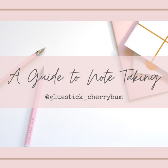
Ahoy there! I'm back with another study post °˖✧◝(⁰▿⁰)◜✧˖°
So if you aren't aware already, me as well as various other study bloggers are notorious for writing aesthetically pleasing handwritten notes. Notes aren’t absolutely necessary if you prefer to do without. A lot of my friends and acquaintances don’t bother with them and prefer to rely entirely on the lecture materials provided. I find that it helps me indefinitely in my studies and as a brief creative outlet which I rarely give myself the time for.
Why take Notes?
Instead of printing the lecture materials given digitally, I've taken it to re-write the lecture notes a few days prior to the lecture. Some lecturers insist their students read the material to get a grasp of the topic before the lecture and this is taking it a few steps further. They say writing something down is equivalent to reading it 7 times, meaning getting into memory this way is so much more efficient which is one of the biggest reasons I insisted myself handwrite my notes. Also writing your own notes is totally customisable to your needs, do you prefer mind maps or lists? Infographics or paragraphs? Minimalistic or colourful? It's all up to you.
Why I personally take notes
Different plants have different needs. Some need to be watered daily, some twice a day and some every other day. Some thrive in nutrient-rich soil and some prefer to sit in dry sand. Just like plants, each individual student has different needs and circumstances to thrive. For me, since I have a relatively low attention span and am a relatively slow learner, I needed the head start of reading topics beforehand to catch on with the rest. To me, with proper preparation for lectures, attending the lecture is like filling in the missing puzzle pieces. At least it should be. Also, I'm more of a visual learner, so if you're like me, then well structured, colourful and easy to read notes are not only more appealing but really help me in my studies and help me grasp topics a lot faster.
SUPPLIES
Probably the part where everyone is pumped for but I'll to simplify as well as be in-depth as possible.
Basically, you need paper and a pen. Need some colours? get some highlighters or coloured pens. Some people usually go one or the other but you can benefit from using both systematically.
What I look for in my preferred paper:
Thicker paper (120gsm) because I use markers and pens that bleed through anything less and I like my paper sturdy because I heavily reference my notes and I don't want them to get worn out as quickly (i want to actually try to use thinner paper and be gentler but not sure how much I can commit to it o(╥﹏╥)o).
Smoother paper is good if you use felt tips so they don't get damaged that quickly.
Line spacing. Its a waste of space and paper if you have small handwriting but largely spaced outlines. Not easy to find though.
Line colour. I prefer lighter lines such as light grey if possible, it just looks tidier that my writing contrasts more than with jet black lines.
Recycled or sustainably made paper. Because environment. Trees happy. Duh.
At the moment I'm a fan of loose-leaf paper because I'm not a fan of wasting notebook paper at the back (plus its even harder to get the paper features I want in notebooks unless I'm lucky) but if I were to succumb to using notebooks, I would definitely prefer thread-bound or hand-sewn over spring bound just because I think metal springs are annoying and if they're plastic, they aren't recyclable. You know me.
In conclusion, it's hard to find test pad with all of these features, you can consider printing your own notepaper if you're as picky as I am but you do you. If you can only afford flimsy see-through paper, that's alright. But make sure your supplies are appropriate for them as most of the supplies I use will bleed even on regular paper
Pens
Don't bother going all out and using fine liners or drawing pens to write notes. Get practical. Pick your poison. Smooth gel pens or dry ballpoint? Ergonomic or Budget-friendly? Disposable or refillable? My only guideline is to make sure they have waterproof ink because in any case, you need to send in an assignment last minute and have to rush through the rain without a folder you definitely want your writing to be at least legible if anything. (yes I learned this the hard way, yes illegible work will cost you a lot of marks. don't make my mistake 。:゚(。ノω\。)゚・。
Also. Black or Blue? Studies show that writing in blue improves memory collection but black is the more neutral aesthetic. What do I do? I use black as my main colour and write keywords and important facts in blue to take advantage of its memory-enhancing properties.
My current preference: Zebra Sarasa Clip (because its made of 75% recycled plastic and is a good quality pen) with Pentel Energel refill (gel ink that dries quickly. that's all I need)
Budget-Friendly: There are good quality pen sets at the ECO shop (Malaysian dollar store) or buy disposable pens in bulk at any book store. Trust me, it saves a lot more than buying a brand new 80 cent pen every now and again. (Also including the cost of transportation to the store because when you live independently, every cent matters) It's not exactly environmentally friendly but hey, anything to cut the cost right?
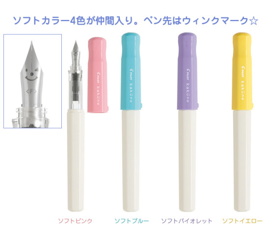
Zero Waste option: Fountain Pen with a converter (not the cartridges) and glass bottles of ink refill. Yes, it sounds daunting but its zero waste if that's your cup of tea. You don't have to go all out and buy an expensive luxury fountain pen made of stainless steel, or go fancy and get a flexible nib. If you ask me, I have my eyes set on the pilot kakuno fountain pen, its simple, aesthetic and highly recommended for beginners (although not plastic-free its made out of 85% recycled plastic which is cool since I'm hoping to make a one time purchase, I won't mind it being made from plastic but that just my taste)
Coloured Pens
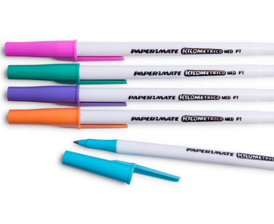
So I haven't been a fan of using coloured pens for a while but ill tell you I'm currently using a cheap set of coloured gel pens from Kaison just because they have cute patterns but the ink flow isn't that smooth so I should've bought something more practical. The ultimate budget-friendly option which is not only cheap but long-lasting and good quality, and ones that I’d recommend for anyone is the Papermate Kilometrico ballpoint coloured pens. So far I only know they come in five colours but they've been my favourite for years. Most people I know that disagree with me usually don't like the colour range or arent a fan of dry ink but if you aren't that picky and looking for a reliable option they're a good option, plus if you're using cheap paper, they won't bleed or anything so that's cool.
Highlighters
I love pastel highlighters. Its soft, cute, aesthetically pleasing to the eyes and some colours are better at actually highlighting words rather than their neon counterparts like green and purple. Although not the cheapest option, I doubt ill ever go back to neon highlighters ever and ill only be recommending pastel highlighters thanks.
My current preference: I'm currently using Monami Pastel Highlighters just because they were on sale with comparable prices to unbranded cheap pastel highlighters. I will never recommend commonly branded highlighters like Stabilo Boss or Zebra Mildliners because the extra pennies just aren't worth it since the unbranded kind has lived up to my standards. (also I haven't tried those branded highlighters mind you but I doubt I'm missing out on anything)

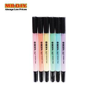
Budget-Friendly option: While Zebra Mildliners are being sold at RM5 for one and RM25 for a set, Mr DIY sells knockoff brand "BEIFA" for RM7 for a set of six which is a pretty good deal if you ask me (also there are double-sided ones with a bullet and chisel tips if you thought mildliners were the only option with those features). I've also found some rare gems, unbranded pastel highlighters hidden in common bookstores for an even cheaper price, but they're really hard to find unless the pastel highlighter trend decides to catch on. I digress.
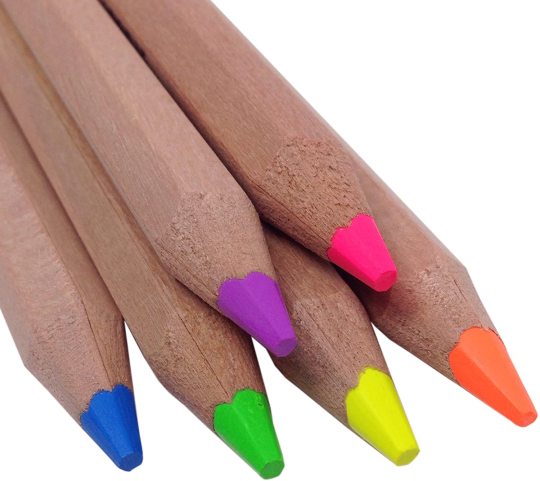
Zero Waste option: I heard about highlighter pencils, just wooden pencils with neon colour pigments, but why get trendy when you can use any old wooden colouring pencils lying around? I don't think ill give up plastic highlighters for wooden pencils despite being a strong environmentalism advocate but there are a few options for highlighters made from recycled plastic but they either don't come in pastel colours or too pricey for my taste (yes I'm a cheapskate for crud sake)
Extras
These other things aren't exactly necessary but they add little flourishes and/or aid you in your note-taking. Not exactly an extra investment but its completely up to you
Sticky notes (or coloured memo pads) for extra notes, diagrams or equations which I like for them to stand out a bit. (Pastel over neon of course)
Washi tape to divide subchapters (but a highlighter streak does the job)
Correction tape because never will I ever use correction fluid mind you
Brush pens for headers (completely unnecessary but I don't have any other outlet to practice brush lettering so.) Recommendations: Artline Stix (chunky but super cheap, marker type not for thin paper), Pentel Fude Touch (great for beginners, small and practical, 83% recycled plastic, but will bleed on regular paper)
Alternatively, a regular black felt tip marker just to make the title stand out is good enough.
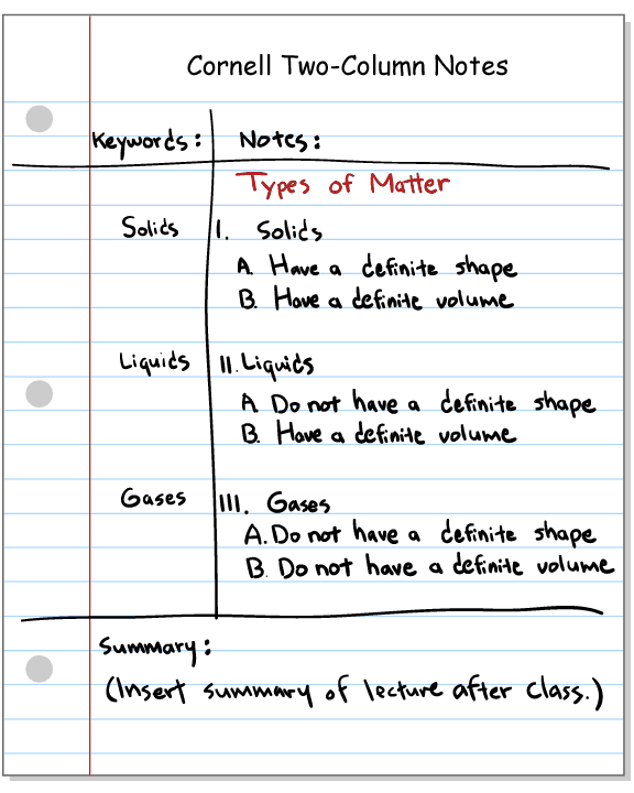
NOTE TAKING TECHNIQUES
An underrated note-taking method is the Cornell method which is frankly a systematic way to write notes in which you divide the paper into 4 sections, a place for title and date and stuff, the main body for notes, extended side margin for extra info/lecture comments/questions/subtitles and bottom quarter reserved for a summary of the notes. Some people modify this technique by omitting the summary section, depending on your needs.
Bullet points and indents. This is pretty self-explanatory, but it's pretty much notes that aren't chunky paragraphs. Easier to read, easier to register information, easier to skim through. You get the gist of it.
Highlighting system. Some people go all out with their highlighting system and designate colours to certain things such as green for vocab, orange for equations, blue for subtopics. etc. You can try this out if you want, but for me, the plethora of colour is quite distracting and not that aesthetically pleasing, but you do you.
BREAKING DOWN MY METHOD OF NOTE TAKING
My priorities to note-taking are: Easy to read, simple, decluttered and visually pleasing. For colours, I mainly use up to 4. Black pen for the main information, blue pen for keywords (or any coloured pen that matches the highlighter), one or two highlighters as a colour theme and matching sticky notes for extra info, diagrams or equations.
I assign a whole chapter to a specific colour theme, first assigning a certain highlighter colour to the first six chapters, if there are more than six chapters, I use 2 accent colours just to shake it up a bit. This makes it easier to differentiate the chapters when flipping through your notes.
So its, hand-lettered title (i do my lettering quite quickly, mind you) or all caps title in black marker. Mini banner doodle for subtitles (a simple box with a drop shadow works just fine), contrasting coloured keywords (or underlined) and highlighters just for accents like dividing subtitles or drawing boxes for extra info (that or sticky notes). I don't simplify my lecture notes, rather rewriting them in a more orderly manner and leaving a good amount of extra space here and there (or an extended margin if I use Cornell) for extra lecture notes. Also, I highlight whatever notes that my lecturer would point out as important or worth remembering. And that's pretty much it. After the lecture, I then know which parts of the notes were more vital and can then simplify those key points into flashcards which ill discuss in a different post.

Thanks for reading, I know my posts are pretty long but that's the way I like them, long but in depth. As usual, if you would like me to cover any specific topics, feel free to message me or give feedback. I hope to be able to write 2 or 3 articles a month if I can but until then, have a nice day. Study smart peeps.
ヾ(@°▽°@)ノ
#study#studyblr#studygram#studyspo#studyinspo#study inspiration#study motivation#zero waste#zerowaste#zero waste lifestyle#zero waste student#environmentalism#notes#stationery
51 notes
·
View notes
Text
Copperplate calligraphy – origin, technique and reasons for recent upsurge in its popularity
COPPERPLATE CALLIGRAPHY – ORIGIN, TECHNIQUE AND REASONS FOR RECENT UPSURGE IN ITS POPULARITY
Calligraphy is a visual art form associated with writing. Lettering design and execution with a pen, ink brush, or other writing instrument. The art of bringing form to signs in an expressive, harmonic, and skillful manner might be classified as contemporary calligraphy.
Modern calligraphy ranges from useful inscriptions and designs to fine-art pieces with or without readable letters. Though a scribe may perform both, classical calligraphy differs from type design and non-classical hand-lettering.
Wedding and event invitations, font design and typography, original hand-lettered logo design, religious art, announcements, graphic design and commissioned calligraphic art, carved stone inscriptions, and memorial documents are all examples of calligraphy in use today.
Origin of Copperplate calligraphy
Copperplate calligraphy is a traditional script derived from a form of handwriting called the English round hand. Copperplate Script is a phrase that describes one of the most well-known and admired calligraphic forms of all time. Earlier versions of this script requires the use of a feather pen with a narrow point. Later, as industrialization progressed, the use of more flexible and durable fine point metal nibs became more common. Many masters contributed to the definition of the copperplate script's aesthetic canons, but the work of writing master and engraver George Bickham, who collected script samples from twenty-five of London's most brilliant calligraphers in his book The Universal Penman (1733-1741), stood out as particularly important. Copperplate was certainly the most widely used script throughout the 17th and 18th centuries, and its influence was felt not just in Europe but even in the United States. It is very rule based and structured handwriting
RULES you must follow to begin with Copperplate calligraphy
The primary rule is to write at the same angle as the letter with the nib
To write the upstrokes thin (without pressing the pen) and the downstrokes thick (pressing the pen)
Basic strokes are critical components in learning letter concepts.
Each letter of the alphabet is assigned to a distinct group.
Lower case letters in Copperplate Script have seven basic strokes
Tools and Techniques for Copperplate Calligraphy
Tools you’ll need:
Buy a “oblique or straight holder pen”
Have a “Dinky dips”
Use your “Moon Palace Sumi Ink”
Always get hands on “Logos Calligraphy guide sheets”
Copperplate tests your patience, skill and attention to detail. Holding a pen correctly is crucial in calligraphy because it ensures smoothness while writing and also reduces pain that can be induced by long periods of writing.
Let’s have a look at how to hold the pen correctly –
Place the index finger on the pen holder's tip, with the forefinger facing down in the same direction as the nib.
Maintain the pen holder at the third joint of your index finger (metacarpophalangeal joint)
Place the thumb on the left side of the pen holder, separating it from the index finger. The tip of the thumb corresponds to the first joint of the index finger.
On the right side of the pen holder, place your middle finger. The pen holder comes into contact with the first joint of the middle finger. The ring and pinky fingers curl inwards and are placed adjacent to the middle finger. When writing, they are the two fingers that rest against the page surface.
Hooray! You got the basics right!
Recent upsurge in its popularity
As we all know that wedding ceremony is one of the reasons for recent upsurge in popularity for copperplate calligraphy. Who doesn't want beautiful embroidered calligraphy on their wedding invites. It just doesn't stop there, nowadays you can find copperplate calligraphy everywhere, right from thank you cards on any designer clothes to personal practices in a diary. The rise of poems in this font gained massive attention on long lost art which is now widely recognized.
Nowadays bad handwriting is rampant, it's everywhere which indirectly gets associated with lack of interest in a particular subject. Many times bad handwriting can cause a direct impact on marks. Few handwriting is so pathetically unreadable that it creates a massive headache for the teacher to comprehend the page. That's why good handwriting is a part of a discipline, like personal hygiene.
At the end of the day, you would want your handwritten memoirs to be worthy memories. Adding copperplate calligraphy can add up to the sweetness to your personal diary.
Penkraft conducts classes, course, online courses, live courses, workshops, teachers' training & online teachers' training in Handwriting Improvement, Calligraphy, Abacus Maths, Vedic Maths, Phonics and various Craft & Artforms - Madhubani, Mandala, Warli, Gond, Lippan Art, Kalighat, Kalamkari, Pichwai, Cheriyal, Kerala Mural, Pattachitra, Tanjore Painting, One Stroke Painting, Decoupage, Image Transfer, Resin Art, Fluid Art, Alcohol Ink Art, Pop Art, Knife Painting, Scandinavian Art, Water Colors, Coffee Painting, Pencil Shading, Resin Art Advanced etc. at pan-India locations. With our mission to inspire, educate, empower & uplift people through our endeavours, we have trained & operationally supported (and continue to support) 1500+ home-makers to become Penkraft Certified Teachers? in various disciplines.
1 note
·
View note
Text
A Most Unexpected Expectation
The following story was written by the wonderful @edaigoa to pair with the graphic featured at the end of this post in a collaborative story we’re writing. Enjoy!
Sitting at his desk, Kalyanar looked over the parchment Avie had handed him. It was finer than anything he could normally afford, crisp and expertly produced, but for once, the richness of it did not bring a scowl to his face. Instead, he was smiling, fingertips running gently over the embossed emblem his lover had ordered printed on each and every sheet. It was something he could have done himself, with some work, but having it gifted to him with an excited grin had warmed his heart. That she had specifically chosen a modified Brightquill symbol meant more than he could say.
With his lips pursed, he set his usual quill aside, rummaging about in his desk for a moment before pulling out another, along with a tray and a runed ring. The new quill - or rather, old, as he had to blow a layer of dust off - was made of thick, heavy metal; despite the obvious care that the individual vanes had been sculpted into a realistic feather shape, even an orc might have found the pen cumbersome. It was, by all appearances, too heavy for practical use. The round tray and ring both matched the quill, made of the same silvery metal and etched faintly with runes. The tray was set aside, and a bottle of fresh ink that shone faintly with mana was poured within. The ring, Kalyanar slipped over his thumb; a loose fit, until it wasn’t, sitting snug at the knuckle after only a moment. The printed parchments were stacked, tapped on the desk, and stacked again. He flipped through the pages, thumb ring brushing the edge of each sheet before the were laid out on the desk in front of him, in neat rows and columns until all the available space on the desk was filled, with a single master parchment and a scrap of notes directly in front of himself.
He had spent ages on those notes, short though they were; Avie dictating and editing on the fly as he dutifully read out the lines, writing scratched out and rewritten until perfected. Despite their shared excitement, they both wanted it to be just right.
Ring still on his thumb, he took up the hefty quill in a light grasp and tapped it on the edge of the ink bowl; bowl and quill alike rang like a delicately crafted bell. The quill split- halved and split, again and again, copying itself into thinner and thinner slivers that surrounded the bowl, floating in midair. Kalyanar reclaimed the original in a much more comfortable grasp, now that it was reduced to the thickness of a normal quill, the metal vanes and barbs of the feather thin enough to waver in the air.
He dipped the quill into the ink, and it’s copies followed like a flock of angry hummingbirds, nibs taking up ink like nectar and flexible metal tines softly buzzing together with every motion. He took up a position over the master parchment- and the copies mirrored him whirr of finely ringing metal as they jostled for position over the other sheets. Kalyanar waited calmly, despite how his own nerves jangled along with the chiming feathers; only when each quill was as still as the one in his hand did he shift, moving the pen back and forth without touching parchment. Each and every one mirrored his motions in perfect chorus. Glancing briefly at his test sheet, the scribe set quill nib to parchment and began to write with his finest, most formal script.
For a while there was no sound but the gentle scrape of quill upon parchment and the faint buzz of metal tines; every so often, he returned to the ink bowl, and the mirrored dance turned to organized chaos as each quill rushed to echo the motion in a flurry of metallic feathers and jabbing quill points. Somehow, Kalyanar neatly avoided getting pricked, the magic more organized than it appeared. With the steady hand of a scribe, Kalyanar filled in the page; at some point, he heard Avie back come in behind him, the only warning the rustle of her clothes and the soft, indrawn breath of her surprise as quills whipped about. He smiled, but didn’t comment, even as he felt the weight of his lover’s ley-bound gaze upon his back and the magical scrivenery tools.
For all the preparations and care, the actual writing did not take long. Formality completed, Kalyanar signed his signature at the bottom with his own personal script that included a heavy dose of showy flare- but leaving plenty of room for Avie to do the same. A breath of air over the parchments- hot, unnaturally so, and laced with embers that did not burn - dried the remaining wet patches in the ink in record time. Only then, did he turn, quill deposited on the rim of the ink bowl with a flurry of followers that slowly carded back together into one fat quill.
“What do you think?” He asked, holding the master parchment up for inspection with a hopeful smile. “It should be just as you wanted. I’ve been working on this ink for a while... I ground up the tailing shards from Lori’s enchanting into the pigments. I feel like I nearly enchanted my mortar and pestle half a dozen times process of testing, but I think I’ve got the right method down. Hopefully it’s not too bright? It still looks good on this end, so I figured this was as good of a time as any to test it-”
“I can see it,” Avie said, neatly interrupting his rambling; her voice soft with wonder as she grasped the parchment with shaking fingers. The shimmery black ink glowed with mana under the spellbreaker’s leysight, making normally imperceptible writing just as visible to the blinded woman as it had been before. Suddenly, with a single gesture, a whole avenue of life was abruptly reopened for her.
“-Ah. Good. I’m glad,” Kalyanar breathed, at a loss for a moment, before he reached up from his seat with a gentle hand, palm resting on his beloved’s arm as she blinked rapidly, clearly trying to keep tears at bay. “Hey. Come here?” He offered, sliding his chair back from the edge of the desk. There was a moment without a reaction as she kept staring at the parchment, oft-white eyes glowing an intent lilac, before Avie’s arm slipped around Kalyanar’s shoulders as she claimed a spot on his lap; she avoided putting pressure on his bad leg with familiar ease, despite the faint tremble in her step.
“...it really isn’t too bright, is it? I tried to use a moderate amount-”
“It’s fine,” Avie laughed, the words breaking with tears and the sharp sound of a sniffle despite her obvious happiness. “It’s perfect. Kalyanar, I can see it. That's perfect. And so are the words.” She finally looked away from the parchment to beam at Kalyanar, before leaning in to kiss him soundly. By the time they pulled apart, Kalyanar’s cheeks were flush and damp from Avie’s tears.
“...I wanted you to be able share this with me,” he whispered, forehead resting gently against her own. “This, more than anything.”
“Thank you. It’s the best present.” Another sniff and Avie roughly scrubbed a hand over her cheek, before she straightened up with a toss of her hair, reclaiming her poise with dignity. “But. I hope you weren’t expecting me to sign all of these by hand?”
Kalyanar let out a relieved laugh, tilting his head to rest his brow briefly on her shoulder. “Of course not.” Grin growing easily into a toothy smirk, he slid the ring off his thumb, dropping it neatly into Avie’s palm. “Here. I can show you how this works.”
Brows furrowing, Avie stared at the offering.
“...I am going to get stabbed by your army of quills,” she laughed in return. Avie turned the ring over in her hand- before slipping it onto her own thumb, fearless as ever.
“Nonsense! You’ll be fine. Give the pen a tap. It will still remember the parchments…”
“I’m not sure I remember how to sign my own name.”
“Don’t even joke. You’ll be fine. Here, let me show you...”
Not long after the ink was dry on dozens of identical signatures, the entire collection of copied parchments could be found posted around the Dawnspire, and slipped into the mailboxes of every significant friend, acquaintance, and noble found with the bounds of Quel’thalas:
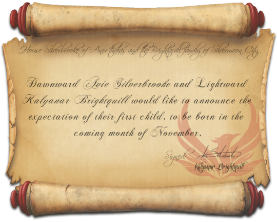
House Silverbrooke of Anor’thalas and the Brightquill Family of Silvermoon City
Dawnward Avie Silverbrooke and Lightward Kalyanar Brightquill would like to announce the expectation of their first child, to be born in the coming month of November.
Signed: Avie Silverbrooke & Kalyanar Brightquill
16 notes
·
View notes
Text
Looking for Markers? MUST READ. I'll tell you which are worth the price.
COPIC ORIGINAL MARKERS:
The classic Copic markers are also termed as Copic original markers. It is available in 214 different colors and is specially designed for artists and illustrators. It is the most expensive markers out of other Copic markers, such as Sketch and Ciao markers, as it holds the maximum amount of ink. The ink can be refilled 9 times from distinct ink bottles and has 9 distinct nibs selection. Classic Copic markers contain a medium broad/brush tip and a fine nib/bullet tip that can be used for various kinds of results. These kits contain seventy-two original Copic marker colors, come in diverse sets and are imported. These markers have been used by the illustrators and designers worldwide for decades. They are used for various kinds of piece of arts. Art like the step by step drawing tutorials I have on my site here. These markers are the good investment as you have to buy it only once as they are refillable. These are also termed as alcohol based markers. It allows you to replace the nibs and is a complete flexible marker. They are one of the most favored markers and they even have been hand tested before sending it out to assure that it performs well. Copic inks do not absorb toner as Copic markers are alcohol based; their ink dries rapidly and blends fluently. They are termed as fast-drying, long lasting and reliable. They work great with watercolors and can be surely enhanced with color pencils. This means that this piece of art, when blended with other fine art media such as watercolors and color pencils, increases the adaptability of this product. A medium broad nip much gives the finer line in contrast of the fine nib. The bullet tip is best suited for light hands whereas brush tip can provide much better results and control on the blending. The colors of Copic markers can also be mixed to create an infinite hue range. By intermixing with the colorless blender solutions, a diluted tone value is created which looks stunning when applied to coloring or sketching.
The alcohol inks used in these markers are permanent on many surfaces such as paper, leather, wood, fabrics, plastic, faux fur etc. they also work well on glossy surfaces such as glazed ceramic and glass. However, the ink might scratch off from such glossy surfaces so use a sealant to protect the surface. Make sure that the sealant does NOT contain alcohol, ethanol, or any other form of alcohol as these will ruin your coloring and drawing ideas for beginners. Copic Original markers have a very low odor so you don’t have to worry about getting overwhelmed with the smell when working in a closed or small room. Due to the low-odor, replaceable tips and refillability, these markers are completely environment-friendly. They have tight fitting caps which will never let the markers dry out. You can even swamp theses markers with water or left them in your car in sun or snow and they will not be damaged or dry out as long as the cap is placed properly.
Copic original markers have a minor issue that they feel huge and uneasy in the hands of artists, illustrators or the person who have a keen interest in the artwork which is hardly a downside if you compare it with all the great benefits it provides you and step by step drawing videos. The Copic markers tight-fitting caps have the classification of the color code stamped which means that the writing and coding on the color cap will never come off. The entire cost of this Copic original marker and the refilling of ink (6 times) is $1.54 that is an incredible value for a product of this quality. The color codes of the diverse ink refills are similar to Copic Sketch markers for apparent classification. There are certain types of Copic markers, but the most frequent are the Copic Classic/Original, the Copic Sketch, and the Copic Ciao. The Copic Sketch markers come in a vast range of colors i.e. 358 colors whereas Copic Ciao markers hold 180 color options. The comparison between these three markers is that Copic original markers hold the maximum amount of ink whereas the Copic sketch marker is in between the Copic original and Copic Ciao. Ultimately the Copic Ciao markers are used for beginners, cheaper and have the least amount of color options so we can conclude that Copic original marker is considered a premium product among both of them. These superb and high-quality inks are checked at least four times for accuracy in accomplishment. The customers of these Copic markers enjoy their artwork and are convinced by using these markers. The users rapidly feel the quality difference of these excellent markers. And easy stuff to draw for sure. In a nutshell, it is a premium product at a premium price.
CLICK HERE TO BUY ON AMAZON
COPIC ARTIST PREMIUM MARKERS:
The Copic Ciao markers are the exemplary markers for beginners. Ciao markers contain a set of seventy-two pieces. These markers are alcohol based markers and are of premium quality. Comic’s artists, architecture, fashion designers and even the landscape painters prefer these markers because they are blendable and provides much better control. This piece of art has been designed for the intermediate artists and the people who have a keen interest in coloring or sketching.
These markers are priceless in comparison to the expense, as they are artist level quality and can be refilled an enormous number of times. The longevity should be acknowledged rather than to consider the price. The Ciao marker has a round body and is narrow than the other Copic markers. It is easy and comfortable to cover these markers in hands as it fits nicely, convenient in coloring and is a durable good.
As compared with the other Copic markers, they are best suited for blending. Alike the other Copic brands, this marker is a double ended as well as color coded. It contains a super brush nip and a medium broad tip. The Super brush tip has a flexible, pointed tip that is implicative of a brush nip or a brush pen whereas the medium broad nib is firmer, angled and a chisel-like a tip that is productive for calligraphy and sweeping strokes. These markers have the tremendous results and it allows an artist to shade and blend colors. These markers provide 180 distinct color options in this Copic Ciao line. They are well worth if the person is desirable to take art to the next level and improve the style of a piece of artworks.
Copic Ciao markers work even better than paint. Usually, this is the only brand that works with paint. These markers are designed for those artists who want to experience the markers for the very first time. The artists are now converting to Copics after using the prismacolors. They are alcohol based markers and are of low odor. The children can happily work with these markers as they are non-toxic and are considered secure for them. They can be widely used on paper, wood, fabric, plastics, faux fore and much more. They are meant for frequent use and the users can enjoy a durable design and the colors that enhance the versatility of these markers. They are also termed as Copic Artist Premium markers.
The Copic Ciao markers are significantly permanent. This is amazing for the users who draw on distinct surfaces. If these markers by a twist of hair get into the hair somehow, it can color the hair that is contacted. These markers are that much strong that the color can’t be washed off from the hair. However, it can be removed with alcohol-based hands wash and sanitizers. Shading is what basically this marker is usually used for and it is recognized as high-quality markers.
A difficulty with the Copic Ciao marker is that it holds the least amount of ink in comparison to other Copic markers which is hardly a downside if you compare it with all those superb benefits it provides you doesn’t make for easy stuff to draw. These markers are great in shading the drawing book and assist to make any drawing look convincing. The users should keep these markers stored when they are not in use to protect the investment. Practice will enhance the outcomes if the artist wants to enjoy it fully. Use it yourself and also gift it to others and loved ones. They will love it and will always thank you.
CLICK HERE TO BUY ON AMAZON
MEXPY MARKERS:
DESCRIPTION:
Mexpy markers are alcohol based markers that provide exclusive color saturation and its glassy ink allows unique layering and remarkable blending effects in designing craft room, design studio, drawing coloring and much more. They mixed up and make a great addition to colors whether they brush markers or design markers. They contain a package of twenty-four markers each, their nips are replaceable and pens are refillable. They are dual tipped markers contain a firm fine tip on end and the chisel tip on the other end and are basic in color. They show the effect of 3D and refined shadowing. These markers are favored by illustrators as well as layout artists. They contain color code on caps, are super brushed, blendable and a variety of two hundred colors. It is a tremendous tool for artists, crafters, designers and the people who have a keen interest in artwork.
REVIEWS:
The different color configuration sets contain a variety of rich colors that can be utilized on different artworks. For instance, a beautiful and innovative dress has been made by blending colored markers and the colorless brush. They worked great together and was quite appreciative. The dots pattern on the dress was done by the colorless marker to lighter the ink and make it looks impressive. Look for drawing ideas for beginners on the main site 😀
It looked stunning when applied on the rubber surface. A fine tip brush marker gave spectacular result than a brush marker and gave a natural look by the coloring the chops as depending on the surface. The chisel tip didn’t look great on the rubber surface. The ink of brush markers dries swiftly so plan it accordingly. It worked like super classy.
It looked clean when applied to wire hooks. The markers used to color the wire in diverse colors. The blending is done by the clean colors so that it works magnificently and look versatile. This also worked well on plain metal staples.
Here are plain cloth flowers. Lets took a part of flowers and choose the yellow color to paint the center of petals and hold until it dries. Then move forward for wetting the outer surface of the petals each at a time with the colorless blend color by flaunting it. The color fluid by inking the surface with the orange marker.
This brightens up the color of markers and the colored flowers are much cuter and glorious than the original one. So you can design some fantastic clothes by these markers for your kid’s toys and honestly, it looks elegant.
Next one is a reused soda tab earrings that have been made by using the markers to color the metals. This looks fashionable as it can be gifted to the people who are related. The coloring is done by both fine tip and chisel tip. The few small beats are placed at the bottom of the earrings and color them by the light shade mexpy marker to enhance the beauty of the earrings. The interior part is colored by distinct mexpy markers with a variety of colors.
The other one is a cut up piece of aluminum soda that is colored by various colors of mexpy markers. Use a toothpick to hold a metal during the painting process so that the ink doesn’t spoil until it dries. Then sink the heated metal to ensure that the color would remain everlasting on the metal. The color combination of the metal looks innovative and pretty. This demonstrates that the innovative things can be made by the help of mexpy markers.
This is just the tip of the iceberg as many innovative things can be made like fun hanging wall, sketch work, necklace and much more. These markers offer you versatility and intensity in its ink. Its ink dries pretty quickly which is such a great pro, as waiting for the ink to dry so you can move on to the next phase, is kind of irritating and annoying. They are really easy to work with and their colors are always vibrant as the finished result. So go along and make your perfect piece of artwork whether it is your school science project or your very own masterpiece to show off to the world what easy things to draw is all about. Everyone should use these markers to get the spectacular results as the results are far beyond the expectations. I loved them because of the smooth flow of ink and the double ended tip.
CLICK HERE TO BUY ON AMAZON
Don’t forget to check out the other step by step drawing video tutorials featured on the site. And get some great drawing ideas for beginners.
Looking for Markers? MUST READ. I’ll tell you which are worth the price. was originally published on EASY THINGS TO DRAW
13 notes
·
View notes
Text
First Look: Wacom MobileStudio Pro 16
I first saw the Wacom MobileStudio Pro at NAB last year and finally got my hands on one to test this winter. For an amazing Cintiq-style creative pen tablet that is also a touchscreen mobile computer, camera, 3D object scanner and more, I wanted to stretch the limits of its capabilities beyond the average sketch-pad and drawing demos you typically see with Wacom products. Here’s the first look at this interesting hardware/peripheral configuration:
Wacom MobileStudio Pro 16 shown with optional wireless keyboard
I first saw the Wacom MobileStudio Pro at NAB last year and finally got my hands on one to test this winter. For an amazing Cintiq-style creative pen tablet that is also a touchscreen mobile computer, camera, 3D object scanner and more, I wanted to stretch the limits of its capabilities beyond the average sketch-pad and drawing demos you typically see with Wacom products.
Here’s the first look at this interesting hardware/peripheral configuration:
Wacom MobileStudio Pro 13 & 16
Wacom MobileStudio Pro 13 (MSRP $1699-2199) is designed specifically to meet the demands of creative professionals who want the freedom to create anywhere. It’s a full-featured, Intel®-powered computer with the muscle you need to run professional creative applications. Choose up to 16GB of RAM, an Intel® Core™ i7 processor and Intel® Iris™ 550 graphics – with up to 512GB of fast storage.
With a resolution of 2560×1440 and color accuracy of 80% Adobe RGB coverage (CIE1931), Wacom MobileStudio Pro 13’s screen is dazzling. Not only will your work look amazing, it will feel amazing too. The new etched glass surface makes it feel like you’re working with pen and paper by providing a balanced amount of resistance to the Pro Pen 2’s tip. Plus, multi-touch gestures make zooming and rotating your creations as simple as pinching and swiping on your smartphone.
Wacom MobileStudio Pro 16 (MSRP $1999-2699) is a full-featured, Intel®-powered computer with the power you need to run professional creative 2D, 3D and CAD applications. Building a prototype of a new gearbox in SolidWorks®? An hour of HDR edits that need rendering in Adobe® Premiere® Pro? MobileStudio Pro is more than up to the task. Choose up to 16GB of RAM, an Intel® Core™ i7 processor and 512GB of fast storage. Plus, both Wacom MobileStudio Pro 16 models come with NVIDIA® Quadro® graphics and on-board memory to make heavy files fly around your screen.
The 4K resolution (3840×2160) of Wacom MobileStudio Pro 16’s screen renders each fine brush stroke accurately and provides plenty of space in which to work. Color accuracy of 94% of Adobe® RGB means you can accurately reproduce even the most subtle shades. Your work will look amazing – and it will feel amazing too. The new etched glass surface provides the familiar sensation of working with pen on paper. Plus, multi-touch gestures make zooming and rotating your creations as simple as pinching and swiping on your smartphone.
While the MobileStudio Pro 13 & 16 are not just tablets, they also aren’t laptops. At first glance, the ports available on the sides of the device include a MicroSD (SDXC) card slot and 3 *USB-C slots.
*NOTE: If you’re a Mac or PC user that’s upgraded all of your Thunderbolt 2 drives and peripherals to Thunderbolt 3, you’re still going to be out of luck unless one of your devices also has the USB 3 connector and you have a converter cable or breakout dock. I’ve not found any TB2/3 to USB-C docks or converters that will communicate properly, so only the USB 3 to USB-C has seemed to work.
Wacom MobileStudio Pro 16 with optional wireless keyboard and a USB 3 SSD with a USB-C converter.
Specs from Wacom’s Website (MobileStudio Pro 16):
Display Size: 15.6 inch (39.6 cm) Resolution: UHD (3840 x 2160) Advanced Control: 8192 levels pen pressure, tilt and multi-touch Productivity Boosters: ExpressKeys™, on-screen controls, time-savings settings Ergonomics: Right or left-handed use, adjustable optional stand Compatibility: Windows 10 – Stand-alone Mac, Windows – with Wacom Link Processor: 6th generation Intel® Core™ processors Graphics Card: NVIDIA® Quadro® M600M 2GB GDDR5 to NVIDIA® Quadro® M1000M 4GB GDDR5 Storage: 256GB – 512GB Solid state drive (SSD) Product Type: Creative Pen Computer Micro SD Slot: SDXC card (uhs-ii) RAM: 8 GB to 16 GB DDR3 Expandable Memory: No Expandable Storage: Memory card or external HDD, purchased separately Security: Kensington® security slot for Kensington MiniSaver™ Mobile Lock. Fingerprint Sensor on select models. TPM 2.0. Multi-Touch: Yes PenWacom Pro Pen 2 Pressure Levels: 8192, both pen tip and eraser Tilt Range: 60 degrees Tilt Recognition: ±60 levels Type: Pressure-sensitive, cordless, battery-free Switches: 2 side switches Extra Nibs: 3 extra nibs (2 standard, 1 felt) Pen Carrying Case: Yes Pen Stand: No Pen Holder: Yes Grip: Latex-free silicone rubber Technology: Patented electromagnetic resonance method Weight: 2200 g / 4.85 lbs Size: 418 x 262 x 19 mm (16.5 x 10.3 x 0.75 inch) Displayable Colors (maximum): 16.7 million Screen Size: 15.6 inch (39.6 cm) Technology: LED Viewing Angle: 178° (89°/89°) H, (89°/89°) V Aspect Ratio: 16:9 Contrast Ratio: 1000:1 Brightness: 314.78cd/m2 Active Area: 346 x 194 mm (13.6 x 7.6 in) Graphics Input: USB-C (for optimum performance) or Mini DisplayPort using optional Wacom Link Color Gamut: Adobe RGB at CIE1931 Coverage Ratio: 85% Area Ratio: 94% Adobe RGB at CIE1976 Coverage Ratio: 90% Area Ratio: 94% Response: 25 ms Industry Standard Pre-sets: Adobe RGB, 6500 deg. K white point default: DCI, REC 709, SRGB Operating System: Windows 10 Pro ExpressKeys™: 8 customizable, application-specific Touch Ring: Yes on Rocker Ring Touch Strips: No On-Screen Controls: Yes Rocker Ring And Home Button: 4 position customizable with default TouchRing function and home button Radial Menu: Yes Precision ModeYes Display Toggle: Yes Dedicated Pan, Scroll, Zoom, Brush Size: Yes Orientation: Right or left-handed use (Portrait/Landscape modes – auto sense rotation) Cable Included: AC adaptor and power cable Display: N/A PC And Mac: Optional Wacom Link with USB-C, Mini DisplayPort and USB cables. Optimum performance using certified USB-C cable to USB-C port Video Out: USB type C Peripherals: 3 USB type C (*NOT Thunderbolt compatible) Network: Bluetooth® 4.1 technology Wireless: 802.11 ac Cameras: Front: 5 MP HD Back: 8 MP HD Back: Intel RealSense™ R200 (3D scanning camera) on 512GB model Speaker2 x 2.0W Sensors: GPS, electronic compass, accelerometer, ambient light, gyro Power Supply Input: 100 to 240 VAC, 50/60 Hz Power Supply Output: 5V/3A (15W), 20V/5A (100W) Battery: 7.6 V, Li-polymer, 70 Wh Power Consumption: Max: 96W, 0.9 W when asleep, 0.6 W or less when off Battery Life: Battery life will vary. It depends on how the products are used and which device settings are selected. Battery Charging Time: Up to 2 hours Audio: Audio headset jack included. System Requirements: With optional Wacom Link: Windows® 7 or later, Mac OS X® 10.10 or later, USB-C port (or Mini DisplayPort and standard USB port) Limited Warranty: 1 year in USA, Canada, and Latin America 2 years in Europe 1 year in Japan & Asia Pacific What’s IncludedWacom MobileStudio Pro 16 Wacom Pro Pen 2 Pen case with 3 replacement nibs, color rings and nib removal tool, Pen holder AC Power Adapter + power cable Quick Start Guide Cleaning cloth Certifications: VCCI Class B, FCC Part 15, Subpart B (class B) and C, CE, KC, BSMI, C-tick, CB, CCC, EAC, China RoHS, Korean RoHS, EU RoHS, SII, NOM, CEL, IC, Energy Star, CEC-BCS, Energy Label Law Previous generation pens: Airbrush, Art Pen, Classic Pen, Grip Pen, Pro Pen Model Numbers: DTH-W1620M, DTH-W1620H Microsoft Specialized PC Certification: None
Pro Pen 2
One of the important factors of the performance in action is the Wacom Pro Pen 2, which delivers incredible speed, sensitivity and accuracy – in addition to the flexibility in varying natural pen grip that people differ individually.
This is the first on-screen pen device that I’ve used that has no strange parallax or strange offset due to tilt angle or pen grip position.
Hands-on with the Mobile Studio Pro 16
The obvious first option was to open up Adobe Photoshop CC and give the drawing/sketching capabilities a quick run to get the feel of the pen-to-surface response and sensitivity. Having used several variations of the Wacom Cintiq tablets in the past, I really wanted to experience this new screen and pen technology, that Wacom engineers have claimed is a thinner glass with a tougher scratch-resistant surface and that the lag time is also undetectable.
The pen tip action is so smooth it does require you to adapt a different touch than you might be used to with your old tablet or Cintiq. I had to adjust my pen tool prefs settings to require a harder pressure than I have in the past until I can develop a lighter feel in my drawing approach.
If you’re an existing Wacom user, this experience is noticably different – in a very good way!
I also spend time re-programming the click buttons on the pen to simulate Right-click and Alt/Option buttons for ease of bringing up contextual menus, brush and selection tools.
If you are a keyboard shortcut junkie like I am, there are definitely some things you use frequently that can be programmed into the ExpressKeys and the TouchRing that will really speed up productivity (I’ll get into those more in my next article in this series for various apps/functions). Not to mention the many, many other keystroke combinations you may use in any one application.
However, I found that relying solely on the touch-screen/pop-up keyboard for simple Windows OS tasks such as Logging in with your password and accessing apps or the Start menu from the task bar (if it’s hidden) is nearly impossible at times, so I opted for the wireless keyboard to keep handy. It’s also much more intuitive to enter text for design and layout work as well as extracting text from a doc that you use in your layout/design or on-screen text for your video productions.
Also – the touch screen is as sensitive as you’d hope it might be. Very similar to using a large iPad and familiar gestures (you can choose between Windows 10 standards or Wacom standards in your setup prefs). I would highly suggest setting up one of your ExpressKeys on the tablet to toggle the touch screen on/off or you’ll be cursing at it while you work and it’s trying to guess between your pen tip and your hand for input instructions.
One thing I’ve been using is a Compression Glove that not only helps isolate my skin away from the screen’s surface while working, but also supports my hand/joints while working for hours gripping the pen. It keeps the screen clean from skin oil residue and doesn’t triger the touch screen surface unless you want to intentionally. Also, I’ve discovered a “hot spot” on the screen that gets really, really warm on the lower-center which I assume is where the processor or video card is located and it actually feels hot to the touch. The glove helps to isolate your hand so the intensity of the heat is much less when you glide over it or rest your hand on the screen at that location.
Also, the built-in 8MP camera will allow you to capture images on the spot directly to your device so you can start working on design comps, sketches and storyboarding right away. This is perfect for location scouting and storyboard development!
Using the MobileStudio Pro 16 with Adobe After Effects
I know you’re asking yourself “Why would I even think about trying to run After Effects on a pen-computer?” – and in most cases, you probably won’t very often. But if you have to do a lot of roto or paint work on hundreds/thousands of subsequent frames, then I can’t imagine NOT using either a Cintiq or the MobileStudio Pro for these tasks.
I tried it out with the memory-intensive Roto Brush Tool and working with media it was reading off the USB 3 SSD drive and it performed surprisingly well. Would I do a full feature production with this alone – no way, but if I needed to take care of a couple shots on the road or on a client site, then having the MobileStudio Pro with me is a self-contained way of accomplishing what would otherwise need for me to wait until I returned to my studio – or carry a lot more gear with me.
I will be covering more about the Roto Brush tool, paint tools and other editing workflows with the MobileStudio Pro 16 in my next article int he series, so stay-tuned.
3D Scanning with the Intel RealSense Cameras and Sensors
Something that nobody would expect with a pen computer is a built-in 3D scanner. It’s a smaller version of the Intel RealSense that promises to deliver a reasonably good scanned model.
The camera array on the back of the MobileStudio Pro contains Wacom’s native 8MP RGB camera (far left, not used for 3D scanning), followed by the R200’s first IR camera, its RGB camera, the IR laser projector and at the far right the second IR camera. The mount underneath is for the optional stand.
I tried a couple half-assed attempts to scan something but realized I wasn’t really following the instructions properly (who reads the instructions right out of the box?)
So we’ll be looking forward to doing some proper scans and modeling with the Artec Studio and MobileStudio Pro in an upcoming article in this series. I can only imagine how useful this modeling capability could be when combined with 3D texture painting on the scanned models.
Here’s the general introduction to using the scanner with the included Artec Studio Ultimate software (first year only is free with the device):
youtube
In my research for examples of scanning with the MobileStudio Pro, I ran across this very interesting (albeit quite lengthy) YouTube video from Laurence Mann’s channel – but he visits Ten24 studios and lets a real pro use it and show us how to set it up and scan properly with it. An extra treat if you watch through the whole video to see what a high-end 3D scanning studio produces – but I digress… check it out:
youtube
Again – that’s a drastic comparison but also a great example of how to get a good scan and just how impressive a model you can get with a portable device!
My First Look take-away…
So my thoughts and observations in general after testing the MobileStudio Pro 16 for a bit are positive and also mixed. The design in general may be confusing to some. Is it a pen-tablet? Is it a baseless laptop? Is it a 3D scanner? What problems does it solve for me?
It might be the first rendition of what computing in the future may look/feel like. Maybe we’ll see something similar in the not-too-distant future that is more modular and customizable?
Does it replace my laptop? Of course not. But it does allow me spontaneous creativity in a single tool that can do so much. What I know is that Wacom is trying hard to capture a different market here and I think they’re on to something.
PROS:
Portability and flexibility. The MobileStudio Pro 16 fits in my laptop backpack and weight a lot less. I’ve used it (with the keyboard) as my sole workstation a couple days just to see if it could be done, and while I had to keep it plugged into AC power for most of the time, it functioned surprisingly well!
The Pen functions beautifully with the screen glass. The right amount of drag on the surface keeps it from feeling like glass – more like a Rapidograph on vellum. No noticeable lag time with normal motions and works great with all the Adobe CC apps that I tested it on.
Plus it’s just cool. Way beyond just a tablet – it’s a real computer with real software. Not cheesy mobile apps or dumbed-down versions. I can use my actual production files off my hard drive and work directly with them.
CONS:
The only negatives for me from the original OOBE (Out Of Box Experience) was the lack of accessories that I find too important to exclude to make the MobileStudio Pro a truly self-contained pen computing experience for the working professional. Like the wireless keyboard ($50), Wacom Link ($70 – to use with your Mac/PC like a regular Cintiq) and a stand ($100). I mean, C’mon – at least throw in the friggin’ plastic stand folks! Very few people are going to be ONLY holding the device in their laps or in the air with their hands. I had to prop it up constantly to get at a usable viewing/drawing angle.
And the lack of Thunderbolt 3 connectivity. USB 3 is slow and outdated and hard to find compatible peripherals for. I’m really hoping they update the ports in their future designs.
Also – the battery life kinda sucks. We’re talking like iPad 2 battery life. And I haven’t found a portable charging brick yet that will support the MobileStudio Pro, so you’d better hope you’re going to be near an AC power outlet and DON’T FORGET YOUR AC ADAPTER! 😉
But alas – I see the future, and so will you when I bring you my next articles in the series covering ExpressKeys programming, video/roto workflows and real-world 3D Scanning with the MobileStudio Pro 16.
Stay tuned…
The post First Look: Wacom MobileStudio Pro 16 appeared first on ProVideo Coalition.
https://www.provideocoalition.com/first-look-wacom-mobilestudio-pro-16/
0 notes
Text
Calligraphy for beginners – Guide on learning calligraphy
Are you interested in learning calligraphy?
If that’s the case, you’ve just come across the perfect article to do that.
Learning calligraphy is not an easy process, but with the right guidelines in place it may take less time than you think.
What is calligraphy?
The term is borrowed from old Greek and refers to the skill of beautiful writing.
Rather than a simple ability to write pretty letters, calligraphers are expected to follow a number of rules and conventions, including such that govern how letters are positioned and arranged in the text.
How to do calligraphy? More importantly, does it really make sense to do it?
If you’re a designer, for instance, modern calligraphy will be a great skill to add to your resume, and the fastest way to attract clients with elegant logos, signs, cards, invitations, and more.
Our calligraphy for begginers article will help you familiarize with all these things and help you in learning calligraphy, and give your work a recognizable and personalized touch.
Here comes our compact calligraphy guide:
Learning calligraphy – where to start
Image source: Colin Tierney How to learn calligraphy? The first step down the road is to get the right equipment, including the best calligraphy pens. Pointed-pen calligraphy will require you to learn how to use a dip pen, referring to the ones made of metal tips and nibs, and attached to special nib holders.
All similar guides on calligraphy basics recommend these pens, as they don’t contain ink inside and can’t cause any damage – instead, you dip them into the special container while writing, and benefit from their flexibility to experiment with line variations. This way, your pen will never corrode or clog; despite of the number of different inks you have to use to complete your project.
How to use calligraphy pens? These are the tools you will need:
Nibs
Nib holders
Paper suitable for fountain pens
Ink
The nib
Image source: Mike I Creative Mints
The nib we’d recommend to beginners learning how to use a calligraphy pen is Nikko G-Nib, having in mind that it is relatively firm, and produces this and nice lines with the desired level of flexibility.
The nib holder
There are two types of nib holders: Straight and oblique. The first time suits better upright calligraphy styles, while oblique holders facilitate the combination of several different styles.
A high-quality and affordable alternative is the Speedball Oblique Pen Nib Holder, as well as Tachikawa Comic Pen Nib Holder for Various Pen Nib – Model 25 (great choice for upright styles, as it holds the nib more firmly than other similar alternatives).
There are also designers who use the same holder for all calligraphy pens, but we advise beginners to try several different options before they choose a single holder.
The paper
Image source: Matt Vergotis
The roughness of ordinary paper will make it impossible for you to use it for calligraphy purposes. Among other problems, you will encounter situations of your nib catching on the paper, and creating annoying ink splatters.
On top of that, regular printing paper has more fibers and consequently absorbs the ink and lets it spread inside, which will likely prevent the smooth and clean lines calligraphers are trying to achieve.
In order to make calligraphy more effective and enjoyable, purchase paper that can withstand fountain and dip pens, as for instance popular brand Rhodia that is very smooth and ink tolerant. There are several types available: blank, lined, or with dot grids.
The ink
Image source: Matt Vergotis
There are several types of ink suitable for dip and calligraphy pen, but beginners should always go for quality black samples. Our choice here would be Speedball Super Black India, as this ink is very dark, waterproof, and on top of that reasonably priced.
Preparation tips
The same as any creative practice, calligraphy is done the best in a pleasant working environment.
A convenient and well organized desk where you can place all your supplies, and feel positive and relaxed is the best place to work on your calligraphy skills.
Choosing the best writing location
Image source: Eddie Lobanovskiy
To make the most of your calligraphy practice, pick a comfortable and relaxing place where you can rest your feet flat on the floor. Organize supplies well, and keep the place uncluttered to ensure enough moving space for your arm.
The writing paper should be placed over a special writing board, or at least 5-6 sheets of scrap pieces to write on. This way, you will have a soft surface that allows you to write more naturally than you would on the tabletop, and the surface won’t let your paper move around.
Preparing the tools
Image source: Jason Carne
Make sure there are a non-linty towel and a cup of water around, so that you can clean the nib here and there. Paper towels are also fine, but have in mind that their fibers happen to snag on the nib and cause frustrating splatters.
Your ink should be placed in a wide-mouth bottle or jar to avoid touching the sides, and placed where you won’t easily knock it over. Basically, your working tools should be within your reach, but yet on a safe distance. For instance, we’d place them inside a tape roll, or even keep them closed to avoid any risk.
As mentioned before, you should place the nib inside a nib holder. The easiest way to do that is to grasp the nib somewhere close to its base, and then push it inside the holder using its outer ring.
Make sure you’re not holding the nib by its tip, as it may bend out of shape. To do this right, look for a YouTube tutorial and follow the instructions.
The basic strokes of calligraphy
Image source: Paul von Excite
Calligraphy’s building blocks are thick downstrokes and thin upstrokes. The thin upstrokes are easy to draw, as you hold your pen lightly and move it upwards.
Thick ones, on the other hands, require more pressure as the nib is being moved downwards. Of course, you should balance and combine both movements to produce the best possible line variation.
Before you begin, dip the nib deeply inside the ink jar, making sure that the breather hole on the nib’s back is completely covered. Wipe the excess ink on the sides off, and you can begin writing.
These are the rules you should follow:
Image source: Jeroen van Eerden Downstrokes come first. As you hit off, don’t apply any pressure, as this will help observe the changes in line thickness. This way, you will also protect your nib.
Experiment with different loops, and combine thinner upstrokes and thick downstrokes. The continuous line loops will help you connect them, and come up with the perfect combination.
The following step is to press the drills, and then release them. Proceed with thick downstrokes, and release the pen slowly as you move towards the bottom.
Change the order. Draw your downstrokes in a way that they seem to flow into the downstrokes.
Continue with ovals. Apply heavy pressure on the left hand side and lighter pressure on the rights side.
It happens often that a new nib draws two parallel lines instead of a single one, or ‘railroads’, as experienced calligraphers describe it. The reason is that you either applied too much pressure, or have no more ink to work with.
Equipment and stroke tips for professionals
For those of you who feel confident to start writing professionally, we’ve prepared some pizzazz to add to your beautiful lettering.
Modifiable characters
Image source: Mike I Creative Mints
An easy way to give your writing a proficient look is to change the slant, something you can easily do adjusting the width of the strokes and the length of their connectors. Start by changing the distance between letters, and giving the baseline an angled, staggered, or curved look.
Such modifications will help alter the feeling your writing inspires, as well as the message it conveys. Is it formal, dynamic, or whimsy? Think about it!
You can also change the way in which you form letters, and make them a bit thinner, rounder, or even joined in a different way. Do this several times, and you will for sure come up with a brand new design.
Flourishes and frills
Image source: Paul von Excite
Your are learning calligraphy so you need to do some flourishes. Flourishes can be added to your text as curlicues and loops, so that it will turn our more beautiful and easy to notice. For instance, you can cross heavy lines with lighter ones to show that you do care about the text’s visual balance.
Another alternative is to trim the calligraphy with special drawings coordinated with your words, or use banners to highlight important lines. The more complicated your design is, the smarter it will be to start out with a pencil drawing and test it.
Traditional calligraphy
Image source: Inkration
Spencerian and Copperplate are the perfect examples of traditional calligraphy scripts, as there is little of their modern descendants’ variations to be seen on them, but the classic elegance is undisputed. Special projects may require you to familiarize with them, an idea that is also useful to improve your calligraphy discipline.
The perfect nibs
Image source: Kemal Sanli
Your ideal nib should be sharp, flexible, and very responsive. In such way, you will be able to draw thinner lines, and enrich them with dramatic and fine finishes. For sensitive projects, we recommend three great nibs in particular:
Speedball No. 101
Brause 361 Steno Blue Pumpkin
Brause 66 Extra Fine Arrow
None of these nibs will be easy to use, but the effort is absolutely worth it.
Useful tricks
Image source: Matt Vergotis
You’ve just started monetizing your calligraphy skills, but something still looks quite wrong with it. It may be that you’re having problems using the nib, in which case you may find the following tips useful:
If you’re facing problems with the strokes:
Instead of jumping on the bandwagon, try out faux calligraphy and see how the strokes look and fill. Write cursively, and fill in the spaces for the downstrokes. This way, you will mimic the ideal line variation, and see what you’re actually supposed to do.
Practice on printable sheets until you’ve learned perfectly how to shape your letters. It shouldn’t be difficult to find some basic stroke and capital samples on the Internet.
Start with lighter pencil drawings, and trace over them slowly with your pen. Once the ink is dry, erase all pencil traces.
Large letters make it easier to depict critical mistakes.
If you got a sloppy-looking slant
Use slanted guidelines while practicing. Draw one of your own using a protractor, or even apply regular paper. A guide sheet under the paper will make the process easier.
In order to create the right slant, rotate the paper. You will see immediately which the best position for you is.
In order to skip rotating the paper, replace your current nib holder with an oblique one.
If your hand is too shaky or tired to work:
Use practice strokes to warm up
Hold the pen loosely, and shake the hand out
While writing, move the entire arm instead of the wrist.
Spend more time practicing. Do more drills, even when you’re simply using your phone. This will help move the hand smoothly and naturally.
If the ink simply won’t stay on the nib
Some of the new nibs have a very thin oil coat that may not coincide with your ink. To prevent a serious problem, rub it with alcohol (or with a softer toothbrush and paste), or simply pass it through flame.
The problem may also be that there is some remaining, dry ink on the nib that is interrupting its flow. In such case, take a pen cleaner and scrub it off.
Keep in mind that a regularly used nib requires occasional cleaning and maintenance. To clean it properly, remove it from the nib holder, brush it thoroughly, and let it dry completely before you apply it again.
If your work could use some refreshment:
Change the nibs, and try several new ones.
Change the ink. You will find many types of calligraphy-friendly ink to work with, but dip pens can usually tolerate any liquid able to leave lasting marks when applied over paper. Some designers even choose to use nontraditional methods, and make their drawings with watercolors, coffee, or berry juice.
Choose a style
Image source: Paul von Excite
Unlike calligraphers of the past, designers today are free to choose whatever style they like, or even professionalize in several ones to complete different projects. As discussed before, knowledge on several calligraphy styles is useful to showcase the writer’s personality, convey an important message, or simply complement a formal occasion. Here are some popular ideas that could inspire you:
Formal flourishes
Image source: Eddie Lobanovskiy
If the tone is classic and vintage, that doesn’t mean that the script won’t look modern. Combining styles like these will impress everyone who sees your work, starting from your friends to the Queen of England!
Elegant calligraphy
Image source: Joshua Bullock
Writings can be fun and sophisticated at the same time, and elegant calligraphy is there to prove it. Mixing classic lettering with dynamic flourishes is the best choice you have to design invitations for weddings and other special occasions.
Romantic and artistic
Image source: Matt Vergotis
Did it happen to you that a particular slender script reminds you of romance?
These lace-like writings have scrolled and high angle flourishes, and are thus suitable for delicate letterforms and invitations that will captivate your guests’ attention.
Whimsy
Image source: Paul von Excite
Whimsy writings feel breezy and relaxed, and usually inspire us to think of fairytales and getaways. It is because of their fluid baseline and dynamic angles that these writings capture our mood, the way a well written poem makes us dream of adventures.
Bouncing balls
Image source: Eddie Lobanovskiy
Regardless of your age, you will always be attracted by good-looking invitations, a trick designers often use to get the fun rolling and sell well. The perfect script for such invitations is the romping one, achieved with playful baselines and rounded letters to set the good time tone.
Important calligraphy facts
Calligraphy doesn’t happen overnight. You must practice, as much and as often as you can.
It won’t take more than a couple of hours and few attempts to understand whether you can actually do calligraphy.
If you’re not 100% focused, it won’t work. And that’s the end of the story.
Calligraphy is not only about how you write, but also what you’ve written. This is why you should always write ‘real’ words, and convey a meaningful message.
You must learn continuously. While doing so, you will discover a vast and fascinating world that sucks you in with and keeps you looking for more. The fun involved is just unparalleled.
What makes the difference is quality, so make sure you buy some top quality supplies.
Calligraphers are usually friendly people and awesome communicators. Thus, they are your best source of information and inspiration, and you should immediately start looking for a mentor.
The top five calligraphy options
Next, we will set down the most important calligraphy outlines categorized in five different approaches and sets of lines and letterforms. The section will also help learn on diverse tools and techniques that can be used for your projects, and we recommend you to try all of them.
Double-pencils
Double-pencils are both simple and very helpful for those constructing calligraphic letters. They can also be applied to create large and captivating lettering for posters, banners, and similar promotional materials.
youtube
You need a couple of well-sharpened pencils with two rubber bands. First, shave some of the pencils’ side surface off to place them in an adjacent position, and to make sure they are close enough.
Rest them together in a vertical, point-down position, and make sure their peaks are at the very same level when touching the paper. For the purpose, you can fasten them with tapes or rubber bands on both ends.
Then, take the double-pencil and hold it in your usual drawing position. Ideally, it should be pointed front-left, and at an angle of about 45 degrees.
While both pencils are placed upon the paper, press them lightly, and point them both forwards and left. The distance between their points is what forms the so-called ‘invisible nib’.
As you move your hand, you will be drawing a double line, and if you decide to make circles while pointing it in the same direction, your double pencil will create unique thin-and-thick ribbons with unparalleled precision.
If you don’t feel familiar with pen angles, or are lacking the confidence to produce the thin-and-thick effect, think carefully of all moves and directions involved.
This process will require three different skills: working with the pen angle; directing the hand movement; and putting the right pressure on the paper.
Felt-tip pens
These pens are more than convenient, very cheerful, and most importantly – much cheaper than all similar tools.
Of course, this doesn’t come without a toll, and the ink of these pens tends to fade in time, or maybe look too heavy and be damaged easily under the slightest pressure. This is why these pens are a great tool to practice, but not a top rated alternative when completing important projects.
youtube
To get one of your own, get a pen and a piece of paper. In case you tend to mess around with first-time experiments, get two – a 3-5mm and a 1.5-2 mm pen. Start with the broader one.
You won’t have to worry about paper either: felt-tips pens will work just fine on printer samples, parchment (not ideal for beginners), or similar materials.
The pressure here must be light and even, as many calligraphers undergoing training make the mistake of pressing too heavily. Doing so won’t help your felt-tip pen work perfectly, but only soften and splay the only tool you have to practice with. Keeping clinging contact with the paper, on the other hand, will produce much better results.
Touch the paper with only one corner of the nib, and then proceed with the other to get an overview on how your writing is going to feel.
Rest all of the nib’s end-width on the page, and then rock it slowly: does it feel that one of the corners is leaving the paper while the other still remains there? It is almost like magic!
This time, place the full width of your nib on the page, making sure that both corners are touching it appropriately. Remember that this is the ideal writing contact, and that pressing harder may cause any of the nib corners to lift.
The pen angle and the pressure are two different points, and the pen should point out to the left and the front at approximately 5 degrees. Doing that, the hand should be moved to form light and beautiful ribbons.
For sharper and crisper lines, consider getting a higher quality marker, but you should be considering this only once you feel confident to practice calligraphy professionally.
The best value and best-buy pack we recommend is Sharpie Calligraphic, which contains 12 nibs with different colors and sizes; and Staedtler Duo, a 2-piece fair quality marker set. The superior pack that doesn’t smudge and bleed is called Calligraphy Pen Set, and comes with four light-fast ink pieces in the primary colors.
As discussed previously, it makes no sense to buy special calligraphy paper while you’re practicing, as printer paper is both satisfactory and affordable.
Still, if you find yourself annoyed by constant ink stains you can consider Ampad’s Dual Ruled Pads or thin at cartridge paper such as the one used in UK, but have in mind that they will cost slightly more.
Writing calligraphy with refillable, cartridge, and fountain pens
Image source: Moran Goldstein
What you will need is: a pen, a separate ink supply (a refill bottle, or an included cartridge).
If looking to understand how refillable and cartridge pens work, think of their fountain counterparts: Each pen will hold a large reservoir filled with thinner ink, and that ink will flow through the barrel’s baffles controlled by an internal mechanism. This way, it will run straight inside the nib unit, and spread easily onto the page.
With a pen like this, you will also get multiple nib units in different sizes, and a wide selection of cartridges to use with the pen’s main body.
The biggest benefit of using refillable and cartridge pens is that they’re easy to work with on horizontal surfaces, thanks to their advanced mechanism for mechanical control of ink flow.
Unlike dip pens, they’ll prevent you from running out of ink in the middle of a word, and are certainly a much safer option for clumsy beginners.
Cartridge ink is slightly thinner, in order not to dry out and clog on the innards of your pen, and this also gives it a jolly thin look when applied on paper.
The nib unit is also notably rigid, having in mind that its mechanisms have to screw within the barrel. This means that cartridge ink combined with a flexible and responsive nib may indeed revamp your whole calligraphic experience.
The same as fountain pens, cartridge calligraphy pens leak in a spectacular manner.
This doesn’t change the fact that the ink left inside them over time can dry out and clog, which imposes the need to maintain them properly. Here and there, you will have to wash their nib unit really carefully, but you can never remove all ink stuck on their basin.
A bonus tip
Image source: Paul von Excite
Refillable and cartridge calligraphy pens are considered most productive by calligraphy professionals, and are also typical for many popular websites. For this reason, beginners are highly recommended to use them.
Dip-pens and quills
There are many different types of dip pens, but there are few essential principles that apply to all of them. For instance, all dip pens are built with these elements:
Handles and nib holders – Holders and handles are the area where the writer will grip while working, and should therefore be comfortable and soft to his hand. Most of the time, they come with internal metal arrangements on both ends of the nib, so that you can move them in and out securely.
Nibs – Nibs are the pen’s metal endings that have two separate parts, and an extending ‘tongue’ that keeps those together. Their tip is square-cut to make full contact with paper, and usually flexible enough to allow ink to spread crisply and evenly on your surface.
Reservoirs – Reservoirs are sometimes built within the structure of your nib, and look like small depression cups on the side used to feed the slit. Some of them are provided as separate metal cups you have to fiddle on the nib before you can use them, including such that are place on top and underneath the nib. The main function of reservoirs is to accommodate a small ink supply and keep it ready at the slit’s top, so that you’re able to write at least few words before you replenish with ink.
The reservoirs will not always be built within the nib, which makes it possible to buy each of the three elements separately, namely to mix-and-match between them. The options are endless, and can’t possibly be put together in a single guide, but the experience of popular calligraphers may help you make the right decision.
As a beginner, you may also want to save some time and effort, and thus consider buying a preassembled dip-pen kit. In most cases, you will be given 4-6 different nibs with holders and reservoirs, and they will cost less put together than what you’d pay buying them separately. We once again recommend Speedball’s Calligraphy Lettering kit, where you will find a holder and even 6 different nibs.
Ink may or may not be included in your set, so start looking for a suitable one.
The best ink types for dip pens
These are the best inks you can use with dip pens:
The best results are achieved with opaque and thicker inks such as Chinese stick ink, India ink, or even gouache paint you’ve previously diluted to make its consistency half-creamy.
For wishy-washy and undefined strokes, you can consider watery inks typical for fountain pens.
What you can do instead is to get a medium-sized brush suitable for watercolors, and then refill the reservoir at the nib-slit’s upper portion.
Writing calligraphy on slopes
With a dip pen as your preferred tool, you will find it easier to write on slops than writing desks, including easels and boards perched within your lap and supported by the desk’s edges. Calligraphy will take its time, so make sure you’re comfortable.
First and foremost, choose a stable writing surface that won’t slide away.
Adjust seating, and make sure you’re comfortable and set up on a working height you find relaxing.
If possible, fix the paper surface on the slope (you can use blu-tac and masking tapes such as the ones medieval monks used to hang weight on).
If you’re using a quill or a dip pen:
Keep the ink/paint opened, and placed close to your non-writing hand.
Choose a good ‘parking place’ to load the brush safely once you’ve dipped it, and avoid ink from splotching on other surfaces. You can get a small saucer that will accommodate your tools while you’re having a coffee break or attend a call.
Pay attention: Resting the loading pen/brush across the open ink bottle will cause ink to spread on the handle, and eventually end up messing up your fingers while working.
How to load a quill/dip pen
Take the pen in your writing hand, and hold it in a horizontal position
Dip the loading brush in a way that allows you to take only few drops.
Preserve the pen’s horizontal position while applying ink from the dropper/brush tip to the reservoir.
Replace the saucer and the brush on their saucer, and preserve the pen in a horizontal position. Otherwise, you may end up cleaning ink stains from your lap.
Take a piece of scrap paper and test the flow of the ink on each side of the sloping board. Only after you’ve done that you can proceed with your main tasks.
The choice of your ink, nib, and writing surface will determine how often you have to reload your reservoir. In the best scenario, you will do so after few words instead of few letters, but this may also depend on the speed you’re working at.
The very same rules apply when you’re using a quill. Unlike steel nibs, quills are more flexible and wear down easily, especially when you’re using them on cheap and abrasive paper.
Because of the slit nibs of quills and dip pens, these tools happen to damage paper when handled by a non-professional.
Unless you’re absolutely sure that you know what you’re doing, we recommend you to look at similar calligraphy methods that take less effort to learn.
Writing calligraphy with sponges and square-end brushes
Image source: Matt Vergotis
Here comes the ‘messiest’ calligraphy approach we prepared in this guide:
The thinner the brush’s sides are the better results you will achieve. The recommended width is somewhere between 6 and 20 mm, preferably with a firmer texture (sable and nylon instead of bristle, for instance). Brushes are also categorized as flat and bright, the later being consider as a better option that preserves line control with its shortness and stiffness.
You can take a normal cleaning sponge and cut it into block, and then turn it into the most remarkable calligraphy tool. When using it, don’t forget to protect your hands with ink-proof gloves.
There are several important differences between writing calligraphy with a nib and a square brush.
The brush, for instance, is very flexible and soft, and will respond to higher pressure by creating thicker lines, and that’s not what traditional nibs actually do. Another characteristic of brushes is that they tend to run out of ink quite fast, and happen to produce a modern texture and unique, scratchy look.
The best way to use brushes is on a sloping surface (approximately 30 degrees). Horizontal writing surfaces will also do well, as long as you they grip the color well.
We recommend using sponge nubs for bold and large letters, as their firmness can make your strokes unbelievably crisp.
You must, however, control the pressure you apply, as any variation may squash the finesse of your lines and cause paint to run down the page, but you can of course do this deliberately (looks absolutely adorable!).
Another interesting effect of sponges is that when running out of ink, they produce patchy effects similar to the ones of the brush, and create interesting contrasts and fading lines that are very attractive.
Ideally, you should use a thick and opaque ink as for instance India, extra thin poster paint, or diluted gouache colors for your sponges and brushes. All other runny and watery ink won’t stay long on the sponge, and will thus make your letters look drippy and patchy.
The biggest advantage of using sponges and large brushes is that they leave enough space and wet ink on the letter line for you to add additional colors, blend them in an interesting manner, or simply let them flow.
When mixing several colors in a single letter, take a slight scope is whatever bright color (white is also fine), and draw a basic letterform. Afterwards, place it on a horizontal surface, and pour several drops of darker and contrasting colors. Don’t move it until it dries completely, unless your original intention was to blend it more, and make it look unique.
Mastering faux calligraphy
Faux calligraphy is in fact modern calligraphy that has been created with a standard pen (gel, ballpoint, and so on). For many designers, standard pens help get acquainted with calligraphy altogether, and there are two important reasons for that:
The thing with standard pens is that they’re not intimidating, and are often more flexible and more approachable than other types. At the end of the days, these are tools you’ve used ever since you can remember, and there’s already enough muscle memory to work with and create beautiful calligraphy.
Faux calligraphy, nevertheless, is not only there for beginners. Regardless of your proficiency level, you can find it useful to practice for your important projects.
Assembling a great calligraphy dip pen kit of your own
Here is what you’re going to need:
A couple of Nikko G nibs – At the beginning of this post, you had the chance to read more on the quality of these nibs, often referred to as the best beginner-friendly nibs on the market.
A straight pen – A good choice is a Manuscript pen, as it has a universal nib insert. We also recommend General’s cork pens because of their flexibility and ease of use.
32# Laser jet paper – Or simply put –printing paper. This is a cost-effective solution that nevertheless prevents ink from bleeding and feathering.
Screw-top containers and Sumi ink (India ink will do as well). Both of these inks are opaque, and will provide your work with smoother viscosity.
‘Art water’ – To clean the nib from time to time, you will need a cup of water.
Non-fibrous towels and cloths – You can also use paper towels, but you should be careful keeping the nib away from catching their fibers
Instead of buying expensive, overrated calligraphy kits for beginners, we recommend you to put together one of your own, and pick only the tools that are beginner-friendly, affordable, and genuinely useful to you.
Cleaning the nibs
Upon purchase, all nibs come with manufacture oil on them, as this oil helps keep them sellable and well-preserved. It will be almost impossible to keep oil and ink on the nib at the same time, so clean the nib thoroughly before you start using it.
Once done, you will see how ink flows off the nib smoothly and seamlessly, and doesn’t blob on your paper as it would with oil in it.
Assembling the dip pen
Most beginners opt for Speedball’s plastic pens because of their Nikko G nib, but there is nothing wrong with using universal-insert dip pens either.
These pens have a rim and even 5 metal petals, and can thus accommodate many different sizes and types of nibs.
Holding the pen
Gripping a dip pen is no different than gripping a standard one, which means you’re still supposed to use the thumb and the forefinger, pinch the holder with them, and place the middle finger behind the pen for additional support. While drawing, use the ring finger and the pinky to drag light lines.
Dipping the pen in the ink jar
The nib you’re using won’t matter – the quality will still depend on whether you’ve dipped it deep enough.
In technical terms, this means dipping slightly above the vent hole (the central one), in order to avoid putting too much ink on the nib, and letting it flow down while you’re writing.
You should also shake the nib firmly over the art water to make sure all excess ink has fallen off.
You are ready to go!
The main difference between regular ballpoint pens and dip pens is the angle: modern calligraphers should be looking to keep the nib angle related to the paper constant.
You should never hold your pen vertically, but shoot for an angle of 45 degrees between your pen and the paper.
Holding it too upright is not a good idea either, as the nib may catch on the paper’s fibers, and affect the way in which your ink flows.
The post Calligraphy for beginners – Guide on learning calligraphy appeared first on Design your way.
from Web Development & Designing http://www.designyourway.net/blog/typography/learning-calligraphy/
0 notes
Text
Stylefile Marker Review
Stylefile Marker Review
Just over a month or so ago, I was allowed the opportunity to review these incredible, German based, Stylefile Markers. As we all know, especially in the art world, you can bet your hands on anything designed and or manufactured in Germany, being of incredibly high standards, so I was very excited to be given this opportunity.
As I have mentioned in my YouTube review of the Stylefile Markers, I try my best when reviewing a product to keep the review completely about that company and not mention other companies. I will however, be releasing a series videos specifically comparing similar products, but when it comes to markers, so many people, myself included, consciously or subconsciously compare to the most widely renowned Japanese markers used by so many manga and anime illustrators.
within the past few years, so many cheap versions of the Japanese illustrator markers have flooded the market, most of which not even coming close, however, the last year has seen that market change so dramatically, of which I have reviewed some excellent alternative markers. The Stylefile Markers however, as a collection and I will explain the collection in this review, deliver exceptional quality and a uniqueness I've never seen before in any marker brand.
Also with the Stylefile Markers, I completed my first ever speed drawing of the Marvel character "Black Panther" and I can say that the Stylefile markers and their fantastic range of nibs made the result of the drawing, as good as it is. To see the speed drawing you can see it here.
(adsbygoogle = window.adsbygoogle || []).push({});
Stylefile Markers
As I have mentioned, the Stylefile markers are a German based company and if you take a look on their web site, in the gallery section, you will notice that, although not exclusively, a lot of amazing graffiti artists have taken to the Stylefile marker, in fact, if you read the history of the company, you will discover that the concept of the Stylefile marker was born from the professional graffiti world. Stylefile started out around 2009 and since then have been evolving ever since, introducing more innovative approaches to marker art. I have to say, I have fallen in love with these incredible markers and let me show you why.
Types Of Stylefile Markers
There are three different types of Stylefile markers available at the minute and as I have mentioned, as a collection, as a collaboration between all three styles of marker, Stylefile make creating your art such an amazing experience. It is also important to mention that these markers are also Alcohol based as I know some people are sensitive to such markers, however, I must say that there is very little to no odour from the markers, although I fully understand that some people are just more sensitive than others to this type of medium.
The Classic
The first of the markers is the Classic, the classic sports a black, round barrel, the marker is dual tipped with each end cap displaying the colour of the ink in the marker. As well as the end caps being the same colour as the ink, both caps have the name of the pigment written on them as well as a numerical code, representing the colour should you need to either replace the marker individually, or purchase a refill.
Along the barrel of the marker, toward the end caps, a large dot and small dot have been painted on the barrel, helping the artists to visually identify which cap reveals the chisel nib and which the fine bullet nib with the large dot representing the chisel nib. The small dot represents the fine bullet nib, however, there is also a thin light grey band between the cap and the barrel, adding another visual guide to which nib is covered by the cap. A lot of marker artists will contest to the fact that on many occasions, they will have had to take of both caps in order to locate the desired nib, but with these easy to identify markings, Stylefile has removed this headache.
The nibs on the Stylefile Classic is of a classic nature and perhaps nibs you have seen in other markers, however, the quality of the nib is also a major factor and Stylefile have sourced the highest quality nibs. I have only been using my Stylefile markers for approximately a month and a half, in this short period of time I have used the markers extensively, as you may also be able to see in the speed drawing of Marvel's "Black Panther" I created.
(adsbygoogle = window.adsbygoogle || []).push({});
Stylefile Brush Marker
Next up is the Stylefile Brush Marker, now the brush marker seems to be the most popular type of nib that marker artists are looking for and Stylefile do not fall short. As with the Stylefile Classic, the Brush marker sports a light grey barrel, also displaying the same large and small dots close to the end caps for ease of identifying the nib types. As with the Classic, rather than a light grey band, the Brush sports a black band between the barrel and cap as another identifying feature of the brush tip. So the large dot indicates the chisel nib and the small dot, along with the black band, identifies the brush nib.
Again, as with the Classic, the lids on the Brush marker are the same colour as the ink within the marker, again making it incredibly easy to select the colours you want at a glance. Looking a little bit closer, you will also see that both lids are marked with the colour name and a numerical code representing the pigment should you need to order a replacement marker or refill.
The Stylefile Brush tip is an excellent tip, with a level of flexibility allowing for a plethora of marks to be made. Also, in some of my other marker reviews, people have contacted me months later and told me that the nib on their particular marker has either lost it's point or frayed. As previously mentioned, I have been using the Stylefile markers extensively for a month and a half now and the Stylefile Brush tip has kept its shape perfectly, no fraying and ink flow has remained as rich and free flowing as the day I first used them.
Stylefile Brush Marker Skin tone's
I was incredibly fortunate that Stylefile sent me a wonderful 12 set of Brush Tip Skin Tones which as you can see from the images below, this set in itself is such a valuable set to have in your arsenal.
(adsbygoogle = window.adsbygoogle || []).push({});
Stylefile Allround Marker
The Stylefile Allround is the third marker in the Stylefile range and also the newest to the lineup, but in my opinion, the Stylefile Allround is what really sets this brand among the other so many marker companies. I have never seen another marker out there, with the same nibs that the Allround sports.
As with the Classic and the Brush, the barrel is round and dark grey in colour, making all three Stylefile markers really easy to distinguish between one an other. The Allround also has the same markings to help identify which nib is under the lid. So, on to the nibs and what makes them so unique and why I feel, that as a collection, the Stylefile markers are the finest on the market.
The large dot on the Classic and Brush markers represents a chisel nib, but not in the Allround, this time the large dot identifies a nib I have never seen anywhere before, never mind in a marker. I really don't know how to describe it, so the best thing to do is show you the nib.
The other nib on the Allround is yet another nib I have not seen on a marker but it is one heck of a nib and one that really helped me with the Black Panther drawing I done. Actually, the reason I chose the Black Panther drawing was because, Stylefile sent to me a set of 12 Neutral Greys and in the set of 48 Brush markers, there was 12 Neutral Grey Brush markers. I felt Marvel's, "Black Panther" drawing would allow me to demonstrate the range of amazing nibs and just how well the Stylefile markers all work together.
As you can see from the image above, the Stylefile Allround nib is along the same lines as a fine liner, but with all the power of an artist grade marker at the helm. The Allround as I mentioned is one of Stylefile's newer markers to the range and as things stand, the Allround does not have the same vast selection of colours the other two have. This may be the way things will stay or perhaps more colours will be introduced to the range at a later date. Regardless, the Allround is an outstanding marker and one I will be saving my money to get some of the colour sets.
Stylefile Over All Features
So I have spoke about some of the individual features of the markers, but altogether, Stylefile have really pushed the boat out to make this marker stand out among the many markers clambering to reach the top spot. to be honest though, I don't think Stylefile are interested in entering some race to be top choice marker for illustrators and artists a like, I feel Stylefile confidently let their product do the talking and stand alone with a unique art product for artists and illustrators of all walks to love adore and pine for.
The first thing I noticed about the Stylefile markers was the incredible ease of removing the lids. So many markers have really stiff lids to remove and it is almost a tug or war game to remove them, this is not the case with all three of the Stylefile Markers.
Although the barrels of the Stylefile markers are round, on all the lids there is a small fin preventing the barrel from rolling off your work surface. Stylefile have also made identifying all three different markers really easy with their very different barrel colours
Stylefile Sets
The best way to find out about the sets and pricing is to visit Stylefile's awesome web site, they have a section on there, with a map of the world and the distributers of the Stylefile markers. Simply click on your country and a list of stores will be provided of where you can purchase the markers in that particular country.
For the Classic Marker, sets of 6, 12, 24, 36, 48 and 72, there is also a 120 Display set along with a huge 756 display case for retailers to purchased, complete with markers.
The Brush Marker sets are the same as the Classic, 6, 12 , 24, 36, 48 and 72 as well as the retailer display sets which I have to say look absolutely amazing. I say retailer display sets, anyone can purchase them really as they are available on Amazon as well as the Stylefile web site.
The Allround as I have mentioned are the new kid to the lineup, they have a 12 set of Neutral Greys, 12 set called Main Set a and a 12 set Main Set B. Both A and B sets are colours.
As well as the sets, I have mentioned throughout the review that the markers can be purchased individually in Open Stock which is fantastic, however, Stylefile have also started with 25ml refills bottles, which in themselves look amazing.
Stylefile Sketch Pads
Of course, Stylefile don't just stop with the outstanding markers, they also provide the perfect surface to use these beauties on. When Stylefile sent the markers to me, I almost threw out the box after removing the markers, but I knew it was too heavy to be an empty box. So I removed all the packing paper to protect the markers and much to my delight found an A3 Stylefile Marker Sketch Pad. However, they also have hard back pads which look amazing, I haven't used them yet, hence I say yet as I can assure you, this will not be the last review you hear from me and this amazing company Stylefile. I plan of purchasing the colour range of the Allround, the Cool and Warm Greys in the Brush and a hard back Sketch pad and if my funds can stretch I will purchase an empty Stylefile storage shelf which I will of course review and add to my growing art storage reviews.
Conclusion
I know this is perhaps a bit of a long review, however, when you think about it, this review covers three individual markers that just so happen to be from the same company. I won't ramble on and so will just say I loved these markers. Their lay down and coverage was beautiful, the colours in the markers rich and the unique nibs, as a collection, allow marker artists to tackle any work their heart desire, no matter how detailed. I love the Stylefile Marker and highly highly highly recommend this marker to any marker artist out there. Don't forget, to see the Stylefile marker in action, please check out my "Black Panther" speed drawing on my YouTube channel.
#Stylefile#Stylefile Markers#Artist Markers#Marvels Black Panther#Black Panther#Stylefile Brush Marker#Stylefile Classic Marker#Stylefile Allround Marker#Stylefile Refills
0 notes
Text
Pens for Better Penmanship
TRYING TO WRITE a note by hand after years of typing on a physical keyboard or smartphone screen can be discouraging. Often, the spastic result only vaguely resembles penmanship.
Thankfully, though, getting your skills back up to a level that would make your grammar-school teachers proud isn’t difficult—it just takes the right tools and, of course, practice.
go to know more_ https://penswiki.wordpress.com/2017/01/18/pens-for-better-penmanship/
Adjust Your Ink Flow
Buying a fancy pen won’t transform your chicken scratches into gorgeous calligraphy, but your choice of pen can make a big difference if your longhand has gotten rusty over the years.
Those struggling to write neatly should avoid rollerballs, according to Todd Craver, former owner of the recently shuttered Seattle pen and watch shop World Lux. “Rollerballs tend to cause your handwriting to deteriorate in appearance; they almost flow too quickly,” he explained. On the flip side, ballpoints require writers to apply excessive pressure on the tip to get the ink to flow, which can have equally deleterious effects.
The most forgiving writing implement happens to be one of the oldest: a fountain pen, which provides a “fractional amount of feedback,” explained Mr. Craver. “It makes you slow down just a little and makes your writing more legible.”
Molly Suber Thorpe, author of “Modern Calligraphy: Everything You Need to Know to Get Started in Script Calligraphy” (St. Martin’s Griffin) seconded the fountain-pen strategy. “Slowing down makes you more conscious of your letter-form strokes and their shape,” she said. “It lets you really take the time to form each letter, instead of just letting your muscle memory dictate the shape of each word.”
1. LAMY Studio; 2. Sailor’s 1911 Large Collection; 3. Namiki Pilot Vanishing Point Metallic; 4. Faber-Castell Loom; 5. Varsity Pilot; 6. Faber-Castell Ambition; 7. Uni-Ball KuruToga Roulette F. MARTIN RAMIN/THE WALL STREET JOURNAL, STYLING BY ANNE CARDENAS
Although fine fountain pens can cost five figures, even the least inexpensive models can help, according to Steve Wiederlight, co-owner of New York City’s Fountain Pen Hospital. He said you can spend $30 or $10,000, but “the $10,000 pen is not going to make your penmanship better.” A good starter model is the Varsity Pilot ($4, pilotpen.us), which is available in many office-supply stores as well as specialty pen shops, and costs roughly the same as a rollerball.
Even Ms. Thorpe, a professional calligrapher, opts for relatively inexpensive fountain pens for everyday use. She keeps a LAMY AL-star ($47, lamyusa.com) in her purse, because she likes its smooth ink flow and fine tip, “which lends itself to small handwriting like mine,” she said. She also favors the affordable Faber-Castell Loom ($40,fabercastell.com) for its balanced weighting.
The LAMY Studio ($99, lamyusa.com) is another popular fountain pen for beginners because of its rubberized grip and substantial weight, said Mr. Craver. For those who want the performance of a fountain pen but the convenience and familiarity of a retractable ballpoint, the Namiki Pilot Vanishing Point Metallic ($175, pilotpen.us), which has a click-action, retractable nib, is a suitable option.
When you are ready to invest in a more expensive pen, Mr. Wiederlight said that penmanship-focused writers should look for one feature in particular: a genuine gold nib, which is more flexible than a steel one. “It shows the variation of the lines: more pressure, thicker stroke; less pressure, thinner stroke,” he said, adding that the gold will get smoother over time. He pointed out that Sailor’s 1911 Large Collection ($310,sailorpen.com) has the same 21-karat gold nib found on the company’s much more expensive models.
0 notes
Text
YOU ARE THE COOLEST PERSON ON TUMBLR NOW!
I finally took the time to photograph my vintage dip pen nib collection, and I need to share with you all how wonderful and diverse their designs are.
These two are my favorite. Just look at them! One of them is named Gorille and the other Mephisto, but to me they're little pumpkins.
And of course you gotta love the Pinocchio nib. You get to write with the nose of a tiny guy! Just not something you get to do anymore.
#i collect them because they come in fun shapes but they're also incredibly nice to use#all the ones i own write impressively smoothly#even the most flexible and fine pointed nibs#i have a ton of modern nibs as well (like a lot) and smoothness plus flexibility is not a common trait combo#good object#dip pens
32K notes
·
View notes
Text
Looking for Markers? MUST READ. I'll tell you which are worth the price.
New Post has been published on https://easythingstodraw.net/review-looking-for-markers-must-read-ill-tell-you-which-are-worth-the-price/
Looking for Markers? MUST READ. I'll tell you which are worth the price.
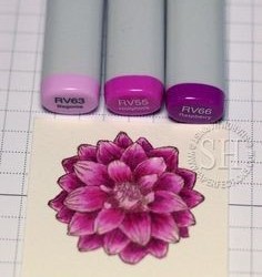
COPIC ORIGINAL MARKERS:
The classic Copic markers are also termed as Copic original markers. It is available in 214 different colors and is specially designed for artists and illustrators. It is the most expensive markers out of other Copic markers, such as Sketch and Ciao markers, as it holds the maximum amount of ink. The ink can be refilled 9 times from distinct ink bottles and has 9 distinct nibs selection. Classic Copic markers contain a medium broad/brush tip and a fine nib/bullet tip that can be used for various kinds of results. These kits contain seventy-two original Copic marker colors, come in diverse sets and are imported. These markers have been used by the illustrators and designers worldwide for decades. They are used for various kinds of piece of arts. Art like the step by step drawing tutorials I have on my site here. These markers are the good investment as you have to buy it only once as they are refillable. These are also termed as alcohol based markers. It allows you to replace the nibs and is a complete flexible marker. They are one of the most favored markers and they even have been hand tested before sending it out to assure that it performs well.Do you want to improve website in google search engine its a Gift for you for me click this and use this all tools free SeoToolSerp Copic inks do not absorb toner as Copic markers are alcohol based; their ink dries rapidly and blends fluently. They are termed as fast-drying, long lasting and reliable. They work great with watercolors and can be surely enhanced with color pencils. This means that this piece of art, when blended with other fine art media such as watercolors and color pencils, increases the adaptability of this product. A medium broad nip much gives the finer line in contrast of the fine nib. The bullet tip is best suited for light hands whereas brush tip can provide much better results and control on the blending. The colors of Copic markers can also be mixed to create an infinite hue range. By intermixing with the colorless blender solutions, a diluted tone value is created which looks stunning when applied to coloring or sketching.Also, don’t forget to Watch Rick and Morty Illustration The Definitive Step by Step Process
The alcohol inks used in these markers are permanent on many surfaces such as paper, leather, wood, fabrics, plastic, faux fur etc. they also work well on glossy surfaces such as glazed ceramic and glass. However, the ink might scratch off from such glossy surfaces so use a sealant to protect the surface. Make sure that the sealant does NOT contain alcohol, ethanol, or any other form of alcohol as these will ruin your coloring and drawing ideas for beginners. Copic Original markers have a very low odor so you don’t have to worry about getting overwhelmed with the smell when working in a closed or small room. Due to the low-odor, replaceable tips and refillability, these markers are completely environment-friendly. They have tight fitting caps which will never let the markers dry out. You can even swamp theses markers with water or left them in your car in sun or snow and they will not be damaged or dry out as long as the cap is placed properly.
Copic original markers have a minor issue that they feel huge and uneasy in the hands of artists, illustrators or the person who have a keen interest in the artwork which is hardly a downside if you compare it with all the great benefits it provides you and step by step drawing videos. The Copic markers tight-fitting caps have the classification of the color code stamped which means that the writing and coding on the color cap will never come off. The entire cost of this Copic original marker and the refilling of ink (6 times) is $1.54 that is an incredible value for a product of this quality. The color codes of the diverse ink refills are similar to Copic Sketch markers for apparent classification. There are certain types of Copic markers, but the most frequent are the Copic Classic/Original, the Copic Sketch, and the Copic Ciao. The Copic Sketch markers come in a vast range of colors i.e. 358 colors whereas Copic Ciao markers hold 180 color options. The comparison between these three markers is that Copic original markers hold the maximum amount of ink whereas the Copic sketch marker is in between the Copic original and Copic Ciao. Ultimately the Copic Ciao markers are used for beginners, cheaper and have the least amount of color options so we can conclude that Copic original marker is considered a premium product among both of them. Also, don’t forget to Watch Rick and Morty Illustration The Definitive Step by Step Process These superb and high-quality inks are checked at least four times for accuracy in accomplishment. The customers of these Copic markers enjoy their artwork and are convinced by using these markers. The users rapidly feel the quality difference of these excellent markers. And easy stuff to draw for sure. In a nutshell, it is a premium product at a premium price.
CLICK HERE TO BUY ON AMAZON
COPIC ARTIST PREMIUM MARKERS:
The Copic Ciao markers are the exemplary markers for beginners. Ciao markers contain a set of seventy-two pieces. These markers are alcohol based markers and are of premium quality. Comic’s artists, architecture, fashion designers and even the landscape painters prefer these markers because they are blendable and provides much better control. This piece of art has been designed for the intermediate artists and the people who have a keen interest in coloring or sketching.
These markers are priceless in comparison to the expense, as they are artist level quality and can be refilled an enormous number of times. The longevity should be acknowledged rather than to consider the price. The Ciao marker has a round body and is narrow than the other Copic markers. It is easy and comfortable to cover these markers in hands as it fits nicely, convenient in coloring and is a durable good.
As compared with the other Copic markers, they are best suited for blending. Alike the other Copic brands, this marker is a double ended as well as color coded. It contains a super brush nip and a medium broad tip. The Super brush tip has a flexible, pointed tip that is implicative of a brush nip or a brush pen whereas the medium broad nib is firmer, angled and a chisel-like a tip that is productive for calligraphy and sweeping strokes. These markers have the tremendous results and it allows an artist to shade and blend colors. These markers provide 180 distinct color options in this Copic Ciao line. They are well worth if the person is desirable to take art to the next level and improve the style of a piece of artworks.
Copic Ciao markers work even better than paint. Usually, this is the only brand that works with paint. These markers are designed for those artists who want to experience the markers for the very first time. The artists are now converting to Copics after using the prismacolors. They are alcohol based markers and are of low odor. The children can happily work with these markers as they are non-toxic and are considered secure for them. They can be widely used on paper, wood, fabric, plastics, faux fore and much more. They are meant for frequent use and the users can enjoy a durable design and the colors that enhance the versatility of these markers. They are also termed as Copic Artist Premium markers.
The Copic Ciao markers are significantly permanent. This is amazing for the users who draw on distinct surfaces. If these markers by a twist of hair get into the hair somehow, it can color the hair that is contacted. These markers are that much strong that the color can’t be washed off from the hair. However, it can be removed with alcohol-based hands wash and sanitizers. Shading is what basically this marker is usually used for and it is recognized as high-quality markers.
A difficulty with the Copic Ciao marker is that it holds the least amount of ink in comparison to other Copic markers which is hardly a downside if you compare it with all those superb benefits it provides you doesn’t make for easy stuff to draw. These markers are great in shading the drawing book and assist to make any drawing look convincing. The users should keep these markers stored when they are not in use to protect the investment. Practice will enhance the outcomes if the artist wants to enjoy it fully. Use it yourself and also gift it to others and loved ones. They will love it and will always thank you.
CLICK HERE TO BUY ON AMAZON
MEXPY MARKERS:
DESCRIPTION:
Mexpy markers are alcohol based markers that provide exclusive color saturation and its glassy ink allows unique layering and remarkable blending effects in designing craft room, design studio, drawing coloring and much more. They mixed up and make a great addition to colors whether they brush markers or design markers. They contain a package of twenty-four markers each, their nips are replaceable and pens are refillable. They are dual tipped markers contain a firm fine tip on end and the chisel tip on the other end and are basic in color. They show the effect of 3D and refined shadowing. These markers are favored by illustrators as well as layout artists. They contain color code on caps, are super brushed, blendable and a variety of two hundred colors. It is a tremendous tool for artists, crafters, designers and the people who have a keen interest in artwork.
REVIEWS:
The different color configuration sets contain a variety of rich colors that can be utilized on different artworks. For instance, a beautiful and innovative dress has been made by blending colored markers and the colorless brush. They worked great together and was quite appreciative. The dots pattern on the dress was done by the colorless marker to lighter the ink and make it looks impressive. Look for drawing ideas for beginners on the main site 😀
It looked stunning when applied on the rubber surface. A fine tip brush marker gave spectacular result than a brush marker and gave a natural look by the coloring the chops as depending on the surface. The chisel tip didn’t look great on the rubber surface. The ink of brush markers dries swiftly so plan it accordingly. It worked like super classy.
It looked clean when applied to wire hooks. The markers used to color the wire in diverse colors. The blending is done by the clean colors so that it works magnificently and look versatile. This also worked well on plain metal staples.
Here are plain cloth flowers. Lets took a part of flowers and choose the yellow color to paint the center of petals and hold until it dries. Then move forward for wetting the outer surface of the petals each at a time with the colorless blend color by flaunting it. The color fluid by inking the surface with the orange marker.
This brightens up the color of markers and the colored flowers are much cuter and glorious than the original one. So you can design some fantastic clothes by these markers for your kid’s toys and honestly, it looks elegant.
Next one is a reused soda tab earrings that have been made by using the markers to color the metals. This looks fashionable as it can be gifted to the people who are related. The coloring is done by both fine tip and chisel tip. The few small beats are placed at the bottom of the earrings and color them by the light shade mexpy marker to enhance the beauty of the earrings. The interior part is colored by distinct mexpy markers with a variety of colors.
The other one is a cut up piece of aluminum soda that is colored by various colors of mexpy markers. Use a toothpick to hold a metal during the painting process so that the ink doesn’t spoil until it dries. Then sink the heated metal to ensure that the color would remain everlasting on the metal. The color combination of the metal looks innovative and pretty. This demonstrates that the innovative things can be made by the help of mexpy markers.
This is just the tip of the iceberg as many innovative things can be made like fun hanging wall, sketch work, necklace and much more. These markers offer you versatility and intensity in its ink. Its ink dries pretty quickly which is such a great pro, as waiting for the ink to dry so you can move on to the next phase, is kind of irritating and annoying. They are really easy to work with and their colors are always vibrant as the finished result. So go along and make your perfect piece of artwork whether it is your school science project or your very own masterpiece to show off to the world what easy things to draw is all about. Everyone should use these markers to get the spectacular results as the results are far beyond the expectations. I loved them because of the smooth flow of ink and the double ended tip.
CLICK HERE TO BUY ON AMAZON
Don’t forget to check out the other step by step drawing video tutorials featured on the site. And get some great drawing ideas for beginners.
0 notes