#exercise in data layout and graphics and things
Explore tagged Tumblr posts
Visit Tumblr Blog
Explore Tumblr blogs with no restrictions, modern design and the best experience.
Last Seen Tumblr Blogs


Fun Fact
Tumblr has been banned in Indonesia for providing people with access to pornographic content.
Text
obsessing about old pdas again, they're so fun and cute! and i have always loved the idea of a computer in my pocket, in a rather different form to smartphones or something. plus i really wanna learn to write programs for one? just little utility programs really, but it'd be fun to work on, and it feels a lot less intimidating than more modern devices, to me at least. plus it might be fun to be able to write code for it on one of my old macs or something, would be the right time period, assuming i find something compatible. hoping i'll maybe find some sort of pda for sale at vcf west this weekend, otherwise i might have to start looking around ebay or something
#i've wanted for a long while to make some sort of program that would let me make exposure notes and things for my photos#something i can take with me when i go out shooting and is quick to work with so i can end up with exposure noted down for a whole roll#exif data but for film#and not in the way that some fancy cameras from the 90s would print exposure data in between frames#tho that is really fuckign cool#also not in the way that some other cameras stored exposure on board and let you browse it on the tiny lcd on top#or by plugging in a pda for like one specific nikon#anyway#v cool thing to me and something i've wanted to make for a while#also there's a part of me that wants to try to write some sort of pokedex program#tho that's less interesting for use and more just something i think would be cool to make#exercise in data layout and graphics and things#lots and lots of ideas here#i guess#idk#anyway just something i keep thinking about a lot#we shall see if this goes anywhere
3 notes
·
View notes
Text
See the Difference: Before-and-After Graphic Design Transformations
There’s something incredibly powerful about a side-by-side visual comparison. A “before” shows the missed potential—a confusing layout, clashing colors, outdated fonts. And the “after”? That’s where the magic happens. Clearer messaging. Stronger branding. Cleaner visuals. In short: results.
Before-and-after graphic design transformations aren’t just about aesthetics. They reveal how thoughtful, professional design directly impacts how people perceive, trust, and act on what your brand puts out into the world. And that’s why businesses are increasingly investing in expert Graphic Designing Services that focus on more than just making things look “nice.”
They want to see the difference—and more importantly, feel it in engagement metrics, lead quality, and sales.
Let’s explore what truly changes during a visual upgrade—and how these design transformations tell a bigger brand story.
1. From Cluttered to Clear
Before: A homepage filled with overlapping text, mismatched buttons, and no clear CTA. After: A clean layout with structured hierarchy, strategic white space, and one powerful message.
Clarity is one of the most underrated elements in graphic design. When users land on your page, they make split-second decisions. A cluttered layout feels overwhelming and untrustworthy. Post-redesign, we often see bounce rates drop and session time increase—because people finally know where to look.
2. From Generic to On-Brand
Before: Stock photos, generic icons, and templates that don’t match the brand’s tone. After: Custom visuals, curated typography, and a color scheme tailored to the brand’s identity.
One client said their original social media posts looked “like they came from five different companies.” Now, they have a cohesive feed where every visual reinforces their voice and message. That’s the power of design aligned with brand DNA.
3. From Static to Engaging
Before: Flat, lifeless visuals with no clear focus. After: Dynamic composition, bold CTAs, and strategic use of motion graphics or illustrations.
We redesigned an ad campaign for a D2C wellness brand where the original visuals had bland product shots. The redesign used a bold background, layered product shadows, and lifestyle images—and CTRs improved by over 40%.
4. From Hard-to-Read to User-Friendly
Before: Fonts that are too small, low contrast, or poorly spaced. After: Readable, mobile-friendly typography that guides the viewer’s eye.
Typography isn’t just about style—it’s about function. Upgrading font pairings and spacing can make a drastic difference in how people engage with your messaging, especially on mobile.
5. From Inconsistent to Unified
Before: Flyers, ads, and decks that look like they were made by different teams. After: A unified visual system, with consistent brand elements across all touchpoints.
Inconsistent branding erodes trust. After implementing a consistent design system for a B2B client, their team reported improved confidence in sales materials—and faster approval cycles across departments.
6. From Outdated to Modern
Before: Gradients, bevels, shadows, and styles that scream early 2000s. After: Sleek, minimal design with modern color theory and flat iconography.
Outdated design can make even a high-quality business feel irrelevant. A refreshed look positions your brand as current and forward-thinking—without changing your product or service.
7. From Low-Performing to Data-Driven
Before: Designs that were based on gut feeling, not analytics. After: Creatives backed by A/B testing, heatmaps, and user feedback.
Design should not be guesswork. With data-informed tweaks—like moving CTAs higher, changing button colors, or swapping imagery—many clients see measurable performance boosts post-redesign.
Conclusion: The Value Is in the Visual Proof
Design transformations aren’t just a creative exercise—they’re a strategic upgrade. They tell your audience: we’ve evolved, we care, and we’re ready to deliver better. And the best part? The results speak for themselves.
If you're ready to elevate your brand with design that doesn’t just look good—but converts, retains, and resonates—explore our professional Graphic Designing Services. Let us help you create your own before-and-after success story, one visual at a time.
0 notes
Text

I believe my poster successfully advocates on behalf of my topic of plastic pollution in our oceans and waterways. By establishing what the problem is and-- perhaps most importantly-- why this is your problem, I believe the graphic goes for a more personal, even self-preserving approach. I attempt to integrate current technology with the poster through the placement of a QR code in my call to action to foster not only a mental engagement with the piece, but a somatic, physical element as well.
I believe the organization of my type and graphic elements will be not only legible to a viewer but engaging as well. The background elements of minimalistic waves communicate the idea of a vast body of water while the dingy greens communicate that something might be wrong.
This poster was designed specifically with stopping people in mind. I wanted to make a bold headline that could be read from across a room, and one that piqued the reader’s interest enough to come closer. By asking the viewer “What’s in your water?”, the graphic begins a dialog. The natural response of “I don’t know, what is in my water?” creates a sort of conversation or back and forth. My graphics are displayed next to my data to leave the viewer with a visual in their head to relate back to what they hopefully learned.
The more stressed out I get over projects, the better I understand the importance of being meticulous and intentional with my process materials. I believe the wireframing process perhaps more than any of the others has helped me the most with the development of ideas. The organization of my wireframe sketches informs how my poster comes together, and the way my poster comes together informs my future wireframes as I learn more and more about the way I work and how my mind organizes information.
I think researching the topic helped inform my design decisions and elevate them to a point I’m sure I wouldn’t have reached otherwise. Breaking down the research even further into what could and couldn’t be represented visually was a crucial factor in determining the layout and look of my icons and which facts would ultimately end up on the poster.
My favorite part about critique, especially in progress critique, is having something to take home with me. This time around it was being beaten over the head until I stopped placing red text over a green background. Getting perspective and fresh eyes from other artists is an invaluable resource that gave me ideas and revealed ways of solving problems that would come up that I wouldn’t have come to otherwise, like restructuring my grid so my bullet points all matched, or really going for that giant bold headline.
This project was an exercise in re-familiarising myself with Illustrator’s suite of typography tools. I’m so used to laying out my type in inDesign that the subtle differences in interface and how things function presented a little bit of a learning curve and more than likely an hour or two of frustration as well.
1 note
·
View note
Text
Software Articles From AMAZINES.COM
Utilizing graphic design companies to conceptualize and execute the picture that will signify your corporation is a smart move that might doubtlessly increase recognition and trustworthiness. Alan Fletcher: As one of the founding partners of Pentagram, Fletcher shouldn't be solely considered one of the biggest designers of his era but of any generation. So, it is necessary, when utilizing raster images, to account for the way giant a picture will probably be printed or posted and to make sure that the quantity of pixels can accommodate top quality. The graphic design firm that you simply avail should be capable of give you graphic designs that have a visual appeal and skill to catch all eyes with the intention to get the graphic design options that are impressive and efficient. Such designers keep late in workplace to make these further bucks. There are many strategies for arranging subjects to create enticing graphics. Although many graphic designers work independently, those who work for specialized graphic design corporations are often a part of a design crew. The pendulum is swinging again towards the inventive expression of graphic model and it is extremely troublesome to induce employment as a graphic artist while not a minimal of some college training at a professional graphic type college. A repositionable wall graphic consists of various pictures printed on vinyl sheets with vibrant and brilliant colors. Along with using photos and texts to exemplify the company's services and products, these strategies make the purchasers enthusiastic and completely happy. When we depute the graphic design for outsourcing, the someone taking contract to do the graphic design will for certain exercise the character, prospects and benefits, theme and sources of the company or concern. The best thing about being a graphic designer however, is the liberty you get to make use of your imagination each day with something completely different. In addition to the usual enterprise playing cards and corporate stationary, designers usually develop a set of visible model tips ( style guides ) that describe best practices and supply examples of visual branding applied throughout numerous media. They work intently with clients from the analysis and strategy planning stage, by way of all features of the production and printing process, to create a powerful visual identity. Graphic designing is a extremely artistic field during which designers work with texts, photos, colours, patterns, and mix them to convey a particular thought. You may use these free enjoying playing cards clip art pictures in your personal website as long as you give a link back to this site. Designing for the online introduces a whole host of latest variables, limitations, and opportunites that are not current in print design. It's easy to be intimidated by the sheer amount of learning associated with graphic design, but remind yourself that even essentially the most proficient designers had been newbies as soon as, too. It was a style concerned with communication, and one the place the designers believed that their design was socially useful. Individuals on this role design the layout for numerous forms of print and electronic media utilizing specialized computer programs. In the same approach, UX designers need to create products that resolve customers' problems—and generally, standard solutions aren't all the time the best or most applicable ones. Graphic designers work with both textual content and pictures. Knowledgeable graphic design firm makes use of modern and up-to-date software and procedures to supply graphic designs that create a visible attraction and communication. In a journal article or commercial, often the graphic designer or artwork director will give photographers a commission to type original pieces just to be integrated into the design format. There was a time when a graphic designer might get hired strictly on their inventive portfolio. You must also give any reference that you simply suppose will assist designers. Designers are also liable for interactive designs the place the content changes as it gets up to date, as well as screen interfaces that help people navigate by means of a variety of data. Further digital studios for undergraduate graphic designers embrace a computer lab totally geared up with the Adobe Artistic Suite and a digital workshop outfitted with large-format printers, bookbinding tools, vinyl cutters, and 3d printers. There are grasp's degree programs created specifically for designers wishing to advance in theoretical studies (MA) or focus their work on a studio degree (MFA). His cultural posters and company design identities - together with his designs for Vitra and Siemens, for which he is most likely greatest known - are timeless but modern. This data helps designers in saving their precious time. The vulnerability proven or graphics evaluated exactly match for the particular concern should necessarily act upon the customer to deliver them to the door step of that firm or enterprise. Typically seen as http://iconiceyes.co.uk/cardiff.php ” laptop, the G750JW-DB71 has all the suitable stuff to make it a robust graphics laptop as well. By outsourcing the graphic designs of an organization the picture and identicalness is elevated so much as people may have enquiry about the product and started buying. InnoBlaze Applied sciences is aware of our clients need and is aware of the graphic design of your corporation collaterals and stationeries after some Analysis of the enterprise. Internships permit aspiring graphic designers to work with designers and to experience the design process from concept to completion. All designers of well-known logos do not strike it filthy wealthy. Designers, take a look at these contests so you can start building your career. When you find yourself undecided about what time length to set for a design undertaking within the temporary, then think about the type of the mission. Particularly in US, East Asia and nicely developed nations have started outsourcing the graphic designs in massive numbers. Communication lies on the coronary heart of a graphic designer's job. I'm graphic designer. Naveen Kumar is the author of this text , who has not only mentioned the a number of ways to get freelance graphics design jobs online and earn money however has introduced a transparent market situation. I think grid-layouts will definitely influence my very own designs, especially the net graphic and it'll keep it a lot neater. A Broadcast Designer You create visible designs and electronic media for use in television productions. Graphic Designers within the US earn a imply annual wage of $39,491. Whether carving statues or portray figures, the Egyptian graphic designers used a grid system as a way to adhere to a canon of aesthetics, which determined some strict ratios. Jihee Lee is a Korean graphic designer who studied and works in Germany. I find that it's a lot easier to write an image-description of a cartoon that I drew - or of a graphic-design representation that I put collectively than it is to put in writing an image-description of (for instance) a photograph. A Logo Designer You create the visual expression of the organization's key message or value. If you can't discover the wonderful print, its probably since you are like each different business proprietor and already threw out the highest half (that they deliberately made right into a throw-away piece of paper). PSLab is looking to rent a graphic designer with 3-4 years of expertise. Graphic design can use picture-based designs involving images, illustrations, logos and symbols, type-based designs, or a mix of both methods. powerpoint presentation layout may rest assured that our designers would be the best representatives of your corporation mission and vision. As long as the factors set down by the consumer is met, there's nothing to stop a graphic designer from having free reign with a website to verify it looks the most effective it presumably can. Designers can specialise in a particular kind of media (vehicle wraps or magazine advertisements, for example) or create a broad assortment of collateral for print, digital, and past. Graphic art and illustration are often seen as being the identical as graphic design, nevertheless they're each very totally different. Graphic design is artwork with a purpose. A) Paid Invite- One can ship a paid invite to designers for $20 per invite. By means of the transition from a messenger to a creator of content, designers now have more possibility to shape these values than ever before. Ikko Tanaka (田中一光, 1930 - 2002) graphic design is deeply rooted in Japanese traditions while at the same is knowledgeable by contemporary western visible expression. Though it is doable to use different pc platforms, the Apple Macintosh is the trade customary used in the majority of professional design fields & is the platform used within the Visual Arts Department. They also work closely with the designers to develop the page templates. The company customized emblem represents the organization hence serving to the organization set up its particular person sort. For an idea artist within the recreation artwork and design business, there are particular job classes to concentrate on, job openings associated with visual development, animation manufacturing, online game design, character design, and invention. These components are used in conjunction or opposition with one another to create visually placing and impactful designs. In late 19th-century Europe, particularly within the United Kingdom, the primary official publication of a printed design was launched, marking the separation of graphic design from positive art. When exploring the difference between raster and vector pictures, we talked about pixels already - that they're tiny squares of colour that form a a lot larger raster picture. Step three - Embrace age-acceptable graphics applications into your curriculum to help your college students acclimate to pc design ideas. Vexels is the design stock where everybody can discover no matter they need - whether you are a Graphic Designer, a Merch-Vendor or an Agency, they have one thing for everyone. Create the photographs that you simply wish to see in your subsequent story. Demand for conventional” graphic designers who work primarily for print publishers has fallen substantially, however that doesn't tell the entire story.
1 note
·
View note
Text
Filemaker pro advanced training

FILEMAKER PRO ADVANCED TRAINING HOW TO
FILEMAKER PRO ADVANCED TRAINING ANDROID
FILEMAKER PRO ADVANCED TRAINING PRO
FILEMAKER PRO ADVANCED TRAINING SOFTWARE
FILEMAKER PRO ADVANCED TRAINING PROFESSIONAL
Emphasis on questions and student participation,.
Live class with trainer in class and interactive student participation,.
Purchase with Advanced FileMaker class for discounted package price of $430.Īn investment in knowledge pays the best interest.
Create simple relationships between files, andĦ hours, $260 (available for Windows and Macintosh).
Define formulas for Calculation and Summary fields,.
Use the Header and Footer layout parts, and add a Grand Summary part,.
Create and format a blank new layout, and add fields and labels to it,.
Enter and edit data, and navigate among records,.
Decide whether to define a field’s data type as Text, Number, Date, Calculation or Summary,.
Class discussion and hands-on exercises teach you to . This workshop is designed for business people who want to create databases such as mailing lists, billing systems and inventory logs.
FILEMAKER PRO ADVANCED TRAINING PRO
The initial consultation is free.Home > Classes > Course Descriptions > FileMaker FileMaker Pro Course Syllabus Get in touch with us to learn more about how FileMaker can elevate your business operations and improve your bottom line. We’ve serviced nonprofits, government entities, and FileMaker users in the public and private education circles. We have a long and strong track record of working with teams in both large and small companies in various industries. We can create a new solution for you, enhance your existing solution, or provide you with FileMaker training and support. Our team consists of certified FileMaker developers, as well as SQL and Web developers. Now that you know what FileMaker is, let our team of FileMaker experts show you firsthand how it can improve your business productivity. Those involved in K-12 education can also use this app development platform to improve their institutions' processes every school year. FileMaker is commonly found in the following areas: More than a million users in 50,000 companies benefit from the tool. Organizations across a wide variety of industries can take advantage of FileMaker. What Industries or Companies Use FileMaker? Depending on your requirements or preferences, you can deploy an application in a matter of minutes. When it comes to sharing all this productivity goodness, you have the option to host your solution on FileMaker's cloud service or lock it away on-premise. Managing customer contact information is also easy to do with FileMaker. Leveraging the power of customization, you can organize things like events and projects, as well as track assets. Your team will be empowered to make more informed decisions. With this platform, your team members can access your company's information in a single place, following your unique workflows and processes. The custom app you create using the Claris FileMaker platform can be made to perform any number of every day business-related activities and ones explicitly tailored for your ever-changing needs. This, in turn, will boost your organization's overall efficiency.
FILEMAKER PRO ADVANCED TRAINING SOFTWARE
The platform also allows you to adapt an app for a desktop, Web browser, tablet or phone.Īll in all, the software can help you improve your workflows and save money and time. With a FileMaker-based solution, your business team can more easily share and manage data anywhere, on-site or in the field. FileMaker is more than a database it provides a graphical interface and security features that make it flexible and powerful.
FILEMAKER PRO ADVANCED TRAINING PROFESSIONAL
Design is an essential element because the more professional your solution looks and feels, the more compelling it is to use. The app is both visually appealing and easy to use. What Can FileMaker Do?įileMaker makes it possible to develop an application custom-tailored to your organization's needs. Integration capabilities speed up development and typically reduce double and sometimes triple data entry across multiple tools.
FILEMAKER PRO ADVANCED TRAINING ANDROID
It also offers the benefit of working on both Windows and Mac operating systems and Android and iOS mobile devices.Īdditionally, you can integrate FileMaker with other homegrown/enterprise systems and other web applications, including MailChimp, QuickBooks and HubSpot, to name a few. This workplace innovation platform is fast, robust and flexible.
FILEMAKER PRO ADVANCED TRAINING HOW TO
Here's a rundown on what FileMaker is and how to use it effectively for your organization.Ĭlaris FileMaker, previously known as FileMaker Pro, can be used to produce custom applications for enhancing your productivity and operations. So, what is FileMaker exactly? And how can you use it to improve your business operations? That's why running your business as efficiently as possible is so critical.įortunately, that's where the Claris FileMaker software development tool comes in. When you're running a business, every dollar counts.
0 notes
Text
Download Nicepage crack (keygen) latest version VCT3,

💾 ►►► DOWNLOAD FILE 🔥🔥🔥 Download Now Nicepage Crack 4. The fact is that Nicepage is truly intuitive. You can create a site with at least one page, and for each page, you can modify the header, body, and footer. Nicepage Crack 4. The nice page allows you to realize practically any advanced web architecture. After an exhaustive examination of thousands of the most modern website architectures on Pinterest, Behance and Dribbble have created the new device, Either way, you have plenty of options to modify each format. The downloadable website page proofreader has a simplified interface , and you are not restricted to where you can place the components on the page. Nicepage 4. The usual methodology in the construction of sites does not allow coordinating these progressive Web Design tendencies. Apply movement and movement to the Nice page controls: the animation trigger on page load, scroll and slide change. The animation effects list includes essential vitality like Swing, Jello, and many others, including motion activity like Slide or Fade. Motion activity responds to page scrolling and scrolling. Nicepage Crack Serial Key Likewise , you have the freedom to choose the right one among all page makers. However, we know that finding the best is very intense. It gets more confusing when you think of two things that have a kind of comparative obligations, like Nicepage and Quix. The guide will walk you through how to add pages, where to go to add blocks , how to resize and move components, and more. I soon finished this educational exercise and quickly became happier using the manager. Nicepage Crack You will find your solution; Read this article from start to finish. In the end, you will effectively recognize which one you should choose. There is also a version of Nicepage with web-based facilitation, about us page. Be that as it may, you have many alternatives to adjust each design. The downloadable site page manager has an intuitive interface, and you are not restricted to where you can place components on the page. Nicepage Crack Latest Key You can also modify images, add and remove squares, and change settings niceties like tones and text styles. You can add different segments, graphic components, easily adjustable images to the plane, titles and messages, forms, recordings, connections and closures, guides and structures, menus and symbols, and surprisingly simple HTML and PHP components. Save to WordPress, Joomla! I soon finished this tutorial and quickly became happier with using the manager. Be that as it may, you have plenty of options to change each format. The downloadable website page proofreader has a simplified interface, and you are not restricted to where you can place components on the page. See distances in fields as you drag. All the sections you need and more Select the section types that suit your data: Introduction, Features, Command, Map, Contacts, etc. More than sections ready to use Nicepage Full has selected the most popular sections, fully customized and ready to use on any website. Use over grid layouts. Use a grid to place images and text. Get an answer automatically. Pages and toolbar Create websites as many web pages or create a one-page landing page. After an exhaustive analysis of thousands of the best web designs on Pinterest, Behance and Dribbble have created the new tool, Nicepage, to mainly cover the latest web design trends. Save for WordPress, Joomla! Theme Settings: Design the best themes and templates. Set colors, fonts, typography, header, footer, blog, and post templates for your articles. Allow your website visitors to read content on all modern screens comfortably. Animation and Motions: Applies animation and motion to the controls on the Nice page. Video Background: Add videos as a background to sections, containers, and cells. Magnetic Guides — Easily align your objects with magnetic guides. See the distances in the boxes as you drag and drop. All the sections you need and more: Select the correct unit types for your data: Introduction, Features, Team, Map, Contact, and more. Create Sections: Generate sections based on various sources, including web searches, social accounts, and images from your local folders. Get responsive automatically. Subject: Google fonts include WordPress theme and Joomla template Prohibition: find the place that contains the blocks. Each section, grid, cell, the container can contain all kinds of HTML elements and can have all sorts of backgrounds. This is so powerful that it will take my little brain many months to use it in my design business in the right way. The Smart Building options are simply excellent. The support is very responsive and helpful. There is a lack of focus on development. There is no clear roadmap for Nicepage Horizontal menu layout options are minimal. Artisteer did a better job with the menus. The licensing strategy is not very clear, and it seems that things could change in the future.
1 note
·
View note
Text
Download Nicepage crack (license key) latest version G15;

💾 ►►► DOWNLOAD FILE 🔥🔥🔥 Download Now Nicepage Crack 4. The fact is that Nicepage is truly intuitive. You can create a site with at least one page, and for each page, you can modify the header, body, and footer. Nicepage Crack 4. The nice page allows you to realize practically any advanced web architecture. After an exhaustive examination of thousands of the most modern website architectures on Pinterest, Behance and Dribbble have created the new device, Either way, you have plenty of options to modify each format. The downloadable website page proofreader has a simplified interface , and you are not restricted to where you can place the components on the page. Nicepage 4. The usual methodology in the construction of sites does not allow coordinating these progressive Web Design tendencies. Apply movement and movement to the Nice page controls: the animation trigger on page load, scroll and slide change. The animation effects list includes essential vitality like Swing, Jello, and many others, including motion activity like Slide or Fade. Motion activity responds to page scrolling and scrolling. Nicepage Crack Serial Key Likewise , you have the freedom to choose the right one among all page makers. However, we know that finding the best is very intense. It gets more confusing when you think of two things that have a kind of comparative obligations, like Nicepage and Quix. The guide will walk you through how to add pages, where to go to add blocks , how to resize and move components, and more. I soon finished this educational exercise and quickly became happier using the manager. Nicepage Crack You will find your solution; Read this article from start to finish. In the end, you will effectively recognize which one you should choose. There is also a version of Nicepage with web-based facilitation, about us page. Be that as it may, you have many alternatives to adjust each design. The downloadable site page manager has an intuitive interface, and you are not restricted to where you can place components on the page. Nicepage Crack Latest Key You can also modify images, add and remove squares, and change settings niceties like tones and text styles. You can add different segments, graphic components, easily adjustable images to the plane, titles and messages, forms, recordings, connections and closures, guides and structures, menus and symbols, and surprisingly simple HTML and PHP components. Save to WordPress, Joomla! I soon finished this tutorial and quickly became happier with using the manager. Be that as it may, you have plenty of options to change each format. The downloadable website page proofreader has a simplified interface, and you are not restricted to where you can place components on the page. See distances in fields as you drag. All the sections you need and more Select the section types that suit your data: Introduction, Features, Command, Map, Contacts, etc. More than sections ready to use Nicepage Full has selected the most popular sections, fully customized and ready to use on any website. Use over grid layouts. Use a grid to place images and text. Get an answer automatically. Pages and toolbar Create websites as many web pages or create a one-page landing page. After an exhaustive analysis of thousands of the best web designs on Pinterest, Behance and Dribbble have created the new tool, Nicepage, to mainly cover the latest web design trends. Save for WordPress, Joomla! Theme Settings: Design the best themes and templates. Set colors, fonts, typography, header, footer, blog, and post templates for your articles. Allow your website visitors to read content on all modern screens comfortably. Animation and Motions: Applies animation and motion to the controls on the Nice page. Video Background: Add videos as a background to sections, containers, and cells. Magnetic Guides — Easily align your objects with magnetic guides. See the distances in the boxes as you drag and drop. All the sections you need and more: Select the correct unit types for your data: Introduction, Features, Team, Map, Contact, and more. Create Sections: Generate sections based on various sources, including web searches, social accounts, and images from your local folders. Get responsive automatically. Subject: Google fonts include WordPress theme and Joomla template Prohibition: find the place that contains the blocks. Each section, grid, cell, the container can contain all kinds of HTML elements and can have all sorts of backgrounds. This is so powerful that it will take my little brain many months to use it in my design business in the right way. The Smart Building options are simply excellent. The support is very responsive and helpful. There is a lack of focus on development. There is no clear roadmap for Nicepage Horizontal menu layout options are minimal. Artisteer did a better job with the menus. The licensing strategy is not very clear, and it seems that things could change in the future.
1 note
·
View note
Text
20,000 used sneakers turned to basketball court

This is not just a basketball court, but a recycled playground. Nike has erected a new basketball court in Belgrade, but it's not just any basketball court; this playground area has experienced Nike's game-changing sustainable project, 'Move to Zero.’ The playground features neon tints, contrasted by pitch blacks, and complemented by greys; the court itself is made of 20,000 previously used sneakers donated by the local community; and it features a repurposed, exciting new layout for the game of basketball that derives from the brand identity designed by the London design agency "Accept & Proceed."

This is an urban-scale exercise aiming at revitalising public space and re-energising the neighbourhood, using sustainable design principles at its core.
"We're pursuing science-based targets to substantially minimise our carbon footprint and waste," adds Rustique-Petteni (senior director of global sustainability engagement at Nike). Adhering to sustainable ideals comes with its own set of problems and complications. Finding new methods to perform old things necessitates extensive research and development. Returning to the basketball court, the graphic design components on the ground are delineated with bright hazard stripes to differentiate play and gym activities, while the overall borrowed style from the 'Move to Zero' programme intends to invoke the urgency of climate change and the global climate catastrophe.
This endeavour is fairly unusual in my situation, as I was investigating playgrounds in Southwark, London, for my Design Practice1 course. The playground study exposed me to new ways of reporting and showing data visually, as well as understanding playgrounds and the politics of developing them in London's southeast.
Sustainability and re-usability are significant keywords in my essay writing assignment since I am investigating and bringing to light how graphic design interventions affect environmental sustainability in public spaces?
Recycling lowers the need to cultivate, harvest, or extract fresh raw materials from the Earth. This, in turn, reduces the negative disturbance and damage done to the natural world: fewer trees are chopped down, rivers are diverted, wild creatures are damaged or relocated, and water, soil, and air pollution are reduced.

Manufacturing items using recycled materials uses less energy than manufacturing goods from new raw materials. At times, there may be a large discrepancy in energy levels.
In order to improve sustainability in public spaces, design methodologies must be adapted to local and cultural characteristics, as well as environmental design problems must be addressed.
A worldwide framework for accountability is also essential in the design practice.
References
Campaigns, F. (n.d.). Nike constructs basketball court using 20,000 upcycled sneakers. [online] https://www.famouscampaigns.com/. Available at: https://www.famouscampaigns.com/2021/11/nike-constructs-basketball-court-using-20000-upcycled-sneakers/.
world, S. (n.d.). Accept & Proceed’s Nike basketball court is made of 20,000 upcycled sneakers. [online] www.stirworld.com. Available at: https://www.stirworld.com/see-features-accept-proceed-s-nike-basketball-court-is-made-of-20-000-upcycled-sneakers
Friends of the Earth. (n.d.). 7 benefits of recycling. [online] Available at: https://friendsoftheearth.uk/sustainable-living/7-benefits-recycling#:~:text=Recycling%20reduces%20the%20need%20to.
0 notes
Text
Assignment 3
My take on the third assignment was that I wanted to do a simple infographic that was relevant to the global epidemic happening at the moment, and the first thing that came into mind was the topic of mental health. I then did some short research with regards to the topic and some findings I have seen showed that the term “self-love” and “self-care” has been mentioned and widely searched on SEOs (e.g Google) since COVID-19.
Draft icons and information I wanted to include:


Looking back at when I first started on my draft prototype, perhaps the very first mistake I had made was not delegating categories or having a specific layout for my data before I dived into actually designing and positioning them. My initial thought process as to why I decided to not align the points was to show the personality of the topic itself, and simply because I wanted to go for a light-hearted yet fun look. My colour scheme mainly revolved around the shades of the colour blue: blue represents calmness and serenity which helps in conveying my message of “self-love”.
First draft of prototype:

Then, I decided to add in leaves that are coloured green as it complements the meaning of the blue with its representation of nature.
Final draft for the critique:

Some comments I have gathered from my peers through critique are that though they understood the intentions behind the initial decision of not aligning the points, there was no distinct starting point of the infographic. Not much flow can be seen in the draft and the way “EXERCISE” is placed is a little off as it is too above the header of “Steps & Benefits”. Important points I had received from my instructor are to ensure that there is continuity and proper layout (i.e. alignment), because there were a lot of elements going on (e.g words surrounding those graphics). Additionally, I was told that I could use different typefaces to further streamline on my infographic, to settle on a good framework and solid layout before I move on to the rest.
Keeping all these in mind, I decided to re-do my infographic on a portrait piece with the intention to section my data to clearly demarcate the varying sections into three parts and to ensure there is flow throughout.
The draft final prototype looks like this:

Though there is distinct improvements from my critique piece, my instructor had recommended me to pump up the contrast for my “Tips” section through using either a heavier font or creating individual boxes/shapes to anchor each header. This should be done so that the words do not blend into the leaf graphic and to ensure clarity. Alternatively, I was given the option to tone down on the opacity of the leaf graphic, which I opted for in the end.
Next, I was encouraged to streamline my text for the “Steps & Benefits” section as not every pertinent data needs to be interwoven by an enlarged text, especially when it involves readability. Bullet points or opting to use a different font weight for visual hierarchy were some changes I could make to represent the information in a way that communicates more effectively.
Keeping in mind the recommendations made to me; final submission piece:

This assignment was tougher for me as I started out on the rough side mainly because I did not have a solid foundation for my layout. Having said that, it was a fruitful process for me in terms of learning how to properly align my information, and to consider the flow as well as the contrast of how my elements can go together in order for me to communicate my message effectively to my audience.
0 notes
Text
low fed ideation time
I have had a week to research and begin my ideation. At this stage, I have picked up some inspiration from the RedBull data dance night and after the analysis of James Turrell's work. Still, on track to merge technology within the wellness industry, I have a rough idea of a visual sequence a student will observe as a part of their meditation practice. I want to create a visually calming graphic that is lead by the depth of breath. I'm picturing a circle that expands and contracts, indicating that the user takes a deep breath or exhale.
How cool would it be to deep dive into the soundscape world and use chimes, frequencies, traditional bells to support this visual! So - okay, I'm pretty excited by this.


Today I spent making low fidelity prototypes, quite literally my favourite thing to do in the studio. I had great chats with Hannah regarding these interesting formations sitting in front of us. I gave Hannah my wee elevator pitch, and she could see and understand this purpose.
This installation will be an aid to beginner meditation students. It can also act as an anxiety relief practice along with being a potential breath work tool.
I've tried to make these as easy to understand as I could. But with these prototypes, I was able to test eye level, size of screens, multiple users and wall layouts. It was pretty simple to imagine being the little dude and gazing at the screen (or projection?). I got quite a lot out of this exercise, seeing my idea differently and more realistic.
0 notes
Text
Top 10 Essential techniques of Data Visualization
Information perception strategies allude to the formation of graphical portrayals of data. Representation has a significant influence on the Data Visualization Company and deciphers huge information in a constant construction by using complex arrangements of mathematical or real figures.
With the apparently boundless floods of information promptly accessible to the present organizations across businesses, the test lies in information translation, which is the most significant understanding to the individual association just as its points, objectives, and long haul goals.
That is the place where information representation comes in.
Because of the manner in which the human cerebrum measures data, introducing experiences in outlines or diagrams to envision huge measures of complex information is more available than depending on bookkeeping pages or reports.
Perceptions offer a quick, natural, and less complex method of passing on basic ideas generally – and it's feasible to try different things with various situations by making small changes.
Late examinations found that the utilization of representations in information investigation could abbreviate conferences by 24%.
Thus, the representation of information is basic to the supported achievement of your business and to help you yield the most conceivable worth from this attempted and tried methods for breaking down and introducing indispensable data. Here are 10 fundamental information representation strategies you should know.
1. Know Your Audience
This is perhaps the most ignored at this point crucial ideas around.
All things considered, the World Wide Web and Information Technology as an idea are in its earliest stages - and information representation is a considerably more youthful part of computerized development.
All things considered, the absolute most cultivated business people and leaders think that its hard to process in excess of a pie diagram, bar outline, or a flawlessly introduced visual, nor do they have the opportunity to dig profoundly into information. Consequently, guaranteeing that your substance is both moving and custom fitted to your crowd is quite possibly the most fundamental information representation strategies possible.

2. Put forward Your Goals
Like any business-based pursuit, from brand narrating directly through to computerized selling and past - with the representation of your information, your endeavors are just pretty much as compelling as the system behind them.
To structure your perception endeavors, make a coherent story and drill down into the experiences that matter the most. It's critical to set an obvious arrangement of points, targets, and objectives preceding your administration reports, diagrams, graphs, and extra visuals.
3. Pick The Right Chart Type
Quite possibly the best Data Visualization Design Services on our rundown; to prevail with regards to introducing your information viably, you should choose the correct graphs for your particular venture, crowd, and reason.
For example, on the off chance that you are exhibiting a change throughout a bunch of time spans with in excess of a little modest bunch of bits of knowledge, a line chart is a compelling method for representation. Besides, lines simplify it to plot various arrangements together.
a) Number graphs
Continuous number diagrams are especially successful when you're looking to grandstand a quick and intuitive outline of a specific key exhibition pointer, regardless of whether it's a business KPI, site appearances, commitment levels or a level of development.
b) Maps
Most importantly, maps look incredible which implies they will rouse commitment in an executive gathering or show. Besides, a guide is a speedy, simple, and absorbable approach to introduce huge or complex arrangements of geological data for various purposes.
c) Pie outlines
While pie diagrams have gotten a terrible rep as of late, we feel that they structure a valuable perception apparatus that presents significant measurements in a simple to-follow design. Pie outlines demonstrate especially valuable while showing the corresponding creation of a specific variable over a static time span. What's more, in that capacity, pie graphs will make a significant thing of your representation stockpile.
d) Gauge diagrams
This model shows the working cost proportion, unequivocally identified with the benefit and misfortune space of your money division's key exercises, and this shading coded wellbeing check assists you with accessing the data you need, even at a fast look.
Measure outlines can be successfully utilized with a solitary worth or information point. Regardless of whether they're utilized in monetary or chief dashboard reports to show progress against key execution pointers, check diagrams are a superb guide to feature a quick pattern sign.

4. Exploit Color Theory
The most clear of our chosen information perception procedures - choosing the correct shading plan for your presentational resources will help upgrade your endeavors altogether.
The standards of shading hypothesis will quite affect the general accomplishment of your perception model. All things considered, you ought to consistently attempt to keep your shading plan predictable all through your information representations, utilizing clear differentiations to recognize components (for example positive patterns in green and negative patterns in red).
As a guide, individuals, all in all, utilize red, green, blue, and yellow as they can be perceived and unraveled easily.
5. Handle Your Big Data
With a mind-boggling level of information and experiences accessible in the present computerized world - with 1.7 megabytes of information to be produced each second for each individual in the world constantly 2020 - taking care of, deciphering and introducing this rich abundance of understanding ends up being a genuine test.
To help you handle your enormous information and separate it for the most engaged, intelligent, and edible perceptions conceivable, here are some fundamental tips:
Find which information is accessible to you and your association, conclude which is the most important, and mark each part of data unmistakably to make it simple to isolate, break down, and unravel.
Guarantee that the entirety of your partners, staff, and colleagues comprehend where your information comes from and how to get to it to guarantee the smooth treatment of experiences across divisions.
Keep your information ensured and your information taking care of frameworks basic, edible, and refreshed to make the perception cycle as clear and instinctive as humanly conceivable.
Guarantee that you use business dashboards that present your most important bits of knowledge in one simple to-get to, intuitive space - speeding up the perception interaction while likewise crushing the greatest worth from your data.
6. Use Ordering, Layout, And Hierarchy To Prioritize
Following on our past point, whenever you've ordered your information and separated it to the parts of data that you consider to be generally significant to your association, you should burrow further, making an obviously named progression of your information, focusing on it by utilizing a framework that suits you (shading coded, numeric, and so on) while allotting every informational collection a perception model or diagram type that will grandstand it as well as could be expected.
Obviously, your progression, requesting, and format will be in a condition of consistent development yet by setting up a SaaS UX, you will put forth your perception attempts speedier, easier, and more effectively.
7. Use Word Clouds And Network Diagrams
To deal with semi-organized or unequivocally unstructured arrangements of information proficiently, you ought to counsel the administrations of organization outlines or cloud words.
An organization outline is regularly used to draw a graphical diagram of an organization. This style of format is helpful for network specialists, creators, and information experts while arranging exhaustive organization documentation.
Likened to arrange charts, word mists offer an edible method for introducing complex arrangements of unstructured data. However, instead of graphical resources, a word cloud is a picture created with words utilized for specific content or subject, in which the size of each word demonstrates its recurrence or significance inside the setting of the data.
8. Incorporate Comparisons
This might be the briefest of our information perception strategies, yet it's significant regardless: when you're introducing your data and bits of knowledge, you ought to incorporate however many unmistakable examinations as could be expected under the circumstances. By introducing two charts, outlines, graphs together, each showing differentiating adaptations of a similar data over a specific time period, for example, month to month deals records for 2016 and 2017 introduced close to each other, you will give an obvious guide on the effect of your information, featuring qualities, shortcomings, patterns, pinnacles, and box that everybody can contemplate and follow up on.
9. Disclose to Your Tale
Like substance advertising, when you're giving your information in a visual organization the point of conveying a significant message or objective, recounting your story will draw in your crowd and make it simple for individuals to comprehend with insignificant exertion.
Logical examinations affirm that people, in enormous, react better to an all around recounted story and by adopting this strategy to your representation interests, you won't just astonish your associates, accomplices, and customers with your reports and introductions, yet you will expand your odds of passing on your most basic messages, getting the up front investment and reaction you need to make the sort of changes that will bring about long haul development, advancement and achievement.
To do as such, you ought to group your data, thinking as far as an author, setting up an obvious start, center, and end, just as a contention and goal, building pressure during your story to add the most extreme effect on your different perceptions.
10. Apply Visualization Tools For The Digital Age
We live in a high speed, hyper-associated computerized age that is far eliminated from the pen and paper or even reorder mindset of the bygone eras - and all things considered, to make a thundering perception achievement, you should utilize the advanced instruments that will help you settle on the most ideal choices while gathering your information in the most proficient, successful way.
An errand explicit, intelligent online dashboard or instrument offers an absorbable, instinctive, thorough, and intuitive means of gathering, grouping, masterminding, and giving information ease - guaranteeing that your methods have the most conceivable effect while taking up an insignificant measure of your time.
We trust these information perception ideas served to help drive your endeavors to new fruitful statures. To improve your progressing exercises, investigate our forefront business knowledge and online information representation instrument using UX design for AI.
Whereas you can also integrate UI UX Design Agency in USA with data representation for better results.
0 notes
Text
9 Useful Steps to Curate Efficient E-Learning Storyboard Content for Educational Purpose

Learning and course creation has made considerable progress. There has been a mix of a wide range of learning, including bricks and mortar classrooms, advanced instructional exercises, virtual classrooms, E-learning, and some more. Independent of the sort of learning, curating content can be very difficult. It turns out to be much more excruciating when you choose to incorporate illustrations, recordings, or different types of drawing in components. That is when storyboards come into the image.
As the name proposes, the storyboard discusses the learning/instructional class with a turn. It is a guide as a slide deck, report, or prototype in which the mentor/instructional originator lays the structure for the learning/instructional class. Storyboards are universal and can be utilized with models like ADDIE. The benefits of utilizing storyboard in training/learning incorporate boosting student's commitment, visual training, and deciding the shortcoming in the training design.
The educational content developers say that each storyboard has a 'strong establishment' as a typical factor that depicts its prosperity. While planning a storyboard, one ought to incorporate each and every piece of learning, including engaging content, imagining, and intuitive components. The key advances associated with planning a storyboard that leaves an effect on the student areas referenced underneath.
Step 1- Select a storyboard layout
According to the academic content developers, there is no storyboard that is 'one-size-fits-all'. The sorts of storyboards differ as per the getting the learning/training needs just like the kind of industry. Some may require word record and others may require PowerPoint slides. Contingent upon your venture needs and industry, decide on a particular sort of storyboard.
Step 2- Characterize the goal and objectives
In the following stage, have an unmistakable thought regarding why you are making the storyboard, what are the ideal results and the essential and optional learning objectives. These angles will go about as a guide all through the cycle. Distinguish the adapting needs of the student and the key components you need the student to detract from the learning experience. Furthermore, decide the sum and sort of information you will be working with.
Step 3- Distinguish the intended interest group
Decide the kind of audience and perform interviews, center gatherings, surveys, and so on to acquire experiences into the instructive, social, and expert information base of your audience. In the event that a storyboard has effectively been made before, evaluate it and understand all are the viewpoints that require improvement. Likewise, decide how and when you will assess the students. Sort out the correct kind of appraisal approach for the picked idea and audience.
Step 4- Curate the content
Gather the essential data from different materials and topic specialists. Create intelligent content while keeping the learning goals and adapting needs engaged. Characterize your subject, center around key focuses, and depict your thought/topic. Utilize simple and direct language, short sentences, true instances of illustrations. This is trailed by characterizing the plan components. Try not to incorporate all assemble data overall. All things considered, break them into lumps of data and afterward remember them for your storyboard.
Step 5- Add and sequence the content
Then, choose the grouping where you will introduce the topic. Add the content to create and orchestrate the grouping in the record or screen. The normal progression of content, the viable is the adapting course. Whenever required title each page in the storyboard for the sequencing reason. Likewise incorporate associations, routes, movements, expanding, and so forth to direct the student to the following page or slide in the storyboard.
Step 6- Select the authoring tool
Subsequent to building up a total substance for the storyboard, the following stage is to pick the writing device. Sort out if there are numerous associations, components that hinder the turn of events, and exchange reenactments before finishing the writing devices. Some mainstream writing devices incorporate a spring suit, which comprises rich highlights needed to add life to the storyboard.
Step 7- Pick the multimedia components
Multimedia components like animations, simulations, videos, graphics, and so on can undoubtedly catch the attention of the students. Fuse scientific depiction in each piece of the storyboard and choose the sort of visual components you need to remember for your storyboard. Guarantee to leave a little space for sound/video cuts, smart components, and portrayals in the significant slide/page in the storyboard. In any case, try not to exaggerate something very similar.
Step 8- Add the account content
Subsequent to choosing the sight and sound components to fuse the voice-over content. Guarantee to keep the content short as the significant ideas will be clarified through the voice-over. Additionally, try not to clarify the superfluous ideas relating to the point as it would exhaust the students. Remember the content for every individual branch for the storyboard.
Step 9- Guide route and audit the storyboard
Distinguish the designs you will incorporate to address straightaway and back activity and pick a particular situation inside the story to incorporate these activities. Additionally, guarantee there is fine progress between the pages or slides. Preceding conveying the storyboard, get criticism from topic specialists, and guarantee the course can possibly increase the value of the current information base of the students.
Follow the means referenced above, pick the best academic content developer for storyboard creating measure. On the off chance that you have any inquiries or criticism, don't hesitate to drop your remarks underneath.
0 notes
Text
Asus TUF Gaming A17 Review
Asus' TUF gaming laptops are priced and positioned below its elite Republic of Gamers (ROG) models, but the TUF Gaming A17 gives you more than you might expect for $1,099.99. It combines a beefy eight-core AMD Ryzen 7 4800H "Renoir" processor with a very ample 16GB of RAM and a positively generous 1TB solid-state drive. It backs its 17.3-inch full HD display with a capable Nvidia GeForce GTX 1660 Ti GPU. It offers longer battery life and tougher construction than many competitors, passing MIL-STD 810H tests against shock, vibration, and environmental extremes. The GTX 1660 Ti won't max out the system's 120Hz-refresh-rate screen—and the screen isn't the most gorgeous thing you've seen—but the A17 is a good option for plus-size gaming on a budget.
TUF-Guy Credentials
Available in Fortress Gray or Bonfire Black (my test model TUF706IU-AS76 was the former), the A17 combines an aluminum lid with a plastic keyboard deck and underside. The lid is decorated by four faux corner screws and an ungainly winged-shield logo that (sort of) spells "TUF" if you squint at it sideways. The rear edge of the lid is sliced away to reveal a strip of the deck with "TUF GAMING" lettering.
Medium-thin bezels surround the 1080p non-touch screen, and a slight bump in the top bezel accommodates the webcam. The camera lacks IR face recognition capability and there is no fingerprint reader, so you can't use Windows Hello to bypass typing passwords. Chiseled lines bracket the keyboard, which features translucent W, A, S, and D keys. A hexagonal power button occupies the top right corner.
Though ponderous next to a 15.6-inch system, the Asus is not too big and heavy for a 17.3-inch gaming rig, measuring 1.0 by 15.7 by 10.6 inches and weighing 5.7 pounds. That undercuts the HP Omen 17 (1.6 by 15.8 by 11 inches, 7 pounds). There's little flex if you grasp the screen corners, though some is noticeable if you press the keyboard deck.
The only ports on the notebook's right side are a USB 2.0 port and a Kensington lock slot. On the left, you'll find Ethernet and HDMI ports, two USB 3.2 Type-A ports, one USB 3.2 Type-C port, an audio jack, and the connector for the AC power brick. Asus forgot an SD or a microSD card slot.
Colorful, Comfortable Keys
Pricier gaming laptops tend to divide their RGB keyboard backlighting into multiple zones or allow for the programming of individual keys, but the A17 shows just one color at a time. Using the Fn and cursor arrow keys, however, you can adjust the ample brightness of the key lights, or choose among color cycling, breathing, or strobing effects.
There's a Home/End key at the far top right of the layout, but you're most likely to access Home, End, Page Up, and Page Down via the numeric keypad, which will mean awkward toggling of Num Lock as you switch from data entry to navigating a spreadsheet. The typing feel is pretty good, a little shallow and plasticky, but fairly snappy and firm. The good-size touchpad has two rubbery buttons. It glides and taps smoothly.
As for the TUF Gaming's biggest asset—the 17.3-inch screen—it offers support for adaptive sync and a 120Hz refresh rate for games. (Asus says the TUF works with G-Sync monitors plugged into the USB-C port via a DisplayPort adapter.) Alas, though, the native display is the least-appealing feature of the TUF Gaming A17. It's dim even at the top backlight setting, making white backgrounds look dingy, and colors appear muddy and muted. Viewing angles are broad, and the contrast and detail are decent, but overall the screen is no better than bearable.
The 720p webcam captures adequately bright and colorful but rather soft-focus and noisy images. Sound from the bottom-firing speakers isn't very loud, even cranked to the max, but it isn't bad—short on bass, but clear and able to distinguish overlapping tracks. DTS:X Ultra software lets you make a minimal difference in the audio's character by choosing among music, movie, RPG, shooter, strategy, and voice presets, or playing with an equalizer. A free 14-day trial of DTS headphone software is included.
High Marks in Performance Testing
We've tested 17-inch gaming rigs that cost three times as much as the TUF Gaming A17 (Asus' own ROG Strix Scar 17 comes to mind), but for our benchmark comparisons here I chose four more or less affordable gamers. Two are 17.3-inch machines, the Aorus 7 SA and HP Omen 17—which stretches the definition of "affordable" by some $500 over the TUF, splurging on a GeForce RTX 2070 GPU that makes it the favorite in our graphics tests. Two are 15.6-inch systems, the Dell G5 15 SE and our $999 Editors' Choice winner, the MSI Bravo 15. You can see the contenders' basic specs in the table below.
Productivity and Media Tests
PCMark 10 and 8 are holistic performance suites developed by the PC benchmark specialists at UL (formerly Futuremark). The PCMark 10 test we run simulates different real-world productivity and content-creation workflows. We use it to assess overall system performance for office-centric tasks such as word processing, spreadsheet jockeying, web browsing, and videoconferencing. PCMark 8, meanwhile, has a storage subtest that we use to assess the speed of the system's boot drive. Both yield a proprietary numeric score; higher numbers are better.
Like its rivals, the A17 blew past the 4,000-point mark that indicates excellent productivity in PCMark 10. Like nearly all modern laptops with PCI Express-based solid-state drives, all five contestants aced PCMark 8's storage subtest.
Next is Maxon's CPU-crunching Cinebench R15 test, which is fully threaded to make use of all available processor cores and threads. Cinebench stresses the CPU rather than the GPU to render a complex image. The result is a proprietary score indicating a PC's suitability for processor-intensive workloads.
Cinebench is often a good predictor of our Handbrake video editing benchmark, in which we put a stopwatch on systems as they transcode a brief movie from 4K resolution down to 1080p. It, too, is a tough test for multi-core, multi-threaded CPUs; lower times are better.
The eight-core, 2.9GHz (4.2GHz turbo) AMD Ryzen 7 4800H is one potent processor (in the 45-watt desktop replacement and gaming rather than 15-watt ultraportable class), and it gave the Asus, Dell, and MSI superb results in these tests.
We also run a custom Adobe Photoshop image-editing benchmark. Using an early 2018 release of the Creative Cloud version of Photoshop, we apply a series of 10 complex filters and effects to a standard JPEG test image. We time each operation and add up the total. (Lower times are better.) The Photoshop test stresses the CPU, storage subsystem, and RAM, but it can also take advantage of most GPUs to speed up the process of applying filters.
The MSI and Dell slipped a bit in this exercise, but the TUF posted a first-rate time, even if its ho-hum screen and lack of an SD card slot make it an unlikely choice for avid photo editors.
Graphics Tests
3DMark measures relative graphics muscle by rendering sequences of highly detailed, gaming-style 3D graphics that emphasize particles and lighting. We run two different 3DMark subtests, Sky Diver and Fire Strike. Both are DirectX 11 benchmarks, but Sky Diver is more suited to laptops and midrange PCs, while Fire Strike is more demanding and lets high-end PCs and gaming rigs strut their stuff.
As expected, the Omen 17's GeForce RTX 2070 graphics claimed first place, but the Asus delivered a creditable performance, a notch above low-cost gamers with GeForce GTX 1650 GPUs.
Next up is another synthetic graphics test, this time from Unigine Corp. Like 3DMark, the Superposition test renders and pans through a detailed 3D scene, this one rendered in the eponymous Unigine engine for a second opinion on the machine's graphical prowess.
The Asus, Dell, and Aorus essentially tied for second place behind the HP. Spending more will get you higher frame rates, but these are more-than-acceptable results.
Real-World Gaming Tests
The synthetic tests above are helpful for measuring general 3D aptitude, but it's hard to beat full retail video games for judging gaming performance. Far Cry 5 and Rise of the Tomb Raider are both modern AAA titles with built-in benchmark routines. We run these tests at 1080p resolution using both moderate and maximum graphics-quality presets—Normal and Ultra for Far Cry 5 under DirectX 11, Medium and Very High for Rise of the Tomb Raider under DirectX 12.
Once again, it trailed the Omen 17, but the A17 posted very satisfactory results for its price, easily surpassing the desirable 60-frame-per-second mark even at the games' finest image quality settings. We've tested many budget gaming laptops that wish they could do this well.
Battery Rundown Test
After fully recharging the laptop, we set up the machine in power-save mode (as opposed to balanced or high-performance mode) where available and make a few other battery-conserving tweaks in preparation for our unplugged video rundown test. (We also turn Wi-Fi off, putting the laptop into airplane mode.) In this test, we loop a video—a locally stored 720p file of the Blender Foundation short film Tears of Steel—with screen brightness set at 50 percent and volume at 100 percent until the system quits.
We like to see at least four hours of battery life from a gaming notebook. The Asus more than doubled that, winning this event. Actual gaming will, of course, drain the battery faster than mere video viewing, but with the A17 it's at least possible.
One of the Better Deals in a 17-Inch Gamer
With its 1TB SSD—and a second M.2 slot accessible by unscrewing the bottom panel—the Asus TUF Gaming A17 is a welcome change from low-cost gaming laptops with a skimpy 256GB of storage, and its Ryzen 7 processor is a real powerhouse. But while you can live with the screen, you won't be thrilled with it; I waffled between giving the laptop three-and-a-half and four stars on our rating scale, and the display narrowly tipped me to the lower score.
Still, its less-than-dazzling display doesn't negate the TUF Gaming A17's above-average value when you tally up the rest of the components. Good 17.3-inch budget gaming rigs are scarcer than their 15.6-inch counterparts, and if you desire a big screen but lack a big checkbook, this sturdy performer deserves consideration.
0 notes
Text
What you Need to Know about Website Designing
There are many techniques for creating website design. Website design often needs to assume different roles and be fully efficient about structure viable and improved web page formats. Most of the exercises you take in website design originate from work understanding; Learning is an iterative process and is not a preferred way to take information to make errors.

A website is a means of interacting with visitors and it represents your business on the World Wide Web or the Internet. Your website needs a design that is on brand and tailored to enable and enhance the user journey, it is really important to involve an experienced website designing company in India. Here are some tips and technologies that should be followed when designing a website -
Optimize Web Graphics for Better Page Load Time
There are different aspects to creating web designs. Web design should expect different roles as often as possible and the structure should be fully capable of possible and improved web page formats. Most of the activities you take in website design begin with an understanding of the work; Learning is a repetition method and there is no favored technique for getting data to make mistakes.
Here's a general rule of thumb to choose the right file format: pictures that have strong colors are best saved as PNGs and GIFs, while pictures with continuous colors are best saved as JPGs. There are plenty of tools available to you that will help you customize your images and reduce their file size and cut download time. These tools are Online Image Optimizer, SuperGIF, PNGGauntlet, etc.
Keep Your WebPages Clean and Simple
A decent website design is not the only one that looks visually appealing, yet one other than one is user-friendly. Designing a perfect and basic website ends a high ease of regular use website design that is not wrong to collaborate. Having too many web page features and parts on a page, you risk the opportunity to distract site audiences from the motivation behind the site.
Make sure there is a reason in each page component and make the following inquiries by yourself:-
# What exactly is needed of this design part?
# How does this element of design help the user?
# If this element of design is suddenly removed, will visitors be harmed?
# How is this part of the design related to the lead, message, inquiry and purpose of this site?
Navigation is the Most Important Thing You Will Design
The most important feature of the web page includes the navigation of the site – without it, whichever page customers land on, they get stuck. With that undeniable reality off the path, we'll talk about some important points to consider when developing a navigation plan. To begin with, it's important to do a lot for the opportunity and apprehension of the website's navigation framework. That's common sense, yet it's all surprising despite what number of web designs web navigation has been allowed.
Use Fonts Wisely and Methodically
Despite the fact that there is very large number of text styles, you can use a bunch of very similarities. Make it a point to follow web-protected text styles. In the event that you don't care about web-protected text styles, consider a dynamically advanced website structure that affects sIFR or Cufon. Keep the font style used constant.
Make sure the headings in relation to paragraph content are usually different. Use zero area, change line-length, text dimensions, and letter-spacing properties to make content beautiful to read and be read easily available.
Don’t Forget Search Engine Optimization
A decent website designer should be sure to remember the basics of SEO when designing a site. Simply you can hire expert SEO agency can help you jump start your SEO marketing strategy and start increasing relevant traffic to your website, For example, organizing web content with the goal is that important content is spoken as titles. This is the place that explains how to prove the code appropriate.
Knowing the right, semantics and remedies based on HTML/CSS - you'll increasingly understand that web pages are better than table tables for web layouts for accurate depiction of content, yet in addition to web search tool rankings; you will realize that CSS background content picture replacement is a smart idea.
Conclusion
Codeaxia Digital Solutions is a mobile app development company in Delhi, India. We help you select the right channels for your business like Email Marketing, Pay-Per-Click Advertising (PPC), Search Engine Optimization (SEO), Display Advertising, Social Media Marketing (SMM), Content Marketing, Affiliate Marketing, Influence Marketing, Online Public Relations, Video Advertising, LinkedIn Advertising, Mobile Marketing and Marketing Automation.
0 notes
Text
Multimedia and Politics
What is Multimedia?
Multimedia refers to content that uses more than one medium. The categories of media are slippery, but they generally include: Text, Sound, Graphics/images and Animation/video (live footage as opposed to animation)Multimedia became an important concept as the Web moved away from a largely textual layout to a graphical one. Many sites were competing to become true multimedia sites with a mixture of text, sound, images and videos.The Kashmir Walla is one of the multimedia platforms of politics, culture, business and literature.
They support and help initiate conversations around these themes with aim to question the traditional mind-sets, mainstream discourses and entrenched positions. They also share Daily Kashmir news, Breaking news in Kashmir, Latest News in Kashmir .
Types of multimedia?
Following are 5 components of Multimedia
1. Text Materials.
2. Photographs and Other Still Images.
3. Audio Files.
4. Video Presentations.
5. GIF's and Other Forms of Animation.
The communication of political information is an important process in the political system, and the mass media play a central role in this activity. The mass media provide most of the electorate with a framework for understanding past, present and future events. Yet there is extensive debate about both the extent and the character of the impact of the mass media on politics. Some believe that the media are anti-democratic because of their power to manipulate the way people think about politics at home and abroad. Others are more concerned with discovering the meaning of media content through analyzing interaction between media messages and the culture of specific audiences. Many critics have accused the mass media of trivializing politics. Because different television channels and newspapers find that they are competing for a limited number of viewers and readers, there is the tendency to make the news more attractive by treating it as entertainment rather than as a serious business.

What is Politics?
Politics speak of a set of activities related with the governance of a country, or an area. It involves making decisions that apply to members of a assembly. It refers to achieving and exercising positions of governance organized control over a human community, particularly a state.
How does media plays role in politics?
We all know that media and politics enjoy a symbiotic relationship. Simply speaking, none of the politicians, how powerful they may be, can afford to neglect media. Wikipedia defines it as the practice and theory of influencing other people on a global, civic or individual level. In nutshell, it is all about creating conducive atmosphere for better governance. And mass communication mediums (or the Media) are instrumental in creating a public perception on polity and governance!
What is the importance of multimedia?
There are two aspects of the media itself is all modern technologies. It is hardware and software. Multimedia technology and features can be conceptually divided into control systems and information. Multimedia CD-ROM is the main storage and exchange of media. Without such a convenient CD-ROM, the computer industry can not constitute a sale of hundreds of megabytes of multimedia programs for audio, visual and text data. It is a good form of communication.Multimedia plays an important role in today’s society because it is society now all are the things is keep up with the times. The multimedia is a good way for communication because that can easy to communicate and understand what they say. After that, multimedia has animation, music, video and more of this. This can easier to attract people to listen what you talking about. Multimedia also can make easier to deliver what you want to say. If they don’t know what you say, they can see what you do in multimedia. Because the multimedia is making easier the things let they can easy understand.
For latest breaking news in Kashmir visit https://thekashmirwalla.com
#Kashmir breaking news#Latest news Kashmir#Daily kashmir news#Breaking news in Kashmir#Latest News in Kashmir
0 notes
Text
How to simplify your design
Companies are in constant pursuit of building simple and usable products. More features, new technologies, and advanced capabilities but still in a lightweight and simple to use format. More often than not, making it simple is the hardest thing there can be.
What is “simplicity”?
We can define simple – as something that is easily understood or done; presenting no difficulty. Simplicity is a subjective, things that appear simple for one person will not be perceived identically by another. Generally, we form our personal opinion regarding any process being simple or complex, in three quick stages:
Removing difficulties on the way of users to their goals — will help you move towards simplicity. In The Laws of Simplicity, John Maeda offers ten laws for balancing simplicity and complexity in business, technology, and design — guidelines for needing less and actually getting more.
The Laws of Simplicity, John Maeda: http://lawsofsimplicity.com/
Maeda — a professor in MIT’s Media Lab and a world-renowned graphic designer — explores the question of how we can redefine the notion of “improved” so that it doesn’t always mean something more. And a book is a great read so I really recommend you to check it out.
What about complexity? Talking about simplicity we need to mention the opposite side of the spectrum. As simplicity sense of complexity is subjective. With appropriate training, even rocket science is not so hard. But there are several factors that tend to complicate even the simplest task. They should be avoided in product design as much as possible:
So how can we apply it to product design?
1. Build products with focused value
There is so much software that tries to do so much for so many audiences, everyone tries to be a Swiss Army Knife of the industry. If you want your product to be simple you need to define a core value and identify who is this product really for. Not every product should have Facebook built-in.
2. Remove everything unnecessary
The simplest way to achieve simplicity is through thoughtful reduction. When in doubt, just remove. Secondary information, not frequently used controls, and distracting styles. It’s as easy as that. Once you start to apply this principle you will immediately see the results. But be careful of what you remove.
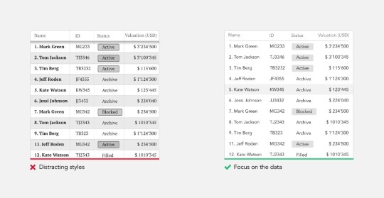
“Simplicity is not the absence of clutter, that’s a consequence of simplicity. Simplicity is somehow essentially describing the purpose and place of an object and product. The absence of clutter is just a clutter-free product. That’s not simple.”-Jonathan Ive
3. Translate data into a meaningful format
Majority of products that we design daily are focused on a lot of data that the user needs to make sense of in order to efficiently carry on their daily task. When you know users interested in trends and changes, help them with visual representation rather than a bunch of numbers. You always can show additional information on demand. Try to extract the meaningful from the data you have and put it in front of the user.
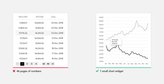
4.Support quick decision making
Users bombarded with choices have to take time to interpret and decide, giving them work they don’t want. This was famously explained by Hick’s Law. Hick’s Law predicts that the time and the effort it takes to make a decision increases with the number of options. So if you want your user experience to feel simple you need to support quick decision making as much as possible. Eliminate the need to choose when is not required, guide and handhold user.
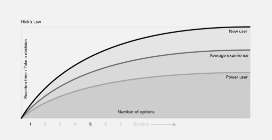
5. Too many choices will scare off customers
Current psychological theory and research affirm the positive affective and motivational consequences of having personal choice. These findings have led to the popular notion that the more choice, the better — that the human ability to manage, and the human desire for, a choice is unlimited. But in reality, research proves the opposite.
The Jam Experiment is one of the most famous experiments in consumer psychology; offering consumers less choice can be good for sales. Critically, the study reveals when precisely offering less choice may enhance your sales.
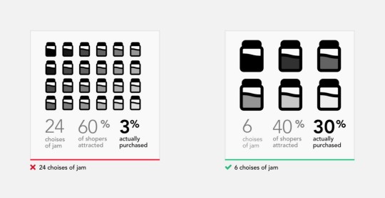
This experiment seemingly proves that customers presented with fewer choices are 10 times more likely to purchase compared with those who are shown many choices. It has been helping up as a crucial example of choice overload, the idea that presenting customers with too many choices actually inhibits customer purchases.
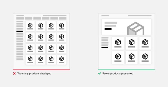
6. Provide recommendations where multiple choices are presented
When choices cannot be avoided, try to limit them. Provide a recommendation yourself or share statistics of what is most preferred by other customers. Clearly communicate to the user what the key difference between proposed options. This approach is often used on pricing plans pages.
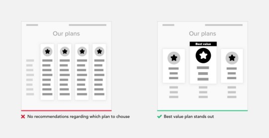
7. Draw users attention to the right areas
When you understand the journey of your user to reach their goals, on every stage of that journey are things that are more relevant and will help you to progress to the final goal. Find those key areas and draw user attention to them.
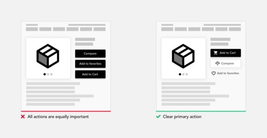
8. Use color and typography to communicate a hierarchy of content
How many times you heard — “Users don’t read”. And it’s kind of true, we are really selective to what we actually remember or deep dive to. If you ever accepted Huge User Policies without reading a word then you know what I mean. There are so many characteristics that can influence what type communicates: typeface & font, size, kerning, leading, capitalization, and color. Use that to communicate the hierarchy of content. With right use color and typography, you will be able to reflect product branding and make it instantly recognizable, much more attractive and memorable.
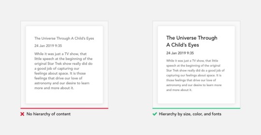
9. Organizations help the system of many look fewer and more manageable.
Let’s take a simple test. In the illustration below we have 2 images. Use a stopwatch to measure how much time(and effort) it will take for you to count the number of black dots in each square.
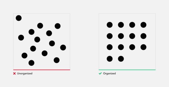
Finished? As you will see for yourself counting the unorganized square of dots took considerably more time, and in addition to that put a much more cognitive load on you. Why we had this result if the squares have an identical number of dots?
Mapping dots on to a specific matrix, helped us scan them visually, and group when counting. While in the unorganized square we had to go dot by dot, counting them individually. In addition, many of you probably made a miscalculation or was forced to double check your result with left image.
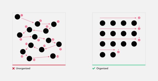
Organization of elements not only improves recognition but also makes it easier to remember. When operating any machine, it’s very important to remember the position and function of all controls. Let’s do another small exercise. It’s only a minute ago you were counting the dots in 2 images, now please recall the position of every dot in 2 squares. For majority recalling the unorganized structure is close to impossible.

10. Group related content
Often an easy way to simplify complex page is to start grouping components. At that point, users are dealing with few groups rather than with multitudes of unrelated components. Adding borders (creating common regions) around an element or group of elements is an easy way to create separation from surrounding elements. There are multiple principles of grouping in Gestalt psychology that help items feel related: Proximity, Similarity, Continuity, Closure, and Connectedness.
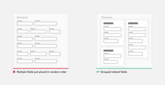
11. Break up huge tasks in smaller steps, try one column layout
Different kinds of forms are present almost in any product. It’s a way you capture user information. Sometimes even after removing everything unnecessary, those can get huge. Such forms can be very demotivation for the user to finish. So what we can do is break up that huge task into a series of smaller ones. All of a sudden it seems much easier to carry out this process to the end. Finishing small subtask gives the user a portion of endorphins and satisfaction to carry on.
When designing forms, use one column layout instead of multiple columns. One column layout is much easier to fill out. This way user doesn’t need to think what to fill out next, simply moving down the page in straight line.
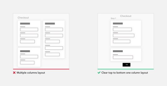
12. Be transparent in communicating the process and system status
Uncertainty makes us anxious, it should be avoided as much as possible. That’s why at any time unless it’s obvious, the user should be able to see where he is currently in the process, where he coming from and what’s coming next. Keeping a summary of the previously provided information is also a good idea, it lower loads on user memory and removes the need to go back to double check previous steps.
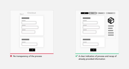
13. Do the calculations for your user
Human brain bad at raw arithmetic involving numbers. Evolutionary pressures have favored brains optimized for object recognition compared to arithmetical operations. Try to leverage the system to do all calculations instead of the user.
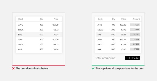
14. Hide complexity with progressive disclosure
Progressive disclosure is a design pattern used in UX design to make user interfaces easier for users to interpret. It involves sequencing information and actions across several screens so as not to overwhelm the user or hiding irrelevant information until it becomes relevant. Progressive disclosure follows the typical notion of moving from “abstract to specific,” including the sequencing of user behaviors or interactions. A good example of progressive disclosure is iOS nested doll navigation.
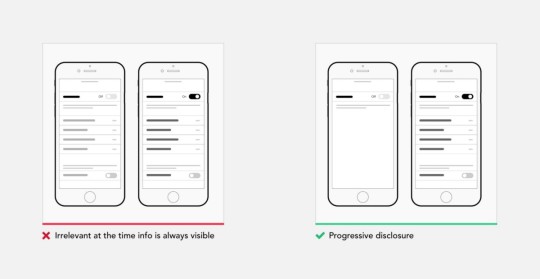
15. Rely on commonly accepted patterns and interactions
Users spend most of their time on other products. This means that users prefer your site to work the same way as all the other sites they already know, and they come on with specific expectations to how your product should look and behave. This statement holds true for any digital or physical product from social network to your fridge and reflects consumer mindset. That’s doesn’t mean you should stop innovating, more to evaluate whether a depart from traditional ways presenting navigation or controls, justifies user to change their mental model.
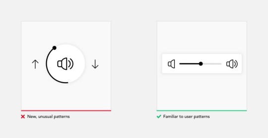
16. Design a streamlined first-time experience
The primary goal of any design should be connecting users to the value product provides as soon as possible. Think about that for a second. So anything that stands between a user and him actually operating a system, is a barrier unless it serves a functional need. The first-time experience is very important for any process, we humans are very quick to form our opinion about the product and walk away immediately if we are not satisfied.
Even the simplest task is challenging if you try to do it the first time. Sometimes additional training is required before we can operate the product. In digital design I suggest to forget a manual approach, user expectation is the product should be simple enough to understand and they expect help on demand, or when something goes wrong. Provide contextual help instead of an upfront overwhelming user with learning material, design for empty states
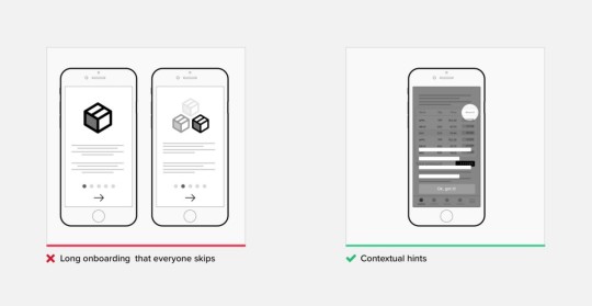
17. Keep in mind ergonomics and circumstances under which product will be used
Simplicity as we already defined by how easily you can actually use the product, with its ergonomics. Ergonomics is the process of designing or arranging workplaces, products, and systems so that they fit the people who operate them. Most people think it is something to do with seating or with the design of car controls and instruments — and it is… but it is so much more. Ergonomics applies to the design of anything that involves people, including digital products. In 1954, psychologist Paul Fitts, examining the human motor system, showed that the time required to move to a target depends on the distance to it and relates inversely to its size. So make sure commonly used elements large and position them close to users.
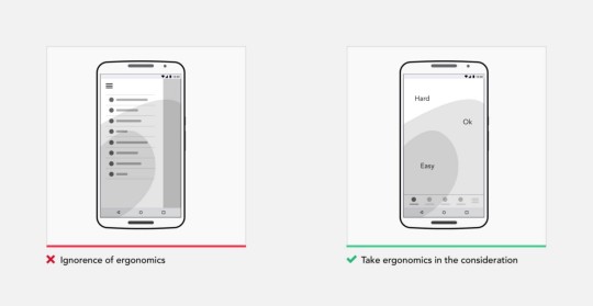
18. Support inline edit and autosuggest values
Remove all unnecessary interactions, views, steps in every process. There is an optimal speed at which the user should operate the system, it called a “state of the flow”. Don’t break that flow with popups. For all actions/values that can be changed later, support inline edit as much as possible. Autosuggest values when a great number of values is available.
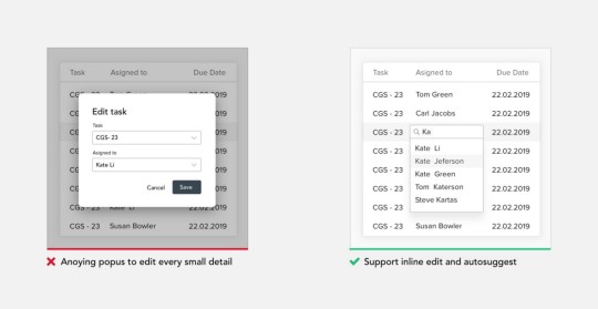
19. Use Smart Defaults to Reduce Cognitive Load
Smart defaults are selections put in place that provide answers to questions for you. This supports users to complete forms faster. Filling in forms requires people them to parse it, formulate a response, and then input their answer into the affordance provided on the form. Defining relevant defaults, designers need to understand users and the context in which they will use a product. This is only possible with deep research and testing, to learn from their users and adjust defaults based on their users’ historical data and usage patterns. Always set the default to the choice the vast majority of users (say, 90–95 percent) would choose if explicit choices were required.
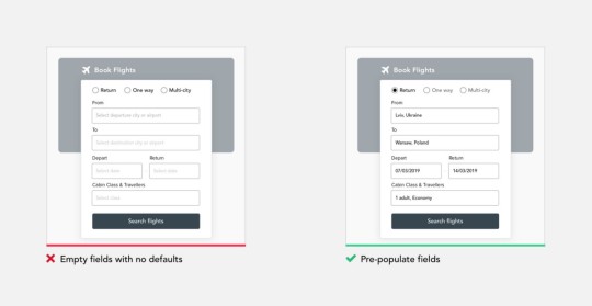
20. Prevent errors
Error messages bring a lot of stress and bring the users a feeling that they messed up or not up to the task. Ensure automatic check for entered data and provide alerts or reminders for inappropriate data entries to reduce errors. Either eliminate error-prone conditions or check for them and present users with a confirmation option before they commit to the action. Destructive and irrecoverable actions should be guarded with a forcing function to ensure that users conscious of the impact their choice will have.

21. Design for accessibility
As a designer, your goals are to champion accessibility, make sure your product is accessible by a broader audience without exclusions. There are over 1 billion people worldwide who have a disability. Don’t use color as the only visual means of conveying information. Ensure sufficient contrast between text and its background, support keyboard navigation etc. Accessibility is not confined to a group of users with some different abilities, when you design for accessibility you improve the experience for everyone using the product.

Conclusion
Designing simple to use and understand products is not easy, but its a way to go, and there are quick ways to move towards simplicity.
The post How to simplify your design appeared first on Design your way.
from Web Development & Designing https://www.designyourway.net/blog/user-interface-design/how-to-simplify-your-design/
0 notes