#extrapolating from incomplete datasets
Explore tagged Tumblr posts
Visit Tumblr Blog
Explore Tumblr blogs with no restrictions, modern design and the best experience.
Last Seen Tumblr Blogs


Fun Fact
Tumblr was acquired by Yahoo for $1.1B in 2013.
Text
wait a goddamn second…
you know the short stories? the ones you get with the Draw Points?
You know the one short stories collection, “Moments of Bliss”? The collection with all the consorts being sweet/romantic/paramours with you?
You know how Aquia was added as a consort option on the Japanese server?
Check this shit out.

Listen:
All the other stories in this collection feature sweet, romantic moments with the consorts (Except for the one with Robin).
Aquia may seem like an exception to this rule, until you recall that he has been added to the game as a consort option— on the Japanese server. He has only one short story, and it is the latest edition to the collection, no. 240. This tracks with him being a later, more recent addition to the consort cast.
… Sherry and Violet are there, as well.
Put on your tinfoil hats, my guys.
Hypothesis: Aquia’s short story being added to the moments of bliss collection is a result of Aquia being made a consort option.
The implications of this hypothesis?
Sherry and Violet’s short stories have also been added to the moments of bliss collection, because they are going to be made consort options.
Y’all— if any of y’all have gotten Sherry or Violet’s short stories in the Moments of Bliss collection, PLEASE tell me if it’s platonic or not. I feel like I’m most likely tripping, but I also might be onto something…
Other potential options:
Situation One: Robin, Sherry, Violet, and Aquia’s stories are all grouped together at the end of the collection because they feature platonic relationships, as opposed to romantic relationships with the consorts.
Counter argument to this theory: Aquia’s short story can reasonably be read as romantic. It wouldn’t make sense to have all of the romantic stories featuring consorts be grouped first, throw in three stories featuring platonic friendships, and then pick up the theme of “romantic moments with consort” again for one more story— except in Situation Two:
Situation Two: Robin, Sherry, and Violet’s stories were all grouped together at the end of the collection because they featured platonic relationships, as opposed to romantic relationships with the consorts. Aquia’s story was added to the collection when he became a consort option, and is meant to be interpreted as romantic.
Counter argument to this theory: Look at the titles of Sherry and Violet’s stories. “Love Spell” and “Together”. One could reasonably believe, based off the titles alone, that these stories may be romantic in nature. It’s still possible that these stories could be platonic, of course, but come on— if you saw a story called “Love Spell” with Fenn’s image next to it, would you doubt that story’s potential romantic nature? If any of the established consorts had a story with these titles, you would not bat an eye. Such titles would not be out of place for them— if Sherry and Violet were to be consorts, their stories would also fall under such romantic titles.
Let me know what you think!!
#court of darkness#codvn#aquia avari#sherry invidia#violet muller#am I tweaking#maybe#or maybe I just really want to see some representation in this game I like#please#Otome#I don’t think anything I’ve said is an incredible reach#I very well may be wrong here#but I think I’ve come to reasonable conclusions#extrapolating from incomplete datasets
19 notes
·
View notes
Text
there are two types of people: those who can extrapolate from incomplete datasets,
2 notes
·
View notes
Text
Analytical and Computational Reconstruction of Regge Trajectories in Nonperturbative QCD
Author: Renato Ferreira da Silva Institution: [Insert Institution] Date: [Insert Submission Date]
Abstract
This work presents a numerical and phenomenological reconstruction of Regge trajectories for light and heavy mesons, using experimental data from the Particle Data Group (PDG). By applying regularized dispersion integrals and a generalized Breit-Wigner model for the imaginary part Im α(s), we demonstrate that hadronic spectra require non-linear corrections beyond traditional linear approximations. Comparison with AdS/QCD models and estimates of spin J and width Γ(s) provide a deeper insight into the analytic structure of strong interactions in the nonperturbative regime.
1. Introduction
Regge theory provides an elegant analytical framework for understanding the spectrum of hadrons and their scattering amplitudes. However, real-world trajectories exhibit nonlinear behavior and deviations from simple linear fits, especially for narrow or exotic resonances. This article integrates modern numerical tools with real experimental inputs to reconstruct Regge trajectories and assess their alignment with theoretical expectations from QCD and holographic dualities.
2. Methodology
2.1 Imaginary Part: Generalized Breit-Wigner Model
To realistically model the imaginary part of Regge trajectories, the exponential ansatz was replaced with a sum over generalized Breit-Wigner functions, capturing the behavior of physical resonances:Im α(s)=∑nwnΓnMn2(s−Mn2)2+(ΓnMn)2
This formulation better reflects resonance widths and masses as observed in scattering experiments.
2.2 Regularized Dispersion Relation
The real part of the Regge trajectory is computed from the imaginary part using a principal-value dispersion relation, carefully regularized to handle singularities near s=s′:α(s)=α0+1π[∫s0s−ϵ+∫s+ϵ∞]Im α(s′)s′−s ds′
2.3 Data Source
Experimental inputs are taken from the 2024 Particle Data Group (PDG), including masses and widths of well-established mesons, organized by spectral families (rho, f2, D∗) in the pdg_mesons.csv dataset.
3. Results
3.1 Rho Family
Included: ρ(770), ρ(1450), ρ(1700)
The fitted trajectory closely follows experimental data and deviates significantly from the linear AdS/QCD model at low energies.
Estimated values of α(s) align with expected spins J=1,3.
3.2 f2 Family
Included: f2(1270)
A smooth trajectory is observed around s≈1.6 GeV2, matching the known spin-2 assignment.
AdS/QCD overestimates the real part α(s) in this region.
3.3 D∗ Family
Included: D∗(2007), D∗(2460)
Due to extremely narrow widths (<0.1 MeV), the trajectory is nearly flat.
D∗(2007) gives α(s)≈1.7 (consistent with J=1), while D∗(2460) gives α(s)≈−0.5, suggesting it lies outside this trajectory.
4. Spin J Estimation
StateMass (GeV)s=m2 (GeV2)α(s) EstimateD*(2007)2.006854.0271.71D*(2460)2.46076.055-0.49
5. Discussion
Real-world Regge trajectories are inherently nonlinear and cannot be captured by idealized models alone.
The AdS/QCD hard-wall model, while useful for high-energy limits, does not reproduce the fine structure of real meson spectra.
The results suggest the necessity of incorporating composite cuts, state mixing, and relativistic corrections.
Future directions include using machine learning to extrapolate incomplete trajectories and integrating results with Lattice QCD spectra.
Conclusion
This study delivers a reproducible, numerically precise framework for reconstructing Regge trajectories from experimental data. The results demonstrate that hadronic dynamics at low and intermediate energies require models beyond linear approximations. The methodology bridges phenomenological fits, dispersion theory, and theoretical predictions from AdS/QCD, offering a basis for future experimental exploration and theoretical development.
0 notes
Text
AI scaling myths
New Post has been published on https://thedigitalinsider.com/ai-scaling-myths/
AI scaling myths
So far, bigger and bigger language models have proven more and more capable. But does the past predict the future?
One popular view is that we should expect the trends that have held so far to continue for many more orders of magnitude, and that it will potentially get us to artificial general intelligence, or AGI.
This view rests on a series of myths and misconceptions. The seeming predictability of scaling is a misunderstanding of what research has shown. Besides, there are signs that LLM developers are already at the limit of high-quality training data. And the industry is seeing strong downward pressure on model size. While we can’t predict exactly how far AI will advance through scaling, we think there’s virtually no chance that scaling alone will lead to AGI.
Research on scaling laws shows that as we increase model size, training compute, and dataset size, language models get “better”. The improvement is truly striking in its predictability, and holds across many orders of magnitude. This is the main reason why many people believe that scaling will continue for the foreseeable future, with regular releases of larger, more powerful models from leading AI companies.
But this is a complete misinterpretation of scaling laws. What exactly is a “better” model? Scaling laws only quantify the decrease in perplexity, that is, improvement in how well models can predict the next word in a sequence. Of course, perplexity is more or less irrelevant to end users — what matters is “emergent abilities”, that is, models’ tendency to acquire new capabilities as size increases.
Emergence is not governed by any law-like behavior. It is true that so far, increases in scale have brought new capabilities. But there is no empirical regularity that gives us confidence that this will continue indefinitely.
Why might emergence not continue indefinitely? This gets at one of the core debates about LLM capabilities — are they capable of extrapolation or do they only learn tasks represented in the training data? The evidence is incomplete and there is a wide range of reasonable ways to interpret it. But we lean toward the skeptical view. On benchmarks designed to test the efficiency of acquiring skills to solve unseen tasks, LLMs tend to perform poorly.
If LLMs can’t do much beyond what’s seen in training, at some point, having more data no longer helps because all the tasks that are ever going to be represented in it are already represented. Every traditional machine learning model eventually plateaus; maybe LLMs are no different.
Another barrier to continued scaling is obtaining training data. Companies are already using all the readily available data sources. Can they get more?
This is less likely than it might seem. People sometimes assume that new data sources, such as transcribing all of YouTube, will increase the available data volume by another order of magnitude or two. Indeed, YouTube has a remarkable 150 billion minutes of video. But considering that most of that has little or no usable audio (it is instead music, still images, video game footage, etc.), we end up with an estimate that is much less than the 15 trillion tokens that Llama 3 is already using — and that’s before deduplication and quality filtering of the transcribed YouTube audio, which is likely to knock off at least another order of magnitude.
People often discuss when companies will “run out” of training data. But this is not a meaningful question. There’s always more training data, but getting it will cost more and more. And now that copyright holders have wised up and want to be compensated, the cost might be especially steep. In addition to dollar costs, there could be reputational and regulatory costs because society might push back against data collection practices.
We can be certain that no exponential trend can continue indefinitely. But it can be hard to predict when a tech trend is about to plateau. This is especially so when the growth stops suddenly rather than gradually. The trendline itself contains no clue that it is about to plateau.
CPU clock speeds over time. The y-axis is logarithmic. [Source]
Two famous examples are CPU clock speeds in the 2000s and airplane speeds in the 1970s. CPU manufacturers decided that further increases to clock speed were too costly and mostly pointless (since CPU was no longer the bottleneck for overall performance), and simply decided to stop competing on this dimension, which suddenly removed the upward pressure on clock speed. With airplanes, the story is more complex but comes down to the market prioritizing fuel efficiency over speed.
Flight airspeed records over time. The SR-71 Blackbird record from 1976 still stands today. [Source]
With LLMs, we may have a couple of orders of magnitude of scaling left, or we may already be done. As with CPUs and airplanes, it is ultimately a business decision and fundamentally hard to predict in advance.
On the research front, the focus has shifted from compiling ever-larger datasets to improving the quality of training data. Careful data cleaning and filtering can allow building equally powerful models with much smaller datasets.
Synthetic data is often suggested as the path to continued scaling. In other words, maybe current models can be used to generate training data for the next generation of models.
But we think this rests on a misconception — we don’t think developers are using (or can use) synthetic data to increase the volume of training data. This paper has a great list of uses for synthetic data for training, and it’s all about fixing specific gaps and making domain-specific improvements like math, code, or low-resource languages. Similarly, Nvidia’s recent Nemotron 340B model, which is geared at synthetic data generation, targets alignment as the primary use case. There are a few secondary use cases, but replacing current sources of pre-training data is not one of them. In short, it’s unlikely that mindless generation of synthetic training data will have the same effect as having more high-quality human data.
There are cases where synthetic training data has been spectacularly successful, such as AlphaGo, which beat the Go world champion in 2016, and its successors AlphaGo Zero and AlphaZero. These systems learned by playing games against themselves; the latter two did not use any human games as training data. They used a ton of calculation to generate somewhat high-quality games, used those games to train a neural network, which could then generate even higher-quality games when combined with calculation, resulting in an iterative improvement loop.
Self-play is the quintessential example of “System 2 –> System 1 distillation”, in which a slow and expensive “System 2” process generates training data to train a fast and cheap “System 1” model. This works well for a game like Go which is a completely self-contained environment. Adapting self-play to domains beyond games is a valuable research direction. There are important domains like code generation where this strategy may be valuable. But we certainly can’t expect indefinite self-improvement for more open-ended tasks, say language translation. We should expect domains that admit significant improvement through self-play to be the exception rather than the rule.
Historically, the three axes of scaling — dataset size, model size, and training compute — have progressed in tandem, and this is known to be optimal. But what will happen if one of the axes (high-quality data) becomes a bottleneck? Will the other two axes, model size and training compute, continue to scale?
Based on current market trends, building bigger models does not seem like a wise business move, even if it would unlock new emergent capabilities. That’s because capability is no longer the barrier to adoption. In other words, there are many applications that are possible to build with current LLM capabilities but aren’t being built or adopted due to cost, among other reasons. This is especially true for “agentic” workflows which might invoke LLMs tens or hundreds of times to complete a task, such as code generation.
In the past year, much of the development effort has gone into producing smaller models at a given capability level. Frontier model developers no longer reveal model sizes, so we can’t be sure of this, but we can make educated guesses by using API pricing as a rough proxy for size. GPT-4o costs only 25% as much as GPT-4 does, while being similar or better in capabilities. We see the same pattern with Anthropic and Google. Claude 3 Opus is the most expensive (and presumably biggest) model in the Claude family, but the more recent Claude 3.5 Sonnet is both 5x cheaper and more capable. Similarly, Gemini 1.5 Pro is both cheaper and more capable than Gemini 1.0 Ultra. So with all three developers, the biggest model isn’t the most capable!
Training compute, on the other hand, will probably continue to scale for the time being. Paradoxically, smaller models require more training to reach the same level of performance. So the downward pressure on model size is putting upward pressure on training compute. In effect, developers are trading off training cost and inference cost. The earlier crop of models such as GPT-3.5 and GPT-4 was under-trained in the sense that inference costs over the model’s lifetime are thought to dominate training cost. Ideally, the two should be roughly equal, given that it is always possible to trade off training cost for inference cost and vice versa. In a notable example of this trend, Llama 3 used 20 times as many training FLOPs for the 8 billion parameter model as the original Llama model did at roughly the same size (7 billion).
One sign consistent with the possibility that we won’t see much more capability improvement through scaling is that CEOs have been greatly tamping down AGI expectations. Unfortunately, instead of admitting they were wrong about their naive “AGI in 3 years” predictions, they’ve decided to save face by watering down what they mean by AGI so much that it’s meaningless now. It helped that AGI was never clearly defined to begin with.
Instead of viewing generality as a binary, we can view it as a spectrum. Historically, the amount of effort it takes to get a computer to program a new task has decreased. We can view this as increasing generality. This trend began with the move from special-purpose computers to Turing machines. In this sense, the general-purpose nature of LLMs is not new.
This is the view we take in the AI Snake Oil book, which has a chapter dedicated to AGI. We conceptualize the history of AI as a punctuated equilibrium, which we call the ladder of generality (which isn’t meant to imply linear progress). Instruction-tuned LLMs are the latest step in the ladder. An unknown number of steps lie ahead before we can reach a level of generality where AI can perform any economically valuable job as effectively as any human (which is one definition of AGI).
Historically, standing on each step of the ladder, the AI research community has been terrible at predicting how much farther you can go with the current paradigm, what the next step will be, when it will arrive, what new applications it will enable, and what the implications for safety are. That is a trend we think will continue.
A recent essay by Leopold Aschenbrenner made waves due to its claim that “AGI by 2027 is strikingly plausible”. We haven’t tried to give a point-by-point rebuttal here — most of this post was drafted before Aschenbrenner’s essay was released. His arguments for his timeline are entertaining and thought provoking, but fundamentally an exercise in trendline extrapolation. Also, like many AI boosters, he conflates benchmark performance with real-world usefulness.
Many AI researchers have made the skeptical case, including Melanie Mitchell, Yann LeCun, Gary Marcus, Francois Chollet, and Subbarao Kambhampati and others.
Dwarkesh Patel gives a nice overview of both sides of the debate.
Acknowledgements. We are grateful to Matt Salganik, Ollie Stephenson, and Benedikt Ströbl for feedback on a draft.
#AGI#ai#AI research#airplanes#anthropic#API#applications#artificial#Artificial General Intelligence#audio#barrier#Behavior#benchmark#benchmarks#billion#binary#book#Building#Business#claude#claude 3#claude 3.5#code#code generation#Community#Companies#computer#computers#copyright#course
0 notes
Text
"Blank Chart Prediction: Methods and Strategies for Accurate Forecasts"
Blank chart prediction, often referred to as data extrapolation or trend projection, is a crucial analytical process used in various fields, including finance, economics, marketing, and science. It involves making predictions based on incomplete or insufficient data by identifying trends and patterns from available information. In this article, we will delve into the methods and strategies employed in blank chart prediction to help you understand how to make accurate forecasts even when you have limited data at hand.
Historical Data Analysis:
One of the fundamental methods in blank chart prediction is historical data analysis. By examining past trends and patterns, analysts can identify cyclical behaviors and make informed predictions about the future. Time series analysis, a common technique, helps extract valuable insights from historical data by identifying seasonality, trends, and irregular components. This method allows analysts to create predictive models that account for past behaviors and extrapolate them into the future.
Regression Analysis:
Regression analysis is another widely used method in blank chart prediction. It involves establishing relationships between variables and using these relationships to predict future values. For example, in financial markets, analysts often use linear regression to predict stock prices based on factors like interest rates, earnings, or economic indicators. More advanced techniques, such as polynomial regression or machine learning algorithms, can provide even more accurate forecasts by capturing non-linear relationships.
Moving Averages:
Moving averages are simple yet effective tools for blank chart prediction. They smooth out fluctuations in data by calculating the average value over a specified time period. Different types of moving averages, such as simple moving averages (SMA) and exponential moving averages (EMA), can be applied depending on the nature of the data. These averages help analysts identify trends and predict future values by extrapolating from the moving average curve.
Seasonal Decomposition:
In many fields, data exhibits seasonal patterns that repeat over time. Seasonal decomposition is a method used to separate these seasonal effects from the underlying trends and irregular components in the data. By removing seasonality, analysts can better understand the true trends and make more accurate predictions. Common techniques for seasonal decomposition include seasonal decomposition of time series (STL) and seasonal adjustment with the Census Bureau's X-12-ARIMA.
Machine Learning and Artificial Intelligence:
With the advent of machine learning and artificial intelligence, blank chart prediction has advanced significantly. These technologies can handle large datasets and complex patterns that traditional methods may struggle with. Algorithms like neural networks, decision trees, and random forests can uncover intricate relationships within data, leading to precise predictions. Machine learning models also allow for the incorporation of multiple variables and feature engineering to enhance forecast accuracy.
Expert Opinions and Qualitative Information:
In some cases, qualitative information and expert opinions can play a crucial role in blank chart prediction. Subject matter experts can provide valuable insights and domain knowledge that quantitative methods alone may miss. Combining qualitative and quantitative approaches, known as mixed-method forecasting, can result in more robust and reliable predictions.
Conclusion:
Blank chart prediction is an essential tool for making informed decisions in various domains. By employing a combination of historical data analysis, regression analysis, moving averages, seasonal decomposition, machine learning, and expert insights, analysts can increase the accuracy of their forecasts, even when faced with incomplete or limited data. As technology continues to advance, the field of blank chart prediction will only become more sophisticated, allowing us to make more reliable predictions and better navigate an uncertain future.
0 notes
Text
S7: both here and there, pt1
The best word for S7 --- from a data standpoint --- is polarizing.
The datasets have been pretty volatile, and that’s telling in and of itself. I’m sure by now you’ve heard about the earliest Rotten Tomatoes’ score for S7, at 13%. As word spread, I’m not kidding when I say I gleefully refreshed every five minutes to watch the votes jump up another 200 or so --- while the actual score inched upwards like molasses in January.
Crowd-sourced ratings --- Rotten Tomatoes, IMDB, Yelp, Good Reads, Amazon, etc --- aren’t unknown quantities anymore. We know the first round of reviews, the majority of the time, will produce the highest ratings. After that, it’ll slowly drop until it reaches an equilibrium (when a few votes could no longer tip the score). A break in that established pattern --- of the low votes coming in first --- is a bad sign. Displeased viewers are more likely to just turn off; it takes shit getting real --- or personal --- to get action from the angry ones.
A little context: the first 200 or so votes had an average of about 1.9, which is beyond abysmal. If it’d been a 2.5 to 3.0, that’d signal dislike. 1.9 is verging on serious rage --- and every time someone put out the cry that the average wasn’t climbing fast enough, it simply drew more attention to the developing schism.
S7 now has 2758 votes, 1.4 times more than S1-S6 put together. The fandom moved at a fever pitch, and many of those calls were exhorting fans to vote a flat 5. To still only get a 3.9 average means almost 700 people gave the season the lowest possible score. That’s one-quarter of the viewing populace. One-quarter.
Let’s hypothesize the first 250 or so votes were a single cranky group. If everyone else was generally happy to give 4s or 5s, S7 would be at 91% with a 4.2 average. Without access to the actual breakdown, the only conclusion is that there was no single negative push. The anger continued, even as a larger group tried to cloak that anger with inflated values.
And that’s just the simplest example of polarization and volatility I’m seeing in every dataset, which is why I waited a bit longer to report in. As a warning, there is no single value to say this season was good or bad; we’re going to have to consider all the data in context before we can pass judgment.
We’ll start with the usual datasets to get a sense of estimated viewership and audience engagement and get the broad strokes. In the follow-up I’ll get into more datasets that will round things out for a fuller picture.
an explanation about Netflix ratings
For those of you just tuning in, Netflix is a black box. They never share the specific viewership data, and even the ‘trending’ is calculated based on the viewer + other various data. (Your trending on Netflix is not automatically the same list as someone else’s.) The few times anyone’s tried to capture viewing data, naturally Netflix swears the numbers are all wrong.
The closest we can come is Wikipedia’s page analysis, which apparently correlates to Neilson ratings. That means we’re extrapolating that we could expect the same behaviors from viewers for digital shows. These aren’t the ‘real’ viewer numbers, but that’s fine. I’m using them for comparison, after all, so what really matters is the change, not the total.
a note about the two core datasets
The wikipedia dataset and the google dataset are essentially measuring audience engagement. The drawback is that past 90 days, google’s dataset is combined into weeks, plus it’s relative. To compare multiple seasons, I’m stuck with by-week values. I prefer wikipedia’s dataset for this finer-grained look, because I can get down to the day.
However, I’ve taken the two datasets, merged by week, and compared. They map almost exactly, with a caveat, The release-week values for wikipedia are always higher than google’s by around 5%, and the between-release lull values on google are higher than wikipedia’s by about the same. The truth probably lies somewhere in the middle, but without actual numbers from google, eyeballing is it probably good enough for my purposes.
post-release tails comparison
A little over two weeks in, first thing is we check the tails, which are a measure of how long engagement lasts after a season’s release. There’ll be a peak, and then interest will taper off until it hits a threshold, usually the level of audience engagement in the lull between seasons. Sometimes, the tail is relatively flat and long (ie S6). In others, the tail is a bit steeper, indicating a quick drop-off (S3-S5). But it’s also a factor of how high the peak reached, in that some seasons will have farther to go (S1, S2) before reaching that lull threshold where the ‘tail’ ends.
After S6 (yellow line) reversed the falling trend, S7 (dashed green line) is following the same path. If you were expecting a tremendous rise (or fall), you’d be disappointed; the surprise in S7 is that it has no surprises in this dataset. It’s holding the line established by S6, albeit at a higher engagement rate.

This graph takes the above, and adjusts so the peaks are equalized. Now we can see the tails in a better comparison.

S7 wobbles in equal measure to balance out S6; the most we could say is that S7 is holding the line. It neither gained, nor lost. Because the two graphs above are daily, there’s a bit of noise. To streamline that, we’ll take the same data but gathered into weeks (Friday to following Thursday, as releases are always Friday).
comparing the first four weeks of every season
Here we’re comparing the totals for the first week of all seven seasons, then the second week, etc. (S7′s data is incomplete for the 3rd week, so that green bar will probably increase.)

Even here, there are some interesting details hiding in the data. Basically, the rate at which S6 built on S5 is pretty close to the rate on which S7 is building on S6. And the fact is... that’s not how multi-seasons stories usually work.
comparing viewership peaks across seasons
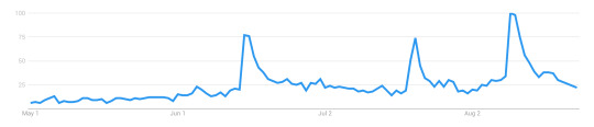
As comparison, this is google’s interest over time tracker for House of Cards:
If a series is expected to go out with a bang, there's usually a spike for the final season, but all the seasons before will steadily degrade, and often by a regular percentage. A quick comparison of several multi-season, serial, shows (Orange is the New Black, Unbreakable Kimmy Schmidt, Stranger Things, Daredevil, TrollHunters) seems to indicate the House of Cards pattern would be considered a successful show. Whenever it peaks, about 20% of those viewers will drop out, and after that, the numbers hold mostly steady, with perhaps a 5-10% drop at most. (Trollhunters breaks this mold with a 50% drop for S2, and a finale that almost matches its S1 peak.)
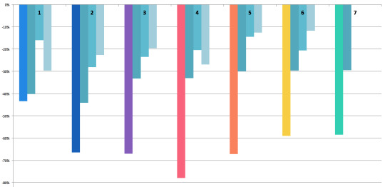
With that in mind, let’s look at the rate of change from one point to another: the peak of season A to the peak of season B. They’re floating so you can see better how the drop from one affected the next.

After S1, 31% of the audience dropped VLD. Of the remainder, 20% quit after S2; after S3, a further 20% didn’t come back for S4. This is where you can see S4's damage: 28% didn’t come back for S5. All told, between S1 and S5, 68% of the viewers quit the show. If VLD had been a Netflix original, S5 would have been its last season.
But thanks to marketing or hype, 17% of those lost viewers returned for S6, which in turn influenced the return of 22% more viewers for S7. None of the other shows had a mid-series rise, let alone a second increase. Viewership hasn’t caught back up to the levels after S2, though, but if I were to say any point turned around the sinking ship, it’s clearly S6.
It’s too soon to say whether S7 will take that further, or if S7 is just holding onto the lead S6 put in place. We won’t really know that until S8.
weekly rate of change to see patterns
Some of the seasons peaked on the 2nd or 3rd day, so I started from that point; starting on the release date (with lower numbers) would camouflage that peak and defeat the purpose of this comparison. The question here is: can we see a pattern in viewership engagement over the first month after a release?
With rate of change, the smaller the drop, the lower the difference. Frex, look at the 3rd and 4th weeks of S5. The difference between weeks 3 & 4, and weeks 4 & 5, is only 1%. That means the engagement level was dropping at a steady rate across those weeks.
Now you can see the real damage: S4. Basically, a week after S4′s release, 78% of the audience checked out. Next to that, S5 regains a tiny bit of ground, and S6 increased that. So far, S7 is holding steady with S6.
Again, S7 hasn’t lost ground, but it hasn’t really gained, either.
pre- and post-season context: measuring hype
What none of these graphs show, so far, is the context of each season. For that, we need to look across all the seasons. Again to reduce the noise (but not so much it’s flattened), I’ve collected days into weeks, starting on friday, ending the following thursday. The release week is marked with that season’s color.

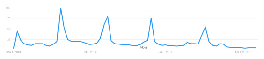
I know it’s kinda hard to see, here, sorry. To throw in a different dataset for a moment, here’s a simple track of all searches for ‘voltron legendary defender’ from May 2018 to now.
This pattern echoes across several other datasets, btw. There’s a spike for S6, which never entirely drops off, and then we get a second spike for the premiere at SDCC. (Which is also the first time a between-season premiere has skyrocketed like that.) After SDCC, the base level stays high.
In other words, does S7 appear as a larger spike because it began from a higher base rate? How do we compare season-to-season, when one starts at a radically elevated position compared to the rest?
The question became how to untangle hype from viewer reaction to the season. Here’s the viewership levels for S5, S6, and S7, again consolidated into weeks.

After S5, things dropped pretty low. A week before S6, reviews, a trailer, and some wacky marketing hijinks lured a lot of people back in. Two things happened between S6 and S7 that are worth noting.
The first, two weeks after S6, was the announcement that Shiro was no longer a paladin, and his link with Black had been severed. This weekly graph blurs the details slightly, but the drop you see in the next two light-gray columns actually starts the day after that announcement.
The second gray bar is SDCC, where S7E1 premiered. In the gap between then and the week before release, the levels drop back to the new (higher) baseline. Excitement was high, propelling audience engagement. If hype is meant to increase engagement, and these datasets are capturing the same thing to some basic degree, there’s a value in what the pre-season week and post-season week could be telling us.
the narrative in the data
If the week-prior is high, it means audiences are engaged due to pre-season marketing, trailers, rumors, and reviews. If the week-after is high, it means audiences are excited and engaging directly with the show itself. In other words, you could say week-prior measures how much people are buzzing or getting ready, and week-after measures how much they’re re-watching or encouraging others to watch.
For S1 and S2, the week-prior was really low. After S1 there was a splash in October, but not big enough to keep energy up through to S2. Both S1 and S2 had much higher week-after rates. The simplest reason would be that people who’d seen the season were now talking about it and raising buzz on their own, thus propelling further engagement.
Until S7, S3 had the highest week-prior engagement --- and the first time there was a drop, comparatively, in the week-after. S4 follows that trend, with a much larger drop. S5′s before and after are close to equal, which to me says that whatever excitement was ginned up prior, the season didn’t have much of an impact one way or another. It feels almost apathetic, actually.
S6 reverses the trend; people went into it barely more excited than they had been after finishing S5, but for the first time since S2, there was a post-release rise. Audiences were engaged again. Even with the drop from the post-season news, it wasn’t so far SDCC couldn’t rocket it back up again. But if you look at the graph above for S7, once again there’s a slight drop in the week-after.
Given the level of week-prior excitement (especially with the SDCC spike still fresh in people’s minds), the lack of post-season buzz is noticeable.
To get a better look, I’ve isolated the rate of change for each season, comparing week-prior and week-after. S1 and S2 had such extreme amounts (744% and 156% increases, respectively) that it torqued the entire graph. I’ve left them off so we can focus on S3 through S7.

After S3, engagement dropped by 9%, indicating a less-enthused audience after seeing the season. S4 went further, dropping by 27%. S5 managed a small increase of 4%, and S6 increased engagement by 18%.
S7 has a 2% drop. Not as bad as S3′s, but nowhere near the huge spike we should’ve seen, had the pre-season hype been borne out in the season itself. That excitement didn’t quite pop like S4; it’s more like a slow leak.
comparing across datasets
One more thing before I wrap up this first post. Google’s data is on the left, and Wikipedia’s dataset is on the right, with the weeks marked that include the actual release date. (I did this in excel so the images don’t line up quite right, but hopefully it’s good enough to illustrate.)

With Wikipedia’s daily values added in a Fri-to-Thu week group, there’s only one week before a strong drop. With the Google calendar-style (Sun to Sat), S7′s second week goes even higher, and the drop is steep.
In the Google numbers, 2/7ths of the green bar is ‘now showing on Netflix,’ and the remaining 5/7ths is the hype-based engagement levels. The same goes for the week following, which in google’s dataset is even higher; 5/7ths of that, plus the last 2 days of the week before, equal the S7 green bar on the Wikipedia dataset, on the right.
And that means there was enough traffic in five days to propel an entire week to even higher than the week that contained the first two days of the season (which usually loom over all others by a noticeable degree). It’s even more remarkable when you look at the Wikipedia dataset, which is arranged to run from Friday to the following Thursday -- and which does have a drop-off.
I’ll be tapping a few more datasets to unpack this anomaly, in my next post. I’ll warn you now, they paint a very different picture of S7.
part 2 can be found here
77 notes
·
View notes
Text
TF Fanfic Census 2017 (pt. 3) - Quantifying IDW Fics
Let’s dig a little deeper into what’s going on with IDW Transformers fanfics on AO3 and try to quantify what people have posted. 😃

First off we’re going to take a look at how IDW Transformers stacks up against some other popular comics for number of fics - 5,000 seems like a small fandom, but the readership of print comics (excluding manga and some graphic novels) is really low these days, so it’s only fair to look at us in comparison to other print comics. All of these were fairly popular series that had a comics specific tag I could zero in on; keep in mind that series popular before AO3 existed (2009) or with demographics that don’t use AO3 won’t be fairly represented.
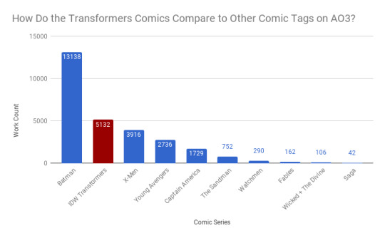
That said, wow! We’re right up there with some of these random-ass popular comics I picked cause I thought they’d have a lot of fanfiction. Cool!
Notes: If you have trouble reading the graphs, they’re also available in an image post: here and here
Most of this data is queried directly from AO3 using their advanced search. However, some data you just can’t get that way. So I also randomly sampled 620 IDW fanfics to give us some approximations - I’ll indicate if a chart is pulled from the sample instead of the full dataset.
Ratings Breakdown

There are nearly twice as many explicit as mature works, while teen and general audiences are about the same, nestled between the two.
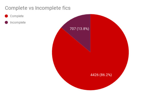
Complete vs. Incomplete Fics
How many works in the archive are currently incomplete/works in progress? About 14% of fics.
But then, only a multi-chapter fic can possibly be incomplete. We should probably look at them separately from the one-shots. Slightly less than a quarter of all fics are multi-chapter fics.

So, let’s zoom in on just those mutichapter fics. Here we can see that nearly 60% of multi-chapter fics are currently incomplete.

Incomplete in this case doesn’t necessarily mean abandoned - they could be active works in progress. Let’s take a quick look at when incomplete fics were most recently edited (and I’m not saying everyone who’s taken more than a year to update has abandoned a work! this is just for reference! write at your own pace!)

So 55% percent of incomplete fics (387 of them) haven’t been updated in the past year. Take from that what you will.
How Many Works Were Being Written Each Year?
This, of course, gets complicated. Because a multi-chapter work could have continued on for many years - should we look at when it began or when it completed? If we look at all works and when they were last updated we see a sharp peak in 2015 and then a shallow decline in 2016-2017.

Is that the real data trend? Or are multi-chapter updates messing us up? Well, if we look only at one-shots, we see something very similar:

There’s still a peak in 2015, but now we see a steeper decline into 2016 and 2017. Which seems sad, I just got here. ☹ But have no fear, 2017 seems artificially low because we’re just counting the first 10 months. If we extrapolate a uniform upload rate for November and December, the total count should be at about as much as last year.
This chart could also reflect a shift towards multi-chapter fics instead of one-shots. I can’t figure any way to query that, so there’s no way to check.
How Long Are They?
First let’s query the database and see how many fics fall into different length ranges.
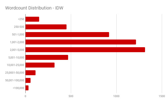
Hmm...interesting. How does that compare to Transformers fics as a whole?
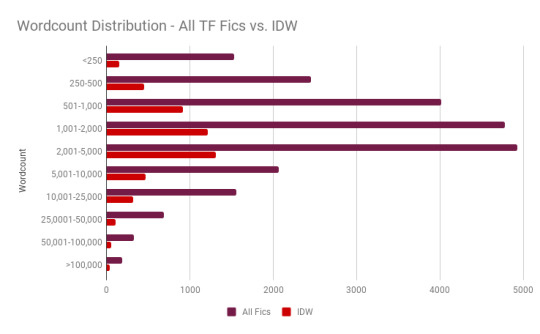
Well, from here they look pretty similar, but it’s tough to compare them because the IDW sample is so much smaller. Let’s look at what percentile of fics fall into each bracket instead and see what’s different:
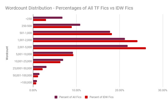
Ah, that’s better. Here we can see that IDW fics are more likely to fall in the 1,000-5,000 range than other Transformers fics, but less likely to be very short or very long.
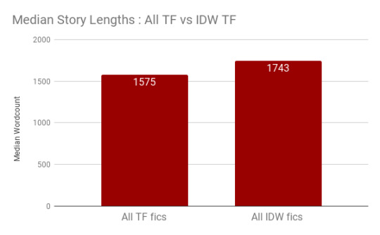
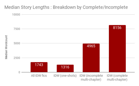
We can also use the database to find the median fic lengths: just sort by length and go to the center. From that we can see that the median length of a IDW fic is slightly longer than that of the median aggregated Transformers fic.
We can also see that, predictably, one-shots are shortest, followed by incomplete multi-chapter works, followed by complete multi-chapter works. No surprises here.
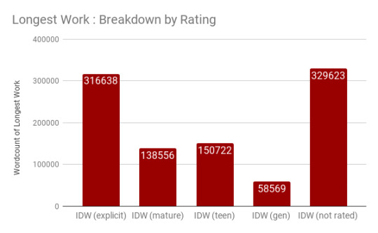
If we look at it by rating, though, we get some interesting data. Explicit and mature works are by-and-away longest, while teen and gen works are comparatively short. Works that aren’t rated fall between the two.

The reason to look at medians instead of means is that fanfiction is going to have a bunch of outliers - the longest work in any category is far, far longer than the majority of other works and pulls the average up. Let’s take a peek at the longest work in each rating.
From our sampled data I estimated the mean lengths; sure enough, they’re a lot higher than the medians. I calculated an average length for a finished multi-chapter work at 33,943 words (versus the known median of 8,156) and that of an unfinished multi-chapter work as 10,225 words (versus the known median of 4,965). Meanwhile, one-shots have an average length of 1,906 (versus the known median of 1,316).
We can also use the sampled data to see see what the distributions look like. If we look at how many chapters fics have, the one-shot predominates.

If we look at the same dataset excluding one-shots, we get a better look at the spread of chapter numbers for multi-chapter fics. 2-3 chapter fics are nearly twice as common as 4-5 chapter fics. (The data gets patchy on the upper end since a sample of 600 fics is going to pick up on very few very long fics.)

Since the sample includes both word count and number of chapters, we can approximate how many words stories have per chapter. The calculated average number of words/chapter was 2,541 for complete multi-chapter works and 1,906 (same as the fic length) for one-shots.
Let’s look at the spread of all fics. (The histogram here has stupid block sizes which I could not change 😐.) If we look there’s a surprisingly sharp decline after a chapter length of 580 words.

This is, of course, because of short one-shots. If we exclude one-shots from the dataset we get a very different shape. Now chapter lengths are fairly evenly distributed between shorter-than-500 and 2000 words, then beginning a gradual decline.

And that’s about it for looking at lengths, chapters, publication years, complete/incomplete works and ratings.
What’s Next?
Pt. 1 - Quantifying TF Fanfiction between Adaptations
Pt. 2 - Relationship Scoreboard (All Series) - A Quick Look at the Most Popular Pairings
Pt. 3 - This post!
pt 4 - (IDW) Quantifying Reader Response - let’s take a look at how readers respond to the fanfics that have been posted.
pt 5 - IDW Relationship Spectacular (½)
pt 6 - IDW Relationship Spectacular (2/2)
#mtmte#maccadam#overthinking it#data data data#on fanfiction#if you want to see more of me over-analyzing tf#check my 'overthinking it' tag#gay space car robots: in space#undescribed#mine
58 notes
·
View notes
Text
Modeling COVID-19 data must be done with extreme care, scientists say
As the infectious virus causing the COVID-19 disease began its devastating spread around the globe, an international team of scientists was alarmed by the lack of uniform approaches by various countries' epidemiologists to respond to it. Germany, for example, didn't institute a full lockdown, unlike France and the U.K., and the decision in the U.S. by New York to go into a lockdown came only after the pandemic had reached an advanced stage. Data modeling to predict the numbers of likely infections varied widely by region, from very large to very small numbers, and revealed a high degree of uncertainty. Davide Faranda, a scientist at the French National Centre for Scientific Research (CNRS), and colleagues in the U.K., Mexico, Denmark, and Japan decided to explore the origins of these uncertainties. This work is deeply personal to Faranda, whose grandfather died of COVID-19; Faranda has dedicated the work to him. In the journal Chaos, the group describes why modeling and extrapolating the evolution of COVID-19 outbreaks in near real time is an enormous scientific challenge that requires a deep understanding of the nonlinearities underlying the dynamics of epidemics. Forecasting the behavior of a complex system, such as the evolution of epidemics, requires both a physical model for its evolution and a dataset of infections to initialize the model. To create a model, the team used data provided by Johns Hopkins University's Center for Systems Science and Engineering, which is available online at https://systems.jhu.edu/research/public-health/ncov/ or https://github.com/CSSEGISandData/COVID-19. "Our physical model is based on assuming that the total population can be divided into four groups: those who are susceptible to catching the virus, those who have contracted the virus but don't show any symptoms, those who are infected and, finally, those who recovered or died from the virus," Faranda said. To determine how people move from one group to another, it's necessary to know the infection rate, incubation time and recovery time. Actual infection data can be used to extrapolate the behavior of the epidemic with statistical models. "Because of the uncertainties in both the parameters involved in the models—infection rate, incubation period and recovery time—and the incompleteness of infections data within different countries, extrapolations could lead to an incredibly large range of uncertain results," Faranda said. "For example, just assuming an underestimation of the last data in the infection counts of 20% can lead to a change in total infections estimations from few thousands to few millions of individuals." The group has also shown that this uncertainty is due to a lack of data quality and also to the intrinsic nature of the dynamics, because it is ultrasensitive to the parameters—especially during the initial growing phase. This means that everyone should be very careful extrapolating key quantities to decide whether to implement lockdown measures when a new wave of the virus begins. "The total final infection counts as well as the duration of the epidemic are sensitive to the data you put in," he said. The team's model handles uncertainty in a natural way, so they plan to show how modeling of the post-confinement phase can be sensitive to the measures taken. "Preliminary results show that implementing lockdown measures when infections are in a full exponential growth phase poses serious limitations for their success," said Faranda. Provided by: American Institute of Physics More information: Davide Faranda et al. Asymptomatic estimates of SARS-CoV-2 infection counts and their sensitivity to stochastic perturbation. Chaos (2020). https://doi.org/10.1063/5.0008834 Image: Estimates of the total number of infection counts using COVID-19 infections within the U.K. Extrapolations show enormous fluctuations depending on magnitude of the last available data point. Credit: Davide Faranda Read the full article
0 notes