#fanbinding series
Explore tagged Tumblr posts
Visit Tumblr Blog
Explore Tumblr blogs with no restrictions, modern design and the best experience.
Last Seen Tumblr Blogs


Fun Fact
12.7% of mobile users access Tumblr.
Text
Fanbinding: Searching Ceremonies Series by KouriArashi


Binds #26-30
The Searching Ceremonies by KouriArashi ( @gingersnapwolves )
Date Completed: 06/08/2025
Size: 5 Folios. 589,985 words.
There are several series on my to-bind list and I had no idea how to approach a project like that. So in my time-honored tradition I just decided to dive in and see what happened along the way. The Searching Ceremonies were a nice middle ground in the number of stories/volumes so it became my guinea pig.

I ended up with five flatback volumes bound with mystery Amazon bookcloth, some scrapbook paper I’ve had in my stash for about 15 years, and shiny blue HTV from the Dollar Tree, and I’m pleased as punch with the results.
Typesetting was the most challenging part of the process but also the most visually uninteresting. I went with a very no-frills look with Times New Roman as the body text and Bodoni for the titles and headers. If you ever try something like this in a word processor like LibreOffice Writer I would recommend getting all your settings exactly right with the first story, then save a copy and use that to copy/paste the second story in for volume two. At that point it should just need a few tweaks to get both typesets looking alike. Do not decide in the middle of formatting the fourth story that you actually don’t like the border you put around the titles and chapter headings, and then have to go back and remove them and fix the spacing on four books. Ask me how I found this out…


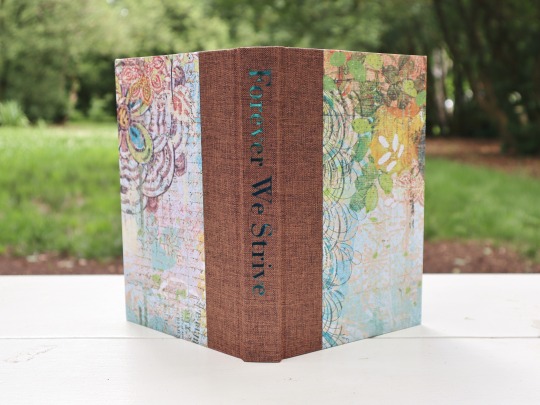
(The borders weren’t too bad, but they gave the whole thing a 1950s academic journal vibe, which wasn’t the look I was going for.)

#fanbinding#Teen Wolf#The Searching Ceremonies Series#Divided We Stand#KouriArashi#sterek#handbound books#fanbinding series#half letter folio#quarter cloth#fanbinding 2025
162 notes
·
View notes
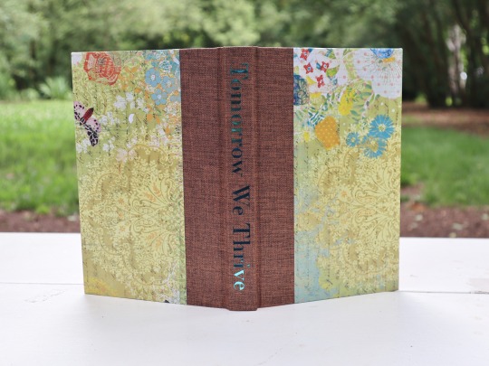
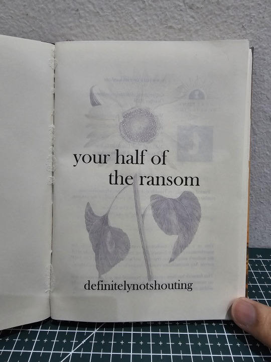
Text
your half of the ransom by definitelynotshouting

After the massive chonker of my last bind, I wanted to do something simpler and less complicated. And there was one fic that is in my to-bind list that is both short and sweet to typeset: your half of the ransom by @definitelynotshouting.
Buuuut trust me to not do some experimenting, even now.
Also, apologies for the terrible lighting. And for adding glue to the spine which resulted in the ripping at the gutter for the title page. Oops.
As a fan of the Life SMP Series, I always wanted to bind something from Secret Life but kept it off due to other projects coming to the forefront. Well, that list is cleared! Time to do justice to the marooned GoodTimesWithScar and his empty sunflower fields!

I have done many a sewn-boards binding, but I wanted to experiment to see if I can make one for a single signature / booklet. If this is successful, I can use this to bind and embellish really short fanfics and even zines into proper books, with endpapers and hardcovers and even a nice spine!
Not only did my experiment turn out well, It has made me want to search for more short fics to turn into proper hardcovers!


I also tried another experiment with applying fanart and prints. I have pasted artworks onto book pages before, and they always end up either warping or waving from glue moisture. So this time, I only dabbed glue onto the top edges of these images and pasted them onto the beginning and last pages of the fic proper.
Verdict: they don't warp and are freely flexible, no stress onto the pages or spine! (yay!) But their bottom free-wheeling corners like to wedge themselves against the opposite pages next to the gutters, making them a danger for creasing and wear (nay!)
Special thanks to @definitelynotshouting for writing this fic and to @l3o-draws for her permission for me to use her beautiful Secret Life Scar fanart for this fic! You both are amazing!
#bookbinding#fanbinding#ficbinding#my bookbinds#mcyt#Life SMP Series#Trafficblr#Secret Life#Secret Life SMP#GoodTimesWithScar#gtws#gtwscar
154 notes
·
View notes
Text
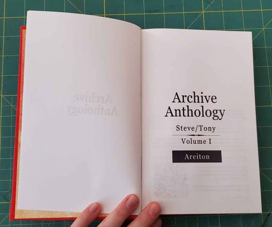
Zero's Fic Binding - Archive Anthology - Stony Volume 1
A collection of fics all written by Areiton (@areiton)
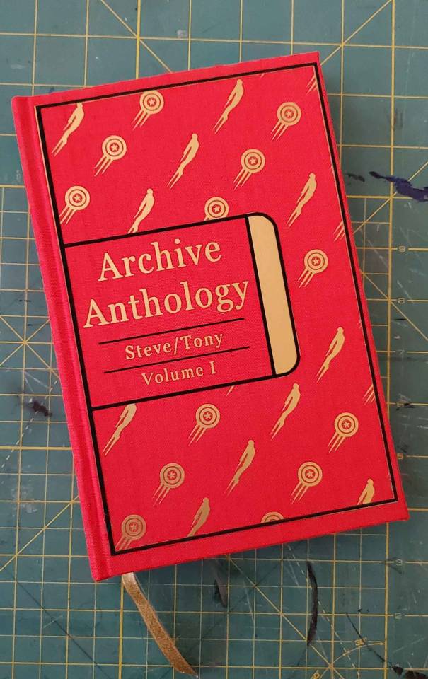
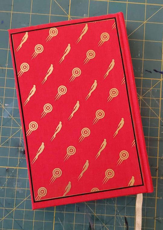
let me hear (your battle cry) | chains around my daemons | monsters of sea & sky | inspired | muse
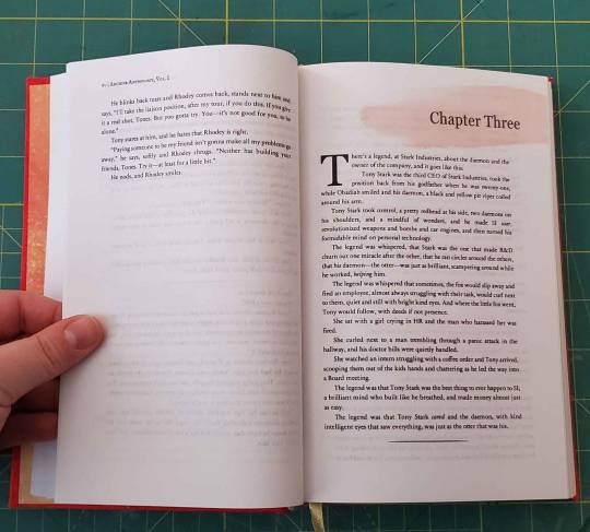
Fandom: Marvel
Ship: Steve Rogers / Tony Stark
Start Date: 10/07/24
End Date: 11/25/24
Pages: 355
First Archive Anthology book. This is a collection of 5 of my favorite Arei Stony fics. They are all also from 2021, which I did not mean to do but just so happen to realize as I was typesetting. I wanted to start this proof of concept project with someone who I A) knew and B) would be cool with me using their fics as a test.
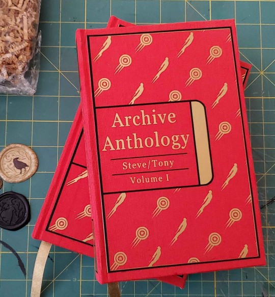
So, the cover. She's beautiful. For the AA series, I want the covers to be the uniform - so every Stony book will copy this cover type, but the colors will shift to blue and white for Vol 2, and then back to red and gold for Vol 3. I sketched out the Iron Man that I wanted myself and made an SVG for the first time, leave me alone, adding the swoosh marks to him and to Steve's shield. I wanted a simple, classic looking font for a universal text title. This book series wont have quotes on the back so instead I have a full spread of the graphic. Tony's the icon on the spine this time - and I think he looks great~

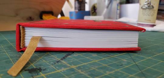
Ah! The side shot. I used my guillotine for the first time - so the chop on this bitch is CHRISP. Headband is gold and handstitched. The whole side profile? Crispy like fall leaves.
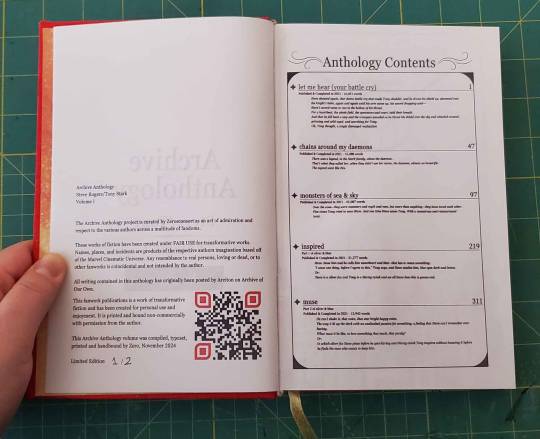
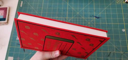
Title page shots. A TOC (that I only notices was a little low after I had printed both copies) with a new and customized copyright page. I looked at a bunch of pages in the Renegade Bindery discord and compiled something that felt right AND specific to this project going forward.
Typesetting this was not…bad. It did take a while while I worked out fonts and overall ideas, but ones I had them I was able to fly through. There are quite a few here, so lets take a peak...
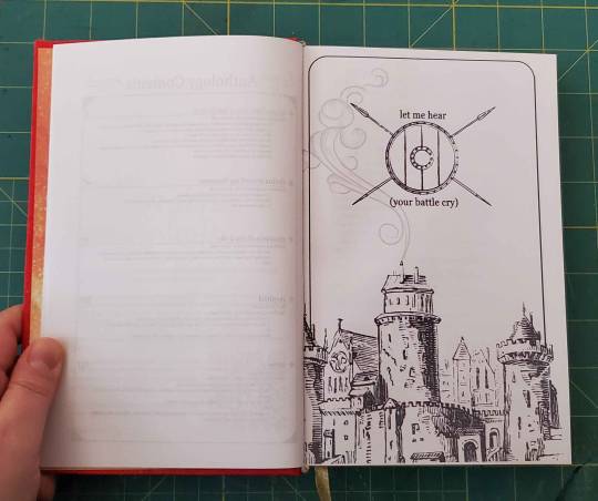
I kept Let me hear a little simple - with more medieval drop caps and banner headers. This fic is the only one with a nontypical drop caps - but with how simple the titles were I wanted a little bit more. I also - as per my standard - did this fic first, and then started to dig down and get more complicated the further in I got.
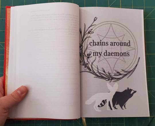
Chains has a little more flavor - each chapter has a splash of color. Originally I had hyper detailed headers for this fic, but they just look like SO MUCH, and I couldn't figure out a way to make them look uniform with the different daemons I was showcasing. Scaling back with a flash of color, but not to much, feels much better for this fic. Also realized that I need to figure out how to trim to what my printer considerers a 'full page'.
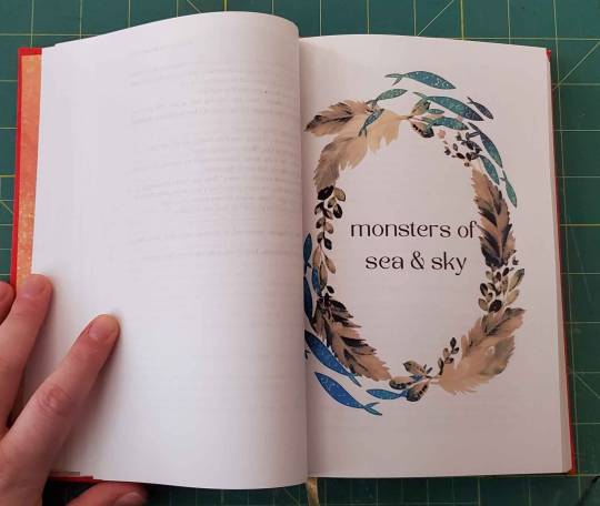
mos&s has a little more character for the headers, where I pull peace out from each chapter to add to the title. This chapter header - and the last one - are my favorite. I used hand drawn lines to highlight under each chapter title, and pulled a color for the splash image to match with both that line and the matching line breaks in the chapters.
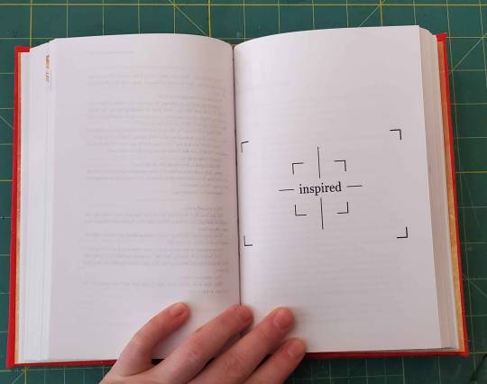
inspired is told from Tony's point of view - so I kept the chapter titles black and white, with harder linework and a focused idea from in each of the chapters.
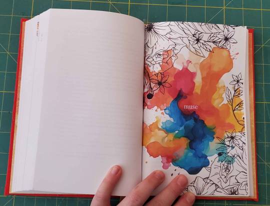
In contrast, muse is told from Steve's POV - so every chapter header is an explosion of color. They're all based on a variety of art mediums - spray paint, stamp art, charcoal, oil pints, anything I could find that I remember ever doing myself. I also colored each of the drop caps a contrasting color to what the header art is.
All in all, I'm very happy with how this came out. This is the blueprint I'll use for any of my Anthology books going forward. I already have at least three more in mind for Stony specifically, and then a collection of Raven Boys and Good Omens ones that are not long enough to be a book by themselves but I still want THEM ON MY SHELVES.
Thank you again Arei - your wonderful <3 Go read Arei's fics ASAP!
#zeros fic binding#ficbinding#steve rogers/tony stark#bookbinding#2024 bind#steve/tony#stevetony#stony#mcu#Archive Anthology Series#fanbinding#typesetting
60 notes
·
View notes
Text


I made the amazing Butterfly series by Moreta1848 into a book!
A6 size, cream white paper, body font is Coelacanth and title font is Empherian. The butterfly motif is my own design.
Now brb, I’m going to get a nice cup of tea and some muffins and read this series for the nth time.

(You can go read it here.)
#star trek#star trek tos#spirk#k/s#fanbinding#it is an absolutely amazing fic series and I love it to bits#and yes the qr code goes to the fic. there's one for all 3 fics in the series#...I tried but could not figure out how to fit the url itself on one line without fucking up some formatting#so now it looks a wee bit confusing (at least to anyone who hasn't used AO3 before)#(but I do not anticipate any non-AO3-users reading this in the foreseeable future so...)
52 notes
·
View notes
Text
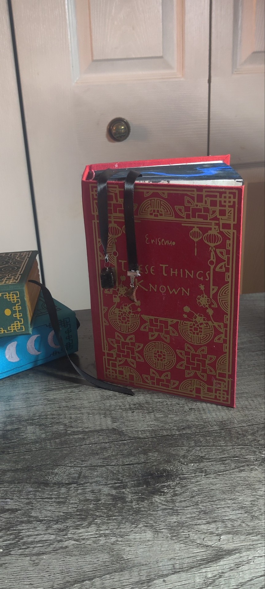


@erisenyo and they're done!!
I plan on redoing them at some point but for now this is what I have. I did some things differently this time. I perfect bound it because I could not bring myself to sew again.
Have some more pictures.
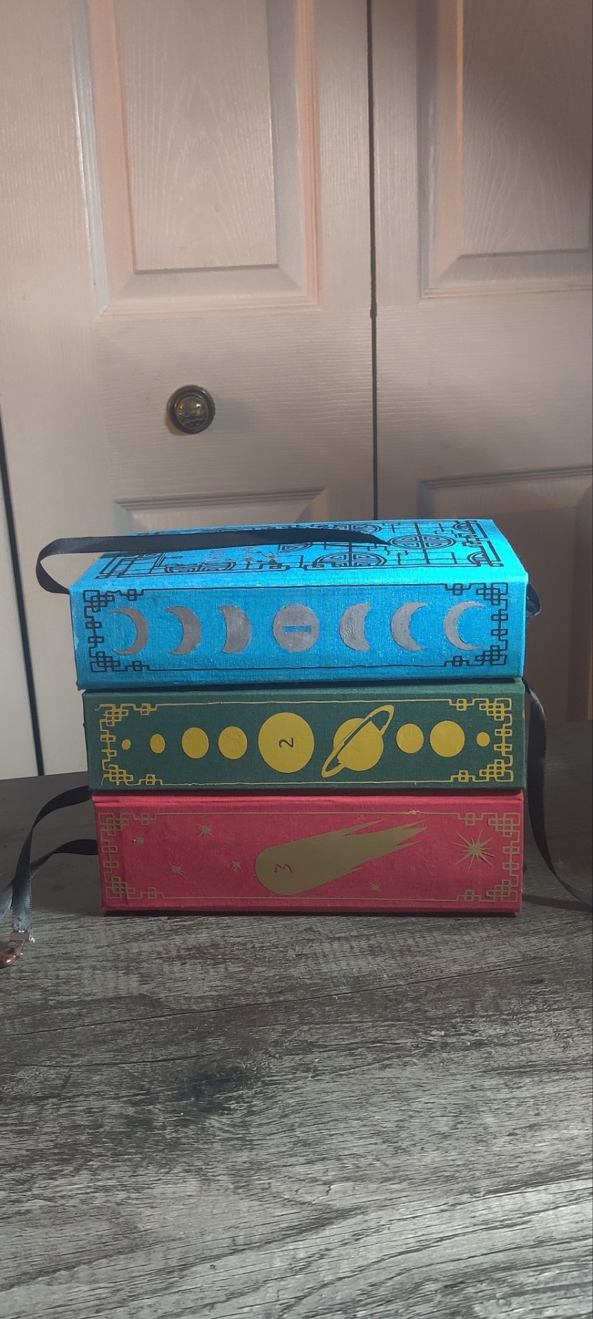
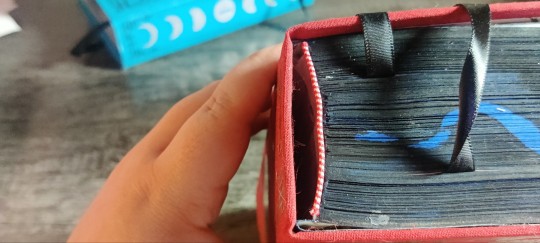
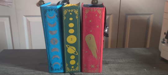
Book three is definitely my best work, still flawed but my best work. I realized what is causing my spines to be wonky but it was too late for this bind.
Also we're not going to talk about the paint bleed.
56 notes
·
View notes
Text

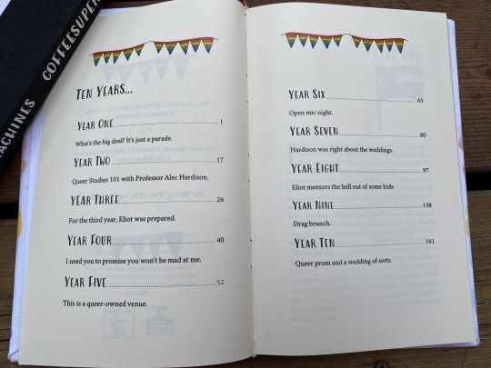
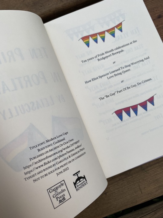
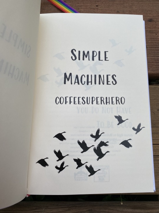
My final Fanfic Writers' Appreciation Day package has been delivered! Ten Prides in Portland by Leiascully and Simple Machines by coffeesuperhero continue the Leverage OT3 theme I've got going on this year. The fic aren't necessarily a series, but are thematically connected, and also the authors are married to each other. (It happens! My wife and I met writing Due South and Hard Core Logo fanfic lo these many years ago!)
There are some similar things I adore about both these fics. I love the sort of playing with structure in both of them, and watching the characters evolve, and also, seeing the queer community in all of its heartfelt messy occasionally infuriating glory. I also adore the thoughtful Eliot character exploration.

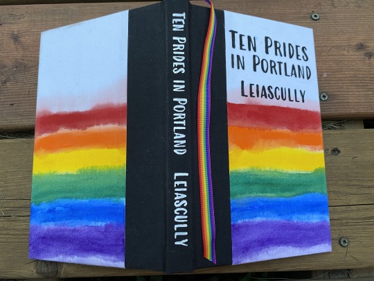


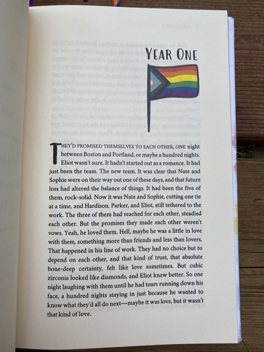
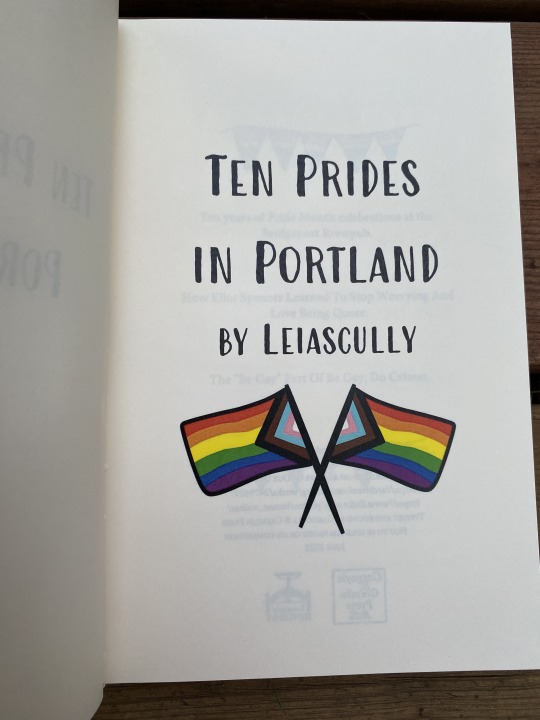
First off, Ten Prides in Portland! What it says on the tin. Ten years post-series at a certain brewpub in Portland, as Elliott finds queer community and figures himself out. This book is the reason I now have rainbow ribbon for bookmarks. As you can see, I went so very literal with this one. Homemade book cloth, acrylic paint, and cardstock endpapers printed with a map of Portland.

I had way too much fun with the layout on this one! It was an easy theme to lean into.
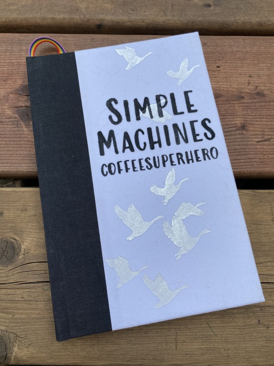

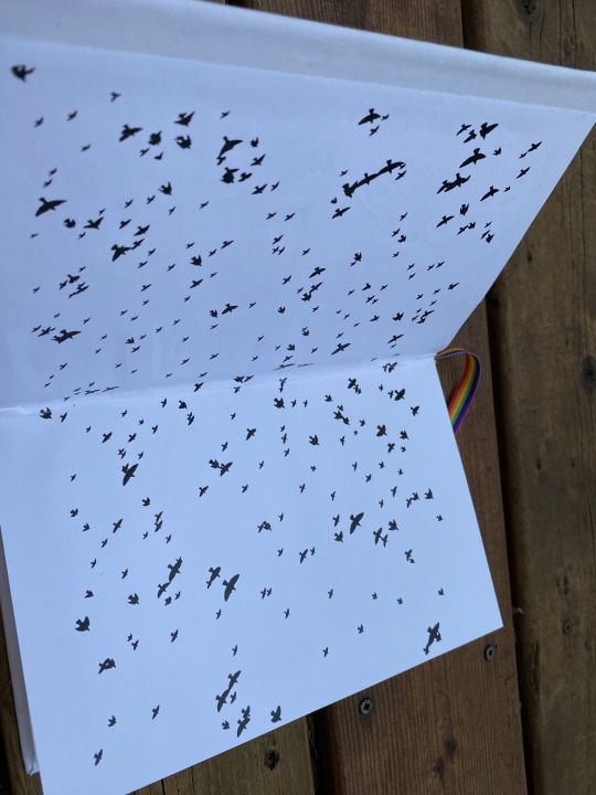

Eliot navigates a relationship with two people he loves, runs a restaurant, and figures himself out. I love the character dynamics, the cast of queer characters, and the way the second fic in the series is structured around brewpub menu items. The titles are from the iconic Mary Oliver poem Wild Geese, which is where the bird theme comes from. I used a really lovely fancy liquid mirror silver paint for the geese on the cover, which is gorgeous in person but hard to photograph.

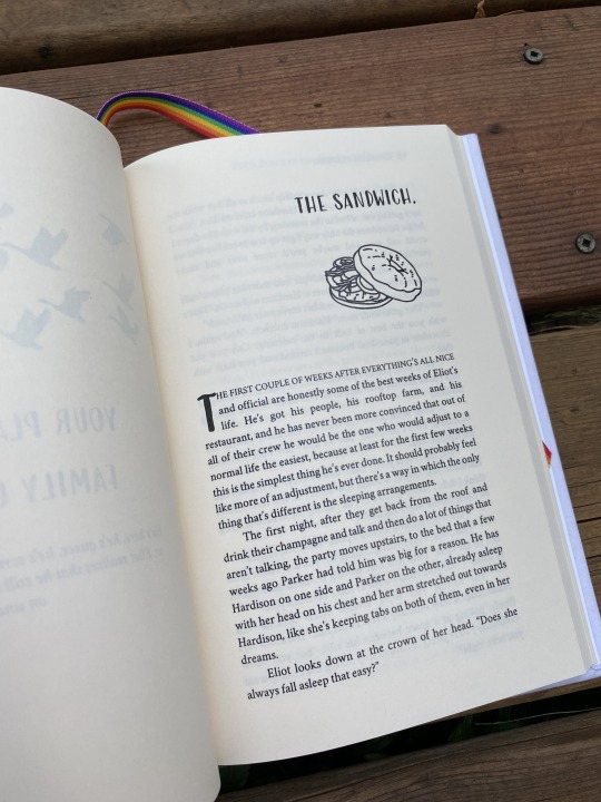
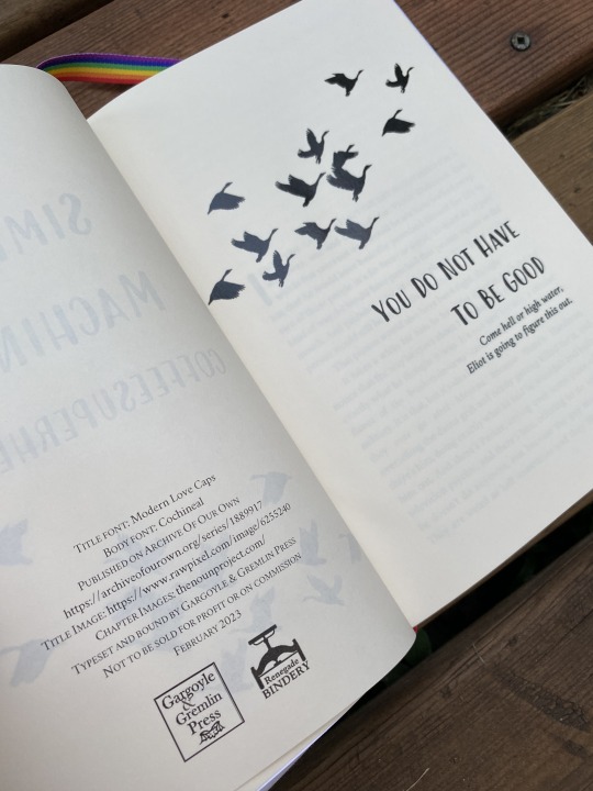

More geese! Some menu formatting! Also, a food-themed illustration at the beginning of each chapter to match the menu item. (Thank you, stock images on The Noun Project.) This was another fun one to play with.
Not pictured here for either book: the insurmountable printer issue I was having where any page with an illustration turned out extra-dark, and the flip side was correspondingly lighter. BUT. I'm still pretty pleased with how they both turned out, happy to have both of these on my shelf, and even happier to send them off in a set together to the authors' hands.
Happy slightly belated FFWAD, Leiascully and Coffeesuperhero!
#fanbinding#ficbinding#ffwad 2023#fanfic writers appreciation day#renegade loves fic#leverage fic#leverage ot3#eliot/parker/hardison#operation: give queer characters queer community#ten prides in portland#leiascully#simple machines series#coffeesuperhero#just another really elaborate fic rec
162 notes
·
View notes
Text
I really really want to make some art for the postmortem fic series
#I also really want to fanbind those hehe#the series is by furiosophie btw. go read them and weep if you haven’t yet#I’ve been thinking about them for months#thranto#thrawn#eli vanto#thrawnposting#personal
21 notes
·
View notes
Text
Remind me to buy Moira's Pen & the full English edition of The Queen's Thief
#because WHY stop translating the series at volume 4 huh???? WHY????#could be a chance to dabble in fanbinding but nope... I know I don't have the energy#tqt#the queen's thief#moira's pen#wherethekiteflies#tqt fandom#the queen's thief fandom
2 notes
·
View notes
Text
Need to get back into my longfic series bc writing longfics is so fun (albeit stressful lol, but that’s mostly just be putting pressure on myself)… I love getting excited comments on new chapters and reading people’s theories and emotions hehe :3 And writing multiple chapters gives me more motivation to keep writing… hm
#I’ve attempted to write the first chapter of different parts of the series multiple times and I just Can’t#once I get a good first scene or two then I’ll commit to the rest#it will happen… eventually#ALSO my DREAM is for someone to love my fic enough to bind it#(<- guy who spends way too long scrolling through and fawning over Renegade Binding posts)#I would love to get into bookbinding/fanbinding myself but I don’t wanna spend a bunch on materials. maybe someday I will commit#ANYWAY sorry this just got rambly. tldr I want to write more longfics so people can love and cherish them. yay#but also so I can be motivated to keep writing lol#chalcy stuff
4 notes
·
View notes
Video
youtube
Nerdforge destroyed theHarry Potter books to make this...
3 notes
·
View notes
Text
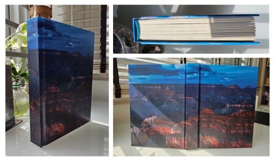
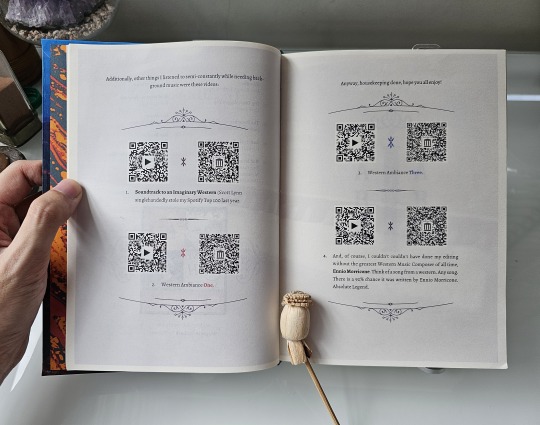
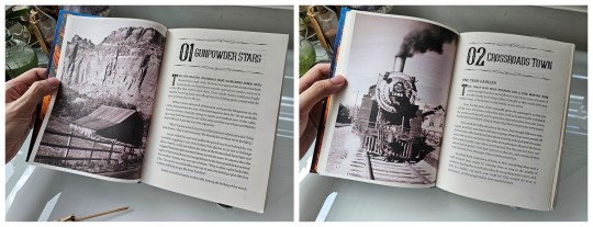
Fanbinding: The Desert Storm (series) by @blue-sunshine-mauve-morning

MAY THE FOURTH BE WITH YOU!
This is 1 of 2 posts for today, a massive project that I have hit a significant milestone for: completion of both my & the author's 15-volume set of the 1.1 million word The Desert Storm. This is the fic series that got me into Star Wars as an actual fan.
Four years after Order 66 and the fall of the Jedi Order, a grieving, struggling Ben Kenobi finds himself inexplicably taken back in time, crashing headlong into the foundations of fate. Grasping hope and vengeance with both hands, Ben rebuilds his identity and seeks to change the course of history: by saving Anakin Skywalker, the Jedi Order, the galaxy - and just maybe saving Obi-Wan Kenobi along the way.
My design for this typeset was significantly influenced by mem, who had begun a typeset before me and selected black & white images for the title pages, a trend I continued.

As this fic series has meteliculous attention to both canon & EU lore, I stuck with aurebesh characters for titles wherever appropriate, which occasionally gave me some fun opportunities for chapters & tables of contents like this:


For scene dividers, I used a image you can interpret either as twin suns, or as an eclipse.

While I committed to a more classic and less elaborate design for this series, I still rounded & backed every volume in the set. "Editioning" high numbers of similar books like this is often considered in bookbinding circles as necessary to practice skills (I am at 37/45 volumes), and I can certainly say that I have gotten much better at a number of things along the way. The largest book in this series is 616 pages; the smallest, 160 - and I needed to round & back both.


Further thoughts...
Blue_Sunshine (the author) has a fantastic skill for foreshadowing; reread of this series are a must. On top of that, character relationships are consistently and realistically fleshed out and developed. And critically for a "go back in time" story, Blue has a wonderful grasp of the dominoes - what changes trickle down and ripple out; and how that could come back to bite some people. Finally - if you live a badass Obi-Wan Kenobi, this is definitely a fic series for you. Also Blue is a lovely person & our little bits of correspondence has been such a bright spot for me.
Material notes: Duo oatmeal bookcloth, orange marbled jute from Sustain and Heal, hammermill cream paper, gold foil + paint for titles.

#fanbinding#bookbinding#celestial sphere press#Star Wars#Obi-Wan Kenobi#The Desert Storm#star wars prequels#may the fourth#may the force be with you
452 notes
·
View notes
Text
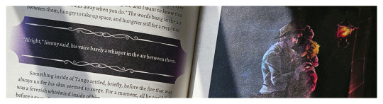
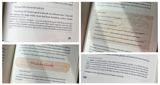
Dirges in The Dark by WixWrites
Before I start, let me just say: Ranchers! Scarian! Hermits and Life Series and Empires characters! Sheriff Jimmy! Sheriff Scar! Criminal Tango! the Wild West! Treebark and Ethubs!
RANCHERS. THE WILD WEST. CREEPING ELDRITCH HORROR.
Whoo, that was a rush.
I'll be honest; I think this book would have come out much sooner if not for my decision to add-in a whole lot of stuff into the text and pages. It got to the point that the original cover would have been a wanted poster at the front and a sheriff's report at the back!
I had to restrain myself, lest this book would never get finished at all. It's already been 59 days since my last post, and doing the original cover would have stretched the days even further. So I had to follow the mantra: Finished, not perfect. Besides, nothing says I can't make another version in the future...
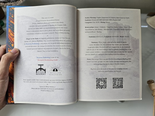
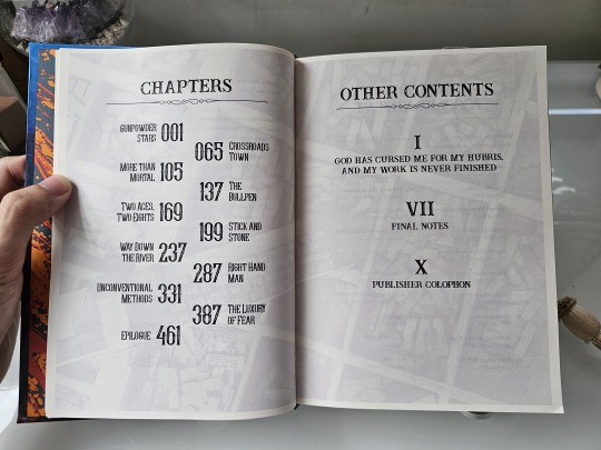
From the moment I finished this fic, I knew it would become a book. But at 143,412 words, Dirges in The Dark by @twodiamondhoes would stretch my ficbinding skills to the limit and would be the second-ever bind that would reach past 250 pages (the first was an MCYT Sleepy Bois fic that predates this blog that I want to redo).
Eventually, the full typeset took up 520 pages! And as such, I finally decided to use extra support for the entire textblock. From an old pair of pajamas, I backed strips of fabric with glue and paper before cutting it into tapes, forming a crucial support for the various weaves along the spine. I then covered the entire spine in brown wrapping paper for even more strength.
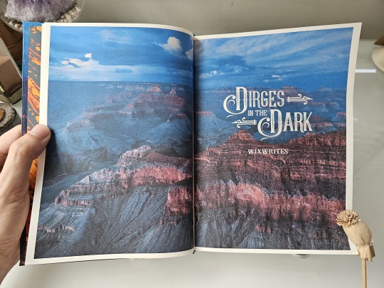
For the title and headings, I scoured for and found several typefaces, dingbats, and vector graphics which really evoked the fic's Western and Gothic vibes. I also took some inspiration from fellow ficbinders in the Renegade Publishing group for the style of layout and formatting throughout the book, such as using faded images in the background of these pre-story pages.
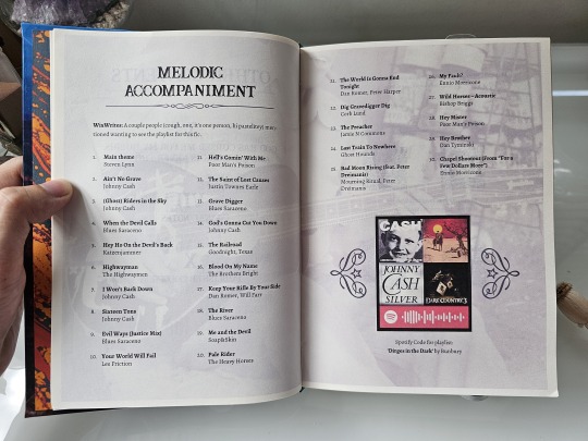
I wanted the reader to be immersed in the Wild West from the get-go, so having such images from the start — before the story even begins — felt very appropriate. I tried to make them thematic to the information presented, like a singing cowboy for the music playlist pages, but I think I made the image too faint to be seen!
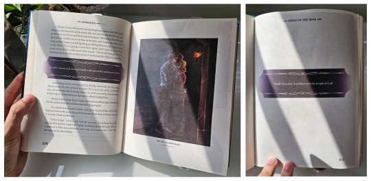
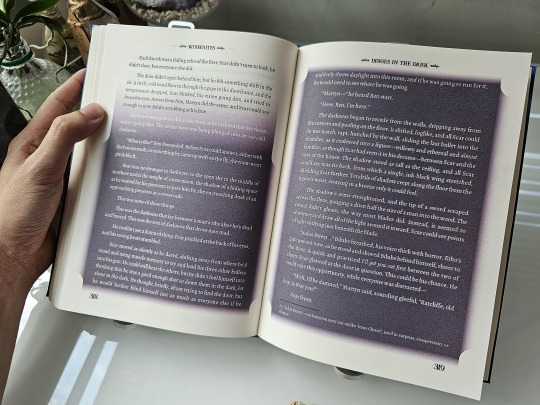
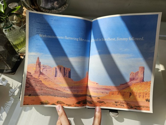
As for the chapter openers, I experimented with some layouts before finalizing on what you see: photos taking up one entire page on the left with the chapter titles and opening paragraphs on the right.
Just like my last bind, I want to make the reader feel immersed in the story and also bring out the mood of that particular chapter. This, however, led me to entire days of scouting and scouring stock photo sites just to find the right pictures for 11 different chapters. 4/10 would not recommend for sanity.
Given that the story uses a number of foreign words, old slang, and specific Wild West-era terms, I added a plethora of footnotes at the bottom of some pages for extra context and meaning.
I also wanted to be playful and make certain story parts, such as characters receiving letters and notes, really look like they're a part of the story. So I cropped old paper textures and fished out old fonts from the past to make them look as if they're actually there, pasted against the paragraphs!
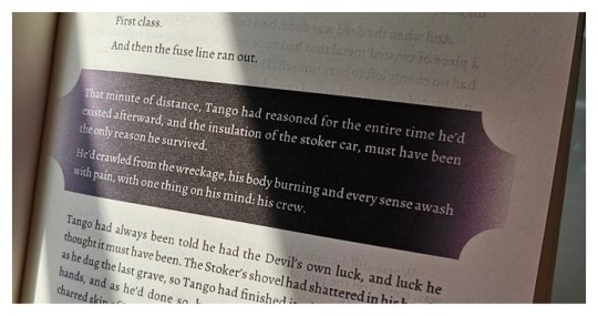
More importantly, there were some specific parts of the fic that felt super important and I wanted to highlight these passages, especially the Deals made by the characters throughout their arcs. Given DiTD has a certain affinity with eldritch darkness, I decided to highlight such paragraphs by backlighting them against a band of pure black. Besides being thematic as hell, I made the bands have curved edges and decorative lines to add a certain western-gothic touch!
It was from this that I begin to think "what if I can color entire pages to convey the mood and setting?"
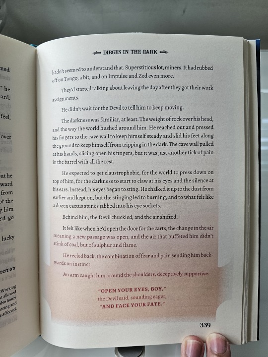
...Which led to the madness in these pages. I can't reveal too much because of spoilers, but there are certain times when the characters end up in situations where the very light turns to dark. Or they end up in hellish situations. Or the eldritch creatures began to speak.
It took some creative brainstorming to figure out how to show the mood of such scenes in printed pages, but I eventually figured out that I need find the right fonts, change their colors from black to white, and then change their backgrounds from white to dark to highlight them all! The power of formatting!
There's a lot more pages where I went wild with such shades and fonts, but I ain't revealing in public because spoilers!
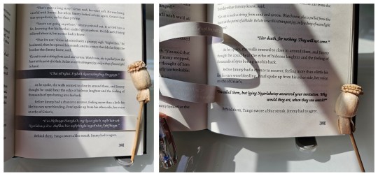
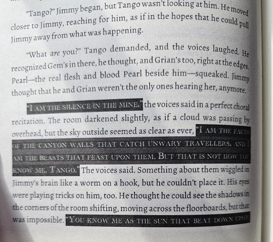
But undoubtedly, this is the biggest experiment I have made with this bind. There is a certain part where Grian and Pearl spoke in eldritch R'lyehian / Cthuvian, and I want to convey the sheer strangeness of the speech and it's meaning. Something outside the box.
Luckily, I have an inspiration in fellow fanbinder @mythrilthread, who made an amazing fanbind that used vellum overlays to showcase the speaking of alien languages and what they mean in English. AND IT LOOKS SICK AS FUCK. When I finished reading Dirges, I knew I had to emulate this form of language translation, so I printed the eldritch speech, cut it, and pasted it onto the spine to give a similar effect of strangeness, and IT LOOKS SO COOL!!!
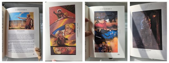
And lastly, I just had to include some of the amazing fanart made by readers into the book! All of these are placed by their corresponding text and chapters, and they all look so cool!
So I want to give a special thanks to @azzayofchaos, @leafdoodles, @hybbart, and @foxyola for granting their permission for me to include their incredible works into this bind! The dark shades and page formatting is one thing, but these works truly make this book feel so much more alive!
All in all, this bind was an odyssey in the making. I experimented with page formatting, layout wizardry, and bookmaking methods that I haven't tried before. While I know I could do better, I am beyond happy to see this work finished!
And once again, a thousand thanks to @twodiamondhoes / WixWrites for crafting an amazing story!
#bookbinding#fanbinding#ficbinding#my bookbinds#mcyt#Hermitcraft#Life SMP Series#Trafficblr#Empires SMP#Dirges In The Dark#jimmy solidarity#tangotek#team rancher#solidaritek#Wild West#Old West#American West
199 notes
·
View notes
Text
i'm guilty of treason (i've abandoned control) by voxofthevoid

i'm guilty of treason (i've abandoned control) is a smokin' hot Steve/Bucky series by @voxofthevoid
Description: S.H.I.E.L.D Agent Bucky Barnes is captured on a mission and meets Commander Steve Rogers, the erstwhile Captain America. It escalates quickly.
The Bind
voxofthevoid's work is uniquely challenging to typeset because of the long lyrical story and chapter titles, written all in lowercase. How do you set these up so that they (1) squish in nicely, (2) look properly elevated as chapter heads, but also (3) retain the impression of nonstandard capitalization?
The solution I found was using the Gobold font family, which has some interesting alternates and ways to title that are less obviously caps-or-minuscule
Title page illustration: @麻痔旳小日子 weibo.com/liduke
Titles: Gobold Uplow
Table of Contents: Gobold Lowplus
Body: Adobe Garamond Pro
silver Dead Dove Publishing endpapers
Case in dark blue Duo bookcloth and Selvedge Indigo patterned paper from Cambridge Imprint.


Fanbinding #157 by ArmoredSuperHeavy/Dead Dove Publishing, Completed December 2024
156 notes
·
View notes
Text
Tagging onto op's post because I didn't take nearly as nice pictures:
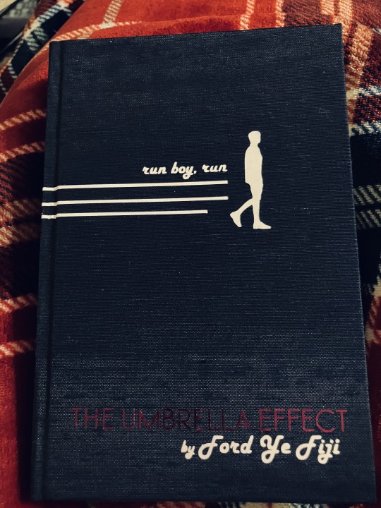
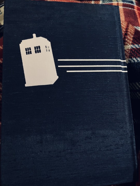
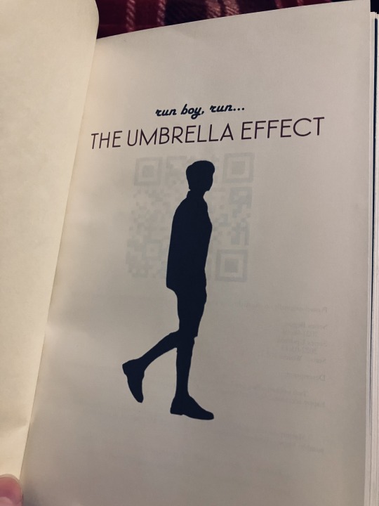
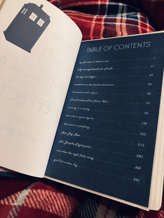
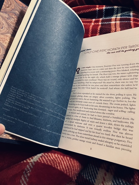
Binding of the run boy, run (The Umbrella Effect) series by the genius @ford-ye-fiji!
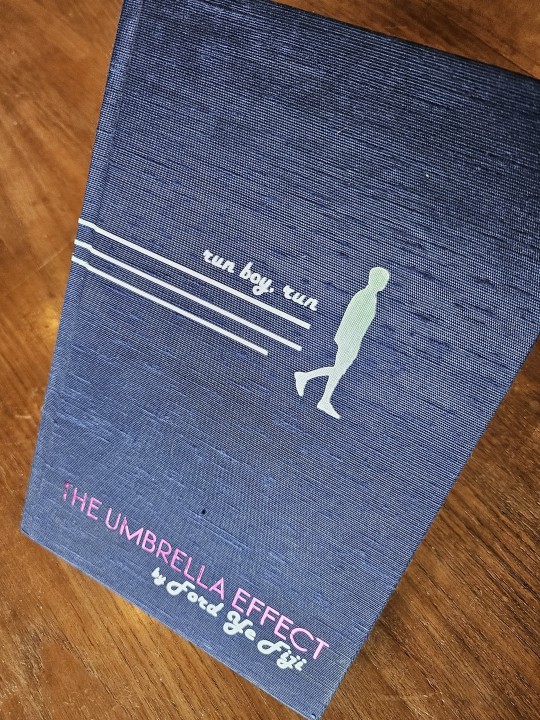
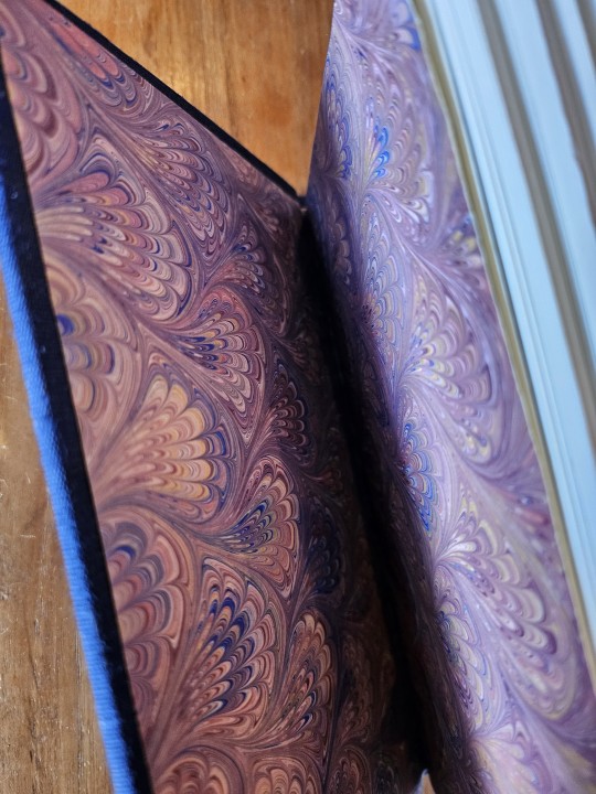

Crossover binding focusing on the excellent naming conventions in the title, parts, and chapters.
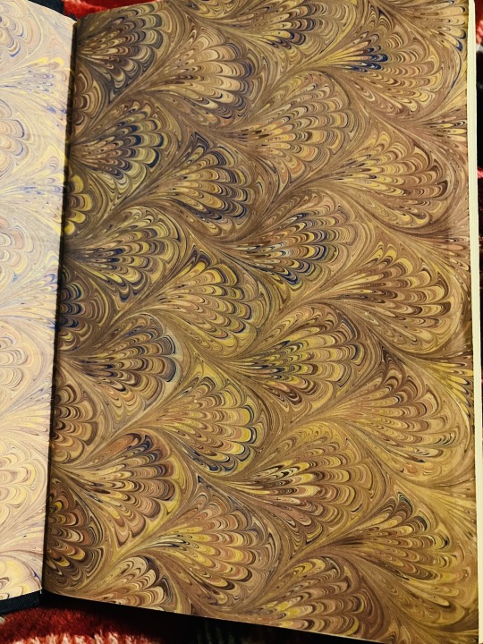
Asahi navy cover cloth with iridescent and metallic title vinyling. Peacock style Italian marbled endpapers and blue insert pages separating each part. QR code on the title page linking to the video that inspired the work.
it’s here!!!
it’s here it’s here it’s here!!!
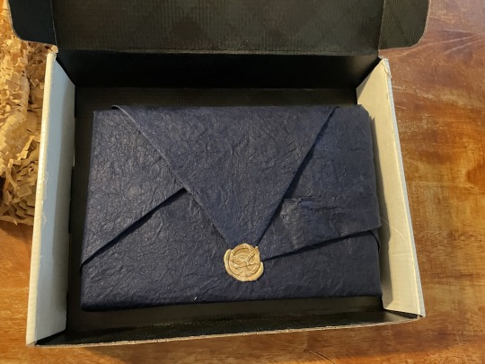
The lovely GORGEOUS binding of my tua/dw series has arrived!!! And in such glorious packaging! Many MANY thanks to the insanely talented @nodeadfandoms for this beautiful binding
this end paper is so pretty!! And the graphics are perfect I love
My words on a page!! I can’t believe it! And the beautiful blue sectioning i’m…. Literally this is so so beautiful thank u so much!!!
#bookbinding#fanbinding#ficbinding#Complete#tua#Dr who#<3 <3 this series is just inspired and I'm watching classic who bc of it
154 notes
·
View notes
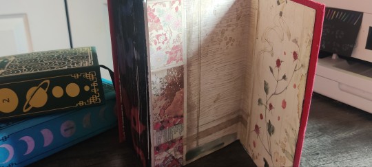
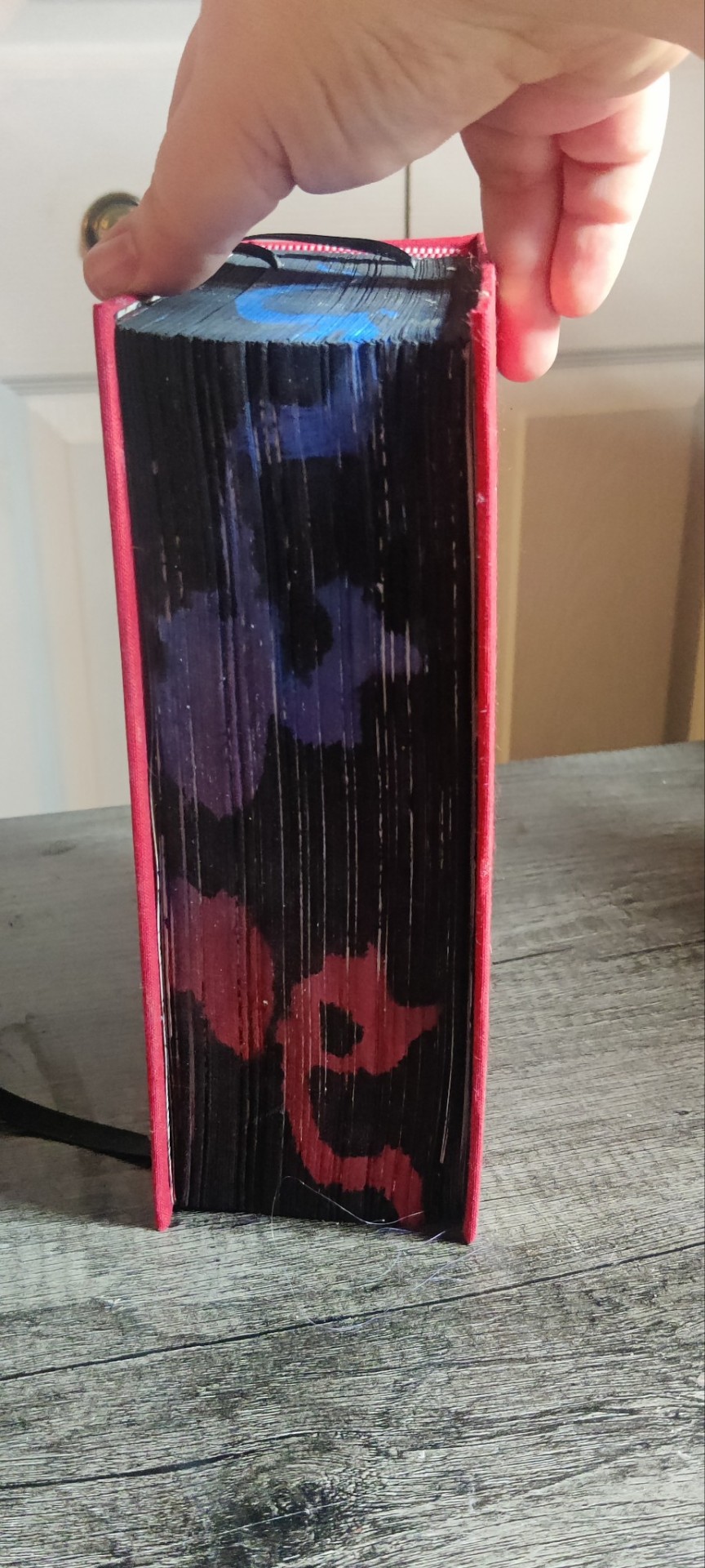
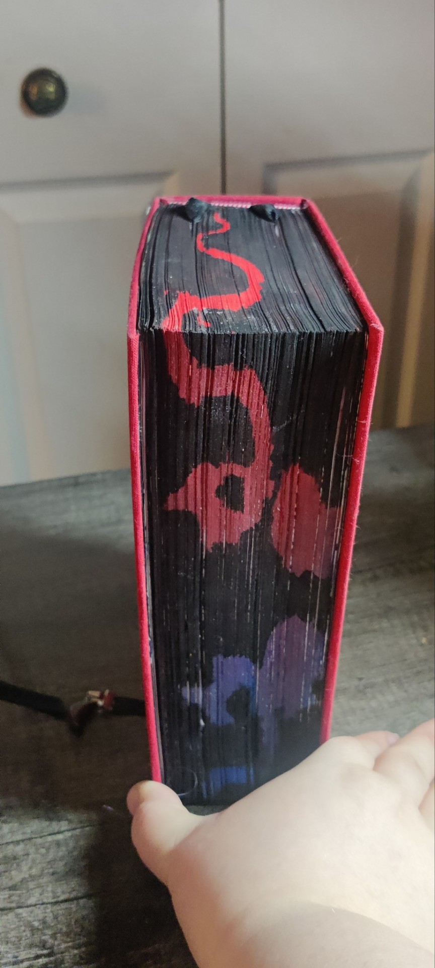
Text
Fanbinding: Atlas by distractedKat

Bind #23
Atlas by distractedKat
Date Completed: 4/10/2025
Size: Folio, 135,529 words, 432 pages
Copies: 1
This is a pretty classic Star Trek AOS series about the final semesters of the Academy after the Narada incident and the maiden voyages of the Enterprise. Starts out light and then gets pretty dark.


I had a lot of fun with the typeset on this one. It was originally a series of four stories so I found a vaguely planetary dingbat font (52 Spheroids) and gave each section its own unique icon to go behind the title divider & chapter numbers. Century for the body font at 10.2 size - as bad as the orphan words are at this random size they were worse when the font was smaller or larger. Viner Hand for the titles picked solely on the “looks cool and already loaded on my computer” basis.


This fic has always been red in my brain (probably because it starts at the Academy), so that was the spine settled and I had the perfect scrapbook paper in stash. Casing this in was a struggle - I had to trim it several times to get a square cut so my margins are smaller than I planned, and then I somehow twisted the whole thing into a vaguely spiral shape when I rounded the spine. Best not to look too closely at the coverboards in relation to the textblock!


Once again, I took too many pictures.
#fanbinding#bookbinding#half letter folio#Atlas#distractedKat#star trek aos#spirk#quarter cloth#fanbinding 2025
84 notes
·
View notes
Text

Recurrence by Torch is part of my ongoing goal to bind at least a few works from the fandoms I've been in over the years. I will fully admit I was just kind of along for the ride in Star Wars prequel series fandom, back when The Phantom Menace came out. A good friend at the time fell hard for it, I have a general fondness and nostalgia for the original series, and it was one of the big slash ships of the day (by which I mean m/m slash, not horror slash) and everyone was writing it. It was a fun band wagon to jump on!
But this is not a fun fic.
The author's notes for this short series reads: "This is not a nice story. In fact, it's probably the least nice story I've ever written."
And it's precisely because it's not a nice story, and is a unflinching, horrible refutation to moral absolutism that it's stuck with me for more than twenty years. It fits into the genre of darkfic, and I think is well worth preserving as a piece of fandom history.
The series notes read "This is not a nice series. It deals with issues of abuse: abuse of trust, abuse of power, the sexual coercion of a very young person by a much older person, and the cyclic nature of bad choices. Please proceed with caution."


The total series is just under 6k words, and I've done a pamphlet bind for it, with a cardstock cover. The cover is lined with gel-plate printed acrylic paint on tissue (because I raided my wife's art stash again), and the cover image is a historical astronomy illustration smashed through some filters and flipped into a negative image. (Look, I CAN use GIMP, an open-source Photoshop alternative, I just never claimed to have any expertise or finess with it. My level of use is "oh, what does this menu do?" ninety percent of the time.)


This was actually one of my earlier fan binds, in April 2022. But I'd just bound and shared two X-Files fic also by torch, and decided to post a few other things in between... and then it languished in my drafts for, uh, two and a bit years.
Fun (slightly embarrassing) fact, the background for the photos is a much-abused cookie sheet that I really should replace one of these days.
(torch, I'm not sure if you're still active in fandom, but if so, I'm happy to make you a copy of this or share the digital files at any point!)
#fanbinding#ficbinding#pamphlet bind#star wars: the phantom menace fic#recurrence series#torch#fandom preservation and promotion moment#darkfic
44 notes
·
View notes