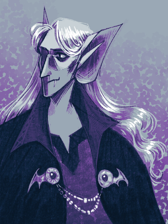
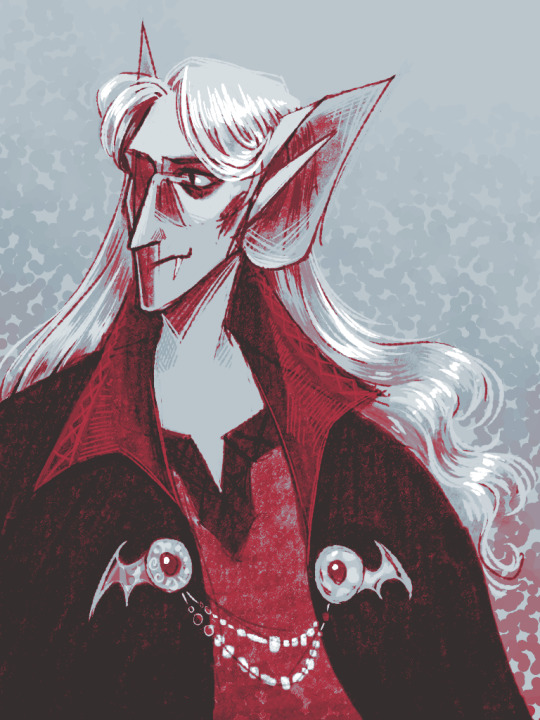
#half-rendering and gradient maps are fun!!! and looks so nice
Explore tagged Tumblr posts
Visit Tumblr Blog
Explore Tumblr blogs with no restrictions, modern design and the best experience.
Last Seen Tumblr Blogs


Fun Fact
130K people were victims of a chain letter scam that affected Tumblr in May 2011.
Text


just experimentin'
#low stakes 🦇#my art#half-rendering and gradient maps are fun!!! and looks so nice#why fully render something all painterly when i can instead focus on rendering my fave parts while still leaving some sketchy lines#there is a beauty in sketches i think#kinda wanna do this with the rest of my boys too
50 notes
·
View notes
Text
Thundercrack Carnivale Skin Reviews
This is my first time looking at all skin and accent submissions in the 2019 Thundercrack Carnivale contest, and while it was very time consuming, I loved to look at the behind-the-scenes of all of them! Some of my favorites were accepted, but some were rejected. I’ll go through the ones who were accepted and I also approve of, then the honorable mentions, and then the ones that got rejected but I feel quite differently.
1. What’s Up Danger
I really love this one’s special effects that make it look very dynamic! My Lightning representative is also a female fae, so I’m definitely getting this one for her. In addition, the Spiderman: Into the Spiderverse reference was also very awesome!
2. Security First
DocMulligan, the designer, originally made 2 versions of this, the yellow variant and the blue variant. The blue variant was chosen, but as a personal preference, I like the yellow one better. It seems to blend in more with the black and yellow caution tape, and overall has a more aesthetically pleasing look.
3. Rendering
The idea of software and 3D modeling is a very unique one for the Thundercrack Carnivale! I really hoped this one would be picked, and the feeling of relief to see this skin make the cut was unexplainable. XD Unfortunately, I currently don’t have any dragons that can fit it.
4. All Systems Go
Snapper battleships??? Yes! This one was designed very well, and the shiny metal texture used for it is just amazing. I’m such a big sci-fi fan! I need to get a Snapper to fit this one.
~~~~~~~~~~~~~~~~~~~~~~~~~~~~~~~~~~~~~~~~~~~~~~~~
5. Expanse Enhanced
The level of detail in this one is nice! Cyborg tundras need to be a thing! It also has a little bit of an unsettling look on it, with the metal skull and electric blue flames.
6. Blueprinted
The design of rough drafts is cool, and this one especially is created quite well! The gradient of purple and blue, and the little labels on the wings add a great effect!
7. Cyber Support
The color scheme is defintely cyberpunk! The batteries and pipes of glowing electricity look incredible! Gaolers with this tech are on the cutting edge of futuristic life at its finest!
8. S.S. Stormchaser
No contest, this is the most detailed entry of all. Look at the doors, the cannons, the electric spires, the flags flying in the wind...!!! There’s so much to observe in this skin, and I think it was quite popular with the other players too! A bit of a disappointment it didn’t get in.
~~~~~~~~~~~~~~~~~~~~~~~~~~~~~~~~~~~~~~~~~~~~~~~~~~~
9. Gaolitronic
This gives me big animatronic vibes! I really love how it has all these hints on the dragon that this is not what you think it is. The wear and tear of the wings and rust on the horns are also a great addition!
10. Mainframe
I know it’s a bit simple, but I like it! The lines are very clean, and it’s got a minimalistic look that I really dig. But is it just me, or does this one remind me of Ikea’s floor map???
11. Automaton
The way violentabyss draws wires is just??? So good??? Underneath the glass belly of the Pearlcatcher is a bundle of delicate cables and sensitive wires connected to an electric core.
12. Precious Metals
All I can say is... sparkly... the copper glitter effect is too good to resist... There’s even small sparkles on the wings too! A subtle accent, but great to boost the looks.
13. The Gods are Made
This one is absolutely phenomenal. How does one create that hologram look??? The fuzzy glowing edges and the lines that rise from the background light were done so beautifully! Turn any Skydancer into an instant vaporwave aesthetic!
14. Enlightened
Ridgeback lightbulb spines are an immediate yes from me. They’re just a fantastic idea!
15. Loading...
Ugh.. the lag... I find it hilarious to poke fun at slow loading screens and how only half of the picture is visible. The frustration! I would definitely buy this one if I could.
16. Circuit Charge
Like Mainframe, this one is simple, but the straight lines and perfect circles are very alluring. Black backgrounds and blue glowing lines are one of my favorite aesthetics.
17. Atomic Breath
Godzilla??? This one is epic! I like the spines and the ultimate energy this radiates from the core!
18. Stormy Wild West
Steampunk! Heck yeah! Yeehaw culture meets modern technology to create a fantastic skin! Guardians sporting this outfit definitely have the fastest hand in the west!
19. Nuclear Core
If I had a Guardian breeding pair, they would wear the Atomic Breath skin and the Nuclear Core skin. I can’t get enough of these types! I also love how AMPkid showcases that it works well on both light and dark color schemes! It also makes me want to get a Giraffe/Hex dragon.
20. Sign Off
Bad T.V. signal is a wondrous idea! The little glitch effect between the colors is also really cool! Applause to dadminkestler for the bold idea!
21. Iron Maiden
Similar to Automaton, this one shows the inside mechanical workings of a female Pearlcatcher. The details are also very nice to look at, and the broken pieces and torn wings are fantastic!
22. Color Bleed
This one is very similar to Sign Off, but for a Snapper! It’s a bit creepy to look at the eyes, but the chills are what I’m all about! I enjoy how the trickling colors fall.
23. Neon Desert
This is just so adorable to look at! The glowing cacti, fuchsia clouds, and tiny glowing stars make it feel cute and cozy. Seeing this accent makes me smile. :)
24. Zap! Pow!
Wow! Comic effects are so dynamic! This illustration is very unique and I like it a lot! Pretty sure I’ll be looking for any prints of these!
25. Digital Blackout
2 words: I. NEED. The circuits, the glitch effects, the binary code, and especially the low battery sign on the tail! Not only that, but the lighting of reds and blues is very visually pleasing!
26. Prickly Pear Princess
I understand that it’s part of the Thundercrack Carnivale theme because the Lightning territory is in the desert. This skin is very bold to be based entirely off of a plant and not copy everyone else with technology and electricity, and I applaud Lusterwing for that! This is thinking out of the box! Plus, the cacti look very well drawn!
27. Death’s Head
This one has big terminator vibes with the visble teeth/jaw look and the unsettling robotic eyes. It’s a terrific combination of skeletons and android parts! Also the glowing red parts remind me of Genji???
28. Pesky Pop-ups
This one made me laugh. Web-surfer problems now make their way onto the Flight Rising dragons themselves!
29. DinoRun
Ah... memories of playing this game when the internet’s down. This one’s a bit of a bonus one, because while I wouldn’t be interested in getting a print of it if it was available, it’s cute and funny.
0 notes
Text
How To Make This Physical Map of Wyoming For Some Reason
This is a physical map of the beautiful US state of Wyoming.
And here is a quick cheat sheet of its elements:
Let’s take a closer look at this cartographic process in ArcGIS Pro, shalllllllll weeeeeee…
Imagery Layers
Just like an onion. The more layers there are, the more they’ll cry. Why are they crying, and who are they? We don’t have time to delve into the unknowably complex workings of the human heart. But we (I, anyway) definitely have time to delve into the knowably simple workings of this map.
This map begins, as do many of my weird concoctions, with a Firefly Imagery basemap. Just the basemap, though, no glowing stuff this time around. The Firefly Imagery basemap provides us with rich, desaturated, surface texture without all that bothersome hue. Great context.
In the Add Data dialog, there are lots of ways to bring content into your project. I suggest you explore what is available in the Living Atlas, a curated warehouse of great, hosted, content. I’ll make lavish use of it in this map. By choosing the Living Atlas source and searching for “Firefly” I find and add the Firefly Imagery service.
I love it.
But this is going to be a physical map, so while the Firefly Imagery provides a good textured tonal base, I want to add a cartographic Land Cover layer to paint back in some contrived hues.
When I give this layer a transparency of 65%, I get a merging of the Land Cover chroma with the Firefly texture.
The topographic relief of Wyoming is magnificent. I want to call attention to the beautiful, and variable, ruggedness of the state. So I pulled in a hillshade layer from the TopBathy set…
But the default grayscale appearance is of little use to me, so I play with colors and opacities in the Color Scheme Editor and get a color ramp that has fully transparent mid-tones so the underlying map doesn’t looked washed out; rather, it has been bumpified. More on that here.
Now it looks like this:
Yowza, those mountains are coming right at us! Now this looks like a map I could run my hand over. The bumpification hack is great, and it pairs especially well with the mist hack. Let’s pull in a simple Digital Elevation Model, also from the TopoBathy family of elevation data…
By default, it looks like the typical DEM ramp of black to white. But you can perform all sorts of color/opacity shenanigans to make it paint in a misty white only at the lowest elevations.
The result is an elevation layer that replicates a ghost-like mist that clings to lowlands and meanders up and through mountain valleys. High elevation mountains are revealed in crisp clarity as they rise above the wispy plains. This gives the map a painterly sense of forced reality. Find more self-indulgent examples here.
Vector Layers
Pretty fun right? Who’s got it better than us, seriously. So far this map is made up only of a Firefly Imagery basemap, and two deviously symbolized TopoBathy image services. Time to get all vectory on this map though.
I downloaded US Counties from the Census Bureau, and symbolized them with a thin white stroke and and underlying black gradient stroke to give a slight dropshadow effect. This inherent contrast helps them remain visible, albeit faint, over lighter and darker terrains. Plus I think it looks kind of nice. Learn more about using Symbol Layers to stack up visual layers in an item’s symbology here.
Resulting in this appropriately muted counties overlay…
Then I added lakes and rivers from the super helpful Natural Earth. Since the lakes are visible in the imagery and land cover, I gave them a null style (but still checked on) as a foothold for labels, later. Rivers are thin semitransparent blue strokes. Barely visible, really. Towns, also quite small and mostly added as a label foothold, came from a US DOT Open Data portal.
Next I added a states layer, also from Natural Earth. But in this case I only wanted to show the state of Wyoming, to set a visual focus for the map. How can you only show one state from within the states layer? A definition query! The visual query builder made it easy, even for a stooge like me. Definition queries quickly became a tireless ally of mine in this project. For what it’s worth, I also used them to show only larger-population towns in the step above.
The visual goal of this is to make the border of Wyoming look like a cool vignette, wrapping around the state and mega-framing the theme and content. I gave the symbology a few gradient strokes (make sure you give them negative offsets of half the line width, so they render inside the state (positive offset if you wanted them to render outside the state, like a dropshadow).
Ah, there’s Wyoming!
To further this goal of highlighting Wyoming, I added a second version of that states layer to serve as a sort of visual masking effect. But rather than showing only Wyoming in this case I chose to hide only Wyoming.
I gave these not-Wyoming states a semitransparent white symbology.
Which looks like this:
Now there can be no doubt. Wyoming, clearly the star of the show.
Labels
Adding labels to each of these layers is a blog post in itself. But I’ll just breeze through it with a couple of tips.
Embrace transparency. I’ve made all text semitransparent and their halo colors even more transparent. If a layer is less important, like counties, transparency can help reinforce that.
Contrast font color with halo color. I either used semitransparent gray fonts with semitransparent white halos or a semitransparent white font with a semitransparent black halo.
Use letter spacing with abandon. If you have crowded low-priority features, like towns, push the letter spacing tighter together. So long as they are readable, it’s cool. If you have a tier one feature, like the state name of Wyoming, go bonkers with letter spacing (and force all caps). In this example WYOMING has an eye-popping letter spacing of 1,600%.
Orient labels to curve along the graticule. It seems to give the labels a sense of belonging in the geographic context.
Well, there you have it. The steps of how to make this map. Maybe you don’t even want to make a map like this! But even still I think there are some helpful tidbits in here for all flavors of mapping adventures.
Show And Tell
I’ve heard Daniel Huffman, describe much more eloquently the creative, and technical, empowerment that comes with watching another map maker pull back the veil and show their process. But I have to rely on analogy. I am often fascinated by, and frankly intimidated by, many Vader-caliber maps that I see out in the wild, just swinging that lightsaber and breathing through a respirator like an unknowable machine. But when I’ve had the opportunity to chat with that maker, or watch them give a how-to talk, or read their blog post, I realize that any map is just a series of usually-doable steps, and underneath the helmet is a redeemed old gray dude with burned off eyebrows. The magic was in the steps up and putting them together just so. Anybody can do it.
Happy Mapping! John
from ArcGIS Blog http://ift.tt/2GuZULc
0 notes