#i aim to make them Easily Readable
Explore tagged Tumblr posts
Visit Tumblr Blog
Explore Tumblr blogs with no restrictions, modern design and the best experience.
Last Seen Tumblr Blogs


Fun Fact
Kazakhstan’s Minister of Communications and Informatics has blocked the Tumblr site because it contained 60 sites of terrorism, extremism, and pornography in 2015.
Text

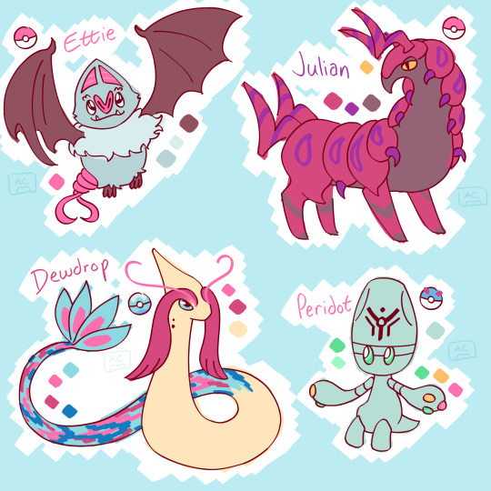
put together outfit and team refs for my trainersona milo!! (they/them) i am very excited for art fight :]
notes under the cut
pokemon team
ettie ♀ - milo's first pokemon, met as a woobat the night milo got isekai-ed! trainerless but taken to a pokemon center for mild injuries, she managed to escape containment and stick herself to milo's cheek, and has been with them ever since. she's goofy and sweet. she's also a service pokemon, using calm mind to help milo with their anxiety.
julian ♀ - originally caught as a venipede in a subway tunnel by ingo helping the interpol survey the line milo dimension-hopped on. he gave her to them a few months later so they'd have a slightly stronger pokemon to look after them while training ettie. she's now milo's ace, and their main form of transportation in hisui.
peridot ○ - caught in a visit to celestial tower! a gaggle of elgyem started following milo, fascinated by their non-native psychic vibes. peridot was the boldest, and came with them after a friendly battle. it's incredibly curious about human objects + technology and will frequently pick things up to examine with them with the utmost care
dewdrop ♂ - fished up during milo's time in hoenn! he's a spunky creature, very personable, and the most enthusiastic battler on milo's team. has never quite gotten the hang of using healing moves.
outfits
isekai - their usual winter gear from earth, what they were wearing when they got isekai-ed. their giant thrifted ski jacket from the 90s is exceptionally warm. you can only see the straps, but they had their backpack on them as well! earthly belongings that came with them include several class notebooks, a tarot deck and journal, a box set of their favorite horror ttrpg, a deck of cards, their phone, headphones, and a phone charger. they were on their way back from visiting friends when they got eeby deebied to the pokemon world.
casual - an average outfit they end up with while in the process of settling in! they wear this and similar outfits in their everyday life, going to their galarian language lessons and to work in the quilt shop in nimbasa. the grey tank is band merch from a hard rock/metal band called Destiny Bond that elesa introduces them to. :]
events - when they're going out somewhere and want to Look Good, milo goes full 70s twink! nothing like some good fruity androgyny. they are incredibly glad historical fashion trends of the pokemon world mirror earth's.
hisui - the first few months in hisui they spend in the couple sets of plainclothes they brought with them from the future, but once they get to jubilife, milo does a LOT of trading to acquire various outfits from the clothier's! they favor women's hakama and geta sandals when in town. their original glasses from earth get lost early on in an incident with a flock of staravia, so they go a few months without until they're able to get new ones.
#pokemon#pkmn#trainersona#pokemon trainersona#the hardest part of art fight for me is not infodumping in my oc's bios#i aim to make them Easily Readable#SO! i do it here :]#milo's team is all in their 40s level wise#like a true ex gifted student they trained up until the next gym would've taken Concerted Effort to beat#so they stopped at their 4th badge in both unova + hoenn#(only got 1 in johto but that's another story)#nickname wiiiise#they just kind of pulled the name ettie out of thin air#but julian was named for julian devorak (red)#peridot was named for the steven universe character (little green alien)#and dewdrop was named for the nameless ghoul of ghost (very spirited)#star scribbles#pkmn one way ticket
26 notes
·
View notes
Text

The Venture Bros. #57: “Operation: P.R.O.M.” | November 21, 2010 - 11:30PM | S04E16
Folks, it’s a big one. I’ve been trying to shed myself of being painfully complete or even practically readable with these blog posts, but this one’s special. I may even run spellcheck.
Operation: P.R.O.M. is sort-of a mid-series finale. It feels like the ending for a phase of the show. Hank and Dean are graduating to young adulthood with a homeschool Prom while the show formally says “bye bitch” to certain characters, such as the spectre of 24 or Triana, who, would you believe it, doesn’t appear in the show after this episode! I had to look that up to make sure it was true! Dean blows it with her and never sees her again (on camera, anyway. I haven’t read the expanded universe novels)!! I respect them for their unwavering devotion to not fixing Triana up with Dean. It simply makes sense.
This not only wraps up some “important” story threads, but it also has quite a few memorable standalone scenes; Triester’s apparent struggles with becoming a Hulk, the definition of “Rusty Venture” as a disgusting sex act (available on blu-ray with the choice of uncensored or censored audio, for those of you believe less is more), and the wonderful final scene where Brock races to save the Ventures from doom set to Pulp’s “Like a Friend”.
This sequence is, for my money, the best thing the show ever did. Lotta poetry in there. Brock giving a shit about the Ventures for the first time ever. Life in the face of death/death in the face of life. The fact that it still turns into a scene where Brock gleefully kills monsters makes it very true to the show’s own identity. You could argue quite easily that not only is this where Venture Bros. peaked, but also Adult Swim itself; and the fact that the monsters are modeled after Zorak from Space Ghost is very symbolic. Not to mention the meta-aspect of Jackson and Doc actually successfully clearing a very good and popular song and being able to use it effectively, a thing that they very rarely got to do.
Triester’s fate was taken from Ben Edlund, whose post-mortem wish is to be shot into space with a note urging aliens to revive him. This intent is mildly changed, I think, in the Gargantua-2 episode, where the implication is that he was aiming for Jonas Jr. I guess the implication here is that the vacuum of space can just preserve a body?? Is this true @neiltyson???
Hank’s attempt to date the mail lady was actually based on a throwaway joke about him having a childish crush on her in a previous episode. Shit like this makes the commentary tracks or wikis really valuable; I don’t think I would’ve remembered the significance of him showing up to the mail lady’s house organically.
Finally: It’s worth noting that one element of this episode might not come off too well, which is that Rusty inadvertently saves the family by drugging the prostitutes he hired with his own brand of Spanish Fly. I recall at the time that this aired, Jackson actually engaged with a few comments sections where the show was perceived as misogynistic. Also, Princess Tinyfeet in S&M appliances took some heat, with one comment I remember saying that they found that bit disturbing because she “looked scared” in one shot.
Further complicating this was the story doesn’t make it EXPLICITLY CLEAR that the prostitutes are actual double-agents. Some could interpret the twist being that Moltov was simply lying about the double-agent thing to distract Brock. There is a deleted scene on the blu-ray that actually does make this clearer, but I saw a few confused people for whom this added to their revulsion. Because, of course, Rusty is still drugging women that he himself thinks are prostitutes. Jackson and Doc maintain that Rusty is just a bastard who does horrible things like that, and viewers are just going to have to accept that.
Look, do I actually care about this? Not that much, just because I simply don’t get a genuinely misogynistic vibe from Jackson and Doc. Not to say my read on this is more valuable than yours. I’m mostly mentioning this because the central idea here isn’t “this doesn’t hold up now because of woke”; it’s one of those cases where they got some pushback almost immediately. I just sorta don't like the idea of anyone mischaracterizing a modern critique as being a new thing.
I do love this episode still, and I still think it’s the show’s peak. I’m not necessarily here to say that I think the show made a mistake by continuing on afterwards, but they never topped themselves after this. Described in the book Go Team Venture, this episode basically rejuvenated Jackson and Doc’s love for the show, and they described how they basically just started getting really excited for a fifth and came up with most of their ideas while producing this episode. So what if season five isn’t as good as anything in this episode? As long as we’re clearing season three, I’ll forever give this show slack.
EPHEMERA CORNER:
youtube
MAIL BAG
*picture of Jon leaning on the season 3 logo* You got the dud!
lol
7 notes
·
View notes
Text
Book Review: "Tender is the Flesh" by Agustina Bazterrica
Spoiler-free

Genre: dystopian, science fiction, psychological • Word Count: 62k • Triggers: extreme gore, cannibalism, animal cruelty, uncomfortable sexual scenes?? • Year of Publication: 2017
Plot: ★★★★★
Characters: ★★★
Writing Style: ★★★
Re-Readability: ★
all my reviews - blog navigation
General Thoughts
In a world where a virus has made all contact with animals dangerous to humans, cannibalism has been legalized and institutionalized as a means to survive.
This premise sounds extremely promising for a work that aims to criticize not only society but human nature as whole, and offers a unique setting for an interesting novel.
I like to think of myself as someone who is not easily shocked. This book shocked me. Saw is one of my favorite franchises, so is The Silence of the Lambs series. I consume horror and gore on a daily basis, however this book did something to me that made me put it down multiple times. I found myself unable to continue it until I finally finished it a few days ago. I left it on my bookshelf untouched for a few months since I started reading it. But let's get into the detailed ratings.
Plot
I like the plot, a lot. I gave it five stars because it is unique, it is thought-provoking, and it is controversial. I have never read anything like it before and most likely never will, and that alone is interesting and worth quite a few stars to me. It challenges the authority we have given ourselves over animals. I am not vegan, I am not even vegetarian, but that book almost turned me into one. It is not a book that you pick up and read while humming to yourself by the pool with the sun shining above you and birds chirping around you. Let's look at the blurb.
"Working at the local processing plant, Marcos is in the business of slaughtering humans—though no one calls them that anymore.
His wife has left him, his father is sinking into dementia, and Marcos tries not to think too hard about how he makes a living. After all, it happened so quickly. First, it was reported that an infectious virus has made all animal meat poisonous to humans. Then governments initiated the “Transition.” Now, eating human meat—“special meat”—is legal. Marcos tries to stick to numbers, consignments, processing.
Then one day he’s given a gift: a live specimen of the finest quality. Though he’s aware that any form of personal contact is forbidden on pain of death, little by little he starts to treat her like a human being. And soon, he becomes tortured by what has been lost—and what might still be saved."
Going into it, I knew it would be graphic from what I had already read about the book, but I never would have imagined just how graphic it would get. All the processing that is done is described in greatest detail, and the dehumanizing name - "heads" - used for the people that are being slaughtered makes it all the more uncomfortable. Marcos, our protagonist who works at one of these processing plants, is then gifted a female head, one born in one of the breeding centers. He does not kill her, though. Instead, he begins an affair with her, which is one of the worst crimes one could commit in this society. The narration treats 'Jasmine' - as he later calls her - like an animal, using verbs and adjectives one might not necessarily use to describe human action. It is Marcos who humanizes her, in a way, giving the novel hope for a happy ending despite the fact you can already guess how this story will conclude.
Marcos was married before to a woman named Cecilia, but after their child passed away as a baby they went their own ways. The death of his son weighs heavy on Marcos, and in Jasmine he sees a second chance at being a father; she becomes pregnant.
It is the ending that shocked me. This is a spoiler-free review, so I only aim to give you guys recommendations for books without taking away all the fun, so I won't get into it more. However, it is an ending that leaves the reader sitting in silence, staring at the pages and thinking to themselves "what the hell even happened here?"
Characters
Marcos is written to be quite human and realistic, with many flaws which made him both unlikeable and at times unbearable. Except that one time when he played with some puppies he found, because I would have done the same, to be honest. Dangerous virus be damned.
There is not a single character in this book I would consider good-natured on a moral scale, but perhaps it is exactly what makes it so engaging to read. The characters in the book serve as a substitute for animals not only in the meat industry; an animal's prime aim is to secure the preservation of its own species. Marcos is doing exactly that, both biologically and socially.
One of the most important settings in the novel is an abandoned zoo, yet it almost feels like the characters in the book are the zoo animals themselves, and the reader is observing them destroy each other. I did not like the characters, but I did not have to like them to enjoy the story for what it is.
Writing Style
Now, before I get into this, I would like to say that I acknowledge that every writer has a different writing style and that it is entirely subjective whether I like it or not. Personally, I like descriptive, sometimes even a bit flowery prose with long sentences. But this would have been out of place for this book.
The sentences are direct and straight to the point. There is nothing hidden behind metaphors, it is exactly like the processing farm portrayed: honest, raw, and uncensored.
It is not my favorite style of writing, hence the missing two stars, but for the type of novel this is, it is more than fitting.
Re-Readability
For this point, I simply have to say this is not a novel I will ever re-read. Reading it once has left enough of an impression to let it stay on my bookshelf and never touch it again. For me it is too uncomfortable and too disturbing to do so. Still, it has left a huge mark on me and I will most likely be thinking about this book for quite a while. The one star is by no means intended to be negative.
Conclusion
All in all, I would say if you're a horror fan or a fan of stories that criticize society, this is the book for you. However, do keep the trigger warnings and extreme graphic descriptions in mind when choosing to read it. And perhaps do not have that steak beforehand.
10 notes
·
View notes
Text
Little RP-related vent (not aimed at anyone I follow on this blog, so no worries mutuals, it's fine, you're good).

I try to be as precise as I can when I write. I may not have the best aesthetics, but I keep my writing clean, readable and all. I keep my muse's page up-to-date, with all the information needed. When setting up a thread, I make sure it's clear to my mutual where it's set, when, why and all, and I always do my best to leave my part of the story with an opening the mutual can latch onto to keep the writing going. Whenever there's something I am unsure with, I make sure to politely reach to the other person to make sure I didn't misunderstand anything, or to explain and work out any perplexity.
And then. Then there's people with overcomplicated aesthethics, talking about their muse at lenght, in the smallest, most insignificant detail (which is great, don't get me wrong), but when it's their turn to pay attention to the mutual's muse? They completely go over it. I give them a 'bait' for their reply, with my character asking them something, they leave me with nothing in theirs, no curiosity towards my muse, nothing they can interact on. I prepare a setting, it gets ignored, and when I clarify it they reply "ok lol it's ok I probably wasn't pay attention to what I wrote". Excuse me?! You're writing with another person. You must pay attention to what you write!
I'm all for being proud of one's own muse: it's great, and when the passion comes through, it can easily look inviting and drag other people in, to interact and write together. But seriously, in a RP community, a muse is nothing without interactions to work on it and develop it, to bring out its potential. Just gushing about it with no access to them feels empty to people who are there to write with you. Role-playing is a mutual action. And when all the care, respect and attention I try to pour in it is unreciprocated, it gets easily disappointing and no wonder I feel like dropping a thread on the spot.
Sorry, again, it was just a moment of venting. Maybe it's because I feel particularly inspired to write these days. Anyways, you people here are good, so don't worry, and thanks for all the fun you offer me.
9 notes
·
View notes
Text
This is funny as hell 😆 but like... It's also a difficult fucking thing for writing gay anything. The trick I've found is, use the heck out of people's names, just... Not all at once. A lot of my editing involves finding and fixing those awkward or unclear sections that have either too many or not enough proper names.
It's not a hard and fast rule, but generally what I've found works best is consistently using one guy's name + pronouns for the other in short runs, and switching it up in chunks as you go. Don't use everyone's name all the time unless you're aiming for the "Jane sees Spot, Jane sees Spot run" style. But really don't just use pronouns everywhere unless you want your readers to give up on actually understanding what's happening.
What the fuck do I mean?
Okay. Example time. Ben and John both use he/him pronouns.
All pronouns is way too confusing:
Ben looked at John. He looked back at him, realized he was looking at him, and smiled.
"What are you looking at?" he asked, grinning.
All names instead is awkward to read, but at least it's clear what's happening:
Ben looked at John. John looked back at Ben, realized Ben was looking at John, and smiled.
"What are you looking at?" Ben asked, grinning.
Instead of going full speed on names or pronouns like those examples, pick someone to be "he" for the exchange:
Ben looked at John. John looked back at him, realized he was looking at John, and smiled.
"What are you looking at?" he asked, grinning.
Not bad. Pretty readable and understandable. Maybe a little awkward, maybe not entirely clear whose line of dialogue that is, though? Try swapping out the designated "he" for that section:
Ben looked at John. He looked back at Ben, realized Ben was looking at him, and smiled.
"What are you looking at?" Ben asked, grinning.
English is also nicely redundant. You'll often find places you can literally just drop words to keep a smoother reading flow by reducing repetition of names and pronouns, and it will still be easy to follow:
Ben looked at John. He looked back, realized Ben was looking at him, and smiled.
"What are you looking at?" Ben asked, grinning.
You can-- carefully-- use things like titles or roles in the place of names and pronouns, but don't overdo that option and do not use them for a POV character. Nobody thinks of themselves as "the captain" or "the friend", and they certainly don't think of themselves as "the tall brunette." Example:
Ben looked at John. His boyfriend looked back at him, realized Ben was looking at him, and smiled.
"What are you looking at?" Ben asked, grinning.
That has let me change up who gets pronouns without making it confusing, and I can easily leave in or remove the "at him" from the end of the sentence second as I like.
Anyway, last note: keep in mind that lots of pronouns will always seem clearer to you as the writer than it will to readers, because you already know what you were imagining. Whereas lots of names will feel way more repetitive to you because you're the one looking at them over and over ad nauseum. Your goal is making sure your readers know what's going on without stopping to re-read one passage three times and then only figuring it out with context they had to get from two paragraphs later.
One of the hardest parts of writing gay anything is that they (often) use the same pronouns. Balancing names and pronouns so that I'm not overusing either of them is maybe THE hardest part of writing for me, because if you use 'he' too many times in a row you'll lose track of who's doing what, but too many names is repetitive and awkward to read!
41K notes
·
View notes
Text
Phoenix's Blog
Week 1: Identifying Interests, Experiment Ideation, and Demo Ideas
In Week 1, I focused on identifying my interests and aligning them with potential design experiments. This process helped me reflect on my skills, passions, and the issues I care about.
Identifying My Interests
I’m passionate about several areas, including:
Gym: Designing products for physical health and fitness.
Hanging with friends: Exploring designs that enhance social interactions and mental well-being.
UX/UI Design: Creating intuitive and accessible digital experiences.
One Piece: Inspired by storytelling and engaging narratives in design.
Electives and Skills
I've taken electives like Assistive Technologies, Mixed Realities, and Local Making, which broadened my design perspective. Key skills I've gained include 3D printing, laser cutting, Adobe software, 3D modelling, and digital prototyping.
Social Issues That Matter
I’m passionate about pollution, climate change, and mental health, and I aim to address these through sustainable, inclusive design.
Past Grad School Projects
I’m especially drawn to assistive technologies, as they align with my goal of improving lives through design.
Design Models and Tools
I enjoy working with tools like Figma, Adobe software, and AI, which allow me to create both digital and physical prototypes.
Next Steps
I’ll continue exploring design solutions at the intersection of assistive technologies, UX/UI, and sustainability in my experiments.
Week 2: Experiment Ideation and Demo Planning/Development
This week, I shifted my focus to refining the concept for my demo, which centers around creating a banking UX/UI design app. I continued to brainstorm and ideate on how to create an app that not only looks aesthetically pleasing but also ensures accessibility and usability for all users, especially those with different abilities.
Experiment Ideation
I began by identifying the core features that a banking app should have. These include:
Simple navigation to easily access accounts, transactions, and customer support.
Personalized dashboard with important information such as account balance and recent activity.
User-friendly interface that is intuitive and minimizes cognitive load.
Given the focus on assistive technologies and inclusivity, I want the app to be accessible to everyone, including those with disabilities. This means integrating elements like:
Voice commands for hands-free operation.
Clear and readable typography for visually impaired users.
Color contrast and high-visibility modes for users with low vision.
Demo Planning and Development
For my demo, I started planning the UX/UI design for the banking app, mapping out the app’s user flow. I sketched wireframes for the home screen, account overview, and transaction screens, prioritizing a clean, minimalistic design. I also began researching potential UI patterns that could make the app more intuitive.
I plan to use Figma for creating the interactive prototypes and start with a basic version of the app to test key features. The goal is to build an app that is easy to navigate, efficient, and addresses both functional and accessibility needs.
Reflection on Challenges
One of the biggest challenges this week was balancing the aesthetic appeal of the app with its usability. It’s easy to get caught up in making the design look visually appealing, but I need to ensure the app remains functional and accessible. I’ll need to test the design with users to find the right balance.
Next Steps
Next week, I’ll begin building out the initial prototype of the app in Figma, focusing on the core features and incorporating user feedback. I’ll also explore accessibility tools and test the app with different user personas to ensure it meets their needs.
Week 3: Demo Presentation – Explaining UX/UI Design Principles
This week, I had the opportunity to present a demo to my peers, focusing on explaining the core principles of UX/UI design and how they play a role in creating functional and user-friendly applications. My demo centered around a banking app prototype that I had been working on, and I used it as a case study to demonstrate various UX/UI principles in action.
The Demo
The main goal of the demo was to explain what UX/UI design really means and how it works in practice. I walked my peers through the banking app prototype, showcasing how I applied key principles like user-centered design, accessibility, simplicity, and intuitive navigation. I discussed how these principles are integrated into the design to create an experience that is both effective and enjoyable for users.
Key Principles Covered
User-Centered Design: I explained how the design was built with the user in mind, focusing on their needs and preferences to create a seamless experience.
Consistency: I highlighted how maintaining consistency throughout the app, from buttons to typography, ensures that users can navigate the app easily without confusion.
Accessibility: I showcased features such as high contrast modes and voice commands, demonstrating how the design accommodates users with different needs.
Simplicity: The app was designed to keep interactions as simple as possible, reducing unnecessary complexity and improving overall user satisfaction.
Peer Feedback
The feedback I received was very positive! Peers appreciated the way I explained the principles behind the design decisions. They felt that the interactive prototype helped them better understand how the principles were applied and how important it is to keep the user experience smooth and intuitive.
Some of the key points of feedback included:
The clarity of the explanation: Peers mentioned that the demo did a great job of breaking down complex UX/UI concepts into simpler terms.
The real-world application: Using a working app prototype helped them visualize how these principles come together in an actual product.
A suggestion to focus more on usability testing to see how real users interact with the app, which I plan to incorporate moving forward.
Reflection and Next Steps
Reflecting on the demo, I’m happy with how the principles were communicated. However, I plan to:
Further explore usability testing in future presentations to show how real-world feedback shapes the design process.
Continue refining the accessibility features to ensure that the app is as inclusive as possible.
1 note
·
View note
Text
Keyword Repetition: How much is too much?

A recent conversation about keyword repetition sparked this post to guide anyone else falling into the SEO trap.
I was talking to a client this week who was panicking about the content on their website. Basically they had been speaking to an outside expert about their page copy and how it could be improved. Fair enough so far.But then the age old subject came up about keyword repetition. Cue the client physically counting the times a keyphrase is repeat throughout several of the blog posts I had written.For anyone that hasn't been working in the web world for nearly 25 years, I shall bring oyu up to speed: Before 2012, it was possible to game Google (et al) into ranking your website higher than your competitors. One of those early tactics was to stuff your chosen keyphrases into copy as many times as you could. it didn't have to make sense but it worked.Luckily at around 2012, Google put a massive stop to that with the Google Panda and the Google Penguin updates. Between them, websites that were both thin on content and were blatantly using bad techniques to promote their website saw a massive drop in rankings. Overnight.So now the playing field is more even. Yes, you will have to repeat your keyphrase in the content you write, but what extent of keyword repetition is bad?
An Extreme example of how not to do Keyword Repetition
I shall start with what is not allowed. What i am about to give you is an extreme example of keyword repetition. Tell me if you can comfortably read the copy in this image:
An example written in an image so it doesn't get me into trouble! Yes. neither can I! This is too much. That text isn't even readable and reeks a bit of desperation. Copy like this will make any visitor to your website do a 180 and go back to Google. And after a short while, Google will want to know why so many users are doing the same. And bang! You are on the naughty list.
So what Should I do?
When talk about a subject, you know a lot about, or are passionate about, you talk about it using using common terms with a second thought. So by creating compelling content about the subject, any potential keyphrases are repeated naturally. Whether you are writing a page or a post, it also helps to know what keyphrase you would like to rank for. I will tackle this in another post, but let's just say for now, you have your keyphrase in mind.
Write Something Compelling
Remember the internet is still an information super highway that most of the population of the world use for information. Google and other search engines exist so web users can find the best information to serve them.So if people are coming onto your website to read your content on X keyphrase, it means they want to know more about it. Not necessarily to buy your product/service. They could just be seeking advice on the subject, or doing research or comparing ideas. So how can you best help that end user? What advice can you give them about X subject? What do they need to know moving forward? Even better, what shouldn't they do? These should give you ideas for good content.
Is there an actual number for Keyword Density?
Keyword density is the number of times a keyphrase appear in a web page (or post).There is not a definite number to adhere to, but as a guide, there is a formula according to SEM Rush.If you divide the total word count of your post/page with the number of times your keyphrase is repeated. Then multiply this number by 100 and that is your percentage.

But that's a bit techy isn't it? You may get some SEO consultants give you a figure such as repetition every 1-200 words and SEO software that say aim between 0.5%-3% for the optimum in SEO.
My Best Tips
- Focus on User Experience not SEO. You could easily drive yourself mad by focusing on keyword density for SEO, so don't! Instead focus on serving the user. The keyphrase needs to appear as early as possible, for example in a heading. This at least tells the end user that they are on the right page. - Write for the people, not the search engines. An age old tip that applies even now. You are not a robot and your users are deifintely not. So write natural content for them. If you try writing your copy with search engines in mind, people will turn away. A massive red flag for Google. - Use an SEO plugin. If you are on WordPress, a shop site or any CMS based platform, you can add a good SEO plugin that can notify you if your repetition is just a bit too much. For WordPress, I use the free verison of Yoast SEO. This checks your content in real time and warns you if you are over optimising for your keyphrase.If you aren't on any platform then try an online tool like SEMRush's Online Checker - Read through your content. Copywriting can be mentally draining, so once your've written your piece, go away and take a break from the screen. Make a cup of tea, watcha film or something. Then look back on your article on a fresher mind. Does it read ok? Do you understand it? If not then make changes. - Get someone else to read it. it's also easy to get to engrossed in your writing. So ask someone else to read it: A colleague, your boss, your friend. They will tell you if it sounds forced. If you are stumped, then I volunteer my Mum who gives a very honest opinion!
Conclusion
Whether you are conscious of falling foul of Google or want to write the best piece possible for your website. These tips should give you a better insight on what to focus on. If your article is that compelling and well written then othr websites will want to link to it naturally or even better, Google will use your content to inform its users. DVH Design offers both small business SEO and dedicated SEO for larger companies. Get in touch today to discuss your SEO needs Read the full article
0 notes
Text
The Importance of Effective Flyer Design in Marketing
I think that a proper flyer design is a vital piece of the marketing campaign make up. While designing a flyer, I concentrate not only on the composition of the design itself but also on its attractiveness in terms of colors and informational clarity. To stand by them I pay attention to such elements like color, font, images, and general layout of my artwork.
undefined • Purpose: While doing the designing, I would be the first to finalize the flyer's primary purpose. For instance, does it aim at promoting an event, offering a discount or increasing brand awareness? However, having the goal in mind assists in creating a purposefully artistic work. • Target Audience: Audiences understanding is key to focus on the details that resonate with them and meet them at their point of relevance. I take into account that the age range, gender, and interests may vary. Therefore, I design the flyer's colors, images, and the language accordingly. • Call to Action: I make sure the flier has an action that easily shows the course of action the receivers need to take. Whether you are visiting the website, contacting the business or making a purchase, the call to action notification should be firmly on the display. • Brand Consistency: I ensure my flyer adheres to the brand style guide and this helps brand identity and also unifies its marketing message. In this regard, brand colors, fonts, and logos are some of the aspects used in the design. • Readability: My focus is on readability, this means that I will utilize easy to read fonts, white space to create visual clarity and organizing information in a proper succession. Eye catching headline, bullet points, and short paragraphs will bring more clarity among the readers. Finally, the brochure that was designed properly could succeed to attain the audience, pass the information, and encourage action. A flyer can be made with design elements and can be targeted to an audience as a strong marketing tool.
For more please read article
0 notes
Text
CTS B WEEK 6
In Week 6, we focused on Critical Self-Reflectivity a practice of examining our everyday environment and questioning design choices we might usually take for granted. Critical self reflectivity involves not only identifying design flaws but also understanding their impact on usability and experience. This week’s exercise made me realize how easily I overlook design issues that subtly influence our daily interactions.
During a campus walk, I noticed a design flaw in the legibility of shop marketing posters. Many posters stretched text and images to fit, making them hard to read and visually unappealing. This small issue affects consumer perception; poorly presented information can create a negative first impression, causing a brand to appear unprofessional or uncaring. Through this example, I realized how crucial it is for design to prioritize user experience otherwise, it can unintentionally damage a brand’s reputation.
For a solution, I considered increasing font size and focusing on print quality over cramming in information. This would enhance readability but might reduce the amount of text on the poster, creating a trade off between clarity and content. I realized that effective design often requires balancing such factors, and that critical self reflection helps us make these thoughtful choices.
This experience has shown me that I need to develop my self reflectivity skills further. Being critically self reflective means staying curious about design in my environment and actively considering ways to improve it. Moving forward, I aim to notice design issues in daily life, understanding that impactful design starts with careful observation and critical awareness.

WORD COUNT:
248
CITATION:
“ IMPQCT Art Prints for Spaces in BOW IN FUSE onotone Art, Geometric Shapes, Monochrome Design.” Pinterest, 21 Sept. 2024, kr.pinterest.com/pin/17521886046720667/.
0 notes
Text
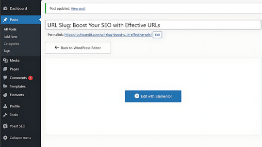
URL Slug: Simple Steps to Boost Your SEO and User Experience

Ever wanted to know why some URLs look clean and simple while others are long, complicated, and confusing? That clean part at the end of a URL, known as an “URL slug,” plays an integral role in how easily people and search engines understand a page’s purpose. In SEO, it does much more than just look pretty — it enhances search engine visibility and user experience. What makes a slug so crucial to SEO, and how can I create slugs that will attract both visitors and search engines?.
What is a URL Slug?
A slug in a URL is what one finds after the domain name. It summarizes the content of a webpage in a few words. Such as in “www.example.com/seo-tips,” “seo-tips” is the slug. It should be descriptive, concise, and perhaps contain relevant keywords. A good slug is what gives both search engines and readers a bright idea about what they will find on the page; thus, it should be one of your website’s necessary structures.
Why do URL slug matter in SEO?
Relevance for Search Engines
Keywords in the URL slug are very important because they help the search engine understand the content of that page. Incorporating keywords informs search engines that your page aligns with current searches, thereby maintaining your page’s prominence in search results.
User Experience
Link Sharing
It means that the web page with a simple URL — clean — will be shared more. Whether you are sharing via social media, email, or in a chat, a well-structured URL looks more trustworthy, which means it will be shared more.
Keyword Optimization
On-page SEO is improved by having your target keyword in the URL slug. The alignment of the URL with the page’s title and content creates an internal coherence for a search engine and helps the page in relevance representation.
Best Practices for Creating SEO-Friendly URL Slugs
It’s much more than the use of keywords — it’s a ‘court of clarity’ and simplicity in relevance to the message being communicated.
Short and descriptive: Avoid extra words. Ideally, aim for slugs that are simple, clear, and focused on a single topic.
Use Keywords: The primary keyword should creep into the slug as naturally as possible. Keyword-stuffing in slugs looks spammy and is not going to do your SEO any good.
Special Characters: Avoid and or?. These characters confuse the browser, and your URL may be unreadable. You don’t need anything but letters, numbers, and hyphens.
Hyphens instead of Underscore: For search engines, a hyphen is a space, so the URL will be more readable. “how-to-bake-cookies” is better than “how_to_bake_cookies.”
Use lowercase letters: Even if your URLs are case sensitive, do use lowercase. This avoids confusion and eliminates duplicate URLs.
Remove Stop Words:��Words like “a,” “the,” and “of” are used in most slugs, but in most cases, they are not necessary, making the URLs longer than necessary. Keep it clean and to the point.
Common Mistakes to Avoid
Avoid these common mistakes for user-friendly, SEO-friendly slugs.
Long or complex slugs: The longer the slug is, the harder it is to read. More importantly, however, very long slugs dilute the meaning of the slug itself. Simplicity End.
Keyword stuffing: Loading a slug with keywords can give it a spammy look and may also hurt your SEO. Use one key word.
Urls Changing Very Frequently: It may result in a lot of broken links that will again deplete a lot of traffic and further harm SEO. Try to set the best possible slug and stick to it from day one.
How to Optimise Existing URL Slugs
If you’re optimizing existing slugs on your site, you can do this through the following step-by-step process:
When Optimizing Existing Slugs: If you change the slug of a URL, you would want to set up a 301 redirect to send the old one to the new one and keep it that way, so the SEO value is retained there and users aren’t taken to the broken page.
Track performance: Immediately after doing these changes, track them by using Google Analytics and Google Search Console regarding the traffic and rankings. It will show you whether those changes actually did happen or not.
Real-Life Examples of Good and Bad URL Slugs
Here are some examples to illustrate what works and what doesn’t in URL slugs:
Good: “www.example.com/digital-marketing-tips” is clear, contains relevant keywords, and the user knows at once what is going to be inside the page.
Bad: “www.example.com/p = 123abc456” — non-descriptive, with no keyword description, and does not create a response to either the user or a search engine.
For example, one is short and very easy to read, and the second is vague and not even memorable.
Conclusion
URL slugs are a small but powerful part of your SEO strategy. By keeping them clear, concise, and relevant, you improve both search engine rankings and user experience. Take a look at your website’s URL slugs and see if they’re up to par. By following the tips in this guide, you can create optimized slugs that contribute to your overall SEO success. Ready to improve your SEO? Start refining your URLs today!
For more information, Visit now
1 note
·
View note
Text
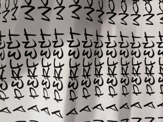
Experiments
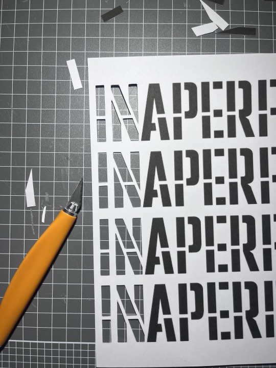
made this stencil in photoshop, just used one of the fonts on PS , i did play around with fonts but found that the spacing, size, and form of the letters didn't fit what theme i was aiming for
in this experiment i actually used different paper, i found that working with normal printer paper was not ideal for cutting stencils as the paper wasn't strong enough to hold the weight between two cuts (like the line in the middle , the thine ones) , when cutting the stencil the paper would often break when cutting smaller stencils or lines, and i could reuse them instead of them being crumpled up and used as a once off which led to works having trouble showcasing bold results from the stencils (i also used the same paper for the joker stencil) , the paper was heavier more like card stock - 210gsm
the cutting of the stencil actually felt like it was the most difficult part, which is what i have noticed when working with stencils, its very time consuming to make sure that i am cutting away not too much and not too little, whilst also ensuring that the figure/words could be easily seen like the curved bits so that the audience can make out the object
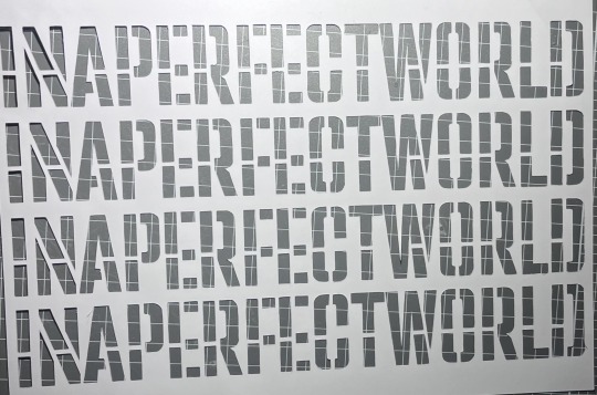
The text is actually lyrics from Kendrick Lamars song PRIDE, i felt that the lyrics best represented the theme i was looking or aiming for,
i think for the theme i was trying to head down this poster feel like the ones with big bold letters that feel as if they are attacking you or something
i then made a practice/mock of what colours i wanted the text to be
alongside this i played around with layering to see the effects however from this i found that the words could only be red from the top and the bottom line
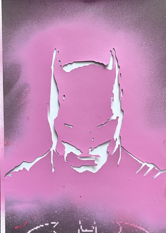
i then made this batman stencil, i think it might've been because i used the joker as a stencil but also i like his posture, it gave this intimidating feel like he's looking down on you or something, like big brother spying on you (1984 George Orwell)
i knew i wanted to layer it with the text as i felt it would work well contrasting against each other
when making the stencils i used this free website that makes stencils, and edited the photo to remove any noticeable things like the bat on his chest to not label it or give the audience that visual relationship
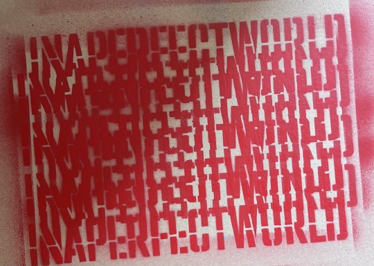
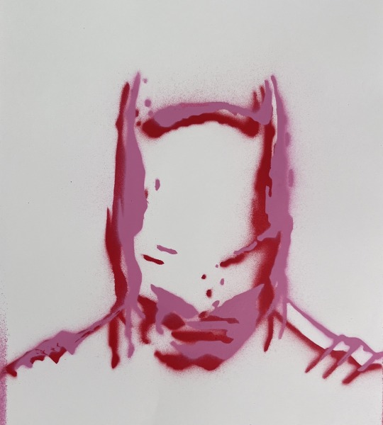
at first i only did the red stencil but then added the pink slightly off from the previous and the results where quite interesting, i actually like the look
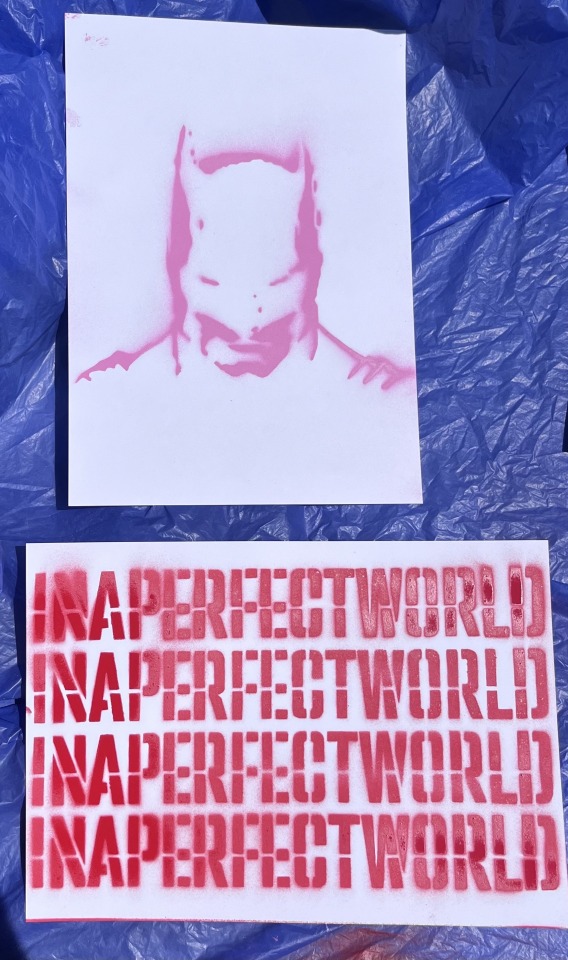
i then created two new mocks to see what works best the image behind the text or the text in front of the image
i decided to use the red and pink because of the previous mock above
i do see that the text stencil did not come off as well as i would've liked especially the "in" "per" and "wor"
after this i then layered the two stencils onto the pages
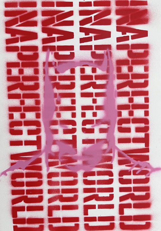
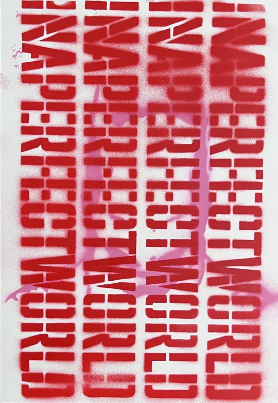
from this i found that the best one was the one that had the image layered on top of the text (left)
the one on the left doesn't hade the face too much where as the on on the right you can hardly make out the character/image however this combined with the text stacked vertically creates this feeling of jail bars, like the one on the right is behind bars and the one on the right is in front i also feel like the one on the left is contrasting better, like its more readable and defined whereas the left is not on the same level
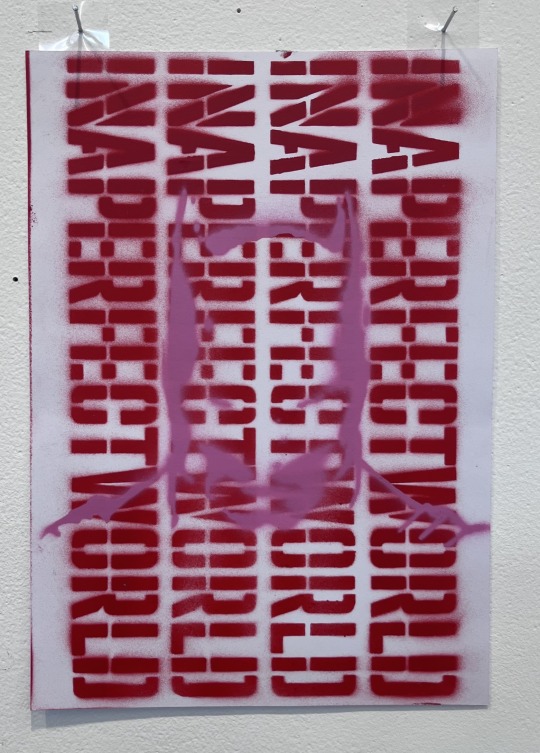
i then installed it vertically like a poster and the results where better than i expected, i mean when looking at it uninstalled it didn't give the same effect as it did installed
too me it comes across as different, maybe because if haven't done something like this, or because it kind of makes me want to investigate this work i don't know if that makes sense
i mean the image of batman still is obscured, like it still doesn't have to definitive, bold lines
i do feel like it is comedic though, like you could read it very literally as in the text read "in a perfect world" and then you see batman, so is it this thing where the work is saying in a perfect world i'd be batman , however maybe it feels this way for me because i know what the image is or if im playing onto that big brother is it either all for big brother or against, i don't know
i fell like it could also be read as this thing that is bringing awareness to something like shedding light onto topics that are hidden ?
Failed Stencil:
0 notes
Text
How do I design a door hanger that stands out?
Door hangers are still a remarkably powerful technique in the marketing world, where every company is fighting for customers' attention. If properly designed, they are difficult to ignore due to their immediate and physical nature. How then can you make sure that your door hanger is unique from the others? Let's get started with some professional advice.
Understanding the Purpose of Door Hangers
Door hangers are not just pieces of paper; they are your ambassadors, representing your brand directly to potential customers. They serve as mini billboards, delivering your message right to people's doorsteps.
Identifying Your Target Audience
Before diving into design, it's crucial to know who you're targeting. Are you aiming for homeowners, apartment dwellers, businesses, or a specific demographic? Understanding your audience's preferences and needs will guide your design choices.
Key Elements of an Eye-Catching Door Hanger
Size and Shape: Choosing the right size and shape is crucial. Standard sizes like 4.25" x 11" or 3.5" x 8.5" are common, but don't be afraid to think outside the box for a unique shape that grabs attention.
Visuals and Graphics: Images speak louder than words. Use high-quality visuals that resonate with your audience and complement your message. Remember to optimise image size and fonts for clarity and impact.
Compelling Copy and Messaging: Keep your messaging clear, concise, and persuasive. Use easy-to-read fonts, even at a distance. Bold headlines and bullet points can help highlight key information.
Call-to-Action (CTA): Every door hanger should have a clear CTA that prompts action. Whether it's "Call Now," "Visit Our Website," or "Get 20% Off Today," make it easy for recipients to know what to do next.
Quality Materials and Finishes: Invest in quality materials that reflect the professionalism of your brand. Choose sturdy cardstock or PVC for durability, especially if your door hangers will be exposed to outdoor elements.
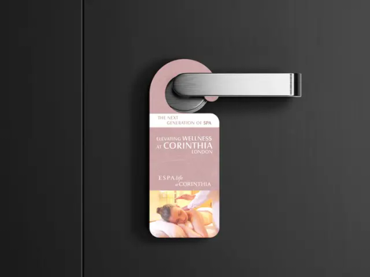
Tips and Techniques for Designing Memorable Door Hangers
colour Psychology: colours play a significant role in evoking emotions and influencing behavior. When designing your door hangers, choose colours that align with your brand identity and evoke the desired response from your audience.
Creative Typography: Experimenting with fonts can add personality to your design. It's essential to consider readability and legibility, especially from a distance, to ensure your message is easily understood by recipients.
Interactive Elements: Go beyond traditional paper by incorporating interactive elements like QR codes or scratch-off sections. These features can engage recipients and encourage them to interact with your door hangers, increasing their effectiveness.
Die-Cutting and Unique Shapes: Differentiate your door hangers by using custom die-cut shapes that capture attention and leave a lasting impression on recipients.
Personalisation with Variable Data Printing: Add a personal touch to your door hangers by personalising them with recipient names or tailored offers using variable data printing. This customisation makes recipients feel valued and increases the likelihood of engagement.
Door Hanger Guides: Utilise comprehensive door hanger guides to assist in your design process. These resources offer valuable insights and tips to help you create impactful and effective door hangers that resonate with your audience.
Practical Considerations and Best Practices
Readability and Placement: Ensure your door hanger is readable from a distance and that key information is prominently placed for easy access.
Proofreading and Quality Assurance: Double-check for typos, grammar errors, and design flaws before printing. A typo on a thousand door hangers can be a costly mistake.
Testing and Refining: Test different designs and messages to see what resonates best with your audience. Don't be scared to adjust your strategy based on feedback and results.
Conclusion
Designing a door hanger that stands out requires a thoughtful approach that considers both creativity and practicality. By understanding your audience, utilising impactful visuals and messaging, and investing in quality materials, you can create door hangers that make a lasting impression. Remember, Printed Door Hangers is here to help you every step of the way in your door hanger guide journey.
1 note
·
View note
Text
Crafting SEO-Friendly Slugs: The Roadmap to Online Visibility
In the vast digital landscape, where websites jostle for attention, the significance of a well-crafted SEO slug cannot be overstated. So, what exactly is a slug in the realm of Search Engine Optimization (SEO)? In simple terms, a slug is the user-friendly, URL-friendly version of a webpage's address. It's the part of the URL that comes after the domain name and plays a crucial role in enhancing your site's visibility on search engines. Let's embark on a journey to unravel the essence of SEO slugs and understand the key points to consider when creating them.
Understanding the SEO Slug:
The slug is the tail end of a URL that identifies a specific page on a website. For instance, in the URL "www.example.com/blog/seo-slug," the "seo-slug" is the crucial component we're focusing on.Craft slugs that are easily readable by humans. Use words that reflect the content of the page, making it clear and comprehensible. Avoid jargon or symbols that may confuse visitors.
Importance of a Well-Crafted Slug:
Enhanced Search Visibility: Search engines use slugs to understand the content of a page. A concise and relevant slug can improve the chances of your page appearing in search results when users are looking for specific information.
User Experience: A clean and descriptive slug contributes to a positive user experience. Visitors can quickly grasp the nature of the content by glancing at the URL, which fosters trust and encourages click-throughs.
Points to Remember While Creating a Slug:
Use Hyphens, Not Underscores: Search engines interpret hyphens as space, helping them recognize separate words. For example, "seo-slug" is better than "seo_slug" for readability and SEO.
Keep it Concise: Aim for brevity while maintaining clarity. Long, convoluted slugs can be overwhelming and might dilute the SEO impact.
Incorporate Keywords Naturally: Integrate relevant keywords into the slug, but do so naturally. Avoid keyword stuffing, as it can harm your SEO efforts.
Exclude Stop Words: Remove common words like "and," "or," and "but" from your slugs. These words don't add much value to search engines and can be omitted for simplicity.
Update Slugs for Content Changes: If you modify the content of a page, don't forget to update the slug accordingly. This ensures that your URL remains an accurate reflection of the page's content.
Test for Readability: Before finalizing a slug, put yourself in the shoes of a visitor. Ask whether the URL effectively communicates the essence of the page and is easy to remember.
The humble SEO slug is your digital signpost in the vast online landscape. By adhering to these simple guidelines, you can craft slugs that not only appease search engines but also resonate with your audience, paving the way for improved visibility and a more seamless online journey.
Career Fortune is your launchpad to a thriving digital marketing career! Their unique Pay After Placement Digital Marketing Course is crafted to empower your journey, ensuring success through a personalized approach.
The faculty isn't just about expertise; they're mentors driven by passion, providing real-world insights to make your learning experience enriching. You get to immerse yourself in a hands-on curriculum, going beyond theory to equip you with practical skills essential for the dynamic digital marketing landscape. Picture yourself landing roles in esteemed companies, as the strong network opens doors to exciting opportunities, giving your career a solid foundation.But their commitment doesn't stop there – 100% Job
Guarantee is their pledge to your seamless transition from learning to a fulfilling career. Recognizing diverse learning preferences, they offer both online and offline classes. Whether you prefer the flexibility of online learning or the traditional classroom setup, they cater to your needs. Are you worried about the financial commitment? With their Pay After Placement in Pune option your investment is tied to your achievements – pay your fees only after securing a job.

#Payafterplacementcourse#digital marketing#digital marketing courses#digital marketing course#pay after placement digital marketing#Pay after placement#pay after placement in pune#pay after placement pune#pay after placement courses in pune#digital marketing courses in pune
0 notes
Text
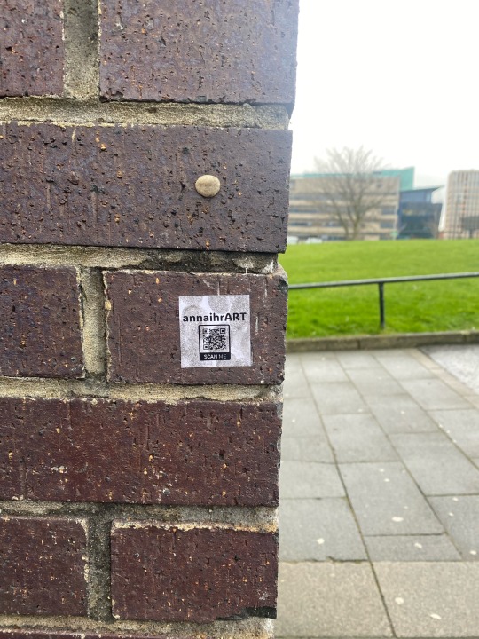
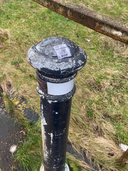

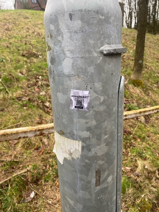
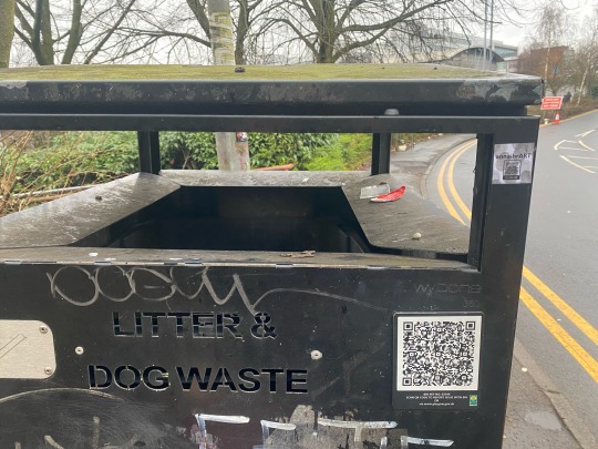
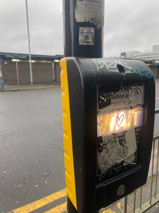
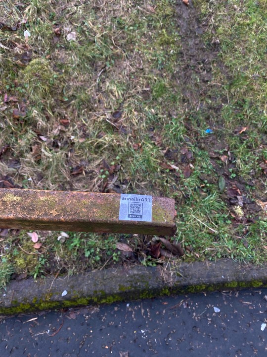

Stickers
Here I am using the stickers, really just any place that has a smooth surface where the sticker with adhere to. Same with the cards, I found this really fun! I suppose a downfall with the monotone is that it does not stand out, instead blending in when it comes to the poles and metal. I'm not sure where I stand with that, I like that they are subtle, like at my attempt to communicate with the public. But I suppose if I want more viewers, I would have to make something a little more obvious. So far, I would say I am happy to continue trying this method out. Whether I get followers from it I won't be able to know, since the viewers are unlikely to tell me where they found me from, this if a mystery I am happy to leave unsolved though.
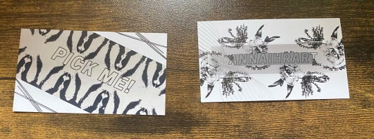
Cards
The cards arrived, and I love how they look! The business card is nice and sleek looking, I love how the colours came out and the QR code again works perfectly. I think it is readable and easy to understand while maintaining a quirky and playful design.
The tempting cards are really cool, however I would say about these cards that the monotone has caused them to be less obvious, which was a worry I had. As much as I like their modern and sleek look, they don't stand out to me as much as the colourful ones did. I also feel that with the prompt cards, the 'pick me', is not easily readable, considering it is outline font rather than bold. I will continue to put these out into the world and see how it goes, however I will need to reconsider how I use fonts and their accessibility and success at what I am aiming to achieve.
0 notes
Text
How can I increase my viewers?
1. Optimize Video Titles, Descriptions & Tags
Compelling Titles: Craft clear, concise titles that include primary keywords. Aim for titles that spark curiosity without resorting to clickbait.
Detailed Descriptions: Write informative descriptions (at least 250 words) that naturally incorporate relevant keywords. The first 100 characters should be particularly engaging, as they appear in search previews .
Effective Tags: Use a mix of broad and specific tags to categorize your video accurately. Tags help YouTube understand your content and recommend it to the right audience .
2. Design Eye-Catching Thumbnails
High-Quality Images: Ensure thumbnails are clear and visually appealing.
Bold Colors & Text: Use vibrant colors and readable fonts to make your thumbnails stand out.
Emotional Faces: Incorporate expressive faces to create a connection with potential viewers.
Consistency: Develop a consistent style to make your videos easily recognizable .
3. Maintain a Consistent Posting Schedule
Regular Uploads: Stick to a consistent schedule to build anticipation among your audience.
Optimal Timing: Use YouTube Analytics to determine when your audience is most active and schedule uploads accordingly
4. Engage with Your Audience
Respond to Comments: Interact with viewers by replying to comments, fostering a community around your content.
Encourage Interaction: Ask questions and prompt viewers to like, share, and subscribe.
Community Engagement: Participate in discussions on other creators' videos to increase your visibility .
5. Utilize Playlists and Shorts
Organize Content: Group related videos into playlists to enhance watch time and make navigation easier for viewers.
Leverage YouTube Shorts: Create short, engaging videos to reach a broader audience and capitalize on the popularity of short-form content .
6. Implement SEO Best Practices
Keyword Research: Identify relevant keywords using tools like Google Keyword Planner and incorporate them into your video metadata.
Hashtags: Use relevant hashtags in your video description to improve discoverability .
Closed Captions: Add accurate captions to make your videos accessible to a wider audience and improve SEO.
7. Collaborate with Other Creators
Cross-Promotion: Partner with creators in your niche to reach new audiences.
Guest Appearances: Feature on each other's channels to provide fresh content and attract subscribers .
8. Analyze and Adapt
YouTube Analytics: Regularly review your analytics to understand viewer behavior and identify successful content strategies.
Adapt Content: Use insights to refine your content, posting schedule, and engagement tactics.
9. Explore New Features
YouTube Hype: Utilize YouTube's "Hype" feature to promote your videos and gain visibility among smaller channels .
By implementing these strategies, you can enhance your YouTube presence, attract more viewers, and foster a loyal community around your content. Remember, consistency and engagement are key to sustained growth on the platform.
0 notes
Text
This is something that I have been daydreaming about for a long time also. I agree by far the biggest problem would be to actually get people to use it, but still it's interesting to think about the technical issues…
I think aiming specifically to "recreate tumblr" actually helps with some of the questions. If people routinely reblog posts, then it would be natural for them to also "seed" those posts, giving some redundancy. The client could store posts that you have viewed locally, so that they don't go away too easily and you can reblog them later if the links rotted.
Also, the way to discover content/users on tumblr is that you see it reblogged by someone you follow, so there is no recommendation algorithm that can be manipulated. There is a trade-off between privacy and discoverability: if (like Twitter) likes and follows are public, then anyone can make "client-side" recommendations based on "liked by somebody who is followed by many users that you follow", etc.
Making follower/following-lists are public would also have a nice bonus effect on direct messaging. You can always sign and publish the public keys of anyone you interact with, to construct a PGP-style web-of-trust. This system would be really resistant to eavesdropping. As soon as you knew even a single correct identity (e.g. because someone emailed it or published it on their web page or gave you a physical business card), then any attempt to man-in-the-middle you would instantly unravel. We could have secure communications without needing a centralized certificate authority.
Apart from data availability, I think some other problems are:
Naming. One problem with P2P systems is that it's hard to create globally unique nicknames. I want to be "youzicha", but without a central party, how can you enforce that nobody else uses the same nickname? Actually, nowadays you can use a blockchain to do it, but this is pretty heavy-handed, you would need to include some kind of rationing or payments or proof-of-work to prevent people from immediately nickname-squatting every short name. I think it's better give up on unique names altogether, so that people's unique identifier is just their public key, and then they can publish whatever metadata they like to make themselves easier to find. ICQ used to work this way, with users being identified by just a number but no human-readable nickname.
Anonymization. We don't think about it so often, but one service that centralized companies provide to us is to act as anonymizing proxies. It works both ways: I can publish this tumblr pseudonymously as "youzicha" without disclosing my real-world identity, and also I can look at peoples post on Twitter and Tumblr without them being aware of it. If everything was purely P2P, you would see each page view (and the IP-address of the person who made it) in real-time, which seems like a nerve-wracking experience.
I think this is a genuine advance: back in the old Usenet days people generally posted under their full government names, which maybe worked well because Usenet as a whole was a kind of subculture, but now people constantly doxx each other and having the wrong political opinions can damage your career. (C.f. the debate surrounding Facebook, Google+ and their "real names" policy.) If the system doesn't provide anonymity it seems important to at least make this fact very clear in the user interface, users could get burnt. Maybe automatically do some IP geo-lookups to illustrate the kind of information it leaks.
Blocklists, spam, harassment. As you noted above this seems like a big problem.
But if implemented well it could be a selling point, because the current solutions are so disliked. On the being-censored side, sites like Hacker News and Twitter play weird mind games to secretly shadow-ban you, which feels disrespectful. On the censoring side, people who deal with a lot of incoming messages find the current blocking solutions too blunt. If you provided an elaborate (Turing complete?) policy language, a thousand flowers could bloom: shared blocklists, "topics" like USENET newsgroups which anyone can post to, and then "overlay" newsgroups which are moderated, etc. Popular bloggers could do the Luna thing where you have pay them (using some cryptocurrency) to see your message.
People could publish their rules for receiving messages, which would serve several purposes. First, clients can avoid routing messages which would be discarded anyway (a kind of distributed DoS-protection, as a replacement for Cloudflare). Second, your client software can usefully advice you ("sorry, because of spam rules this message cannot be sent to PopularBlogger. In order to unblock it, do one of (1) build up a posting history of n messages on X Forum, (2) have your message approved by a moderator in group Z, (3) get a friend-of-a-friend introduction from one of the following people, …"). And most importantly, you can performatively block Nazis and post really elaborate DNI lists.
Beheading and child abuse videos. I think this is a bigger problem than "if we're not hosting any of the bad shit it's not on us", because if a social media system is truly censorship-resistant the government will not allow it to exist for long. Interestingly, this is goes against some of the other desiderata: you'd want it to not be anonymous, to make it easy for the police and/or online vigilantes to chase down criminals. And you might want content to not be discoverable. (E.g. if you use BitTorrent Mainline DHT you maybe interact with people who search for bad things, but since they only provide a SHA-1 hash you never know.)
Hypothetical Decentralised Social Media Protocol Stack
if we were to dream up the Next Social Media from first principles we face three problems. one is scaling hosting, the second is discovery/aggregation, the third is moderation.
hosting
hosting for millions of users is very very expensive. you have to have a network of datacentres around the world and mechanisms to sync the data between them. you probably use something like AWS, and they will charge you an eye-watering amount of money for it. since it's so expensive, there's no way to break even except by either charging users to access your service (which people generally hate to do) or selling ads, the ability to intrude on their attention to the highest bidder (which people also hate, and go out of their way to filter out). unless you have a lot of money to burn, this is a major barrier.
the traditional internet hosts everything on different servers, and you use addresses that point you to that server. the problem with this is that it responds poorly to sudden spikes in attention. if you self-host your blog, you can get DDOSed entirely by accident.
scaling hosting could theoretically be solved by a model like torrents or IPFS, in which every user becomes a 'server' for all the posts they download, and you look up files using hashes of the content. if a post gets popular, it also gets better seeded! an issue with that design is archival: there is no guarantee that stuff will stay on the network, so if nobody is downloading a post, it is likely to get flushed out by newer stuff. it's like link rot, but it happens automatically.
IPFS solves this by 'pinning': you order an IPFS node (e.g. your server) not to flush a certain file so it will always be available from at least one source. they've sadly mixed this up in cryptocurrency, with 'pinning services' which will take payment in crypto to pin your data. my distaste for a technology designed around red queen races aside, I don't know how pinning costs compare to regular hosting costs.
theoretically you could build a social network on a backbone of content-based addressing. it would come with some drawbacks (posts would be immutable, unless you use some indirection to a traditional address-based hosting) but i think you could make it work (a mix of location-based addressing for low-bandwidth stuff like text, and content-based addressing for inline media). in fact, IPFS has the ability to mix in a bit of address-based lookup into its content-based approach, used for hosting blogs and the like.
as for videos - well, BitTorrent is great for distributing video files. though I don't know how well that scales to something like Youtube. you'd need a lot of hard drive space to handle the amount of Youtube that people typically watch and continue seeding it.
aggregation/discovery
the next problem is aggregation/discovery. social media sites approach this problem in various ways. early social media sites like LiveJournal had a somewhat newsgroup-like approach, you'd join a 'community' and people would post stuff to that community. this got replaced by the subscription model of sites like Twitter and Tumblr, where every user is simultaneously an author and a curator, and you subscribe to someone to see what posts they want to share.
this in turn got replaced by neural network-driven algorithms which attempt to guess what you'll want to see and show you stuff that's popular with whatever it thinks your demographic is. that's gotta go, or at least not be an intrinsic part of the social network anymore.
it would be easy enough to replicate the 'subscribe to see someone's recommended stuff' model, you just need a protocol for pointing people at stuff. (getting analytics such as like/reblog counts would be more difficult!) it would probably look similar to RSS feeds: you upload a list of suitably formatted data, and programs which speak that protocol can download it.
the problem of discovery - ways to find strangers who are interested in the same stuff you are - is more tricky. if we're trying to design this as a fully decentralised, censorship-resistant network, we face the spam problem. any means you use to broadcast 'hi, i exist and i like to talk about this thing, come interact with me' can be subverted by spammers. either you restrict yourself entirely to spreading across a network of curated recommendations, or you have to have moderation.
moderation
moderation is one of the hardest problems of social networks as they currently exist. it's both a problem of spam (the posts that users want to see getting swamped by porn bots or whatever) and legality (they're obliged to remove child porn, beheading videos and the like). the usual solution is a combination of AI shit - does the robot think this looks like a naked person - and outsourcing it to poorly paid workers in (typically) African countries, whose job is to look at reports of the most traumatic shit humans can come up with all day and confirm whether it's bad or not.
for our purposes, the hypothetical decentralised network is a protocol to help computers find stuff, not a platform. we can't control how people use it, and if we're not hosting any of the bad shit, it's not on us. but spam moderation is a problem any time that people can insert content you did not request into your feed.
possibly this is where you could have something like Mastodon instances, with their own moderation rules, but crucially, which don't host the content they aggregate. so instead of having 'an account on an instance', you have a stable address on the network, and you submit it to various directories so people can find you. by keeping each one limited in scale, it makes moderation more feasible. this is basically Reddit's model: you have topic-based hubs which people can subscribe to, and submit stuff to.
the other moderation issue is that there is no mechanism in this design to protect from mass harassment. if someone put you on the K*w*f*rms List of Degenerate Trannies To Suicidebait, there'd be fuck all you can do except refuse to receive contact from strangers. though... that's kind of already true of the internet as it stands. nobody has solved this problem.
to sum up
primarily static sites 'hosted' partly or fully on IPFS and BitTorrent
a protocol for sharing content you want to promote, similar to RSS, that you can aggregate into a 'feed'
directories you can submit posts to which handle their own moderation
no ads, nobody makes money off this
honestly, the biggest problem with all this is mostly just... getting it going in the first place. because let's be real, who but tech nerds is going to use a system that requires you to understand fuckin IPFS? until it's already up and running, this idea's got about as much hope as getting people to sign each others' GPG keys. it would have to have the sharp edges sanded down, so it's as easy to get on the Hypothetical Decentralised Social Network Protocol Stack as it is to register an account on tumblr.
but running over it like this... I don't think it's actually impossible in principle. a lot of the technical hurdles have already been solved. and that's what I want the Next Place to look like.
245 notes
·
View notes