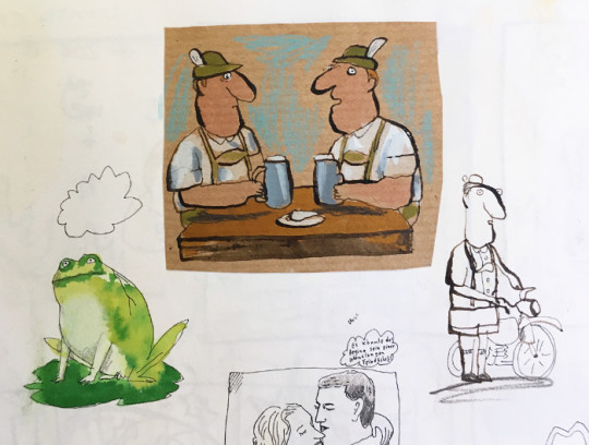
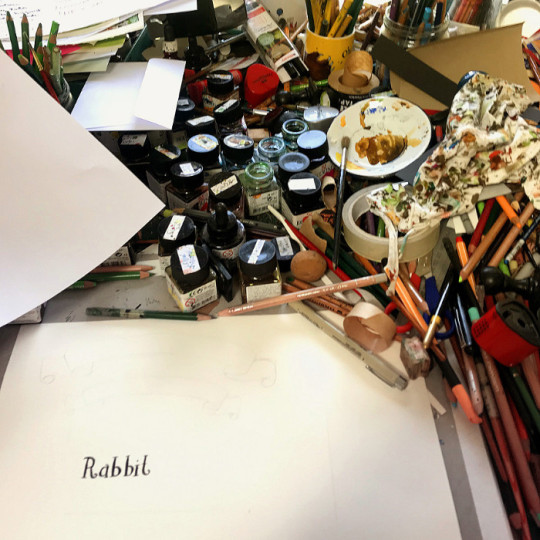
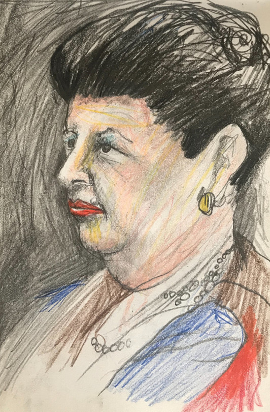
#i love working with this pen ... these watercolour sketches would be nothing without it
Explore tagged Tumblr posts
Visit Tumblr Blog
Explore Tumblr blogs with no restrictions, modern design and the best experience.
Last Seen Tumblr Blogs


Fun Fact
The Tumblr app for Google Glass was released on May 16, 2013.
Text

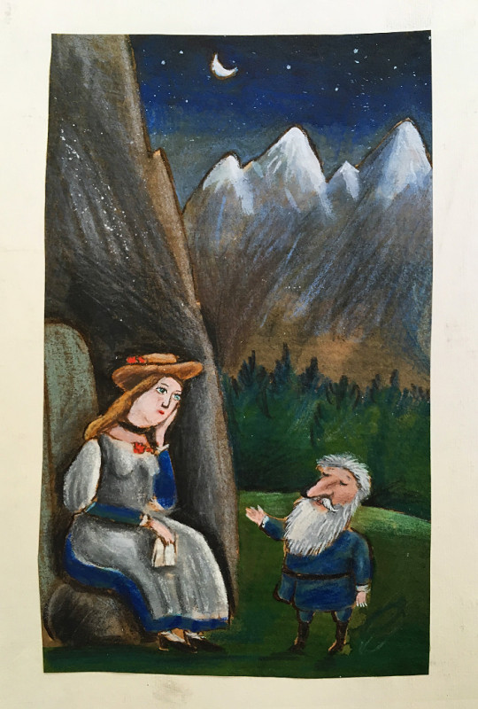
also a significantly less cool 4×04 watercolour diana to follow up the bridget i posted earlier
#shui draws#mythic quest#david brittlesbee#diana brittlesbee#lesbaksbee if u squint but i wont tag it#i love working with this pen ... these watercolour sketches would be nothing without it#steadler chisel tip pigment liner my baby darling dearest
15 notes
·
View notes
Text
Portrait of a Soldier
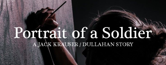
The Lost Swan
/Thought I decide to share another one of my stories about Krauser and Dullahan and this is one of the first stories I wrote about before The Lost Swan. So think of it as a look into their little quiet life.
Enjoy reading!/
Mentions of: Suggestive talks and Krauser being a prev lol
It started off with a little headshot sketch of Krauser at the corner of the paper on the layout of the building she had drawn out so they could set out a plan to infiltrate. It was a small sketch not bigger from his index finger and yet nothing was missing from his face with those detailing of his scars done with a ballpoint pen. Dullahan didn’t realise it as he hid it with a mug. It was only when she was folding it away was when the sight of the sketch made her remember what she had done, forced to pretend that she didn’t see her own work or that Krauser knew it was her doing.
She won’t know that he liked her little sketch.
The next time Krauser discovered more of her work was when he dropped by her loft via the glass door on her balcony. He was given a keycard by her recently so he could enter her place normally, but oh well, old habits die hard sometimes. He knew Dullahan was currently away on her own missions so he took his chance to recuperate for a couple of days after taking quite a number of mercenary works over the past couple of weeks. Two days should be enough for him. Maybe more if he’s waiting for her return. He does miss her admittedly after all. There were some leftovers that were still good, coffee was full, and his clothes awaiting for his next return were neatly ironed and folded when he opened his wardrobe.
Her loft was spotless as usual knowing the hitman needed the sense of order in her own haven.
The easel, however, was not standing there last time he was here.
Krauser knew she does art as a hobby and he has seen her paint from landscapes to still life of the places she has visited. Last time he had seen her paint was at an opera house she attended alone and he watched her paint the singer on stage before returning his focus to his weapons. Normally when she’s not painting she would have it tucked away.
There a fabric was draped over the easel, presumably to hide the canvas underneath. Curiosity got the best of him to take a peek at her new project. The canvas remained blank, save for a memo stuck to it to remind her to buy more paints, and figure out how to get the smile right for the portrait she’s going to be working on. When it comes to her little art studio in the corner of the living room, there would always be an artist’s sketchbook to see what the memo was talking about. And so there it is, the red well loved leather bound sketchbook is found resting on the table. He has seen her sketches before and albeit without her permission, so nothing like the usual peek doesn’t hurt anyone.
Only he didn’t expect to see his own face staring back at him. Krauser’s face was drawn quite stern with a pencil based on the shading on his face and how most of the details were focused on his eyes to the wrinkle of his brow and the furrow on his mouth. Why the hell did she draw him like this? Was that how she saw him when he got annoyed with her or anyone during those times? That woman, unbelievable. However, that wasn’t the only sketch she had drawn of him. In fact, there were a lot more sketches of him. From headshots to full body drawings of him in various poses and with different mediums, she has filled out a variety of him in over five pages. A couple of them were nude drawings of him done with charcoal and watercolours.
The way she had drawn those were not done in a lewd way or to make him look like a god. Dullahan had drawn him as she had seen him whenever he’s naked, normal. The way his back muscles shifted in charcoal as he was drawn sprawled out on his front on the leather couch he lain on, recalling the time she had given him a back massage. The other drawing that was done in watercolour was when he was taking a shower. He looked completely bliss, possibly for the fact that he was taking a hot shower at the time when she walked in and he never saw her admiring his body from the door that was not lustful.
He has to admit, she has done an amazing job drawing him that he couldn’t help but smile a little upon each inspection of his own appearance. It was then he realised what the memo had meant on the smile. The headshots of him had been drawn with a smile on his face. It wasn’t a big obvious kind that gets into everyone’s face and nor was it a faint kind. It was…simply there, smiling back at the person holding the sketchbook. The smile in those sketches were not exactly how he’s smiling right now, but he can clearly see how hard she had worked to get it right from a pencil to a pen in most of her sketches of him based on imagination alone. Krauser rarely smiles and never does even when a day is good. It was always neutral or stern looking with a rarity of smirking to tease the woman.
The sketchbook was placed back where it found and positioned it correctly so when Dullahan returns, she doesn’t know that he took a peek inside of it and see what has been on her mind lately to draw these out. Krauser has seen past headshots of people she has met once to people she knew but to have multiple drawings of a particular person made him feel special about it and that simply has him smiling as he heads upstairs to shower and get ready to sleep in her bed.
The next time he was at her place, Dullahan now Trish Odile was home too as it was one of her days off from both her waitress job and her hitman contracts, allowing her time to relax and recuperate too. Krauser was lounging at the couch with a book from her bookcase in hand and Trish painting by the glass doors. Both of them minding their own business in the comforts of their home.
From the placement he laid himself across the couch, it was the perfect angle to sneak a peek at Trish in the middle of painting, knowing full well she must be painting a portrait of him based from one of her sketches at her opened sketchbook by her side. Sometimes he would sneak a peek at her finely shaped legs sticking out from the oversize T-shirt she’s wearing that currently belongs to him, also knowing full well that she missed the smell of his scent as he does with her bedsheets. The way her ankles crossed over one another, or how one is crossed over the leg when she leans closer towards the canvas, and sometimes his favourite is when she tucked a leg under her or propped a knee up all while fixing up the shirt, sneaking a glimpse of the rest of her legs and to see if she’s either wearing underwear underneath or those tight yoga shorts.
“You’re staring at me.” Trish called him out on his peeking, never once halted her work and her eye not leaving the canvas to look at him. She wasn’t going to admit that she was peeking at him on her end too. Krauser looked content in his position and the book he chose to read was The Invisible Man. From her angle it was her eyepatch he would see her ‘looking’ back at him, and yet she still knew he was looking at her. “What is it?”
“Nothing.” He said, flicking his gaze back on the words he last stopped at, pretending to skim through the sentences to continue his rouse of reading. “Just curious about what you’re painting this time.” He can hear the creaks of the chair being made as she shifted her position again. “Something for my mission soon.” She started. “I have to act as a painter for a gala my target is going to open and I’ll need enough examples to show them to him to have them on display.”
“Sounds fun.” He knew it was a lie and simply went along with it. “You already have your alias on this mission?” “Of course.” Trish let out a chuckle as she stood up and stretched her body, allowing Krauser to lower the book a bit to catch his shirt riding up to see those legs again. He’s going to have them wrap around his waist very soon on this couch and hear that moan she’s currently making after she has stretched.
Trish finally looked at him, a small smile forming on her face. “Do you want to attend the gala as my plus one when the time comes?” “Tch, fancy events are not my forte for missions like yours.” He brought the book up to hide his face and soon catches the hitman approaching him from the top of the book, catching sight of the small pout she’s making. “I’ll pass.”
“You’re no fun, Jackie.” She purred out his nickname he secretly liked as she got closer, and soon she was straddling on his hips, taking the book away so she could have his full attention on her. “It would be nice to see you wearing a suit for once. Maybe one of those fancy military suits you probably had to wear during your army times.”
“What will you be wearing?” He asked her, resting his hands on her hips and rubbing one of his thumbs over the outline of her lower garments. It was definitely the yoga pants. “Matter of fact, what are you wearing underneath?” His free hand decides to sneak under the shirt and tries to tug down the shorts. “I don’t see your nipples poking out. Bra?”
Trish cocked her head to the head, the smile switching to a smirk. “Take it off?”
“That’s an order.” He stopped her from removing his shirt. “Leave it on. Bra off.” Krauser soon smirked when Trish let out a huff while she complied to his orders, snapping off the hooks with the flick of her hand, pulled the straps out from the sleeves, and then pulled out the said bra itself from the opening of the shirt. It was lacy and dark red, one of his favourite colours and one of his favourite sets from hers. Once her shorts were pulled off, Trish planted her hands on his chest while her hips gave the slightest rub against his clothed hips, a soft moan emitted from her lips, and bowing her head down so their faces were quite close to each other.
“Now what, Jackie?”
“You start by calling me ‘Sir’ this time.” He said, grabbing a fistful of her hair in his grasp, pulling her head back to hear that sweet sharp gasp. “And get down on your knees on the floor right now, sweetheart.”
The strong smell of lavender from her shampoo disappeared from his nose, leaving a lingering scent and forcing him to wake up from his deep slumber. Trish was gone from his grasp in the king size bed they shared. Krauser forced himself to sit up from his place, rubbing the sleep out of his eyes to see the warm light illuminating the little art studio. He quietly slid out of the bed, approaching the balcony to see the woman preparing her tools and her paints to continue her work at the canvas. From the top, he can’t see the progress of her work from where he stood and due to her angling the canvas to ensure her shadow doesn’t obstruct her painting session.
He wasn’t sure why of all times, especially in the middle of the night, she chose to continue painting. He had to step back into the darkness when he watched her rush to the kitchen for what he could tell was boiling water to make tea or coffee. It was tea since he doesn’t smell coffee. As much as he wanted to head downstairs and confront her about it, he left it be, returning to the warm sheets and the alluring smell of her body lotion she applied on herself on the comforter to the smell of her lavender shampoo on her pillow.
Dullahan wasn’t lying about having a mission as a painter and he can’t believe he actually joined her as her plus one for the gala they’re attending. Dullahan had to disguise herself with a blonde wig, green contact lens, and cover up her scars as usual. Krauser did not as no one in this building would recognize him. Not even the security guards who simply waved them in and didn't check him for any weapons he might carry, which is his knife hidden inside his jacket. No military suit for him but a simple yet classic black tuxedo Dullahan has managed to convince himself to wear with a black bowtie. As for her, she wore a dark red dress with spaghetti straps and a long silt on her skirt, exposing her right leg.
The sight of her chest simply revealing for other men to take a quick look at almost had jealousy bubbling at the pit of his stomach while at the same time he admitted that she looked sexy wearing this kind of dress and in the same shade of red like her bra a week ago. To be the matter of fact she’s not wearing a bra at all for her outfit.
“What colour is your underwear right now?” He whispered in her ear while Dullahan collected two glasses of champagne from a passing server, handing one to Krauser. A teasing grin formed on her face. “Why ask me such a curious question like that, darling?” Her voice was laced with a sweet enduring tone a lover would give to their significant other since they are posing as a married couple. She tugged on his arm with her arm wrapped around him to guide him to one of her paintings people are admiring currently. The first painting was a beautiful beach with the view of the ocean, and if one looked closely at the cliff, there was a little cottage, with a lone woman walking along the path barefoot and her shoes held in her one hand. Part of the body concealed with a parasol.
Krauser, who is not a fan of the fine arts, was oddly impressed by the colours she used in her painting. It almost gives off a hazy feeling of a dream one might still be having currently. He doesn’t recognise where the beach is and he’s simply assuming it must be her dream for the future. Peace and quiet.
Dullahan tugged his sleeve to get him to lean down as they head for the next painting and whisper in his ear. “It’s black and it’s a thong.”
A smirk graced his lips. There was no one by one of her other paintings, allowing him the chance to whisper what he has in mind for her. “The next time you wear this dress again and I have to tag along, I want you to wear nothing underneath it.” Trish, continuing to keep up her facade of enjoying her time, simply smiled as if he told her something sweet before she took a sip of her champagne. “I will make you rub yourself on my leg like a depraved whore and it’ll be music in my ears to hear you beg for sweet relief from me.”
Whether it was automatically or by his words alone, her face flushed and she let out a soft giggle, hiding her smile with her glass. “Oh darling, how sweet of you. I should go and find our dear host and say my thanks to him. Hopefully I won’t take long but meet me in the private room over there soon.” Pointing at the closed doors guarded by two men at both sides of the door with a velvet rope to steer off anyone from approaching. “Tell them you’re with me and they’ll let you in.” Trish patted his broad shoulder and winked at him. “Fifteen minutes. Enjoy yourself, honey.”
He did his best to enjoy the rest of the gala alone. It was almost suffocating with people asking him for his thoughts and opinions on other artists’ works to Dullahan’s. As much as he didn’t like any of the artworks, he wished he could slit their throat right now if someone makes another disapproving remark on her paintings simply because of their thoughts on them. Bloody critics they are.
Fifteen minutes was nearly up and Krauser made his way to the private room she told him about. He noticed a selected number of people were allowed to enter, possibly connections with the said painters itself, and he was one of them to enter as soon he told the guards of his connection with Dullahan’s alias.
The lightning in the room was dimmer and warmer compared to outside and there was a lesser number of paintings itself. Only five paintings, each belonging to one artist themself. One of the patrons did a double take on Krauser and was forced to look away when he bared his teeth at them.
Why were they looking at him like that?
That’s when he met his painted self hanging on the wall. His portrait was wearing his military suit during his golden years with his signature red beret he wears now. In the painting, he was sitting on a fancy chair, his signature knife resting in his hand with his elbow resting on his knee propped up higher than the other. It made him look like he was one of those commanders from old period war era but with a modern take of it. Krauser noticed that she painted him scar free of them, making him look less stern than he is currently yet there was a glint of mischief in those icy painted blue eyes and the way his head is angled to the side as if someone caught him thinking something bad. More importantly, it was the smile she painted on him. It still wasn’t right but the way the corner of his mouth curled upwards to the way his lips parted very slightly exposing a flash of teeth matched the mischief look she painted. The background she painted was a dark green with a single window behind him showing a brief view of the beach that oddly looked familiar.
Krauser was honestly awed by how much work she put into this portrait of him. He was lost with thoughts and no words could describe how she portrayed him to be displayed for private eyes to see.
Dullahan finally arrived, joining the soldier by his side. She smiled from seeing his stunned expression of her latest painting. She took note of his body language from his right hand cupping his own face, possibly to hide those parted lips from her eyes, the way his brows knitted together while one of them was raised, and how he wouldn’t stop staring at the painting to look at the painter herself.
“I’m glad you like it, Jackie.” She spoke softly so only they could hear it. “To be honest, I didn’t want this on display at the gala but he insisted I do. Thankfully none of these in this room are for sale but the ones outside.” She tucked the loose strands of her blonde wig behind her ear while she looked around their surroundings. “He’ll die slowly and by tomorrow it’ll be on the news. From a heart attack or a sudden stroke.” She leaned against him, resting her head on his arm. “What do you think of it?”
“I like the colours.” He said. “Plus you didn’t make me look like those arrogant captains painted like gods.”
“Glad to hear that, love.” Her mouth twisted and sighed a bit to herself. “The only thing I don’t like is that I couldn’t get your smile right. I did the best I could with what I did there.”
“I don’t care. Looks good to me.” His answer was nonchalant despite her disappointment at the one thing she couldn’t achieve correctly. “Next time if you think of painting me again, paint the scars on. It’ll look better.”
“I’ll take note of that.” Dullahan lifted her head up to give him a sincere smile for his honest words. “I’m heading back out so I can have an alibi. Care to join me?”
“In a moment.”
“Sure thing.” She nodded her head and soon left the private room. Once everyone else had left the room, a smile graced his scarred lips, cocking his head to the side to admire the painting better and soon letting out a chuckle while stuffing his hands into his pockets. She nor anyone will ever see him smile right before their eyes and that will be his own secret. Besides, he liked how she painted her version of his smile. Despite not being a fan of art, he’s certainly a fan of her work.
“You did well, sweetheart. You did well.”
#Jack Krauser#Dullahan#Krauser/Dullahan#Hatter's writing#Jack Krauser X OC#Krauser X OC#Resident Evil Krauser
7 notes
·
View notes
Text
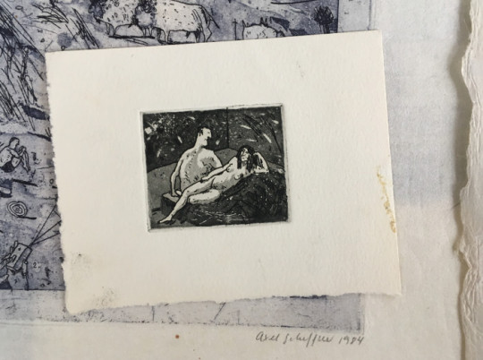
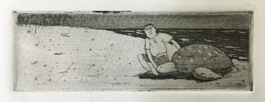
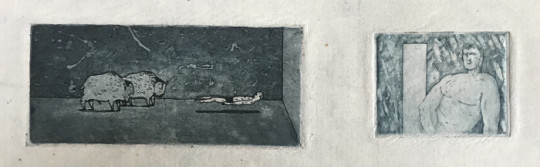
Axel Scheffler
In this post, Axel takes us on a journey through his art studio and career. As well as sharing wonderful development work from some of his much-loved picturebooks, he shows us unseen sketchbook pages, early illustration commissions, etchings he made as a student, and his recent work to educate children about the coronavirus.
Visit Axel Scheffler’s website
Axel: I’m not really sure how many books I’ve illustrated in the 30+ years that I’ve been working. Over 150. I mostly work for the UK market, but occasionally I do books with German publishers. Not picturebooks though, so nothing that collides with the co-edition market.
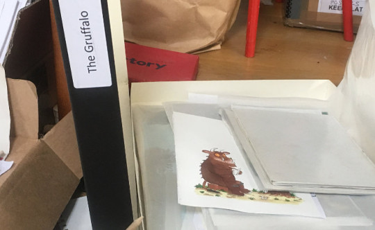
Each of the boxes you see here contains one of my books: the sketches, illustrations, dummies, alternate versions of covers, everything.
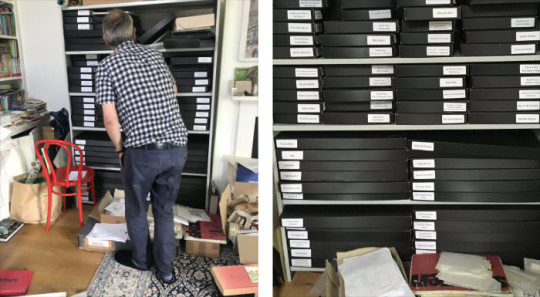
I organised these boxes with Liz, my assistant, to have all the main books there so we can find things for exhibitions. There’s still lots of drawings in these boxes which aren’t sorted yet. Liz is such a great help, but it’s very difficult for me to keep on top of everything. I think I would probably need two Lizes, or perhaps three.
So yes, I don’t really know where to begin... I’ve got endless sketchbooks and little drawings on paper. I’ve got some really old sketchbooks I could show you.
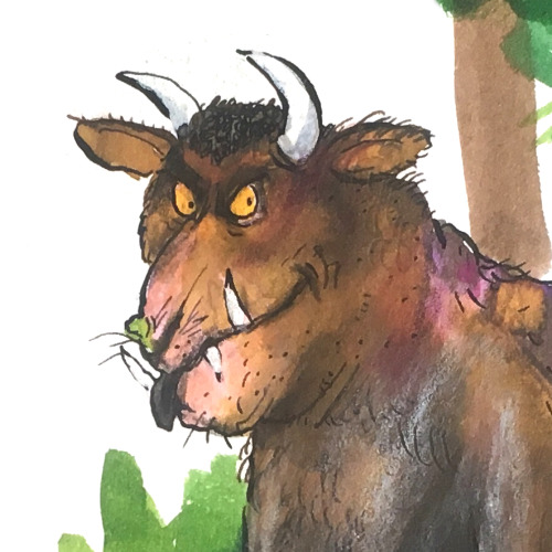
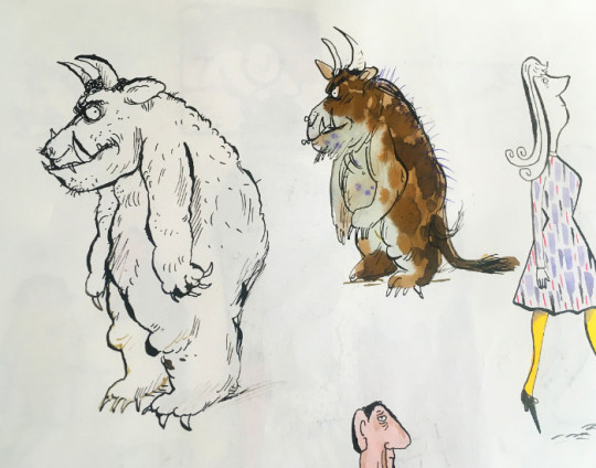
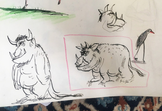
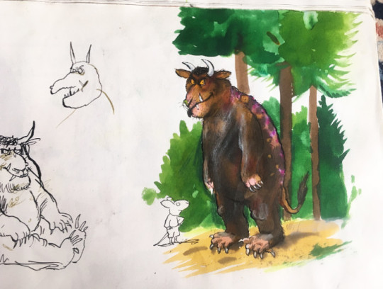
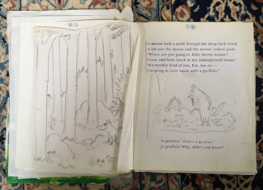
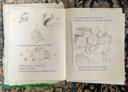
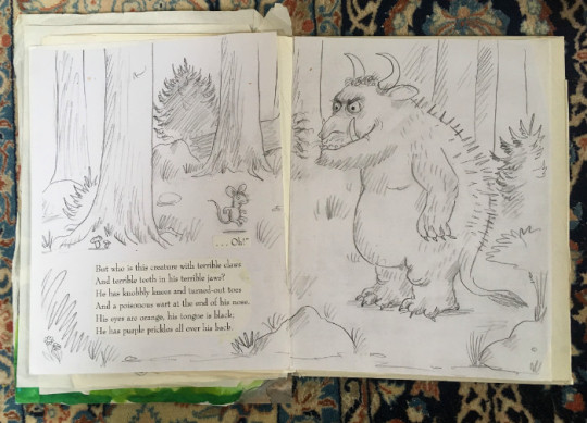
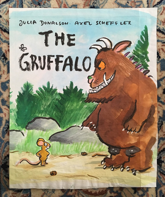
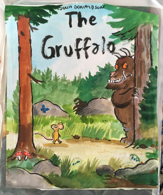
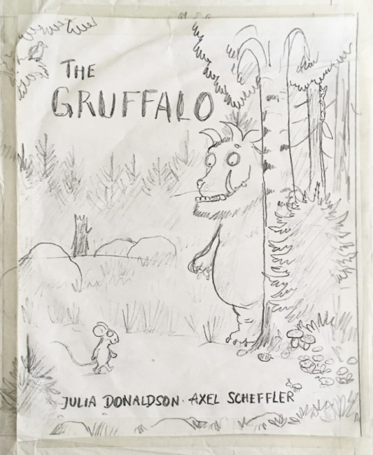
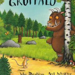
Shall we start with The Gruffalo?
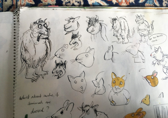
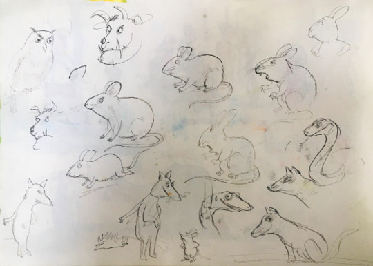
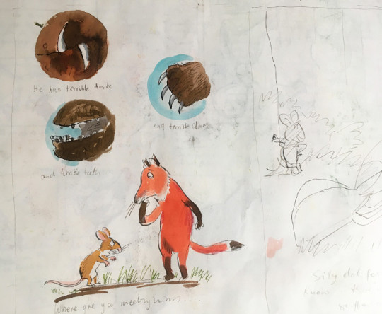
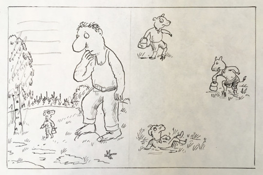
My early sketches of the Gruffalo were thought by my editor to be too scary for small children. So I had to make him a bit rounder and more ‘cuddly’. Initially, I‘d also thought that all the animals would be wearing clothes, as they often do in picturebooks. But Julia had different ideas, and to be honest I was relieved. How would I have dressed the snake?
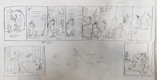
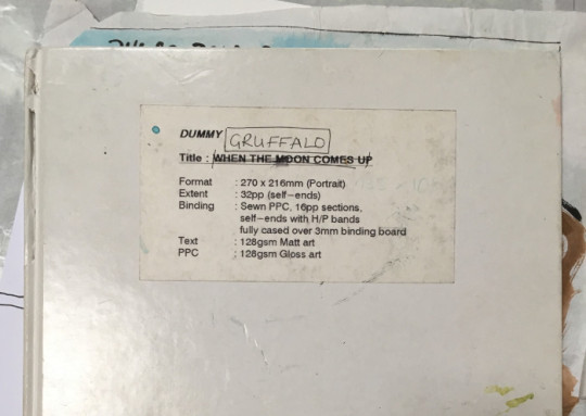
Here’s some spreads from the dummy...
I tried a lot of alternate covers for this book; I think there were twelve in total. There’s some where the Gruffalo doesn’t even feature on the cover.
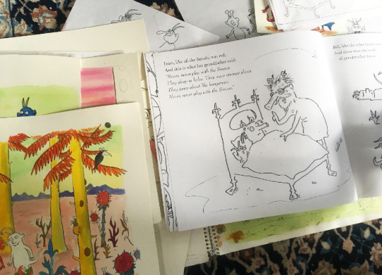
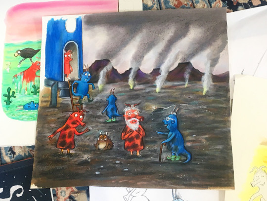
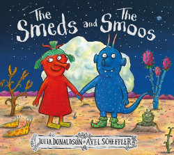
My latest book with Julia is called ‘The Smeds and The Smoos’. It was quite nice to work on because it’s so different from the other books we’ve done together. The text is a bit like a mixture between Dr Seuss and Lewis Carol; it has this nonsense element. But it’s basically Romeo and Juliet in outer space.
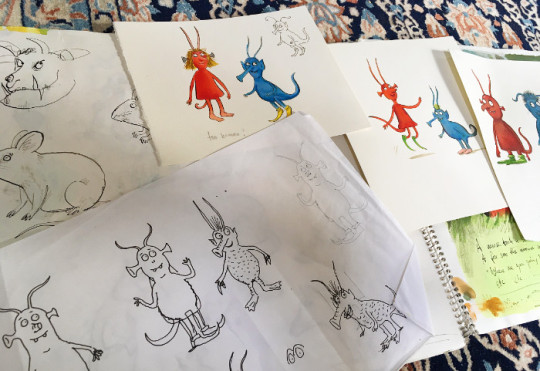
It’s an alien story, so I didn’t have to draw any rabbits or squirrels for a change, and I could invent more. I had more freedom. But like always, I got bored with drawing the same characters over and over again. But that’s picturebooks.
There was quite a lot of development work in the case of this book. But when it’s a story about a fox or a squirrel, I don’t do this kind of stuff. Over the years, it’s become much quicker and easier working on my books. I do far less research than I used to. Now I generally just do a quick pencil sketch then go straight to artwork.
Sometimes I have to start again because things go wrong though. This was a finished piece that was abandoned. I think I suddenly thought that the rocket was far too big or something. I do that; I work on something for ages, and then I suddenly look at it from a distance and realise that something needs redoing.
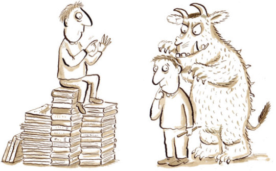
Did you spot the little Gruffalo in this picture? Since ‘The Snail and the Whale’, I’ve hidden a Gruffalo in each of my books with Julia (not ‘The Ugly Five’ though).
For almost all of the books Julia and I have done together, our editor has been Alison Green. We’re an old established team. And I’ve always worked with the publisher Kate Wilson; I followed her from Macmillan to Scholastic, and then to Nosy Crow. Julia moved from Macmillan to Scholastic, and decided to stay there. So Julia and I have some of our joint titles with Macmillan and some with Scholastic. Julia does books with other illustrators for Macmillan, and I illustrate other books for Nosy Crow.
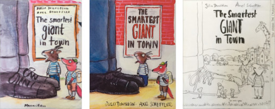
People often ask me which of the books I’ve done with Julia is my favourite. It’s quite hard to choose, but I enjoyed working on ‘The Smartest Giant in Town’. I liked the way I could do a crazy world with animals, giants, fairytale characters, everything mixed together without anyone caring or questioning it. I’ll show you a few things from the box...
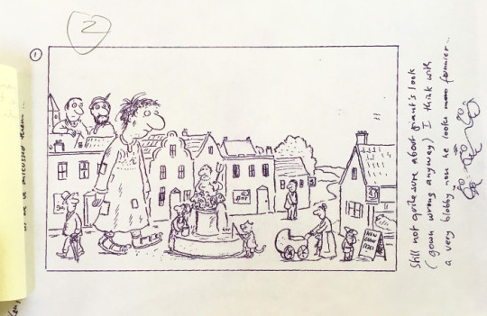
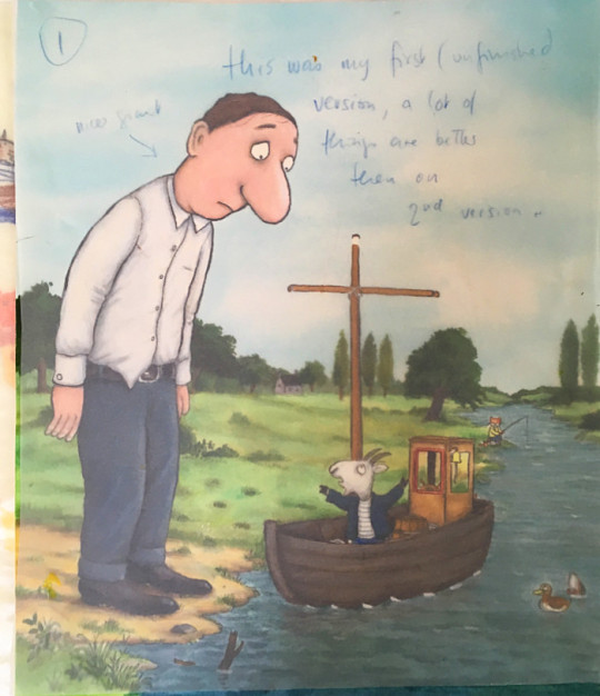
For this book, the cover was changed at the last minute. The original design had the title written on a poster stuck on a brick wall, but the sales people said they wanted a landscape, so I did another one. Years later, they used the original design for a new paperback edition, so it wasn’t completely wasted in the end.
I mentioned my endless sketchbooks earlier. I’ll show you a few of them. This was mainly me playing around without thinking about what I was doing; it wasn’t a conscious thing.
I haven’t looked at these sketchbooks for ages. It was such a long time ago. I don’t work in sketchbooks like this anymore, and I no longer doodle. But for fun, I make illustrated envelopes for friends.
I often think about doing a book with just pictures, but I’m always too busy doing other things. Posthumously, perhaps there will be time to do this. I’d also love to experiment and be more spontaneous; it’s been my dream for decades to do something completely different. But when I receive a book project, I always feel under pressure to finish it, and I’m always late with everything, so I end up doing it the way I’ve always done it.
This is my drawing table, which is and always has been too small and too messy. I think I have to accept it will always be this way.
I use Saunders Waterford paper for my illustrations. It’s funny how we all have our special paper. My rough sketches are often quite small, so I have them blown up to the correct size. Then I trace the sketches on a lightbox onto my watercolour paper. After that, I draw the outlines in black ink with a dip pen. I colour everything with Ecoline inks using brushes, and then coloured pencils on top of it (I use Faber Polychromos and Prismacolour crayons). I might then need to redraw some of the black lines, or use some white gouache for highlights.
I studied History of Art in Hamburg, but left before graduating. I realised this wasn’t what I was good at; I’m not an academic.
Then I had to do my alternative service as conscientious objector. Sixteen months. There was still conscription then; that’s how old I am. I worked with mentally ill people in their homes. It was during this time that I had a friend studying ceramics at Bath Academy of Art in England. I went to visit her. I really didn’t know what else to do, so I thought maybe I could move to Bath and go to the art school. So this is what I did. The course was Visual Communications, so it was design, printmaking, photography, all that stuff. But I realised I only wanted to do illustration.
I’d gone to art college hoping to learn something. I don’t think that necessarily happened, but drawing intensively for three years was, I think, what I had needed to do. I don’t remember actually finishing any projects though.
Here’s some drawings from my student sketchbooks. I did lots of observational drawing back then, which I don’t anymore. I did it then because they told us to. I’m an obedient person!
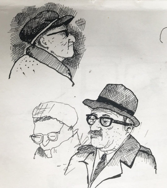
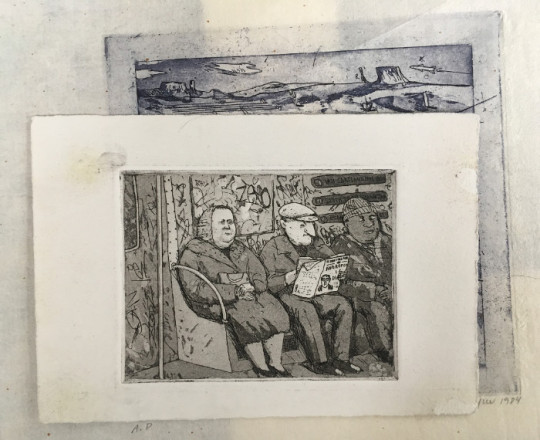
While I was a student, I did an exchange in New York: Cooper Union Art College for three months. These drawings are of Jewish immigrants, meeting for coffee. It was 1984, so many of them were still alive; refugees from Germany or Austria. I heard them speaking German, so that’s how I knew.
Sketchbooks are such a good way of memorising things. Nobody really knows about these sketchbooks; I used to take them to interviews, but they’ve been hidden away for years.
After I graduated, I moved to London and took my portfolio around. My art teacher had suggested I should do this to get work, so that’s what I did. In those days, you had to ring them and ask to come around. I got two commissions straight away, and it’s been busy ever since, really. I’ve always had something to do.
Here’s some of my early commissions. Starting from 1985, I guess. Very pointy noses...
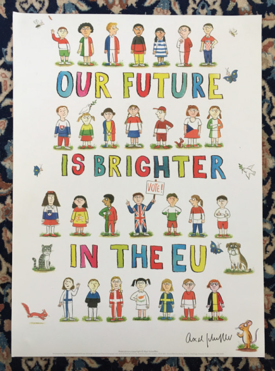
I did so much of this kind of work. It was a good way of earning money quickly. Occasionally, I still do editorial. I did some Brexit drawings for the remain campaign. Sadly, it didn’t help. Maybe I wrecked everything!
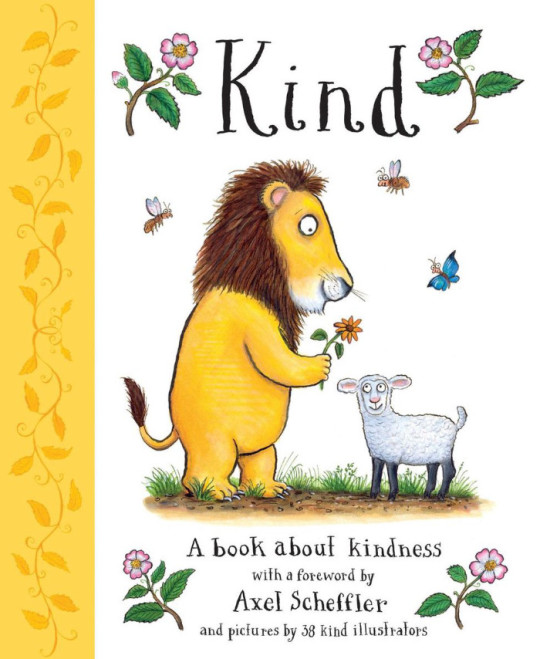
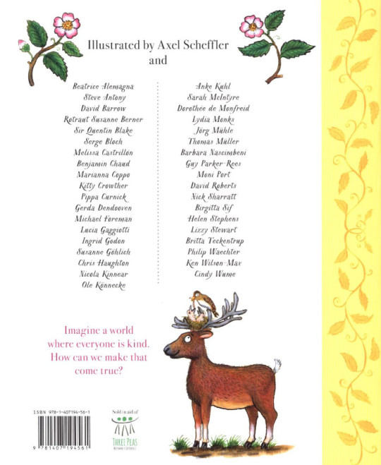
I’ll say a few words about the KIND book... 38 wonderful artists donated a picture to illustrate some of the many ways children can be kind. Such as sharing their toys or helping people from other countries to feel welcome.
One pound from each book sold goes to the Three Peas charity, which supports refugees from war-torn countries. It’s been a big success so far, and Three Peas has received a lot of money from sales in the UK and co-editions.
I’d quite like to do the UNKIND book next! I think illustrators would probably enjoy that, but I don’t imagine it would sell very well.
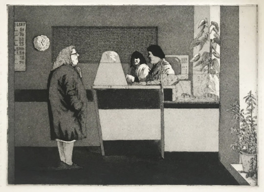
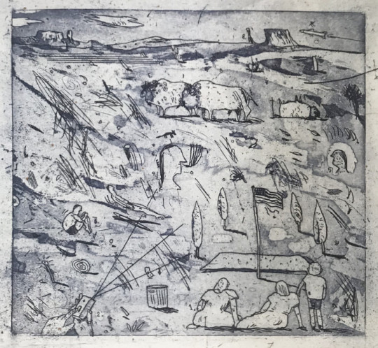
And now for something completely different! Some etchings I made when I was a student.
People often ask me which illustrators I’m inspired by. I don’t seek any direct influence on my work, but I’ve always said that Tomi Ungerer had the greatest influence on my approach to illustration. Although his style is quite different to mine, this humour and wackiness is something that has always appealed to me. And the details.
William Steig is someone I got into later, when I was already illustrating. And Edward Gorey of course. And Saul Steinberg. I think the Czech artist Jiří Šalamoun is wonderful. And I like Eva Lindström from Sweden a lot. She’s so great.
Okay, to finish with I’ll talk about the coronavirus work I’ve been doing...
I asked myself what I could do as a children’s illustrator to inform, as well as entertain, my readers here and abroad about the coronavirus. So I was glad when Nosy Crow asked me to illustrate a book on the subject. I think it’s extremely important for children and families to have access to reliable information in this unprecedented crisis.
You can download the free digital book in English here, and in over 60 other languages here.
I also wanted to do something light-hearted to cheer people up, and I thought, “What if I imagine some of our characters in corona situations?” Julia liked the idea and wrote rhymes for the new scenes. This was really more about entertainment than serious information.
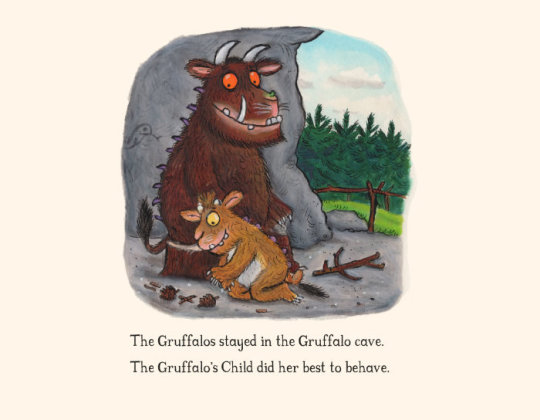
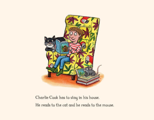
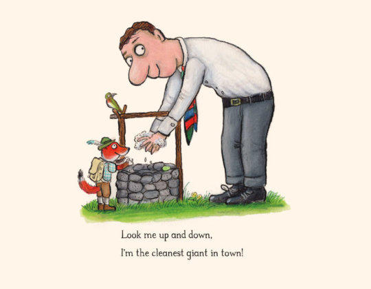
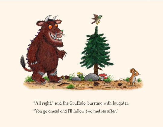
Artwork and verse © Axel Scheffler and Julia Donaldson 2020. Based on characters from ‘The Gruffalo’s Child’ (2004), ‘Charlie Cook’s Favourite Book’ (2005), ‘The Smartest Giant in Town’ (2002), and ‘The Gruffalo’ (1999) — © Macmillan Children’s Books.
And here’s one more thing: my ‘letter from lockdown’. On The Children’s Bookshow website, you’ll find lockdown letters from lots of other wonderful authors and illustrators.
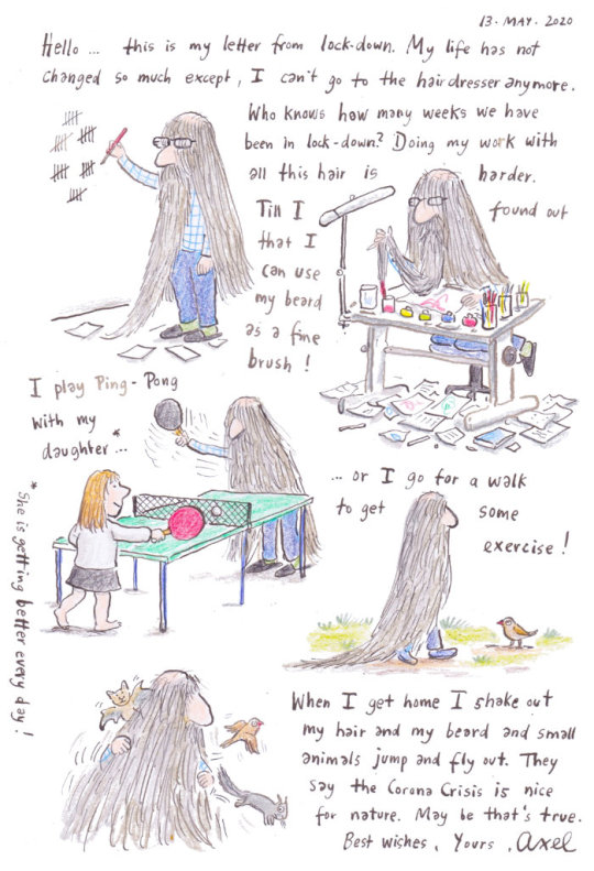
Illustrations © Axel Scheffler. Post edited by dPICTUS.
Buy this picturebook
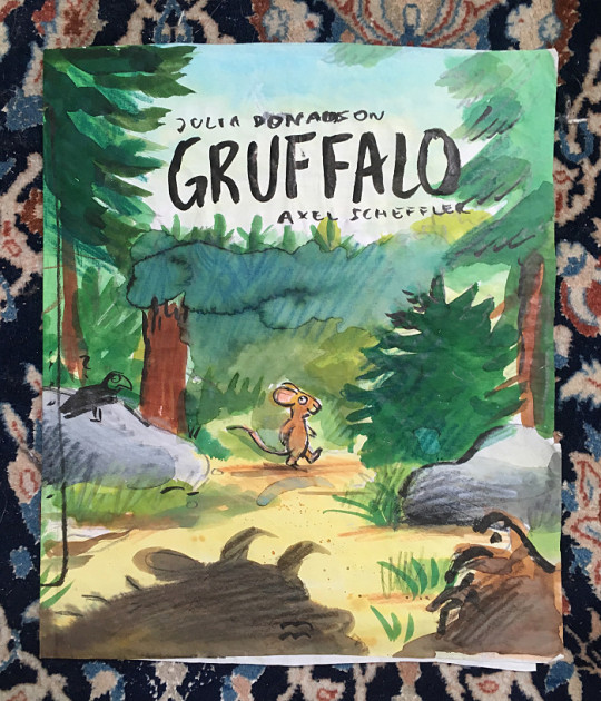
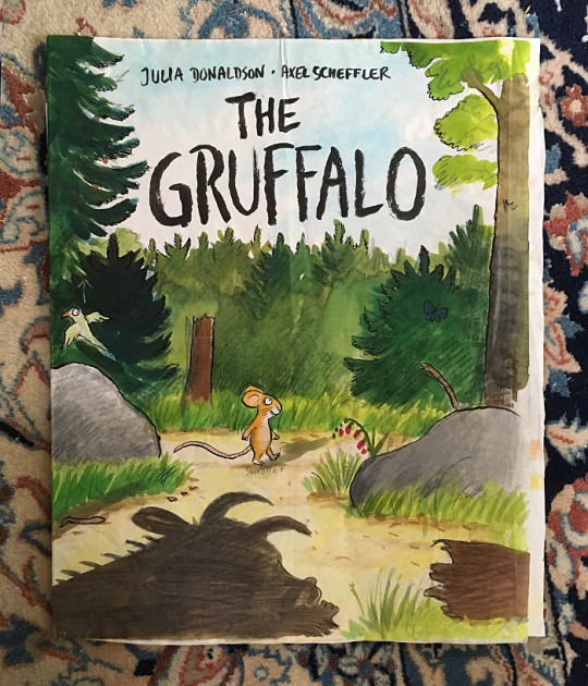
The Gruffalo
Julia Donaldson & Axel Scheffler
Macmillan Children’s Books, UK, 1999
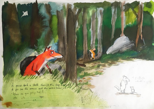
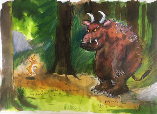
‘A mouse took a stroll through the deep dark wood. A fox saw the mouse and the mouse looked good.’
Walk further into the deep dark wood, and discover what happens when a quick-witted mouse comes face to face with an owl, a snake... and a hungry Gruffalo!
‘The Gruffalo’ has become a bestselling phenomenon across the world. This award-winning rhyming story of a mouse and a monster is now a modern classic, and will enchant children for years to come.
PUBLISHED IN THE FOLLOWING LANGUAGES & DIALECTS
Afrikaans
Albanian
Arabic
Australian
Azerbaijani
Basque
Belarusian
Bengali
Breton
Bulgaria
Catalan
Chinese (Simplified)
Chinese (Traditional)
Corsu
Croatian
Czech
Danish
Doric
Dundonian
Dutch
English
Esperanto
Estonian
Faroese
Farsi
Finnish
French
Frisian
Gaelic
Galician
Georgian
German
Glasgow Scots
Greek
Guernésiais
Hebrew
Hindi
Hungarian
Iceland
Indonesian
Irish
Italian
Jèrriais
Kazakh
Kölsch
Korean
Latin
Latvian
Lithuanian
Low German
Lowland Scots
Luxembourgish
Macedonian
Maltese
Manx Gaelic
Maori
Marathi
Mexican Spanish
Mongolian
Norwegian
Orcadian Scots
Polish
Portuguese
Portuguese (Brazil)
Romanian
Russian
Sami
Schwabisch
Serbian
Sesotho
Setswana
Shetland Scots
Slovakian
Slovenian
Spanish
Swedish
Swiss German
Tamil
Thai
Turkish
Ukrainian
US English
Vietnamese
Welsh
Xhosa
Zulu
Buy this picturebook
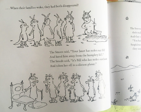
The Smeds and The Smoos
Julia Donaldson & Axel Scheffler
Alison Green Books, UK, 2019
The Smeds (who are red) never mix with the Smoos (who are blue). So when a young Smed and Smoo fall in love, their families disapprove.
But peace is restored and love conquers all in this happiest of love stories. There’s even a gorgeous purple baby to celebrate!
PUBLISHED IN THE FOLLOWING LANGUAGES
Afrikaans
Catalan
Croatian
Dutch
English
Finnish
French
German
Hebrew
Hungarian
Italian
Korean
Luxenbourghish
Polish
Russian
Slovenian
Spanish
Swedish
Turkish
Ukrainian

Buy this picturebook
Kind
Alison Green, Axel Scheffler & 38 illustrators
Alison Green Books, UK, 2019
Imagine a world where everyone is kind; how can we make that come true? With gorgeous pictures by a host of top illustrators, KIND is a timely, inspiring picturebook about the many ways children can be kind, from sharing their toys and games, to helping those from other countries feel welcome.
One pound from the sale of each printed copy will go to the Three Peas charity, which gives vital help to refugees from war-torn countries.
PUBLISHED IN THE FOLLOWING LANGUAGES
Bulgarian
Catalan
Chinese (Simplified)
Chinese (Traditional)
English
French
German
Greek
Hebrew
Italian
Korean
Netherlands
Portuguese (Brazil)
Romanian
Spanish
Swedish
Turkish
Vietnamese
2 notes
·
View notes
Text
A creative collaboration!
by Cardinale and Becky
Cardinale -
A couple of weeks ago, Becky and I were chatting about a story page for CFT - (which you can find here - Tales of Wonder and Wisdom — Carry Forth Tradition. ) I had been asked to record stories for a podcast series,‘Tales of Wisdom’, a few years ago. I had done a lot of classical singing in my life but never recorded. I loved reading to my children when they were young, and my mother and Omi read the old classics to us - Grimm’s, Hans Christian Anderson, Lagerlof and so on - on a daily basis. My father could spin a tale on the spot and in no time would have us mesmerized or rolling on the ground in giggles… so I thought, why not? Can’t be that hard (haha).
The point was to keep the wealth of wisdom, wonder, culture, and tradition in these stories and make them accessible to young (and old!), so with that as the goal, our little team dove in and braved the learning curve. It was a truly rewarding experience. I had written a column for the Epoch Times (A Berkshire Journal) for a while, so the writing came in handy too, as many of the stories had to be re-written into a format that could be narrated. We ended up incorporating some of the pieces from the column, too, and over time, I was more at ease with the process. The program came to an end a year later, but I kept collecting stories and trusted that when the time was right, there would be a place to share them….
And then Becky created CFT, and now the stories will come alive again.
Most of the older stories have many variations, as for the most part, they would have been passed down orally and made their way around the world, taking on different cultural aspects. We’ve decided most of the ones we share will be re-written for CFT based on the original stories, and that the illustrations will be done by CFT artist contributors. That process in itself makes the story become even more alive through collaboration.
Today we launched our first effort, a Jamaican folktale that (CFT contributor) Ioanna Kalogirou had recently told me about. The story sounded really interesting, and again, there are a few variations to be found. It’s a bit of a haunting tale with a lyrical quality, so it called to be written in a kind of prose-style. I guess I was imagining ‘telling’ it, as I wrote. It will lend itself well to recording at some point. Then Becky magically produced a stunning woodpecker, and, there it was! We thought we would share a little bit about the creative process involved in bringing these wisdom tales from all over the world to life. Hopefully it will inspire you to have a go! Enjoy!
BROTHER WOODPECKER — Carry Forth Tradition
Becky -
When Cardinale said she had a story in mind, a folk tale, I offered to draw something for her. Recently I find myself home schooling myself to improve my art skills. It’s been a very difficult time for everyone, and I notice I find some light relief when fully absorbed being creative. I know how good it makes me feel when I see or read other people’s uplifting work, so this is encouraging me to develop my own abilities. I can think of nothing better than creating beautiful, uplifting and interesting pieces of art combined with traditional stories to brighten up someone else’s day.
Cardinale asked if I could draw or paint a woodpecker, something I have never done before and I wasn’t really sure what to do. I’ve also never been asked to draw something before, and with a specific purpose. I wasn’t sure whether to ink it or do a watercolour - I’m not an expert at either. I really am a ‘wanna-be artist’ who spends more time thinking, planning and reading about other people’s art, or watching videos of how to do it, or reading theory about art, but without actually doing much of my own work. The master procrastinator; and this has actually stopped me from doing anything, or moving forward. There was always a reason why I couldn’t.
I recently discovered that once I sit down and make a few marks that it all seems to start flowing out of me. Utterly magical.
My lovely sister bought me some beautiful, colourful ‘precision brush pens’ for Christmas by Creativepeak and mum, who is an artist, bought me some incredibly magical watercolour paints by Derwent a few weeks ago. I have Sakura Pigma Micron inking pens which I love using, and recently, to carry on with the metallic theme, I bought myself some of Derwent’s metallic pencils which also turn out to be watercolour pencils (thanks for telling me Paula!), Faber Castell metallic highlighters, and Sakura Gellyroll metallic gel pens (the list here is deliberate in case you feel some inspiration and don’t know what pens to buy - these are all my current favourites). And I have various pads, papers, for various mediums, rulers, erasers, brushes, the easel, the works…. Actually, I have no excuses now, nothing to stop me form creating my own mini ‘masterpieces’ - BUT what I didn’t account for, something I have recently begun to understand and experience, and what I am now gearing up for, is the STAMINA I need to carry through any piece of work I begin! It is really hard work and needs incredible focus. I’m very good at starting things and not finishing them and this collaboration wouldn’t allow for that approach.
Eventually, after sitting quietly for a while digging deep into my thoughts and heart, with an anonymous photo of a Jamaican Woodpecker I found on the internet staring at me from my screen, it suddenly dawned on me that I needn’t panic, or give up, or freak out, or feel pressure, or worry about whether it would be good enough or if it was the right choice of image to take inspiration from or whether it would accompany the story properly………. so I just grabbed what was most comfortable for me to handle and I sketched the woodpecker. I used my favourite mechanical Tombow pencil, yes I have a favourite pencil, it makes me more careful and considerate as I draw. I took a photograph of it, as it had occurred to me that as we are all about inspiring other people to ‘have a go’, it might be interesting for others to see the different stages of the creative process. Then I inked it, and was surprised it looked ok, and took another photograph. Then I added the vibrant colours with my brush pens, which are lovely to work with because they come with a water brush (a brush with a container attached to it which you fill with water so you can squeeze it and control the flow to get water into the brush) which you use to blend the colours together giving it a watercolour look. Jamaica is a really colourful place and I thought it might help illustrate the story and I must admit I was pleased with the result. It is good to see I have made some progress, and also really good to see where I can improve my skills. It’s a wonderful, magical, boundless journey in itself!
Below are some photos of the different stages it went through. Mum thinks it took me about three hours. Three hours of ignoring all the thoughts about all the other zillions of things I need to do, or worry about, or tidy up, or answer to…. and people wonder why many artist have untidy houses, but doesn’t cheerful art brighten up the world? I’d say it’s worth it then, I can sleep soundly tonight knowing that I may just cheer someone up and that my conscience has been nourished.
0 notes
Photo

History Behind the Story - The Baby Princess
Queen Victoria and Prince Albert’s first child, Victoria Adelaide Mary Louisa, the Princess Royal, was born at Buckingham Palace on the 21st of November 1840. The real baby Vicky was actually nicknamed “Pussy” for the first few years of her life - something the ITV series chooses not to recreate!
Read more about the baby Princess under the cut.
Queen Victoria and Prince Albert’s first child arrived three weeks early, taking everyone by surprise. ‘Just before the early hours of the morning of the 21rst[of November]’ Victoria wrote in her journal, she had woken feeling ‘very uncomfortable & with difficulty aroused Albert from his sleep’:
Tried to get to sleep again, but by 4, I got very bad and both the Doctors arrived. My beloved Albert was so dear & kind. [The Doctor] said the Baby was on the way & everything was all right. We both expressed joy that the event was at hand, & I did not feel at all nervous.
Unusually for the era, Prince Albert stayed with his wife throughout her labour. He was, wrote Victoria, ‘the greatest comfort and support.’ The baby arrived at two that afternoon (‘alas! a girl & not a boy, as we both had so hoped & wished for’) and was immediately whisked away ‘stark naked’ to be shown to the official witnesses including the Prime Minister, Lord Melbourne, the Foreign Minister and the Archbishop of Canterbury.
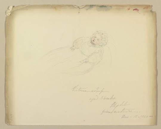
“Victoria asleep, aged 3 weeks” - pen and watercolour sketch by Queen Victoria dated 12th December 1840 (Royal Collection)
Queen Victoria recovered quickly from the birth - a day later she ‘felt as well as if nothing had happened’ and by mid-December happily reported that she was ‘walking about the house like myself again.’ Both mother and baby were strong enough to travel to Windsor for Christmas. Victoria had chosen not to breastfeed her new daughter, and hired instead a Mrs Ratsey of Cowes, Isle of Wight, to act as wet nurse. Mrs Ratsey was required to show deference to the baby’s rank by always standing while she breastfed her.
Baby Victoria, or “Pussy” as her parents began to affectionately call her, slotted in easily to Queen Victoria and Prince Albert’s busy lives. She was brought down from the nursery to see them twice a day - once after breakfast and again in the afternoon when Victoria changed for dinner. Victoria loved to show off her daughter to visitors to the place, and would produce the baby for even her cabinet ministers to see. On the 11th of December 1840 Victoria proudly described ‘our dear little Child’ in her journal:
She gets daily prettier, & is so "éveillé" [alert] for her age. I hope & think she will be like her beloved Father. She has large, bright, dark blue eyes, a nice little nose & mouth, a very good complexion, with a little colour in her cheeks, very unusual, for so young a Baby.

Lithograph of Victoria, Princess Royal with her parents Queen Victoria and Prince Albert. Published by William Spooner c.1840. (British Museum)
The doting parents micromanaged every aspect of baby Vicky’s infant life. Prince Albert wrote long memoranda outlining how the nursery should be run - the Princess was not to be left alone, she couldn’t be shown to anyone or taken out of the nursery without the express permission of her parents, and the nurses had to consult either the Queen or Prince Albert before they acted on the doctor’s orders. Prince Albert even slept with the key to the nursery under his pillow.
The baby Princess was christened in the Throne Room at Buckingham Palace on the 9th of February 1841, her parent’s first wedding anniversary. She was given the names “Victoria Adelaide Mary Louisa” after her mother, both grandmothers, and Queen Victoria’s aunt, the Dowager Queen Adelaide. Victoria recorded the day in her journal:
Today it is a year, that I have been blessed by becoming the wife of my beloved Albert. What perfect happiness I have enjoyed since then! & how I pray it may continue. This anniversary must ever be the most precious one in my life. — Albert gave me a little brooch representing a cradle with the Child in it, — the quaintest thing I ever saw & so pretty.
[... I] Dressed in a white ribbed silk gown, trimmed with my wedding lace, with my diamond Diadem, necklace of Turkish diamonds, & Albert's beautiful sapphire & diamond brooch. He was in his Field Marshal's uniform with high boots, & looked so handsome. We went into the Green Drawingroom & received all the Company. When all had arrived, the Archbishops of Canterbury & York, the Bishops of London & Norwich, & the Dean of Carlisle (as Vicar of the Parish in which our child was born) went into the Throne Room, which was very handsomely filled up as a Chapel. We 2, with our suite, went in soon after we then sent for the Child who looked very dear in a white Honiton point lace robe & mantle, over white satin. [...] The Archbishop of Canterbury christened the Baby from the new Font, & with water from the river Jordan, sent by Dr Browning for the purpose. The names the child was given were: Victoria, Adelaide, Mary Louisa. She was wide awake & never cried, though the Archbishop held her most uncomfortably. My sincere & fervent Prayers were offered up for our dear Child. [...] Albert a I agreed that all had gone off beautifully & in a very dignified manner.
Albert wrote proudly that his daughter was:
awake, but did not cry at all, and seemed to crow with immense satisfaction at the sights and brilliant uniforms, for she is very intelligent and observing.

Princess Victoria’s christening as painted by Charles Robert Leslie c. 1841-2. Adelaide, the Queen Dowager, whom the Princess was named after, steps forward to name the baby. (Royal Collection)
Albert had designed his daughter’s christening font himself (silver gilt with cherubs and waterlilies to represent purity and new life), and he composed a chorale for the banquet held that evening in the princess’ honour. The centerpiece of the grand occasion was a tiered christening cake topped with an edible sugar figure of Britannia holding a tiny sugar Vicky. Lady Sarah Lyttleton (who was later appointed governess to the royal children) was among the attendees. In a letter to her daughter, Lady Lyttleton described her impression of the baby princess:
She is a fine, fat, firm, fair, royal-looking baby, sitting bolt upright, and too absurdly like the Queen; grave, calm, and penetrating in her look, most gentle and sweet-tempered. She wore a very plain white pelisse of muslin, and a droll little Quaker-shaped straw bonnet; no bows or bustle about her, and she surveyed us all most composedly for a minute. She was shewn at her carriage-window to all the standers-by, and it was amusing to us who followed to see the universal grin left upon all faces after their look at her. She will soon have seen every pair of teeth in the kingdom. They say she laughs, crows, and kicks very heartily, and the Prince tosses her often.
Although both of her parents had initially felt disappointed that Vicky was not the son and heir they had hoped for, they had quickly became besotted. Albert in particular doted upon his baby daughter and the pair remained close throughout their lives. 'Our young lady flourishes exceedingly,’ wrote Queen Victoria to her uncle Leopold when the princess was six weeks old:
I think you would be amused to see Albert dancing with her in his arms; he makes such a capital nurse (which I do not, and she is much too heavy for me to carry), and she already seems so happy to go to him.
There is a popular myth that Queen Victoria hated her own children, largely inspired by a series of letters she wrote to Vicky in the 1850s and 60s after Vicky had married and was beginning to have children of her own. Victoria, who had by this stage had given birth to nine children (and likely suffered postpartum depression after some of the births), wrote that being pregnant made her feel ‘like a cow or a dog’ and that she disliked very little babies:
I have no tendre [fondness] for them until they become a little human; an ugly baby is a very nasty object - and the prettiest is frightful when undressed - till about four months; in short as long as they have their big bodies and little limbs and that terrible frog-like action.
But sensational articles like “Queen Victoria hated her children, say academics” (Telegraph, 2012) and “Queen Victoria adored Prince Albert so much it made her loath her nine children” (Mirror, 2016) do not tell the whole story. Queen Victoria had a whole host of complex feelings about motherhood, including a deep and sincere love for her children. In another letter to Vicky, she reminisced fondly about her daughter’s babyhood:
[...] though I hated the thought having children and have no adoration for very little babies, (particularly not in their baths till they are past 3 or 4 months, when they really become very lovely) still I know what a fuss and piece of work was made of you [...] I used to have you in my dressing room - while I dressed for dinner, dancing on Mrs Pegley’s [the nurse] knees - till you got so lively that you did not sleep at night. All that was very foolish, and I warn you against it - but one is very foolish with one’s first child.
Miniature of the Princess Royal as an angel by Sir William Ross, signed and dated 1841. Prince Albert had this miniature copied and made into an enamel brooch set with sapphires, rubies, emeralds, diamonds and topazes which he gave to his wife that year for Christmas. Victoria was ‘delighted’. (Royal Collection)
Further Reading:
Queen Victoria’s letters and journals
An Uncommon Woman: The Empress Frederick by Hannah Pakula
Queen Victoria’s Children by John van der Kiste
Victoria the Queen by Julia Baird
#i try to be brief#but these get longer and longer#victoria princess royal#queen victoria#prince albert#itv victoria#victoria itv#victoria series#victoria series 2#2x01#a soldier's daughter#jenna coleman#tom hughes#artist: queen victoria#queen victoria's journals#william ross#william spooner#lithograph#painting#portrait#charles robert leslie#royalty#royal history#british royal family#british royalty#royal collection#british museum#history behind the story#victoria spoilers
15 notes
·
View notes
Text
Week 4 - Guest Speakers
Over a course of two weeks, we had the pleasure of welcoming different guest speakers, coming from graphic design, illustration and animation backgrounds. It was a great experience as I haven’t had the opportunity to attend a talk from a professional designer, nevermind three different ones from various industries.
The first guest speaker that came to the university was Korky Paul, an award-winning illustrator of children’s books, most famous for his work for the Winnie The Witch books. These are books I owned and loved when I was younger, so I was really excited to meet the illustrator behind them! The Winnie The Witch books are worked on with Valerie Thomas, who writes the text – the two don’t have a personal relationship, despite collaborating on many books together as all the work between the two is done through their editors and agents; I found this particularly interesting, as I thought authors and illustrators often worked closely together.
The talked consisted of Paul giving an insight to his work process, describing in detail how he starts an illustration, right until the finished product. Paul creates his work with bright watercolour paints and pen and ink; his work is recognisable by an anarchic yet detailed style. Each illustration take roughly five days to complete due to the detail; in a standard 32 page picture book layout, which Paul described, there are about 24 pages of illustration as the other pages are used for titles, copyright text etc – this information was extremely useful, as now, if I were to create my own picture book, I would know the layout and what each page consists of. Typically, the illustrations Paul creates are over a double page spread, so he creates 12. As a starting point, Paul researches the object he is going to draw. In this case, the process he described came from Winnie’s Dinosaur Day book – the key subject is dinosaurs, so Paul looked at images of dinosaurs, their habitats and behaviour. He noted that he was surprised that no one really knows what colour dinosaurs really were, which gave him the freedom to paint them any colour he wanted; he normally creates quite realistic work, as stated earlier, so being able to pick any colour to work with was exciting. After this, Paul studies the text he has been given; he strongly pointed out that there must be a connection between the text and images as the Winnie The Witch books are children books, and the images exist to help them understand the text, which is why they must reflect the text. A first rough draft of a drawing that is inspired by the text is created. Paul doesn’t simply create this on a clean sheet - he considers the layout of the book, so the text has its own space, enabling it to stand out, and not be covered by images. He also considers bleed and trim when it comes to printing, so he isn’t drawing on edges that will be cut off.

The first rough draft (image belongs to Korky Paul)
After the first draft of the drawing is created, he uses a photocopier to enlarge the drawing to the correct print size, and places this on a lightbox, a vital tool when it comes to illustrating considering to him, making it easier for him to copy what he’s already drawn. The drawing is the improved by fixing composition, design and text positioning. Inks, specifically Kanadahar drawing inks and a dip pen, are used to draw over the pencil lines, and those are then erased. The photocopier is then again used – this time to copy the drawing onto watercolour paper. Again, pencil lines are drawn over with same inks, then erased. Before using watercolours, masking fluid is used as a base, then peeled off. Then, the painting beings – Paul uses Schminke Horadam Aquarelle watercolours. He starts by painting the background, then midground, and foreground last.

Painting progress, and finished painting (image belong to Korky Paul)
All the finished drawings are lastly scanned into his Mac, where he uses InDesign to place them into a document which is then sent to his editors.
Images placed in InDesign (image belongs to Korky Paul)
During the talk, Paul shared his drawings of all the illustrations he had done for this book, and we were able to see the in person the rough drafts, outlined images and the finished ones - this was really inspiring as it was a different experience getting to look at it in person and seeing all the detail close-up, rather than just what was being shown in the presentation. I took some images of the outlined images; I got given page 24 and 25 to look at, which again was interesting as I got to see what the other illustrations in the same book were like.


The second guest speaker was a former University of Derby student, Ian Cherry. Cherry has passion for sports, especially football, and this is what he focuses his graphic design work on as he specialises in designing typefaces that are used on back of football shirts. He currently works at the Derby County Football Club, and has an impressive history of designing for clubs like Real Madrid, Manchester United and Hull City. Cherry’s talk consisted of his journey from leaving university to now, which was really interesting and inspiring as it was relatable to me.

Cherry’s first job was at a sports company - SportingiD, which focused on personalising sports kits. Cherry was a Design Assistant - he applied for the role when still at university; despite not having the required experience, his hunger to succeed and passion for sport made him stand out and get the job. Cherry mentioned that the difference between time given at university and in a job has a massive difference - at university, the time given allows for a lot of potential ideas to be explored, developed and experimented with, whereas at a job, the time given always varies - sometimes as little as a couple of hours can be given as a deadline, but that’s just the reality of working as a designer in an unpredictable field that is sports. Ideas are rarely sketched and developed; having to learn to come up with good ideas quick is a vital skill, and one that comes with more practice and experience. After being a Design Assistant for a while, there was nothing but success that followed - Cherry was promoted to Graphic Designer, and designed for many football clubs including the famous Real Madrid three times, all thanks to his creative fonts, attention to detail and ability to work fast. This lead to another promotion - Senior Graphic Designer, which eventually lead him to go back to Derby as he got the most out of that job as he could. He was offered a job as the only Graphic Designer at Derby County Football Club. There, he designed a font that is not only used for the shirts, but the football club as a whole - the font is featured on posters, social media material, season tickets etc. The current campaign he described is dedicated to football fans, with the slogan “nothing without u”, appearing prominently on all Derby County Football Club material. Cherry touched upon that all the images used were taken by a photographer who specifically works for Derby County Football Club - he doesn’t use internet or stock images. This ensures that he always has the copyright to the images he uses, as well as originality as no one else will have access to these photos. Although, there is a downside to this - picking out images can be very time consuming, as you are unable to search for one specific image as you are when using Google Image search for example.

Cherry noted that the campaign covers all sorts of formats, such as digital and the physical tickets, so the typeface and images used must be flexible and adaptable in order to fit every format. Cherry oversees two designers where he currently work, and describes his job as no week being the same - consistency appears at times, but the job is unpredictable which makes it really exciting and busy.
The last guest speaker was the animator Samantha Moore, an award winning animator and researcher. Moore specialises in creating animated documentaries; she had a breakthrough with ‘doubled up’ (https://vimeo.com/19516862), an animated documentary about the artist's shock at finding out she’s pregnant with twins, to music by artist Adam Goddard, shown on Channel 4 and many festivals after. The film was praised for touching on the topic of balance between being a mother and an artist, which isn’t covered in mainstream media. Following this, Moore created animated documentaries such as ‘An Eyeful of Sound’ (https://vimeo.com/11649675), a visualisation of life with synaesthesia; the short film takes a selection of every day sounds and animates the responses of real people who suffer from synaesthesia put together to music and sounds from Adam Goddard once more, as well as ‘Loop’ which animates molecules and scientific process via 3D modeled animation, worked on with Dr Serge Mostowy at Imperial College London. This video is used to explain how the cytoskeleton responds to intracellular pathogens by assembling into septin cages within a zebrafish infection. Moore collaborates with experts on the subject she is focusing her animation on very often, and is one of the things she’s most known for - this is the same for music as she always works with music professionals to create sounds, and never uses anything pre-recorded. She also works with real people when researching and interviewing, and always ensures she’s accurate and always sends her process to check back and see if what she’s created matches the experiences of the people she interviewed - this was very important in the living with synaesthesia project for example. Moore also often sketches and photographs her visits to inspire her and help her create ideas, as well as ensuring her work is accurate again if she has photographs and sketches to refer back to. Despite this, Moore still mainly works digitally, although the project she is working on currently, ‘Bloomers’, a film about an underwear factory in Manchester is created by printing on fabric, meaning it’s something different to what she creates normally.
To me, the visit from Ian Cherry was most inspirational as he focused on graphic design and the industry I aspire to be working in soon, therefore it was important to listen to a successful journey from graduating to where Cherry is at now. I also loved how he was a student at the university, as I got a taste to experience a real, successful University of Derby graduate story. I am not dismissing the talks from Paul and Moore - there were elements in both their talks which were interesting and related to me, such as Paul’s mixed media and experimental journey to the finished illustration, as well as Moore’s advice and tips on collaborating, but the talk from Ian Cherry was just most interesting and inspiring to me personally.
0 notes
Text
Hello, my name is Brenda Jiral and I am originally from Rochester, Michigan. I currently live in Hamilton, Michigan with my husband and two of my three children. I have been drawn to art for as long as I can remember. I see beauty in things that most people would simply pass over or dismiss.
Sunlight Breaking Through
Sunny Day
Like the way bright sunshine creates the most beautiful shadows; full of color and life. Or the multitude of color shifts that are in the human eye or a flower. I am frequently mesmerized by the dazzling light that bounces off a lake in the morning sun, and the range of colors in every rock and weed under the water’s surface.
Enchanted
I have been “making art” since I was a child, so, it was a natural progression for me to become an artist. I believe it’s what I was created to do. I studied fine art at college, but after three years, I decided to put higher education “on hold” in order to pursue my other dream: motherhood. I got married, had three beautiful children, and devoted my life to my family. The only creative outlet during those years were the many craft projects I would do with my children.
Dogwood Leaves
Once they were all in school, I was finally in a position to dust off my dreams of creating art and see what I could do with it. After taking the few watercolor painting classes that were available at our local art center, I was left to my own devices. So, from then on, I became self-taught. I poured over every book and video I could get my hands on at the local library, and watched every You-tube tutorial I could find. And I experimented: A LOT!
Sunlit Shore
My father was also an artist, and one of the things he said all of the time is that “art is 10% talent and 90% work” -Alfred M. Ponte. That doesn’t dismiss natural, God-given talent, but rather, it puts the emphasis on what you DO with that talent. You can either sit on it and do nothing with it, or you can work your tail off to develop it and share it with the world. I’ve chosen the latter, I worked hard, and now I enjoy teaching others what I’ve learned. “Your talent is God’s gift to you; what you do with it is your gift back to God.” -Leo Buscaglia.
Pomegranate
For the past two and a half decades, I have lived with chronic pain and illness. To say that it’s been hard would be a gross understatement. I don’t share this often, because most people really don’t know what to do with that information. And honestly, I’ve been judged harshly all too often.
And I don’t share it to get attention or because I feel sorry for myself. I share it in hopes that if there is someone else out there, struggling with health issues, my story would give them hope. That maybe there’s a purpose for this struggle and something good can come out of it.
Resilience Sketch
Resilience
I don’t have one of those inspiring, miracle stories. I will most likely be in pain and ill for the rest of my life. And I have come to terms with that. This story is more about how art has helped me through some of the darkest days of my life. Art has been a blessing in so many ways. I am so very grateful for the gift it is in my life! There have been days that, because of the pain or the endlessness of it all, I felt really down.
And rather than dwelling on that and allowing it to get out of control, I would go downstairs to my studio in an effort to take my mind off of the pain. At first, it can be like pushing a rope. I may not “feel” inspired or excited about what I’m doing, but I choose to do it because I know I need it. I may be just doing a little sketching in my journal or pushing some paint around on a scrap of watercolor paper, or whatever.
Trees & Hills
But at some point, I realize I no longer feel down. Don’t get me wrong, the pain is still there, but my heart feels a little lighter and I am excited about what I’m doing. And that’s when the paint has begun to work its magic on me. I feel joy and peace and alive again! And that’s when I remember: I’m going to be ok.
In spite of the health issues, I still try to teach a few classes or workshops per year. It’s not nearly as much as I would like to be doing, because I love to teach, but for now it will be enough. Maybe someday, I will enjoy better health and be able to do all of the things I want to do with my art, but for now, my life is full.
My Process And How I Got Here
When I was in high school, my art teacher expected a sketchbook full of drawings every term. How I dreaded that deadline! I really didn’t like to draw. I know that sounds crazy, since I am so passionate about All-things-ART. But I really didn’t like to “waste time” in my sketchbook. (That’s the way I felt about it then).
I wanted to do the serious art, not sketch! How silly I was back then; I cringe when I think about how much energy I spent avoiding my sketchbook. I’d wait until the day or two before the deadline and just throw it all together, giving only the bare minimum in order to get the grade.
Kohlrabi
Fast-forward to my early days learning to paint in watercolor. I would get so frustrated with my attempts to draw something in order to then paint it. All I wanted to do was paint, but my efforts showed my lack of drawing ability. I was reminded of my art teacher’s insistence on mastering the basics, and realized that I had failed to build a foundation before I started to “build the house”.
So, I went back. I began the discipline of forcing myself to draw at every opportunity. After all, I had a lot of time to make up! I put a sketchbook in my kitchen, so I could draw during breakfast and lunch and one downstairs, in my studio. I also put one in my car to draw while waiting for my kids to finish sports practice or orthodontist appointments. Eventually, I began to love to draw. I began to see the wisdom of building a foundation of this basic skill. Now, I don’t go anywhere without my sketchbook or watercolor journal. I travel with it and record memories and I draw, draw, draw.
Driftwood
Pink Geraniums
My creative process varies on the project I am working on at the time. If I am looking for a new painting idea, I will often go to my sketchbooks and “mine” them for inspiration. I will also pour over the thousands of photos I have taken over the years for just the right image that speaks to me. I also keep a running list of painting ideas, and sometimes I fear that there won’t be enough time to do them all.
Like I said earlier, a lot of my paintings begin in my sketchbook or watercolor journal. Some of my favorite ways of drawing is contour drawing, blind contour drawing or continuous line drawing. I am drawn to this technique because there is a decisiveness and character to the line that otherwise wouldn’t be there. Rather than a sketchy line, which is hesitant and unsure, the contour line that I employ feels confidant and sure. And rather than going for a photographically realistic look, or an architecturally accurate line, this line expresses more of the freedom I’m after and attracted to in nature. It feels more organic and personal to me.
Single Tree
Continuous Line Drawing
Over the years, I have tried many different brands of paint and watercolor paper and I have no plans on settling on any one kind. I’m all about experimenting and exploring. In fact, I don’t consider myself a traditional watercolor “purist”, but rather, an experimental, mixed media artist, because I will never stop experimenting with new mediums and techniques. That’s what excites me the most about art: that I will be learning until the day I die!
Mossy Tree
Mossy Stump
When it comes to watercolors, I mainly use Daniel Smith and Winsor & Newton paints. And for paper, I love Arches cold press and Winsor & Newton brand. In addition to those, one of my favorite discoveries a few years ago is mineral paper. I am so in love with this surface! It’s smooth and so receptive to watercolor and ink line drawing. I have found two brands so far: Yasutomo Mineral paper, which comes in only two sizes, and Terraskin Stone paper. (This one is a little more difficult to find, but what a gem!)
I also love to use Caran D’Ache Neocolor II water-soluble wax pastels, Derwent Inktense Blocks and watercolor pencils and a variety of water-soluble ink pens. And I can’t leave out my trusty fountain pen that I use for a lot of my drawings in my watercolor journals!
Yellowstone
In closing, I would like to thank Charlie at Doodlewash for allowing me to share my story and my love of art with others. And thank you, fellow-art explorer, for taking the time to read my story.
Benda Jiral Website Facebook Doodlewash
GUEST ARTIST: "How Art Helps Me Through the Difficult Days" by Brenda Jiral - #doodlewash #WorldWatercolorGroup #watercolor #watercolour #art Hello, my name is Brenda Jiral and I am originally from Rochester, Michigan. I currently live in Hamilton, Michigan with my husband and two of my three children.
#WorldWatercolorGroup#art#art therapy#artist#doodlewash#drawing#featured#painting#sketchbook#Sketchbooks#sketching#watercolor#watercolor sketching#watercolour
0 notes
Text
Hello, I’m Clare. I live and work in North Devon with my boyfriend Sam and our cheerful 18 month old little boy. I have always enjoyed painting, drawing and crafts of all types. My Dad is an artist, though he’d never admit it!
I can’t remember a time that I wouldn’t sit down and sketch away. After school, during lunch breaks, weekends – I’ve always spent every free moment creating something. More recently, my painting sessions have got shorter, limited to a snatched few hours during our little boy’s naps, or evenings when I’m not too wiped out, but I still grab every chance I get!
I’ve never formally studied art, unless you count GCSE level! I studied French, Spanish and Russian at the University of Exeter and am now a copywriter by profession. Back when it came to choosing a degree, I was tempted to indulge my love of art and embark on a degree in illustration, but I was put off by the competitiveness of the industry and the freelance nature of the work.
EPSON MFP image
Now though, I would love nothing more than to be a freelance illustrator. I feel that doors are opening to me slowly, having had a few commissions recently which are leading in the right direction, but I’m a long way off even considering it as my only source of income.
So, Why Watercolour?
In the past I’ve tried my hand at a lot of different media, from acrylics to pastels, collage to gouache. Over recent years, watercolours have become my firm favourite. It’s so easy to pick up my palette and just paint. I love the versatility of watercolours, but what I’ve come to enjoy the most is the way you can blend and overlay colours with glazes and gradients.
Everything I have learnt has been from experimentation, watching YouTube videos and using other artists’ work for inspiration.
Colour selection has long been one of my biggest challenges. Probably due to the fact I’ve never studied art, I’ve never had the best grasp of colour theory. I can appreciate great colour combinations I see them in other peoples’ work, but I find picking colours to use in my own paintings very difficult.
Just recently, I’ve resorted to consulting Pinterest for colour inspiration, and forcing myself to stick to a limited palette in order to create more harmonious pieces. It’s been like a painting epiphany and I now feel much more confident in choosing my palette.
My Materials
My Winsor & Newton paints are one of my favourite possessions. I would save them in a fire. I’d want them with me if I was washed up on a desert island. If I go away for a few days without them, I miss them.
It hasn’t taken me long to form such a close bond with my watercolour set. I bought it about three years ago on my first, and regrettably only, visit to a Cass Art shop in London (a drawback to living out in the sticks). Seriously that place is artists’ heaven – so much beautiful, quality equipment at reasonable prices. Anyway, I treated myself to a Winsor & Newton professional watercolour set with 24 pans and haven’t looked back.
The colours I use most are Paynes Grey for shadows, Permanent Sap Green, Winsor Yellow, Winsor Red and French Ultramarine, as well as several browns and orange.
As for brushes, I’m not very adventurous. I tend to just stick to my trusty two – a Daler Rowney Aquafine Round size 6 and a Rosemary & Co Series 301 size 3 for finer details. I fish out my larger brushes for bigger pieces, but at the moment most of what I do is in my sketchbook, so these smaller sizes suit me just fine.
I’m not a snob when it comes to paper, I’ve even had people looking down on my cheapy sketchbook and pads of WHSmith’s own brand watercolour paper. The truth is, most of the time I’m painting for myself, and I secretly like the cockles in my sketchbook which leave it looking fat and bursting as it grows more full.
I should counter that with a disclaimer though, whenever I’m doing illustration work for a client, I switch to artist quality paper, usually Bockingford. To date, my biggest commission was an illustrated map of the Thames to feature in boat hire company ‘Le Boat’s’ tourist guide.
What’s My Style?
I don’t think I have a style. At least, I’m still trying to find it! I’m not sure I’ll ever be happy to just work in one style though, as experimenting keeps me motivated. There’s always more progress to be made, another step towards becoming an accomplished artist, so I’m reluctant to find a style and commit to it forever more.
EPSON MFP image
If pushed to describe my style, I’d have to say relatively detailed and always realistic. I also make layered paintings, combining my love of watercolour with my second love, paper cutting.
Below is a poster for a theatrical production of The Ugly Duckling and Other Tales.
The following layered piece was my first painting which I’ve ever had exhibited, selected to be displayed at the Burton Art Gallery, Bideford during their annual open exhibition. I painted from reference photos taken of people one morning going about their business in Bideford.
How Do I Paint?
I always begin with a purple coloured pencil line drawing. I learnt from another artist that if used lightly, the purple lines practically disappear with the watercolours, and it also doesn’t risk muddying the colours like a soft graphite pencil might.
Sometimes I leave the line work at that and use the paint itself for definition, as in my wildlife paintings, but other times I use a black Micron 005 and 01 for outlines. For my last couple of paintings I’ve used a dip pen and ink; definitely a technique I want to pursue further.
I paint in layers, starting with very light colours and building them up, using glazing to create depth. I usually use Paynes Grey for shadows, or sometimes mix a bit of the opposite colour on the colour wheel to give a more realistic colour. I can’t say I never use black, because I do on occasion mix a little in with Paynes Grey, but most of the time I avoid it.
Blending colours when the paint is still wet makes my heart sing. So cheesy. But seeing colours flooding into each other and drying into such beautiful gradients is perfection! I have learnt that using flat colours is what has made my paintings boring and lifeless in the past, so now I always try to pick out subtle differences in colour and reflect this in the layers I apply.
Artists I Love
When it comes to artists I find inspiring, I could go on forever! My favourite changes on a regular basis, every time I find someone new whose work I’m excited by. Here’s who I’m loving right now: Matteus Urbanowicz, Holly Exley, Jérémy Soheylian, Katya Mihailina, Minnie Small and everyone on the Urban Sketching Facebook group!
I hope you’ve enjoyed my ramblings and photos of my work. I’m extremely flattered to have been asked by Charlie O’Shields to be a guest artist among such accomplished painters!
Clare Willcocks Website/Blog Portfolio Facebook Instagram Doodlewash Gallery
#WorldWatercolorGroup - GUEST ARTIST: "Happy Experiments..." by Clare Willcocks #doodlewash Hello, I'm Clare. I live and work in North Devon with my boyfriend Sam and our cheerful 18 month old little boy.
#WorldWatercolorGroup#artist#doodlewash#featured#food#illustration#illustrator#painting#UK#watercolor#watercolour
0 notes