#information design
Explore tagged Tumblr posts
Visit Tumblr Blog
Explore Tumblr blogs with no restrictions, modern design and the best experience.
Last Seen Tumblr Blogs


Fun Fact
Kazakhstan’s Minister of Communications and Informatics has blocked the Tumblr site because it contained 60 sites of terrorism, extremism, and pornography in 2015.
Text
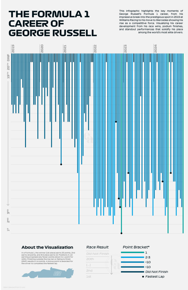
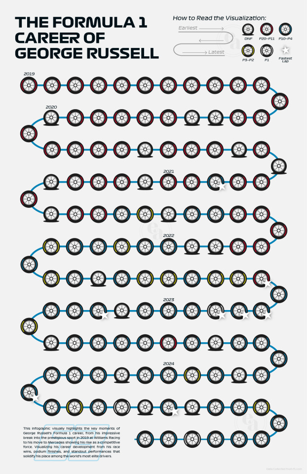
The Formula 1 Career of George Russell: A Visualization
2 Teams. 128 Career Races. 711 Career Points. 8 Fastest Laps.
George's Russell's entire Formula 1 career thus far is summarized and displayed visually in these two infographics. Exploring data visualization design through the extensive and detailed data provided by Formula 1 on their website, I was able to compare the difference between more formal and statistical design against creative and symbolic design options.
(Note: The infographic on the left was my final assignment submission and thus the information ended just after the Vegas GP 2024 weekend because of where the due date fell in the F1 calendar.)
#i loveee how in the one on the right to can literally see when he switched teams LOL#the one on the left is my favourite because it just shows data patterns so nicely#not that anyone asked but i got 100% on this assignment mwah#thank you george this ones for you baybee#f1#formula 1#f1 data#george russell#george russell f1#information design#infographic#f1 art#formula 1 art#mercedes f1#williams f1#graphic design#f1 fanart#gr63#fanart#formula one fanart#formula 1 fanart
31 notes
·
View notes
Text
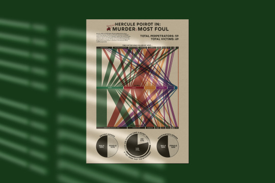
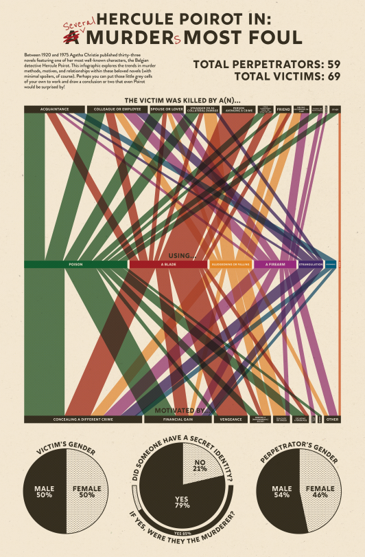
An Agatha Christie infographic for my information design class! Featuring so, so many crimes
Data sourced from the Agatha Christie Wiki and Hercule Poirot books Wikipedia pages
#agatha christie#hercule poirot#poirot#agatha christie’s poirot#poirot series#murder mystery#infographic#info design#information design#graph#parallel sets#graphic design
51 notes
·
View notes
Text


☠️ Bone-Appétit ☠️
Drawtober 3: Devious Dining
All you need to know is that the meat is delicious.
~✦~✦~✦~✦~✦~✦~✦~✦~✦~✦~
✦ Like my art? Consider supporting me: Ko-fi. For custom art for personal use, view my Commission Info. For graphic design/art for business purposes, i.e to make profit from reselling the work as a product, using it for advertising/promotion, etc., view my Contract Details on my website: emilylaj.com/contract-details. ✦
#drawtober#devious dining#drawtober 2023#halloween#artists on tumblr#drawtober 3#halloween 2023#skull#skull and crossbones#line art#menu#logo design#illustration#poster#graphic design#typography#digital art#illustration design#vector art#information design#menu design#my art#text#purple
2 notes
·
View notes
Text
Learning by Accident On Purpose
Getting Fired on Friday Yay Friday! I’ve received a few new assignments at work. I love creating decks and working with information. Organizing, simplifying, and turning it into something that makes sense on the first read. (that last part needs work). I usually dump everything that’s in my head then I need lots of time to organize/simplify it. Do I love working with data more than I love…
#blog growth#blog strategy#blogging lessons#content creation#Creative Process#digital storytelling#information design#journaling#learning by doing#Personal Reflection#plugins#reader to search#SEO#UX writing#web visibility#website upgrade#WordPress Business Plan
0 notes
Text
New listings added today! (5/5/25): So, where do we go from here? That's the main question following the closing of STC. Here are some suggestions that I've gathered: #techcomm
#business communication#Communication#content#Content management#content strategy#Design#digital literacy#education#elearning#globalization#indexing#information architecture#information design#information development#instructional design#knowledge management#learning and development#localization#medical writing#proposal management#proposal writing#scientific communication#service innovation#talent development#tech comm#Technical communication#technical communications#technical editing#technical writing#technology
0 notes

Text
corian solid surface products manufacturer in Turkey🇹🇷
www.maryfass.com
shopping mall / column / ceiling / decor / restroom / table / kitchen / counter / information desk / signboard / stair / custom size and colors
corian / porcelain / quartz / marble slabs made in turkiye #solidsurface #porcelain #corian #quartz #coriancountertops #kitchencountertops #bathroomcabinet #marblesink #showerpan #showertray #hoteldesign #tophotelprojects #interiordesign #interiordesinger #construction #residentaldesign #hospitalitydesign #hospitalityindustry #shoppingmall #architectdesign #kitchenisland #kitchencabinets #kitcheninteriors #modernkitchen #dreamkitchen #homekitchen #calacatta #carrara #furniture #decoration #coriansink #kitchensink
#maryfass#madeinturkey#solidsurfaces#corian#solidsurface#showertray#coriancountertops#basin#interiordesign#architectdesign#shopping mall#column design#information design#restroom partitions
0 notes
Text


The longer I work as a designer, the more certain I am that other artists are my favorite clients. I love collaborating with local musicians and seeing the impact my work can have for them. So, once again, I’m here to talk about supporting your local music scene. Every dollar you spend at a local show goes further—not just for you, but for the artists and venues you’re supporting—than it ever could anywhere else.
This graphic was created back in 2016. Since then, we’ve lost many of these artists and venues. Let’s do our part to ensure we don’t lose any more. _ 🔗 Learn more: shoutgraphics.design/projects/print/listen-local/
#shout#shout! graphics#shout!#branding#shout graphics#poster#print design#graphic design#information design#local art#local music#local venues#shiii whaaa#a bad night for a hero#infographic#blind the thief#we are not a glum lot#knight in colors#flux capacitor#7th circle collective#rhinoceropolis#hi-dive#hi dive#the deer pile
0 notes
Text
Connecting the Dots in Data

How do we design information so that it doesn’t overwhelm the reader?
FactorDaily’s latest story, ‘The Crying Shame of Image-Based Abuse’, went live this month. Written by Rohini Lakshané, who is a technologist, researcher and Wikimedian, the article gives an overall view of how Image-Based Sexual Abuse is prevalent in our society and the culture of shaming has made it convenient for women to be made easy targets.
I had been itching to work on a story backed by data so that I could try working on infographics and untangle complicated subjects into understandable chunks. I have often felt that when we work with data, we go astray from the insights and indulge too much in the stats. While data and graphs are essential and play a crucial role in analysis, as a reader, I believe the narrative and boiling down of insights are vital aspects that must be kept at the forefront when designing infographics. Rohini’s story had data, but it turned out that the journey mapping of how non-consensual images are captured and then floated out into the world of the internet before getting recycled again and again became the key visual piece for the story. The world of image-based sexual abuse runs deep, and having a core image that could map the perpetrators, their motives, and their modus operandi will help the reader get an overview of the subject.
The complicated part about the distribution of non-consensual images is that the source, destination, and intermediary are often interchangeable. My initial attempt was to address this, but it burdened one map to accommodate more information than it could manage. I wanted the graphics to be as low-tech as possible so that they could be adapted across different formats without compromising what it meant to do.

Breaking down the information into chunks for clarity

Sketching out the mapping of information for infographics
Creating three different infographics was a better way of disseminating the information. The first one was about mapping, where the capturing of non-consensual and consensual images takes place. The second focuses solely on the perpetrators, their motives, and what channels are used to distribute NCII (Non-Consensual Intimate Images). The last graphic focuses on how NCII gets posted and recycled in an incident. I will be discussing the latter one here in this post. I wanted the graphics not to be compromised by the screen size. Seeing beautiful infographics squished to illegible size on a handheld device is saddening. To counter this, I first worked for the smallest screen size, dictating the way the illustrations shaped up for the infographic. Since the illustrations had to work in small sizes, I kept the details minimal but gave them a slightly angular look to suggest the discomfort of the subject matter. The idea was to avoid creating stereotypical visuals, often putting the spotlight on women as victims. It was important to stay objective and look at the infographics to communicate subtle suggestions of the jarring reality the article discusses.


Sketching the visual language and creating the illustrations with a colour palette that has strong contrast
I first created a structure to tackle the flow of information. This stage is best done with neutral greys, so your emphasis is more on comprehensibility than stylisation. My initial attempt at stylising the graphic went overboard, and it started to create unnecessary interpretations, such as the Infographic looking like a tree. It’s essential to dial down and ask yourself what you want the reader to see and discard anything becoming baggage. I cut down the extra fluff, which helped me add further layers of information, such as how the NCII flows from one network to another on distribution channels. My partial colour blindness lends a particular brutality when I work with colour. Using colours in graphics is like using salt in cooking; it has to be just the right amount. I stayed away from dull colours because while the subject matter is not on the bright side, the visual needs to stand out when scrolling on a device, and secondly, the more colourful and noticeable range in the colour palette helps in the segregation of information.


A vertical flow of content for viewing the infographic on phone screen

Infographic for viewing on Desktop
I customised each of the graphics for three different screen sizes: desktop, tablet, and phone, but the reshaping of the content for the print output made it further enjoyable. Rohini was going to talk about IBSA at the Asia Pacific Feminist Forum and wanted to take a set of flyers for it. Working with print is often exciting because the format can be extremely playful, and you get to capture the audience’s attention in a focused manner because this is not Instagram or a Chrome tab that you can switch to. I tried to work with folds of paper based on the lead illustration for the story. The illustration attempts to put the reader into the shoes of the perpetrator, who is trying to look at a woman changing her clothes. When you unfold the paper, the undressed parts are revealed. The act of this is meant to spotlight the perpetrator first, and then you get the overview of the story through different graphics and tables highlighting the critical parts of the story.


Flat view of the flyer when unfolded
A well-designed output is like a competent driver getting a good engine, and we need more thoughtful design in the societal work to take the conversation further.
Reposted from FactorDaily's Medium page.
1 note
·
View note
Text
hero/villain showdown but one of them has a spontaneous medical emergency and the battle gets put on hold while their archnemesis drives them to Urgent Care
#it should be like. a hernia. or diverticulitis#something intestinal for maximum Awkward Scenario#and the entire car ride alternates between awkward silence and the driver lecturing their nemesis on the importance of regular check-ups#this is funnier if the hero is the one having the hernia tbh. but both options are Very Good#want to emphasize that it is a 'medical emergency ' that is clearly not extreme enough for the emergency room#and the sidekick/henchperson gets stuck in traffic so the hero/villain stays for moral support#they spend 8 hours in the waiting room playing Uno (it devolves into a screaming match)#at the end of the ordeal one of them vows to burn the hospital to the ground with their laser eye powers#and it's Not The One You Think#oh oh oh! ALTERNATIVELY:#it's an allergic reaction; one of them accidentally poisoned the other by using like. soybean derivative in a tranquilizer dart#emphasis on *accidentally*. yes they were technically fighting but That Wasn't Supposed To Happen#so now they're obligated to take responsibility and Stay In The Waiting Room#(can't decide if it's funnier if it's the hero or the villain stuck in this situation)#(probably the villain)#“why didn't you TELL me you were allergic to soybeans???”#“um because you would use it against me in combat?”#“as opposed to NOT telling me! which has worked out fantastic for you!!!”#villain being genuinely offended bc they have a biochemistry degree and have invented literally dozens of untraceable poisons#they have the scientific skill to poison their favorite jackass in hundreds of ways#(and have done so before! in admittedly non-fatal outcomes but that was by design okay)#but it's “dangerous” to do them the simple curtesy of informing them about a SOY ALLERGY????#above all else they consider themself a scientist#and they're LIVID that their favorite (reluctant) test subject lied about their medical history#“technically i didn't LIE--#“I read you the questionnaire! the very first time i held u hostage i READ YOU THE QUESTIONNAIRE!!!”#“...the what now”#“the MEDI--holy shit you weren't even paying attention were you#i had you bound and gagged over an ACTUAL BUBBLING ACID PIT and you couldn't even be bothered to--#“--so i was obviously a bit BUSY at that moment! I'm sorry i ignored your VILLAINOUS MONOLOGUING while the BLOOD WAS RUSHING TO MY HEAD but
7K notes
·
View notes
Text
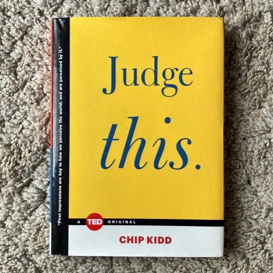
Chip Kidd: Judge This (2015)
1 note
·
View note
Text
A collection of chart designs.
0 notes
Text
The page is filled with links to superb critical thinking about the world.
1 note
·
View note
Text
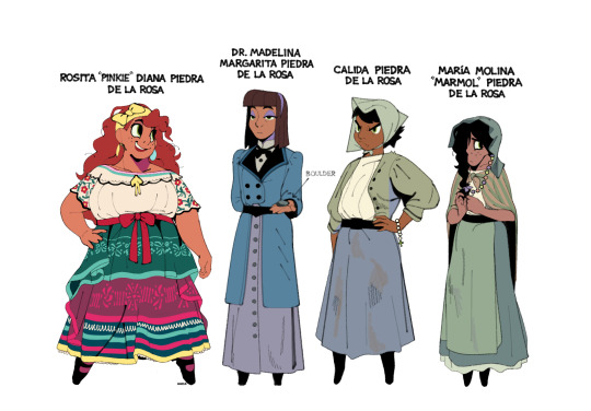
The Piedra sisters.
Born and raised in a small mining town in New Mexico. Calida and María Molina have stayed behind to support their parents while Rosita and Madelina have gone off to pursue their dreams. Madelina recently obtained her Ph.D. in geology from Las Cruces College. Rosita works as a baking apprentice and entertainer in Ponyville, Nebraska. Madelina is the eldest, Calida the middle child, and Rosita and María Molina (non-identical) twins.
#mlp#pinkie pie#maud pie#limestone pie#marble pie#my art#fanart#character designs#the grand galloping 20s#ty to everyone who helped with their names#hopefully the puns in their names work#some quick design notes: i wanted all the sisters to wear a dress/skirt; belt; and some sort of hairband that informs their#personality. so pinkie has bows all over. maud has a buttoned skirt and very basic hairband. limestone and marble wear bonnets#their bonnets are also meant to mirror the shape of their wacky hair in the show#they all sorta stand on their tippy toes too#no reason why#also gave pinkie and marble the same eye shape freckles and curly hair to show they're still twins
7K notes
·
View notes
Text
So, where do we go from here?
So, where do we go from here? That's the main question following the closing of STC. Here are some suggestions that I've gathered: #techcomm
In the aftermath of STC closing, there’s just a lot going on. As the Board VP who is still involved in closing activities, I’ve seen a range of emotions from those who’ve claimed a connection with STC. Most are sad but understand that we had to do what we had to do, and showed appreciation for the organization over the years. Other have expressed things…differently. I have words for those people…
#business communication#Communication#content#Content management#content strategy#Design#digital literacy#elearning#globalization#indexing#information architecture#information design#information development#instructional design#knowledge management#learning and development#localization#medical writing#proposal management#proposal writing#scientific communication#service innovation#talent development#tech comm#Technical communication#technical communications#technical editing#technical writing#translation#user design
0 notes