#instead of using someone else's psd
Explore tagged Tumblr posts
Visit Tumblr Blog
Explore Tumblr blogs with no restrictions, modern design and the best experience.
Last Seen Tumblr Blogs


Fun Fact
Tumblr was the first site to host the blog for President Barack Obama in 2011.
Text

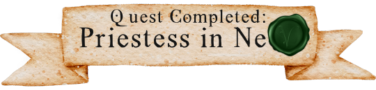
Made some video game style quest banners for my dnd group, and I'm really proud of how they turned out!!! I spent a solid 30-60+ minutes making three separate seals, and 2/3 of them aren't going to ever get used. So here's pics of them:
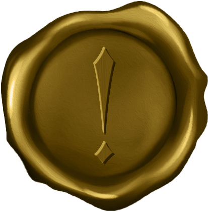
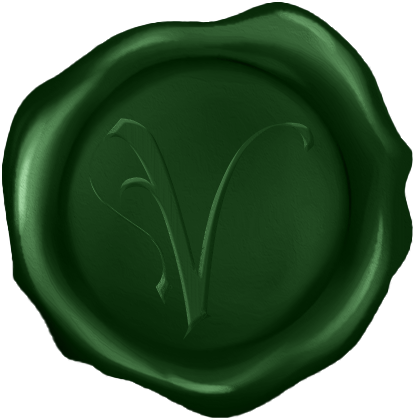
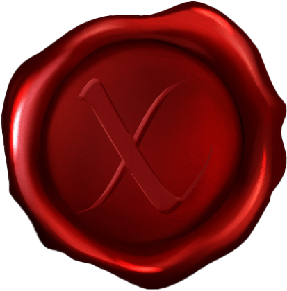
(Quest acquired, quest completed, and quest failed.)
Here's the original image I started with and used as a base for all three versions:
#morrigan.text#graphic design#my designs#the seals were inspired by the seals/icons in the quest journal in P:WotR because of course they were.#also I shit you not but this font is called greco-roman lubed wrestling. which made all of us lose our fucking minds bc we have a running#joke about oil wresting / mud wrestling in the campaign and it does happen to be greek myth inspired.#if anyone would ever want me to clean up this template and share it I can. Right now the PSDs are disasters with a ton of excess layers#but if someone were interested I could clean them up and upload them.#they're insanely large and I had to resize them to get them to even upload to discord but I could change that too.#in fact I probably should for my own sake lmao.#or at least the sake of my computer's storage space...#although I do have a whole unused terabyte of space. but still. I don't need these things to be 8k pixels wide.#I just didn't pay attention to how big the parchment banner image was and sized everything else to fit that instead of resizing THAT.
8 notes
·
View notes
Text
COMMON TERMS IN EDITBLR & THEIR MEANINGS. — guide by Aria.
* this post includes long texts.

KIN / ME TAGS
usually used by fictionkins who dont like doubles. "No Kin/Me tags" means you cant tag the character in the post as your kin, nor as "you", "irl you", or similar, usually due to the OP being uncomfortable with it. just respect it.
F/O TAGS
f/o (standing for fictional other; a character one selfships with, often romantic but can also be platonic, familial, or more) tags are essentially the same as the previous; OP probably is a self-shipper (also known as Yume, but could also be a Riako) of such character, and does not want other Yumes to tag the character as "their partner/wife/husband/love", or otherwise similar terms reflecting the user having a relationship with the character.
F2U or FTU
F2U, or FTU (standing for free to use) means... exactly what you think; usage of the creation posted is allowed to the public.
NF2U or NFTU
...the opposite. usage of the work is not allowed. the OP can sometimes also add "unless [user/name] afterwards, meaning only the one mentioned can use it.
CREDIT
pretty basic in every community. leave the OP's user somewhere visible; some have preferences of how they like to be given credit, such as; Linking, (linking their post or profile to a text, usually pinned post or your bio,) @'ing them, or just Adding their user somewhere visible (again, such as a bio or pinned post.)
REPOST & REBLOG
these two have a big difference. reblog is when you click the button on the app that looks like this -> 🔁, and repost is when you save the work and post it somewhere else. never repost someone's work unless they allow it, but reblogs are always nice.
PLAIN TEXT / TRANSLATION
tons of people here use typing quirks and/or fonts that some cant read, find difficult to read, or break screenreaders, which obviously bothers them a lot. plain texts/translations are versions of the same texts that are easier to read, having no typing quirks, fonts, symbols, or whatever was making it difficult/impossible to read and such.
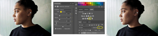
PSD
stands for photoshop document. can be used on photopea or photoshop. when using these, it saves the project file and when opened has each layer, instead of the flat image. the term PSD is often used for colorings that alter the colors of your picture to custom ones with settings made by the creator, but it can be used for anything.
^^ NOTE: read this please ^__^ my wording came out wrong but this kind person explained. it better
USING AS BASE
commonly used for psds. this means you cannot grab the psd, and... use it as a base, adding your own layers to it and making it your own.
if any of these are incorrect shoot me an ask and i'l change it asap. thanks.

#tutorial.pdf#sorry for long text oops#i always feel the need to overexplain myself even if im bad at it#rentry resources#rentry help#rentry tutorial#rentryblr#editblr#editblr help#editblr terms#editblr guide
123 notes
·
View notes
Note
hullo! i really love your psd colourings and i was wondering if you have any tips on making them?
Hiiii ummm!! THANK YOU!! I just recommend trying everything and getting really well acquainted with what each adjustment layer in photoshop can do. When I'm making PSDs I try to focus on over all balance of the colors. Hence also why I'm a huge fan of color correction in PJSK art and the like. When making PSDs I recommend using more than one type of source (2D, 3D, etc.) especially if you want to make PSDs that work for dark skin. It's okay to do things that you don't see other people doing, also.
Recently, I had to reach out to a few friends to figure out how to do something I had never tried before, so I think talking to people that you know edit and make PSDs is super helpful.
A lot of my work is based around 'do I like this?' and if the answer is no I keep working on it (unless I'm making something for someone else LOL). Trust your own aesthetic sense instead of worrying about what other people will think. Do weird shit. Try to do the opposite of what you usually do. Play with colors you like and don't worry about colors you don't like. It's all fine, because you're slowly developing a skill. Like, you have to keep in mind this is a skill people hone, it's not like we woke up one day and knew how to edit in photoshop MY OLD EDITS ARE SO UGLY. I used to only edit by using a dark purple Pin Light layer and fighting with color overlays LIKE. IT GETS BETTER. It's great a lot of people now start with adjustment layers instead JGIOREJGIOREGJDFKL
Don't ever take color specific requests unless you want to bash your head into photoshop for 8 years also because then you're worrying about if you've got the color right and it's frustrating bc the PSD looks better a DIFFERENT way and you're missing the color you wanted and - <- you see? This is the devil. Do whatever you want forever.
#i could probably talk more abt things so if you have specific questions come off anon and i'll try to help :)#also i have a psd blog @normalsolutions :thumbsup:
7 notes
·
View notes
Note
Honestly you're one of my favorite blogs and I adore how you edit and your style- I don't interact all that much due to school and not being on Tumblr much to fill my queue to keep active, but I'm probably going to end up practically spam queuing up your edits because they're absolutely scrumptious!
I'm not all that popular of an edit blog either- though I have taken a bit of a break, and you're definitely very underrated for the wonderful quality of edits you have!
Thank you very much, anon, you’re appealing to my ego a lot here and.. it’s so awfully very kind of you.
I mean I have come a long way in two years, I’ve definitely improved so so much from my earliest work and I’m proud of my growth as an editor. The problem I face though is that I feel like a lot of editors and editblr nowadays is just… very samey for me not gonna lie. And even if someone is only editing for, say, a few months and they’re a couple years younger than me, they’re still producing the same level of editing as everyone else I see. I don’t know how to make those popular gif and still image headers. I don’t like the popular lace image, it isn’t my style at all. I don’t use PSDs because they confuse me and I don’t have a PC or any software, all I have is ibis. I don’t mean to ramble here, but it’s merely how I myself view what I do against all the other editors.
I do feel sometimes this kind of invisible peer pressure to resort to more popular editing styles, with all the pastel colours and laces, but I don’t follow that because I feel like if I did, I would lose my identity as an editor. And yet the problem is I’m seeing all these editors who have been here for say a month or two and they’ve had this storm in requests and followers and they’re having milestones every month or two. It’s taken me two years and I’ve yet to get to 300. And while yes I started exclusively as a kin blog for a fandom, and then widened my reach, it’s.. still depressing.
But yk what? At the end of the day I’d rather keep my identity as an editor even if I stay small and my sources are obscure. I’m proud of myself and that’s what matters. My only hope is people don’t start exclusively requesting the themed flags instead of my many many edit types!
/gen for all of this, I’ve had a terrible few months. Here’s hoping June will be better. Happy Pride Month anon. Sorry I sound like I’m drunk. I’m not.
3 notes
·
View notes
Text
Temp Rules
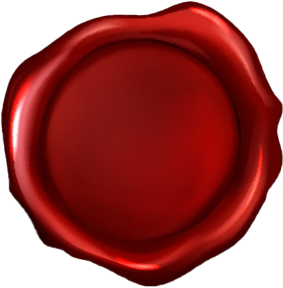
PSD Credit: Gumball by Kaijucatrph
This Interpretation of Piers follows Fudj's SWSH Rewrite where in the past Spikemuth was a much larger, livelier city that even hosted the Galar League Finals. However when Rose constructed Wyndon the Galar League Finals were moved there instead and the stadium along with much of Spikemuth was either destroyed or abandoned. However I will also be using canon & headcanon in my interpretation here too so it's not a 1 for 1 follow of Fudj's rewrite.
General rp etiquette applies. IE. No god-modding, don’t be pushy for replies, don’t reblog IC things you’re not a part of, don’t kill/severely injure my muse without mun’s permission first, etc.
Mun is not muse IE. Muse may say or do things mun does not agree with and vice versa.
Memes do not have an expiration date(unless the meme specifies IE. First five get kisses, etc). So if one sees an old meme they'd like to send, feel free to do so.
I will hard block anyone who sexualizes children or teenagers. This is the first and final warning.
Don't vague blog about me or anyone else on the dash. If you have an issue with me or someone else bring it up front with them directly. I'm not here for vague blogging, I will block people for it.
I will not interact with muses from Hazbin Hotel / Helluva Boss / Zoophobia, Villainous, Boyfriend to Death, South Park, Hetalia, Attack on Titan or muses for IRL People (IE. Idols, Youtubers, Celebrities, Historical Figures, etc.)
I do not tolerate the use of AI generated images for icons, graphics, etc. Nor do I tolerate the use of AI writing for replies. I feel AI generated images & writing are a form of art theft and will block anyone I see using it. If one does use it I request they block me as well.
I don’t want any racists, LGBT+Phobes of any kind, Pedophiles, Nazis or general nasties following me. If I see anyone acting in this way I’ll block them on the spot.
All triggers will be tagged as 'Trigger tw'. This blog will deal heavily with themes of suicidal ideation, depression and parentification
I'm Keres. I'm 29, I'm white, I have autism, AVPD, BPD and I run several other blogs. My Gloria blog which is technically attached to this one is @galarglory
1 note
·
View note
Text
How I Set Up Recolor Actions!
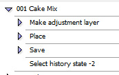
if you saw me hit post early on this, no you didn't
I'm having to re-re-redo my CS2 actions, so I figured I'd post a quick primer on what steps I use, both to be helpful and so that if I'm missing something that'll save me headache later, someone else can yell at me.
All of these steps occur on a newly-opened DDS or PSD. If you have adjustments to make on a file before recoloring it, I recommend saving, closing, and reopening it (or a duplicate of it) to keep the history on it simple.
Make Adjustment Layer Recorded by running your recolor steps Mine is a gradient map, but if your recolor action is a multi-step process, record all those steps here. It's functionally the same.
Place Recorded by using the File>Place... context menu This one's important! I have a spot in S4S where I keep a file that is always titled overlay.png. If you're ever recoloring something that has parts you don't want to be hit by the recolor, cut it out and save it as a .png that you can retitle to overlay and plop in that folder. The Place step will insert it as a layer on top of your recolor, perfectly aligned on the canvas IF you don't display mipmaps. Lifesaver for stuff like eyes, buttons, etc. If your recolor doesn't have any overlays, keep a same-sized PNG that's fully empty in as overlay.png.
Save Recorded by saving the file (ctrl+shift+S) You'll probably need to make two sets of macros if you use both DDSes and PNGs, and it'll also need to be redone if you change your save file location. But you can do that somewhat faster by copying the entire folder of palette actions, deleting the save step, and just going through one by one on the actions to re-record it to the proper format/file name/location/etc.
Select history state -2 Recorded by going to the History palette and selecting the state directly before the recolor actions began. And now undo it all! This preps for the next color to be applied, and keeps you from having a big buildup of overlay layers floating on your project. Note that the number of history states displayed will change depending on how many steps are in your recolor process. And that's it! At least, for my process. I would recommend having all recolor actions per each palette you work with in their own folder, and then make a new folder for All-In-Ones where you make a new action whose entire purpose is to play all of a palette's actions in one shot so you can set it and walk away for a bit. And then if you're like I was when I first started, you have an action to play all those actions, and you decide you're gonna recolor everything in 16 or 17 whole-ass palettes, and then you get burnt out from having to take so many preview screenshots and quit. ... Maybe don't do that, actually. Regardless, there you go! Do let me know if you have any questions! I'm always happy to help people out with stuff like this. (especially if you start cake mixing stuff with me. what who said that.) Maybe next I'll make a cheat sheet on how I set up my S4S self-importing macro and troubleshooting it... Semi Important Note: If your computer has an SSD, constantly writing and rewriting the same files over and over can ding away at its health. If you have an external hard drive, you can set the files up to save there instead, and hold shift when deleting the DDSes/PNGs to skip over the Recycle Bin and have them be immediately deleted.
#s4cc recolor#ts4 recolor#i hope this helps someone!#come recolor things in Cake Mix with me#it's got such good unnat colors#anyway countdown to someone telling me there's an easier way in three... two... one...#also remind me to tell you about my zombie external hard drive some time if that sounds even a little interesting
0 notes
Text
~controversial opinion~ time but does anybody else think it’s super hypocritical for people to say “credit to the artist” (without actually crediting the artist or linking their work) but then immediately follow it up with “don’t steal my icons”. like i hate to say it but you’re literally using someone’s artwork without permission and without any suggestion of who said artist is, and then claiming ownership over it. that’s stealing my guy
#and i'm not saying like you're a dick if you do that or a bad person#i just think... artists get done real dirty in the rpc#if you can credit every tiny tweak of a format and psd#you can credit the art and blood/sweat/tears that the artist put into it#instead of just 'credit to whoever made this:)' which is very uhm. unhelpful#like i don't think saying you should use all your art with permission is ever going to fly because people cba#reaching out to artists and finding out#but... at least credit openly and visibly#bc really if you're not using your own psd you're cropping someone else's art etc etc you've really done the bare minimum of work#and if someone bumps your icons they are not doing anything much worse than you are#but that is just my God Honest opinion#(& again it isn't a sign of decrepit morals - i just think people don't... show a lot of compassion to artists!!!!)#(and show a slight lack of self awareness!!)#AUTEUR. ███ 夜曲 ⋮ out of character.
5 notes
·
View notes
Text

#lumiiicreates : hi hi, my name is lumi and i've been rping for god knows how long and recently been making a bunch of promos and themes for me and my friends and decided why not make a commissions acc for it? so here to provide all the things!
update : i have decided to turn this commissions blog into a "pay what you can." so either you can't afford or you want to pay whatever amount, i will take whatever! also, as for taking commissions, i removed the google form since i barely check on that. instead, message me in the inbox.
commissions are paused

please read below :
credit : please make sure to credit me anywhere you'd like. may it be a pinned post or on the promo itself. adjustments : since i do save the psd, easy adjustments as adding to the banners, fixing typos, fixing texts, switching psd, ect i will do for free. however, if you change an fc or have any other major changes, depending on how much you want me to edit, i will charge you. if after you paid me and suddenly want something else to be done, you will have to commission again. pressure & demands : please be kind and don't pressure me. i am only human and can only take so much that i can. and please don't demand me to change something or demand i add more things. a simple "hi, could you possibly add so and so please?" is much appreciated. if you pressure me or demand things from me in anyway, you will be blocked and your commissions will be canceled. can you make your own changes? : if you have changed an fc and want to add the new fc yourself and move small things around for the new fc to fit, as long as you still give me credit and give me a heads up, switching out the psd, then that is okay. but you are not allowed to change anything else that alters the edit itself. if you are not happy with the work i have been keeping you updated with before payment and went ahead and said yes and changed everything, i will ask you to take it down. the way i work is keeping you updated as i create the edit until you are satisfied. so if you are unhappy with what i make, i advice you tell me so we can work around it or you decide to pull out and ask someone else. i am not here to waste anyone's time so please don't waste mine. payment : this is now a pay what you can and however much you like. you don't have to pay me first hand. i will work on it and keep you updated to make sure you like it. then once it's done, that's when you can pay and i will send you my ko-fi (paypal). psds : i do not own any of the psds. each of them was used from deviantart
what i do (please keep in mind, i will do all for one per blog)
dash banners dash icon with psd icon border (no caps pack) temporary pause mobile header pinned post promo (one) promo (two or more panels)
my ko-fi
3 notes
·
View notes
Photo

Happy Haikyuu Day!
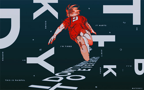
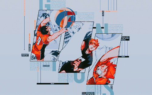
Sorry for the bad quality first off T^T I keep having to resize these so that they’re smaller for Tumblr and it ruins the quality. But more importantly, happy Haikyuu day! (at least it is Japan already!) This edit embodies some of my favorite moments within the series and below, I’ve written some of the thoughts that went into this piece/my feelings on these moments! Manga spoilers ahead (I'm pretty sure I’ve kept them to a minimum but just to be sure, please proceed with caution!), and I hope you enjoy this edit! (Overlays: accio-glow, aulia-chan on dA; PSDs: hurtears, hallyumi, yangyanggg on dA) 1. “Today might finally be the day we get the chance to let our talents bloom… it could be tomorrow. Or maybe next year. Or maybe it’ll finally come when we’re 30. I’m not sure if physique has anything to do with it but I do know for sure that if you don’t believe that day will come, it never will.” This quote is a testament to Oikawa’s growth and is a symbolic representation of Oikawa freeing himself from the shackles of “geniuses” and “prodigies.” So what if your opponent is a genius? So what if they possess more innate talent? As his mentor and inspiration Jose Blanco states, “Are you saying you know what the limits of your abilities are already? Even though you aren’t yet finished growing physically or mentally? Even though you haven’t mastered all the skills you can master? If you’re going to complain that someone with more talent than you will always be better than you… no matter how hard you work, how many tricks you learn and how many great teammates you have… do that only after you’ve given everything the very best effort you have.” There will always be someone better in the world. But to claim that you cannot hope to compare to the likes of them is to resign yourself to a predetermined defeat as well as dismiss both your own efforts and theirs. There’s no guarantee when your efforts will pay off. As Oikawa declares, it may be today, tomorrow, or even when we’re 30. But if you don’t believe in yourself first, if you don’t believe that you will bloom in your own time, “that day will never come.” The flower in the background is the iris. It is known to represent trust, faith, and hope amongst many other ideals. I chose this particular flower because of the manga cap used in this panel. I cannot emphasize how much I love the bond between Oikawa and Iwaizumi, especially this particular moment when Oikawa points at Iwaizumi with such authority and determination as if saying, “This ball, this moment, is meant for you.” Not to mention the pairing with the iconic “Talent is something you make bloom, instinct is something you hone” quote. An absolutely masterful sequence of scenes that always gets my blood rushing.
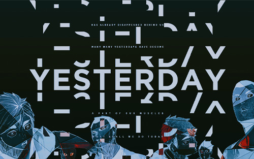
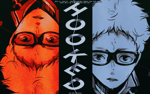
2. “Don’t look down! Volleyball is a sport where you’re always looking up!” This moment gives me chills every time. It’s something so fundamental and simple and yet, when Ukai yells this, it instills that feeling of “You can do it.” It makes my heart flutter and I feel so excited because it’s such a beautiful way of saying “Don’t give up, it’s not over yet.” And even if the ball has dropped for the last time or you have lost this match, there’s always tomorrow. There’s always the next match where you’ll have to look up. This quote gives me the same feeling as when Takeda-sensei says, “For the rest of your lives, you can do anything you set your mind to!” You only truly lose when you stop trying or you give up. 3. “It hurts. I’m tired. This is painful. I don’t want this to ever end.” / “The ball hasn’t dropped yet!” Whenever Haikyuu characters say “Just one more!” or “The ball hasn’t dropped yet!”, the tension and desperation is almost palpable. It’s so incredibly moving to see them strive to save that ball just one more time, to focus purely on what is in front of them. Even if they don’t all pursue volleyball as a professional career, the passion they all have for the sport is real. That sort of passion is beautiful to watch and admire, and I wish I could have that kind of passion for something in my life. 4. “The underhand only uses two hands. The overhand uses 10 fingers. That’s all the more to support your spikers with, which is what it means to be a setter.” / “To cut through the wall that looms before your spikers, that is the purpose of a setter.” This particular panel depicts the two ideologies of Atsumu and Kageyama respectively, two of my favorite setters and characters in general. Atsumu “may be pretty cocky at times, and overwhelm his teammates with his thirst for victory, but he treats his spikers with more sincerity and selflessness than anyone else.” He may be overbearing and an asshole at times, but his love for the sport and the art of being a setter is second to none. On the other hand, there’s Kageyama who’s so damn cool with his one-liners. Kageyama’s passion and drive to win may blind him to his surroundings and teammates but he truly believes that the setter is the one who clears the path for their spikers. When their spikers feel cornered and the walls are closing in, it is the setter who “cuts through the wall that looms” ahead. The old Kageyama who was a prisoner to speed is no longer, and his growth as a player brings me to tears every time. 5. “Someone once asked me, ‘Do you ever feel bitter over the fact that you’re not a regular on the team, and amongst your juniors there’s a genius to boot?’ I never understood the exact definition of what it was to be a genius to begin with, but upon hearing the question, I understood the general gist of what they were getting at. Every so often there will be someone who thinks that ‘people like Atsumu’ were ‘good’ from the get-go. But the thing is, if I practiced something from 1-10 every day, then people like Atsumu would have done it from 1-20. Or, they would have done the same 10 but in a more efficient or concentrated manner. They might also ask ‘Instead of doing it 1-10, how about I tried it from A-Z, what would happen then? Now doesn’t that sound interesting?’ They’re the kind of people who think about stuff like that. Even if they fail, even if they are hated and get ostracised by others, no matter whether they’re right or they’re wrong, even if they subvert something the rest of us hold in high regard, they’re the kind of people who can’t sit still without giving it a go. Even if they start coughing up blood from their lungs, they’re the kind of people who want to keep on running, no matter what. There’s going to be a lot of people in this world who make you go ‘Wow, I’ll never be able to defeat them,’ and it’s only natural that you think they’re amazing people. I think that to be able to keep charging ahead is a talent in and of itself. You can call people like them whatever you like, the term ‘genius’ isn’t exactly an insult. That said, to think they were ‘good from the get go’ is to condemn yourself to a predetermined defeat without even playing a match against them, and I also think it’s very rude.” This quote, hands down, is one of my favorite quotes of all time. It is not genius or natural talent that makes individuals truly great, but it is grit. Without a doubt, people are not born equal. There will always be someone with more innate talent or latent capabilities. We all begin at different starting lines. But those who truly stand out are those who go the extra mile, like those dubbed to be the Monster Generation (Kageyama, Atsumu, Hinata, Bokuto, Ushijima, Oikawa, etc.). To others they may seem like natural prodigies but behind their flawless technique and precise ball control lies countless hours of training. They trained harder than anyone else, sacrificed in order to hone their abilities, and ran farther than the rest of the pack. They’re the type to fixate on what lies before them without much regard to anything else.They eat, sleep, breathe, and live volleyball with every waking second. They’re always trying new things (Atsumu pulling off the freak duo quick in the middle of the Inarizaki match) and continually looking for ways to improve (“But the thing is, if I practiced something from 1-10 every day, then people like Atsumu would have done it from 1-20. Or, they would have done the same 10 but in a more efficient or concentrated manner. They might also ask ‘Instead of doing it 1-10, how about I tried it from A-Z, what would happen then? Now doesn’t that sound interesting?’ They’re the kind of people who think about stuff like that”; Kageyama keeping a volleyball journal). It is not what they were born with that makes them great; it is their overwhelming desire to win. 6. “‘Yesterday’ has already disappeared behind us. Many, many yesterdays have become a part of our muscles. What shall we do, today?” This quote, chills. There’s no point ruminating about the past or what has already passed; you can’t change it. (In retrospect, I wish I included another quote from Inarizaki in this panel: “One time is enough. We rise to the challenges of today.”) You learn from the mistakes of yesterday and use them as stepping stones for tomorrow. I wish I could eloquently phrase how much I love this quote or my interpretation of it but alas, my writing is fancy Garbage. 7. “But if… just if… that moment comes for you, that will be the moment you really get hooked on volleyball.” If you didn’t get chills when Tsukishima blocks Ushijima, I have no words for you. Tsukishima-it’s-just-a-club Kei, Tsukishima-I’m-the-normal-guy Kei — Tsukishima Kei, who always underestimates his own capabilities and relies on what he can see in front of him, blocking the Ushijima Wakatoshi, one of the top three high school aces nationally. The character development from someone who did the bare minimum (as noted by other players/coaches at one of the training camps) to someone who finally had their moment to get hooked on volleyball is one of my favorite progressions of all time. Seeing him fall in love with volleyball gradually and then all at once is truly heartwarming and beautiful to witness. 8. “No matter what other people may say, we are the protagonists of the world.” This quote is incredibly empowering to me. Even if your days consist of mundane activities, you are the protagonist of your own story every day. You may not be the main character in a shounen manga or an adolescent seeking to usurp the government in a dystopian novel, but this is your story. No one can tell it like you do and no one can replicate your story. It is yours and yours only. And that concludes my Haikyuu word vomit! I really do wish I could have properly conveyed my pure adoration and love for this series better. I truly do love Haikyuu so very, very much. It will always have a special place in my heart and I will never forget the memories and lessons it has taught me! Thank you, Furudate-sensei, for such a beautiful story. And thank you Haikyuu, for everything. For all the losses and victories we shared. For all the smiles and laughter, and for all the tears we shed. Thank you, from the bottom of my heart.
#happy haikyuu day!#819#haikyuu!!#haikyuu gfx#haikyuu coloring#hq!!#hq!! edit#kagehina#kageyama tobio#hinata shouyou#oikawa tooru#kenma kozume#miya atsumu#tsukishima kei#bokuto koutarou#akaashi keiji#karasuno#fukurodani#i'm still trying to figure out tumblr don't mind me DLKFJ#gfx#anime#anime gfx#anime graphics#mine#mine: graphics
1K notes
·
View notes
Note
for the ask game 2, 7, 16, 21, 30
2. What is your least favourite set you've made?
i have two answers, first is any gif set i've ever made before late may 2021, second is this one😭
7. Who are your top 3 gif makers?
we are scratching out that 3 and making it a 5 as was done the last time someone asked me this bc i cant make tough decisions so i am opting out and choosing all of them </3
@taehyungq - mel and her pretty natural colourings and all her comps and the ot7 content i live for it T-T and she creates so much content throughout the week, what would we do without her ????? asdfghjkl 👁️👄👁️
@honsool - listen i could talk about jay's pretty earthy colourings until i am blue in the face it's so nice and satisfying to look at and so so unique💞
@hyunsung - idk how else to describe mona's creations other than flawless, like everything about them is so perfect ??? colouring, quality, speed, size.. evERYTHING 👁️👄👁️
@jung-koook - i am a hoe for three things when it comes to gifs; (1) consistency, (2) sharpness, and (3) dark colourings, and sky somehow always aces all three ???? S.O.R.C.E.R.Y. 😤😤
@kimtaegis - annie, the queen of big gifs and vibrant colourings. i love the way she colours her gifs and i can almost always tell a set is her's at first glance, especially when she does that thing with their lips where they just pOP 👁️👄👁️
16. How long have you been making gifs?
if you mean just in this fandom, then since january 2021, so a year total. if you meant just in general, i started gif making back in 2016 and stopped for like 3yrs in 2018 lmao idk what that adds up to
21. PSDs or original colouring for each gif?
I have a base psd i use on almost all of my gifs, but sometimes they don't work no matter how i adjust it and i have to start from scratch. i'd say they're all original colourings on my gifs bc each one, with or without that base, is coloured differently and uses different adjustments than the last
30. How frequently do you like to post?
ideally id like to post daily but school and my dumb brain inhibit that lmao i'm working to start posting every other day instead since that seems a bit more manageable for me (:
send me a number from this list of questions for gif-makers🌻
11 notes
·
View notes
Text
hello one and all. hope you’re having a great day/night depending on your location in the world !! with it being my birthday this weekend ( april 10th ) i thought i might do something for someone else instead. so, in saying that, this is me offering to make some icons for a few people. they will have a psd/border of my choosing unless you have the psd of yours then i might make some using them. this is open to my followers !! hit the heart and you will go into the slot of consideration for the icons.
4 notes
·
View notes
Text

Okeyy here it is!! I decided to put together a step by step (gif) coloring tutorial where i list the layers i use and how i've so far made them work for me.
I've been giffing for 2 years now (i'm using PS CC2019, the example pics are in finnish but icons and placements should be the same) but it's an ongoing learning process.
My coloring style is quite natural, i don't do fancy stuff often and i mostly just want the colors to look as true to real as possible but better than originally. And for this kind of style i've found the steps below working for me.
I also don't have any base psds or anything that i'd often use. I always start the coloring for each set from the scratch because, to me, it's the most fun part of giffing. I have 6 layers I use every time and then some random additional ones that i often add too. None of this is me saying what you should do, this all just me explaining what i do and hopefully this can be helpful to someone.
Ok ok time to get to the point so:
1. Curves
I always, like literally always, start with this layer
Sometimes i just drag the line upwards to brighten the gif but very often i use the eyedropper tool
Choose the white tool, pick the whitest (but not 100% white coz then it won't do anything) spot and it will make that the whitest part of the gif. It also works great at correcting the colors, sometimes you need to try multiple different spots to get the best result
The black dropper tool works the same way, only opposite, so clicking on the darkest spot you make that the blackest part of the gif
If the effect is good but a bit too much, you can lower the opacity of the layer, or the other way, so if it did well but not enough then duplicate the layer
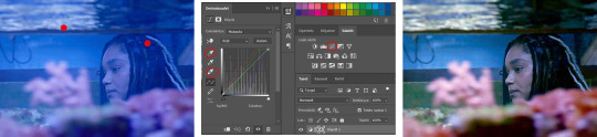
Example: the difference between the left and right photo is 2 clicks and this, my dudes, is why i worship curves. I chose the white eyedropper tool and clicked on that light spot visible in the water, then i chose the black eyedropper and clicked on fatou’s hair and that’s it. Needs more work, but that’s a pretty allright (and easy!!) start (zoom to see better)
2. Levels
I drag the left and right sliders a bit to the center to get contrast (left ~5-20, right ~240)
The eyedroppers work on this layer pretty much the same way as in curves, but i'm more used to using them only with curves
3. Black and white gradient map
I set the blending mode to soft light and lower the opacity to ~10-30 %, this brings some depth to the colors imo
4. Vibrance
I usually add ~20-60, it really varies tho and you can just wing it most times
5. Exposure
I set the top one (exposure) to 0,1 - 0,2 and bottom one (gamma) to 0,97 - 0,90. This is an effective layer so better not do too much
6. Color balance
Owing my life to this layer
I add this layer at around this point of coloring but i drag it to be the bottom layer, since when it's under the rest of the layers it's more effective
In the midtones, i always drag the bottom slider towards blue, something as small as +2 might work, sometimes you need to go +15 or so. I might drag the middle slider slightly to the left to reduce the green tones, and the top one on either side depending on the tone of the gif
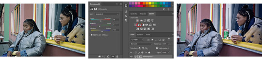
Example: this one doesn’t have any of those other 5 coloring layers i always use so it needs more work but also it shows how effective color balance is. I added more blue than normally, at least with one layer, but this one needed it imo. Love to see the green go whoosh
At this point the coloring might be done (jk it likely isn’t) but if it needs some more work then i might try one or some/all of these:
7. Photofilter
I mostly use either warm orange filter to bring some warmness to the colors or cold blue filter to correct yellow/green/red tones
8. Hue/saturation
I choose red and drag the middle slider (saturation) to -5 to -20, this helps to reduce the orange/unnatural skintones
Example:
9. Selective color
Playing around with whichever color i want to add or reduce, if i feel like the gif needs more contrast i choose neutral and/or black and drag the bottom (black) color to the right.
If sometimes the whites are too blinding, i choose white and then the bottom option (black) and drag it to the right ~10 -20.
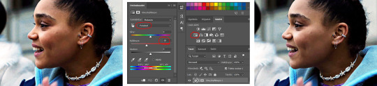
If the skintones are too yellowish, i choose yellow and go -40 / -40 / -80 and leave the blacks at 0. If it does too much, i lower the opacity of the layer, or in case i want it to be more, i duplicate the layer
Example: (zoom and cry happy tears over the ugley yellowness being gone)
10. Gradient map
For example blue-white gradient to get to colder tones, yellow-white to brighten/soften the colors or smth like pink-blue if you want to get fancier (the options are limitless tbh)
I set these to soft light and lower the opacity, usually to less than 40%
If i want the color to strongly affect the entire gif, then i leave the blending mode to normal or choose color
11. Brightness
Adding this if some more brightness is needed (i don't use the contrast option here but go to levels instead, if needed)
_________
Tips with poc!!
Some things i've found to be helpful when wanting to bring color back to the skintone after brightening or other adjustments have taken some of it away:
a. Check the points 8 & 9
In selective coloring choosing neutral or black and then black in them and dragging it to the right helps to darken the skintone
Try choosing red or yellow and then yellows or blacks in them and dragging the slider either to the left or right, depending if you want to add or reduce the yellow/red tone
Honestly the best advice i can give with selective coloring is to just simply play around, choose a color, drag them sliders to the left 'n right and see what happens
b. Go to channel mixer and add a little bit of red (+101-105)
c. Add levels or contrast or vibrance layer
d. Choose a warm colored photo filter
e. Be careful with exposure and too much brightness
_________
Soooo yeah, these are the layers i use, sometimes you can't do everything with the same layer so for example i might add one or two more curves to get brightness, or multiple selective coloring layers or add another color balance etc.
Generally i like to do small changes with one layer and not everything all at once.
_________
As for when saving the gif for web, these are my settings. I translated the one’s that aren’t obvious but everything else i’m assuming doesn’t need translating since this view always looks the same.
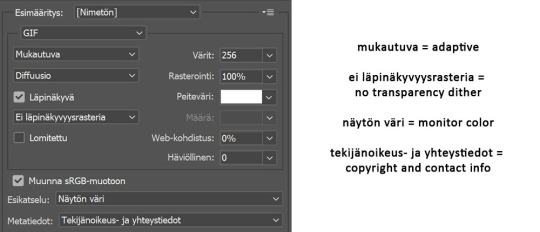
I use diffusion 90% the time, but when it doesn’t look quite right i try pattern. And sometimes when the gif has been really dark originally (😩) and has needed tons of brightening layers, noise might be the best option.
At the bottom i have the quality set as “bicubic”.
_________
So that’s it! If you made it this far, thank you, ily <3 Lots of stuff i’ve learned along the way and lots of stuff to be learned. Hoping that maybe you got to learn something from my way of coloring, too. And if not, thanks for reading anyway 😌✌🏻
#here it is 😳#i've never done posts like this but i tried to explain stuff as shortly but clearly as i could#hope it's easy to follow#and that i didn't forget anything crucial jdjdkdkd#gif tutorial#coloring tutorial#mp
49 notes
·
View notes
Text
My GIF making process!

I’ve been asked many times for a tutorial, but because I get really detailed, I always get overwhelmed by the idea. But I finally decided to buckle down!
Just so you know: I don’t use PSDs in this, and I don’t import layers to frames or anything like that. I like the hard way—at least in gif making, I believe you get higher quality gifs. Join me as I show you how to make gifs by loading videos directly into the Photoshop timeline and my coloring and sharpening techniques.
Tools used:
Mac OS X (only necessary for the first step, and there are other ways around it with a PC)
Adobe Photoshop
YouTube Purchases (any streaming service will work)
Topics covered:
Obtaining the Source Material
Loading the video file into Photoshop
Prepping, Cropping, and Resizing the Media
Adjustment Layers
Sharpening
Exporting
Obtaining the Source Material
There are a few different methods for obtaining video to work with. Proper YouTube videos are nice, but finding any major motion picture in that format is difficult, if not illegal.
Once I realized I could get really great quality video by doing screen recordings from streaming services, I stopped worrying about finding (and pirating) high resolution video files. So now, I just go to whichever streaming service I need to, pick out the movie or show, find the spot, and record small snippets.
Mac screen recording instructions:
On a Mac, Command+Shift+5 will bring up the screen recording dialogue.
Resize the frame of what you want to record within the browser.
Go to a second or two before, press the “record” button, and then begin playing the video, remembering to keep your cursor out of the recording box.
Use the Space bar to pause your video when you’ve gotten the snippet you need. Stop the screen recording by clicking the ⏹ button that is in your menu bar at the top of the screen.
Important: when the recording appears in the bottom right of your screen, click on it, and then trim the video on either end. This will help your computer convert the video file to the type that can be opened by Photoshop.
Click “done” and it will appear on your desktop, ready to be used!
PC Users: ??? Here’s a Google search I did for you
Loading the video file into Photoshop
Lots of people use this process for making gifs (a great tutorial!). I didn’t even know it existed until last summer, when I’d already been giffing for years. I wish I could still do something like that with these screen recordings, but the files are absolutely HUGE, especially on Macs with double retina displays, which actually increase the dpi by a lot. Making screencaps of them fills up my hard drive, almost immediately—even when I’ve got 20 gigs of free space to work with. So what do we do? We just. Open the file. In Photoshop. Et voila!
You can do this with any type of video, not just screen recordings.
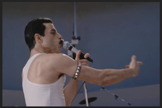
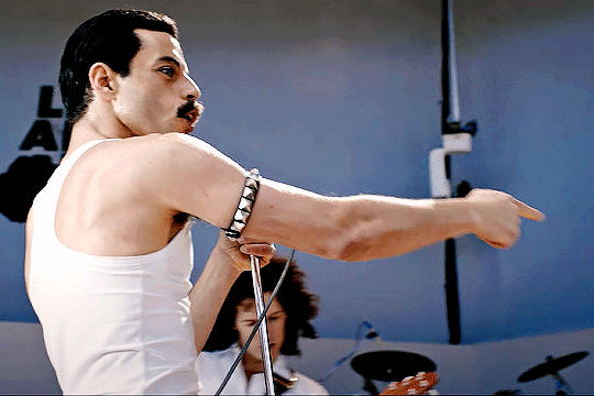
Prepping, Cropping, and Resizing the Media
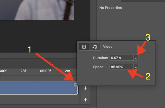
When Photoshop loads your videos up, it makes the video hilariously fast (something about frame conversion). You must slow it down for it to look natural. THIS MUST BE DONE BEFORE YOU RESZE. Your Photoshop timeline window should be at the bottom of the screen. See that little triangle in the top right of the video?
Click on it, and a menu will appear to change speed and duration.
Change the speed first- usually between 80-85% will seem realistic. (I actually went a little faster than I usually would on this at almost 86%—I don’t recommend this)
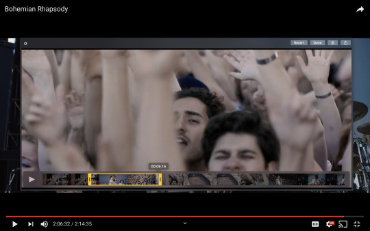
Press the button next to duration and pull the toggle all the way to the far right (if you don’t do this, full length of the video will be cut off).
Now you’ll want to crop it. Ever since Tumblr upped its GIF size limit, I have been playing around with 7:5 ratios, but let’s go with 3:2 for now. Use the Crop tool, pick out 3:2 in the top left (it may say 2:3, but you can switch that) and then find the most suitable spot in your gif for that. Hit enter on your keyboard.
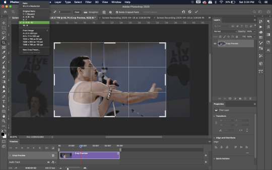
Some things to keep in mind when cropping:
Most videos come in 16:9 ratio (BoRhap is even wider). If it’s a wide shot, you’ll need to do the full 16:9 to not lose anything. Of course, experiment and find what’s right for you!
As you can see above, I moved forward in the timeline and made the crop to a point in the video when the broadest movement was happening.
Certain videos WILL have a black or red bar that may be imperceptible until you’ve already exported the gif. Just crop in a little tighter on top and bottom to avoid them.
Now you’ll need to resize your gif to be the correct size for Tumblr. If you don’t use Tumblr’s exact dimensions, your gifs (as uploaded) will appear blurry or pixellated. We’re doing a full-width gif here, which is 540px. On a Mac, I use Command+Option+I (for “Image Size) to open the resize dialogue. You can also find it under Image->Image size...
Make sure to also have “Resample” checked. Lately I’ve been playing around to see if different options are better. Most GIF makers use “Bicubic Sharper (Reduction)” and they are not wrong to do so. I’ve just been unhappy with it lately, so I have been trying this other setting out, “Bicubic (smooth gradients)”.
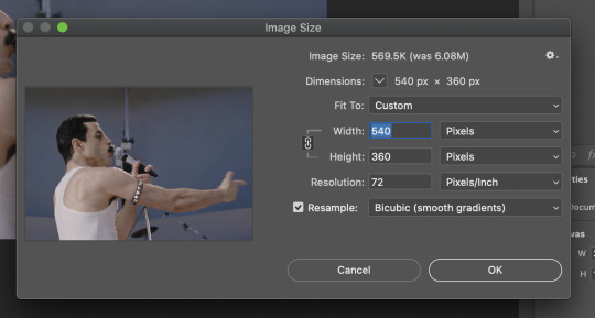
Click OK. A dialogue may come up that asks if you want to convert to a Smart Object. The answer is yes, okay, do it. The only major caveat is that you can’t go back and change the timeline speed. That’s why we did it first. But you can preview the speed now that it’s smaller, and if you don’t like it, use Command+Z (or “Undo”) and go back a couple steps to get the speed you like.
You may find, especially on a Mac screen (and possibly other displays), that at 100% your gif looks too small to be 540px. That is the curse and blessing of working with super-high resolution hardware. Zoom in to 200% and proceed about your business. This is what it will look like on Tumblr.
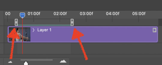
You may find it helpful at this point to begin by defining the beginning and end of your gif by moving around these bumpers. It’s safe to keep gifs under 02:00f in length. Under half of 01:00f will be way too short. (I tend to overshoot in length and then trim the beginning and the end once I see how big the gifs are upon exporting.)
Adjustment Layers
Now the creativity and fun begin!
There are a LOT of ways to get creative here. I’m going to keep it simple, very simple, but I strongly recommend opening up a new adjustment layer of each type and trying to figure out what each does!
You’ll find the adjustment layer menu at the bottom of the Layers window.

Curves
There are a lot of ways to make Curves work for you! It can do the job of Brightness/Contrast, it can do Levels, it can do Color Balance! We’re going to use it mainly to help with brightness here, but also to level out some of the tones. One of the quick tricks you can do is use the droppers on the left side of the Properties window. There are three- one with a white tip, one gray, one black. These can help define what your white tones are (and whether they need to be more of one color or another), and so on with your blacks. Sometimes it works, sometimes it doesn’t; in this case, I think it doesn’t:
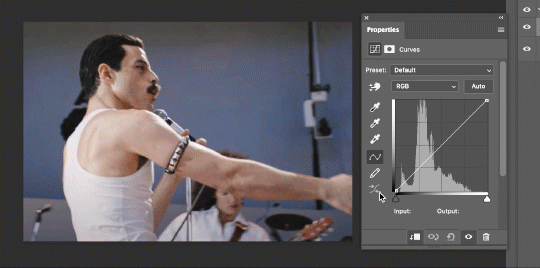
That looks totally blown out and somehow also too dark!
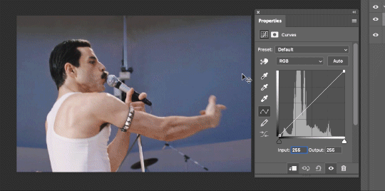
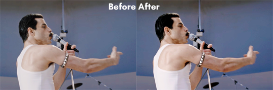
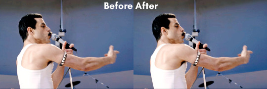
So instead, we’re going to use that little hand with the finger pointing out and some arrows pointing up and down. This lets you define which sections you want to get brighter or darker, and how much. It doesn’t do color correction. In the example below, you can see I dragged up on a white spot and down on a dark spot. Then, I moved points around on the curve itself to refine (which the gif here doesn’t show...).
Vibrance/Saturation x2
Next, I’ve been using @gwil-lee‘s Vibrance/Saturation trick (I know you said you learned it from someone else, but I learned it from you!).
Create a Vibrance Adjustment layer, bump the values up a bunch, and then change its Fill to somewhere between 2-9%. Change the Blend Mode to Color Burn. Then make a copy of that layer keeping everything the same, but make it Color Dodge. I can’t quite define what these do, but it makes it punchier!
Color Balance
Most people are familiar with this. For this gif, I’m going to make the shadows more Cyan/Blue and the highlights more Red/Yellow. Just a few points each.
Exposure
I brought the Exposure up a bit, but not enough for you to need to read about, haha.
Selective Color
Here’s where you make fine adjustments to colors. This particular scene is extremely simple, color-wise, so keep it simple. I’m going to bump up the cyans/blues, take up the black by just a point or two, and maybe bump up the yellows and reds a tiny bit. (And as always, remember, the “opposite” of cyan is red, the opposite of magenta is green, and the opposite of yellow is blue. CMY/RGB!)
I think at this point I’m going to call it with the adjustment layers. You can go absolutely hogwild with more of them! But at this point, I’m ready to start sharpening!
Sharpening
I do three sharpening filters these days. These are all under Filter->Sharpen. Make sure your media layer (default called Layer 1) is selected as we go through this! (Also, this can really take a toll on your processor, so don’t say I didn’t warn you.)
Sharpen- This layer does the basic job
Smart Sharpen (Amount: 10%, Radius: 10, Reduce Noise: 4% Gaussian Blur)- This layer gives texture
Smart Sharpen (Amount: 500, Radius: 0.3, Reduce Noise: 12% Gaussian Blur)- This layer gives refined sharpening and smoothing
Fiddle with these as needed! Let your gif play all the way through- this may go slowly as your processor works on it. Make sure the beginning and end points make sense.
Exporting
After You’re going to have to use File->Export->Save For Web (Legacy)... or use the shortcut of Shift+Option+Command+S. This could take some time for the dialogue to pop up! Be patient.
In my opinion, these are the best gif export settings for crisp edges and no noise:
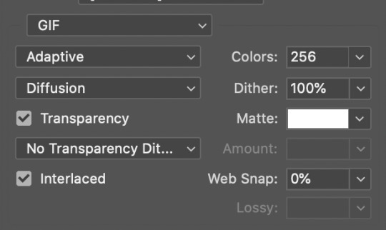
Now you see how big the file is in the bottom left. Tumblr won’t let you upload anything bigger than 10MB and it’s safer to stay under 9MB, in my experience. When your gif is too big, you have a couple options. You can close the dialogue and change the length of your gif.
OR, you can uncheck “Interlaced” and bump up the lossy to 1 or or more. This will create noise. Sometimes, that’s a good thing!
Here’s without lossy:
Here’s WITH lossy: (Honestly in a fast moving gif like this, it’s almost imperceptible, but I can see it!)

And now that I’ve exported, I can see what there’s a little black line on the bottom! So I’m going to trim that off and call it good! You can see the full gifset here.
Hope you enjoyed! Reblog if you try this out or learned anything. Feel free to reach out with questions any time!
447 notes
·
View notes
Text
SIMPLE TIPS ON MAKING GIFS by @lolasmuse
hey!! so i’ve known the basics on how to make gifs for a long time now, but recently i’ve taken interested on how to improve them/make them quicker so i’ve been researching a lot of simple tips on different posts and videos/tutorials that helped me out so much! they might be silly common knowledge for some, but because i didn’t know about most of them until recently it may be the same case for other people! an anon asked me if i had any tips so i decided to put them all in one post. here we go:
you know the pain of trying to find the right parts of the video to gif? especially when it comes to longer files like episodes or movies. instead of importing the whole thing on photoshop, download VLC media player first and open it there. get to the part you want to gif and click this magic button, then click it again once the scene is over. it’ll record it and save into a different file, that you can now import and it’ll be a million times easier to get the right frames!
actions!!! took me a long time to finally understand how much they make our lives easier! when it comes to making gif icons, it can take forever to resize and convert and everything else, so actions makes everything much quicker. this is the one i use, by @mintrps. you download it and open it on photoshop. then you click on window, and actions. all you have to do is click the selection and then play it! first i pick the timeline, choose the psd (you can use the psd after you convert, but i find it easier to do it before, so i don’t have to readjust it in the timeline) then click convert, choose the size (i use 80px for gif icons), sharpen and that’s it!!! i also use a pattern on top but that’s optional.
this one may be a big common knowledge, but i’ve found out about it recently and it changed my life!!!!!!! yes the drama queen. so i knew you can use the free transform tool by pressing ctrl+t on the keyboard, but it might mess the entire thing when you try to adjust it. SO, i’ve now learned there’s this other magic button you click after pressing ctrl+t, and now you can use it without messing with the proportions of the gif! i use this tool after i choose the size on the actions, it’s a lot quicker and easier.
👏 sharpen 👏 your 👏 gifs!!!!!! i can not stress this enough. i really wanna go back in time and kick myself everytime i see my old gifs, cause it makes SUCH a difference!! there’s a sharpen action in the one i linked above that works great, but i use this one on my gifs, by @captaincoloring. here’s an example of an unsharped gif vs a sharped one:


annnd that’s all i got. these are all based on the idea that you know the photoshop basics when it comes to making gifs, but hopefully it can help someone out there. special thanks again to @mintrps and @captaincoloring for the resources!!!
edit: i recorded the actions process here, in case it helps!
195 notes
·
View notes
Note
Hello!! Do you have any recommendations or tips on how to start making gifs? Ive always wanted to, but I dont know where to start..
hello sunshine! yeah of course, i will give you some tips! first of all I'll redirect you to this tutorial, i think it covers all most important points in gif making and resources. starting from installing photoshop, to making base psd, to add-ons like topaz or resizer to improve the quality. personally i use avisynth for all of my gifs but it's just because i don't remember how to resize gifs in photoshop and cut the videos LMAO 😭 i only use topaz clean, i make all the psds myself, i never used any pre-made psds so i can't really give you any links or examples, sorry :( but for my own psds i mainly use curves and exposure (sometimes levels too but then i don't like to mix it with curves because both have basically the same purpose) for shadows/contrast, and for color tweaks i use selective color, color balance, hue/saturation (mainly to remove unwanted colors) and in the end i like to use channel mixer for finishing touches. but still, most of the time i just wing it all, since every scene usually needs different coloring 🤭 so yeah, you just have to experiment and try everything, it's natural that not everything will work for everybody, so you might end up liking the adjustment that for example someone else don't like to use! you can always ask more people about their giffing process and which adjustments they use, that way you'll definitely find a way you're gonna like! ❤️ and please, take your time, try to prioritize the quality of your gif instead of the speed, i know sometimes we find ourselves under the pressure that "someone else giffed it / posted faster" but we really shouldn't think about it. if you want to make the gif, just make it, it should be only fun for you, not stressful 🥺 notes are important but they're not everything, and every blog/gif is unique in its own way, even if the concepts or scenes are similar - they're never the same, they are always unique. so yes, have fun with it and please don't get discouraged! 💓💓💓
12 notes
·
View notes
Text
creator tag game
thanks @danslevy for the tag!! i love this tag and it’s so fun to look back on everything i’ve created this year (it’s been a lot!!!) (putting this under a cut bc it got so long skfhkjsdh)
Rules: answer the questions and then tag 10+ other creators to answer the questions!
first creation and most recent creation of 2020: first and most recent
one of your favorite creations from 2020: i would say probably this juke gifset or this awae gifset
a new style you tried this year and a gifset that uses it: i only started giffing this year so p much every style was new to me but i’d say maybe this color palette gifset for skam
your favorite coloring: this skam gifset bc it was my first time doing a color palette and i love how it turned out and also this skam gifset bc it was one of the first times i actually like,,, colored something instead of just using a base psd and calling it a day
a creation that took you forever: i think this prom gifset is the one that look me the longest that i have posted bc there’s one i haven’t even finished yet rip
your creation from 2020 that received the most notes: this jesy nelson gifset
a creation you think deserved more notes: oof there’s a few that come to mind bc skam doesn’t get a lot of notes skfjhsdkh but probably this mayla gifset bc i love how it turned out but it didn’t get a lot of notes?? or this mayla one but i get that skam fr fandom is kinda dead now rip
a creation with a favorite scene/quote: i love love love this song and i love this victor/benji gifset i made with it
a new fandom you joined and a creation you made for it: i joined lots of fandoms this year but jatp would have to be the biggest one and i’ve created,,, a lot of jatp gifsets but i really love these few i’ve made recently and this one bc it was my first jatp gifset
a creation you made that breaks your heart: oof def this merlin gifset
a ‘simple’ creation that you really love: i love how this oslo gifset turned out, i made it when i was just learning to gif so i didn’t really know what i was doing but it turned out well
a creation that was inspired by another one (add both your creation and the one that inspired it!): i love my hearteyes series (one two three four) which was inspired by a 2gether gifset but i think this is the original insp (at least as far as i can trace it)
a favorite creation created by someone else: this merlin gifset by @mazykeen literally lives in my head rent free as does this one by @yenvengerberg and there are literally too many jatp ones to list bc this fandom is so creative so i’m not even gonna try sdkjhfkjsd
some of your favorite content creators from the year: ooof okay buckle up bc this is gonna be long:
for jatp: @merceralexs @alexsmercer @juliesmolinas @miriammaisel @lukefromsunsetcurve @juliesmolina @oswiins @owenjoyner @funny-face @milesgmorales @jakeperalta @theobligatedklutz
for skam: @noramachwtz @lucaslallemants @lesbiansykkuno @isakyaqi @parallel-univers @zoesrobbe @cityofember @mailinrichter @alterloev
for other fandoms: @arthurpendragonns @mazykeen @lyrasbelacqua @timothyolyphant @danslevy @rainbowkarolina @vicspedretti @cathy-parr @amandaseyfried and sooo many more but this was just a small list of some of my fave content creators
for good measure, another a couple more creations of yours that you love:
these nooreva ones
this & juliet one and this six one
this skamverse one and this one
this love simon soundtrack one
this skam españa one
tagging @merceralexs @alexsmercer @juliesmolinas @miriammaisel @lukefromsunsetcurve @noramachwtz @owenjoyner @lyrasbelacqua
28 notes
·
View notes