#like thinner but horizontally rather than vertically
Explore tagged Tumblr posts
Visit Tumblr Blog
Explore Tumblr blogs with no restrictions, modern design and the best experience.
Last Seen Tumblr Blogs


Fun Fact
1,644 Tumblr posts in 1 second.
Text


Neon Byte MCs (@/inkwitchgames) [2/5]: Katharine Cinder
#meet my ocs#grapes chars#meet my neon byte mcs#nb: katharine cinder#oc: katharine winther#unlike with freyr wher eboth pics were different versions of his lewk#for kathy this is pre and post the facility#i havent decided how much of her bs i'm gonna keep. but i do know it will involve her dad and/or an ex being trash#kathy is empire district and gonna be with ram#it is hard to do high end~ styles on this picrew. on most tbqh#hard to master ms. roh's fantastic jawline with just a picrew but i did my best#the other were too round or made the rest of the face too#... squat?#like thinner but horizontally rather than vertically#picrew game#picrew: neon byte
5 notes
·
View notes
Text
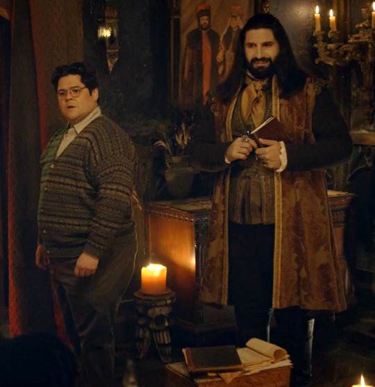
Costume Spotlight: Guillermo's Sweaters in Season 2

At long last, I'm returning to the sweater pile to do a deep dive on our favorite knit-clad vampire slayer, Guillermo de la Cruz. In season one, Guillermo wore sixteen different sweaters across the season's ten episodes. In my first post I did an overview of the different types of knits and some of the little character nods I noticed in the later episodes.
Guillermo wears fourteen different sweaters across season 2, with roughly half of those being new sweaters for the season--there's one I can't quite decide if it's a new sweater or the same one he wore in 1x02 to the city council meeting, but in different lighting. That being said, someone give me his thrifting skills (and storage skills)! This is also the season where he debuts his iconic slayer trench coat and stake bandolier, but I'll do a separate post on those.
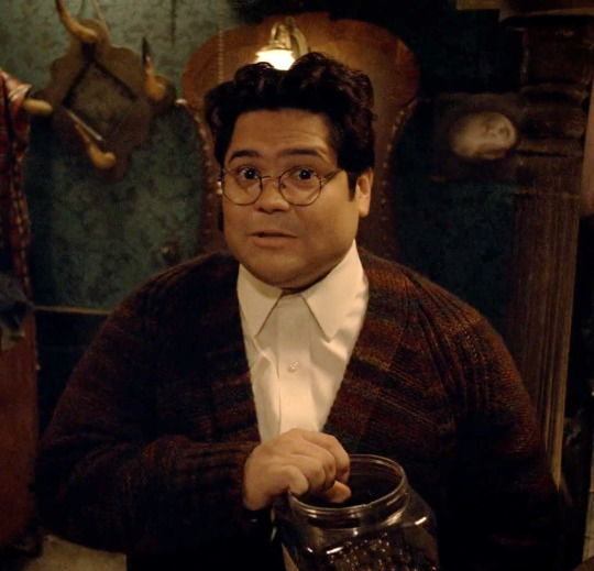
Season two's sweaters are heavy on the Fair Isle knits and cardigans, with many appearances of a new fuzzy red striped cardigan that debuts in 2x01 (pictured above). I almost think of this as Guillermo's character development cardigan, because of when he wears it throughout the season:
2x01- Just before he slays his first vampire assassin of the season.
2x08 - When he tells Nandor about Celeste's offer and then leaves.
2x09 - Throughout the episode, where we see him taking a break for the first time and refusing to listen to Nadja trying to get him to end it early, when he finds a way out of the room of doors for himself, Nadja, and Colin Robinson, and when he comes up with a compromise to save Laszlo, Colin Robinson, and Nandor from the witches.
2x10 - At his mom's apartment when he's talking about why he left, and to the Theatre when he slays all the vampires and rescues Nandor, Laszlo, Nadja, and Colin Robinson.
He also debuts a fourth Coogi sweater in 2x01, this one a vertical striped pattern with dark navy and turquoise elements.

Yet another new addition to the sweater collection is this gorgeous brown and red Fair Isle v-neck pullover with a solid brown collar and cuffs. It's similar to a sweater he wears in season 1, but better fitted and with a nicer pattern.
Another noticeable new addition is this blue and gold Fair Isle v-neck from 2x06:

I want to see if there are more appearances of this one in later seasons, as it only appears in this one episode of season 2 as far as I can tell.
There's this geometric gray and black mosaic knit cardigan he wears in 2x07 to consider:
And of course, the iconic yellow cardigan and rainbow turtleneck combo from 2x08:

This sweater is such a departure from everything else he wears! So much brighter, while also being less dated. Most of Guillermo's sweaters (the fuzzy cardigan that screams 2013 aside) look like something from the 80s or 90s found in a vintage shop...or a grandparent's attic. This cardigan stands out as a very clearly modern take on a retro style (I'd say late 60s/early 70s), like something you'd get from ModCloth, and is a thinner material than most of his others as well.
Is he dressing to fit into his new household? Or is this the kind of thing Guillermo would rather wear, in an environment where he feels more comfortable and supported? We never see this sweater again, even as Guillermo gains more power and respect in Nandor's household, and we never see him wear anything like it again, either, so it's hard to say.
Lastly, there's this Intarsia knit cardigan in brown and green that appears for this hilarious brief moment in 2x10:
Season 1 Sweater Appearances
In addition to his new sweaters, Guillermo reprises several sweaters from season 1. His gray Fair Isle cardigan from 1x05 and 1x10:
This heavily textured Coogi cardigan from 1x06-1x08, as well as 1x10:
The first Coogi (or Coogi-esque) sweater from season 1, with the horizontal pattern and red accents:
The lovely bird-patterned Fair Isle from 1x02 that will continue to show up all the way through season 5, and even in a promo photo from season 6:

And this thing, which I still can't decide if it's a brand-new sweater in different lighting, or the sweater Guillermo wore to the city council meeting in 1x02:
I don't have a ton of information on knitting styles to include this time, a I covered a lot of that ground in the season 1 post, but I do think it's interesting that Guillermo in this season wears some more vivid colors (the addition of more reds for him this season is especially intriguing), better fitting sweaters, and higher quality ones. While of course this could simply be due to a bigger budget for the show's sophomore season, I also think it's part of an ongoing evolution of Guillermo's style over the course of the show.
As he gains more confidence, it begins to show in his wardrobe. He even unbuttons that top button on his shirt a few times this season! And as he comes into his own more and more as a powerful vampire slayer, I think his clothes echo that as well.
What's your favorite season 2 Guillermo sweater? And would you be interested in a chart showing all the appearances of each sweater over the course of the show? Or is that just me.
#harvey guillén#guillermo de la cruz#character costumes#wwdits#plus size fashion#fashion#sweaters#menswear#coogi#fair isle#cardigans#wwdits season 2
53 notes
·
View notes
Text
How to Identify American Holly
Click here to learn more about the How to Identify article series.
Name: American Holly (Ilex opaca)
Range and typical habitat(s): Typically southeastern United States, from eastern Texas to the Atlantic coast, southern Missouri, and central Florida to scattered portions of New England. iNaturalist observations also place it in portions of Michigan, Illinois, Ohio, and Oklahoma, showing some expansion compared to the 2014 BONAP map, so its range may be expanding in response to climate change. In most of its range it is an understory tree growing in the shade of larger species. However, in Florida’s scrub habitat it grows as a shrub.

Photo by Derek Ramsay, GNU FDL 1.2
Distinguishing physical characteristics (size, colors, overall shapes, detail shapes): At first glance American holly looks quite similar to the European holly (Ilex aquifolium) so commonly used got holiday decorations (more about the differences between the two below.) It has medium to dark green oval-shaped leaves, sometimes with a yellowish tint, whose margins (edges) have concave curves between sharp points that are regularly spaced; large leaves may reach three inches long.

Photo by Famartin, CCA-SA-4.0-INTL
The American holly’s leaves have a leathery, stiff texture, and may appear waxy, and the underside is paler, often yellow in color. Each leaf has a central vein (midrib) that is depressed, appearing almost like a deep crease. Thinner veins branch off of both sides of the midrib. Some leaves may display smooth margins instead of the more typically spiky ones, especially when they are high enough to be out of the reach of browsing herbivores like deer.

The foliage stays green throughout the year rather than being shed in fall; a given leaf may stay on the tree for up to three years before being displaced by a new replacement leaf. The leaves grow in an alternate pattern along a twig, with each leaf growing a little further along the twig than the last. The tree’s branches and trunk are covered in pale gray bark that is relatively smooth, but may have horizontal and vertical striations, along with various nodes and bumps, and might also play host to white patches of microlichen colonies. Other lichens, as well as mosses, also may add color to the American holly’s bark.

Photo by Krzysztof Ziarnek, CCA-SA-4.0-INTL
An exceptional specimen of American holly can reach almost 100 feet tall when mature, though it grows slowly. Such large trees are generally a century or more old, and the oldest on record was just a few years shy of 150.
The flowers of American holly are small (1/2″ or less across) with green centers and four (sometimes six) white petals that are broad with a rounded end, and whose tips curve back toward the plant. They grow in clusters of several flowers sprouting from one spot. American holly is dioecious, meaning that there are female and male plants; the males tend to reach sexual maturity a few years earlier than the females, but they all are generally reproducing by the age of ten.

When fertilized by insects the female flowers then turn into the well-known red berries. Technically these are drupes rather than true berries, with four seeds apiece, and while they start out green they ripen to a bright red. The berries are popular with birds like cedar waxwings (Bombycilla cedrorum), but are toxic to humans and our pets.

Photo by Douglas Goldman, CCA-SA-4.0
Other organisms it could be confused with and how to tell the difference: Due to their similarity, American holly and European holly may easily be confused at first glance, and both prefer the understory of a forest. However, the European species does not grow as large. The leaves of European holly are darker and have a glossier appearance; the edges may also be more warped where those of American holly lie comparatively flat. Moreover, European holly grows more commonly along the west coast of North America, and is more sparse throughout American holly’s native range, especially outside of cultivated spaces.

European holly (Ilex aquifolium)
Yaupon holly (Ilex vomitoria) is another species native to the southeastern North America, particularly the Gulf Coast states and the southern third of the Atlantic coast. It is a much smaller shrub that rarely exceeds thirty feet tall, and its leaves are round with serrated or scalloped edges rather than the pointed margins of American holly. The petals of the flowers may not curve as much as on American holly.

Yaupon holly (Ilex vomitoria)
Dahoon holly (Ilex cassine) also grows in the extreme southeastern United States, from Louisiana to the southern tip of North Carolina, and primarily along the coastline except in Florida where it can be found across much of the peninsula. Its leaves are longer and more slender than those of American holly, and the margins are almost entirely smooth except for a series of very small spikes.

Dahoon holly (Ilex cassine). Photo by Douglas Goldman, CCA-SA-4.0
Possumhaw (Ilex decidua) has long, slender leaves with a gently pointed tip and serrated edges. This deciduous plant drops its leaves in fall, unlike the evergreen American holly.

Possumhaw (Ilex decidua)
There are other plants that have similar leaves to American holly but that grow out of its range, such as the various species of Oregon grape (Mahonia spp.) in the Pacific Northwest, and holm oak (Quercus ilex), for which the genus Ilex was originally named.
Further reading:
USDA: American Holly
North Carolina Extension Gardener Plant Toolbox: Ilex opaca
Missouri Botanical Garden Plant Finder: Ilex opaca
Native Plant Trust: Ilex opaca – American holly
University of Connecticut Plant Database: Ilex opaca
Did you enjoy this post? Consider taking one of my online foraging and natural history classes or hiring me for a guided nature tour, checking out my other articles, or picking up a paperback or ebook I’ve written! You can even buy me a coffee here!
#holly#American holly#North America#native plants#Ilex#shrubs#plants#plant identification#nature identification#botany#trees#ecology#conservation#biodiversity#long post#nature#Yule#Christmas#holidays#scicomm
12 notes
·
View notes
Text
Creating Decoration Pieces for My Level
To help decorate my level, I plan on creating sets of items to place around the house.
The first thing I want to create is a lamp to put around the house. I started by using a cube that I scaled the top face down to make look like a lampshade. I bevelled the sides of the lampshade to make it feel softer.
The stand was created using a cube bevelled at the sides similar to the table stand. Another larger, flatter cube was used to create the base.
Next, I created a book set to add to the bookshelves. To keep things simple, These books are all just coloured cuboids as only the spines and sides would be seen when on the shelves so the opening of the books didn't matter.
The next set I wanted to make was for items to go on tables, including the expensive items I want to use as items of interest. This includes an open book, an ink pot and quill, a ring box and stacks of coins.
The open book is just a cuboid with a smaller cuboid on top to create pages. One half of the pages is taller than the other, using the extrude tool and the bevel tool to make it appear like the book is open with one side having a lot more pages.
The ink pot started with a bevelled cube that I use the multi-cut tool on to create a lip on the top. I then used a smaller cube to cut out a bit in the top of the pot to look like its open but full of ink, The quill began with one thin cuboid as the spine of the feather. I then added a thinner cube which I made thicker at the top to create the actual feather part of the quill.
The ring box used two identical cubes to create an open box combined with a smaller cube to cut out the lid. A bevelled cube was used to create the padding to hold the ring. The ring itself was created using a taurus that had its divisions turned down to make it much less complex. The jewel was created in a similar way to the lampshade from before, using a bevelled cube with a small bottom face rather than top.
Each stack of coins used a cylinder with the vertical divisions turned down to 8 and the horizontal divisions up to 5 for each coin. Different stacks are different sizes as I plan to have them each worth different amounts in game.
0 notes
Text
What to Expect While Going to Buy Flux-Cored Wires Online-Shop Now: 9810654634
When purchasing flux-cored wires, there are several key factors to consider to ensure the product meets your welding requirements. Flux-cored wires, designed for flux-cored arc welding (FCAW), are popular for their efficiency and adaptability in various applications, from structural steelwork to heavy equipment repairs. Here is what you should expect and keep in mind while going to buy flux-cored wires online:

1. Types of Flux-Cored Wires
Flux-cored wires come in two main types: self-shielded (FCAW-S) and gas-shielded (FCAW-G). Self-shielded wires contain flux that produces its own shielding gas when heated, making them ideal for outdoor projects where wind might disrupt a separate shielding gas. They work well in structural steel applications but can produce more spatter.
Gas-shielded wires, on the other hand, require an external shielding gas like CO₂ or a gas mix, and they provide a cleaner weld. These are often used in indoor or controlled environments, where a stable gas supply is feasible, offering less spatter and a higher-quality finish. When purchasing flux wires from Castron Electrode or any other reliable site online, make sure you know which type suits your welding environment and project requirements.
2. Consider the Wire Diameter
Flux-cored wire diameters range from 0.030 inches to 3/32 inches or more, with the most common sizes being 0.030, 0.035, 0.045, and 1/16 inches. The thickness of the metal you're working with should dictate the wire size you choose. Thicker wires can handle higher amperages and are best for heavy-duty applications, while thinner wires work better on lighter, thin-gauge metals. Your welding machine’s capabilities will also influence your choice, as some machines are not designed to handle certain wire sizes. Be sure to check both the specifications of your welding machine and the material you’re working on before finalizing a wire diameter.
3. Material Compatibility
Flux-cored wires are typically suited for welding steel and stainless steel but can be formulated for other metals as well. For example, stainless steel flux-cored wires are available, providing corrosion resistance for projects involving stainless materials. Look for wires specifically designed for the type of metal you're working with to ensure durability and a strong bond. For specialized applications, consult the product's specifications and, if needed, the manufacturer, to confirm compatibility.
4. Ease of Use and Welding Position
Flux-cored wires are rated for different welding positions, such as flat, horizontal, vertical, or overhead. If you are working in a restricted or awkward position, look for wires rated for all-position welding. This flexibility will make your job easier and yield better results. Some wires are also designed to minimize splatter, slag, and cleanup, making the welding process smoother and reducing post-weld work.
5. Wire Quality and Brand Reputation
The quality of the flux-cored wire by Castron Electrode Online can significantly impact your welding results. Choosing a reliable brand that adheres to industry standards will ensure consistent performance, reduce porosity, and minimize slag. Trusted brands often offer a range of flux-cored wires that have undergone rigorous testing and provide thorough documentation on their product specifications.
6. Cost Considerations
While budget is a consideration, focus on value rather than the cheapest option. Higher-quality wires may come with a higher upfront cost but tend to offer better welding performance and longer-lasting results. Bulk purchasing may be more economical if you’re working on a large project.
7. Packaging and Storage
Flux-cored wires are susceptible to moisture, which can cause issues like porosity in welds. Look for packaging that protects the wire from environmental factors and consider storage solutions to maintain its quality over time.
In conclusion, buying flux-cored wires online involves assessing the type, diameter, compatibility, ease of use, quality, and cost. Each of these factors will play a role in achieving successful welding results. By choosing the appropriate flux-cored wire, you can ensure efficient, high-quality welds that meet your project’s needs. For more details, visit
0 notes
Text
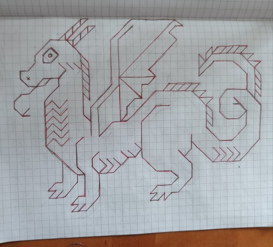
Yes! Yes! Yessssssss! Fearsome! Sublime! Implacable! Impeccable! Also that sweet fface! I cannot cannot wait to meet their friends.
This is what I want people to understand about interlocking crochet — there is a distinct learning curve, sure, but once you've got it there's simply no stopping you, and here's your proof!
I don't know if @bearhats worked this out entirely themself (v plausible) or saw me spilling secrets on my mawkish attempt at the craft-Reddit ho stroll last week, but this seems like a fun opportunity to fully hijack a stranger's post and talk about working from hand-drawn graph paper charts, which is how I started, and about how I do more detailed patterns in Illustrator:

Once you have a handle on the technique, you should be able to pretty easily freehand the manatee in the middle from just the pencil sketch on the left. I even include "graph paper" versions of motifs with all my patterns, which I use when I want to plan out captions to add or arrange odd-sized blocks for blankets.
A basic graph paper chart gives you the Colour A mesh (outlines), which is all you need in a pinch! Sketch a motif by connecting any vertices, making only horizontal, vertical, and 45° lines*. Diagonals can cross to form an "X," but that's tricky to crochet, and you'll want to do it sparingly. Draw a rectangle to contain it. Count the number of boxes wide it is, and that's your pre-border width in mesh spaces (msps). Your Colour A starting chain [FA] is that number times 2 + 5 (or +4 if you prefer to start in the 5th ch, as is common in regular filet, rather than the 6th, as I do). The graph paper verticals are dcs, and the horizontals are ch1s. A marked vertical is a dc on front (or through both meshes), an unmarked vertical is a dc on back. Colour B (background) foundation [FB] is FA minus 2 chs, and you just kind of work around the outlines as they come together: when you cross an unmarked horizontal, you dc on front, and when you cross a marked horizontal, you dc on back. If you need me to explain diagonals, go read an actual pattern and/or watch the video.
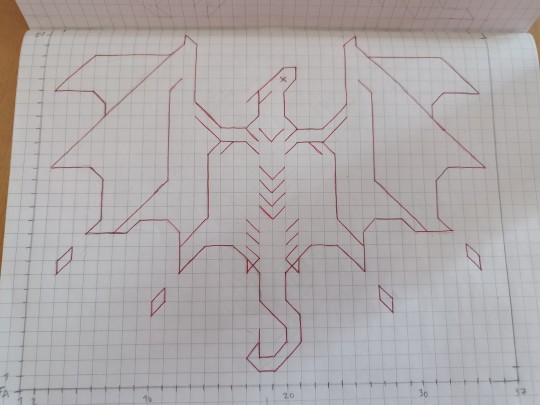
What graph paper charts don't give you information about are fill stitches (as modelled by the manatee on the right and, extra impressively, in @bearhats' dragon!) These require an extra level of planning, because you need to leave gaps to make room for stitches that won't be made until later rows, which isn't exactly intuitive.
These sketches (OP's and mine) also don't distinguish between F (dc on front of work) and T stitches (dc through both meshes), which both make a vertical line on front but do it a bit differently. This is almost always fine and the distinction is vibey—I use Ts in mesh backgrounds and along edges for structure, around certain details like eyes to emphasize them, and in some cases to make a thinner outlines or achieve a certain texture, but they are interchangeable for most purposes.
Anyway, at a certain point I figured out that it was actually faster and easier to make patterns in Illustrator.
That is my original manatee chart, back before I was even bothering with written notation, and before it had even occurred to me that fill stitches where a thing to do. Here's the original Clover:

If you know Illustrator (or similar, probably, though I quit in frustration the one time I attempted it in Inkscape), it shouldn't be hard to parse how the charts are made:
Make a grid of square cells with the the Rectangular Grid tool, however many cells (mesh spaces) wide and tall.
Use Pathfinder > Outlines to chop the lines into individual segments. Add a dark stroke, that's Colour A.
Duplicate it, give it a light stroke, and use Direct Select to shave off a row and a column. That's Colour B.
Align the grids, ungroup everything.
Select individual line segments and send them to front or back (use the shortcuts) to create a pattern. You'll need to use the pen tool to draw diagonals and duplicate vertical line segments to make fill stitches.
Duplicate the finished motif. *(Duplicate it again, and shave off just the top row—Colour A or B, not both). Repeat from * until no rows remain. Bing bam boom, you've got an illustrated chart for every row, probably in reverse order but who cares?
I add notation and do a lot of finessing to make those charts easier to read, but that is literally my entire process an in a nutshell.

That completes this unplanned, unscripted, and thoroughly unasked-for lesson in in making patterns—or bootlegging mine, which I do frankly prefer you did not do, especially since I'm still giving most of them away. But for real, I would never *could* never have made OP's dragon (for starters, it's enormous! On par with the absolute largest motifs I've done), and the rest of you would I'm sure come with things I could never imagine and would never in a million years wish to.
*Right, angles. OP, for your dragons, know that you can also make double-length diagonals (1x2 or 2x1 msps, corner to corner). I work those as dtrs (3 yos) though those are, mathematically at least, too short for the task, and in some thread combos you may need to add a yo or extend the stitch at the base (I don't recommend using half stitches in the body mesh). Early days on those, even for me!

PPS: Because anyone reading down here is presumably a wonk, above is the notation I'm proposing for long diagonals. I'm happy with it as a left-handed reader/crocheter, but I'd love either an OK or feedback from righties — because you people don't crochet left-to-right (i.e., the same direction as notation, the sensible way), I'm worried that the direction of the horizontal arrows is going to be somehow off-putting?? Does it even really matter when there's a diagram to spell it out? I could just as easily call them nnh (horizontal, or over 2) and nnv (vertical, or over 1 and down a row), which is certainly easier to type.
Here's the notation in the wild:


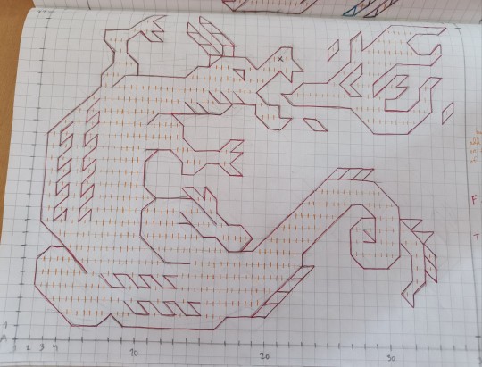
finished dragon design i made after learning the interlocking technique + also using their border designs! @interlockingpatches
+ a couple more ideas for other dragons to expand this project
#interlocking patches in the wild#making patterns#tutorial#crochet#interlocking crochet#interlocking filet crochet#dragon#dragonsssss#standing ovation for OP
70 notes
·
View notes
Text
Livable Streets in China

In 2019, there were almost one billion passenger-trips on public transit in the US. This is roughly the same number as that of Tianjin, a city in China with only 13 million people. China as a whole has more than this, the USA's total yearly number of passenger-trips, every single day. Evidently, when it comes to transit infrastructure, China's doing something right.
I'll note that I'm only talking about urban transit, here - China's vast high-speed railway network is already well discussed, and fills a space occupied, in the US, by domestic airline flights. When it comes to urban public transport, China is king. China has the longest metro system in the world, in Shanghai, with 400 stations and 800 kilometers of track. China also has the second, third, fourth, fifth, and sixth longest metro systems - in fact, the only metro system in the top ten not in China is the Moscow Metro, built by the USSR - and half the size of Shanghai's.
Still, there's room for improvement! The Central Urban Work Conference convened in 2015, the first since the beginning of opening up, marked a paradigm shift in urban design. China's qualitative change, from a rural to an urban country, is a recent transition, and it takes time for its effects to equalise. Before discussing the most advanced leaders of China's urban drive towards livable streets - which are literally tearing up highways to build parks instead - it might be useful to get a broader view.

The city of Zhuzhou, in Hunan province, is a small, third-tier city of only a million people. Being a third-tier city, its situation is different from the first- and second-tier cities, who developed, and have been strongly introduced to, new urban design paradigms. The city's rapid motorisation impacted the vitality of its urban centre, deterring street-front social interaction and general livability. The city government considered this a large issue, and began moving funds away from highways and road expansions, and towards the renovation of smaller streets. Now, for context, in this scenario of unchecked motorisation, 78% of Zhuzhou's residents still travel by walking, cycling, and taking public transit.
When it came to Zhuzhou's approach to these issues, it was one that comprised of many approaches touted internationally. Streets are thinned, and given chicanes to reduce car speed. Drivers are able to see their speed more clearly on thinner streets, and, psychologically, feel unsafe driving at high speeds. Sharp corners and dog-legs are built onto streets, to physically ensure slower speeds, especially at intersections and crossings. Slip lanes are removed, and islands are added to pedestrian crosswalks. Pedestrian crossings, rather than dipping down into the street, remain level, physically forcing cars to slow down as they make their way up, like a speed bump, and enforcing the perception that the cars are infringing into a pedestrian space.

Some approaches were more unique, and integrated building design. Part of the city's design manual focused on the somewhat-common but less discussed feature, of aspect ratio - the vertical height of buildings for a given horizontal space, important for avoiding the depressing, flat expanses of tarmac that make up US sprawl. Another focused on the integration of pedestrian overpasses and underpasses into buildings, and the enforcement of building overhangs and arcades that provide a sheltered space.

These are the changes put into motion in third-tier cities, meeting and exceeding the beacons of urban design often presented in the west. When it comes to first-tier cities like Shanghai, the award-winning Shanghai Street Design Guidelines are realising advanced, human-centred urban design for greater numbers of people than ever before.
2K notes
·
View notes
Text


elemestudent | middlestudent highstudent | collestudent
elemestudent: a gender related to elementary school and being a student, being an elementary school student, etc.
middlestudent: a gender related to middle school and being a student, being a middle school student, etc.
highstudent: a gender related to high school and being a student, being a high school student, etc.
collestudent: a gender related to college and being a student, being a college student, etc.
[pt: elemestudent: a gender related to elementary school and being a student, being an elementary school student, etc.
middlestudent: a gender related to middle school and being a student, being a middle school student, etc.
highstudent: a gender related to high school and being a student, being a high school student, etc.
collestudent: a gender related to college and being a student, being a college student, etc. end pt]
suggested by anon! each flag uses the same colors, just darkened and desaturated as the grade level goes up.
flag id: four flags of the same format. they each have a frame around the left, top, and right edges; a much thinner frame within that frame; a large rectangle within the frames; a thin vertical stripe near the left edge of the rectangle; four evenly-spaced thin horizontal stripes down the rectangle's length; a thin wavy line between the first and second horizontal stripes and third and fourth horizontal stripes; and a pencil-like shape made up of a long rectangle with a thin triangle at its left end between the second and third horizontal stripes, with its point overlapping the vertical stripe.
in the top left flag, the outer frame is light brown, the thin inner frame is bright green, the large rectangle is cream, the vertical stripe is bright red, the horizontal stripes are bright sky blue, the wavy lines are bright purple, and the pencil is bright yellow. in the top right flag, all colors aside from the light brown outer frame and cream rectangle have been darkened a bit, making them plain rather than bright. in the bottom left flag, all of the colors have once again been darkened a bit, making them dark. in the bottom right flag, all of the colors have again been darkened a bit, making them very dark. end id.
banner id: a 1600x200 teal banner with the words ‘please read my dni before interacting. those on my / dni may still use my terms, so do not recoin them.’ in large white text in the center. the text takes up two lines, split at the slash. end id.
dni link
#genderstudent#-student#elemestudent#middlestudent#highstudent#collestudent#my flags#my terms#new flag#new term#mogai flag#mogai term#mogai#long post#potential eyestrain
25 notes
·
View notes
Photo


Kimberly and her dog child, Jude, live in a rented 1/2 shotgun house in New Orleans. Here it is, decorated for Halloween.


Kimberly loves the porch and the open layout of the apt. The biggest challenge of living in a shotgun has definitely been the size. It’s the smallest apartment she’s ever lived in—she went from a 1,600-square-foot place to just under 600 square feet.

She loves decorating for the holidays, and they practically have a new one each month in New Orleans.

A lot of her Halloween decor stays up year round, though, because it’s just her aesthetic

Overall, she tries to do Halloween on a budget..

Rather than spend $20 on a fall leaf garland from a home decor store, she’ll buy four strands of the thinner/cheaper fall leaves at Dollar Tree and twist them together.

Then she has a full garland for only $4. There are tricks like that you can use to make the lower quality stuff look higher end, fuller, whatever the case, for a whole lot cheaper. That way you can spend your money on a few nicer items.

In her apt., the kitchen has been remodeled and while it’s nice, doesn’t look anything like the original.

Kimberly’s proud of this wall by the fridge. She took a vertical shelving unit and mounted it on the wall horizontally after painting it turquoise. She uses it to store coffee mugs, glasses, etc. She used a vintage dresser from the 1950s below it for more counter space for a coffee station and the microwave. The drawers add wonderful storage.

Jude in his Halloween neckerchief.
https://www.apartmenttherapy.com/halloween-decor-new-orleans-shotgun-house-tour-36823516
52 notes
·
View notes
Note
I love how you worded this Sofie! I’ve been wondering about the logistics of this, too, although I have a slightly different headcanon if you don’t mind me sharing 😊
I like to think that mystery dungeon function similar to how Palkia “locked down” Alamos Town in Rose of Darkrai, i.e. setting a spatial boundary that rebounds and attempts to escape and traps those already within its boundaries.
In the case of Explorers, since it’s time that’s acting up (until Grovyle, Hero, and Partner fix it) and then space that goes wacky thanks to Darkrai’s secondary meddling (which makes me wonder if he would’ve gone for Giratina and the reverse world next had Palkia not kicked him into amnesiac oblivion), I figured there’s a bit of blending going on since time isn’t linear and space is flexible—a combination of both planes intermingling to create the issue.
So, we know that mystery dungeons do not operate at random, despite their name, as they have a certain set of rules by which they abide:
The areas within which they occupy are visibly distinctive from normal landscapes.
They do twist on themselves to form labyrinthine structures that differ each time they’re entered, but the entrance and the exit are fixed, which thus means they extend towards the same general direction (be it horizontal, like fields or caves, or vertical, like ravines or towers).
They have a specific “list” of items and feral Pokemon that they are capable of regenerating, but that never deviates unless outside forces influence them. (Outlaws/civilians entering into them for various reasons, dropping specific items, or whatever else kind of job offers are usually a result of said outside forces, but in the case of “special events”—like the secret rooms for which you have to bring a key, for example—I think would preexist but maybe only appear when the dungeon presents it after regenerating after a certain number and period of time; kind of like the Mirage Islands in Hoenn, sort of.)
If you drop or leave anything there, especially if it’s not in that “list,” it’s lost forever bc the dungeon “deletes” it since it wasn’t “written” into its makeup to start with.
Probably some other stuff I’m forgetting tbh…let me know if I’m missing any glaring details
With all of these factors in mind, here is my personal assessment of how they would logistically work in a more realistic context, forgoing the game mechanics:
Space/time gets distorted in a certain area in the fabric of reality at a specific point, creating the beginnings of the mystery dungeon within the perimeter of however wide and/or deep the distortion goes. (I also think they’re semi-linear rather than having floors; although there would most definitely be elevation variation, especially in caves and such.) There is really no rhyme or reason for what areas are effected, bc plain fields get involved just like ancient ruins and/or locations with Time Gears, which I think might influence the process more than other places that don’t have them…maybe it slows it down since they’re supposed to heal time like they do in Temporal Tower, but then that’s why the exchange of them being removed and freezing time around them is so drastic, like the release of pressure after lancing a wound? (Perhaps if we wanted to involve Giratina, too, they’re locations where the barrier between reality and the reverse world is thinner? Idk, but it sounds like a cool concept)
Whatever items, Pokemon, or particular non-fixed geographical features (i.e. water/lava) that is initially trapped within said perimeter cannot escape, as they are “bound” to that area. They’re written into that distorted fabric and irremovable thenceforth. For bosses, it’s contextual. Uxie lives on top of Fogbound Lake and generates Groudon as an illusion. For the Concealed Ruins, though, Regigigas is incoherent and trapped, and the Hitmonlee/Bronzong might be trapped and duplicates. These could be interpreted differently.
Being stuck there drives these Pokemon feral eventually. And, due to the nature of the dungeons “time looping” themselves, it causes duplicates/copies of those Pokemon to form at random. Space/time is continually contorting, folding, and wrinkling over itself again and again. This applies to items, etc, too. This is why the landscape gets gnarled, as well, and why you end up with dead end corridors and such.
As the issues with time/space get worse, the fabric continues to erode and spreads outwards and gets bigger over time. This might trap more Pokémon and/or items inside. This might also cause there to be more “phases” of a dungeon.
This process can only be stopped by time and space being patched back up. This occurs during the storyline, obviously, and while it is an incredibly slow process that will take years longer to unmake the damage done, they will eventually shrink back down to nothing once more, and the location will be healed, as well as the original Pokemon having their minds restored. I don’t think they’d have any memory of the ordeal, though (that would be the merciful thought).
In addition, I want to add some extra headcanons:
Traditionally, you cannot leave without losing items/money, but I personally think, in this context, that would be caused by being knocked out and those things dropping out of your Treasure Bag. It doesn’t necessarily have to happen, but in the case of apprehending criminals, they would most definitely rob you blind. I prefer the thought that you can leave, however, and the Guild just encourages you to stick through the job and warns of the outcome mentioned above to have their apprentices prepare for dungeons and jobs accordingly.
As far as the “magical teleportation” for clients with the Explorer Badge, I have two thoughts: one, it has an Escape Orb implanted in it and you can use it to send Pokémon out (but you’d have to replace it every time—maybe the Guild would provide them, and it would be neat to see them work as Pokeballs without actually being Pokeballs), or two, just…escort them back out. This would make sense for rescue missions especially, and for item deliveries/escorts, obviously they handle themselves just fine. If you’re apprehending criminals, knock them out and either coordinate with Magnezone to have his deputies take them off your hands once you exit the dungeon or drag them back to Treasure Town for arrest at the Guild. I prefer the latter bc it just seems a little more feasible.
I agree with your point on recruitment, Sofie! It makes more sense that the “sane” Pokemon are the ones that would join the team more reliably, not the feral ones trapped in a literal space/time vortex lol.
Like I mentioned above, while dungeons are like mazes, they are somewhat fixed in where they lead, and therefore somewhat linear.
I also don’t believe in the “something is coming” thing. I think it’s just a game mechanic to get people to stop messing around on one floor for too long. (Unless…?)
Probably more stuff I’m forgetting. I’ll post more if I remember other details. :)
Anyway, sorry I rambled and kind of took over your post, but stuff like this is so fun to untangle into something that translates from a game to a concept somewhat explicable in a realistic context!😊
How would recruiting pokemon from dungeons work in your pmd verse?
It's mostly non-canonical--- unless a pokemon in a dungeon originates from outside of one (i.e. is a normal, sentient person that actually exists and isn't just conjured by the mystery dungeon), you can't recruit them. Most of the time, the only sentient pokemon you encounter in dungeons are outlaws or people who need to be rescued--- so if you're going to recruit someone, it's usually after you rescue them and you meet back up at the guild!
#fisara’s answers#pokemon#pokemon mystery dungeon#explorers of sky#meta#headcanons#the present is a gift au
18 notes
·
View notes
Photo

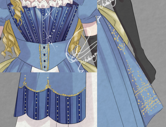
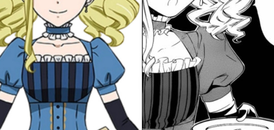
Lizzie’s Campania Dinner Dress REDESIGNED
After having redesigned the Notorious Robin Dress of O!Ciel (click here), I thought I’d try my hands on another well-known dress; Lizzie’s dress on the Campania!
As explained in the post linked above, Yana seemed to not have an inkling of historical fashion knowledge at the beginning of the series. As the series became bigger however, she employed a Victorian Era expert and the results are clear.
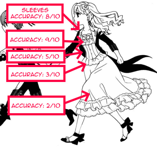
In this post I will examine to what extent Lizzie’s dinner dress is accurate and break this costume down from the top, and propose how to “correct” these while trying to keep as much of the original design as untouched as possible.
I. Dinner Dress

Hair
Just like I said in the Robin Dress™ REDESIGN post, needless to say, 19th century people would not have worn twin tails. Wearing the hair down was considered ungroomed for women in the 19th century, but young, unmarried girls were allowed to spare a few hairpins.
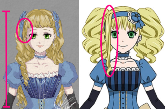
Unlike O!Ciel who would always try to strive for a more mature look, Lizzie would aim for the opposite.
In the late Victorian era it was normal to have bangs, but it was proper to have it cut well above the eyebrows. So Lizzie’s bangs only need to be trimmed a bit to be period accurate.
The long dangling fringe of Lizzie’s is a tribute to her mother, but alas, that one does need to go... I do not dare fully risk the WRATH of Frances the Formidable however, so in honour to her, I have kept that bang as much as possible. The sides of the bangs were allowed to be longer in order to frame the face better, but the point remains that the face should not be covered.
(I know, I know, two symmetrical half-arsed fringes would have been better, but I promised to try change as little as possible...)

Victorians hardly ever cut their hair, because the longer the hair, the more feminine and desirable a girl/woman was deemed to be. The aesthetic of hair in 1880s was more in the vertical direction instead of horizontal. Hence Lizzie would probably have worn her curls a bit smaller, therewith using up less hair into the width.
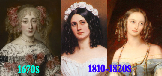
The period wherein people strongly favoured a horizontal aesthetic was approximately 200 to 70 years outdated. If we had to justify what type of hair Lizzie’s hairdo was supposed to be historically, I could only say it is probably the 1670s early baroque hairdo. (I mean... that portrait IS fairly similar to Lizzie’s hair, is it not?)
The hair ornament Lizzie wears is not entirely impossible, just very unlikely for the 1880s. I have kept the weird rosette that she wears, and used them to pin up both sides of her hair. I could not find any visual sources of people wearing rosettes in their hair instead of their chest after earning some type of prize, but since there were no regulations regarding how a ribbon must be tied into a bow, the rosettes can stay.
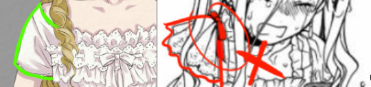
Neckline and Bodice
The design of the original bodice also requires a bit of work. Just like with the Robin Dress, the main problem lies with the silhouette.
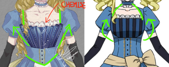
In the height of the Victorian Era, the main endeavour was waist reducing, hence the chest area would be accentuated and “streamlined” towards the shoulder, while the seams would detract from the waist optically.
Instead of the straight design of the chest panel, I replaced it with a fan-shaped front piece, of which the lines would achieve this ‘streamline’ effect.
The halterneck-like neckline as in the original design would have been quite unlikely as it would have made the neck stand out, and make the much thinner neck compete with the desired small waist. The rule of thumb for what aesthetic bodices should have was generally open wide top, closed small bottom (V shaped, not O). Usually when there is a halterneck-line, something else that would redirect the eyes towards the larger shoulder-chest area would adorn the bodice too for compensation.
Thus, instead of the rounded halterneck-line, I replaced it with a straight square neckline. Though square-necks were not very popular in Lizzie’s time, they were not unheard of. Miraculously I happened to stumble upon this illustration from 1889 (exactly Kuro’s present day setting), and herein we can see both the short lantern sleeves and the square neckline.
Decoration wise there is nothing inconsistent with 1889 fashion, but as Lizzie is the daughter to an influential Marquis and the dress is supposed to be a dinner dress, it should be a tad gaudier. The elaborateness of Lizzie’s original dress was more alike that of a daytime walking dress. I did not deviate too much from the original manga’s design, I simply added some gold details that were not there yet.
(The anime’s dress had been simplified for animation’s sake, so my redesign is based on the manga’s slightly more elaborate triple panel decoration.)
This choker ribbon necklace is the same as for the Robin Dress. Like I said before, these were worn by people in the 1880s, but they were not standard for fancy night time events. However, as it is technically not historically ‘inaccurate’, it can stay.

Waistline
Just like the Robin Dress, Lizzie’s waistline is the most historically inaccurate part that renders the entire design a period amalgamation.
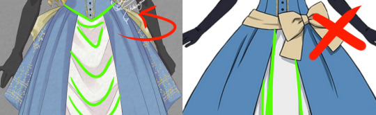
First of all, I gave the waistline a pointed end and swagged the inner skirt up towards the hips for a dramatic V-shape. The bow-sash worn around the waist was something that was in fashion during the 1780s and 1790s, and was part of the ‘Chemise de la Reine’ look that was named for and popularized by Marie Antoinette.

Fashion trends do always come back every now and then, so a ribbon bow is not necessarily taboo. But the height at which the bow sits on the original dress would guide the waistline towards the hips, which would have gone against the small-waist aesthetics of 1880s, which would have been taboo.
Hence, I removed the sash entirely, and shoved the bow itself to the back (more on this below.)
Skirt
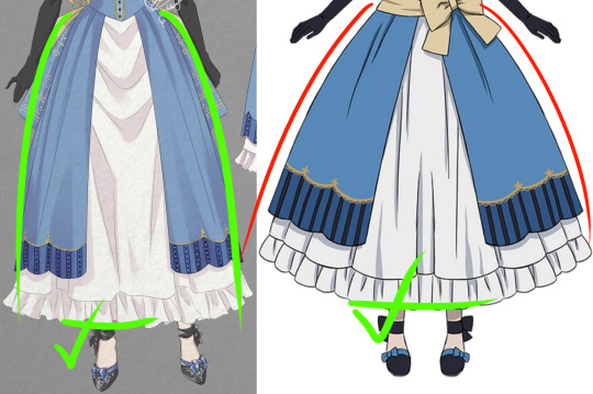
Again, the same problem Yana had with the Robin Dress; the bell-shaped silhouette that would be at least 30 years outdated by 1889, so I simply reduced its volume.
The split panel front however, was common in the 1880s, as such it remains untouched.
The dress code for formal events would require a floor-length hem for dresses, but a dinner party such as the one on the Campania would be semi-formal, and Lizzie who strives for a very youthful look would have been able to get away with a shorter hem. Hence, the skirt length also remains unchanged.
Bustle
“Does this dress make my butt look small?” would have been the question women asked. Late Victorian fashion just LOVED a huge behind, and the bustle was the absolute star of any feminine outfit.
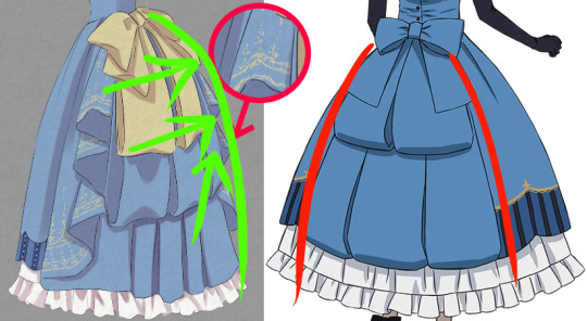
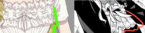
The design of the ornaments on the original dress is actually spot on, except that it would simply lie flat over the skirt, rather than help the skirt get a large bulge.
So for the redesign, I have decided to use the golden bow that sat at the front to draw the attention towards the maximised behind. Underneath I used the original triple row tails, and flanked this decoration with large pleats to produce a dramatic back. For completion’s sake, I have added golden embroideries to the pleats so that the large golden bow will not just sit there as a random piece of ornament.
Shoes
I could find relatively few sources on late 1880s shoe fashion, so my caveat here.
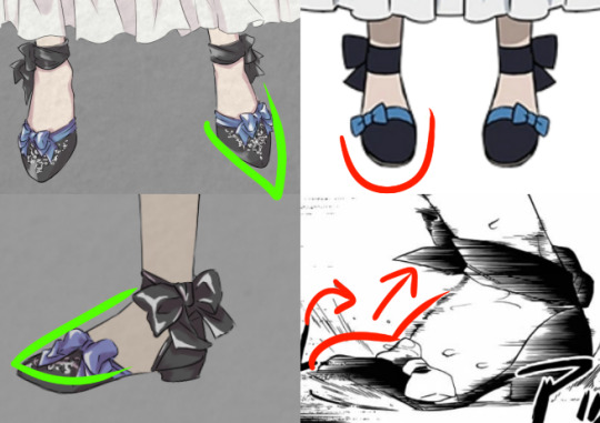
Lizzie’s d’Orsay type of shoes were not standard in the 19th century England, but they were definitely not impossible. 1880s d’Orsay pumps were a bit more closed around the lateral arch, but the technique to make completely open d’Orsays was already available in the 1600s, and wildly popular after the 1830s. As I could not find any sources on when they stopped being popular, I think Lizzie’s shoes would probably have been acceptable.

What I do propose to change is the point of the toe. Only very, very young girls (up to age 4 ish) would wear a rounded nose. Slightly older children and adults would wear pointed toes instead.
The only other thing I propose to change is only a “problem” if I were to be perfectly pedantic and nitpicky; namely the arch of the shoe. Arches of the shoe until the 1910s were mostly straight, and did not have the same arch as our natural feet have. So in order to create the perfect 1889 shoe silhouette, I straightened Lizzie’s shoes too.

Y’all still with me? Good. Now comes the trickiest part, THE UNDERWEAR, a.k.a. Lizzie’s Battle Suit.
II. Battle Suit
Lizzie’s dinner dress was actually fairly historically accurate, earning a personal Chibimyumi rating of 6.6/10 in total (as opposed to Robin Dress’ miserable total rating of 4.1/10). Her Battle Suit however, scores less well, reaching only a 5.4/10.
Chemise
Victorian undergarments were nothing like our contemporary ones. If you have no breasts then it is easy, but if you do... well, a bra is bad enough, right?
Well.... In the Victorian times women wore layers on top of layers, of which the first was the chemise. Contrary to popular belief, people did not wear corsets directly on their skin. Corsets were very hard to wash, thus the chemise served to both protect the corset from getting dirty, as well as absorb the sweat.

Yana did do pretty good research as attested by her not having fallen for this popular misconception. Lizzie does indeed wear a type of chemise underneath her corset, though I would say that the sleeves are too elaborate for the dress she has chosen to wear on top.
Such elaborate sleeves were worn to be combined with smaller sleeves so that the lace can protrude from underneath, giving the entire outfit a little icing on top (like the lace at the chest). Lizzie’s dinner dress has lantern sleeves that would not reveal any of the chemise’s sleeves.
Chemises were washed quite regularly, but lace is a very expensive and delicate material. Hence, in order to minimise wear-and-tear, people would probably have avoided wearing ultra fancy chemises if it cannot be seen anyway. But who knows. Lizzie is a rich kid, she probably has enough lacy chemises at her disposal. Still, just to be perfectly historically accurate, I gave her chemise simpler sleeves.
Corset
Unlike the chemise, corsets were not regularly washed, and thus elaborate lace was very desired.
The large ruffles on the chest of Yana’s design however, are probably a tad too elaborate, and judging from the thickness, they could easily disrupt the smoothness of the outerwear.
1880s corsets were generally not very decorated as their function was valued over anything else. This corset I found dating from 1887 is the most elaborate authentic one I could find, and it indeed strongly resembles the one Lizzie wears. However, as even this one does not have lace protruding as much as Lizzie’s, I have toned the corset down too for the redesign.
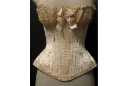
In the 1880s, both corsets with and without front closure were worn. However, the pieces as elaborately decorated in the front would not have front closures. Hence I removed the hook and eye closure in the redesign.

The thing that is the least accurate about Lizzie’s corset is the boning structure. What produced a well-shaped waist was not how tight you lace the corset, but the structure of the boning. An unlaced corset of that time would have looked much ‘curvier’ than any tight-laced straight-boned corset.
By the late 1880s, boning techniques were so advanced that they were very soft and flexible, and yet also provided the firmness necessary for the desired look. The straight paneled type of boning drawn by Yana was outdated and strongly advised against.
Finally, the mini-skirt at the bottom of the corset is cute, but I have yet to find one like that in the 1880s. I don’t think that tiny piece of fabric would disrupt the desirable silhouette, but there will be PLENTY layers on top, so I removed it just to be sure.
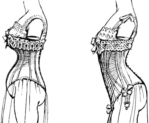
Skirt
The skirt - or rather, everything that happened UNDER the skirt is a stack of complexities.
The most bottom layer would have been the underwear with trouser-legs, layer 1. Layer 2 is the protruding hem of the chemise, that may either have been long or short. But the chemise and the underwear are the only things that were worn UNDER the corset, hence the frilly-frilly skirt we see Lizzie fight in should have been the chemise, and not the underskirt.
The chemise was never something as wide as the one drawn by Yana, and could therefore not achieve that flare effect. I know it is absolutely gorgeous, and from an artistic point of view I myself would not have done otherwise. But as I am doing historical fashion research and redesign, I shall compromise myself and settle with a narrow skirt. The skirt would probably have been so narrow Lizzie would have trouble fighting. So it would not have surprised me if she decided to make a large split in it, or rolled it up and tucked it under her corset.
The frilly underskirt we see Lizzie wear should be layer 4 rather than 2. If we study Lizzie’s dress, we can see that the frilly part is a separate piece of clothing, unlike what the anime-art suggests.
Underneath this layer, there would have been a bustle (layer 3) that was strapped around the waist, over the corset. Like I explained before, bustles were essential to any Victorian dress. They came in many shapes and sizes, but I have settled with the simplest one.
Should we wish to keep the frilly skirt, then we need to keep in mind that Lizzie would have worn FOUR layers, which would hardly have made it any easier for her to navigate through the water than before. So why bother remove the dress and expose herself at all then? Hence, all layers from layer 2 on will sink with the Campania.

From our 21st century point of view, the Battle Suit looks quite cute, and we would probably just wear it like that. But if we consider down to what layer a real 1889 girl would have to have stripped, and how many somewhat embarrassing contraptions had to be removed first before reaching some level of mobility, we can probably understand how embarrassing it truly must have been.
Well, I had tons of fun doing this research, and I learned a great lot about what corsets really were (and not the inhumane torture devices they are claimed to be). I hope you all also had fun reading this too. (*´▽`*)ノ

【Related post: Ciel’s notorious Robin Dress™ REDESIGNED】
【Related post: Redesign: O!Ciel and Sebastian in different eras】
MASTERPOST My Art
MASTERPOST Furukawa Era Kuromyu
MASTERPOST Gender in Kuroshitsuji
MASTERPOST Analyses & Info
#Kuroshitsuji#Black Butler#Redesign#design#Campania#Campania Arc#Luxury liner arc#Lizzy#Lizzie#Elizabeth Midford#historic accuracy#Historic fashion accuracy#Historic fashion#fashion
2K notes
·
View notes
Text
Autumn Art Walk

Harvey recently spent a day at the Guggenheim Museum in Bilbao in this fantastic outfit combining a sheer watercolor shirt, chocolate zip-up wool blend jacket from Zara, olive drab drawstring chino pants tucked into black Gucci combat boots, his signature sunglasses, and a black wool beret.
Achieving Visual Balance


This is such a great study of how thoughtful styling can take casual, comfy pieces and elevate them into something that looks ultra-cool and put together in a way the pieces might not on their own. This outfit achieves balance in three key ways:
Color: The thoughtful combination of soft late autumnal colors reflect and complement one another. The greens of the shirt tie into the green of the pants, and the black beret and black boots join with the hints of black in the shirt and the drawstring of the pants to create a throughline in the outfit's color scheme. The brown jacket contrasts to all without fighting with or overpowering. Rather, it makes the greens in the shirt really pop, and remains in harmony with the more muted green of the pants.
Texture: The thicker jacket material contrasts sharply with the thinner, less structured sheer material of the shirt in a way that's pleasing to the eye. The more structured wool material of the hat and the solidity of the leather boots balance out the softer texture of the pants, not so much dressing them up as edging them up.
Silhouette: The blockier, broad-shouldered shape of the jacket is contrasted by the tapered line of the tucked-in pants, creating a nicely balanced overall silhouette.
Balance vs. Symmetry
Some people think balance always means creating a reflection across a vertical or horizontal line: make the silhouette a square, rectangle, oval, or an hourglass. But that isn't balance, it's symmetry, and the two are not the same.
Organic life tends not to be perfectly symmetrical, and there have long been fashion trends that intentionally sought to disrupt the appearance of too much symmetry in favor of creating a visual effect that feels more lively and authentic.
Think one razored eyebrow, split-dyed hair, color blocking, or the many fashion trends that seek to create the appearance of super long legs, super short torsos, or silhouettes that resemble triangles rather than squares or hourglasses. If you find your outfits feeling boring, try to create balance, not symmetry!
Even the combination of mass market and designer items in one outfit speaks to the theme of balance, as does the inclusion of older pieces we've seen on Harvey many times with a brand-new jacket from his recent travels.

Affordable Options
The Zara jacket is pricey at $250, but Macy's has a similar one on sale for $49.99 that comes in sizes up to 2XL (50-inch chest). There's also this option from ASOS for $84.99, sizes up to 2XL (48-inch chest).
You can find wool or wool blend berets in a lot of stores this time of year (I highly recommend checking ThredUp!), but I like this one from Nordstrom for $29.99.
These loose tech cargo pants from Old Navy come in sizes up to 4XL (54-inch waist) and retail for $49.99 (currently on sale for 50% off!).
I have a whole post on lace-up combat boots! But these Madden Girl lace-up combat boots are currently on sale for $34.50 and come in sizes up to 11M.
I think I'm gonna do a whole separate post on mesh tops, because Harvey wears a lot of them, they're gorgeous, and it's hard to find nice ones for plus sizes that don't make you want to claw your skin off. I'm also still working on a sunglasses post, so stay tuned for that!
#harvey guillén#fashion#plus size fashion#menswear#street style#wwdits cast#zara#gucci#shoes#accessories#jackets#autumn style#affordable options
16 notes
·
View notes
Note
Heya! I wanted to cosplay Winter Lissa from Fire Emblem Heroes but I’m having trouble figuring out, well a lot. Mostly a sewing pattern for the top of the dress, the leather corset and figuring out how make a ‘solid�� steel like crinoline. I have one make of boning I believe and velcro and it’s a nightmare to wear but that’s the only thing I see recommended. If you have any advice it would be much appreciated please (*・ω・)ノ
Hello there!

Oh, Fire Emblem designs.
Bodice of the dress:
The type of neckline on this is called a “sweetheart neckline,” so that should help you in your search. To get the most support, you will want to add at least some light boning to the bodice.
I would recommend getting a corset or corset-like pattern for the bodice, and then using the same pattern (but ever so slightly sized up to accommodate the fabric underneath) for the visible corset piece. All you would need to do is stop the corset piece just below the bustline, rather than using the full pattern.
The sleeves you probably won’t need a pattern for – you can use rectangles with elastic in the top and bottom for the puffed part, and then swing a fabric tape measure in an arc to get the bell sleeve pattern or use slash and spread on a rectangle the size of your arm – but if you want to find a pattern for a bell-sleeved blouse or dress and just splice the lower portion of that onto the puffed part, that would work as well.
A very cursory glance at some corset patterns yielded these, but I’m sure there are many more options if you flip through a pattern book: 1 2
Leather corset:
For the corset, you probably won’t find a pattern that is exactly like the shape on the bottom, so you’ll have to create that yourself. If you can find a corset that goes over your hips, it will be easier, but if not, it’s not a big deal.
I would make a mockup with extra fabric at the bottom for the hips, figure out how wide each panel needs to be from there (measure the gaps between the panels and add that amount to the pattern), making sure to wear it over your hoop skirt. Make a second mockup with the added fabric, fine-tune the fit, and create the decorative shaping on the bottom – just draw on the mockup with a marker where you think it looks best, and then transfer that to your paper pattern with a ruler.
You very likely aren’t going to be able to get the perfectly straight panels of dark and light that you see on hers. That’s fine. A corset, by necessity, is cut very curvy, so those lines aren’t going to be perfectly straight while also giving you shape. If you want to create straighter lines or don’t want to have to worry about creating an extra panel for the light parts in the middle, you can applique a lighter fabric on top of the corset.
Make sure that whatever pattern you use, you add boning! I tend to stay away from the pre-cased plastic stuff from most chain fabric stores. If you can access spiral steel, that would be best. Yes, bone it even if you bone the bodice underneath.
Hoop skirt:
The good thing about her hoop is that it’s fully circular – there aren’t any gaps in the horizontal bars – so you can take advantage of normal hoop skirt functioning.
How hoop skirts work is that there are pieces of flat, flexible steel forced into a circular shape by a connector. These pieces of steel want to spring open and stay flat, so connecting them into a hoop directs all that force into keeping the steel in a circular shape. Then, several of these rings of varying diameters are arranged vertically into a skirt – typically by sewing them into fabric, but in this case, you will need thinner vertical supports than a full skirt. The relative sizes of the hoops and how far apart you make them will create the shape – hoops with a large difference between their diameters will create a more triangular look, so you probably want to keep them close to the same size near the bottom and then make them smaller as you go up for her bell shape.
As for tutorials, you’ll probably get more relevant results if you search for “cage skirt tutorial” than it you look for “hoop skirt” or for Lissa specifically.
Whatever your base material (I recommend steel hoop boning, but that can be hard to work with, so a thin plastic or a plastic boning may also work), you will need to create some kind of decorative exterior to create the metallic look. If you use thin plastic, you can simply paint directly on it. If you use another material, you can case it in metallic silver fabric or you can create an exterior facing of a rigid material (such as posterboard or thin plastic).
And yes, hoop skirts suck to wear. Make sure you have a good waistband on yours so it doesn’t dig in at the waist. It will always be a bit heavy, but if you wore a corset underneath the hoop, it would help distribute some of that weight. For sitting, find chairs with no backs or arms when possible, and if you don’t use a rigid material for the vertical supports, you can collapse it onto itself like a paper lantern. When walking, many materials will allow you to slightly squeeze the hoop skirt in at the sides into a more elliptical shape so that you can fit through doors and not hit people with your skirt and such. Make sure that whatever you use for decorative facing on the cage skirt, if using a flexible material and want to use this technique, is also flexible.
Another tip if you haven’t already thought of it: be sure to purchase plastic ornaments instead of glass! If one falls off during the con or someone bumps into you, you don’t want to end up with shattered glass everywhere.
I hope that helps! Good luck :]
—Fabrickind / Q&A Staff / Twitter
30 notes
·
View notes
Text
Disclaimer! I Talk A Lot. Art & styles are my special interest. I can ramble about art with very very little prompting the way you can ramble about birds haha.
So if this is unwanted or if I’m missing the point at all, uhhhhhh wups.
A couple more recommendations really quick -
(most of these people also have more works to look over, I just thought that these ones in particular were the clearest examples!) Floating Megane -----Focus on the expressions Paper SU -----Focus on the body/clothing with the sharp corners/edges SADist -----Focus on the tone shift. Beginning, lineart is thicker and more rounded with clear shapes. Towards the end, it starts to get sharper, thinner and with harsher corners. Neil Illustrator [light general TW?] -----Focus on hand/limb shapes, and especially clothing shapes. 速冻冰块0201号 -----Focus on the shading, wrinkling, detailing in some places - like hands - that resembles more semi-realistic rather than anime. At Logart [Abuse tw] -----Focus on how the amount of lines increases as it gets more serious. Tear tracks are marked with multiple horizontal lines, rather than a few vertical. As the tension builds, there’s more details in shading, hands, clothing wrinkles.
OK SO, why I wanted to put emphasis on those parts! Now that I’ve had time to sit at my desktop and draw something
Since you wanted more on edgier anime styles, that’s what I’m focusing on here. This applies to more than just headshots, it’s just easier to example it on headshots!

When looking at style references, something to really keep an eye on is line type and shading style! I have a handful of more exaggerated examples here.
You can see more blocky/sharp line art is in the left column, and on the right columns it’s a lot more smooth/rounded lines. The left column also has varies line weight - corners on the outside of shapes are bolded while the concave parts are lighter. On the right, the lines are overall pretty uniform.
Most anime/anime adjacent artists tend to use a mix of these for their own style! Some will have people with sharper lines, while the clothing is more soft/smooth. Or the opposite. Or maybe the face is smooth, while the hands are sharp.
If you look closely in some anime, most of the work will typically have a leaning towards smooth lines and cell shading. However, in scenes of existential horror there’s more lines, and the lines might becomes more sharp and blocky. And in scenes of action, sometimes they’ll replace the shading with or add crosshatching.
So your references are going to vary substantially, even within the same anime or by the same artist! Usually poster/promo art leans very heavily into the smooth lines and clean flowy shapes, even if the style in the show itself has sharper lines.
Both the lineart and the crosshatching is a way to give an illusion of detail - you’ll see that design wise, or information wise, nothing has really changed between the bottom right and the top left of the 4 shading examples here.
This difference in line type also contributes heavily to why some people might like their sketches more than their lined art. A lot of people tend to assume that smooth clean lines are what you’re supposed to do for everything, without really knowing the possibilities around purposefully messy lines to convey emotion.
I’ll change the way I do lines depending on the purpose of the piece - emotion, information, appealing, disturbing, and so on.
If you have a specific vibe or a specific style you want to emulate, I can break down the specific components of what goes into it!
Since PINTEREST wants to SHAME me, (/lh /j) Ill ask the fellow traumatized folk on this blog, does anyone have any darker, heavily emotive, edgier art styles that are semi-abstract and/or anime that you can recommend?
I very very much love Wooma art for reference and a lot of Vocaloid PV styles and Id absolutely love recommendations if anyone out there had any
I'm trying to develop a stable way of doing more than just headshots and busts and I kinda wanna study stuff
I might also look something more into xxxholic cause what I've seen is that it kind of is neat itself
#Rose rambling time#art rambling#if this is helpful please continue asking me about art I will talk until the end of time#I will drop everything to talk about art with 0 notice
30 notes
·
View notes
Text
6 magical living things that you can see straight through
https://sciencespies.com/nature/6-magical-living-things-that-you-can-see-straight-through/
6 magical living things that you can see straight through

The power to be unseen has long captured our imaginations – from ancient myths to modern fantasies of rings and cloaks that can bestow such a gift.
One way to achieve a type of invisibility is to let light pass straight through you – to become transparent. This requires a body composed of tissues that neither scatter nor absorb the light that hits them. The natural world is full of living examples of this.
“Transparency is, at face value, the perfect camouflage,” behavioural ecologist James Barnett from McMaster University in Canada, explained earlier this year, while discussing glass frogs.
“It is relatively common in aquatic species where animal tissue shares a similar refractive index to the surrounding water. “
A refractive index describes the speed of light passing through a material, compared with a vacuum.
Since the path of a light ray bends in direct response to its change in speed as it passes from one medium to another, lower refractive indices mean less bending. And less bending means clearer transparency. For example, window glass has a refractive index of 1.52. Water is 1.33. And air is a lot closer to 1.
Many microscopic and marine critters have taken advantage of transparency, to hide where there’s nothing but water to hide within, including classic jellyfishes, sea snails, and lots of baby fishes.
“Air and tissue are quite different in their refractive indices, so transparency is predicted to be less effective in terrestrial species. Indeed, terrestrial examples are rare,” explained Barnett.
But some landbound plants and animals have also evolved at least partial transparency – from insect wings to the leaves of the humble succulent Haworthia cooperi.
Here are six see-through species and their strategies for invisibility.
1. Mirror eye masks
Aside from their eyes and stomach, glass squid are almost entirely transparent.
A cranchiid squid seen through a polarising light filter. (NOAA)
“Eyes and guts cannot be made transparent,” explained Woods Hole Oceanographic Institution biologist Sönke Johnsen, in a 2001 review on animal transparency. “Eyes must absorb light to function and guts are betrayed by their contents, since even transparent prey become visible during digestion.”
But the squid have tricks to deal with their opaque bits too. The eyes of at least one of the 60 species making up the glass squid family use a combination of light emitting organs called photophores and reflective cells to deflect this light. Together they create the illusion of sunlight filtering down through the water.
To minimise the impact of their visible digestive organ, it’s positioned vertically as the squid swims horizontally along its length. They also hold their arms up too, as you can see in the video below. This position reduces their silhouette, in case the squid happens to pass over a hungry predator on the lookout for shadows suggesting dinner.
Glass squids can also morph into a sphere as a defence mechanism, by pulling their head and arms into their mantle - looking highly ridiculous in the process.
youtube
2. Blended edges
The guts of the glass frog (family Centrolenidae) also remain clearly visible through their transparent bellies, but they were not shaped by predators viewing them from below. This species’ partial transparency helps complete its camouflage as it snugly clings with its clear side against lush green leaves of its arboreal forest home.
Its clear belly helps the amphibian change in brightness to match the light levels of its chosen perch. The frog’s limbs are also translucent, blurring the lines between it and its surrounds, for better hiding in plain sight.

(Matthieu Berroneau/Getty Images)
3. Bacterial cloak
Instead of creating a light-and-mirror illusion, other transparent species have different strategies to hide their visible eye tissues, like crustaceans whose retinas match the colour and brightness of their surrounding environment. The deep sea amphipod, Paraphronima gracilis, has eyes as big as almost 50 percent of its body. Evolution found a way to make most of these giant orbs transparent, aside for the 12 tiny red retinas in each eye.
Those retinas are spaced in just the right way to make them less obvious from below, while maximising their sensitivity to light coming down from above.

Female Paraphronima gracilis with white egg sacks and 12 red retinas in each eye. (Fergus et al, Current Biology, 2020)
4. Bumpy disruptions
To counter reflections caused by the changes in refractive index between the air and organism, some creatures have evolved tissues with submicroscopic bumps. If the bump widths are less than half the wavelength of the light falling on them, they form an averaged-out smooth gradient between two interfacing refractive indices, disrupting the surface’s ability to reflect light.
The coffee bee moth (Cephonodes hylas), uses this strategy in its strikingly clear cutaneous wings, along with the corneal surface of their eyes.

(Nitin Prabhudesai/500Px Plus/Getty Images)
5. As flat as can be
Many baby fish start off as transparent larva riding the ocean currents, and eels are no exception. Before they reach their adult form, freshwater eels pass through a leptocephalus larval phase and then a glass eel stage.
These floating ribbons take the strategy of making themselves flat to the extreme. The thinner an object is, the more light can pass through unperturbed. This also makes them very hard to see edge-on.
[embedded content]
6. Now you see them, now you see through them
When dry, skeleton flowers (Diphylleia grayi) look like a fairly typical white flower. Then the rains descend, and they magically transform into ethereally delicate flower-shaped crystals.
Their white colour isn’t from a pigment, but rather arises when the petal’s rough surface and air gaps work together to reflect light, creating the illusion of whiteness. The refractive index between the clear cellular surface and the pockets of air between their protrusions differs enough to diffuse and reflect a lot of the light that hits them, giving them a white appearance.
But as the rain fills spaces between the cells, replacing the air, the cells’ and gaps’ refractive index becomes more closely matched, letting far more light to pass unaltered and allowing us to see straight through them as well – not unlike a wet, white T-shirt.
Whether this provides D. grayi any evolutionary advantage or not, is a mystery, but they are beautiful to witness.

(Yong et al., Journal of Materials Chemistry A, 2015)
Scientists have taken inspiration from these incredible earthlings and co-opted some of their transparency tricks into our technologies.
Biologists have engineered human cells to have changing opacity using proteins from squid, so we can better see what is going on within them. And engineers are experimenting with the moth wings’ bumpy surface method to create antireflection surfaces for devices.
These wonderfully strange life forms display some of the extreme ways evolution warps light in the game of ‘eat or be eaten’.
#Nature
#01-2021 Science News#2020 Science News#Earth Environment#earth science#Environment and Nature#Nature Science#News Science Spies#Our Nature#outrageous acts of science#planetary science#Science#Science Channel#science documentary#Science News#Science Spies#Science Spies News#Space Physics & Nature#Space Science#Nature
2 notes
·
View notes
Text
TAFAKKUR: Part 37
Your Intestine
Maybe now you will snap at me saying, “What are you trying to do? You are nothing but a set of long pipes, you are the last one to talk about itself!” But take care and do not be so quick to dismiss me; do not make a face at me for the waste material I carry. You need to know first that your organs-the heart, kidneys, liver, and others-cannot work without me. Exaggeration? Not at all! So just listen to me and see for yourself.
In order for you to understand me better, keep in mind a basic principle about the functioning of living organisms-they all depend on energy use. If no energy enters a living system, then no metabolic activity, no life function can be carried out. Think about a car without fuel. No matter how great the car is, it simply won’t work without any fuel in the tank. The human body is no different. Plants and animal products which people consume as food provide the body with fuel. However, you cannot make use of the energy in nutrients in the form in which you take them in. They need to undergo a process so that they become usable fuel for us, like crude oil being refined into gasoline to make a car work. This is roughly what my duty is. Without my functioning, you would be devoid of the energy to move a finger, and eventually die. Do you understand now how important a set of pipes I am? You just think that I look like a soft and hollow canal and misjudge me as simple. Well, I know that I don’t have such complex parts as the heart, lungs, and kidneys, but I’m created as a perfect work of art in plain design.
Although the hoses you use for watering your garden wear out and break in a relatively short time, my walls made of four layers keep functioning through a lifetime without any holes unless I contract a disease like cancer. My outer layer consists of a durable connective tissue, the next one consists of two sets-one horizontally and one vertically laid-of straight muscles, the next layer under that consists of glands spread in a soft connective tissue, and the innermost layer is the epithelial mucosa where the actual absorption takes place.
Now, let’s come to how I achieve digestion, one of your body’s vital activities. Actually, there is no place for me to take any pride in it; I’m just doing as I am ordered. Anyway, the complex processes occurring within my simple-looking walls are just fascinating! Every one of my cells producing the particular enzymes to break up each nutrient is like a separate factory. Some of these enzymes break proteins into different levels of peptides, some break the peptides into amino acids, some break fats into fat acids and glycerin, whereas some break carbohydrates down into glucose. All of these particular enzymes have their sub-branches within themselves. For example the enzymes breaking down fructose (fruit sugar), lactose (milk sugar), and starch are all different. In order for the enzymes to be effective, my inside needs to have the right pH level; the enzymes work in very sensitive conditions. To give you an idea, the enzymes in the stomach-which happens to be the second station the nutrients are destined for before they come to me-work in an acidic environment (pH: 2.5–3). In my case however, basic fluids are secreted and this strong acidity is neutralized for my enzymes to work.
My overall length is around 8.5 meters from the first entrance at the stomach to the last exit. The small intestine is nearly 7 meters long and the remaining 1.5-meter section is the large intestine. Although the small intestine is the longest section of the digestive tract, it is still called small since it is smaller in diameter than the large intestine.
The small intestine is also divided into three sections. The very short (25–30cm) and relatively thicker part right after the stomach is the duodenum. Bile-which works like detergent and facilitates breaking up fats-produced by the liver and digestive enzymes from the pancreas enter the duodenum. Thus, the nutrients are digested one step further and pass on to the second section (jejunum) and then to the third (ileum). You cannot easily tell apart these final two sections. As blood circulation is more intense in the second section, this section is more reddish and the contractions here are faster and stronger. The third section is narrower and has thinner walls. The blood circulation here is relatively lower and the movements are more limited. The thin membrane of connective tissue (mesentery) around me which attaches me to the abdomen wall and prevents me from knotting up is relatively fatty in this third section.
My most vital parts are the villi-tiny nipples covering the curly surface of my inner wall like a carpet. Shaped like the fingers of a glove, villi yield an enormously large inner surface. They contain a net of capillaries and lymph canals. In addition to the glands secreting the enzymes to break down nutrients, the secretion of certain glands protects me against the destructive effect of the stomach acid. Some cells secrete mucus for lubrication and protection of the passing nutrients. As some cells of the villi secrete digestive enzymes, some of my cells absorb the nutrients broken down until the final phase and pass them to the bloodstream.
How can some guys mistake such a splendid mechanism as a work of unconscious nature? What I’m telling you about is a manifestation of such great knowledge and might that it leaves you spellbound. I know the characteristics of foods, I know about the other organs’ needs, I adjust various enzymes and an absorption system, I fit them in a limited space… In addition, I do all these in the most ideal way, without any waste or flaw! C’mon can all these happen by themselves? Now, if I were to start telling everyone about the absorption mechanism in detail, they would probably see those cells as divine beings! The One who assigned special carrier molecules and a system for every nutrient molecule, has placed two transfer systems as blood and lymph pathways in every single one of those millions of villi! The blood pathway passes amino acids, water and salts into the blood directly, whereas the lymphatic pathway absorbs fats to pass them to the blood indirectly. After absorption, the nutrients become a property of the body and they are carried in the bloodstream to all the cells waiting for them in need.
Well, what about the waste then? Since everything you eat is not beneficial and usable, and some things are even toxic, they should be disposed of as soon as possible. The unabsorbed remnants are still too watery to be disposed of; sending them away as they are will be a waste of water and minerals. But don’t worry, everything is perfectly planned! Now the large intestine comes on duty. In this 1.5-meter section, the water of the waste and certain minerals are absorbed, and the waste solidifies. The large intestine is also divided into three sub-sections. The pouch connected to the junction of the small and large intestines is named the cecum and there’s the appendix at its end. This end sometimes festers and you have to have it removed in an appendectomy. Now, there’s this made-up story that the appendix was once longer since your ancestors only ate plants, that it has evolved into a shorter form for I now eat more meat, so on and so forth… Bah! Nothing is created in vain. If it didn’t have a duty, it simply wouldn’t be created. Only after some time did it dawn on them, after researchers proved that it is so necessary, that as a lymphoid organ, rich in blood vessels, it produces antibodies to fight the germs which somehow make their way into me.
The rest of the large intestine is the colon and the rectum. The mucosa covering my inner surface is rather smooth. It secretes mucus to facilitate the removal of waste. In addition, useful bacteria are made to work in abundance in the large intestine for your needs. These bacteria synthesize the group B vitamins like B12, thiamin, and riboflavin, along with vitamin K. You see how all the processes are carried out so splendidly? If it weren’t for vitamin K, your blood would fail to coagulate, and the slightest injury to your blood vessels would kill you. Could you ever have imagined that what looks to you like a sewage canal could produce vitamins of vital significance? Your Creator has infinite wisdom.
Now you may wonder how the acts of this organ which resembles a long hose are regulated, how the nutrients inside are propelled, and then thrown out. To put it briefly, the “willful” part of your brain does not even know about it. Indeed, if it knew, it would be constantly busy with me and unable to do anything else.
Under the control of the autonomous nervous system, the straight muscles of my walls gradually contract in waves-this is squeezing act is called peristalsis. The nerve fibers connected to me fall into two basic categories-sympathetic and parasympathetic. As the sympathetic fibers pressure me to slow down, parasympathetic fibers stimulate me to act. Thus, I try to keep a balanced functioning between these two opposite effects. When the waste material I propel this way assumes a state to be disposed of, it reaches the rectum, and when the walls here strain, I make a natural call to you that I need to get rid of garbage. This is the step where your will has a partial interference.
Colon cancer, which troubles many people today, appears in this final section. The major reason is consuming too much meat and fatty foods, lack of movement, and leading a stressful life. When these are combined, I fail to function properly. If you want to help me at that, you should consume fiber-rich foods such as fruit and vegetables, and also lead a peaceful life. My web of nerves is amazingly rich and complex. Therefore, I am sensitive to nervous changes. If you feel down or sad, and if you suffer too much stress, I begin to go into spasms. Then I fail to dispose of waste, the toxic material inside me begins to damage my inner walls and eventually increases your cancer risk. Therefore, you’d better take up the habit of a glass of warm water when you get up in the morning, and try to have regular meals at the same times of the day. Most importantly, always have fresh green vegetables on your table, reduce meat intake… and it would be great if you could afford to consume olive oil rather than any other.
Hey, wait! I was about to forget the most important point. If you don’t have any peace of mind, all of these will be useless. This doesn’t mean that you will never worry; after all, this world is a testing ground and you are a human being like anyone else. However, if you give in to troubles and get overcome by feelings like panic, fatigue, and hopelessness, then my functioning will be upset. So, troubles faced with active patience and effort without giving up hope do not harm me much.
I do not wish you to wait until you see colon cancer patients disposing of waste through a hole in their belly into a plastic bag before you feel grateful for the blessings you enjoy. Actually, maybe I have told you at most a tenth of what I know about myself. Anyway, I think even this much will give you an idea of what a work of art I am. Thanks for listening to me
#allah#god#muhammad#prophet#sunnah#hadith#quran#ayah#islam#muslim#muslimah#hijab#help#dua#salah#pray#prayer#revert#convert#reminder#religion#welcome to islam#how to convert to islam#new muslim#new revert#new convert#revert help#convert help#islam help#muslim help
10 notes
·
View notes