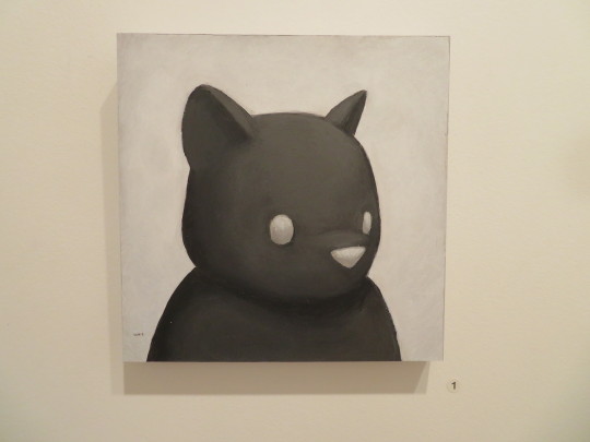
#luke chueh
Explore tagged Tumblr posts
Visit Tumblr Blog
Explore Tumblr blogs with no restrictions, modern design and the best experience.
Last Seen Tumblr Blogs


Fun Fact
The “We are the 99%” Tumblr blog became the slogan for the Occupy Wall Street movement.
Text
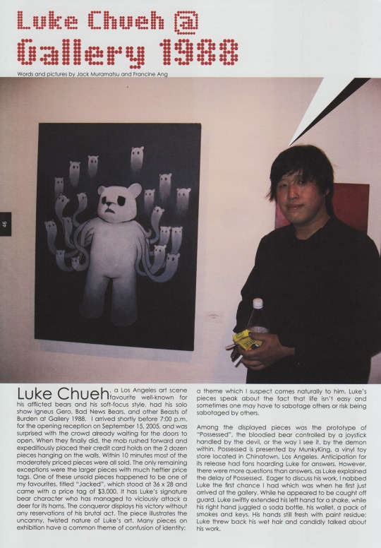

Luke Chueh at Gallery 1988 - vol 01 issue 10 of Play Times magazine (2005)
#luke chueh#scans#play times magazine#urban vinyl#igneus gero bad news bears and other beasts of burden
32 notes
·
View notes

Text
The art by the guy who made the folie a deux album cover>>>>


5 notes
·
View notes
Text
Luke Chueh
#autosuggestion #pointofview #codingyourself #programyourself #endlessness #creatingyourself #neverstoplearning #fantasy #empathy #equality #respect #love #basics
#cartoons #cartoon #art #cartoonnetwork #drawing #comics #animation #s #illustration #cartoonart #artist #anime #cartoonist #digitalart #sketch #love #memes #funny #artwork #comic #disney #draw #tomandjerry #scartoons #fanart #artistsoninstagram #oldcartoons #meme #looneytunes #saturdaymorningcartoons #surreal #surrealart #surrealism #surrealismartcommunity #popsurrealism #popsurrealist #popsurreal #surrealist #surrealista #surrealistic #lowbrowart #weirdart #lowbrowartist #surrealisme #surreal_art #surrealismo #surrealpainting #newcontemporary #lowbrowpopsurrealists
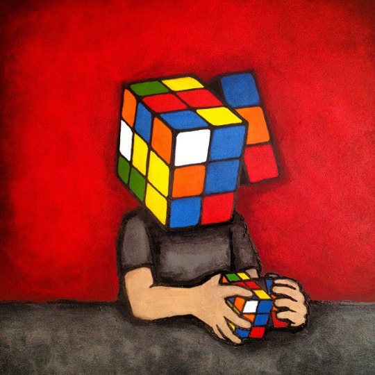
#fucking favorite#Luke chueh#6/2024#rubikscube#never stop learning#contemporaryart#contemporary art#new contemporary#newcontemporary#x-heesy#surreal#cartoons#l o v e
12 notes
·
View notes
Text

Work by James Jean


Work by Luke Chueh

Work by Giorgiko, moniker of husband and wife duo Darren and Trisha Inouye. These works are an homage to Darren’s family as Japanese Americans that experienced the WWII era.

Work by Mike Shinoda


Work by Yoskay Yamamoto
Giant Robot Biennale 5 at the Japanese American National Museum features artwork from Sean Chao, Felicia Chiao, Luke Chueh, Giorgiko, James Jean, Taylor Lee, Mike Shinoda, Rain Szeto, and Yoskay Yamamoto.
From the museum about the exhibition and Giant Robot–
Giant Robot launched in 1994 as a hand-assembled zine in Los Angeles and grew into a staple of Asian American alternative pop culture. Since 2007, JANM has partnered with Eric Nakamura, founder of Giant Robot, to produce the biennale that is dedicated to showcasing the diverse and creative works brought together by the Giant Robot ethos.
This year marks Giant Robot’s thirtieth anniversary. While the zine and magazine are no longer published, its legacy and influence are indelible parts of our culture. The shop and gallery continue to thrive in Sawtelle’s Japantown and reflect the independent spirit of its origins. Giant Robot continues to be a highly influential brand encompassing many aspects of Asian and Asian American popular culture. These galleries contain a cross section of Giant Robot’s stalwart artists, emerging talents, and friends.
The video below from PBS Artbound is a great documentary about the Giant Robot project.
youtube
This exhibition closes Sunday, 1/5/25. On the same day the museum is free and hosting the 2025 Oshogatsu Family Festival- Year of the Snake event which will include cultural performances, crafts and other activities.
#Giant Robot#Art#Japanese American National Museum#Los Angeles Art Shows#Art Show#Documentaries#James Jean#Luke Chueh#Giorgiko#Sean Chao#Yoskay Yamamoto#Eric Nakamura#Mike Shinoda#Taylor Lee#Felicia Chiao#Rain Szeto#Giant Robot Magazine#Los Angeles Art Show#Painting#PBS Artbound#PBS Documentary#Sculpture#Year of the Snake#Art Documentary#DTLA#Youtube
2 notes
·
View notes
Text


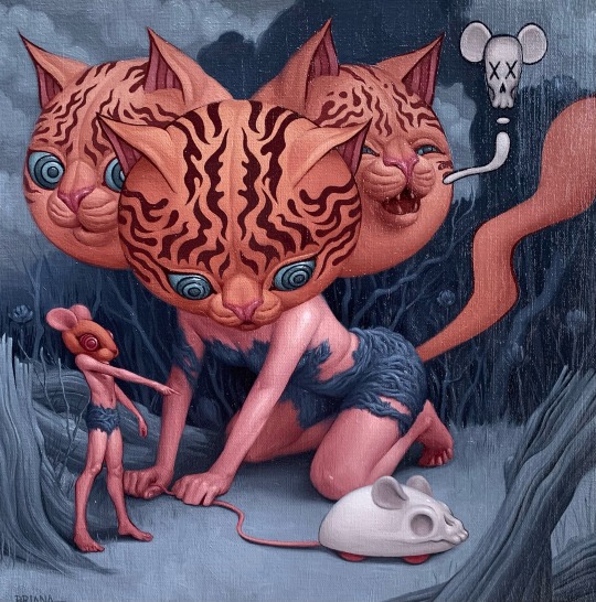
Cats are better than you.
And Bears too.


#luke chueh#sad bear#death mouse#xenomorph#polar bear#polar bears#bears#bear#cats are the best#captainpirateface#cats are weird#bipolardepression#cats are life#cats are cute#cats are liquid#cats on tumblr#cats of tumblr#chemicalimbalance#wtf#captainpiratefacelovesyou#sighthsandsoundsofinstagram#sights and sounds of tumblr#tom jones#whats new pussy cat#spotify
2 notes
·
View notes
Text
10 notes
·
View notes


Text
Five Points Festival 2024 Vendor Announcements (2/27/2024)
Five Points Festival 2024 Vendor Announcements (2/27/2024)
The Press Release: Luke Chueh: We are excited to announce that Luke Chueh will be making his Five Points debut this year! Chueh is a contemporary artist based in Los Angeles, California. His art is best known for its unique blend of cute and melancholy themes, often featuring animals with melancholic expressions. Luke has exhibited his work in galleries and museums worldwide and has collaborated…

View On WordPress
#1000tentacles#agintoys#aksoulmuch#amanda louise spayd#announcements#chris ryniak#clutter magazine#convention announcements#five points festival#five points festival 2024#leong wankok#luke chueh#marusan toys inc.#nyc bindlewood#ph khor#zerospace
0 notes
Text


CREATURES.
Supersonic Art's latest group exhibition, "CREATURES," opens this Friday, November 10th on Supersonic Art Shop at 1PM PST.
This curated collection spotlights the masterful creations of over 30 esteemed global artists, each bringing to life both authentic and fantastical CREATURES.
Featuring work by artists:
ADAM BATCHLELOR • ALEXIS TRICE • ANTHONY SOLANO • AUSTIN PARKHILL • BEN PEETERS • BRIAN BUTLER • BRIAN MASHBURN • BRIANA HERTZOG • BRIN LEVINSON • CHRIS LEIB • CODY JIMENEZ • DAVID SURMAN • DREW MOSLEY • DREW CHRISTIE • EVAN LOVEJOY • EWA PRONCZUK KUZIAK • JAMES CORWIN • JOSIE MORWAY • KEVIN PETERSON • LAUREL PICKLUM • LUKE CHUEH • MARK SEABROOK • MARK TODD • MASAO KINOSHITA • MATT BRACKETT • NICOLE EVANS • PAUL BARNES • SAM YONG • SAM WOLFE CONNELLY • TRATOS • TRIPPER DUNGAN • WOOJAE JEONG
Request a collector's preview NOW!
#art#painting#illustration#art exhibitions#exhibitions#fine art#contemporary art#kevin peterson#animals#animal art#art for sale#artists on tumblr#curators on tumblr#artwork#cool#beautiful#new contemporary
1K notes
·
View notes
Text
Everything's chill with "bear (patrick) in mind" until you find out the Luke Chueh painting Pete started vagueing Folie A Deux with is called "Bear In Mind"
#Chueh is the guy who did the FAD cover art btw those polar bears are his *thing*#but i'm specifically talking abt the tumblr post with the painting of the bear taking the polar bearsuit head off and revealing a brown bea#sth sth 'on the bright side got the wrong insides' too you can really go ham on the webweaving with the Wentz-Chueh bears TBH#fanfic ass band that won't let us meme in peace without getting some weird coincidences
53 notes
·
View notes
Text
Week 2
Artworks + Reflection:

•Title: I’m Happy!
•Year: 2025
•Medium: Spray paint on paper, 84 x 59.6cm
Using a stencil from previous works, I wanted to create a canvas completely flooded with these cheerful, cartoon-like characters. However, I decided to alter the stencil slightly. Through earlier experiments, I realised that the original version was too small and visually dense — it held too much detail for the image to register immediately with the viewer. I found that for a character to make an instant emotional impact, simplicity was key.
In particular, the smile and the eyes on the original stencil were too thin and subtle. Although the image still worked, I felt it needed to be bolder — not by scrapping the stencil entirely, but by refining it: leaving some parts intact while re-cutting or removing others where necessary.
I began by creating a single, isolated character as an introduction to the new stencil. Then, I started producing works that were each dominated by one repeated image and one colour. I wasn’t overly concerned with precise stencil placement — instead, I allowed myself a few seconds to visualise the result, adjusting only if I wanted to show more of the background or obscure it further. This process felt fluid and instinctive.
Despite the heavy layering of spray paint, I didn’t worry too much about the page bleeding. I did, however, take small pauses between layers to reduce smudging when moving the stencil. Interestingly, I noticed that stencil placement started to feel automatic — almost like muscle memory — as if I wasn’t consciously thinking about where to put it. I simply adjusted the layout based on the canvas as it evolved in front of me.
The final outcome feels like a wave of repeated visual information — the kind that continuously greets your eyes wherever you look. By resisting the urge to add contrasting layers or imagery, the piece embraces a kind of visual overload. It’s almost like the viewer is searching for something more, but nothing else appears. This tension reinforces the idea of sensory and emotional saturation — like being overwhelmed by sameness.
I see the repeated smiles as comedic but also slightly unsettling — almost like the work is telling you, “smile, smile, smile,” over and over, leading you to question the sincerity of the image. Is this character genuinely happy? Or is it masking something? Through reshaping the eyes and mouth, I think the work begins to suggest frustration or emotional instability — the kind that lurks behind forced positivity. Even the way the stencil has been cut starts to resemble a character crying or bleeding, adding an emotional depth that pushes beyond the surface of simple repetition.
Artists:
Luke Cheuh

Luke Cheuh. (2011). LOWBROW (AND STILL THE LOSER) [Acrylic & ink on panel / 76.2 × 61 × 5.1 cm]. Copro Gallery, Santa Monica, Los Angeles, U.S.A. https://www.artsy.net/artwork/luke-chueh-lowbrow-and-still-the-loser-1
Title: LOWBROW (AND STILL THE LOSER)
Year: 2011
Medium: Acrylic ink on panel ( 76.2 x 61 x 5.1cm )
the work to me comes off as this solemn m, sad, down, bear/person discouraging himself with a playful hand gesture whose eyes are covered with a red rectangular block writing lowbrow
Instantaneously i was reminded of SUPREME the hype-beast fashion brand who was very influential in the uprise of hype-beast culture/consumerism
idk i did read it as an attack or rather tap on the shoulder of the hype-beast culture, like look at i'm a loser wearing LOWBROW (SUPREME) ? like yeah i'm a loser but i'm wearing supreme or even the inverse
i like it, the hinderance of facial features and anything significant ,in terms of adding to the characters demeanour etc. we as the audience cannot provide with certainty as to how this being is being portrayed( to show what?speak about what?), how it feels ? it provides a sense of mystery in a work that holds only a handful of elements, i guess what i'm trying to say is that the theres not so much going on composition wise that you kinda feel uneasy, trying to grasp the characters surroundings (visual clues) to create meaning
i like this uneasy feeling, what if i were to translate into my own work. like an abundance or repetition of one stencil only to alter it with one other thing. like what if i flooded the canvas full of imagery that it becomes to much that the audience cant grasp what is going on ? or is it more of a thing where less is more? maybe i can start implementing text as a way to tie in the canvas/background.
Hektad

HEKTAD. (2021). More Love Not War [Acrylic spray on canvas (58.4 x 88.9cm)]. Gallery 23, New York, New York, U.S.A. https://www.artsy.net/artwork/hektad-more-love-not-war
Title: More Love Not War
Year: 2021
Medium: Acrylic spray on canvas ( 58.4 x 88.9cm)
HEKTAD’s work has informed my current practice through his use of vibrant colours, stencils and layered text to create visually dynamic, immediate, and emotionally rich pieces in particular his work More Love Not War. In this piece, the over-lapping spray-painted hearts in bright, vibrant colours allow for a visual immediacy which is contrasted with the stencil of an attack helicopter in black and white. The phrase “NOT WAR” crossed out and placed below the word “LOVE” creating this merging of symbolism, in a plea for peace (Taylor, 2023). Similarly to HEKTAD my practice utilises spray-painted layered imagery and vibrant colours to draw the viewers in, creating an easy viewing.
The way HEKTAD composes his elements has influenced how I structure my own works to create these emotional but visually captivating pieces. Whilst HEKTAD’s works advocate for unity, peace (ONE Art Space, 2021) and love mine lean towards frustration, chaos, and mental overload. In my practice I employ child-like, distorted characters like the one in my work “Caution” to evoke a loss of innocence and conflict. HEKTAD and I embrace the raw, imperfect textures, and inconsistencies (Hektad, 2022) to explore the hopeful versus the darker, more disorientating sides of human experience.
Research:
Boztas, S. (2024, October 4). Real art in museums stimulates brain much more than reprints, study finds. The Guardian.
I found this article quite insightful. I’ve always believed that art, regardless of how it's experienced — whether in person or through social media — can still have an impact. But what struck me was the idea that certain artworks, even those made centuries ago, still manage to captivate viewers by creating a kind of “infinite loop” of eye movement, drawing attention to specific focal points. This made me think — should I try to incorporate a similar anchor in my own work? Something that the viewer’s eye can return to, reigniting the process of looking?
I think there is evidence of this in my practice. Many of my works include a clear focal element, like a singular stencil against a background. That contrast helps reduce visual overload while also encouraging the viewer to dig deeper, to question what’s being shown or hidden. The simplicity becomes a strength — it invites curiosity.
This article also made me reflect on digital versus physical viewing. It’s made me slightly skeptical about how art translates through digital platforms. In my practice, I really emphasise rawness and immediacy — a quick, intuitive process tied to the physicality of spray paint and stencils. I feel like some of that energy would get lost if my work were fully digitised. There's something about the imperfections, textures, and scale that can’t be fully captured on a screen.
Phanyeko, T. (2025, January 16). A spotlight on Art: Exclusive Q&A with Visual Activist, Athenkosi Kwinana. GLAMOUR.
i felt that the article caused me to question the role of my art and its meaning or impact in shifting mindsets and if my work does this is this what i want? do i want to create works that gradually become more challenging in terms of engaging with the audience or do i move that aside and focus on the imagery rather than what the imagery can evoke? i did wonder if i could perhaps create and analyse after to piece together potential meaning that may otherwise be hidden to the conscious mind?
yes i do feel that my work tends to try and engage with the audience in hopes of starting conversation, evoking emotions/memories with its imagery however i am unaware to what i maybe talking about beneath the surface imagery
further reading opened up a debate as to whether or not my work is a form of revolt or opposite of one task like a poster highlighting or pushing revolution to the masses, if i were to take this and ask if my own practice acts as an opposing force to whatever task belief etc. i am acting against i would say that it would probably be more of a personal revolt or act of opposing personal, cultural pressures etc. maybe even finding ones self whilst being surrounded by the good and bad or negative and positive influences?
0 notes
Text
“Hundred Acre Deep” Fine Art Print by Luke Chueh
To commemorate the release of Luke Chueh’s Lost in the Hundred Acre Woods Edition Low Fidelity vinyl figure, Luke made a painting inspired by the colors he chose for the design. And now, Luke is making this wonderful painting available to his fans as a fine art print! “Hundred Acre Deep” by Luke Chueh is an 8”x10” signed and numbered fine art giclee print on Moab Entrada Natural 290gsm cotton rag paper. Limited to just 200 pieces, this print can be purchased now at LukeChuehStore.com for $40. http://dlvr.it/T9MrBL
0 notes
Text
6 notes
·
View notes
Text
The urge to redraw different Luke Chueh paintings as Bear Nuts characters increases everyday
1 note
·
View note