#mainly did to try to make myself shade with something not a gradient and get more comfortable with blocky shading
Explore tagged Tumblr posts
Visit Tumblr Blog
Explore Tumblr blogs with no restrictions, modern design and the best experience.
Last Seen Tumblr Blogs


Fun Fact
Hackers stole 65M passwords from Tumblr in 2013.
Text

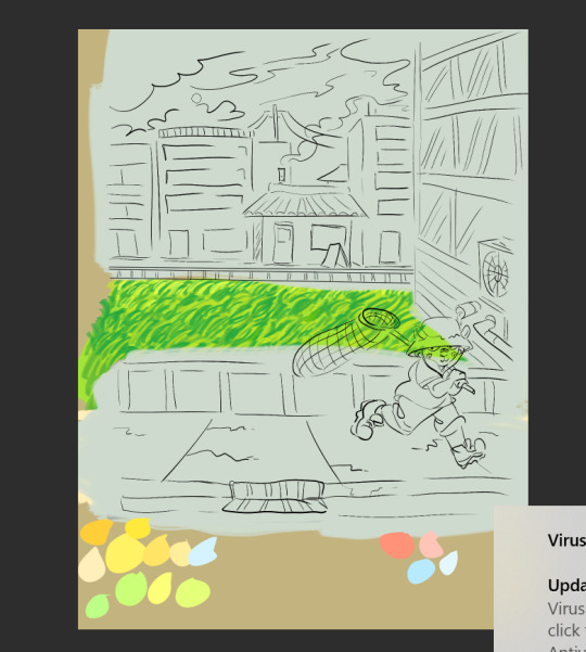
We wanted to try drawing in some old web ms paint warrior cat style, so we drew Sturgeon from @whatlurksbean 's webcomic, What Lurks Beneath
#what lurks beneath#plushi paws#my art#fanart#ms paint#old web#idk that i captured the art style specifically i mean theres a range of styles from that era in ms paint#i did a semi scritchy one lol#mainly did to try to make myself shade with something not a gradient and get more comfortable with blocky shading#and also bc i love sturgeon#might do her siblings as well#cat#warrior cats#wlb is not a warrior cats fan comic but tagging bc im trying to emulate an art style used for warrior cats a lot#and its cat#i might push the shading on this futher later idk
127 notes
·
View notes
Text
2024: Art In Review
2024 has come and gone with a whole new slew of art from yours truly. The first half of this year felt fairly stagnant, but I do believe I really cleaned up in the second half. I’m really proud of a lot of the art I made this year! As always, I’ll be going over everything month by month, making sure to point out anything important along the way.
January


A fairly tame month overall with the prime exception of my plague doctor drawing from near the end of the month. Even now, I’m still quite proud of myself for this piece! The detail and shading are both fantastic, albeit with a little roughness in some areas. Going into 2025, I would like to improve at drawing humans, and this piece is a good starting point for that goal.
February


A fairly cozy month with only a few pieces made. If you asked me at the time, I would say I was the most proud of the Sunspot drawing, but if you asked me now, I would say I’m most proud of the Chao drawing. I’ve looked at it quite a lot since initially drawing it (mainly due to it being, for some reason, one of the first files to show up on Google Drive) and I realise it actually looks quite nice! The rough lines and bright back-shading add a lot. NEVER gonna get over that extra thumb on Chao’s left hand though. No idea how I missed that.
March


A VERY dry month, unfortunately. I dipped back into Pokemon (if only very, VERY slightly) by drawing Impidimp. Satina is here too. Things get more exciting later!
April


It’s got the same amount of drawings as last month, but I actually have things to say this time! The Baxter and Forthington drawing was meant to be a bit of a successor to art I made for a Rhythm Heaven art collaboration I was a part of nearly 3 years ago. It certainly looks a lot better than the art I made back then! Still think it could be a little better though… I’m a bit more experienced with smooth shading now, so maybe I should give it another shot?
The Wortox drawing is also interesting, although not as much. I deliberately went for a rougher style with it, and decided not to draw new lines for the line art, and instead use the lines I had already drawn for the sketch. I could try something like this again for quicker drawings…
May


It’s got a few more drawings than last month, although most of them are doodles and tests, unfortunately. The Sam & Max drawing is easily the standout here. I always love drawing them every once in a while. I also tried my hand at a new art style this month! Judging by the fact the drawing was never finished, I don’t think that was all too successful.
June


Now THIS is a big month. Picture this: It’s the run-up to Art Fight and I’ve got no updated reference images for all of my OCs! I have been experimenting with a new art style earlier in the month but it still needs some tweaking. The drawings as a result of these factors are some of my favorites from the whole year! The gradient into two different layers of shading looks great and you’ll be seeing more from this art style later in the year.
As well as adopting a new style for myself, I also experimented a little bit more with smooth shading with my drawing of Jack O’ Lantern, from Shin Megami Tensei. Considering it was a drawing of the same character that showed me I could improve at my art, I’m happy to say I’m really proud of this one! I don’t think I’ll try a style like this again though: I like my lines smooth.
Lastly, an unfinished Lethal Company drawing. Once again tried a different style with this one, and while I do think some of it looks fantastic, it overall wasn’t shaping up to how I wanted it to look, so I stopped working on it before I got to the shading stage.
July

July was Art Fight month! I only did one piece for myself, and it was for my 21st birthday. I used this month to experiment more with tweaks to my art style during Art Fight. You can find the results of that here. I found a style of smooth shading that works well for me, and I had a whole lotta fun throughout the event!
August
Oops! Nothing
But seriously, I was so burnt out after Art Fight I kinda just… didn’t do anything this month! Apologies.
September

Didn’t do too much this month! Was still burnt out from Art Fight, but I managed to squeeze a few pieces out in the latter half. The Wortox and Krampus drawing was an experiment in doing more elaborate scenes. Truth is, this was actually my second attempt at doing something like this. The first is still a sketch! I might finish that some day.
October


This was a VERY interesting month. See, this month, I did a drawing challenge, of sorts. I challenged myself to come up with a new original character for every day of October, from the 1st to the 31st. Some of these ended up as quick doodles, others as fully completed drawings. A few even got remade! I’m really quite proud of myself for being able to stick it out the whole month, even if some of the drawings were rushed or the ideas were rough. I’ll definitely try something similar next year, although the topic is yet to be decided…
Also! Halloween! As always, I did a halloween drawing this year: Skweeb as a pumpkin… Pumpskwin! But that’s not the end of it! At the end of the month, my friends and I decided to host a very special movie night, with all of us in costume! Unfortunately, I don’t have a webcam and didn’t bother to buy one before the event, so I instead opted to create a Pumpskwin VTuber! It was a real fun process from start to finish and I just love working on odd projects like these. Maybe I can do another in the future?...
November


After the rollercoaster that was October, November saw things settle down quite a bit. I experimented a little more with art styles and made a birthday drawing for a friend. Quite a cozy month.
December


Finally! December! This month! It had a little bit more activity than last month, with more art style experimentation! I believe I’ve landed on a secondary art style, one I can use alongside the style developed in June. It’s a modified version of an art style I had for a bit earlier in the year, but with cleaner lines. I quite like how drawings look with it!
Well! That’s all 12 months covered! While I could very easily just put my best drawing from each month in a template and post that, I like going over all of my thoughts and goals month by month instead of simply showing the results. Anyone trying to get into art could read through something like this and get an idea of how they want to approach their projects. I also just like talking about my interests, too.
Of course! LAST but CERTAINLY not least, my yearly redraw of my first ever art piece! I believe this is a BIG improvement from last year’s, and I’m really quite proud of how it looks!


Thank you for reading.
2025 is right around the corner!
#summs-art#digital illustration#art#digital art#artists on tumblr#artwork#digital artist#original character#summs-thoughts#summs-ocs#clown#sam and max#dst wortox#imp oc#clown oc#demon oc#clown demon#demon#imp
4 notes
·
View notes
Note
The other ask about college reminded me, I just brought a physical copy of superbright to my college professor, I took digital painting with him and now he's letting me sit in on his life drawing class. He did a quick flip through and he liked it! He also immediately said "yeah if you like this art get into the history, who did they learn from?" I've only been following you for 2ish years? And it's just been what's landed on my dash. But I looove your pieces, the coloring on the backgrounds versus how Leo and Takumi are drawn, and then the pieces like the mainly pink diner.
So yeah mainly wanted to say you're super cool! Things that you learned from would be neat to see but no pressure.
hi i was honestly very shocked to read that you would show this to your professor who is probably a really great artist but im glad he liked it? ???
i answered the rest of this under the cut
as far as my art history goes, i have no academic background in art so i'm just making stuff up. i think like a lot of kids I got my roots in wanting to draw like shoujo manga, particularly the big eyed round faces of the early 2000s. I would just try to copy the eyes or something. To this day I honestly don't really look at tutorials or watch speedpaints i kind of just look at finished art and try to emulate the things I like about them. It's very simplistic I think and perhaps means I don't make art that's as clean or efficient as people who actually go out and try to learn how pro artists actually draw.
i went on pixiv a lot as a teen and followed like 1000+ artists and looked at a lot of art all the time. I was really enamored by people who could draw characters and backgrounds, like fuzichoco. (this is a super weird fun fact but one of my favorite artists in like 2011-2012 who specialized in like drawing beautiful girls with beautiful backgrounds ended up getting into leokumi under a different name/account and i was their mutual! and i didnt realize this until rather recently. im too shy to share the name tho. my teen self is throttling me btw). I Really wanted to learn how to draw backgrounds so i had to go through the struggle of teaching myself perspective and later on downloading 3d software so i could see boxes on the same plane at angles lol.
When I see art I like I try to capture the essence of what it is I liked about it in a piece (maybe one time its desaturated colors, and the next its dramatically long legs, or adding blur to the foreground), and i decide if it worked out and I want to keep doing it. Some stuff i definitely continue to use is i draw upper eyelashes the way i do because of Sata (touken ranbu, feh artist) and i started drawing leo with weird non-blond hair colors because of Araki (the jjba mangaka, who often colors his characters in alternate palettes than their "canon"). Even though i think there are stuff im a bit rigid about, like i always kinda stay in the realm of anime style, I'm still trying to keep trying out stuff I see in other artists, not just even anime artists but everyone's favorite Leyendecker or Mucha, or I'll take photos of random stuff to file away as an idea. Like I have a photo of leaves my coworker collected that have a nice green to pink gradient that I took for inspiration.
As far as the diner picture goes I think to pull off that piece I needed to practice making art with less colors and also less contrast. Similar shades of pink take up most of the picture with teals being a secondary color and avoiding adding other colors in large amounts. I think the linework is doing a lot of work in that piece. I had to google a photo of a person sitting at a diner table for the perspective.
idk if this answers anything but it was fun to think about?
16 notes
·
View notes
Text
the always wonderful shelley @shanheling tagged me to do this thank u so much!! i think that everyone i wanted to tag has already been tagged to do this but if you feel like doing this feel free to consider urself tagged by me!! im putting this under a readmore bc its long and i ramble a lot
the piece i was tagged to explain my process on is this oc piece! unfortunately i have a habit of deleting my original clip studio file once ive finished my art and saved it as a new png file, so i dont have the file to show the sketch and different stages of this piece. but I still can go through my general process and talk about how i did that piece!
1. planning
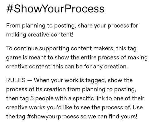
honestly i think about the art that i want to do a lot, and in this last year or so ive thought about the art i want to do more than ive been able to actually create and finish that art that i want to do. for my planning i tend to do a lot of different thumbnail sketches for the art im thinking of
these are some examples of thumbnails, a lot of times ill do thumbnails just on pencil and paper and with some of these theyre done quickly with my fingers on my phone note function on a day where i was feeling too bad to get up and draw on paper but still wanted to get the thumbnail ideas down. two of these are for the same songxiao piece that i still havent finished and i have more thumbnails digitally on clip studio for the same piece, i do a lot more thumbnails when a piece isnt working the way i want it to and theres times where ill completely scratch a thumbnail or a sketch and start over in order to do more thumbnails because i dont feel happy with some aspect of it.
two of these are small gouche painting thumbnails for two pieces i did maybe a month or so ago, i did the thumbnails and then tried to expand on them digitally and im wanting to do more thumbnail paintings like this in the future because it was fun
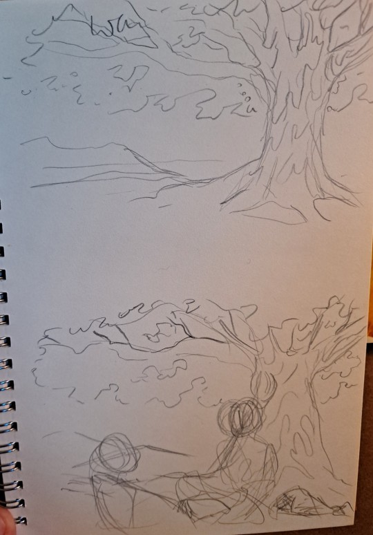
for the piece of my oc trio it was based off a series of ask prompts i got for a few different outfit prompt memes i had reblogged, so i based their outfits on the ones in the meme. when im drawing figures i tend to try and get the movement down in the poses when im sketching, i do several rough sketches of the pose before beginning to start setting down lines (if im doing lineart at all because sometimes i dont like doing lineart and do a more lineless painting kind of style). i really try to get my art to convey some kind of emotion, in the oc piece i wanted it to feel fun and like youre seeing three best friends while theyre out on the town having a fun night
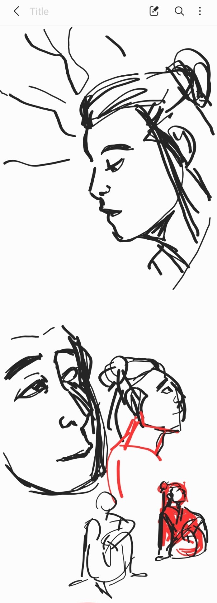
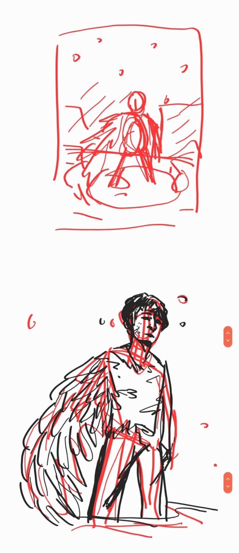
2. creating
this is the only real example i have of a piece in the middle of being filled in and created, this piece is one that im really not very happy with & have had lying around for a while and ill probably scrap it and try to come at it from a different perspective at some point. but anyway it still shows what i do, i lay down a kind of neutral gray color underneath my final sketch/lineart if im doing lineart in that piece and then i start picking out the colors that i want for the piece and kind of setting out a pallette for myself. i dont do this color pallette thing 100% of the time but i do it really often, especially if im working on a commission or a larger piece where i know theres going to be a lot of colors or if its a piece where im not sure exactly what color scheme i want so laying out the colors together helps me kind of decide what kind of scheme i want. i am sooooo picky about my colors in my art i am genuinely obsessed with colors in art and there are times where i really have to stop myself from working on something forever just constantly adding more colors or putting little tiny changes and gradients in the colors.
after ive got the colors i want down i tend to try and block out parts of the piece with the base color for that section, and then i start to paint with the colors that i want to go on top of that base color from there.
once im satisfied with the colors/shading/rendering and everything ill go back and look over things and will fix things that look off or sometimes completely redo segments if they dont look right to me. when i was younger and mainly doing digital art using my phone and my fingers i would use a lot of filters and overlays on top of my art once i was done, and honestly im glad to not be doing that anymore because i dont think it made my art look any better. i do color adjustments and sometimes will put on a color overlay or a layer to emphasize the shadows and the light in the piece, but i try to keep those layers to a minimum and like i said before i have a tendency to obsess over the colors and ill spend a good amount of time in the color adjustment tool of clip studio and then ill just decide "actually it looks fine as it is" so yeah!
3. posting
i feel like i dont have a lot to say here gbfm i mean i honestly have a lot of thoughts about the relationship between artists and social media and how social media changes our views on art including our own art and how we can feel like we constantly need to be posting new art and just become content machines churning out new stuff. but ill save that rant for another time. i used to be really concerned about how many notes my art would get when i was younger, and i dont at all blame anyone who still is very concerned about that bc it sucks when u work hard on something youve created and then you dont get a lot of recognition for it, but honestly within the last two years or so i feel like ive begun to have a lot healthier relationship with posting my art. i really just post my art on my art blog, reblog it to my main blog, and then thats that yknow! i do really appreciate any and all support people give me, it means the world to me, but for me having the mentality where i dont need to post all the art i make and i dont need to be posting every day or every week or every month even has been a lot healthier for me because then im not constantly asking myself why didnt this get notes is my art awful??? and yeah i just kind of post it and my brain goes okay were done with that art we gotta make more
ive honestly been struggling a lot with art thru the pandemic and if youre reading this and have been struggling with creating in any way recently or even before the pandemic, please know theres no shame in having trouble creating and it doesnt make you bad at whatever it is u create!
thank you for reading this, feel free to consider urself tagged by me again if u want to do this!! love u all
6 notes
·
View notes
Photo
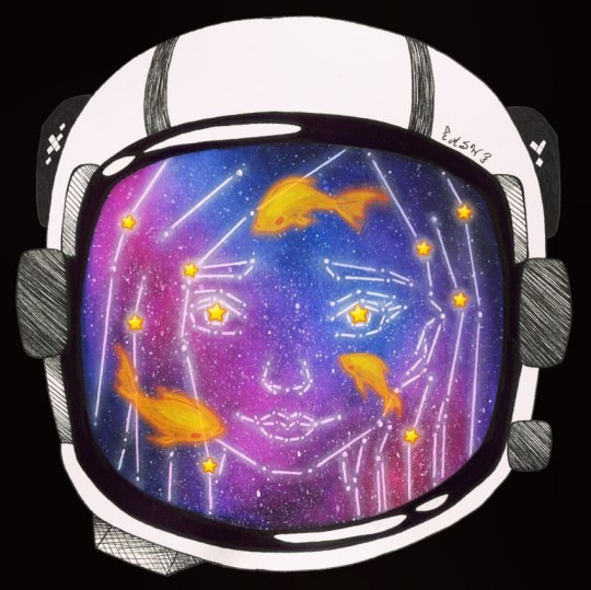
Light in the Darkness
For Qinni. May she Rest In Peace. ____
I'm sure many of you have heard the news by now, but in case you haven't: Qinni passed away on February 8th, after years of struggle with a heart condition and a relatively new cancer diagnosis. The first tweet I saw saying she'd passed...I thought it was a mistake or some kind of sick joke. She'd said in recent updates she was estimated to have a year, year and a half. That was one of my first thoughts, She was supposed to have another year. But, sadly, it wasn't a mistake. And soon, everywhere online was alight with those of us that had been touched in some way by Qinni's work. She is gone, but she is not forgotten. I never knew Qinni personally, but she was one of the first really popular artists I found myself drawn to here on dA. And a lot of my artistic style circa 2016 was influenced by her work, though I don't think I realized it at the time. This includes the artwork I would go on to make into the wallpaper I use for my banners all over social media. And thus, it only made sense to use that piece as a reference for this tribute piece. A piece that I had to drop everything to make, despite whatever else I had planned. I also decided to draw on an idea I'd been thinking about for a while; the original idea being a mermaid wearing a space helmet, but the helmet is also a fishbowl. I didn't include the mermaid part here, as I mainly wanted to focus on space and star themes since those are elements that Qinni's art is really known for. (Although, after having spent some time going through her gallery and social media posts, it seems the Little Mermaid was a subject she frequented too, so it still would've worked, I think.) I started with a sketch, using My Fantasy, My Insanity for a reference for the face as I mentioned, and some graphics from pixabay.com for the helmet. I did modify the hair to be more like Qinni's, made the eyes match, and turned the previously neutral mouth into more of a smile, but other than that the basic lines are largely the same. At some point, though I'm not really sure where the idea came from, I had the idea to do the whole sketch of the face out like a constellation. (My original plan had been to just have a galaxy in the blank space between the face and the helmet or just do the hair that way.) This is something I'd never tried doing before, so I stopped and did a couple of test pieces to see if what I wanted to do would be possible traditionally. I knew it would be digitally, but I wanted to stick largely to a traditional piece since Qinni became known for her watercolor work. Fortunately, those test pieces turned out really nicely, aside from me discovering watercolor paper was my better bet over mixed media for the gradient effects I wanted (which in hindsight I really should've seen coming, but this is why I did separate tests in the first place). And I will be posting these test pieces at a later time since they did work out well, talking more about how I figured out the process I'm about to go over as relates to each of those. With those tests done, I was finally able to start on the actual artwork. (Although I did stop a few more times as I went to do other tests.) I started by scanning the sketch in and booting it into Paint Tool Sai to break it down into the more simple lines and spaces I'd need, like making a connect-the-dots puzzle in reverse. First I just went over the sketch with connected (but straight) lines, making corners at curves, and then I made a new layer and broke those lines down a bit farther, leaving dedicated spaces at certain corners and where lines intersected for stars later. Then I printed off the lines and, after inking the helmet onto watercolor paper (including the ink-technique shading), used my lightbox and a ruler to carefully trace the face lines into the helmet. I taped down the edges of the paper, covered the shine spots on the helmet near the face space just to be on the safe side, and then got to work with painting. It may not look like much, but I spent a long time going back and forth with the paint to get the blending and colors right. I wanted just the right amount of pink, just the right amount of blue. A little dark over here, but lighter over there. Lots of blending and lifting involved. As is typical of me, I'd put paint on, blend it out, then put more on and start the cycle again. But eventually, I found the right balance and got something I was happy with. (And fortunately, I was smart enough to use some of my 100% cotton watercolor paper to make this process easier; it would not have blended this nicely over this large of an area if I'd used anything else.) That had to dry overnight since by the time I finished with it, it was approaching 4 in the a.m. and I was exhausted. The next day, I used a ruler and a white gel pen to go back over the constellation lines and make the notable stars (dots) attached to/connecting them. As well as I used a yellow Gelly Roll moonlight pen to place yellow stars in certain places, a specific nod to the stars in many of Qinni's artworks. After I'd given the gel pen a few minutes to dry, I pulled out the white gouache and got busy splattering to really bring home the galaxy look. And then after that, I went in with some PanPastel to give the lines a glow so they'd pop a little more. It was good, but even after I filled in the two top elements on the helmet to be black to balance a little better (they'd just been cross-hatched before), it still wasn't quite what I wanted. I'd known for a while I was going to be taking out the extra white of the paper background in Photoshop, so I decided if I had time (it was a busy few days surrounding this artwork's creation) I would try fixing the yellow stars in Photoshop and maybe a few other experiments to finalize it. This turned out to be a good thing, as just as I was finishing up the now-digital stars, I realized I'd completely forgotten one of the main elements I'd wanted to include: The fish! And to be honest, I'm still not sure how that happened. They just totally slipped my mind during the initial planning and testing phases. But since I was already there, it wasn't too hard to pull up some of Qinni's artwork as a reference and draw a few fish in digitally, then turn down the opacity a little so the orange wouldn't be too overbearing. And that worked out, as originally the piece had still felt kind of empty somehow. The fishies fill in some of the more bare spots pretty nicely. There are a million other little ideas or tweaks I could do if I went back in and gave myself more time, but it's already more than what I had imagined. And I can fiddle with it all I want, but all the art in the whole world that I could ever make will never fully express my gratitude towards Qinni and my sorrow that she's gone. That one of the brightest lights in the art community has moved from earth to the stars. Qinni's work reminds me of one of my favorite poems by FridgePoetProject (another wonderful artist that passed away all too soon), The Daily Magnet #106, which reads, "You write love into my eyes with starry ink." Although, perhaps it would be more appropriate to say she painted it into our hearts with starry watercolor. Rest In Peace, Qinni. <3 ____ Artwork (c) me, MysticSparkleWings
#thankyouqinni#galaxiesforqinni#starsforqinni#qinnitribute#qinniartinspired#qinniart#qinniartbookvote#galaxy#stars#constellations#astronaut#watercolor#ink#traditionalart#digitalart#mixedmedia
3 notes
·
View notes
Text
CEDEC 2018 talk: 20 Years of Game Graphics Evolution and Beyond
The following is a translation of a speech that was held on the second day of the CEDEC 2018 conference held on August 23, 2018 at Kanagawa, in which three veteran developers, Takashi Atsushi of Sega Games, Yuji Yamada of Sony Interactive Entertainment Worldwide and Yoshihito Iwanaga of Bandai-Namco Studios reflect on their various works in the industry during their past 20 years, focusing mainly on the sixth, seventh and eighth console generations, as well as their expectations of the upcoming ninth generation. The speech was moderated by Kazunobu Uehara of Konami Holdings (who returned to the company in 2017 to research new technology).
You can view the original article at the following page:
https://www.inside-games.jp/article/2018/08/28/117005.html
Looking Back At Gen 6
The session started with Mr. Uehara asking a different question to each speaker and getting an answer from each.
How do you feel about the transition from PlayStation (PS1) to PlayStation 2 (PS2)?
Yamada: The PS1 was a system that lacked features such as perspective correction on textures, so it still couldn’t 3D all that efficiently. However, the PS2 finally implemented them and had way better 3D capabilities. While the PS2 had simple functionalities, it also had tremendous bus width and access speed, so as a creator it was a fun machine to learn how to use.
What kind of platform was the Dreamcast (DC) like?
Atsu: The Dreamcast was capable of the perspective correction feature that was mentioned just now, so I’m proud to say that the Dreamcast was root of all the modern 3D consoles! Nevertheless, there were still some aspects in which the Dreamcast lost to the PS2 in terms of raw numbers. When I read that the PS2 was going to feature a DRAM bus width of 2560 bits, I thought that was a typo. However, the PowerVR2 GPU employed by the Dreamcast has pixel-sorting feature for semi-transparent polygons, which is a feature not available in modern consoles. In that sense, the Dreamcast truly a dream-like hardware.
How do you feel about working on all three of the aforementioned platforms (PS1, DC, PS2)?
Iwanaga: I was involved with the original arcade version of SoulCalibur released in 1998, which ran on the PS1-based System 12 board. We ended up porting the game to the Dreamcast, where every aspect of the game was remade from scratch. Then the PS2 came and I became involved with yet another completely different platform. We desperately build a program which could create beautiful graphics using the same algorithms... It was that sort-of era.
At this point, Mr. Uehara brings up a comment posted at the “respon” page which claims that the PS2 only had a hardware manual at first, so it took time for the developers to prepare the polygons.
Yamada: That’s right. The developer would be given a book containing all the commands of the current graphics driver as well. The developer would flip the thing page by page until they got to the command that they needed. (laughs) But back then I was glad to just have that book.
Iwanaga: It was a dictionary-like document that we nicknamed the “Blackbook”. I desperately wrote a program to control all the functions written there, since it was a pretty difficult book to memorize.
Atsu: Since the Dreamcast was based on Windows CE, it allowed for multi-platform development with Windows, but very few games utilized that feature. But if you think about it now, this Windows-compatibility would be carried over to the Xbox. Considering “blood” is the only thing that’s being left on the current consoles, there’s something deeply moving.
It seems as if graphics advanced a lot during the PS2-era. But what about struggles and breakthroughs of those days?
Yamada: It’s pretty surprising to think that we used to program the nearClipping of polygons myself... I did the best I could at the beginning, but then a compiler came out halfway during the generation that made it easier to program .
Iwanaga: I wanted to create visuals with a bit of elegance, so I created a pseudo-gradient by using alpha-blending on two screens and blurring it upwards and downwards, which made it possible to display 180,000 semi-colors. SoulCalibur III was made with such a strange method.
The colors of the Dreamcast feels a lot different from those of other consoles from the same generation. Why is that?
Atsu: The Dreamcast has a very bright output. The startup screen looks very gray if you use an RGB connection, but when you use a video output it will look bright enough to be white. That creates the impression of producing vivid colors.
Looking Back At Gen 7
What are your thoughts on the transition from PS2 to PlayStation 3 (PS3)?
Yamada: I was concerned over what to do use the added computing powers for. With the added memory and pixel shaders, the creative width expands. Most things became feasible when we asked “can we made this?” That’s why the deciding on what to create and what direction to take became important.
Atsu: Although it was possible to use shaders on the original Xbox during the previous generation, it became a characteristic feature of the 7th console generation. The degree of freedom during development changed tremendously. Up to that point we worked really hard on making the graphics by combining fixed functions, but now we were only limited by a programmer’s skills. Of course, resources were still limited, so we had to decided on what was effective.
Iwanaga: If you try to output a 6th gen game on 7th gen hardware, the results are pretty strange. What resembled depth of field (DOF) on a blurry CRT television set suddenly became voids of space thanks to the increased resolution that made the graphics sharper and clearer. (laughs) From that point on I was told not to adjust the DOF too firmly.
It seems Deferred Rendering became popular around that period and that felt like a real turning point. What are your thoughts on that?
Atsu: Our company (Sega) took a while to come to deal with Deferred Rendering, but because the PS3 is capable of anything as a hardware, many developers had a problem with combinatorial explosions due to gradually increasing shaders. Deferred Rendering became the solution to that issue.
Yamada: I was shocked at how much Deferred Rendering changed visual-making. Until then lightning was something you focus on when design the appearance, but afterward it became an actual element that you had to be conscious of.
Iwanaga: When Deferred Rendering became too commonplace, I had to think of another method to devise unique graphics... To that end, I wanted to employ more Forward Rendering... It was an age in which I felt conflicted about many things we did.
Were there any western-developed titles that made a strong impression to you?
Atsu: Everything Naughty Dog was putting out by the end of the PS3′s lifespan. There was a point where I felt troubled over what I’ve done thus far when seeing their games.
Yamada: I was also impressed by Uncharted, but Killzone by Guerrilla Games, which employed Deferred Rendering, was pretty impressive too. I felt strongly that I had to make something that matched.
Iwanaga: Even though it just came out, when I saw Horizon: Zero Dawn, I thought it was over for me... But then I realize I must go on and keep trying my best no matter what.
The Current State of Gen 8
What are your thoughts on the transition from PS3 to PS4?
Atsu: While the PS3 was pretty flexible, it was also pretty difficult to work in terms of performance, so we had to rely on tricky techniques during development. So when it came to finally develop for the PS4, it felt like an era where we can finally focus only on the content creation finally came.
Yamada: The things we can do now has since expanded, so the direction of what to focus on has become difficult. One of the current trend in graphics is physical-based rendering (PBR). As for game genres, open world is what’s popular now, so the amount of effort in development is pretty tremendous. We now struggle to create efficient assets and building the flow on an actual machine.
Iwanaga: The method of development is now the same as it is on PC. The difference in performance now depends on recognizing the limits of your hardware.
What are your methods of creating visuals?
Atsu: The visuals we aim for are photorealistic, so the first step is to have proper PBR. It is our company’s policy to aim for what direction the post-processing will be done from there. It’s just like the post-production of a movie, in which you create and edit visual effects on already-filmed footage.
Yamada: The introduction of the Unreal Engine also made creating realistic imagery much easier. The big issue now is how to differentiate your visuals. Do you do it by post-processing? Or by your camera work? The strength of your own content has become more important than ever.
Iwanaga: Because there will always be developers in Japan who to express everything in their games like how they envisioned things in their mind, I believe it’s crucial to know how to draw in your own visual styles after mastering realistic rendering techniques such as PBR.
What about the possibilities of non-realistic and toon-shaded graphics?
Yamada: Our company (Sony) released a game titled Gravity Rush, which has a strong fan-following. Many people, in Japan in particular, like that sort of graphic style. I think there’s room for even non-photorealistic styles through the use of photorealistic technology.
Iwanaga: I think you can only use photorealistic technology up to a certain point for non-realistic imagery. Although it’s not necessary to do everything from scratch, I think it’s important to add your own flavor too.
Atsu: Here at Sega we prefer the term “manga dimension” over “toon-shading”. We came up with the term “manga dimension” in Jet Set Radio, which we like to think as the originator of modern toon-shading. Anyway, regardless of whether the final seasoning is non-photorealistic or anime-style, the raw ingredient underneath is always PBR.
What To Expect From The Future
On August 21, Nvidia presented the raytracing technology that will be employed in their GeForce RTX graphic cards. How do you feel about raytracing?
Atsu: I felt satisfied that we couldn’t achieve what we couldn’t see (on-screen) before, but after seeing Nvidia’ s presentation, I feel like we have no choice but to start our research and learn how to do raytracing.
Yamada: I think raytracing will become commonplace thanks to Nvidia’s presentation. As a developer I am looking forward to the new platforms that will bring raytracing to the market and how it will affect the industry.
Iwatani: I’ve been doing things similar to raytracing lately, so I’m not particularly intimidated. Perhaps raytracing is not that far off into the future.
Is it better to make your own game engine or use an existing commercial one?
Atsu: We at Sega are doing our best with our in-house engines. You could say that as a former hardware manufacturer ourselves there is a sense of pride that if you want to do achieve innovations ahead of everyone else, you must take the reins ourselves.
Yamada: The game engine we used tend to depend on the title we’re working on. However we want to create our own game engines as our technological capabilities expands.
Iwanaga: If a game needs massive reworking then a new engine will come into play. I believe new game engines had to be made on a regular basis for such situations. If you’re working on a game that isn’t suitable on an existing engine, it’s best to create one as quickly as possible, if you can.
What are your expectations for the next console generation?
Atsu:I think games will be easier to make, not just in terms of graphics. The leap from PS3 to PS4 was tremendous, which is why I love the PS4! In the future, when 4k or 8k become standard and raytracing is commonplace, I hope that there won’t be an era in which machine power is insufficient.
Yamada: Many developers have told us that the PS4 is easy to develop for, so we want to maintain such an environment for our next console. What we need to do next specifically is something I want to know.
Iwanaga: Since graphics have improved considerably, I want to focus on other aspects, such as sound. The HD rumble employed by the Nintendo Switch is another thing. I would like to make better games by using the machine power for such “feel.”
The session eventually ended with the speakers giving words of encouragement to the young audience.
Atsu: There was a sense that the generation has moved on to a younger one during the transition from 2D to 3D presentation. I think we will feel such a shift again as new technologies such as raytracing are introduced. The younger generation are currently training and preparing themselves for such an era. I’m looking forward to it. (laughs)
Yamada: There was a time when using only 20 or 30 polygons was enough to create a character, but I feel tired as an old man, having to use thousand of polygons and applying techniques such as a PBR. (laughs) Now the boundaries between videogames and movies are gone, as there many overlapping aspects in terms of technology. I think it’s an exciting genre in which new cutting-edge technologies are being developed every year, so I encourage more people to join.
Iwanaga: You may find it difficult at first, since there are many things you might need to learn. But the progress of technology has made things a lot easier too, so I wish you would face those challenges. People who can render are in great demand, even within corporations. I hope all sorts of companies will make great games.

From left to right: Takashi Atsu of Sega, Yuji Yamada of Sega, and Yoshihito Iwanaga of Bandai-Namco
1 note
·
View note
Text
Personal Illustration Process
04/06/18
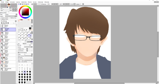
For my final piece, I have pretty much decided that I will be having an illustration in my final piece, the illustration will be of me. There is more context and rough sketches of ideas in the 10-page sketchbook work post below which detail the ideas which I had relating to the illustration. Anyway, I’ll talk briefly about some ideas that I have for my final piece. My main idea now is to draw myself have a cityscape background behind me. The illustration will include me wearing a striped t-shirt, which will be added in Photoshop when I have finished the whole illustration - the stripes will be lines which I will distort so it looks like a striped t-shirt, but also not at the same time because it will look manipulated and unshaded - I think that this will look pretty good when it’s done. The background will be hopefully transparent so that I can export it into Photoshop, but if this doesn’t work, then I will try my best to cut around it using the tool available to me in Photoshop such as the pen tool, it will just come down to my own accuracy. The reason I’m keeping the background plain is so that I can have a cityscape background which I will create in either Photoshop or Illustrator, I say Photoshop as I recently created a scene for an animation there, and found that as long as I don’t use complex shapes such as shapes that involve the line tool to create, then creating a cityscape scene shouldn’t be too tricky - the whole reason for using Photoshop for this at all is because of the effects it offers as opposed to Illustrator.
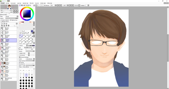
So I started by sketching out some line art, which I think looks okay, but the face needs some working on. I decided to kind of exaggerate the eyebrows because I think it resembles me more that way. I think the hair looks relatively similar to my own, though probably a bit straighter-looking, but I tried to get the curl on the right hand side, and the hair which you can see at the back of my neck. The glasses may look a bit too big, but the neck and clothes look fairly good in my opinion. For this line art I used a very thin black watercolour brush with brush sensitivity on, as I’m using a Wacom drawing tablet - not really expensive one with a screen, but it does the job.

I started adding some basic colour to the segments which need to be coloured in, in this case being the hair, the visible skin and the jacket - I also thought that I would colour the shirt in white, so that when I export it when it’s finished, it’s not transparent because it wasn’t coloured in. The colours aren’t flashy or anything, but I think that it will still look good when it’s all finished. When colouring, there’s a specific way that I do it. I colour the different parts on their respective layers, and then add another layer above it, and enable something called ‘clipping layer’ or I think that’s what it’s called - basically, it means that whatever I do on this layer, will only happen on whatever I did on the layer below it, so it’s extremely useful for shading different parts of a drawing. This will take effect on the part below.

I began to start shading in places I thought would fit, like on the neck, where a shadow is cast from the head. I also shaded under the hair above my glasses, as the hair would be casting a shadow there too. For the shade I used mixes of orange and grey. Because of the blue jacket thing that I’m wearing here, I tried to reflect the colour from it slightly onto the neck shade, on the right. This was also the point at which I drew the glasses, which took a really long time to get right as I did it freehand with no shape tool or anything. I think that they turned out alright.
Next I shaded the face slightly, so that it didn’t look so flat. I also added a shade on the face to give the impression that there’s a nose - I also added a subtle highlight on the nose too. I drew a facial expression and also a little detail under the mouth to show that the chin is there. After this I decided to start working on the hair. I started by adding shade and lines where I thought my hair kind of parts, and then I added some highlights mainly near the left hand side. I didn’t have any particular idea for a light source in this illustration, though judging from the shadows on the face and neck, I would assume that it’s coming from the front. I also added a small shade under the middle of the glasses - I haven’t yet decided whether I want to have a shadow being cast from the glasses themselves, because it would be frustrating to draw them all over again except this time I’ll need to be even more accurate. I might be able to duplicate the layer and change the colour to the skin shade and have them underneath the glasses.
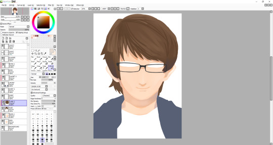
I worked on the hair for a while to try and get it to look kind of smooth, which I think I’ve pulled off for the most part, although I might work on it some more when I’ve done everything else. The hair contains a range of shades. I even used a desaturated purple, as well as some saturated browns and some greys. For the highlights, I tried to smooth them out and they’re just regular browns, with a bit of desaturation to them. After doing the hair, I decided I was unhappy with the eyes once I tried adding pupils, so I changed the shape of them a bit. I also added a more noticeable highlight on the nose as well as add one below the nose. I’m not very good at caricature, so facial features don’t tend to look a whole lot like how they should, so I have to rely on getting the hair right to some degree for now. I added a kind of gradient thing to my jacket, though I may remove it - I still plan on shading the jacket, I just thought it might be a cool touch.
I decided to work on the hair some more, and added some more highlights, most notably on the left side of the hair. One of the more prominent things which I added here is the eyes. I think that they look alright, maybe it bit sad-looking, which wasn’t my intention - maybe I’ll work on them later. The face still needs things adding such as the eyebrows, which I think will be the thing to make it look more like me. The whole illustration still needs line-art around it, so I will add that when all of the colouring is done - though if line art doesn’t work then I’ll leave it as it is now. A problem that has been raised by my tutor, and that is that since my composition is going to be landscape eventually, with the illustration looking like this, the sides of my arms are cut off. I don’t know how I didn’t think of this, but I’m glad that it was pointed out much sooner than later. I suppose I’ll have to draw the arms on, which in theory might actually be quite difficult, since I’m working with quite a few layers, and also I’m not even sure if I’m able to expand the canvas, I’ll have to research this soon, as the deadline is creeping up on me, and I can’t spend too much more time on this illustration.
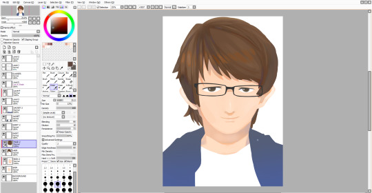
Luckily, I was able to expand the canvas as much as I wanted so I could draw on the sides of the arms. I decided not to sketch them first, so they may look a bit off, or that could be because I really need to improve on drawing anything from the head down. Alongside this, I drew on details around the eyes, most notably the eyebrows, which I think turned out well. I also changed the eyes slightly, though I still look sad. Also - I made the hair a bit rounder near the top, as I thought that it just looked a bit off before.
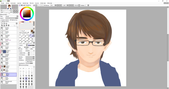
I am almost finished - except not, because now I have to work on the jacket, which was the part I was least looking forward to, so if the drawing doesn’t look as good now, I’ll be blaming it on the jacket. Anyway, to start, I very loosely stuck to my original lineart, though there are some differences between them. I stuck with one of the watercolour brushes that I’d been using throughout this whole illustration, though maybe I should’ve used something else because the texture just doesn’t really look like clothing. I suppose just a different type of brush may have done the trick, though it still comes down to how I handle the shading and where to put it. I usually like to draw things like hair and clothing in segments, like with hair, there’s different parts to, and with clothing, there’s folds, which I need to vastly improve it seems. After I finished with the dark tones, I decided to add highlights I deemed necessary, that or I just added them because it looked empty - though perhaps I shouldn’t have added highlights, and just worked on the darker shades because I’m not particularly pleased with how it turned out. Anyway, that was the end of the illustration, I thought I would add a kind of inner glow in the illustration, as I plan to have this illustration in front of a city. To do this all I had to do was go on each layer and use a large white airbrush. Also, I’m leaving the shirt blank as I still plan on adding some black lines in Photoshop which I will manipulate to look wavy.
Final Illustration

Overall, I think that this illustration turned out well, in particular the head and neck. As I mentioned, I’m not very happy with the jacket, but I think that no matter how many times I redo it right now, I won’t be able to make it look good - it just comes down to me needing much more practice drawing and shading clothes. Looking back at this, I noticed the head looks a bit too big for the body, which wasn’t what I had intended, but I guess after all, the whole thing is just an exaggerated drawing of me.
0 notes
Text
Dressing Yourself - W’s take
It was in college when I became economically independent enough to dress myself, thanks for a part-time job. The first thing I wanted to buy with my first paycheck was a pair of shoes. A very nice and friendly local family friend took me around in Houston on a weekend for shoe shopping to welcome me. However, it turned out to be a long a fruitless trip. Till today, I am still embarrassed thinking about that afternoon when the mother of two young kids took me to at least five stores, but I just couldn’t find any pair I liked. I couldn't really articulate exactly what it is that I was looking for, all I know was which ones I didn’t like. Only much later that I was able to describe the exact characteristics that make something feel right.
Even without a successful purchase, that afternoon marked the start of my long and full of fun shoe shopping journey. I know being really into shoe shopping is a stereotype of spoiled girls, but allow me to tell you something about my love for shoe-shopping that has nothing to do with being spoiled. I focused on it mainly because of two reasons. Firstly, I really enjoy dressing myself with my own money, and freshman fifteen really destroyed all possibility of me knowing my size for things other than shoes. Secondly, it’s relatively easy to buy shoes online, especially you can't really go anywhere without a car in Houston. My roommate in college did mock me for having two pairs of Converses. One high top pair in light pink jeans fabric, one regular pair in white. To her, they were completely the same shoes. To me, even though they may have similar functions, they, in fact, say completely different things about me. One pair ia just plain sneakers, the other has more funk. The latter is feminine, unique, yet not too out there.

The conversation about Converse with roommate was the first time I realized that for me, shoes are not important because the way they look, but what they say about me when they are on me. Other than funky Converses, I also had a few pairs of heels. To me, those heels are not just for formal rare occasions in college like graduation ball, (those are just excuses to buy heels). They represent the type of professional women I aspire to be, they type who get to wear elegant heels every day. After graduation, just as I thought that it's finally time for me to conquer the skyscrapers wearing sharp heels, I arrived at NorCal for my job. The reality of California’s year-long chillness and SF’s ubiquitous 2-story houses very quickly popped the bubble of my high heel dream. Despite having to give up my heels fantasy, I did enjoy having complete freedom dressing myself. Having a regular salary meant the range of things I can afford went to a brand new level - now I can confidently stroll on all floors of Nordstrom, instead of only feeling comfortable in the sale corner. With a fatter wallet, I started to notice fashion trends. The first one I encountered was minimalism. If you don’t know what that is, imagine IKEA but for clothes.

If you have only black, white, and grey in your wardrobe, you are a hardcore minimalist. This trend really confronted me about the way I want to dress. Even though I appreciate simplicity in other parts of my life, I just don't enjoy the of color. The joy that a nice tint of turquoise brings me really outweighs neatness. In painting, black is created by mixing many colors together. This means any color mixed with black just becomes mostly black. This is why I think wearing black makes me feel muted, my true color redacted. Accepting that I am just not into all black and white or anything in between was a big relief.
After that, I started exploring different tints and shades of colors. What’s even more exciting is that when there are colors, there are patterns. I got really into gradient and wide stripes. Colors do bring the extra steps of matching colors when picking outfits. Patterns even add another dimensions of matching. But through trial and error, I found a good principle to follow. I try to have at most three colors or patterns in total (two for work), at most two from the same category, color or pattern. A good combination is two colors and one pattern. For example, if I'm wearing very colorful flower pattern shoes to work, I'd just match them with a black dress. On weekends, I may add a hat to add one more color or pattern.

If on a bright sunny day, I decided to wear a yellow dress, and a white and navy stripe belt, I already have three visual features (yellow, navy, and stripe), so my only choice of a shirt is a mostly plaint white/navy one. Speaking of matching colors, excluding black and white, it's always safe to start with the same hue, try different tint or shade (guys do this a lot). For example, pale blue and navy, pink with cherry, light green with forest green are all good combinations. The further the colors are on the color wheel, the harder it is to match. But when done well (yellow and navy), it can also look amazing!

At one point, I realized that no matter shoes or colors, they are really about how I want to be seen. The first impression I’d like to give people is that I pay attention to the way I dress. After they get to know me, I want to be seen as a colorful person, not a plain black and white and sneaker person. This is more challenging to accomplish at work than on weekends, especially in a work environment where the requirement of clothes is just "wear some". At any work place, you can dress differently, but not too differently. There is a theory in Sociology called Optimal Distinctiveness. It say the best social group is composed of people who are not too different that ppl cannot relate to each other, but distinct enough so each of them can contribute their unique value. How we dress in a group follows the same rule. If in a group at work where most people wear a T-shirt, it's weird if one person wears 3-piece suit, which is way too formal. It is also out of place if one person wears fishnet stockings and miniskirt, which is too unprofessional. So the tolerance band where ppl won't ask if you are dressing for a special occasion is somewhere right above and below the standard. Dressing the way slightly deviate from the medium, for me, is a chance to say I'm not just about work, I'm also into film, painting, and basketball. Let’s talk about those occasionally. Expressing these about myself is very important to me. There is one exception, however. It is Halloween. Halloween is my favourite holiday, because it's a chance to be truly out there without being inappropriate. It’s one day in a year to dress solely for yourself, living the fantasy.
1 note
·
View note
Link
The following blog post, unless otherwise noted, was written by a member of Gamasutra’s community. The thoughts and opinions expressed are those of the writer and not Gamasutra or its parent company.
Voxel art hasn't been around for too long in popular games media. It had an appearance long ago before polygons were the deciding factor for art/technical direction in games, but that's long forgotten. The reason, simply put, is hardware stress making it impossible for voxels to be a feasible rendering technique in games.
Greebles can be easily explained as "bumps". A Minecraft map, when viewed from afar, looks rather bumpy doesn't it? Well that bumpiness would be called "having a lot of greebles". I hope that helped to clarify the confusion.
When I first started making voxelart in the summer of 2013, it was pretty common to use the form to make "retro-3d-art" like 3D Dot Heroes. It was fun and considerably easy to get results fast so I would often make between 5 to 10 full models a night (5-6 hours). I didn't think much of the resulting poly count when making these models because everything I was producing would be exported and rendered in a Voxel Engine. Voxel engines were good at making you think "oh hey! this should totally be fine on computers to run, I wonder why more studios don't use voxels in games". Well, once I started actually contracting art out instead of modding, I quickly learned how intense voxels really are.
Late 2013 I started working on my first commercial game and, boy, did I learn a lot about Voxel engines. Everyone back then was either using an existing voxel engine or making their own (please don't do this if you're doing this today, for your own sanity) and I had to learn a lot about the inner workings of voxels. Once you start working in a voxel engine you start to observe how much voxels burn through your computer hardware. Various factors play into this stress but if you simply view the polycount, something as simple looking as Minecraft can be extremely memory consuming. Every single voxel will draw 12 polygons at a time, which is a lot for something as insignificant as a piece of dirt. On top of that, if you make a character which isn't a perfect cube, you sure as hell are going to break through 100 polygons for the 1 model, and fast.
Luckily, when working with any engine today, you can export voxel models as polygonal objects (because most, if not all, voxel editing tools will come with exporters for standard 3D formats). This will allow you to take something made up of hundreds of voxels exported with as little polygons as possible.
This is where the fun begins. When I started doing Voxel Art professionally I decided to spend most of my spare time figuring out new voxel art styles. These were all style which ignored the constraints of poly count, so I was still committing a terrible sin of killing my computer graphics card and CPU. When I started making mobile games I realized that this can't do; I needed to make an art style that could reduce the poly count as much as possible so you could still enjoy your games at 30FPS+. Soon enough I realized this became my style. Due to market demand of making voxel art for low spec hardware, I started developing a style which got further away from Pixel Art and Retro Art and got closer to forms like Low Poly Art.
***
Almost every game requires a character and it normally becomes the first thing you make. Voxel characters suck.....so much. You don't have the freedom of making something super rounded or shaped out otherwise your character becomes completely unreadable and technically demanding (high poly count)
Ex: The character below looks to have a functional shape. you can see the defining factors; its limbs, its torso, and its head. "Not bad" you might think....but boy, add in some lighting and it'll become a mess of shadows.
This was one of my first experimentation's with freeform character design in voxels, ignoring the polycount or the squareness of voxels. The idea was to use the extreme and understand what are the pros and cons. The pros here is that you can very clearly define a shape and explain to a player that "X" is an ear. Admittedly, the above design isn't terrible, I'd even say it works, but the moment you add in new factors like animation you run into a massive technical wall. Skin rigging and even Rigid Body rigging become a painful job of making sure the mesh doesn't break itself. Aside from the T-pose model, unless this was animated frame per frame like a Pixel Art piece, it wouldn't come out in an ideal fashion.
When I came to this point in my designs I noticed I need to immediately find a way to reduce the poly count and make it look good. Simply put, I need to make flat design work somehow.
This was one of my first successful animations/rigs, made in a game jam years ago. This made me realize that I didn't need to make models with full arms and legs to be functional in expression. This was likely my first significant step in understanding the "Rayman" Aesthetic as the potential future of voxel character design. You can make hyper-expressive animations without the concern that your arm or leg will look all weird (because nothing is there) and you have less content to make in the long run, even if you make variants to limbs.
This step in my style was defined by my technical capabilities. I wasn't a great animator and I barely knew what I was doing at the time, so when I found something that worked, I stuck with it and refined it as much as possible. Today I've refined myself to the point of using arms and legs, while only using the Rayman aesthetic when the gameplay deems it necessary (ex: Spartan Fist).
These were both later attempts at Character designs. The first one above is from Critical Annihilation. I avoided the Rayman limbs since the game was lightly animated, but even then I felt the character was too stiff. I later made these set of dwarves for a client and I'll point out 2 mistakes I made:
I used noise....far too much. Something I no longer use. Noise will only cloud the design you intend to make. You have no direct control over the result when applying noise and so it no longer feels like something polished.
I used too much stepping to define a design. By this I mean that I made the beards have a 45 degree slant (little steps resulting in greebles).
Admittedly, you can see that I've already reduced the amount of stepping in my models from the first one I showed to now. This was me slowly realizing that I wasn't prioritizing shape/design clarity. When you apply shadows in-game, everything gets blurred out. Additionally i noticed that shadows would hide a lot of details I put into the color work. This lead me to reduce the amount of colors I had in my palettes and focus on the visible design.
***
We're in 2015, I've learnt how to animate a bit, I've started to understand limits of color use when applying lighting to models in-game....Let's throw all that out the window for something new!
For most of that year I worked on a game called Voxelnauts, which had a one of a kind aesthetic; Flat-shaded Voxel Art. The polar opposite of everything I had taught myself to date. Let's ignore the fact that shadows are a thing, and ignore the limits of voxel rendering (because it used a raytracing engine rather than a traditional mesh renderer).
(Voxelnauts, by Retro Ronin)
The character above was not made by me, though I did animate him (gif version can be found on my portfolio site). This model was made by the art director John Su. He taught me a lot:
You can apply shadows manually on objects by coloring the voxels. Imagine the light source and work accordingly. BUT!
Make sure your color gradient on shadows is obvious! Don't be shy, make it contrast both in hue and brightness (the beige skin vs the dark red/pink underarm)
Because it's flat shaded we can make limbs clip into one another and no one can tell!
And lastly, the way you sculpt a voxel model is VERY valuable. EVERY VOXEL COUNTS.
These are all the things I learned, either told by JS directly or things I've noticed as I was adopting the games style. I still take a lot of these points to heart, mainly the way I rig and animate models and the value of every voxel.
When I stopped working on this project I took everything I learned and starting finding designs in voxel art which can utilize an entire body design. I managed to go in a new direction and attempt a model with a full body.
This old man was designed with Luciana Nascimento. We worked together, using her concept art of this old man to make a design which would work in a single mesh. I was once again attempting to make voxels even more reduced in polycount though there were some struggles with this nonetheless.
I still hadn't accrued the skills to properly skin-rig, so making this old man work efficiently was a nightmare.
The coat has stepping, and while it didn't interfere with the model's visuals (it hid things as it should) it was, once again, a nightmare to skin rig.
However, I did gain some knowledge from this:
The head was connected to the body but splitting the head made animating a lot easier, and it had no obvious negative impacts to the look of the head animations (head rotation didn't clip into another mesh).
***
2016! New year, hopefully I get to learn and try a bunch more things. (I did)
I had not used some techniques from the Flat-shaded experience since I thought it was reserved for that aesthetic....nope. I decided to take that knowledge and apply it to some high resolution voxel character. Splitting the meshes based on limbs, similar to the Rayman style, but this time I'll include joint limbs like arms and legs. Additionally, I'll take some knowledge from Flat Shading and model those limbs in a way which makes clipping less of a concern and more of an artistic rule.
Results:
(Settlers Keep, by Foxdawn)
This design took into account MANY things I learned to date and I bet you can see some of those things.
I used colors sparingly; 1 color as the base value for a property and a second color (normally lighter from the base) as the highlight which would contour the objects.
Limbs had variable sizes (voxel density is 1:1) so they would each go into one another. Using, say, a larger shoulder with a slimmer arm socketed inside made animating easier. No need to skin rig, I kept rigid body rigging and it gave the right amount of expression, as seen above.
I made most objects as flat as possible and utilized the rigging/animating process to dictate subtle details (like the feathers bending on the bird).
The above model is very high-res compared to everything I had made previously but it pushed my art forward with all the knowledge I had. When I moved onto another project you'll see that growth even further.
I took the large scale human model and condensed it further to make something a little less demanding yet would still follows the same animation process. This design became a lot clearer as something feasible when my animation and rigging skills got a lot better. Setting this up was simple in principle and the results were fantastic. However, this art direction is only feasible if:
The character design showed a level of importance based on sizes. eg: Character's head is predominantly larger than everything else.
I used the same philosophy as previous: limbs are variable sizes to hide any clipping/Z-fighting
Use contouring colors, except this time it's used to outline important segments instead of everything.
Any shading is done using contrasting colors instead of subtle gradients
Here's another example of using the above rules, to give you a better idea when working with variable creatures and designs. The rules above can also help to make certain designs a lot easier to set up. By avoiding voxel stepping all together and preparing models in a T-pose for rigging, while keeping models as low poly as possible, you have more opportunities to create unique animations and poses, like below:
From Qubicle
To Maya
To Unity!
I became accustomed to a workflow which made my models feel entirely incomplete in the editor. A model was truly complete when it was running in-game. Building out the final design in my mind before doing the groundwork, and working backwards from there. This would be the process:
Keep the final design in mind
Deconstruct the model into limbs or parts which would require animating
Block out the limbs to get a sense of complexity and possibly reduce the complexity from there
Begin modeling
Simplify the design to utilize as few colors as possible but still do some shading on the model directly
Export to Maya
Rig and begin animating!
Seems quite straightforward, but once you get the hang of your tools, you get a better sense of how to make your art before actually making it.
0 notes