#majorProject
Explore tagged Tumblr posts
Visit Tumblr Blog
Explore Tumblr blogs with no restrictions, modern design and the best experience.
Last Seen Tumblr Blogs


Fun Fact
The most popular pages on Tumblr are about Minecraft, GIFs, and David J. Peterson.
Text
Pentawards / The packaging design book
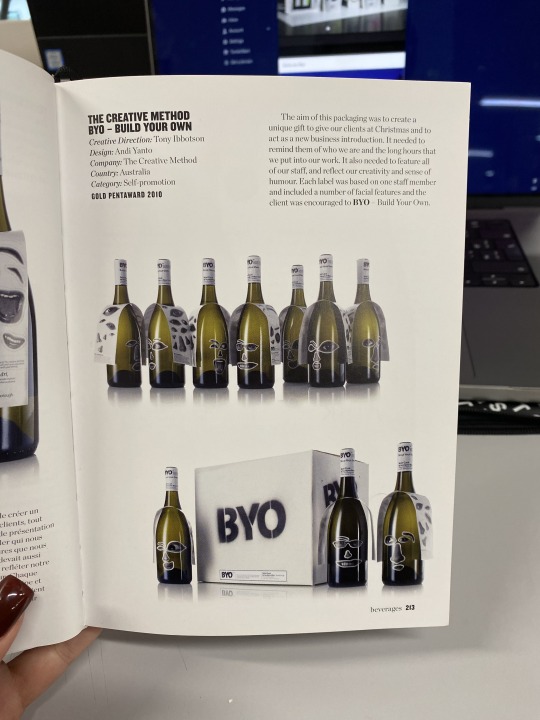


Byo - Build Your Own
This wine bottle collection offers customers the opportunity to personalise their bottles with stickers, which creates an engaging and interactive experience. It's a clever way to divert attention from the product itself to a fun activity. This enhances customer engagement even before they taste the wine.
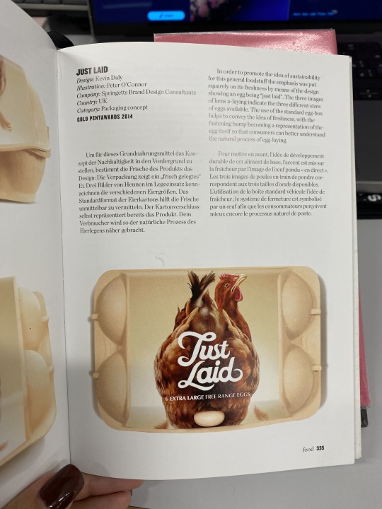
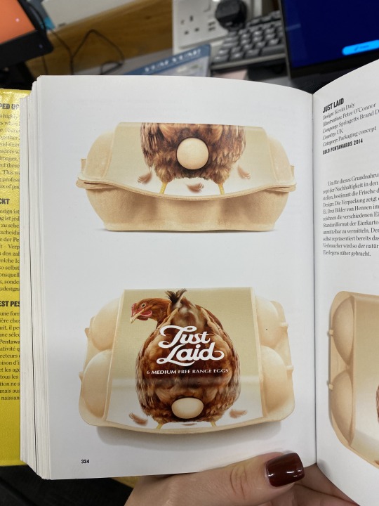
Just Laid
This brand employs simple yet memorable packaging with a brave and humorous approach. It resonates with the idea of using wit in branding to make customers smile. Among all the products mentioned, Just Laid stands out as the most memorable, which proves the effectiveness of humour in branding.
Food lines
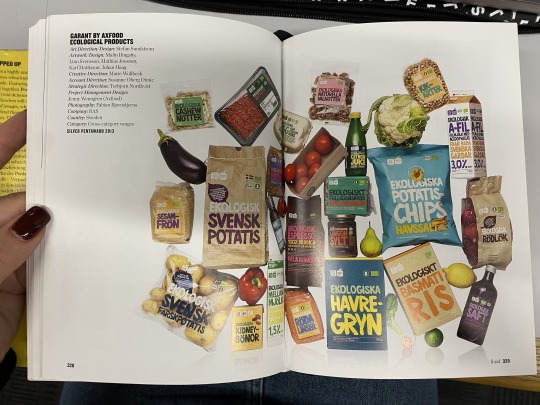
I have looked at food line brands to gain an understanding of how consistency can be achieved throughout different packagings. The left example, achieves it through typography, despite using different colours for each product. This demonstrates how type can serve as a unifying visual element across a product line. The second brand uses flat figures of the product on each packaging to create visual cohesion while allowing for product differentiation. Kallo's approach to brand identity involves using various illustrations that correspond to the contents of each product. The abstract style creates a cohesive and visually appealing hierarchy across the product line.
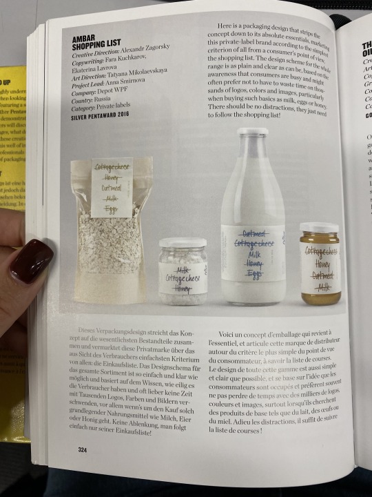
Amber Shopping List
Although this packaging design uses an idea of a shipping list that names all the essentials you might need to get, it sparked an idea of crossing out bad ingredients that are typically used in upf products. I can apply this to ingredient lists or even use it in the logo if it becomes a part of my brand identity.
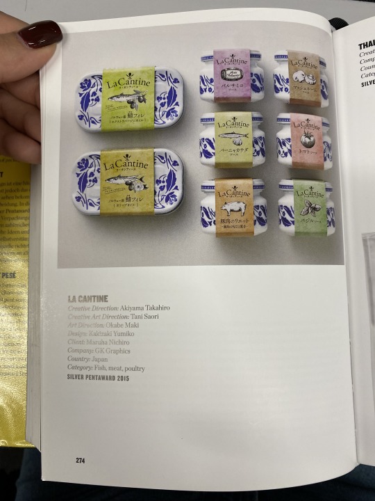
La Cantine
I liked this brand as it is sustainable and allows you to reuse the packaging. The use of paper sleeves adds an element of excitement to the packaging experience.
2 notes
·
View notes
Text
Similar Projects That Have Been Made Recently In Industry
“Digital Botanical Garden | Roots to the Digital Future” – Workshop Showcase (2024)
Showcased at Instituto Politécnico in April 2024, this project simulates an evolving virtual garden via looping visuals and digital fabrication. The immersive narrative garden concept mirrors the looping, contemplative structure of Digital Gardens.
youtube
Project Reference:
Digital Botanical Garden, 2024. Digital Botanical Garden | Roots to the Digital Future. Available at: https://www.youtube.com/watch?v=w3Lxoyca2_4 [Accessed 15 Jun. 2025].
1 note
·
View note
Text

I experimented with kettlebells and bite marks, and settled on this design.
1 note
·
View note
Text
Research - OddMuse


I looked through Odd Muse’s social media and how it has changed as the brand has got bigger. At the start it was all very beige, mainly the clothes and quotes, they didn’t show models faces that much it was all very clearly branded. They made a very clear social media presence of who they were and what they were selling.
This is their latest posts and we can see how much the brand has grow and adapted. Their latest shoot was in LA which is a massive upgrade from their bedrooms, we see more of a story through the images and through the clothes. This grid is telling who this brand is and what they stand for whereas at the start it was one blazer trying to sell the brand.
1 note
·
View note
Text
MP - Music (LO1)
I asked my mother about music and she recommended Ikia mina Ogbo (a socio-cultural and philanthropic organisation for wives and daughters of Opobo). Thus, it’s traditional music to praise Opobo women.
I’ll ask if she can translate and use the four stanzas as separate songs.
youtube
I appreciate the fact she offered this song because it represents what I'm aiming to show which is the Iria ceremony (about women). I believe using this, I will ensure that users can make a variety selection of songs to enhance the experience.
1 note
·
View note
Text
Refining Craeft logo

Following the calligraphy experiments, I continued to experiment with thicker brush stroke but I found the thick stroked made the r look too overwhelming. This makes it the first thing someone sees instead of the C which is the main letter.
I then experimented with adding curved edges as when looking at blackletter I found this is a reoccurring component. I think this worked successful on the r but it made the logo look too wide at the bottom when placed at the end of the C.
When referring back to blackletter designs, I found that block lines were user consistently in capital letters to join the top of the letter to the bottom as an ornamental decoration. I think the thin line works better than the extended r because the variation in the line weight linked more to the blackletter style.

1 note
·
View note
Text
FMP Blog 16
I have finally finished the sculpts and I will be entering the retopology and uv unwrapping phase of this project. I started working on this project later than I had expected so I decided to use some plugins and auto-retopology for the retopology process. I had initially planned to manually retopologise at least one of the characters but due to time constraints, this was the best option I had. Since nailing the hands was key to making the character look good, I decided to use the plugin ZWrap to apply a good topology to the hands of my character. This method is being used a lot in the industry to reduce time by reusing existing topology. The heads of my characters already had good topology as well, since I used a free base mesh from the 3D Scan Store. The reason I decided to use this is because the base meshes using scan data are being widely used within the industry. Using them will also help make my process more efficient and faster. I would also be able to create a better head model and focus more on the finer details since the anatomy of the head would be accurate for this base mesh. For the other parts of this character, I used ZRemesher the auto-retopology tool, along with the polygroup feature to achieve a relatively clean topology. For the props that I had modeled using hard surface methods, I decided not to retopologise them. Instead, I just subdivided them to create the high poly version. These choices have helped me make up quite a bit for the lost time.
0 notes
Text
FMP - Translate + Transform Briefing
Introduced to our one week project based on the theme 'Translate + Transform'.
Background:
Translation can mean the process of translating words or text from one language to another.
In a broader sense it is the conversion of one form or medium into another. Or it can mean the process of moving something from one place to another as found in mathematics or coding.
Task:
To pick something and translate it visually used a system devised by you, mapping the process and explaining it clearly.
This could be translating a scientific data set into an image, translating walks into a typeface, translating a song into code or translating emotion into a 3D object.
0 notes
Text
Typography workshop / Legibility & Gestalt

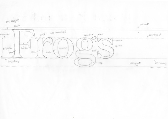
The first part of the workshop delved into legibility and type specifications. We explored the elements that contribute to the coherence of a typeface, which I found particularly interesting. The session was full of theoretical insights and factual information about typefaces, providing us with a deeper understanding of the subject. We familiarised ourselves with terminology and applied it practically through a task, ensuring that we adhered to the rules and positioned the letterforms correctly. Additionally, we tested our knowledge with a quiz on type terms.
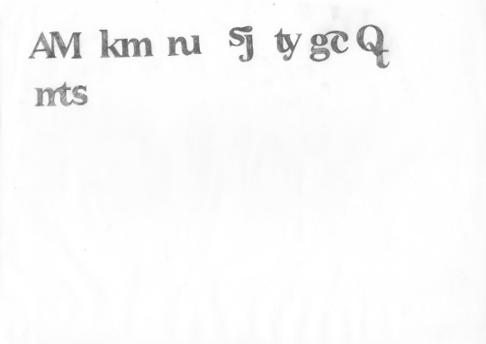
The second part of the workshop was about ligatures. We had the opportunity to create our own ligatures by tracing the given letter shapes. This allowed me to further enhance my understanding of this typographic element. I noticed that there is a lot of freedom and opportunities within merging and combining letter shapes.


In the afternoon session, we delved into one of the Gestalt Principles - closure. We first learned about this concept theoretically and then put it into practice by creating various grid compositions.
This session significantly enhanced my comprehension of effective page layout and the elements that contribute to its completeness. In my previous work I mainly used columns as grids. This workshop demonstrated the significance of closing elements and constructing frames to achieve a cohesive and polished page appearance.
1 note
·
View note
Text
Similar Projects That Have Been Made Recently In Industry
Miguel Chevalier – Herbarius '2059' & Extra-Natural (2018–2021)
Chevalier’s virtual garden installations—like Herbarius '2059'—use algorithmic growth to simulate poetic, interactive plant life. Thematically aligned with Digital Gardens, these works merge nature, technology, and abstraction.

Project Reference:
Chevalier, M., 2018. Herbarius '2059'. [digital installation]. Available at: https://www.miguel-chevalier.com/work/herbarius-2059-2009 [Accessed 15 Jun. 2025].
0 notes
Text
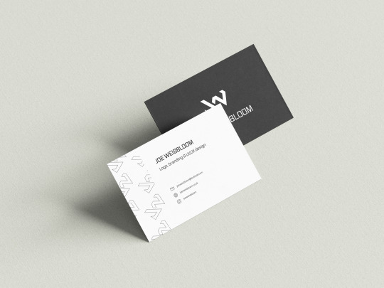
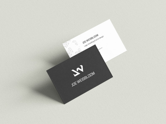
I finished up my mockup up some business card ideas. I kept these clean and simple, only containing essential information.
Overall, I felt that my personal portfolio and branding assets accurately represented me as a designer, and assist in displaying my design skills. I will however continue updating/changing these assets in the future.
0 notes
Text
conclusion
Overall I think this project was a huge success, this is something I’ve wanted to do for ages and finally found a reason to give myself that final push. I would like to pursue a career in branding and packaging, this project definitely taught me that it’s not all about how pretty it looks from the outside. There’s way more that goes into a brand that then allows it to grow and become something incredible. All the pieces that went into this brand were clearly thought out and each piece together to create one. I am buzzing with all of my outcomes and am so please with the way this has all come together. I wish I had given myself some more time to focus on social media and think about the way I would push this brand out and get it known. I would have also liked to create some more products to give more of a range but again I wanted to focus on making this brand as solid as I could so if this was something that could expand or do well the foundations of it were well built.
0 notes
Text
MP - Form (Nigeria) (LO2)
I asked my mate Ruth about any curiosities she has about Nigeria.
Biggest celebration in someone's life - Wedding
How's the school system split - Kindergarten, Primary, Secondary, Tertiary, University
Nigeria was founded in - 1960 (Received it's independence in 1960 but named 1897 by Flora Shaw, a British journalist.
The hub city - Lagos.
Three major tribes - Igbo, Yoruba, Hausa.
How did Nigeria gain it's independence - In December 1959, members were elected to an enlarged House of Representatives. Sir Abubakar was confirmed in office and one of the first acts of the new government was formally to petition the United Kingdom for independence in October 1960, in accordance with the promise made in London two years earlier.
What's the job market - It's terrible for the youth but NYSC (compulsory palamilitary service for a year) helps people to get their feet into industry as they need to work.
Are there many foreigners - No, there aren't many foreigners in Nigeria, it's mostly populated with Africans. However, I will say they are treated well compared to other countries.
Where is Nigeria situated - South of UK in the world map.
What do Nigerians wear to church (She asked me this because I usually wear formal clothes)
Nothing really inspired me much because it was trivia-like questions but this shows and attempt to engage with the target audience.
0 notes
Text
Logo development
When researching old English for the name generation, I found that old English alphabet uses a similar style to some blackletter fonts. Talbot Baines Reed, a 19th century printer, observed that Black letter appears in need all presses from England's earliest printers (Reed, 1887, p.48). Therefore, by using Blackletter I am connecting the brand back to England Heritage, clearly showing that the crafts have history that should not be forgotten. Furthermore Gen Z find Black letter appealing because it is fun and playful (Crossley and Houghton, 2024).
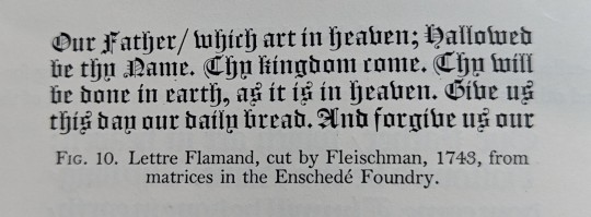
Image from book history of old English letter foundries, example of old black letter.
When looking at examples of Black letter, I noticed that the C design reminded me of a C and an R. I thought this may be interesting to create a logo for my visual identity because it plays on the historical style. This relates to the main concept of my project, bringing traditional crafts back to the forefront of contemporary practice.

To start I began sketching possible designs on paper, using the blackletter typefaces as inspiration. This allowed me to study the letters and see how they are made. I found combining a capital C and lowercase r was more successful because the two letterforms use similar curves and serifs to create the decorative typeface.
I then used these sketches to create some digital logos. Experimenting with different bush styles

I liked how the strokes made the letterforms feel hand drawn instead of digitally created. This brings the elements of hand made crafts back into the logo design. Although the logo needs to be digital I want to hint at the hand crafted element of the concept.
Following this I chose four versions I thought were most ledgible and fit with the blackletter style.

I thought these designs were most successful because they use a varied line weight, hinting at calligraphy brush stroked. However, I though the right side logos were more abstract, which may not suit the target audience as they prefer more simple and straight forward communication.

Based on this, I chose the 3rd experiment to develop into a full word to see how using similar shapes would create a logo. I think this was useful in seeing how a logo type could look based on the letterforms I created. However, I think creating the full logo type makes the logo lose the link to Blackletter. Therefore I will need to experiment with combining the letterforms with black letter to see if this is more effective in convey how the websites aim is to show how historical crafts have a place in contemporary setting.
Although I like how the letterforms looked similar, I think they look too separate making it look disjointed and unbalanced.
Reed, T. (1887). History of the old english letter foundries. Revised Edition. Faber ; London
1 note
·
View note
Text
FMP Blog 6
One of the challenging crucial aspects for me while doing the blockout is to make sure that the headgear and neckpiece of the character are as accurate as possible to its real-life references. This is due to the fact that the reference is from a religious art form called Theyyam. When referencing and drawing influence from different sources, especially culturally relevant ones, it is important to ensure that they are obtained from reliable sources with sufficient research. It is also important to note that when referring to culturally significant religious art forms, care must be taken not to depict the individuals or the community involved disrespectfully. It could lead to legal implications or cultural issues. In my case, I have taken the time and care to research the cultural practices and their significance to the culture while incorporating them in my design so as not to offend anyone. As a result, the headgear and neckpiece are taking a longer time to be created than I expected. I also decided to sculpt them as a separate tool and then insert it into the character tool since it has a lot of elements. Although it wasn’t that hard getting all the elements in place was a time-consuming task. Below is the references I used and my progress on these props so far.

Reference

Headgear and Neckpiece Progress
0 notes
Text
mp – learning agreement draft.
learning agreement draft and feedback from tutorial.


database can limit visual experimentation – leave the outcomes more open.
more work if i end up changing my outcome.
don't want me to end up with just an index – may end up getting swamped in the data collecting.
talk more about the subject matter in the synopsis.
female serial killers would be more interesting and I could do more with it rather than female killers as a whole.
scope to explore with the quote.
can lean more into the playfulness of what I've been able to identify.
more narrative to be explored with further in depth information on each killer.
trigger warnings for ethical issues - a heavy topic, but could play with them to reiterate what I've identified.
I feel okay after this tutorial as it was recommended for me to focus on just female serial killers which will allow me to not get swamped in too much data. It will also allow me to go further in depth into each killers case, rather than just creating an index which wouldn't allow me to visually explore. I think it's good that I should keep my outcome more open for my learning agreement to be able to expand visual experimentation throughout the project.
0 notes