#might put together another of one of these for making UI/layout from scratch
Explore tagged Tumblr posts
Visit Tumblr Blog
Explore Tumblr blogs with no restrictions, modern design and the best experience.
Last Seen Tumblr Blogs


Fun Fact
130K people were victims of a chain letter scam that affected Tumblr in May 2011.
Photo


For the anon curious about these Spotify gifs, this is not so much a tutorial but a (hopefully beginner-friendly) guide on how to tinker with the Spotify PSD file.
Also anyone who wants to use the PSD for their own projects is free to do so! No credit needed.
Guide and download links under the cut!
Things you need:
PSD file and video (download here)
Photoshop
Shortcuts to PS tools:
Move (press V)
Brush (B)
Text (T)
CTRL + and CTRL - to zoom in and out
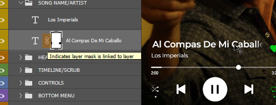
I. LAYERS Open BASE.psd. You'll notice a bunch of folders. LAYOUT contains all the Spotify buttons and text. Underneath all that is BG VIDEO. That’s where we put the background video.

Quick note: I usually resize the BASE file down to 268px (my preferred default width for this kind of gifset) before I change anything. I do this to cut down on file size and avoid crashing PS. Video layers eat space! To avoid problems with animation later on, I highly suggest resizing it now.
To do that, look at the menus on the top of the window. Select Image > Image Size or hit Alt+Ctrl+I for a shortcut.
II. CHANGING THE TEXT All of the text layers are directly editable with the Text Tool (hit T). Just hover over the text you want to change and click to edit. Hit ESC or click on any random layer to exit the text editor.

III. CHANGING THE TIME Same with the song titles. Hit T, hover your cursor over the numbers and click to edit.
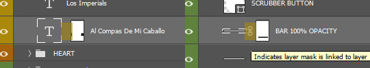
IV. MOVING THE SCRUBBER BUTTON Go to the SCRUBBER BUTTON layer. Hit V to select the Move Tool. Press SHIFT (not SHIFT+V, only SHIFT) while moving it horizontally with your mouse so the button stays flush on the bar.

V. CHANGING THE SLIDER SCRUB POSITION Now we gotta match the bar/timeline to the Scrubber Button. Select the BAR 100% OPACITY layer. Click exactly on highlighted area.
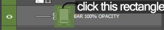
This is a Layer Mask. On this mask, anything painted black will become transparent and anything painted white will show up. Currently, most of the bar is hidden by that mask. We want the BAR 100% OPACITY layer to match the where the SCRUBBER BUTTON ends so we have to paint part of it back in.
To do that, hit B to use the Brush Tool. To quickly change the brush size, hit ‘[’ or ‘]’ on your keyboard. Take a look at this portion of the toolbar on your left:

The color on top is the one you’re painting with. If you hit X in Brush Tool mode, you can quickly switch between the top and bottom colors. We want to paint with white on this Layer Mask to expose more of the BAR 100% OPACITY layer. You can use the SHIFT trick (same thing with the Move Tool) to keep your brush stroke straight.

Now the Scrubber and bar/timeline match!
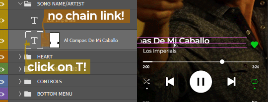
VI. ANIMATING LONG SONG TITLES (optional) You'll notice that the song title has a Layer Mask too. It's there to mimic the scroll-fade effect Spotify puts on long titles. But compared to the BAR 100% OPACITY mask, this one is missing that little chain link in the middle.
If we turn the chain link on for the text layer (click on middle portion), this is how it will animate:
The mask is moving with the text. Not what we want.
But if we turn the link off, the Layer Mask stays put and only the text moves. We get that Spotify scroll-fade effect.
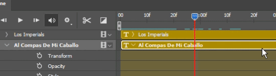
Now we animate! Look up the menus and select Window. Find and click on 'Timeline'. This window should appear on your workspace:

In your Layers window make sure the big T is selected, not the mask. Then find the song title layer in the Timeline.

Scrub to the start of animation timeline. Click on the tiny stopwatch next to Transform. You've created your first keyframe.
Scrub forward to where you want to end the animation. To move the text, hit V to select the Move Tool and then press the left/right arrow keys OR do the same trick with SHIFT + mouse same as before.
Move the text to the left until the last few letters are no longer obscured by the mask. This should automatically create another keyframe on your animation timeline, like so:

To preview your animation, hit SPACE. Adjust the keyframes until you find the right speed. And that's animation done!
VII. SAVING YOUR GIF Click on File > Export > Save for Web (Legacy) or hit ALT+SHIFT+CTRL+S at the same time to bring up this box:


Leave the settings as they are. Hit save and you’re done!

#photoshop tips#spotify#might put together another of one of these for making UI/layout from scratch#but that shit ain't beginner-friendly#this will have to do for now#😅#bcs spotify#my tutorials#gif tutorial#photoshop tutorial
272 notes
·
View notes
Text
6 Stages of UI Design
starting from nothing and ending up with a final high fidelity design takes a lot of different skills and knowledge but in terms of ui design i've broken it down into a simple process.
so let's look at the six stages of ui design
we helping you become a more skillful and mindful designer so this post is meant to be a high level overview of the entire ui design process it's important to keep in mind that in order to make your user interfaces usable and beautiful you'll need to have a strong understanding of visual design principles like visual hierarchy usability heuristics color and typography and you'll need to start with good insightful user research and data to back up your design decisions and decide what needs to be in your user interface designs and how it should all work and flow together but i'll leave that part for another video so once you've successfully defined your user's problem your constraints requirements and features then you're ready to start looking at how you can visually represent the components state changes and interactions at different levels in order to make your product a reality
stage 1
sketching this is the quickest lowest cost and lowest commitment way to kick off your designs it gets the high level top of mind ideas out of your head and onto your paper or screen generally these are really rough and if they look pretty bad then you're probably on the right track it's something you should be able to do in a fairly short amount of time on paper a whiteboard or using a wireframe or design app there is no right or wrong way to do this but here are some common things that they could include outlined boxes to represent the general containers and areas that need to be placed on the page placeholder boxes to represent images text and graphics and these can be done in low mid or high fidelity depending on the project needs at this stage the purpose is to start off the conversation it helps to clarify and define layout features and allows you to change ideas quickly and iterate it also helps you visualize how screens might look on different device sizes and in different contexts some tools that you can use in the sketching process are paper and pen board sketch pad figma jam or various apps for your ipad or tablet.
stage 2
wireframes or gray boxing this is what things look like before visual design principles have been applied it's where you can start to see the general layout and elements taking shape what's on it this is things like filler content allurum ipsum or actual text which i highly recommend placeholder images or stock images and this can usually be done in your design software using an existing ui kit to kick things off or done from scratch the purpose of this stage is to visualize the general layout it's to build trust with stakeholders and help them see those initial ideas a little bit more fleshed out before moving on it's a fast and cheap way to create initial ideas in a little bit more depth or to show low or mid-fidelity screen designs some great tools for this are things like just in mind's free wireframing tool existing wireframe kits that you can use in your design apps or something like balsamiq.
stage 3
component design dynamic user interfaces unlike static website landing pages or marketing sites require you to think through states and conditionals component design deals with things like symbols such as buttons and badges element states like button hover states or clicked states components like tables lists cards and forms and shows actual texts and images the purpose is to plan the usability uncover accessibility and responsive problems translate ideas into consistent elements that can be shared with engineers and more easily and accurately discussed and shared across teams great tools for stage 3 are design apps like sketch figma and adobe xd.
stage 4
user flows and task flows now it's time to decide how users will get from one screen to another what happens when they click this or if they forget to add in some information this is about understanding users mental models and your systems model and the orchestration of all the pathways and responses that your interface will provide this might take the wireframes and put them together with arrows into wire flows you may have flow charts and conditional statements the purpose is to show navigation routes to check for missing states and information and to visualize entry exit and decision points for the user or customer journey some examples of helpful tools at this stage are flow map or wire flow or just in mind's wire framing tool.
stage 5
mock-up or high fidelity designs this stage should show things exactly as they will appear in the final product now that you have all of the under the hood stuff worked out it's time to put your best graphic copy and visual design skills to the test this is where you make every pixel as perfect and measured as you can and where you can add your own unique brand aesthetic and thematic elements the purpose is to create pixel perfection to create consistency across your typography and components to add a sense of your brand by selecting final images or creating final graphics it's time to add in that good real copy in order to get final approval from stakeholders some of the tools you'll be using here are sketch or figma or adobe xd maybe dropbox for sharing files or some other cloud sharing platform stock photography sites and maybe illustrative programs for custom graphics.
stage 6
prototyping this ties everything together and shows exactly how the app is expected to look and behave what's on it all of the important screens in a high fidelity this should show target points to mimic what it will be like when the user interacts with the real thing the purpose is to link together all of the screens and flows in a simulated environment it's to ensure that everything looks works well and flows as intended before it goes to production this can be considered the pre-code or no code version of your product some of the best tools include design apps like envision or the baked in prototyping solutions from your design app like sketch figma or adobe xd. so keep in mind that these 6 stages are not necessarily a linear process you may be asked to take the wireframes from stage two and jump into stage six and create a prototype from them it all depends on the unique requirements the time and the budget of the project you're working on so it's best to get familiar with all of these stages and get comfortable jumping back and forth between them if you want to get better at doing this sort of thing and mastering ui and design principles come check out our UX design course in bangalore at designingcourses.in
0 notes
Photo
10 Best Weather App Templates
By using a premium weather app template, you will be able to easily create a fully functional and professional designed weather app that your users will love.
One of the many premium weather app templates available on CodeCanyon.
Developing any type of app from scratch can be an overwhelming process. You will have to spend time and money to get the app up and running. Developers will need to be hired, time will need to be spent working alongside the developer, and the app will need to be continually tested before it is ready to launch. By purchasing one of the many high-quality weather app templates available on CodeCanyon, you will be able to put together a fully functional weather application in no time!
The Best Weather App Templates on CodeCanyon
Explore over fifty of the best weather app templates ever created on CodeCanyon. With just one small payment, you can purchase these premium weather app templates and create a weather app that your users will love.
Here are some of the best-selling weather app templates on CodeCanyon for 2020:
These premium weather app templates give you everything you need to create a fully-functional weather app for Android and iOS. These templates give you plenty of flexibility and customization to create a weather app that works for you and your business. Here are a few features that you can expect from the weather app templates on CodeCanyon:
hourly forecasting
automatic location detection
7-day forecasts
humidity, pressure, & wind forecast details
Don't spend another second looking for an app developer. Head on over to CodeCanyon and purchase a weather app template today!
Best Android Weather App Templates of 2020
1. Simple Weather 5.0
This is a simple weather template with two screens—the main screen which contains the weather info and the settings screen to control the units. Along with an attractive layout, its notable features include five day weather forecasts updated every hour, the ability to add multiple locations, and also AdMob integration. This template is already integrated with the OpenWeatherMap API, but you can easily customize it to any other API if you want. Why don't you give it a shot by downloading the APK from the Play Store?
2. Weatherize
With Weatherize, you will be able to display weather data based on location in real-time. You will be able to Implement simple menus that are easy to navigate for your users. The interface allows users to type in a new location in the search function or you can use the phone's GPS to get your current location. The smooth and simple animations help create a modern and pleasing user experience.
3. Map Tracking
If you need something more than just a simple weather app, then Map Tracking might fit your needs. This material design app is packed with awesome features such as location-aware weather updates, a speedometer, embedded Google Maps, and AdMob integration. An Android APK is freely available for you to download, so you can give it a try!
4. Forecast4u Weather App
This weather app template comes with plenty of advanced features that are sure to improve the user experience. The template comes with 3 different themes that are displayed to the user based on the time of the day. Another useful feature includes the hourly reporting which can be linked to your phone's push notifications. Unlike other weather app templates, you can get an advanced breakdown of the weather with forecasting details like sun rise, sunset, dew points, pressure, and much more!
5. Simple Live Weather Forecast App
This weather app can automatically detect your location and display the weather forecast. It uses the OpenWeatherMap API to receive forecast information. Here are a few notable features from this weather app:
automatic location detection
multiple weather providers
current weather conditions
hourly weather forecast
Download this awesome weather app template now!
6. Weather App
This modern app template will show you the weather forecast for today and the next three days using the Open Weather Map API. You will be able to select a colored theme for the app and will be able to display the weather on your phone's home screen. This simple but effective app template will work for any of your weather app needs. Here is what users are saying about this weather app template.
"Seriously in love with the design! Good luck with sales!"—vp76
Best iOS Weather App Templates of 2020
7. iWeather
iWeather is a feature-rich weather client for iOS. It allows you to interact with the Wunderground API to download and show all the latest local and international weather information. Here are a few key features of this weather app template:
4-day weather forecast
forecasting details include: temperature, wind speed, humidity, and visibility
comes with developer PDF guide
Wunderground API integration
8. Simple Weather
This app template makes it easy to customize colors for icons, labels, backgrounds, and buttons so you can make it fit any color scheme for your business. You can display 4-day forecasts in detailed information with this app template.
A detailed user guide is included with your purchase so you can get the app up and running hassle-free. Whether you need the weather forecast for your current location or any location around the world, this app will give you an accurate forecast.
9. Moncoco-Weather
This light-weight and simple app template is the perfect app if you are looking to display a 4-day forecast. The color scheme and icons used in the app are visually appealing and give the design a spacious feel. The app receives the weather information from the Wunderground API and will allow users to instantly update the 4-day forecasts.
Here is what daijiaoking says about this app template:
"Wow! Good functionality of work always comes together with nice UI design. Good luck to your sales!"
10. Store Finder
Store Finder is another iOS app template that is more than just a weather app. Store Finder is packed with features such as the ability to locate a store—and it has a weather feature that fetches and displays the current weather information for a location.
Unlike most of the iOS apps in this list, it is written in Objective C, so if that is your language of choice, Store Finder might be the template for you. It also includes a PHP back-end and Google Maps integration. This app template is compatible with iOS 10.
Now that we have gone over some of the best-selling weather app templates, let's go over some of the best free weather app designs.
5 Free Weather App Designs for Download in 2020
Designing your weather app can be difficult if you are not a graphic designer. If your design is not up to par with today's modern designs, then your app will have a difficult time performing well. Another option would be to hire a designer to create this design for you, but this can be quite costly.
To help you save money on your weather app costs I have collected five of the top weather app designs for you to download in 2020.
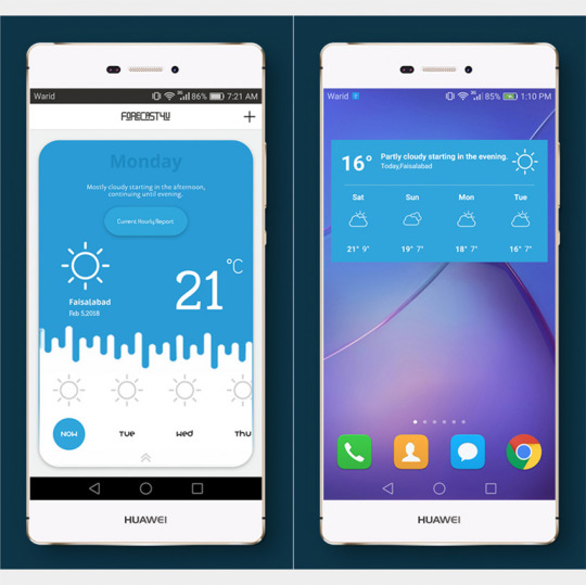
1. Weather App UI Design Screens
This minimal weather app design will give your users a unique experience. Half of the app features an illustration of the current weather and the other half gives the weekly forecast.
2. Weather App Ui Design
This contemporary looking design allows you to display a multi-day forecast and hourly forecasting. The hourly forecasting features a chart and forecasting details with icons for a more visually appealing user experience.
3. Weather Template
This simple but effective weather app design allows you to display the entire week's forecast on a single screen. The 2 color blocking themes make the design seem uniform and professional. Each type of forecast will be displayed by 9 different icons.
4. Weather App Concept
This design features vibrant colors and a unique layout. The four-day forecast is swipable at the top of the phone and displays the forecast on the entire screen. This design can be great if you are looking to have your app stand out.
5. Weather Application Design
This design features visually appealing designs and spacious layout. This design can be great for adding interest to your app. Based on the current design, you can only display the temperature.
Still looking for more app templates? Now we will show you even more best-selling app templates that you can use in your next for the development of your next app.
Discover More Awesome App Templates for 2020
The weather app templates mentioned above are the best weather apps available on CodeCanyon for 2020. However, if these app templates don't fit your particular needs or you may are looking into creating a different type of app with app templates there are plenty more app templates on CodeCanyon that can work for you.
Feel free to check out a few of the other Envato Tuts+ articles we have that will highlight even more high-quality app templates that you can use for the creation of your next app.
Android
9 Android Templates to Inspire Your Next Project
Franc Lucas
Mobile Development
9 Best Multi-Purpose Android App Templates
Nona Blackman
Mobile App
9 Best React Native App Templates of 2020
Nona Blackman
App Templates
15 Best Swift App Templates
Franc Lucas
Take Advantage of the App Templates Available on CodeCanyon Now!
When it comes to creating an application for mobile devices, using app templates are your best option. You can cut down on not only the time it takes to hire and work with a developer, but you will save a great deal of money by purchasing an app template.
CodeCanyon offers the best weather app templates on the web for you to download with a one-time low cost. These app templates are fully customizable and give you the power to mold the app to fit your particular business's needs. The weather app templates available contain all of the necessary features needed for a weather app including, detailed forecasts, location detection and search, and hourly forecasting.
Get your weather app up and running in no time by purchasing one of the many high-quality weather app templates on CodeCanyon!
by Chike Mgbemena via Envato Tuts+ Code https://ift.tt/2wzSSon
0 notes
Text
Putting Layers into the Spotlight: A New Approach to Web Design
New Post has been published on https://www.templified.com/putting-layers-into-the-spotlight-a-new-approach-to-web-design/
Putting Layers into the Spotlight: A New Approach to Web Design
Nothing could be more user-friendly than Layers, a popular WordPress theme that caters exactly to the user’s ease and benefit. Created by the team behind Obox Themes, the simplicity and flexibility of its design and its point-and-click site building system remove the usual hassles associated with creating a website from scratch. It provides a fresh innovative take on web design without sacrificing any hint of functionality.
Introducing Layers
To start with, Layers is a free and open-source theme framework made using an HTML and CSS front-end structure. It was specifically created for WordPress, a website that operates as a content management system, a publishing platform, or, in more colloquial terms, a blog. The overall UI of Layers is native to WordPress itself, which means one doesn’t need to learn an entirely new site system before using it. It’s designed to make the process of building and customizing sites easier and faster.
Layers works directly with the main core of WordPress and simply extends to its functionality. It’s built within the WordPress theme customizer, though WordPress itself doesn’t permit the installation of any theme or plug-in outside of their marketplace. To use the advanced features offered by Layers, the user must host WordPress.
Words to Know
Theme: This is the first thing visitors see upon stumbling your site. Simply put, a theme is the visual display of the site’s contents and features. It represents the structure used to hold all the site’s functions together.
Parent theme: It’s a special type of theme written specially to allow wide customization of content. In general, developers extend Layers through Child Themes or Extensions, as theme frameworks are not intended for direct modification. This approach ensures layout portability among different platforms.
Child theme: A child theme inherits all the functionalities of its parent theme, or otherwise known as a theme framework. It’s a place to put additional stuff on the overall theme, a trait that permits one to easily switch between pre-made layouts and templates without messing with the base functionality.
Extension: Self-explanatory in its name, it’s a WordPress plug-in that works to extend the current theme. It’s specifically designed to work with Layers and allows the user to stack extra customization on top of the theme’s fundamental framework.
Widget: It designates a block of content in a given page. Often it makes room for headers, sidebars, buttons and sliders, to start with.
List of Features
In Layers, emphasis is placed on speed and agility. With the aim to be as lightweight as possible, the framework attempts to avoid all the clunky interface issues that other themes often face. The outcome is increased site stability, better usability, and overall performance improvement. The open-source nature of Layers also contributes to its user-oriented structure. It has something for every type of web user, from the average blogger to the professional developer.
As a theme framework, the primary feature of Layers is its highly flexible customization system. The interface as a whole gives a considerate amount of control over the visual components of the site and provides enough freedom in adding or styling page content. Offered to users is a wide range of custom widgets, templates and pre-built site layouts to kick things off when first establishing the site.
Drag-and-drop interface
Following the trend of other web creation tools, Layers employs the point-and-click system, which enables the user to practice their web layout skills without having any coding experience beforehand. This ease provided by the theme allows one to bypass the manual and sometimes frustrating process of writing or manipulating chunky HTML and CSS code. For the Layers framework, one must simply drag and drop whatever content they intend to manipulate. This allows for almost effortless editing and enhances the experience of managing multiple blocks of content in the site. In turn, the user can then arrange the site’s contents based on each’s purpose or role in the overall layout.
Widget customization
Layers utilizes widget customization technology. Customization tools are automatically put inline, and the foundation block of the site is built using horizontal rows, with each row able to be occupied by one widget. The purpose of widgets is to cleanly divide the website design into as many sections as one wants to have. The user then decides the content that each widget contains. For Layers, there are various kinds of widgets available. Including are posts widget, slider widget and map widget, among others. Additionally, Layers also accepts third party widgets and custom-made widgets.
The theme framework makes it so that configuring widgets is easy and uncomplicated. For posts widget, the user can decide what posts to display, how many to show all at once, their layout in the site, the categories and more. This allows for easy blogging as the latest content can always be managed by the user. Layers also provides the access to tailor the design and appearance of each widget, whether it be its ratios, colors, fonts, formats or other features.
Tools and plug-ins
The theme framework grants access to the usage of multiple plug-ins. These plug-ins are generally installed to enhance the site customization experience and go beyond the current functionalities of the base theme. It is to be noted again that Layers was never meant to be modified in itself. Its main role is to allow child themes and layouts to be extended and edited using its features. The ideal approach therefore to create backup templates in which tweaks could be made, added, erased and modified as one pleases.
Page layout templates
Included in the Layers package is a selection of pre-built page templates to provide the default formatting of static pages. These templates are also easily customizable, and the user can add or remove widgets as they please. Regardless of what changes are implemented, a key feature of the theme framework is its mobile friendliness. The website that has Layers installed is privileged with a mobile-responsive layout. Example pre-made layout templates are a homepage layout, a portfolio page, and a contact information page.
Because Layers is a WordPress theme, this poses difficulties in changing themes in the future. As prominent in drag-and-drop site builders, altering the foundation theme at causes the site to lose every progress and custom work done on it. Any content added to the site through widgets also gets lost in the process.
Live preview
Page modifications are shown in real time. The user has continuous live access to every change they make on the site. In short, results can easily be previewed just as soon as it’s processed, which equates to faster feedback and, in turn, smoother work. There is no need to go through the hassle of switching browser tabs, opening new windows, or refreshing the page every few minutes just to load the changes. On another note, one can use the live preview feature to view their website from a visitor or a passerby’s perspective and check if the layout’s contents are showing up as it’s properly arranged. This especially helps when trying to view the site pages from a different platform or browser.
Technical Details
Layers function well in both desktop and mobile platforms, though issues might present when using earlier versions of browsers. Taken into account are the type of browser and operation system used. Layers currently supports most major versions of Chrome, Firefox, Safari, Opera and Internet Explorer. The last one requires version 10 and above. Browser support on the whole heavily depends on the HTML, CSS and JS standards the site follows.
International English is used as the primary language for the framework. The availability of other translations largely depends on open-source contribution and public demand. As of version 1.2.14, Layers has seen progress in fourteen languages. On the other hand, the framework is now packaged with five official languages, providing support for localization in German, Turkish, Spanish and Simplified Chinese.
Layers is subject to trademark laws and the GPL 2.0 License. Obox Themes owns the rights to Layers and its core contents. It can be redistributed without proper credit nor can it be modified in terms of the branding. For all purposes, the framework and extended child themes can be freely downloaded for either personal use or commercial purposes. Extensions can be sold for profit as long as the original brand has not been reattributed or tampered with.
Applications in real life setting
Today, Layers has found active use in many websites of various goals and agendas. It has been utilized in photography logs, educational blogs, branding sites, business databases, online stores, freelance portfolios, and so much more.
A fully functioning website can serve as a good storage of information, putting multiple sets of data into one single space. This makes it easier to keep track of online activity, but of course a website must also have an excellent template to boot. Layers acts as a productive supplement to project management, providing control over tasks and team efficiency. Customization settings also give the means to create tools specifically meant for the user’s objective. The use of widgets can be a good means to make lists with clean formatting.
When the theme framework is utilized properly, one can see its compatibility with real life functions and therefore reap its benefits at the maximum.
Premium
Layers is free and available for use online. However, users have an option to upgrade to the Pro version and get access to better features. Layers Pro is treated as an extension that can be installed like a plug-in. For its features, it enables advanced customization of logos, background, image options, menu styling and site colors. This package introduces a wider range of control over web customizability.
Parameters have been tightly set on Layers to ensure that it doesn’t discriminate against new users, especially those not familiar with WordPress standards. Applying for the Pro version removes all those boundaries and exposes the user to full freedom and design potential.
For Layers Pro, background videos are allowed for the first time. These includes both third-party videos and self-hosted videos. To maintain the mobile responsiveness that Layers advocates for, background videos automatically swap to images when viewed in smaller screens in an attempt to reduce rendering times.
More emphasis is put on header modification. Logo can now be resized or enlarged. Headers can contain background images. Height, spacing and other variables can be tweaked according to one’s wishes. Menu links can be altered in a way that they either promote beauty or readability.
There is new control given over the type of information being displayed in a page. A content block can simply be toggled on or off, and without ever directly manipulating the source code.
Layers Pro sees a more detailed attention to colors. Text colors in buttons, widgets and menus can be manipulated. Background colors of headers and footers can be controlled. Border color, radius, and thickness are now available in this version.
Lastly, there is also the addition of entirely new widgets, exclusive to Layers Pro. Much more features are present in this package. For example, page animations are added in Pro.
To summarize, Layers Pro unlocks even more opportunities for theme customization. Even so though, the free version certainly doesn’t lose in quality. It’s then left to the user’s choice on whether they want to fully maximize their web design opportunities. For the purchase, they as the buyer are given three choices, in that they can either go for the single domain package, multiple domains package, or the unlimited domains package.
Review and Conclusion
Overall, Layers promotes an efficient, intuitive and versatile web design experience that isn’t always provided by other theme frameworks. Familiarity with WordPress is a big plus, but regardless picking Layers up is a relatively quick and easy procedure. The theme framework is designed to be simple, not resorting to the bulky scripts that other frameworks implement. As a result, its structure is very accessible to the general public.
If one desires to try this theme framework out, they should either grab the source from GitHub or download Layers directly from its official site. Without needing to go through development lessons and years of coding, Layers gives you the ability to put your most desired ideas into life.
0 notes
Text
Build a card-based UI with Foundation
Card-based website layouts have taken over the web. Made popular by Pinterest, Twitter, Facebook and Google, cards have become a go-to design pattern for many different use cases.
It’s not hard to see why. Cards work perfectly within responsive web design. As self-contained units, they can be moved, shuffled and mixed with different content types. They also respond easily on different screen sizes, from single columns on mobile devices to multi-column on larger devices.
Steps to the perfect website layout
The ZURB team has used card-based layouts in its design work for years. Its frontend framework, Foundation, has always sought to equip web designers with the tools they need to quickly design and build responsive websites by including a wide range of modular and flexible components. Version 6.3 added to this collection of building blocks brings a brand new off-canvas implementation, responsive accordions/tabs, and a powerful new card component.
In this tutorial we’ll be learning how to create a responsive card-based UI that takes advantage of Foundation’s Flexbox-based grid to open up a whole slew of possibilities.
01. Set up a development environment
The first step is to set up a development environment. For this tutorial, we’ll be using a node-based development environment, so you need to install Node.js. The details to do this depend on your environment, so check here to find out what to do.
Once you have Node installed, install the Foundation CLI using npm install -g foundation-cli, which will make it easy to set up a new Foundation project.
02. Start a new project
Let’s create a new project based on the ZURB template. Run the command foundation new net-magazine-tutorial, select ‘A website (Foundation for Sites)’, ‘net-magazine-tutorial’ and then ZURB Template. This will set up a project template based on Foundation, complete with build system and development server.
The template comes with a sample page in src/pages/index.html. For simplicity, we’ll remove that sample and replace it with an empty <header> </header> to start from scratch building out our card-based UI. Run npm start from the command line to run the development server, and you should see a bare HTML page ready for cards.
03. Create a card
Now it’s time to create our first card. For now, let’s just put it straight inside a section with the class .cards-container. When creating a card using Foundation, there are three core classes to be aware of: .card, .card-section and .card-divider. For more advanced users, each of these corresponds to a SCSS mixin (card-container, card-section and card-divider).
A simple card with the Foundation Yeti on it, header and footer created using the card-divider class
But, for this tutorial we will use the default classes for simplicity. The .card class is the container; every card will live within a .card. This defines things like borders, shadows, and default colouring.
The .card-section class defines an expandable content block, where you might put content, while the .card-divider class defines a non-expanding block, such as a footer, header or divider. Let’s use all of these classes to create our first, basic card.
04. Add component styles
If we just do this, our card will be huge, expanding to fill the entire screen. We’re going to deal with overall sizing shortly, but for now let’s use this as an excuse to learn how to add component styles in the ZURB template.
Add a file _card.scss to src/assets/scss/components/ specifying a max-width: 300px for .card and include the file in our main CSS by adding @import components/card; to src/assets/scss/app.scss.
05. Make your cards reusable
In order to create a repeatable layout with multiple cards, we’re going to want our cards to be reusable components that we can plug in over and over again. The ZURB template that we’re using for this tutorial uses a templating language called Handlebars, which includes the ability to create partials, or reusable blocks of code.
To move our card implementation into a partial, simply cut and paste the .card component we built into a file in src/partials, say src/partials/basic-card.html. You can then include that content by simply adding the line in your index file.
06. Start building your layout
We’ll cover different card types in a little bit, but first let’s use our reusable basic-card to start creating a larger, responsive layout for our cards. To do so, we’re going to use a concept from Foundation called the block grid.
Foundation contains a few different types of grids, but they all start from the concept of rows and columns. A row creates a horizontal block which can contain multiple vertical columns. These basic building blocks make up the core of almost all layouts.
With a simple block grid, we already have a beautiful, scalable layout for as many cards as we want to include
Block grids are a shorthand way to create equally-sized columns and to allow yourself the flexibility and freedom to add an indefinite amount of content and have it lay out nicely in equal columns. You simply add a class to the row and then add as many column components as you like. Foundation will lay them out for you neatly and cleanly.
Since we expect to have a very large and changing number of cards, this is ideal for our purposes. Let’s set this up quickly in a four-column grid and add a few dozen cards. For now we’ll only worry about large screens, so we’ll simply apply the .large-up-4 class to the row.
07. Make it responsive
Next, let’s consider what we want to happen on different screen sizes. Foundation comes with small, medium, and large breakpoints built in, so we can simply apply a different block-grid class for each breakpoint to shift things around.
Let’s put one card per row on mobile screens, and three per row on tablet, by adding the classes .small-up-1 and .medium-up-3 on the row. If we do this, and remove the stopgap max-width property we put _card.scss. We already have a beautifully responsive layout that looks good on all screen sizes.
08. Try some new card types
Combine different styles of card to build your layout
Now let’s diversify our set of cards, another type is a pure edge-to-edge photo. Card sections and card dividers contain padding by default, but to have edge-to-edge content we can simply put the image directly inside of the card. Let’s add this as a photo-card.html partial in src/partials.
09. Introduce Flexbox
There are hundreds of possible ways we can put together cards – for some inspiration, you can check out the Foundation cardpack repository. But let’s move on to how we manage layout when we have different-sized cards. If you insert the photo-card partial into the layout alternating with the basic-card as we did before, we end up with a bit of a jagged experience because our heights are different. This may be fine, or we may want to adjust our layout to compensate.
The Foundation card pack gives you a great set of pre-built Flexbox cards to level up your card game
For this tutorial, we’ll compensate by using our favourite new CSS layout technique – Flexbox. Foundation comes with a Flexbox mode for its grid. To enable it, you simply need to open src/assets/scss/app.scss, comment out @include foundation-grid; and @include foundation-float-classes; and uncomment @include foundation-flex-grid; and @include foundation-flex-classes;.
10. Make your cards the same height
With the Flexbox classes enabled, it’s simple to get our cards to be the same height. First, we can make our columns flex parents by adding the .flex-container class. This is a prototyping shortcut for adding the display: flex; property to them. Once we do this, all of the cards will become the same height, but since flex child elements shrink by default, some of our cards get kind of narrow.
We can fix this issue by simply telling those elements to grow. This is done by either targeting them with CSS and giving them flex-grow: 1; or for simplicity while prototyping, just by adding the class .flex-child-grow. Once all of this has been done all of our cards fill the columns and will be nicely the same height.
This article was originally featured in net magazine issue 293. Buy it here or subscribe to net here.
Liked this? Try these…
10 reasons you should be using Atomic Design
Create and animate SVG Polygons
CSS tricks to revolutionise your layouts
This post comes from the RSS feed of CreativeBlog, you can find more here!
The post Build a card-based UI with Foundation appeared first on Brenda Gilliam.
from Brenda Gilliam http://brendagilliam.com/build-a-card-based-ui-with-foundation/
0 notes