#mobile header example
Explore tagged Tumblr posts
Visit Tumblr Blog
Explore Tumblr blogs with no restrictions, modern design and the best experience.
Last Seen Tumblr Blogs


Fun Fact
In 2020, Tumblr had 29.4 million users in the US.
Text


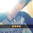
#mobile header example#banner example#completed! commission pieces#! part of a full commission which featured: mobile header. set of banners. dividers. 300 static icons#! these are a few examples from full set#creature features! samples
1 note
·
View note
Text


FREE MOBILE HEADERS / BANNERS. please like or reblog and credit if using.
3 notes
·
View notes
Text

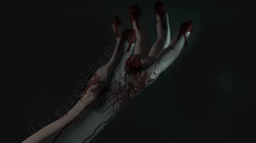

blog pack for @deceivesthem !
#rp icon commissions#rp commissions#open commissions#open rp commissions#banner commission#mobile header commission#dash icon examples#dash icon commission#dash icons#blog pack examples#mobile header examples#banner examples#commission example#examples#just updating my blog don't mind me
3 notes
·
View notes
Text
A QUICK GUIDE TO AO3 CUSTOMIZATION FROM SOMEONE WHO KNOWS NOTHING ABOUT CODING

ft adding pink to everything and my secret to writing long comments
note: I originally posted this to twt but if that place burns in a fiery pit I spent too long on this for it to disappear, so I'm putting it here too :)
so many people know way more about this than I do, but this is a step-by-step walkthrough of the changes *I've* made, and hopefully it works as an introduction people can build from for whatever they'd like to do
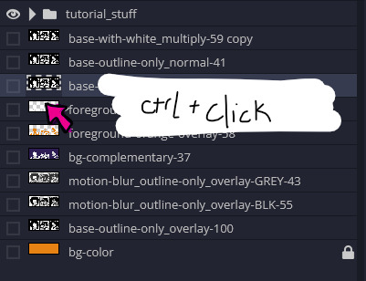
There are a lot of images in this post! (click to enlarge)
to start, AO3 skins
site skins change how the AO3 website appears when logged in (even on mobile), mine is pink and blue!

I'll have my skin turned off throughout the post so the guides appear as they will for you
to create, edit, and view skins, go to the "skins" tab from the left-hand menu. you can also view public site skins from there or from the button in the preferences.


public site skins are made by other users. i would really encourage previewing and exploring them to become familiar with the possibilities (maybe you just want to use one of them and now you're done!)
to create your own skin
on the skins page, click "create site skin"
if you don't know CSS (same), use the wizard! clicking on the "?" will give more information about each option
I only use the colours section you'll see a link right there for hex codes I use pink as a header colour and bue for accent but lots of people change the background colour and that looks really cool!
submit


The next step (optional!!!) is to add CSS from a public skin to your own. I use "ByLine" by Branch. this separates the tag categories and adds spacing to make them easier to read.
here is a before and after using the fic "Landslide" by @roosterbruiser as an example


to see the CSS of a skin, click the title
copy all the text below the CSS heading
in the skin creator/editor press the custom CSS option and paste all the text into the CSS box


you can have both wizard and custom CSS settings, in mine you can see the header and accent colours as well as the CSS

level up: USERSCRIPTS
userscripts are small pieces of code that modify a website. for AO3, this may involve adding shortcuts and buttons or even advanced tagging functions (computer people, I'm so sorry if this is wrong, I'm trying). I use Greasy Fork and Tampermonkey.
This is how I write long and formatted comments!
Greasy Fork is an archive of userscripts and Tampermonkey is a browser extension and userscript manager. You don't need to use these two in particular. please use your common sense when downloading anything or adding permissions to your browser.
Greasy Fork guide on installing scripts
Install Tampermonkey on Chrome
there are TONS of user scripts for AO3. This is another good opportunity to explore all the possibilities. there are lots of more complicated options I haven't explored.
scripts for AO3

i use this floaty review box
and this comment formatting
EDIT: if you use chrome you might need to turn on developer mode in your chrome extension manager - you can google "tampermonkey developer mode" and it should explain that :)
to install (once you have Tampermonkey installed):
open the script you want in Greasy Fork and press install
Tampermonkey will open, press install again


clicking the Tampermonkey extension will let you toggle scripts on and off, and opening the dashboard will let you view, edit, and delete scripts


i find i can only have a few turned on at a time before they cancel each other out, but that depends on which ones you're using and someone more savvy might be able to fix that
how to use the floaty review box - write more comments!
there will now be a "floaty review box" button at the top of the work, it will open a floating text box you can move anywhere on the page. highlighting any text and pressing the insert button will paste the text with italics into the box


anything you type in the review box will appear in your comment at the bottom of the page!
if you have also installed the comment formatting script, you'll be able to highlight any text in your comment and use the new buttons above the comment box to format it

thats all ive got! Hopefully this is a good starting point to get familiar with some of the terms and basics for skins and scripts <3
if you want some inspo for how to comment on fics i made a whole fic rec list on twitter based on comments I've left, it's here. i have a masterlist of recs there mostly for darklina/reylo and similar ships.
the tag #reading with ru has cod recs and me talking about books
:)
#please no one follow me from this im never helpful otherwise#ao3 skins#ao3#fanfic#ao3 community#fandom#ao3 resources#im sorry if the image quality is awful lmk if I should clarify any of the text!#floating comment box#floating review box#ao3 guide
779 notes
·
View notes
Text
DISCOUNTED COMMISSION
Hi lovely, my birthday is coming up in / on September 17 and I will turn 30! It’s such a big thing for me and I’d like to gather as much fund as I can to make it a good one and hopefully to clear up some debt and bills alongside groceries sorted to feel free and have a better grip off anxiety , severe depression & bpd especially since. I live alone. The discount will continue after September too!
The commission process is slower than usual given the many heatwave and my disability kicking in but you will get your graphics done and I’m okay being nudged every now and then.
I take payment before i start working on anything and it is made through PayPal ( or any of the other alternative below ) and sent it as friends and family. if there are fees to pay I am not the one who should be charged.
Donation and tips are welcome but not obligatory. Please note though if you decide to pay via Kofi it will takes an amount off it.
PayPal.
Kofi or this one here.
Amazons wishlist.
Throne
Pricing
Dash icons 5 dollars ( you will get more than one if you ask )
Post banners ( ooc, inbox call, Shipping call etc ) pack 5 - 20 dollars depending on the complexity.
Mobile Headers 8 dollars.
Promotion 20-25 dollars dollars depending on the complexity
Blog pack: 20 - 30 dollars. ( Dash icon, mobile headers, promotion, post banners ) depending on the complexity.
Buy one get one might apply for some of these if you sent a proof of purchase
So if you’re interested in potentially helping me out or comissions me feel free to reach out, thank you! It would be a pleasure to work with you in the near future. You can find some examples below.


216 notes
·
View notes
Text
an overview of my progress on the new site over the past 5 months of building
i decided i would put together a big post compiling all of the things i have currently implemented to the new site since at the moment it's scattered amongst a million small update posts. i feel like this will be good reference for anyone who has ideas that aren't included yet
the comic reader
you can now change the placement of the comic pagination arrows to be above, below, or on both the top and bottom of the comic page.
you can search for individual page numbers via a search bar (and also search 'cover' 'back cover' etc)
you can bookmark pages and save your place at any time in any series, and the home landing page will give you a link to your saved page when you revisit the site so you dont have to go all the way to the read section just to access your place. saving your bookmark tells you what page you're saving (or clearing if you're removing it)
you can now select individual scenes in the volume that have non-spoiler names but proper associations to the content for returning readers to quickly find specific scenes
on desktop you can change the size of the page on your screen
on desktop you can hide the site header (this is not necessary on mobile)
there is a legend explaining what each button does
new comment service that does not have ads
transcripts now come from the sides of the screens and do not require scrolling down to read them, and they are correct and no longer inaccurate on certain pages
tooltips that explain what each navigation arrow button is for
content warnings
you can select individual categories of content you do or don't want to see via switches
you have the ability to disable warnings entirely if you wish, just turn all of them off
you can choose between verbal warnings (stuff in dialogue) or visual warnings (things seen on-screen)
you can suggest adding content warnings to specific pages if there are errors OR if there is something major i overlooked
there is a page that lists every content warning in a volume with contexts for each individual warning, whether it's verbal or visual, and links to the pages
there is a pre-moderated comment section that allows anyone to ask questions about content warnings (for example, asking if something will ever be in the comic or asking what category something specific would be listed under).
there is a list of things that do not get warnings and a list of things that will never be depicted in the comic
scenes that did not have content warnings before now have them to match the proper category system
archives
volume archives are now images instead of links, and they are displayed in a grid format which is mobile-responsive so it doesn't take absolutely forever to scroll through an entire volumes archive
volume summaries are more easily accessible
the new transcript archive which is a text-only version of the entire comic, including a clean version in case you need things in dialogue filtered out
mobile devices/tablets
the website is now properly mobile responsive and designed to function like a regular mobile website and is not unbearable to use anymore. it just feels and looks like any other mobile site!
comic pages now touch the edge of the screen and do not always require zooming in to read dialogue
transcripts are now more device-friendly and do not appear broken on small screen devices anymore
all comic reader features work on mobile (except the 2 desktop-only features)
content warnings do not take up too much space or overflow the comic page box
margins are improved to make basically everything more mobile friendly
you can still see page backgrounds faintly on mobile, but they have an overlay to make reading the comic page contents easier. this was not originally planned but i made it happen! yippie!
display
the site now has a built-in dark mode that works for every site theme, however, keep in mind that due to the nature of dark themes they are obviously not as colorful as the main site themes
there is now a saturation slider which changes the saturation of the site to whatever percentage you wish
saturation affects the background and does not ignore it
the screen does not flash as new elements load in, however, images specifically may take a moment to load depending on your internet speed. this is something i'm trying to fix but i can't guarantee it because it's not entirely in my control how websites load images depending on your internet speed
secrets!
cast page
cast page for each series is divided by individual character type (main patients, side patients, main staff, side staff, family, outsiders etc)
cast profiles are mobile responsive in an easy-to-use way and do not take forever to scroll through on mobile devices, instead they are collapsible and you only have one open at a time.
desktop has anchor links to specific profiles using my cute emoji edits :]
search bar on the main cast directory page that takes you to specific characters by entering their name (or variations of it)
profiles include allotpuns, genders, pronouns, nouns, sexuality, species, age, hatchday, height, and a list of all of their afflictions
there are popups that explain the meanings of certain phrases or words (like specific sexualities) and neopronoun usage explanations and examples
cast page profiles for all of the currently public cast members
biographies that contain character history (or at least the currently public history) and a detailed explanation of their personality that replaces the trait system for simplicity's sake
secrets!
comic itself
pages with errors have been corrected
pages with improper characterization/retconned information have been updated and replaced with new dialogue
character card intros now contain pronouns and retconned pronouns have been corrected
uni is no longer referred to with exclusively he/him anywhere except in the comic itself to avoid confusing new readers/people who do not look at other areas of the site
scenes that did not previously have site themes now have them, for fun!
secrets!
FAQ
the FAQ is no longer a million miles long despite containing all of the questions it originally had. it is now collapsible sections that make accessing certain question types easier
pre-moderated comment section that allows anyone to ask questions about the comic, even if they do not have a tumblr account. these questions are directly on the FAQ itself. it is pre-moderated to keep things on-topic.
bug report page where you can describe problems you're having if the site isn't working right for you. this is also pre-moderated. common/important issues will be pinned
navigation bar
there will be links to all of the ask blogs on the navigation bar, including the AUs
there is a link to the spinch lore page directly at the top. no more digging through the FAQ!
navigation bar has dropdowns to specific types of pages to increase the link count without cluttering/taking up too much space
the links are no longer poorly sized images, instead they are actually made with html
landing page
when you first open the site, you will be linked to a settings page that allows you to set your display settings and content warnings in advance
you can set saturation and select dark mode if you want
this landing page is not bright and has an overlay to prevent it from immediately forcing you to see bright colors
this is everything that is currently implemented. there may be things added in the future, this is just all of my current progress.
what do i have to finish?
uploading the comic. i currently have volumes 1-2 fully uploaded and transcribed, v3 is fully uploaded, and v4 is undergoing the upload process.
finish the archive pages to include all of the volumes
finish the cast profiles
work on the spinch lore page
do proper beta testing with the crew to make sure everything works on as many devices as i can possibly test it on
thank you to everyone for being patient with me over the past few months as i work hard on this. i feel really good actually writing out everything i've done overall because i have more progress than i actually realized!!! i hope everyone is excited to see all of this in action because i can't wait for you to see it either!
57 notes
·
View notes
Text
commissions are officially up & running properly again; currently providing everything from mobile headers & pinned posts to psd packs & misc. graphics. click the links below for examples of my previous work, commission info, and fill out the form! - info. , commission form. , examples.
#rp commissions#graphic commissions#icon commissions#roleplay commission#rp commission#rp comm#rp comms#rp graphics#rp sources
13 notes
·
View notes
Text

template: simple geometry
this is a fully customizable template i originally made as a dash theme header for one of my characters and then got carried away with. you could use it for acceptance graphics or a regular character template, too! two psds are included: one of the example above, and one that will work for dash themes on desktop without too much editing. it will require some messing with it to get it to look good on mobile. feel free to get creative with how you use this, but personal use only, please! i encourage you to change colors and images and fonts–– everything to suit your own purpose! hopefully the template is fairly straightforward because everything is labeled, but knowledge of how to use clipping masks and how to make a png of your character is needed. all of the zodiac sign symbols are included, and all you have to do is toggle visibility.
DETAILS
* fonts used: alegreya Sans, vallena * coloring on the png is by me and included in the download. change as needed! * please do not steal, copy, or use this template commercially. * see here for full rules. * please credit me if you use this by @ ing or linking to my tumblr or my payhip. * customize it to your heart’s content, so long as you still credit me. * feel free to send me a link to anything you make with this! * don’t hesitate to message me with any questions or problems you run into.
🌻 download for free on payhip!
#dailyresources#dailytemplates#supportcontentcreators#hisources#rp template#acceptance gfx template#acceptance gfx psd#rp psd#character psd#character template#header template#header psd#rp resources#free rp resources#*zena#*zena:templates#*zena:free#free resource#hi long time no see <3 i am so busy w a fulltime job now but i liked this and thought y'all might too!!
37 notes
·
View notes
Note
Heyy, I’ve been reading your wonderful one piece works for a while — and I couldn’t stop wondering how are you actually doing those magnificent headers?
Like… hello? The great quality, with additional 3D-alike details I could catch by my eyes? I got only Ibis Paint X on mobile, since I’m only a young man that literally two months ago went on a life-time ‘adventure’ of living alone in a small apartment.
In short — I got no money to pay for additional graphics/drawing programs, not yet at least
Hello!
Thank you! I'm glad you enjoy my writing - I'm curious to know what's your favorite piece / part? Also I'm so happy you like my headers? Makes it feel worth it to spend time on them! :D
I have excellent news for you, I used a mix of Canva and Photopea. They're both FREE!
I'll be explaining the process for making these two kinda? The full tutorial is below the cut, to be courteous to the other folks, hope you don't mind?
Though I am hearing that Canva has given people some grief. But Photopea is just *chefs kiss*
If you've ever used photoshop, Photopea is essentially a free photoshop, and it even has the automation tools! An absolute lifesaver when you have multiple layers you want to export (but that's for larger projects not this)
I'm going to assume you have basic knowledge of layers in digital drawing programs for this. If anything isn't clear: ask me, I'll clarify!
//-------------------------------------------------
My General Process is:
Search for official art / images
bring it into canva / photopea
crop / arrange images to match the dimensions
select a thematic color that is associated with the character
separate the foreground from the background
mess around and test things until they work
//--------------------------------------------------
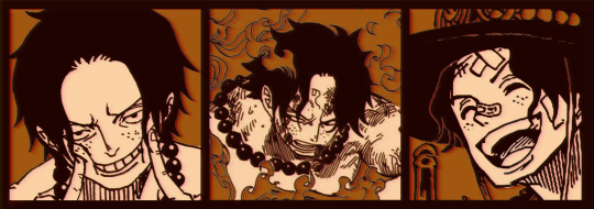
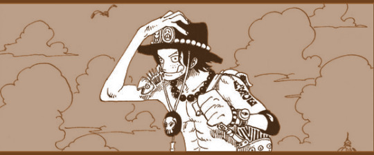
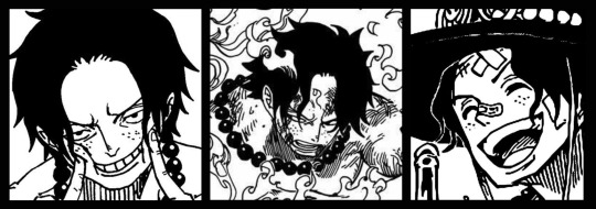
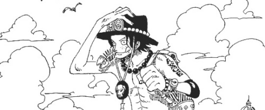
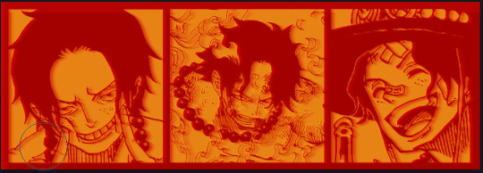
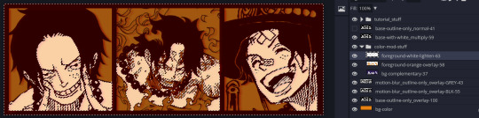
Given "Louder than Words" is the latest one I've made, I'll start with the process for it.
Dimensions: 3000 x 1055 px dpi: 96
//-------------------------------------------
Let's Get Crackin'
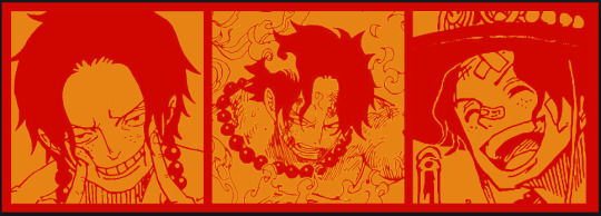
Alright let's grab some official art so we're not using any fanart without the artist's permission
I try to pick images that feel relevant enough to what I'm trying to make. For example: the image for the Matching banner shows the ASCE tattoo which is super important in that fic
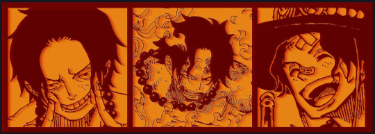
2. Let's arrange them onto a banner where each individual image has the same/similar dimensions to the rest
That's probably part of why you like these. To a certain extent they have similar dimensions, so they have a uniformity that's pleasing to the eye! (It's not perfect because I threw perfectionism to the wind because this is tumblr not my portfolio) Tip: if you have 3 images and only 2 that have similar dimensions, and the 3rd one can't be cropped logically: but the one that's a different aspect ratio in the middle!
3. lets arrange them in such a way that the borders all feel like they're the same/equal width/thickness
you might find that you have to shrink some images for this, that's fine.
ALTERNATIVELY: if you're going with one image crop it so it's just the relevant info and it matches the dimensions (3000 x 1055 px)
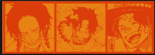
We have our base! Now let's add some color, and direct the viewer's eye together!
4. pick out a color that you think matches your character / vibe - that color is going to be your background Given I'm making an Ace banner: orange is the color I'm going with
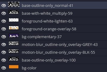
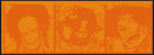
I went and named my layers for this lol. The numbers represent the opacity, and they aren't important. I just kept changing the opacity until I liked the way things looks. But here's the secret to the 3D feel:
Motionblur (+ moving it about)
Separating the foreground and background and dulling out the background.
I'm going to show you my process so you can see the effects, but first let's give you some quick skills:
//------------------------------------
SKILLS / THINGS I THINK ARE HELPFUL
//------- Select Similar
magic wand -> select something -> right-click -> select similar This works best when you have high contrast images (like manga panels that are black and white). You can select the black or the white areas. Depending on what works better for you. TIP! Invert selections with ctrl + i Say you know that you want to select everything but Ace's face in the second panel. Select his face with the magic wand then ctrl + i, and that's the only thing NOT selected

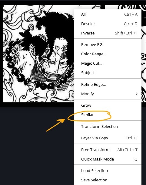

TIP!!!!!!!!!!!!!!! Please, please, please, duplicate your original image and work on the duplicate layer. This helps you SO much. !!!!!!!!!!!!!!!!! TIP! Check your selection tolerance! This could be why too little, or too much is being selected.

//------- The Move Tool
Shortcut key: v While the move tool is active, you can nudge the stuff on whatever layer with your arrow keys Shift + arrow key = 10 px move (generally)
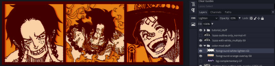
//------- Layer Locking
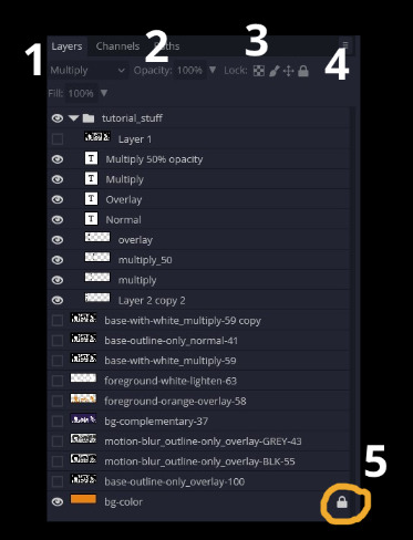
1- Layer Blending Mode (see Overlay vs Multiply vs Normal) for how this can affect results) 2- Opacity: how see through it is / isn't 3- Lock Transparency (it's the little checker board) 4- Lock Layer (looks like a lock) 5- Lock icon that appears when anything on the layer has been locked More on 3 Lock Transparency: You can only paint on / modify what's on that layer. You CANNOT add anything to any area that is already transparent Here's a demo of what you can do with this power:
Here's the original Image - notice how it's just the lineart with a transparent background.
It's powerful: abuse it
//------- Overlay vs Multiply vs Normal
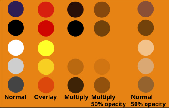
I think seeing this is the best way to visualize how different modes can affect the color.
//--------------------------------
Back to the Tutorial
!!I IMPORTANT NOTE !!
Please play around with the opacity slider to figure out what opacity works best for you on the multiple different layers we're about to make / work with. It's up to your own style to figure this out. Next: please feel free to not follow all of it. Add more layers, add less layers, take the base principles and go wild! :D
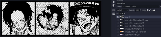
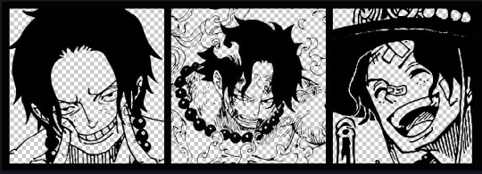
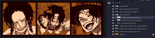
5. Separate the lineart from the background and save it as a new layer 6. Duplicate it and set it to overlay, or set it to overlay immediately
7. Duplicate that lineart layer twice and set the blending mode to overlay 8. lock transparency on the top one and change it to be a dark grey 9. Apply motion blur to both:
Main menu bar -> Filter -> Motion Blur I made it so that the grey layer was blurrier than the black layer
10. More them around a little to give it a "3D effect" as you called it.
It creates shadows under the lines - I was aiming for an effect similar to chromatic aberration (chromatic aberration is a valid way to add punch to your stuff too!)
So this is what things look like now - painful, but let's keep going
11. Duplicate the ORIGINAL / BASE lineart layer, that you DID not apply motion blur to -> set the blend mode to multiply (reduce opacity for it to actually take effect)
okay that's less painful here's what the layers look like right now:
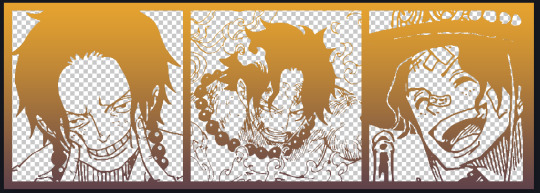
let's bring more focus to Ace's face, and push the background farther away:
12. Use the magic wand tool to quickly select large areas of the faces / focal area / foreground and the lasso tool to refine things
TIP! Hold shift + click -> add to selection Hold Alt + click -> subtract from selection
13. On a new layer with blending mode -> lighten, fill that selection to be white
If you look at it, you'll notice that it is ALREADY starting to draw our attention to his face, but the background is kinda aggressive, so let's dim that down
TIP! Right-click on the gradient tool to find the paint-bucket tool

TIP! Sample All Layers: Turning this option off makes it so that you only work with the content on THAT specific layer. Turning it on makes it so that it is working while taking all other layers into consideration.
14. ctrl + click on the "white foreground" layer to select the contents of that specific layer (pink thing is your mouse)
15. ctrl + i to invert selection and ON A NEW LAYER (layer mode -> multiply) fill that with a complementary color
16. I did one last thing where I took the original base (before we separated the lineart) and added it to the very top and played with the opacity to get something less in your face (layer blend mode was set to NORMAL)
And that's it!
More considerations that I take:
I want the banner to be "thin" or not square, so it doesn't take up too much screen real estate on people's devices
I don't want readers having to scroll too much to get to my writing (which is the whole point of the post, let's not waste their time making them look for things)
I want the banner content to be relevant enough?
ie: with Matching: I wanted the ASCE tattoo to be visible. With matching I wanted Ace to not look too happy in some of them.
I'm also trying to avoid spoilers, I hated getting things spoiled, so I'm trying to be careful that the images I pick don't spoil anything really.
Congrats on starting life on your own! I did that whole living by myself thing too! Tip: keep the pantry stocked with lentils, beans, pastas, baking essentials, rice. They really come in a clutch when you're hungry.
#photopea resources#photopea psd#tutorial#tutorials#tumblr banner#photoshop#photoshop tutorial#digital art#fuck adobe#adobe photoshop
39 notes
·
View notes
Text
blog pack example.
personal use.
psd coloring, banner, mobile header, promo, icon border &&. divider.

8 notes
·
View notes
Text

EXAMPLES : mobile header - £6
0 notes
Text


SpookyType's $5 Commissions
Do you need a new theme background? Mobile banners or banner headers for your posts? A new promo, perhaps? Icons borders with psds? then I've got your covered! Everything here is marked at $5 USD with no additional charges! Tips are also accepted and appreciated. I don't have many examples right now since I lost almost all of my past work to a computer breakdown. But I will provide what I can and do what I can for all of you.
theme backgrounds: x
banners/promos: x
icon borders: x
i can only accept paypal payments at the moment. send me a message if you're interested or have any questions! find my colorist examples and promo: here and here.
#commission#commissions#open commissions#commissions open#commission are open#commissions are open#taking commission#taking commissions#looking for commission#looking for commissions#signal boost#rp commission#rp commissions#graphic commission#graphic commissions#graphics commission#graphics commissions#theme commission#theme commissions#theme background commission#theme background commissions#banner commission#banner commissions#promo commission#promo commissions#icon commission#icon commissions#icon border commission#icon border commissions#tumblr theme
2 notes
·
View notes
Text

MY COMMISSIONS ARE NOW OPEN!!
my financial situation hasn't been the best recently and that on top of my schitzophrenia has been getting to me so i've decided to open up commissions. here is my ko-fi which includes what i do (sidebar gifs, mobile headers & more!) and all the information you need if you want to commission me anything (+ some examples of my work). if you’re not interested in commissioning but would still like to support me, you can do so through my ko-fi and my paypal <3 + 50% of all commissions will be donated to the palestine children's relief fund who provides free medical care and humanitarian aid for children in the middle east.
12 notes
·
View notes
Note
Finally a blog that isn't toxic I've been wondering while looking at it about the NaruHina being trans and that was mind boggle mind sharing the story for it
It sound hilarious (srry if I may seem like I am making fan of trans it's just that the situation is funny)
Kishimoto accidentally confirmed NaruHina's trans because during an interview, someone asked him why Naruto had whiskers on his cheeks, and Kishimoto just replied it happened from being in the womb of a jinchuriki, but both Himawari and Boruto also have whiskers, so using that logic, Naruto had to have carried them in his womb, and since both kids belong to Hinata, she had to have gotten him pregnant, thus, trans NaruHina
Trans fans of the pairing (such as myself) went wild and so we flooded the NH tag with our own edits and just would RB/post about it because it was fun, and we were literally having fun as NH fans
My mutuals and I (that share the same HC and OTP) also found it hysterical how transphobic NH fans said I was spreading "false news" (for literally quoting Kishimoto) and also said I was posting "Fake manga panels" for my (DONE VERY POORLY ON PURPOSE) manga edits that are clearly not meant to be taken seriously:

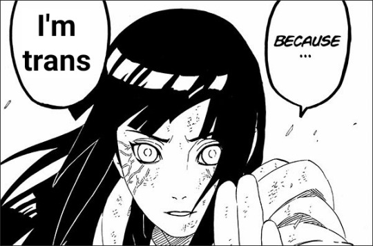
Like I literally made the font different/cut into the speech bubble, cause, yk, it's all meant to be shit posts and I ended up making more out of spite just to piss off transphobes
I make tons of shit post edits of my favs constantly because that's just the kind of fan I am (my icon and header on mobile, for example)
I don't post much Naruto anymore because I left the fandom for the most part (literally most of it SUCKS) but I still occasionally RB/make edits to this day, and I will also say trans NH is canon, just to ruffle transphobic feathers
13 notes
·
View notes
Text

anahilation is now open for commissions!
˙ ˖ ✶ hi friends! i'm ana, 26, she/her, cst + i've been in and out of the commission game over the last few years. i used to offer custom tumblr themes but am now opening up with a focus on offering blog graphics like promos, mobile headers, and more. please like & reblog to spread the word! thank you soso much!!
view commission info such as guidelines, examples, pricing, and how to submit a form in the source link! 💌
from feb. 23 to march 8, receive a free 5-pack of post headers with your order! use code "high five" in your form to redeem. limit 1 redemption per user.
#rp commissions#rp resources#rph#rpc#graphic commissions#promo commissions#mobile header commissions#indie rp#excited for this eeee!!
19 notes
·
View notes
Text

Attention Kataang Week artists, gif makers, and anyone using images in their work!
Please consider making your images accessible! It’s easy—just add a brief description in the alt text of your images. Adding alt text is NOT a requirement to participate in Kataang Week, and we are happy to reblog your posts whether you use alt text or not. But we encourage you to think about doing it—making images accessible can help visually impaired fans to better enjoy your creations.
What is alt text?
Alt text is a brief description of an image that is read aloud to people who use screen reader software.
How do I write alt text?
The description of your image doesn’t have to be long or detailed. One or two lines, plus any text in the image, can be very helpful.
Example: A digital drawing of Aang and Katara holding hands and kissing.
See the header image of this post for another example: click or tap the “ALT” in the bottom left corner of the image
A quick guide on how to write useful alt text here
How do I add alt text to images?
Adding alt text is easiest to do on the tumblr mobile app—just follow the steps here.
We hope that was helpful! Kataang Week is just around the corner, and we’re super excited to see what everyone has created 💖
- The Mods
58 notes
·
View notes