#my binds
Explore tagged Tumblr posts
Text
The Cadence of Part-Time Poets


The Cadence of Part-Time Poets by @motswolo
Have been working on this 10 volume set for the past few months now, and they are finally complete. My Magnum Opus. I have peaked and probably depleted all of my brain power.
Thank you to @motswolo for writing such a beautiful story. My brain chemistry has been favourably altered. Will forever flinch when I hear Queen, The Beatles or Bob Dylan. Love to you from western Canada (west coast best coast lets gooooo).
I also posted a TikTok Reel of these since posts here are limited and I love the insides as much as the covers, so if you wanna see between the pages, here’s that.
Also thank you @avisbindery for letting me scream and cry in your DMs while I read the fic. May you get some uninterrupted sleep now LOLLL.
Going to write a whole essay below about the ideas and details because uhhh I wanna yap bit!
So for starters, I wanted to make these binds look like magazines because of the epilogue where (spoiler) Tonya sees Remus in a copy of New Musical Express. But of course this fic is long, so I was like, what if I do multiple volumes? This very quickly spiralled into me painstakingly (finding publication-accurate fonts almost sent me to an early grave) recreating 10 different music-focused magazines from the 70s and 80s from scratch (thank you to Photoshop, Affinity, Procreate and Canva). Each volume features a unique cover, along with stylized typesets to match that display the songs for each chapter but in different designs. And then I went a little crazy and made a 45 sleeve and a cassette too, to really set the scene when I took the photos lol
While the covers display the dates pertaining to the contents of that particular volume (Sept 1975 for volume one, for example) I was thinking about what the magazines would say if they were really published when Marauders are traipsing about being spectacular and famous in the future. I sprinkled in details from the fic itself and fanon-ed it a bit, but that was the general inspiration :-) Tried to keep the photos used either faceless/obscured, or to use the fancasts on Mots’ Cadence master post. I also tried to use period-accurate photos but didn’t always succeed, so settled for photos of 4 member bands where I had to :”) But the general intent with the facelessness was that they could be implied to be Marauders. If you squint? lol. Just pretend. Pls.
Volume One: Based upon The Record Song Book. This magazine went on to inspire the typesets, since it publishes lyrics and such. The cover images are of Spacey Jane and David Thewlis.
Volume Two: Based on ZigZag, specifically the issue from July 1978 featuring Siouxie and the Banshees just because I thought it looked sick as fuck. I re-drew the abstract shapes and such in procreate. The cover images are The Clash and a young Gary Oldman. Lord he was foiiine.
Volume Three: Based on Trouser Press, November 1980. The cover images are a young Metallica, and my personal fav fan cast for James, Reiky De Valk. The film negatives are from a Bruce Springsteen tour, 1976.
Volume Four: Based on Gay Times (November 1984), a queer magazine from the UK because this volume contains Wolfstars first kiss hehe. Also hence Somebody To Love plastered all over the covers. The Front cover is Inhaler. The “4A” on this one is of course the boys’ dorm number, but I made the A the lambda symbol as this was a pride symbol in the 70s after Stonewall.
Volume Five: Based on Melody Maker. Front image is Alex Turner. All of the text on this one is pulled directly from the fic. The scene where they all drop acid and James jumps off the roof Almost Famous style had me hootin’ and hollerin’… until Tomny showed up hahaha :”)
Volume Six: Based on IT (International Times, Aug 1971). Front image for this one is Joy Division, and the back features Jane Asher for Lily
Volume Seven: Based on Record Mirror, June 1976. Front image is John Taylor of Duran Duran. Yum.
Volume Eight: Based on Rolling Stone. More vibes than anything for this one, but the quote still makes me laugh. Front image is of Matt Hitt. Can you tell I photoshopped a cell phone out of this one? IDK. This photo just screamed ‘Remus’ to me so I had to use it. The back image is an old cigarette ad, but the photo is taken in Shepherd’s Bush.
Volume Nine: Based on Fusion magazine. Front image for this one is once again Inhaler. Oops. Back cover is our gals. Images are Jodie Foster as Cherry, Brenda Sykes as Mary, and Goldie Hawn as Lottie.
Volume Ten: Based on New Musical Express. You know why :”) These are all victims of fanon, but this one especially. I wanted it to be NME instead of the re-invented logos I’d been doing for all the rest, as I wanted it to look like the magazine the Sister gives to Tonya. I referred to an issue of NME from October 1979 for this and layered in fic references where it made sense to. The cover image for this one is (I think) Cigarettes After Sex. This issue also contains all of the B-Side chapters, and the Marauders song lyrics too just for fun :)
Slasher Chick: This is just my take on what Sybill’s zine could’ve looked like. Prob way off but I just wanted to have fun with this one since I had no cover to reference lol. The zine contains her little write-up and the interview, lifted straight from the fic :")
ok yap sesh over byeeeeeeeeeeeeeeee lmfaooooo
#fic: the cadence of part-time poets#motswolo#wolfstar#fanfic#sirius black#remus lupin#james potter#peter pettigrew#regulus black#bookbinding#tcoptp#coptp#the cadence of part time poets#marauders#moony#padfoot#my binds
1K notes
·
View notes
Text
Royal Flush by @astolat

My next astolat bind! Royal Flush got it's own book :)


This bind looks intentionally very similar to the Game of Thrones Anthology I already posted. The design elements used in the typeset are mostly the same.
More images under the cut :)
Each chapter beginning includes that gorgeous frame from a ca. 1450 bible, which you can view here: https://www.getty.edu/art/collection/object/103RTN#full-artwork-details. I cleaned it up so that the background and original text are gone and I could use just the frame.

I also made a little scene divider from that frame :)

I'm really happy with how this turned out.

And here you can see it next to the anthology! The anthology is a folio (paper folded once), while Royal Flush is a quarto (paper folded twice, meaning it's half the size and there were four pages per side of sheet).

As always: Many thanks to the Renegade Bindery Discord Server @renegadeguild for opening up the world of fanbinding to me. And thanks to astolat for sharing this beauty.
#bookbinding#fanbinding#ficbinding#astolat#game of thrones#asoiaf#royal flush#bleating book bindery#my binds
279 notes
·
View notes
Text


Party Favours by @howlsmovinglibrary
"You want to go down this road?" asked Shadowheart. "At least do it well. If you need a fake date who’s pretty, charming, and distracting for both yourself and others? Who won’t take it too seriously, but also won’t fuck it up by being embarrassed the entire time? You don’t ask me. You ask Astarion.” A year after their adventuring party officially disbanded to enjoy their fame and immense wealth to the full, tiefling wizard Rosalie (reluctantly) asks Astarion for some help with a large, fake-date, ex-girlfriend sized problem.
Now this... this is a bind that got away from me somewhat. The typeset is one of @besidekick's lovely typesets made for the 2024 Renegade Exchange. I had read Party Favours a while ago and loved it (such a fun Astarion/Tav dynamic, funny as hell, deeply tender, and I'm weak for a fake dating trope), so I immediately squirreled the typeset away for future use. Turned out that the future was about two weeks later when I attended the Renegade Binderary workshop on cover cutouts and thought, "Hey, wouldn't it be cool to design a cover for Party Favors that incorporates the astrological elements of Rose's divination spell and a window cutout." Which was a good thought, actually, because this bind turned out incredibly well.
About the Bind
This particular bind is a legal quarto, printed on cream 20/50 lb long grain paper. It was also my second try at chisel trimming a text block, an attempt that mostly went off without a hitch.
Endpapers are a lovely chiyogami. Front and back covers each feature a window cutout to reveal some delightful foiled scrapbook paper that I scavenged from one of those weird collage pages that appear in every scrapbook pad for some reason.
The cover was my first attempt at foiling a full cover design. That was... a battle. But we eventually got foil onto the bookcloth. Now, did it take me three tries? Perhaps. But we... we don't need to talk about that part.
This was also my first in-boards three-piece bradel construction. (Lot of firsts on this bind.) Somewhat more involved than previous casebound binds, but it was so satisfying to assemble.
#having the common renegade experience of 'i made a legal quarto and a 3 piece bradel and now i will never make anything else ever again'#fanbinding#fan binding#bookbinding#baldur's gate 3#bg3#astarion#astarion ancunin#tavstarion#astarion x tav#my binds
202 notes
·
View notes
Text


Fanbinding: National Service
I was inspired by @celestial-sphere-press and @pleasantboatpress 's Binderary presentation on cutouts, inlays, and onlays to attempt a tricky one. The marbled paper inlay was cut out by hand and has some ragged edges as a result, but it looks just as cool as I hoped it would. I'm still getting the hang of sizing cases for flatback books, so the spine piece is too large, and the hinges are uneven, but shh. It opens and closes like a book, I am content and will revise my method next time! I used @woodlandwarbler 's wonderful typeset of National Service by burntcopper to make this bind.
334 notes
·
View notes
Text
Back in October last year, I started reading This is an Adjuration by @not-freyja.
By the time I had made it to chapter 5, I had already started typesetting this story as I read because I knew this would be one of those stories that I needed to have on my shelf.
When I finally caught up to the story at chapter 31, I begged the author to let me bind this when it was finished.
Nearly a year later, and what is probably the most important bind of my life is finally finished. Check out these glamour shots, and if you want to hear more about the actual binding process and about how this fic actually changed my life, see below.

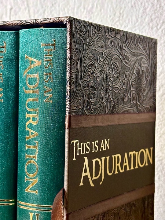

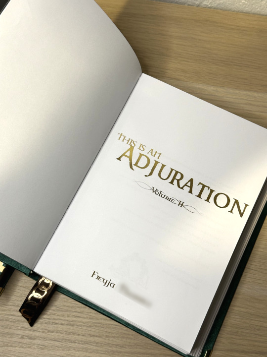
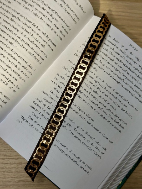
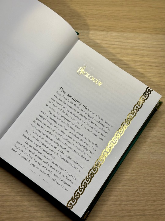
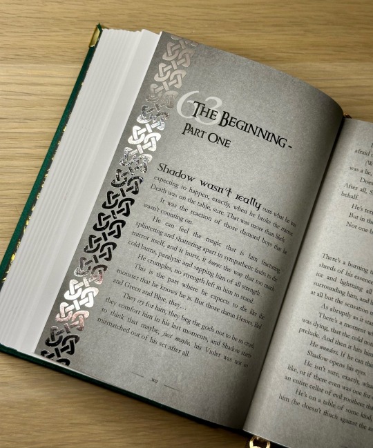
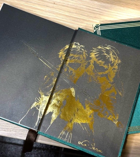
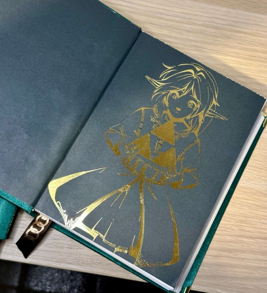

So funny story, before I get into the technical side of this bind, but this fic actually changed my life. Not as in I was greatly emotionally moved by the story, though don't get me wrong I absolutely was, but genuinely this fic introduced me to some of the best people I have ever had to privilege of knowing (Hello Class, you know who you are 🩷), and also, it introduced me to Freyja, the incredibly talented author, who, as I type this, is curled up in bed next to me fast asleep after flying half way around the world to go on a two week long date with me.
Moral of the story folks is comment on the fics you like. You might accidentally meet the love of your life on, and I can't believe I'm saying this, AO3.
Anyways, about the bind!
This bind was a challenge from day 1. I had to do the typeset for this 300k word fic 4 times, and had to split it across 2 volumes. This was the longest fic I have ever attempted to bind, and it was so thick I couldn't get it in the paper trimmer.
To make this book as durable as possible, I attempted a few techniques. I secured it with 3 tapes, I made an Oxford hollow, I rounded the spine, I made a slipcase and I used 2.3mm boards where normally I use 1.8mm.
The slipcase is covered with embossed faux leather, buckram and plain ribbon, and lined with gold satin fabric. I've never made a slipcase before so this was an experience.
The books are covered with an emerald green silk finish bookcloth which really gave the books the luxury they deserved. I foiled custom end papers as well as every chapter title page using heat reactive transfer foil on toner ink (never again I am never doing that again omg it took days). Huge thank you to @la-sera for letting me use her artwork which helped inspire this fic!
The grey flashback chapters I had to use HTV for the border decoration and I'm very happy with how that turned out because it was so easy and straight forward, unfortunately it just wasn't viable for the whole book.
It feels weird to finally have these books done. They have my blood, sweat, tears and my heart poured into them, and I've been working on them for so long that it's odd to actually have them finished. I'm so proud of this bind, and feel like I've grown so much as a fanbinder by making these.
Anyways, if anyone has any questions about the process, please don't hesitate to ask!
(and if you are an Linked Universe fan and haven't read Adjuration yet, this is your sign!)
#linked universe#bookbinding#fanbinding#ficbinding#this is an adjuration#my binds#ivyring bookbinding#hi freyja!
494 notes
·
View notes
Text





Away Childish Things by @letteredlettered
I'm so excited to finally share this bind of one of my all time favorite fics! Thanks to lettered's generous binding policy, I decided to go all out.
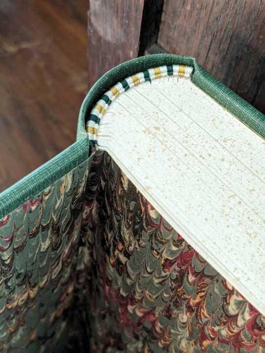
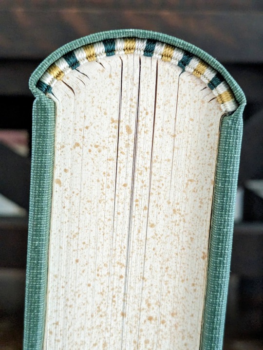
This bind has a foiled cover and spine, hand sewn silk endbands, and thirteen custom chapter headers. It was also my first time rounding and backing.
You can find more pictures and information about my process under the cut.
For the cover and spine, I recreated the design of Beasts of the Field (1902) by William J. Long.
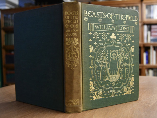
I wanted something that captured both the whimsy and maturity of the story, and this cover fit my vision perfectly. It also gave me the opportunity to recreate another antique cover from the public domain.
Unfortunately, the design was a bit complicated for my Cameo 4, so I was unable to fill the lines in. You can also tell that the foil did not adhere properly near the bottom, so the flowers are lighter than I would like them to be.
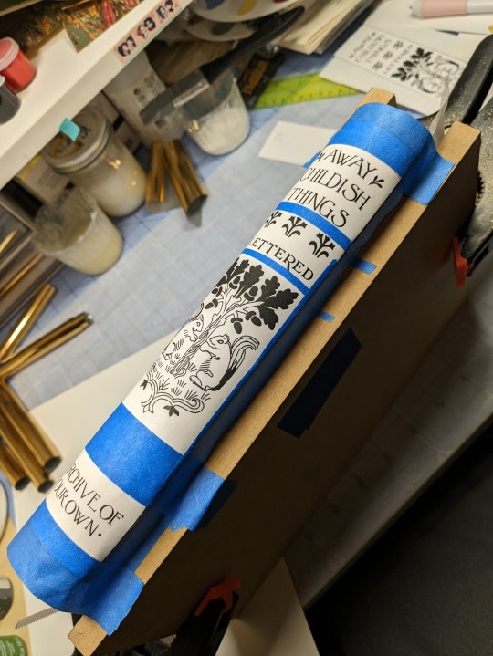
Because of the trouble I was having with my Cameo, I decided to foil the spine by hand. I deeply regretted this decision two hours later, and it took me four hours to finish foiling. My wrist still hurts!
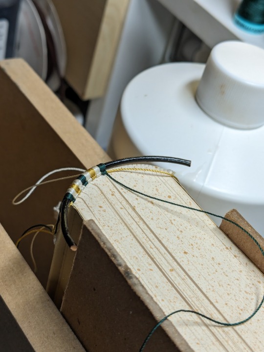
Sewing the headbands was my absolute favorite part. I was encouraged to try them by a lovely binder on Instagram, and I ended up completely addicted. I splurged on some fancy silk thread so I could give this fic the royal treatment it deserves! I think they look like beautiful little caterpillars.
As for the rounding and backing... I'm not going to talk about it. Nightmare. Lots of nervous sweating. Emotional agony. Next topic!
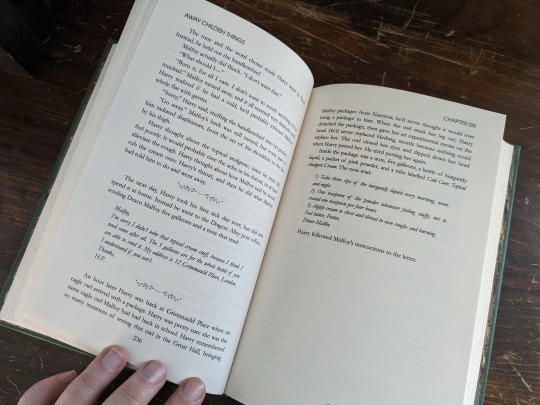
I worked on the typeset back at the beginning of January when I had some time off, and it took me a solid week of obsessive editing to complete. My sister suggested that I use Harry and Draco's patronuses for the chapter art, but there unfortunately aren't many public domain illustrations of deer and foxes playing together.
It was at that point that I also decided that I wanted the animals to match the respective ages of Harry and Draco and the tone of each chapter. For the 13 chapters I ended up editing 25 different illustrations together. The bulk of these are taken from vintage versions of Bambi and Reynard the Fox. It's possible that a few stock images from 1980s nature books snuck in there, but I did my best to keep them all pre 1925.

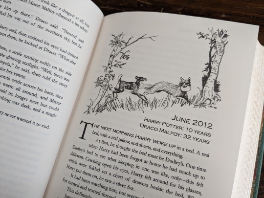


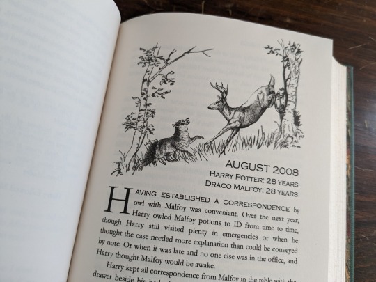


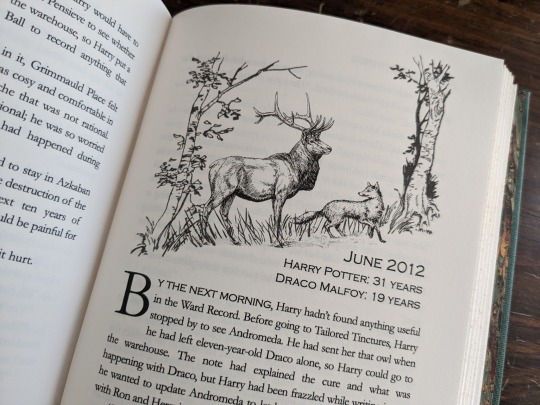


I'm not a skilled editor, and some of these are worse than others, but I'm quite proud of what I was able to cobble together. On the final page I put a young fox and deer running off together. I wanted it to seem like Harry and Draco's inner children had been freed.
I'm a bit embarrassed to say that this bind took me about 4-5 months to complete! I started in early January, and went wildly off track learning how to round, back, and sew headbands. And then I was hit by some killer creative block that only lifted last week!
There are still many things I could improve on, but I'm so proud of everything that I learned and accomplished with this bind! A big thank you to lettered for inspiring me with such a wonderful story. <3
#book binding#fic binding#fanbinding#fanfic binding#drarry#away childish things#harry x draco#my binds
984 notes
·
View notes
Text


Bind #4 - Switch by Ceres_Libera on AO3
What do you mean I finished binderary project #4 before bindery project #2 & #3
This is not only my favourite ever fic, but my favourite ever book/story/wherever. I've come back to it so many times over the years and every time I absolutely adore it.
Tiny text is tiny because I wanted to make a text block that fit through my guillotine.
This was originally meant to be my "over the top/impractical cover design with rhinestones, but the more I thought about it the more I wanted something that wouldn't get damaged with use, and I didn't want to buy rhinestone application equipment for one project. I might still try it in the future though.
Chameleon vinyl is fun, edge painting with alcohol based metallic paint was a mistake but I was too impatient to go out and buy something non-alchohol based when this was already on my shelf. It's a little messy in places but not bad for a first attempt! I really want to learn proper edge gilding at some point.
#mckirk#star trek#star trek aos#bookbinding#fanbinding#handmade#binderary2025#renegade bindery#renegade bookbinding guild#crafts#my binds
176 notes
·
View notes
Text


Bound: A Christmas Miracle by @sleepstxtic
Typeset and bound by: me, @phoenixortheflame.
A Christmas Carol with a Drarry twist.
I bound this lil cutie for @sits-bound as part of a Drarry holiday bind exchange.
The cover design was inspired by a 1999 edition of A Christmas Carol. And the half-title and full-title page illustrations (by moi) were inspired by a scene in the fic in which (spoiler but not incoming) Draco tips a statue of Joseph over onto the baby Jesus.
Besides including my own illustrations, there were a lot of other firsts with this bind: first time participating in an exchange (Thank you, katy for organizing), first time doing a quarto, first time doing a wrap cover.
Quartos are fun! Perfect for shorter fics. And because they use standard letter-size paper, not short-grain, I was able to easily source cream paper — much nicer on the eyes.
Also, the case is smaller! Which means I can print a wrap cover at home. I used 48LB matte photo paper, which held up during gluing. It's slightly thicker than I'd prefer, but it did the trick, even if the spine folds did crack a wee bit.
The endpapers are hand-marbled from George Hill. The colours are so gorgeous. I wish I'd ordered more (I still might).
As always — I made a copy for the author. She'll be getting hers at a later date when I bind another of her fics.
#drarry#ficbinding#fanbinding#typesetting#draco malfoy#harry potter#holiday fic#sleepstxtic#my binds#phoenix binds
157 notes
·
View notes
Text


A bind for @renegadeguild 's 2025 Tiny Book Exchange! [An exchange where you typeset a smaller fic and then someone binds it for you! [or you only typeset a fic or just bind someone else's submitted typeset, ya got options]]
typeset made | bind made (you're here)
I got to bind @bossbot97 's lovely typeset of @croik 's Kane & Feels / Ghost Wax crossover: The Title of this Fic has been Redacted for your Safety! (which i'm realizing now I didn't get any other interior pictures ahhhh)
The finished book measures approx. 2"x 3"
This fic features the characters from both audio dramas hunting/being hunted down by a creature with a bird-like skull covered in feather-like shapes, so I took that aspect and ran with it.
I initially wanted to have more to the cover of this bind but life got a bit in the way and I was honestly quite liking the more simple look for this. Makes it feel more like a mysterious and ominous book you'd just... find somewhere, yaknow?
Overall, the chisel trimming turned out alright. Surprisingly harder to do on a smaller book than a full sized one! (At least for me lol). First time sanding/edge-coloring and that turned out not bad!
Materials: I actually got this bookcloth from a Talas sampler pack (and they don't label their samples) but I believe it's Asahi Bookcloth in #2379 Black. (And it adds such a neat texture for this bind.) The endpapers are black cardstock with overlapping feather textures printed on it, so the pattern is subtle until it catches the light. Bound using linen thread and archival pva glue, endbands sewn using single strand embroidery thread in a faux-double core style. Printed on Hammermill 20lb cream paper.
Cover: An inset window that holds a paper cut bird-like skull. Made with cardstock cut into different layer silhouettes, painted details, glued together, waxed, and then glued into the window (which took so many little tabs to get that shape lol)

#fanbinding#fanfic bookbinding#my binds#kane and feels#k&f#ghost wax#bookbinding#tiny book exchange#tiny book exchange 2025
59 notes
·
View notes
Text
binderary 2025 round up:
1/3 binds complete
2 new skills learnt
printer conquered
and 3 new fandoms joined


The bind I managed to complete was of if not by faith, then by the sword by @sauntering-down. the beautiful beautiful typeset was gifted to me by c_art for the 2024 Renegade Typeset Exchange.
I love the grey-scale aesthetic of the typeset and tried to continue that with a black cover and grey endpapers. I did try and have a lightsabre design on the cover but didn't quite space the sections out enough for it to look coherent. The font used on the cover and spine is Aurebesh Calligraphy to fit the aesthetics of the title of the fic. A gold/orange bookmark ribbon to match Cal's lightsabre in my jfo game and little feather charm like the feathers of the Shyyyo bird.


This bind was my first time doing a three piece bradel bind and i didn't have any of my past binds to reference at the time so the boards are cut too large. There are numerous more mistakes and imperfections, but I love it anyway. Life got in the way of completing all my goals this binderary but i still feel it was a success simply because i did some bookbinding.
81 notes
·
View notes
Text


My first tête-bêche binding, my first octavo, and my first time working with leather. This is a combination of two Star Wars fics I've adored for years, and which I nearly always read as a pair, so this combo seemed really natural. The stories are 'Wonderterror' by Peradi and 'Luke Skywalker. 19. Full Human.' by Samvelg. They both explore the premise of the Skywalkers as Eldritch creatures as a result of Anakin's (lack of) parentage, and they are amazing. I made an effort to reach out to both these authors for permission but received no response; if either of them request that this post be taken down, I will of course do so. But as this is a personal book for my own collection that will not be sold or distributed, I felt that showing it off was fair.
Printed on legal paper, font is Uni Neue(body text), Gearus (titles, headers, cover text), and Typographer Caps (drop caps). Images are composited from standard star wars and kraken/cthulhu conography, which is duplicated on the covers (with nearly invisible black squiddies underlying the flashy star wars logos, love how subtle they came out). Typeset in Affinity. Covers in black fairly low grade cow leather with HTV, endpapers printed from an image found in rawpixel's public domain archive, and headbands sewn on. Specifically made the bookmark ribbon long enough to run through the book twice, to potentially mark places in both fics at once.
#book binding#bookbinding#fic binding#ficbinding#fan binding#fanbinding#hand binding#handbinding#my binds#star wars fic#others fic#tete-beche
239 notes
·
View notes
Text


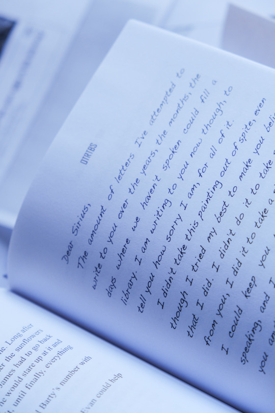

art heist, baby! by @otrtbs
the time i bound ahb, promptly hopped on a flight to new york city, and then shamelessly cried in front of degas dancers (also saw so many other works mentioned in the fic!! the rothkos nearly took me out)
the whole bind is inspired by galleries! each chapter has a different work mentioned in the story with a little placard indicating the chapter name/number plus the artist details ◡̈ the maps on the cover are copenhagen + brazil because I love pain
+ a paperback copy for my fandom buddy because misery loves company
(bound with permission ◡̈)
#all i do is cry#normal people can look at these paintings and feel nothing#fic: art heist baby#jegulus#wolfstar#marauders#fan fiction#book binding#my binds#remus lupin#sirius black#james potter#regulus black
448 notes
·
View notes
Text
I am really proud of the typesetting here :)
A Game of Thrones Anthology with works by @astolat

These are some of my favourite astolat Game of Thrones fics in book form.
(I've included "Gifts", "Pretty", "Traveling Far", "The Next Time", "Raised by Wolves" and "Let The River Run")

More pictures and me yappin' under the cut
Each work begins with a title page that not only shows the fic's title but also includes a small illustration (mostly medieval-style heraldry) based on the pairing(s) of that particular story (e.g. a lion for House Lannister, a sun and moon for Tarth, ...). These images were sourced from rawpixel and further edited and combined.


I also picked the title color for each fic from a medieval frame I used on the following page. It is from a ca. 1450 Bible, which you can view here: https://www.getty.edu/art/collection/object/103RTN#full-artwork-details. I cleaned it up so that the background and original text are gone and I could use just the frame.


The little b/w chapter start illustrations also appear in the header of each body text page. like this:

and on the cover like this:

The font used for the body text is EB Garamond, for dropcaps Initials TFB and for titles 2013 Albertus. (Better visible in this screenshot of a spread.)

I really love how this came out - especially how using that medieval frame makes it look like a book of fairytales.

As always: Many thanks to the Renegade Bindery Discord Server @renegadeguild for opening up the world of fanbinding to me. And thanks to astolat for writing such beauties!
393 notes
·
View notes
Text


to lie down with dogs by @motorghost
Hanzo and Cole are on a top-secret reconnaissance mission in the industrialized wasteland of post-Crisis North Dakota, hunkered down in a factory ill-fit for human occupation. Cole seems fine with the situation, but Hanzo's doubts extend far beyond their little room.
Now, as we all know, the number of hours I have logged in Overwatch is between me, beloved indie game developer Blizzard, and God. That said, after a certain number of hours logged in a game, you become somewhat obligated to at least sample the AO3 archive, and believe me when I say that I have far surpassed that number. to lie down with dogs was one of the first fics I read, and it more or less set the standard for Hanzo characterization for me. The writing is incredibly snappy and voice-y, and it's filled with descriptions that still to this day will randomly pop into my head when I think about the characters.
About the Bind
Typeset designed in Affinity Publisher. Titles set in Ruas, main text set in Charis SIL.
Scene dividers (which match the decoration on the back cover) are vectors from The Noun Project designed by Tatyana (wheat) and Uswa KDT (feather).
Flat back legal quarto, printed on 24/60 lb warm white paper with lacquered chiyogami endpapers (and to answer the question that gets asked like once a month in Renegade: yes, the coating causes a very faint stickiness that in no way affects the structure of the book or damages the papers).
Covers designed in Affinity Designer and applied using custom vinyl stencils and acrylic paint.
Samples from the typeset under the cut.


116 notes
·
View notes
Text
Bookbinding: The Secret Garden
Having been at this hobby for over a year now, I decided it was high time to make something I could share with people who aren't part of Fandom. Project Gutenberg to the rescue, with a copy of The Secret Garden, something that holds special meaning for me and my parents to whom I will be gifting the book.
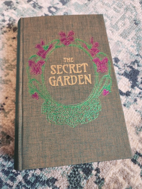

This was my first time incorporating more than one color of foil in my cover designs. I'm really happy with the effect!
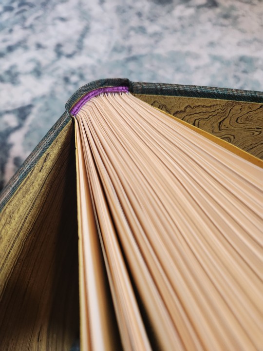

I used soie perlee silk thread for the hand-sewn endbands and jute fiber marbled paper for endpapers. With my favorite trick of using the same paper for an Oxford hollow for that peep of color in the spine when the book is open.


I recently was gifted a color printer, so of course I had to play with incorporating color in the typeset.
It was challenging to capture the nature of the cover colors in a still photograph, but I'm enamored with that colorshift as you turn the book over in your hands! All in all, I think this is some of my best work to date.
411 notes
·
View notes
Text


Two author copies delivered! Both for @bropunzeling (AO3 here).
More photos and info under the cut!
I actually did my copies of these a while ago--both in February, one in 2024 and the other in 2023. collide the spaces that divide us was one of my earliest attempts at social media formatting, and one of the last books I ever made with my inkjet printer. I did end up fixing a few things on that one's typeset, but it's nearly identical to my first copy. You may also notice in the photos that I chopped off a bit too much off the edge--I didn't yet know how to use my guillotine, and in all the time that's passed since then, it's become defunct (sharp enough to cut off a hand, but not sharp enough to cut through a stack of paper lol)
It's neat to see such a clear example of how much I've improved as a bookbinder in a year and a half--my copy on the left, author's on the right:


Also, a comparison of color ink (left) vs color laser (right):


Like this, it's easy to see how much more vibrant color toner is than ink. Ink works much better for complex images, but since I don't print a lot of photos, but do make a lot of social media typesets, this works much much better for my purposes.
Soon after that, I bought a black-only laser printer and had a whole new set of challenges. It was in this era of printing that I made only fools rush in. It has one of my most complex title pages to date, as they're not really my forte.
Below are my copy, the title page, and an example of how I did texts in this particular typeset.


My copy has a cloth spine and a different cloth as the cover, with a strip from the endpapers to hide my sins act as a bridge between them. This is one of the binds from last Binderary that I'm most proud of.
The title page is in several different pieces--sort of jigsaw-puzzled together from vectors, Google Drawings, and a few different fonts.
Black-toner-only printing meant adjusting how I did social media formatting, and this is one of my favorite ways I solved that problem. I like the simple, almost minimalist formatting that sets the texts apart but doesn't steal the show.
I'd been meaning to offer author copies for these books for as long as I'd had them, but it's hard to understate how little I wanted to use my inkjet once I got a laser XD It's both slower and more expensive to use an inkjet, so as soon as I got my color laser printer set up, I sent the DM!
I organize my handbound fics by ship--that is, every ship has a set spine cloth and title color--so one of my favorite things about author copies is that I get to be a little more creative about covers!
#my binds#fanbinding#author copy#bropunzeling#collide the spaces that divide us#only fools rush in#hockey rpf#mattdrai#binderary 2023#binderary 2024
135 notes
·
View notes