#next up is adjusting scrollbar widths
Explore tagged Tumblr posts
Visit Tumblr Blog
Explore Tumblr blogs with no restrictions, modern design and the best experience.
Last Seen Tumblr Blogs


Fun Fact
28.6 is the average number of monthly visits per US mobile user.
Text
Trying to decrappify a new laptop when you don't actually know computers is like trying to learn a new language on the fly, except instead of risking embarrassment when you get the language wrong it's more like risking ruining files and/or your very expensive and incredibly-necessary item
#whoever decided to replace the right Ctrl key with a copilot key c'mere I just wanna talk to you with this heavy steel pipe#got it remapped tho#next up is adjusting scrollbar widths#Kayt.txt
3 notes
·
View notes
Text
How to Use CSS Grid for Sticky Headers and Footers
CSS Grid is a collection of properties designed to make layout easier than it’s ever been. Like anything, there’s a bit of a learning curve, but Grid is honestly fun to work with once you get the hang of it. One area where it shines is dealing with headers and footers. With a little adjustment in our thinking, we can pull off headers and footers that behave like they are fixed, or have that “sticky” treatment (not position: sticky, but the kind of footer that hugs the bottom of the screen even if there isn’t enough content to push it there, and is pushed away with more content).
Hopefully this sparks further interest in modern layouts, and if it does, I can’t recommend Rachel Andrew’s book The New CSS Layout strongly enough: it covers both of the major modern layout techniques, grid and flexbox.
What we’re making
Let’s implement a fairly classic HTML layout that consist of a header, main content and footer.
We’ll make a truly fixed footer, one that stays at the bottom of the viewport where the main content scrolls within itself, as needed, then later update the footer to be a more traditional sticky footer that starts at the bottom of the viewport, even if the main content is small, but gets pushed down as needed. Further, to broaden our exposure to grid, let’s design our main content holder so that it can either span the whole width of the viewport, or take up a nicely centered strip down the middle.


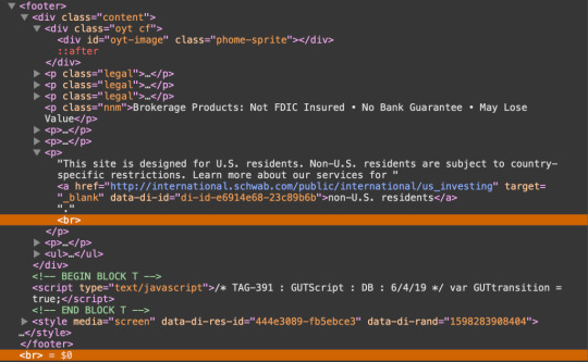
A fixed footer is slightly unusual. Footers are commonly designed to start at the bottom of the viewport, and get pushed down by main content as needed. But a persistent footer isn’t unheard of. Charles Schwab does it on their homepage. Either way, it’ll be fun to implement!
But before we move on, feel free to actually peek at the fixed footer implemented on the Charles Schwab site. Unsurprisingly, it uses fixed positioning, which means it has a hard-coded size. In fact, if we crack open DevTools, we see that right off the bat:
body #qq0 { border-top: 4px solid #133568; background-color: #eee; left: 0; right: 0; bottom: 0; height: 40px!important; }
Not only that, but there’s the balance of making sure the main content doesn’t get hidden behind that fixed footer, which it does by setting hard-coded paddings (including 15px on the bottom of the <footer> element), margins (including 20px on <ul> in the footer), and even line breaks.
Let’s try to pull this off without any of these restrictions.
Our baseline styles
Let’s sketch out a bare minimum UI to get us started, then enhance our grid to match our goals. There’s a CodeSandbox below, plus additional ones for the subsequent steps that get us to the end result.
First, let’s do some prep work. We’ll make sure we’re using the whole height of the viewport, so when we add our grid, it’ll be easy to put the footer at the bottom (and keep it there). There’s only going to be one element inside the document’s <body> with an ID of #app, which will hold the <header, <main> and <footer> elements.
body { margin: 0; /* prevents scrollbars */ }
#app { height: 100vh; }
Next, let’s set up our header, main, and footer sections, as well as the grid they’ll all sit in. To be clear, this will not work the way we want right out of the gate. It’s just to get us started, with a base to build from.
body { margin: 0; }
#app { height: 100vh; /* grid container settings */ display: grid; grid-template-columns: 1fr; grid-template-rows: auto 1fr auto; grid-template-areas: 'header' 'main' 'footer'; }
#app > header { grid-area: header; }
#app > main { grid-area: main; padding: 15px 5px 10px 5px; }
#app > footer { grid-area: footer; }
We’ve created a simple one-column layout, with a width of 1fr. If that 1fr is new to you, it essentially means “take the remaining space” which, in this case, is the entire width of the grid container, #app.
We’ve also defined three rows:
#app { /* etc. */ grid-template-rows: auto 1fr auto; /* etc. */ }
The first and third rows, which will be our header and footer, respectively, are sized with auto, which means they’ll take up as much space as needed. In other words: no need for hard-coded sizes! This is a super important detail and a perfect example of how we benefit from using CSS Grid.
The middle row is where we’ll put our content. We’ve assigned it a size of 1fr which, again, just means it takes up all of the remaining space that’s left over from the other two rows. If you’re wondering why we aren’t making it auto as well, it’s because the entire grid spans the viewport’s whole height, so we need one section to grow and fill up any unused space. Note that we do not have, nor will we ever need at any point, any fixed heights, margins, paddings — or even line breaks! — to push things into place. Such is the good life when working with grid!
Shall we try some content?
You’ll notice in the Sandbox that I used React to build this demo, but since this isn’t a post about React, I won’t belabor those details; React has absolutely nothing to do with any of the CSS Grid work in this post. I’m only using it as an easy way to navigate between different chunks of markup. If you hate React, that’s fine: hopefully you can ignore it in this post.
We have Header, Main and Footer components that render the expected <header> , <main> and <footer> elements, respectively. And, of course, this all sits inside our #app container. Yes, in theory, #app should be an <article> element, semantically speaking, but that’s always looked weird to me. I just wanted to covey these details so we’re all one the same page as we plow ahead.
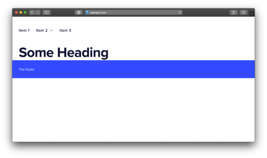
For the actual content, I have Billing and Settings sections that you can navigate between in the header. They both render fake, static content, and are only meant to show our layout in action. The Settings section will be the content that we put in a centered strip on our page, Billing will be the one that spans our whole page.
Here’s the Sandbox with what we have so far.
The Billing section looks good, but the Settings section pushes our footer off screen. Not only that, but if we scroll, the entire page scrolls, causing us to lose our header. That may be desirable in some cases, but we want both the header and footer to stay in view, so let’s fix that.
Fixed header, fixed footer
When we initially set up our grid, we gave it a height of 100vh, which is the entire height of the viewport. We then assigned the rows for the header and footer an auto height, and the main a height of 1fr to take up the remaining space. Unfortunately, when content exceeds the space available, it expanded beyond the viewport bounds, pushing our footer down and out of view.
The fix here is trivial: adding overflow: auto will cause our <main> element to scroll, while keeping our <header> and <footer> elements in place.
#app > main { grid-area: main; overflow: auto; padding: 15px 5px 10px 5px; }
Here’s the updated demo that puts this to use.
Adjustable width main section
We want our <main> element to either span the whole width of the viewport, or be centered in a 600px space. You might think we could simply make <main> a 600px fixed width, with an auto margins on either side. But since this is a post about grid, let’s use moar grid. (Plus, as we’ll see later, a fixed width won’t work anyway).
To achieve our centered 600px element, we’ll actually make the <main> element a grid container. That’s right, a grid within a grid! Nesting grids is a totally legit approach, and will even get easier in the future when subgrid is officially supported across browsers. In this scenario, we’ll make <main> a grid with three column tracks of 1fr 600px 1fr or, stated simply, 600px in the middle, with the remaining space equally divided on the sides.
#app > main { display: grid; grid-template-rows: 1fr; grid-template-columns: 1fr 600px 1fr; }
Now let’s position our the content in the grid. Our different modules all render in a <section> child. Let’s say that by default, content will occupy the middle section, unless it has a .full class, in which case it will span the entire grid width. We won’t use named areas here, and instead specify precise grid coordinates of the form [row-start] / [col-start] / [row-end] / [col-end]:
#app > section { grid-area: 1 / 2 / 1 / 3; }
#app > section.full { grid-area: 1 / 1 / 1 / 4 }
You might be surprised to see a col-end value of 4, given that there’s only three columns. This is because the column and row values are column and row grid lines. It takes four grid lines to draw three grid columns.

Our <section> will always be in the first row, which is the only row. By default it’ll span column lines 2 through 3, which is the middle column, unless the section has a full class on it, in which case it’ll span column lines 1 through 4, which is all three columns.
Here’s an updated demo with this code. It’ll probably look good, depending on your CodeSandbox layout, but there’s still a problem. If you shrink the display to smaller than 600px, the content is abruptly truncated. We don’t really want a fixed 600px width in the middle. We want a width of up to 600px. It turns out grid has just the tool for us: the minmax() function. We specify a minimum width and a maximum width, and the grid will compute a value that falls in that range. That’s how we prevent the content from blowing out of the grid.
All we need to do is swap out that 600px value with minmax(0, 600px):
main { display: grid; grid-template-rows: 1fr; grid-template-columns: 1fr minmax(0, 600px) 1fr; }
Here’s the demo for the finished code.
One more approach: The traditional fixed footer
Earlier, we decided to prevent the footer from being pushed off the screen and did that by setting the <main> element’s overflow property to auto.
But, as we briefly called out, that might be a desirable effect. In fact, it’s more of a classic “sticky” footer that solves that annoying issue, and places the footer on the bottom edge of the viewport when the content is super short.
Hey, get back to the bottom!
How could we keep all of our existing work, but allow the footer to get pushed down, instead of fixing itself to the bottom in persistent view?
Right now our content is in a grid with this HTML structure:
<div id="app"> <header /> <main> <section /> </main> <footer /> </div>
…where <main> is a grid container nested within the #app grid container, that contains one row and three columns that we use to position our module’s contents, which go in the <section> tag.
Let’s change it to this:
<div id="app"> <header /> <main> <section /> <footer /> </main> </div>
…and incorporate <footer> into the <main> element’s grid. We’ll start by updating our parent #app grid so that it now consists of two rows instead of three:
#app { /* same as before */
grid-template-columns: 1fr; grid-template-rows: auto 1fr; grid-template-areas: 'header' 'main'; }
Just two rows, one for the header, and the other for everything else. Now let’s update the grid inside our <main> element:
#app > main { display: grid; grid-template-rows: 1fr auto; grid-template-columns: 1fr minmax(0, 600px) 1fr; }
We’ve introduced a new auto-sized row. That means we now have a 1fr row for our content, that holds our <section>, and an auto row for the footer.
Now we position our <footer> inside this grid, instead of directly in #app:
#app > footer { grid-area: 2 / 1 / 2 / 4; }
Since <main> is the element that has scrolling, and since this element now has our footer, we’ve achieved the sticky footer we want! This way, if <main> has content that exceeds the viewport, the whole thing will scroll, and that scrolling content will now include our footer, which sits at the very bottom of the screen as we’d expect.
Here’s an updated demo. Note that the footer will be at the bottom of the screen if possible; otherwise it’ll scroll as needed.
I made a few other small changes, like minor adjustments to paddings here and there; we can’t have any left or right paddings on <main>, because the <footer> would no longer go edge-to-edge.
I also made a last-minute adjustment during final edits to the <section> element—the one we enabled adjustable width content on. Specifically, I set its display to flex, its width to 100%, and its immediate descendant to overflow: auto. I did this so the <section> element’s content can scroll horizontally, within itself, if it exceeds our grid column boundary, but without allowing any vertical scrolling.
Without this change, the work we did would amount to the fixed footer approach we covered earlier. Making section> a flex container forces its immediate child — the <div> that contains the content — to take up all of the available vertical space. And, of course, setting that child div to overflow: auto enables scrolling. If you’re wondering why I didn’t just set the section’s overflow-x to auto, and overflow-y to visible, well, it turns out that’s not possible.
Parting thoughts
We haven’t done anything revolutionary in this post, and certainly nothing that couldn’t be accomplished before CSS Grid. Our fixed width <main> container could have been a block element with a max-width value of 600px, and auto margins on the left and right. Our fixed footer could have been made with position: fixed (just make sure the main content doesn’t overlap with it). And, of course, there are various ways to get a more traditional “sticky footer.”
But CSS Grid provides a single, uniform layout mechanism to accomplish all of this, and it’s fun to work with — honestly fun. In fact, the idea of moving the footer from fixed to sticky wasn’t even something I planned at first. I threw it in at the last minute because I thought the post was a bit too light without it. It was trivial to accomplish, basically moving grid rows around, not unlike putting lego blocks together. And again, these UIs were trivial. Imagine how brightly grid will shine with more ambitious designs!
The post How to Use CSS Grid for Sticky Headers and Footers appeared first on CSS-Tricks.
You can support CSS-Tricks by being an MVP Supporter.
How to Use CSS Grid for Sticky Headers and Footers published first on https://deskbysnafu.tumblr.com/
0 notes
Text
3 Helpful Ways to Use Overflow Options in Divi
Divi’s built in Overflow Options make is super simple to add overflow css properties (ie. visible, hidden, scroll) to any element on the page. This is helpful for creating unique designs and scrollable content with ease. In this post, I’m going to go through what these overflow options actually do. And, I’ll walk through three helpful ways to use overflow on your own Divi site.
Let’s get started.
Understanding Divi’s Overflow Options
Divi’s overflow options allow you to set the css overflow property of an element to one of the following values:
Default – The default value is visible (see below).
Visible – The overflowing content will remain visible and not become clipped when extending outside the box. Since this is the default setting in Divi, you will rarely need to select it.
Scroll – Overflowing content will be hidden, but users will be able to scroll through the hidden content either vertically or horizontally.
Hidden – Overflowing content outside the box will be hidden (without the ability to scroll)
Auto – This option will engage scroll functionality whenever necessary (ie. the content extends beyond the box). This would come in handy for designs with a set height or width that need to have scrolling capabilities on smaller browsers.
Divi has an overflow option for both horizontal and vertical overflow allowing you to set different property values for each. This comes in handy for when you want to add vertical scroll functionality to an element but you don’t want a scrollbar to appear horizontally as well.
Here are a few quick illustrations taken from the designs in this tutorial to help you understand how overflow options work.
Overflow Visible (default)
In this example, the content that has been positioned outside of the row container remains visible, which is the default setting for all elements in Divi.
Overflow Hidden
Once you add the overflow hidden property to the row, the content outside of the box becomes clipped and hidden from view entirely.
Overflow Scroll
Using overflow scroll allows you to hide the content outside the box container (much like overflow hidden). The main difference is that a scroll bar appears allowing the user to scroll through the content that exists beyond the limits of the container.
For example, here is a text module with a height of 400px. The content of the text module extends beyond the text module but remains visible by default.
But once you add the vertical overflow scroll property to the text module, the scroll bar appears allowing the user to scroll through the hidden content.
Now that you understand the overflow options a little better, let’s dive in to building some working examples of helpful ways to use them in real life.
3 Helpful Ways to Use Divi’s Overflow Options in Divi
#1 Using Overflow Hidden to Clip Overflowing Content for Unique Designs
To understand how to use the overflow hidden property, we are going to create a quick example design with overflowing text and an overflowing image. Then we will see how the design changes when setting our row to overflow hidden.
First, create a regular section with a one column row. Before we start adding modules, let’s give the section the following padding:
Custom Padding: 12vw top, 12vw bottom
Then update the row settings as follows:
Width: 80vw Max Width: 80vw Padding: 0px top, 0px bottom Box Shadow: see screenshot Box Shadow Blur Strength: 80px
Then add a text module to the row and update the following text module settings:
First add an h2 heading in the content box as follows:
<h2>Overflow</h2>
Then update the design settings as follows:
Heading 2 Font: Lato Heading 2 Font Weight: Bold Heading 2 Font Style: TT Heading 2 Text Alignment: center Heading 2 Text Color: #dddddd Heading 2 Text Size: 15vw Heading 2 Letter Spacing: 0.1em Heading 2 Text Shadow: see screenshot Heading 2 Text Shadow Color: rgba(0,0,0,0.05)
Now, to make the text overflow the row content area, we need to use custom margins. Add the following custom margin to the text module to make it overflow above the row (vertically) and on each side of the row (horizontally).
Margin: -6vw top, -10vw left, -10vw right
Next, add another text module below the one you just created and update the following:
Content:
<h3>design</h3> <p>Your content goes here. Edit or remove this text inline or in the module Content settings. You can also style every aspect of this content in the module Design settings and even apply custom CSS to this text in the module Advanced settings.</p>
(By the way, code snippets like this are a great way to take advantage of the overflow scroll option.)
Text Font: Lato Text Text Alignment: right Text Text Size: 24px (desktop), 16px (phone) Text Line Height: 1.3em Max Width: 50% Module Alignment: right Padding: 4vw right
Now, let’s add an image that overflows outside the row. Create a new image module below the two text modules and then upload an image of your choice.
Then update the image settings as follows:
Max Width: 35vw Margin: -12vw top, -8vw bottom, -5vw left Box Shadow: see screenshot Box Shadow Horizontal Position: -40px Box Shadow Vertical Position: -50px Shadow Color: rgba(0,0,0,0.17)
Design with Row set to Overflow Visible (default)
Now let’s check out the design keeping our row overflow set to visible (the default).
As you can see, this default overflow visible options is great for creating some beautiful and modern designs.
Design with Row set to Overflow Hidden
Now let’s see what happens when we use the Overflow Hidden property for the row. Open the row settings and update the following:
Horizontal Overflow: hidden Vertical Overflow: hidden
Here is the result.
As you can see, the overflowing content (the top heading and the image) is now clipped and hidden to create a unique design. And with this setup, you can easily take advantage of the transform options to scale and move the elements around to get the design just right.
#2 Using Overflow Scroll to Allow Users to Scroll Through Content Vertically
This next example introduces vertical overflow scroll. This overflow option comes in handy for adding scrollable content to lists of links or resources. You can turn any module or row into a container for scrollable content. Here’s how to do it with a text module.
Create a regular section with a one-column row. Then add a text module with the following content:
<h3>overflow scroll</h3> <ol> <li><a href="#">Lorem ipsum dolor sit amet</a></li> <li><a href="#">consectetur adipiscing elit</a></li> <li><a href="#">sed do eiusmod tempor</a></li> <li><a href="#">incididunt ut labore et dolore</a></li> <li><a href="#">Ut enim ad minim veniam</a></li> <li><a href="#">quis nostrud exercitation</a></li> <li><a href="#">ullamco laboris nisi ut</a></li> <li><a href="#">aliquip ex ea commodo</a></li> <li><a href="#">Duis aute irure dolor in</a></li> <li><a href="#">reprehenderit in voluptate</a></li> <li><a href="#">velit esse cillum dolore eu</a></li> <li><a href="#">fugiat nulla pariatur</a></li> <li><a href="#">Excepteur sint occaecat</a></li> <li><a href="#">cupidatat non proident</a></li> <li><a href="#">sunt in culpa qui officia</a></li> <li><a href="#">deserunt mollit anim id</a></li> <li><a href="#">est laborum</a></li> </ol>
Then update the text module design settings as follows:
Text Font: Lato
Link Text color: #333333 Link Text Size: 18px
Ordered List Text Color: Ordered List Text Size: 20px Ordered List Line Height: 1.8em Ordered List Style Type: decimal-leading-zero
Heading 3 Font Weight: Ultra Bold Heading 3 Text Size: 50px Max Width: 500px Padding: 3% top, 3% bottom, 8% left, 8% right
Here is what the text module looks like before we give in a height and overflow scroll.
Now, update the text module with a max height of 400px. Since the default overflow value for the text module is visible, you will notice the text overflowing below the module.
All we need to do now is set the vertical overflow to scroll as follows:
Vertical Overflow: scroll
Here is the final design.
For more examples on how to use vertical overflow scroll on your Divi site, check out these posts:
How to Create a Scroll Gallery Mockup with Divi’s New Overflow Options
How to Design a Scrollable Recent Posts Widget Area in Divi
#3 Using Overflow Scroll to Allow Users to Scroll Through Content Horizontally
Using overflow scroll for horizontal scrolling is another way to keep your content accessible from one concise location. Plus, it is also a great way to incorporate side-swiping functionality on mobile without a plugin.
To show you how to do it, we are going to build a quick example together.
First, create a regular section with a one column row.
Then add a blurb module to the row.
You can replace the default image with a new image or icon. Then update the design settings with a few tweaks:
Text Alignment: center Title Font: Lato Title Font Weight: Heavy Padding: 3% left, 3% right
Duplicate the blurb module 5 times so that you have a total of 6 blurbs in your row column.
Then update the row settings with the following custom CSS to the Column Main Element.
display: grid; grid-template-columns: repeat(6, 50%);
This will give your column of blurbs into a horizontal grid layout with 6 columns each with a width that is 50% of the container (or in this case the row). This means that two blurbs/columns will occupy the space inside the row. The other 4 modules will extend outside the row to the right side. This is where the overflow scroll property comes in handy. Update the following overflow option:
Horizontal Overflow: Scroll
Now you can adjust the width of the row as needed and the two blurbs will always line up nicely. Here is the final design.
I added a box shadow to the row so you can see the box of content a bit better. Notice how two blurbs will display initially until the user scrolls to the right.
For more info, check out the full post on creating horizontal swipe cards.
Final Thoughts
Overlapping elements and positioning elements outside of the typical grid layout is becoming more common these days. Mostly, this is done purely for design purposes. Understanding how to use Divi’s overflow options will help you understand how to hide or show content outside of a container to create these unique designs. And, understanding overflow scroll will also come in handy for adding scrollable content to your website.
I hope this article has helped shed some light on the overflow property and how you can use it for your next Divi project.
I look forward to hearing from you in the comments.
Cheers!
The post 3 Helpful Ways to Use Overflow Options in Divi appeared first on Elegant Themes Blog.
😉SiliconWebX | 🌐ElegantThemes
0 notes
Text
Oxygen - WooCommerce WordPress Theme
https://opix.pk/blog/oxygen-woocommerce-wordpress-theme/ Oxygen - WooCommerce WordPress Theme https://opix.pk/blog/oxygen-woocommerce-wordpress-theme/ Opix.pk LIVE PREVIEWBUY FOR $60 WordPress 5.0 and WooCommerce 3.5.3 compatible — Changelog Oxygen is a WooCommerce theme, built exclusively for online shopping and offers a great variety of options to customize the look and feel of the theme via theme options panel. You can choose between 4 header types, change typography, toggle shop and blog settings and create unique page layouts with WPBakery Page Builder (formerly Visual Composer) premium plugin, which comes free as a part of the theme. Slider Revolution its also included as a free component for the theme and you can create great beautiful and stunning slides for your site. Oxygen is featured on Behance and the theme is updated regularly! MicBergsma a youtube superstar that has 400K+ subscribers uses Oxygen theme. We can’t wait to see what you have created with Oxygen theme, if you are proud of your site, please submit it to our showcase. Theme Features: Fully support of WooCommerce Responsive Full Retina Ready 5 Header types WPBakery Page Builder plugin (included) Revolution Slider plugin (included) Advanced Custom Fields PRO plugin (included) WPML Compatible Catalog Mode 9 Custom WPBakery Page Builder widgets (by Laborator) Updated: 700+ Google Fonts Custom Skin Builder 7 Predefined Theme Skins Rich Custom CSS area Tracking Code area Child Theme RTL Support Text + Image Logo 4 Cart Ribbon icons Product Sharing Blog Post Sharing Sticky Menu Quick View Footer, Blog and Shop Widget Typography selection Contact Page WooThemes Wishlist YITH Wishlist Touch Carousels Icons Collection Blog page Search page 404 Page Blog Post Gallery SEO Optimization 7+ Custom WPBakery Page Builder Shortcodes Products Carousel Image + Category Banner Feature Tabs Social Networks Payment Methods Icons Text Banners (Call to action) Blog Posts shortcode Products shortcode Lookbook with carousel FAQ’s (Accordions and Tabs) … and we are carefully extending this list on every update! The sample images viewed in the live preview are for demo purposes only and are not included with your purchase. External Resources used on Oxygen WPBakery Page Builder Revolution Slider Owl Carousel GSAP Engine Codrops Bootstrap Font Awesome iconset Iconmonstr Google Fonts Oxygen Supports: WPML Plugin YITH Wishlist Plugin YITH Infinite Scroll YITH WooCommerce Zoom Magnifier WooCommerce Wishlist Plugin NEW: WooCommerce Additional Variation Images Quality theme with the best customer support ever! I’ve bought many themes before, and it is the first time I’ve rated any product on ThemeForest. The frequent update & support reply is truly amazing! Keep up the good work!! Bought and worked with over 60+ themes. Overall this is one of the finest themes I have ever worked with. Complete package, top notch design, quality code and most important… service level is perfect. To Art and Team congrats! Regards, Paul Very flexible theme, easy to use, easy to customize, and the design is gorgeous. It’s really affordable and packed with a ton of features. They reply to your inquiries very fast. One of the best themes I’ve purchased so far, I’m very happy with this purchase, kudos to the Laborator team for this awesome creation I’m really really happy with this theme. Looks great, works like a charm. Great documentation and A+ in support. Would recommend to everybody! Beyond awesome customer support. Not a single issue so far that hasn’t been resolved. You get MORE than you pay for. Definitely recommend any product by Laborator, just because of the effort they put in their customers!! Wish I could rate with more stars. Best theme, best real-time support. I think there should be 10 stars for Oxygen! The theme is really well done… and in addition, the creator has incredible customer support. I’d rate 6 stars if I could Truly the best customer support I have ever received on Themeforest. Many thanks!!!! Awesome design! Thanks for creating superb theme for WooCommerce All questions are answered very fast and friendly. The theme is very good, complete and updated continuously updating things and adding improvements. In summary, the best theme! Design: Clean, beautiful, timeless! Support: The best on Themeforest! Great theme! Highly adjustable and customizable. And great support. Not just general support but also fixing individual problems if you might run into one. Great design also! The author of this theme gives the best customer service on the ThemeForest website. Love this theme! Really simple interface and nice and light on the front end. Nice and easy to customize either through css or through the dashboard. This is the theme I’ve been hoping to find for years! The best customer support that I have ever experienced dealing with a WordPress theme. The developers are more than happy to help with any issue no matter how big or small. Most importantly, the developers have created a beautiful theme that works out of the box. I highly recommend this theme! I rate this theme with 5 stars but it was difficult to select the main reason for the rating. I mean, design, code, and support are really awesome. 100% recommended! I hope they keep updating with some extra features that would be nice to have! The theme is great, very flexible, but the most important thing is the great team and the support!!! Love it!!! My favorite theme of all times – great work by the developers. It’s an amazing theme, that’s one thing. But the support is quicker than lighting! It’s amazing how fast these guys helped me out with my questions. The theme is coded to perfection and it’s beautiful design but the support puts the biggest smile on my face! Thanks, guys! Version 5.2.1 — Dec 7, 2018 NEW: WordPress 5.0 support NEW: WooCommerce 3.5.3 compatibility added NEW: Bonus slider pack "Christmas Snow Scene" for Revolution Slider UPDATE: WPBakery Page Builder plugin updated to version – 5.6 FIX: Go to top creating extra blank space in the end of site FIX: Mobile menu disables scrolling when opened in some cases NOTE: If WooCommerce release a plugin update that is newer than version 3.5.3 - please wait for a compatible theme update. We are always working to make the theme better and more stable. If you enjoy Oxygen please consider leaving a nice review. P.S: Happy holidays to everyone, we’ll see again in January 2019 with more of - our own New Year’s resolutions, new features and improvements. As always, feel free to share feedback and questions via our support system. Version 5.2 — Nov 01, 2018 NEW: WooCommerce 3.5.0 compatibility added UPDATE: WPBakery Page Builder plugin updated to version – 5.5.5 FIX: WooCommerce warning on Checkout after installing 3.5.0 FIX: Small bug fixes and CSS improvements Version 5.1.1 — Oct 10, 2018 NEW: WooCommerce 3.4.7 compatibility added UPDATE: Advanced Custom Fields PRO plugin updated to latest version – 5.7.7 UPDATE: Google Fonts list updated with latest fonts UPDATE: Reorganized theme package files FIX: ACF PRO failed to update Version 5.1 — Sep 26, 2018 NEW: ACF Pro implementation, faster and better organization of custom fields FIX: Revolution slider field not working with ACF5 or ACF Pro FIX: Extra space for sticky menu when logged-in as admin – https://d.pr/i/8rOHT2 Version 5.0.5 — Sep 15, 2018 NEW: WordPress 4.9.8 compatibility added NEW: WooCommerce 3.4.5 compatibility added NEW: Option to disable/enable Custom CSS entirely – https://d.pr/i/kAuUK9 UPDATE: WPBakery Page Builder plugin updated to – 5.5.4 UPDATE: ACF fields plugins updated to 2.1.0 FIX: Product category images not showing when using "Uncropped" option in Customizer FIX: Button color not applied for "Laborator Button" WPBakery element FIX: Bug fixes and performance improvements Version 5.0.4 — Jul 04, 2018 NEW: Option to show or hide product image captions in lightbox – https://d.pr/i/OspDxM UPDATE: WPBakery Page Builder updated to version latest version – 5.5.2 UPDATE: Revolution Slider updated to latest version – 5.4.8 UPDATE: Support for WooCommerce 3.4.3 FIX: Order dropdown in shop archive page not working FIX: strpos() warning showing on PHP 7.2+ FIX: Login and coupon form breaking layout on small device viewport FIX: Small improvements and bug fixes To all American citizens Laborator wishes you happy Fourth of July! Version 5.0.3 — Jun 14, 2018 NEW: Option to show or hide product rating on single page – https://d.pr/i/uZMqUJ UPDATE: Demo Content Packages updated to latest version FIX: Page contents not styled properly in some cases FIX: Ribbon position position reverted to left FIX: Primary font not applied as default font FIX: Few PHP notices in single blog post page FIX: Route finder not hidden when set in page options FIX: Product review stars not aligned properly when Next-Prev navigation is hidden FIX: Few skin colors assignments Version 5.0.2 — Jun 06, 2018 UPDATE: Support for WooCommerce 3.4.2 FIX: Revolution slider missing on pages FIX: Quickview not showing product description when there is scrollbar FIX: Small CSS fixes Version 5.0.1 — Jun 01, 2018 UPDATE: Support for WooCommerce 3.4.1 FIX: Empty cart not showing right after cart is cleared FIX: Unstyled register form shown in My Account page FIX: Sticky logo width not compatible with menu height FIX: Error that breaks page when WooCommerce its not activated FIX: Laborator admin menu showing page 404 FIX: Few skin colors assignments Version 5.0 — May 30, 2018 NEW: Re-factored WooCommerce code for better management and template replacement - https://d.pr/i/WkJFOA NEW: Full Support for WooCommerce 3.4 NEW: Support for WordPress 4.9.6 NEW: Infinite Scrolling is now supported with YITH plugin - https://d.pr/qYhBC5 NEW: New and better organized shop settings in Theme Options > Shop Settings – https://d.pr/i/Wz2TdH NEW: Performance improvements for faster theme execution NEW: GDPR compatible contact form – https://d.pr/i/UUXElZ NEW: Go to top link – https://d.pr/i/LuKPEk https://d.pr/i/JNRPmS NEW: Demo store notice new placement and design - https://d.pr/i/dkjTwY NEW: Photo Swipe lightbox for product gallery – https://d.pr/i/lMGMeg NEW: LazySizes integration - new and better lazy loading library implemented NEW: Cross sells products can be added to cart directly – https://d.pr/v/7GeH2G NEW: Option to disable (or enable) Custom CSS – https://d.pr/i/jQx71i NEW: Set number of columns for related (up selling) products – https://d.pr/i/bv7f8h NEW: Shortcode for privacy policy link: [oxygen_privacy_policy title="privacy policy"] NEW: Product Quickview proportional image sizes (not cropped) – https://d.pr/i/GsABYq UPDATE: PHP 7.2 compatibility (Applied for Oxygen files only) UPDATE: WPBakery Page Builder updated to version latest version – 5.4.7 UPDATE: Revolution Slider updated to latest version – 5.4.7.4 UPDATE: Language template file updated with latest translations UPDATE: Google Fonts list updated with latest fonts (150+ added fonts) UPDATE: Demo Content Packages updated to latest version UPDATE: Reduced file size of Oxygen theme installable archive (16% smaller) FIX: Proper tag assignment of titles (h1,h2,h3) for better SEO FIX: 254 language strings moved to WooCommerce translations FIX: Products Carousel auto-play not working FIX: Post gallery images showing in HTTP protocol when HTTPS is used FIX: Quickview images cropped in the center FIX: RTL improvements and script libraries compatibility FIX: Search page code refinements FIX: Fewer thumbnails are generated for uploaded images FIX: Many, many more minor fixes and overall improvements Oxygen update history (view all the changelog details) Source
0 notes
Text
Value Bubbles for Range Inputs
Range inputs in HTML are like this:
<input type="range" name="quantity" min="1" max="10">
In browsers that support them, they look like this:

Now that's great and all. You could use it for anything where you want to collect a number from a user that has an enforced minimum and maximum value.
But notice anything weird? All by itself, that range input doesn't communicate to the user what number they will actually be submitting. Now if your input is something like "How are you feeling? Left for sad, right for happy." - then fine, you probably don't need to show the user a number. But I would wager it's more common that you'll need to show the number than not show it.
To be fair, the spec says:
The input element represents a control for setting the element's value to a string representing a number, but with the caveat that the exact value is not important, letting UAs provide a simpler interface than they do for the Number state.
But c'mon, just because we want a cool slider doesn't automatically mean we should prevent the user from knowing the submitted value. I wouldn't necessarily say browsers should alter their UI control to show that number. I am saying we should build that ourselves!
This is the perfect use case for the <output> tag, which is specifically for values calculated by form elements. Here is a super simple implementation of how you might use it:
<input type="range" name="foo"> <output for="foo" onforminput="value = foo.valueAsNumber;"></output>
Update! New version with Vanilla JavaScript that also works better.
Our goal here is to display a "bubble" that shows the current value of a range input.

Setting the value of our "bubble" from the value of the input is a matter of pulling the range value and plopping it in the bubble:
range.addEventListener("input", () => { bubble.innerHTML = rangel.value; });
The trick is positioning the bubble along the range input so it slides alongside the "thumb". To do that, we'll need to calculate what % the bubble needs to be scooted to the left. So let's make a function to do that to keep things a smidge cleaner:
range.addEventListener("input", () => { setBubble(range, bubble); }); function setBubble(range, bubble) { const val = range.value; const min = range.min ? range.min : 0; const max = range.max ? range.max : 100; const newVal = Number(((val - min) * 100) / (max - min)); bubble.innerHTML = val; // Sorta magic numbers based on size of the native UI thumb bubble.style.left = newVal = "%"; }
Here we're making sure we account for the range inputs min and max attributes and calculating a % position between 0-100 based on the current value in that range. Not all ranges are the default 0-100 numbers, so say a range was at value 50 in a range of 0 to 200, that would be 25% of the way. This accounts for that.
But it has one annoying flaw: the bubble is too far to the left at the start and too far to the right at the end. On range inputs, the thumb doesn't hang off the left edge so it's center is at the start, and same at the end. Like a scrollbar, the edges of the thumb stop within the track.
We can use some magic numbers there that seem to work decently well across browsers:
// Sorta magic numbers based on size of the native UI thumb bubble.style.left = `calc(${newVal}% + (${8 - newVal * 0.15}px))`;
Here's that final demo:
CodePen Embed Fallback
I was inspired to poke around with this because reader Max Globa wrote in with their version which I'll post here:
CodePen Embed Fallback
A cool aspect of Max's version is that the range input is CSS-styled, so the exact size of the thumb is known. There are some numbers that feel rather magic in the JavaScript math, but at least they are based on real numbers set in the CSS about the size of the thumb.
Other Versions
Dave Olsen ported the (original) idea to not have a dependency on jQuery. Here's that version:
CodePen Embed Fallback
Sean Stopnik:
CodePen Embed Fallback
simurai:
CodePen Embed Fallback
Vincent Durand:
CodePen Embed Fallback
Don't forget range input can have datalists which put little notches on them which is kinda cool.
Ana Tudor has a massive collection, many of which indicate the current value through their design.
😬 Old Version from Original Version of this Post (jQuery, plus doesn't work as well)
Just leaving this in here for historical reasons.
Let's pull in our friend jQuery and get our CSS on. This goal is below. Any range input, any time, any min/max/step - we put a bubble above it showing the current value.

Let's style the output element first. We'll absolutely position it above the input. That gives us the ability to adjust the left value as well, once we figure out with JavaScript what it should be. We'll fancy it up with gradients and border-radius, and even add a little pointer triangle with a pseudo-element.
output { position: absolute; background-image: linear-gradient(top, #444444, #999999); width: 40px; height: 30px; text-align: center; color: white; border-radius: 10px; display: inline-block; font: bold 15px/30px Georgia; bottom: 175%; left: 0; margin-left: -1%; } output:after { content: ""; position: absolute; width: 0; height: 0; border-top: 10px solid #999999; border-left: 5px solid transparent; border-right: 5px solid transparent; top: 100%; left: 50%; margin-left: -5px; margin-top: -1px; }
Now what we need to do is watch all range inputs for a change in their value. Our goal is to shift the left position of the bubble in pace with the slider. That's not the simplest thing in the world, being that sliders can be of any width and any minimum or maximum value. We're going to have to do a little math. Here's all the jQuery JavaScript, commented up:
// DOM Ready $(function() { var el, newPoint, newPlace, offset; // Select all range inputs, watch for change $("input[type='range']").change(function() { // Cache this for efficiency el = $(this); // Measure width of range input width = el.width(); // Figure out placement percentage between left and right of input newPoint = (el.val() - el.attr("min")) / (el.attr("max") - el.attr("min")); // Janky value to get pointer to line up better offset = -1.3; // Prevent bubble from going beyond left or right (unsupported browsers) if (newPoint < 0) { newPlace = 0; } else if (newPoint > 1) { newPlace = width; } else { newPlace = width * newPoint + offset; offset -= newPoint; } // Move bubble el .next("output") .css({ left: newPlace, marginLeft: offset + "%" }) .text(el.val()); }) // Fake a change to position bubble at page load .trigger('change'); });
The one gross part in there is that 1.3 value. I was trying to line up the tip of the bubble's triangle with the center of the slider. It's not easy, because the slider's center is never 100% left or right. That value isn't perfect, nor perfectly implemented, but it's better than not having it.
As a bonus, browsers that don't support the range input still get the bubble action.

The above code depends on the range inputs having a specified min and max value. If they don't it kinda breaks. I think it would be weird to use a range input without specifying these things, although if you don't it seems they default to 0 and 100. To bulletproof this, you'd grab each attribute, test it, and if it didn't look right fix it. Something like:
var minValue, maxValue; if (!el.attr("min")) { minValue = 0; } else { minValue = el.attr("min"); }
...then use the minValue variable in the math. And do similar for max. Anyway, here's the live demo:
CodePen Embed Fallback
The post Value Bubbles for Range Inputs appeared first on CSS-Tricks.
Value Bubbles for Range Inputs published first on https://deskbysnafu.tumblr.com/
0 notes
Text
Divi Plugin Highlight: Ultimate Divi Builder Addons
Divi Builder Addons is a third-party plugin that adds a lot of jQuery scripts that are used by high-end websites to the Divi Builder. Simply toggle the scripts you want and add the CSS classes to the Divi Builder modules. It’s easy to use and includes lots of features and animations.
Ultimate Divi Builder Addons Menu
Upload and activate the plugin as normal. A new menu item is added to the dashboard menu called Ultimate Divi Builder Addons. Clicking this opens a screen with lots of features in the left window. Clicking on any of them shows a toggle and information in the right window. The right window also includes CSS classes for some of the effects and shows how to use them. Others include multiple toggles for more features and options such as colors, image sizes, durations, etc. They’re all disabled by default.
The features that are displayed in purple are enabled, while those they are grayed out are disabled. In the example above, the feature includes other options as well as a CSS class. All of the information you need about how to use a particular feature is shown in the right window when you click on it.
Features include:
Custom Scrollbar
DoSlide Horizontal
Fade into View
Flipping Text
Hide the Divi Theme Header When Scrolling Down
jQuery Pageflipping Vertical Scroll
jQuery Pageflipping Horizontal Scroll
jQuery Scrollflow
jQuery ScrollFX
jQuery ScrollTrigger
jQuery End Page Box
Loading Header While Scrolling Effect1
Loading Header While Scrolling Effect2
Loading Header While Scrolling Effect3
Loading Header While Scrolling Effect4
Revealator Animation
ScrollMagic Responsive Duration
ScrollReveal
StickyStack: jQuery Stacking Effect
Scrolling Windows
Super Simple Text Rotator/Ticker
Wow Animation
Ultimate Divi Builder Addons Examples
Here are a few examples of the features when used with Divi layouts.
Custom Scrollbar
Custom Scroll Bar lets you place scroll bars on your content. It has 8 different effects. Paste the CSS class into the CSS Class field of the section, row, or module where you want to use the effect. In this one, I’ve added a custom scrollbar effect to the text module’s content in the Esports layout.
A scrollbar now appears on hover so I can scroll to see more content in the same space. This is effect 1. It has a different design on the live site. I’ve lightened the background so it stands out.
This is effect 3. It adds arrows to the top and bottom of the slide.
Effect 5 changes the handle from a line to a dot and changes the style of the arrows.
Flipping Text
Flipping Text is a text-typing effect that creates a ticking intro animation. It has 5 effects. For this example, I added Flipping Text to the Paralegal layout. This is the first Flipping Text typing effect. It types one letter at a time. There are several different classes you can use. Each one types at a different speed.
jQuery ScrollFlow
jQuery Scroll Flow adds scroll animations to rows or modules. It has 5 animations. I’ve added this one to a row in the Paralegal layout so that it affects all of the modules together. You can also add it to just one of the modules in the row so that it slides in place to fit in with the rest of the content that’s already there.
As I scroll to the row the content starts to show. It’s smaller than normal and has the opacity set low enough to allow the background to show through.
Scrolling a little more increases the size of the content and the opacity until it’s revealed in its full-width and opacity. It decreases again as I scroll back up. This one remains in the same locations, but it has several other classes so you can make it slide in from the right, left, or slide up or down while adjusting its size and opacity.
jQuery ScrollFX
jQuery ScrollFX scales the text and changes the background opacity. The scrollfx class is added to the section. The modules in this section show normally when you scroll to them and while they’re on the screen.
As you scroll past them, the content of the section reduces in size and they reduce in opacity.
jQuery Scroll Trigger
The jQuery scroll trigger slides a module on page scroll. Add the scroll trigger class to the section. This is the Resort layout. The background image is automatically moved to the side when the class is added.
All of the content including images, buttons, text, etc., slides into place as you get to that section.
And then it settles down once everything is in place.
jQuery End Page Box
jQuery End Page Box places a box that stays at the bottom of the screen. It’s created by adding code to a text module at the end of a section.
This adds a box that appears at the bottom of the screen and changes to show different content that you specify for each section.
Here’s the next section. The box slides out and in from different directions or with different animations for each of the sections.
Loading Header While Scrolling
Loading Header While Scrolling adds a bar to the menu that shows how much of a page you’ve seen. It doesn’t require a CSS class. You can customize the color of the scrolling bar. There are four styles to choose from.
This is effect 1. It adds a scrolling line across the top of the screen. It increases in size as you scroll, showing how much of the page the visitor has seen.
This is effect 2. It displays a much wider bar.
This is effect 3. It grows vertically as you scroll, taking up the height of the logo. It doesn’t get very large, but it still shows the scrolling effect.
Effect 4 takes the width of the logo.
Revealator
Revealator adds scrolling triggered animations to sections, rows, or modules. It has close to 40 options. I’m adding to a blurb in the Bakery layout. The blurb is missing until the container for it is fully visible on screen.
It animates onto the screen according to the class you choose. This one has lots of animation options including fade, rotate left, rotate right, slide left, slide right, slide up, slide down, zoom in, and zoom out.
Scroll Magic Section Wipes
Scroll Magic Section Wipes creates an animation that wipes content onto the screen as you scroll. I think this is my favorite of all the effects. It’s added to the section.
Once that section is fully showing on screen it freezes in place and the next section scrolls over it. You can add this to as many sections to create an interesting scrolling method for the entire page. If you want every section to overlap, then you’d be interested in the StickyStack feature.
Scroll Reveal
Scroll Reveal reveals modules on scroll. Choose from 17 different animations. You can add it to sections, rows, or modules. The section at the bottom is zooming toward the reader on scroll.
This is effect 1f. The row spins into place as you scroll to it.
StickyStack: jQuery Stacking Effect
StickyStack: jQuery Stacking Effect stacks panels as they reach the top of a viewport. In other words, every section freezes on screen as you scroll and the next section scrolls to overlap it. The result looks amazing on scroll. This is the Risk Management layout.
Here’s another section of the same page. The overlapping portions work perfectly.
Super Simple Text Rotator/Ticker
Super Simple Text Rotator/Ticker lets you add markup to text and rotate several words. It has 5 animation styles. This one is rotating between the words Simple and Customizable.
Here, it’s rotated to display the second word. Both words fade in and out.
Ultimate Divi Builder Addons Price
Ultimate Divi Builder Addons is $59 for use on unlimited websites and includes lifetime updates. Updates often add new features. You can try a demo for free to see if you like it.
You can purchase Ultimate Divi Builder Addons from DiviBuilderAddons.com.
Ending Thoughts
Ultimate Divi Builder Addons has a lot to offer and can save a lot of time in developing features and animations. I was impressed with the number of features that are included and how easy they are to use.
Some are more difficult to show without filling this article up with large GIF’s. For example, Wow Animation has 75 animations to choose from, and you can change the delay, duration, distance, and the number of times it repeats.
The plugin does require you to be comfortable pasting a CSS class into a section, row, or module. Fortunately, this is easy to do and there’s plenty of information in the Divi documentation about pasting in CSS classes.
If you’re interested in an easy way to add lots of features and animations to Divi, Ultimate Divi Builder Addons is worth checking out.
We want to hear from you. Have you tried Ultimate Divi Builder Addons? Let us know what you think about it in the comments.
Featured Image via GoodStudio / shutterstock.com
The post Divi Plugin Highlight: Ultimate Divi Builder Addons appeared first on Elegant Themes Blog.
😉SiliconWebX | 🌐ElegantThemes
0 notes
Text
Creating Endless Horizontal Swipe Cards for Mobile with Divi
Swiping through content is something almost everyone does on a daily basis. It has basically become second nature so it goes without saying that adding it to your website can help improve the overall user experience. In this post, we’ll show you how to create endless horizontal swipe cards that are mainly focused on mobile and tablet devices, where touch is involved. Although this is a mobile-first tutorial, the outcome will work great on desktop as well. People can use the scrollbar that’ll be included or ‘swipe’ left and right using their touchpad.
Let’s get to it!
Preview
Before we dive into the tutorial, let’s take a quick look at the outcome on different screen sizes.
Example 1: One-Column Row
Desktop
Mobile
Example 2: Two-Column Row + Multiple Modules in ‘Swipe Column’
Desktop
Mobile
Approach
To create this beautiful effect, we’ll need to transform an entire vertical column into a horizontal swipe/scroll grid mechanism using just a few CSS code lines
Using a vertical column for this mechanism (and turning it into a horizontal grid) will allow you to add as many swiping cards as you want, you get to determine how many columns there get to be
In other words; you’ll add modules downwards and the swipe/scroll mechanism will place hem in a horizontal column
For the first example, we’ll use a one-column row
This will allow the swipe mechanism to take up the entire width of the screen
The second example, on the other hand, turns only one of two columns into a swipe/scroll mechanism and leaves the other column in its static state
We’ll also show you how to add multiple modules to a ‘column’ of the swipe/scroll mechanism
Once you understand the approach, you’ll be able to literally create any kind of design you want and have it be part of the swipe/scroll mechanism that you can see in the GIFs above
You can find all of the fluid background images that we’ll use by going to the ‘Download 10 FREE Fluid Section Background Images for Divi‘ post
Recreate Example #1
Add New Section
Let’s start creating the first example! Add a new section to the page you’re working on.
Add New Row
Column Structure
Then, add a row with one column. We’re going to turn this entire column into a swipe/scroll mechanism.
Sizing
Without adding any modules yet, open the row settings and go to the sizing settings. Here, we’re going to remove all the space between the section, row, and column. In other words, the column will take up the entire width of the screen.
Make This Row Fullwidth: Yes
Use Custom Gutter Width: Yes
Gutter Width: 1
Column CSS Code
As mentioned before, we’re turning the column itself into a swipe/scroll grid mechanism. To do that, we’ll need three lines of custom CSS code, which you can find below. Go ahead and add these to the Column Main Element in the advanced tab of the row.
overflow-x: scroll; display: grid; grid-template-columns: repeat(6, 70%);
The first line of CSS code enables scrolling/swiping. The second line turns the column into a horizontal grid. And the third line of CSS code defines the grid. We’re basically saying that we want 6 columns that’ll each have a width of 70%. Depending on the number of swiping cards you want to show up in the swipe/scroll mechanism, you’ll have to modify the values. So, say for instance you want 10 different swipe cards to be part of the mechanism and you want to increase the width of each column to 90%, you’ll have to use the following line of CSS code instead:
grid-template-columns: repeat(10, 90%);
Add CTA Module to Column 1
Add Content
Once you’re done modifying the row settings, go ahead and add a CTA Module to the column. Add some content of your choice.
Link
You’ll also need to add a button link URL to have the button show up in the module.
Gradient Background
Continue by adding a gradient background.
Color 1: #802bff
Color 2: #001519
Background Image
In the approach section of this post, we mentioned that we’ll use the fluid background images that you can download for free by going to this post. Once you’ve downloaded the fluid background images, search for the ‘fluid-style-2.png‘ image file and upload it to the background image tab. Modify the background image settings accordingly:
Background Image Size: Fit
Background Image Position: Center
Background Image Repeat: No Repeat
Background Image Blend: Overlay
Text Settings
Move on to the design tab and make sure the following text settings apply:
Text Orientation: Center
Text Color: Light
Title Text Settings
Modify the title text settings next.
Title Font: Didact Gothic
Title Font Weight: Bold
Title Text Size: 1vw (Desktop), 2.5vw (Tablet), 4vw (Phone)
Title Line Height: 1.9em
Body Text Settings
Along with the body text settings.
Body Font: Open Sans
Body Text Size: 0.6vw (Desktop), 1.3vw (Tablet), 2.5vw (Phone)
Body Line Height: 2.6em (Desktop & Tablet), 2.1em (Phone)
Button Settings
We’re changing the appearance of the button in this module as well.
Use Custom Styles for Button: Yes
Button Text Size: 0.9vw (Desktop), 2.1vw (Tablet), 3.5vw (Phone)
Button Text Color: #000000
Button Background Color: #ffffff
Button Border Width: 10px
Button Border Color: #ffffff
Button Font: Didact Gothic
Sizing
It’s also important to slightly decrease the width of the CTA Module in the sizing settings. This will make sure that there’ll always be a gap between this module and whichever module comes next in the swipe/scroll mechanism.
Width: 95%
Module Alignment: Center
Spacing
Of course, we want everything to look great across all different screen sizes. That’s why we’ll add various custom padding values in the spacing settings.
Top Margin: 50px
Bottom Margin: 50px
Top Padding: 12vw (Desktop), 5vw (Tablet), 14vw (Phone)
Bottom Padding: 12vw (Desktop), 5vw (Tablet), 14vw (Phone)
Left Padding: 20vw (Desktop), 3vw (Tablet), 8vw (Phone)
Right Padding: 20vw (Desktop), 3vw (Tablet), 8vw (Phone)
Border
Last but not least, we’re also adding ’20px’ to each one of the corners of the module.
Clone CTA Module as Many Times as You Want
Once you’re done customizing the CTA Module, you can go ahead and clone the module up to as many times as you want.
Change Gradient Background & Background Image of Duplicate 1
Change the gradient background of the first duplicate.
Color 1: #7a010d
Color 2: #001519
And use the ‘fluid-style-9.png‘ background image instead.
Background Image Size: Cover
Background Image Position: Center
Background Image Repeat: No Repeat
Background Image Blend: Overlay
Change Gradient Background & Background Image of Duplicate 2
Change the gradient background of the second duplicate next.
Color 1: #26ccff
Color 2: #001519
Upload the ‘fluid-style-10a.png’ image file as the background image.
Background Image Size: Fit
Background Image Position: Top Left
Background Image Repeat: No Repeat
Background Image Blend: Overlay
Change Gradient Background & Background Image of Duplicate 3
Change the gradient background of the third duplicate.
Color 1: #ff21b8
Color 2: #001519
Upload the ‘fluid-style-6.png‘ background image.
Background Image Size: Fit
Background Image Position: Center
Background Image Repeat: No Repeat
Background Image Blend: Overlay
Change Gradient Background & Background Image of Duplicate 4
Change the gradient background of the fourth duplicate.
Color 1: #4400aa
Color 2: #001519
Use ‘fluid-style-4.png‘ as the background image.
Background Image Size: Fit
Background Image Position: Center
Background Image Repeat: No Repeat
Background Image Blend: Overlay
Change Gradient Background & Background Image of Duplicate 5
Change the gradient background of the last duplicate.
Color 1: #ff2626
Color 2: #001519
Use ‘fluid-style-7.png‘ as the background image.
Background Image Size: Fit
Background Image Position: Top Right
Background Image Repeat: No Repeat
Background Image Blend: Overlay
Adjust Column CSS to Number of Modules
We’ve mentioned this before but again, make sure that the CSS code matches the number of modules you have in your column.
Styling the Scrollbar
Add CSS Class to Column
You can also style the scrollbar that comes with this swipe/scroll grid mechanism. Add the following CSS class to your column:
Column CSS Class: swipe-scrollbar
Add Custom CSS to Page Settings
Then, open the page settings, go to the advanced tab and add the following custom CSS code:
.swipe-scrollbar::-webkit-scrollbar { width: 10px; } .swipe-scrollbar::-webkit-scrollbar-track { background: #fff; } .swipe-scrollbar::-webkit-scrollbar-thumb { background: #333; border-radius: 50px; }
Recreate Example #2
Clone Previous Section
On to the next example! Clone the section you’ve created in the previous part of this post.
Change CTA Spacing Settings
Then, change the spacing settings of the first CTA Module.
Top Margin: 50px
Bottom Margin: 50px
Top Padding: 5vw (Desktop & Tablet), 14vw (Phone)
Bottom Padding: 5vw (Desktop & Tablet), 14vw (Phone)
Left Padding: 4vw (Desktop), 3vw (Tablet), 8vw (Phone)
Right Padding: 4vw (Desktop), 3vw (Tablet), 8vw (Phone)
Extend Spacing Settings to All Modules in Column
Extend these new spacing settings by right clicking and clicking on ‘Extend Spacing Styles.
To: All Call To Actions
Throughout: This Column
Change Column Structure
Continue by changing the column structure of the row.
Move Modules to Second Column
And place each one of the modules in the second column instead.
Move CSS to Second Column & Change Values
Since we’ve moved the modules from one column to the other, we’ll also need to do the same thing for the CSS code. Add the CSS class to column 2 instead.
Column 2 CSS Class: swipe-scrollbar
Place the CSS code lines in Column 2 Main Element. We’re also changing the width of each column into ‘80%’.
overflow-x: scroll; display: grid; grid-template-columns: repeat(6, 80%);
Add Title Text Module to Column 1
Add Content
Continue by adding a new Text Module to the first column. Add some H2 content of your choice.
Heading Text Settings
Go to the design tab and modify the H2 text settings.
Heading 2 Font: Didact Gothic
Heading 2 Font Weight: Bold
Heading 2 Text Alignment: Center
Heading 2 Text Size: 2.5vw (Desktop), 5vw (Tablet), 6vw (Phone)
Spacing
Add some custom top margin as well.
Top Margin: 100px
Add Divider Module to Column 1
Visibility
The next module we need in column 1 is a Divider Module. Make sure the ‘Show Divider’ option is enabled.
Show Divider: Yes
Color
Change the divider color next.
Color: #333333
Sizing
Along with the sizing settings.
Divider Weight: 7px
Height: 0px
Width: 10%
Module Alignment: Center
Spacing
Complete the Divider Module by adding some custom top margin across different screen sizes.
Top Margin: 1.8vw (Desktop), 2.5vw (Tablet), 4vw (Phone)
Add Body Text Module to Column 1
Add Content
The next and last module we need in the first column is a description Text Module. Add some content of choice.
Text Settings
Continue by changing the text settings in the design tab.
Text Font: Open Sans
Text Size: 0.7vw (Desktop), 1.6vw (Tablet), 2.3vw (Phone)
Sizing
Modify the sizing settings too.
Width: 43% (Desktop), 68% (Tablet), 70% (Phone)
Module Alignment: Center
Spacing
And add some custom top and bottom margin.
Top Margin: 50px
Bottom Margin: 50px
Switch over to Wireframe View
Once you’re done modifying all the modules in column 1, go ahead and switch over to wireframe view.
Add Text Module to Top of Column 2
Here, we’re going to add a Text Module to the top of the second column. The CSS code we’ve added has helped us create 6 different columns. This means that if you want two different modules to appear in each one of these 6 columns, you’ll need to have 12 modules in total. The module placement happens horizontally, so the first 5 modules you have in column 2 will appear next to each other. Then, the mechanism will switch to another row and add the remaining 6 modules.
Add Content
Open the new Text Module you’ve added at the top of the second column and add some content of choice.
Text Settings
Then, go to the design tab and modify the text settings.
Text Font: Didact Gothic
Text Font Weight: Bold
Text Color: #000000
Text Size: 1.1vw (Desktop), 3vw (Tablet), 3.5vw (Phone)
Clone Text Module 5x
Go ahead and clone this Text Module 5 times. Now, you’ll have 6 different Text Modules, this equals the number of CTA modules we have as well. So if you’re using 10 CTA Modules instead, you’ll need to add 10 Text Modules (or any other modules) to balance the column structure.
Change Content of Duplicates
Change the content of each one of the duplicates to match with the CTA Module that’ll appear below it and you’re done!
Preview
Now that we’ve gone through all the steps, let’s take a final look at the outcome on different screen sizes.
Example 1: One-Column Row
Desktop
Mobile
Example 1: Two-Column Row + Multiple Modules in ‘Swipe Column’
Desktop
Mobile
Final Thoughts
In this post, we’ve shown you how to create endless horizontal swiping cards using Divi. Creating these swiping cards will not only help you add an extra dimension to your website, but it’ll also help visitors navigate seamlessly through all the content your website has to offer. If you have any questions or suggestions, make sure you leave a comment in the comment section below!
The post Creating Endless Horizontal Swipe Cards for Mobile with Divi appeared first on Elegant Themes Blog.
😉SiliconWebX | 🌐ElegantThemes
0 notes
Text
Divi Plugin Highlight: Divi Toolbox
Divi Toolbox is a third-party plugin that adds a lot of new effects to Divi that would normally require CSS, JavaScript, PHP, or lots of individual plugins. The effects are easy to use and customize and give your Divi website some extra sparkle to stand out from the crowd.
Effects include site-wide changes, new mobile menus, particle backgrounds, footers, widgets, styling, animations, headers, navigation, new blog layouts, Divi layouts in new locations, login screen customization, popups, and lots more. Many of the features can be styled with new additions to the theme customizer. Divi Toolbox does not work with Extra or the Divi Builder plugin.
Divi Toolbox General Settings
The Divi Toolbox option screen is added to the Divi dashboard menu. Settings are enabled here, but the adjustments are made in the customizer.
The General settings includes global headings style, customize login page, hide projects, allow SVG file type uploads, custom browser scrollbar, 404 page settings (choose a layout and hide the header and footer), and social icons settings (enable styling, open in a new tab, and add more icons).
Adding more social icons opens a field where you can enter the URL for 9 more social networks.
Here’s the General tab in the customizer, where I can adjust the settings that I enabled. Settings include headings and fonts, the browser scrollbar, and the login screen. In this example, I’ve made a few adjustments to the h1 and body text and added styling to the scrollbar. I’ve also added more social icons.
For the login screen, you’ll have to make your changes and then log out or view the screen in another browser.
Here’s my login screen after adding a background image, logo, and changing the size and colors of the fields and the text. It does take a little tweaking since you can’t see the screen as you make your changes.
Divi Toolbox Header Settings
The Header settings add styling to the menu, enable a custom dropdown menu, add a CTA menu button, change the logo on fixed menu, enable overlapping logo, and add a Divi layout before navigation on the home page, and a layout before and after navigation on other pages.
The CTA menu button lets you apply the CTA to the first or last menu item, or apply a custom class. It provides the CSS and instructions on where to add it.
Here’s customizer for the header. I’ve added a layout above the menu (in this example it’s just a text module, but you can add a complete layout if you want). The overlapping logo has a square box with shadow effects. I changed the logo size from 200 to 140 and moved the social icons to the main menu. I’m hovering over the Services menu item so you can see the CSS effect.
Divi Toolbox Footer Settings
Footer settings include a sticky footer, footer reveal, customize menus and widgets, customize the back to top button (which adds a custom button link option), and add before and after footer layouts.
In this example, I’ve changed the header and menu fonts to all caps and increased the spacing. I’ve also adjusted the hover colors and added an icon next to the text on hover. I’ve added a layout after the footer layout. This one uses a revealed footer (which is why the text is behind the text module above it).
I’ve styled the back to top button so it displays text. It has a shadow effect and I’ve adjusted its location. I left the colors at default. I’ve centered the bottom text and social icons. For the hover effect I chose Grow (it also includes shrink, move up, move down, wobble, heartbeat, jello, and pulse). I’m hovering over the Facebook icon so you can see the effect.
Divi Toolbox Mobile Settings
The Mobile settings include a field to enter the mobile menu breakpoint (the exact screen width when the menu changes from desktop to mobile), custom styles, change the logo, choose the hamburger icon click effect, collapse the nested sub-menu, and enable several CSS classes. The CSS classes allow you to reverse the columns and center the text, modules, and buttons.
Here’s a look at the page in Google Chrome with Responsive selected. As soon as I took the screen size less than 980 pixels it changed to the mobile icon that I selected and added the hamburger menu with animation that I chose.
In this screen, I’m styling the mobile menu’s background color, hover background color, and hamburger menu. I’ve changed the text for the main menu items to all caps and left the CTA text standard. I also changed the background for the CTA menu item. You can also adjust the menu and icon size.
Divi Toolbox Blog Settings
The Blog settings allow you to customize the sidebar and widgets, the post meta, the archive and category pages, choose a layout (from 6 options), hide the archives sidebar, and customize the read more button text.
For single posts you can choose the sidebar layout, hide the post title, add an author box, add previous and next links, add related posts, and customize the comments form. You can also add custom layouts after navigation to single posts, archives, categories, author pages, and search results pages.
For the blog page, I added a shadow effect to the sidebar, changed the fonts and their styling, and styled the search box and increased the size of the border. It uses an alternating layout and I customized the read more button text.
This example is layout 6. I’ve customized the meta font colors again and added a hover color. I’ve also customized the read more button background.
The individual blog posts let you customize each of the elements that you added in the blog settings. In this screen, I’m customizing the related posts, next and previous links, and the author box. You have control over all of the text, colors, shadows, etc.
In this example, I’m customizing the comments form. You have control over the field’s colors (both focus and non-focus), border, text, colors, button, etc. I’ve changed the button background color, the field’s focus color, added a border to the field, and changed the radius.
Divi Toolbox Modules Settings
The Modules tab provides settings to add a follow-the-mouse hover effect, add a slim email opt-in (it provides CSS for three different options), secondary buttons (which adds a new layer of customization), and lots of tweaks.
The tweaks include an animated triangle icon for accordion and toggle modules, removing the horizontal bottom border and padding for pricing tables, moving the portrait image below the content in testimonials, hide horizontal scrollbars, and adding CSS to vertically align columns and to change the height of any element to 100% of its viewport height.
Here’s a look at the slim email opt-in. It places all of the fields on a single line. This example also uses the secondary button. Only the buttons that I’ve added the CSS class to will get these changes. Using the CSS class means that I now have two global button styles.
Divi Toolbox Extras Settings
The Extras tab includes preloaders, popups, particles background, 3D tilt effect, and parallax scrolling for modules.
There are 12 preloaders to choose from. You can have them to only appear on the home page if you want, and select their transition type and speed. The selector screen shows the preloaders’ animations. You can customize them further in the theme customizer.
Trigger the popups with any link from a menu item, button, link in text, etc. Create as many as you want. Choose any premade layout for the popup. Customize the background and close button in the customizer.
This is moving particles. You have full control over the color, shape, number of particles, speed, size, line size, opacity, and interactivity. There are two CSS ID’s for particles, letting you have two different designs.
Here’s a look at the tilt feature. You can adjust the tilt, perspective, scale, speed, and glare. Add it to any section, row, or module.
Divi Toolbox License
There are two licenses to choose from:
Regular License (for use on one project) – €49.00
Extended License (for use on unlimited projects) – €169.00
Ending Thoughts
I’m impressed with the amount of features and settings this plugin has. I especially like that it adds related posts, previous and next links, and an author box to blog posts that are not created with the Divi builder. The scrollbar is also a nice touch.
There are a few settings that you can get to in the Divi modules, such as header text, but this provides more detail for those settings. I would like to see a few more adjustments added (for example, shadow effects for the comments box, more logo option, social media icon placements, etc.).
If you’re interested in added a ton of new effects to Divi in the easiest way possible, Divi Toolbox is worth a look.
We want to hear from you. Have you tried Divi Toolbox? Let us know about your experience in the comments below.
Featured Image via vasabii / shutterstock.com
The post Divi Plugin Highlight: Divi Toolbox appeared first on Elegant Themes Blog.
😉SiliconWebX | 🌐ElegantThemes
0 notes