#on featuring native flora and fauna in my artwork
Explore tagged Tumblr posts
Visit Tumblr Blog
Explore Tumblr blogs with no restrictions, modern design and the best experience.
Last Seen Tumblr Blogs


Fun Fact
The total number of visits Tumblr.com received during January 2021 is 327 million.
Text

mink & yellow trout lily
#art#traditional art#mustelids#mink#plants#yellow trout lily#artists on tumblr#parsleydraws#parsley draws#prl#For the last 2ish years I've been focusing#on featuring native flora and fauna in my artwork#This has helped me become more aware#of the wonderful wildflowers#growing along the trails I hike#Yellow trout lily thrives near my home#and it brings me so much joy#seeing their little leaves#pop up in early spring#followed by delicate yellow flowers
68 notes
·
View notes
Text

Explore some of the smallest, yet most magnificent, plants, animals, amphibians, and insects of the Appalachian Mountains through a new exhibit of illustrations by West Virginia native and West Liberty University (WLU) alumna Rosalie Haizlett, January 15 - February 12 at WLU’s Nutting Gallery. A free opening reception takes place Wednesday, January 15 from 5-6 p.m. An artist talk, Q&A, and book signing will follow the reception at 6 p.m. in Hall of Fine Arts room 209. This traveling exhibit features 40 of Haizlett's original watercolor paintings and illustrated maps that contributed to her newly published book, Tiny Worlds of the Appalachian Mountains. The book is a celebration of the often-overlooked flora, fauna, and fungi that Rosalie personally observed during a six-month journey throughout the Appalachian Mountain chain, from Alabama to Newfoundland. Based on the edge of the Monongahela National Forest in Elkins, W. Va., Haizlett shares her appreciation for the natural world by creating vibrant watercolor art prints, illustrated nature books, and online classes to help others connect to their surroundings using their own creativity. As an artist, Haizlett’s clients include Smithsonian Folklife, The Washington Post, Patagonia, The Nature Conservancy, and the U.S. Fish & Wildlife Service. She has also been an artist-in-residence at Great Smoky Mountains National Park, the National Audubon Society, and at the Roger Tory Peterson Institute of Natural History. Along with Tiny Worlds of the Appalachian Mountains, Haizlett also authored and illustrated Watercolor in Nature, a step-by-step instructionbook published in 2021. An inspiring teacher, she has guided more than 60,000 students to paint through the online learning community, Skillshare. Here, she invites students to learn alongside her while developing a deeper appreciation of the natural world through art. Haizlett reflects on returning to her alma mater to exhibit and what she hopes audiences takeaway from viewing her work. "I'm really grateful for this opportunity to return to my alma mater and share my newest work with the community. Right before I graduated 8 years ago, this same gallery housed my senior project, an illustrated book of my study abroad experiences. Now, I'm back to share the story and process behind another illustrated book—but this time, it's actually been published and can be found in libraries and bookstores. It feels like a full-circle moment,” Haizlett says. “My hope is that this exhibit appeals to audiences of many interests and all ages, given the combination of colorful art, storytelling, and the emphasis on the natural world. I embarked on this project to foster a shared sense of place and a spirit of curiosity and gratitude for the many fascinating plants and animals who also make their homes in these hills and mountains," she adds. WLU Professor of Art and Nutting Gallery Director Brian Fencl explains how Haizlett’s success can inspire current students and praises her ability to articulate her creative process. "For our current students to see someone who studied in the same studios they work in, and to hear about her unique path to success, should be inspiring,” Fencl remarks. “Beyond being a gifted visual artist, Rosalie is also a great communicator when talking about her artistic process and her creative journey. This is a show and artist talk you don’t want to miss,” he adds. To learn more about Rosalie Haizlett, purchase artwork, or sign up for classes, visit her website, rosaliehaizlett.com, or follow her on Instagram: @rosaliehaizlett. Located in WLU’s Hall of Fine Arts, the Nutting Gallery is open 11 a.m. - 4 p.m., Tuesday through Thursday. Gallery events are open to the public and free to attend. The Nutting Gallery is dedicated to educating, enriching, and engaging students and the public through art exhibitions of the highest quality through a variety of exhibitions during the academic year while supporting the educational and cultural mission of West Liberty University. These offerings are supported by the WLU Department of Media and Visual Art. Read the full article
0 notes
Text
Singaporean Style
A lot of thought will need to be made into the specific artstyle of my artwork, not only the pixel art style but also the cultural palette and design of infrastructure.

Singapore is one of the far-eastern gem cities alongside Hong Kong and Tokyo and is very famous for being one of the most cutting edge and modern cities in the world, despite its similarities along side Hong Kong from the global perspective they have completely different structural styles that are heavily influenced by their own unique cultures, this can be seen in Hong Kong with the use of Feng Shui in buildings from skyscrapers to sewers. Singapore has a unique naturalistic integration among its buildings, several feature a large amount of moss and other plant life and most famously the Singapore Changi Airport features a giant terrarium complete with 53 species of flora and 8 species of fauna commonly found native to Singapore.

In my artwork Singapore would be one of the greenest illustrations compared to the others especially considering it will also have much more buildings and skyscrapers. In my artwork Singapore would be one of the greenest illustrations compared to the others especially considering it will also have much more buildings and skyscrapers. This will be a challenge to create but if done correctly it would be amazing.
0 notes
Photo

Do in love with these sweeeeet as native flora and fauna tracks pants! that are so warm and comfy, its like wearing pyjamas outside but being super fashionable at the same time ! three cheers for comfy clothes - with pockets ! 😍 this pants feature one of my favourite Australian flowers - the bottle brush and many more, its also got the echidna garden artwork on it -( you can see it in detail at lurlineavangeline.com (link in bio)) this is a special work and based on the epiphany "Are you guarding or are you gardening your heart and inner worlds". 💚🌱🌸 the echidna in the drawing finds balance between these worlds and native flora begins to grow between its spines ! its so fun to do this work and put these epiphanies out there in such a colourful way! change peoples days, even in the smallest ways, by placing colours and messages into their environment, you can see those little sparks of magic go off in peoples eyes some times :) 💜💛💙🐨🌱🌸☀️💚
1 note
·
View note
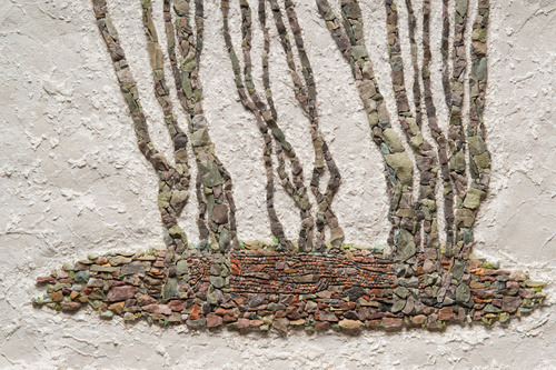
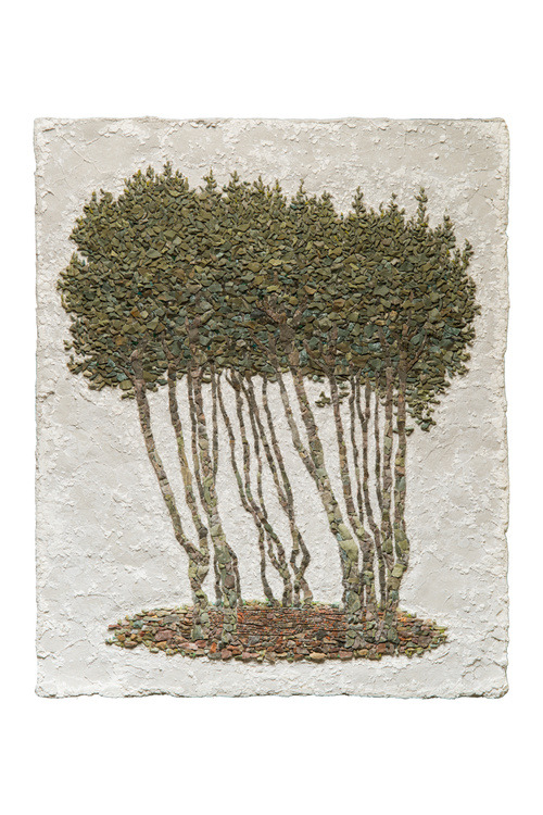
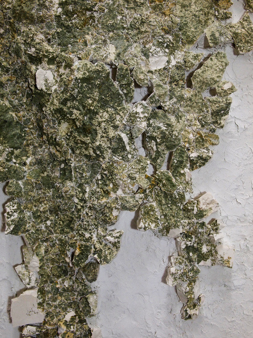
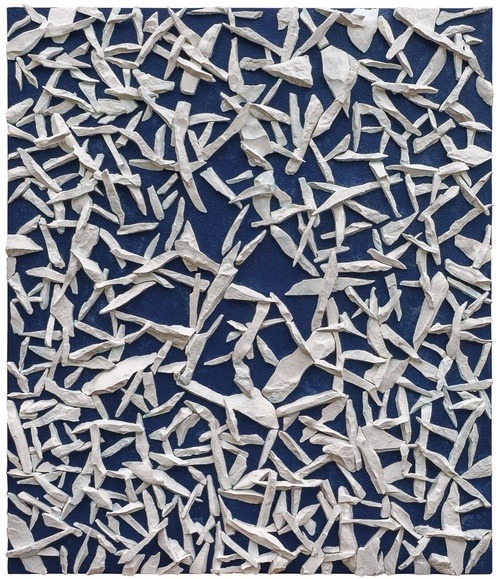
Text
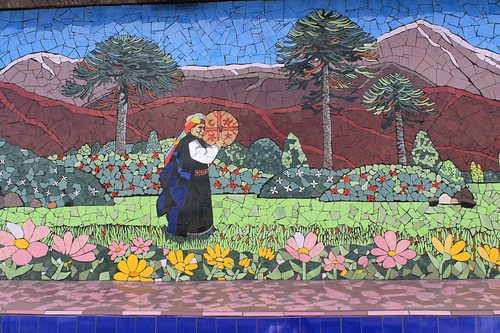
7 Artists Reinventing the Ancient Art of Mosaics
From the floors of ancient Pompeii to the walls of the New York subway, mosaics have been a feature of urban life for thousands of years. Beloved by hobbyists and DIYers, these assemblages, typically created by arranging pieces of glass or stone, are often categorized merely as craft, reducing their appeal to artists who would prefer to avoid those associations.
Yet there are others, not so easily dissuaded by the medium’s workaday reputation, who have approached it with an inventive spirit. The famously experimental painter Jack Whitten explored the form by creating tesserae, or mosaic pieces, from slices of dried paint that he shaped into sculptural forms resembling stone or tile. While many of the artists that follow don’t exclusively make mosaics, each is determined to push this often intransigent medium in a fresh direction.
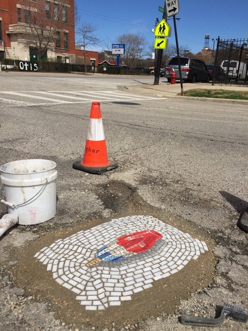
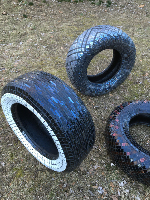
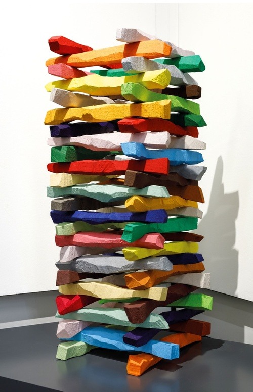
Jim Bachor
B. 1964. Lives and works in Chicago
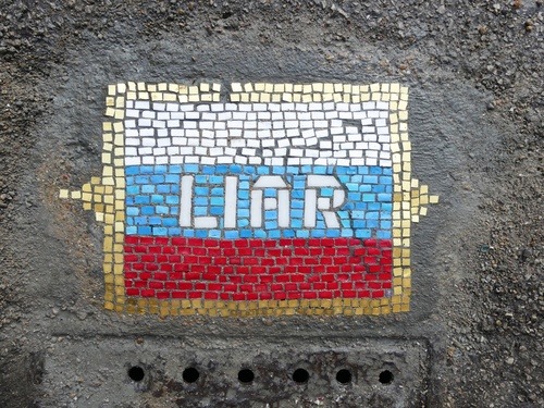
Jim Bachor, LIAR, 420 North Wabash, Chicago, May 2017. Courtesy of the artist.
Jim Bachor, Push Up, 835-849 North Hudson Avenue, Chicago, May 2015. Courtesy of the artist.
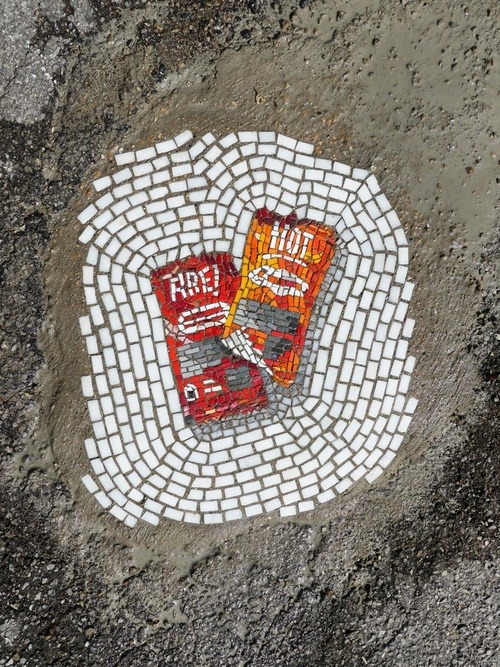
Jim Bachor, Hot Sauce Packets, 3650 North Hermitage, Chicago, May 2017. Courtesy of the artist.
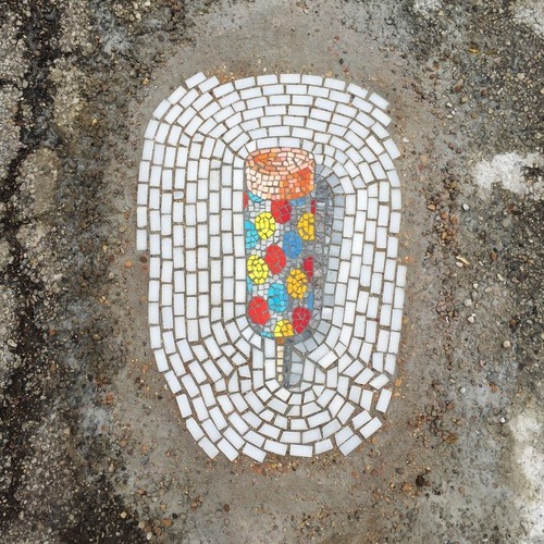
Jim Bachor, Bomb Pop, 443-449 North Armour Street, Chicago, April 2015.
If you’ve spent any time traversing the city of Chicago on foot, you may have stumbled across one of Bachor’s pieces. They’re installed in potholes across the city, brightening the pavement with images of everything from rocket pops to tulips to Burberry plaid.
Bachor is impressed by the long history of mosaics, but he also resists it. “Mosaics carry a lot of baggage. There are entrenched, preconceived ideas as to what they are,” he continues. “My approach is to try and drag mosaics into the 21st century by exploring contemporary subject matter, modifying techniques, and rethinking the process when I can.” Bachor’s interest in advancing the medium has led him to create mosaics that are meant to be viewed with 3D glasses and others that incorporate the actual material of the object they depict—Starbucks coffee or carbonized Twinkies mixed into the mortar in which the piece is set.
But it was the longevity of mosaics that first caught Bachor’s attention during a visit to Pompeii in the 1990s. “I can still remember the guide saying that marble and glass don’t fade, so the artwork looked essentially like the artist intended almost 2,000 years ago,” he says. “It’s the thought that drives my work to this day—the idea of making an enduring mark in this world, however slight.”
Isidora Paz López
B. 1975. Lives and works in Hinterweidenthal, Germany
Mosaic by Isidora Paz López. Courtesy of the artist.
López is known for her ambitious public art projects that have covered thousands of feet of her native Chile in mosaic tile. She loves the form because it makes an impact on the community and gives her a chance to go big. “With mosaics you can make meticulous work with tiny pieces and precious little details, but you can also use big pieces and make huge things, like murals, interventions in architecture, and urban art projects,” López says.
In 2012, she assembled a team to create mosaics depicting native flora and fauna on over 80 pillars along a metro train line in Puente Alto, a suburb of Santiago, Chile. Then, in 2014, López went even bigger: She organized the 1st International Urban Mosaic Intervention, a two-week-long event that brought together some 80 artists from 22 countries to create a massive mosaic on the facade of a municipal building in Puente Alto. López sketched out a basic design on the wall in chalk, but each artist was free to choose whether to follow her lead, to modify the design, or to deviate from it completely. The biggest challenge of the project was making the seams where one artists’ work met the next feel harmonious, but in the end, López was pleasantly surprised. “The result was much better than expected,” she says. “Friendly collaboration, compromise, and the talent of the artists made it possible to create something cohesive and beautiful. It was really magical.”
The generous notion of a mosaic as a catalyst for communal bonds, and a site where disparate components can meet, is at the heart of López’s practice. “You can use a wide variety of materials, from the most luxurious ones to recycled objects or materials collected from nature,” she says. “I mainly use ceramic tile, but I love to experiment and mix it with other things.”
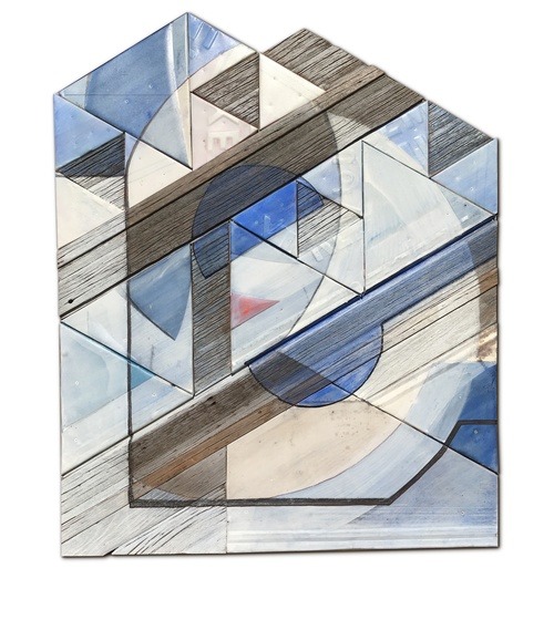
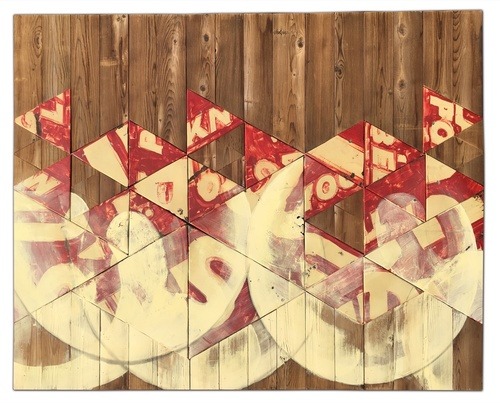
Benjamin Lowder
B. 1974. Lives and works in Otter Lake, Illinois
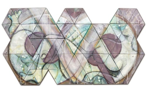
Benjamin Lowder, Eve (from his “Myth, Math & Magic” series), 2017. Courtesy of the artist.
Benjamin Lowder, El (from his “Myth, Math & Magic” series), 2017. Courtesy of the artist.
Benjamin Lowder, Formation, 2017. Courtesy of the artist.
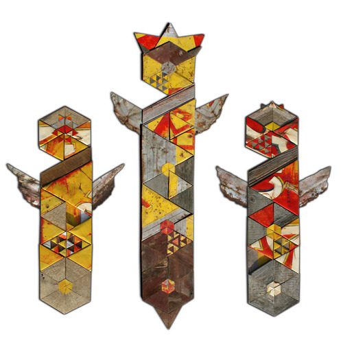
Benjamin Lowder, Kether, Chokmah & Binah (from his “Myth, Math & Magic” series), 2013. Courtesy of the artist.
Rather than the traditional glass or stone, Lowder’s mosaics are composed of reclaimed wood, often sourced from barns, and metal signage—materials that reflect his Midwestern milieu. In some, bits of hand-lettered typography appear in a reorganized jumble. It’s like looking at an old country store through a kaleidoscope. And yet, references to religious icons and celestial phenomena suggest a sort of spiritual geometry, taking Lowder’s compositions beyond remixed Americana. They’re more reminiscent of the diagrams in illuminated medieval manuscripts.
Lowder’s current body of work uses triangles of reclaimed wood and vintage metal signs as the base unit for his mosaics. “Many of my aesthetic choices about how the triangles fit together in my works are based on the proportions and patterns of natural growth structures,” the artist explains. He’s interested in “self-similarity,” a mathematical phenomenon sometimes found in the natural world, in which each individual part is a nested reflection of the whole—as is the case with ferns, snowflakes, and cauliflower. It’s easy to see why mosaics would offer the ideal medium to explore these relationships.
Jason Middlebrook
B. 1966. Lives and works in Hudson, New York
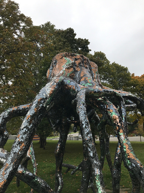
Jason Middlebrook, Underlife, 2010-13. Courtesy of the artist.
Work by Jason Middlebrook. Courtesy of the artist,
Middlebrook’s mosaics can take on mythic proportions, as in the case of his giant tentacle-like root forms covered in glass or stone. “I started working with mosaics because I wanted a material that was painterly yet could also act as a skin for sculpture,” Middlebrook explains. His monumental outdoor work Underlife (2010–13) glitters with glass tile, making the work seem almost animate, a hungry creature on the hunt.
Middlebrook cites Louis Comfort Tiffany and Antoni Gaudí as inspirations for his work, particularly in terms of their committed attention to detail and meticulous techniques. Yet the enduring association of mosaics with craft irks him. “I don’t like that mosaics are labeled ‘craft,’ so the challenge is to make them into a contemporary medium,” he says.
Middlebrook’s work has changed dramatically from when he first arrived in New York in the mid-1990s to participate in the Whitney Independent Study Program. “I was making air freshener sculptures and drawings of muscle cars—think Richard Prince meets Robert Smithson,” he says. Those works were a far cry from the mosaic of delicate flowers that Middlebrook created in 2011 for the Avenue U subway stop in Brooklyn. “I guess I got seduced by the material and its generous possibilities,” he concludes.
Takako Hirai
B. 1975. Lives and works in Ravenna, Italy
Takako Hirai, Giardino segreto (secret garden), 2017. Photo by Giampaolo Solitro. Courtesy of the artist.
Takako Hirai, La mia tana (my hideout), 2017. Photo by Giampaolo Solitro. Courtesy of the artist.
Takako Hirai, La mia tana (my hideout), 2017. Photo by Giampaolo Solitro. Courtesy of the artist.
Takako Hirai, Vene (veins), 2017. Courtesy of the artist.
Hirai first fell for mosaics while on a university trip to Rome as a painting student in 1997. Originally from Kumamoto, Japan, Hirai returned to Italy in 2003 to study mosaic art, then moved to Ravenna permanently in 2005. At first, Hirai worked in a mosaic studio and saw the practice as more of a day job, albeit one that could inform her painting. “I did not know anything about mosaics, or even any mosaic artists,” she says. “I discovered the possibilities for artistic expression while training.”
Hirai’s work, with its natural shades, gentle gradations of color, and irregular stones, feels earthy. She often captures natural moments of growth or change—a sprout breaking the surface of the soil, or wind blowing in the leaves of a tree. Other, more abstract compositions mimic the sparkle of light on water or the impression of a crater in stone. Hirai emphasizes that the cracks between the tesserae are an important avenue for communicating meaning. “I utilize the space between fragments and hide feelings there that I want to keep secret,” the artist says. “But I also want that feeling to appear in the landscape when you look at my work.”
Enzo Valentinuz
B. 1946. Lives and works in Romans d’Isonzo, Italy
Enzo Valentinuz, Hawthorn, 2013. Courtesy of the artist.
Enzo Valentinuz, Building, 2012. Courtesy of the artist.
Valentinuz’s art is inseparable from the Friuli-Venezia Giulia region of northern Italy. His fascination with this part of Italy stems from the area’s striking beauty as well as its dark history; the Italian border where he was born and still lives was the site of bloody battles during World War I.
Originally trained as a fresco painter at the Academy of Fine Arts of Venice, Valentinuz would have an encounter with nature that ultimately turned his attention toward mosaics. Fifteen years ago, during a walk on the Karst plateau—a rocky plain that extends from northeastern Italy to western Slovenia—he noticed the way that the beauty of rocks contrasted with the landscape’s painful history.
“I felt the violence of cannons and mortars as the origin of the splinters falling all around. It occurred to me to use those broken stones, which had seen or felt the fighting, as a pictorial element in my artworks,” he explains. Rough-hewn, often painted, and arranged in orderly grids, circles, or towers, Valentinuz’s stones suggest modern-day menhirs or collections of raw pigments sorted according to color.
Cassandra Emswiler Burd
B. 1983. Lives and works in Dallas, Texas
Cassandra Emswiler Burd, My dreams will pull you through this garden gate, 2014. Photo by Kevin Todora. Courtesy of the artist and Dallas Contemporary.
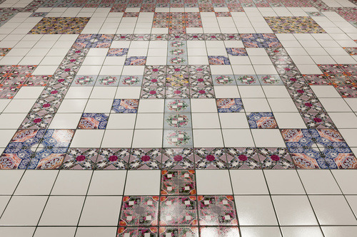
You might argue that Burd doesn’t make mosaics at all. The Texas-based artist uses whole tiles, rather than broken or cut ones, to make her work. Yet she employs them to the same end: creating patterns and images via a process of assemblage. Burd’s compositions look like one thing at a glance, and quite another upon closer inspection. Her tiles are printed with photographs of her family, home, and environment, but at a distance they appear to be the quotidian patterns you might find on a kitchen floor.
Burd is interested in how tile can create architectural space as well as how it can hold memories. “The history or conditions of the site in which the tile is installed are always a primary concern,” she says. “I’ll often incorporate photos of the site into the design, or the graphic motif might derive from its architectural features or commemorate a person connected to the place.”
Among her interests and influences, Burd lists French philosopher Gaston Bachelard and the history of landscape, gardens, and vernacular architecture, and her work reflects this mix of theoretical concerns and functionality. Since buying a home, she’s been installing her own tile in the bathrooms and kitchen. “This leap into domestic space has been exhilarating,” Burd reports. “The tiles are inspired by the pattern on the kitchen floor of my childhood home. So being able to bring them into the space of my first home as an adult is like the completion of some sort of sacred loop—it’s very special to me.”
from Artsy News
0 notes
Text
A visit to the New York City and the High Line.
We just returned home from New York City. Visiting the Big Apple during the Christmas season was on our bucket list, and this year we made it happen. Bill and I went to Manhattan in February 2008 with Bill’s youngest sister, Maria, and her husband, Curt. I also went as a high schooler when I was seventeen.
Benches on rollers at the High Line. I believe these benches are made of FSC (Forest Stewardship Council) ipe. In Phase I of construction which opened in 2009, wooden elements were constructed of FSC ipe, which was criticized. Phase II used reclaimed teak. Both types of wood weather to a silvery gray.
Last week, we went back to New York with our traveling companions and what fun we had! Part of our visit had to be a trip to High Line Park, located thirty feet above the busy streets near Chelsea Market and the Meatpacking District. Although it was early winter, our visit was still extraordinary. Last summer, I did a lot of research on the High Line for a project, and it was magical to see the abandoned railway and gardens come alive beneath my feet.
Mutations by Dora Budor, an art installation for 2017 at the High Line. Artwork is featured throughout the park.
Visit High Line Park in any season.
Winter is a great time to visit because you can see the bones of the garden and its structure without flowers to entice you. I’ve read that winter is the garden’s designer, Piet Oudolf’s, favorite season to visit. I think it’s his favorite season in his gardens period.
Abandoned tracks flow into planting beds. This tension between the natural world and the industrial one is part of what this park celebrates–the urban hardscape melding with natural soft textures.
The next time I walk the High Line I’d like to return in September when the ornamental grasses and asters are at peak bloom. Oudolf found much of his inspiration from plants that self-seeded during the railway’s fallow years. Before construction of the park, the people who created the Friends of the High Line organization climbed up to the railway and were surprised by nature’s resiliency. Click on the photos in the galleries to make them larger.
Bare tree against the blue sky at the High Line.
Mexican feather grass and other plants, native and non-native make up a the palette used by Piet Oudolf.
Ilex verticillata, winterberry holly loaded with beautiful berries.
After much care from humans–isn’t that always the way–the garden grew and took on a wilder aspect very pleasing to the eye.
The garden contains over 500 species of plants. You can download a complete plant list from the Friends of the High Line. Here, also, is a bloom list from August 2016.
Taking photos of the flora and fauna with the sun at my back makes for interesting shadows at the High Line.
If you’d like to read more about the gardens of the High Line, there is a book for you! Gardens of the High Line: Elevating the Nature of Modern Landscapes, (Timber Press) written by Piet Oudolf and photographed by Rick Darke came out last summer. I haven’t read it yet, but perhaps I shall.
The Hudson River from the High Line’s railroad spur overlook.
Our visit.
We entered on the “slow stairs” next to the Whitney Museum of American Art and walked the entire 1.5 miles. We got there as the park opened at 7:00 a.m., so there was little foot traffic except for the occasional jogger. As we ended our stroll, the High Line was starting to fill up with pedestrians walking and running. City dwellers and tourists alike adore this park, so it is well-traveled. I noticed signs throughout alerting visitors not to step on plants. Originally, the planting areas weren’t fenced, but now workers must fence them because the walkways are so well used. The fences are actually small chains that don’t take away from the garden.
The 10th Avenue Viewing deck is the perfect place to watch the traffic below. It is especially effective at night.
Below is a Facebook Live video of our visit. I was in the prairie meadow section of the park.
Situated in the center of a busy commercial area, the High Line juxtaposes nature with concrete and steel. It’s known for its dynamic design features including peel-up benches, concrete risers that blend in with the railway lines and planks with open joints that melt into grasses and perennials. The High Line revitalized the surrounding neighborhood, and I noticed tall buildings being erected nearby. There are many new office buildings and hotels in an area that was once nearly desolate.
The railway that was built in 1934 because 10th Avenue was too dangerous and was once called “Death Avenue” is now essentially a green roof. Nature, industry, and nature again form and reform. For me, it’s symbolic of life, death, and rebirth.
The Standard Hotel sits like an open book atop the High Line. All of the rooms have floor-to-ceiling windows. There is also a bar on the top floor called Top of the Standard. It has a great view of the Hudson River.
Walking the pathway beneath the Standard Hotel.
The weather in NYC has been so mild that shrubs and trees still wore their fall foliage.
The High Line exists only because two citizens who lived on the west side were concerned about their neighborhood and the abandoned, elevated railway. Joshua David and Robert Hammond, separately attended a community board meeting to discuss the fate of the line. At the meeting, they became interested its preservation. Afterward, they talked and decided to do something. They helped create the Friends of the High Line, the group that guided the eventual park and gardens.
If you’d like to read an insider’s view of the High Line, check out Living the High Line blog, by Annik La Farge. It has great information.
The High Line was one of many highlights of our trip. Yeah, I know that’s a pun, but I had to go there. If you go to the New York City, you simply must visit. It’s a worthy stop whether you’re a garden traveler or not.
A trip to High Line Park A visit to the New York City and the High Line. We just returned home from New York City.
0 notes
Text
Reflection
The narrative in my repeat illustrations is based off classic 80s and 90s representations of Australian identity/Australiana. In this I looked to visually communicate ideas suggestive of iconic artists Ken Done and Jenny Kee. Like many artists in this Australiana period, both Done and Kees work were recognizable in the ways they treated colour and shape to represent the diverse nature of Australia and its inhabitants in particular, flora and landscape. My poster art aimed to mimic use of colour and composition reminiscent of the works created by such artists. This idea best suited the brief of ˜Social Fabric” because it best represents the social fabric that is integral to the celebration of Australia as a united country post colonialization and post Gallipoli. Through floral representation a direct symbol is created to infer the historical role of relationships between the Australian landscape, flora and fauna and to contemporary socialisation. This was achieved in my graphic illustration of the Australian native flower and gum leaf. The dimensions of the flower were flattened to make it a simple design to repeat. Due to the 2 dimensionality colour was also flattened/saturated rather than creating toned gradients as the illusion of perspective was intentionally avoided. However, an additional layer was created to the mono layer by adding a shadow with a contrasted colour. This conclusively aided in the colour scheme, allowing for there the artwork to be loud and eye catching. The focus on primary colours was too inspired by works of Done and Kee. Their works incorporated many different shaped illustrations of flora and fauna but remained balanced in the use of complementary primary colours. In their use of saturated primary colours they strayed from realist depictions of flora which allowed for their works to be loud and recognizable which is a feature explored in my poster. For the fonts in the title I chose a simple approach. The simplicity was achieved through small scale and the choice of san serif text. The title only being in the top corner means that the poster itself can be viewed as the art without being a visual overload. This too was the reasoning for the san serif. The illustration itself is already quite complex and intricate so therefore a serif types intricate nature would make the poster too busy. Overall, I struggle in using the software but I surprised myself with how quickly I have been able to pick it up. Although, I think the biggest challenge in this task was making a well-informed choice on colour. I’m very unsure with which colours work best in complimenting each other to then result in a visually appealing graphic work.


top: Ken Done, 1984 - Barrier reef gardern
bottom: Jenny Kee, 1980 - Kee Collage (on a silk scarf)
0 notes
Text
Concept Statement
‘Bilby’s World’ is a short-form comic series following the ups and downs of an earnest young Australian native. It is an exploration of misery and joy and the dull times between.
My collection of short comics were heavily influenced by other artists working in the short-form comic genre. First I observed the conventions and strengths of popular artists, noticing they commonly had a consistent style and focused on a main character. Designing a main character was a long process of doodling and colouring. I considered doing human characters in a self portrait protagonist like Ruby Elliot who goes by the alias Ruby Etc. She draws herself in few lines and often leaves her drawings uncoloured. Her linework is very messy which expresses her frustrations in dealing with her mental illness. I admire her expressive style and how her lines can show people what she is feeling in a way words couldn’t. My main character eventually became a bilby loosely based on myself. I chose a bilby because I love Australian flora and fauna and because my granny always insists Easter is about a Bilby not a Rabbit. It’s a way she expresses her Australian pride. I have thought about pride and shame around Australia for a long time now, and have found a compromise. First Australians suffer continual oppression at the hands of colonisation. I feel deep shame over our history and present actions as a European Australian. Some people who don’t understand progressive politics can think progressives feel only shame. I want to dispel this myth by creating my uniquely native Australian character with as much love and pride I can muster. I do feel pride in things that make Australians who we are ;our humor, our politics, our idiosyncrasies. ‘Bilby’s World’ celebrates all this is a short-form even millennials can enjoy.
I was also influenced by Alex Norris who creates Webcomic Name: a self-referential, formulaic, and digitally created comic series. She illustrates everyday dilemmas in an endearing style. His comics are made digitally and look naive yet polished. I like this style but I first tried to illustrate the way Ben Montero does. He is an Australian artist based in Greece, working in pen and watercolour to create comics and album and tour artwork for musicians. His work is very emotional and inspires me to explore emotion in my own art. I often see comics from my favourite artists online and feel very happy or sad and feel love for their characters and this inspired me to make my own. Montero is best at inciting vivid emotions of sadness, loneliness, hope and humbleness. A motifs he uses that creates these themes are beds which feature his characters resting and being cosy. This gives a very accessible and humble mood to the comics. He also draws items associated with disability including wheelchairs, crutches, bandages, glasses and IVs. I applaud his good representation of disabilities which often aren't included in stories if they aren’t part of the plot. Motifs such as these remind us of mortality and the characters fragility. One of Montero’s triumphs is his ability to illustrate loneliness and sadness in a beautiful way that somehow makes the reader feel happy.
The process of creating the final draft of the comics was harder than expected. Drawing my comics slightly larger than my casual doodles made my linework less confident. Artist Ben Jones works in a larger scale (about 1m squared) and his simple style is very effective but more abstract than i am wanting to create. I would like to try paking paintings like his in the future. To overcome my problem I needed a thicker brush to size of paper ratio. I also encountered problems in drawing my comics and then the watercolour making the pen ink bleed. I bought an 0.7 mm uniball pen which is waterproof and other than initial smudging within 10 seconds of application, the ink does not budge even for water. This meant i did not need to use pencil to map out the areas to colour, saving time and ugly pencil marks.
For the assessment one poster I responded to the prompt regarding the relationship between humans and nonhumans. I made a picture-only comic with 5 panels out of cut up colored paper. I really enjoy telling a narrative in a limited number of frames and making the viewer feel empathy for my characters. My poster was larger than traditional comics so for assessment two I decided to work smaller and in pen like most comics do. ‘Bilby’s World’ evolved directly out of my poster, specifically in the comic style and consideration of emotion.
0 notes
Text
key west paintings
Key West Paintings, Sculpture, and Photography – Get the Key West Picture?
Key West paintings, sculpture, and photography by local artists are the imaginative and realistic embodiments of Key West’s many facets – the stunning sunsets and wondrous wildlife, culture-fests, spirited events, historical-legendaries, and the maverick community in the real-life galleria.
Key West has been a luminary convergence-zone for glorious artistic achievements such as Tennessee William’s plays, John James Audubon’s bird-chronicles, and Ernest Hemingway’s novels. And the historic artistry extends till the current decade as burgeoning artists keep flocking to the Keys. Artists’ works of Key West paintings, photography, and sculpture all find inspiration in the Florida Keys – the pleasing panorama and the total-way-of-life, all central to the daring Key West artist.
Key West Paintings, Sculpture, and Photography Artists and Recent Works:
Fran Decker features fabulous imageries of seascapes, landscapes, and the Key West neighborhood from a whimsical view. The vibrant colors of his Key West paintings in acrylic embody the beauty of the classic conch-houses, historical landmarks, and the tropical flora and fauna – a perfect home. (“B.O.’s Fish Wagon”, “Banana Bay Marina”, “Blue Heaven”, “Fish Feast”) Susan Kay Holler encompasses a sensuous yet spiritual, realistic yet metaphysical perspective art stock, drawing the viewer into the ‘stories’ of exotic mythic living-forms, human or animal, in print. Her works find inspiration in Key West mythology and Native-American philosophies, with the goal of a ‘Jungian’-journey into the heart, into a “place of tranquility and contemplation, where the spirit can rest and rejuvenate itself.” Her series of graceful underwater nudes takes the viewer to the serene Key West coral-reef. (“Venus Down Under: Into the Light” acrylic) Annmarie Anderson and her watercolor and multi-media genius catch sight of the Caribbean tropics, garnering honors and giving out charities. (“Pierre’s” sunny-soothing garden-porch painting) Kim and Ian Workman ‘KIMIAN’ artworks, nurtured by their marine-conservation upbringing, paint the aquatic fish-scenes Key West ‘personified’. The works follow the gyotaku-watercolor-acrylic-ink-method where fish rubbings are enhanced by printing conserved fish onto handmade-paper or canvas then employing coloring-techniques into the rubbings. (“Sunset Celebration”, “Water Fairies”) Kathy Lancaster photography simply tells that a doctor, educational-leadership mentor, author, and parent can also be an enthused artist in the celebrated Key West artists���-world. (“Arielle” guitarist’s photo) Dan Simpson holds the brush aside from a soldering-iron and bass-guitar, creating eclectic hippie-travel-music-inspired digital art. (“August Fruit” digital-photo)
Other Titles and Artists: “Everglades,” photo by Nicholas Bergery; “Fishing Fowl,” sculpture by Doug Makemson, photographed by Karley Klopfenstein; “Going Deep,” by M. Ann Lynch; “Lunch at Herbies,” photo by Susan Thomas; “Moth Wing,” photo by Leo Gullick; “Pelican,” sculpture by Ryan Stimers, photographed by Rob O’Neal; “The Tourists,” by Amy Dean; “Fish Cleaning Table,” sculpture by Lynn Loftus; “An Eggsellent Day” by Janet Mueller; “Side Street South” by Michael Palmer; and “Little Green Heron Hiding” by Jim Salem
Contact Florida Keys Council of the Arts and take home the Keys. Overflowing with inspiration and artistic opportunities, it is the Keys that colors the Key West paintings.
Visit Our Stores
Home
Go to Homepage Disclaimer Please use PayPal button for all my Handcrafted Products All My handcrafted items are made in Seattle,Washington $11.95 plus shippingr Join Facebook Group: Magikal Journey Art Studio Public Group (4800 members) https://www.facebook.com/groups/magikal/?ref=aymt_homepage_panel
https://plus.google.com/109438225808606562460 Google Store https://www.instagram.com/starbornlewis/ Store
Da Vinci Designs/ Website https://www.facebook.com/Da-Vinci-1505571056179865/
https://plus.google.com/109438225808606562460 Google Store
Two Old Guys Would love to hear from you. We always like to know what you think. Feedback/Subscribe Email us: [email protected] Two old Guys Would love to hear from you Disclaimer
This site is for information and support only and NOT a substitute for professional legal or medical advice, diagnosis, or treatment. Website is For entertainment or information or education only! Go to Homepage
$11.95 plus shipping Go to Homepage New Arrive to website Store
https://store-2-old-guys.com/key-west-paintings/ from Blogger http://store2oldguys.blogspot.com/2017/09/key-west-paintings.html
0 notes