#posting this from typography class. end me
Explore tagged Tumblr posts
Visit Tumblr Blog
Explore Tumblr blogs with no restrictions, modern design and the best experience.
Last Seen Tumblr Blogs


Fun Fact
130K people were victims of a chain letter scam that affected Tumblr in May 2011.
Text
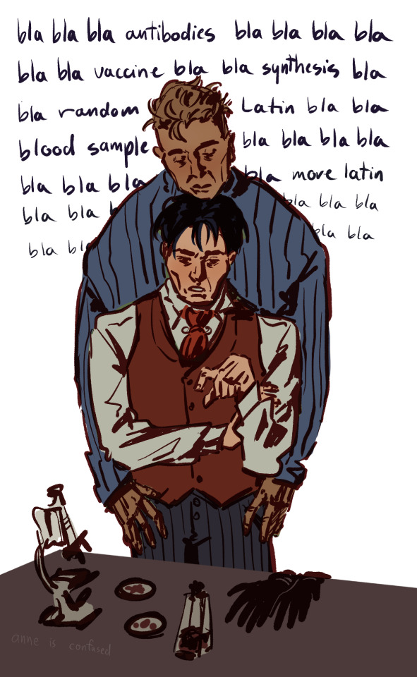
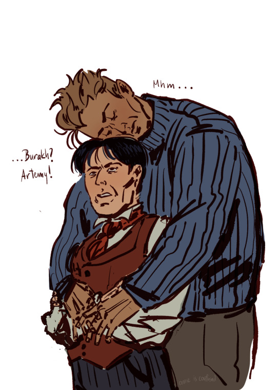
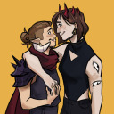
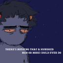
two plague doctors with a height difference is something that can actually be so personal
#at least let him move his arms..#posting this from typography class. end me#my art#pathologic#burakovsky#Мор. Утопия#burda#artemy burakh#daniil dankovsky#who will win my inexplicable depressive episode or the guys in my computer#i just need to nap it out (<-guy who needs 8 months of paid vacation). this is true for them aswell as for me
690 notes
·
View notes
Text
Yoshio Urasawa AMV MEP Sign-Ups!
I'm hosting a weirdly specific Detective Conan MEP (Multi-Editor Project)—one focused on the eleven episodes written by Yoshio Urasawa, set to YUNGBLUD's "weird!"
If you don't recognize the name Yoshio Urasawa, you might recognize another: Smile Village. Urasawa is a Conan screenwriter known for penning the wackiest, most outrageous scripts, like "Intrigue at Smile Village" (Episode 997) and "The Genius Restaurant" (Episode 1,089). This is a MEP to celebrate these oddities, with one part per Urasawa episode!
All oddities in question:
Episode 943: "Tokyo Barls Collection" (cabbage core)
Episode 955: "The Secret of the Insect Man" (bug outfits)
Episode 976: "Follow Them! Detective Taxi" (armadillo)
Episode 997: "Intrigue at Smile Village" (does it need explaining)
Episode 1,010: "The Idol Whose Smile Disappeared" (dine and dash)
Episode 1,028: "Ballad of the Woman Who Loved Cake" (drowning in red bean paste)
Episode 1,057: "Bad Guys" (they really want to throw Conan off a roof)
Episode 1,067: "The Shopping Center In Love" (wrestling)
Episode 1,089: "The Genius Restaurant" (candy is for babies)
Episode 1,119: "The Four-Person Class Reunion" (host clubs are serious business)
Episode 1,126: "The Detective Who Lost His Mind" (most normal Urasawa episode)
How It Works
Open to editors of all levels!
As stated, each part will focus on one of Urasawa's episodes. While bringing in other sources from the anime or manga is permitted, the majority of each part should be the one Urasawa episode.
No style guidelines or color scheme! The only guideline is to be weird!
Please render your part in 29.97 FPS. If using Sony Vegas, please disable resample.
There is no preference on file format.
If possible, leave at least 15 extra frames at the end of your part for transition purposes.
The final MEP will be posted to this Tumblr and my YouTube channel. There will be optional subtitles on the YouTube upload, but the Tumblr upload will be hardsubbed with stylized subs like this sign-up video (though they're subject to change). Subtitles will be positioned to not cover up any editor's typography.
Deadline is 23 March
Sign-ups will remain open until 23 February. Any unclaimed parts will then be claimed by me and/or anyone interested in editing more than one part.
Sign-Ups
A sign-up form can be found here! Or, if you prefer, let me know the following in a comment/message/ask/etc.:
The episode and part you'd like to edit with
Would you be interested in editing more than one part?
Current parts under the cut!
Parts
Intro: Fake Name Part 1: Conan Ray Graves! - Episode 955: "The Secret of the Insect Man" Part 2: Jecka1021 - Episode 1,089: "The Genius Restaurant" Part 3: dipndops - Episode 1,010: "The Idol Whose Smile Disappeared" Part 4: Kava Plays - Episode 997: "Intrigue at Smile Village" Part 5: MarshmallowGoop - Episode 1,126: "The Detective Who Lost His Mind" + Episode 1,155: "Follow Them! Detective Taxi 2" Part 6: Jecka1021 - Episode 1,119: "The Four-Person Class Reunion" Part 7: Caliowl 333 AMVs - Episode 1,028: "Ballad of the Woman Who Loved Cake" Part 8: MarshmallowGoop - Episode 1,067: "The Shopping Center In Love" Part 9: dipndops - Episode 976: "Follow Them! Detective Taxi" Part 10: Liz Winchester - Episode 1,057: "Bad Guys" Part 11: MarshmallowGoop - Episode 943: "Tokyo Barls Collection"
#detective conan#case closed#yoshio urasawa#video#eye strain#amv#mep#finally getting this up after ten years!#i've been wanting to make this mep for ages#it's so super specific#and the timeline is tighter than i wanted; i meant to post this sign-up a *month* ago#so i'm fully prepared to edit the majority of this myself#but i thought i'd open it up in case anyone else is interested!#really mean it that editors of all levels are welcome#even if you've never edited an amv before!#meps are good places to start because the parts are so short#all materials can be provided for this btw and if anyone is looking for a program#i use davinci resolve free version and it's very powerful! and free!#in any case i hope if anyone joins that they have fun with this!!
82 notes
·
View notes
Text
Uni work - OC based fake brand
So for my Illustrator class I had to create a logo and typography based of an original character. I decided to use an old oc of mine that I hadn't drawn in a while.
I introduce you to Emerald brew !
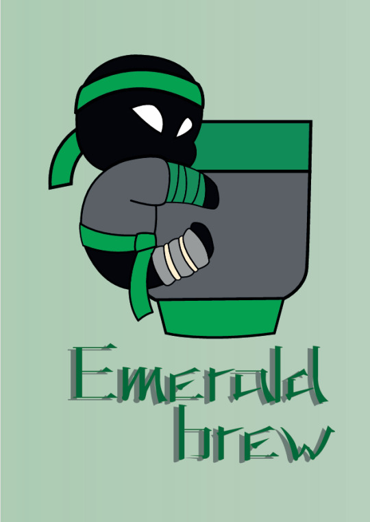
Could not post this on insta because of pics formats, but I wanna post it here !
Emerald brew is a brand of tea & tea time accessories, inspired by Japan. The oc I chose for this project is called Satoru. He's a ninja, his nickname is "stealthy emerald" and he enjoys tea a lot. The idea and name come from this.
We were required to make a moodboard for our brand's vibe and colors :

Images searched for this were inspired by Satoru's design, tea sets, japanese tea cups, all to make something simple yet elegant in green tones (dark or pastel preferably) with grey and black.
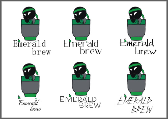
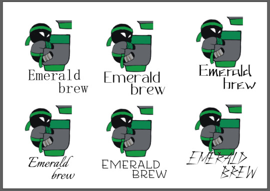
Visual research for logo :
Design rework for Satoru (will give him an actual new refsheet in the near future)

Chibi-fied version of said design

Visual tests for cup (design based on character)

Pose testing for mini Satoru

Picking favorite poses+cups and testing combos for final version

Typographic work :
Font and color tests


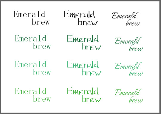
Visual test with final design + chosen fonts to pick the very final design
Aaaand the final result was the first pic so you've seen everything !
This was hard to do on Illustrator (first time I actually used it for a serious project, and yes it was mandatory), but I think I like how it turned out in the end. I got to draw my oc when I hadn't drawn in months, and my mutuals helped me with designs on discord stream. So yeah, it was cool.
Would you want to buy Emerald brew's teacups ?
#drawing#french#ninja#green#fake brand#illustrator#graphic design#typography#logo design#visual search#moodboard#satoru#stealthy emerald#emerald brew#visual research
5 notes
·
View notes
Text
WEEK 11
postmodernism
For this week we talked about Postmodernism, but first, we need to understand what was modernism. During the late nineteenth and early twentieth centuries, modernism affected music, art, architecture, and literature until the end of WW II. The main focus was to reject the traditional. "Modernism often embraced grand narratives and a belief in progress, rationality, and the possibility of achieving universal truths. It aimed for purity, simplicity, and clarity in art, literature, and design." (Paniagua). Postmodernism showed up around the 1950s and it is usually seen as a reaction against the ideas and values of modernism. (“Postmodernism | Tate”). "It emphasizes diversity, fragmentation, individual subjectivity and rejects the idea of a single, universal truth or aesthetic." Visually, postmodernism is all about "being extra," strong colors, dramatic layers, and fragmentation as in :

postmodernism art! When we think about postmodernism, we think about this specific Marylin Monroe portrait. What makes this art a good example of postmodernism is that it plays a lot of bold colors and plurality. For this class, we had to create, in pairs, an advertisement for an object. Me and my friend decided to make a poster about makeup. We had to include Typography, Fragmentation, Plurality, and/or Distortion.

our poster!
We took inspiration from those famous Marylin Monroe portraits which are very colorful. So there is a lot of repetition (plurality) and the typeface we chose is very bold, giving a little bit of an editorial look!

(Bartolo)
Postmodernism is also known for making people think. it's not only about aesthetics but what message you want to give.
word count: 260 words
REFERENCE LIST:
Paniagua, Gustavo. “Modernism Vs Postmodernism - What Is the Difference?” Slidebean, 1 Sept. 2023, slidebean.com/blog/modernism-vs-postmodernism.
“Postmodernism | Tate.” Tate, www.tate.org.uk/art/art-terms/p/postmodernism.
cartoon: Bartolo, Luke. Post-Post-Modernism. lukebartolo.blogspot.com/2016/06/post-post-modernism.html.
Marylin Monroe: McDonald, David. David McDonald. 22 Dec. 2016, globalmillennial.org/postmodernismand21stcenturysociety.
3 notes
·
View notes
Text
Graphic Design 4
Hello you loquacious lollipops!
On Friday we spent some time on the computers designing a little book to convey what our project is all about.
I missed most of Thursday's workshop but i know they mostly folded paper, introduced the concept we did today and that I should research an artist who deals with paper. I'll try and catch up on this in the next post or the post after.
Anyhow, we went on Illustrator and divided our A3 (420mm x 297mm) page using guides. I also added a 10mm border around each page and numbered them in a way that when folded the book was in order. Lydia helped me with this as it was more explained in yesterday's class.
I realised I needed to design a cover and back cover page that were cohesive and matched my project so I immediately thought of one of my earlier designs. I added text and aligned both pages so that they would match up.

I used a Cooper Black Font because I thought it matched the rounder parts of the design but was still bold but I might change this. I might also rearrange the bottom text but I quite like the way it looks right now. I want to know what my tutors think first as I don't feel too confident with typography.

This is the back cover where the design matches the cover's as a continuation of it from the back. from my initial design where the box was in the middle, Sharon felt there would be more balance if it was at the end of the page, but with this I can still get that effect and meaning of the first design without throwing off the balance on the singular pages.
I realised I want a better picture of my girl on the swing to put in this but I didn't like any of the later ones I took so I went to photoshop. I was using the magic wand tediously to select every part until Lydia saved me with introducing me to masking. This sped up the progress of selecting things for me and although I was aware of it I didn't properly understand it until then. This made the whole cut-out process much easier.

Here is a picture of the book template layout and some of these assembled pieces in it. You can see how the pages are numbered and how some have to be upside down before the paper folds so it lines up. You can also see the guide on the first one to see how I divided up the page.


You can see I've also put in a bit of my character design work from animation where I also plan to put another bit of my Animation work into page 2. The next two would be Graphic Design and then the last two being Painting. I also added a line of text on each page or the ones I have done to tell that story of what my project's about.
I was also thinking of doing another one of these but with illustrations of my animation work and a designed book cover of my animation's story. It depends if I have the time because I still want to get more of my animation done.
3 notes
·
View notes
Text
Visual language post 2
Session 6- 04/03/25
Today I went to The Ford foundation gallery. I walked 40 mins there and was about 30 minutes early, me and professor went in early and into the 'Reverberations' exhibition. It was so good and I really enjoyed looking at all of the art work. I used a laminated map which showed me who created each piece and how they were created. I took my time at each piece as it was really quiet before the rest of the class arrived and I took photos of what inspired me. I paid attention to the use of symbolism and signs, facial features and book cover designs.


I also went Into the garden after which was really pretty.

Session 7- 11/03/25
Today we started class by presenting one piece of work that we loved and inspired us from the exhibit - I chose to talk about The Native Guide Project by Anna Tsouhlarakis. I didn't realise we had to write a paragraph for 3 pieces we liked so I kind of just made it up but I did believe the things I said and I completed the work after we presented. There are the 3 I spoke about and submitted-


After this we went round the class and looked at everyones beginning sketches for the man on wire film book cover.

My sketches are very simple and very basic but I just wanted to jot down my quick initial ideas and I feel the annotations are more effective anyway- at least for me anyway. I also didn't realise that we had to create sleeve covers too for 3 different categories- I am finding it hard to understand the briefs professor puts online but she explained them to me one on one and now I think I understand the project. We are creating 3 different book covers and sleeves to go with them- for 3 different categories- psychological thriller, children's book and then typography based.
Homework- create 4 rough sketches for each category including sleeves. I completed these in my break between classes-


I did some secondary research for book cover design before doing these sketches for some inspiration-


Homework- come next week with 3 solid concepts for each category and begin planning how to create each one- think abstract.
Session 8- 18/03/25
Today we had a studio day and worked on our book cover designs. Our deadline is two weeks from today and next week we need to have completed our designs and have a rough print out of them to get feedback.


Session 9- 25/03/25
Today we had a short critique for people who brought out rough print outs of their book jackets and covers. We then had a studio session for the rest of class and I worked on typography (body text, blurb...) for my designs.
Due next week- final designs, final presentation, final print outs onto a book, final photographs of the book designs.


28/03/25- I sent off my print fx file but I ended up spending £50 on prints I can't even use because I left on the fold lines on the file...

1 note
·
View note
Text
Blog #7 - Week 7


Blog #7
Week- 7
Alyssa Marshall
2/27/25
This week I finished my Final for my poster over the weekend. I made the changes that I mentioned in the last blog post, and I feel happy about the final. Then Monday I was introduced to the next project. The next project is a poster for a design competition. The Prompt is: mindful design, it is very open ended plus there is an optional AR component if i want to add that to my poster. After class I did some research and brainstorming about mindful design and mindfulness. For my research I looked into articles about mindful design and examples of it. One of the articles I read was Mindful design: What it means and how to achieve it By Alex Ziegler. It is mostly a discussion article with questions between other designers. I like how they explain how design can be mindful by getting rid of digital clutter and noise. They want to create intentional awareness by doing something such as purposely creating friction to make a user think.It is not something that needs to be loud or too forceful in design, it is about creating visual satisfaction. I enjoy this article because of the way it phrased this. It could be something I think about when designing my poster.Although I believe the article is talking about UX/UI design, the ideas can still be used and thought about.
For my brainstorming I tried breaking it down into what traits and correspondences that come to mind, when I think of mindful design. I made a short list and narrowed out what directions I can go in.For example when I think of the prompt, what comes to mind is:Calm colors (blues, Warm colors) , Attention, Relaxation, Yoga, Grounding, meditation, etc. i will attach my list.Then I made my mood board.In my mood board I wanted to focus on type based designs and experimental and heavy designs with texture and contrast. I also tried drawing from my own experiences. I practice mediation often when I can, and it is something that helps me feel more relaxed when I feel overwhelmed with life and classes. It helps alot to take five minutes to Close your eyes, breath and be mindful of yourself and your surroundings. One of the best analogies that helped me visualize and understand meditation is: imagine all your thoughts are cars going by. Pay no attention to a single one, acknowledge it , be mindful of it, and let it pass. Keep moving. I feel if i can put this idea into a poster it would be cool and original.Another idea I have, that I could create a poster out of, is on grounding and being mindful in nature. I still have quite a few ideas and want to do more research and sketching over the weekend. I have sketches from in class but I feel because of how open ended it is I need to take more time to brainstorm to find something that is original and not cliche.
NETFLIX’S ABSTRACT PAULA SCHER EPISODE
Watching this episode, I really enjoyed it. Paula Scher is such an icon. I love how she describes NYC as the city of signs. It is amazing how she does with typography, and she has such command over it.As she says “Painting with words.”Her background is very extensive, and I recognized many the work in the examples in the episode. Something that such out to me is that she is taking inspiration from books on type and woodcut for her designs. It has been mentioned in class how it is important to break away from the internet to find something original. I loved the map designs she painted about how she organizes all of the data in these maps. In the parts where she is talking about her maps, she is also very funny. I find it interesting how over time she adapted moving from physical to digital and then back to physical media. It must have been an interesting time to be a designer. Something else that was talked about in the episode is the idea of play in design to get better and more fun ideas. This was something that was touched on in the intro class for Graphic design, that I took with professor Chi. I feel there is a push-pull at times trying to be at a state of play and balance a workload, trying to not get overwhelmed. Lastly, I want to finish this blog out by saying that Paula Scher is very inspirational and I can only dream of being as driven as her.
0 notes
Text
Okay, thoughts written down after class when I’ve actually got time to listen to the whole thing because this thing is movie length for some reason
This is gonna be long but it’s all in one reblog so it doesn’t clog up your feed
Insert from future me: I ended up listening to half of it before taking a break so this is gonna be the first half. This should’ve been two different albums. I feel like a 15 song album is my limit for a listen-through. I’ll give thoughts on the second half later
Fortnight: not about the video game sadly. the song is mostly standard Taylor Swift fare with some edgy flavor thrown in there. I’ve never listened to Post Malone before and I like his voice in this one. Might see if I like some of his other work later. Can’t say I’m a fan of the music video’s specific use of psych ward imagery.
The tortured poets department: I don’t really like this one. Specifically the writing. It just doesn’t vibe with me. Hopefully it gets more young people to read Dylan Thomas though. This just sounds like Taylor Swift song and nothing else to me. She’s not really breaking new ground with this one.
One of the things I like about Taylor Swift is that she’s fairly different between albums while still sounding solidly like Taylor Swift but at this point I’m sorta struggling to figure out what she’s doing differently here
My boy only breaks his favorite toys: It’s aight. I’ll probably listen again but not on repeat. It’s too similar in tone to the last two songs though in my opinion
Down Bad: it’s on this album for sure. The lyric video for this one is a good example of my problem with official lyric videos these days. Like there’s getting creative with your typography and then there’s whatever that PowerPoint slide looking abomination is.
So Long, London: It’s pretty good but not in a knock your socks off way it’s just pretty good I like it but at this point as an album I’m wondering where we’re going with this. We’ve mostly stayed in a very similar tone musically with these first five songs
But daddy I love him: This is the first one that’s going in the casual listening shuffle playlist. It’s more similar to her older stuff but not in a way where it feels like a step backwards. Just a little bit of her old country flavor here but not too much. Just a pinch. Classic persona stuff as well. She’s done this sort of thing from the beginning but did a lot of it in folklore and evermore
Fresh out the slammer: I don’t really get this one lyrically. Like the whole concept of it is sort of lost on me I think. Musically it’s pretty similar to stuff she’s been doing since Reputation so not much to report on that.
Florida!!!: This song gets better as it goes along. I really love the drums in this one. It’s also reminded me I need to listen to more Florence + The Machine. Love the vocal mixing here too. It’s got good texture. I’d like to eat this song, tbh. In a good way. Going on the shuffle playlist.
Guilty as sin?: Classic Taylor Swift pining sing. That’s the good stuff. It’s even got a chorus! Might consider putting it on the shuffle playlist.
Who’s afraid of little old me?: Obviously written for teenage girls to have revenge fantasies to. I think this was the one people were getting mad about on tumblr. I think I get the criticism but this song is not that deep and I don’t think it needs to be. Not going on the shuffle playlist but I might listen to it on loop while writing as background noise
I can fix him (no really I can): it’s here for sure. It’s on the album. Don’t super care about this one either way but I just know if there’s ever a music video for it it’ll be insufferable
loml: not my vibe but it’s well done and has some good turns of phrase in it
I can do it with a broken heart: Classic song about being famous and under pressure that the average person can’t relate to. It’s kinda fun though. I think we needed some fun in this album. I mean yeah the lyrics are about being depressed after a breakup but it’s fun musically.
The smallest man who ever lived: Not exactly sure what that was tbh. Breakup song I suppose. It’s fine. Won’t be seeking it out again.
My thoughts so far are that there’s some good stuff here but I worry that maybe she’s reached the point of fame where people can’t tell her when a song doesn’t need to be on an album anymore. Some of these songs tire me, I’ll be honest. There’s a lot of sameness going on here I haven’t come to expect from her.
I have figured out that all the sudden Taylor Swift hate on my dash is due to a new Taylor Swift album being out and seeing that I'm a casual Swift fan (I do not identify as a Swiftie) I think perhaps I should listen and report my findings so I'm gonna have it on while I get ready for class today. Which is fitting because I'm going to poetry class so seeing as I am technically a tortured poet supposedly this album is meant to speak to me so *mario voice* Here we go!
587 notes
·
View notes
Text
Blog 2
Hey there, I'm back with another post! This week's reading was about grids and how they are used in the typography world. From what I gathered from the reading, grids exist to keep things in control, in this case, the words on a page (whether it's a page in a book or a web page). Just like typefaces, grids, one upon a time, had a more 'organized' and strict construction. For example, a page would be split into 2 columns of uniformed text. Graphic designers did not start experimenting with grids until the 20th century (which seems to be the century where they really started going bonkers with ideas, from what I observed). During this time, it became more of a flexible, systematic tool to create much more modern and bold creations.
This week, we were still working on project 1. Last week I only had the first 3 squares done, however, now I have pretty much all of my squares, even though they are not finished but it is something. Tuesday we did not have class so I just decided to work at home and boy I was struggling so much on square 4. The cuts that I had to do were semi-hard and the paper was not cooperating with me so I ended up giving up after finishing the 1 square. Wednesday night, I recovered with a new game plan: I ended up redoing square 3 to make it less detailed and add more thicker lines so the cutting process would be easier. It worked and I was able to complete square 4. As of now, I have squares 4-6 all cut out and I am happy with them. As for the rest of the squares, I just have to finish square 9 and then cut them into 4 by 4 squares and then glue them onto my construction paper. I told you that this artist never quits (although I almost did several times but that is not important)! Until next time, signing off.


0 notes
Text
Blog post 1: Arts245
This week in the reading we learned about how type faces and letter forms have evolved! One thing I learned is that the history of typography reflects the opposition of the hand and the machine, the organic and the geometric and the human body and the abstract systems. I thought this was really interesting to learn and just think about these duality's and how these tensions birthed the printed letters we have today. Another thing that i found super interesting is that a lot of the font names we have today come from the names of the writers who created them in the 15th and 16th century. This cool to me because I feel like you always hear these font names I wonder what they come from and now I know! Another thing that I never thought about that makes sense is that italic lettering is supposed to be the messier and more natural version of fonts. Now that I know this it makes sense why and its cool that someone decided to choose a font characteristic that makes something look messier and less clean.
For class this past week I will say I started off very stressed and confused. My first two square attempts where not anywhere I wished they would be and just felt unsuccessful. I took a break from it for a day and came back to it and I feel like this really helped because I could tackle the project with fresh eyes and more relaxed. I went to McMaster to use a light table and completely redid square one and two. Im not gonna lie when I say that I don't love them, but i'm happier with what I have now and just proud of myself for persevering. Now i'm just stressed about starting the cut out portion but know that I will feel better when I get started and am in the grove and get the hang of it. Here is my new ones:


These are my 1st attempts that I ended up redoing:

0 notes
Text
Week 10: Chapter 9 + Immerse - 3/22/24
It was interesting to consider the aspects of design that involve movement and time in this chapter. I forget that kinetic typography isn't just a recent thing; rather than only involving digital animation or websites, it can also be something as simple as collage or cue-cards in old movies. With this it’s cool to think about the places we encounter motion design in our everyday lives, from movie credits, to social media, to even typing this post out right now. It was helpful to read about the importance of context and structure, and how all of these elements can affect a viewer’s perception of a design just based on so many nuanced factors. Design really is all about perception, and through reading this chapter it was interesting to note how so many components of a good kinetic design are also components of a good static design, like hierarchy. Looking back at al of our immersive poster animations, it is neat to think about how effects or movements that each of us chose can create a certain feeling or idea just because of those artistic choices.
I enjoyed learning about Artivive and animation at the close of our immersive design project. Though it started out frustrating, it was so cool to gain knowledge on different tools and to see all of my work come together at the end. I loved getting to see what everyone else came up with, too; something I always appreciate about art classes is the way that each of us can approach the same assignment with totally different perspectives and techniques. It sure creates a really awesome collection of diverse artworks and animations, and I found it so cool to get to view each of the poster animations on the wall during class Wednesday. I’m a little unsure about the direction I want to take for my process book, but I’m looking forward to redesigning it as I was getting sick of my old portfolio format. I made my original one in a comic book style, and though I was happy with the concept, it looks a little too gimmicky to me now. I definitely want to do something a bit similar in terms of it being graphic and drawing inspiration from comics, but I want my next process book to be a lot cleaner, more artistic, and more intentional. I have been looking at a bunch of other layouts and portfolios for inspiration, so I want to sift through all of that and start narrowing down my color scheme and looking at typefaces, layouts, and designs.


0 notes
Text
Reflection 2


Within the past two weeks our class has completed our second project which was centered around typography, and led me to my first experience using adobe illustrator. The day that we began working on it I was honestly extremely lost because I had woken up sick, and even passed out during class! A couple days later though I had found out that I had strep throat, and after a week of antibiotics I'm feeling much better, anyways before passing out all I really did was follow my professors recommendations of using short words around 3 letters to start off, and sort of mixed them around until I found some sort of format that I enjoyed them being in while also making it so the word was not easily recognizable. The words that I had used were Moon; Egg; and Cat. Why those words? I thought they were funny. The next class that we worked on this project I was feeling a bit better, and had also received some helpful advice from my peers especially when it came to my design for "Cat" which had given it an interesting sort of symmetry. While doing the peer review it was amazing to see what everyone else had thought of for their designs which I honestly wouldn't be able to get anything as close to as good as theirs regardless of whether or not I was sick. After we had all finished out designs we printed them out, and cut them out to post onto a whiteboard where we made a sort of collage trying to see what designs were similar to each other so we could put them together, and form some sort of shape that we would leave for the next class to continue to build on.
This week we had begun working on our third project which revolves around making a poster for the voting season that is upon us. I'm not really sure what we did for the first bit of class, I think they were looking at some articles, but I was pretty late thanks to extremely bad traffic despite leaving an hour before hand. Anyways we all had to make at least 10 sketches based off a quote from a list that we could choose from, but at the start I had a bit of trouble thinking so I had just done a bunch of random sketches for random quotes. None of them were able to really dive deep though so I just made them as silly as possible. After we had finished our sketches we peer reviewed them, and after that was over I was finally able to think of some more ideas for one of the quotes and I ended up adding a few more sketches while our professor was walking around to see where we were at. The quote I was able to make the most sketches for was "What is justice? Giving water to trees. What is injustice? To give water to thorns. Justice consists in bestowing bounty in its proper place, not on every root that will absorb water" by Rumi, and this was probably the easiest for me because it already forms a vivid image. Key things that I had thought about was obviously watering the trees, and the thorns with the water itself being justice. As I kept going though I had remembered symbols of justice such as scales and implemented that into a couple of my sketches. I am a bit satisfied with the last few that I had ended up with, and will try my best to flesh it out further for my end product.
0 notes
Text
Process & Reflection (Week 3)
Text Reflection
This week, we read chapter 2 of our textbook, which is titled “The Anatomy of Typography”.
Right off the bat, I knew this was going to be a really interesting and enjoyable chapter to read (at least for me). I say this because I’m inexplicably obsessed with typographic anatomy and abstraction, which has been well-documented in many of my older blog posts. I honestly don’t know why I love it so much, it’s like a switch flipped when I was introduced to the topic in ARTS 102.
The chapter’s introductory “blurb” contained a really beautiful sentence, where it likened writing and typography to “thoughts made visible” and “frozen sounds”. It sounds dramatic, but reading it gave me chills and now I can’t stop thinking about it.
Moving on to the chapter’s main content, I found the section about the historical evolution of typography really thought-provoking. I always assumed that modern typography evolved from early handwriting, but I’d never thought about how the limitations of historical writing technology affected the development and evolution of letterforms. It's interesting to think about what our modern alphabet might have looked like if the technology back then had been different.
Lastly, I really appreciate the level of detail and organization of the chapter overall. Last semester, in Typographic Design 1, the course textbook covered a good amount of information on typographic anatomy, but it wasn’t super detailed and it felt less organized, which made it difficult for me to absorb what I read. This textbook is much easier to understand, as it provides plenty of helpful figures (like diagrams, side by side comparisons of different typefaces, etc). These figures helped me visualize and understand the concepts I was reading about. Overall, it was a really enjoyable and informative chapter, and it’ll be a helpful resource for the new project.
Process
This new project reminds me a bit of the “Sports Team Redesign” project, which was the final project in my Typographic Design 1 class last semester. This is mainly because we’re designing a logotype and merchandise, which we did as part of the final project. However, this new projects ks obviously very different in all other aspects. The 2 words I ended up with were “sparkling” and “whiskey”.
I'll be honest, my heart kind of dropped when I pulled my adjective, “sparkling”, and it just dropped even further when I drew my noun, “whiskey”. I don't feel comfortable with the idea of creating an alcohol-centered brand or promoting the use of alcohol through my designs, even if they aren’t going to be used for a real music festival. Luckily, Professor Wanco said she wanted us to stay away from explicit depictions of substances or substance use, which was a relief to hear.
I had a little bit of a hard time word mapping, specifically with the word “whiskey”. At first, I couldn't think of a single way, or a single synonym for whiskey that wasn't alcohol-related. I had a kind of “lightbulb moment” when I eventually thought of the word “spirits”. It technically relates to whiskey, but it's also a word for ghosts, which I felt I could work with. I ended up going with “Shimmering Spirits Music Festival” and started brainstorming logotypes.
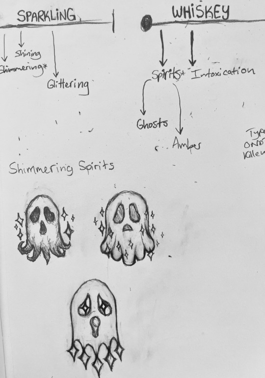
When I started sketching, I got a little carried away with the “logo” part of the logotype, which you can see from the above picture (depicts some my sketches). So, I'm working on finding ways to incorporate typography into the logos I’ve sketched.
I’m also working on developing a layout for the poster. I was initially using hand-drawn (I used a graphite pencil and a ruler) grids for my poster layout sketches, but I soon realized that drawing grids by hand is pretty tedious. Additionally, I needed to be able to freely rework the layouts, which meant I needed to be able to erase parts of the sketches without erasing the grids. So, when I got home, I printed some custom-sized graphing paper and started sketching again.
I’m looking forward to making mood boards this weekend!
0 notes
Text

Today I went to the Intro to Laser Cutting workshop. I have some plans for a sculpture that requires me to cut and slot pieces together - I’ll post the sketch at the end.
The goal of the workshop was to show us how to use the software to design something on a 2D plane and then operate the laser cutter to translate the design into 3D.
My group used Adobe Illustrate to create designs. Starting off simple, we typed in words that we associated with our selected theme. I chose some words from my mind map, including two of the primary sources I was focused on.
Afterwards, we made a new file and selected a black and white image, as it would be easier to separate the values and decide what areas to cut. I chose a poison dart frog.
I toured the software a little and tried out the other tools - I think understand the basics, though there’s still some settings I don’t understand and some ideas I don’t know how to execute. As the classes continue, though, I think I’ll get more into the rhythm of it. It looks like most designs are best imported rather than done in the software.
I noticed that a lot of the smaller pieces and letters fell through he honeycomb matting once they were cut - if I’m cutting designs with intricate details and small pieces, they’ll have to be enlarged so they don’t fall through as well. Tomorrow we’ll be doing engraving and etching, so I’ll be able to have small designs as long as they’re not fully cut. The whole thing needed to be sanded, as the burn marks from the laser are obvious.
The outline of the wood could be used as a stencil for typography or a stamp - I’ll keep that in mind for the future.
0 notes
Note
Hi Loa! You said you started off with HTML/CSS/JavaScript, and you post a lot about your website projects. So I wanted to ask if you have any advice for the process of designing a website and making various graphics. I enjoy coding a whole lot, but I've avoided front-end stuff until now because looking into design and tools for it made me feel a little overwhelmed. What would you do if you were to start learning anew web design for your coding job and hobby projects? Thank you a lot :)
Hiya! 💗
I'd be happy to share some advice on designing a website and creating graphics. It's great that you enjoy coding and want to explore front-end development and design, and don't worry, though I love frontend stuff a lot, I still find some things overwhelming e.g. I'm currently learning Django which I have put off from learning because it looked "hard" but now I love learning it. Just give yourself a little push and you'll enjoy it! 😉🙌🏾
Web Design Inspiration
Two key places I get inspiration for my website designs are Pinterest and Behance!
For instance, when I was, and still am, researching Old Web GUI designs, I made a Pinterest board of images relating to what I wanted to design and I used that as a reference when building the design in HTML and CSS. So, I would look at the picture and think "Okay in terms of HTML elements and CSS styling, how can I replicate this? 😉👍🏾". You can check out these boards: board 1 | board 2
Pinterest is the main inspiration place, and Behance is for more in-depth web design components. What I mean is if I need inspiration for a navbar design or a certain card design, I would use Behance.

Now I don't particularly do this, which is bad, but I do recommend making a wireframe for your web designs. I talked about wireframes in a previous post, but to sum it up; wireframes are good because they allow you to stick to your design plans and not go off on a tangent. These are especially good when working in a team at work, for example.
The reason why I don't particularly do them as often as I should is because I see things in my head vividly enough that I won't forget where everything should be - no super power but that's the main reason I don't make wireframes. As well, I change ideas halfway through so there's no real need for me to keep making wireframes if I will change the design 2 minutes later! 😭💔
But that's just me, but you should totally start designing wireframes. Practising drawing up some wireframes will definitely help with being creative in your designs. Take everything around you as an inspiration. The way I think of it is to think like an artist who is capable of painting anything - all you have to do is look around and paint. You can do the same with web development - everything is an inspiration. I saw a person make a whole webpage with amazing graphics... just about water. You can do the same.
If you need help on that part, definitely look into graphic design. I took extra classes in Graphics (which was just graphic design) when in school which involved looking at graphic artists and studying their work, then replicating something with our own twist. You can do the same with web design - study websites online, some you like or random ones. Look at a piece of the website and try and replicate it. That's why I like projects which are like "make a Google clone" or "make a Netflix clone" because it gives you the chance to study other people's codes and you can keep that knowledge for any future projects!
And lastly, study web design principles. There are some principles that good websites all put into their design that make the user's experience good. Read this article about it and this should even give hints to how you could design your next website! Learn about fundamental design principles such as colour theory, typography, layout, and composition. Understanding these principles will help you create aesthetically pleasing and user-friendly designs.
Web Design Tools I Use
Now, what do I use every time I start a new "project", what online tools do I use? I literally have these on my browser's bookmarks, ready to go!
Pinterest (inspiration) - LINK
Behance (inspiration) - LINK
Coolors (colour palette generator) - LINK
CSS Gradient Generator (because I'm lazy) - LINK
Google Fonts (main source for fonts) - LINK
Font Palace (fonts I want but not on Google Fonts) - LINK
Font Awesome (for the little icons) - LINK
Image Colour Picker (if I have an image and I want to pick the colour from it) - LINK
Optional tools:
Bootstrap 4/5 (sometimes I use this for personal projects, definitely use it at work) - LINK
Pattern.css (creates a patterned background for you, again I'm lazy) - LINK
Storyset on Freepik (people graphic images) - LINK
Pexels (stock background and even fake product images) - LINK
Unsplash (same as Pexel) - LINK
LottieFiles (set animations) - LINK
TinyPNG (makes image sizes smaller so less space) - LINK
CSSmatic (4 cool CSS generators) - LINK

That's all I have to say, if I didn't help with your question, message me to help you further but I do hope this helps you!! Good luck! 🥰🙌🏾💗
#my asks#resources#codeblr#coding#studyblr#tech#progblr#programming#studying#software developer#webdev#web design#web graphics#tools
117 notes
·
View notes
Text

I posted 55,662 times in 2022
That's 14,195 more posts than 2021!
369 posts created (1%)
55,293 posts reblogged (99%)
Blogs I reblogged the most:
@duckdotcom
@nastywizard
@retroactivebakeries
@steampunkforever
@theknifeofdunwall
I tagged 41,410 of my posts in 2022
Only 26% of my posts had no tags
#aesthetic - 12,309 posts
#good art - 6,692 posts
#favorite - 3,151 posts
#architecture - 2,202 posts
#illustration - 1,843 posts
#art - 1,700 posts
#monsters and creatures - 1,453 posts
#retro sci fi - 1,275 posts
#typography - 1,204 posts
#video - 1,149 posts
Longest Tag: 137 characters
#it’s like accidentally catching the glance of a stranger but forever. in a pleasant way though imo. like yeah we’re not here together but
My Top Posts in 2022:
#5
it's funny that people are googling "psycho ending explained" they do that for you in the movie. like what do you think all that was for
3,562 notes - Posted August 14, 2022
#4
sitting at a typewriter in the hotel from the shining typing "she B Lyndon on my Johnson!" over and over again
4,144 notes - Posted June 22, 2022
#3
imagine you get jumped by simon and garfunkel and you hear them say take his ass to scarborough fair
6,170 notes - Posted August 10, 2022
#2
whenever i mess up cooking eggs the edwardian dandy who follows me around looking over my shoulder says "poor show, old boy!" and shakes his head sympathetically
8,326 notes - Posted September 1, 2022
My #1 post of 2022
i wish i went to RENE MAGRITTE university
i would wear a BOWLER HAT every day and eat APPLES and HAM WITH EYES for lunch. i would take FIREPLACE TRAIN to class and smoke CECI N'EST PAS UNE PIPE. i would be more likely to meet WHITE DOVE, FLAMING TUBA, LE MINOTAURE, and MYSELF
9,723 notes - Posted May 3, 2022
Get your Tumblr 2022 Year in Review →
#year in review#my post/reblog ratio is astounding. also this is showing that i simply love to tag things
2 notes
·
View notes