#so the actual body shape changes are subtle and it's based more in the patterns and the ears
Explore tagged Tumblr posts
Visit Tumblr Blog
Explore Tumblr blogs with no restrictions, modern design and the best experience.
Last Seen Tumblr Blogs


Fun Fact
25% of US internet users with an annual income of $80-100K use Tumblr.
Text
So I was thinking and wondering; what if the Florges line had a closely related (but not the same) male counterpart line? And so, I drew the following Fakemon:
meet Falilys, Falarino and Fanceur!
Fairy-Types drawing from Water power, they're male ballet dancer/butler themed. Dex entries + big ramble under the cut.

Falilys ("fa-lee-lees")
The Tiny Lilypad Pokémon
Fairy-Type — drawing power from Water-Type
Exceedingly rare in modern times. It's thought Falilys is born when a Flabébé undergoes a strange mutation in the egg.
The dewdrops Falilys carries on its head are important to it. Knocking them off makes it cry.
A very honouring Pokémon, Falilys are often seen carrying Flabébé across lakes, ponds and rivers in exchange for pollen to eat.

Falarino ("fa-la-ri-no")
The Lilypad Pokémon, evolved form of Falilys
Fairy-Type — drawing power from Water-Type
The lilypad Falarino once used to travel is now carried on its head. It practices balance with it, twirling and dancing across lake surfaces.
Some folklore says Falarino's teardrop shaped marks developed after it was shunned by Florges.
With the grace of a dancer, Falarino emerges at night to heal stagnant bodies of water and encourage healthy growth of aquatic plants.
Fanceur ("fan-se-ur")
The Lilypad Pokémon, evolved form of Falarino
Fairy-Type — drawing power from Water-Type
Fanceur will only remove its lilypad— its source of power— to use as a shield for someone it loves. It spins up streams of water when it dances.
With a haunting cry and an ever-sorrowful expression, Fanceur skips and skims across bodies of water, telling a tragic tale through elegant dance.
Though people used to assume Fanceur would woo Florges with its dances, it's now been found it acts more as a personal servant to its counterpart.

And now for the ramble. Down below are Shinies, colour variations (Fanceur colours are Dawn, Cream, Slate, Dusk and Silk) and a head shape comparison between Fanceur and Florges.

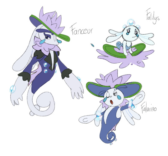


Hoo!! So! This line is my pride and joy. it's my first time making a Fakemon not look like shit. I thought it would be cool if there was a diverging line at birth for Florges and I ran with the idea of it becoming a dancer-servant rather than a guardian. I think it would also be really funny if they shared the same egg group BUT you can't breed Florges and Fanceur anyway. because fuck you. made the Shinies shades of purple to match Florges, and then here we are! funny sad water lily fairies.
#moom makes bullshit#digital art#art#artists on tumblr#Pokémon#fakemon#Flabébé#Floette#Florges#Falilys#Falarino#Fanceur#I had a lot of fun making these guys!!#I imagine they'd be incredibly rare and hard to befriend#something something that one bit from no girl's toy TOO MANY GIRLS!!! /j#and yeah. they're constantly sad. if Florges is happy then Fanceur can be a miserable little guy just trying to do best for his employer#he just wants to dance and scream at lakes and that's a vibe#wanted to make it slightly more masculine but not so much it's just stupid to look at#so the actual body shape changes are subtle and it's based more in the patterns and the ears#and then the Water-Type draws instead of Grass! because I just thought it would go well together! they both serve the same roles#if anyone ever wants to draw the boys please ping me I would be honoured
36 notes
·
View notes
Text
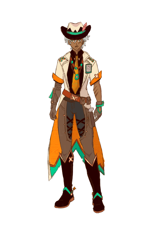
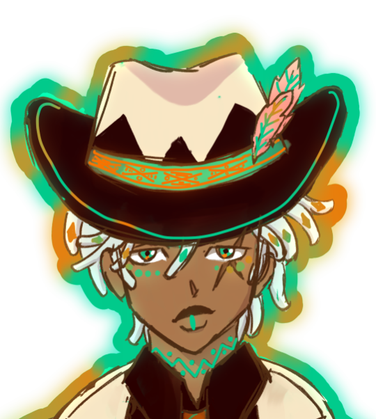
a rough little ifá redesign !!
i love him deeply, however, with the way that he's based on a yoruba god (again) and a cowboy, i wanted to lean into both a little more (and make the colors feel a little less platypus-like iykwim). so i did it!
i think his design is genuinely solid, so i didn't change that much, like, at all, i just embellished it a little.
design notes under the cut <3
normal style:
we'll start small: i loc'd his hair!! very easy way to keep the shape language of straight hair without compromizing a character's visual blackness. even though i don't like the 'dark skin, light hair trope', ifá's design motifs rely pretty heavily on visual contrast, so i decided to just keep his hair the same color.
i removed most of the embellishments on his hat, since i think it needlessly complicates the top half of his design and draws attention away from the fact that its a cowboy hat, which is, of course, the important part. plus, the buttons and the stitching reminded me too much of a voodoo doll, and with the addition of the bones in his nightsoul state, it kind of muddied the actual influences of his design.
i also kept his neck tattoo, since it was fun and worked with some of the patterns i introduced in his design, and i also made his skin less gray to work better with his colors
speaking of colors, i did actually lessen the contrast between the white, teal and orange by unifying the palette, allowing for it to be a little easier on the eyes and a little more warm toned in a way that makes him feel more grounded in genshin's fantasy environments, especially with the modern feeling of the nametag and the style of the clothes.
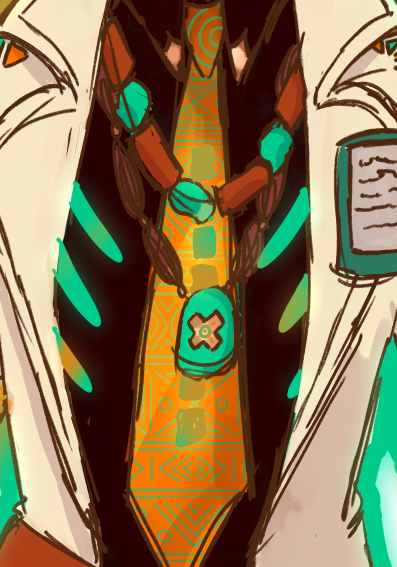
with his top half, i wanted to add a little more visual intrigue, since all of the complexity of his design felt imbalanced toward his hat, rather than the center of his body. the easiest way to do this was to draw on the african cowboy aesthetic and add a tie and beads to his shirt and jacket combo. the opele chain that his constellation is named after is actually based on the method of divination that the worship of ifá entails, since he's the god of destiny, and so i wanted to give him a little more of that influence, since in his constellation it seems to refer to the string of his hat, which i removed.


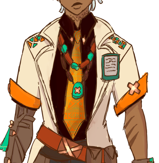
on his tie, you can see ankara patterns, which is a direct callback to his yoruba basis, along with turquoise and burnt orange beads which are also yoruba. in addition, i kept the nametag, since it was doing a lot of heavylifting fro denoting him as a medical professional, but i moved the feathers to his hat, and made them cacucu's feather's specifically. i also changed his primary color from the teal to orange to add to the less futuristic feel and to cut the 'a platypus???'-ness.
i also changed the metal accents to be bronze, since bronze is a commonly occuring precious metal in nigeria, and kept the cross motif. i added some pouches to his belt to make his outfit feel more like something he would work in, without over-complicating his silhoutte.
when it comes to his pants, i kept them jawns the same, idk mannn. if it ain't broke don't fix it. i did change the colors to warmer ones and changed the blue to a charcoal gray situation to keep the colors harmonized.
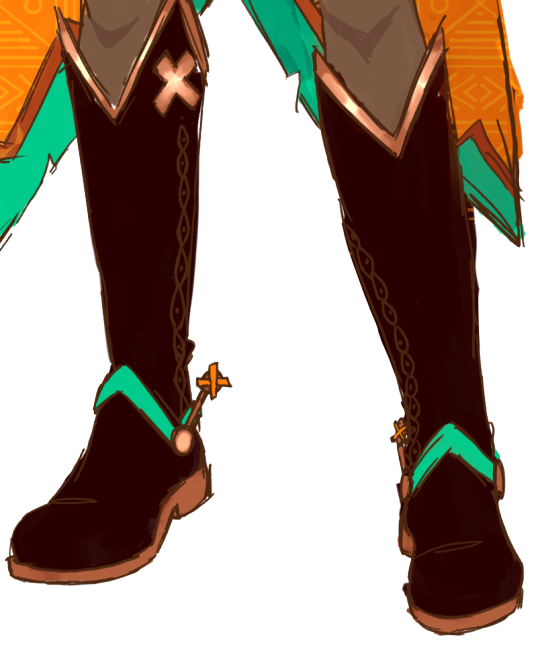
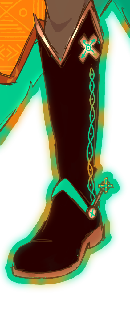
his boots, though?? i changed those a little. they just weren't cowboy enough for me, plus there was a chance to add a couple more instances of yoruba patterns to his design. i just flipped the tops up, added spurs and some stitching down the sides, and that was it.

in putting changing his main color, i also swapped the colors for the inside of his coat, and added ankara patterns on the orange part to match his tie.
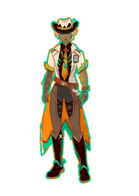
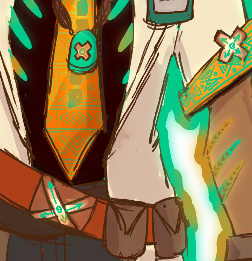
nightsoul state
upon realizing that both he and chasca (and i assume the other vision-holding members of the flowerfeather clan) have skeleton motifs in their nightsoul state, i knew i couldn't take it out entirely. since chasca's is more subtle, i just kept the ribs from the original nightsoul design and added lil' vertibrae to his tie.
i also aded ankara patterns to his sleeves as well, and highlighted the scars on his arm.
when it comes to his face, i wanted to incorporate actual yoruba face paint, and since he already has markings under his eyes in the original, i wanted to keep that too (especially since the other option was above his eyebrows which doesn't make sense since you can't see it under his hat and hair).
additionally, i put ankara patterns along the band of his hat, and highlighted cacucu's feathers, since i thought they were an important part of his new design.


on his boots, followed the lines of stitching. i also added little embellishments on the metal accents, just for fun.
closing statements
first, this was fun as fuck. second, to anybody who wants to represent a culture in a fantasy way like this? don't do what genshin did with natlan. don't take the name of our gods and give it to white ass blorbo bleebus who isn't even associated with us in any way. don't take the names of sacred items and just give them to any old thing. do your research. consult real people. be respectful. if you want somewhere to start, @creatingblackcharacters is my favorite resource for all things black character designs. read through all the lessons, i promise you it'll change the way you think about character design forever.
#merqti art <3#merqtio does fanart !!#merqtio does a redesign !!#ifa#artists on tumblr#ifa genshin#genshin impact#genshin redesign#yayyyy first ever in-depth character design post !!!!
71 notes
·
View notes
Text
Design concepts for Grian!

basically, completely overhauling how I draw him!
Design notes under the cut!
Animal: Sphinx
He's one of two people that try to hide that he has a motif (the other being Scott, but I'll get to him), so his animal traits are a lot more subtle. We only see more overt traits like his wings and big teeth through his hallucinations.
FACE/HEAD
Wide face! Very rectangular.
Generally, he has more reserved expressions that are based off his eyes.
His face/head shape is meant to resemble that of a lion, with a broad nose, round ears, and a lazy, catlike smile.
The shape of his hair is meant to resemble a bird with tucked wings, though I'm not sure how well I pulled that off!
He has lowlights in his hair that, when pulled into the "wings," makes the light and dark strands crisscross into that waffle pattern.
He doesn't have irises! It's a genetic disorder called aniridia, which affects his sight. During/before EVO he still had ~75% of his irises and wore contacts, but now he's fully reliant on his watcher abilities to see (though bright lights still affect him!).
BODY TYPE
Even mix of soft muscle and body fat. Reads as soft but can absolutely pack a punch!
Most of his bulk is around his abdomen and biceps, with a bit of overhanging fat in both areas (though we don't really see this).
Legs are fairly skinny to give a more birdlike appearance to his shape.
CLOTHES
An adapted version of business casual! Adventure casual? Business adventure?
The leather vest is mostly there for weight. It's there to help ground him when he's experiencing the wing hallucinations. Most of the weight for it lands on his back, where said wings would otherwise sit.
Leather patches on his elbows and the toes of his shoes from wear and tear (though the left one is starting to tear off again...) as well as a messy stitch on the side of his pant leg.
This outfit doesn't actually fit, but he works with it! This is his favorite outfit and he's going to make it work goddamnit!
Doesn't generally button the top button on his undershirt.
ADDITIONAL
He's the only one that sees the wings/eyes/teeth in his hallucinations! He does also see more overt versions of other motifs (so hare ears on Etho, or antlers on BigB, for example). This isn't all he sees, and episodes can induce nausea in the same way looking at a magic eye painting can make you dizzy.
He doesn't show any physical signs of injury or aging, nor does he have the ability to make lasting changes to his appearance (such as tanning, gaining/losing muscle mass, haircuts, tattoos, etc.) with the exception to this rule being, ironically, his eye bags.
Final note is that with the life series, I'm approaching the watchers through a complex trauma lens. In my interpretation, they are otherworldly and incomprehensible entities that can damage the human psyche just through small, direct interactions. Grian, after being changed into one against his will for an extended period of time and then changed back, has a very difficult time separating that experience from his own identity. The watchers themselves ARE NOT a current part of the games, but Grian uses the abilities gained from them in order to run the games. It's his way of both reconnecting with his humanity and reclaiming that trauma.
Once again, the watchers ARE NOT a part of the games in my version. References to them through Grian are either flashbacks or hallucinations.
#now to re-learn how to animate him#grian fanart#grian#trafficblr#traffic smp#traffic smp fanart#he gets some complex trauma as a treat for me myself and I#I have in fact been thinking about jinx arcane a lot and that might've spilled over into this#watcher grian#watcher grian fanart#I KNOW WHAT I SAID ABT THE WATCHERS IN MY VERSION#but technically it still applies#Krash’s animal coded designs#krash art
134 notes
·
View notes
Note
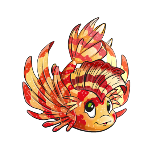
Random Neopets review: Koi
(No Neopet review requests in the inbox right now. Feel free to send if you have any.)
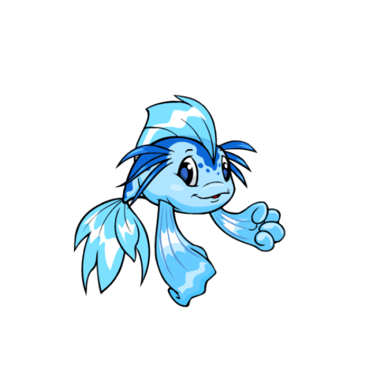
The Koi is just straight up a Koi (fish). However, as far as Neopets-based-on-a-real-animal go, I think it has enough unique elements to make it stand out—multiple whiskers up on the head instead of around the mouth, uneven fins more akin to a betta fish than a koi, and the overall body shape make it feel like a unique design. I also like their mouth shape and overall personality—they're a little cheeky and just look very friendly as a whole.
The basic colors are fine, and show pretty good color use with the spotted markings being the darkest element, followed by the body and then the fins. However, the fins are a bit inconsistent; blue has the fins pretty dark, while the other three have them lighter and with the front fins inexplicably a different color than the rest of them.
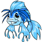
In terms of conversion, I feel like the Koi got the short end of the stick to some degree. It still looks fine as a whole, but the bizarre decision to put both of its fins into fists is super weird to me—why not just leave them, seeing as some pets can't hold items anyway, or just "cup" one of the fins like the Flotsam—and makes them look like they have hands instead of fins.
Beyond that, it also lost a bit of its personality, the shading and detailing on areas like the top fin got worse, and the markings were changed for the worse as on the old art, they hugged the eye and went down much further on the body, which gives it more contrast than the converted art. Also, the whiskers become smaller and moved back on the body, which doesn't look as natural as their original placement. Like I said, not the worst conversion ever, but it could've been a lot better.
Favorite Colours:

Royal: I quite literally just talked about these designs so I'm not going to repeat myself, but the tl;dr version is that I really like the way the designs work underwater and reference King Kelpbeard, and how both genders are equal. The pet styles are also very beautiful.
Maraquan: A Maraquan Koi sounds redundant, but this user-created design is beautiful. The lion fish inspiration is a great idea and is a good concept that works well with the Koi's pre-existing design. The colors are also stunning, and the changes to the fins are noticeable enough for it to feel unique. Only nitpick is the head whiskers feel tacked-on and probably could've either been dropped or made bigger.
Spotted: You want a Koi that's even more like a koi (carp)? We got you covered! Real-life koi are quite beautiful, so doing a color based on their standard patterning makes sense and looks as pretty as the actual fish itself.
BONUS: I have no idea how accurate this clothing is to ancient Egypt, but at any rate I really like the desert Koi. It's a simple design, but the brown contrasted with the golden accents is just beautiful, and I love the subtle lighter brown areas on the underbelly and whiskers. The clothes also look very natural (hard to do with a fish) and the way the purple gem matches the eye is just [chef's kiss]. The base colour is also lovely.
26 notes
·
View notes
Text
ok my thoughts on the veilguard character creator ✨
I TOOK NOTES, i only focused on creating my pride n joy Onan, I haven't fully fully explored the CC but i still clocked in just over 2 hours LMAO (i also didnt rly take in progress screenshots so sry </3 i foolishly wrote my notes by hand n now im typing them up bc i wanna talk abt it lol)
In order of discovery:
✨Pronouns being separate from GENDER + nonbinary options (i think i already knew this but still !!! :)))
Adjustable Height - YAY but I wish there was some visible comparison in game since it scales by percentage, like i want a tall elf/dwarf but how tall r we talking in game yk?? or a short qunari? can i get a scale for height comparison if u dont wanna give numbers for in game heights at least orz
CURLY HAIR with decent physics MWAH (wish these were organized by length or smth lol)
lighting options 👍 (finally)
INTERESTING TAKE on the skintone/complexion system, I rly liked it!! would be nice to see other devs emulate!
acne :) i'll hav to explore the complexion options a bit more but having acne options is nice!! i like when characters can look normal idk <3
(are there vitiligo options i haven't found them yet??? or is it just that one slider)
the option to remove the hair while adjusting the face/head features is GENUINELY GALAXY BRAINED !!!!!!! would be nice if utilized for adjusting the complexion too just bc after i made that mf bald i noticed a bunch of random freckles i hadnt before so :T
(what does the chin bump do, idle animations can make it hard to distinguish if anything is changing, why do some of these idle animations look like they r grimacing lol, A LOT OF SUBTLE CHANGES, not as exaggerated as I was maybe expecting tbh?)
undergarment style 👍
body proportion sliders, nice but nothing dramatic
eye height asymmetry ! lots of asymmetry options !!
hooded eyelids specifically UM, there's a slider, i wasn't super impressed w/ it but maybe it was just the preset i chose?? i was worried about like, v hooded/monolidded eye shapes not being an option but the inquisitor preset i played around with looked decent so?? maybe i need to explore it more
Heterochromia, eyebrows and eyelash options are all 👍:)
FUN COLOR SYSTEM (this note was specifically abt the hair, but its the same for p much all coloring options)
is there no way to actually adjust the lip shape/cupid's bow?? 😔
CUSTOMIZABLE VALLASLIN IS COOL (was personally hoping for dao's tats to be an option but that's for my own specific machinations lol i think regional vallaslin/different takes is rly cool !!! like the way dialect changes over generations/locations YK???)
body tats r also cool, i think they could have included some vallaslin specific ones??? esp since theyre confirmed slave markings and we see how detailed fenris' are it stands to reason traditional vallaslin would follow the same pattern but OH WELL
scar options and customization !! being able to adjust the color and intensity is a nice touch
✨✨✨TOP SURGERY SCARS :)))) only the one option but 1) it's there and 2) it is specifically titled Top Surgery scars <333 (i feel like volition was SO CLOSE with the "surgical scars" in SR22 but they were just too scared to fully commit and left it vague, so for bioware to pull the trigger ITS NICE a step in the right direction 🥰)
OUTFIT PREVIEWS WHEN CHOOSING CLASS AND THEM CHANGING BASED ON FACTIONS IS SICK!!!!! (also seeing the differences between Aspirational Armor, Casual, and Starting Armor is sooo smart tbh)
love the previews when choosing a class!!! combat looks v fun!!! idk how i feel abt the warriors lmaooo they seem sooo. anime-y? Also Death Caller (drain life from enemies? ok) aka socially acceptable blood mage ig ??? 😒 bring back problematic mages !😑) all the rogue subclasses looked cool bc its the best class next question����
backstories and factions seem really fun and cool, the faction passives are sick but EYE PERSONALLY still dont think i would compare it to origins. maybe my opinion will change once i play !
Voices. 😐 crawling-in-my-skin.mp3. I am NOT a fan of voiced player characters and i wish it could have been an option to just. not be voiced! (like WHYYY am i an antivan crow without an antivan accent UGHHGHGUGH🤮 GET AWAY FROM ME) u can make the voices slightly deeper ig. 😒
no tapestry !! no offense it was a cool system but soooo tedious! i appreciate inquisition's history being streamlined like this (which means fuck u to dao/da2 ig?? LMAO NEWAY im guessing no kieran?? n no after effects from the well of sorrows??? 🤔🤔🤔)
Inquisitor prosthetic 👍
oh my god i cant find any of the screenshots i took of my son fuck my entire stupid gayass life bye.
0 notes
Text
🗝️🏷️trafficking, RAMCOA in medium detail, child abuse, active threat, and more!
I have information I need to spit out before it gets cycled through, but I can’t think well enough to make it generally useful. Uhm. Words.
- it’s so hard to comprehend language rn. We have longer running programs built to stop us remembering or sharing secrets, but also we are being cued. I can’t tell what they know about what they’re doing, but every time I turn around at least one of them is staring. I’m sitting in a locked bathroom because they are always right there
- the grandparents know more physical cues than our immediate family, and they’re super touchy and insistent on sitting across from us. It’s not those things alone that are weird, but in combination with the effects their gestures have it seems off. The cues aren’t all impossible to replicate unintentionally, but it would be damn hard to use them in a row or in regular speech.
- they know too much, but also not enough. Our mom talks to them about everything, regardless of what we ask or if she says she won’t. There are some things, like abuse incidents they supposedly weren’t there for, that they bring up details about. Usually with another cue, but idk why they’re tying them like that, I don’t think we connected them before. They also get confused about events we know they were there for or told about, and sometimes they follow it up with a forgetting or innocence cue. They’re old, but they’re the type to point at houses and talk about specific parties thrown there or quirks the occupants had.
- they’re very nice until they’re not. I actually think this is mostly cultural. They don’t talk bad about anyone until they leave the room, they speak politely even when they’re throwing slurs, they use perfect table manners and volunteer to help around the house. We fought with them today about whether sex and labor trafficking of children was okay, and they think it is. We feel so bad about cutting them off until they start talking about how different races are the downfall of the country. Again, they are just conservative old white people.
- our parents are dissociative. We weren’t sure if it was alters or just memory and state change before, but they respond to certain cues with switching and pick up different accents and behaviors based on the cue. Key word is cue, cause we thought maybe it was just social interaction until we saw them respond to a more obvious cue, and then a few more subtle ones.
- the trafficking conversation. Some of us fight with them a lot just because we aren’t part of the same group anymore and wildly expanded our vows since then. I think most people know sex trafficking is bad? The physical labor might be a generational thing, but both explain some of our trauma with them. They legit don’t think sexual abuse is bad. Or hitting, or slavery, or torture. A lot of the dangerous stuff is plainly traceable to their everyday beliefs. Not exaggerating or bending words either, they either used those words or their dictionary definitions.
- ways they’ve cued us, in minimally triggery wording; uncommon foods, uncommon touch patterns, direct quotes of media used to structure our system, uncommon hand shapes and gestures, situationally inappropriate body language, object pairing to produce trained responses, references to training events, word salad of cue words that makes no outside sense, muttering cue phrases from directly behind or next to us, holding hands up to deliver cues, tossing cue phrases into conversation to achieve desired effect, etc.
- they mentioned and named the religious groups we were trafficked in without prompting. No driving nearby, no ongoing conversations, no related objects in the proximity, I don’t know why they brought them up. In the same vein, they keep talking about corporal punishment and commenting on people’s outfits. No point, no prompt, just to bring it up. We came into the room our whole family was in and they were talking about how different races were better because they disciplined their kids harder, then started making racist comments about the groups they were talking about.
- our family all start using language and cues they usually don’t, which might still be normal, but it was really sucky to not only have the misgendering and misogyny, but also the comments about Asian people from our half Asian father. They regress past years of dragging them out of toxic beliefs to make the grandparents smile. It’s not DID related, but I still hate it.
- we have suicide, sh, forget, denial, crazy, and other programs running now from cues they used. The grandparents don’t cue for funsies like the rest of our family, but they do it as often. If we didn’t have the knowledge we do now, we wouldn’t be surviving for the next school year. Thinking back (read: looking at journals), our last big suicide attempt was right after the car ride home from their house. We’d been clean for almost a year, unless I’m thinking of the wrong attempt. There were multiple, at least two within a day of leaving their house.
I’m scared. We lock the doors when we sleep near them and set up items to tell if we’ve been active without remembering it, but the most I can do is talk to friends in case the worst happens. It looks like we won’t die from torture, so there’s a sliver of hope. We’re gonna deal with consequences later, but Im hoping the last forget and sleep cues cover my tracks some. I hate it here. That’s all I’ve got.
#did osdd#dissociative identity disorder#traumagenic system#actuallydid#ramcoa#tw ramcoa#osdd#did system#polyfragmented system#osddid
8 notes
·
View notes
Text
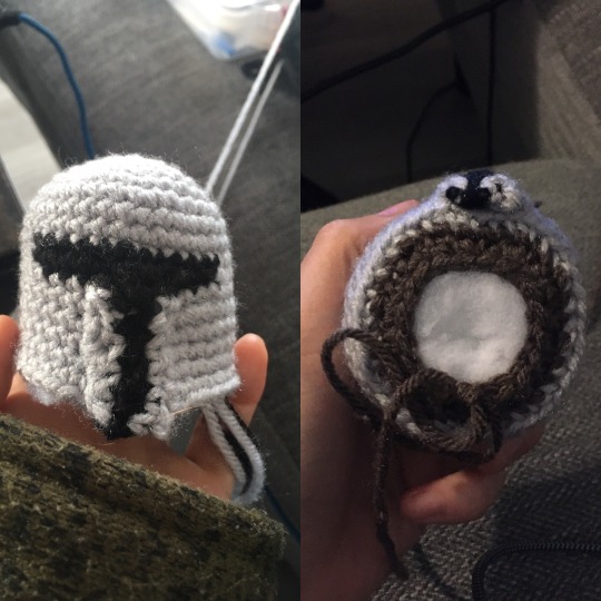
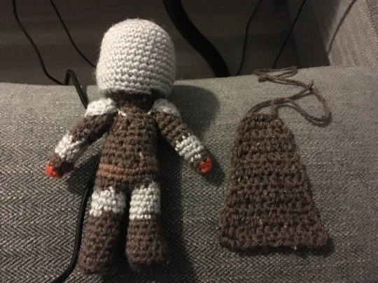
The Mandalorian Pattern
Ok! Here is my original crochet amigurumi pattern for the Mandalorian, to go with my other yarn creation, Baby Yoda. As before, if you use this pattern, please link back to my page, and tag me or send me a picture! I will slam that reblog button so fast! Or tag me on insta: @ erin.gurumi
Fun fact: this isn’t my first time around Mandalorian armor... In 2013 (!) I crocheted my friend a Boba Fett amigurumi, which you can see HERE and HERE. I improved the pattern a bit, but I did want to share because there are some in-progress pics which could potentially help, as I’m unfortunately not the best at taking them while I work!
Technical stuff: I used a 3.0 mm crochet hook and these yarns:
Loops and Threads Impeccable in Walnut Tweed (body and cape)
Red Heart Super Saver in Cafe Latte (belt and bandolier)
Red Heart Super Saver in Light Grey (armor)
Red Heart Super Saver in Black (visor)
Red Heart Super Saver in Carrot (gloves)
I was really happy with the brown color I found for the body (this project was the first time in YEARS I’ve actually opted to increase my stash and it was worth it!), but I think there is plenty of room to experiment with other colors!

^ Helmet
I think it was such a bold choice to go with uncolored metal for the Mandalorian’s armor! It’s very hard to simplify and not be evocative of medieval knights or Trojan/Spartan warriors... In this picture, you can see I made a short strip of grey yarn that I thought could be the seam down his helmet, but I decided it just didn’t work for my scale.
6 sc in a magic circle
inc 6x to make 12 stitches
(1 sc, inc) 6x to make 18 stitches
(2 sc, inc) 6x to make 24 stitches
(3 sc, inc) 6x to make 30 stitches
(4 sc, inc) 6x to make 36 stitches
2 rows of 36 stitches
1 row of 36 stitches, with 12 black stitches in the front
1 row of 36 stitches with 12 black stitches aligned with previous ones
4 rows of 36 stitches in grey
1 row of grey, add two increases at the front (38 stitches)
1 row of 38 stitches
I found it easiest to eyeball where I wanted to start the black yarn for the visor, rather than count out how many grey stitches before the color change. At the end, leave a tail but don’t pull the loop through, since changing to the brown yarn for the under helmet part will be a color change.
^ Front visor section and bottom of helmet:
Before closing off the helmet, I made the front separately and sewed it on - I think that’s much easier than trying to do color changes in each row and keeping them nicely lined up, plus, it gives the helmet just a bit of texture that I like to imagine gives the suggestion of some contours.
6 foundation single crochet in black
turn, 6 sc in grey, tie off leaving a tail
reattach grey yarn to other side of the black, 6 sc, tie off
sew onto helmet
To close off the helmet, change to the brown yarn, and for the first row crochet only in the back loops to make a sharper change between the helmet and the underside (neck?) area. I was not super precise with this part, as all I wanted was for the underside to be mostly flat.
(2sc, dec) ~9x in back loops to make ~29 stitches
(1sc 1 dec) until closed (stuff part way through)
tie off and weave in tail

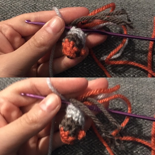
^ Legs (make 2)
To make the feet look more boot-like, I did all the foot-to-leg decreases on one side, but most of the shape comes from just smooshing it with my hand. Also, I tried to evoke his one larger armor piece by having an extra row of grey on his right leg, but it ended up being a bit subtle. (I know his armor is only on the front of his legs, but I didn’t want to color change that often in such a small space, and the back of the leg is hidden enough by his cape that I don’t mind!)
6 sc in a magic circle
inc 6x to make 12 stitches
(1 sc, inc) 6x to make 18 stitches
1 row of 18 sc in back loops
(decrease 8x), 2 sc to make 10 stitches
6 rows (his left) or 5 rows (his right) of 10 stitches in brown
color change to grey in back
3 rows (his left) or 4 rows (his right) of 10 stitches in grey
For one leg, tie off the tail, for the second leg, make sure that the loop is still available to start the torso section. (I chose which leg to begin the body based on the direction I was crocheting, for me it ended up being HIS right leg). Make sure both legs are stuffed!

^ Torso:
The torso is made by connecting the two legs with a round of crochet. I started with the brown yarn, switched to a lighter brown for the belt section, then for the breast plate unfortunately it’s just a bunch of color changes! My best advice is to keep securing and tying off ends as you go, and stuffing as the body gets taller.
On right leg, color change from grey to dark brown, chain 1, slip stitch into left leg, sc around both legs (~20 stitches - if it ends up more, just decrease in back to that)
another row of 20 stitches in dark brown, color change to light brown
2 rows of 20 stitches in light brown
(1 dec in the back) 7 grey in front, 12 dark brown in back (19 stitches)
7 grey in front, 12 dark brown in back (19 stitches)
(1 dec in back), 6 grey in front, 12 dark brown in back (18 stitches)
6 grey in front, 12 dark brown in back (18 stitches)
(1 dec in back) 5 grey in front, 12 dark brown in back (17 stitches)
5 grey in front, 12 dark brown in back (17 stitches)
(1 dec in back) 4 grey in front, 12 dark brown in back (16 stitches)
(1 dec in back) all dark brown (15 stitches)
(1 dec in back) all dark brown (14 stitches)
Finish off and leave a tail to sew the head on.
^ Arms (make two):
I was really happy with my decision to make his little orange mitts - for such a simple costume with very little ability to emote, those gloves really help to draw focus on small gestures!
6 sc in magic circle in orange, color change to brown
1 row of 6 stitches in brown
(inc, 2 sc) 2x to make 8 stitches
Take one tail of the orange yarn and thread it through to the second brown row, chain 3 and loop it over, securing it back into the brown yarn to make a thumb
Change to grey, 4 rows of 8 stitches
Change to brown, 5 rows of 8 stitches
Stuff and finish off leaving a tail.
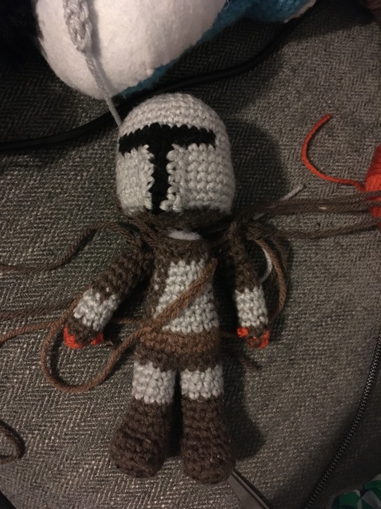
^ Bandolier / Assembling body:
Sorry he looks a little dismembered here... but at this point you’re almost done!
For the bandolier, in light brown, chain ~9 (I just measured it across his chest plate from belt to shoulder)
Tie off the end and pull both tails through the body, making it snug against his chest, tie off and weave in ends
Sew head onto body using the tail from the neck, weave in ends
Sew arms on leaving a little room between them and the head (so his pauldrons will fit!), weave in ends
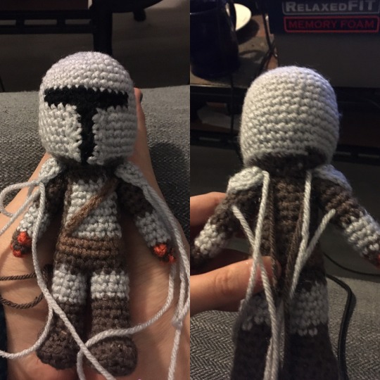
^ Pauldrons
These are simple! Make two!
6 sc in a magic circle
(sc, inc) 3x to make 9 stitches
To attach them, since I liked the look of the stitches sitting freely on the arms, I took the tail from the center and sewed it through the arm, then used just a single stitch on the upper arm and lower arm to hold them in place.
^ Cape:
A lot of the taper on this cape was because I was accidentally dropping stitches at the beginning of each row - I am terrible at crochet when it isn’t in the round! I used half double crochets since I like how they make a slightly looser texture than the body. You can also see here why I try to color change in the back - it doesn’t end up looking super even!
foundation single crochet 14, turn
1 row (14 hdc, turn)
9 rows of (1 dec, hdc across, turn)
This got me to approximately 5 stitches across, which looked like a good size to fit between the shoulders. I took the other tail and wove it up the side until both tails were coming from the top of the cape. Tie off the end and sew onto the back of his neck!

I know that was a lot! As always, feel free to ask me questions if you get stuck or something doesn’t make sense, since it’s very possible I made a mistake in my write up! Best of luck crocheting your very own Mandalorian! I hope to see him and his partner in crime Baby Yoda off on many adventures together!
#amgiurumi#crochet#pattern#freepattern#themandalorian#mandalorian#the mandalorian#mando#dyn jarren#dynjarren#pedro pascal#pedropascal#babyyoda#baby yoda#yoda#star wars#starwars#disney#mandadlorian#tw long post#free pattern#din djarin#dindjarin
1K notes
·
View notes
Text
Two Halves of a Whole | 3: Consequences (Vergil x Reader)
Vergil has a score to settle with you, my dear reader. He just can’t let you have a victory in anything, but that’s hardly surprising, is it?
This is one of the last shameless smut-y chapters, cause the story is beginning to take shape and, lemme tell you, fluff and cheese abounds.
Word Count: 2528
Warnings: Strong Language, Sexually Explicit Content, BDSM/Bondage
They say every action has consequences and you were never more aware of that fact than you were in that very moment.
Vergil was leaning over you, one hand clasping your wrists together above your head, the other tracing agonizingly slow lines over the fabric of your underwear. He’d been at it for what felt like an eternity and every nerve in your body was crying out for him to just fucking touch you already.
But, he wasn’t going to. Not yet. This was your payback for everything you’d put him through.
“Please!” you groaned.
You lifted your hips toward him, which only prompted him to move his hand further away.
“Shh,” he hissed, his breath tickling the outer edges of your ear. “I’m not finished warming you up yet.”
He pressed his fingertips against your clit for just a second before continuing his teasing, gently nibbling your ear and trailing kisses down your neck. This was the most he’d touched you since he’d begun and you found yourself overwhelmed as pricks of pleasure spread throughout your entire body from the points of contact, gathering near the base of your spine.
You were already aching for him. How did he always manage to do this? He knew your body so well, zeroing in on your weak spots without you even needing to say a word. This was both a blessing and a curse. On the one hand, he could bring you pleasure unlike anything you’d ever experienced before. But on the other, he knew exactly when to stop at the point that would torment you the most, right when you were about to go over the edge.
He was definitely using the latter to his advantage at the moment and you weren’t sure how much more you could take.
“You want me to touch you?” he asked. “Beg for it.”
The growl in his voice sent a delicious chill down your spine and you squirmed beneath him, trying to pull your wrists from his grasp in an attempt to defy him. He was so cocky and it annoyed you the extent to which it was justified.
Your attempt was fruitless but, deep down, you had known it would be. He was so much stronger than you.
“Please!” you mewled again.
“Not good enough.”
His grip around your wrists tightened just to the point of pain and you moaned.
“Vergil, please,” you tried again. “Please, touch me.”
“Where?”
He was really gonna make you say it.
“I want your fingers inside me!”
Your face grew hot under his scrutinizing gaze as you waited for his response.
“Better,” he said.
His mouth was never far from your ear, which he knew was a very sensitive spot of yours, and the feel of his breath against it brought with it a brand new wave of goosebumps.
In accordance with your desires, he finally slipped his hand beneath the waistband of your underwear, brushing his fingers against your entrance before slipping them just inside.
He continued to hold them there, eyeing you expectantly with a smoldering gaze.
He was waiting for you to direct him again; you didn’t need him to say it this time in order to figure it out.
“Deeper,” you said.
“You’re going to have to be more specific.”
You huffed. As soon as he released your hands, he was going to pay for this.
“I want your fingers deeper inside me.”
He smiled and, for just a second, there was a flash of genuine affection, but it was gone just as quickly as it had appeared.
Once again, he obliged you, sending his fingers straight for your most sensitive spot, and you couldn’t hold back a cry as he began to massage it with his fingertips.
“Does that feel good?” he asked.
“Yes!” you gasped.
There was no point in playing coy anymore. You knew he was going to keep forcing the truth out of you whether you wanted to release it or not.
And so, you gave up for the time being, your head falling back as he continued to thrust his fingers in and out of you.
He pressed his thumb against your clit and began to rub it in perfect sync with his other movements. The relief you felt was instantaneous, only to be followed by an even more intense sense of longing.
How long was he going to drag this out? Even as he picked up his pace a bit, you could tell that he had no intentions of actually letting you cum just yet.
Confirming your suspicions, he removed his hand and reached down to the floor beside him to pick up the black vibrating wand that had become so infamous between the two of you.
That was what had started all of this in the first place. He'd been helping you tidy up your room and, next thing you knew, he'd found your favorite toy tucked beside your mattress and was threatening to torture you with it.
This was your punishment for stealing his dignity with it, he'd said.
He looked you straight in the eyes as he switched it on and placed it between your legs, tracing the same pattern his hand had been following moments before.
“How does it feel to be so powerless?” he asked. “Completely at the mercy of my touch?”
You looked up at him through half-lidded eyes and smiled.
“Pretty good,” you said.
You had begun to grow used to taking on a more dominant role, so you had to admit that this made for a nice change of pace. But as your eyes scanned the length of his body, which was still looming over you, you suddenly got an idea.
You had to keep your movements subtle to keep him from noticing, moving your right knee ever so slowly until it brushed against his erection, which had become quite obvious from the way he was positioned.
He gasped and flinched away, his grip on your wrists loosening just a little.
“Don’t do that,” he said.
You noticed that his growl had lost a bit of its edge as he scolded you.
“Maybe I’m not as powerless as you think I am,” you said, your smile growing wider.
He repositioned himself so you wouldn’t be able to repeat the action.
“Quiet,” he hissed.
You wiggled your wrists again, hoping to take advantage of his distracted state, but he held them fast.
He turned up the setting on the wand and you cried out at the sudden intensity. Your body began to jerk around of its own accord as he focused the tip of it on your clit and held it firmly in place.
“Your voice sounds so beautiful when you scream for me,” he said, and the sound of his voice sent a powerful surge of pleasure coursing through you.
He was so good at this. No matter how much of an upperhand you thought you’d managed to gain, he always reduced you to a quivering mess in the end.
“Let me hear it. Let me hear how good it feels.”
You bit your lip and a whimper escaped from between your clenched teeth. You’d shut your eyes quite some time ago, but apparently, his voice was all you needed to send you over the edge.
And just when you were about to get there, he pulled the wand away. How did he always know?
Your muted sounds of pleasure were replaced with an exasperated groan.
“Don’t hold yourself back,” he said.
“I won’t!” you cried.
“You promise?”
“Yes, I promise!”
You could still hear the wand buzzing in his hand and the anticipation forced your eyes back open. The sight of him above you, lips slightly parted, his eyes focused intently on your face had you aching all over again.
“Alright,” he said, and he pressed the wand back where it had been.
This time, you made no attempt to restrain the sounds that spilled from your mouth. Before, you had been concerned about frivolous things, like embarrassing yourself in the event that the neighbors heard you through the wall, but now your only concern was finding your release.
He upped the intensity again and your legs began to tremble. Your first instinct was to try and hold them still, but then you remembered that such things were no longer allowed.
“Oh god!” you cried.
You’d never set it this high when you’d used it on yourself and found that it was always right on the cusp of being too much for you.
“Tell me when you’re about to cum,” he said.
It briefly crossed your mind that he may have only been asking this of you so he could deprive you again, but the thought didn’t stick around for long. It was impossible to focus on much of anything as your senses had been entirely overtaken by the pleasure you felt.
“Say it,” he said.
You struggled to find your voice, but eventually managed to force out a squeaky, “I’m gonna cum!”
You felt him smile against your neck and he whispered, “good girl.”
With his praise still ringing in your ears, your entire body began to shake as a powerful orgasm overtook you. Your legs jerked from side to side and you felt the urge to try and pull away from the overwhelming vibrations, but he somehow managed to hold the wand firmly in place throughout.
Just when you were sure you couldn't take anymore, the sensation began to subside and your body finally relaxed.
He switched off the wand and released your wrists.
“Holy shit,” you said, running a hand through your sweaty hair. “That was really intense.”
“I’m not done with you yet,” he said, and your heart started to race again.
He tossed the wand onto the floor and leaned over you until his body was just about flush with yours.
“I can’t just let you go after you got me so riled up.”
You were beginning to feel the stirrings of arousal again already and you were surprised that your body still had any energy left.
“That’s not a fair accusation,” you said, tangling your fingers in his hair. “You made me do it.”
He took your face in his hands and began to kiss you, not even attempting to hold back his fervor any longer.
Apparently, he had been holding back quite a bit.
He eagerly licked at your lips and you were more than happy to allow his tongue into your mouth. It felt so good to be able to kiss him and touch him again, and the act of doing so brought with it a strange sense of relief.
You slipped your hands beneath his t-shirt and he managed to pull himself away from you just long enough to remove it and discard it onto the bed beside you.
“Are you ready?” he asked, and you nodded.
He lifted himself off you again and finally pulled your underwear all the way off, then undid his pants just enough to release his erection.
He was rock hard, but you never would have guessed it based on the way he had been acting. You would have to figure out his secrets for maintaining his composure so well if you ever hoped to get the upper hand on him again.
He lowered his body back onto yours and slowly eased inside of you, causing you to shudder. You were still a bit sensitive from your last orgasm, but it took you only a few moments to adjust.
“I’ll go easy on you,” he said. “This time.”
You were about to tell him that he didn’t have to do that, but your body reminded you that you needed to take it slow as another shudder rippled through you.
“Probably a good idea,” you said.
His thrusts were gentle, but it was apparent that he was exerting quite a bit of effort to hold himself back.
He placed his hands on either side of your head and your hands made their way into his hair again, which was already beginning to fall out of place.
“I’m not gonna tease you this time,” he said.
“You better not,” you said.
A particularly deep thrust made you gasp and you could already feel yourself building to another orgasm, though not quite as intensely as before.
“Right there,” you breathed.
He did it again and your body tightened.
“Like that?” he asked.
“Yes. Just like that.”
He continued like this, pressing his lips back to yours, then moving them down to your chest and peppering it with light kisses.
It was always so thrilling when he dominated you, but you also loved moments like this. It wasn’t often that he chose to show his gentler side, so it was always a treat when you got to experience it.
Though, it had been happening more and more frequently as of late, you’d noticed.
You wrapped your arms around him and pulled him in closer, burying your face in his neck and kissing just below his jaw.
You pulled your lips away and moaned softly against his skin as you came for the second time that evening. Instead of being as explosive and all consuming as the last, this one was soft and steady, leaving a deep sense of satisfaction in its wake.
He leaned over and kissed your cheek, then pulled out of you and came onto your stomach, which was still unfortunately covered by your shirt.
And then, just as you’d begun to relax into post-coital bliss, you heard an unexpected sound just beside your ear: the tearing of fabric.
Your eyes flicked open and you turned toward the source of the sound to find that he’d torn a small hole in your bed sheet with his fingers.
You cocked your head to one side, giving him a weird look.
“Hey,” you teased.
“Sorry,” he said.
“You ruined my shirt and my sheets. Unbelievable.”
You smiled up at him and he smiled back.
“Well, I can remedy one of those two, at least,” he said.
He removed your shirt, then went to lay down beside you, pulling the blanket up over both of you.
“That wasn’t too much, was it?”
You were exhausted after all of that, but it was definitely the good kind.
“No,” you replied. “Not at all.”
“Good.” He wrapped his arms around you and pulled you in to his chest. “As you know, I don’t have much experience in these matters.”
“You keep saying that, but I can never tell.”
“That’s very flattering.”
“It’s the truth.” You nuzzled his chest. “You’re amazing.”
He said nothing in response to this and you were quite sure you’d embarrassed him.
“Let’s get cleaned up,” he finally said.
"Don't forget, we still have to finish cleaning up the room," you shot back.
"Later." He stood up from the bed. "I'll go run you a bath."
You watched him disappear into the bathroom and shook your head. You weren't sure what he had in mind for you next, but what you could be sure of was that you weren't done facing your consequences just yet.
96 notes
·
View notes
Text
Hi!! I’ve just spent way too long writing down a probably excessive amount of worldbuilding for Jevin’s species in @martuzzio‘s hermit space outlaws AU!!! Disclaimer: I pulled everything scientific-sounding in this post straight out of my ass. Also I’m pretty sure I contradict things that have been established as canon at at least a couple points. martuzzio, please feel free to take this or leave it, or only take part of it, whatever you like. I just got hit by worldbuilding inspiration! And I had to get it out!!
History of Slimes!
Modern slimes’ ancestors were simple, non-intelligent slimes a lot like the Minecraft ones. Jevin’s species (the only intelligent species on the planet) is specifically descended from cave dwelling slimes, but there were also species that lived aboveground in damp environments such as swamps.
Ancient slimes needed very damp environments in order to survive. (Even the ones that lived aboveground were nocturnal, because direct sunlight could be deadly to them!) Modern slimes, including Jevin’s species, are much much more resilient than their ancestors, though hot and dry environments are still bad for them. This change came about because of a mass extinction event that killed most ancient slime species as well as most other life on the planet!
Slimeworld used to be a very wet place, but several million years ago, something happened to cause a planet-wide drought. The evolutionary pressures of the drought are what eventually led to the rise of Slimes as an intelligent species - before then, there was no intelligent life on the planet.
The cause would have to be unnatural, because I'm pretty sure there’s no natural way for a planet to just lose all its water. So I think some advanced spacefaring species came and drained most of the water off of Slimeworld for some reason. Why? Who knows, they’re probably all dead now.
This catastrophe left almost no habitats for slimes to live in. The surface-dwelling species almost all died immediately, with only a few hanging on in obscure corners of the world. The ones in the caves were a little safer, but not for long, because the devastation wasn’t just limited to slimes!
The extreme damage to Slimeworld’s environment killed off most life on the planet. The ancient cave slimes thrived for a little while! Dead stuff falling into caves from above had always been their main food source. But eventually the fallout of the drought settled and the famine hit them too.
Food was scarce and it wasn’t coming to them anymore. Anything that wanted to eat on this new world needed to be able to survive and ideally travel long distances in the harsher climates of the outside world. Most cave slimes couldn’t do that, so most cave slimes died off. But a few had mutations that let them do just well enough to survive. Those were the ones that evolved into Jevin’s species!
Ancient slimes spent a long time hanging around cave mouths, rolling out at night to find food and retreating back during the day. The ones that got the furthest and still managed to make it back were the most successful. The first big break of the Slime species in terms of intelligence was when they started carrying their shelter around with them instead of having to hide every day.
That’s right: the first human technology was sharp stick, but the first Slime technology was leaf hat.
Physiology of Slimes!
Ancient slimes started out pretty much the same as slime molds here on Earth. They were colonies of individual organisms that all acted together like a single body, but could survive just fine on their own. However over time they evolved to become more and more dependent on the colony, and the cells became more and more specialized. Now they’re something in between a colony and an individual! Each cell of their body is technically a different organism, but they can’t function outside of the colony. Also, each colony does have a single consciousness, they’re not hiveminds.
They evolved like this because in the harsh environment of the drought, a single cell would die in minutes. A colony could retain moisture for much longer! The fact that colonies were now staying together all the time let them start to evolve more internal organization, which led to the evolution of intelligence!
Slimes are very structurally simple. A slime is made up of a jelly-like mass and a more rubbery, less malleable core.
The jelly layer cells have a unique structure - under a microscope they kind of look like sea urchins, but with long flexible tendrils instead of spines. The way they tangle and cling lets the slime hold together and keep its structure instead of melting!
The tendrils also act as transmitters and receptors for the electrical signals sent out by the slime’s “brain.” Each cell is in constant communication with all the cells around it, which is how a slime moves and controls its body. They also pass nutrients to each other based on chemical signals!
However the structure of these cells means that they lose water very easily. In hot or dry environments, the tendrils of the cells retract to reduce the amount of surface area that water can escape from. This means they don’t cling together as easily, and the slime “melts.” Enough time in its melted state and the cells start to die because nutrients aren’t being passed around the body like they should be.
The jelly-layer cells are all pretty much interchangeable. They’re also very adaptable! When exposed to open air, jelly cells lock up their tendrils and partially dehydrate themselves, passing the liquid back into the mass of jelly behind them. The result is the thin, rubbery “skin” of a slime’s body. This was the most crucial adaptation that allowed modern Slimes’ ancestors to survive the drought, since it drastically improves their ability to retain water.
The core cells are different, more structured. The core is a slime’s brain. If most of a slime’s body is like jelly, the core would be like stringy algae. It’s still very flexible and malleable, but if it tears or breaks, that damage can’t just be healed by squishing the parts back together. The brain is usually kept scrunched up safely in the middle of the slime’s body, and there’s a dense layer of more rubbery jelly surrounding it.
Slimes can digest almost any organic material, but a lot of the life on their planet evolved to be toxic to them, and if something is toxic to slimes you better believe it’s toxic to most everything else. There are a lot of really weird toxins native to Slimeworld!
Culture of Slimes!
First I’ll just copy/paste the ask about Slime fashion I sent to martuzzio a while ago since I am still enamored with it:
idea: since they're blind, Jevin's species's fashion is entirely based around the vibrations they make when they contact whatever surface they're moving on. you pick up different materials or combinations of material depending on what "look" you're going for and hold it on the outside of your body. they could use all kinds of material for this - cloth, metal, powders, whatever. you arrange different items in patterns on your surface to create different "outfits" (soundscapes) of vibration. the more complex the pattern, the fancier and more formal the "dress." this stuff makes it a bit more difficult to move since it reduces their traction, and it also takes effort to maintain more complicated "outfits", so dressing up is really only for formal situations or showing off. casual dress is keeping just a few things you like the sound of on your surface, and it's also perfectly acceptable to wear nothing at all. of course this all looks really weird to people with eyes.
Slime language doesn’t just involve sound. It also incorporates chemical signals (which give a sense of the slime’s mood and fulfill the same function as body language does for us humans) and touch. Two slimes having a conversation will press tendrils of their body together and communicate with something like a cross between braille and sign language. This is actually the main component of their language - sound is kind of secondary. It’s impossible for a non-slime to “speak” the slime language without the help of technology, and slimes can’t make the range of sounds that humans do with their vocal cords. Fortunately they can hear at least as well as humans and using a soundboard to talk is pretty intuitive for them!
Most slime cities are either underground or underwater. The oceans of Slimeworld are pretty densely populated! It actually led to a lot of environmental problems in the Slime species’s history, because there isn’t a ton of ocean left to live in. A lot of aquatic animals on the planet went extinct during the slimes’ industrial revolution a thousand years or so ago.
Slimes obviously don’t have visual art since they’re blind. Some of the main art forms of the species are perfume and culinary art! Because of all the stuff on their planet that’s toxic to them, slimes evolved a very keen sense of taste/smell. They can detect minuscule amounts of a chemical. Most other species can’t appreciate their art because their senses aren’t fine enough to pick up on all the subtle flavors and smells! Also slimes’ ideas about what tastes and smells good can be... eccentric.
They also do sculpture and music. They have some really awesome musical instruments because they can shape their body to whatever shape it needs to be to use the instrument!
Personal space isn’t really a thing in slime culture. Their language requires being in constant contact to speak, so casual touch with strangers isn’t just normal, it’s the polite thing to do. If there’s a group of slimes in a room, each one is pretty much always touching at least one or two others. Blobbing together is natural for them!
...aaand that’s all I got for now, because it’s 4:30 AM. I hope this is coherent because I didn’t really edit it! If you have literally any questions at all please let me know! because there are certainly details that didn’t make it in here!!
#martuzzio#space outlaws lore#hermitcraft#worldbuilding#slimes#ijevin#I don't even watch jevin... I just really like worldbuilding and I love this au......#and now it's almost 5 am help me
90 notes
·
View notes
Text
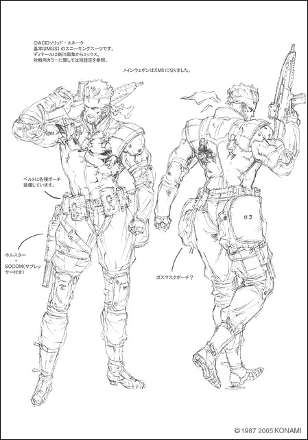
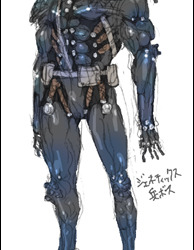
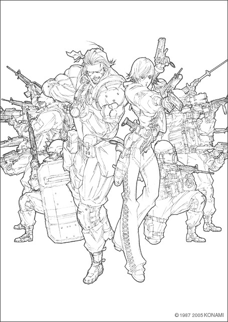
Tsubasa Masao on Metal Gear Acid character designs
Source: Postscript of MGA (waybacked)
The following is a translation of five blog posts made by Metal Gear Acid character designer Tsubasa Masao for the now-defunct “Postscript of MGA” blog, where he provides commentary on the designs he provided for the game. Most of the images were thankfully preserved by the waybacked version, except for the ones on the fourth blog post, which were taken from the still active gallery page from the official Metal Gear Acid 2 website. I’ve moved Tsubasa’s commentary of Snake’s main weapon of choice in MGA into the first section regarding for better flow and also added a model sheet of Snake from MGA2′s official gallery, since the sub-section looked odd without any images..
Solid Snake
The first thing we talked about Snake was wanting to change the impression that people had of him up until now, which resulted in the long-haired Snake we see in this game. Thinking about it now, perhaps it was better if we had kept usual hairstyle. As for his costume, we decided at the earliest stage to keep his usual sneaking suit from previous games, so it is what it is.
We had a request from Mr. Shinkawa to make the XM8 into Snake’s main weapon in the game. It’s a gun with quite a unique appearance, as you would know if you had seen the original. On the illustration we added a lot of over-the-top extra parts to the gun, but in retrospect I think it would had been better if we had left it as it is.
Teliko Friedman
Teliko was the first character we designed for Metal Gear Acid. Since even the scenario was still in its tentative stages, I couldn’t quite grasp an image for her yet.
For the face I was told to make her look like a “female Rambo or something like an Uma Thurman type.” I wasn’t too crazy about doing a female Rambo and wondered about what I should do, which is how I ended up with the design we’re seeing here. I was conscious of Uma Thurman’s role in Pulp Fiction at the time. She had a sort-of coquettish feeling, don’t you think?
Since I don’t like loose-fitting military clothing, I decided to make her silhouette tightly around her body. Afterward, I thought about the character’s stance and came up with the sneaking suit style.
A new-type of sneaking suit.
Built-in muscle strengtheners in one part that increases speed and strength.
A new-type of bullerproof inner wear made by the U.S. Army. Protective clothing consisting of aramid fiber soaked with polyethylene glycol.
And so on.
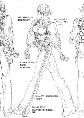
Model sheets for Teliko Friedman. There are gimmicks not shown in the game such as stun knuckles and muscle strengtheners.
I wanted her gun holster to flutter on her character model’s hip while she moved, but we abandoned that due to the small screen size of the PSP unit.
As for the coloring, since she was being paired with Solid Snake, we decided to dress her in a brighter color to contrast with Snake’s black sneaking suit.
Teliko was designed to be a very typical heroine, so we thought it would be best if she didn’t have too many idiosyncrasies.
What do you think?
Roger McCoy
He’s the character who supports Snake and Telico in this game. We wanted him to have a very different outward appearance from Colonel Campbell.
We experimented with various patterns such as an elderly version of Roger or a black version of Roger, before we settled on the finalized design.
We didn’t have any particular aim with his concept, but we thought it would be better if he was more intense than previous versions of the Colonel character.
Afterward, I wanted his silhouette to have a peculiar characteristic, so I decided to give him a crippled leg and a cane to walk with. (I don’t know if this is reflected in the game though).
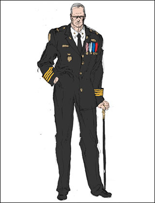
Rough sketch for Roger McCoy. Instead of a suit, he originally wore a military uniform.
Alice Hazel
I was ordered to make a pretty girl with ESP abilities. I was told that she has a personality that clashes with Snake’s, so I drew her in a sassy matter, but then I changed her to be more unemotional, or rather coldhearted.
For her attire I thought just having her wear a school uniform would be too plain, so I gave her a bomber jacket atop her blazer, which she received from Roger. The gun she wields on the second half of the story is hidden inside her jacket.
Since the characters in Acid are involved in a story where they’re either, manipulating someone or being manipulated by someone, I have her holding a doll as a hint that’s she pulling the strings from behind. Originally it was going to be a ventriloquist doll, but that would had been too obvious.
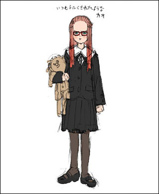
Alice’s initial design. “I thought she should be wearing glasses like Tommy February. I liked how it came out, but I had to redo her design after they decided to go into another direction.”
Alice’s finalized design. You can see the direction of the character took a 180 degrees turn. The characteristic doll remained until the end.
Lt. Leone
It was settled that he would be a “retro soldier”, “have the physique of a bear” and “wields an anti-tank rifle.” Based on those ideas, we decided that his gear should be vintage. But was this really the image of an old-fashioned soldier?
After that we wanted to make his silhouette stand out, so we had him wear a cloak on one side. This cloak takes the form of a Ghillie suit so that it could stand out when he moves rapidly during hand-to-hand combat.
His image was set in stone in the very early stages, so there weren’t any particularly big changes made afterward. By the way, in the international versions they added a voice clip of him chanting “pansies! pansies!, which made him stand out even more.
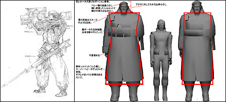
The left image is an early rough sketch. The right image is a proportion specification designed for reference. “In regards to his body shape, I didn’t want him to just be bigger, I wanted him to stand out as a giant even without the contrast.”
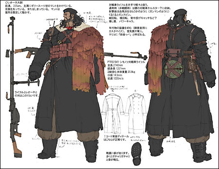
Colored model sheet for Leone. His systematic characteristics and clothing are established to the minuet detail.
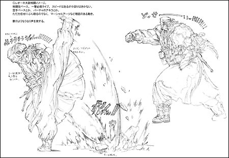
From Leone’s model sheet. He was drawn with a fighting image and it seems he was initially expected to have close quarter attacks.
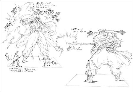
From Leon’s model sheet. The initial character image is almost completed at this stage. His kick attack was rejected due to limitations with the character model and such.
Elsie & Frances
Originally they were supposed to be characters who lived in VR space. But when the scenario changed during the middle of development, they were no longer virtual characters, but ventriloquist dummies who exists in the real world. Out of all the characters, I think they’re the ones who had their image changed the most from the early stages.
Their manipulating strings are established to be wires that could be attached to the walls or ceilings (like a spider’s cobweb), so that the dummies could be controlled from a distance.
We wonder if we made their relevance apparent in the miscellaneous cutscenes.
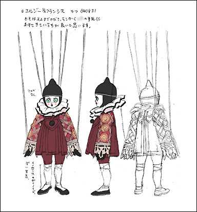
Finalized design for Elsie and Frances. Shown here is Frances, the elder of the two sisters. Elsie, the younger sister, has a cracked face and a speech impediment.
William L. Fleming (aka Gary Murray)
The boss character of this entry. Since he was established to be an excessive neat freak, he wears a fancy brand name suit under his shabby coat. His shoes are also shiny brand names. His coat is tainted with the oil fluids for Metal Gear KODOQUE.
Since it was said that there was going to be a cutscene where he shoots a gun, he was given a belt under his coat, which is equipped with a gun holster during his Fleming persona.
Originally he was established to be a middle aged man, but since he was going to be a boss character, he ended up looking quite younger than he was intended to be. Because of story reasons, he was a difficult character to make him look unique with his clothing, so we were concerned in making him stand out.
In fact, we had the idea of outfitting him with a powered suit similar to the one worn by Solidus and having him directly confront Snake and Teliko. Mr. Shinkawa gave me various ideas, such as “give him a METAL BLADE!” But because complications with the story, those ideas were abandoned.
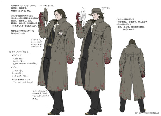
Model sheet of William L. Flemming. There are detailed notes such as the differences between his true self and his Gary Murray persona. It seems there were plans to have him directly engage Snake and Teliko.
La Clown
La Clown’s backstory is that of an “assassin who specializes in disguises and hypnotism.” Because of this, the character’s design doesn’t differ much from Telico’s. For the illustrations, La Clown’s proportions were changed in subtle ways.
Line art illustration of La Clown
Enemy Soldiers
The jobbers of Metal Gear Acid. The small fry soldiers. This time they wear desert camouflage, giving them a middle eastern atmosphere. Perhaps they have a dusty unfashionable image.
The model sheets of the enemy soldiers. The first sheet is a soldier from Leone’s unit. The second is a member of the Genetics Army. The designs of the enemy soldiers this time are based on MGS2, since it’s set in a similar period.
Model sheet of the Genetics Soldier. “Because it is an equipment for measuring data, there are stuff like experimental cords and labels attached to it.”
Changes in Concepts
Initially the concepts we got from the scenario were horror and suspense. Specifically there would be ghost characters that would appear in key scenes, the boss characters were going to be cyborgs who served Fleming, and so on...
After days and months have passed (or maybe it wasn’t that long), the horror aspect became more downplayed and the scenario was changed to a more suspenseful one in all aspects. The colors red and black are used a lot by many characters in general, but that was actually a remnant from the early stages when the horror aspect was more emphasized.
Although MGS served as the basis, there were many twists and turns in the art designs. Because of the lack of flexibility in the development schedule, I was concerned about keeping the Metal Gear world in place while somehow giving Acid its own color. After all, the world Metal Gear is quite deep.
Model sheet of Minette Donnell. “Because she’s a malicious girl, she wears deep red.”
Rough character designs from the early stages of development. The first character is Dr. Flemming and the second is Senator Viggo. “Originally Viggo Hach was just an old man who suddenly became rich.”

More initial designs. The first is a member of the FPH. The second is the Genetics Soldier Boss. “The Genetics Boss would’ve been an underling of Flemming who would’ve supervised the other Genetics Soldier. He would’ve covered his whole body with armor-like muscle strengtheners.”
More rough designs of boss characters. They too were also underlings of Dr. Flemming. The first design looks like a bee woman with poisonous attacks, while the second looks like a giant man with sludge attacks.
See Also
Metal Gear Acid 1 & 2 Gallery
20 notes
·
View notes
Note
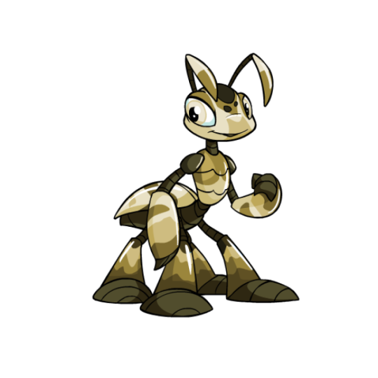
camouflage pets?

Camouflage is, in theory, a pretty straight-forward colour; military-style patterns with variable colours (some of which, ironically, are pretty neon and/or blend into absolutely nothing). It's not the most exciting colour, but it's unique enough and the different colors and patterns give each pet some individuality.
However, the thing with camouflage is that a large portion of pets go a completely different direction with it—instead of military camouflage, they go for naturalistic camouflage, aka normal animal markings. (Though once again, ironically, not all are even camouflaged—the camo Nimmo is based off the poison dart frog, which is a form of aposematism rather than camouflage.)
I do like this direction better, as it's generally more camouflage-y and much more interesting, but I do find the inconsistency jarring. This is not helped by the lack of rhyme or reason behind which pets get what, as several pets that you'd expect to get the nature-based look get the military look instead. I honestly feel like TNT should've just released a "naturalistic" paint brush at some point, and grouped all real-world pet designs under that, considering that several other colours have this problem (spotted, striped, etc.). Like, I love these designs, but it honestly feels like two completely different concepts awkwardly put into one brush.
Camouflage existed before customization, but being a simple pattern there wasn't any real change to the color after conversion. Yay!
Favorite Species:
Krawk: Falling into the nature-based category for this colour, the camouflage Krawk is based off a crocodile/alligator's patterning. Not only is it indeed camouflaged, with countershading and spotting to break up its form, but the brown and light green palette is very pretty and the markings are perfectly done without feeling too busy or detailed. I also like how the eye is the only brightly-colored part of the design.
Ruki: The camouflage Ruki is interesting, as it works as kind of a hybrid of the two different takes on the color—the actual palette is similar to some species of mantid (like the Carolina Mantis), but the markings are still somewhat military-ish in terms of shape. The light brown and dark brown contrast here is very nice, as are the gradient-esq look of the legs and arms. I also like the detail that Rukis come from the Lost Desert, so this one's palette is perfect for it to blend in back home.
Lenny: Based off a California quail, the camoflauge Lenny is very neat. The markings have been adjusted to fit the Lenny's design perfectly, and the soft mottled look is both proper camouflage and breaks up the body a bit without being too busy. The subtle color palette is also appreciated.
BONUS: I wanted to give one of the military-style pets a shoutout, and I think the Jubjub is the best of them all. It could plausibly blend into snow, and the subtle gradient and low-contrast markings give it a really nice sense of depth that most other military-style pets lack.
Least Favorite Colour:
Meerca: The camouflage Meerca could plausibly blend into foliage to a degree, but that doesn't change the fact that it's honestly pretty ugly. The brown and green palette is far too low-contrast, causing some nasty vibration within the markings and making it look very muddied. Brown and green aren't inherently bad (see the Krawk above), but the orange-brown and the mint green don't work together at all. Here's a quick fix:
41 notes
·
View notes
Text
Indian food is as diverse as its people and geography. Indian food or cuisine is recognizable by its unique flavor as it uses numerous ingredients, deploy a wide range of food preparation styles, cooking methods and culinary presentation.. Each dish is made with specific spices and it has its own smell and flavor. Spices are one of the vital taste enhancers in India. Oil is the important part of Indian cuisine like coconut oil and mustard oil. Vegetables and fruits vary according the region and season in India. Generally food is prepared using different cooking methods and in a specific way based on whether in north, south, east or west of India. Each section (north, south, east or west) has its own food style. In the common Indian household people usually sit on the floor and food is eaten with hands or fingers. Diverse serving style varies vary within India. A common way of displaying food throughout India is called “thali”(a large plate with different samples of Indian food on it).and ayurveda had exerted a strong influence on Indian food recipes and eating pattern. Indian food and spices has nutritional as well medicinal properties also. Indian food is invariably complex. I
Introduction
Indian culture is the Indian’s way of life because of the population diversity, there is immense variety in Indian culture. Indian food is one of the world’s most diverse diverse cuisines, characterized by its sophisticated and subtle use of many spices, vegetables,grains and foods grown across India.
One of it is Food that plays an important part of Indian culture, playing role in everyday life as well as in festival .In India it’s not just for eating but it is a way of socializing, getting together with family, friends and relatives. Indian cuisine varies from region to region shows people ethical, inclusiveness and cultural diversity. Generally Indian cuisine is split into north, south, east, and west. Various uses of spices (From ultra spicy food to delectable confectionery) and various ingredients are integral part of Indian food preparation. Indian cuisine is full of colors, flavors and aroma. Indian cuisine is based on matching opposite flavors such as hot and sweet taste.
The beauty of thali is that it is significant part of our it is a wholesome, meal and it tells us the scientific approach of nutrition as it represents the food pyramid of today like carbohydrates from grains, dietary fiber from fruits and vegetables and nutrients from dairy products like yoghurt, milk, curd and electrolytes from water. It is a balanced diet where variety is at its best. .Meals are served in thali, in which the food being served. An arrangement of small metal cups, or katoris, glasses, spoons etc... Is filled with single servings of food and condiments and arranged on the thali culture and usually sit on the floor,on pillows,or on very low stool and food is eaten with hands in India.
Indian cooking has unconventional style of making or cooking things which make them unique and it has its own cooking techniques, methods and equipments. Various cooking techniques are:
Tadka (tempering): it is the most common way of cooking. It essentially means frying whole spices in a little amount of different oil, ghee or butter. It is the aroma released from the spices which give the unique flavor or taste to the main dish which is being cooked, be it vegetables,dals,legumes,cereals or sometimes chicken,meat,fish etc. A tadka commonly has mustard or cumin seeds in oil.
Bhuna (curry): This is way of cooking curries. Here the spices are fried or dry roasted to form a paste. Curries which are served in thick spiced sauce form are made using the Bhuna style. The main ingredients of the dish are later cooked slowly in the paste. It has some variations depending upon what all spices are added in or is there water or milk or curd or yoghurt added to make it in a gravy form.
• Dum (steaming over coal): It is a process of steaming food but without using the actual appliances. A virtual compression is made in the cooking pot. Dough is used to seal the lid on the handi (pot or vessel, so the moisture gets trapped within and the food gets cooked on the flame. The recipes involving dum are usually cooked on coal fire and coal is also placed on the lid to ensure cooking. The most commonly cooked food is the famous Dum Biryani, meat etc. Cooking in dum style gives a unique aroma of the spices and warmth.
• Dhuanaar (smoke seasoning): Dhuanaar actually refers to smoky way of cooking food. The smoky flavor is imparted while cooking. The process involves burning charcoal in a small pot and then keeps it in a bigger pot, around which the meat or vegetables or fish are cooked. Dry spices and ghee are poured over the coal and a lid is place quickly over, so the smoke remains within the pot and infused the smoky flavor within the dish.
• Tawa Cooking: Tawa is a round thick iron griddle, slightly concave in centre and most commonly used for unleavened bread like chapattis, rotis, etc. It is also used for some unique dishes which require fast cooking and in large quantity, with outer rim is used to keep the dish warm. It’s served straight out of the tawa and eaten instantly.
• Talna (frying): Food is fried in different oils in a wok or khadai. It should be shallow or deep fried depends on the dish being cooked.
• Tandoori (clay oven): It is the highlight of the Indian cooking. Here the marinated food is cooked in the clay oven over charcoal fire (approx 550F).The marinated food is put on skewers and cooked inside the hot pit, buried and enclosed. Like rotis, meat, kebabs etc. •
Balchao (pickling): It is a Goan style of pickling where vegetables like eggplant or seafood like prawns are pickled in sugar, vinegar and spices for a day or two.
Foods of India are better known for its spices or vast array of spices used — both whole and ground, which are often combined into complex spice mixed. Common spices that we use in our kitchen are actually not common as it provide health benefits as well as flavor and aroma also. Every spice has its own unique taste and completes the dish as only salt cannot do the magic to satisfy our taste buds. Even now scientist is curious to explore the Indian kitchen to find out more about it. But consumption should be in moderation as everything in excess is bad.
The most commonly used spices are :
Turmeric (haldi): This is the most common spices of India. It comes with yellow color and flavor that can make a wide range of meals like sambar, dal, kadhi, marinating meat etc... to look good and taste good. Turmeric comes with a feature that makes it great for health like prevent cancer, act as antioxidants, prevent inflammation etc...
Asafoetida (hing): This is one of the strongest spices with a sharpy strong taste. It will change the taste and the aroma of any food. It is used to make dal, sambar.lemon rice etc. This spice comes with a number of health benefits like treating asthma, whooping coughs, chronic bronchitis; it’s antimicrobial and even detoxifies body.
Cumin Seeds (jeera): It pungent, sharp and astringent used in wide variety like soups,candies,lassi,pongal etc.It is caraway shaped seeds usually medium brown. Frequently used in curry and seasonings. The health benefits are prevents cancer, used as stimulant and carminative agent
Ginger: It is mildly pungent and has sharp burning sensory stimulation. Dry ginger is more pungent and valuable for the zest it gives to blander spices and used as masala in pulav, non-vegetarian dishes, mango salad etc .whole root is used in tea, chutneys, pickles, lime juice, buttermilk etc.Its health benefits are ,antioxidant, reduce inflammation and pain in joints, detoxifies carcinogens, good for cold and cough etc.
Cardamom (eliachi): It is specie belonging to the ginger family, whose seeds are used as spice. The fruit contains brownish black seeds. It is mainly used for flavoring sweet preparations, cookies, breads, cakes and preserves. It is very good for digestion.
Black Pepper (kali mirch): It is a small round berry of a tropical vine with small white flower and it has pungency and aroma. It’s native to south India and used for both its flavor and as a medicine the health benefits of black pepper includes curing illness such as constipation, diarrhea, and heart diseases, etc.
Cloves: Cloves are well known for their warm, sweet and aromatic taste along with medicinal benefits. Clove has lots of healing properties and used for upset stomach and tooth ache, etc Saffron (kesar):Saffron known as the golden spice of India for its expensive and exotic richness and are found in Kashmir valley and it gives yellow colour.It is used in ice-cream, thandai, rasmalai, kesar milk, in rice dishes, soups, sauces etc .its health benefits are used as sedative and used for eye infection. Cinnamon (dalchini): Frequently consumed spices and is relatively inexpensive. It is a thin tinner bark of the cinnamon tree. It is used in pulav, biryani, korma, cakes, cookies and puddings etc.health benefits are prevent for diabetes,keeps digestion proper etc
Mustard Seeds Most Indian households use mustard seeds or its oil for various purposes; it can help control symptoms of asthma, packed with B-complex vitamins and help to relieves rheumatoid, arthritic and muscle pain. Indian cuisine is an assortment of zealously guarded culinary skills, ranging from sharpest to the sublest.
Four directions of India east, west, north,south region greatly influence the religious and cultural aspects giving the wide Varity of cuisine .
North Indian Food Food in the north India, to begin with, Kashmir cuisines. In Kashmir, mostly the dishes are made from the main course of rice found in the beautiful valley. Another delicious item cooked here is the 'Saag' that is prepared with a green leafy vegetable known as the 'Hak'. But on the other hand states like the Punjab, Haryana and Uttar Pradesh also show high consumption of chappatis as staple food. Again, these chappatis are prepared with a wide variety of flours such as wheat, rice, Maida, besan, jowar etc. Besides chappatis other closely related breads baked in these regions include Tandoori, Rumaali and Naan, lachha paratha etc. However in the northern region impact of Mughlai food is quite obvious. And some popular dishes are chapattis, biryani (made with rice and cooked with various spices, vegetables.meat etc), tandoori chicken (it is marinated with spice cooked in tandoor and prepared with yoghurt and spices).
West Indian Food In western India, the desert cuisine is famous for its unique taste and varieties of food. Rajasthan and Gujarat are the states that represent the desert flavor of Indian food. Here an immense variety of dals and achars (pickles/preserves), papads is used that simply lack of fresh vegetables in these areas. In the states like Maharashtra, the food is usually a mix of both north as well as south cooking styles. Here people use both the rice and the wheat with same interest. Along the coastline of Mumbai a wide variety of fishes is available. Some of the delicious preparations include dishes like the Mumbai Prawn and Pomfret.In Goa, that is further down towards south, one can notice Portuguese influence in the cooking style as well as in the dishes. Some of the major dishes of this region are the sweet and sour Vindaloo, duck baffad, sorpotel and egg molie etc.
East Indian Food In the eastern India, the Bengali and Assamese styles of cooking are there. The staple food of Bengalis is the mouth watering combinations of rice and fish. Usually the Bengalis love eating varieties of fishes. A special way of preparing the delicacy known as 'Hilsa' is by wrapping it in the pumpkin leaf and then cooking it. Another unusual ingredient that is commonly used in the Bengali cooking is the 'Bamboo Shoot'. Various sweets prepared in this region, by using milk include the 'Roshogollas', 'Sandesh', 'Cham-cham' and many more.
South Indian Food In the southern India, the states make great use of spices, fishes and coconuts, as most of them have coastal kitchens. In the foods of Tamil Nadu use of tamarind is frequently made in order to impart sourness to the dishes. It simply perceive the Tamil Food from other cuisines. The cooking method of Andhra Pradesh is supposed to make more use of chilies, which is used to improve the taste of the dishes. In Kerala, some of the mouth watering dishes are the lamb stew and appams, Malabar fried prawns, Idlis, Dosas, fish molie and rice puttu. Another famous item of this region is the sweetened coconut milk. Yet another dish is Puttu, which is glutinous rice powder steamed like a pudding in a bamboo shoot.
Snacks and Drinks The Indian snacks not only tempt Indians but they also tempt the non-Indians. The delicious snacks can be prepared as salty, sweet or spicy or oily dishes. Pav bhaji is one of the popular Indian snacks. Here slice of bread is served with mashed and fried vegetables. The pani puri perhaps hits the top position among snacks served in India. It is liked by youngsters as well as elderly people. The puffed and hollow bread is stuffed with spicy potato and onion and served with tamarind water. A shot of lime juice, cumin powder, paprika, roasted nuts enhance the taste of the pani puris. Some more mouthing tempting snacks are like pakoras, samosas, jalebi dhokla, bhelpuri, mattra kulcha etc. Tea is the most popular drink in India. It is prepared with milk, sugar and aromatic tea leaves. At different parts of India, tea is boiled with clove, cinnamon, ginger, nutmeg, cardamom to enhance the rich taste. Lassi is another Indian drink made from buttermilk or sweetened yogurt. The drink is sometimes flavored with rose syrup and mango juice. More drinks like nimbu pani, thandai, rassam etc.
Conclusion


Food is the integral part of Indian culture and its very unqiue.It has a perfect blend of flavors using different spices Food gives us an enormous insight into the culture as it sheds light on the regions indigenous crops, cooking techniques, different spices, different food and even the reflects the history of an area. Food has been recognized as an important component of intangible heritage. In India food are better known for its spiciness but it has some nutritional and medicinal properties also.
2 notes
·
View notes
Text
Nobody wanted it, but it’s here anyways. Eeveelution Tier Ranker, let’s go. (Note: I don’t hate any of these and it’s less about whether they’re good competitively and more from a design standpoint -- i.e., how well I think they represented their chosen element and were creative when doing so. It’s okay if you disagree! But don’t click if you don’t like hearing opinions that are not your own.)
S Tier Explanations:
Vaporeon: Honestly one of the more creative Eeveelutions, and it hit it out of the park on the very first gen! It’s notable because instead of simply representing the element of water, it looks like a creature that might actually dwell in the ocean depths. I love its little neck fringe and the mermaid tail and how literally everything about it (except for maybe the feets) seem changed from the base Eevee form.
Leafeon: Probably personal bias, but I don’t care. Leafeon kicks ass. They could have gone the super cutesy route and made it like a flower-cat-dog-rabbit-thing, but they instead gave it a look of an insect that would be using leaf camouflage to sneak up on prey. I love the little bits and pieces taken out of the leaf growths, and also the cute detail of its feet being brown, like it grew out of the mud.
Espeon: Complicated doesn’t always mean good (foreshadowing for later) and Espeon proves it. It is a beautifully simple take on a psychic version of Eevee, with no real frills. It’s a soft lavender (which, being a shade of purple, hints at mystical origins without shoving it in your face, its thin, forked tail reminds me of a tuning fork that some use to meditate, and the red gem in its head I guess makes you think of the Third Eye of the mind. It doesn’t do a bunch of crazy stuff, but it doesn’t need it. Amazing stuff.
A Tier Explanation:
Umbreon: I feel like I want to like Umbreon as a concept more than I actually do. On paper, it’s pretty promising. The name Umbreon itself is a very clever play on the Umbra of a shadow -- the darkest part of it. The rings all over its body makes you think of an eclipse. But that’s... Really it. It has cat like pupils...? Which does set it apart from the other Eevees, and is also fitting of its reputation as a night lurker, but that’s really it. I think the biggest problem with Umbreon is its overall shape. The silhouette doesn’t really change between it and Eevee a whole lot, and not in a way that would make you think of its chosen element. To put it another way, if Umbreon was color-shifted to be, say, a bright orange, would it still look like it represented darkness to you? That’s the best way I can explain it, but I do have to acquiesce that it’s just a hard element to design for in general. They did the best with what they had and I respect them for that.
B Tier Explanations:
Glaceon: Literally the only reason it’s here is because of the Ushanka-shaped hair do / ear flaps. It’s enough to communicate “this is something you’d encounter in cold weather!” while also being relatively creative about it instead of giving it an icicle for a tail or something. There’s also the subtle diamond-shape to its ears, fur flaps, and tail, kinda making me think of a snowflake in a way? But the rest of the body, other than its fur color and patterns barely changes at all. They even get rid of the fluffy neck scruff, which seems a bit counter intuitive since this is a COLD weather Pokemon, but I digress. It’s something all of the post-Gen-1 Eeveelutions have in common for some reason.
Eevee: Basic can be good! Eevee doesn’t really do anything super extraordinary to me, other than be cute. TBH when I look at it, I don’t really see a “Pokemon that can adapt to any climate” -- it just looks like a cute fox cat dog thingy. But that has its place in the world, too.
C Tier Explanations:
Jolteon: It feels like a sin to have two Gen 1 Pokemon as the sole C tier tier holders, but they fall so short of Vaporeon in my honest opinion. I do like their designs! They’re cute! But they’re not super transformative to me, and that’s their cardinal sin. Jolteon is the Lightning Eeveelution so... It’s Yellow. And they made it spiky like it stuck its paw in an electric socket. Done and done! That’s not very creative to me, though I do rate it as a half step above Flareon just because they basically got rid of its tail. That at least distinguishes it from the Eevee profile pretty well.
Flareon: It’s literally just “Eevee but Hot Cheetos Flavored”. If you color shifted it to Eevee’s base colors, you’d barely be able to tell the difference between them and that’s a problem to me. Yeah, the neck fluff, tail and head fluff kinda resemble flames I guess, but that’s just really lazy in my opinion. If it wasn’t literally the embodiment of fire, it looks like it would overheat in the exact environments it’s supposed to inhabit. Definitely deserves its spot here.
D Tier Explanation:
Sylveon: So I know what you’re thinking. “Mittens just hates anything they didn’t grow up with / thinks the Fairy typing is lame!” No. Absolutely not. Fairy is probably my favorite type, and I was psyched for Mega Evolution, Dynamaxing, and basically any gimmick the later games came out with. Nostalgia is a factor with me, but I make a concerted effort not to let it cloud my judgement. I don’t even hate that we got a Fairy Eevee before getting a Dragon one. My dislike of it is 100% just the way it’s designed. It’s the laziest take of “Eevee, but Fairy Type!!!” imo, and I have similar complaints about Galarian Rapidash. Like what about it says “Fairy”??? The fact that you gave it a cute lil bow and ribbons and made it soft pink and white and stuff??? Lazy! I kind of don’t like the assumption that “Fairy Type = uwu cutesy girly shit” and not because I don’t like the girly shit, but because I feel like that sort of stuff shouldn’t JUST be relegated to one or two typings (Normal type tends to also be kinda guilty of this imo but at least there’s WAY more diversity there). That’s why Klefki, Grimmsnarl, Mawile, and Shiinotic are some of my favorite Fairy Types of all time. Because they do something that both pays homage to the lore they’re taking the Fairy typing from and also making something genuinely original with it. (And it’s also why Mienshao is probably my favorite fighting type Pokemon! Because it’s this situation but just in reverse!) Sylveon just feel like something they banged out with a day or two of brainstorming. “Yeah, just make it pink and cute and shit. Good enough. Let’s go get lunch.” And unlike the first Gen, which I can forgive for being a bit unoriginal because this was still a very new concept for them, for them to bang out something THIS substandard in the 6th gen just makes me kinda mad. Sylveon deserved better and it should have been cooler, more creative, and played with its theme way more. It was cheated. But! that’s just my opinion.
At the end of the day tho, the Eevee line is probably one of my favorite families in the Pokemon universe and all of these Pokemon are super cute and I’d cuddle them in a heart beat. I just think some could have been designed a bit more creatively, but that’s just me! I’d love to hear your opinions. And I might make something like this for Dhimani too (either also doing the Eevees or doing something like rating all bug Pokemon and stuff.)
#{ooc}; i will not shut up#accurate tag is accurate#i cant do drafts but i can shit this out in an hour i guess lmao ok @ brain
5 notes
·
View notes
Text
This thread will explore the character design and visual cues for easy identification of characters in homestuck. Go in detail about design choices for specific characters and how they work well in differentiating the characters
It has already been explored how her long jacket makes her look smaller, but it’s an interesting addition to her design and balances all the indigo she wears otherwise she would be wearing more indigo than her actual color. When looking at the base sprites for characters in homestuck it’s interesting how they’re both at the same time 1: very simple, following the same base and lacking various characteristics (like noses and ears) and 2: extremely easy to differentiate from each other.
Even arguably the two characters most alike to each other, June and Jake who have the exact same face and only differentiate from each other by their hair and outfit are easy to tell apart even when ignoring their bodies and looking only to their faces.
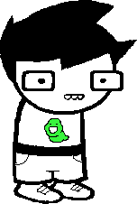
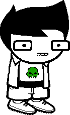
And of course we should mention the use of different glasses for easy identification of the characters. In a comic where characters are so simple it begs the question: how to make characters easily identifiable? The answer? A lot of glasses.
Jake and June again are the only ones who share a pair of glasses, all the others have one completely unique to them. Jade has round ones, Jane has oval ones, and we absolutely can’t ignore the iconic Strider shades.
Dave and Dirk’s shades have not only become something to easily identify the character, but almost a platonical symbolic representation of their characters. Dirk’s glasses specifically considering how unique they are and how they associate him with anime protagonists
This makes the few characters like Rose and Roxy that don’t use glasses almost unique in their own ways. When six out eight kids wear glasses being the only ones who don’t becomes a novelty (not even mentioning Meat Roxy’s heart shades).

Other subtle details in each character like how their hair is build, mostly using basic shapes that don’t even look like hair and more like a symbolic representation of hair. Like Dirk and Dave's hair are literally birds turned 90 degrees.
Other details like Rose’s headband, the Prospit kid’s buck teeth in contrast with the Lalonde’s lipstick and between their eyes with Jade and Jane’s while June and Jake only have dots for eyes.
Their symbols on their chests and the main detail of their outfit is also a huge signifier of who you’re looking to and part of their personality. Also the only hint of color in their initial outfit designs.
Their bottoms are all also simple and minimalist representation of their clothes. Jade has a long skirt that slightly sits on top of her shoes: You can either read that as just a normal part of her long skirt, or that she’s too small for her skirt.
And now we get into how their designs are so abstract that you can easily have different interpretations of visual things. Some things are just shapes and colors in a way different people will interpret it in different ways.
Maybe Roxy’s hair just looks like that or maybe it’s meant to represent the beehive haircut that was popular in the 60’s linking to Mom Lalonde’s vintage housewife aesthetics.
So let’s skip to act 5 and take a look at the trolls: The first one to have their appearance shown is Karkat. You can consider him the default troll that all others are defined by how they’re different from him.
He has no glasses, little bags under his eyes and what I like to think is the equivalent of buck teeth connecting him with June. They also help his face look less blank. Adding fangs and teeth to trolls is another easy way to make their designs unique.
His hair is very wild which fits into being an literal alien and presents how other trolls will also be wild and have more different designs. His shirt is black, a clear juxtaposing to the kid’s white outfits as the trolls have mostly black clothes.
Creating a clear distinction between kids and trolls and a shared motif between each group. Karkat also has a symbol on his shirt, but a astrological sign one in contrast with the kids having mostly symbols that don’t properly make a pattern.
And of course: he has horns. Giving each character unique horn designs fitting their zodiac motif and personality is another great way of differentiating between them. Each one has a distinct pair of horns that can be easily used to differentiate them.
The next to be introduced is Gamzee: His expression reflects his personality. His hair is even more wild and barely even looks like hair. It's just a lot of shapes together conveying the idea of very wild and unkempt hair.
His horns are much longer and his teeth looks like proper fangs and his facial paint and pants details reinforce his clown aesthetic. He also wears his blood color on his shoes presenting the pattern.
Why is Gamzee often considered the tallest troll? All characters in homestuck have no clear size distinctions. In this image we see Nepeta and Equius (who fanon wise often have very different body types) having the exact same height and body type.
And while Karkat is shouty, he is also harmless, making it common the body type of a very angry little marshmallow. Kanaya on the other hand is composed and refined, making it easy to view her as tall, but in a very different way that Gamzee is tall.
Terezi, has a much more kempt hair and a simple design. Her horns are small, just a little more sharp than Karkat’s, but she is also the first one to have glasses, bright red ones like her shoes which connects her design to Vriska.
Her glasses are another point of iconicity. Where you could only draw a piece that is enterily composed of her glasses and the viewer will know that it’s about Terezi Pyrope.
Her smile and her sharp teeth is another point that brings her personality out. She is sharp and although she is smiling it’s not a friendly and welcoming smile. It’s a smile that invokes fear as she is not scared of violence.
Sollux is another one that comes with iconic glasses. They’re not only useful as a visual signifier, but it fits his duality theme and the two universes. They’re perfectly round in contrast of Terezi’s sharp glasses following shape theory
Rounder shapes are whole and friendly in contrast with triangles that are more dynamic, volatile and aggresive. Sollux might not show it, but he is also harmless and one of the trolls with the largest common sense among the twelve and highly caring for the others.
He also has 4 horns. They’re all very simple, but the fact he has the double amount than all the others not only also fits his themes, but also helps to easily differentiate him from the others. His hair is short, simple and somewhat kempt.
Unsure over the intent of his “bangs”. Are they just short? His hairline? There is a joke about him cutting his hair with funny scissors. Interpretation. And for last his shoes also fit his theme of duality. A small detail, but helps to build his character with few cues.
Tavros has a mohawk (or side cuts, interpretation) and very large bull horns. He wears sandals on the color of his blood and a jacket in contrast to all the others that wears only shirts (something he shares with Vriska)
We will be mostly focusing on Aradia’s dead form because she just changes forms too much in a period of time too small. First: her eyes are completely blank a very clear visual signifier if you ask me!
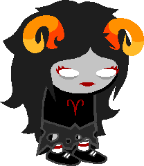
Her ram horns reinforces her motif and red lipstick and lashes makes her face that would be otherwise quite bland more unique. Her skirt reflects how she is dead and i like the implication that her shirt is button up one.
Another on the list of “things that are implied, but not actually confirmed so its open to you on how you want to draw them”. Her hair is long and fluffy, like a sheep’s fur! Another fitting into her motif.
Next we have Nepeta. She is the first one to have clothes of the blood color of someone important to her. Directly connecting her design to her moirallegiance to Equius. Her mouth and horns fit into her cat motif and her wild hair reflects how unkept she is.
It has already been explored how her long jacket makes her look smaller, but it’s an interesting addition to her design and balances all the indigo she wears otherwise she would be wearing more indigo than her actual color.
And how long can we talk about homestuck without her eventual appearance? That’s right, the next one to introduced is Vriska Serket. Part of the iconic glasses gang her half shades aviator and eightfold eyes makes not only for an easy signifier that “yes, this is Vriska”
But fun fact! the reason i started reading homestuck in the first place was because i saw an image of vriska and i wanted to know what was the deal with her eye.
Her horns reflect the hook and and arrow in her symbol, but also there’s meta about how it represents the sun and the moon. Much to think about. It also connects her with Kanaya as they share one horn since both of their signs are “M”s.
Her jacket is something she shares with tavros and her red shoes she shares with Terezi. Her large hair has a small bit that reminds me Jade which I like to think links to how they’re almost opposites, but I might be just making this up (interpretations!)
Also her eye patch and metal arm links her to captain hook, but I already wrote a very long meta on that too. https://tinyurl.com/qooc5el
Next is Equius. His horn is broken which explores how trolls *can* break their horns over physical trauma. It fits into his symbol and also phallic metaphors. He also wears iconic glasses: square shattered ones with eye bags underneath.
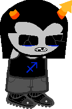
His default mouth brings in to the fact he constantly breaks his teeth and he is one of the only characters with straight hair. And for last: while Nepeta wore indigo all over her her body, Equius doesn’t wear a single piece of green clothing.
Kanaya somewhat follows Terezi and Vriska’s of bright red pieces. Her hair is short and very sharp with few details. Her visible fangs make her mouth more unique. Her long skirt connects her with Jade as they’re both space players.
Her design is clean and conveys very well the idea of how refined and consistent she is. She cares about her appearance and also her T-shirt long sleeve shirt combo also helps to make her more unique
Eridan and Feferi are awfully more detailed than the others like the more far from Karkat we get the unique designs do (which also reflects on how detailed the dancestors are). But anyway.
Eridan is the only one to have dyed hair. His face doesn’t need that many details as he also has those big square glasses and seadweller fins. He wears a lot of Vriska’s color showing how he didn’t moved on from their break up and golden rings to show royalty.
Feferi is almost the only one with no bangs which already makes her design unique. Her golden tiara and goggle make her face unique and simple to signify. her outfit is awfully detailed compared to others with golden jewelry and whatever that skirt was.
All the unique glasses help to frame all the character’s faces and make clear who they are even with the lack of noses, ears or different facial shapes. All the different types of tooth and color of lipstick help to easily differentiate their mouths
It ends up creating designs that could be hyper simplified and still be recognizable. Reducing a character to it’s bare essentials, but it’s already presented on it’s bare essentials so you only elaborate on that.
Not only that but they're reduced to platonical symbols that can easily be subverted so a character can be so many different things.
And here’s hyper fast doodles of each character I did to prove how simple it is to convey an image that can easily be related to each character.
A few more bits on other characters: The midnight crew all have unique body shapes as they lack hair and have very simple designs. They also have unique hats for each one.
Doc Scratch’s head is a white circle. You really can’t go more unique than that. You see a large white circle, that’s doc scratch. It's hyper simple, but also not meant to be interpreted. It *is* a circle and that's it.
The Felt has very unique body shapes since there is way too many of them and they need to be clearly different from each other. They also have unique mouths and and hats, not only in color, but also in shape, to elaborate on that.
The cherubs, well they’re green so it’s easy to distinguish them from other characters and it's interesting how they're so similar to each other, but also so easily differentiated: eyes, cheeks, mouth expression and outfit is all you need to see the clear distinction.
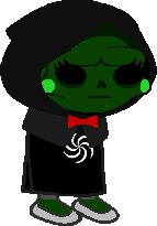
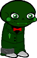
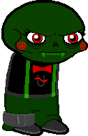
thank you for reading
#long post#homestuck#character design#june egbert#rose lalonde#dave strider#jade harley#jane crocker#dirk strider#jake english#roxy lalonde#Aradia Megido#tavros nitram#sollux captor#karkat vantas#nepeta leijon#kanaya maryam#terezi pyrope#vriska serket#equius zahhak#gamzee makara#eridan ampora#feferi peixes#doc scratch#midnight crew#calliope#caliborn#homestuck meta
9 notes
·
View notes
Text
Asemic writing
Today we created our own abstract messages and secret script (asemic writing) by layering wet and dry media and creating opportunities for suggestions of letter forms by weaving slices of writing together. we used our articles to inform what our initial writing would be and researched Pokras Lampas, Simon Williams, Cecil Touchon, Fabio Zanino and Jerry Iverson to take inspiration from and create ideas from their form of asemic writing.
Simon Williams
Simon Williams is a contemporary painter who mainly uses Alkyd oil and acrylic paint to create his abstract painting. He takes inspiration from many things such as childhood comic books, propaganda posters and graffiti art, which personally I think really shines through in his work due to the large sweeping curves and the bold colours shown throughout.
Texture is a very prominent thing within his work as there are many brush strokes where it appears as though the brush didn’t have that much paint on it and therefore the brush has left a scratchy texture. This contrasts with some of the very smooth round shapes created in his work which have an almost 3d look to them due to the way the paint has been applied. I really like the curves and flow of the lines in this piece and that is something I would like to achieve in my own work at some point.
I also like the use of colour in this as Williams has put the majority of the vibrant colours in the background, leaving the foreground to be mainly black and white. This intrigues me as it is something I have never thought about doing in my own work but definitely something I should experiment with. I really like the simplicity of this piece and how the shapes created could suggest letters but it is not obvious from which language or alphabet the are derived from, since they don’t actually exist. This is the exact effect I want to create in my own work.
The piece below is my favourite because of the colours found within it. While the main colours appear to be teal and purple, a small amount of pink and red can also be found within the black which is very interesting to me as it makes me wonder why Williams decided to include such a small amount of a warm colour which contrasts the cool colours throughout the rest of the piece. In my opinion it could be to send the message that a warmth and hope can be found in every cold bleak situation.
This piece is also different to the previous piece as there is colour in the foreground and the background. There are also much more hues of all the colours used, which is something I would like to do in my own work along with creating textures similar to how Williams does in is work, with very dry brushes containing only a small amount of paint. I would also like to create a general theme with the shapes I create as Williams only uses very round curves and I would like to only use one type of shape in my work, possibly the opposite shape, with many angles and straight lines.
Pokras Lampas
Pokras Lampas is a graffiti artist from Russia who has created many large scale installations and worked with many brands on advertising campaigns due to his eyecatching patterns which resemble letters. His lines have a very calligraphic style to them and usually follow an overall uniform shape for example lines of the asemic writing forming circles in a similar way to a mandala.
I really like the colours within his work and how it is usually a black background with colours over it as I could achieve this effect by inverting some of my own work which is going to be made on white paper. I also really like the large scale and versatility of his work as it works on many different surfaces such as walls, cars and even people in a very detailed and interesting way as by using these different canvases the intricacy isn’t lost.
I particularly enjoy the piece above as the brightness if focused surrounding man and the art gradually gets darker and more shadowed towards the edges of the photograph. I also like the way this has been captured as by having him sit in the middle of the art it displays the central focal point and how large the installation really is in a photograph which prior to him sitting there wouldn’t have made clear the scale of the piece.
The campaign and product below are some of the most visually appealing pieces by Lampas that I have seen due to the variety of colours used in the body paint and how vibrant everything is. The way the lighting makes the shadows appear as pink ties the whole photograph together as without the adding neon pink it would’ve appeared rather bland.
The shapes of the the letters in Lampas’ work remind me a lot of blackletter and therefore if I wanted to display something old and ancient in my own work I could use shapes similar to this o=to do so as Blackletter is the oldest typeface.
I do also like the combination of red and yellow and how the shapes fram the neck and shoulders in a similar way to how clothes do. From looking at Pokras Lampas’ work I have learnt that in my own asemic writing I should think about what shapes my asemic letters are making and whether they form any other shapes such as circles in his work.
Cecil Touchon
Cecil Touchon is an artist who creates abstractions based on typography. The he creates hints at letters and has much depth to it due to the way he makes the rectangles and rounded wedges overlap and interact with eachother. He uses billboard fonts as inspiration for the type of font he is subtly adding into his work and this makes for some big bold shapes and colours that are very striking to catch people’s attention as billboards typically contain adverts and are definitely made to be noticed.
I really like how he has mixed a very natural colour such as tan with a bright periwinkle blue in this piece as I could use this in my own work to portray the messages of my articles as many of them draw parallels between 2 very contradicting subjects, for example nature and technology. The colours also remind me of the sea and a beach and therefore the dark areas could be pollution, or the white and blue could be the sky and the tan could be the ground.
I really like how colours and shapes carry over many of the rectangular shapes and connect them all together, creating very abstract shapes in the process. In my own work I could use this as I could think about how long I want to continue a line for and how much I want the shapes within my work to overlap and affect eachother as by not having them overlap I could end up with a very different outcome than if I did.
The second piece I looked at by Touchon is very different to the first one as it contains no colour and the shapes of the letters are much more similar to letters usually seen in everyday life. We took inspiration from this in our own work as we started our pieces by weaving together some black and white type. This piece reminds me slightly of David Carson’s work as it has the same elements of a glitchy sort of type and scramble up words that his work commonly contains.
This also reminds me of the tomato project due to the black and white and bold lettering which is making shapes in an unnatural way. I think it would be very fun to try and create a piece similar to this in photoshop as I could splice together words and then use the threshold tool to make them very dark and computerised, which would work well for many of my articles, especially the one about robot flies as that is very technological and I think that the outcome could be very technological and futuristic.
Fabio Zanino
Fabio Zanino makes sculptures which are created from objects which he has broken apart and then put back together but only using certain pieces to give the entire object a new identity. He calls this work “Decostruzioni” as he deconstructs things and reassembles them to give them a new purpose and makes them abstract artworks.
I think Zanino’s work is extremely interesting in the way that he will take something which already had a purpose, destroy it and separate it from the original purpose and somehow rebuild it in a way which makes it yet again purposeful. By ridding the objects words and textures of their meaning he can then manipulate them by changing the shape and arrangement of the object and make the textures be interpreted in a completely different way.
Unlike the other artists researched today, Zanino doesn’t necessarily create asemic writing all the time as not all of his pieces contain text, but the way in which he works is similar to that of asemic writing and we took a lot if inspiration in how we worked from him as we disfigured our own writing and our own work and then rearranged it to give it new meaning and new purpose, and I then even went on to rearrange and reweave the asemic pieces I had already created and manipulated them further giving it a third layer of hidden meaning.
Jerry Iverson
Jerry Iverson creates art based on the balance and grace if Asian calligraphy. To do this he uses many layers of paper ink and glue to chop up the words and experiment with how black lines can look like words even if they mean absolutely nothing. I really like this nihilistic approach to asemic writing where the intention is to have it be meaningless as it more or less gives Iverson the freedom to do what he wants without having to think about context. This may have been why there is no colour in this piece as while many of his pieces aren’t colourful some have very subtle colour and this has none to show how it means absolutely nothing.
I really like the texture created by a dry brush and ink in this piece and that is definitely something I could put into my own work and maybe even create something similar using oil pastel or charcoal as they both have a very scratchy texture similar to this.
I also really like how a lighter wash of ink has been used in his work to create a shadow like image behind the harsh black lines that replicates them. The shapes in this piece are something I would like to use in my own work as they are very harsh fine lines with lots of texture which really appeals to me as texture is something I want to include more of in my own work. I also like the way he has copied some of the lines in a lighter wash to add depth as it makes he entire piece more visually appealing in my opinion due to the use of many tones.
The piece below is from the series “Line Bombs”, based on the wars in Iraq and Afghanistan and the disruption they have caused. Iverson has displayed this disruption very successfully by using many layers and textures in a very messy way which is effective for showing an explosion. The ink splatters could represent the corruption and damage that the bombs and wars are doing.
The choice of applying ink in this way could also be to display the aggression and anger associated with war and the way that the ink interacts with the other media on the page could be as a representation to how that anger goes on to affect people unknowingly as you cant plan how ink is going to react to the page you are putting it on.
I really like the use of many shapes and textures and the way that Iverson chooses to layer his work as it makes interesting compositions with lots of depth and many different shades from black to white, I also like how he doesn’t opt to use gradients and instead applies colour in a more jarring way to send the harshness of the messages he is portraying across.
My asemic writing
For my own asemic writing I decided to based all on my article about mammoths being revived, as I haven’t done much work concerning this subject and alspo I thought it could work well for asemic writing due to them being ancient and how I could link them to cave drawings.
For all my pieces I first started off by writing words rather largely on an A4 piece of paper repetitively to then be cut into strips to weave together and hide the message. The words I chose were “mammoth revival extinct animal restoration” as they all link to the chosen article and almost make sense as a phrase. When slicing my words up I decided to do it lengthways down the paper to allow myself longer strips to weave together as I wanted to weave across most of the page and this would be easier to do with longer strips.
I then went on to create the asemic writing and I did this with a biro at first just to extend the lines and shapes created by the sliced up letters and continued the shapes they made, overlapping and connecting some of them in a way which reminds me of Pokras Lampas. I also wanted to replicate something which looks like It could’ve been made in caveman era, but I don’t think I achieved this in my writing very well as it reminds me more of Asian or Russian architecture and the patterns seen on that. I did however make the ends of all my lines very scratchy and not uniform to hopefully replicate some of the textures which could been seen in very old cave drawings.
After continuing the lines I added some oil pastel to create the rocky scratchy texture I was trying to achieve. I think it did a successful job of adding texture and following some of the weaving which was glued down on the page already. Because of the ridges in the paper due to the weave it made very interesting depth as the oil pastel would pick up more in some areas than others. I then also used oil pastel to highlight some of the shapes I created and enlarge them in grey in a similar way Jerry Iverson. I think the grey and the orange look very nice together as it is a warmer grey and therefore more on the brown side than the blue side.
Finally in this piece I added an ink wash of a very pale peachy orange colour which ties the whole thing together as it makes the whole think have a colour overall. I got this idea from looking at Simon Williams work as he using long sweeping strokes and I tried to make my brush not too wet to display some of the brush texture like he does. I also used the ink to further replicate some of the shapes I saw and give the piece a border with shapes that make sense in context to the rest of the piece. Overall I believe this outcome was very successful and other than the writing not looking exactly as I had Hoped I really like how the textures turned out and I believe I achieved my goals regarding texture and composition as it all works in harmony with eachother.

In the second piece I wanted to aim to have the writing be more reminiscent of the textures and shapes seen in caves so I used oil pastel instead of biro to do the original asemic writing and I do think this helped overall give the entire thing more of a rocky texture. I then went on to add some blue oil pastel too as mammoths lived in the ice age and I though it would make sense to use blue as blue is a cold colour associated with ice. I like how the blue oil pastel turned out so I added more blue and this is where it all went wrong.
When adding the blue ink I added too much of it and completely covered the whole piece, overwhelming it, which is not at all what I wanted to do, so I tried to fix this by adding white acrylic paint. I like how the white acrylic looks as it adds a frosty look to the blue but it didn’t many to fix the mistake I made and therefore I don’t like how this outcome ended up. If I was to do this again I would use a small brush for the blue wash or maybe I would choose a different colour than blue altogether or maybe a different shade as it doesn’t look like ice as I hope and instead looks much more bright and possibly happy.
On the other hand I do like how this composition started and how the oil pastels looked when used as the original writing and I do believe that there are many appealing textures within this which the addition of acrylic helped a lot with as it made the piece even more rough and scratchy which is overall the appearance I was aiming for.
For my final piece of asemic writing I wanted to create an overall shape and have all the lines I created be inside of it. To do this, when I was placing the weave I considered how I could frame the page so I decided to put the weaving in 2 corners diagonally from eachother so I could connect them with lines through the middle of the page, I used a black sharpie to do the base writing and I made the lines very thick to develop onto them later. I made them very sketchy as well to create a similar effect to the previous piece but in a different medium. Some of the lines got extended very far across the page to connect both halves together. I really like the way that placing the weaving in this way affects the lines as it makes both corners much more full with lines than the middle and I think this works very effectively in creating a balance across the whole page.
I then used oil pastel on the weaving to dark the corners, causing the middle of the page to be a break of light in the darkness. This also added a lot of depth in areas where I wanted it and worked just as I had hoped it would. From doing all these pieces I have learnt I really enjoy the textures which oil pastels can create and how using them subtly can change the entire theme of the whole piece.
I then added ink washes in the shape of the piece and I think it worked very well to tie the whole shape together and emphasise how the piece shows and follows an overall shape, which is something I started to consider in the first place because I looked at Pokras Lampas.
Finally I added white down the centre of each black line which made the overall piece have lightness where it needed it so it wasn’t tot dull. Overall the outcome of this composition is something I enjoy very much and I think it was very successful in the way that it flows from one side of the page to the other, If i was to fix elements of it I would’ve made the white lines much less jagged and more smooth compared to the way that it is so that they could contrast the jaggedness of the black lines they are surrounded in.

As an additional composition I photocopied my first piece and put it into negative as well as one normal photocopy and I weaved them together as I had been with the rest of the pieces. I really like how this turned out as the contrast between both pieces is very visually appealing to me. If I was to fix any elements of this I would’ve cut the pieces into strips more neatly as they look rather jagged and not in straight lines the way I wished they are. I do really like how I weaved from one side of the page to the other as that is something I think make the page very balance in a simple way.
1 note
·
View note
Text
Love After You (Pt. 2)
Summary: In a time of ballrooms and ballgowns, a looming war threatens to bring darkness. Still, love finds a way to cut through. Some loves, you find, come slowly. Others, come unexpectedly. Could either one survive the war that is to come?
A/N: Hi hi!!!! I’m back with a new chapter for this series! Thank you so much for your kindness with the first chapter! I really do hope you'll enjoy this new one. Thanks so much for reading!!

“A party?” you try to keep your voice from raising. If you had learned one thing about your mother is that she did not appreciate anyone raising their voice, especially about parties.
“Yes,” she says sternly, more than ready to fight any remark you might throw her way.
She sits across from you, fingers moving expertly as she fills in a rose petal on her embroidery hoop.
At least her eyes are down, you think. Her gaze was cold enough to freeze a spring day.
“I don’t want to hear any of your complaints,” she barks, reading your mind. “Your father said yes, and frankly this town could use a party.”
“Yes mother, but,” you venture, wondering just how many words she’s going to allow you.
“But nothing,” she cuts you off as she heaves a sigh.
Apparently just three.
Would it kill you to try sneaking in a few more? Perhaps, but the options for entertainment were limited, and that message from Steve hadn’t arrived, so you took a chance. She did have a needle in hand, though. But what a way to go — pierced by embroidery needle.
“But there’s nothing to celebrate,” you finish your sentence, eyes darting looking for any place to hide — preferably one that could stop a flying needle.
“What did I just say?” she doesn’t speak her words; she spits them out. No piece of furniture could halt those weapons.
“But nothing,” you repeat her words, toning down the sass you so badly wish you could express freely.
“You get that attitude from your father,” she continues her rant, fingers picking up where she had left on the rose petal. “How unfortunate. But in any case, I am planning the party, and you are too. No complaining or I will be sure you plan the entire party on your own, do you hear me?”
You know you should respond with a Yes, mother but you’d be lying if you said the thought of responding with a Maybe I will plan the party on my own didn’t cross your mind. But she had already reprimanded you once, though, and you were hoping to live and see Steve again, so you decide to bite your tongue.
“Yes, mother.”
“Good,” she says in relief, clearly not in the mood to continue arguing. “This party has to be the talk of the town for the next year. I’m even planning on sending a letter to Patrick, just to ask when he’d be available to play.”
She was inviting the most celebrated pianist in the region with no particular reason for a party except to cure the apparent boredom your mother was suffering.
“And base the date of the party around his schedule?” you ask, measuring your mother’s distaste of the question by how quickly her fingers move as she continues embroidering.
“Yes,” she responds, fingers almost a blur, leaving you to wonder how she managed to embroider such delicate petals. “If I have to wait a decade for him to play at my party, then so be it. But he has to be here, that’s final.”
“Yes, mother,” you say in a monotone voice.
“But until I get his response, we need to think of people to invite. The mayor is back in town; we should invite him.”
“Yes,” you mumble.
“You can invite Wanda if you’d like. She’s a nice girl from a nice family. She’d be a fine party guest.”
This is what you’d come to learn was your mother’s form of a peace offering. She’d offer you something, that had already been decided by her, and disguised it as something you had decided on your own.
You had not, in fact invited Wanda, your mother had. And she most likely already had a guest list in mind so all she expects you to do, really, is say yes.
“The Starks, of course,” she says, voice trailing as she moves on to a more detailed section on her pattern.
“Of course,” you repeat.
“And the Banners?”
“Would not be a party without them, mother,” you say very much enjoying her distraction.
“The Hills. You like Maria, right?”
“Yes, I do.”
“And you know who else is in town?”
Your mother sends you a glare when you don’t respond.
“Mr. Barnes,” she answers her own question and your entire body tenses.
That man, you were sure, had passed. The word of his death had arrived in town a few weeks ago. Most people saying it was of old age, others more sinister, however, murmured that a secret life had caught up with him. Those rumors painted a more gruesome death colored with illegitimate children and mistresses.
“That man passed,” you heard your voice shake. He couldn’t be back. And if he was, your mother couldn’t be inviting a dead man to her party. What would Patrick say?
“Not that Mr. Barnes,” her laugh fills the room. “His son.”
Now, Mr. Barnes had not been the most open of books. Most of his time spent in a large plot of land he owned hours from the town, only returning to his home in town for a few months. Still, when the cholera outbreak hit years ago, the word in town said his wife and children had fallen ill and passed. Not all his children, apparently.
“His son just moved into the house on Regina Street. What kind of neighbors would we be if we didn’t welcome him with an invitation to our party?”
“His father died just weeks ago, mother. Is he even ready to attend a party?”
“Well, there’s only one way to find out,” she said, an eyebrow raised.
---
The letter to Patrick had been sent that same day, your mother unable to contain herself, a date had been set, guests delivered of their invitations, and now the night had arrived.
You had chosen a midnight blue off-the-shoulder dress for the occasion: the color, a secret nod to Steve’s uniform. His eyes had lit up, a bright smile on his lips when you had told him. Even though he wouldn’t be with you tonight, a piece of him would.
Your mother had added her own touch to the dress, giving you a white lace shawl that beautifully contrasted with the richness of the blue.
Descending the stairs, Patrick’s lively melodies had already begun to fill to the foyer. You find couples swaying to and fro making it almost impossible to make your way through into the front parlor, where the majority of the guests lounged around chatting.
Carefully you squeezed past the full skirt ballgowns, hearing a few groans from the couples whose dance you were interrupting.
Still, you continued moving, your eyes catching your mother’s as she spoke to the mayor and his wife. A tiny nod of approval as she took in the way the shawl she had given you draped across your shoulders.
She was in her element. Social gatherings were her time to shine, and by the looks of it, most everybody was hoping to get in a few words with the hostess of tonight’s party, making your mother stand tall, a brilliant smile on her face.
The soft glow from the candles that surrounded the room drew your eyes to the tall windows that looked out to the garden of the home. In the nighttime, only shadows were visible, creating a black backdrop to the merry atmosphere in the room.
Distracted, you jump when an unfamiliar voice suddenly speaks from your right.
“If you stare long enough, your eyes play tricks on you and shapes appear in the shadows,” a young man you’d never met before says, gaze fixed out onto the garden.
Dressed in a perfectly tailored black suit, a crisp white shirt, and silky white bowtie, the man squints his eyes, still focused on the garden.
“There,” he says, raising his drink and gently tipping it toward the windows. “That almost looks like a dog,” he chuckles.
Confused by his words, you look in the direction he had pointed towards, eyes finding what you knew was a rose bush. Still, you find yourself smiling as you can just make out the sloppy outline of a dog.
“We don’t have a dog,” you say, smile still in place as the longer you stare, the more distinct the shape becomes.
“Are you sure?” he replies, gaze fixed on you now. “Because, miss, I swear there’s a dog in your garden.”
“I’m sure,” you can’t help but laugh at the seriousness in his voice. Anybody else would be convinced he’s actually concerned.
“Where are my manners,” he speaks up, straightening his back and setting down his drink on a small table to his left. He seems confused for a second before he reaches out and takes your hand in his, slowly bringing it up to press a formal kiss along your knuckles. “My name is James Buchanan Barnes, and it’s been an honor getting to attend this lovely party of yours.”
With a timid look, he lets go of your hand, eyes hesitant. The confidence and ease present in his voice just minutes ago seemingly wavering.
Barnes.
Your mind starts connecting the dots, realizing this is most definitely not the older man you had originally pictured when your mother had mentioned the Barnes last name.
“Mr. Barnes,” you voice your thoughts aloud. “I’m very sorry about your father.”
The ease in your voice also wavers. Speaking about death was never pleasant.
“Thank you,” he responds too quickly. “I was a bit surprised when I received the invitation,” he says, confidence slowly returning as he pushes past the death of his father. “Wasn’t expecting such a warm welcome.”
Picking up on the not-so-subtle clues that he wished to change the topic, you follow his lead.
“It’s my mother’s sole goal to be friends with everybody in this town. By the end of the night, she will have spoken to everybody in this room about four times, just to be absolutely sure she’s done her role as hostess justice.”
“She’s cornered me twice already,” he laughs, abruptly stopping to look for any sign of offense on your features.
“You’ve got at least two more times coming your way,” you give him an understanding smile. If anybody had felt cornered by your mother, it was you. “My advice, try not to make eye contact with her.”
It happens too fast for you to be certain it’s real, but out of the corner of your eye, you see something golden move quickly in the garden. A golden color that seems very familiar.
It couldn’t be.
Perhaps Mr. Barnes was correct, and your eyes had only been playing tricks on you.
It seemed he hadn’t seen what you thought you had, though, as he speaks through his laughter.
“That’s hard to do when her eyes seem to be on every corner of the room at once.”
“It’s a talent she’s worked hard to develop,” you reply, stomach doing flips as you picture just what she’d do if she ever discovered what you were talking about with the town’s newest resident.
“Speaking about talent,” he begins, “The pianist? He’s the Patrick.”
“Yes,” you answer with a chuckle. “The one and only.”
“It would be a shame if we let his talent go to waste, don’t you think?” You note his voice has dropped. Typical. “May I have this dance?”
It takes you a few seconds to respond as your eye again catches a glimpse of gold in the garden. This time much closer to the windows.
“Of course,” you finally say with a courteous smile, missing the way his eyes light up.
You sense your mother’s gaze on you both and finding her, you spot the smile on her face. Whether it’s meant for you or the couple she’s speaking to is up for debate. But there’s something in her smile, as if she’s looking beyond tonight, a sense of knowledge on her part.
But it’s hard to dwell on the details of her smile, as Mr. Barnes strikes up another animated conversation. One hand on your waist, the other delicately wrapping around yours.
“It’s hard to tell at night, but I believe I saw there was a few more of those dog bushes in your garden. Are you responsible for those?”
“They’re actually rose bushes,” you say in mock offense, making him chuckle. “And yes, tending to the garden helps pass the time.”
“My father owns, well owned,” he amends, “a large estate a few hours from here. There’s a very rare type of lily that grows there. People always asked him for bulbs, but he never gave any away. They would even offer him money, and he still refused.”
“Well he was proud of them only being in his garden,” you say distractedly trying to spot the hint of gold once again among the sea of darkness of the outdoors.
“I could bring back a few bulbs for your garden the next time I’m in town,” he suggests. “I’m sure they’ll thrive under your care.”
This time, it’s not just a blur of gold that you spot, but your favorite shade of steel blue, as you see Steve’s eyes peeking into the foyer, his usually neat golden hair, a mess.
He has the nerve to send you a wink, gesturing up the stairs with his head, before disappearing into the darkness once again.
“That’s very nice,” you mumble, hoping Mr.Barnes hadn’t picked up on the fact that you had no idea what he had just said.
And just on cue, the last notes to the piece being played fills the foyer.
“Thank you for the dance,” you say in haste, already itching to get up to your room. “If you’ll excuse me, I think I need a bit of a break.”
“Of course,” his voice is soft, a sound that matches the softness of his gaze. “It was my pleasure, miss.”
You step away from him, trying to steady your racing heart as you make your way up the stairs.
You aren’t very successful, however. The thought of Steve being here too much for your heart to take.
Slowly opening the door to your bedroom, you find him halfway through the window of your room, awkwardly draping his legs over the ledge.
“What are you doing here?” you ask quietly, trying not to laugh as he finally makes it into your room after a bit of a struggle.
He makes his way to you, a smile on his lips as he lets his gaze take in your dress.
He’s not in his uniform tonight. Instead, he has a casual pair of trousers with suspenders on, a light blue shirt buttoned only halfway, letting a white shirt peak from underneath. The sleeves of his shirt are rolled up until just below the elbow.
He’s a dream.
“Well, you left me wondering just how gorgeous this dress of yours was, sweetheart. I had to come see it for myself.”
“And?” you ask, giving him a twirl.
“You’re a dream come true,” he whispers, his words dripping like honey, and suddenly he seems too far away.
It seems he also senses the distance between you both as he takes a couple of steps, arms encircling your waist, soft lips finding yours. Warmth spreads in your chest, as his scent surrounds you. It’s home, it’s safety, it’s love. Butterflies flutter in your stomach as his hold becomes tighter, his kiss deeper. Everything around you disappears. It’s just you and him. Gone is the soft, muffled sound of the music and chatter from downstairs, it’s replaced with your synched heartbeats.
He parts first, appeasing you with a peck when he sees your pout.
“Seems I wasn’t the only one to recognize how beautiful you look tonight,” he says, a teasing tone to his voice you can look right through.
Your heart drops. Certainly, he didn’t think you and Mr. Barnes had anything more than a simple shared dance.
“It didn’t—" you begin, stopped by another quick peck.
“I know,” he reassures you, but his gaze is still too gloomy for your liking. “I just hoped to be the one to get a dance with you tonight.”
“Well the music is still playing,” you say, wanting desperately to see that spark in his eyes return.
“I can barely hear it,” he responds, suddenly straightening out, an idea quickly forming. “Do you still have the present I gave you?”
You immediately catch on, choosing to let go of the fact that he thought there was even a small chance you had gotten rid of his present. Finding the small heart-shaped box in your vanity drawer, you walk back to where he stands — the box reflecting the glow of the moonlight.
He opens it, his fingers delicate as if the box could shatter if he moves too quickly.
As the first few notes of the melody begin to play, he sets the box down.
“May I have this dance?” he asks, his boyish smile finally returning to his face as he bows.
“It would be my pleasure,” you smile, responding to his bow with a curtsy.
“I made sure to wear my Sunday best,” he chuckles, bringing you close.
This time, you let your head rest on his shoulder, eyes closed as he sways you to the melody of the music box.
“You’re always so handsome,” you reply, tucking your head even more into the crook of his neck, his warmth bringing you in. “Always a dream.”
“You’re my dream,” he whispers, placing a feather-soft kiss to the top of your head. “Sometimes I wonder if you’re real because how is it possible that the perfect person for me exists and is right here in my arms. Will I one day wake up alone in the barracks, only to realize this was all just a dream?”
“No,” you soothe him, understanding his sentiment all too well. “Because it isn’t a dream. I love you with all my heart, Steve.”
He continues to sway you both, letting your words settle deep within his heart. Deep enough to ensure that nothing could ever erase them.
“And I love you,” he says.
You have to open and close the music box a few times, hushed giggles breaking the silence. But after some time, you let the melody fade, dancing, instead, to the beat of your hearts.
---
Bucky tags :D ( i kept my promise!!)
@camillechan @just-add-butter @buckyisthepuresthuman @carry-on-my-fandom @creideamhgradochas @sixweekcure4dreams @verycoolveryunique @dugan365 @jitterbuck @buckysmusculararm @headinthe-fridge @jamesbarnesappreciationsociety @hedwigthelegend @sappybarnes @coal000 @the-whitewolfie @natcad @winters-beauty @dixonsbugaboo @sawdustandsugar @silverbvcky @whyugottabsorude @theoutlinez @killjoynotes @agentpegcxrter @demonspawn2468 @books-movies-eternal @buckysbeech @thefridgeismybestie @lionheo04 @pinkfairyfluff @imaginecrushes @cauraphernelia @angieptt @fridolf-arach @nerdgirljen @bucky-is-a-hero-fightme @consttantina @titty-teetee @bfuckjames @crowleysqueenofhell @sebtrashcan-stan @jaamesbbarnes @heartssick @losemymemory @redstarstan @dracris33 @fuckthatfeeling @tamed-chaos @bringmetoawonderland @mlehbleh @mawimey @delicatelyherdreams @buckyswinterchildren @jaysaku @stanclub @your-pixels-are-showing @thisismysecrethappyplace @who-the-heck-knows @polaroid-idiocity @plumsforbuckxx @friendly-neighborhood-lich-queen @bambamwolf87 @ohhhotstan @whileinparis @sebbysstangirl @trashpandabarnes @buckybarneshairpullingkink @ohhhotstan @lokilvrr @freyjawalker @sebbybarrnes @palaiasaurus64 @httpmcrvel @piensa-bonito @until-theend-oftheline @awkwardfangirl2014 @mywinterwolf @all1e23 @teamcap4bucky @wintersxsoul @prettyyoungtragedy @suz-123 @buckyofthemyscira @kentuckybarnes @tropicalcap @moonbeambucky @gamorazenn @hello-lucifer-here @sold-my-soul-in-2016 @ifyousayyouloveme @sgtjbuccky @darlingtholland @desibarnes @aryastarss @driftingtonystark @everythingbooknerd
Love After You tags
@arosewithdaisies @verygraphicink @bookgirlunicorn
#bucky barnes x reader#steve x reader#bucky x reader#steve rogers x reader#bucky x you#steve x you#bucky barnes x you#steve rogers x you#bucky fanfic#bucky barnes fanfic#bucky fanfiction#bucky barnes fanfiction#historical!AU#stories by notimetoblog
204 notes
·
View notes