#sunnysidetutorials
Explore tagged Tumblr posts
Visit Tumblr Blog
Explore Tumblr blogs with no restrictions, modern design and the best experience.
Last Seen Tumblr Blogs


Fun Fact
If you dial 1-866-584-6757, you can leave an audio post for your followers.
Note
I'm a big fan of your drawings, especially your drawing process!
Question, what brushes do you use to make your backgrounds more dynamic? And any recommendations on how to implement backgrounds?
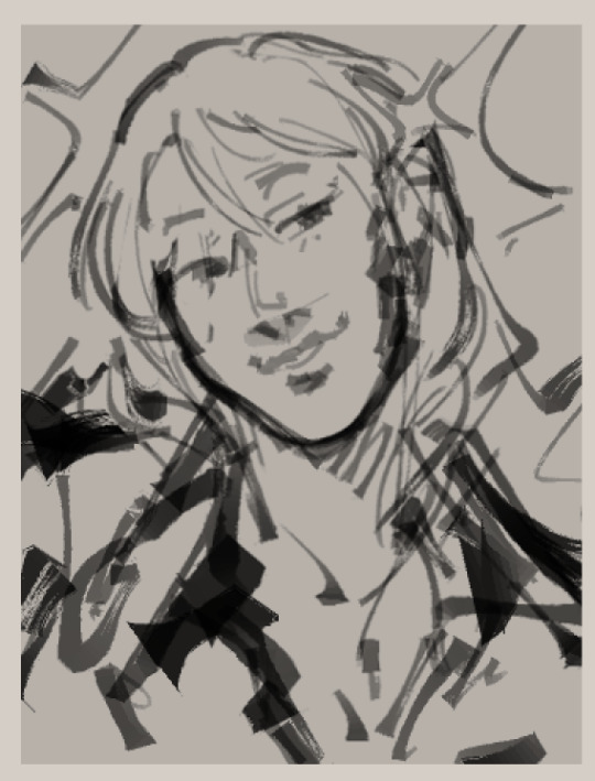
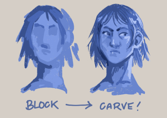
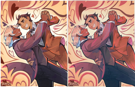
ahhh thank you! on implementing backgrounds, the way i do it is that i usually thumbnail before starting on what would be the final drawing. here's some thumbnail vs final drawing stuff lol


they dont have to be the most polished but they should give you an idea on what you want the final drawing to look like! though, sometimes, i don't thumbnail (WHICH U SHOULD THUMBNAIL, IT MAKES THE PROCESS SM EASIER BC U ALREADY HAVE AN IDEA OF WHAT YOU WANT THE FINAL PRODUCT TO LOOK LIKE) --
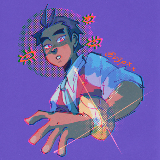
BUT!! when i don't thumbnail, i do use references that have a similar perspective on what i want to draw and go from there. i also add some extra stuff to it to give some personality and atmosphere to the background i want to draw (i wanted to draw an overgrown and abandoned building so i added tons of plants everywhere! which is my favorite thing to do lol)


i'm extremelyyy inspired by how steven universe's backgrounds look, so i implement some things I've observed from them! namely, how the lineart of things offset with the object itself, i like to do it a lot with plants bc i feel like it adds pizazz


also, something i try to do with every drawing with a background is to make use of a foreground element that would lead the eye of the viewer to the main focus of the drawing (which is usually the character) having some moving parts to your bg whether that be leaves, petals, curtains or whatever add some dynamism to bgs i feel


and uhhh another piece of advice that i heard that i thought was pretty useful to me is to treat designing backgrounds like you're designing a character! is this place neat or messy? brand new or ancient? what kind of person/people hang around here and what kind of stuff do they leave here?
also, if fullass bgs are difficult for you to draw, sometimes you don't even have to draw the whole thing! you can just give the suggestion of a background via some props and scene elements! put that background in a box for all i care!


(also if you're struggling to draw props, 3d models are your best friend)
ok onto the brushes LOL it depends on the background really bc when i draw rooms or buildings, i just use my regular brushes for that since i just line and ink them like i do with characters.
when it comes to backgrounds set in nature, however, i tend to go a lot more free/abstract with it so here are the brushes i usually use! they're also pretty helpful for painting, i just try to achieve a lot of texture with em
Custom Brush (i use this one for the leaves i gave in my examples!)
Stamp Table Pen Set スタンプ台の線画
Flat_Dirty_Archv
Rake Brush
Oil Brush
Thickpaint Superflat
MB_Wood
Smoke Brush (used this on that abandoned building drawing and could lady, it's really fun for like fog and mist too)
anddd that's it, i think! hopefully these are helpful!!!
#if this feels rambly its bc it is DFDGHD im kind of loopy rn so sorry if some of the things here dont make sense#sunnysideanswers#zygmainthedark#sunnysidetutorials#undescribed
95 notes
·
View notes
Note
I absolutely love the colors you use! Do you have a specific color palette that you choose from or do you just like to keep colors in a specific range?
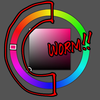
ahh thank you! i elaborate a bit more on how i choose colors here but the way i choose colors involves a lot of color relativity (the way a color can appear a certain way to someone bc of the color next to it.)

the way my colors look in the end is also decently influenced by the gradient maps/color adjustments i use to put over my drawings pftt, here's an example!

of course, i do still choose my own colors, usually, i use the combos i learn that work well with each other, but i love how purples, oranges, warm tones look so i do end up adjusting my drawing to get that result wheezes

anyways, here's some gradient maps i really enjoy using. i just put them on top of the drawing and then adjust the opacity to my liking and then boom!
126 notes
·
View notes
Note
hey sun! sorry to bother you, but I'm currently doing a commission for a guy who wants a portrait made in the disco elusium style and I've never drawn in that style before ^^;
any tips, especially how to color?
not a bother at all! and while i'm not an expert on the disco elysium art style since i don't think i've done enough studies on it to say that i'm confident on saying what to do, i'll try my best to list out the things i've noticed while mimicking the art style. i'll split this into two parts, the composition of a portrait and the rendering and technical stuff behind it
i'll keep it under read more bc some of these portraits i'll be talking about are spoilers! whoops!
COMPOSITION
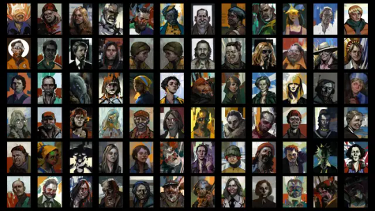
there's like, an unbelievable amount of variety when it comes to the portraits of disco elysium! personally, when i'm trying to mimic the art style, i try and look at the portraits in the game and see which of these characters are the most similar personality-wise to the character i'm trying to draw, and then i reference
1. PERSONALITY AND GROUNDEDNESS
let's compare the portraits of these two characters, ok? we have sylvie and idiot doom spiral. right off the bat, TOTALLY DIFFERENT VIBES, and that's good because we can instantly tell what kind of people these characters are supposed to be! and that's something disco elysium is excellent at.
sylvie's portrait is very simple; a very limited palette is used and the rendering on her is rather exact even with the rough-esque rendering that disco elysium's art uses. idiot doom spiral's portrait, on the other hand, is a lot more chaotic. there's more disorder to his portrait with how the paint strokes in the background seem to mix in with his face, there's a disheveled quality to how he's rendered.
ask yourself, how grounded is this character you're drawing? on a scale of sylvie to idiot doom spiral, how normal does their portrait look?
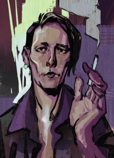
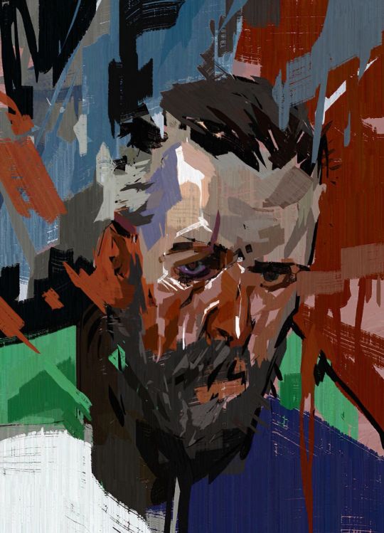
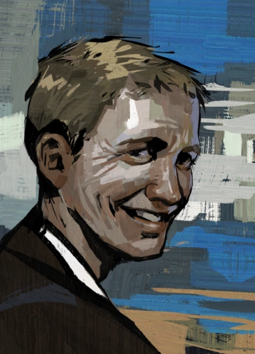
now, i'm not done with this klavier but i think it's pretty obvious that i heavily referenced smoker on the balcony's portrait because they have very similar vibes and role: pretty boy npc who your protagonist may or may not be a little infatuated with pftt (there's just something so different about them! i can't put my finger on it...)
2. WHAT DO THEY STAND FOR/THE ABSTRACT

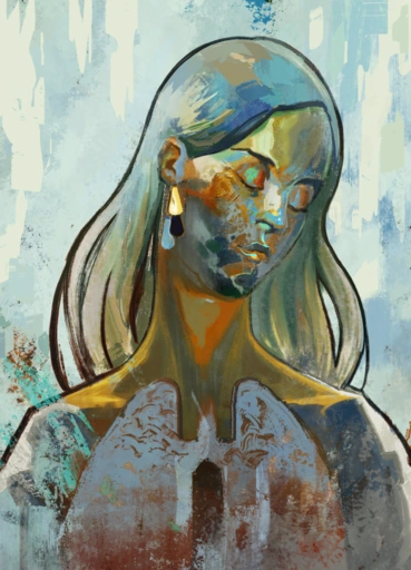
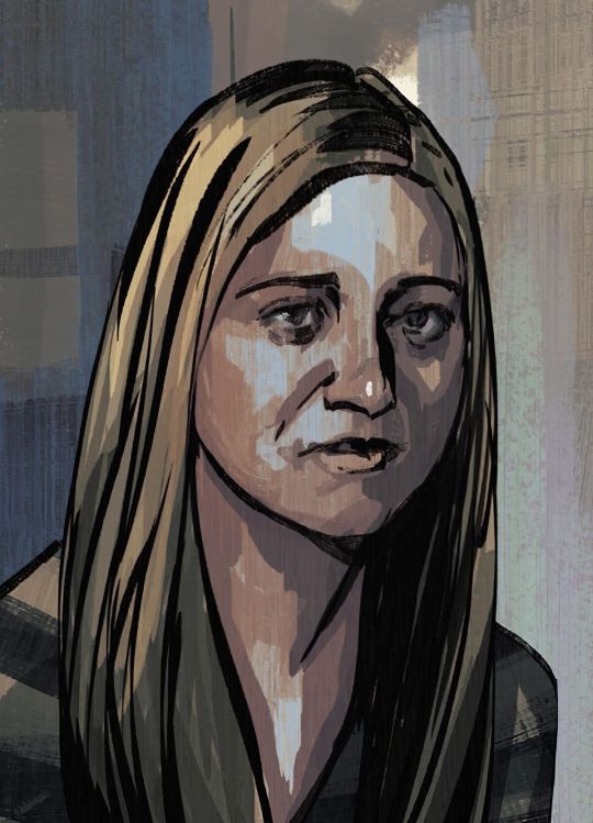
ok! besides personality, they also have a knack for just doing some gorgeous portraits that truly reflect just, the history of a character and their role in the story. now i'm not the best at analysis so these are just gonna be some very simple observations about kim and dolores dei's portraits pftt.
the big white circle behind kim's face, besides doing an excellent job of framing kim, is very reminiscent of a nimbus which we typically see in religious art. it makes kim look like a very important figure, someone you should listen to. it's also kind of like a nod to how kim is like the few people who's like, civil and even nice to harry after his whole mind-breaking bender.
for dolores dei, GODDD i can rave about this portrait forever, it's such a favorite of mine. first, the rendering of her skin, she's like an opal or a golden statue; it's otherworldly, which makes sense because that's what harry thinks of her. and then, the splotchier and messier rendering below her, it's like she's fading away, she's just a distant memory of the past.
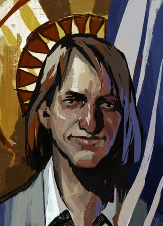
i'll use this very quick doodle of apollo in the de style to explain my point about symbols better. what is it that you want to emphasize about your character? are there any motifs you'd like to show?
i definitely wanted to portray apollo as determined and even heroic-looking in this portrait. leaning into his name, added that rim-lighting as if the sun was shining on him. emphasized his badge by giving it this exaggerated shine on it and lastly, made the background like the one he has when he perceives.
3. LOCATION
for backgrounds, i feel like you can go either three ways: abstract colors, political alignment, and location.

(i'm not happy that i have to use gary as an example here but he's the most blatant example of the second type of background AKSKSKS orz)
ok! so harry's bg, pretty funky, pretty fun. gary's bg, he's a fascist, that's the fascist flag in de. moving along trant's bg looks like a very abstract version of the wall in the building he's seen gazing at, heck, the way he's head is turned to you looks like you just called out his name and he quickly turned around to look at you but he is still very much facing the building.
more examples of those three things! garte: colors. titus: that red block is present on all union members. dicemaker: facing the window in the darkness of her workshop.
RENDERING
de has fairly very realistic looking faces, so brush up on your knowledge of the anatomy of a face or collect many faces/portraits that look the character you're trying to draw and reference the SHIT out of them!
1. BRUSHSTROKES

you're gonna be needing some brushes that have a texture to them ok. you're gonna need to slap those bad boys in that digital canvas and go wild ok. you can still do lineart kind of not everything is like rendered RENDERED bc some portraits make heavy use of smoother-looking black strokes to indicate lineart. ok i love you
2. PALETTES
think back to personality and symbolism, what colors are strongly associated with your character, and how grounded are they. the more normal they are the more minimal colors are used but if there's something going on with them you can go so so so wild
and also, you can eyedrop tool the colors from any of the de portraits, makes life easier pftt
3. HOW TO RENDER? HELP?
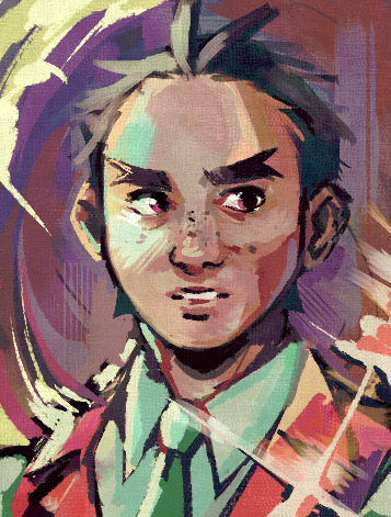
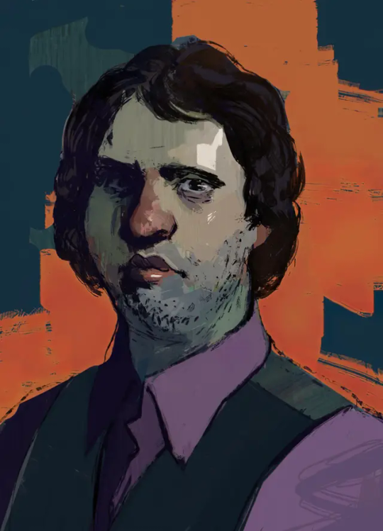
i'll go ahead and put my drawing of butch!kim here bc i basically just did a study of kim's portrait pftt. the art style is very painterly so i'm so sorry to say that you're gonna have to paint 😔 i know... i'm so sorry...
so block your colors! block your shadows and chip away on that thang, give it dimension! don't zoom in on your canvas in the earlier stages bc you'll end up fixating on one tiny part instead of the whole painting itself, and that's gonna make the duration of your drawing so much longer lol
ok i've been writing this for way too long and i can't think anything more to add so if there's anything else you want to know that i didn't mention here, feel free to ask me again. now good luck 🫡
#again not a bother at all i'm just terrible at answering asks quickly FDGHJD orz#sunnysidetutorials#sunnysideanswers#marchmay-may#described#id in alt text
63 notes
·
View notes
Note
Hey, how do you do your colours
I'm pretty sure you did tell us before but I can't find it, could you link it?
I love how you do your colours btw
here ya go! and thank you as well <33
also, for those who are curious, the posts where i explain how i do art stuff is under the #sunnysidetutorials tag! :^]
38 notes
·
View notes
Note
How do you choose the colors in your art? Your color palettes always look so cohesive and so pleasing to look at!
ah, this is gonna be pretty long so i'll talk about it under keep reading :^]
now i am no expert!!! i am just a guy!!!! i'll just be talking about how i do it! ok!
PART 1: COLORS??? HELP.
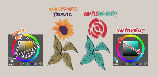
i really like going with warm stuff on my art so it's kind of a given that most colors i use end up wounding up on this side of the color wheel
so, let's say i'm coloring trucy, a character who wears blue, i end up choosing warmer looking blues, sometimes i end up choosing purple or gray if the other colors i chose makes it look like blue, yannow, color theory and stuff. like this for example!

now the first one is noticeably blue, but the second one is like a lavender and third one is like, really not blue! it's like a desaturated rose color or something, however, paired with the right colors...
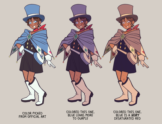
they're all "blue", aren't they?
PART 2: CHOOSE WEIRD COLORS
by weird colors, i mean colors that aren't like what the thing looks like irl. like, a leaf is green right? but, it doesn't have to be when you color it!
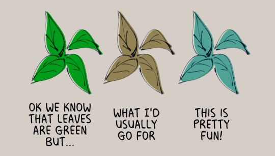
like when i color things gold sometimes, i use a light and desaturated red-orange for it or how like with the color blue, i don't even use blue at all!
now just because i use warmer tones a lot doesn't mean i don't use the colors from the other side of the color wheel, it depends really, if the color scheme i'm going for is monochromatic or if i really wanted to make something pop
but of course, you can't just color willy-nilly, you gotta take into account
PART 3: CONTEXT AND MOOD
where and when is your drawing set? what's the mood? are we having fun here or are there Horrors?
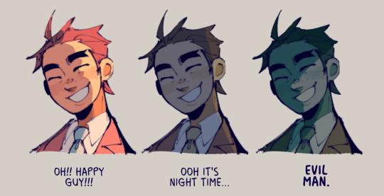
see how it changes the mood? the things we're supposed to be feeling when we look at the drawing? yeahg. ill use warmer colors when i want the drawing to look happy dreamy etc but ill break out the blues and greens when we're in sinister town pftt
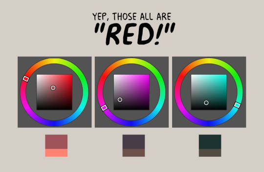
also, just wanted to share again how other colors can change what another color looks like:
PART 4: GRADIENT MAPS AND OVERLAY LAYERS
now as for making colors more cohesive... seriously, just slap that thing on top of your piece and it helps the colors get together even more! like of course i choose my own colors but gradient maps + overlay layers are kind of like adding that one final thing.
i'll use this one as an example, left one is no gradients maps/overlays and the right one is with them. i just really prefer some good ol' ourple tones in my art so there are a couple of things i add on top to really bring out the warmth in here, like so:

PART 5: ANYTHING ELSE?
uhhh don't be afraid to use tools in your program to correct the colors you don't like ala color balance tone curve contrast brightness etc etc.
hell, you can even color pick from like irl pictures and adjust accordingly to what colors you want.
i also do have like colors that i consistently use when shading things after countless trial and error; like how i'll use purple to shade red, blue to shade with green etc etc
ig that's all, hope this helps!
#sunnysidetutorials#ajdgdjkd there's another in my ask box asking me about how i shade so stay tuned for that ig#im sorry gusy but if yall wanna get into my head with how i color ya gotta tackle color theory first#like . its pretty easy to understand i think#however it did took me a while to like *actually* be able to apply it in my art#so i understand that it can be pretty difficult
1K notes
·
View notes
Note
Den i've always been super curious as to how you do the screenprint/polkadot thing in your art, I love it so so much Would you be willing to drop a quick tutorial if it isnt too much trouble?? <:Dc its so funky and i've never been able to figure it out
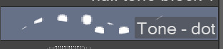
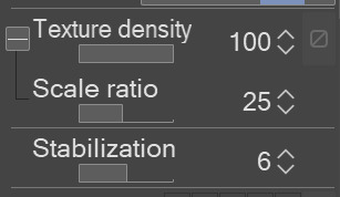
the tone thing i do in my art is just a neat csp brush set! :^]c i do tend to use this one brush in it the most tho!
i also slap some chromatic aberration on it to make it look trippier + when i want it to fade in the edges (to add like a glow effect), i usually do this!
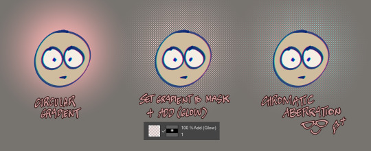
hope this helped!!
#sunnysideanswers#sunnysidetutorials#apollo justice#ace attorney#love to do this effect#sunnysidedraws#sumiremain
326 notes
·
View notes
Note
do you have any tips for the first time taking commissions? also, your artstyle is delightful, i love the bright colors and linework !
thank you! i'm no expert so i'll only be talking about my own experience and what i did when i opened commishes last year :^]
1. set up your pricing, samples, and tos ok this one's kinda obvious bc you gotta show people info on what stuff you could draw and how much will it be! you could either make a carrd or info document for this. feel free to look at other artists' info docs/commish carrds too to see how they formatted theirs so you could get an idea.
as for pricing, i think looking at how other artists' price their work too could help in deciding how your gonna price your works. i personally looked at other artists who i think have a similar style to how i draw and factored in how long i usually work on something when pricing my stuff.
2. establish a limit/amount of slots for commissions the last thing i wanted to happen when opening commissions was to be overwhelmed, thus, making me unable to start on any work bc of task paralysis, i didn't want to bite more than i can chew so i made sure to know and limit how much stuff i can draw.
i limited myself to 8 slots, under it are 4 slots for sketches, 2 for both flat-colored drawings and shaded drawings. i knew drawing with colors would take a lot more time so they're in a lesser amount compared to sketches which i confidently think i could do quicker.
of course, as you grow more confident with your workflow/process/speed, you're free to have more slots or no slots at all! even make a waitlist or something.
3. communicate clearly with your clients got busy and can't work on your commission at the moment? tell it to your client! people are nice and pretty understanding when life gets in the way so don't be shy or embarrassed to say that you can't work on their piece right now. be clear too or even give an estimated date of when you can continue it.
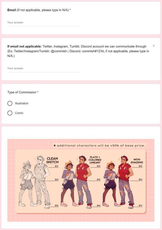
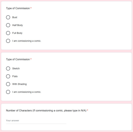
4. make a form where people can submit commish requests i didn't do this the first time so communication with clients took a lot more time and energy than needed, so make life easier for yourself and make a form that asks everything you need to know about your client's commission: the commish description, number of characters, reference pictures, style of drawing, etc.
here's a video on making commission forms that i thought was pretty helpful! once again, feel free to look at other artists' forms too to see how they formatted it and such.
here's mine as a lil example:

that's really all i could think of rn, hope this helps anon :^Dc
38 notes
·
View notes
Note
(omg hi ur on tumblr !!) i loved your post with the sprite redraws, can i ask how you added the glow effect to nahyutas scarf? thanks!
aww thank you, glad to hear that!! <33 and the glowy effect is pretty simple to do actually!
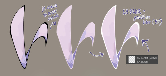
step 1: change your lineart color to the base color you used for the scarf slash thing slash w/e.
step 2: duplicate your lineart layer and gaussian blur it to at least 5% (or more, up to you!), then set the layer mode to add (glow) so the outline of it glows :^]
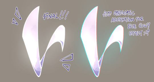
step 3: make a layer with the blending mode add (glow) above the whole thing. then get your soft airbrush, get a very light color, then put it in the areas where you want it to be super glowy! :^D
bonus step: do a little chromatic aberration as extra pizzazz :^P
and that's it, hope this helped ya! <33
52 notes
·
View notes
Note


ok so here's how!
step 1: using your gradient tool, make a gradient on your canvas. step 2: while pressing ctrl on your keyboard, click on your thumbnail (that's this one) so that you could make a selection in the shape of your gradient.

step 3: now that you have the shape of the gradient selected, click on the mask button to make a mask in the shape of the gradient you made.

step 4: then, delete what's inside your layer, leaving only an empty layer and the mask you made. step 5: get your tone brush and color the inside of your layer with it, and that's how you get the effect!
hope this helped!!
Den i've always been super curious as to how you do the screenprint/polkadot thing in your art, I love it so so much Would you be willing to drop a quick tutorial if it isnt too much trouble?? <:Dc its so funky and i've never been able to figure it out
the tone thing i do in my art is just a neat csp brush set! :^]c i do tend to use this one brush in it the most tho!
i also slap some chromatic aberration on it to make it look trippier + when i want it to fade in the edges (to add like a glow effect), i usually do this!
hope this helped!!
326 notes
·
View notes