#translateandtransform
Explore tagged Tumblr posts
Visit Tumblr Blog
Explore Tumblr blogs with no restrictions, modern design and the best experience.
Last Seen Tumblr Blogs


Fun Fact
Tumblr’s reach among the 26-to-35-year-olds in the US is 11%.
Text
Translate and Transform Evaluation
Year 3 - Translate and Transform
(26 October 2020)
I enjoyed this project a lot, even though I think I took on a project way too complex for a one-week project.
What informed & motivated my design decisions?
Since there were no theme restrictions I wanted to work on something that related to my interests, something that could fit in with what I aim to do later on in my career. Music and Languages (Japanese specifically) are two topics that I am very interested in and maybe even passionate about.
What changes & developments has this project gone through?
Did I manage my time well throughout the unit? In my opinion I managed my time during this short project well. I am glad that I had some ideas pretty quickly, so I could actually work on them and develop them.
How did I respond to feedback?
How can I improve my design process?
What have I learnt from this unit of study?
On reflection, are there any improvements I would make to the final outcome? There is not really an actual outcome to this project in my opinion, as I realised it is much more complex. Maybe I am thinking too far but the system that I came up with isn’t really a solution to the ‘problem’ (is it really a problem either? I am not sure). Colour codes for the more simple alphabet might be a nice idea but what about the people who are colour blind? The system would not work for them. They could probably still make out the shapes but the colours are important too. But that poses the next problem. The colour code would mean that there would have to be a specific colour assigned to a letter. That might confuse people. Why does h suddenly have to be pink everywhere? How would people with synaesthesia cope with this? There are more technical questions too. Would the Japanese society and government even accept a system like this or would that offend their culture? I am not sure whether or not I have to think about things like this but those thoughts came up in my mind and since they are unanswered I don’t really consider my outcome a final outcome at all.
0 notes
Photo


Translate & Transform Presentation & Feedback
Year 3 - Translate and Transform
(26 October 2020)

0 notes
Photo
Language Visualisation
Year 3 - Translate and Transform
(25 October 2020)
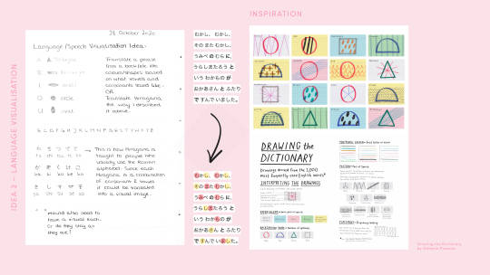
After our tutorial on Thursday I decided to prioritise my language idea. I didn’t research a lot before I started as I already knew about the Japanese language (specifically the alphabet I decided to tackle) and also I had quite a clear image of my idea and how I wanted to visualise it.
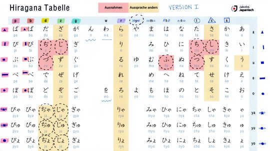
The first step was to print out a really nicely designed Hiragana and Katakana chart (not designed by me but it was so well organised that I had to use it) to then draw my ideas on it. I worked with Stabilo Pastels for the colours and used a muji pen for the shapes.
•••••
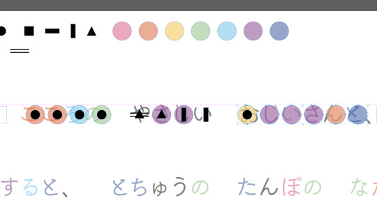
Version 1 I did assign most colours and shapes randomly. My goal was to just see if it would somehow work out at all.However, the decision for the shapes of the vowels was deliberate. I was thinking of how we shape our mouth to say the vowels (a,e,i,o,u) and chose a simple shape close to that.
a = triangle e = rectangle (horizontal) i = rectangle (vertical) o = circle u = square
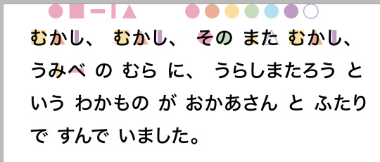
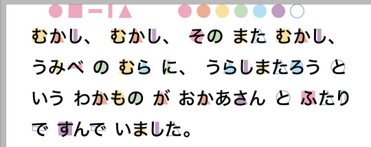
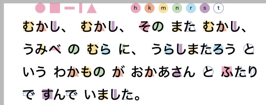
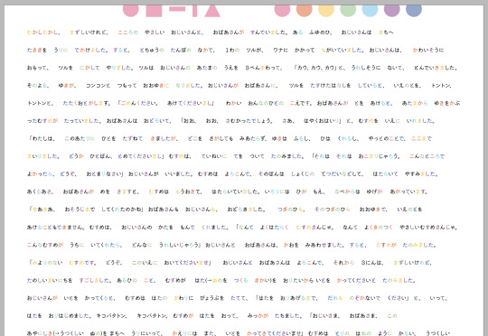
I then looked for an easy text, written only in Hiragana - it is a tale called うらしまたろう (Urashima Taro).
https://crunchynihongo.com/hiragana-reading-practice-urashima-taro/.
むかし、むかし、その また むかし、うみべ の むら に、うらしまたろう と いう わかもの が おかあさん と ふたり で すんで いました。
I tried to ‘translate’ the first line of that tale into my colour-symbol system. It turned out that it looked like a whole new language and was really complicated. Though, I realised that the vowel-shapes were quite easy to remember, as well as the parallel horizontal lines ‘=’ (which represented the letter ‘m’ in this version). Compared to the ‘°’ or ‘//’ it just stayed in my mind better and I could remember those characters were ‘m’-characters.

•••••
Version 2 Technically this would be version one because I did dis grouping before the other one but my organisation got me confused so I called this version two. What I did was to group all the characters by vowel. The vowels were assigned a colour and then all the characters that included that vowel would also have that colour. I realised there was no point in that system as it would not have helped to solve the initial problem so I decided to just discard it without translating the text.

•••••
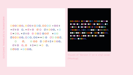
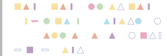
Version 3 I took the thought from Hannah, trying to find a solution that supports my own learning, and decided to colour-code the consonants in the order of the rainbow colours (I have organised things by rainbow colour since I was little so I knew this would be easiest for me to remember quickly). Some of the consonants (like ‘k’ and ‘g’) have the same characters but the ‘g’ is like an adjusted form of ‘k’ and features (“). Knowing this I could assign the same colour to ‘k’ and ‘g’ as I knew I’d be able to keep them apart anyway. I did the same for ‘h’, ‘b’ (”), ‘p’ (°); ‘t’ and ‘d’ (”); and ‘s’ and ‘z’ (”). I kept the shapes for the vowels as they were originally as I figured they work well - though I was contemplating whether to leave them away completely since my biggest problem was Japanese characters like れ and ね, that look similar but belong to different consonants. Most of the time, once I know the consonant-group I also know the vowel. (I hope this makes sense...)

I translated this again, to see how it works in comparison to the first system. It looked a lot more simple and less chaotic. The colours make it clear which consonant-group the character belongs to - at least after one has memorised the colours. The shapes of the vowels are easier to see as well which increases the reading speed.

There were still some issues that I had from the very beginning. Like the character し (shi) which consists from two consonants and one vowel. Do I represent the characters exactly as they are pronounced or do I focus on reading speed and the general groups without taking too much care of pronunciation?
Version 4 Focusing on my own learning I thought just a colour-grouping would be enough as I am aware of the different pronunciations. I just have difficulties remembering which consonant-group the character belongs to. To test this I took a longer text and only colour-coded the characters (without any extra symbols). I did this yesterday so I have to give myself at least a day of not looking at this. I know the system I created so it wouldn’t be really well examined if I tried to read it right after applying the system.
http://www.hukumusume.com/douwa/0_6/jap_pc/03/01.htm
•••••
For this project I felt like colour-coding only wouldn’t answer the brief though. So I decided to also translate this longer text into my Version 3 system. While doing that I thought it would look cool on an album cover so I did some experimenting with that.
0 notes
Link
Hiragana Table
Year 3 - Translate and Transform
(22 October 2020)
0 notes
Link
Katakana Reading Practice
Year 3 - Translate and Transform
(22 October 2020)
0 notes
Link
Hiragana Reading Practice
Year 3 - Translate and Transform
(22 October 2020)
0 notes
Link
Frome Data Visualisation
Year 3 - Translate and Transform
(22 October 2020)
0 notes
Photo

Chineasy by ShaoLan Hsueh
Year 3 - Translate and Transform
(22 October 2020)
https://www.dandad.org/awards/professional/2015/book-design/24451/chineasy/
https://www.amazon.co.uk/ChineasyTM-Everyday-World-Chinese-Characters/dp/0500292264/ref=sr_1_1?adgrpid=52654277425&dchild=1&gclid=Cj0KCQjw28T8BRDbARIsAEOMBcxEu71jyeWJ0u2W_XzqXK8aw8t_KlbdYeRoH-_kdRvCGDJqTgmWAv4aAqsQEALw_wcB&hvadid=259041401669&hvdev=c&hvlocphy=9045719&hvnetw=g&hvqmt=e&hvrand=2375713979273600760&hvtargid=kwd-301536549734&hydadcr=12094_1783041&keywords=chineasy+book&qid=1603356425&sr=8-1&tag=googhydr-21
0 notes
Text
Tutorial 22.10.2020
Year 3 - Translate and Transform
(22 October 2020)
Notes from the tutorial:

0 notes
Photo


Translate and Transform Tutorial Slides
Year 3 - Translate and Transform
(22 October 2020)
0 notes
Photo

Land Rover Topographic Calendar by Zeynep Orbay
Year 3 - Translate and Transform
(21 October 2020)
I am not sure if this counts as a translation? Like, translating time into a... model? I just found this very pleasing to the eye and thought it might suit the topic. But not sure about that.
https://www.zeyneporbay.com/#/iii/
0 notes
Photo

Food Data Visualisation - Design X Food by Ryan MacEachern
Year 3 - Translate and Transform
(21 October 2020)
A photographic approach of visualising data with a really nice colour palette and a clear representation of the data.
0 notes
Photo


Data Visualisation (Physical) - Data Xmas
Year 3 - Translate and Transform
(21 October 2020)
I love this data visualisation idea by a Spanish design studio. They used chocolate to show the data and made these visualisations a a kind of Christmas present.
0 notes
Video
youtube
Data Visualisation - David McCandless
Year 3 - Translate and Transform
(21 October 2020)
Inspiring video about David McCandless who is a data journalist.
0 notes
Video
youtube
D3.js A Practical Introduction
Year 3 - Translate and Transform
(21 October 2020)
This is a tool to convert data into graphics using code. It is complicated and I have not watched it completely yet as I think this will exceed the frame of this one week project. However, I think coding in combination with design can be extremely fascinating and full of possibilities so I might come back to this at some point.
0 notes
Photo
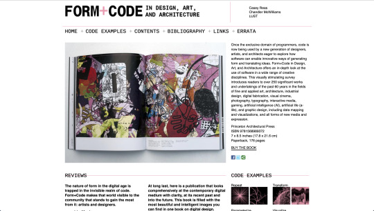
FORM + CODE
Year 3 - Translate and Transform
(21 October 2020)
http://formandcode.com
0 notes