#typespecimen
Explore tagged Tumblr posts
Visit Tumblr Blog
Explore Tumblr blogs with no restrictions, modern design and the best experience.
Last Seen Tumblr Blogs


Fun Fact
Tumblr’s website traffic is steadily declining.
Photo


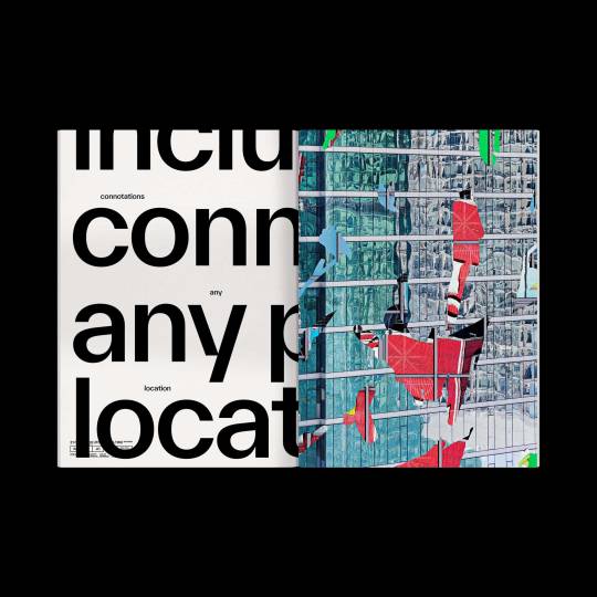
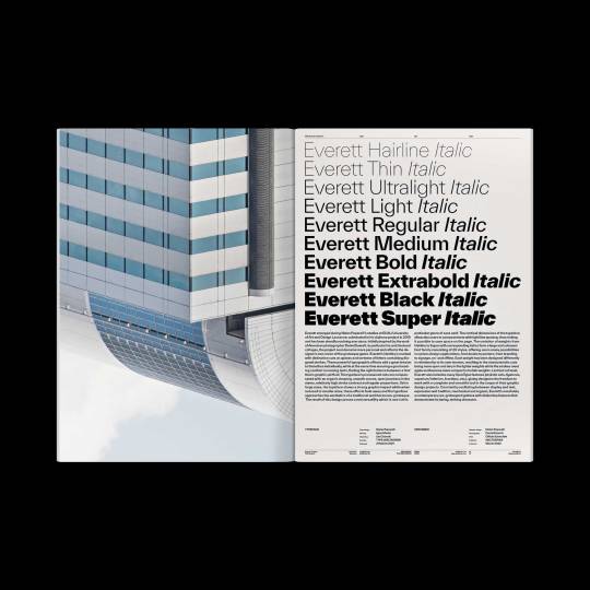
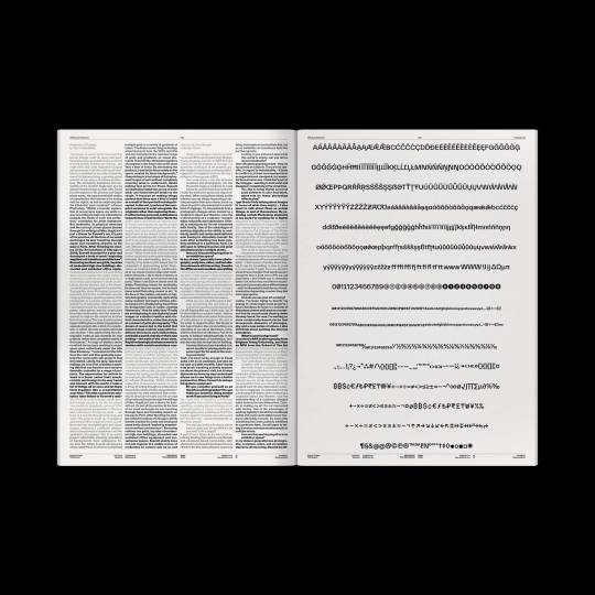
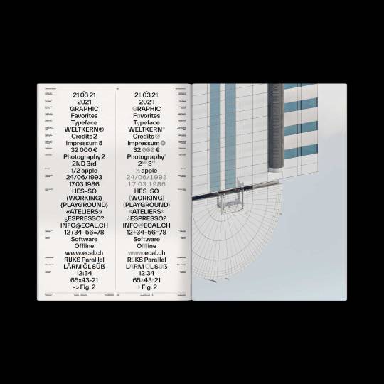

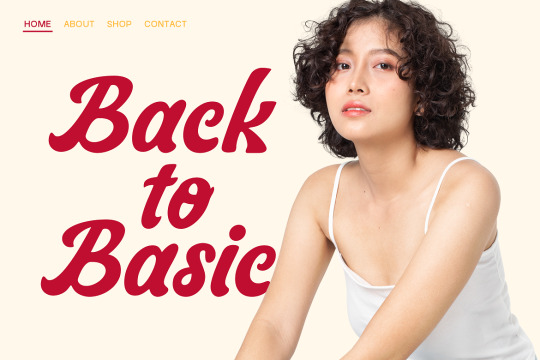
Forever Everett out now on WELTKERN®! 🌈 Published by WELTKERN® Photography by Daniel Everett Typography by Nolan Paparelli Printed by Offizin Scheufele
#weltkern#twkeverett#typeweltkern#nolanpaparelli#danieleverett#forever#everett#forevereverett#specimen#typespecimen#typedesign#typeface#type#poster#print
195 notes
·
View notes
Photo
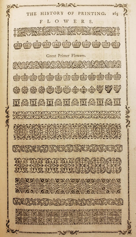
From: Luckombe, Philip, -1803. A concise history of the origin and progress of printing. London : W. Adlard and J. Browne, 1770
Z124 .L94
#typespecimen#printerstype#printingtype#type#caslon#williamcaslon#floralornament#crowns#thistle#fleurdelis#skullandcrossbones#hourglass#english#18thcentury#rarebooks#specialcollections#libraryofva
320 notes
·
View notes
Photo

DENIM has italics, full family counts 12 styles now. #new #displaay #foundry #denim #typeface #font #sans #italic #type #typography #typedesign #typefoundry #fontdesign #letters #specimen #typespecimen #typographic #typeinspire #graphic #design #graphicdesign #thedailytype #goodtype #lettering #designfeed #typefacespecimen (at Rome, Italy) https://www.instagram.com/p/CYruja8rsUT/?utm_medium=tumblr
#new#displaay#foundry#denim#typeface#font#sans#italic#type#typography#typedesign#typefoundry#fontdesign#letters#specimen#typespecimen#typographic#typeinspire#graphic#design#graphicdesign#thedailytype#goodtype#lettering#designfeed#typefacespecimen
15 notes
·
View notes
Photo

究竟涅盘 #type #typedesing #logotype #typeface #chinatypo #typefacedesign #chinesecharacters #typegraphy #fontdesign #graphic #calligraphy #handwriting #typespecimen #branding #字体设计 #手写 #书法 #作字 #汉字 #字体 #中国 #中文字 https://www.instagram.com/p/CjakXWuuwMo/?igshid=NGJjMDIxMWI=
#type#typedesing#logotype#typeface#chinatypo#typefacedesign#chinesecharacters#typegraphy#fontdesign#graphic#calligraphy#handwriting#typespecimen#branding#字体设计#手写#书法#作字#汉字#字体#中国#中文字
3 notes
·
View notes
Text


FREE DOWNLOAD!!! WARINGIN - SCRIPT TYPEFACE Waringin is a retro styled and graceful script font. Fall for its gorgeous style and use it to create gorgeous wedding invitations, beautiful stationary art, eye-catching social media posts, and much more! TAP HERE FOR FREE DOWNLOAD
TAP HERE TO BUY FOR COMMERCIAL USE
THANKS FOR YOUR LOVE
#font#fonts#type#typeface#displayfont#futuristicfonts#alphabet#myfonts#logodesign#esportlogo#fontdesign#typefacedesign#typography#typographicdesign#template#trendingfonts#typespecimen#typedesign#fontstyle#typographytips#fontsforyou#displayfonts#contemporarytype#letters#art#artists on tumblr#books & libraries#illustration#music#graphic design
3 notes
·
View notes
Photo

All the pi, set in beautiful 60 point Sylvan (or Champlevé). I’m still setting my daily line of type—a project that began in 2021—and the end is in sight as I proceed alphabetically. I see you, Wide Latin. #typespecimen #oneliners #typography https://www.instagram.com/p/CbGKoB9P2eD/?utm_medium=tumblr
3 notes
·
View notes
Text


"Horizontal splinters, slanting rains, elongated immateriality."
Appreciating the weird poetry of type specimen books for today's #typographytogether April challenge.
What's your favorite line?
Type specimens from Lawrence Johnson's Second Supplement to the Specimen Book of Plain and Fancy Types, Ornaments, and Combination Borders. [Philadelphia, ca. 1850?]
44 notes
·
View notes
Photo


🎩 Wonderland: Clarendon Specimen [2016] 🎩
Objective: Create a book of the Clarendon typeface with the theme of "Alice in Wonderland".
—
Typography I: Form Print [5.5 in. x 8.5 in.] Illustrator, InDesign, Acrobat
#design#designs#graphicdesign#designer#graphicdesigner#aliceinwonderland#wonderland#clarendon#typography#typespecimen#type#print#printdesign#printdesigns#printdesigner#book#bookdesign#bookdesigns#bookdesigner#adobe#indesign#adobeindesign#illustrator#adobeillustrator#acrobat#adobeacrobat#uic#art
5 notes
·
View notes
Text
REFINE POSTER 3 [GMS BRIEF]
For my third poster design, I tried a new printing technique and I absolutely loved it. I love trying out new hands-on techniques and I will use this again and hopefully master it!
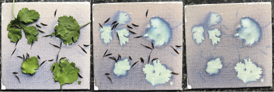
Cyanotype
Cyanotype is a printing process used in photography and creates a cyan-blue print. This process has been most popularly used since its creation in 1842 by engineers and a lot of cyanotype printing can be known as 'blue prints'. It is a process that uses a mix of chemicals to copy drawings or in our case, create images using everyday objects. The process is photo-sensitive and the application of the chemicals to a porous surface, allowed to dry in the dark and then exposed to UV light when ready to create your copied image as a contact print.
In printmaking, plants are typically used in this type of printing however you can use any solid object, pressed onto the sensitized paper usually with a sheet of glass over the top.
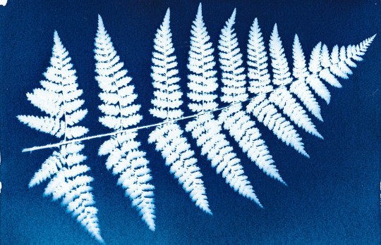
- An example of a cyanotype print using a fern leaf
When I started, I tried a Cyanotype on a small piece of canvas with some every day objects and seeds to see if I could create a nice effect using plants and seeds. I loved the effect created however the canvas continued to develop and the image was soon lost.
For my cyanotype experiments I used letters I had previously made for this project and placed them on paper I had sensitised with a chemical solution.
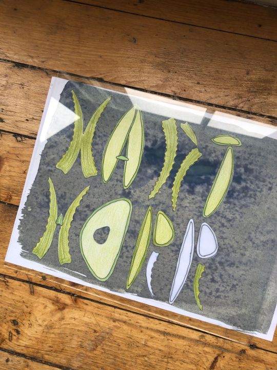
I arranged the letters and allowed them sit in sunlight for 30 mins. I had sesnsitised some recycled white paper as I wanted a grainier texture to the image however in the final prints, the recycled nature of the paper caused the ink to gather in spots and not dry fully. At first i wasn’t happy with this however in the end it worked out.
My first print came out okay - too much ink as mentioned but I did enjoy that the pencil strokes had even come through on the image.
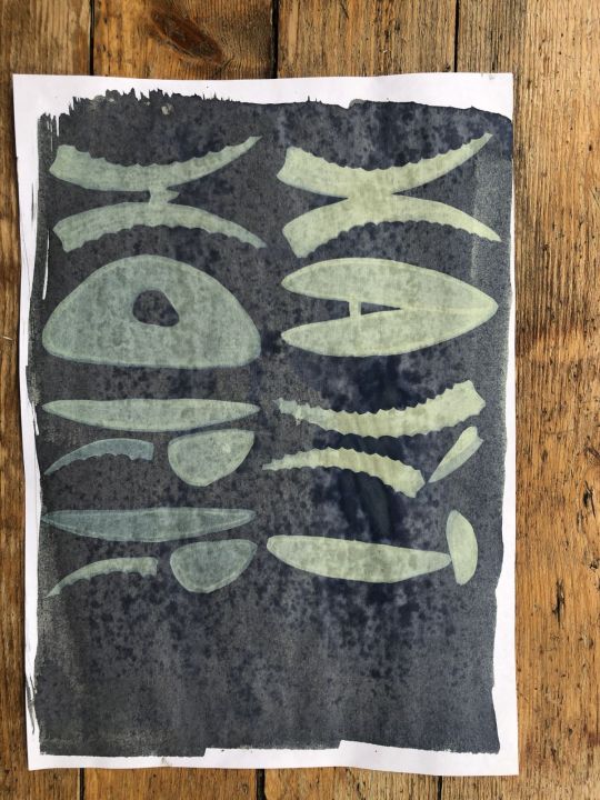
I tried again with another formation, this time arranging my letters at random on the paper.
I used a sheet of glass on each print and left under the window. This time for 40 minutes and this page I sat in the sun for a couple of minutes before I out the letters on.
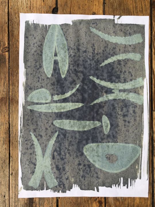
I liked this version a lot as again, you can really see the different colours coming through from the different pencils in the rendering. The gathered ink on the recycled paper wasn’t great though.
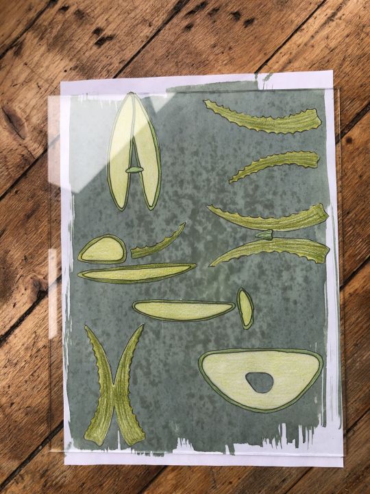
On my third attempt, I changed the letters around again.
And my print came out like this:
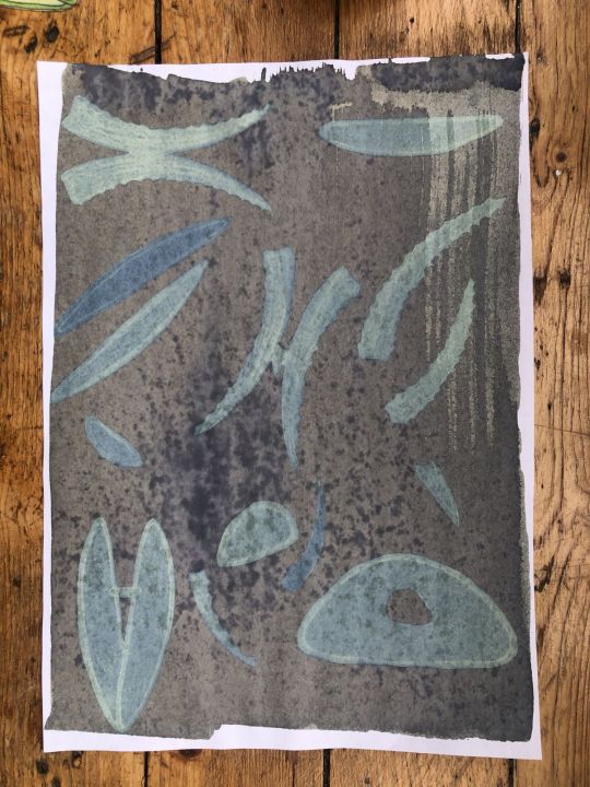
I had added extra shapes but these were not coloured in and you can see this clearly on the print so I didn’t like this as much as the other two. I chose my favourite image and used that for my poster design.
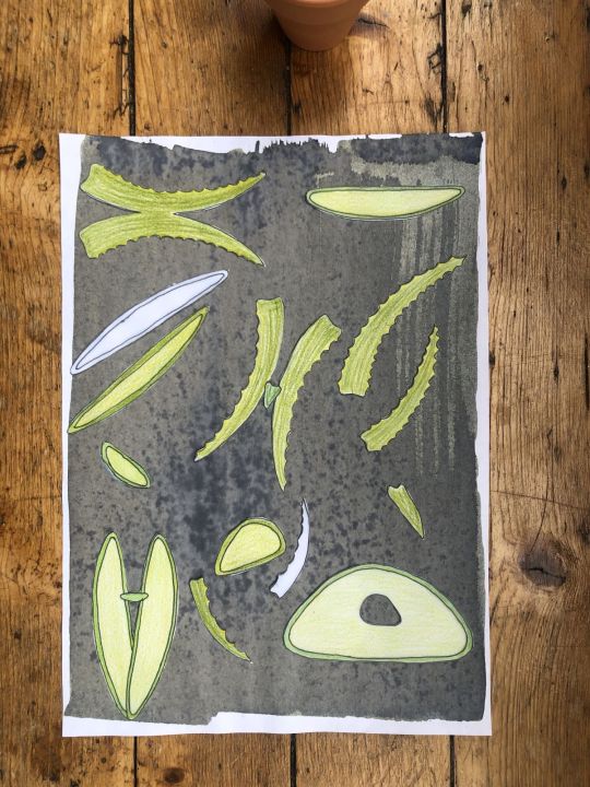
Using photoshop, I tuned the image a little, I wanted to pull through some greens to maintain the aloe feel. I had attempted to tone the prints with tea however this washed away my entire design so definitely something to play with in future.
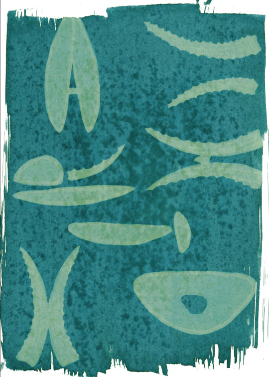
I am so happy with this design - it has become the front of my final design solution. I then played around with fonts to use to go along with this and the back side of my poster can be seen below, using a typewriter style font to enhance the imperfect print style qualities. I brought some graphic qualities from the front onto the back of the poster to make it more dynamic and brought my font in black.
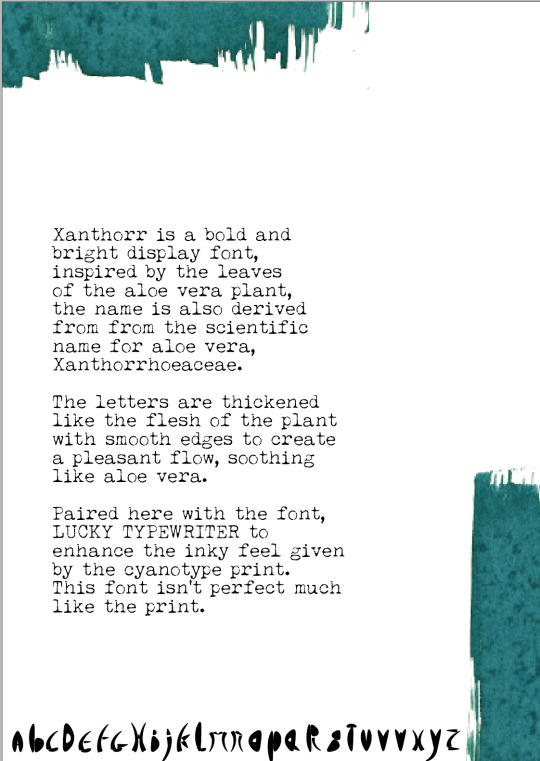
On reflection, I really enjoyed this process and would use it again. I spent a good amount of time looking for fonts that could match up with the design (seen below) and I am happy I settled with this one. If I were to do it again, I would perhaps try layering cyanotype on top of each to see how that would work or I would move the letters about halfway through processing time.
5 notes
·
View notes
Photo

This typeface began specifically for my poster for the Genova edition of @showusyourtype. I really wanted to experiment with creating a serif typeface and I was very happy with the results, but it’s been quite a challenge trying to expand it since. I have about half the letters done, and I’ve been stuck there, but here is a little taste anyway! . . #typefacedesign #typefacedesigner #typesample #typespecimen #logotype #fontsinuse #fontdesign #typedesign #typedepartment #typographic #typeriot #typecollect #contemporarytype #365typefaces #typeswiss #type01 #lavendrtype #thetypists #generaleclectics #typetopia #typeeverything #heydesign #designcrack #eyeondesignmag #graphicindex #selectedwork #grvphicworld #curatory #visualgraphic #fkndesign https://www.instagram.com/p/CTAOsiALYQ3/?utm_medium=tumblr
#typefacedesign#typefacedesigner#typesample#typespecimen#logotype#fontsinuse#fontdesign#typedesign#typedepartment#typographic#typeriot#typecollect#contemporarytype#365typefaces#typeswiss#type01#lavendrtype#thetypists#generaleclectics#typetopia#typeeverything#heydesign#designcrack#eyeondesignmag#graphicindex#selectedwork#grvphicworld#curatory#visualgraphic#fkndesign
2 notes
·
View notes
Photo

Thanks to @typotheque for sending this beautiful type specimen book ____________________________________ #typeface #Typotheque #November #font #release #Georgian #Hebrew #project #Here #typedesign #design #graphicdesign #alphabet #character #characters #specimen #TypeSpecimen #book #poem #Typebook #photography #magazine #designmagazine #designbook https://www.instagram.com/p/CS9MwxNIViK/?utm_medium=tumblr
#typeface#typotheque#november#font#release#georgian#hebrew#project#here#typedesign#design#graphicdesign#alphabet#character#characters#specimen#typespecimen#book#poem#typebook#photography#magazine#designmagazine#designbook
2 notes
·
View notes
Text
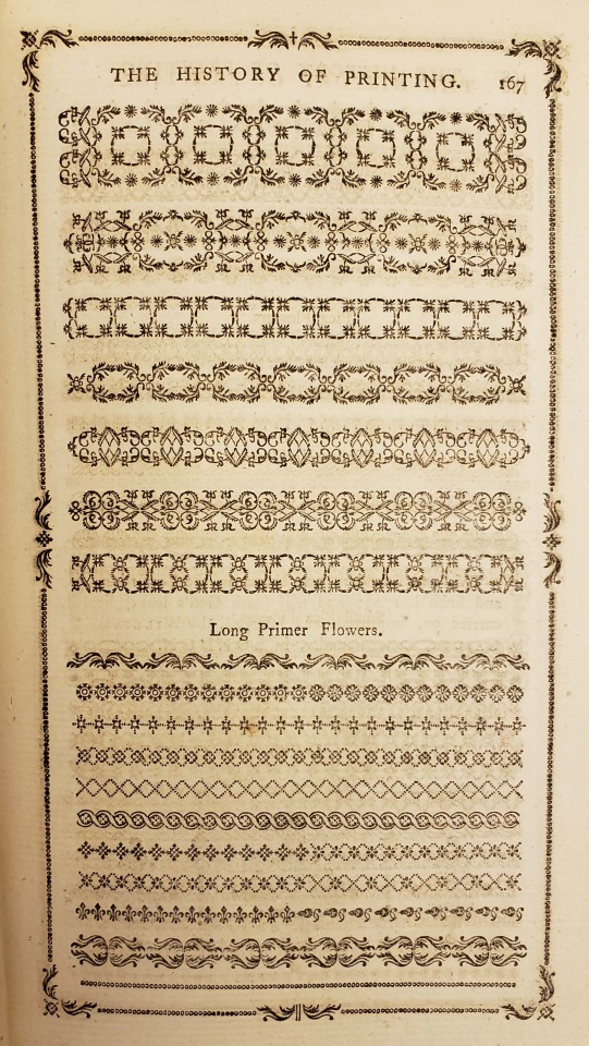
From: Luckombe, Philip, -1803. A concise history of the origin and progress of printing. London : W. Adlard and J. Browne, 1770
Z124 .L94
#typespecimen#printerstype#printingtype#type#caslon#williamcaslon#floralornament#english#18thcentury#1770s#rarebooks#specialcollections#libraryofva#printinghistory
64 notes
·
View notes
Photo

NEWLY Denim typeface contains italics. #new #displaay #foundry #denim #typeface #font #sans #italic #type #typography #typedesign #typefoundry #fontdesign #letters #specimen #typespecimen #typographic #typeinspire #graphic #design #graphicdesign #thedailytype #goodtype #lettering #designfeed #typefacespecimen (at Houston, Texas) https://www.instagram.com/xyz_displaay/p/CYCfpsyLN-g/?utm_medium=tumblr
#new#displaay#foundry#denim#typeface#font#sans#italic#type#typography#typedesign#typefoundry#fontdesign#letters#specimen#typespecimen#typographic#typeinspire#graphic#design#graphicdesign#thedailytype#goodtype#lettering#designfeed#typefacespecimen
14 notes
·
View notes
Text
Type Specimen Poster - Inform
In my initial foray into InDesign I was incredibly proud of my first mockup. Given the brief to create a poster with no graphic input, only using the words available, I was proud and impressed with how I was able to use the type to tell a story. The letter o jumped out at me in the title of the brief, and so I chose to use that as my focal point, showing the letter rolling out of place every time it was used in a word. I enjoyed having the restrictions put on us to not use any graphics but found myself urged to adapt the words into some kind of image.

As a hangover from this, I started trying to tell the story of my typeface using ‘type as image’. Trying to create arrows, attempting to mimic the design shape the font came from and blatantly just using rectangles to allow the type to get a message across simply didn’t work for me. I had written my copy out as a large paragraph and the cut it into three main chunks, but breaking it down further caused the final product to seem sporadic and very hard to read.

But I had been inspired by own writing to further the analogy of travel, and started to formulate the idea of an airport conveyor-belt. Itself a means of travel, I hoped I’d be able to allow the reader to follow my narrative along the curved path of the conveyor, as one’s eyes follow their suitcase travelling slowly towards them.

Essentially, I was trying to draw a conveyor-belt and force my text into it. I was really proud of my work though. It looks like a conveyor belt, almost to its detriment as the writing didn’t follow the path, stuck as I was in the traditional “left-to-right, top-to-bottom” mindset when I was putting the words into place.

Story of my design life really: I was just trying to make a pretty picture, and had put the brief to the side. The last design looks like a piano surrounding a clown’s face. I had forgotten what I was doing this for, I was showing off what I had learned to do with InDesign - I was supposed to be showing off my font. So I stripped everything back (again), and even deleted my rambling copy where I was asking myself questions then boasting about the answers. At this point I also changed the font that I was typing with. I had been using Grilli Type’s Haptik as I felt it helped to carry on the curve-aspect of Suitcase, but it had started to distract me, forcing everything to seem very circular. As much as I wanted to use the Suitcase font, my experiment with Calligraphr had shown me that it would have been a little too intense to be utilising the tapered version in paragraphs. I then came across Prompt, by Cadson Demak - I feel this is round enough to continue the theme from the D-shape, but also has a squatness that linked to the length that many of the shapes utilise.

I put the name of the typeface to the side (literally) and put the facts into words. 1 - I was inspired by the handle on a suitcase 2 - That shape was really cool and incredibly adaptable 3 - I designed a font using that shape
Once I had this copy, I chose to highlight a few parts of the text, before playing with kerning and line-spacing in order to have a nice spread across the A3 sheet I would be printing on. At the bottom of my poster I had a lot of space, but I resisted the urge to fill it with pictures. I brought back the breakdown of my image, only showing half of it to allow room for imagination (and to steer clear of any salacious feedback). And I wanted to acknowledge the useable font, so the watermark-style reference in the bottom corner made sure there wasn’t just an abundance of negative space, but it also allowed me to showcase the number-forms I had created.
3 notes
·
View notes
Photo
Getting ready for the next work, wash your clothes because it's almost the weekend. . . . . . . . . . . . #balibillydesign #graphicdesign #myfonts #typespecimen #seriffont #artnouveau #typography #typespire #typegang #goodtype #freefont #logo #coolfont #36daysoftype #typeface #font #typedesign (at Bali) https://www.instagram.com/p/CT7PsinMEXv/?utm_medium=tumblr
#balibillydesign#graphicdesign#myfonts#typespecimen#seriffont#artnouveau#typography#typespire#typegang#goodtype#freefont#logo#coolfont#36daysoftype#typeface#font#typedesign
1 note
·
View note
Photo

Fall called: it’s on! 🍁 Today’s one-liner is set in Grayda, a script designed by Frank Riley in 1939, bracketed with @moorewoodtype beauties. #woodtypewednesday #letterpress #typespecimen #typography https://www.instagram.com/p/CUJEz-kPThv/?utm_medium=tumblr
2 notes
·
View notes