#used contrast to both reinforce and challenge the idea of light highlighting the nature of a subject as it is often associated with “good”
Explore tagged Tumblr posts
Visit Tumblr Blog
Explore Tumblr blogs with no restrictions, modern design and the best experience.
Last Seen Tumblr Blogs


Fun Fact
In 2020, 27% of US Tumblr users had an annual household income of over $100,000.
Text
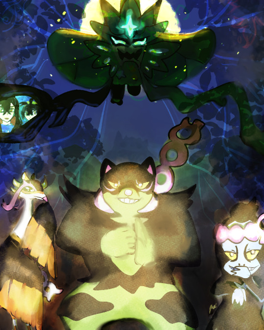
🏮Happy 1st anniversary teal mask!! 🏮Thank you for the many cool memories, awesome mons and characters that we met along the way! Ogerpon the iconic 🙌 I’ve met many cool people on here through shared interests in the story, expressed in many fun arrays of art, writing, memes and etc.
#the teal mask#pokemon#pokemon fanart#pokemon scarlet and violet#pokemon sv dlc#okidogi#serendipiti#munkidori#ogerpon#kieran pokmon#carmine pokemon#pokemon kieran#pokemon carmine#Worked on this a day before classes started lol (queued post)#used contrast to both reinforce and challenge the idea of light highlighting the nature of a subject as it is often associated with “good”#the poses#expression and the “shadows” behind the loyal three suggests there is more than what the eye sees...#with ogerpon her mask glints + the moonlight: illuminates the back side of her that we cant see#suggesting another side of her that we would eventually see#Some of the peak experiences was ogerpon’s introduction#Loyal three’s music#ogerpon backstory and finding the crystal pool#The Loyal three
137 notes
·
View notes
Text

TASK 4: Proportion / Scale
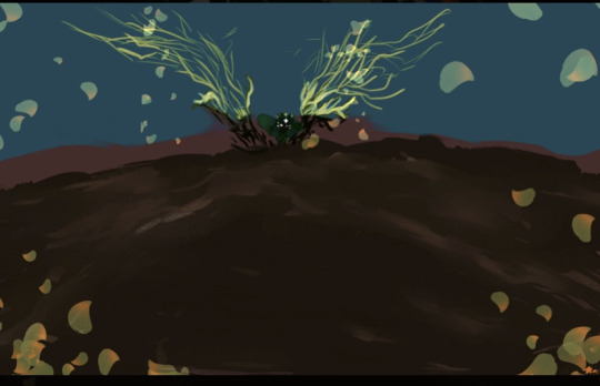
This artwork, featuring an oversized matchbox crafted from eco-friendly materials like sand clay, bamboo, and paper, powerfully comments on the environmental impact of human actions. The volume is exaggerated, turning a typically small, disposable object into a large, imposing form. This shift in proportion magnifies the matchbox's significance, symbolising the scale of destruction caused by something as simple as striking a match.
In terms of texture, the contrast between the smooth, sandy surface of the clay and the natural grain of the bamboo creates a tactile dialogue between artificial and natural elements. The line work is clean and precise, especially in the matchsticks themselves, which are slender and uniform, echoing industrial production. However, their organic material composition disrupts this notion, emphasising a return to nature.
The matchbox's form and shape are geometric and rigid, representing human imposition on the natural world. This rigidity is softened by the choice of materials, more typically found in nature than in industrial processes, creating a tension between the form's function and its materiality.
The colour palette is earthy and muted, with beige, brown, and off-white tones dominating the piece. These colours root the artwork in its environmental message, blending with the natural surroundings and reinforcing the idea of harmony with nature. The use of natural light in the photograph enhances these tones, casting soft shadows that highlight the textural qualities of the materials.
The environmental context of the piece is crucial in reflecting the concept. By placing the matchbox outdoors, surrounded by dry leaves and earth, the artwork engages directly with the site, making the potential for fire—symbolised by the matchsticks—all the more immediate and alarming. The placement underscores the fragility of the natural environment and the ease with which human actions can harm it. This careful consideration of site, combined with the deliberate choices in volume, proportion, and material, creates a piece that is both a visual and conceptual warning about the environmental consequences of human behaviour.
INSPO:
Andy Goldsworthy
Andy Goldsworthy is renowned for his ephemeral land art, which directly engages with natural environments. He uses materials like leaves, stones, ice, and twigs, creating site-specific works that often decay over time. His work emphasises nature's cycles and the passage of time. It is a meditation on the temporality and fragility of the natural world.
Patricia Johanson
Patricia Johanson's work blends art, ecology, and landscape architecture. She creates large-scale environmental projects that restore and enhance natural habitats while providing public spaces for human interaction. Her designs integrate ecological restoration with aesthetic beauty, making her work a model of sustainable environmental art.
Agnes Denes
Agnes Denes is a pioneer of ecological and conceptual art. Her work Wheatfield—A Confrontation (1982), in which she planted a wheat field in Manhattan, juxtaposes the natural environment with urban development. This work challenges viewers to consider the relationship between nature, agriculture, and urban spaces.
Richard Long
Richard Long is known for his walking-based art, where he engages directly with the landscape. His sculptures, often made from materials found during his walks, like stones and driftwood, highlight the environment's natural beauty while leaving minimal impact. His work reflects a deep respect for the natural world and a commitment to sustainable practices.
Nils-Udo
Nils-Udo is a German artist who creates site-specific environmental art using natural materials. His work emphasises the harmony between art and nature, often creating nests, shelters, and other organic forms that blend seamlessly with their surroundings. His art is a call to preserve and respect the natural world.
These artists engage with the environment in ways that resonate with sustainability, natural beauty, and ecological awareness, potentially providing rich inspiration for my practice.
0 notes
Text
Journal - One Rendering Challenge 2020: Competition Winners Announced!
Architizer is thrilled to announce the winners of the inaugural One Rendering Challenge! Reviewing a stellar shortlist of 100 architectural renderings and their stories, our esteemed jury have selected 2 top winners — one non-student and one student entry — along with 10 fantastic runners-up.
The top winner in the Non-Student category was “Zoom to the Future” by Carlotta Cominetti, Tamás Fischer and Camelia Ezzaouini of visualization studio Virginlemon. Their rendering tells the story of an elderly man resting his weary feet in the courtyard of his residence … with a futuristic twist. Mengyi Fan, One Rendering Challenge juror and Director of Visualization at SHoP Architects, had this to say about the image: “Sometimes it’s satisfying to see artists use the incredible arsenal of tools we have today to create scenarios beyond those that replicate reality. The artist of ‘Zoom to the future’ has used them creatively to literally and metaphorically create a thrill ride without sacrificing craftsmanship and interesting composition.”
The top winner in the Student category was “Lifting Longyearbyen” by Brandon Bergem, a student at the University of Toronto. Bergem’s image was inspired by the dramatic, barren landscape of Svalbard, Norway. Mengyi Fan loved the composition, describing it as “a complex construction built of layers on layers, tied together seamlessly with skillful control of color and lighting. I love the muted color story presented here — the subtle bit of muddiness reinforces the artificial nature of the carefully crafted environment.” Visualization expert and juror Peter Guthrie commented: “This is not the sort of image I would typically be drawn to, but on repeated viewing, it keeps giving more and more. I love all the details and obvious effort that has gone into it.”
In partnership with Fiverr’s new architecture and building design services, we’re delighted to present each top winner with a grand prize of $2,500, along with pro rendering software from the likes of Chaos Group, Adobe Substance, Evermotion and Quixel. Without further ado, take in the winners of the 2020 One Rendering Challenge, including both the renderings and their accompanying stories…
Non-Student Winner: “Zoom to the Future” by Carlotta Cominetti, Tamás Fischer and Camelia Ezzaouini (Virginlemon)
This rendering is mostly about the future: A future project, a future vision, a future situation. There’s always something that persists, protecting our life’s routine. Imagine waiting for your dear to come back home after work; it’s late and cold, your courtyard (in need of a refresh for years) is dark, and you have to keep a safe distance from the trash. Neighbors are chatting behind enlightened windows. You’ve been living in this building for almost 14 years. You know by heart every crack, every leak, every pot containing every dead plant. You have seen dozens of families moving out and moving in. The world outside is speeding up.
The elevator is out of service, again; you have to take the stairs and that’s f***ing annoying!
Please take your time to zoom in! #full3D #zerophotoshop
Student Winner: “Lifting Longyearbyen” by Brandon Bergem (University of Toronto)
This is a scene from the incomplete Museum of Natural History to Ultima Thule. An official from the governor’s office exclaimed: “The ground is melting!” She cautioned the town folk that “We can no longer trust the permafrost.” The governor needed to devise a strategy simultaneously mitigating the unrelenting bombardments by natural forces while maintaining the town’s natural heritage.
Her innovative solution was to remove and lift the houses from their foundations and insert them into a mega-structure, tall enough to hover above the impending flood. The townsfolk were relieved to see that their cheerfully painted homes were unharmed. A collective pride inspired the community to rename their town from Longyearbyen to Askeladden, a name derived from Ashlad, a small child from Norwegian folklore who succeeds when all others failed.
Commended Entry: “Joey Loves Monday” by Adonis Gabriel Gumba (Binyan Studios)
A big house with an open plan. A swimming pool on all sides. Magnificent views all day long. A hot sun and breezy nights. Seafood all the time. Joey lives here … He’s in fifth grade, loves to draw and is good at math. He’s very good in class. He never misses school; in fact, he’d be in school even on weekends if it was allowed. He promise himself he’ll go to college and finish study. He wants to be an astronaut. He’s certain he will be.
Must be realistic. Create the non-existent. Emphasize the beauty. Highlight the potential. Visualize a dream. Make it feel real…
This is my attempt to render something more than realistic. Inspired and referenced from ” stilt houses” in Philippines, Myanmar, China and Bangkok.
Commended Entry: “The Vent” by Dennis Allain (Dennis Allain ADI)
The Vent is an architectural exploration based on a world overcome by structure. From a design perspective, I had been interested in this idea of construction and how it can overcome that which was once thought valuable and beautiful. The object of past idealism is portrayed in the white structure placed in middle ground.
In setting up the composition, it was important to use the bridge to extend the viewer into the image. The water and refuse in the foreground was also an attempt to add depth. The background also played a role in creating depth and defining silhouette of the city. As an artist, I am constantly trying to perfect a color pallet and examine how form, color, value and texture work in concert to tell a story that resonates with the viewer.
Commended Entry: “Electric Rain” by Vittorio Bonapace (Vittorio Bonapace Studio)
A moment, suspended in time. Feel the vibe in the rain. Get inspired by city night reflections. Moody, cinematic and a little futuristic, this image aims to express one’s lonely feelings on a cold rainy night, and the desire for a warm, safe place where one can find energy again, after walking in solitude. The rendering represents the continuous relationship between what a city gives you and what a city takes from you.
Commended Entry: “The First Day of Spring” by Maciej Józefiak and Rafał Stachowicz (AESDE)
This image is a reflection on architectural visualizations in general. Architectural visualization aims to present architectural visions in an attractive, interesting and complete way. Its task is to show how the architectural design will become a finished, existing building. The attractiveness of visualizations, with a superficial approach to the subject, is usually limited to showing the object within fake and unreal scenery. However, is bending reality necessary to create a successful frame? Does a good visualization have to mean a caricatured image full of happy people?
The reality that surrounds us is completely different. This does not mean, however, that it is less interesting. On the contrary, the world around us is full of inspiration to create an image which, in addition to the banal external appearance, presents the world in an intriguing and truthful way.
Commended Entry: “Urban Farm Temple” by Duy Phan (Monash University)
Melbourne will be home to 8.5 million people by 2050. Infrastructure does not keep up with the population, leading to the construction area of residential areas. More and more people have to expand their homes into farming areas, while the demand for food constantly increases to meet the daily consumption needs of the population. The picture of the food supply becomes even darker when the bushfires kill millions of animals and plants and cause severe air pollution.
In the near future, food will become a new religion, where hungry megacities devour dozens of tons of vegetables and meat every day, continually running out of supplies. In the heart of the city — the deepest place in the desert of concrete created by ourselves to be isolated from nature — the Temple of Urban Food offers a picture of the future tense, where the green of vegetables brings belief in urban people’s survival.
Commended Entry: “Deadline” by Erik Peter (Pixelateit)
We’ve all been there. It is the last day of the last week before holidays — the busiest time of all. You can not wait to go home. But there is still so much work to get done before that happens … So let’s just do it! While we are working hard and having fun, there is no time to notice how cold it is outside, how steam and smoke from traffic and chimneys is rising above the rooftops, and how the snowflakes are flying about. There will be enough time for all that, on our way home … Once we meet the deadline.
The building’s façade is inspired by the Greifswalder Office Building designed by Tchoban Voss Architekten in Berlin, Germany. The rooftops are akin to typical Berlin scenery, to be true to the original location of the building.
Commended Entry: “Time Traveling” by Tigran Hakobyan (theRENDER)
It’s an interesting and challenging thing: To tell a story with one still image. During thoughts about it, I saw ”Antwerp Port House” designed by Zaha Hadid Architects, which has amazing contrast of an old building and a new futuristic shape. It perfectly demonstrates the connection between centuries. That’s why I chose to show time traveling.
Like the movie ”The Time Machine (2002)” in which the main hero time traveled using a Machine that stays static in its location, the rendering shows how the atmosphere and the surroundings are changed by going back in time, while the main building stays the same.
Commended Entry: “Dog, Bird and Man” by Toni Schade (sonaar)
There is no rational concept for this image, but a strong reference with a strong feeling: The movie Nostalghia (1983) by director Andrej Tarkowskij and its magical final scene — A Russian farm house, a man and a dog and a camera that is slowly moving backwards to reveal that this very scene is embedded in the ruin of a seemingly enormous Italian cathedral. It is an image about home and outland, one so strong and so emotional that it stuck in my mind ever since I watched the movie for the first time about 15 years ago.
Commended Entry: “Orchard Jenga – Start of the Night Shift” by Duy Phan (Monash University)
To cope with urban heat island effect and lacking trees canopy coverage in cities cramped context, on top of the existing two-level car park, Orchard Jenga proposes to plant not only trees but eatable vegetations vertically, casting healthy shadow for open public space underneath. The facility produces organic fresh foods for the nearby Queen Victoria Market by applying the technology from the adjacent University of Melbourne research centre.
Covered by the transparent water tank, the unique façade allows semi visual connection from in and out by caustically reflecting and refracting the light when it passes through. The image is captured at the moment of a night shift begins to start. As those last sun rays pour on the side façade, the aquaponic lights illuminate from the inside. It is not intentionally blending itself with the context but is proudly vivid, stating the message of the city’s sustainable future.
Commended Entry: “Architecture Survives the Idea” by Yuliya Arzhantseva (A+I)
Architecture is function combined with esthetic. And when architects create something, they make an assumption of how people are going to interact with their brainchild. This bus stop is an example of how architecture storytelling changes with time. Made in the soviet time bus stops like this one also had an ideological function – to tell a story of the country people were living in. But architecture lives longer than ideas.
With time the USSR’s brutalist oasis in the middle of nowhere became a shabby reminder of the past. Instead of a buzzy crowd of local workers, there is a cow grazing on grass. And the modern man is standing, detached, near the stop. He doesn’t want to interact with the idea of what this bus stop embodies. It’s now better for the cow – they don’t care. Because ideas pass by, but architecture stays.
As our two top winners, the Virginlemon team and Brandon Bergem will each receive:
$2,500 prize money
Annual Pro subscription to Substance, Adobe’s 3D Texturing Software
1 annual license for V-Ray or Corona Renderer, users’ choice
200 Chaos Software Ltd. Cloud credits
5 3D model collections by Evermotion
6-month subscription to Quixel 8K resolution Megascans
Access to Quixel Bridge and Quixel Mixer
Featured entry in the inaugural “One Rendering” eBook
Further to this, the 10 commended entries shown above will receive a prize package of professional rendering software worth over $700. Revealed last week, the top 100 renderings will feature in the first “One Rendering Challenge eBook, to be distributed to thousands of architecture firms via newsletter and social media channels. Watch out for this stunning publication, coming soon! There will also be further features on the winners in the coming weeks.
Thank you to all participants for their hard work in creating these amazing renderings and telling fascinating stories about architecture. If you are interested in entering next year’s One Rendering Challenge, be sure to sign up for updates by clicking the blue button below.
In the meantime, keep on rendering!
Register for the 2021 One Rendering Challenge
In Partnership With
The post One Rendering Challenge 2020: Competition Winners Announced! appeared first on Journal.
from Journal https://architizer.com/blog/competitions/one-rendering-challenge-2020-winners-announced/ Originally published on ARCHITIZER RSS Feed: https://architizer.com/blog
#Journal#architect#architecture#architects#architectural#design#designer#designers#building#buildings
0 notes
Text
Appraisal:
The main trust of this project was influenced by my exploration of gender neutrality in a previous module, from this module I can been increasingly interested in gender as a topic of exploration and discussion.
The project changed and developed from the original proposal in subtle ways, the topic of exploration was still the same (gender) however I originally intended to explore the roles and expectations specific to women, challenge stereotypes. But as the module progressed, through theoretical research and practical based experiments, I came to the conclusion that I was struggling to create effective imagery which connoted this and was actually becoming much more interested in alternative genders and refusal of the binary much more than just focusing on women and their stereotypes. This is what led me to begin looking into stereotypes and the binary as a whole and through theoretical research of Paoletti(2013) who explores gender labelling and its effects, through this I wanted to create still life imagery of gender and challenge stereotypes through objects, which was visually influenced by Molly Cranna’s work, were she uses colour and objects to connote ‘girlhood’.
I then however realised through further reading that I wanted to push the idea of challenging the binary and look more into how lens based media could consciously influence and challenge conventional perceptions of gender by consciously using gender labelling within the frame, gender labelling such as ‘pink-blue coding’ as Paoletti explores theoretically and visual influence from Ben Hopper’s work of starkly contrasting biological sex with stereotypical gendered objects to reject the idea that gender is aligned to sex and predetermined which I learnt through theoretical research of Freud.
In doing so I would explore alternative gender identities and explore opposing arguments of gender construction looking at Freud VS Foucault and authors such as Judith Butler who believe in social construction rather than biological. I would then support this angle by anthropological research into alternative culture who do reject the binary and view gender as being fluid. This was then supported by primary research of interviews from Otty. E the sitter of my photographic work and also Seadresa the Gender fluid Youtube blogger. This primary research led me to be exposed to personal accounts and views of the angle I was approaching, it taught me about the issues within the binary framework and how an individual’s gender identity is fluid, they were both evident of this.
My final images aim to showcase the alternative while putting binary gender perception into question through the application of gender labelling, and consequently reject Freud’s ‘Anatomy-is-destiny’ theory. Praise and normalise alternative gender like the ‘Zuni tribe’ do which I discovered through anthropological research and make the images large and exposing to celebrate the alternative rather in opposition to the marginalisation and rejection I discovered through primary research, that they receive.
The final work synthesises with my written work as it explores the blurring and fluidity of gender expression as West and Zimmermann, Judith Butler and Simone de Beauvoir suggest in the theoretical work through explaining gender as a ‘doing’ and construction, something we control and perform. The element of performance was theoretically influenced by Judith Butler and then visually connoted in my work through the use of continual lighting kit, to make him appear like an actor, the performing part was then illustrating by the use of him applying make-up and painting his nails within the frame, he was ‘doing’ his gender. Gender labelling which was theoretically influenced by Paoletti was then enforced within the imagery through the use of blue gel lighting to imply the element of masculinity in contrast to the feminine gender labelled object of makeup and a women’s nightgown. The separation of sex and gender which I explore through chapter one of my research project, highlights that gender is not fixed and is something we do, through the contrast of male anatomy and a biologically male model against feminine objects, clearly rejecting ‘Anatomy-is-destiny’. The multiplicity of gender rather than binary categories was influenced by Claud Cahun’s work, where she uses ‘doubleness’ and ambiguity to explore the opposing natures of gender and argument the blurring, Cahun’s work influenced the use of shadows and Mirrors within my final imagery to support an idea of separation, one thing being fixed and the other fluid, like sex and gender, the shadow is altered by the individual and we can manipulate it to how we want, there’s an infinite of possibilities. It is also a nice element to metaphorically represent the two identities of the sitter, what is societally expected of him because of the binary vs how he wants to express himself and his gender, this aspect was contextually and visually influenced by Johnston’s opposing self-portraits ‘the traditional Victorian woman’ and ‘new woman’ which is discussed in the essay.
The output of the images then synthesise with the theoretical work by consciously choosing to create extremely large prints which cannot be ignored and are difficult to not acknowledged, they are a celebration and empowerment of Elliot and alternative gender options who exhibit traits from both categories of the binary, it celebrates them as the Zuni tribe did. The reason for creating the imagery and producing it so large is also to steer away from conventional perceptions of gender by normalising other embodiments of gender and influence the audience into exposing them to other possibilities, highlight the fluidity of gender. The projection in which I have discussed to produce, then reinforces the visual influence of multiplicity, the projection also visually connotes that gender is not a physical thing, (metaphorically not sex and predetermined as Freud suggests) the projection cannot be felt or touched and is not a physical thing, and this relates to my theoretical exploration of gender by saying that gender is not fixed and is an expression/ projection of ones-self that can be manipulated.
0 notes