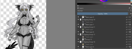
#using krita instead of procreate for the first time in years
Explore tagged Tumblr posts
Visit Tumblr Blog
Explore Tumblr blogs with no restrictions, modern design and the best experience.
Last Seen Tumblr Blogs


Fun Fact
Women make up for the other 50% of Tumblr’s audience.
Text

falin⭐
(click on in for better quality, omg Tumblr what is this)
#using krita instead of procreate for the first time in years#this took like 3 times as long as normal#but!#i did some lineweight for once#mh mh#dungeon meshi#delicious in dungeon#falin touden#faligon#chimera falin#my art
3K notes
·
View notes
Text
Steam 26/12/2024 Finding You Style Summary
I noticed that the past streams disappeared, so I made a summary, since 'Finding You Style' is a great topic. tell me if I missed anything.
steam 26/12/2024 Finding You Style by @kyri45
this was too long to put in an ask
kaiju heights: Wukong's 3 times bigger than Mac's, and MK is in the middle
23 panels to draw with text (spoilers)
discord stream on 30/12 (will have a post later)
50:00 finding a style
have more than 1 style (shows inst)
do you guys ask because you just starting out or someone who wants to stick to one style? it's fine to stick to one, but instead of finding one you evolved one. which is why she will show old art.
What is a style? is it how it looks or rendered? it's not technically that, it's things you don't even think of, so for them a style is a mix of preferences. like if you have long hair, it will be easier to draw long hair. it's what you see everyday, also why artist looks like their art. like for them, their friends boop their cheeks, so the art ended up being rounder You style should be how you naturally draw something
1:08:10 if you are at the start of your journey just experiment, find what's fun and easy for you.
it's fun for her to draw styles characters because you have more freedom
shows old art on inst, with character design sheet used to think about being a animator or concept artist but figured it's not for them by trying it out -shout out to leaphere on inst, also shows how every style has ups and down
shows old art from 11 grade(5 years ago), used to overlay markers in high school thought they won't be a comic artist LOL
when she tried something new, it felt like starting from squarer one. but every time her art changed little by little.
used procreate photoshop or krita
before apple pen, draw on paper take a pic and then use drawing tablet, got apple pen in 2019
lineless art 1:31:20
when did you start liking your art? this year Tells story on how they wanted to be a Vet but the teacher begged her to go to art school the point is that only this year they started to like to draw for themselves
loving what you are doing and loving art are different
tips on comics, it's ok not to know how the story will go but you MUST know how it ends and LOVE the ending, people will know if you don't know the ending. you don't need to show everything.
1:52:00 where to publish comic, tapas for normal comic pages, webtoons for strip comics or your own website, tapas is like youtube with adds so you can get money. before making money from stories you should copyright is (not lawful advice, not a lawyer). hiveworkscomics is commission base.
first time posting fanart was 17 years old, don't be afraid to draw fanart
2:26:40 who knows how the circlet work, not me
JTTW is public domain, you can just download it. right now Kyro54 is at chapter 70 in vol 2
copy right music: pressure: draper
things are meant to be used, even the nice ones, write anything even grocery
2 notes
·
View notes
Note
Hey there! I love you’re semi realistic, semi cartoonish art style bro! I hope you don’t mind me asking but what software/mediums do you use? I am trying to work on my lighting and shadows and textures but I have no clue how artists like you achieve such detail
First off- thank you so much! I truly appreciate it. And second- oh my goodness I am so sorry for how long this ask has sat in my inbox! I hope some of this can still help you :’D
As far as software goes, I’m almost exclusively working in procreate as of late. There’s plenty of great programs- if you need something free and desktop based, I highly recommend Krita. I have a few brushes from different packs that I often default to. You can see them all and links to said packs through this answer I gave to someone asking about my brushes earlier:
As far as detail in my work goes, that’s just through a loooot of practice and doodles and drawings. I’ve been drawing since I could pick up a pencil, so I’ve had a lot of time to figure out the way I like to do things- but even then I have so much to learn!
I do, however, work in many traditional forms of media as well! I haven’t done so as much lately since digital doesn’t require cleanup, but I honestly believe that working in traditional for my entire life up until 5 or so years ago has a hand in how I approach things digitally as well. I’ve done pen and marker illustration, pencil and colored pencil, acrylic painting, as well as 3D work. I’ve worked in a lot of media and I want to get around to trying as much as I can when I have the energy to! If you have questions specifically about what traditional media I use or work with let me know!
When it comes to improving on rendering, doing small studies of images you really like the lighting in helps a lot for me. Learning how to break light in a photo down to simple, blocky shapes helps to figure out getting an initial layer down to refine later when doing full pieces! When rendering a character, especially if drawing something that isn’t in a scene, I always recommend marking out the direction the light is coming from as well as color of the light before even starting, so that you can determine where highlights and shadows would be placed in an initial blockout. Keep in mind there’s different kinds of light in a piece- I would recommend looking into tutorials about direct light, indirect light, reflected light, etc to get a better feel for how it works- while I do my best, I don’t think I am quite skilled enough to explain those nuances.
When approaching most textures, especially unfamiliar ones, references are my best friend always. It might be a good idea to just do test sheets/practice making the textures that would be useful to you on occasion! And in the end, textures also tie into lighting as well, since a lot of what makes textures super distinct is how light hits them, especially when it comes to things like metal. It may be a bit of a hot take, but in a lot of cases I tend to avoid a lot of digital texture/object brushes, especially those meant to simulate natural textures like leaves, and I do those textures manually instead. I just personally like having more control over those shapes and feel it looks better when each texture is made intentionally by hand! Sometimes I do use texture brushes especially for backgrounds, abstract work or subtle layers, especially if I’m working on something very fast, but it’s not my first choice. However I do know there’s plenty of artists who use texture brushes in ways that look great, so that’s just personal preference. :)
I do apologize it took me so long to respond! But if you have any specific questions, my dms are open and I want to start replying to y’all more!
4 notes
·
View notes
Note
That Vritra drawing looks really good tbh!! I just wanna tell you that (oh I love women...)
Also, I'm curious as well about how you would do greyscale painting. Do you have any tips/advises about it? As I'm thinking I want to practice painting with that method, too
so idk if im the BEST person to ask given this is the first time i've used greyscale in like...idk 5 years? but basically the gist of it is to paint the image in monochrome black and white so your values stay clear. the program i used is krita so i'll explain how to do it there but theres actually more guides for procreate, clip studio, photo shop etc
for this, in order to make sure coloring later was easier, i made each color group (skin, hair, tail+bra, tie and underskirt, gold) a different layer. i dont usually label mine because i hate myself but you may fine doing so more useful. once you've colored each layer in the correct grey value just shade it normally.
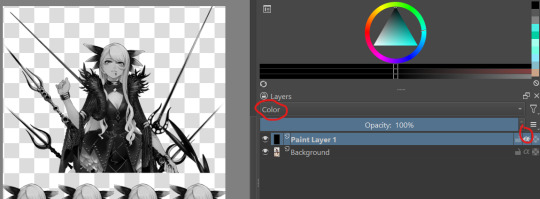
i also wanted to make sure i got the values for her skin right so i tried this trick i saw the other day on a reference image i have of her, which is to make a second layer, alpha lock it and switch the layer setting to color instead of normal. this sets the image to monochrome with very little fuss so you can easily color pick values without much issue (although you'll notice i actually lightened her hair a bit bc og vritra's is pretty close in value to her skin)
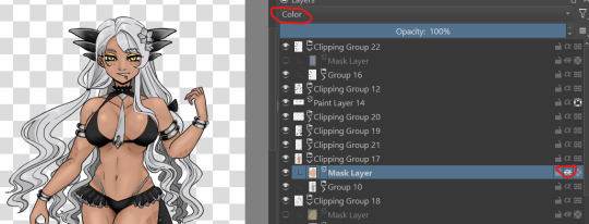
once you've colored in the values you're bascially done. just make a clipping group and set the clipping layer to 'color' and it will fill in the layer to the color you picked. you may need to adjust the layer below a bit-i ended up having to darken the tie because the green wasnt coming out the right color. the other thing is that i actually set the gold to color dodge on a dark brown because i felt that made a better gold color. realistically, you would also further tweak the image but it was pretty late last night so i called it a day
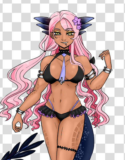
this also gives you the ability to play with the color palettes a bit although you wont be able to go beyond the base values- like in this case, i cant really make her hair or skin darker than how i already set it, so keep that in mind unless you're good with other filter settings
7 notes
·
View notes
Note
Ik you've answered this/similar questions before but I've looked through some of ur tags and can't find it. I want to buy my sister a drawing tablet but really have no idea which ones are the best. Like I did look some things up, but I thought I'd ask for some people (who like draw on tablets) too.
no worries, for whatever reason my art advice tag is like 90% nonfunctional and it’s like, the only tag of mine that does that ☹️ i will say, i have only owned a couple different tablets (so obviously i’m not gonna be able to tell you if there are better models out there) but i’ve liked all of them!
i think this is the first tablet i ever used? it’s hard for me to be sure, because it was really long ago. basic wacom tablet with a black screen. it takes more effort to pick up the skill of putting your hand on a blank black surface while creating an image on the screen, but something cheap like this is nice if you’re not able to commit to something more expensive and aren’t sure how far you want to take the hobby.
(to be clear, it’s not like this kind of tablet necessarily limits you—ikimaru, who’s been a super popular digital artist for years, makes gorgeous art on a bamboo CTH-460 which is a model you can buy on ebay for $18. it’s just that it takes a little more getting used to.)
also, wacom is the brand i used for a basic tablet, and I didn’t mind mine, but i have heard wacom sometimes is a little sketchy with planned obsolescence type stuff 😵💫 like the pen nibs supposedly wear out way quicker than, for example, the huion brand, so you might want to check out what huion’s got. i will say: i used that wacom tablet for 1-6 hrs/day for several years and had no problems, BUT many people on the internet seem to prefer huion over wacom. up to you.
still, i honestly think you can do well with any tablet that has a stylus and pen pressure lol (which is basically all of them). like there are lots of different tablets with lots of different features out there, but the only feature that i found made a real difference to me was touchscreen vs. non-touchscreen.
non-touchscreen tablets are totally usable and usually way less expensive, but the touchscreen is really nice to have if it’s in your budget. it feels closer to traditional art and is easier to pick up.
I personally have never used a touchscreen tablet that was just a drawing tablet—i’ve used a surface pro 4 (a touchscreen computer) and an ipad pro. both were very nice. honestly, I didn’t notice a huge difference in the feeling of drawing on the screens of the surface pro vs the ipad—the biggest thing for me was the art programs. some programs are only compatible with computers and some programs are only compatible with ipads. here’s what I personally noticed:
krita (nice for painting) and ms paint (fun for dicking around in) are both NOT available on ipad, at least as far as i know
rebelle 5 pro (supposedly a very cool program for emulating real painting), which is currently on a huge sale rn (it’s $20, normally costs $150) and is also NOT available on ipad
paint tool sai, as far as i know, is not available on ipad
clip studio paint is available on BOTH ipad and computer, but is more expensive on ipad (it’s a monthly subscription instead of a one-time purchase).
procreate is ONLY compatible with ipad, and is, personally, my favorite art program i’ve ever used. there’s a brush or two from krita that i miss, but for the most part, procreate is solidly better than any other art program i’ve used.
most of the nicest animation programs seem to be incompatible with ipad; the ones that work on ipad are quite basic. this is the only major sticking point for me lol
one thing about ipad that you might’ve read about in your research is this feature that lets you tilt the pencil and draw as if you’re using the “flat” side of it:
this is sometimes cool and sometimes inconvenient, so it kinda balances out to neutral. if you’re torn between ipad and a different touchscreen tablet then don’t decide off this feature lol.
if your sister already has an ipad (or if you’ve got a family one that she has decent access to), it might be a nice thing to just get her a compatible apple pencil, so you can save money on the tablet.
but yeah! those are the models i’ve used and i’ve liked them all. even if you get her a relatively cheap non-touchscreen tablet she can still make really cool art with it and have a lot of fun. good luck!
13 notes
·
View notes
Text
Investigation: Lewis Hamilton Helmet by @f1_bea
Investigation participants: Tang, CAT, Muse and NIN. Start date: 30th of June, 2021. End date: 30th of June, 2021. We have been tasked to investigate the art piece done by Twitter used @f1_bea. The original tweet can be found here: https://twitter.com/f1_bea/status/1410281773595082753?s=21 Many people raised issues with this particular piece of art, as there are some design choices that do not match with the rest of the piece’s aesthetic. This Twitter user has no prior history of posting art on their Twitter, which raised some alarms in our heads immediately.
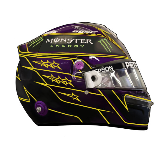
When you look at the full piece, you can see weird artifacting that could partially be due to Twitter’s compression, but our resident AI expert Tang thinks it is due to some filter work. Our primary motorsports illustrator Muse, however, thinks it is due to overzealous use of the blur and smudge tools. Such examples can be seen around the plastic parts near the Visor’s connection, the front of the helmet, and especially around the edges of the tearoffs. Here is a closeup of what we mean:

These weird artifacts could be caused by a multitude of things. Tang as our resident AI expert, obviously sees it as an AI error. He stated that it looks very similar to what one of his rather popular art filters struggles with, when trying to apply the look of a brush stroke. The algorithm often loses track of the actual shape, as it stacks stroke after stroke, causing mild distortion to the original shapes of the photo. Regardless he says there is clearly some hand applied brushwork. The illustrators Muse, CAT and NIN seem to have varying opinions regarding this. Muse seems to believe it to primarily be overpainted on top of a photo that has been passed through a filter. The idea here is that a filter was applied on to a photo to smooth out the surface reflections and hard highlights. Then the artist went back in to further blur and smooth the surface, applying paint to make things more uniform, and then blending it in to the surrounding colour. Muse’s primary argument for this is, that the yellow lines are not shaded like the rest of the painting, as the blurring and smoothing would have diluted them out of existence. Thus shading them would have been difficult, as there was nothing to match the colour to. Generally during this technique, colour is blocked into outlines and then blended together Muse also thinks that the fact that parts of the picture have lineart (specifically the back of the drawing), whereas the front has none supports the theory. As the colouration is fairly similar, the blurring and smoothing of the surface would’ve left them difficult to see, and an inexperienced artist would lack the skill to shade them in after the fact, thus resorting to adding harsh lineart instead of attempting to match the front of the drawing. Muse found a photo that seems to be the original. It was the first result of a Google search titled “Lewis Hamilton 2021 Helmet”. The general colour of the light seems to agree with this assessment.
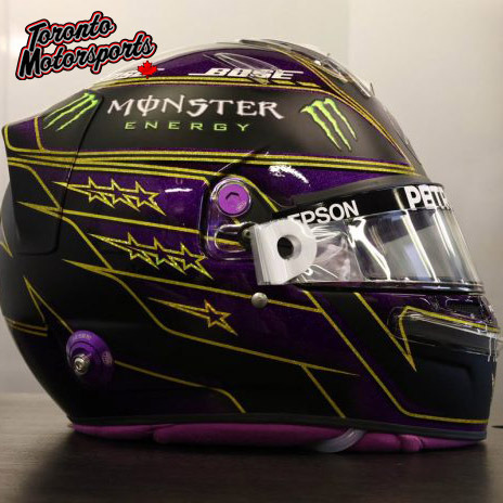
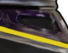
Muse argues that due to the nature of the original photo and the method of accomplishing the task described, a harsh outline was necessary to define the shape of the helmet, as most of it would have been faded out during the smoothing process. Trying to blend in colour to look natural while the rest is feathered away is a difficult task to accomplish, when you lack the artistic skill and experience required. Muse thinks that the software used was likely Krita or Procreate, although states that Procreate often gives you more uniform lines. CAT and NIN on the other hand argue that the whole thing is overpainted. What this means is that it is traced over, and colours are generally shaped in dots over the original image, and then blended together using blur and smudge tools to create a smooth look. As people that overpaint tend to be tediously meticulous about details to get them to appear exact, they ironically often miss small details or holes that often get lost, forgotten, or pixelated, such as this example:
NIN specifically states that she has tried this technique before, and she often forgot to detail, smooth or colour in places as the original photo was laid under and made seeing her own work difficult. Neither of the two have an explanation to why the artist resorted to lineart in some places, where the rest of the drawing used painterly shading. CAT and NIN think the software used was Procreate. During this time, the artist provided a timelapse that could have been achieved by using either technique. One timelapse was omissive, and both Muse and NIN immediately pointed out that it is likely using a technique that is common with overpainters. This is called “omissive timelapse” or “pause timelapse” technique. What this means, is that the timelapse is recorded either in pieces, or edited to clip out parts where the original image lays underneath as reference. During this timelapse, most of the detail is already there, and some colour have been blocked in. Here is a link to the timelaps the artist provided: https://twitter.com/f1_bea/status/1410305202138320900?s=20 Regardless of how you look at it, there is something off with this painting. The design choices within the painting itself collide, such as the choices of soft painterly shading paired with very harsh inconsistent lineart and yellow detail work. A lot of the text is far too sharp, and too perfect when compared to the original photograph. The dimensions essentially match exactly, when the two images are overlayed on top of one another, which is a feat even artists that have been doing photorealistic work for decades fail to accomplish without tracing or extensive measuring. It could be overpainted, which is a technique of tracing that is not deemed legitimate by the general art guidelines, as it does not actually create. It merely copies the original image. Tracing is seemed as appropriate and legitimate only when it is taking the original image to a new direction. Such a technique is often called “additive tracing”, “reference tracing” or “derivative tracing”. This is not such a case. We may be horribly wrong, and the artist may simply have a style that coincides with a lot of illegitimate art that our team has come across throughout our years in the art world. Regardless, we thank you for reading this article! We hope we have managed to bring some insight into this piece of art, and for the methods that could have been used in its production.
2 notes
·
View notes
Text
Digital Painting - The Ultimate Beginner's Guide
Art is food for the soul, and it helps one grow their emotional horizon and share the experience with the world. It takes years of diligent practice even to reach half the level of the master. The most challenging part of any artistic journey is the beginning, though.
Nowadays, many artists are shifting the paradigm towards creating digital art prints. Even more and more people are showing enthusiasm to buy original art online. The rising sale of NFTs involving art is proof of that.
If you too dream of becoming a successful digital artist, you need to start in the right direction. This involves getting your hands on the right tools first.
If you were wondering what digital painting is and how you can start on becoming one, then keep on reading.
What Is Digital Painting?
When you think of painting, the images of watercolor, acrylic, or oils come into the mind. The digital medium has completely taken the concept of artwork to a whole new level. Don't get it wrong. It still requires the same level of techniques and skills as conventional painting.
The only difference is, instead of stroking your brush on a canvas, you paint directly onto your computer or tablet. This makes the process more convenient and faster to deliver.
However, just like a traditional painting, you need to know the tools of the trade for digital artwork.
Digital Painting Tools
There are only two things that you need when you are starting your digital painting journey:
· A tablet
· Some software for painting
The Hardware
Choosing the hardware is pretty simple. You just have to get a decent tablet that can run your painting software smoothly. There are three types that are available.
Display Tablets
If budget is not a concern for you, then you should definitely invest in one of these. They come with a built-in monitor to allow you to draw on the screen directly. The only drawback is that you may require an actual computer to avoid the "dead pixels" over time.
All-in-One Tablets
Options like the iPad Pro from Apple or Surface Pro from Microsoft makes these tablet choices highly popular. These are self-sufficient devices and offers a 2-in-1 functionality too. The only problem is that these are highly expensive with a minimal selection of software to run.
Graphic Tablets
For beginners, this is the best choice since they are cheap. Even a lot of successful artists prefer using these tablets. They come with a touchpad and a digital pen, also known as a stylus. You can plug them with your computer via a USB cable, and they are pretty simple to use.
The Software
There are many options available in the market, and the choices will never end. However, you can choose from any one of these three classics.
Adobe Photoshop
This is a stalwart in the field of digital artwork, and you might want to invest in the premium version for the full features. Any artist will recommend the Adobe software without hesitation.
Krita
If you don’t want to spend money, then this free software is a good choice. It is an open-source alternative to Adobe, though not as good as Adobe.
Procreate
This is another premium software worth investing in. Despite being a relatively new software in the market, its user-friendly interface and lightweight structure have made it popular.
The Art of Digital Painting for Making Your First Masterpiece
Now that you have all the tools at your disposal, it is time to do the actual work- paint! If you are using Adobe Photoshop, then go to File> New Document to open a new document.
· Use More Layers
Pay attention to each layer, from the body part to the highlighted section or a shadow, to make your work come alive. If you want people to buy original art online, then you need to pay attention to intricate details, and layers are your friend in this.
· Utilize the Brushes and Erasers
In digital media, you will get tons of brushes, so try to make the most of it. You can add a lot of details to your painting by using the right tip, softness, shape, and size of the brush. Also, the applied pressure while painting creates a difference.
· Optimize Blending Effect
This is the aspect that gives a three-dimensional effect to your painting. Use a lot of different blending effects to discover what suits your painting style the most. Of course, Adobe comes with a variety of tools to help you in this.
Endnotes
Remember that becoming a successful artist takes patience, hard work and time. By taking the first step towards your dream of becoming a digital artist, you have completed the most difficult phase, though.
You can gain inspiration from learning about the discipline and passion of successful artists who sell their art online. Examples like Ino Chang can motivate you to work hard to make a name in the art industry.
You will learn a lot from their high-spirited endeavors and struggles that brought them success. It is their passion that drives their work and compels people to buy original art online.
So, follow these guidelines and learn more about how to hone your skills to become successful.

0 notes