#which is like sharp and angular with contrast between some curved lines and straight lines
Explore tagged Tumblr posts
Visit Tumblr Blog
Explore Tumblr blogs with no restrictions, modern design and the best experience.
Last Seen Tumblr Blogs


Fun Fact
Mobile US users spent an average of 115.8 minutes on Tumblr app monthly.
Text
Part III: How does this production look?
A follow up to parts I and II
It very much leans into the visuals of the silent films of the early 20th century: it opens with a titles sequence showing the names of the main cast and creators as a series of black and white projections on a downstage scrim.


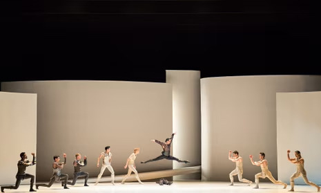
The set for this production belies a phenomenally understated simplicity. It consists of 5 curved white (movable for symmetry or asymmetry) walls, one rising ramp, and one angled triangular piece for lying on. Plus a couple additional walls/pieces of fabric that fly in.


This makes the dramatic cinematographic lighting possible, as lights can peek out from between or behind walls to great effect. It also calls to mind a certain modernism, a focus on shapes and forms in light reminiscent of Gehry's LA Phil:

That the curved edges of the set also bring to mind the circular, looping motion of the play seems a convenient bonus. So is the fact that the moving white rectangles could almost be the silver screen upon which a film is projected.
There are other cinematic influences present in the work, of course. The lighting itself is sharp and directional, and in combination with the pared-down geometric set pieces and breathtakingly deliberate mise-en-scène of the dancers themselves , one gets the impression of the great cinematography of films like Citizen Kane. While the lighting and the costumes do have some color, the main point of contrast between the Capulet and Montague family costumes is darkness versus light (respectively), which lends to the air of careful black and white cinematography.


(The use of darkness versus light could also be a deliberate throwback to the naissance of more intentional chiaroscuro techniques like Tenebrism contemporaneous with the original publication of Shakespeare's play around 1600. In fact, I think it likely that the designers were pleased to achieve both effects at once.)

In general, this production successfully melds a more romantic artistic style with a harsher cinematic one that feels almost brutalist in its angularity. This reflects just as much in the choreography, wherein the shapes and positions of classical ballet are mixed with more angular forms and mime (which is to say: movements and body arrangements that intuitively tell a story due to their proximity to natural movement). Maillot makes frequent use of straight, outstretched arms and 45- or 90- degree angles. In more emotional moments, these melt into something softer with more bend, but in many cases the lines are very stark.


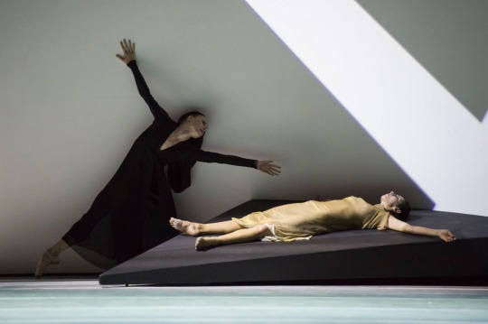
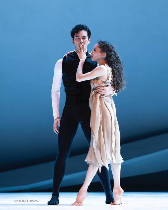
Left: It is the east, and Juliet is the sun Right: Juliet (Angelica Generosa, second cast) mourns Romeo (Dylan Wald), who has killed himself by running at the triangle onstage and impaling himself on it. She will pull a thin blood-red scarf from his breast for effect, and after a bit of dancing, strangle herself with it. In both cases it's abrupt, a suddenly-disturbing departure from the more implied metaphorical violence of earlier
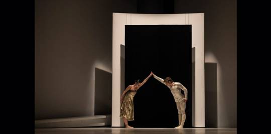
One of the few props of this show is a rectangular strip of semi-sheer white fabric wrapped in wire to give it consistent shape. It's so simple that it serves as symbol and simple visual alike during the marriage scene. Its design replicates a strip of film with its successive squares linked by slightly darker seams. When the acolytes wave it around at the Friar's behest, it mimics the unfurling of a long manuscript in the metanarrative. It's then used to great effect during Romeo and Juliet's wedding ceremony as a veil between them and the audience and as a wedding arch. Afterwards, the acolytes wrap it around the Friar as a Mobius strip. The two sides have at last become one, and the story wraps around itself in a loop, and all points of time are contemporaneous when the story is already written.

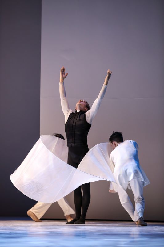
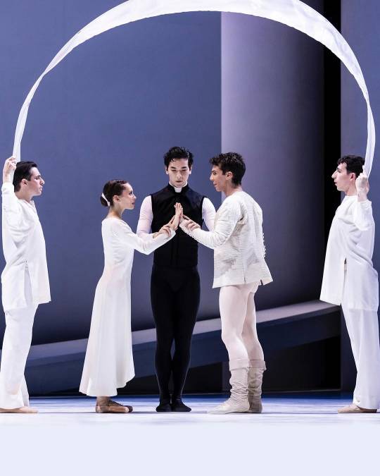
This costuming haunts me. It's the only moment where Juliet entirely matches Romeo, their instant of perfect togetherness. But Juliet's dress also looks like the same fabric as that of the acolytes. Even the cut of the neckline and sleeves looks the same. The foreshadowing here says: soon, you too will be nothing but a ghost in the narrative, stuck in the crosshairs of the story with no agency of your own.
Though I'm far from an expert on fashion, fabric, and costumes in general, I do want to talk about costuming. I wish I had more pictures of the various costumes, especially of the chorus, so that I could better demonstrate the visual messaging. Alas, I'll say what I can.
The separation between Montague and Capulet houses is made very clear to the audience through light and darkness, especially for the men:
Tybalt dominating Mercutio, lying supine
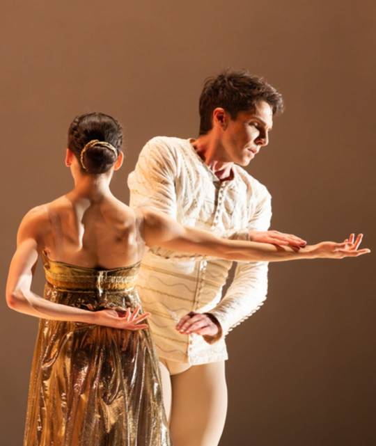
That said, the designer also distinguishes the Capulets from the Montagues through cuts, textures, sheen, and color. The women of the Capulet house wear dresses with a very strong sheen. At the first ball, Rosaline and Juliet wear shining silver and gold, but even Tybalt's seemingly-dark black costume gleams under the lights.


From left: Rosaline and Romeo; Lady Capulet and Tybalt; Juliet and Paris (in matching gold signaling her mother's desire for a match)
The Capulet chorus wears beautiful usually-asymmetric cuts, often with sheer layers, with a strong sheen that suggests precious metal and gemstones. The Montague chorus wears light pastels with stiffer and less pleated fabric that feel both more starched and more textured. No layers for them; their clothes are opaque.


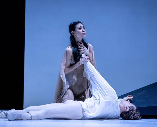
Romeo and Juliet themselves exemplify the aforementioned qualities. Their clothes prior to first meeting conform entirely to their house's standards, with an overwhelmingly shiny gold for Juliet and strong texture for Romeo, but they quickly start to take on aspects of each other's style. In the balcony pas-de-deux, Juliet's grey dress has a much less resplendent shine to it, while Romeo discards his heavily textured white overjacket in favor of a smoother, looser fabric. In the scene of their deaths, Juliet abandons the splendor of her house in favor of a drapey tan dress which maintains her color theming but would fit in with the paleness of the Montagues. Romeo, on the other hand, dons an extremely loose, very sheer white shirt.


Juliet's dress in these last two is the same, though the lighting gives it entirely different tones. Also, this photo of her and the Friar (the peerless Chrisopher d'Ariano) just before she drinks poison makes my chest hurt.
I've been calling the tan dress above "the Jesus dress" in my head since I saw the production, because there's a moment before she drinks the poison where the acolytes and the Friar hoist her up in the air with her arms outstretched sideways. With her bare feet, her long hair finally hanging down, and her flowing, simply cut skin-tone dress, it’s Juliet who will die, rise again, and die for good. She is also good and young and dying for a feud which she wanted no part in. It's a surprisingly apt comparison.
The dancers themselves tackle this as a piece of dance theater, enhanced by more mime than one usually finds in ballet. They act their hearts out on stage not as traditional actors do, but as impressionist painters capture the emotional core of a feeling rather than the visual reality of it. Their inner angst slips out as (perhaps too many) pained screams when the chips start to fall, while their joy lights up their faces with bright smiles. Mercutio, Benvolio, and the Nurse wink, roughhouse, and pratfall charmingly through their opening scenes; Juliette, meanwhile, adopts a playful-yet-shy wittiness that breaks into bashful, delighted smiles later on.


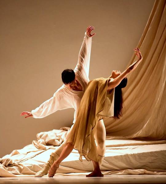
Left: pre-dawn pas de deux with the second cast, Angelica Generosa and Dylan Wald Right: Elle Macy as Lady Capulet mourns her daughter
Maillot also uses certain motifs over and over again, in a way which felt well-rendered rather than overbearing to me. A certain swirling of the wrist in an upward line indicated Romeo and Juliet's romance, a motif which was sometimes used by the lovers and sometimes taken on by the Friar and his acolytes. Juliet reprised some of her mother's motions from an earlier pas during the scene at the ball where she danced with Paris. The Friar's choreography was itself fairly repetitive. Like musical leitmotifs, these motions served to connect the piece to itself, and to make clear when one character was referencing another person or moment in time.
The show struck me overall as a well-adapted take on the bard. The slightly overwrought silliness and drama felt exactly appropriate for the slightly farcical Shakespeare play, and the "mummery" of it all eased the audience's understanding and allowed us to imagine how we ourselves would look or react in the throes of such grief. The minimalist set and tight lighting served as counterbalance and enhanced our sense of intention, modernity, and beauty in this production. It wouldn't be nearly as watchable if it eliminated the fun, and would go against Shakespeare's own intentions if it did besides. But its starkness lays bare the tragedy by stripping down sets and characters and light to their rawest selves. It's not entirely a traditional ballet, and to my mind it is much stronger for it.
1 note
·
View note
Text

The man behind the slaughter
#doctorsiren#five nights at freddy's#fnaf#william afton#purple guy#the man behind the slaughter#spring bonnie#fnaf fanart#art#digital art#my art#fanart#procreate#I wanted to capture the energy I get from him#which is like sharp and angular with contrast between some curved lines and straight lines#he’s also in a similar-ish pose to that one I did of Michael and Glamrock Freddy#bro looks like the squip fr fr#I mean there are characters named Jeremy and Michael
439 notes
·
View notes
Text
51 Brutalist House Exteriors That Will Make You Love Concrete Architecture
Brutalist architecture has come a long way since its original peak back in the late 1950s to 60s. Back then, institutional buildings and social housing projects projected a cold and austere nature that became associated with totalitarianism by the late 1970s, and so fell out of favour. Now we’re seeing an exciting comeback of reinforced concrete and steel exteriors, cast in modular volumes to build great hulking triumphs and unique private residences. Brutalism (coined from a play on the French ‘béton brut’, meaning ‘raw concrete’) is graphic, geometric, and toys with the negative space, all of which make it incredibly appealing to the minimalist mindset of today.
Architect: RP Arquitectos Frame the setting. The negative space created at the centre of this inspiring brutalist structure takes on the appearance of a serene blue skyscape, as though it were an art piece mounted on a raw concrete gallery wall.
Visualizer: Anna Życka Cut through with vivid colour. A stunning red support column and coordinating red window frames electrify this cold concrete mass with hot bolts of creativity.
Architect: Stemmer Rodrigues Arquitetura Utilise elements of natural landscape. A massive concrete volume weighs heavy on the upper floor of this brutalist home design, with one corner perfectly propped on natural rock. Exterior uplighters have been positioned around its base to exaggerate its effect.
Architect: Andramatin Concrete canopies. This Indonesian home design incorporates great concrete eaves that stretch as much as six metres wide. They have been designed in response to the high rain precipitation in Bandung, and as shelter from direct sunlight.
Architect: REIMS 502 The majesty of monolithic slabs. Solid stone slabs stacked one atop the other build a sense of impressive immoveable scale.
Architect: RP Arquitectos Jenga! Perpendicular blocks build the rising stories of this mesmerizing home. skillfully toying with the weighty aesthetic.
Architect: Steimle Architekten Solid and succinct. This modern home exterior can’t easily be remodeled or changed, and so will remain the way the architect intended. The feeling of permanence that Brutalism brings is particularly attractive in our fast paced, quick changing and disposable modern culture.
Architect: Alter Studio Forge a fortress. The front entrance of this house looks like an impenetrable force. All windows are tucked around to the side elevations to maintain a solid face.
Visualizer: Luisö Ramos Carve out a cleft. A dominating tower has been sliced through from top to bottom to release a beam of warm light to the exterior. The cleft exaggerates the linear nature of the architecture, and creates a magnetising draw to the facade.
Visualizer: Luisö Ramos One for the art lover. Cutaways in this concrete facade create a sculptural effect. The entire piece reads like a series of giant art pieces, and even incorporates a huge plinth between the driveway and entry ramp.
Architect: Sanjay Puri Architects Break down the overall mass with smaller pieces. These modular elements disguise a modern mansion in built-up Lucknow city, Decorative screens based on traditional ‘chikan’ embroidery shade the interior from the sun, whilst allowing cross-ventilation. Read more about this design here.
Architect: Giuseppe Perugini Photographer: Oliver Astrologo Lofted geometrics. Cubes and spheres are elevated on a great concrete framework, like a hulking treehouse.
Architect: Robertson Design Regain natural balance. This brutalist home limits concrete to the lower floor of the exterior only. Up on top, walls are fully clad with natural timber to bring balance between cold and warmth, man-made and natural.
Architect: Robertson Design Can’t leave out cantilevered. There is something so very dangerously thrilling about seeing a gigantic block of concrete suspended over mid air.
Visualizer: Oscar Pastor Anyone for a dip? The linear nature of the brutalist house aesthetic lends itself perfectly to the accompaniment of a long sparkling swimming pool.
Architect: Ludwig Godefroy The perfect prop. A somewhat slender support leg props up one end of this home’s huge concrete mass. A rounded cutout makes the enduring strength of the piece seem even less likely, and even more wondrous.
Softened by nature. Despite the imposing scale of Casa Entreparotas, the two story concrete structure is effectively feathered around its edges by soft natural vegetation. Find more snaps here.
Architect: Querkopf Architekten The power of invisibility. The ground floor of this amazing building is made entirely of glass walls, which makes it disappear beneath its concrete crowning piece. See the interiors of this home here.
Visualizer: Sergey Makhno Architects Beauty is in the eye of the beholder. This terraced Japanese garden house, located in the suburbs of Kyiv, Ukraine, looks toward a garden view through a giant eye cut into its facade. More snaps in the original post: A Terraced Japanese Garden House Filled With Sculptural Art.
Visualizer: Amey Kandalgaonkar Reinterpret tradition. Traditional Chinese house characteristics, such as distinctive curved sloping rooflines, multiple courtyards, and an opaque wraparound wall were reimagined to form this unique modernist house.
Visualizer: Amey Kandalgaonkar On the rocks. This breathtaking architectural concept house on a rockface is the stuff brutalist architect dreams are built of.
Architect: FORM/Kouichi Kimura Architects Step it up. The roofline of this formidable structure ascends on either side, like a giant’s imperial staircase.
Architect: Architectural Studio Chado Visualizer: Valentin Shkuro Bricks make a solid addition to brutalist architecture. In this design, grey brickwork builds chunky columns under an extended canopy / first floor terrace.
Photographer: Shoot2Sell Carry on with the curves. A love of Brutalist architecture doesn’t mean that you have to forgo curvaceous outlines. Rounded ‘turrets’ give this home a castle-like appearance. A winding pathway compliments the look.
Visualizer: New Millennium Design Clear balance. Glass volumes are set diagonally across from each other in the upper and lower stories here, creating a visual balance of negative space around a concrete core.
Architect: Spasm Design Ribbed wall panels and slatted room dividers are all the rage in interiors. In this design, a similar texture trend is translated to the exterior using Dhrangadhra sand stone.
Visualizer: Phạm Minh Quang Another textured concept, this time with matching boundary walls and garden fences.
Visualizer: Rafael Biasus Once thought to be undesirably utilitarian, Brutalism now transcends cool minimalism.
Architect: Pitsou Kedem Brutalism ahoy! Portholes are cut out along the elongated face of this unique house exterior, as though it were a beached boat.
Architect: IDMM Architects Got a penchant for pegboard walls? Well then this hole punched place might pique your interest. Massive perforations bore through dense concrete walls to lighten their look, as well as to let natural sunlight enter the volumes behind.
Straighten out the landscape. You almost don’t notice the severe slope of the natural landscape here, thanks to the unrelenting determination of the linear architectural design.
Visualizer: Adam Spychała This time, a design by Adam Spychała works along with the natural slope of the landscape rather than against it. Great sloping sides pull up from a dropped driveway to pause at the main floor, before continuing all the way into the roofline. Let’s take a look at some of the most whimsical of Spychała’s stunning concepts…
Visualizer: Adam Spychała … Brutalism has landed, and it looks like a spaceship.
Visualizer: Adam Spychała This one could be alien life, or it could be the home of a steam punk fan.
Visualizer: Adam Spychała This build definitely smacks of interplanetary colonisation. Round windows look out upon the wild landscape.
Visualizer: Adam Spychała The lookout tower. Round windows gather around the top of this leggy structure, like a cubist meets Brutalist interpretation of a spiders head.
Visualizer: Adam Spychała Geometric love. Circle cutouts and zigzagging V-beams form bold geo designs.
Visualizer: Adam Spychała Lording over the landscape. This spectacular angular modern house appears to push straight out of the forest floor, growing toward the sun with the rest of the lush canopy.
Visualizer: Adam Spychała Jagged rocks meets jagged architecture.
Visualizer: Adam Spychała Concrete concertinas. These linked diamond supports portray the illusion that the house can rise and fall at will– with the imagined sound effect of a massive accordian!
Visualizer: Adam Spychała Blowing out the boundaries. The walls around this house design are blown outward, as though a gift box has burst open to reveal the gifts inside.
Visualizer: Adam Spychała Another skillfully executed sloping concept, this time with added to greenery to meld even further with the environment.
Visualizer: Adam Spychała Mysterious and immovable, this modern masterpiece is tailored with precision. Mirror image double layered walls mark a boundary at either end of the linear form, and support a sharp roof terrace design. A car port is richly lined with wood panels to contrast with the austere precast concrete.
Visualizer: Adam Spychała Make easy transitions to outdoor staircases. Concrete is an easy choice when it comes to the fabrication of outdoor staircases. So, when your house is made of raw concrete as well, it’s smooth sailing to uniting the two.
Visualizer: Adam Spychała If we had a build site on an abandoned beach, then this blueprint would be high on our list.
Visualizer: Adam Spychała Another seaside stunner.
Visualizer: Adam Spychała A cutaway terrace makes this a sun worshippers paradise…
Visualizer: Adam Spychała … And this one too.
Visualizer: Adam Spychała Like a beached mighty whale, the mouth of this building gapes open, with no windows to be seen.
Visualizer: Adam Spychała Cool and cropped. Cold concrete draws low lines into this flat plot, with interest added via a geometric and sloping side silhouette.
Visualizer: Adam Spychała Car lovers Brutalist house exterior. When your concrete house looks like a futuristic car, complete with four hexagonal ‘wheels’ then you know you’ve hit top fan status. We would have added in a Tesla Cybertruck to complete the look.
Recommended Reading: 50 Stunning Modern Home Exterior Designs
Related Posts:
Modern Classic Chairs
40 Stylish Living Rooms That Use Concrete To Stand Out
IKEA 2012 Catalog
Two Sophisticated Luxury Apartments In NY (Includes Floor Plans)
Space saving furniture
Angry Birds Inspired Accessories For Your Home
0 notes