
Don't wanna be here? Send us removal request.
Statistics
We looked inside some of the posts by tanylahj and here's what we found interesting.
Average Info
Notes Per Post
1
Likes Per Post
1
Reblog Per Post
0
Reply Per Post
0
Time Between Posts
18 days
Number of Posts By Type
Text
5
Last Seen Tumblr Blogs


Fun Fact
Tumblr has 411 employees.
Text

Image 1: Today, most pictures were taken at the Broad Art Museum at Michigan State University. Complimentary colors are being shown in the first image. The blue and red really compliment each other in a way that pulls the image together. The first thing you sees the red flooring. Although it is not much of it, it is bright, complimenting the shades of blue on the sweater of the character.
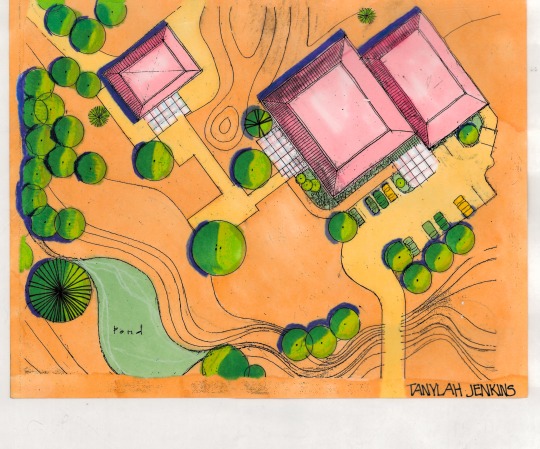
Image 2: This analogous render was created by me. The analogous palette consists of yellow orange, orange and green. The monochromatic buildings bring out the analogous palette because of the different shades. The rendering is very subtle because of the softness of the colors. It is giving you a relaxing background, which makes the trees and buildings stand out.

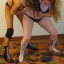
Image 3: The cool colors shown here are blue and green. I think cool colors were used here to separate the wrestlers from the background. The green is bright, causing you to focus on the main characters in the image, the wrestlers. On the wall of the museum, there were plenty of pieces with bright cool and warm colors so I believe that this also fits the theme of that wall.

Image 4: We see warm colors here, yellow and reddish-orange to be exact. I think these colors represent a connection between the two people in this piece. For some reason, I am picking up intimacy from. a man who is trying to help a woman. The warm colors make the image feel warm. Like you can relate to it. This image was also on the wall with the cool colors.
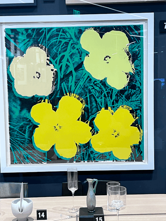
Image 5: The contrast in this painting is strong. The yellow flowers clearly stand out from the black and green background due to the brightness and hue of the two. The flowers stand out, making them the first thing you see. It catches your eye. The point here is to emphasize the flowers.
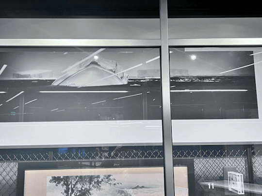
Image 6: At the top of the image is an iceberg standing alone the ocean. There is another iceberg but the long proximity between the two make the stand alone. You are drawn to the iceberg in the front as it is a little difficult to see the other one.
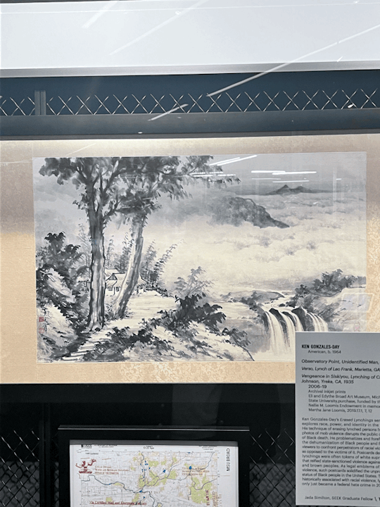
Image 7: This is an image that showcased an active figure ground. It contains white space but the space is an active element-the clouds. It is also acting in the waterfall and the pavement. It separates the elements of the piece and adds realistic features, such as the clouds.
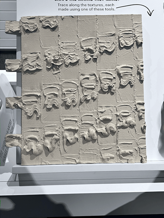
Image 8: This is a historical replica of how a form of art was made. People would pipe the material with a piping bag of some sort and take a thin spatula and design it. Here, the design consists of rhythmic grooves and lines. It also shows proximity between the groups of line and patterns, separating them from each other.
0 notes
Text
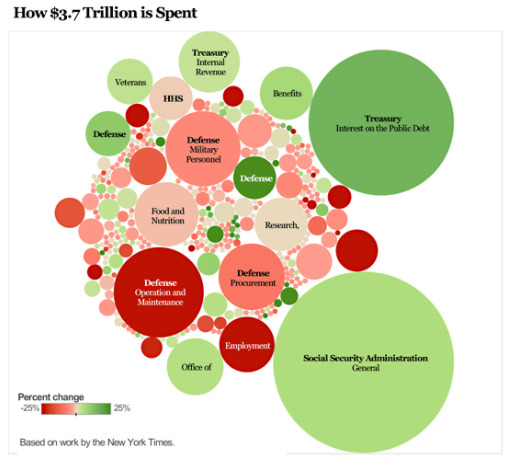
This images purpose is to show much money the government spends and what they spend it on the most. Out of the $3.7 trillion budget, most of it is spent Social Security, Treasury and Defense. From the size of the circles, it gives off the impression that the size represents the amount that each category receives. This is manipulating because you are forced to focus on the larger circles. But what about the smaller ones? What do they represent? Why are those priorities smaller than the ones clearly highlighted? It brings up a lot of questions and doubt.

This is a Target brand called "favorite day". The font is very modern and sleek. It is simple and easy to read. The design on this label is coordinated and flows, from the typography and font size to the color. There are four different fonts, but they are the same color and somewhat the same style. Compared to the other Target brand Good and Gather", the font is different, but still sleek and clean. You have the brand at the top, the title of the product in the middle and an image of the product lining the bottom on the package. Across all of the products, the layout and font sizes are consistent. It also matches the atmosphere of the store and brand, simple. The logo is simple, the employees uniforms are simple, and so are the product packagings.
0 notes
Text
Image 1: The cover of this User Experience book has a nice rhythm to it. You see a rhythm of lines and colors that repeat themself, along with the shadows. It is almost like a sequence with flow.

Image 2: This Dr. Bronner's soap label has a lot of words but the font size is what makes it easier to read and find the information that you need. The title is the largest and boldest. Then you have the certification that is the second largest to show that it is a trusted product. So on and so forth. Despite the business, the font sizes make it easier, showing you the order of importance.

Image 3: Two letters are ascenders in this image, "t" and "l". They ascend above the x-line, making them ascenders.

Image 4: In contrast to ascending letters, the "y" in this image is a descender because it extends below the x-line.

Image 5: On this Barbecue chip bag, we have a couple of counters, which have no opening. For example, The "D" and the "Q" have counters because they are closed letters.

Image 6: Letters with crossbars have a line going through them. In this case, we can see that the cross bar letters are "A" and "H".

Image 7: This font has a large x-height, with the small ascenders being "f, l and d". The largeness of the x-height make the letters look slightly wider than normal.

Image 8: This font has a small x-height, but with large ascenders, which tend the make the letters look thinner and longer than normal. Specifically where it says "Michigan State University" on the name tag.

Image 9: This font, specifically "Think" and "Thoughts" helps to define modernism to me because of how sleek the font is. It is very clean and it does not interfere with the other font that is used. It also the type of font to be used in a modern home, an advertisement or anything professionally related.

Image 10: The typography in this poster is straight-forward. But has a sparkly and shiny design to it. Renaissance is typically associated with history or a building. But in this image, its connotative meaning seems to be something new. Because new things are typically shiny.

0 notes
Text


All of the above images are examples of contrast, not necessarily in terms of color, but in terms of pattern, spacing, rotation and sizing.
Image 1~ A box made for lemons. The font sizes are different and it is somewhat imbalanced. One side contains an image and the other side contains words. There are more words than images despite the size of the image. The first thing that I see is "Seedless Lemons" because of how big it is. We also have a small series of words in the corner but they aren't the focus because they are very small. The main takeaway for this contrast is sizing.
Image 2~ A picture of different shapes in various sizes. The first thing I see here are the rectangles because they are bigger than the other shapes. I love the geometrics of this picture because of the multiple shapes that are shown. But each shape also has a different rotation, making the paper look more fun instead of unison, even with the equal amount of white space between each shape. This image demonstrates contrast in terms of spacing and rotation.
Image 3~ This canvas has a nice contrast to it. There is a cluster of gold dots at the top and bottom and the dots become less and more spaced out as you begin to move toward the middle of it. I think it adds emphasis to the words on the canvas. Despite the business of the upper and lower boarder, the first thing that I noticed was the quote, not the dots. This is contrast in terms of spacing as well.
Image 4~ We have this large circular face on the side of the box and we also a nice amount of white space to separate the texts. However, the focus is on the large circle on the side. It takes away from the other elements on the box. There is also a cluster of words and more circles at the bottom of the box, taking away from the title of the product.
Image 5~ The contrast in this picture os the difference of patterns. We have two different flower patterns on different colored backgrounds. The first pattern has small basic flowers in between the large flowers that are also different. This creates contrast, drawing your attention to the biggest flowers. Right above of the first pattern is a different one, with the same flowers throughout but as different sizes. Looking at this picture as a whole, your attention is still drawn to the larger flowers because of their sizing and the white space between each one.
0 notes
Text


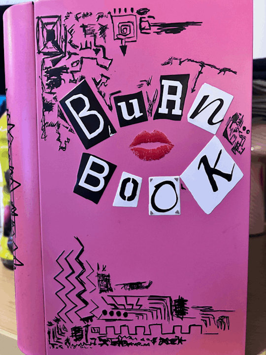
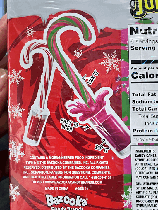

Image 1: Cattleman's meat truck. An advertisement is meant to persuade people to buy or interact with their product. The image of the meat, the font and size of the name, the natural wooden background. I myself, would buy their meat. In fact, I did.
Image 2: A book about crazy faith. The cover of the book persuades anyone to want to read it, especially people who believe in God and are looking for a miracle. The word choice, the authors "crazy" look on his face, the bold colors, the newspaper background. That's probably why I bought it.
Image 3: A "Burn Book" popcorn tin from the movie "Mean Girls." This very unique because it sends different messages and contains a lot of graphic elements: The font size play, the random designs in the corners of the book, and then the lips in the middle.
Image 4: Juicy Drop candy canes. The graphics clearly show that it is for Christmas. They also persuade people to buy it because it looks delicious and makes your mouth water. Then it contains small phrases that show the buyer how simple it is to eat.
Image 5: A case of water. The water graphic on this case makes the water look so refreshing. You might walk in the store to buy water, but this makes you want to open it right away before you buy it.
Overall, I believe that graphic design sends a message and includes elements that further relay the message.
1 note
·
View note