Excersices + explorations in critical thought, theory, & innovation.
Don't wanna be here? Send us removal request.
Statistics
We looked inside some of the posts by vis-com and here's what we found interesting.
Average Info
Notes Per Post
2M
Likes Per Post
621K
Reblog Per Post
1M
Reply Per Post
9
Time Between Posts
9 days
Number of Posts By Type
Photo
15
Text
2
Last Seen Tumblr Blogs


Fun Fact
Tumblr is used by 21% of adults online aged 18-29 years.
Photo


Swimming Semes
#reblogging for the day crowd#free!#nanase haruka#nagisa hazuki#tachibana makoto#ryugazaki rei#swimming anime#also fixing my terrible mistake this is why i shouldn't blog after hours
10K notes
·
View notes


Photo


The invitations for my senior show are ready! If any of you live in the area, feel free to show up!
8 notes
·
View notes
Text
Hey guys, if you don't already know about my cosplay blog, I'd like to share my love fore making costumes and props, as well as fun pictures from conventions and inspiration from professional cosplays :3
You can find my blog here
0 notes
Photo


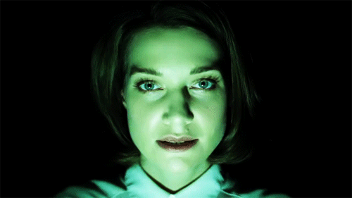
How The Face Changes With Shifting A Light Source
898K notes
·
View notes


Photo


Thilo Frank - The Phoenix is Closer than it Appears (2010) - Mixed media with mirrors
27K notes
·
View notes

Photo


On hort.org I found this particular wall of art pieces all dedicated to the ZUNE MP3. this one is oh so interesting because there is so much going on and the cow one for example has like nothing going on but his milk utters wrapping all around the poor guy probably choking the shit out of him. just kidding. but seriously. These posters or whatever they are are very colorful and I like colorful and kind of fun and straight to the point about these zune players. They are 30 GB. they play music, they are $199 , they include wireless sharing, its an MP3 player, and just its handy size is comfortable to hold.
pieces like this need to be made more because today everything is trying to communicate something that has no sense at all. all any commercial is about is random stuff just trying to make you remember their company when really, if they put things straight to the point and exactly what information we need to know on the ads they are printing or making or shooting or whatever, it will be remembered MORE easily than putting random all over their stuff.
Now since zune has already figured this trick out if only everyone else could.the most colorful picture with all the twirly stuff on it is the hardest to read but it is still legible because it makes you want to look for stuff in the mess and you will find details about the zune hidden in the colorful mess that the ad/poster has made.
The most interesting one to me is the 30GB all in black and white because the patterns are so just random and hypnotizing and when you listen to music it makes sense that it hypnotizes you while youre just sitting there with earbuds in and dancing to the music flowing in and out of your ears and brain.
2 notes
·
View notes
Photo

We have a variety of social media at our fingertips. Utilizing these technologies in 2013, to connect with different publics, is like magic at our fingertips.
* I may have already uploaded this but the tumblr app. is delayed/defective so just in case…
1 note
·
View note
Photo

The term "sequestration" has double meanings.
* I may have already uploaded this but the tumblr app. is delayed/defective so just in case…
0 notes
Photo

This image represents the word "Market." We must use critical thinking skills to "market" products for a variety of audiences.
* I may have already uploaded this but the tumblr app. is delayed/defective so just in case...
0 notes

Text


These Christmas cards done by Hort.org.uk were very entertaining. Chewbacca was the first design to catch my eye so I was instantly drawn to the post (of course). When I clicked into the link I found that they had used other various pop culture icons such as Batman and Zorro to grace the front of their Christmas cards. There were 10 different card designs, each depicting a black and white halftone character with a solid-colored drawn/rendered christmas tree on top of it. The trees, in a way, looked like they were trying to match the movement or essence of the character whether it be scrawled in a child’s hand or vector drawn on the computer. The simplicity is enough to grab your attention and draw you in. I cannot say that they seem very well thought out design-wise, but they were entertaining nonetheless. The cards were all screen printed so that was a plus. I very much enjoy screen printed work and this was another type of design that I could store in my personal archives. Not much more information was given on the cards like the designer/artist or other personal statements. It was most likely just a product advertisement. It was priced at ~30 euros for the set of 10 so I thought that that was a pretty decent price for the fun cards. If I saw them in a store I would probably think about buying them because they’re kitschy (<did I spell that right?) and definitely different from your usual Christmas cards.
Looking through the archive at Hort, I sometimes have a bit of difficulty finding the artistic merit and draw of their designs. It is obvious that they have worked for very high profile clients, but I am personally not very drawn to their work. It is very understandable because art is very subjective, but to have them working with such big names with this type of work is interesting. Their works could definitely fall into the critical design category, but some pieces I feel I could just as easily recreate in under an hour. The images and “brush strokes”, and shapes that they use seem very random and I can’t understand their significance. Wouldn’t that be a problem if you are trying to design something for an audience? Isn’t the point of advertising design to portray a message and have that message easily communicated and understood. There were some that were more clear than others, but overall I was just a little confused with their design choices. I am in no way trying to discount their work or artistic practices, I am just merely giving my own opinion of what I have seen while scrolling through their gallery. Besides this one Christmas card post, I was actually having some difficulty finding something that I wanted to look into and write about. I guess I would just have to say that this type of design is not my cup of tea.
0 notes
Photo


We've been working on some football t-shirts for the European Championship, asking ourselves why the fan-shirt has to look like the team jersey? This is how we would wear them.
As a major fan of European Football, I really like these shirts. He says it perfectly, not all the of the shirts should like the the teams jeresys. It cool to have a shirt that you can wear around everywhere, not just the game. Some of them look like black and white versions of the jerseys while, others look like cool t-shirts. This means that you can just wear them around town and not look like a dork with a jersey on while your not at a sporting event.
It seems that the nike in europe is a lot different then it is in the states. In europe it is more exotic, then here were it more bland. The lettering is crazier and isnt just plan jane lettering.
2 notes
·
View notes
Photo


Eike König is quite an interesting graphic design. I’m no one to judge but he is really random. When looking at his work all going fast in the screen it is hard to create an emotion towards it since every piece is so different than the other. Maybe he is the kind of guy that just do whatever comes to mind without thinking a lot about it. However I have to say that his style of not having a style works pretty well. He is able to camouflage in a good way. He does not have a label (even though not having a label could be a label stereotype). He seems to enjoy the most working with typography and sharpie illustration. I choose this section of work because it is so random and pointless I guess that I loved. Very urbanistic, a lot of urban references and that is something I enjoy. Also to see the same idea evolving in many different ways is really interesting. The t-shirts seems cool. I would wear them.
Another interesting think about his lecture was his advices. I won’t remember everyone but there were this two that caught my attention. He said to do what you love and do not work with jerks. I didn’t see if he defined jerks later on. I thought that was almost common sense until I realize that this is so true. If one gets a jerk partner all the project will suck just because most of the times people disagree and jerks will disagree more with people just for the fun of doing it. I loved how he does not have a graphic design stereotype and how he went to lecture in a super comfortable sweater.
He’s way of dealing with type and overlapping reminds me a lot of the posters we were analyzing in Forms of inquiry. Probably is more like a European style.
I guess what I’m getting from his lecture is basically, do not try that hard. If you try too hard it will look forced and fake. Even if people do not like your design, do not try to come up with exaggerated things just for the sake of amusing others. Amusement is different than function.
#elisa romano#week10#walker#walkerartcenter#lecture#graphic design#Eike König#urban#european#Typography
0 notes