Don't wanna be here? Send us removal request.
Statistics
We looked inside some of the posts by waynejfthird3 and here's what we found interesting.
Average Info
Notes Per Post
0
Likes Per Post
0
Reblog Per Post
0
Reply Per Post
0
Time Between Posts
4 hours
Number of Posts By Type
Photo
17
Last Seen Tumblr Blogs


Fun Fact
Tumblr’s website traffic is steadily declining.

Photo


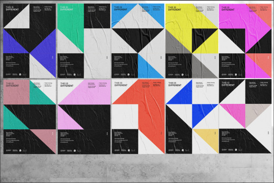
Throughout the project we’ve been speaking wth James to handle a projection element of the degree show. A piece that can use our identity and also display exhibiting students work. James built this structure based from the grid we designed on the posters. He will be mapping colours and work
0 notes
Photo
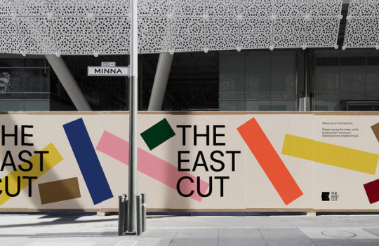
Hoarding inspiration for outside Benzie. Maybe we reduce or even break the grid to create greater white space and larger type
0 notes
Photo

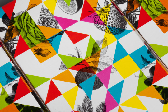
Working on a new print. Not any real concept of sorts, just image play and experimenting with colour combinations. Looking to get this screen printed, or maybe foiled
0 notes
Photo
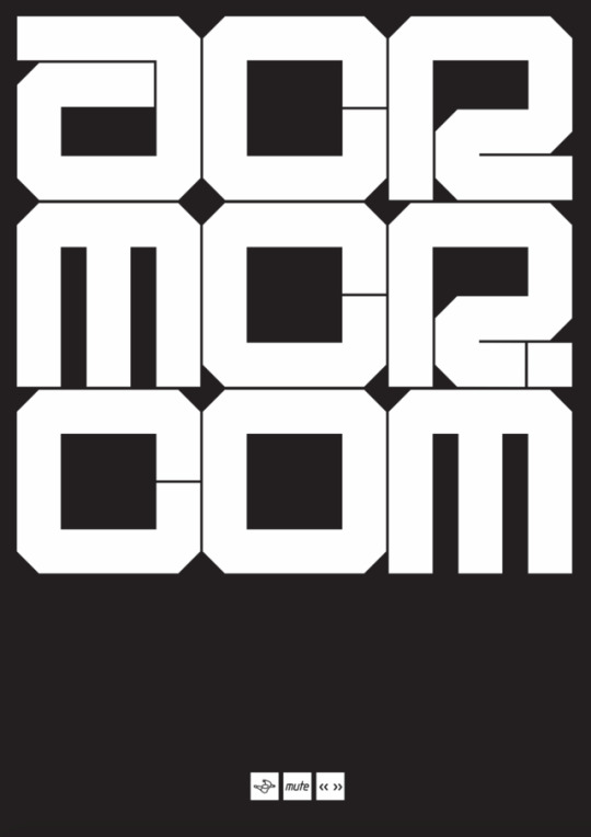
Testing the typeface I developed for ACR to make a poster to advertise their new website.
0 notes
Photo
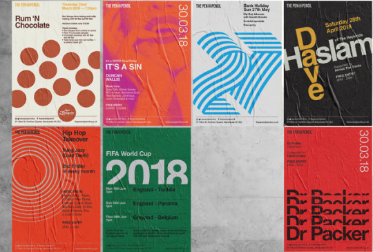
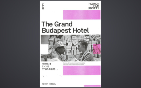
Various posters designed for the Pen and Pencil. Overall the aesthetic works and is a vast improvement on what they were currently doing.
0 notes
Photo

“19″ type play inspired by tony forster and trevors 27 forever work
0 notes
Photo
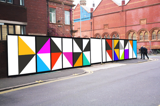
Potential mockups for the hoardings outside Benzie. I’m in 2 minds wether we paint of vinyl a huge version of the grid or take many of the posters and fly poster them all together. The problem with this is the type is too small to serve any purpose being there. We would need to design a different poster that works at seeing from a distant
0 notes
Photo
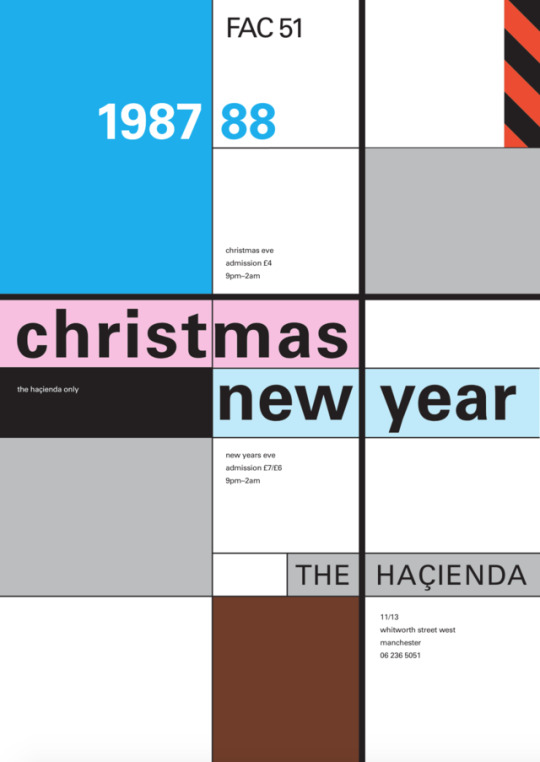
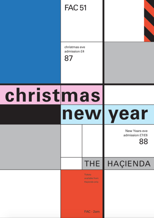
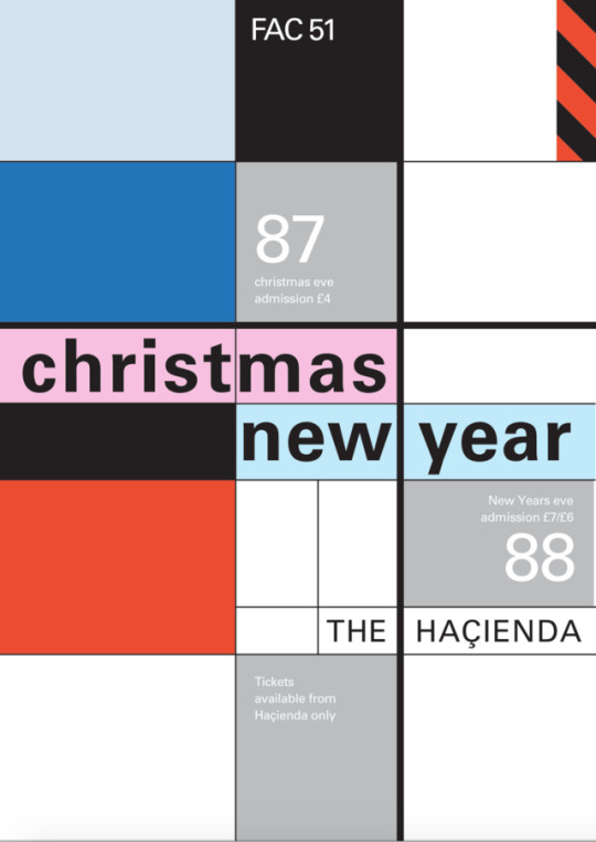
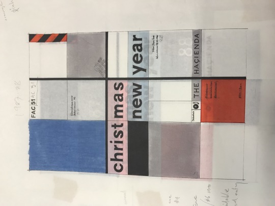
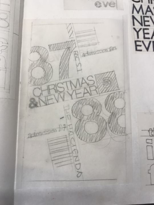
Working on the restoration of this christmas and new year print from Trevors Hacienda collection. There’s ways to yet with the type but this poster is incredible. The colour scheme in particular


0 notes
Photo
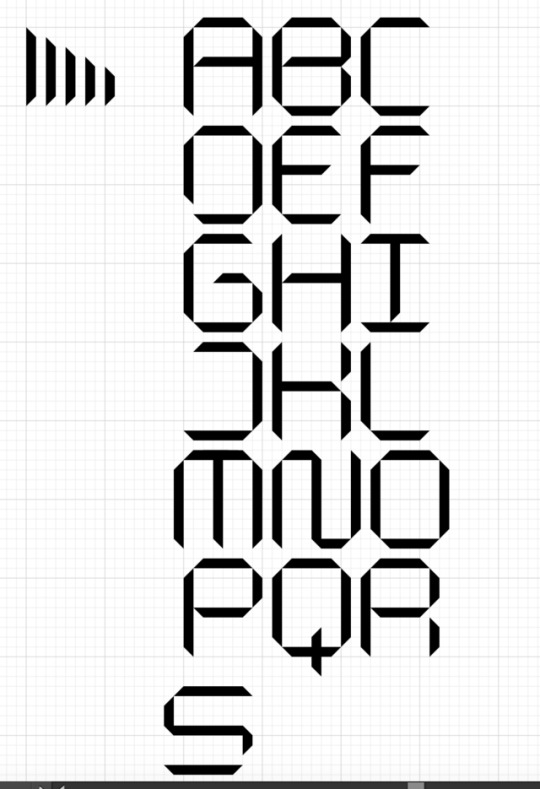
Trying to develop a new typeface that almost looks like it’s folding around itself. Having problems with the S so might need to change the scale of the characters to accomodate
0 notes
Photo

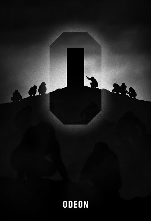
A quick sketch of an idea I’ve had for a few weeks. I recently went to the cinema and Odeon play these promotional videos at the beginning of their films. I saw the inner space of the O and it reminded me of the monolith from 2001 space odyssey. So I thought it might be cool for odeon to create like an advert as such or sting, where their logo is merged in to iconic cinema. Above is the monolith as the inner space of the ‘o’ and the inner space creating a city scape where spiderman can hang from. With more development this could be a series of moving images or posters.
0 notes
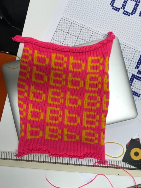
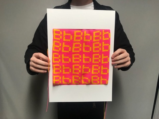
Photo
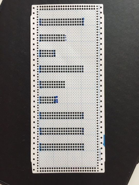
Using the same technique for the type, I had the idea to punch the fashion film society logo into punchtape so we could knit an FFS scarf. A nice way to contextualise the identity in a fashion accessory
0 notes
Photo
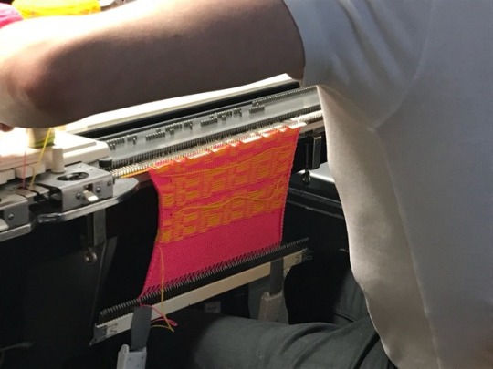
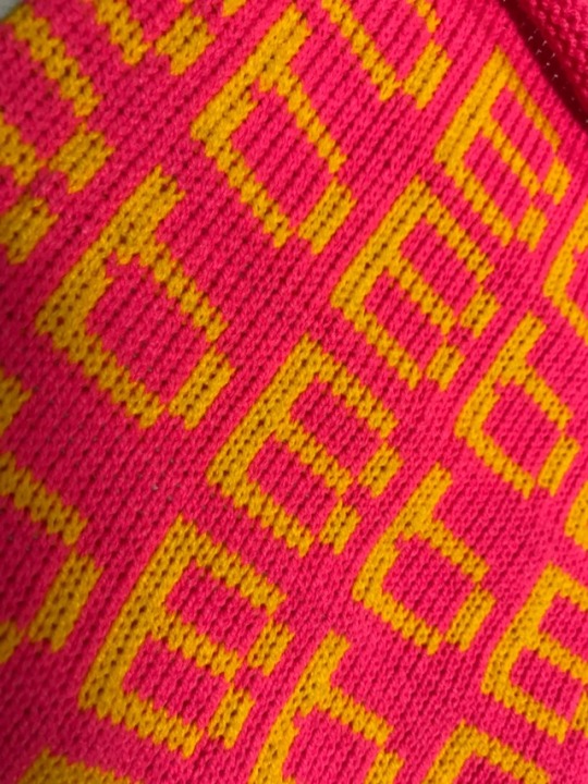
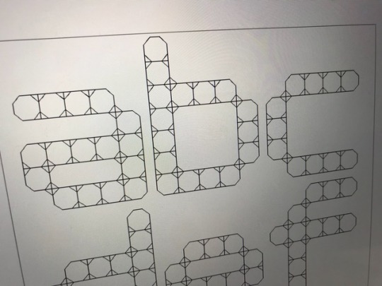
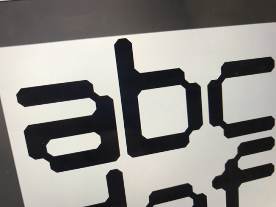

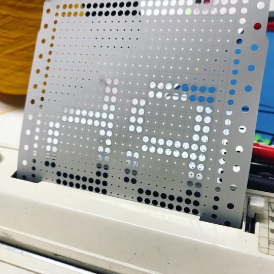
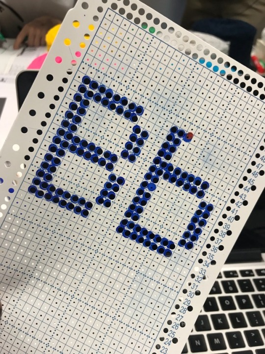
Signed up to sam and hitchs type workshop to learn how to knit some typography for their tricotype workshop. This was created using punchtape and feedin it through a knitting machine that picks up the sprocket holes and creates the type
0 notes
Photo
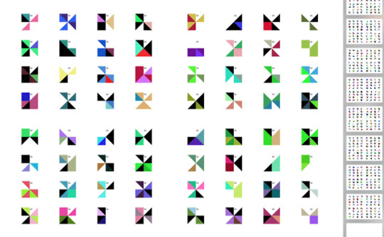
Coding for the booklet generating 1000s of different designs at the click of a button
0 notes