
That moment when your account name is weebtrash but you run an art blog.
Don't wanna be here? Send us removal request.
Statistics
We looked inside some of the posts by weebtrash2kforever-blog and here's what we found interesting.
Average Info
Notes Per Post
1M
Likes Per Post
803K
Reblog Per Post
607K
Reply Per Post
562
Time Between Posts
1 month
Number of Posts By Type
Text
9
Video
1
Photo
5
Audio
1
Note
1
Last Seen Tumblr Blogs


Fun Fact
Kazakhstan’s Minister of Communications and Informatics has blocked the Tumblr site because it contained 60 sites of terrorism, extremism, and pornography in 2015.
Text
gentle reminder~

1 note
·
View note
Text
why you should make a webcomic and why you can make a webcomic
why should you make a webcomic?
it’s regular drawing practice
you get to draw and develop the universe your OCs live in
you could draw your OCs making out with context
see number 3
how can you make a webcomic?
make a new tumblr
install this theme https://www.tumblr.com/theme/37061
post comics as you would on any other tumblr they show up on their own webcomic site
what if nobody sees my webcomic :(
too bad you got to draw your OCs making out and nobody can appreciate your artistic genius obviously the world is not ready for this webcomic genius
197K notes
·
View notes
Video
instagram
The power of layers and layer modes
138K notes
·
View notes
Text
i feel bad for people who use sai but dont know about stabilizer, transparent brushes and clipping groups
254K notes
·
View notes
Text
ATTENTION ALL ARTISTS JESUS CHRIST
THERES THIS WEBSITE CALLED IRADUKAI AND ITS FUCKIN AMAZING BC VARIOUS JAPANESE ARTISTS POST THEIR STEP BY STEP ON FINISHED WORKS STARTING FROM SKETCH UP TO FINISHING TOUCHES
IT ALSO SAYS WHICH ART PROGRAM THE ARTIST USED FOR CONVENIENCE PURPOSES YEAA
ITS IN JAPANESE THO BUT ITS MOSTLY IN PICTURES SO ITS NOT TOO HARD TO UNDERSTAND
YOURE WELCOME
60K notes
·
View notes
Text
free software alternatives
i never stop talking about some of these so i might as well banish them to a single post! you might know about a lot of them already, but feel free to look anyway
Adobe Animate (Flash) → OpenToonz, Synfig Studio, or Pencil2D
Adobe Audition → Audacity
Adobe Illustrator → Inkscape
Adobe Photoshop → GNU Image Manipulation Program or Paint.NET
Adobe Premiere Pro/After Effects → Fusion, Shotcut, OpenShot, Natron, or Blender
Autodesk Maya → Blender
Clip Studio Paint/Paint Tool SAI → Krita, FireAlpaca, (both also include animation tools!) or MediBang Paint
FL Studio → LMMS
Microsoft Office → LibreOffice or Calligra Suite
Scrivener → Celtx (sort of?) or Evernote
VLC media player → VLC media player lol
freeware can be a great opportunity to get a feel for something and learn a new skill. and in some cases, the free versions are almost as powerful, so you might find that you saved a lot of money but made work that was just about equal to what you might have done with paid software!
64K notes
·
View notes
Photo

How to make easy pixelart with aseprite
173K notes
·
View notes
Audio
(N-Guage)
2 notes
·
View notes

Text
HOT ART TIPS!!!!
1) FIRST THINGS FIRST
GET A COMPUTER THAT ISN’T SHIT!!! GET A COMPUTER THAT CAN RUN PHOTOSHOP!! OR A PROFESSIONAL PROGRAM LIKE IT!!!
IF YOUR COMPUTER IS GARBAGE, YOU WILL NOT BE ABLE TO RUN GOOD ART PROGRAMS. YOU WILL NOT BE ABLE TO SAVE LARGE FILES SO THAT YOUR ART CAN LOOK GOOD!!!
2) YOUR ART NOT TURNING OUT GOOD? IS IT LOOKING HELLA SMUDGED???? ARE THE DETAILS NOT COMING OUT GOOD?? OR LOOKING LIKE A SMASHED DONUT???


(REASON FOR THIS)??
BIGGER PICTURE MEANS YOU CAN PUT MORE DETAILS IN IT AND RENDER IT BETTER!!!!!!!
SMALLER PICTURE MEANS LOWER RESOLUTION AND YOU CAN’T BLEND SHIT AS WELL!!!
GOD I LITERALLY FIGURED THIS SHIT OUT TONIGHT!!! YOUR LIFE WILL BE CHANGED!!!
3) DO NOT STAY WITH PROGRAMS LIKE FIRE ALPACA OR PAINT TOOL SAI UNLESS YOU HAVE ALREADY TRIED OTHER ART PROGRAMS!!!
REASON??

(AND FIRE ALPACA)


PROGRAMS LIKE gOOD OL’ PHOTOSHOP, CLIP STUDIO PAINT, AND OTHER PROGRAMS THAT HAVE A VAST SELECTION OF FANCY SCHMANCY STUFF TO ENHANCE YOUR ART ALLOW YOU A LOT MORE ROOM TO GROW!!
4) MAKE!!! YOUR!!! OWN!!! BRUSHES!!!!
LIFE WILL BE IMMENSELY EASIER WHEN YOU FIND THE BRUSH THAT ACTIVATES YOUR MAGICAL ART ABILITIES (MINUS THE TRANSFORMATION SHIT)
HOW DO YOU DO THAT?
HERE’S HOW TO DO IT IN PHOTOSHOP
HERE’S HOW TO DO IT IN CLIP STUDIO PAINT
HERE’S HOW TO DO IT IN FIRE ALPACA
HERE’S HOW TO DO IT IN PAINT TOOL SAI
4K notes
·
View notes
Note
Do you have anymore tips for artists that started out by drawing anime, such as for drawing face shapes?? I'm getting tired of automatically makin eggy heads
sure thing! there are a lot of tutorials on drawing face shapes that are more comprehensive (i recommend searching some art ref blogs? ive seen a few that are very good), but ill provide a few tips ive picked up over the years…
an easy way to make unique face shapes is this method, where you draw a weird round polygon and try to make it into a face. its a fun exercise and its also good practice for character design! i did some tame ones here but i recommend you get really wild with it– you can make a pretty compelling face from almost any shape

another simple way to vary face shapes is to mess around with the profile. particularly, pay attention to the sharpness and size of the brow-bone, cheekbone, nose, and chin.

of course, the best way to improve your facial diversity is to draw from real photos! it doesnt have to be detailed– sometimes i just trace over faces in magazines or do one-to-two minute sketches of photos (this is a really good resource).
finally, i cannot express how important it is to draw individuals of various ethnicities, especially if you grew up imitating anime styles. different ethnic groups have different facial structures, and having a diverse model pool will help you vary your face shapes as well.
hope this helped!
349 notes
·
View notes
Text
Webcomic tips
In the conclusion for now, some things I’d really recommend doing if you’re seriously considering making a webcomic (or really a comic in general). Some of these don’t really apply to strips or gag-a-day type of comics, but I’m not talking about those here.
1. Write down ideas\sketch stuff, LEGIBLY. “I’m gonna remember it later” NEVER works. And if you scribble it somewhere on a piece of paper, you’d better scan it or retype in one doc later, because tiny notes always get lost among other doodles in my skethbooks.

(i know it’s hard to keep everything clean and organized, but this mess is just not productive)
If your project is a collaboration, save your conversations. If you’re working alone, make a blog for your ramblings. You have no clue what tears of relief I cry when I open that blog and rememeber I don’t have to painstakingly look through my heaps of sketchbooks and folders for a tiny idea I’m not even sure I wrote down a few months ago.
2. Inspiration folders, or even better, inspo blog with tags also help with collecting and remembering ideas. Color schemes, landscapes, style inspirations, atmospheric stuff, maybe some photo references, all those neat things.

3. Basic tier: character design sheets. Top tier: common poses, expressions. God tier: outfits they wear throughout the comic. Holy cow tier: turnaround sheets for all those outfits.

(I’d die trying to find good pages for references without these)
4. If you haven’t finished detailing the plot, don’t even think about moving on to drawing the comic. You’re gonna regret it when you come up with a really cool plot element that can’t be incorporated anymore because you’ve already drawn all the parts you could’ve tweaked.
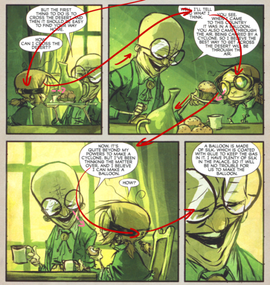
5. Don’t just define the plot, make a script. Writing down the lines and the brief description of the actions serves me fine:
(notice that I approximately divided the pages & the text that’d go to each panel on a page)
6. Hard mode: make thumbnails for all the pages, if possible. At least whenever a new chapter starts.
7. If your story involves some convoluted chronology shenanigans, you’d better write down the events of your timeline in the chronological order.
8. Backgrounds. You can’t avoid them, bro. Like half of the comics are backgrounds, especially if your story involves a lot of adventuring and looking around. I know it hurts, but you’ll have to become friends with them. Read some tutorials, practice on photos, go out and sketch some streets, use 3d programs (like Google Sketch) to understand the perspective, use sites like houseplans to visualize your buildings better, I don’t know. Just be prepared for their imminent evil.
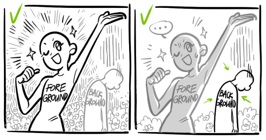
9. If you’re drawing digitally, pick a brush size for the lines and stick with it. You don’t want your lines and detail levels to look all wonky and inconsistent in different panels. And I don’t mean the cool stylistic varying lines, I mean this:
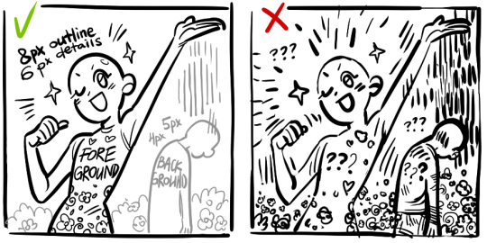
Also, things on the background should have thinner and/or lighter lines to avoid distraction. Usually less details too, unless you’re making a busy background with a simple foreground to help it pop out. Or wanna draw the attention to an object on the bg.
10. Readable fonts. Even if you chose to ignore people with poor sight or dyslexia, the majority of your readers aren’t gonna be excited about struggling to decypher this:
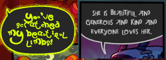
Also, as much as I love my black speech bubbles, colorful text on black still kinda hurts the eyes. I wouldn’t recommend doing that for all the characters. Black speech bubbles are usually used for creepy, inhuman voices. And yes, having a colorful outline in this case helps.
11. Probably newsflash, but did you know that panels have their place, order and functions? They do! My favourite thing ever is how I used panels when I was like 12:
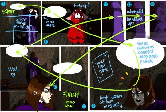
(comics ain’t rocket science, but this one is)
The composition of the panels and word balloons always serve for a better reading experience. They guide your eyes over the page, so that you never feel lost or confused. The images in the comic equal frames in a movie, so it’s pretty damn important in what order you look at things and how quickly you can understand what’s going on!
(Eric Shanower & Scottie Young’s Wizard of Oz)
12. One update a week is fine for testing waters. Don’t overestimate yourself, especially if you have a pretty busy life outside it. A stable comic that updates slowly, but regularly is better than an unpredictable erratic one. You can always pick up the pace later, if you feel confident enough.
13. Try to always have a buffer - a couple of pages in reserve. If you’re making the pages much faster than you’re updating, this shouldn’t be a problem. But if those paces are equally the same, it’s goddamn HARD. But on the other hand, if something happens and you skip an update, those come in handy.
If you’re looking at this list and thinking “wow that’s a LOT of work”, you’re totally right. And it’s okay to be intimidated at first! But that’s why it’s important to start with something small. Once you get the formula down, these things will be natural to you.
48K notes
·
View notes
Photo


Hey friends! Meg here for a really, long, wordy TUTOR TUESDAY! This week we take a look at drawing characters that are interacting. If you need help with anatomy here are a few tutorials: legs, arms/legs, necks, and here is a previous tutorial on poses. If you have any tutorial suggestions send ‘em in here or my personal. Now go forth and I’ll see you next week!
26K notes
·
View notes
Text
Varying Your Body Types
By me, Sara D. (Heh.)
I think it’s very important for artists to vary the types of bodies they draw! Not only does it add visual interest and diversity, but different body types can enhance your characters! (Plus it’s more realistic; when was the last time you walked down the street and everyone had the same body type?) I know I have a hard time drawing different bodies, especially with men, so I’m making this tutorial to teach myself as well (I’ve heard the best way to cement learning something is to teach someone else).
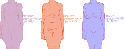
So! Bodies! I’m going to use women for this tutorial because I feel they have more variety in their bodies. One of the most obvious ways bodies differ is in their amount of fat.
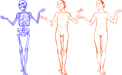
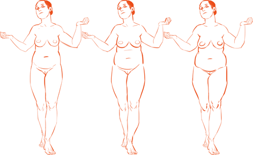
[Click here for full size]
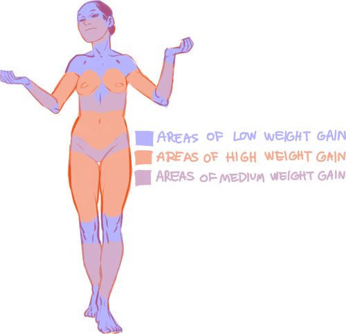
On average, people store fat mostly in core areas like the bust, the waist, and the hips. It is important to remember that people gain and lose weight differently, and this is true no matter how fat or skinny one gets. However, these are common places people store fat:
The face and neck can be immediate indicators as to how much fat the rest of the body has; when someone loses or gains weight, it’s initially obvious in the face. This is possibly because the eye is (usually) drawn first to the face.
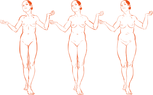
In addition to differences in the amount of body fat, bodies vary vastly in their proportions. The two main ways they differ is skeletally and in fat distribution. The hip to shoulder ratio is skeletal, and someone with wider shoulders might look more powerful or masculine, and someone with wider hips might look more grounded or feminine.
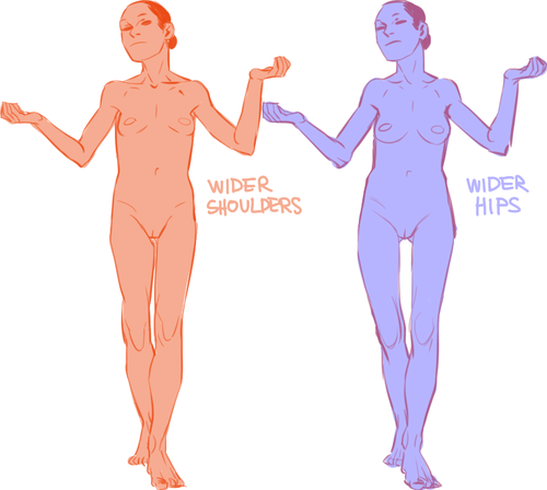
The torso to legs ratio is also a skeletal ratio. Someone with long legs in comparison with their torso might look taller than someone of the same height with a long torso, and they might also look skinnier.
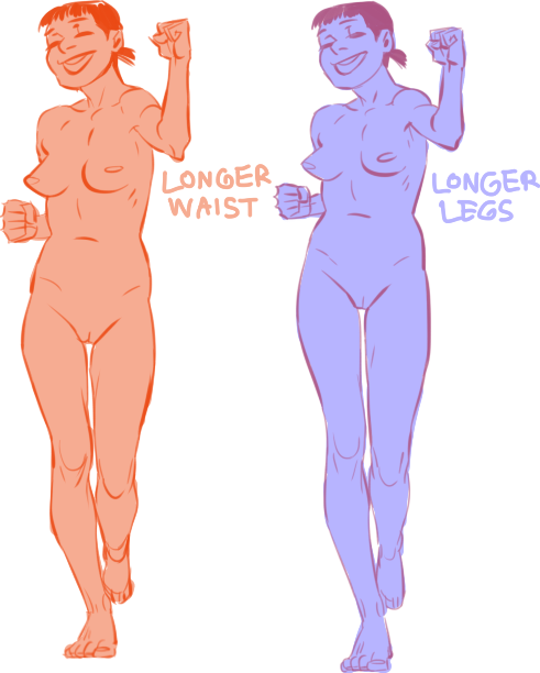
(I say as I finally get some visual variety all up in here.)
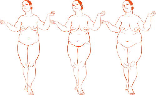
Because the hips are also one of the places with the most weight gain in women, large hips can also be a matter of fat distribution. The three main places where the fat ratio really matters is in the bust, the waist and the hips (making up the core of the body).
While men usually carry weight in the belly area, the fat distribution can really vary with women. Some women carry more weight in the bust, some in the belly, and some in the hips/thighs. Some women carry more weight in two areas, like the bust and the hips, the bust and the belly, or the belly and the hips. Some women show no obvious bias to any area and carry weight equally.
[Click here for full size]
Taking into account skeletal ratios, fat distribution patterns, a vast human weight range, muscle tone and age, there are endless permutations of body types. It would be a shame if you used only one!
Oh, and that first image looks really interesting as a gif.
69K notes
·
View notes
Text
art cheats
hello i am here today to not lose track of the art cheats i have discovered over the years. what i call art cheat is actually a cool filter/coloring style/way to shade/etc. that singlehandedly makes art like 20 times better
80’s anime style
glitch effect
glow effects
adding colors to grayscale paintings
foreshortening ( coil )
foreshortening ( perspective )
clipping group (lines)
clipping group (colors)
dramatic lighting ( GOOD )
shading metal
lighting faces
that is all for today, do stay tuned as i am always hunting for cool shit like this
319K notes
·
View notes
Photo


Someone on Instagram asked me about the “Chromatic Aberration” effect I put on my art, so I decided to make a small tutorial in case anyone else was wondering! **As it says in the first picture, I use Medibang, but this should work across all other art programs!**
3K notes
·
View notes
Photo
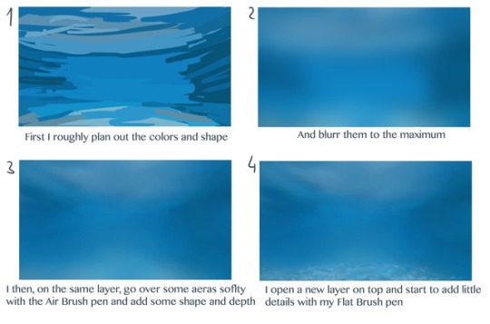
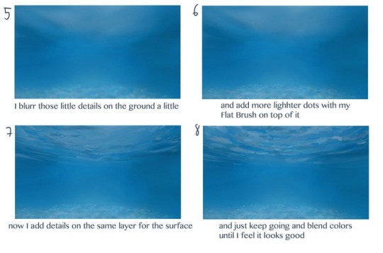
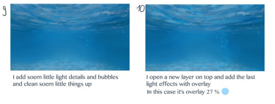

THANK YOU!! <3 I’m always very bad in explaining what I’m doing. Cause there is just a lot of trying and painting over it and mashing and mixing colors until I feel it’s good. So I tried to show you. I hope this helps!
50K notes
·
View notes