
koi, she/they. I make tumblr themes & pages, notion templates, and other resources.
Don't wanna be here? Send us removal request.
Statistics
We looked inside some of the posts by xuethms and here's what we found interesting.
Average Info
Notes Per Post
21K
Likes Per Post
15K
Reblog Per Post
7K
Reply Per Post
19
Time Between Posts
6 days
Number of Posts By Type
Text
12
Photo
5
Last Seen Tumblr Blogs


Fun Fact
69% of Tumblr users are millennials.
Text


Ten years ago today on July 16th 2015, I created glenthemes. Just to be clear: I'm NOT saying goodbye. You're all stuck in here with me. This is a look-back on my journey, the good, the bad, the ugly, and how I ended up where I am now. This short journal is mostly written in chronological order; if you'd like to skip to the parts you're interested in, here's the overview in which the the titles sound suspiciously like episode names:
humble beginnings
how I learned to code
glenthemes was problematic 💅
glenthemes logo
paid themes & pages
landing internships
Discord community
powerpoint guides
college & hackathon
featured on Tumblr's "Getting Started" page
tumblr changes / mobile & NPF era
design style & branding
“the friends we made along the way”
what's next?

10 years of glenthemes.
◍ humble beginnings:
During my early teens, I had a habit of changing my theme every other week (sometimes it would be every other day.) Back then, it was a way of showing my appreciation for my favorite fictional characters; every sidebar image or corner image would be a low res GIF or a poorly cut out mangacap, and that meant the world to me. It was a form of creative outlet during my troublesome high school years. My greatest coding achievement at the time was adding a sepia filter over my posts, but I was sold. I wanted to do more, make more. Some of the theme makers that inspired me to start exploring theme making and coding in general are:
@7th-district
@a--themes/@dianthus-s
@altairisthemes
@cocorini (deactivated)
@magnusthemes
@octomoosey
@pohroro
@redfox-themes
@viwan-th
@yukoki (now @xuethms)
@zeldathemes (now @rachaelthemes)
The first base code (Tumblr theme code starter template) I used and continued using for a few years was by @mrsthemes. Tumblr's theme documentation was confusing and daunting to me at the time, so having a base code provided by others to work from was a major blessing.
(If you're looking for a more up-to-date base code though, I recommend ones from @eggdesign; she's put helpful comments throughout the code! Check [this one here], or [this one] for NPF posts compatibility as well).
◍ how I learned to code:
This is by far the most popular question I get, I'm only touching on it briefly in this post; I have a #learning tag with linked resources if you're interested!
In my opinion, there isn't a "right way" of learning anything, and coding is no exception. While many learn from courses on CodeAcademy, others (like myself) learn from more hands-on projects and via experimentation. As mentioned earlier, I used a base code template; I tried rearranging things, breaking things, building things (you can learn a lot from breaking things, especially in coding) to see what happens. Another underrated resource is CodePen – a coding playground where developers share their mini projects with the full code available for you to study and edit (just remember to credit/link back to the pen link if you end up using it in your projects!).
As an avid gamer, I enjoy challenges and gamified learning experiences, so to further my studies into full-stack development (Node, React, DevOps), I looked to Zenva (they also have courses on how to develop games if you're interested!).
◍ glenthemes was problematic 💅:
I had...issues for the first few years:
Those of you who've been around for a long time may remember that I used to be rude when replying to asks or requests. Even if I was going through a rough period of my life, it doesn't justify the attitude that I had (to users and fellow theme makers alike), and for that I sincerely apologize. I like to believe I'm a better person now; no one is perfect but it doesn't hurt to get a little closer.
I used the smallest fucking fonts for my themes. This issue is arguably way less severe than the one I just mentioned, but there's actually a ✨ good excuse ✨ for that. I used a hand-me-down laptop to make my themes and the resolution was tiny. The text, from my screen, didn't look small; that is, until I finally got a new laptop and realized just how ant-sized everything was. (This was one of the reasons I decided to revamp my older themes).
◍ glenthemes logo:
In 2018, I commissioned my high school art classmate Julie (you can find her on Instagram at julieoolie_!) to make my logo. We went through a variety of different styles ranging from my blog initials ("GT") in a brush font to firmer, geometric shapes. In the end, I settled on the logo I've been using ever since: a 3D cube with its front-facing sides taking the shape of "G" and "T". I wanted to go with this subtle design quirk that makes you go "OH, that's what it is!" after taking a closer look at it. A box/cube with open corners is also a loose metaphor for my style – recognizable and familiar at first glance, yet willing to peek and venture "outside the box/norm" a little. Whether I've actually ventured outside the norm or not is up to interpretation, but I like to (perhaps foolishly) believe that after these years, my themes are at least a little recognizable and have their distinct feel/branding – not too minimal, but too over-the-top either.
◍ paid themes & pages:
In 2018, I released my first paid theme & page. I wasn't expecting much and was nervous – I'd never sold anything online prior to this. Although I started my shop on Gumroad, I transitioned over to Ko-Fi in 2022 as Gumroad's tax on transactions became ridiculous. As a creator that mainly provides free content, publishing paid content can be daunting. While I know that I should charge fairly for the work that I do and the time I've put in, sometimes I still feel guilty for setting a higher price than "expected". So I was pleasantly surprised to see that folks took a liking to my "Ignorance" and "Bliss" pack.
I'm a firm believer in "try before you buy", so I always put up free previews and guides for folks to look through before they make their purchase. Guides take a long time to make, but rest assured that I'll always keep them free. You have the right to know what you're getting into; the more complex a theme is, the more uncertainty there is. And even though I provide free support for any type of content that I do, if I was a customer, I'd feel more at ease if I had a handbook from the start.
It wasn't until this year (2025) that I actually...made my premium code packs available to be purchased as packs. Before this, all themes and pages in each pack were available for purchase separately. It sounds super silly now that I type it out, but hey – you can get each pack for 15% off now!
At the end of the day, it doesn't matter if a theme of mine is free or premium; my support / maintenance for them is the same. Premium themes don't get special treatment just because they're paid. If Tumblr comes out with an update that breaks a part of a custom theme, that will apply to all my themes. So there's only 1 goal and that's to keep everything up to date.
◍ landing internships:
I was grateful to have landed several internships despite not having any formal education in web development. The first was at a fashion boutique, where I was in charge of setting up their new online shop (from inventory management to the eshop's website). The second internship was at a software development company where I learned from and worked alongside full-stack devs, back-end devs, and design and marketing teams for the first time. It was an invaluable, eye-opening experience as it made me realize just how much I had yet to learn (more on that later).
◍ Discord community:
As time went on and more theme questions were sent in, I came to realize that a single "ask and answer" exchange is generally not enough to answer the question properly. So in March of 2019, I created a Discord server so users could join and ask questions in the chat. At some point, Tumblr removed support for code formatting in Tumblr posts and answered asks, which ultimately meant that any piece of code meant to be copied would turn into regular text and lose its syntax, and straight quotation marks (used in coding) would turn into curly ones. Since then, the server has guidelines on how to ask questions, gotten a server mod (hi Keith if you're reading this 🫵), has dedicated channels for art and content sharing, and amassed 1,000 members (a small and quiet Discord community, but a cozy home I've built nonetheless).
◍ powerpoint guides:
If there's anything that I want to be known for, it's this one right here. Guides. Manuals. "README"s. Whatever you want to call it. It's a notoriously detested activity amongst the coding community considering most of us are (jokingly) illiterate, but I love writing documentation. While my main motivation is to help users easily install and customize complex themes, another vital part of it is poor memory. Too many times has someone asked a question about a theme of mine that I barely remember making (10 years of coding and bad habits does that to you), so writing a guide helps pinpoint where I'd start looking. It's also helpful because I can just "tap the sign" and point users to which powerpoint slide in the guide they should refer to (...if I've covered that feature).
◍ college & hackathon:
As my earlier internships introduced me to how much more I could learn, I decided to pursue a formal education in web development. I was ecstatic to have achieved a distinction and went on to participate in my first hackathon. For those unfamiliar: a hackathon is where you (or a group of developers and/or designers) work on a program/coding project for a fixed amount of time, typically 24 hours. This particular hackathon was 9 hours. Many pizzas and energy drinks later, we presented WheelScout, a live accessibility reporting site that helps mobility aid users plan their journey in advance, and we were awarded 1st place. Since then, I've been working on making my themes and overall content more accessible, from best semantic practices to adding improved alt text.
◍ featured on Tumblr's "Getting Started" page:
In May of 2022, I noticed by sheer chance that I was mentioned as a recommended third-party theme maker on Tumblr's "Getting Started" page:

(The wording in this paragraph has since been updated by staff). One thing I'd like to clarify is that a "third-party theme" refers to any Tumblr theme that isn't on Tumblr's Theme Garden. I have many reasons for not publishing my themes through Theme Garden; most of it is due to the fact that I tend to push out updates/fixes and like to see them applied asap, but doing so through Theme Garden could take up to a month, as a member of staff needs to manually approve it. Regardless, being mentioned was an absolute honor, and I've been working to keep my themes up to date with all of Tumblr's changes (and will continue doing so).
◍ tumblr changes / mobile & NPF era:
This section's long, folks. Remember to take a stretch / hydrate / bathroom break if you've been reading since the start.
Tumblr has been gradually switching over to prioritize updates for mobile/app users for a few years now. Whilst the exact starting point is up for debate, Tumblr isn't the only one – most, if not all social media platforms have switched over to a mobile-first experience.
A while back, a poll titled "how do you use tumblr?" circulated:

So it's not just Tumblr staff prioritizing mobile features & updates – it's also in response to a growing number of mobile users. A lot of it attributes to the fact that many of us on Tumblr are in our twenties and early thirties – we just don't have the time to sit at our computer and scroll through our feed like we used to. So the next best quick and convenient thing? Mobile app. But it's not just convenience –
Here it comes – the rant.

Posts look normal on mobile. They look as intended. They're not squished. If there are multiple images in a row, they aren't stretched, pixelated or blurry (most of them, anyway). And the reason? NPF posts (posts made with the "new" editor which now applies to all users) look like shit on desktop themes unless you're using Tumblr's default theme or a theme tailored to accommodate NPF posts. And before anyone says anything akin to "well, just learn to adapt and make NPF posts look good 🤓☝️", it may be easy for some, but not for those who are accustomed to the legacy Tumblr documentation that was based on "blocks" system which allowed for a theme to be made with plain HTML & CSS. Now, all posts are considered "text" posts despite supporting various types of media (which is great! but that isn't the problem here) and theme makers have the following options:
Use {block:Text} (which is part of the legacy Tumblr documentation, but that includes every post made with the new post editor regardless of what type of contents there are), which is still HTML & CSS, and style things from there (this method is the most common from what I've gathered).
Use {NPF} which is also a Tumblr variable (albeit a newer one), which returns a string of the post's content and details in JSON format. This can then be dissected and extracted into displaying the post contents like they do on the dashboard. However, JavaScript knowledge is a must, and is completely different from how Tumblr themes used to be made.
Use Tumblr's API (v1) to retrieve posts (similar to how {NPF} is retrieved) and add them to the theme. Again, this relies on JavaScript as well.
So whilst NPF is not "bad" per se, a different (and arguably more advanced) skill set is needed, and acquiring these skills takes time; usually not enough for the coder of your theme (who isn't constantly on Tumblr and has more important IRL commitments) to update it to be NPF compatible by the time you've noticed your posts look off on your blog. Which is partially why I wrote a NPF fix (first released in 2020 but I've rewritten it so many times that we're on version 4 now) that can be applied to any theme (not just for theme makers, but for users too) in attempt to make NPF posts (images in particular) look tidier. But all things considered, the fix is flawed and is in no way a one-size-fits-all solution. Nowadays, most of the help requests I get are to do with my NPF fix applied on someone else's theme (which is fine, that was the intention!) since the HTML markup of posts is different depending on how the theme maker coded it.
Whilst I can't speak on behalf of every user who has chosen to turn off their custom theme at some point, in my opinion (and speculation) a lot of it is because of how unstyled NPF posts look on their blog theme. Although staff has had NPF in the works since as early as 2018, very little support or clarification for the actual changes were reflected on the Tumblr docs. Even certain legacy posts (which should have nothing to do with the NPF changes) were affected:
A legacy quote, at the time of posting or reblogging with the legacy editor, would show up as intended on your blog theme, but reblogging it with the new post editor not only destroys the quote formatting, but it restructures the HTML markup as well. Forget the "quote text" and "quote source", now it's just a plain blockquote (which is synonymously used when a user reblogs a post and adds a comment to it) and a paragraph tag. Its post type also changes from "quote" to "text".
A legacy chat post, at the time of posting or reblogged with the legacy editor, remains a chat post. However, reblogs made through the new editor turn its post type from "chat" into "text". Any additional reblogs with comments will also turn its type into "text". These, however, at least have a HTML/CSS class name you can work off from (.npf_chat).
But back to users not having custom themes enabled and just having the default in-dash / in-app blog view: it's not just a NPF issue. As of 2022, all newly created blogs have custom themes turned off by default. So newer Tumblr users either don't know about custom themes in the first place, or they're convinced it's not an important feature if it's turned off by default. Tumblr has been pushing users towards a mobile-oriented experience regardless of whether you have a custom theme or not. Let's say you visit a Tumblr blog on your phone's browser (e.g. Chrome or Safari and NOT through the Tumblr app), when you scroll down the blog a bit, an obnoxious purple toast appears that takes up a good 40% of your screen:

Personally, it makes me not want to visit the tumblr.com website again. And the sad part is that the same obnoxious toast popup is appearing across other social media platforms as well (staring at you with rage, Reddit).
So while it's easy to point fingers at staff or hold a particular party accountable, it's more complicated than it seems.
That being said, the NPF changes have had positive impact as well. Photosets no longer rely on iframes to be generated, audio snippets don't rely on iframes anymore either (...still unstyled, but at least we have names to work with), and alt text works very well on NPF images (I've only seen it bug out once). Legacy photos and photosets with alt text had a chance of being muddled with the post's actual caption text, so it's not clear which is the image description, making it harder to determine and display when the photoset lightbox is triggered in custom themes.
Since NPF posts became prevalent, I've revised my own base code many times, and the JavaScript fixes that I've applied behind-the-scenes is 3–4 times longer than the actual theme code. Not every theme maker is going to have tedious and repetitive JavaScript code like what I've come up with, but we've all got our own ways of doing things (I'm actively trying to make my code more concise whilst still being coherent!).
◍ design style & branding:
So you might wonder – how did I ever go from this:
I. A bare-ass minimal theme that has nothing in it (it's not available to download anymore),

II. To this, where no pixel dares to be left untouched and the user guide is 23ish slides long?

This may sound corny as hell (and it is) but the answer is just – practice. Stumbling. Realizing what hits well and what doesn't. It's embracing the pang of hurt when you've spent weeks nonstop on a theme and it falls flat on numbers. It's that odd mix of confusion and joy when a theme you didn't spend as long on does do numbers. It's about realizing that you can make something you enjoy, and make content that the audience enjoys even if you're not as enthusiastic about it as they are.
I've grown to learn that minimalism is not my thing. The only exception is if I accompany it with 100+ options for my users to fiddle with. Interestingly, I've had complaints about not having enough options, yet I've also received complaints about too many options. And I understand both sides well from a user's standpoint. However, there are plenty of minimal styled themes out there already, and I don't particular enjoy making them either, so I figured I'd find my own niche. It was rather simple – I just focused on what I would want in a theme.
A major aspect that forms my style is the color scheme / palette. If you look through my portfolio, you'll notice that each theme (mostly) follows either a monochromatic color scheme or analogous palette. It's made to appear that there might be 2 or 3 major colors there (and that any other color is a variation of it, e.g. a couple shades darker), but in reality (if you've used my themes more than once then you're probably aware) pretty much every color can be changed. Although I have a specific mood or feel when I personally envision a theme, users may set an entirely different tone based on their preferences, and I want to give them the ability to be creative with the building blocks I've provided.
In order to make as many colors as customizable as they can be, most components cannot be images. They'd need to be text, a background color, border colors, mask overlay colors or SVG path fill colors of some kind, which adds a whole new level of complexity. But at the end of the day, it's fun. It's like having a shit ton of sliders on a character creation/customization screen in a RPG and you're trying to make the foulest abomination mankind has ever laid eyes on without breaking the game.
Naturally, this extends to other options I offer in my themes as well. My earlier themes (pre 2019) not only have less options to choose from, but are also a lot messier. This was before I figured out how to make dividers / separators in the customization panel, so all the options (regardless of type or element) would show up as one huge list. Also, I hadn't made glorified instruction manuals to walk you through everything back then. It was sort of expected that you'd just know your way around Tumblr themes and how to install them (which is foolish, because imagine how new Tumblr users must feel, especially with the blog settings interface changing every now and then? I'd be pretty discouraged and avoid using custom themes altogether). I now have a handful of options for everything ranging from post widths to paddings to font sizes, gaps, margins, border sizes (both inner and outer), positioning, shadow strengths (if applicable), and many more. An unexpected yet welcoming outcome of providing a plethora of options is that it encourages me to be organized. If I have each part recorded as a variable (properly named, not some keysmash or random food name that I used to do, no matter how amusing it was to me at the time), it saves me a lot of time and effort to then go back and change things if something goes awry. It also helps users who are more familiar with CSS/HTML to edit things in the code if they wish.
This is also an appropriate time to point out that in my newer themes and revamps, toggle options no longer exist. This is because it's been a Tumblr customization page bug for years and still has not been fixed ("on" toggles will appear as "off" and vice versa, rightfully confusing the hell out of users), so I've given up on them. Besides, toggles only provide 2 options: on and off. So why not turn them into dropdown options instead, when you can have even more?

Sure, this makes my theme code super long compared to most other themes out there but I think it's worth it. Waking up and randomly spotting someone having customized the fuck out of one of my themes (positive!) gives me a rush of euphoria like no other (though if you're going to make layout-breaking changes, I do appreciate asking me first 😅). On the other hand, I completely understand those who prefer to have a theme up and running from the get-go without much editing and guide-reading. I have multiple side blogs for my different interests and I'm only using my own themes on half of them (I don't make that many minimal themes, and sometimes a blog does look better when a minmal theme is applied!).
◍ “the friends we made along the way”:
Of course, I wouldn't have made it this far without the power of friendship. I'd like to give a special shoutout to the following lovelies who I consider the closest friends I've made through theme-making (and the ones I talk to the most, always at the top of my DMs list):
Felix ( @nonspace ) — My edgelord partner in crime; the one I share all my soulsborne and metal music obsessions with. His themes are like manifestations of HEALTH album covers in the best way.
Ces ( @tanaka-drew ) — The chaotic and loving sibling that I never had. Not only is her rate of pumping out themes astonishing, but so is her ability (rate of fire) at sending me memes/reels. The friend who I'd help hide a body and vice versa.
Bridgette ( @eggdesign ) — Fellow villain enthusiast, holder of my deepest darkest secrets (only half joking). Queen/monarch of building murals and interactables with CSS. She also draws over at @cornetespoir and is participating in her first artfight!
I'm extremely loved and grateful to have become friends with the theme-making community – and with users of my themes, too! I consider all of you my precious family!
◍ what's next?
For the foreseeable future, I'd like to keep on reworking my older themes so they're up to my current standards. Although I patrol them regularly to check if there's a Tumblr update that impacted the appearance (it's also thanks to you folks who report these issues!), most of my older themes are not an accurate reflection of my standards and abilities of the present day. I still cringe when I receive an ask concerning an old theme that hasn't been revamped yet (usually involves looking through the code again), but I now see it as an opportunity to improve everything from the ground up!
Revamping themes (and not just themes; widgets too) is also the perfect chance to get rid of any jQuery code for good. For me (and I think this is the case for many other theme makers on Tumblr too), I learned jQuery before JavaScript itself (jQuery is a library/extension of JavaScript that designers prefer to use over JS). Sadly, jQuery is outdated, unnecessarily bulky and is infamous for causing issues (e.g. if feature A gets broken, subsequent features will break too, even if they're in a separate function), so since college, I've been going "backwards" to learn core JavaScript so I can eventually eradicate all traces of jQuery from my content.
I'll be making new themes whenever the inspiration hits me! I know I don't release themes at the rate I did 9 or 10 years ago (which was definitely not healthy, at one point I released a new one every other week and they were never checked properly) but that's just adulthood. Nowadays we're elated to accompany our friends to the dentist just so we can spend some time together.
...And that's all 🥹
Thank you for reading (if you actually read the entire thing: are you okay??) and I love you all 🥹
If you'd like to get to know me when I'm "off-duty", here are my socials:
Personal blog / no-context chaos: @devsmaycry
Discord server: discord.gg/RcMKnwz (feel free to lurk or chat as much as you want!)
Bluesky: glen-px.bsky.social
#HAPPY BIRTHDAY GLENTHEMES#im a week late but i just saw this#what an amazing journey you've been through ht <333#im so proud of you#koi recs
186 notes
·
View notes
Text

Hey! This pack contains 102 gradient wallpapers in PNG format, 52 of which are my own gradients. The other half features a crystallized texture version, all sized at 1386x3000px. If you have any opinions or ideas, please feel free to tell me.
Like or reblog if you download. (DOWNLOAD) or (DOWNLOAD)
122 notes
·
View notes
Text


Theme - Allfire; [preview] [code] [magnusthemes] [buy me a coffee?]
A compact, versatile and responsive header theme.
Features:
Full support for NPF posts
Theme is responsive!
Like/reblog buttons
1, 2 or 3 columns of posts
Custom post size from 250px to 540px
Pagination options: Infinite scroll, manual load or pagination
Background image options: Full-size, repeated, none
Header image options: Full-size, compact, none
Change content opacity from 0 to 1
Optional rainbow accents
Notes:
Built with JSON - thanks to @eggdesign's base code!
To insert links into the menu, simply create a page and check “show a link to this page”.
Please turn off the default mobile theme in Advanced Options if you want to use the mobile version!
Subtitle is optional, and you can add icons if you want!
Updates tab is also optional, and you can also add icons if you want!
Icons cheatsheet: here
Full list of credits: here
Please like and/or reblog this post if you use or plan or using this theme, and consider buying a coffee to support me! Thank you c:
304 notes
·
View notes
Text
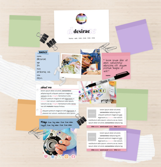
MEL: ABOUT PAGE BY ETHEREAL THEMES
View on payhip ($6.00), check out the preview or support me on patreon for more themes + pages, header templates, coloring psds and more every month!
About Page
Navigation: Home, ask + 4 links (room for more if needed)
**No Javascript Needed**
Color options for: background, links, all content boxes, five accents + more
Sections include:
Profile with avatar, name and links
Basics/info list
Sticky note quote
About me notecard
Tags links
Scrolling Project/WIPs cards
Social media sticker links
Images Include:
100x100 Avatar
170x170 Polaroid
Three additional images
Advanced HTML to edit colors and information as this is only available as an HTML page; box + table size changes not recommended. Let me know if you come across any issues.
110 notes
·
View notes
Text
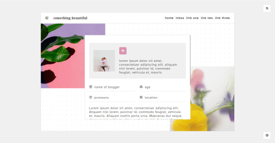
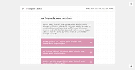

a page pack. these pages are free.
page - something beautiful: live preview | download the code: ko-fi, gumroad
features: two 300x300px about images, page title, three custom links, 100x100px about icon image, quote section, about info section, biography section
page - message in a bottle: live preview | download the code: ko-fi, gumroad
features: page title, three custom links, question and answer section, navigation section, sideblogs section
notes: credits link to the resources, tutorials and scripts used to make this theme possible is found on the bottom right corner of the theme.
join me on patreon | consider commissioning me | buy me a coffee?
74 notes
·
View notes
Text
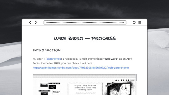
💾 “Web Zero” theme: process doc
It's here! I finally finished documenting my thought process, design direction, and development tidbits for my Web Zero theme after an entire month of procrastination 🫦
I've included references & links throughout if you're interested in web design or web development!
◍ ggl.link/web-zero-process
#hi ht!!! o/ i am indeed reading this#but fr this is such a cool documentation of ur design process#u r so cool#helpful#design#webdesign
94 notes
·
View notes
Text

eed1aa - 8497a1 - ed9e6c - d0505b
188 notes
·
View notes
Text
☁ beryl (collection page).
Links: preview | install
Beryl is a grid-based page that neatly displays your collection — of fics, books, movies, muses, portfolio works, or anything you'd like to show the world. Sticky section titles and graphics remain in view so you never lose track of your progress.
Features: no javascript, neat sections, sticky section titles, sticky navigation, header, item quote blocks, item ratings with custom symbols
Credits: preview header image by yamasa-n (unsplash)
#codes by xue#pages by xue#collection pages by xue#i started reading again this year so it seemed to appropriate to make a recs type page :-)#let me know if you have any book recs#i'm catching up after years of neglecting reading#recs page#tumblr pages#fic recs page#codingcabin#character pages
531 notes
·
View notes
Text


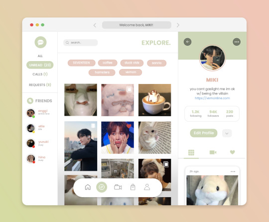
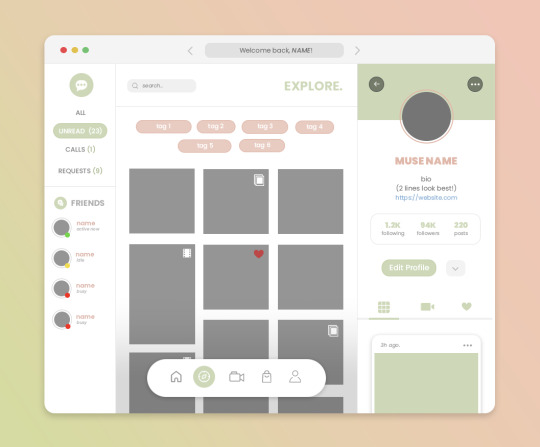
🪷 new xuethms blog theme: lilypads
Finally made a new blog theme with matching ask/ portfolio/ recs pages after thinking about it for 6+ months -- come check it out! Of course, I'll be working on adapting the previous layout into a public release next too.
Full layout credits listed here, with special mention to:
🎨 Graphics: @jellykobi (banner, icon), @stah-l (platypus 3d model)
🌟 Icon fonts: line icons, cappuccicons, feather icons
💻 Coding: @glenthemes (npf fixes, griddery), @eggdesign & @annasthms (photosets.css), @magnusthemes (isotope filters)
166 notes
·
View notes
Text
◦˚~ SET OF BLUE DIVIDERS ~˚◦


Requested by: @rosaeh Info: these were all made by me. please follow my rules & reblog/like if use!
2K notes
·
View notes
Text


BAILEY: PERSONAL THEME BY ETHEREALTHEMES
View on payhip ($6), check out the preview or support me on patreon for more themes + pages, header templates, coloring psds and more every month!
Personal Theme with 300-540px posts
Navigation: Home, Contact, About popup + 3 additional links (with selectable icons)
Dark or light custom tumblr tools control
Un-nested captions + NPF support ; All post previews are made using the new post editor, but this theme also supports old posts. New + old post styles look the same
Color options for: background, scrollbar, text, links, borders, accent, accent text, content + more
Images:
80X80 Avatar Image
130x150 Sidebar Image
Three 150x150 Icons
Eleven PNG decos (optional and editable)
Other Options:
Font options (Serif and Sans-Serif Styles)
Title font sizes
Body font sizes
Post Spacing (space between posts)
Container shadow
Everything you see can be edited including colors, texts and much more. This theme was made with roleplay (resource, fansite, ect) blogs in mind.
Basic HTML to edit, everything is on the main editor. Please reblog or like if using. And let me know if you come across any issues.
126 notes
·
View notes
Text
the lazy coders guide...
okay, so from my various trolls through mammoth google searches to learn bits about coding, i’ve discovered a few wonderful resources out there which actually do some of ( and in some cases, a lot of ) the hard work for you…

these are otherwise known as code generators… here are a few of my faves;;
( NB/ all of the generators are pure CSS - no javascript is needed… )
CSS3 generator - includes generators for; border radius, box shadow, text shadow, rgba, font face, multiple columns, box resize, box sizing, outline, transition, transform, flexbox and gradient
EnjoyCSS - is another multi option generator and will give great live previews with a ton of options - includes; blocks, buttons, text, gradients, backgrounds, shadows, border radius, transition, transformation
CSS3maker - is again, another multi option generator - includes; border radius, gradient, transform, animation, transition, rgba, text shadow, box shadow, text rotation, fontface
Layerstyles - for those of you who use photoshop, this is the editor for you! it will generate CSS code from a PS like editor that should be very familiar - includes; drop shadow, inner shadow, background, border, border radius
Westciv - includes options to generate; gradients, text properties, box properties, transformations
here are some individual generators which give a little more detail and flexibility with the options;
scrollbar generator border radius generator gradient generator gradient generator box shadow button generator button generator menu generator menu generator ( includes bootstrap option ) menu generator tooltip generator tooltip generator ribbon generator table generator table generator typeset generator ease animations full box styling full box styling pattern generator
enjoy :3 love from, octomoosey <3
3K notes
·
View notes
Photo

PIXEL FONTS
Please, like or reblog if you download it
Apple (x) 04b (x) Bangalore (x) Volter (goldfish) (x) Baby Blocks (x) Hydrating Lip (x) Handy (x) Applybeef (x) LittleLego (x) M04 Fatal Fury (x)
3K notes
·
View notes
Photo

Vintage fonts
Please, like or reblog if you download it
Queen - Cherio - Arastin pro
Karimun - Bodbug - Acherone
Shrikhand - Mogan - Alchevrola
Brittanian - Carnival - Rosmatika
Black Quality - Blue Angel - Oliver
3K notes
·
View notes
Photo
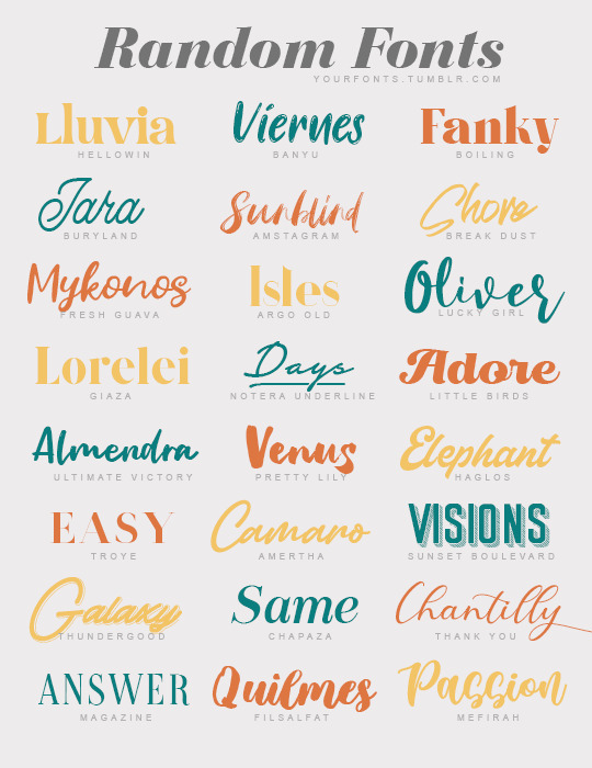
Random fonts
Please like or reblog if you download it
Hellowin - Banyu - Boiling
Buryland - Amstagram - Break dust
Fresh guava - Argo old - Lucky girl
Giaza - Notera underline - Little birds
Ultimate victory - Pretty Lily - Haglos
Troye - Amertha - Sunset Boulevard
Thundergood - Chapaza - Thank you
Magazine - Filsalfat - Mefirah
4K notes
·
View notes
Photo


boombox
by Robin (nouvae)
Play every audio post uploaded on a Tumblr account with this minimal audio player.
It can play, pause, automatically play, go to next song, go to previous song, shuffle, and repeat. It also has clickable tracks, a clickable progress bar, and a light and dark mode (which is saved on desktop even if you close the tab and return to it later). You can jump back to the current song by clicking “The current song is…” or the note on the top right corner on smaller devices. It is responsive and mobile friendly.
3K notes
·
View notes
Photo
💌 ⊹ 𓂃 。 ‧ ₊ KNOCK KNOCK ! in the source link , you will find a download link for an instagram-inspired moodboard ! please do not redistribute , or claim as your own ! usage guidelines is inside the psd. please like / reblog if you found this useful ! <3
975 notes
·
View notes