
Don't wanna be here? Send us removal request.
Statistics
We looked inside some of the posts by zara-aimanunit04 and here's what we found interesting.
Average Info
Notes Per Post
0
Likes Per Post
0
Reblog Per Post
0
Reply Per Post
0
Time Between Posts
4 minutes
Number of Posts By Type
Text
17
Last Seen Tumblr Blogs


Fun Fact
There are dozens of funny blogs to kill time on Tumblr.


Text
Reflection
Techunity provided me with an excellent opportunity to learn about the importance of skills in the workplace. My job entailed creating a logo and branding for TechUnity, and I faced numerous obstacles in completing this project. Because I didn't have access to Adobe, I utilised affinity designer to make a vector logo and Procreate to create sketches.
I met new people, learnt how to work at various speeds, and picked up skills and strategies from my coworkers. This experience provided me a small taste of what working life is like; it was tough for me to manage time and keep work up to date, and giving a presentation to a client was difficult; nonetheless, I improved those abilities as a result of this project.
Overall, it was a fantastic adventure. Despite the fact that I disliked the client, I noticed some professionalism in her
0 notes
Text
Small animation to represent the brand (company-TechUnity)
0 notes

Text
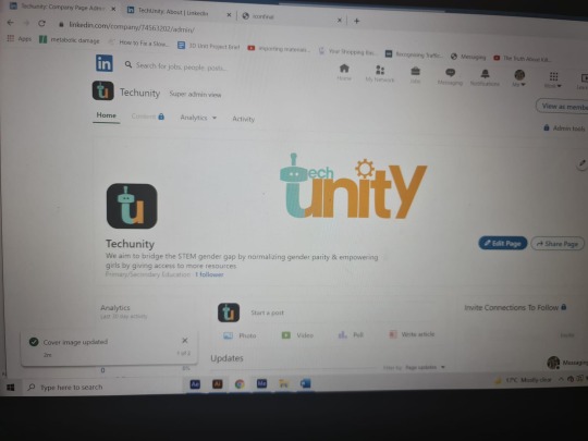
The client wanted the ‘T and U’ as an icon to represent her company, here is the linked in Portfolio showing how the logo looks and reopen the brand.
0 notes
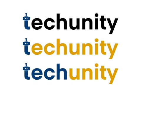
Text
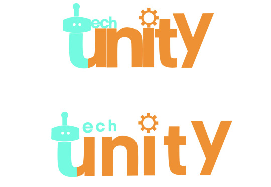
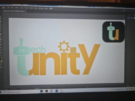
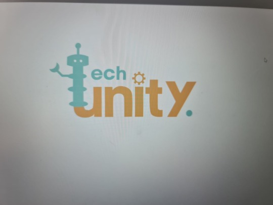
This was the final logo, I’m really pleased with this design. I made this in affinity designer using pen tool. The first one has o space in between but the second one is spaced out, we are left this decision to the client.
0 notes
Text
Experimenting with the robot icon. Our client wanted different variation of the robot icon however I think the original is better
0 notes
Text
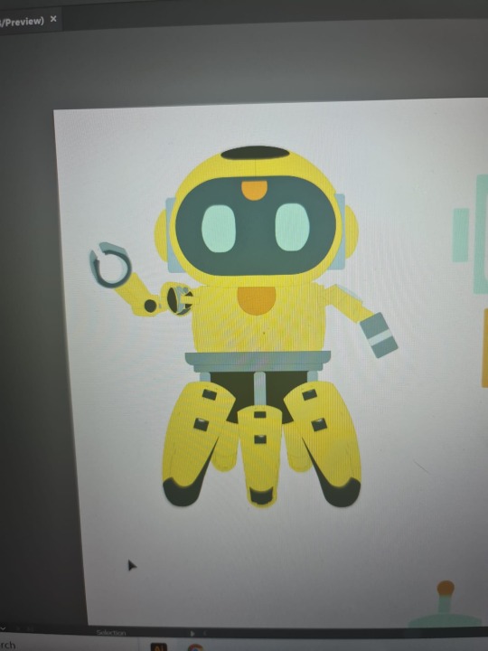
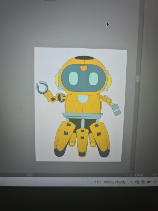
This was the main icon (robot) design for the company, this will represent TechUnity.
The plan is to animate this robot for further development before the deadline
0 notes
Text
0 notes
Text
When submitting I made an error by leaving a white space, as a png you could see the white which was irritating. It was sent back to me and I sort it out. I learned that I should always check my work before sending it off.
0 notes


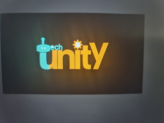
Text
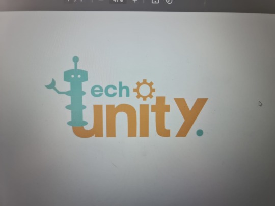
I really like this design. It’s very simple , not very stereotypical, the robot as a the letter ‘T’ works really well, I want to explore other options but keep the ‘t’ robot
0 notes
Text

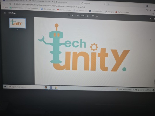
Screenshot of one of the meeting where we discussed the typography and final logo design.
0 notes
Text
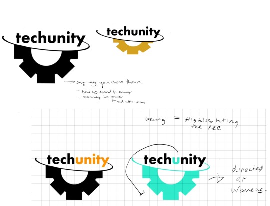
Another experiment with logo, relating it to stem and the brief. This was just a rough idea that I did, Personally I don’t like it as I think it’s not suitable for the purpose of the brand. It does shows stem however, I feel like I should use different icon rather than gear as it’s very common.
0 notes
Text
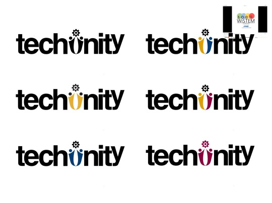
This was one my idea for the logo, the icon represent unity and tech as their is a symbol of gear (stem)
I experimented with different colours however, our main colours were orange and turquoise.
0 notes
