#I originally really wanted to do a more creative and typography heavy set for this one but the gifs said no just pretty colors
Text
Animation Night 51 - Kizumonogatari
Look, we’ve gone several weeks without anything deeply weebish, I have a reputation to maintain here!
Hey friends, I have somehow avoided getting kicked off this website. I have backed up the Animation Night posts locally, though it’s going to take a bit of work to publish the archive on my giþub site!

So, what’s this week about? Studio SHAFT were in their heyday known for two things: the rightly legendary Puella Magi Madoka Magica, which we watched back on Animation Night 10, and is apparently soon to receive a new film... but mostly, the much longer Monogatari series. Starting with Bakemonogatari (2009), this stood out a great deal (and did a lot to establish the SHAFT style): a distinctive blend formal experimentation, dense literary allusions, tight blink-and-you’ll miss it editing with creative use of text, and a wry, discomforting sense of humour.
Monogatari entered the world as a series of light novels by the startlingly prolific Nisio Isin (or NisiOisiN as he prefers it!), centred on a boy named Koyomi Araragi who falls into the orbit of a long succession of supernaturally-afflicted girls. Though that premise probably makes it sound sorta harem-adjacent, and Araragi does get together with one of said girls by the end of Bake-, what I’ve seen of it primarily treats this premise more as a framing device for quite varied supernatural stories; some more horror-oriented, some more comedic. Each entry in the series is titled a pun in the template of [something]monogatari, after a traditional literary form that connotes similarly to ‘tale’. Typically these pormanteau with the kanji 物 (mono, roughly just ‘thing’), so...
化物語 Bakemonogatari (after 化物 bakemono meaning monster)
偽物語 Nisemonogatari (after 偽物 nisemono meaning counterfit)
猫物語 Nekomonogatari (not really a pun, just 猫 neko meaning cat lol)
傾物語 Kabukimonogatari (傾 meaning slope, with afaict a very unusual reading presumably to bring to mind kabuki theatre? or the flamboyant kabukimono samurai gangs? i don’t get this one)
and so on...

I can’t say too much about the light novel series, or how it compares with others of the genre, beyond that it’s reputed to be very wordy! I do know the task of adapting this fell into the hands of directors Akiyuki Shinbo and Tatsuya Oishi at SHAFT, and they evidently wanted to make something rather avant-garde!
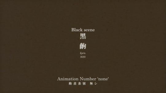
Some of their ideas included things like attempting to capture the interiority of a character by blacking out the screen as if for blinking with ‘black’ or ‘red’ scenes:
...which along with the editing gives the whole production a distinctive rhythm. Other tricks involve extensive use of typography (e.g. flashing up a definition for a few frames), editing to kabuki sounds (each episode beginning with the an accelerating series of beats with passages from the original novel alongside them), and heavy use of geometric patterns and digital effects in the photography: gradients, stark silhouettes, a very stylised modern world yet strangely sterile and empty of people beyond the MCs. They would moreover do unusual things like using real photographs in backgrounds to create constant variation.
And while the drawing count wasn’t unusually large or anything like that - quite the opposite, often there would be almost entirely static, lingering scenes - even those static talking heads scenes would be shot with an unusual pose or composition to make it interesting. Then at key moments, they would drop some really innovative, heavily impactful key animation, such as this legendary fight scene [continued, cw gore, incredible sequence ^^] by Hironori Tanaka, Genki Matsumoto, Gen’ichiro Abe and Ryo Imamura, which made full use of the protagonist’s healing factor.

This approach proved a hit, and they were set to make many, many more adaptations of Monogatari. For a detailed retrospective on the series and its influences, kVin has you covered. (Literally I would be totally at sea without this guy lol.)
Starting in 2011, Oishi went to work on the film series, 傷物語 Kizumonogatari (which we could translate as 'Would Tale’), which was released from 2016-17, telling the first part of the story as a prequel to Bakemonogatari. Although the production was delayed years thanks to Oishi’s ambition, leaving the main series in the hands of an at first much less experienced Tomoyuki Itamura, the final result seems to have paid off, at least going by kVin’s enthusiasm...
The biggest fan of NisiOisiN’s prose is NisiOisiN himself, and so the Monogatari series is renowned for being verbose by both fans and critics. Kizumonogatari is written as the chaotic stream of consciousness of Koyomi Araragi, but Oishi decided to do away with narration and monologues entirely; he took a book that exists inside the mind of a character and tried to make all his feelings explicit and yet portrayed in an unobtrusive way. Not dropping any relevant details without outright stating anything was by all means a crazy idea. And what’s even more outrageous is that he succeeded with his elegant but thoroughly insane solution – eventually at least, I wouldn’t be surprised if he had to redraw his storyboards countless times to achieve it. The Show, Don’t Tell principle has become a bit of a poisonous idea on the internet thanks to reductive fans interpreting it as a rule rather than a powerful approach, but this film pulls it off to an extreme that shouldn’t even be possible.
For a very detailed blow by blow of the various creative things being done, you can read more here.

Unlike the more static TV series, these films are carried throughout by some frankly incredible kagenashi (unshaded) character animation, full of intense expression and inventive touches. These lively animation designs consciously contrast with the (apparently somewhat controversial) decision to set everything in realistic CGI backdrops - which do not attempt to look cel shaded or painted at all, but it seems to fit a production like this much better than the overly-shiny cars in Psycho-Pass, and fits the studio’s habit of being ahead of the curve in adopting digital tech.
So what’s all this in service of telling? In Kizu-, Araragi gets his first encounter with a supernatural girl in the form of (deep breath) the vampire Kiss-shot Acerola-orion Heart-under-blade. Moved to offer his blood up to save her from vampire hunters, he finds himself made a vampire thrall tasked with retrieving her lost limbs.
As far as content: some gore is p much a given in this scenario, but heads up that Monogatari is also known for its improbable fanservice shots. In terms of artistic intent, this is perhaps another element in drawing us into the subjectivity of a teenage boy. And in terms of what to expect, it definitely sounds like these are sometimes used, as in here, in a way designed to discomfort rather than gratify the audience.

My impetus for picking this one out is a fascinating series of staff interviews that were translated on Sakuga Blog over the past month. Something that got this much attention, and kVin’s obvious immense enthusiasm - not to mention the clips picked out! - definitely got my interest. I’m looking forward to seeing it all together.
With the density of allusions and complex typography, this series is quite a challenge to subtitle - but luckily various groups have risen to the challenge over the years. In this case we have a kind of improbably sophisticated sub by Commie, who went to the trouble of not just matching all the fonts and such but even animating the colour changes to match the typography in the series...
Luckily for Animation Night scheduling, most of these movies are pretty short - just over an hour typically - so we should easily be able to get through all of them in one night. Animation Night 51 will begin at 7pm UK time, 3 hours from this post, at the usual spot - twitch.tv/canmom!
22 notes
·
View notes
Text
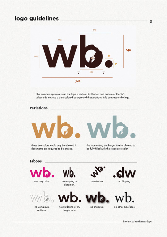
Final Brand Style Guide Project
Inspiration
Using what we have learnt from the entire module, alas the final project provided us with an avenue to create a brand identity either for ourselves or for the CNM department. I chose to create a personal brand guide because I realised that I have never really thought of making something for and out of myself (literally), and while the entire month of ideation and creative process was definitely not easy (not an understatement), I am still thankful for such a wonderful opportunity to give my abilities a test run.
So before embarking on a personal brand, I had to perform research on my own self. Using guiding questions provided in the lectures and understanding the essentiality of performing critical reflections on oneself, I knew that I wanted to create something minimalist, professional and classy. Magazine layouts and editorial designs have always attracted me, and hence, in the first FP consultation I displayed some inspirations of vintage magazines and editorial typefaces. However, a part of me realised that this idea was something I desired, but it didn’t represent me as a whole. Taking some time off to reflect again, I made my final decision to anchor my brand based on something that I really loved: food -- and in particular, BREAKFAST. Now, I was ready to start planning for my brand guide; starting off with the most important elements -- the logo, color scheme and typography.
Logo
Incorporating the vibrant and light-hearted nature of food with the minimalist and professional attributes of an editorial theme was an extremely difficult task. Thanks to the feedback of my peers, as well as inspirations on logo designs, I decided to use this logo here to helm the brand guide.

Here, the typeface of my logo provides the professional outlook, and the bite marks and the man eating the burger in the letter “b” injects the more casual and slightly fun direction using the design concept of negative space. The full stop at the end was a creative decision I performed to tie the entire logo together.
There were feedbacks from my instructors that the man in the logo may be too small and hence become unnoticeable when downsized, and that the burger’s color could possibly take on that of the entire logo. Unfortunately, I decided to stay on with my original logo format as I felt that firstly, enlarging the man makes it too distracting in my opinion and I generally feel comfortable with the spatial relations between the man and the space inside of the “b”. Secondly, I chose to change the color of the burger primarily due to contrast and recognisability, and I felt that filling it with the same color as the entire logo would not make the “burger” itself obvious.
Color Scheme
Next, for my color palette, I was looking for an overall scheme that revolved around bread, eggs and tea (my most favourite components of breakfast). Hence, using these self-took images below, I composed my color scheme as shown below.
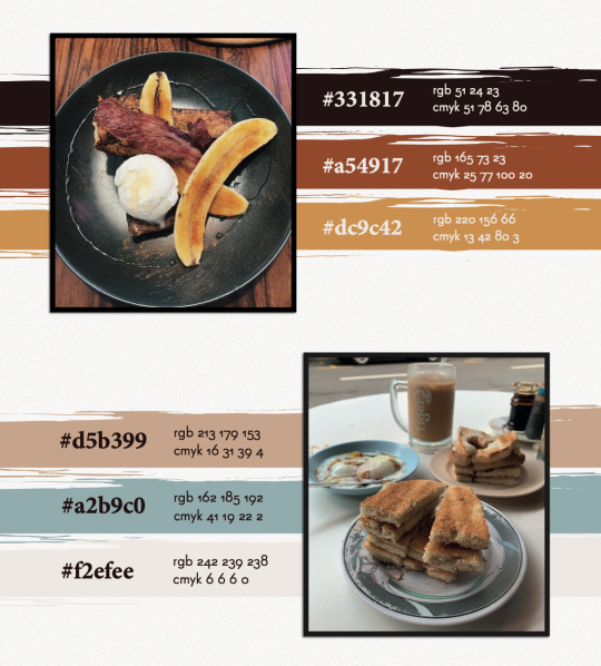
The colors mostly evoke the vibrant and palatable nature of food, with the only exception of the blue, which was a decision I made to include an accent color that could provide a touch of professional contrast to my overall color scheme.
Typography
Lastly, for my typography, I planned to use a sans-serif font as my character style, coupled with a serif font to provide a good contrast. As I was looking up Google for certain combinations suitable for magazine themes, I came across this pair that really caught my attention.

The article was right. Super Grotesk was the unique sans-serif typeface I needed to embody the dynamic spirit of my layout, accompanied by the serif typeface, Minion Pro, to support my characters with neat and outstanding paragraph headers or prominent quotes. Thereafter, I decided to employ Gotham as the strong title typeface to ground my pages together.
Now, with all my base elements, I was ready to embark on my creative process. After long hours of looking up inspiration from Pinterest and Behance, I embarked on a food magazine theme as the layout of my brand style guide.
Front Cover
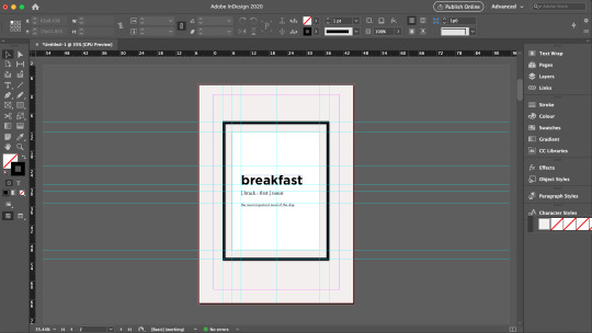
Performing a playful rendition of Time Magazine, I came up with the title “Time ...to eat” to introduce my brand guide. Using InDesign, I demarcated the margins of the magazine’s signature red borders using the Layout settings and drew out the borders using the Rectangle Tool and the Pathfinder function as shown in the screen shot below.

As my logo contained bite marks on it, I wanted to incorporate this similar design element on my cover page and hence, I decided to use donuts. Using the Quick Selection Tool on Photoshop, I traced out the donuts from the images I took, created a new layer, and exported this image as a PNG file. With this, I could attach these donuts unto my cover page without worrying about additional backgrounds.

Page 2
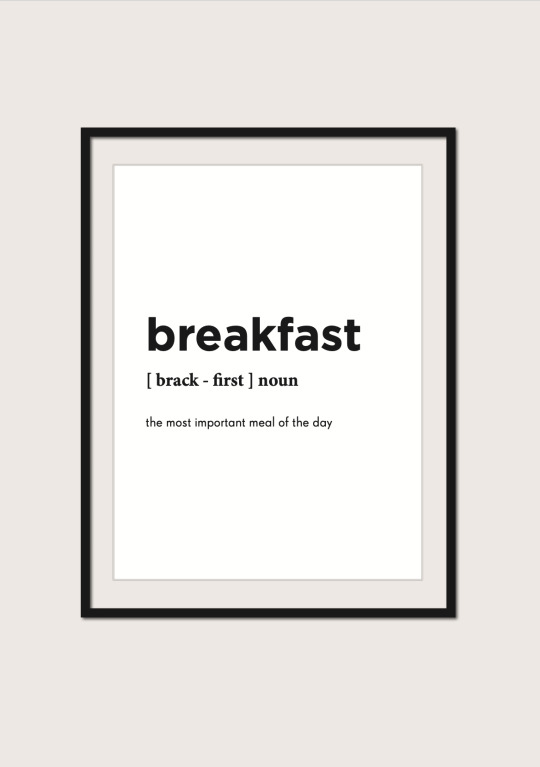
Inspired by a design I found online that held a photo frame with a simple quote, I decided to create one to introduce the specific theme of my brand guide. Borrowing the guide lines from InDesign, I created the base and content of the frame, and employed Drop Shadow function in the Effects panel on various elements, as seen in the screenshots below, to create a 3D effect to stimulate the frame hanging on a wall.


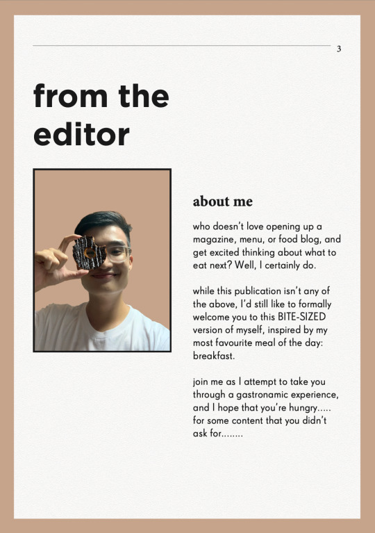
Words from the Editor
To formally introduce myself, and also inspired by magazine preface pages that usually feature the author/editor’s message, I also created a page to welcome readers in into what I am about to show them.
Resume
Naturally, I felt that the first thing I wanted to showcase was information about myself. Hence, the first collateral I presented was the resume. Using InDesign’s margins and guide lines, I created the various sections in a typical resume, but added my own touches, and employed the use of various “eaten donuts” to represent my various skill levels. These donuts were also used to demarcate the various pointers under my job responsibilities, to replace the typical “bullet points”. The final product will be showcased at the last segment of this blog.
Logo Ideation Process
While thinking of how to best present my logo, I was inspired by a senior’s work that featured the step-by-step logo creation process. I borrowed this idea and suddenly had this thought of using noodle strands to help the audience visualise the order of my logo ideation. These noodle strands and the fork was vectorised using Illustrator so as to efficiently remove their backgrounds and to be easily embedded unto InDesign like a clipart.

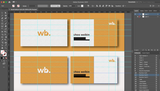
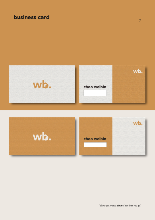
Business Card
For the name cards, I wanted to create a light and dark version, and maintain a professional and minimalist outlook. Firstly, I made use of the Rectangle Tool on Illustrator to create the bases of the cards. While I shortlisted a yellow and blue background this collateral, many of my peers found that the yellow would best represent the vibrancy of the brand and hence, I decided to employ this color.
For the front, while inserting my logo, I found that the contrasting burger color looked very uncomfortable when downsized. Hence, I made the decision to fill the logo with a full color just for this purpose. For the back, I only wanted to retain minimal information being my name, phone number, email, and linkedin account. But after finding that it might seem a little too plain, I sought to make use of design principles of asymmetrical balance to provide a more wholistic design.
In order to create the paper-like feel for my name cards, I applied a Texturised effect unto the name cards, and dropped a small shadow to create contrast between the product and the background. I borrowed the guide lines on Illustrator to standardise the dimensions and locations of each element.
FINAL BRAND STYLE GUIDE
With that, here is my final and end product. Primarily, these pages were designed and collated on InDesign. As I wanted to stimulate a magazine-feel as much as possible, I created an A4-sized rectangle background on Illustrator, applied the Texturised filter, and pasted them on relevant pages. Other than the two donuts seen in the front and back cover that were edited using Photoshop, the remaining pictorial elements were vectorised using Illustrator.
Do observe that for the second half of the brand guide, I inserted a few quotes below the pages as my form of small interactions with the readers. However, bearing in mind also that I could not fulfil similar formatting with the “resume” section as the entire resume took up a large margin of the page, do kindly note that the titling and quote is placed in a slightly different fashion as compared to the rest.

(cover page - comments were made from my final presentation to include my logo at the front, hence I placed it below and structured it to suit the theme of a magazine front cover. I also received feedback that the background was too heavy in contrast, hence, I decided to change it to a color from my color scheme.)

(food image - this image of breakfast was used to complement the previous page with the quote on breakfast)

(food image - another breakfast food image to accompany and support the previous page that introduces my message to the readers)

(resume - vectorised donuts were used here to indicate my various skill levels, and as bullet points to my job descriptions. I received feedback from my final presentation to bold the institutions and my company and role, as well as to enlarge the relevant dates, which I rectified in this draft above.)

(logo - vectorised fork and pasta strands were used here to guide the audience’s vision to my logo ideation process, with the final logo presented the biggest at the bottom.)


(typography - for my final presentation, while many noted that the simplicity of the page was its charm, some also felt that maybe I could incorporate some visual designs to compliment the other pages. Hence, I borrowed the vectorized image of a man holding a chopstick as my symbol for “placing” and “picking” the right typography for the entire magazine. The image has also been edited to 80% opacity to not take over the spotlight of the page)

THE END
I really hope you have enjoyed this as much as I really had fun creating this. It was a rather intense month coming up with all these ideas and discerning what was effective in communicating my brand, but overall I was very grateful especially to my TA, Zicheng, for entertaining millions of my annoying emails and still being able to deliver the best advices to me, as well as my peers who constantly pointed out the rooms for improvement. It’s really a bittersweet end to this journey, but I’m forever grateful for being able to learn this in CNM and also to retain a project that I would be able to at least be proud of for a long time :-)
0 notes
Photo

#finishedbooks Uncompromising Expression by Richard Havers. THIS WAS AMAZING! It was released a few years back and was extremely excited at the time and somehow just forgot about it. I keep notifications on Facebook for the On This Day feature they got that let's you know what activity you had on the same day in history...mainly just so I can delete dumb stuff I said in the past as I slowly ween myself off of Facebook. Alani Cruz shared this book on my wall and we both were hyped to get it but were quite broke at the time...so when i saw this memory realized I had to get it ASAP (and actually my dad got it for me for xmas). What an amazing read, easily my favorite since Donald Richie's Japan Journals. I am a huge huge Blue Note fan and there best music covers everything from bop to the avant garde, with photography that made me want to pick up a camera in the first place. Most of my early photos were Ozu film still or Francis Wolff Blue Note album copies. Wayne Shorter's Night Dreamer cover took me forever to learn how to copy. The typography and overall design by Reid Miles exudes that timeless quality that another favorite read of last year was all about in Dieter Rams. The refusal to simply follow the times explains why they are still so original today. The book included Wolff's contact sheets so I could see his thought process in photography...which was just amazing to me. Been kind of posting them on my stories over the last week but can't let go how dope it is seeing them. But ultimately it is about the music! Coltrane's A Love Supreme was the first jazz record I ever bought when I was 18. Never heard anything like it before but really hadn't heard anything that every respect made so much sense to me ( got the inside sleeve tattooed to my forearm). Think I got Blue Train and Madlib's Blue Note album around the same time. Blue Train was my first blue note album...it stayed in my car for months and i would just play both albums on loop at my shitty grave shift I had in university. Arriving in Japan at 21 in 2006 and getting into literature it was one of my weekly trips to Tower Records in Shibuya (back when it was the only place to get English books) I found a Blue Note album art cover book that was my first art book I ever bought. I remember when Alani came to my house he was all like I got the same book and it was among his personal possessions when he was sick in the hospital along with cameras. At the time Blue Note was having an anniversary campaign in which every three months they released a special reissue of the original albums on cd with the original art work and record sleeve back for just 1000 yen. So when I went for my weekly supply of books in 2008-2009 or so, I would buy a Blue Note album and that is all I would listen for the whole week straight till I went back for another cd and more books. Got so many classics Midnight Blue, Maiden Voyage, Soul Station, Something Else, Cool Struttin', Out To Lunch, Bass On Top, Sidewinder, etc... This book details the history of the company with off sections of the albums that defined the period: complete with a critical summary, credits, design notes, contact sheets in chronological order. The notes on the back of the record sleeve where all I had to go on back then so this added a lot more. The sheer amount of content coming in at around 400 pages is just amazing. I took my time with the book, listening to the cracks I had in my knowledge of albums through itunes while making a list of records I am going to hunt for (I sold my cd collection in 2013 in favor of vinyl for jazz & blues and streaming for everything else). I will keep this book on my table as it will be a constant reference as I try to master the music. Looking through this I recall how ignorant I was with jazz. At first I only listened to about 4 or so artists mostly the easy ones Miles and Trane and only did hard bop through the avant garde (really just late Coltrane). Hated free jazz and found bebop too dated for some reason. Course got heavy into hard bop through Blue Note and it was the Thelonous Monk recordings that got me into where I should have always been with Charlie Parker. I got into art at the time and it was my forward thought in filmmaking that got me on the same page as Ornette Coleman at the other end of the spectrum. Now I am going before bop doing Hawkins, Ellington, and Armstrong, Morton, and Bichet...yet still can't bring myself anywhere near to fusion and feel I can comfortably say I never I will. The stunted progression though I have found was from the limits I set myself. Jazz was so amazing and yet daunting. I set myself these goals so I could focus my learning so if I abstained from going everywhere at once I could get it what little I did listen to. I found my curiosity has since carried me. Yet it was Blue Note and still is that brings me back. For example since I am now into the older I can now fully appreciate the early Blue Note recording of Bichet...and was happy to find that Alfred Lion and Francis Wolff to were weary of bop yet like all truly great things they went to it. Love the added fact that the companies manifest, philosophy, and art direction was all heavily covered in this book. When I think of perfect branding it again comes to the Blue Notes and Rams's Braun period that define what it is for me. At 32 and with my job as creative director of a brand I essentially made from scratch with the three other founders, I loved the sincerity of Blue Note's vision and is something I fight for with Muro. I found parallels in the approach and the loathing of ornamentation or following the times extremely reaffirming. Those guys weren't making millions but they were having fun doing exactly what they believed in and producing music they personally enjoy with (the books slogan) an uncompromising expression. Was such a fun week going through this whilst finding gems I had never heard, among which Jimmy Smith's Groovin at smalls paradise, Tina Brooks lone album True Blue (career cut short due to heron), Blue Hour by Stanley Turrentine with the Three Sounds, Anthony Williams Lifetime and even Cecil Taylor's Blue Note album proved fun enough (even though that and Lifetime is beyond my complete comprehension at this point.) Get this book, if you are a jazz fan or want to be or just like good music, design, or photography!
2 notes
·
View notes
Text
Blog Assignment #3
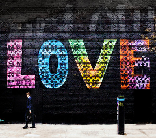
“LOVE”, by Jason Naylor and in Collaboration with Coach
The 2019 “LOVE” mural by street artist, Jason Naylor, was commissioned by the New York City fashion house, Coach. The mural incorporates the brand’s signature C logo with the simple message of “LOVE” using bright fluorescent colors on the side of a building in New York City. Naylor has stated that his works are produced with the intent to promote “love and positivity” through his use of color and word choice (Naylor). While the Coach brand used his design as a part of a positivity campaign that featured the colorful message on products like bags and apparel available for purchase to the public.
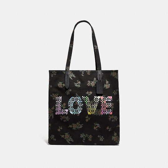
Photo Courtesy of coach.com
From a personal perspective, the “LOVE” mural does not impress me very much. I think Jason Naylor is a very talented street artist, however, this is not a good representation of his work. On the other hand, I like the subtlety of the incorporation of Coach’s signature C pattern with the message displayed on the building. The idea is nice but the execution did not turn out very well in my opinion.
Historically, hip-hop was a very big inspiration to many street artists in the 1970s. The art form was meant to mimic the rhythms and beat from hip hop music in a cool and unique way that was signature to each artist (Lester, 2013). Graffiti and street art largely took place in urban areas (like New York City in this case) and eventually became more advanced over time as artists began experimenting with color effects, shading, and incorporating calligraphy and designs into their creations (Hip Hop Area). Naylor was originally drawn to New York City by its excitement and color which has inspired much of his work. While the Coach brand was founded in 1941 in New York City and is currently based there. Therefore, both the brand and the artist put a great deal of emphasis on their ties and history with the iconic area and people who reside there. The collaboration mixed Naylor’s intense love for color and freedom with Coach’s pride for the city it was founded in to produce this historically creative and expressive piece.
On a technical level, Naylor uses acrylic and spray paint for many of his pieces. He incorporates typography, painting, and illustration, into his various works (Naylor). Typically, the artist chooses to paint his works on walls, canvases, and on the sides of buildings where people will see them. Naylor first covers the area of choice with a thick black paint in order to make any added colors look as vibrant and eye-catching as possible; also known as adding contrast. He then paints a design or message on top of the black paint, effectively making it stand out. The result is a striking explosion of color that is meant to catch the eye of anyone who walks past. From a typographical perspective, Naylor uses a bold typeface to ensure the signature Coach pattern fits nicely inside each letter. The message is large so it can be noticed and is positioned lower to the ground so people can see it more at eye level.
In analyzing the picture on an ethical level, the piece should strive to bring positivity to the world through its message and by the artist’s color choice. In terms of the golden rule, the mural is meant to be a force of happiness and light in a city that can sometimes seem negative. People who look at the mural are meant to experience the brightness that radiates from the rich colors and boldness of the font to ultimately make them feel better. Whereas, the photograph shows hedonism through the depiction of Coach’s blatant advertisement mixed with a message of optimism. Coach and Jason Naylor are also both profiting off of this collaboration that is meant to promote love. As for the golden mean, the mural is a balance between sharing a message of hope that is meant for all people to see and promoting a collaboration in order to sell products. For the categorical imperative, Jason Naylor was commissioned by Coach to complete this mural since it is his profession. Because a major brand paid him to create something, he felt implored to follow through and consequently create the piece for the New York company. In terms of utilitarianism, Jason Naylor probably believed that the importance and the impact of the mural would be more important than the money he would be making from the deal. While Coach must have trusted that mass-producing this message on their products would help spread positivity to a wider audience than those who would just see it on the street. Lastly, when thinking about the veil of ignorance, someone looking at this mural might think of someone in their life that has been feeling depressed. It may possibly cause the viewer to put themselves in the shoes of someone who is unhappy and make them want to buy a product displaying the piece to support the cause and give that person a gift.
Through Naylor’s use of color, typography, location, and meaning, the notion of hope is portrayed through his art. As previously reiterated, his use of color is meant to invoke a sense of wonder and happiness within the viewer which is also true about the message of “LOVE”. The message is emphasized even further by the boldness of the font chosen to represent it. The work’s location is a display of public unity and exclusivity to the people and city of New York. Since street art is such a large part of the city’s history and culture, the message is a fairly appropriate and meaningful way to show its inhabitants that the brand and artist love and honor them. The design of the piece also shows the artist’s strong relationship with the New York City-based brand.

The Sound of Music Movie Poster, 1965 by Howard Terpning
The 1965 theatrical release movie poster for The Sound of Music was made by Howard Terpning. The poster is a painting depicting the main characters in the film such as Julie Andrews with the children in the movie running through a meadow along with Christopher Plummer, who stands slightly off to the side. The town of Salzburg, Austria (where the film is set) is also depicted in the background along with mountains, and a few townspeople. The film credits line the top and bottom of the painting while the title sits near the upper part.
From a personal perspective, I really enjoy the poster. I am biased because I love this movie, and I think the fact that it is a painting gives the piece a lot of character and charm. The colors are extremely rich, and I enjoy this artist’s interpretation of the characters and the beautiful Austrian city. I do, however, find the painting to be a little text-heavy in some spots but overall, I think it is a nice piece of historical film art.
Historically, movie posters had been around for a few decades when this film was produced and the medium was ever-changing. Movie posters were critical to the marketing of films as they were printed in newspapers and hung around theaters to catch people’s attention (Lester, 2013). The story of the von Trapp family is infamous in places like Salzburg, Austria and by people who enjoy the story and care about its history. The film includes fairly accurate storylines pertaining to the imminent Nazi takeover of Austria and a budding war.
From a technical perspective, Terpning painted this piece on paper and is linen-backed, which was very common for film posters at the time. It was also known as a “one sheet” which was a standard-sized movie poster typically hung inside of a glass display case (Lester, 2013). Terpning used various mediums such as painting for the majority of the piece and typography for the credits. While important to the painting, the title itself is not the main focal point as evidenced by its placement on the paper. Instead, the illustrations are the main focus which is also evident by looking at the title’s relatively small font size. In this way, the painting is sequenced so we first look at the main character and then the title which appears to be music coming from her mouth. Viewers are left looking at the characters in the background and the credits as the entire painting works to guide the observer’s focus through every aspect. In addition, the painting’s typographical elements can be considered a free form artistic style since the placement of the text is more fluid.
Ethically, the piece should give viewers an idea of the tone of the film without giving away too much. As for the golden rule, the artist chose to display a moment of happiness among the characters instead of choosing to depict a scene of sorrow or fright. He does this to help keep all audiences interested in the film and to also make the film seem as positive as possible (even though the film is pretty cheerful already). While the painting is representative of hedonism because it was made to advertise a seemingly happy story while profiting off of it. Essentially, both the artist and the company that made the film earn money if this poster coerces people to see the movie. As for the golden mean, the poster is a good balance between having no advertising for the film at all and giving away the entire plot. It hits a point that allows viewers to get an idea of the story without giving away too much. For the categorical imperative, Howard Terpning was commissioned by the makers of the film to paint this poster for the movie. In that way, he had almost no choice in deciding if he should complete the task after having already agreed. In terms of utilitarianism, the artist probably chose to depict this cheerful scene of the movie because it would procure more viewers and also make people happy when they looked at it.
Through Terpning’s use of typography and illustration, he was able to create a significant film poster that is culturally cherished by many. The film remains an important part of Austria’s culture and history not only because it’s where the film is set, but because of the historical events that took place there and are represented throughout the film. It’s also important to note that, however small, the title is an integral part of the painting as the words blend with the message of the film by representing music which is a major theme. The artist’s capability of tastefully incorporating text with the cheerful artwork showed that this poster was much more than a mere advertisement and more about a family’s true story.

Vogue Italia, “The Latest Wave”, August 2010, Shot by Steven Meisel
In 2010, Vogue Italia released its August issue with the campaign known as “Water & Oil”. The controversial spread was shot by the notable Steven Meisel and became yet another part of the late Franca Sozzani’s legacy. The cover of the issue depicts a lifeless model lying on some rocks by the water all while wearing a couture gown that is drenched in oil. The cover says nothing other than the publication’s name and the title: “The Latest Wave”, which is positioned neatly at the bottom. The campaign was in response to the 2010 BP oil spill in the Gulf of Mexico that caused major destruction to the environment. This issue of Vogue Italia was very controversial at the time as much of the public believed the fashion publication was taking advantage of the situation by glamorizing it.
From a personal perspective, I really like this photograph. I think the styling of the shot was beautifully done by artfully displaying the clothes and environment but, more importantly, highlighting the complete devastation that this event caused. I believe the photo allows viewers to witness the damage this incident inflicted on not only the environment but also on the animals that lived there.
Historically speaking, the invention of lithography in 1796 brought about the possibilities of mass production and distribution of illustrations and photographs (Ives, 2004). This paved the way for magazine publications to begin printing photographs and drawings on a larger scale which changed the practice entirely. The first issue of American Vogue appeared in 1892 and the first issue of Vogue Italia appeared in 1965 (Borrelli-Persson, 2017). Throughout their history, fashion publications have, for the most part, generally stayed away from reporting on politics and world problems, only focusing on what they were known for: fashion. However, Vogue Italia has had a long reputation for “pushing the envelope” which is in part because of Franca Sozzani, the magazine’s former editor-in-chief. “I don’t think that today a fashion magazine can only show you the clothes and that’s it. Fashion magazine is connected with art, with cinema, with everything” (Franca, 2016). This was Sozzani’s response to the backlash she received after running the 2010 Water & Oil issue. In essence, by choosing to run this photo series, she challenged the idea of what a fashion magazine is historically known to be.
From a technical standpoint, the spread was shot on a high-quality digital camera by the famous fashion photographer, Steven Meisel. The shoot was conducted outside on a rocky beach in the middle of a cloudy day. Meisel and a crew of makeup artists, stylists, and photographic assistants executed the photos by using hot lights and modifiers to control the amount of light hitting the model. American model, Kristen McMenamy, posed in assorted couture gowns in various positions to emulate famous images taken of the oil-slicked animals that were impacted by this tragic disaster. Photo editing was later completed in a photography lab where editors made decisions regarding adjustments, cropping, and any additional enhancements. Typographical decisions were also made that involved the color of the cover’s font, its positioning, spacing, and choosing of the font itself in order to create the desired look and send the correct message to readers. The cover shows unity and simplicity as the simple text and quiet colors rightly put the viewer’s main focus on the image (Lester, 2013). While the subdued colors of the text match the mood of the photograph well, the bottom title still manages to stand out against the model’s emotionless demeanor creating an interesting contrast.
Ethically speaking, the cover photo should responsibly invoke certain feelings like curiosity within the viewer. In terms of the golden rule, the cover photo does not go out of its way to intentionally harm anyone. However, it does not work to sugarcoat the harsh reality that these images display. The cover represents hedonism because the model is stylized in highly expensive clothing to look good in order to sell copies of the magazine. Meaning, that while the publication is rightly highlighting a tragic event, it is also doing so to make money. For the golden mean, the photograph is a balance between allowing models to risk their lives by putting them in the same situations that the animals were in and not taking any photographs at all. While for the categorical imperative, Steven Meisel was hired to participate in this photoshoot and, therefore, had almost no choice in deciding on whether or not he should take the photos after agreeing. This would also be true as he is a professional photographer and has a reputation to maintain in the business. In terms of utilitarianism, both Steven Meisel and Franca Sozzani must have believed that taking this photo and running it in Vogue Italia would show viewers the impact of this environmental tragedy. In doing this, they probably thought it would bring more awareness to the problems hurting the planet. Lastly, under the veil of ignorance, a viewer who looks at this cover photo might imagine animals that were injured, killed, or displaced as a result of this oil spill. After doing this, the viewer may search to find more information about the problem or even donate to a cause that is helping to clean up the mess. In any case, this entire campaign was very hotly debated in terms of its ethics. Many people questioned the publication’s motives and attempted to judge whether or not all of this garnered attention was really for the good of the environment or for the good of the magazine. After all, the magazine’s ultimate goal was to “unnerve the viewer” but also to “capture the reality of the situation” (Vogue Italia, 2010).
Through Meisel’s photograph as well as Sozzani’s image selection, styling, word choice, and strong underlying message, the photo becomes a powerful representation of a huge problem impacting our culture at the time. Every detail of this photograph speaks to the issue being communicated by Sozzani as the text communicates an eerie message to readers about “The Latest Wave”, which is perhaps a play on words replacing the popular saying: “the latest trend”. While the model’s hair is possibly meant to replicate seaweed which wraps itself around whatever it can hold onto. Together with the model, who, of course, may represent a lifeless animal that has succumbed to its fate. The chilling photograph says a lot about the state of the world and our culture as tensions surrounding the environmental crisis steadily grew and the fashion world gave its response.
References
Borrelli-Persson, L. (2017, December 15). 1892 vs. 2017. Retrieved from https:// www.vogue.com/article/vogue-125-1892-2017-compare-and-contrast-now-and-then
Franca: Chaos and creation. (2016). Retrieved from https://www.netflix.com/watch/80147971?trackId=13752289&tctx=0,0,d99c9bd1aa13a50f73c7528fd5d369ed4c42c958: 7bfd60777a2e844f551057ecdb558ef60aeee626,,
Google Images
Hip Hop Area. Hip hop culture and graffiti today. Retrieved from http:// www.hiphoparea.com/graffiti/hip-hop-culture-and-graffiti-today.html
Ives, C. (2004). Lithography in the nineteenth century. Retrieved from https:// www.metmuseum.org/toah/hd/lith/hd_lith.htm
Lester, P. M. (2013). Visual communication: images with messages. Belmont, CA: Wadsworth.
McDaniel Movieart, K. The Sound of Music, (1965) 28060. Retrieved from https:// www.movieart.com/sound-of-music-the-1965-28060/
Naylor, J. Jason Naylor - About. Retrieved from https://jasonnaylorcreative.com/who- am-i
Vogue Italia. (2010, August 2). Water & oil. Retrieved from https://www.vogue.it/en/fashion/ cover-fashion-stories/2010/08/02/water-oil/
0 notes
Text
The Best Showcase Portfolio WordPress Themes for Creative People | Templified
New Post has been published on https://templified.com/the-best-showcase-portfolio-wordpress-themes-for-creative-people/
The Best Showcase Portfolio WordPress Themes for Creative People
This is our newest collection of fantastic themes. It’s all about showcasing your portfolio, helping you put your best foot forward. This collection has a large amount of themes for you to select from, so I think that it could be pretty darned useful indeed.
Shutter, Bold, Purposeful WordPress Photo Portfolio Theme
First up, a theme I really enjoy called Shutter. Shutter is a WordPress theme purpose-built for photography portfolios, designers and photo studios. It also works great for photo bloggers who want permanent image placement with beautiful single post designs as well. The grid option is always a good choice for creating highly visual, easy-to-navigate posts and pages. With Shutter, you get several different pre-made website demo concept. There are five in total, each one can be imported quickly to help you establish a website that you can be proud of.
Grid themes are amazing four presenting your content in a visual, appealing way. Making sure that your visitors see exactly what they want to see, making it very easy for them to find the content they are seeking, that’s a very important thing. For photography portfolios, well-designed grid layout does a lot of that heavy lifting for you.
Here is a look at one of the 5 premade demo styles.
Oh, sure, why not one more?
If you’d like to have a look at some more themes similar to Shutter, our complete collection of WordPress grid themes is always a good starting point. We have done everything that we can to make sure that each and every collection that we build has nothing but fantastic, high-quality WordPress themes that can make your website even better than before. If you are using an existing WordPress theme and you want to upgrade, now might be the right time to move on to a new theme. Sometimes, theme developers abandon the themes that they’ve created, leaving you searching for help if you run into problems. We have tried our very best to make sure that everything in our collection is still well supported and still offers the high-quality design and features that it originally offered. Of course, if you are an expert with WordPress, you may not need that type of support, but I feel like it is always a good idea to offer plenty of options for everyone.
This is Shutter, an attractive and professional, it’s easily shaped into the kind of photography site you’ve always wanted with a daring and audacious style, fresh, cutting-edge features and the ease of use that is unrivaled. Many have tried, but Shutter has succeeded.
What you can do with Shutter, WordPress Photography Theme
Shutter is the best choice for any photo studio, professional and amateur photographer. It a perfect tool to anyone who wants to showcase his fabulous works and get a remarkable online presence. It is a simple to use WP Theme with a clean design and a distinct approach to the photography website concept. From image galleries to online photo albums, proofing pages to simple portfolios, Shutter does it and does it well.
Advantages of this WordPress Image Gallery Theme
Being a fully responsive WP template, this theme can be easily customized or even transformed to suit all your design and functionality needs. It is full of latest features, versatility (you can change colors, typography, fonts, sizes and much more) and cool options. Just take advantage of all of them! Mobile devices are so popular lately and that popularity is only on the rise, that makes this theme seem fresh, exciting and new. It is.
5 Demo concepts included
This is a unique project crafted to inspire all photographers and gifted people what want to get notable online presence. We’ve created 5 different demo concepts, which you can use for your projects. Our purpose was to showcase its power to stimulate you and your imagination to use its entire potential. Whether you’re setting up a simple portfolio for image galleries or you need a theme for a creative freelancer, I think you’ll love this theme for all of those awesome demo sites.
Additional theme’s details
Shutter comes with lost of sliders, menus, buttons – you will find all the components you need and even more than you could expect from an WordPress Theme. Its uniqueness lays in the minimalistic approach (fully responsive & retina ready) and attention to detail that make the difference. You will love all 5 sleek, crisp, modern and simple designs! That’s what minimalist design is all about, keeping things looking great without overwhelming the senses.
Demo More Information Get Hosting
Dalton Minimalist and Full Screen Portfolio WordPress Theme
Meet Dalton, a professional business theme to help take your website to another level. This one is really Top notch. To get a really multipurpose WordPress theme, Dalton provides a huge selection of distinct characteristics and components that enable webmasters of any experience level to gather a glossy and professional site easily. Every user in a corporate agent into one entrepreneur will have the ability to present themselves online nevertheless they need due to the customization capabilities involved for this WP theme. This causes webpages that load fast and may be retrieved on any size display or monitor all without reduction of picture integrity or mistakes.
Even though the code is remarkable, the owner of the website doesn’t have to know or comprehend any of it to create an extremely polished site which may meet the most special professional needs. Dalton also includes premade templates which could get you started in minutes. Should you would like to tweak the pages to your own intentions, then the intuitive control panel will help. The most up-to-date attributes, such as parallax scrolling and varied gallery alternatives, will be able to help you build a precise solution which will draw your targeted audience and maintain interest long enough to improve your company. The Dalton WordPress theme provides all you want to present your business in such a way as to practically make certain you succeed online.
For more portfolio WordPress themes, try this collection.
No matter what industry a website is needed for, the Dalton WordPress theme can suit your site to a ‘tee’. With a vast array of customization options and a creative, professional style, it provides both the powerful functionality and the polished appearance that any individual or business needs to put their best foot forward online. This automatically responsive theme was built to fulfill all website needs by offering a sturdy framework and plenty of options for aesthetically pleasing site.
Here are just a few of the great looks you can achieve with the Dalton WP theme.
Fancy a sweet looking grid portfolio? Feast your eyes on this beauty!
Let’s never forget about WooCommerce. This is the shop page, which is simple and attractive.
Dalton uses correct HTML5 and CSS3 code and the Redux Framework to construct a powerful and quick-loading site combined with such high levels of customization that any dream style can be created using the advanced template options. Strength, beauty and ease of use combine to form one of the most attractive WordPress themes on the market, whether you are a developer, a business owner or someone completely new to creating websites.
A polished corporate appearance can transform into a cozy artistic style with a few admin interface clicks. Dalton offers Parallax scrolling, several pre-made homepage templates, multiple portfolios and gallery options and plenty of demos to help non-designers get the look they want.
Dalton is a pretty cool character in the movie Road House. Remember him? The guy that said ‘pain don’t hurt’. Well, now that same cool customer has a WordPress theme named for him. Dalton is as simple and straightforward a WP theme as you’re likely to see.
To get a really multipurpose WordPress theme, Dalton provides a huge selection of distinct characteristics and components that enable webmasters of any experience level to gather a glossy and professional site easily. Every user in a corporate agent into one entrepreneur will have the ability to present themselves online nevertheless they need due to the customization capabilities involved for this WP theme. Dalton was developed utilizing the Redux Framework and 100% compliant HTML5 and CSS3 coding. This causes webpages that load fast and may be retrieved on any size display or monitor all without reduction of picture integrity or mistakes.
Even though the code is remarkable, the owner of the website doesn’t have to know or comprehend any of it to create an extremely polished site which may meet the most special professional needs. Dalton also includes premade templates which could get you started in minutes. Should you would like to tweak the pages to your own intentions, then the intuitive control panel will help. The most up-to-date attributes, such as parallax scrolling and varied gallery alternatives, will be able to help you build a precise solution which will draw your targeted audience and maintain interest long enough to improve your company. The Dalton WordPress theme provides all you want to present your business in such a way as to practically make certain you succeed online.
‘Be nice.’ That’s what Dalton said too. Ah, memories.
Demo More Information Get Hosting
Luminary WordPress Grid Portfolio Showcase Theme
Grid layouts are a very intuitive way to present your content. They are so well organized, well developed and easy to use. When someone arrives on your webpage, they are going to see plenty of different options for how to explore the content that you have created. Giving them a well-organized platform to choose from, it’s incredibly important. Creating the right look and feel for your site is a bit easier when you have a well-designed, well-executed grid layout for your images, products or posts. This themed presents everything that you have made in a well-organized and attractive way.
Luminary is a trinity and Polished theme built for photographers primarily. That said, illustrators, designers or creative of any sort who want to promote highly visual content are going to love this theme. There are several different predefined home pages included, though you can also create your own. The one that shown in the demo below is highly visual, placing quite a number of images on the page. I think that that could be a really great attention getter, helping to give visitors an overview of what you have created right off the bat. That way, they don’t have to hunt around to find out more about what you have to offer. Right from the get-go, they will have a really strong idea of what it is that you and your website have to offer.
If you’d like to see even more themes that are similar to this one, our full collection of grid layout WordPress themes is a good place to start.
Well, hopefully this theme works well for you. To be honest, it doesn’t exactly get the greatest of reviews. I’m not entirely sure that I’m going to leave this theme in an hour full collection of WordPress grid themes, it may be time to decide to include some higher-quality templates to take it’s place.
Demo More Information Get Hosting
Naida Showcase Portfolio WordPress Theme
This is Naida.
If you’re looking for a showcase portfolio WordPress theme, this is it. This is a fresh and different perspective for artists who want to put their best foot forward. It’s a unique, different and stylish portfolio template. A lot of themes claimed that that is the case, it’s absolutely fundamentally crew here in the case of this template. You get one click demo import, free premium support and a bunch of high-quality layouts that are ready for action. Just add your content and you’re going to make sure that every reader who comes to your website is hooked from the instant they show up.
Demo More Information Get Hosting
So, that’s the end of this collection. However, we’ve got one more theme to offer.
If thes themes are a bit too spendy for you, we have a free option. This theme is called Oregon and I think it’s a great template for personal blogs, stylish fashion blogs, travel and food blogs come up anything that needs a clean and simple setup. It’s even WooCommerce ready, that allows you to set up an online shop to sell products. considering that it doesn’t cost you anything, it’s worth taking a chance to download it and seeing if it works for your website. Here’s a look at the front page. What do you think?
If you need to find out a little bit more information about Oregon, you can check out the information page here. Or just head over to the demo to see a little bit more of this theme in action. On the pages, I have unselected the sidebar, don’t worry, it does come with the option to have a sidebar. there are actually quite a few different layout options available with this theme, making it a pretty good choice for anyone who wants a clean, fast loading and simple blog site.
Minimalist WordPress Themes
Video WordPress Themes
Typography WordPress Themes
0 notes
Text
20 Best New Portfolios, September 2019
Every month we roundup the best portfolios launched by agencies, freelance designers, and other creative professionals, into one easy-to-digest collection.
And now we come to September. The kids are off to school (the poor dears), the teachers are off to school (the poor dears), and you’re free to spend some time thinking about the most important holiday of the year. You’ve got to get ready for it emotionally, spiritually, and financially.
That’s right, I’m talking about Halloween.
But before you get the pumpkin spice out of the cupboard, why not have a look at these fancy new portfolios? Enjoy.
Note: I’m judging these sites by how good they look to me. If they’re creative and original, or classic but really well-done, it’s all good to me. Sometimes, UX and accessibility suffer. For example, many of these sites depend on JavaScript to display their content at all; this is a Bad Idea, kids. If you find an idea you like and want to adapt to your own site, remember to implement it responsibly.
Braden Hamm
Braden Hamm’s portfolio is a wonderful reminder that typography is everything, layout hardly matters, and what are we even doing with our lives? Well, I’m mostly kidding, but the type design in this particular portfolio is generally fantastic. I’d also like to mention the general use of white space, it’s great.
Platform: Static Site
LGND
LGND uses simple, yet stylish type, calm colors, and excellent contrast to make a corporate-friendly design that isn’t boring at all. It even feels a little “futuristic” without going full sci-fi, and that’s impressive on its own. I don’t know whether it’s because corporate design is legitimately better, or just that I’ve turned 30, but this sort of design is growing on me.
Platform: WordPress
Say
Say’s agency site keeps it simple, going for that sort of artsy, sans-serif minimalism, and I just like it. I like the minimalism, the understated way they use color, and I even like the way you can sort of “paint” on the home page.
I don’t like the custom cursors nearly as much (especially when it’s hard to tell which part of your cursor does the actual clicking), but otherwise it’s a pleasant site to browse.
Platform: Craft CMS
Daniel Blom
Daniel Blom’s portfolio has everything a photography / filmography site needs! Pictures flying all around (only when you first load the site), a masonry layout, and more superminimalism (a word I just made up)!
No but really, after a few concessions to the Flash designer in all of us, it’s a simple and straightforward experience for the most part. I do like that you can change the backgound color of the site while you browse, though.
Platform: WordPress
Revolve Studio
Revolve Studio’s site stands out because it was written in ASP.NET. You hardly expect to see that outside of a corporate site.
It’s also a highly presentation-like site, with even a lot of the content being laid out as it might be in a PowerPoint. It also… doesn’t show any work. The site itself more or less is the portfolio piece, with loads of animation, careful attention to type, and even an example of what they can do with augmented reality design. There’s even audio, but only if you turn it on.
And yet, it doesn’t feel crowded. That’s an achievement.
Platform: Custom CMS (I think)
Fabio Fantolino
Fabio Fantolino’s portfolio might literally be what happens when a grid-obsessed animator gets too into PowerPoint. But really, it’s a gorgeous site in its own way, smoothly animated, and I love that color scheme, simple as it is.
Platform: Static Site
Thibaud Allie
Thibaud Allies’ portfolio is one part print design, and 99 parts definitely designed by an art director. Everything from the giant text to the placement of the images is artsy as heck, but still fairly usable.
Platform: Static Site
Clickpivot
Clickpivot a one-page website with what is basically a buzzword for a name, and that works, I think. I mean, look at that layout, that type. This is the one-page website that every corporate website aspires to be.
All hyperbole aside, it truly is a pretty site.
Platform: Static Site
Ransom
Ransom is artsy, asymmetrical, and almost post-minimalist in its aesthetic. It’s an approach we’ve seen before, but it wouldn’t be on this list unless it was laid out with love, and you can see the attention to detail in this design.
Platform: WordPress
Constance Burke
Constance Burke is a fashion designer, and her illustrations and sketches make up a large part of her site’s overall look and feel. Besides that, there’s a bit of a paper-dress-up-doll aesthetic going on, which both fits the industry she works in, and provides a unique feel to the site. Dress all of that up (pun intended) in a site layout and aesthetic that is well-designed, but intentionally understated, and you get a snazzy portfolio.
Platform: Static Site
Wild
Wild makes use of grid-focused design, some rather slick animation, and a touch of background video here and there to spice things up. The overall result is sleek, professional, and a pleasure to browse.
Platform: Custom CMS
Hochburg
Hochburg’s portfolio mostly sticks to a dark, type-focused aesthetic for most of its normal pages, and switches off to a bright and image-heavy design for the actual portfolio pieces. Light or dark, though, it looks good. Also, they have their own merch shop, which is kind of a power move for any design studio.
Platform: Contao CMS
West Studio
West Studio’s portfolio site is all about the imagery, and can you blame them? Their concept art isn’t just their product, it’s astoundingly beautiful. If their work wasn’t great, no amount of smooth, dark layouts and bold typefaces would make much difference… though they have that too.
The way they integrated their art into the design takes the site to a whole new level, though.
Platform: Custom CMS
This Works
This Works uses skewed elements and splashes of high contrast to spruce up a design that would otherwise be borderline brutalist. And hey, anyone who can make monospaced body text work is fine by me.
Platform: Static Site
Shamim Shafiee
I love almost everything about Shamim Shafiee’s portfolio: the colors, the layout, the type, it’s all good. But what truly makes this whole thing stand out, is that cut-out picture of the man himself, standing proud and tall on the home page (and the “Who Am I?” screen, incidentally).
I mean, he just looks so determined, so confident. He’s the designer for you, and he’s just waiting for you to figure that out, I’ve been a designer for over a decade, and I wouldn’t dare put myself on my site like that.
This sort of thing might normally looks cheesy and sooo ‘90s, it’s working here. It’s all about the attitude.
Platform: WordPress
Giacomo Mottin
Giacomo Mottin’s portfolio kind of mixes some presentation-style design at the outset, with some classic fancy minimalism. It’s dark, it’s sleek, and it looks as fashionable as you’d expect from, well… Italy.
Platform: Static Site
Wesley Van ‘T Hart
And somehow this portfolio looks even more minimalist than the other sites that I’ve already called “superminimalist”. Oh well. In any case, the type is gorgeous, and the almost excessive use of empty space gives the whole design a feeling of elegance.
Platform: Static Site
Haus
Haus is all about them graphics. It’s not often I go on about how much I love a site’s graphics—and the rest of the site is pretty solid, I’m going to shout-out their typography in particular—but Haus is doing things I’ve never seen before.
Take the home page, to start with: it looks like they have a constantly shifting amorphous 3D object floating around, and it’s textured with a constantly-shifting set of kaleidoscope patterns. It’s downright hypnotic, which may not be great for usability, but I can’t take my eyes off it.
Platform: Custom CMS
Aimee Sy
Aimee Sy’s portfolio embraces pastels, a print-inspired layout, and… iframes with zoomed-out websites in them? I can’t recall if it’s the first time I’ve ever seen that approach, but it’s certainly striking either way. The sites are semi-usable and browseable (another word I just made up according to my spellcheck).
Overall, while this portfolio is mostly built from familiar elements, the final product feels quite distinct.
Platform: Cargo, Backdrop
Feed
Feed delivers another simple, minimalist site that does what it says on the tin. As their name suggests, they do seem to prefer a style of layout that looks a bit like a “feed”, and they make liberal use of lazy-loading to create an effect that looks like infinite scrolling (but actually isn’t). It’s a great way to sort of lead people further in to the design and available content.
Platform: Craft CMS
Source
from Webdesigner Depot https://ift.tt/2UHkuQ5
from Blogger https://ift.tt/2Q9Tjiq
0 notes
Text
20 Best New Portfolios, April 2019
Greetings, Readers! It’s April, so there will be no joke here. You’re welcome.
This month, designers seem to have hit the minimalism button hard. There is a bit of variety in there, but if you like lots of white space, you’re in luck. A few Powerpoint-ish sites, too. Enjoy!
Note: I’m judging these sites by how good they look to me. If they’re creative and original, or classic but really well-done, it’s all good to me. Sometimes, UX and accessibility suffer. For example, many of these sites depend on JavaScript to display their content at all; this is a Bad Idea, kids. If you find an idea you like and want to adapt to your own site, remember to implement it responsibly.
Steve Mcgugan
Steve Mcgugan has a name that is a lot of fun to say out loud, the first Drupal site we’ve had on this list in a while, and a quite minimalist approach to showing off his work. It’s clean, it’s pretty, and it’s mostly monochromatic with just a splash of green here and there. Classic and effective.
Platform: Drupal
David McGillivray
David McGillivray continues the trend of the mostly black-and-white site, but with an interesting twist in the way the layout is organized. There’s just a curated list of ten projects on the right, and that’s it. Hover for a preview, then click and go.
It’s not terribly scalable, perhaps, but if you’ve curated your work down to a list of ten projects that show you off at your best, why not? We all end up redesigning our sites at least once a year anyway, right?
Platform: Custom CMS (I think)
Outline
Outline is another wonderfully minimalist site, but this time with a bit more color thrown into the mix. One thing I like is that they built a multi-step pre-project interview right into the site. Sure, it’ll probably deter customers that are in a hurry, but that’s the point, right? You want the ones who have clearly thought about what they want.
My only complaint is that one of their fancier typefaces (Saol Display Light) is a bit harder to read at smaller sizes. This could be an issue with how Windows renders the typeface, but it’s something to keep in mind.
Platform: WordPress
Jonas Folletête
Jonas Folletête embraces a clearly modernist aesthetic, and is one of those odd sites that, although very minimalist, would not be the same without its animated bits. It’s also odd, but the typography feels “French”, you know, like all the fashion magazines that try to look French. Given that Jonas is himself based in France, it makes sense, and it’s cool that this part of his identity is baked right into the design in a subtle way.
Platform: Custom CMS (maybe)
Soumya Ranjan
It’s not often that a portfolio site literally feels like a CV without directly copying a classic CV layout, but Soumya Ranjan made it happen. It’s a fairly common classic layout and aesthetic, but there are just enough small twists all over the design to make it stand out, even if only on a subconscious level.
Platform: Static Site
Versett
Versett is clean and modern, and while it’s not a one-page portfolio, precisely, it depends on the home page to do a lot of the heavy lifting. For example, they put all of their featured work on the home page, I particularly appreciate that they added filters for the projects section.
I also really like their “More+” menu, which describes their services in terms of what a client might want to accomplish, such as “Design a new product”, “Launch a new company”, etc.
Platform: Gatsby
Gilles Rivière
Gilles Rivière’s portfolio is highly Powerpoint-like, and still… I find myself impressed by the general sense of style. Stranger still, I find myself impressed by the animations used, and while it’s not uncommon for me to like a site’s animations, it’s rare for me to be impressed by them. There’s a lot of personality here.
Platform: Static Site (probably)
Wassim Nasr
Wassim Nasr has done two impressive things with his site. First and foremost, he build a lovely purple and pink portfolio that is just plain easy on the eyes, though I wish his input forms were perhaps a bit less transparent on that background photo.
Secondly, he built this near-masterpiece on Wix. Yeah. Wix. I know.
Platform: Wix
Dotdotdot
The ellipsis, AKA “…”, AKA Dotdotdot is maybe one of my favorite bits of punctuation… which is why I try not to use it too often. It’s also a design agency with a snazzy portfolio done up in bright, bright yellow, and big type. Well, long time readers will know about me and the color yellow. When people use it right, I put their site on the list.
Platform: Custom CMS (probably)
Frakton
Frakton brings us yet more yellow, but in less eyeball-smacking amounts. They’ve also brought us a heavy focus on abstract geometric shapes, and strong contrast.
Platform: WordPress
Florian Wacker
Florian Wacker’s portfolio is here because of the gorgeous typography, and especially the rendering of that type. I don’t know what they did to make it look that good on a Windows PC, I don’t know what they configured where, but it’s a pleasure to read… even if I can’t understand a word of it.
(Oh, and don’t be alarmed by the project name that mentions “Nazis”. It’s for a project that is decidedly anti-those-jerks. I checked.)
Platform: Static Site
we are you
The interestingly-named we are you is on the list because it looks darned good, and that’s really enough, sometimes. Side note, they invite you to watch a video on the “About Us” page, and they tell you how long the video will be before you ever set eyes on the video player. I appreciate this a lot.
Platform: Sitecore
Atelier Ramos
Atelier Ramos is a simple portfolio that just puts the work in front of you with little fuss. It take masonry style layouts, horizontal scrolling, and other layout tricks, and mixes them all up with a high fashion aesthetic, and it works quite nicely.
Platform: WordPress
Shotaro Momoi
Shotaro Momoi (AKA Momotaro, apparently) brings us a lovely, simple dark design with lots ok pinks, blues, and a film grain effect that doesn’t get in the way at all. Also, I’m not sure how that overlapping text effect works (it’s rendered live), but I like it.
Of course, I would not be me unless I professed my dislike for custom cursors, but with that done, go check this one out. It really is just that pretty.
Platform: Static Site
Weight Creative
Weight Creative hits hard with a design that’s bright, bold, and just loaded with intentionally cheesy stock photos. It’s like a local business flyer had a baby with a modern web design, and it’s actually delightful. Sure, it’s a corporate sort of playfulness, but this is a business.
Platform: WordPress
Kazuki
Kazuki is an art director, signer-songwriter, and stylist. Her work is thus eclectic and colorful as all getout. The style of the website is a bit more familiar, with a collage-style presentational layout and the requisite serif-based type. I do have to say I like the way some of the “handwriting” was animated, though. It’s a familiar sort of site, but an excellent example of its kind.
Platform: Static Site
Luca Spezzano
Luica Spezzano is a front-end developer, so there is not much of an emphasis on screenshots on their one-page portfolio. I do rather like the grid of logos showcasing their various skills, but I especially appreciate that the actual name of each technology is shown on hover, just in case you don’t recognize the logos.
I also appreciate that there is an outline of things Luca learned while working on each project listed. It’s the sort of thing a potential employer would want to know.
Platform: Static Site
Guillame Lebelt
Guillame Lebelt’s portfolio is an excellent showcase of the way you can combine a simple design system with a certain amount of restrained art direction. Every page is different, and every bit of content was carefully planned, and not copy-pasted. Still, the whole design still feels consistent and uncomplicated.
Platform: Static Site
Boris Jankovic
Boris Jankovic’s portfolio is one of those less-common design portfolios that puts a heavy emphasis, not just on type, but on the writing. While it’s perfectly fine to post images and let your work sell itself, it’s always interesting to see a portfolio so clearly based on text-based storytelling. It helps that the type, while simple, is pleasant to read.
Platform: Static Site
Alexis Benoliel
Alexis Benoliel’s portfolio has the sort of typography and overlapping-element style that you might expect from a more monochromatic design. But no, while there is plenty of literal white space, there’s also a very strong emphasis on color to shake things up. They took that serious, hyper-modern style and actually made it sort of… cheerful. And I like that.
Platform: Static Site
Add Realistic Chalk and Sketch Lettering Effects with Sketch’it – only $5!
Source p img {display:inline-block; margin-right:10px;} .alignleft {float:left;} p.showcase {clear:both;} body#browserfriendly p, body#podcast p, div#emailbody p{margin:0;}
20 Best New Portfolios, April 2019 published first on https://medium.com/@koresol
0 notes
Text
20 Best New Portfolios, April 2019
Greetings, Readers! It’s April, so there will be no joke here. You’re welcome.
This month, designers seem to have hit the minimalism button hard. There is a bit of variety in there, but if you like lots of white space, you’re in luck. A few Powerpoint-ish sites, too. Enjoy!
Note: I’m judging these sites by how good they look to me. If they’re creative and original, or classic but really well-done, it’s all good to me. Sometimes, UX and accessibility suffer. For example, many of these sites depend on JavaScript to display their content at all; this is a Bad Idea, kids. If you find an idea you like and want to adapt to your own site, remember to implement it responsibly.
Steve Mcgugan
Steve Mcgugan has a name that is a lot of fun to say out loud, the first Drupal site we’ve had on this list in a while, and a quite minimalist approach to showing off his work. It’s clean, it’s pretty, and it’s mostly monochromatic with just a splash of green here and there. Classic and effective.
Platform: Drupal
David McGillivray
David McGillivray continues the trend of the mostly black-and-white site, but with an interesting twist in the way the layout is organized. There’s just a curated list of ten projects on the right, and that’s it. Hover for a preview, then click and go.
It’s not terribly scalable, perhaps, but if you’ve curated your work down to a list of ten projects that show you off at your best, why not? We all end up redesigning our sites at least once a year anyway, right?
Platform: Custom CMS (I think)
Outline
Outline is another wonderfully minimalist site, but this time with a bit more color thrown into the mix. One thing I like is that they built a multi-step pre-project interview right into the site. Sure, it’ll probably deter customers that are in a hurry, but that’s the point, right? You want the ones who have clearly thought about what they want.
My only complaint is that one of their fancier typefaces (Saol Display Light) is a bit harder to read at smaller sizes. This could be an issue with how Windows renders the typeface, but it’s something to keep in mind.
Platform: WordPress
Jonas Folletête
Jonas Folletête embraces a clearly modernist aesthetic, and is one of those odd sites that, although very minimalist, would not be the same without its animated bits. It’s also odd, but the typography feels “French”, you know, like all the fashion magazines that try to look French. Given that Jonas is himself based in France, it makes sense, and it’s cool that this part of his identity is baked right into the design in a subtle way.
Platform: Custom CMS (maybe)
Soumya Ranjan
It’s not often that a portfolio site literally feels like a CV without directly copying a classic CV layout, but Soumya Ranjan made it happen. It’s a fairly common classic layout and aesthetic, but there are just enough small twists all over the design to make it stand out, even if only on a subconscious level.
Platform: Static Site
Versett
Versett is clean and modern, and while it’s not a one-page portfolio, precisely, it depends on the home page to do a lot of the heavy lifting. For example, they put all of their featured work on the home page, I particularly appreciate that they added filters for the projects section.
I also really like their “More+” menu, which describes their services in terms of what a client might want to accomplish, such as “Design a new product”, “Launch a new company”, etc.
Platform: Gatsby
Gilles Rivière
Gilles Rivière’s portfolio is highly Powerpoint-like, and still… I find myself impressed by the general sense of style. Stranger still, I find myself impressed by the animations used, and while it’s not uncommon for me to like a site’s animations, it’s rare for me to be impressed by them. There’s a lot of personality here.
Platform: Static Site (probably)
Wassim Nasr
Wassim Nasr has done two impressive things with his site. First and foremost, he build a lovely purple and pink portfolio that is just plain easy on the eyes, though I wish his input forms were perhaps a bit less transparent on that background photo.
Secondly, he built this near-masterpiece on Wix. Yeah. Wix. I know.
Platform: Wix
Dotdotdot
The ellipsis, AKA “…”, AKA Dotdotdot is maybe one of my favorite bits of punctuation… which is why I try not to use it too often. It’s also a design agency with a snazzy portfolio done up in bright, bright yellow, and big type. Well, long time readers will know about me and the color yellow. When people use it right, I put their site on the list.
Platform: Custom CMS (probably)
Frakton
Frakton brings us yet more yellow, but in less eyeball-smacking amounts. They’ve also brought us a heavy focus on abstract geometric shapes, and strong contrast.
Platform: WordPress
Florian Wacker
Florian Wacker’s portfolio is here because of the gorgeous typography, and especially the rendering of that type. I don’t know what they did to make it look that good on a Windows PC, I don’t know what they configured where, but it’s a pleasure to read… even if I can’t understand a word of it.
(Oh, and don’t be alarmed by the project name that mentions “Nazis”. It’s for a project that is decidedly anti-those-jerks. I checked.)
Platform: Static Site
we are you
The interestingly-named we are you is on the list because it looks darned good, and that’s really enough, sometimes. Side note, they invite you to watch a video on the “About Us” page, and they tell you how long the video will be before you ever set eyes on the video player. I appreciate this a lot.
Platform: Sitecore
Atelier Ramos
Atelier Ramos is a simple portfolio that just puts the work in front of you with little fuss. It take masonry style layouts, horizontal scrolling, and other layout tricks, and mixes them all up with a high fashion aesthetic, and it works quite nicely.
Platform: WordPress
Shotaro Momoi
Shotaro Momoi (AKA Momotaro, apparently) brings us a lovely, simple dark design with lots ok pinks, blues, and a film grain effect that doesn’t get in the way at all. Also, I’m not sure how that overlapping text effect works (it’s rendered live), but I like it.
Of course, I would not be me unless I professed my dislike for custom cursors, but with that done, go check this one out. It really is just that pretty.
Platform: Static Site
Weight Creative
Weight Creative hits hard with a design that’s bright, bold, and just loaded with intentionally cheesy stock photos. It’s like a local business flyer had a baby with a modern web design, and it’s actually delightful. Sure, it’s a corporate sort of playfulness, but this is a business.
Platform: WordPress
Kazuki
Kazuki is an art director, signer-songwriter, and stylist. Her work is thus eclectic and colorful as all getout. The style of the website is a bit more familiar, with a collage-style presentational layout and the requisite serif-based type. I do have to say I like the way some of the “handwriting” was animated, though. It’s a familiar sort of site, but an excellent example of its kind.
Platform: Static Site
Luca Spezzano
Luica Spezzano is a front-end developer, so there is not much of an emphasis on screenshots on their one-page portfolio. I do rather like the grid of logos showcasing their various skills, but I especially appreciate that the actual name of each technology is shown on hover, just in case you don’t recognize the logos.
I also appreciate that there is an outline of things Luca learned while working on each project listed. It’s the sort of thing a potential employer would want to know.
Platform: Static Site
Guillame Lebelt
Guillame Lebelt’s portfolio is an excellent showcase of the way you can combine a simple design system with a certain amount of restrained art direction. Every page is different, and every bit of content was carefully planned, and not copy-pasted. Still, the whole design still feels consistent and uncomplicated.
Platform: Static Site
Boris Jankovic
Boris Jankovic’s portfolio is one of those less-common design portfolios that puts a heavy emphasis, not just on type, but on the writing. While it’s perfectly fine to post images and let your work sell itself, it’s always interesting to see a portfolio so clearly based on text-based storytelling. It helps that the type, while simple, is pleasant to read.
Platform: Static Site
Alexis Benoliel
Alexis Benoliel’s portfolio has the sort of typography and overlapping-element style that you might expect from a more monochromatic design. But no, while there is plenty of literal white space, there’s also a very strong emphasis on color to shake things up. They took that serious, hyper-modern style and actually made it sort of… cheerful. And I like that.
Platform: Static Site
Add Realistic Chalk and Sketch Lettering Effects with Sketch’it – only $5!
Source
Publicado en Webdesigner Depot http://bit.ly/2WX9JZZ
vía IFTTT
0 notes
Text
Be Your Own Designer - The Best Free Resources for when You’re Short on Time
You'll be pleased to hear we recently updated this post. It was originally written in June 2015, but now it contains a whole new suite of design tools!
Has there ever been a time when you’ve realised you’re a day away from a big pitch, but you forgot to book any design time through your creative department? Or perhaps there’s that last-minute blog post that needs some images and banners, but there’s no way of roping in a designer at such short notice! It’s easy to become reliant when you have a Design team at the ready, but when push comes to shove, slightly unwillingly, you sometimes have to don that faux-designer’s hat. The trouble is, where do you even begin? To help you out in such hours of need, I have compiled a list of my favourite design resources for non-designers and designers alike. Oh, and did I mention they’re all free?
Just a quick disclaimer: this isn’t Graphic Design 101 (I’m definitely not ready to declare myself redundant as a designer at Distilled). Instead, think of this as more of a design directory if you will. Whether you’re after a nice font to spruce up your Word doc or you really need some images to dress that presentation to impress, if you’re going to find a fast, free solution anywhere, start here.
Typography & Fonts
Font Squirrel
Font Squirrel does exactly what it says on the tin; all the fonts listed are 100% free for commercial use. Best of all they are hand-picked, so unlike other sites offering free fonts (e.g. Dafont) you have peace of mind that there has been a selection process. Plus, not everyone can submit material to Font Squirrel. The only thing to watch out for are the types of licenses: some fonts may only be allowed for desktop use and not web, so do pay attention before downloading.
Google Fonts
If like me (and Distilled as a whole), you’re partial to a Google Doc, you might already be familiar with the awesomeness that is Google Fonts. The ability to just be able to pick and choose from hundreds of open-source fonts, without even needing to download anything! That’s the thing though, Google Fonts are all about the web and positioning themselves as the best resource for ‘webfonts’, they don’t even advertise the fact that you can download every single one of them to use elsewhere offline, even… (drumroll please) in Microsoft Word. It’s really simple to do. Once you’ve chosen your font and added to your collection, click ‘use’ and on the right-hand side, there will be a small download icon. I’d typically recommend getting the .zip file and installing the font manually.
Font Pair
If you’re feeling adventurous and want to use not one, but two awesome Google Fonts to mix things up, what you need is a good font pairing. Luckily for you, the guys at Font Pair have it covered. Choose between no less than six different style combinations that will be sure to give any copy that exciting edge.
FontFace Ninja
Finally, to round up this section is my absolute favourite: FontFace Ninja. This is really more of a tool than a resource, but I just couldn’t leave it out. Gone are the days of desperately trying to find out the font that I’ve seen used beautifully on a website, but which I don’t know the name of. FontFace Ninja is a lightweight extension, for Chrome or Safari, which allows you to find out the name and details of any font on any webpage, simply by hovering over some text. If it’s a free font it should also give you the option to download it. What more could you ask for?
Images
Although in recent years our screens have become saturated with crisp full-screen images, the trend isn’t quite over yet; users are apparently still hungry for more! Here are a couple of my favourite photo sites that will a) meet your audience’s demands, b) not cost you a single penny, and most importantly c) not get your head in a twist over attribution and licensing issues, because they’re all released under Creative Commons Zero (CC0). In other words, not only are the images completely free to use, no attribution is required either.
Unsplash
Pexels
unDraw
If photos aren’t your thing and you’re after illustrations instead, unDraw offers a neat selection that wouldn’t look out of place on any modern website or banner. The best thing is they’ve made it really easy to change the main colour of each image to suit your needs, for instance, if you ever have the internal brand police on your case!
Screenshots & Mockups
Screenshots can be a tricky one to get right, yet in our line of work, it can play a significant part in things like sales pitches or client presentations.
Nimbus Capture
Apart from Grab, the native Mac OS app (which I also do swear by), Nimbus Capture is definitely one of the better screenshot extensions I’ve used. Capturing a full web page may seem slightly excessive if you just need to show a section, but for those instances when what you want to show extends beyond your laptop screen’s physical height, this works wonders.
Magic Mockups
If you want to take it one step further, for example when selling creative ideas, Magic Mockups might just be the extra boost you need. This impressive and easy-to-use tool lets you create in-situ mockups of your website, app or product in just a few minutes. Not convinced? The following example took me less than 2 minutes to make and download. I barely lifted a finger, so this probably is a secret best kept amongst us lazy bunch.
Icons
A lot of icon sets out there are definitely tailored to a more design-savvy audience, those who have Illustrator or Photoshop at their disposal. But what happened to the plain and simple PNG image that you can just whack next to some text in a banner? Look no further than the following two sites. Sure, they don’t have the same volume as a site like The Noun Project, but as with the photography sites I recommended earlier, the advantage is that they require zero moolah, zero attribution.
iconmonstr
Illustrio
Colours
Colours are things that can often throw up a challenge for even the more experienced of designers, let alone someone whose full-time job is not doodling and colouring in all day.
Coolors
Whenever I need colour inspiration, I head over to Coolors. Hit spacebar to cycle through their generated colour combinations (try not to get too mesmerised and sidetracked when doing this!). If you’re the picky type, it allows you to tweak and lock down on the colours you like, just hover over the colour blocks to configure.
As a side-note, everybody should have a trusty eyedropper extension installed (any will do really). While “guess the hex” may have a catchy ring to it, there’s no good reason in trying to match colours by eye anymore, especially if you want to keep your brand colours in check.
Image Templates
Canva shouldn’t be a revelation for people who have to deal with social media marketing. It’s fast becoming the go-to tool for creating quick images, sized perfectly for your needs whether that be Facebook, Twitter, etc. That said, its capabilities aren’t restricted to these, you can use it for general image creation of any kind. So, if I were you I’d take the advice given on their homepage and “Get your team on brand. Unleash your creativity.”!
Presentation templates
Finally just to wrap things up: if the going gets really tough, and you find yourself having to create and design your own presentation from scratch, my advice for you would be… don’t do it! In recent years there has been a surge in interest for presentation tools claiming to do a lot of design heavy-lifting for you. One of them which has come close to living up to this promise is Beautiful.ai, Even as a designer, I sometimes relish the opportunity to relinquish control and just let someone, or something in this case, take care of things like spacing and alignment, not least because it frees up time to focus on the content of your presentation rather than fretting over the format.
If your team are adamant about sticking with the G-suite though, check out Slides Carnival. They offer a range of free Google Slides templates, which can at least get you going. There’s nothing worse than staring at a blank slide, not knowing where to begin.
That’s all for now, folks. Thanks for sticking around. If you have any questions or thoughts, just drop me a line in the comment section below.
Be Your Own Designer - The Best Free Resources for when You’re Short on Time was originally posted by Video And Blog Marketing
0 notes
Text
Be Your Own Designer - The Best Free Resources for when You’re Short on Time
You'll be pleased to hear we recently updated this post. It was originally written in June 2015, but now it contains a whole new suite of design tools!
Has there ever been a time when you’ve realised you’re a day away from a big pitch, but you forgot to book any design time through your creative department? Or perhaps there’s that last-minute blog post that needs some images and banners, but there’s no way of roping in a designer at such short notice! It’s easy to become reliant when you have a Design team at the ready, but when push comes to shove, slightly unwillingly, you sometimes have to don that faux-designer’s hat. The trouble is, where do you even begin? To help you out in such hours of need, I have compiled a list of my favourite design resources for non-designers and designers alike. Oh, and did I mention they’re all free?
Just a quick disclaimer: this isn’t Graphic Design 101 (I’m definitely not ready to declare myself redundant as a designer at Distilled). Instead, think of this as more of a design directory if you will. Whether you’re after a nice font to spruce up your Word doc or you really need some images to dress that presentation to impress, if you’re going to find a fast, free solution anywhere, start here.
Typography & Fonts
Font Squirrel
Font Squirrel does exactly what it says on the tin; all the fonts listed are 100% free for commercial use. Best of all they are hand-picked, so unlike other sites offering free fonts (e.g. Dafont) you have peace of mind that there has been a selection process. Plus, not everyone can submit material to Font Squirrel. The only thing to watch out for are the types of licenses: some fonts may only be allowed for desktop use and not web, so do pay attention before downloading.
Google Fonts
If like me (and Distilled as a whole), you’re partial to a Google Doc, you might already be familiar with the awesomeness that is Google Fonts. The ability to just be able to pick and choose from hundreds of open-source fonts, without even needing to download anything! That’s the thing though, Google Fonts are all about the web and positioning themselves as the best resource for ‘webfonts’, they don’t even advertise the fact that you can download every single one of them to use elsewhere offline, even… (drumroll please) in Microsoft Word. It’s really simple to do. Once you’ve chosen your font and added to your collection, click ‘use’ and on the right-hand side, there will be a small download icon. I’d typically recommend getting the .zip file and installing the font manually.
Font Pair
If you’re feeling adventurous and want to use not one, but two awesome Google Fonts to mix things up, what you need is a good font pairing. Luckily for you, the guys at Font Pair have it covered. Choose between no less than six different style combinations that will be sure to give any copy that exciting edge.
FontFace Ninja
Finally, to round up this section is my absolute favourite: FontFace Ninja. This is really more of a tool than a resource, but I just couldn’t leave it out. Gone are the days of desperately trying to find out the font that I’ve seen used beautifully on a website, but which I don’t know the name of. FontFace Ninja is a lightweight extension, for Chrome or Safari, which allows you to find out the name and details of any font on any webpage, simply by hovering over some text. If it’s a free font it should also give you the option to download it. What more could you ask for?
Images
Although in recent years our screens have become saturated with crisp full-screen images, the trend isn’t quite over yet; users are apparently still hungry for more! Here are a couple of my favourite photo sites that will a) meet your audience’s demands, b) not cost you a single penny, and most importantly c) not get your head in a twist over attribution and licensing issues, because they’re all released under Creative Commons Zero (CC0). In other words, not only are the images completely free to use, no attribution is required either.
Unsplash
Pexels
unDraw
If photos aren’t your thing and you’re after illustrations instead, unDraw offers a neat selection that wouldn’t look out of place on any modern website or banner. The best thing is they’ve made it really easy to change the main colour of each image to suit your needs, for instance, if you ever have the internal brand police on your case!
Screenshots & Mockups
Screenshots can be a tricky one to get right, yet in our line of work, it can play a significant part in things like sales pitches or client presentations.
Nimbus Capture
Apart from Grab, the native Mac OS app (which I also do swear by), Nimbus Capture is definitely one of the better screenshot extensions I’ve used. Capturing a full web page may seem slightly excessive if you just need to show a section, but for those instances when what you want to show extends beyond your laptop screen’s physical height, this works wonders.
Magic Mockups
If you want to take it one step further, for example when selling creative ideas, Magic Mockups might just be the extra boost you need. This impressive and easy-to-use tool lets you create in-situ mockups of your website, app or product in just a few minutes. Not convinced? The following example took me less than 2 minutes to make and download. I barely lifted a finger, so this probably is a secret best kept amongst us lazy bunch.
Icons
A lot of icon sets out there are definitely tailored to a more design-savvy audience, those who have Illustrator or Photoshop at their disposal. But what happened to the plain and simple PNG image that you can just whack next to some text in a banner? Look no further than the following two sites. Sure, they don’t have the same volume as a site like The Noun Project, but as with the photography sites I recommended earlier, the advantage is that they require zero moolah, zero attribution.
iconmonstr
Illustrio
Colours
Colours are things that can often throw up a challenge for even the more experienced of designers, let alone someone whose full-time job is not doodling and colouring in all day.
Coolors
Whenever I need colour inspiration, I head over to Coolors. Hit spacebar to cycle through their generated colour combinations (try not to get too mesmerised and sidetracked when doing this!). If you’re the picky type, it allows you to tweak and lock down on the colours you like, just hover over the colour blocks to configure.
As a side-note, everybody should have a trusty eyedropper extension installed (any will do really). While “guess the hex” may have a catchy ring to it, there’s no good reason in trying to match colours by eye anymore, especially if you want to keep your brand colours in check.
Image Templates
Canva shouldn’t be a revelation for people who have to deal with social media marketing. It’s fast becoming the go-to tool for creating quick images, sized perfectly for your needs whether that be Facebook, Twitter, etc. That said, its capabilities aren’t restricted to these, you can use it for general image creation of any kind. So, if I were you I’d take the advice given on their homepage and “Get your team on brand. Unleash your creativity.”!
Presentation templates
Finally just to wrap things up: if the going gets really tough, and you find yourself having to create and design your own presentation from scratch, my advice for you would be… don’t do it! In recent years there has been a surge in interest for presentation tools claiming to do a lot of design heavy-lifting for you. One of them which has come close to living up to this promise is Beautiful.ai, Even as a designer, I sometimes relish the opportunity to relinquish control and just let someone, or something in this case, take care of things like spacing and alignment, not least because it frees up time to focus on the content of your presentation rather than fretting over the format.
If your team are adamant about sticking with the G-suite though, check out Slides Carnival. They offer a range of free Google Slides templates, which can at least get you going. There’s nothing worse than staring at a blank slide, not knowing where to begin.
That’s all for now, folks. Thanks for sticking around. If you have any questions or thoughts, just drop me a line in the comment section below.
from Marketing https://www.distilled.net/resources/be-your-own-designer-the-best-free-resources-for-when-youre-short-on-time/
via http://www.rssmix.com/
0 notes
Text
Be Your Own Designer - The Best Free Resources for when You’re Short on Time
You'll be pleased to hear we recently updated this post. It was originally written in June 2015, but now it contains a whole new suite of design tools!
Has there ever been a time when you’ve realised you’re a day away from a big pitch, but you forgot to book any design time through your creative department? Or perhaps there’s that last-minute blog post that needs some images and banners, but there’s no way of roping in a designer at such short notice! It’s easy to become reliant when you have a Design team at the ready, but when push comes to shove, slightly unwillingly, you sometimes have to don that faux-designer’s hat. The trouble is, where do you even begin? To help you out in such hours of need, I have compiled a list of my favourite design resources for non-designers and designers alike. Oh, and did I mention they’re all free?
Just a quick disclaimer: this isn’t Graphic Design 101 (I’m definitely not ready to declare myself redundant as a designer at Distilled). Instead, think of this as more of a design directory if you will. Whether you’re after a nice font to spruce up your Word doc or you really need some images to dress that presentation to impress, if you’re going to find a fast, free solution anywhere, start here.
Typography & Fonts
Font Squirrel
Font Squirrel does exactly what it says on the tin; all the fonts listed are 100% free for commercial use. Best of all they are hand-picked, so unlike other sites offering free fonts (e.g. Dafont) you have peace of mind that there has been a selection process. Plus, not everyone can submit material to Font Squirrel. The only thing to watch out for are the types of licenses: some fonts may only be allowed for desktop use and not web, so do pay attention before downloading.
Google Fonts
If like me (and Distilled as a whole), you’re partial to a Google Doc, you might already be familiar with the awesomeness that is Google Fonts. The ability to just be able to pick and choose from hundreds of open-source fonts, without even needing to download anything! That’s the thing though, Google Fonts are all about the web and positioning themselves as the best resource for ‘webfonts’, they don’t even advertise the fact that you can download every single one of them to use elsewhere offline, even… (drumroll please) in Microsoft Word. It’s really simple to do. Once you’ve chosen your font and added to your collection, click ‘use’ and on the right-hand side, there will be a small download icon. I’d typically recommend getting the .zip file and installing the font manually.
Font Pair
If you’re feeling adventurous and want to use not one, but two awesome Google Fonts to mix things up, what you need is a good font pairing. Luckily for you, the guys at Font Pair have it covered. Choose between no less than six different style combinations that will be sure to give any copy that exciting edge.
FontFace Ninja
Finally, to round up this section is my absolute favourite: FontFace Ninja. This is really more of a tool than a resource, but I just couldn’t leave it out. Gone are the days of desperately trying to find out the font that I’ve seen used beautifully on a website, but which I don’t know the name of. FontFace Ninja is a lightweight extension, for Chrome or Safari, which allows you to find out the name and details of any font on any webpage, simply by hovering over some text. If it’s a free font it should also give you the option to download it. What more could you ask for?
Images
Although in recent years our screens have become saturated with crisp full-screen images, the trend isn’t quite over yet; users are apparently still hungry for more! Here are a couple of my favourite photo sites that will a) meet your audience’s demands, b) not cost you a single penny, and most importantly c) not get your head in a twist over attribution and licensing issues, because they’re all released under Creative Commons Zero (CC0). In other words, not only are the images completely free to use, no attribution is required either.
Unsplash
Pexels
unDraw
If photos aren’t your thing and you’re after illustrations instead, unDraw offers a neat selection that wouldn’t look out of place on any modern website or banner. The best thing is they’ve made it really easy to change the main colour of each image to suit your needs, for instance, if you ever have the internal brand police on your case!
Screenshots & Mockups
Screenshots can be a tricky one to get right, yet in our line of work, it can play a significant part in things like sales pitches or client presentations.
Nimbus Capture
Apart from Grab, the native Mac OS app (which I also do swear by), Nimbus Capture is definitely one of the better screenshot extensions I’ve used. Capturing a full web page may seem slightly excessive if you just need to show a section, but for those instances when what you want to show extends beyond your laptop screen’s physical height, this works wonders.
Magic Mockups
If you want to take it one step further, for example when selling creative ideas, Magic Mockups might just be the extra boost you need. This impressive and easy-to-use tool lets you create in-situ mockups of your website, app or product in just a few minutes. Not convinced? The following example took me less than 2 minutes to make and download. I barely lifted a finger, so this probably is a secret best kept amongst us lazy bunch.
Icons
A lot of icon sets out there are definitely tailored to a more design-savvy audience, those who have Illustrator or Photoshop at their disposal. But what happened to the plain and simple PNG image that you can just whack next to some text in a banner? Look no further than the following two sites. Sure, they don’t have the same volume as a site like The Noun Project, but as with the photography sites I recommended earlier, the advantage is that they require zero moolah, zero attribution.
iconmonstr
Illustrio
Colours
Colours are things that can often throw up a challenge for even the more experienced of designers, let alone someone whose full-time job is not doodling and colouring in all day.
Coolors
Whenever I need colour inspiration, I head over to Coolors. Hit spacebar to cycle through their generated colour combinations (try not to get too mesmerised and sidetracked when doing this!). If you’re the picky type, it allows you to tweak and lock down on the colours you like, just hover over the colour blocks to configure.
As a side-note, everybody should have a trusty eyedropper extension installed (any will do really). While “guess the hex” may have a catchy ring to it, there’s no good reason in trying to match colours by eye anymore, especially if you want to keep your brand colours in check.
Image Templates
Canva shouldn’t be a revelation for people who have to deal with social media marketing. It’s fast becoming the go-to tool for creating quick images, sized perfectly for your needs whether that be Facebook, Twitter, etc. That said, its capabilities aren’t restricted to these, you can use it for general image creation of any kind. So, if I were you I’d take the advice given on their homepage and “Get your team on brand. Unleash your creativity.”!
Presentation templates
Finally just to wrap things up: if the going gets really tough, and you find yourself having to create and design your own presentation from scratch, my advice for you would be… don’t do it! In recent years there has been a surge in interest for presentation tools claiming to do a lot of design heavy-lifting for you. One of them which has come close to living up to this promise is Beautiful.ai, Even as a designer, I sometimes relish the opportunity to relinquish control and just let someone, or something in this case, take care of things like spacing and alignment, not least because it frees up time to focus on the content of your presentation rather than fretting over the format.
If your team are adamant about sticking with the G-suite though, check out Slides Carnival. They offer a range of free Google Slides templates, which can at least get you going. There’s nothing worse than staring at a blank slide, not knowing where to begin.
That’s all for now, folks. Thanks for sticking around. If you have any questions or thoughts, just drop me a line in the comment section below.
from Digital Marketing https://www.distilled.net/resources/be-your-own-designer-the-best-free-resources-for-when-youre-short-on-time/
via http://www.rssmix.com/
0 notes
Text
20 Best New Portfolios, May 2018
Welcome back, readers. It’s May, and that means the weather’s getting hotter. Stay inside, away from the evil, evil sunshine. Relax, grab a lemonade, and browse through this month’s collection of portfolios. This time around, we have a whole lot of grid-based minimalism with black borders, and some other stuff, too.
Note: I’m judging these sites by how good they look to me. If they’re creative and original, or classic but really well-done, it’s all good to me. Sometimes, UX and accessibility suffer. For example, many of these sites depend on JavaScript to display their content at all; this is a Bad Idea, kids. If you find an idea you like and want to adapt to your own site, remember to implement it responsibly.
Frank Chimero
We’ve actually featured a previous version of Frank Chimero’s portfolio once before, back in February 2016. Where the previous iteration was mainly focused on selling his writing, this version includes portfolios for his design and illustration as well.
It’s still pretty simple and modern, but there’s now a definite tendency toward using more images. Also, those pencil strokes in the background are a very nice touch, and fit thematically with all of the work he does.
Platform: Static Site
Jacqui Nguyen
Jacqui Nguyen is an architect, and her one-page portfolio pulls off something I didn’t expect to see this month: an accordion-based layout that I actually kind of like. It doesn’t hurt, mind you, that it’s styled to look vaguely like a file drawer.
I have a weird love for office supplies I never use. Anyway, that slight touch of skeuomorphism is just enough to set her site apart without delving into the realm of leather textures and other abominations. Above all, it is functional. That feels appropriate for an architect.
Platform: WordPress
Tej Chauhan
Tej Chauhan combines the presentation style website with pseudo-brutalism (read: minimalism with monospaced type) in a way that I find interesting. On the one hand, you have the presentation-style layout and handling of images for the portfolio, plus the nigh-unusable navigation so prevalent in presentation sites. (The red dot is the menu button.) On the other, every other element is near-brutalist in its aesthetic.
I wouldn’t adopt Tej’s approach to navigation, but the rest of the design presents some interesting contrast in style.
Platform: WordPress
A Friend of Mine
A Friend of Mine is a design agency that took on an interesting challenge when designing their portfolio: limiting the sense of style and personality as much as possible. Their whole shtick is that they tackle every problem differently, according to the situation. They don’t have a “house style”.
In execution, this means that their site is as simple as possible, taking minimalism to its practical extreme. I like to think that the constantly changing background color on the first part of their home page is a symbol of their commitment to doing everything differently as-needed.
Platform: Static Site
Studio Six
Studio Six’s agency portfolio is basically a study in what you might call corporate elegance. It has some of the hallmarks of artsy work, some fantastic typography, and the some of the restraint of your average corporate site. It manages to strike a balance between all of the elements that you don’t see to often.
Platform: Static Site and/or JS App
Katie Shillingford
Katie Shillingford is a fashion stylist, and her site goes for that magazine feel without trying to completely copy magazine layouts. It’s actually one of the better examples I’ve seen of adapting a print medium’s aesthetic to the web, even if it is loaded down with slideshows galore.
Platform: Static Site
daji studio
daji studio is the portfolio of Kenji Yoshida, a sound designer. You might expect, then, to be blasted by audio the second you open the page.
But lo and behold, Kenji is polite. No audio plays until you click one of the many “play” buttons scattered around the pleasing grid-based design. Be like Kenji.
And the site looks cool, too. The audio visualizations that take over the whole screen when you click a play button can be jarring at first, but overall, I like them.
Platform: WordPress
Hiatus
Hiatus is a team of video editors, and their site is deliciously creative. From making their branding look kind of like a pause button, to the rustic style of their site, to the layout that literally keeps the branding front and center at all times, this thing just… well it made me look.
Plus, unlike most video studios, they don’t hit you with a bunch of auto-playing video. You have to actually click on a project and then click play, so you’ve got plenty of time to set up your headphones first, and it won’t hurt your data caps unless you want it to.
Platform: Static Site
Under After
Under After is another minimalist portfolio that spices things up with just a hint of an illustrator’s touch, here and there. The site’s strongest point is really its typography, but the general layout is pretty snazzy as well.
I actually really like the way they designed those testimonials, and it might be the first time I’ve ever said that. Or not. I just know I don’t say it that often.
Platform: Static Site
Base
Base is a branding studio, and they’ve gone with a website design that forgoes any real fancy touches, and gets straight to showing off their work. It’s simple, it’s clean, it looks good.
Platform: WordPress
Mathilde Serra
Mathilde Serra is an art director with a strong emphasis on type. Combined with the strong colors, and a penchant for illustration, her portfolio looks classy and creative.
It’s so good, it’s almost worth the pre-loader. No but really, go look through the case studies. They’re beautiful.
Platform: Static Site
Johanne Roten
Johanne Roten is a Swiss graphic designer, and the Swiss style definitely shows in her work. It’s got that feeling of near-extreme-minimalism we’ve come to associate with our favorite some of our favorite designers from there. It’s also maybe one of the more well-organized one-page portfolios I’ve ever seen.
Platform: Static Site
Make Architects
Make Architects is an interesting portfolio, and not just for its design, which looks darn good. It takes that asymmetry-focused minimalism that got so popular last year, and combines it with a more business-friendly aesthetic.
It also spends half of its home page showing off not just their work, but advertising how they work. ie. it’s an employee-owned company, etc. They put just as much effort into letting you know what to expect from their business practices as anything else. It’s an approach I’ve seen before, but these people do it right from the get-go.
Platform: WordPress
Studio Thomas
Studio Thomas is one of those studios that has, with some mild animation aside, chosen the dead-simple look for their site. I am rather partial, though, to the header/navigation. It takes an interesting approach to telling the user where they are on the site at all times, putting the page title right up top with the site’s name.
It’s like they think telling you what page you’re on is equal in importance to telling you who they are. And I can’t say I disagree.
Platform: Vue.js / Nuxt
MAD
MAD has also gone for a dead-simple look, but they’ve given their type and visual flair a distinctly playful look through very small touches. It’s a subtle kind of full-site branding, but it gets the message across while keeping the site usable and readable. I can get behind that.
Platform: Static Site
Artomatic
Artomatic is bringing us yet more of that minimalism with lots of black borders that is this month’s theme. Well, there’s also a sense of carefully-imposed order, and one of the nicer approached to video that I’ve seen.
Platform: Static Site (probably)
Creative Media Design
Creative Media Design is a German design studio with a style that you might call simple, professional, efficient, and quintessentially German. True to the ambitions stated in their name, though, the site is livened up with the excellent use of accent colors, and a few small touched of handwriting-style type.
Platform: WordPress
MD
MD is yet another site on this list competing for “most minimalist thing since blank paper”. I mean, portfolio slideshows aside, it has a one-column layout. And yet, it still looks good.
Platform: Static Site
Drexler
Drexler’s studio portfolio spices things up by going back to the old asmymmetry. I mean, what’s old is new again, right? Or at least what’s old is a refreshing change of pace in a sea of grid-heavy aesthetics.
Platform: WordPress
Josh Sender
And lastly, Josh Sender has introduced me to the beautiful Romana BT family of typefaces. Just look at those headings. I mean, the rest of the site is good, but those headings are beautiful.
I also rather like the approach to the navigation used on this one-page portfolio. It’s simple, efficient, and mostly stays out of your way, while never being exactly hidden.
Platform: WordPress
Add Realistic Chalk and Sketch Lettering Effects with Sketch’it – only $5!
Source p img {display:inline-block; margin-right:10px;} .alignleft {float:left;} p.showcase {clear:both;} body#browserfriendly p, body#podcast p, div#emailbody p{margin:0;}
https://www.webdesignerdepot.com
The post 20 Best New Portfolios, May 2018 appeared first on Unix Commerce.
from WordPress https://ift.tt/2Kl9W2A
via IFTTT
0 notes
Text
Great Designers Steal: Where Indochino, Wistia, Webistry and Unbounce Source PPC Display Ad Inspiration
If you create display ads for your job, you’re already well aware of how hard it is to get prospects to click.
Unlike search ads, display ads aren’t typically served up to an audience who is actively on the hunt for something specific, so there’s even more pressure to stand out.
Think about it: when was the last time you clicked on a display ad?
On our quest to find out what makes for click-worthy ads, we interviewed the marketers and designers at Indochino, Wistia, Webistry and Unbounce to see what inspires their display ad designs.
Turns out that many of them draw inspiration from the very ads that entice them to click.
Picasso originally said it best:
Good artists copy; great artists steal.
To help you get your creative juices flowing, we’ve gathered the most interesting takeaways from our interviews with the marketers and designers at these companies. This post will cover:
“In the wild” examples of display ads that marketers and designers admire
How real marketers and designers translate their inspiration into their own ads and landing pages for higher-converting campaigns
Helpful resources that experienced designers use to create more clickable ads (that you can use too)
Ready to be inspired?
Indochino: K.I.S.S – Keep it simple, stupid
The fine folk at Indochino are masters of seamless design. Their handsomely designed ads and corresponding landing pages are as perfectly tailored as their custom made-to-measure suits. ;)
When we spoke to Indochino to see where they find inspiration, we learned that they look to brands like Harry’s, Casper and Everlane:
Michelle Wake, Art Director at Indochino, explained to me what she finds striking about these ads:
The biggest design takeaway here is simplicity. All three ads are clear and to the point. The designs are clean and bright with minimal text. Casper, Harry���s and Everlane feature their product in the ad, but in an understated way that does not overwhelm the space.
Or as Lisa Craveiro, Senior Acquisition Manager put it succinctly:
“When designing display ads, keep it simple. Less is more.” -@lisacrav @INDOCHINO
Click To Tweet
How Indochino translates design inspiration into a real-life campaign
Indochino translates the same rule of simplicity from the Harry’s, Casper and Everlane ads into their own ad designs.
Take their “Tailored Advantage” display ad on the left for example.
Although the ad canvas is limited, the design elements are minimal which means that Indochino can feature the product in the design without over-crowding the space.
Also, notice that the white front contrasts well with the darker, solid background. Michelle explained that this is a conscious decision to make the ad pop:
Consider where the ad will be seen. If the image does not have a full bleed background, then we often place products on a colored background.
When visitors click Indochino’s “Tailored Advantage” ad, they’re taken to the following campaign landing page:
Unbounce customer Indochino sends traffic from their “Tailored Advantage” campaign to this landing page. Click to view full-length page.
There are clear benefits to having a minimal, straightforward ad leading to a landing page with flawless design match: this page converts at 7.8%.
Not too shabby.
Wistia: Take design risks in your ads (And let landing pages do the heavy lifting)
Meet Wistia, “your friendly neighborhood video platform.”
Wistia looks to other B2B subscription-based companies like MailChimp and Slack for design inspiration:
Danielle Bushrow, Designer at Wistia explained to me what she liked about the ads:
I love MailChimp’s ads. Their work is consistently unique, delightfully surprising, and – even when it appears to diverge stylistically – is always on-brand through personality or mission. Challenging the preciousness of style guidelines allows them to take more creative risks, and it pays off.
“When designing display ads, take more creative risks – it pays off.” @daniellebushrow @Wistia
Click To Tweet
In other words, these companies do a good job of staying on brand but they’re not afraid to take quirky design and copy risks.
For example, the MailChimp ads use a clever play on words by incorporating copy that sounds like MailChimp in order to grab prospects’ attention: MailShrimp, KaleLimp and JailBlimp.
As Danielle explained to me, if your ad does its job of standing out from the sea of other ads, you can then let your landing page do some of the heavy lifting:
One thing that stands out about these examples is that they commit to one direction, spark interest by connecting with a feeling, and let their linked landing page do the rest.
Display ads: spark interest by connecting with a feeling & let the landing page do the rest…
Click To Tweet
How Wistia translates design inspiration into a real-life campaign
In April 2017, Wistia launched a series of ads for a campaign that was centered around the concept that “all businesses can communicate more creatively.”
By pulling upon creative inspiration from brands like Slack and MailChimp, Wistia created a set of ads with a strongly branded yet playful theme.
The ads sparked interest with unique design (motivating prospects to click):
And then they let their corresponding campaign landing page do the rest of the work by explaining the offer in great detail. It included a persuasive video, testimonials, strong copy and a break down of all the benefits:
Unbounce customer Wistia sends campaign traffic to this dedicated landing page. Click to view full-length page.
It’s an approach that has worked well for them; this landing page currently converts at a healthy 13%.
Webistry: Appeal to your audience’s emotions
Montreal-based digital agency Webistry is a small team with big ideas.
When searching for ad design inspiration, agency cofounder Stefano Apostolakos looks to Netflix, Airbnb and Chipotle:
Stefano explained that the ads that really get his attention are those that tug on his heartstrings (or get him to laugh with a dash of humor).
he explained to me that when you play on your audience’s emotions, they feel more connected to your brand and product. The closer the connection, the more likely prospects are to click.
Make display ads stand out by infusing your ad copy + images with emotion @stefwebist @WebistryHQ
Click To Tweet
Have a look at how the Airbnb ad paints a beautiful, sentimental picture of what it’d be like to book a space through them for your next vacation. (Tell us you don’t have travel #fomo after seeing these ads!)
How Webistry translates design inspiration into a real-life campaign
An image of a puppy can stir emotion in just about anyone.
So when Webistry set out to help their client Poop-N-Scoop run an advertising campaign, they knew that an emotional approach was the way to go.
(If this pup’s adorable face appeared on your screen, you’d be hard pressed not to click.)
But Stefano and his team took things a step further by creating animated banner ads, using a very simple HTML5 banner tool: Google Web Designer.
Stefano explained his reasoning behind creating more dynamic ads for his client:
Animated HTML5 display ads (when done correctly) should provide an additional layer of engagement from your viewers. Overly animated ads could actually hurt your CTR (click-through-rate) so, like everything, test!
The campaign ran as a seasonal promotion; the ads and landing page were active over the spring period (their peak season) when snow starts to melt.
The adorable ads pointed to an equally-adorable landing page:
Click to view full-length landing page.
So how’d the campaign fare?
For the 60 day period that this campaign was live, The Poop-N-Scoop ads had over 155,000 impressions with a click-through rate of 0.3% to the campaign’s landing page, which converted at 5.9%.
Hot dog!
Unbounce: Have a clear and legible typographic hierarchy
Unbounce’s designers and marketers also look to their feeds to find inspiration for display ads. Specifically, our team has been inspired by other SaaS companies like Intercom, Zendesk and Asana:
Unbounce designer Ainara Sáinz explained to me that it’s the typography in these that ads really make ’em pop:
The most important thing to have is a clear and legible typographic hierarchy. It doesn’t matter if you have amazing visuals — if your audience can’t read or understand your message, they won’t click on your ad.
This means that key elements should appear prominently and be emphasized visually with bold copy. That’ll allow users to quickly scan the ad copy for key information.
Display ad space is limited — too much text is confusing. A bewildered prospect won’t click.
Click To Tweet
How Unbounce translates design inspiration into a real-life campaign
In May 2017, we launched a set of display ads to encourage prospects to sign up for a ‘30 day trial’ with Unbounce:
Inspired by the companies listed above, we included an understated company logo. Instead of relying heavily on imagery, we emphasized the ad copy that spoke to the services we offer and the action we wanted prospects to take (try a 30 day trial).
This is the campaign landing page users land on after the click:
Click to view full-length landing page.
The purpose of the landing page is to get prospects to check out more features or go to the pricing page to sign up. Since launching the campaign a little over two months ago, we continue to see conversions increase significantly over time. The ads have a click-through rate of about 0.3% while the click-through rate of the landing page is currently sitting at 22%.
Turn ad design inspiration into action
Now that you’ve learned how brands like Indochino, Wistia, Webistry and Unbounce have mastered the art of ad design, we hope that we’ve equipped you with the creative inspiration you need to take your display ads to the next level.
But before we send you on your merry way, we thought we’d share some resources for sourcing (stealing) design ideas for future PPC campaigns. We asked the designers in this article where they grab inspiration — here were their top picks:
Panda extension for Chrome: An extensive catalog of design resources for pretty much anyone
Envato Elements: A platform for top quality curated resources, not just for designers but for anyone with design needs. It will save you time when picking elements for creative projects
Bannersnack: A tool that helps you quickly and easily create static and animated ads
Google Web Designer: A tool that helps you create or HTML5 banners (free but for advanced users)
Moat.com: A free service that allows you to search for real-life examples of ads from basically any brand you can think of
Dribbble and Behance: Online community of designers sharing samples of their work, process and projects
Awwwards: A website competition that developers/designers can submit to. It recognizes and promotes the best of innovative web design and is the perfect place to steal design ideas
Picmonkey: An online photo editing, collage creation and graphic design tool and an excellent source of design inspiration
Pinterest: This is a great place to find design ideas. Follow other design boards or create your own
And finally, one last thing.
In exchange for our advice on how to steal display ad ideas, we only ask one thing of you.
When looking to other brands for inspiration, make sure that the concepts you “steal” are translated into your ad designs in a way that speaks to the true uniqueness of your brand.
As the Senior Art Director at Unbounce, Cesar Martinez, put it:
Be true to your brand. Learn the difference between what it is to Steal, Copy & Imitate — and stand out authentically without trying too hard.
from RSSMix.com Mix ID 8217493 http://unbounce.com/design/where-to-source-ppc-display-ad-inspiration/
0 notes
Text
Great Designers Steal: Where Indochino, Wistia, Webistry and Unbounce Source PPC Display Ad Inspiration
If you create display ads for your job, you’re already well aware of how hard it is to get prospects to click.
Unlike search ads, display ads aren’t typically served up to an audience who is actively on the hunt for something specific, so there’s even more pressure to stand out.
Think about it: when was the last time you clicked on a display ad?
On our quest to find out what makes for click-worthy ads, we interviewed the marketers and designers at Indochino, Wistia, Webistry and Unbounce to see what inspires their display ad designs.
Turns out that many of them draw inspiration from the very ads that entice them to click.
Picasso originally said it best:
Good artists copy; great artists steal.
To help you get your creative juices flowing, we’ve gathered the most interesting takeaways from our interviews with the marketers and designers at these companies. This post will cover:
“In the wild” examples of display ads that marketers and designers admire
How real marketers and designers translate their inspiration into their own ads and landing pages for higher-converting campaigns
Helpful resources that experienced designers use to create more clickable ads (that you can use too)
Ready to be inspired?
Indochino: K.I.S.S – Keep it simple, stupid
The fine folk at Indochino are masters of seamless design. Their handsomely designed ads and corresponding landing pages are as perfectly tailored as their custom made-to-measure suits. ;)
When we spoke to Indochino to see where they find inspiration, we learned that they look to brands like Harry’s, Casper and Everlane:
Michelle Wake, Art Director at Indochino, explained to me what she finds striking about these ads:
The biggest design takeaway here is simplicity. All three ads are clear and to the point. The designs are clean and bright with minimal text. Casper, Harry’s and Everlane feature their product in the ad, but in an understated way that does not overwhelm the space.
Or as Lisa Craveiro, Senior Acquisition Manager put it succinctly:
“When designing display ads, keep it simple. Less is more.” -@lisacrav @INDOCHINO
Click To Tweet
How Indochino translates design inspiration into a real-life campaign
Indochino translates the same rule of simplicity from the Harry’s, Casper and Everlane ads into their own ad designs.
Take their “Tailored Advantage” display ad on the left for example.
Although the ad canvas is limited, the design elements are minimal which means that Indochino can feature the product in the design without over-crowding the space.
Also, notice that the white front contrasts well with the darker, solid background. Michelle explained that this is a conscious decision to make the ad pop:
Consider where the ad will be seen. If the image does not have a full bleed background, then we often place products on a colored background.
When visitors click Indochino’s “Tailored Advantage” ad, they’re taken to the following campaign landing page:
Unbounce customer Indochino sends traffic from their “Tailored Advantage” campaign to this landing page. Click to view full-length page.
There are clear benefits to having a minimal, straightforward ad leading to a landing page with flawless design match: this page converts at 7.8%.
Not too shabby.
Wistia: Take design risks in your ads (And let landing pages do the heavy lifting)
Meet Wistia, “your friendly neighborhood video platform.”
Wistia looks to other B2B subscription-based companies like MailChimp and Slack for design inspiration:
Danielle Bushrow, Designer at Wistia explained to me what she liked about the ads:
I love MailChimp’s ads. Their work is consistently unique, delightfully surprising, and – even when it appears to diverge stylistically – is always on-brand through personality or mission. Challenging the preciousness of style guidelines allows them to take more creative risks, and it pays off.
“When designing display ads, take more creative risks – it pays off.” @daniellebushrow @Wistia
Click To Tweet
In other words, these companies do a good job of staying on brand but they’re not afraid to take quirky design and copy risks.
For example, the MailChimp ads use a clever play on words by incorporating copy that sounds like MailChimp in order to grab prospects’ attention: MailShrimp, KaleLimp and JailBlimp.
As Danielle explained to me, if your ad does its job of standing out from the sea of other ads, you can then let your landing page do some of the heavy lifting:
One thing that stands out about these examples is that they commit to one direction, spark interest by connecting with a feeling, and let their linked landing page do the rest.
Display ads: spark interest by connecting with a feeling & let the landing page do the rest…
Click To Tweet
How Wistia translates design inspiration into a real-life campaign
In April 2017, Wistia launched a series of ads for a campaign that was centered around the concept that “all businesses can communicate more creatively.”
By pulling upon creative inspiration from brands like Slack and MailChimp, Wistia created a set of ads with a strongly branded yet playful theme.
The ads sparked interest with unique design (motivating prospects to click):
And then they let their corresponding campaign landing page do the rest of the work by explaining the offer in great detail. It included a persuasive video, testimonials, strong copy and a break down of all the benefits:
Unbounce customer Wistia sends campaign traffic to this dedicated landing page. Click to view full-length page.
It’s an approach that has worked well for them; this landing page currently converts at a healthy 13%.
Webistry: Appeal to your audience’s emotions
Montreal-based digital agency Webistry is a small team with big ideas.
When searching for ad design inspiration, agency cofounder Stefano Apostolakos looks to Netflix, Airbnb and Chipotle:
Stefano explained that the ads that really get his attention are those that tug on his heartstrings (or get him to laugh with a dash of humor).
he explained to me that when you play on your audience’s emotions, they feel more connected to your brand and product. The closer the connection, the more likely prospects are to click.
Make display ads stand out by infusing your ad copy + images with emotion @stefwebist @WebistryHQ
Click To Tweet
Have a look at how the Airbnb ad paints a beautiful, sentimental picture of what it’d be like to book a space through them for your next vacation. (Tell us you don’t have travel #fomo after seeing these ads!)
How Webistry translates design inspiration into a real-life campaign
An image of a puppy can stir emotion in just about anyone.
So when Webistry set out to help their client Poop-N-Scoop run an advertising campaign, they knew that an emotional approach was the way to go.
(If this pup’s adorable face appeared on your screen, you’d be hard pressed not to click.)
But Stefano and his team took things a step further by creating animated banner ads, using a very simple HTML5 banner tool: Google Web Designer.
Stefano explained his reasoning behind creating more dynamic ads for his client:
Animated HTML5 display ads (when done correctly) should provide an additional layer of engagement from your viewers. Overly animated ads could actually hurt your CTR (click-through-rate) so, like everything, test!
The campaign ran as a seasonal promotion; the ads and landing page were active over the spring period (their peak season) when snow starts to melt.
The adorable ads pointed to an equally-adorable landing page:
Click to view full-length landing page.
So how’d the campaign fare?
For the 60 day period that this campaign was live, The Poop-N-Scoop ads had over 155,000 impressions with a click-through rate of 0.3% to the campaign’s landing page, which converted at 5.9%.
Hot dog!
Unbounce: Have a clear and legible typographic hierarchy
Unbounce’s designers and marketers also look to their feeds to find inspiration for display ads. Specifically, our team has been inspired by other SaaS companies like Intercom, Zendesk and Asana:
Unbounce designer Ainara Sáinz explained to me that it’s the typography in these that ads really make ’em pop:
The most important thing to have is a clear and legible typographic hierarchy. It doesn’t matter if you have amazing visuals — if your audience can’t read or understand your message, they won’t click on your ad.
This means that key elements should appear prominently and be emphasized visually with bold copy. That’ll allow users to quickly scan the ad copy for key information.
Display ad space is limited — too much text is confusing. A bewildered prospect won’t click.
Click To Tweet
How Unbounce translates design inspiration into a real-life campaign
In May 2017, we launched a set of display ads to encourage prospects to sign up for a ‘30 day trial’ with Unbounce:
Inspired by the companies listed above, we included an understated company logo. Instead of relying heavily on imagery, we emphasized the ad copy that spoke to the services we offer and the action we wanted prospects to take (try a 30 day trial).
This is the campaign landing page users land on after the click:
Click to view full-length landing page.
The purpose of the landing page is to get prospects to check out more features or go to the pricing page to sign up. Since launching the campaign a little over two months ago, we continue to see conversions increase significantly over time. The ads have a click-through rate of about 0.3% while the click-through rate of the landing page is currently sitting at 22%.
Turn ad design inspiration into action
Now that you’ve learned how brands like Indochino, Wistia, Webistry and Unbounce have mastered the art of ad design, we hope that we’ve equipped you with the creative inspiration you need to take your display ads to the next level.
But before we send you on your merry way, we thought we’d share some resources for sourcing (stealing) design ideas for future PPC campaigns. We asked the designers in this article where they grab inspiration — here were their top picks:
Panda extension for Chrome: An extensive catalog of design resources for pretty much anyone
Envato Elements: A platform for top quality curated resources, not just for designers but for anyone with design needs. It will save you time when picking elements for creative projects
Bannersnack: A tool that helps you quickly and easily create static and animated ads
Google Web Designer: A tool that helps you create or HTML5 banners (free but for advanced users)
Moat.com: A free service that allows you to search for real-life examples of ads from basically any brand you can think of
Dribbble and Behance: Online community of designers sharing samples of their work, process and projects
Awwwards: A website competition that developers/designers can submit to. It recognizes and promotes the best of innovative web design and is the perfect place to steal design ideas
Picmonkey: An online photo editing, collage creation and graphic design tool and an excellent source of design inspiration
Pinterest: This is a great place to find design ideas. Follow other design boards or create your own
And finally, one last thing.
In exchange for our advice on how to steal display ad ideas, we only ask one thing of you.
When looking to other brands for inspiration, make sure that the concepts you “steal” are translated into your ad designs in a way that speaks to the true uniqueness of your brand.
As the Senior Art Director at Unbounce, Cesar Martinez, put it:
Be true to your brand. Learn the difference between what it is to Steal, Copy & Imitate — and stand out authentically without trying too hard.
from RSSMix.com Mix ID 8217493 http://unbounce.com/design/where-to-source-ppc-display-ad-inspiration/
0 notes
Text
Best WordPress Typography Themes for Text Centric Writing Themes | Templified
New Post has been published on https://templified.com/best-wordpress-typography-themes-for-text-centric-writing-themes/
Best WordPress Typography Themes for Text Centric Writing Themes
Typography is an important aspect of any site. Selecting the right font and laying it out in an interesting way can seal the deal when it comes to providing a great user experience. Unfortunately, many websites overlook this critical component of building a website. For image heavy blogs, maybe you can get away with it, but if you’re creating a text heavy blog site, the right typography separates average sites from great ones.
But there are so many websites out there, selecting a great looking template can be tricky. We’re here to help you out with a collection of absolute winners. These themes are some of the best typography WordPress themes around and any one of them can help make your website look great, delivering amazing content that your readers will love.
Oregon, Free, Minimalist WordPress Theme by Templified
We’ve got a special theme for you to consider, it’s called Oregon and it’s a completely free theme that we’ve just released. This is a personal blog theme that also works well for lifestyle or travel blogs. Anything where telling a story, sharing experiences and dropping knowledge is what it’s about. Oregon has all the features of a lot of premium themes in this collection, but it’s not going to cost you a thing. Less than a dime, way less that one tenth of a dollar. Step right up folks! This theme is incredibly easy to customize and it allows you to spend more time blogging than fiddling with settings because once it’s ready to go, you’re all set. And set up takes almost no time whatsoever. The content is certainly the star of the show with Oregon and I’ve included it here for that reason. Take a look at the demo or just grab a download for yourself to see if Oregon is going to work for your needs.
Demo Free Download Get Hosting
H-Code
H-Code is a clean, powerful, responsive and attractive WordPress theme that is great for online stores, businesses and creative websites. The typography in this theme is absolutely breathtaking, it allows you to create great looking websites like no other template before it. The designs are modern, the typography is there to match. This developer has years of experience and I believe that they have created one of the best creative themes around, particularly he is bold typography is your thing.
Demo More Information Get Hosting
Kon/Cept
Kon/Cept is a really unique portfolio theme, focused on elegant minimalism, typography and simplicity. This theme is created with a modular concept, it has a really amazing looking masonry grid portfolio layout and it’s packed with other useful features. If you need features, options and shortcodes, this theme has plenty. It also supports woocommerce to let you sell products online. If you want to change up the typography from the standard version that is included, it’s very easy to completely customize this template.
Demo More Information Get Hosting
Crate
Crate is another simple WordPress theme, minimalist InDesign but it’s got a really neat use of typography. The font is particularly small, giving your website a really modern feel. Crate is very simple to use and incredibly simple to customize.the life customizer let you see changes in real time as you make them, this theme is completely translatable into any language and there’s a one-click demo importer to get you stylin and profilin quickly.
Demo More Information Get Hosting
Clean Photo
Clean Photo is a professional photography portfolio theme that balance interesting typography with bold imagery. All you have to do is supply the energy and you’re going to get a result that I think you’ll be pleased with. Clean Photo include slider revolution, visual composer and a couple other premium plug-ins for free. I think the headers are distinctive and interesting, you get several different slider options and the integrated blog uses the same great-looking typography set up to produce a clean and attractive website for any photographer.
Demo More Information Get Hosting
TheM
The M is a blog and magazine theme with a minimal style that produces creative results. The typography is just part of the attraction of this theme, it’s well-designed and perfect for lifestyle blogs, personal blogs and travel blogs. I think that you’re going to love these smooth operation of this team and the sophistication of every page that you create. this beautiful WordPress theme uses a very interesting font that I don’t see on very many sites, but you can always change that up if you decide you don’t want to use the pre-made look.
Demo More Information Get Hosting
Moment
It’s almost cheating to include Moment on this list, but the layout is so simple, it’s almost a minimalist magazine theme. This is Moment, a minimal blog theme for any sort of blogger who wants to ensure all reader attention is directed at your site’s content, not the design. That’s not to say the design is boring, far from it. Nor are the features lacking. It’s just a simple, well designed, modern and minimalistic theme for WordPress that any blogger can make use of. Moment has a unique masonry grid layout that helps organize your posts in a very manageable way. You don’t even need to spend time arranging your posts, they intelligently adapt to whatever size they need to be to make your page look fantastic.
Multiple article layouts help give each of your posts the feel you want. Choose from four different post layouts with images to the left, right, centered or a full width image. Jetpack can help add even more functions to this award winning theme. Powerful options panel and SEO optimization round out the impressive list of features included with Moment. Also, CSS Igniter is very well known for detailed documentation and tutorials on how to set this theme up, as well as fast and friendly support if you should happen to run into any issues getting your site going. CssIgniter’s Moment theme is a bold and dynamic theme with a really cool style. Taking a conservative approach to minimal design, that’s definitely not what CSSIgniter has chosen to do. This theme, while very clean and modern, has a style all it’s own. Every essential tool needed to create an amazing website, it’s at your fingertips, from Visual Composer to Slider Revolution, video backgrounds and Google fonts, there’s a lot going on here to like.
Demo More Information Get Hosting
Milo
One of Made by Minimal’s more popular designs, Milo is the original minimalist blog theme. If you’re a photographer or graphic artist who wants a very simple, very clean theme to show off your content, I really recommend Milo. Milo was created by made by Minimal, one of the best designers of simple, clean, modern and minimalist WordPress themes. But that doesn’t mean that these themes are cheaply made or that they lack features, Milo is a full-featured theme with a lot to offer. This theme is easy to use, it’s beautifully designed and the folks at Made by Minimal are known for outstanding support, so you know you can make changes – simple to advanced – without tearing your hair out. It’s even WooCommerce ready, so you can set up an online shop with ease.
This is a MadebyMinimal original. A great looking WordPress portfolio theme is an excellent way for companies to create an incredible looking, functional portfolio site created fast. I think you’ll agree, the layout and design of this amazing theme is totally delightful and potential customers will love their experience. This clear and easy and feature rich WordPress theme is completely and utterly full of some excellent features that make it very painless to design and create a portfolio website with no major hassles! That rhymed! Milo offers unlimited portfolios, thumbnail gallery view, integrated google fonts, cascading menu and it’s even WooCommerce ready, so you can sell your products from a clean and modern platform.
Demo More Information Get Hosting
No Sidebar Pro
One thing you can really do to make sure your website is minimalist is to remove the sidebar. This minimalist WordPress theme is called No Sidebar Pro. Well, that’s pretty self explanatory, No Sidebar Pro is a stripped down minimalist theme that doesn’t even need a sidebar. No Sidebar is more than a theme, it’s an entire system for presenting your content in the absolute best light, giving your visitors a closely, carefully crafted frame for all of your content, whether written content or images. I absolutely love the typography of the No Sidebar Pro theme and I think you will too. This incredibly well-appointed Genesis Framework child theme is totally, completely and absolutely filled with the kinds of features that make your site great and since it’s a Genesis theme, flexibility, responsive and fluid design and a wide range of features is par for the course. Flat out awesome typography, that is all.
Demo More Information Get Hosting
Grace Under Pressure
Yep, that’s really the front page of this theme, it’s so simple it’s ridiculous. Grace Under Pressure is a minimalist theme that’s all about mobile devices, since it was built to be a touch optimized blog theme. That’s a great feature to have, since so many people are browsing the web on mobile devices, particularly folks looking for news about the latest fashion, travel destinations or shopping for almost any sort of product. Grace Under Pressure has great looking typography, beautiful spaces for your images and a clean navigation set up that gives a great user experience. This theme’s navigation is actually able to detect when you’re browsing on a tablet and it hides the navigation from those users, allowing them to move through your site with gestures. That’s a pretty neat effect and it goes a long way to making this theme very desirable for almost any type of blog.
Demo More Information Get Hosting
Gonjjo
Welcome to the world of words that are almost one of the many slang terms for marijuana. This theme, it’s called Gonjjo and it’s an attractive, simple and minimalist WooCommerce theme that a lot of people are starting to really rave about. So, it’s not just about WooCommerce, Gonjjo is responsive, it’s clean and minimalistic and I know a lot of people are looking for that kind of style these days.
The theme’s developer is Themes-Hub, by the way and so far, they have 35 items for sale on Theme Forest, which is a lot and I’ll tell you, they have a really interesting business model, they sell the rights to develop PSD files on their site. It’s spendy, $300 a pop, but you get exactly what you want, as long as you know what you want, you know? No? Oh. Well, they also do PSD design, convert PSD to HTML and create WordPress, Joomla and Shopify themes too.
Demo More Information Get Hosting
0 notes
Text
20 Best New Portfolios, May 2019
Hello all, as Justin Timberlake once predicted, it is now May. Now that I’ve subjected you to the latest and greatest in boy band jokes from the ‘90s, let’s check out this month’s portfolios.
It should be noted that as I write this, I am working with Internet that I borrowed from my new neighbor (yes, I did ask) and the speed is fairly slow. That’s not a complaint; it’s a warning. It means I’m going to be a lot happier with portfolios that load fast and don’t make me wait behind a preloader…Just sayin’.
Note: I’m judging these sites by how good they look to me. If they’re creative and original, or classic but really well-done, it’s all good to me. Sometimes, UX and accessibility suffer. For example, many of these sites depend on JavaScript to display their content at all; this is a Bad Idea, kids. If you find an idea you like and want to adapt to your own site, remember to implement it responsibly.
Up Late
Up Late is the one of the best neon-soaked portfolios I’ve come across, because it combines those bright and occasionally-flashing colors with considerable restraint in the rest of the design. The one-page portfolio is going to stick in your head for a while.
The only thing I might change would be to put a maximum width on the little bit of body text there is. At wider resolutions, it can get a bit harder to read.
Platform: WordPress
Raphael Aleixo
Raphael Aleixo’s one-pager is dark, clean, modern, and short, but still manages to make room for a full case study with each project. This is, in my personal opinion, one of the only acceptable ways to use modal screens.
The use of animation is sparing by today’s standards, but that just means the site loads and runs fast while still looking pretty. Extra bonus points all around!
Platform: Static Site
Artëm Tarasov
Artëm Tarasov’s portfolio is modernist and goes hard on the masonry layout. Beyond the home page, it’s all about those classic grid-style lines, and splashes of orange for emphasis. This sort of modernism may not be the most visually exciting of aesthetics, but it’s reliable.
Platform: Custom CMS (I think)
Rifat Najmi
Rifat Najmi has embraced a more classic form of minimalism, and plays into a sort of “design blog aesthetic” that’s all about the typography. Portfolio pieces are displayed like blog posts, which blends them in with the actual blog posts. That might sound a bit confusing, but it actually works rather well.
Just… what in the heck is a “certified design thinking practitioner”?
Platform: WordPress
Graphikconcept
Graphikconcept is a highly PowerPoint-style site, but it’s just that good-looking. The imagery, the geometric lines, the use of color to divide the website into visually distinct sections, I just like it. It’s the kind of graphic-design-heavy website that fourteen-year-old-me always wanted to make.
They made me wait behind a preloader, but it actually loaded pretty quickly. I’m going to give these guys a pass.
Platform: Static Site
Angle2
Angle2 is another presentation-style site, and it plays with angles a lot. You know, like in the name. It leans hard into the geometry, especially with the type, and it manages to look a little bit chaotic while remaining fairly usable.
It’s smooth, it’s pretty, and every page is different. No, let me rephrase that… I’m convinced that this is what happens when you give an art director coffee mixed with Red Bull to chase down their Adderall. They presumably designed this, then spent the rest of the week deep-cleaning their house. And I like it.
Platform: Static Site
Psychx86
Speaking of things fourteen-year-old-me would have loved, Psychx86 is totally what I would have named my studio, and possibly my character in any number of MMOs. In this case, it happens to be a snazzy portfolio that is clearly targeted at businesses who like a light touch of space imagery and lovely type.
Platform: Static Site
Contrast Visuals
Contrast Visuals is another portfolio site that leans hard into its name. It’s got black, white, and some video in an asymmetrical layout. It also has, in my opinion, the world’s best one-word navigation bar. It really is a case of less-is-more.
Is it weird that I actually kind of like the little clipart logo that you can chase around the page? I don’t think it’s weird.
Platform: WordPress
Branex
Branex stands out amongst other portfolio sites in its category by embracing color in a big way. And they’ve managed to use a bunch of gradients without overdoing it. And they do darn good-looking case studies.
Look, they’re doing a lot right. It’s like they hit that point in the design process where you think, “It’s good, but it just needs something more.”, and by God I think they found that something.
Platform: Static Site (I think)
Nicholas Jackson
Nicholas Jackson’s portfolio combines a sort of gritty artsy design with elegant minimalism, strong typography, and a great use of yellow. And we all know I’m a sucker for yellow in my web design.
The whole feel is almost like if National Geographic got a bit of a makeover. This especially holds true in the case studies. They’re laid out a bit like magazine articles.
Platform: Static Site
Alt Productions
Alt Productions’ site is interesting mostly for its navigation. Don’t get me wrong, I like the solid type and solid blues, but I really like the way what happens when you want to view a director’s work.
Well, you get to see their work, which is obvious, but when you’re done, you just scroll down and it takes you right back to the menu of directors. It’s simple, intuitive, and it saves clicks and mouse movement. The only potential downside is that users might get lost a couple of times before they get used to it.
Platform: Static Site
Aleksandr Yaremenko
Aleksandr Yaremenko’s portfolio brings us a touch of classic monochromatic elegance mixed with… emoji? I wouldn’t have thought of that, but the effect brings a touch of playfulness to an otherwise dead-simple experience.
Platform: Static Site
Kutia
Kutia is another one of those sites I wish I’d built when I was younger. Smooth gradients, super “techy” type, green Matrix filters on the imagery. Very junior designer me is in love!
Another thing I like is the call to action on the homer page. They encourage interaction by asking, “What can we help you with?”, and providing a number of potential responses. Sure, all roads lead to the contact page, but it helps customers get an idea of what this agency can do for them.
Platform: WordPress
Vincent Saïsset
Vincent Saïsset’s portfolio brings us some more lovely monochrome goodness, with thick type, and smooth animation that just feels right. It’s creative, it’s pretty, it’s good.
Platform: Custom CMS (Maybe)
Steven Hanley
Steven Hanley’s portfolio is made up of two things, pretty much: typography, and animation. Oh there’s imagery, but it takes a back seat to big words, and shifting color palettes until you actually click on a portfolio piece. All in all, it’s pleasant to look at and browse through. Can you ask for more?
Platform: Static Site
EVOXLAB
Now I know I talk about PowerPoint-style sites a bit, but EVOXLAB takes this concept to the next level. They went out of their way to make every section of their one-page portfolio look like an actual presentation slide. Thing is, for the way their content is set up… it really works.
Some of the text is a bit small in the “About Us” section, but otherwise, this design is kind of like a fun trip down memory lane, without all the Flashbacks. (Sorry.)
Platform: Static Site
Rumsey Taylor
Rumsey Taylor’s portfolio is interesting in that Rumsey’s featured work is linked to throughout paragraphs of regular copy text. It’s not the only portfolio to do this, but it does have its own twist on the formula. Go take a look.
Platform: Static Site
Grégoire Mielle
Grégoire Mielle’s portfolio is a semi-presentational site with some 3D graphics thrown into the mix. The fancy schmancy animation leads into a fairly standard but beautifully rendered minimalist layout.
The only thing I’d change would be to give the 3D graphics a little more contrast for those whose screens aren’t calibrated right.
Platform: Static Site
Chaptr
Chaptr is one of those portfolios that goes hard with the “default link blue”, or at least a very similar blue. While I’ve seen and featured a number of sites like that over the years, they still stand out because it seems like a lot of other designers are trying so hard to get away from that particular color.
In addition to loving the blue, I like how on various pages, scrolling will bring different elements into and out of focus, giving you one small chunk of content to digest at a time. It’s a simple effect, but it’s powerful.
Platform: WordPress
Iteo
Iteo presents us with a very business-friendly, yet still lovely aesthetic, with a focus on sans-serif type, and a lot of blue and orange thrown in to spice up the white backgrounds.
The whole thing just screams “modern”, but it’s still tasteful. In particular, I like the animated illustrations that are slightly reminiscent of blueprints. I also like that they add their own elements to the stock photos they use on their blog. It shows they put time and effort into everything they do.
Platform: Hugo
Add Realistic Chalk and Sketch Lettering Effects with Sketch’it – only $5!
Source
from Webdesigner Depot http://bit.ly/2VHfiPf
from Blogger http://bit.ly/2WtIs1o
0 notes
Last Seen Blogs