#go listen to honeybee by steam powered giraffe i've shed too many tears over it to even try to count
Note
hi! would you ever consider doing a coloring tutorial? or maybe any refrences you have that taught you how to paint like you do? my drawing skills are pretty good but im absolutely abysmal at coloring and im looking to improve and learn how to paint. i just love your art, honestly! ive watched your quick draws on youtube but theyre a bit fast so i have a hard time really following them
hi! i’m very flattered that you’d look to me for advice! i actually made a coloring tutorial a while ago, but i figured i should probably remake it lmao
however, important foreword: i’m 15 and have never been to art school and taught myself what i know. so i mean. please take everything i say with a grain of salt.
tutorial under cut!
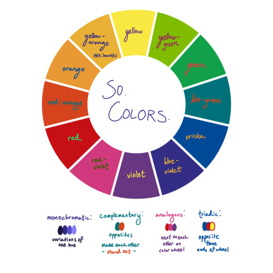
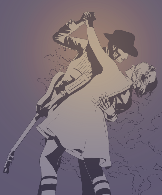
different color harmonies, like the ones i listed, create very different atmospheres. complementary color schemes are very eye-catching, especially when both colors are really vibrant. you see complementary pairs a lot in sports teams or ads. i’ve found that making one color dark, and making it’s complement the light source creates very dramatic and striking lighting! (dark blue-violet and light yellow-orange is one of my favorite color schemes ever it looks so cool)
i usually come up with the general mood i’m going for before anything else. then based on that, you can decide the palette you want to go for. monochromatic and analogous schemes are more calm and pleasing to the eye, whereas triadic or complementary schemes are a lot more jarring

the other thing that informs my color choice is general knowledge of color symbolism. people usually know the basics without ever actually researching the specifics - blue is sad, yellow is happy, red is dangerous, pink is romantic, etc. taking a minute to think about what you want to express creates a big difference!
as for my personal painting process, usually it goes something like this (i saved a bunch of wips from what i’m workin on rn)

i never line this cleanly idk what possessed me. but usually i just sketch out the general figures, which you can probably see alright in my speedpaints
coloring for me is just endless trial and error and doing random shit until i’m done. i have everything on low opacity so i can just throw a bunch of random colors on top of each other on the same layer as the lines until i like the way it looks

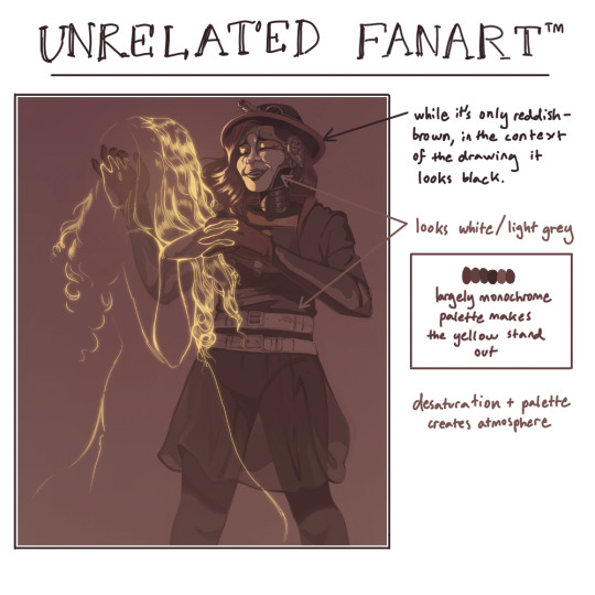
i keep using a low opacity brush on the same layer as everything else, and kind of block out the major colors. try not to pull random colors out of nowhere - keep everything in line with the rest of the palette, unless it’s intentional contrast. for example, the cuff on the man’s suit is supposed to be very vibrant red, but instead of just choosing a red color and going for it, i looked for a closest hue in the drawing. that ended up being that orange-ish pinkish shade you can see in the background between the purple and yellow light. i made it the slightest bit more saturated, but not enough to distract from the focus of the drawing. so it’s not exactly accurate, but you’re allowed to use artistic license to make the palette work. don’t get too hung up on accuracy!

then just general color correction. i thought it looked too grey and boring, so i put a dark purple multiply layer and then some really intense orange and pink overlays because i couldn’t think of a good reason not to. that’s kinda my philosophy on drawing in general tbh
i hope that helped some!! it’s hard to put what i do into words, because it’s really mostly experimenting and judging what looks good by eye. but the major thing i have to recommend would be to just learn the very basics, then just keep trying stuff until you get the effect you want. art is eternal trial and error baby
#art#color tutorial#tutorial#art tutorial#answers#school ended yesterday are you guys proud of me#maybe i'll actually be able to. draw. again.#anyway literally both those art examples are fanart of my favorite band jdbfkdf#not that i'm trying to give them more exposure or anything haha#hahahahaha#go listen to honeybee by steam powered giraffe i've shed too many tears over it to even try to count
228 notes
·
View notes
Last Seen Blogs


baewall
Baewall♥

rubyfieldsforever
What Is And What Should Never Be

pishroofficial
پیشرو | Pishro

homesteadfurniture
Homestead Furniture Inc