#googling the poster name and i think it's called style C?
Text

the second of my Pokemon Colosseum anniversary fanzine submissions. I've always found Colosseum and Star Wars have a lot in common aesthetically (and thematically to an extent), so this is based on one of the original 1977 Star Wars posters.
This game means a hell of a lot to me. Fixating on this, and its sequel, have gotten me through some rough times as a teen and young adult.
May the Orre by with you.
#googling the poster name and i think it's called style C?#gonna be honest i'm not a huge wookie head#i've seen the original trilogy the prequels one of the newer trilogies#the clone wars series and a bit of Rebels#but i'm way more of a casual fan of Star Wars#won't be winning any awards in quizzes that's for sure#trivia nights on Colo and XD on the other hand... i might have a chance there 😂#pokemon colosseum#pokemon colosseum 20th anniversary#orre#ravinoforre
67 notes
·
View notes
Text
1D Day, Hour Two
The file I’m watching on YouTube is much shorter than an hour (44 minutes!!), but that’s because the poster kindly removed the “VT” (shudder) from random countries (it always boils down to [insert country’s name’s] fans wilding, and there’s only so much of that I can take).
Still, hour 2 is fucking ICONIC for many reasons, the biggest being Harry’s barely constrained rage. Yes, Louis’s “done with it all” demeanor on 1D Day is (justifiably) legendary, but Harry’s right there with him (twin flames, y’all). I can’t tell if he’s coked up, genuinely angry, or just passive-aggressively petty because someone told him he had to speak more quickly, much more loudly, and with some enthusiasm, for chrissakes. Oh, he delivers, all right, so much maniacal shouting. Deets under the cut.
Hour 2 is all Lirry, and I, for one, love Lirry, so it’s 44 minutes well spent. Liam tells us, “We’re kicking it off with VT from France, give it up for France!” (“FRANCAIS!” Harry yells), and after the missing bit of French VT, we’re back to Lirry, with Harry vacillating between murdering the French language (“Mercy boo coo to France”) and shouting “I ATE SNAILS” as his contribution to what they did in France last time they were there (Liam played football with some guys near the Eiffel Tower, fwiw).
The first guest is Dynamo (or, “DYNAMO, EVERYBODY” if you’re Harry), and he’s here for card tricks and more (“OH, SNAP” is Harry’s response to Dynamo nearly twisting his own finger off, and god, it’s horrifying). Harry’s fairly manic through the entirety of the card tricks, but I love Liam because he’s me in every card trick (“I’m glad mine’s easy to remember because I’d probably forget,” which is true of any card you take, like, ever???):
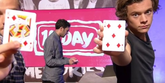
“WHO LOVES MAGIC!” Harry shouts, and there’s a needlessly complicated special interactive trick that gets introduced here, with Dynamo saying that he wrote a prediction on a piece of paper and sealed it in a box at the beginning of the day, so he needs to Harry to keep the key safe. Points if you correctly assumed that Harry will stuff that key right in next to his dick as a joke.
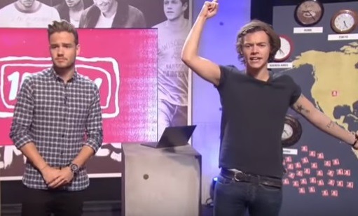
Because nobody rehearsed or prepared for this epic full-day live event, there are all kinds of problems with the cameras, and if you want a fun drinking game to get you hammered within 45 minutes, take a shot every time you see a variation of this (Liam looking vaguely concerned while Harry aggressively points at the sky or the camera while shouting):
A horrifically bad segment that’s a poorly disguised advert for Google Hangouts (lmaoaoaoaooaoaoa) kicks off questions from all over the world (the audio is bad, none of the visuals syncs), but we get some iconic answers to deeply important questions, like, “If you were in the Hunger Games, who would survive the longest?” Liam says he’d hide and then kill passersby (yikes), and Harry says he’s more of a lover than a fighter, so he’d hide in a tree until it all blew over. Liam: “Oh, yeah, you’re definitely more of a lover.” Harry: “Easy there, Piers Morgan.”
The next question is from a group of girls wearing Christmas sweaters, which annoys Harry because “it’s a whole month and two days early,” but I think his issues are bigger than jumping the gun on holidays (and honestly, the UK doesn’t have the twin buffers of T’day and H’ween, so you KNOW this is just part of his general rage). Anyway, they want to know what other careers these two would be involved with, sans the D, and because they’re five, Liam says spaceman and Harry says baker.
After a series of horrible glitches, the next question is about which superhero they’d be, and me as Harry, blowing a giant raspberry as he ponders this important question with the level of exhaustion he surely must feel, three years into this band/interview technique. Liam can read the room, so he picks this one up and says he’d be Kung-Fu Panda, which makes it easy for Harry to say Hong Kong Fuey (!!!) or Top Cat.
With that mess done, it’s time to “ROLL THE VT!” (according to Harry) for Switzerland, and because the producers here are nothing if not cliché lovers, that means tiny cowbells for Harry to play with when we come back. He quickly tires of this, throws the cowbells off stage, yells “WE NEED A CAMERA,” and walks straight into the call box with the overwhelmed girls from hour 1. These girls are still weeping, but Harry says, “Thank you for listening to the album, you’re getting kicked out, sorry,” in the flattest voice possible, so good cop Liam hurries over to ask the weeping girls which song they liked and usher in two new people.
“Happily” is debuted, but we don’t get to see it, boo, but we do get ushered over to a theater with some contest winners. Or as Harry says, “We’re here backstage to meet some fans who have won a chance to be here…SHUT UP…in our VIP cinema,” and then, “You’re crying…is that because I told you to shut up? I didn’t mean it.” Liam is there again to save the day, but there are lots of sound problems, so it’s hard to tell what’s happening, tbh.
Anyway, these fans get to ask some iconic questions, such as, “What would we find in your fridge?” which gives us this classic from Harry: “I DON’T LIVE ANYWHERE, SO NO FOOD,” as the audience says, “awwwwww” in the background.
There’s a question from a lady on the screen, saying that she’s in front of the X Factor studios, and she wants to know what they would change their audition song to, if they could go back in time, and because Harry’s well aware of his various stalkers, he says, “I saw her the other day at the X Factor studios, 100 percent” (fwiw, Harry would do “Wrecking Ball” with props, and Liam would do “Mirrors”).
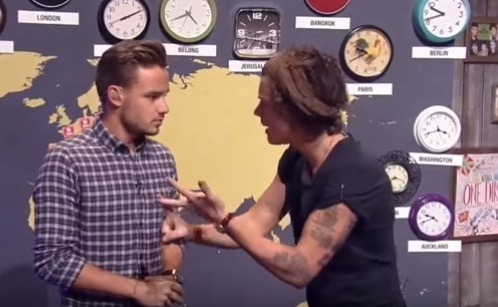
The last question is what they would change if they could go back in time, and Liam says probably his older haircuts, and Harry says that one day in April (and he mentions April again later in the hour, so someone investigate), he had a dodgy breakfast burrito, so he’d probably change that (he also had a dodgy batch of prawns one time, too, but that’s a different story, and god, he’s an underrated comedian). The sound is for shit, but Liam doubts this, prompting Harry to scream, “DON’T JUDGE ME, LIAM, I’M TRYING MY BEST,” and whyyyyyy is he so on fire (and why do I love it so much):
We get back to the studio with an inexplicably breathless Scott Mills (he says he ran…but from where, lmao) and do another spin to figure out who the official 1D account (????) will follow on twitter. Harry starts cheating before people start yelling at him to stop, which is a shame, really, just follow all of these poor bastards, honestly!
We don’t get to see the VT from Germany, but we do get to see Lirry bickering about camera problems and stolen lines, plus an exhaustive rundown of all the thrilling things to come, and I’m so thankful to the person who made this moment a Dua Lipa meme all those months ago:
One of my favorite segments has a really awkward setup, but tl/dr/dw, Harry brags, “I’m a bit of a chef myself, and if I’m honest, Liam, I’m pretty damned good at it,” so we get a “ROLL VT!” and an aggressive finger point, both from Harry, and a silly but charming cook off with the tour chef, who seems like a lovely lady (p.s. look at how glorious his hair was under all those tablecloths…also, he’s chewing gum in a gross way, but this whole bit is worth watching in full):

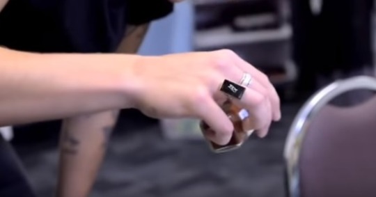
The cook off is genuinely funny and results in a beautiful pavlova from Sarah and a basic sandwich (with pickle and paprika) from Harry, judged by Mark Jarvis, Gemma Styles, and Lou Teasdale, all of whom Harry bribes. I’m more fascinated with this ring, and my head canon has it either saying ILY or JEN (both of which make me smile):
With that bit over, we move on to more rapping of random tweets, and it’s embarrassing, so I won’t get into that. But the VT of Liam surfing is something special, not only because he looks so obviously happy while he’s doing it, but also because he says some very profound things in the interview around it: “I get followed a lot, so it’s quite nice to get out in the sea where nobody can follow you […] it’s so nice and peaceful […] it doesn’t matter what you look like, you can just have a good time, it’s a bit of an escape,” and ouchhhhhh, that’s some real talk.
We head back to the studio for a fashion segment with Louise someone; a handful of lucky fans in Sweden won a t-shirt design contest, and Lirry are gonna do some modeling. Louise is happy that Harry knows where Sweden is (Harry: “I got a B in geography…might have been a C, can’t remember”), and some poor shlub working on this trainwreck in the shadow gets dragged out on camera because he’s wearing green jeans, but he’s not there for long (Harry: “GET OUT” *shove*). Louise describes the fashion show to come, and Harry says that he’s quite good at walking in straight lines, but Liam reminds him that he tends to fall over a lot on stage and that the tiny catwalk is actually pretty shiny (god bless Liam for being so responsible).
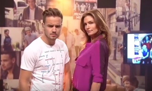
Luckily for all of us, professional model Cindy Crawford is there to help with some tips (she’s introduced as “IT’S ONLY BLOODY CINDY CRAWFORD” by Harry, and I die with Cindy’s “Hello, boys,” and Harry’s “Hello, Mrs. Crawford”…followed swiftly by Cindy’s, “Please don’t call me Mrs. Crawford”). There’s some sexi modeling, and even though he only wears two shirts to Harry’s three (*and* Harry gets down on the ground to pose), Liam wins, according to the Swedes. He requests a model off with Cindy as his prize, and he’s surprisingly good?
The last segment is with Dynamo, the magic man, and for some reason, Harry’s weirdly agro about his own shirt mic, like, unnecessarily so, ripping it off to speak with Dynamo before gently putting it back where it belongs. Maybe he’s just frustrated about how they have to use Google+ (lololololol) for a totally convoluted imaginary concert that ultimately doesn’t work (me as him, tbh).
While Liam does tech support live on air (!!), Harry asks Dynamo to do some card tricks to stall for time after literally nobody says a word when he monotones, “We’re having a technical difficulty…does anybody know any jokes.” Harry pulls a card as directed, but then, for seemingly no reason, he suddenly starts yelling, “THIS ISN’T WORKING, SHALL WE SEE SOME HIGHLIGHTS? HIGHLIGHTS!!! ROLL HIGHLIGHTS [aggressive pointing]!!” and the highlights are truly awful, and I hope he’s enjoying his smoke break for hour 3, jfc.
106 notes
·
View notes
Video
Inspirations and Reflections on a Publicity Video
or: Ryan Talks About Fonts for Way Too Long
by Ryan Bremer ‘22
The publicity video for Anxious People! was inspired by the striking styling of Saul and Elaine Bass, known for creating some of the most iconic title sequences in cinematic history (Vertigo, Psycho, Ocean’s Eleven, Casino, among others.) This initial influence, coupled with James Howe’s terrific typographic work on the production’s poster, lead me to the form-conscious, anxiety-inducing final video. Because most of the characters in the play are named after letters of the alphabet, it was a very natural decision to explore a variety of typefaces and play with the shapes they make when rotated (plus, as a selfish bonus, I am kind of obsessed with fonts so it was nice to have an excuse to use a lot of them.)
Okay, enough of that now; I wanted to use the rest of my space to comment upon each of the name cards, explain my thought processes, and meme around a bit.
Isabella Binici (M) - I wanted something striking right off the bat, and I think that this delivers. Fun fact, the M was originally red but it looked too much like the Gmail logo.
Em Brooksbank (A,O) - I wanted to establish early on in the video that letters would be rotated—hence the fallen A.
Sarah Downey (G, L, C2) - Composition-wise, I am a fan of how the L corner-frames the C2. Also, a number! There are only a few of them in here.
Nikash Kale (E) - Lol, the E looks like some sort of Greek helmet.
Grace Keating (I, P, S) - Lol, Grace’s name is sitting atop some sort of Greek column.
Becca Lipsky (J) - This typeface really stretches out the J and fills up a good bit of the frame.
Molly Malaby (V, LP) - The V reminds me of a scale balancing Molly’s name and the LP. These are the thinnest letters in the whole video.
Ashleigh Marmer (D) - D-:
Maggie McDonald (C, C1) - A match of the C2 from Sarah’s name card.
Bryce Merry (H, SO) - First of all, there sure are a lot of M last names in this cast. Second of all, I really like this one; the SO looks so snug.
Camoni Mullins (M, N, 9, P) - This one has a lot going on and I love it. The M balances out the N and the 9 nicely.
Anne Parsons (Z) - A Z with a slash through the middle was the one specific request I received from the director…I don’t want to spoil the scene, but the choice of typeface here is visually significant.
Sash Pisarchik Shketav (t, M) - Again, I don’t want to spoil the scene, but trust me, this one’s clever.
Amma Saunders (B, Y) - I think that this is the one time that the letters actually spell out something.
Hannah Schilling (F) - This one starts what I call the “Single Letter Suite.”
Ariel E. Ulrich (N) - The N is in the font Arial. I spent way too long laughing about this.
Grace Woodhouse (K) - Okay, I won’t reveal the choices behind this one…let’s just say that it involved some questionable Google searches. If you’re really curious, come to the show Friday or Saturday night and ask me!
0 notes
Text
17/3/20_InDesign_Essentials2
In this session we further explored editorial graphics in InDesign, touching on topics like layout, grids, master pages and typography. To solidify our knowledge in this topic, we then navigated the software to create two mini-projects based around Barbra Hepworth.
-- stage 1 --
In this session we first looked at some layout inspiration as it is difficult to start with a blank page. Some good resources are Designisnpiration.net, Behance, FromUpNorth and Pinterest.
I have created some of my own design inspiration boards on both Pinterest ad Behance, alongside an extensive screenshot folder on my phone with things that have inspired me from Instagram and Twitter. I think that gathering some background knowledge and exploring how other designers approach design tasks helps you to get some basic ideas of where you want to go with your designs. It is difficult to start with a blank page, so getting resource material and inspirational images always helps you gain design footing.

Another important tool when I am designing is choosing the right font. Finding a viable font and font pair is integral to creating good design. Typography is the backbone of layout and a structural piece like a poster. Websites like Dafont and FontSquirrel are always a good option to explore different styles of fonts. I have found that choosing a font I would usually avoid helps me to be more creative and I end up designing something I wouldn't usually even imagine.
Websites like Google Fonts, Adobe fonts and FontSquirrel are more reliable as they have better classification for finding fonts, and usually the spacing and kerning are a lot better than the fonts on websites with cheap or free fonts like DaFont.
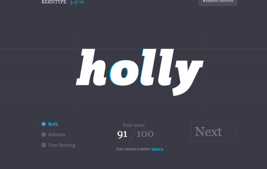
I had a go on the Kern Type font kerning game (https://type.method.ac/#) to test my kerning skills, an important tool if I do download the cheaper fonts. I found that I improved with every time I tried a new word, the ones I struggled the most on were the Serif fonts.
Font vs Typeface
Font: The different cuts, the ‘family’ (Avenir Book Oblique, 40pt)
Typeface: The name of the typeface, the surface level (Avenir)
-- stage 2 --
Choosing a Grid System

Choosing a grid system to base your page around gives you a good sense of how the final will look. Gathering multiple good reference images will allow you to final a good layout and work more quickly to produce a cover or spread. Using multiple layouts in a document is called creating pace, books can become boring by using the same layout over and over. Ways to change pace can be through layout, typography, colours and sizing.
When working in industry, creating a layout that is blank, ready for putting images and text into is essential. With the rise of social media, creating content as quick as possible is essential.
-- stage 3 --
Navigating the InDesign Document:
When creating an InDesign document, I always use essential classic with a clear workspace, visible pages and master pages, and plenty of open space on the artboards. Creating a document at the right size with clear columns is essential as it allows the designer to more easily visualise the final document within a workspace.
One of the most useful tools when working with editorial designs in InDesign are master pages. Master pages are pages in which anything that is applied to them is copied across all the other pages on the document. This is especially useful for creating grids, inserting page breaks or page numbers. I usually use the master pages to layout a grid that I can work with for the rest of the pages. You can create multiple master pages within a document, every page labelled with the paster page title will have the master page spread applied to it (A, B, C ect.).
Creating seamless page numbers is simple in InDesign, you can visit a master page and insert the special character into a text box. You can override this rule and get the page numbering to start later in the document by right clicking the desired page, turning the document pages to shuffle and spread paged off, numbering section options and then start page 1. Using alt and the arrows left and right will quickly allow you to kern type!
In InDesign, dynamic spelling is applied in two ways. In type you cab check spelling at the end like word, but you can also turn on dynamic spelling through; edit-spelling-dynamic spelling, allowing you to see misspellings as you work.
-- stage 4 --
To celebrate the artist Barbra Hepworth, we have been tasked with a mini-brief to execute in InDesign. Her artwork includes very unique shapes forms and materials, producing a very diverse body of work.
The first task is to create a Swiss style poster to promote a Barbra Hepworth exhibition:
Barbra Hepworth / Mini Tasks1) POSTER
Create a poster using graphical shape and text only - inspired by Barbra Hepworth sculpture2 Colour Helvetica only
The second is to create a magazine spread using photography and text- inspired by Barbra Hepworth sculpture.
SPREAD MAGAZINE LAYOUT- Choose Heading/Subheading/Body- 3 levels of typeface/fonts.
Swiss Style:
Swiss Design, often referred to as International Style of Design, emerged as a dominant design direction in post WWII Switzerland. It uses a rational and systematic approach, employing limited colour palettes and the use of grids to establish order. Its reach and influence became immeasurable as it grew from design movements such as Dada, Bauhaus, Constructivism and De Stijl and even influenced areas outside graphic design as architects and figures in the broader world of art embraced its aesthetics.
The ethos of Swiss design is its most defining attribute, far from the work itself, the International Style of Design believes that design is about communication and that good design comes from a clear purpose. ‘Form follows function’ is a strong standpoint in Swiss design and their main influential works come from design that has an objective meaning. In the world of graphic design, many principles and groundworks that we follow originate from the Swiss design ethos, regardless of style changes and new processes, the fundamental rules stand as guidelines for designers.
Mini-poster:
For my mini-poster I decided to use black and white as my main colours, highlighted by a wildly contrasting orange. This design is very much inspired by the Swiss style, using typography as a main body for the layout of the design, then building my design around the grids they type naturally creates. In the classic International Style, I used Helvetica in bold as my typeface for this design, giving me very wide and bold letterforms that I stretched out to use as a sort of framework for the design.
Dame Barbara Hepworth
Moonplay 1972
Tate
As a nod to Barbra Hepworth, I included geometric shapes based on Barbra Hepworth’s sculpture piece; Two Forms (Divided Circle). Her work is inspired by the shapes and intrinsic characteristics of coastal lines and organic structures. I wanted to create a sense of hollowness through cutting a circular shape out of a half circle and showing another through the gap. This feeling of space within a space was difficult to create in the Swiss style, so I made a sense of depth through minimalism. I really like how the colours work in this piece and I am happy with how it turned out with the challenge of a very limited colour palette. The beauty of Swiss style is how minimalistic but appealing the designs are.

Magazine Spread:
For my magazine spread I tried to carry on the style and design that I previously created for the poster. Working according to the International Style methods, I created a grid and lined up the text and objects with it. I wanted to get a sense of the Hepworth design in the spread too so I traced around the sculpture in the facing image and set the text to the shape. I also drew up the string pattern and made that a central piece of the spread, keeping white space in mind the whole time when designing. I mirrored the colour scheme from the cover and kept the typeface the same, only altering the boldness and size of the font between the heading, subheading and body text. My spread really has a sense of theme and creates its own image, something that could be useful as a promotional style for this exhibition as it is consistent and recognisable.

-- reflections --
I think this task was a good opportunity to be creative with poster design and layout, revisiting some InDesign tools and techniques I haven't used in a while. Overall I am very pleased with this outcome and it has inspired me to look deeper into Swiss design when creating a quick layout in the future. Maybe mixing Swiss and modern design techniques would give me something fresh and unique as a response to a design challenge.
0 notes
Last Seen Blogs

cutiejpn
cutie

hsportal
HS Portal

berelyn
Ever the hunter

grayziller
I'm Gray, and that's okay.
identity-of-design
Does it POP