#i forgot to make it tonally clear i was being whimsical
Photo
I Fixed it For You: Dark of the West
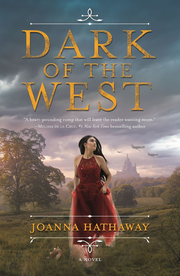
So this cover was sent to me by multiple people when it was revealed five days ago, on account of it being terrible, but in terms of stuff we cover on this blog, I consider it kind of unique case. It’s bad but it’s not garishly so; it’s fairly, though not entirely, Technically competent, with a straightforward hierarchy, no weird spacing, and photographs that are attractive and highly edited but not too artificial-looking, taken on their own. But all of the individual choices here contradict each other and are executed in a bizzare pastiche of moods, eras, and imagery that is super, super not working together, especially not when we consider the contents of the book. So before we get into my version, we have to like. Break this down. And we’re gonna use numbers.
OVERALL CONCEPT/ COMPOSITION: 2/10
This is a fantasy world war II book. That is extremely marketable. Also it is the year of our lord 2017 and we are gripped by tracked-out type and object covers. Yet this book decides to go with a GIRL IN PROM DRESS RUNNING AWAY FROM SOMETHING AND ALSO NOT LOOKING AT YOU cover like it's 2011, nary a narrative element in sight except the pathetic attempt at planes in the distance that we'll get to in a second. Why??? Did this happen ?????
I want to be clear that I don't hate GIRL IN PROM DRESS covers on principle. They were extremely popular for a while and thus there are many, many examples of them being done badly, and yes, they tend towards the generic, often sort of a cheap bid for visual Romance with minimal reflection of the story itself, BUT ALL THAT SAID, there's a reason they're appealing, and when done well they promise a specific sort of female protagonist oriented drama with a Sexy, often Dark aesthetic. And if you know me, you know I'm all about that. But WHY in the world would you not SELL THE FUCK out of your extremely marketable premise here? WWII planes attacking a fantasy castle is the important imagery, not a generic princess and the twenty-odd miles of wildly unthreatening landscape that stand between us and being interested in this book.
But even if, for some crazy reason, the princess really was the only viable central image for this book, this composition is still stiff and dull. A small lone central figure, paired with oversimplified type and nothing else with any visual weight to speak of, is super fucking boring; there’s also something a little weird about how far inwards everything sits, like it’s afraid of being cropped off?
If I had to say something nice about it overall, there’s a very dreamy, unreal feeling to it-- but not only is it ruined by the type (which I’ll get into) but it feels inappropriate. I want drama from this cover, not dreaminess.
GIRL IN PROM DRESS: 3/10
So setting aside the fact that I take issue with its very presence/ centrality, the image is well-edited, but loses big points for the costume, which looks like something I could pull off a Macy's juniors formalwear rack right this fucking second instead of, i don't know, SOMETHING ANALOGUE 1940S AS IF TO REPRESENT SOMETHING FROM THE CONTENTS OF THE BOOK. I'd forgive it if the dress was at least romantic or super pretty and thus contributing to tone, but it's not; the color isn't complimenting anything else on the cover and the style is more anachronistically modern than anything else.
Points are also lost for the weird contradictory lighting on her-- the backlight on the skirt is TECHNCIALLY correct or close enough to it, since we can see the sun there on her far left, but it's so bright on the bottom half of the dress that it's super distracting, and feels incongruous with the lighting in her face. And that's an easy fix? Just trim the image a little and cut off the tulle? She's clearly not actually embedded in the background. We also know this because of her 40% opacity feet, which, lol:
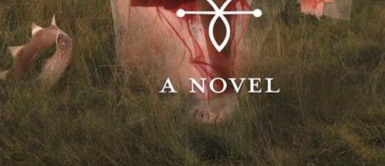
Also, someone was clearly like ROYALTY IS HOT WE NEED TO GET A CROWN IN THERE so it's... just chillin? I'm not at all against metaphorical imagery or crowns in general, but compositionally it looks silly and tacked-on.
WWII PLANES: 0/10
YOU DIDN'T TRY AT ALL.
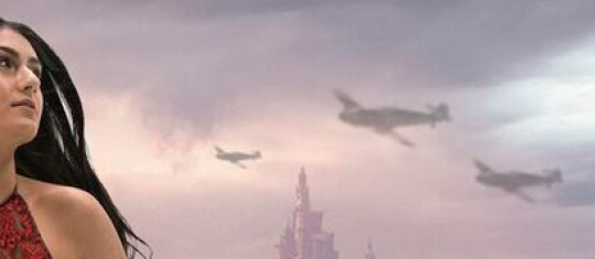
I’M LITERALLY SO EMBARRASSED FOR THIS COVER RIGHT NOW.
PASTORAL LANDSCAPE WITH CASTLE: 5/10
There's nothing wrong with this landscape except some overenthusiastic correction of of the dark values, presumably so it doesn't compete with the girl for attention. This just backfires and makes it overwhelmingly clear that the girl has been pasted on top of it, and turns the potential visual drama of a cloudy sunset into a sort of vague murky pastel thing that makes me want to take a nap. Other than that, this would look lovely on some other less terrible book cover.
TITLE TYPOGRAPHY: 2/10

When I said this cover is mostly Technically competent, this (and the planes) is the exception. This is the saddest attempt at grunge texture I've ever seen in my life. It's so depressing I want to start a nonprofit for it. Please attend my charity gala so that this poor plain type can afford to look properly distressed and not like someone blotted a dishwater-soaked tissue on the corners.
But regardless of the texture, heavy photomanips in particular need a strong typographic hand to tie them together tonally, so it is a massive disappointment to have such WILDLY generic letterforms taking up HALF OF THE COVER. It literally looks like a mockup, a quick comp just to demonstrate the idea to the creative director and you'll actually go back and use a REAL font and REAL grunge effects later, but oops, you forgot to edit it before it went to the printer. Also, what's with that color? If you want it to look gold, use a metallic effect or a texture. This is just ORANGE. At least it could have been the red of the dress and then something would have worked together?????
Additional Design Elements: 4/10
Inoffensive but WEAK use of Flourishes and dividing lines. Author name sitting on a weird place on the girl; why the choice not to nudge it down to hide the weird foot I called out earlier?
Overall median score: Bad, needed fixing.

Now we can talk about my design.
I don’t want to make this post much longer, so I won’t go too in depth in defending it, but it’s not immune to the inherent cheesiness of vast photomanip landscapes. That said, I went a lot Deeper than I generally do for fixes because I knew that somewhere, deep down, was a good composition waiting to be unearthed, and i totally think it was worth the effort.
Focus is split almost equally between FLEEING (?) PRINCESS and the planes attacking the castle, with vast differences in depth generating interest and the overall composition sloping upwards, creating energy and a sense of action. The type had to be something heavy and solid enough to carry a grown-ass grunge texture (because i was determined to show how it should be done), but whimsical enough to keep us within the realm of princessey fantasy, and I added the floruishes on either side to that effect too. (the only Caveat to this redo is that I didn’t intentionally do away with the idea of the girl in a pricess dress, I just couldn’t find any images that worked, and this girl’s grungey jacket ends up suiting the mood, so.)
And I made it, uh, Dark. Because it’s in the title. it just seemed obvious.
Moral of the story: don’t forget the full potential of your type, lean into the inherent artificial nature of photomanip landscapes to max out your composition, and for fuck’s sake, don’t use pixellated planes.
If you like what I do on bookcoversalt, consider buying me a coffee?
66 notes
·
View notes
Last Seen Blogs

58t5-a8w1d
Perdere peso dopo i 45 anni

onantjc-blog
Onan United

ariana-pics-blog1
KIMORA

whiteheadspencer77
The Blogging of Creech 791

ungexskincaretreatmentt
UNGEX