#i want to say sth about beyond the scene too but nah don't have any strength to type longer
Text
I’ll try to make this as simple as possible for those who aren’t familiar with field terms, please note that this is only my interpretation from my knowledge and experience and it might not be 100% similar to Bighit and the design firm’s original ideas.
So BTS and ARMY got a new brand identity. What is brand identity? Brand identity is the identity, the core, motives and goals of the brand, basically everything that makes the brand itself represented in a visual aspect. Logo(s) is one of the most important parts of the brand identity.
This is BTS’ previous logo:
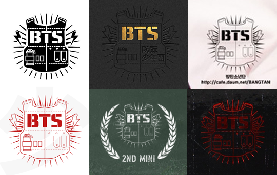
Why this logo no longer suits BTS:
• This logo is made specifically based on the meaning of BTS’ name in Korean, 방탄소년단 (Bulletproof Boy Scouts) taking the image of a bulletproof vest as the base
• Technically speaking, it’s not really a practical logo. Too many small details lead to difficulty when used in small scale and used as strokes.
• It’s created 4 years ago and the logo trend has changed a lot since then, going more towards minimalism (simpler logos).
• Most importantly, it can only represent BTS in debut days. The bulletproof vest stands for “guarding against prejudice and oppression against the youth in their 10s and 20s”. But BTS’ success and achievement have far made them become more than that. They are not only simply defending prejudice and oppression but also offering consolation and hope for the youth as well as everyone else to move forward. This logo isn’t able to express that.
And so they changed BTS’ brand identity and not only did BTS get a new logo, our fandom, ARMY, got one too. (left: BTS, right: ARMY)
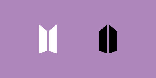
Why the new logo suits BTS:
“BTS’ new BI shows that they aren’t satisfied with the realities and symbolize their youth that is opening the door and stepping out in order to further grow, while their fanclub ARMY is visualized as the reflection of BTS’ youth that meets the members as they open the door. The meaning of the brand has expanded as a concept that merges the past and future. Since their debut, BTS has continuously expressed themselves as “boys blocking the oppression and prejudice that teens face” and have added that the meaning of “Beyond The Scene” is “youth that is not satisfied with the current reality and will pursue their dream without rest in order to grow”.” (Source: 매일경제 via Naver, Eng: Christie & Kylie @ allforbts)
• It’s a minimal logo design which has been the trend in the design field in recent years, with many big names changing their logo/brand identity like Google, Microsoft, Yahoo, DeviantArt, Uber, PayPal, even in the Korean entertainment industry, we have YG Entertainment who changed their brand identity 4 years ago too. These are all for the purpose of catching up with the trend and renew themselves for a fresher and more suitable image for the company’s direction in the future and current success. Minimal logos have more practical use when it comes to digital and print design. This shows that BTS is catching up the flow of the times and not caught up in the past. The design is also developed from BTS’ old logo (the bulletproof vest one), the negative space between two shapes represents the front zip of the bulletproof vest. At the same time, it also resembles two panels of a door, symbolizing the action of open a door to move forward to the future, to a new beginning of BTS. This logo is an infusion of the past and the present, the future of BTS, they still stay rooted to their base but don’t dwell on the past, they are not satisfied with what they achieved and will continue to go higher.
• When flipped 90°, the logo resembles a door with a source of light ahead, meaning that when BTS opens this new chapter, there will be a bright future awaiting for them.

• The logo of ARMY is a reflection of BTS’ logo. Here’s a simple animation to show how BTS and ARMY’s logos are connected:
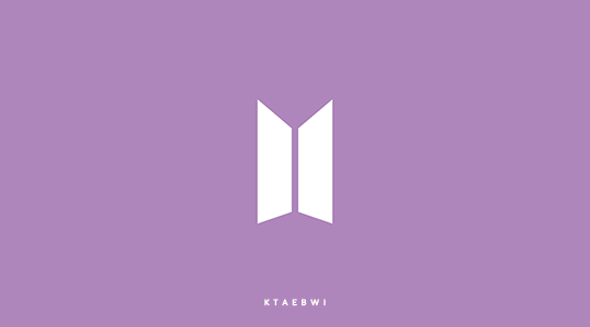
BTS and ARMY’s logos are reflection of each other representing the mutual influence of us and BTS. BTS give us music, hope, determination, ambition, dreams, energy and happiness, and we too are their source of strength, the reason they keep developing themselves to get better and better. As BTS always say, BTS exist because of ARMY and we ARMY are also a part of BTS. The overall shape of ARMY’s logo resembles a shield, meaning we will be the one to protect and shield them against the prejudice and hatred towards them.
• Another reason why I say this is a great logo is because, there are many ways to combine these two logos together. Two of them are:
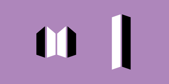
- When putting BTS’ logo in between ARMY’s logo, it becomes two shields. We are protecting, embracing BTS, but at the same time they’re also protecting us, together we double the strength.
- When separating the pieces of each logo and arranging them vertically side by side, they become the symbol of a grand door, the kind of door usually seen in palaces and is commonly used to represent the Gate of Heaven. BTS and ARMY side by side will head to higher places with higher goals.
#bts#what am i doing instead of working#i want to say sth about beyond the scene too but nah don't have any strength to type longer#i think i missed a few things that i thought of when first seeing this logo#but that's all my brain can process after just waking up sr
11K notes
·
View notes
Last Seen Blogs

witchkingdamien
sex

tesselarpixel
T e s s e l a r

branchio
BRANCHIO

artfulentropy
Not Solely Featuring Wolves