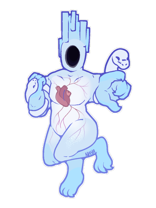
#im really struggling with the transparency aspect of this design.. i know i could just make him all white but. idk that's boring
Text

AND THY PUNISHMENT.... IS DEATH!
Been thinkin abt Minos Prime a lot lately... cool dude. I've been trying to P-Rank everything so that I can actually access Prime Sanctum but I'm painfully busy so for now I just draw him :V
#im really struggling with the transparency aspect of this design.. i know i could just make him all white but. idk that's boring#he's very blue in this one but i was just messin with colors so whateva#nayarts#minos prime#ultrakill#artists on tumblr#ultrakill fanart
77 notes
·
View notes
Text
EVALUATION
Overall this unit has thrown many challenges at me but I am happy with a lot of my outcomes throughout the unit. The first 3 one week projects seemed pointless at the start as they were so short however I soon realised they were so helpful in the overall scheme of things. Each topic from the one week projects all was helpful to the final project so therefore we needed those short ones to give us the knowledge and understanding of what needed to be done for the final 4 week project. My first outcome for series and systems was not necessarily very successful as I didnt seem to get the grasp of how informative it needed to be. I do think my second and third outcomes for project 2 and 3 were much more successful because I did wider research which informed me how I should be working.
For the exhibition project I am actually really happy with how things turned out. I created a coherant exhibition based on the theme of value. Because there were more elements to this project the breadth of my research went quite far and I didnt have singular bits of research which informed everything as it was a longer process and things changed over time. I did get inspired by Tomohiro Inaba however which what got me to the idea of rubbish drawings and scribbled so he was my main artist inspiration. I took inspiration from sculptures to create my own design choices which I think is great because I am going outside just the designers and looking at other mediums to inform my design choices, I like looking into other mediums because I think you will get a more unique outcome from it.
My exhibition went through a few changes as time went on. I started out with just the idea of literal rubbish and was potentially going to be using real garbage as my main brand identity but then I got to the idea of rubbish drawings. This initially was a really exciting time because I thought of an idea out of nowhere and immediately got excited by it because I had lots of ideas running through my head. At this point i knew it would be a good idea to run with it because if Im excited myself about something I think I will always have a better outcome because if you start creating something you arent keen on your hard work wont go into it. Whereas I loved my idea from the start so was really keen to get ideas and trials done. The scribble idea did develop from me encasing scribbles into shapes to then having it all manic and being the main focal point to the design. I do like my brand identity and think it relates to the content well with a nice contrast.
Throughout the project I think I responded to feedback really well and found the tutorials really helpful especially as they were one on one mostly. While speaking with tutors they did seem to like my design choices however I learnt I do need to work on the treatment of my text on poster. I usually have nice ideas but then when it comes to layouts of where text goes and sizing I think I need to work on it. Also during a tutorial with Rich he did mention the name of my exhibition and thinking of just calling it ‘rubbish’ and at first when he said I thought well I should change it because he will mark the work but we had an honest conversation where he said as designers we need to be making our own decisions and take the feedback as just an opinion but not necessarily something we HAVE to go with. I was pleased we spoke about it because it meant I knew I could just stick with what I had because I did like my title and thought it gave an interesting twist on your average exhibition names. That being said I did take on board all the other feedback he gave me and tried and tested lots of trials for my brand aswell changing the posters font type etc.
I think throughout all 4 projects I did work through the process quite well however I do feel I do lots of research in a short burst and often dont make my own comments on it straight away and therefore forget so I need to start making notes all the time and straight away so that the tutors can see I have a wider breadth of research. I think need to work on time management for the next project because during this project the first 3 projects were ok because I knew I had only a week so It gave me the drive to get everything done quite quickly. But for the final project I left my process book way too late because I wanted to do lots of it at the same time to keep a flow going. I should have listened to rich at the start of the unit where he said dont leave it too late because there is a lot to do. I ended up rushing the end of the book and therefore dont think my process book is very coherant in terms of the design. I was really happy with lots of the pages I did however. I think I still need more practise on the softwares such as after effects which I still dont feel very confident on. I am a lot happier with where I am on indesign though as I am using a grid which In first year I was quite bad with as I was always wanting to break a grid. I understand now a grid can be broken if its done right and not on everything I do.
During the exhibition project I used photoshop a fair bit for some of my designs so I learnt a few things on there which will be useful to me in future projects im sure. I also learnt case binding during the unit which isnt relevant to my work but wanted to mention it because I was so happy with my outcome and everyone I showed said it looked great. I reallly do enjoy book binding and really want to learn more tecniques for future use.
As for final outcomes I am fairly happy with everything however if I had more time I would do some adjustments. For example I really wanted to recreate my brand logo/identity because as discussed in a tutorial it shouldnt have been white text and should be transparent. I agreed but had loads of other things to do so couldn't do a new one ready for hand in as it took a long time to get it right. I also would look again at treatment of text as I think font size is too large still even after reducing it a couple of times. I also would look into more wayfinding systems to see if I could come up with another idea for that. As wayfinding was something new to me I was struggling to get to grips with what to do with it but I do think I came up with a nice idea which worked well with the rest of the exhibition. I would also have another look at the process book and give a more coherant feel to it as its slightly manic in terms of being quite different, however I am happy I tried lots of different layouts etc because I did feel really free with my own book and felt I could trial and error lots of things which will help in future because I know what looks good and what doesnt.
Overall I think I created a really coherent exhibition which had a system throughout. I think I answered the brief well and applied a system across many platforms this was really important because I wanted an exhibtion where all aspects worked sympathetically together. I was happy I created an identity which worked black and white aswell as colour because it meant I could apply my system to any background it needed to go on. This is really important because it means its more diverse and can be promoted more freely and on a larger wider scale. The unit has been challenging but mainly useful and inspiring. I enjoyed the final project a lot and have come out of it with so much more knowledge and understanding as a designer which I can take through to future projects.
0 notes
Last Seen Blogs

she-was-lolita
mary

anangryloaf
an angry loaf

landfallfreight
Landfall Freight Co.
burrsblog
BURR
itasuomi
Knowledgeable Moonlight