#it looks so much more vibrant on procreate vs my computer
Text
Things to keep in mind when preparing an illustration for print!
Disclaimer: I’m writing this specifically for a potential zine publication, so it’s not going to cover everything there is to know about going from digital to print. However, for illustrators, we can keep things pretty simple!
When you want to print your drawing, there’s two things that are important: SIZE and COLOR SPACE
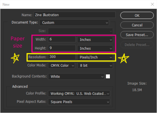
Hopefully this looks very familiar to everyone. This is what you see when you make a new canvas in Photoshop. It’s under File>New or Ctrl+N. It’s also the same in Procreate, CSP, PaintToolSAI, and other similar programs.

First off, make sure you are working at 300 pixels per inch (ppi)!
Photoshop’s default is 72. That is no good because printers work at AT LEAST 300 dpi (dots per inch). That means 300 dots of ink per inch (ish). Each pixel converts to a dot. Any less than that, your image will either not be as sharp as you saw it on your screen, or it will print too small.
After you’ve set your resolution to 300 ppi, you can type in your paper size. Width is the horizontal, or side to side, dimension. Height is the vertical, or up and down, dimension.
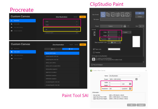
In other programs, the dialogue box should look pretty similar.
This is what my canvas will look like. I am just using 6x9in as an example since that seems to be a popular zine size, but you can work at whatever size you want. I’ve also added what these dimensions would be as pixels since pixels matter more if you’re also planning to post online.
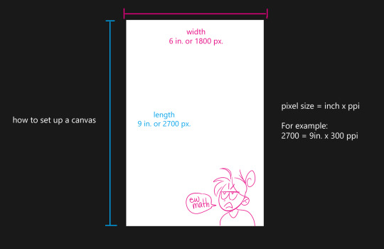
A good range to stay around is 720+ pixels for your shortest dimension (think about it like youtube quality). Most artists stay around the 2000px to 5000px range depending on how much detail they want to draw and strong their computer is. More pixels = more yummy detail. For example, these two crops are the exact same pixel size, but one of them is closer up because the original image was drawn bigger. You can only do that with a bigger canvas.

Sounds obvious but you’d be surprised at how many of my classmates are trying to zoom in on their tiny default 5x7 at 72 ppi PS canvas and they’re like “why is it all pixelated!?” It’s because you have no more pixels, bro. Make your canvas bigger.
So, just because you’re planning to print at 6x7in 300dpi, doesn’t mean you have to stick to those dimensions. As long as the ratio is the same, it’s better to draw at 2 or 3 times the minimum pixels, and then downscale it again later.
Next, convert your Color Space (here it’s listed as Color Mode) to CMYK 8 bit. This is very important for print!
Don’t do this if you are not going to print. There’s a few drawbacks to CMYK that we’ll go over.

If you’ve already created a canvas, you can edit the Color Space (now they call it Color Profile...) by going to Edit > Convert to Profile... and select from the menu.

CMYK color space changes your file so it will only show colors that a printer is able to reproduce, which is also known as a color gamut. Put super simply, digital art is normally seen on an RGB screen, which, depending on your screen’s quality, is able to create very pure, and very bright colors, as well as very subtle darks and whites because you’re playing with actual light. The RGB color gamut is much wider than CMYK. When you print, you can only get as white as your paper and as dark or vibrant as your ink, and if you hold your paper up to your screen at full brightness, your paper isn’t going to look very white.

If you work directly in CMYK from the get go, Photoshop can almost guarantee that your print will have the same colors as what you intended.
or something like that. There’ll be less surprises. RGB is able to create such bright colors because it mixes light “additively” all the way to white. CMYK is like paint, it mixes colors “subtractively” so it’ll only get duller all the way to black.
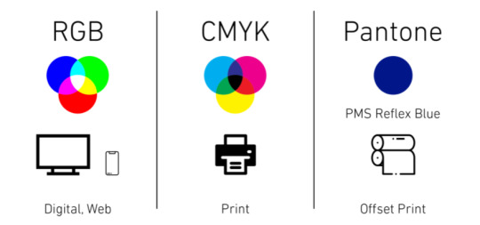
- I borrowed this handy dandy graphic from this article that explains RGB vs CMYK from a graphic design POV: https://blog.iccbusinessproducts.com/rgb-and-cmyk-correct-file-formats
- I also super oversimplified the nuances between the two color spaces, so if you’re even more confused, I recommend reading this article: https://tips.clip-studio.com/en-us/articles/4464
Unfortunately, you can only work in an RGB Color Space in ClipStudio Paint. Here is a link to a way to “proof” or preview the print in CSP: https://tips.clip-studio.com/en-us/articles/5656#763fe323
The last thing you need to know about printers is that they can’t print to the edge of your paper.
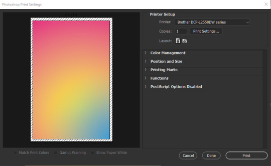
You will always have a 1/8th inch-ish unprinted border around your print. In Photoshop, under File>Print, this unprinted area shows up as those diagonal lines. You can chop it off with some good ol’ shears or straight-cutter but if you absolutely NEED your print to be a certain size, you will have to print on a larger piece of paper than your illustration, at least 1/8th inch on every side (so add a 1/4th inch to each dimension).
For example, since I want my zine to be 6x9in. our paper will need to be at least 6.25x9.25 inch. If you’re sending your image to a professional print shop, you can ask them if they’re able to print to the edge. Though personally, I’d rather just use a common paper size and just chop off the unprinted spots since common paper = cheaper paper.
tl;dr
Change your Resolution to 300 pixels per inch.
Change your Color Space/Profile/Mode to CMYK if you can.
Printers will leave yucky white borders on your print.
Work on a bigger canvas than you expect to print at so you can sneak in all those juicy details.
11 notes
·
View notes
Last Seen Blogs

silentlittlescreamer-blog
Soft Goth

quasarifxxy
totally normal catgirl rei suwa enthusiast

gkcconsultants
Untitled

aliceinchainsofficial
Backstage with The Baldy

leeannenailartist
Leeanne Colley