#oil and gas powerbi course
Text
I did it my way. (With a Little Help from My Friends)
‘I planned each charted course
Each careful step along the byway
And more, much more than this
I did it my way’ - Sinatra
Over the last three years, I’ve built out some proof-of-concept data visualization applications for some large scale Enterprise clients, across a multitude of vertical markets.
These have included, in no particular order:
Semi-conductor manufacturing
Wearable technology manufacturing
Pharmaceutical distribution
Financial
Oil & Gas
Retail
Consumer Hardware & Software
Mobile Communications
Energy Utility
Without exception, every Enterprise client presented similar challenges - namely, how to visually represent data at scale in an insightful, and actionable format.
Here is my methodology.
I adopted a Data strategy:
Data as a service,
ETL as a service,
Data Science as a service, and
Data Visualization as a service.
Data as a Service (DaaS)
Data Acquisition
Technology is making acquiring data in an more automated manner arguably easier and relatively cheaper, increasing the volume and velocity of data produced.
SCADA (Supervisory control and data acquisition devices), Bank ATM’s, merchant credit card swipe terminals, website forms, and sensors - such as Infra-red, Radar and Sonar - even when you compose a tweet...all examples of data acquisition.
With more and more IoT (Internet of Things) devices becoming available, automation of data collection is becoming more even more universal and ubiquitous.
Data Storage
If a record has a time-stamp, it can be recognized as an event, or a transaction; i.e. something happened at this time, on this day, in this month, in this year. These records are (normally) stored in a database.
That was my bread and butter, making sense of events that have happened - or, what was happening in (near) real-time. In recent engagements, it’s the latter that seemed to be more pervasive - sustaining ‘live’ data connections that are capable of very fast refresh rates - sometimes on a per second basis (but more often than not, updated daily).
Data as a Service at the Enterprise meant I’d be connecting to a “Data Lake” such as Hadoop/Hive, a Teradata warehouse on-premise database, or a cloud database like Redshift on the Amazon Web Services platform.
Alternatively (or sometimes additionally), I’d be connecting to ‘NoSQL’ databases like Mongo and Cassandra, while location data was held in GIS (Geo-spatial Intelligence Software) databases like PostGIS or ESRI.
There were also databases that are designed to take advantage of in-memory technologies, and are suited to analytical applications; such as SAP Hana, Memqsl, and Snowflake.
My preferred solution for the foundation of a Data as a Service based architecture is Exasol, because it is proven to be capable of performing analytical tasks at scale, leveraging massively parallel processing and in-memory technologies, enabling rapid responses to intensive queries over massive data sets.
ETL (Extract, Transform, Load) as a Service
‘Extracting’ reads data from a source database (and potentially multiple other sources), ‘Transforming’ is the process of converting this data (joining, unions, performing calculations, cleansing and aggregating) and ‘Loading’ writes to the target database (or writing back to the source).
Business Intelligence applications such as Tableau, Qlik, and Microstrategy often require data to be ‘shaped’ or ‘structured’ in a certain way; usually in a columnar format.
This used to be an arduous task - involving writing batch scripts - but no longer. There are a plethora of enterprise ETL solutions available such as AWS Glue, Apache Kafka and Informatica.
My preferred solution for the basis of an ETL as a Service based architecture is Alteryx, because it is proven to be capable of extracting data from multiple sources - including Hadoop/Hive, Mongo, ESRI and Exasol.
Using an intuitive drag and drop GUI (Graphical User Interface) - it is possible to develop a repeatable, re-usable data transformation as an automated process (also known as a workflow) that can be run on a scheduled basis.
Data Science as a Service
Traditionally, Enterprises would refer complex analytical and statistical tasks such as predicting, modelling, forecasting and so forth to highly skilled data scientists.
It is now possible to automate some of these complex tasks - on Platforms like IBM DSx (accessing tools like Watson ML & Apache Spark), and AWS Domino (accessing tools like Python, Julia & Matlab) but my preference is again, Alteryx, because it is proven to be capable of generating highly accurate predictive models, simulations and forecasts (using the open source R) at scale, as an automated process.
Data Visualization as a Service
There are many Data Visualization tools and libraries available: IBM Cognos, Plotly, Microsoft PowerBI - but here I have three preferences, and sometimes, depending on the scenario and use-cases, I’ll combine all three.
Tableau is proven to be capable of plotting huge amounts of data points on a HTML Canvas. The Server JavaScript and REST APIs (Application Programming Interfaces) allow integration with responsive design Bootstrap web applications and a consistent library of user interfaces. Combined with an Exasol database connection, Tableau is capable of querying multi-million high granularity records - for example transactions - allowing for interactivity over multiple plots/charts.
D3 is my preference if I am using low granularity or summary data. Instead of a server responding to a query and returning that response, d3 downloads and processes data client side, in a browser. D3 is capable of drawing elements on an HTML Canvas or rendering SVG (Scaleable Vector Graphics). It is cross-browser, platform agnostic, and ultimately, the most flexible library which allows for full customization.
Mapbox is my preference if I am using location data. It is capable of rendering multi-million data points using vector tiles, which can be queried client side in a browser.
User Experience/User Interface (UX/UI)
jQuery UI is my preference for a consistent User Interface library. I use Bootstrap to develop responsive design web applications. I typically use client CSS and style guides to comply with typography, color palette and brand guidelines for the application.
Charts and graphs typically remain in a grayscale color palette, with chart types conforming with Tufte/Few guidelines.
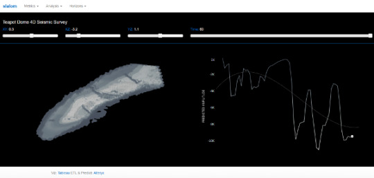
Example #1
Scenario: Four Dimensional Seismic Survey
Use-case: Predict magnitude of seismic activity over time for the different formations (horizons) in the anticline, and compare with actual values.
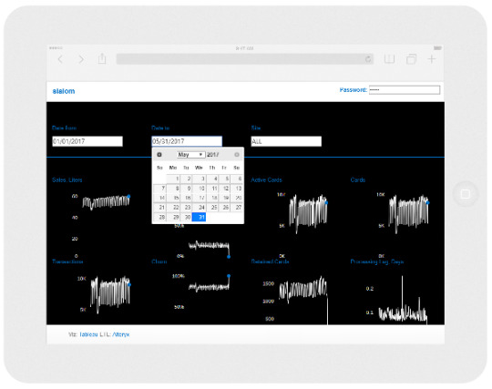
Example #2
Scenario: Fleet Credit Cards
Use-case: Predict churn and retention over time for different retail sites and compare with actual values, making the last data point actionable (alert site manager upon difference to target and/or outside normal parameters).
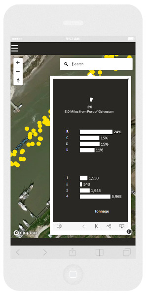
Example #3
Scenario: Demand and supply of products over time for different markets
Use-case: Predict origin and destination locations of logistical assets and compare with actual values over time, to inform a forecast model of product supply and demand.
Of course, I was being my normal flippant self when I sang ‘I did it my way’. I had more than a little help from my friends - you know who you are of course, because I’ve tipped my hat to you on many occasions in previous blog posts.
‘What would you do if I sang out of tune?
Would you stand up and walk out on me?
Lend me your ears and I'll sing you a song
I will try not to sing out of key’ - Lennon/McCartney
The communities
Over the last three years, I’ve learned a lot from developers in various communities:
The twitter-verse of data visualization practitioners,
The Tableau community forum,
The Alteryx community forum,
GIS Stack Exchange,
Stack Overflow,
GitHub,
Behance,
Dribbble, and
Codepen
‘What would you do if I sing out of tune, Would you stand up and walk out on me?‘
The Tableau ‘community’ as of late 2017, seems to be going through a radical period of introspection. When I say ‘Tableau community’ - I’m really referring to the ‘Tableau twitterati’ - not the community forum participants per-se, but cliques such as MakeoverMonday and Women + Data, and the ultimate Tableau coterie - Zen Masters.
In fact, Tableau themselves referred to these groups as ‘tribes’.
A culture, or sub-culture, can form behaviors and attitudes that stem from attachment and perceived loyalty to that clique. Sectarianism is synonymous with tribalism, and is often an consequence of division.
When I read tweets haranguing other practitioners about plagiarism, and read blog posts with political statements to underpin an opinion, or examples of promoting gratuitous and egotistical self promotion, it gives me great pause for concern, and it’s very tempting to stand up, and walk out the door in disgust at what the community not only regards as acceptable, but normal.
‘Lend me your ears and I'll sing you a song, I will try not to sing out of key’
I recommend that Tableau shutters the Zen Master program, and instead, promotes and grows the Tableau Foundation Data Fellowship.
I recommend that the Makeover Monday leadership and participants re-focus their efforts by contributing to the Tableau Foundation Projects and develop towards meeting the Sustainable Development Goals, volunteering their time to the Tableau Service Corps.
I recommend that Tableau welcome Women + Data members on the board of their diversity committees and judging panels of the ‘IronViz’ competitions and feeder contests.
I believe that these recommendations would foster an inclusive, collaborative culture, rather than accepting and promoting sectarianism as a norm; and would re-energize the wider Tableau community.
9 notes
·
View notes
Last Seen Blogs

mavistardew
Dr. Acula: free bloodtests!

wingedinfluencerwinner
Untitled

fairyperiapt
FairyPeriapt

ovidedecroly-blog
ESCOLA DE EDUCAÇÃO INFANTIL OVIDE DECROLY

lifesarocknrollride
Life's a Rock n' Roll ride...